Embed Size (px)
Citation preview
Chapter 02
Describing Data: Frequency Tables, Frequency Distributions, and Graphic Presentation
True / False Questions
1. A frequency distribution groups data into classes showing the number of observations in each class. True False
2. A frequency distribution for qualitative data has class limits.
True False
3. To summarize the gender of students attending a college, the number
of classes in a frequency distribution depends on the number of students. True False
4. In frequency distributions, classes are mutually exclusive if each
individual, object, or measurement is included in only one category. True False
5. In a bar chart, the x-axis is labeled with the values of a qualitative
variable. True False
6. In a bar chart, the heights of the bars represent the frequencies in each class. True False
7. The midpoint of a class, which is also called a class mark, is halfway
between the lower and upper limits. True False
8. A class interval, or class width, can be determined by subtracting the
lower limit of a class from the lower limit of the next higher class. True False
9. To convert a frequency distribution to a relative frequency distribution,
divide each class frequency by the sum of the class frequencies. True False
10.
To convert a frequency distribution to a relative frequency distribution, divide each class frequency by the number of classes. True False
11.
A pie chart is similar to a relative frequency distribution. True False
12.
A pie chart shows the relative frequency in each class. True False
13.
To construct a pie chart, relative class frequencies are used to graph the "slices" of the pie. True False
14.
A cumulative frequency distribution is used when we want to determine how many observations lie above or below certain values. True False
15.
A frequency polygon is a very useful graphic technique when comparing two or more distributions. True False
Multiple Choice Questions
16.
Monthly commissions of first-year insurance brokers are $1,270, $1,310, $1,680, $1,380, $1,410, $1,570, $1,180 and $1,420. These figures are referred to as a(n) __________.
A. Histogram
B. Raw data
C. Frequency distribution
D. Frequency polygon
17.
A small sample of computer operators shows monthly incomes of $1,950, $1,775, $2,060, $1,840, $1,795, $1,890, $1,925, and $1,810. What are these ungrouped numbers called?
A. Histogram
B. Class limits
C. Class frequencies
D. Raw data
18.
When data is collected using a quantitative, ratio variable, what is true about a frequency distribution that summarizes the data?
A. Upper and lower class limits must be calculated.
B. A pie chart can be used to summarize the data.
C. Number of classes is equal to the number of variable's values.
D. The "5 to the k rule" can be applied.
19.
When data is collected using a qualitative, nominal variable, what is true about a frequency distribution that summarizes the data?
A. The upper and lower class limits must be calculated.
B. A pie chart can be used to summarize the data.
C. The number of classes is equal to the number of variable's values plus 2.
D. The "5 to the k rule" can be applied.
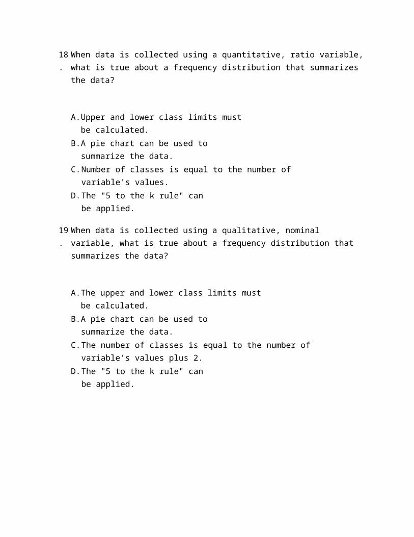
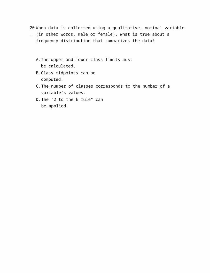
20.
When data is collected using a qualitative, nominal variable (in other words, male or female), what is true about a frequency distribution that summarizes the data?
A. The upper and lower class limits must be calculated.
B. Class midpoints can be computed.
C. The number of classes corresponds to the number of a variable's values.
D. The "2 to the k rule" can be applied.
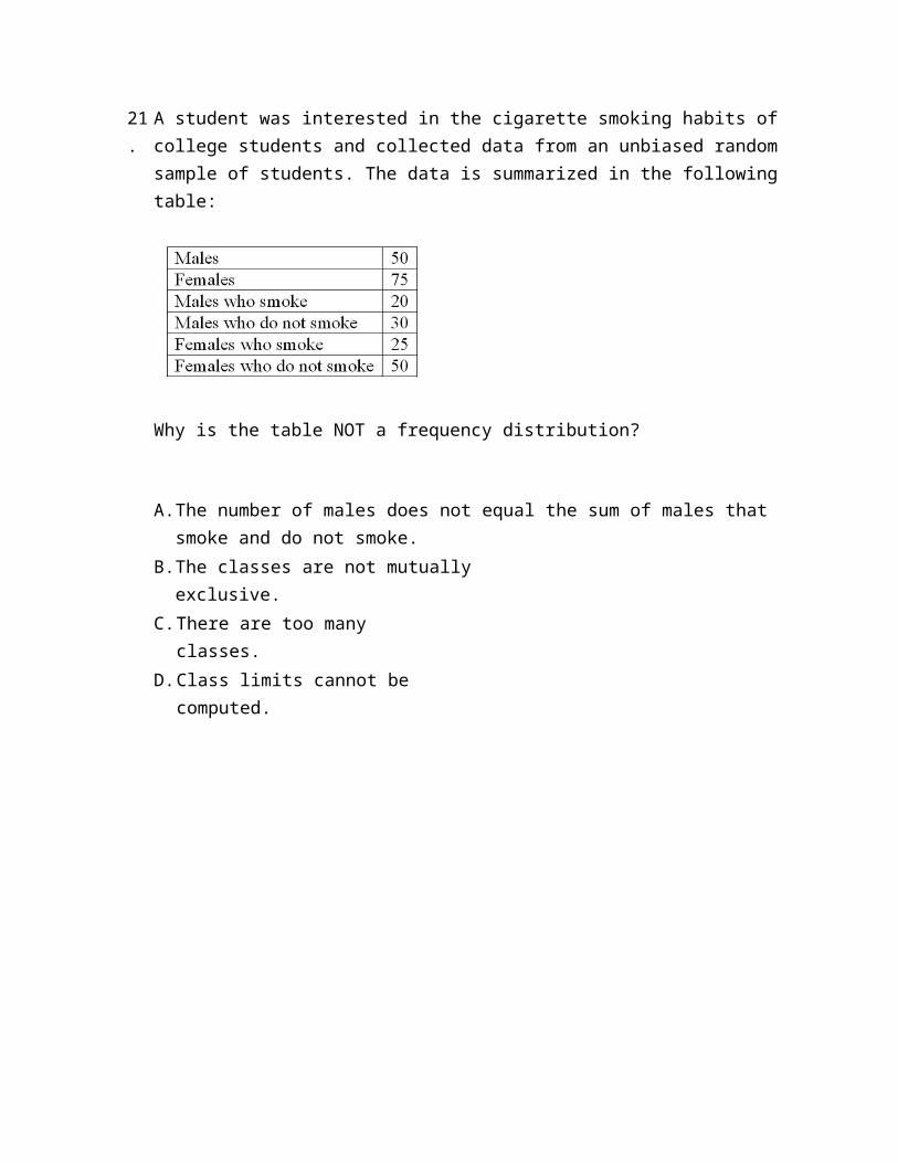
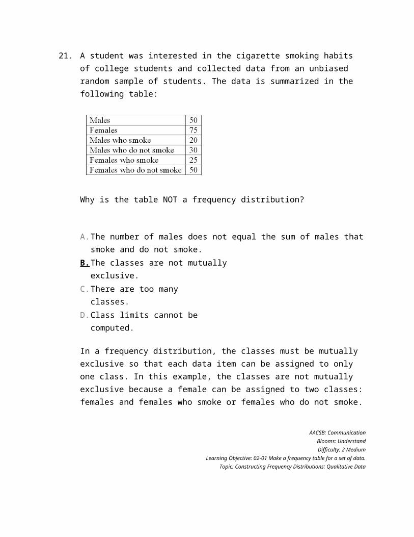
21.
A student was interested in the cigarette smoking habits of college students and collected data from an unbiased random sample of students. The data is summarized in the following table:
Why is the table NOT a frequency distribution?
A. The number of males does not equal the sum of males that smoke and do not smoke.
B. The classes are not mutually exclusive.
C. There are too many classes.
D. Class limits cannot be computed.
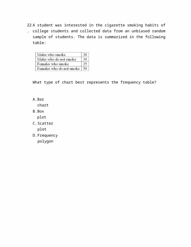
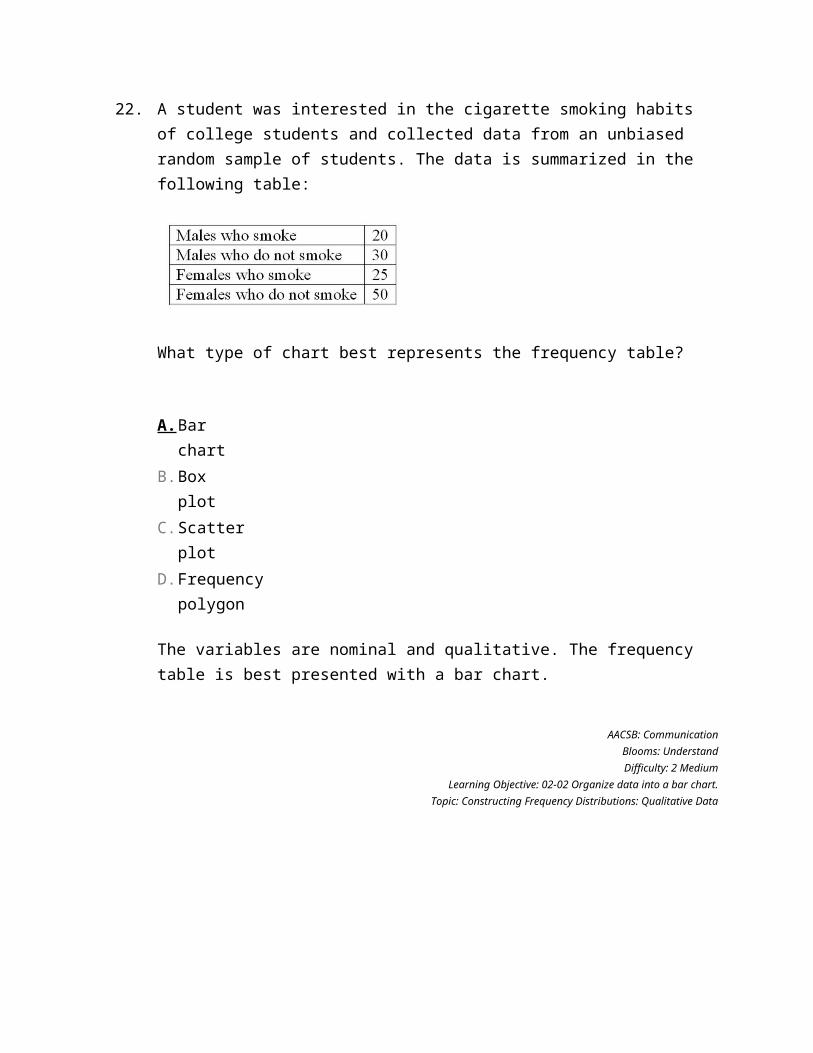
22.
A student was interested in the cigarette smoking habits of college students and collected data from an unbiased random sample of students. The data is summarized in the following table:
What type of chart best represents the frequency table?
A. Bar chart
B. Box plot
C. Scatter plot
D. Frequency polygon
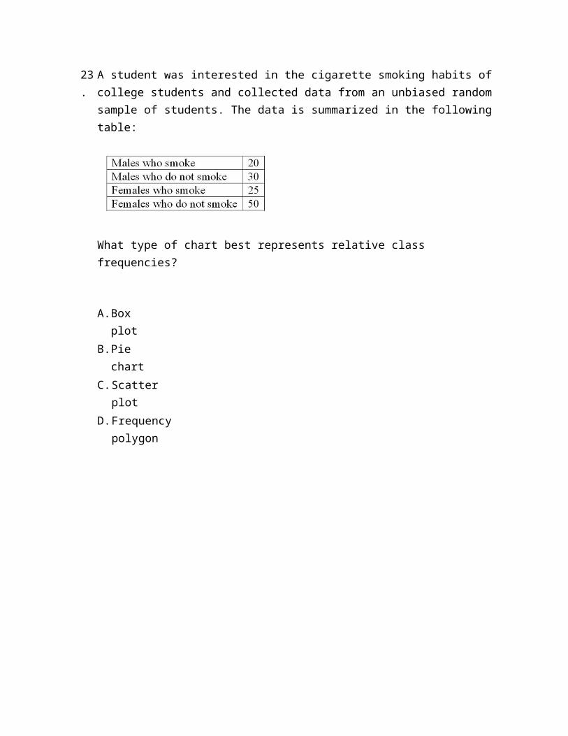
23.
A student was interested in the cigarette smoking habits of college students and collected data from an unbiased random sample of students. The data is summarized in the following table:
What type of chart best represents relative class frequencies?
A. Box plot
B. Pie chart
C. Scatter plot
D. Frequency polygon
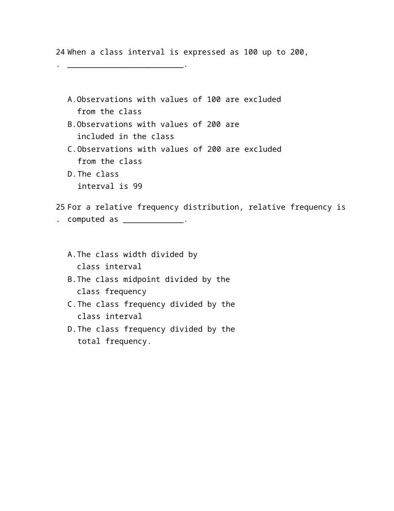
24.
When a class interval is expressed as 100 up to 200, _________________________.
A. Observations with values of 100 are excluded from the class
B. Observations with values of 200 are included in the class
C. Observations with values of 200 are excluded from the class
D. The class interval is 99
25.
For a relative frequency distribution, relative frequency is computed as _____________.
A. The class width divided by class interval
B. The class midpoint divided by the class frequency
C. The class frequency divided by the class interval
D. The class frequency divided by the total frequency.
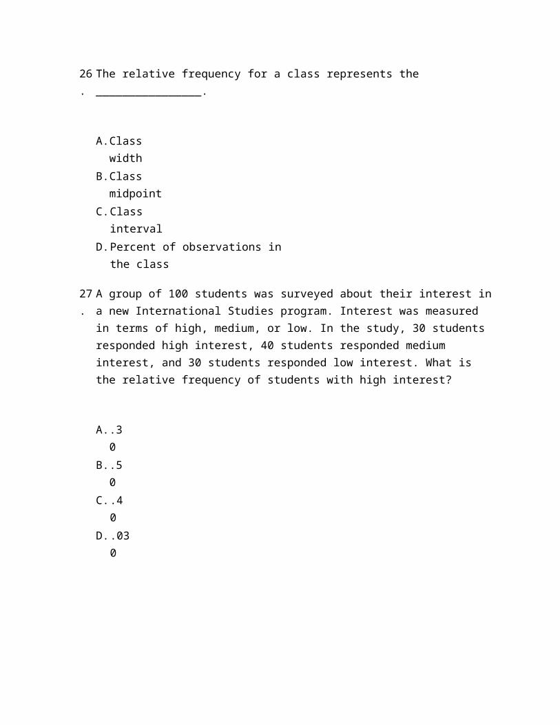
26.
The relative frequency for a class represents the ________________.
A. Class width
B. Class midpoint
C. Class interval
D. Percent of observations in the class
27.
A group of 100 students was surveyed about their interest in a new International Studies program. Interest was measured in terms of high, medium, or low. In the study, 30 students responded high interest, 40 students responded medium interest, and 30 students responded low interest. What is the relative frequency of students with high interest?
A. .30
B. .50
C. .40
D. .030
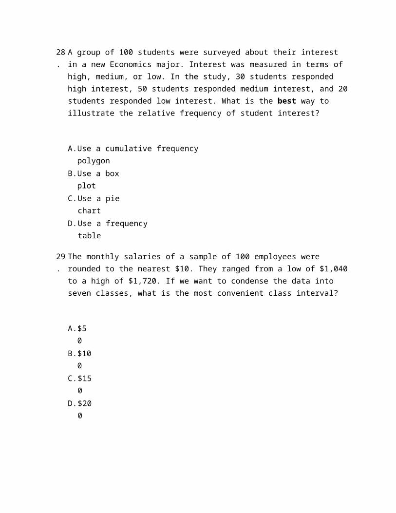
28.
A group of 100 students were surveyed about their interest in a new Economics major. Interest was measured in terms of high, medium, or low. In the study, 30 students responded high interest, 50 students responded medium interest, and 20 students responded low interest. What is the best way to illustrate the relative frequency of student interest?
A. Use a cumulative frequency polygon
B. Use a box plot
C. Use a pie chart
D. Use a frequency table
29.
The monthly salaries of a sample of 100 employees were rounded to the nearest $10. They ranged from a low of $1,040 to a high of $1,720. If we want to condense the data into seven classes, what is the most convenient class interval?
A. $50
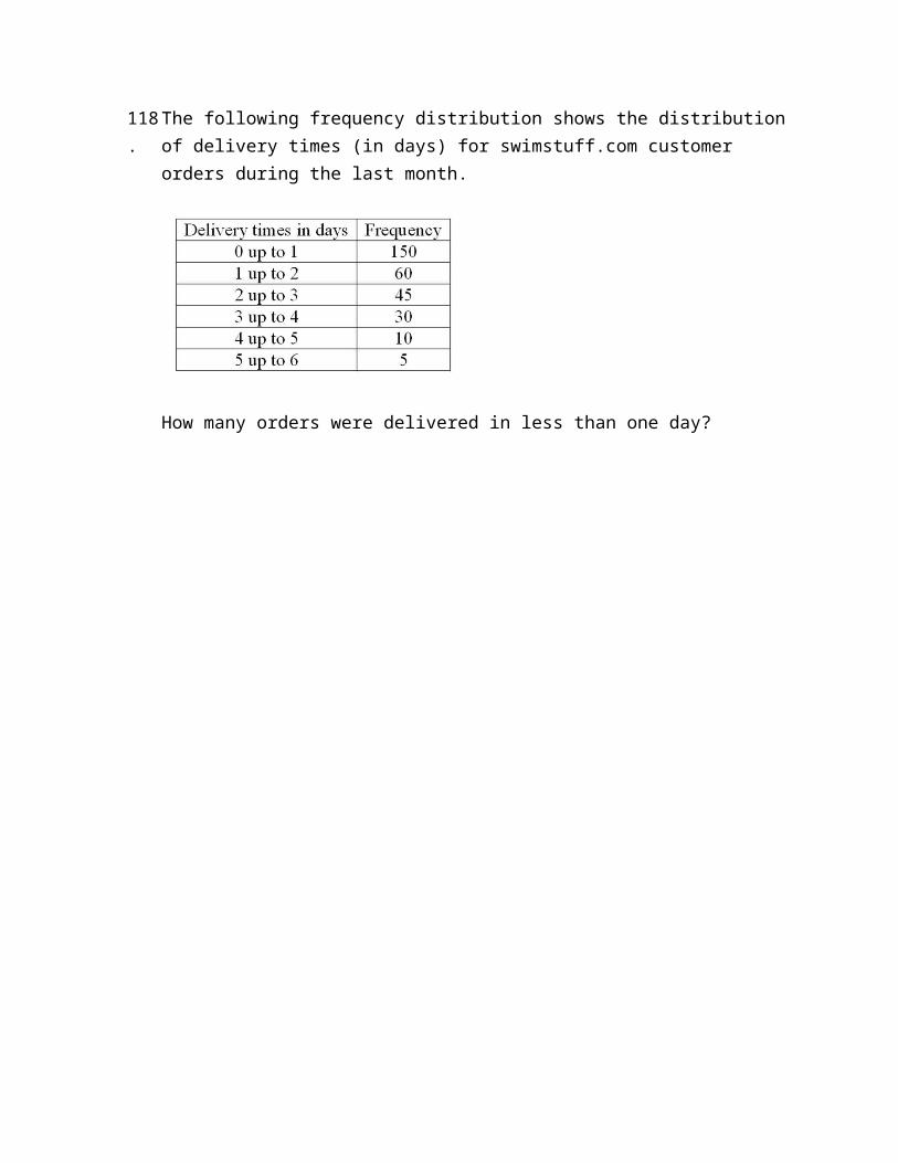
B. $100
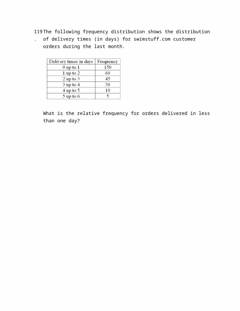
C. $150
D. $200
30.
A student was studying the political party preferences of a university's student population. The survey instrument asked students to identify themselves as a Democrat or a Republican. This question is flawed because:
A. Students generally don't know their political preferences.
B. The categories are generally mutually exclusive.
C. The categories are not exhaustive.
D. Political preference is a continuous variable.
31.
A student was studying the political party preferences of a university's student population. The survey instrument asked students to identify their political preference, for example, Democrat, Republican, Libertarian, or another party. The best way to illustrate the frequencies for each political preference is a __________.
A. Bar chart
B. Box plot
C. Histogram
D. Frequency polygon
32.
A student was studying the political party preferences of a university's student population. The survey instrument asked students to identify their political preference—for example, Democrat, Republican, Libertarian, or another party. The best way to illustrate the relative frequency distribution is a __________.
A. Bar chart
B. Pie chart
C. Histogram
D. Frequency polygon
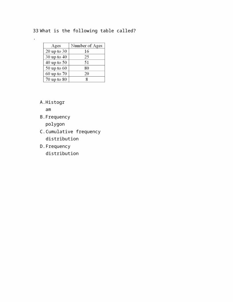
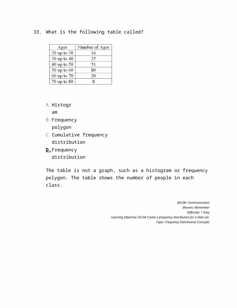
33.
What is the following table called?
A. Histogram
B. Frequency polygon
C. Cumulative frequency distribution
D. Frequency distribution
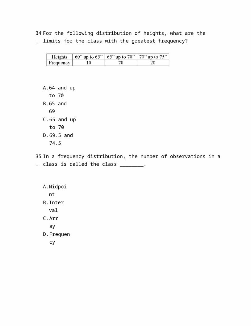
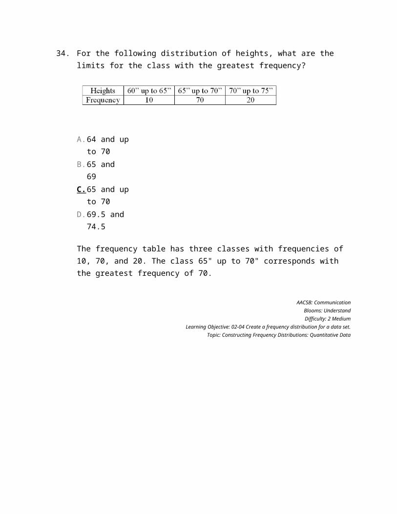
34.
For the following distribution of heights, what are the limits for the class with the greatest frequency?
A. 64 and up to 70
B. 65 and 69
C. 65 and up to 70
D. 69.5 and 74.5
35.
In a frequency distribution, the number of observations in a class is called the class ________.
A. Midpoint
B. Interval
C. Array
D. Frequency
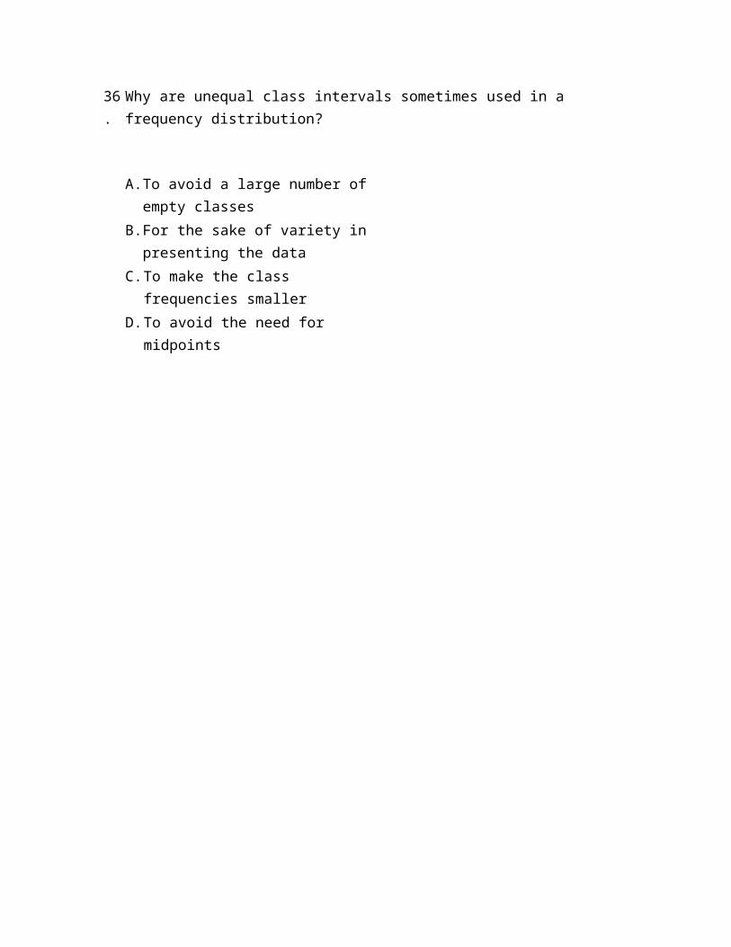
36.
Why are unequal class intervals sometimes used in a frequency distribution?
A. To avoid a large number of empty classes
B. For the sake of variety in presenting the data
C. To make the class frequencies smaller
D. To avoid the need for midpoints
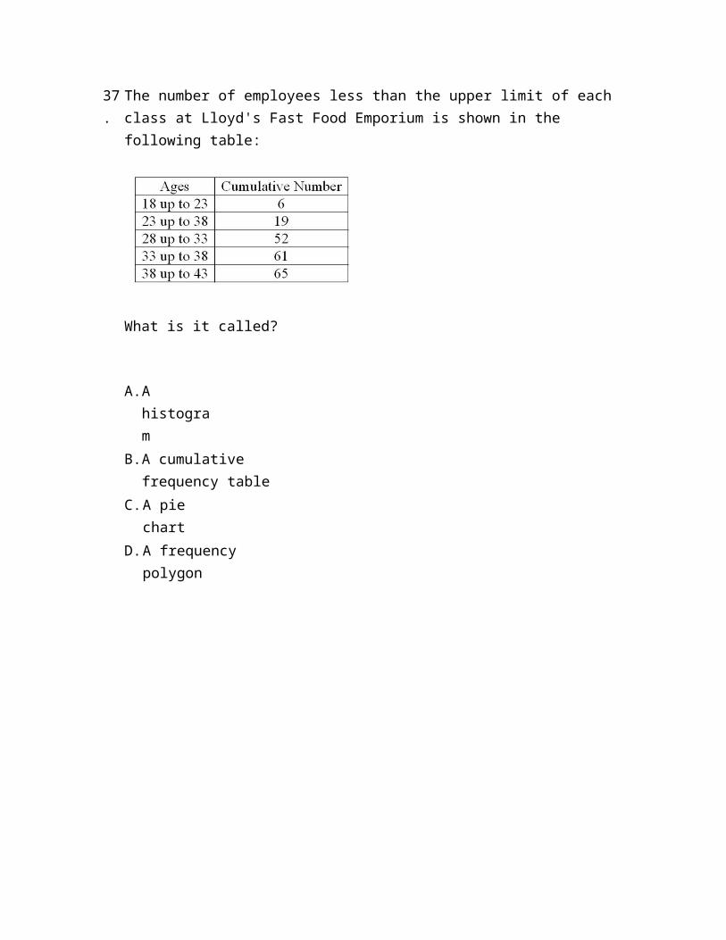
37.
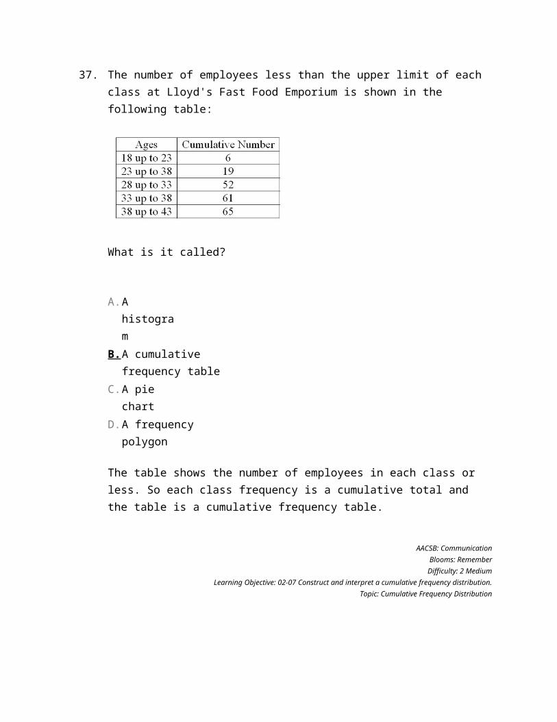
The number of employees less than the upper limit of each class at Lloyd's Fast Food Emporium is shown in the following table:
What is it called?
A. A histogram
B. A cumulative frequency table
C. A pie chart
D. A frequency polygon
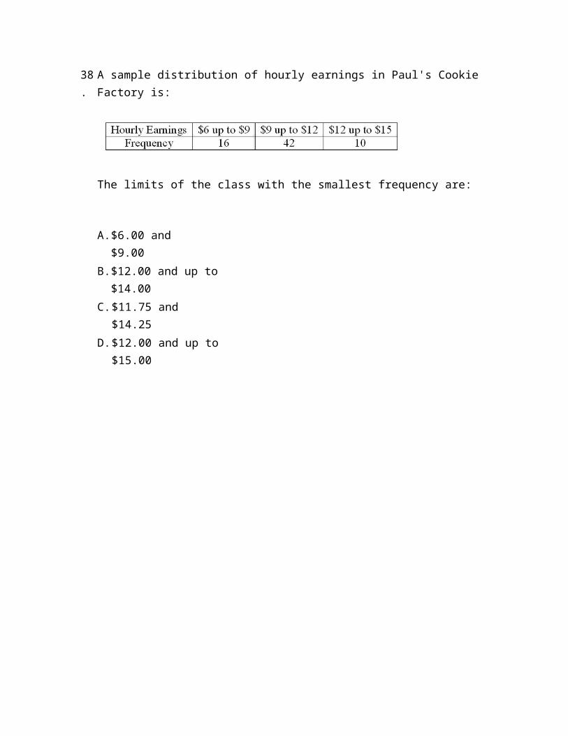
38.
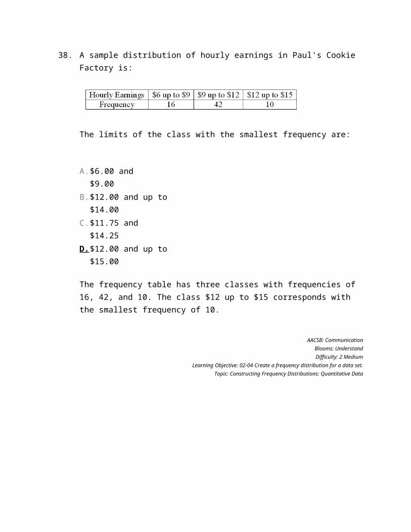
A sample distribution of hourly earnings in Paul's Cookie Factory is:
The limits of the class with the smallest frequency are:
A. $6.00 and $9.00
B. $12.00 and up to $14.00
C. $11.75 and $14.25
D. $12.00 and up to $15.00
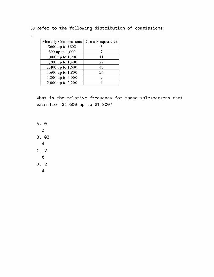
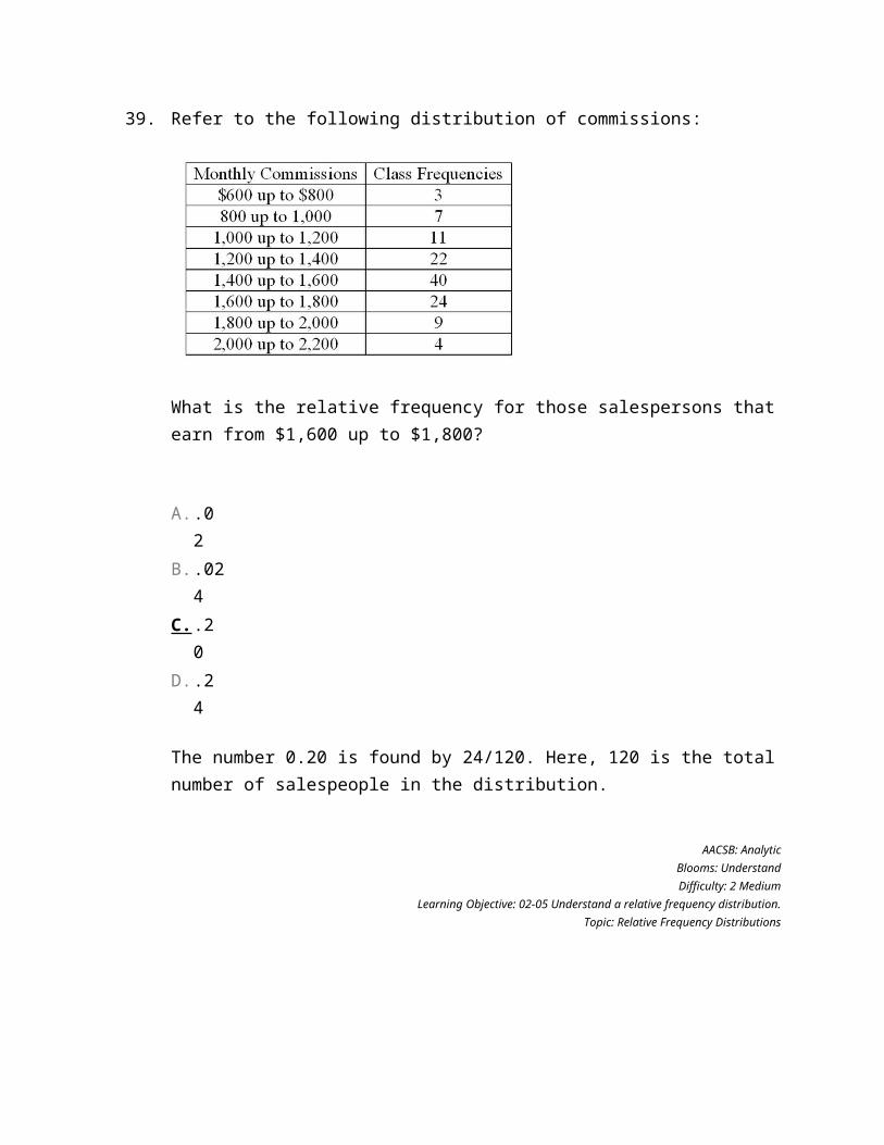
39.
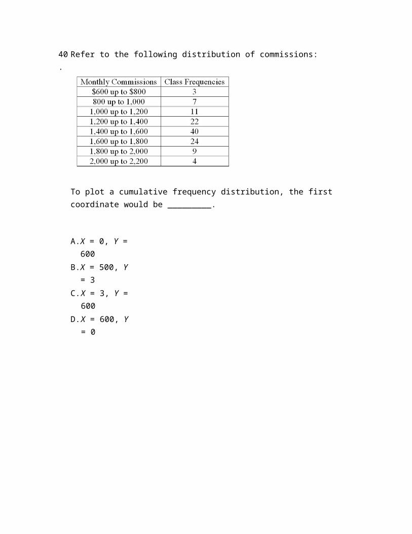
Refer to the following distribution of commissions:
What is the relative frequency for those salespersons that earn from $1,600 up to $1,800?
A. .02
B. .024
C. .20
D. .24
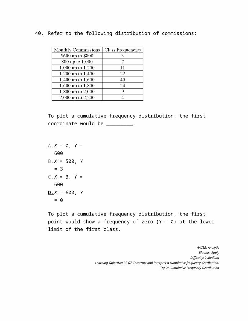
40.
Refer to the following distribution of commissions:
To plot a cumulative frequency distribution, the first coordinate would be _________.
A. X = 0, Y = 600
B. X = 500, Y = 3
C. X = 3, Y = 600
D. X = 600, Y = 0
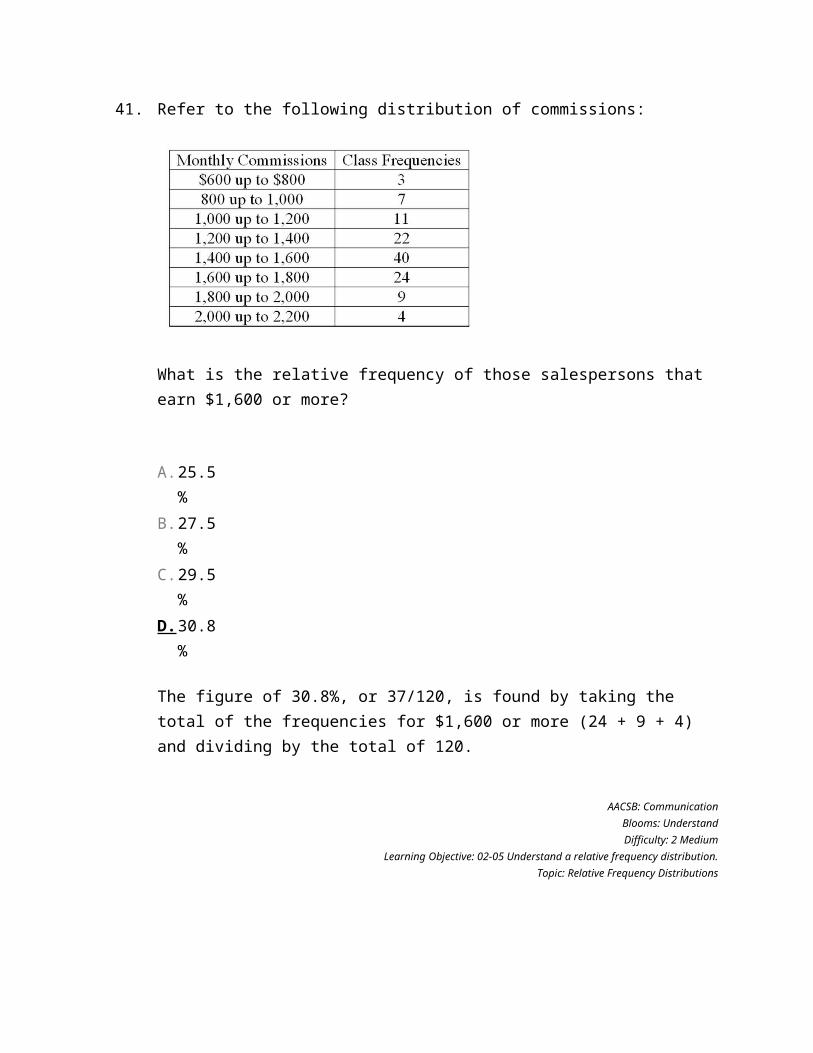
41.
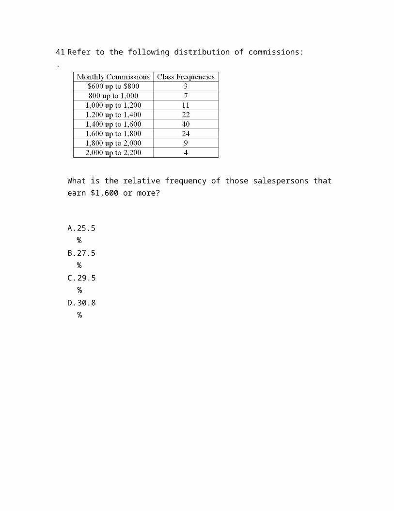
Refer to the following distribution of commissions:
What is the relative frequency of those salespersons that earn $1,600 or more?
A. 25.5%
B. 27.5%
C. 29.5%
D. 30.8%
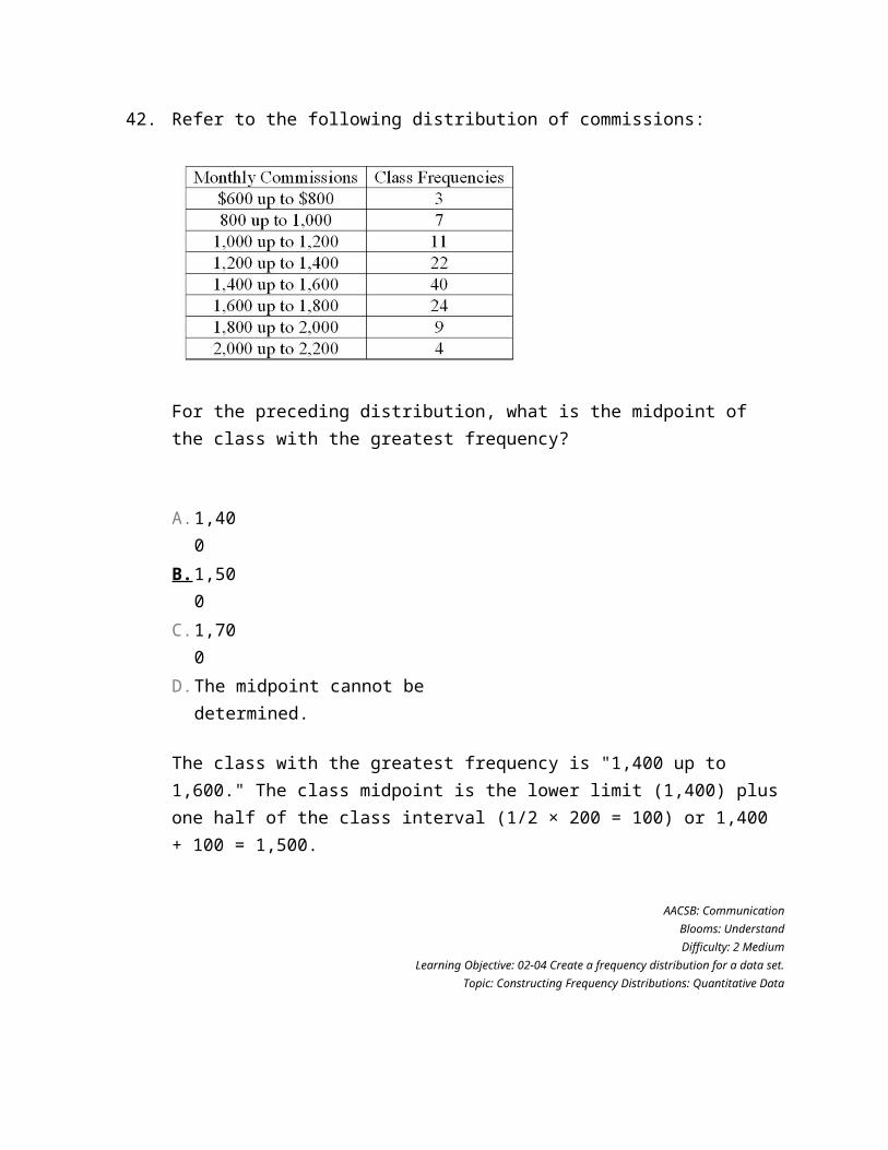
42.
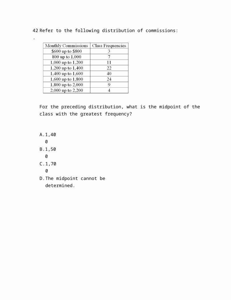
Refer to the following distribution of commissions:
For the preceding distribution, what is the midpoint of the class with the greatest frequency?
A. 1,400
B. 1,500
C. 1,700
D. The midpoint cannot be determined.
43.
Refer to the following distribution of commissions:
What is the class interval?
A. 200
B. 300
C. 3,500
D. 400
44.
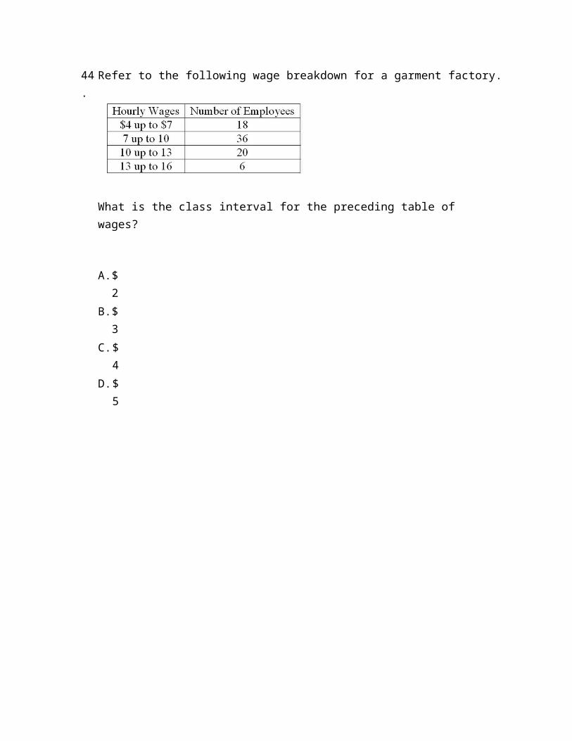
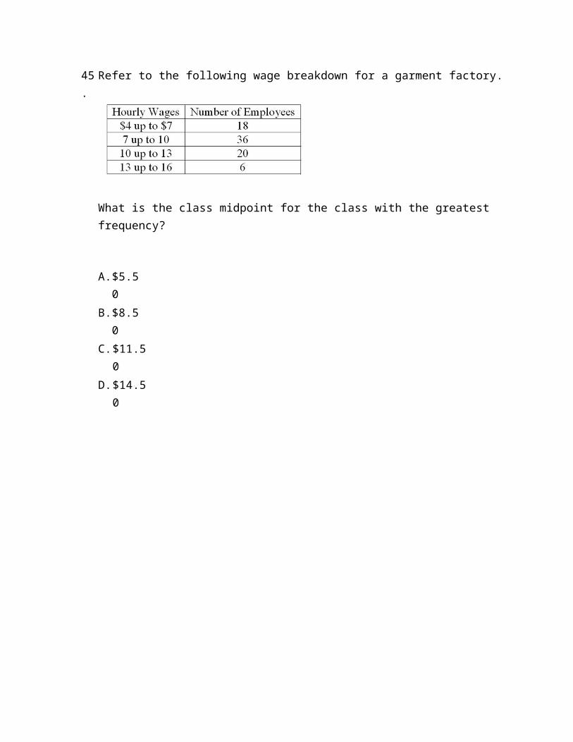
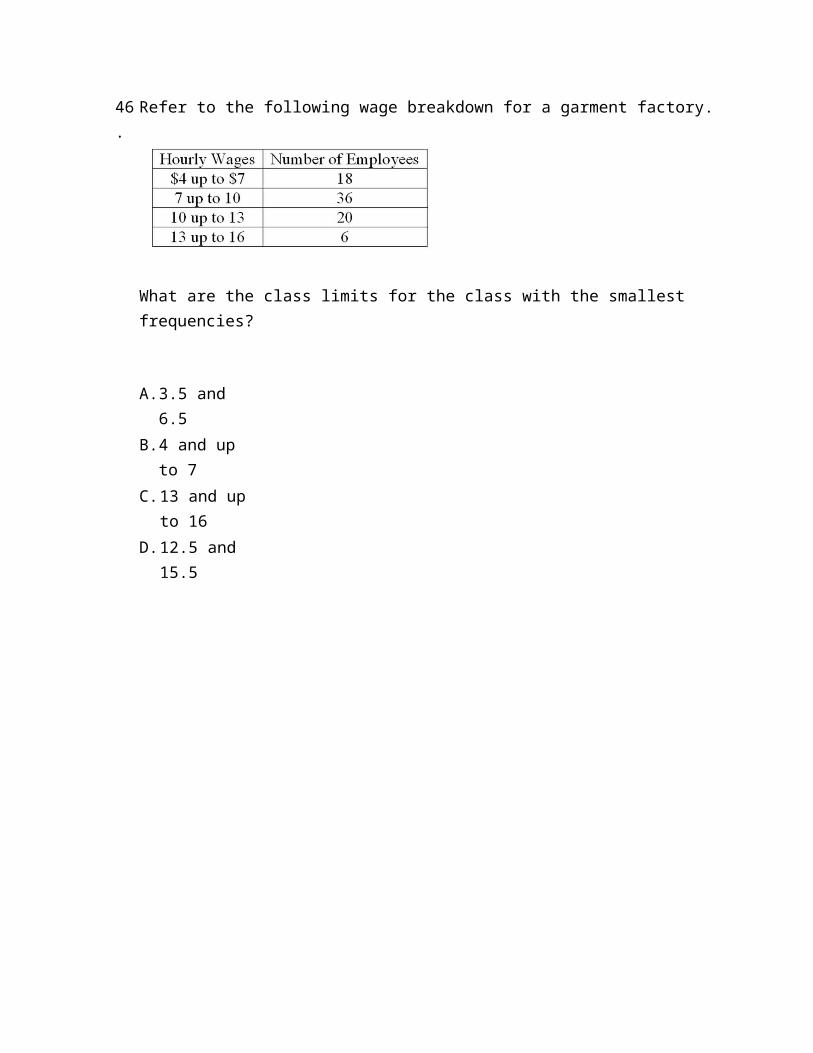
Refer to the following wage breakdown for a garment factory.
What is the class interval for the preceding table of wages?
A. $2
B. $3
C. $4
D. $5
45.
Refer to the following wage breakdown for a garment factory.
What is the class midpoint for the class with the greatest frequency?
A. $5.50
B. $8.50
C. $11.50
D. $14.50
46.
Refer to the following wage breakdown for a garment factory.
What are the class limits for the class with the smallest frequencies?
A. 3.5 and 6.5
B. 4 and up to 7
C. 13 and up to 16
D. 12.5 and 15.5
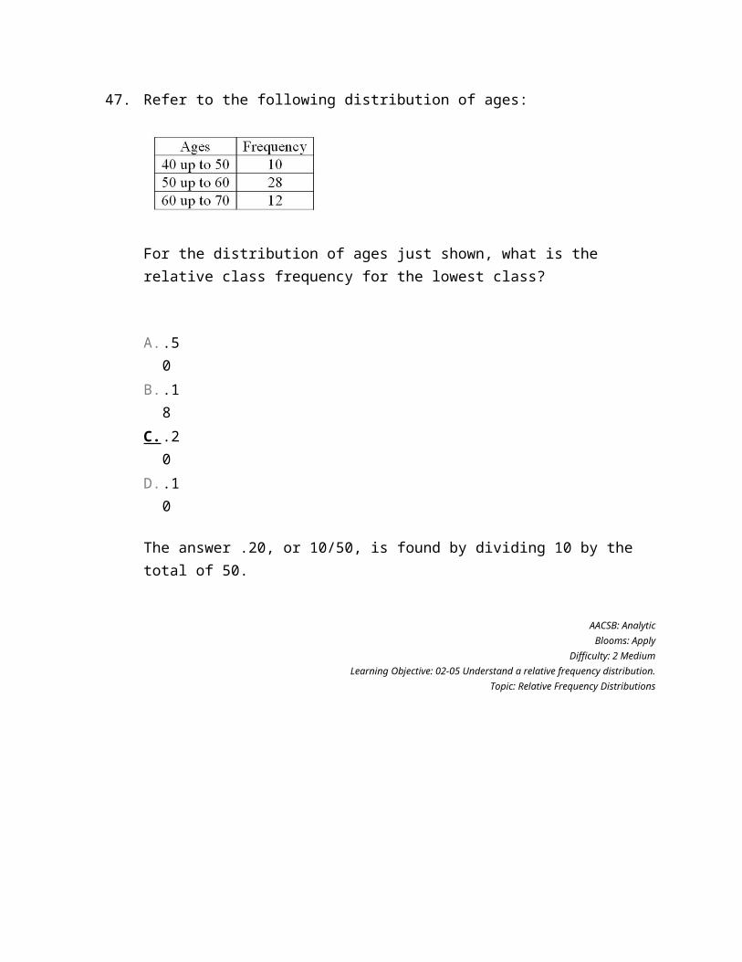
47.
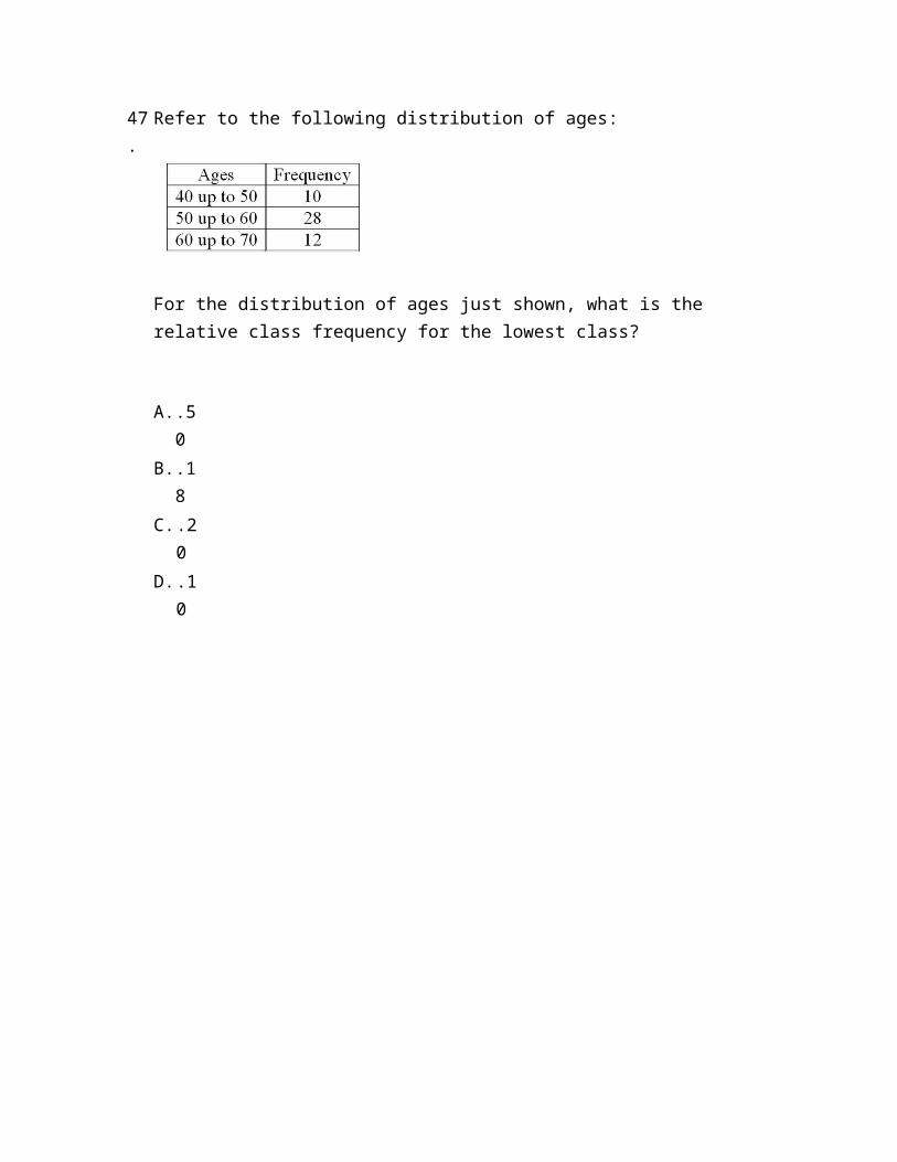
Refer to the following distribution of ages:
For the distribution of ages just shown, what is the relative class frequency for the lowest class?
A. .50
B. .18
C. .20
D. .10
48.
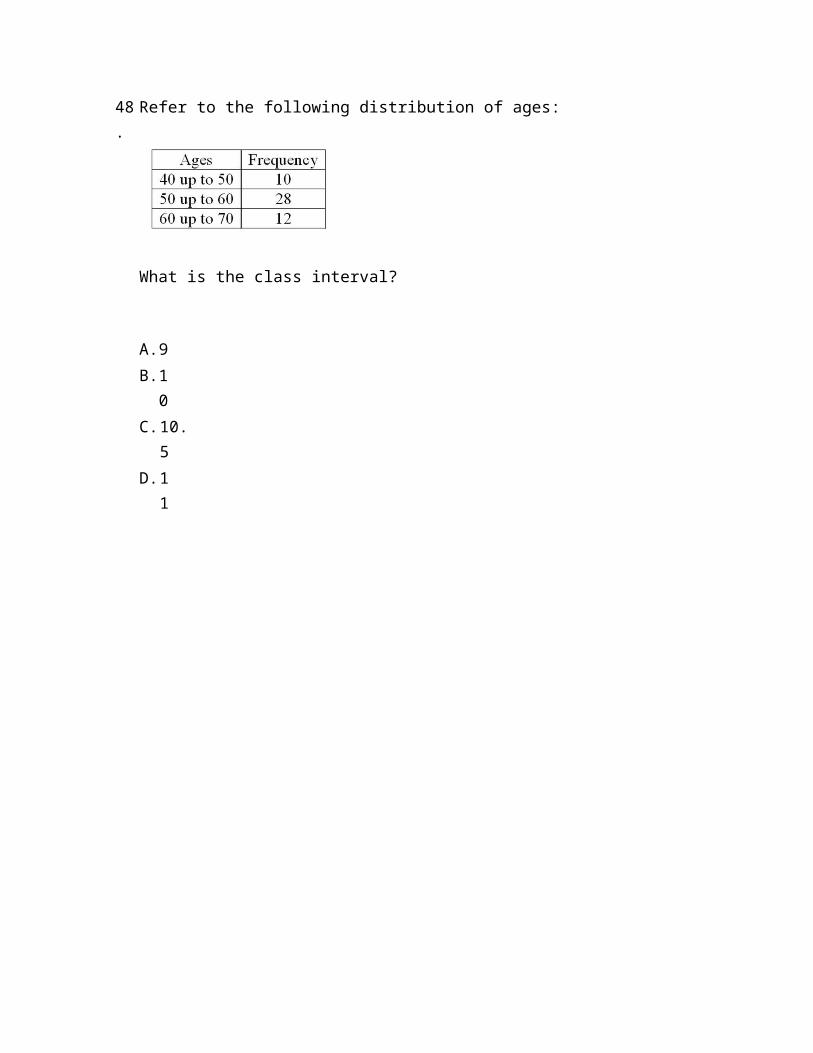
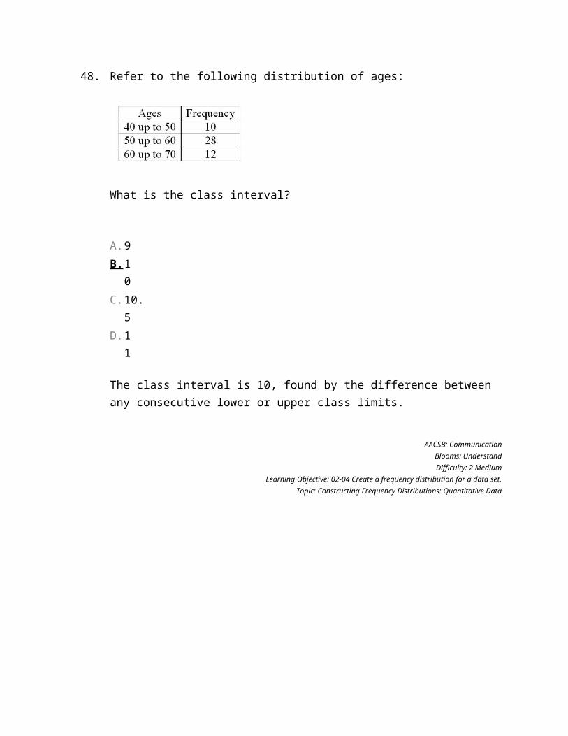
Refer to the following distribution of ages:
What is the class interval?
A. 9B. 1
0C. 10.
5D. 1
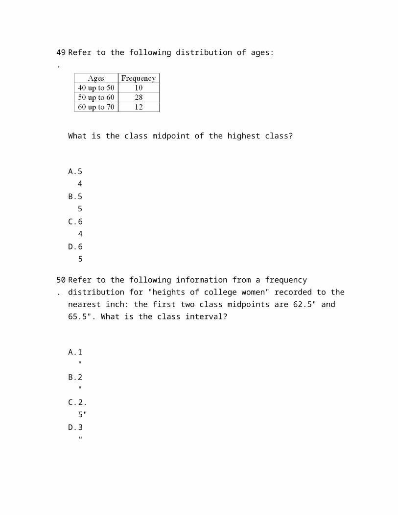
1 49.
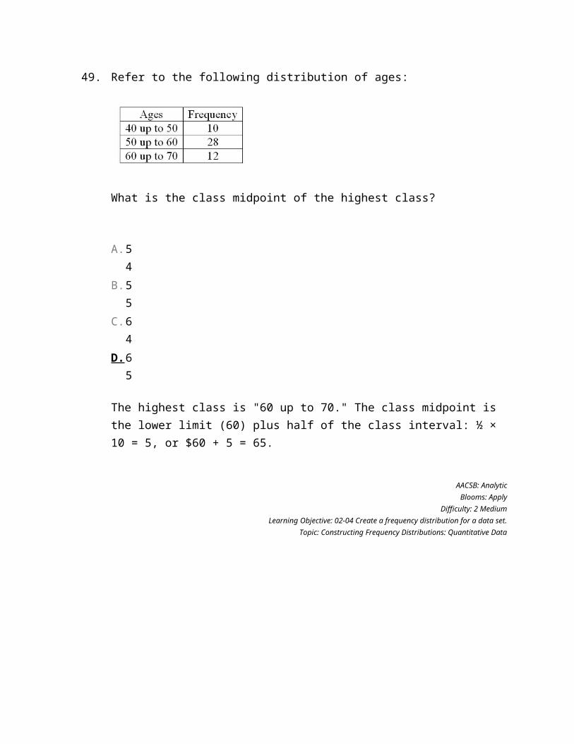
Refer to the following distribution of ages:
What is the class midpoint of the highest class?
A. 54
B. 55
C. 64
D. 65
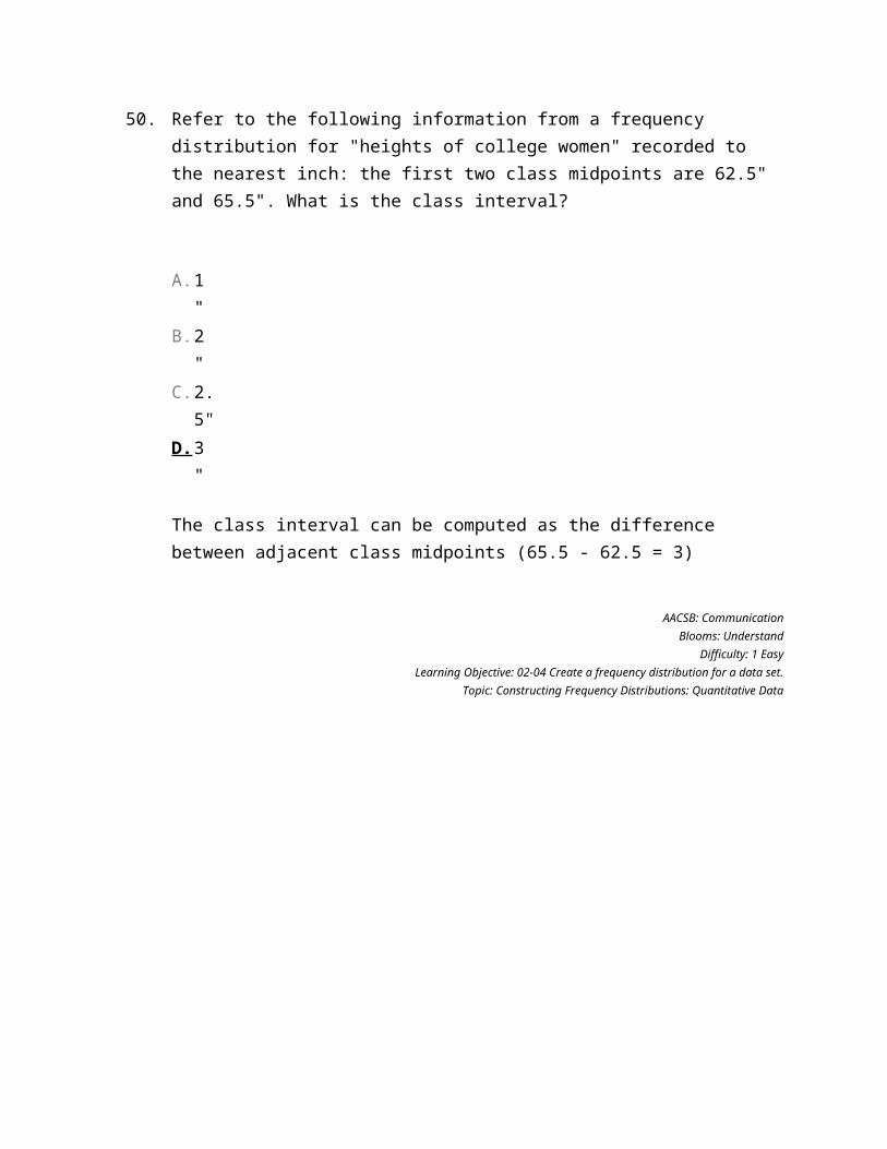
50.
Refer to the following information from a frequency distribution for "heights of college women" recorded to the nearest inch: the first two class midpoints are 62.5" and 65.5". What is the class interval?
A. 1"
B. 2"
C. 2.5"
D. 3"
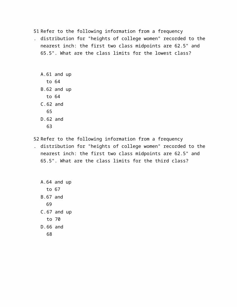
51.
Refer to the following information from a frequency distribution for "heights of college women" recorded to the nearest inch: the first two class midpoints are 62.5" and 65.5". What are the class limits for the lowest class?
A. 61 and up to 64
B. 62 and up to 64
C. 62 and 65
D. 62 and 63

52.
Refer to the following information from a frequency distribution for "heights of college women" recorded to the nearest inch: the first two class midpoints are 62.5" and 65.5". What are the class limits for the third class?
A. 64 and up to 67
B. 67 and 69
C. 67 and up to 70
D. 66 and 68
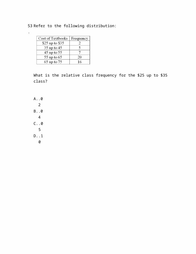
53.
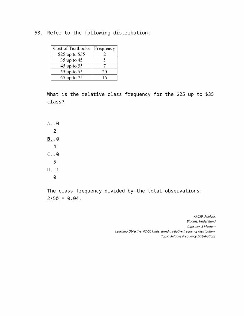
Refer to the following distribution:
What is the relative class frequency for the $25 up to $35 class?
A. .02
B. .04
C. .05
D. .10
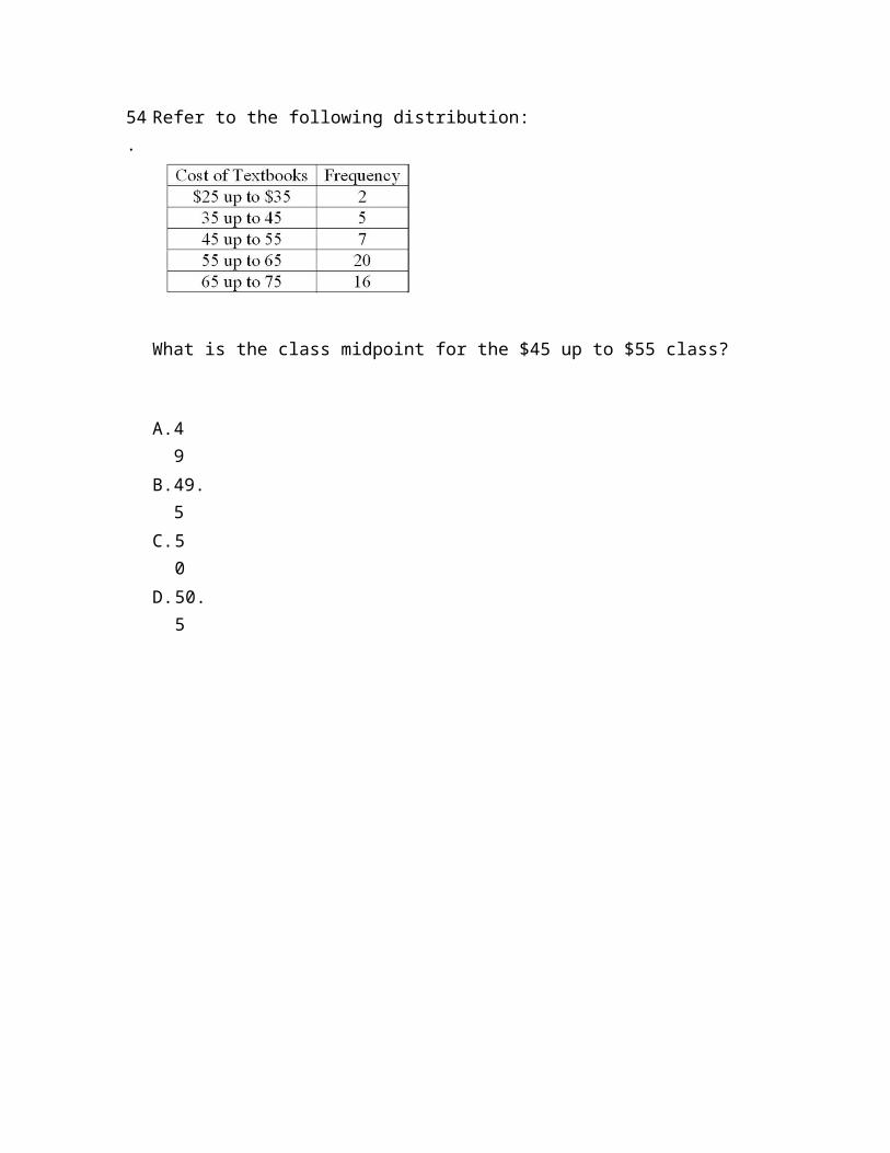
54.
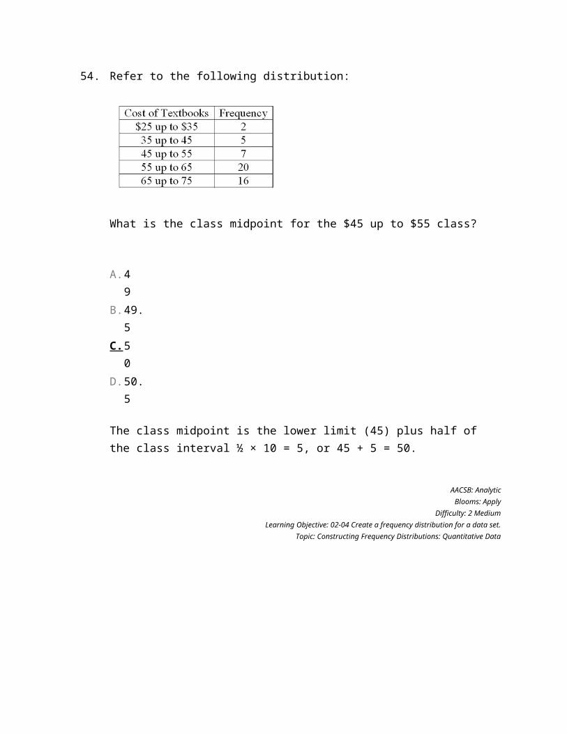
Refer to the following distribution:
What is the class midpoint for the $45 up to $55 class?
A. 49
B. 49.5
C. 50
D. 50.5
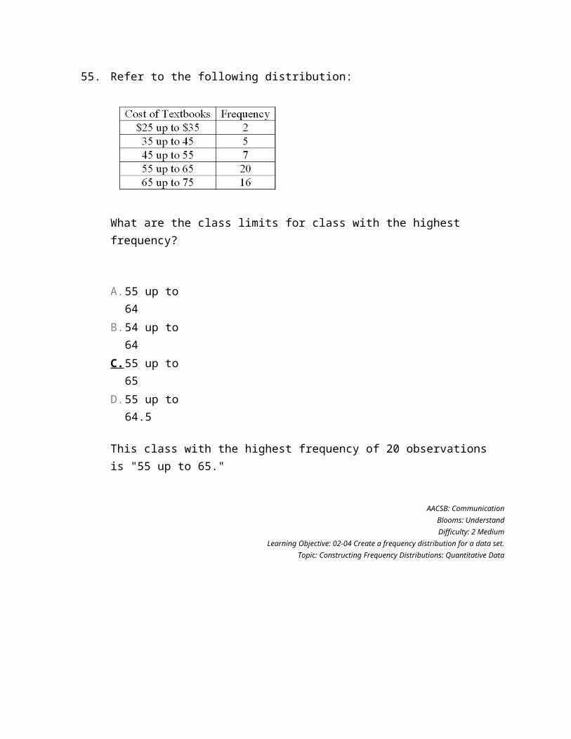
55.
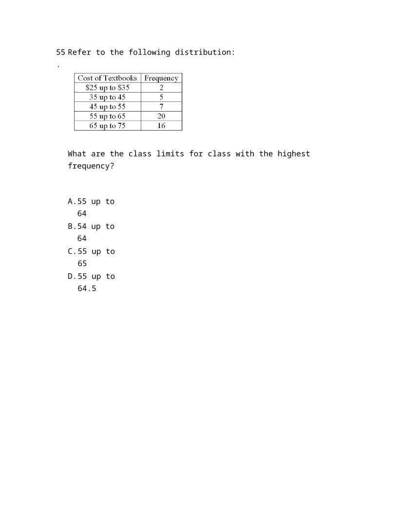
Refer to the following distribution:
What are the class limits for class with the highest frequency?
A. 55 up to 64
B. 54 up to 64
C. 55 up to 65
D. 55 up to 64.5
56.
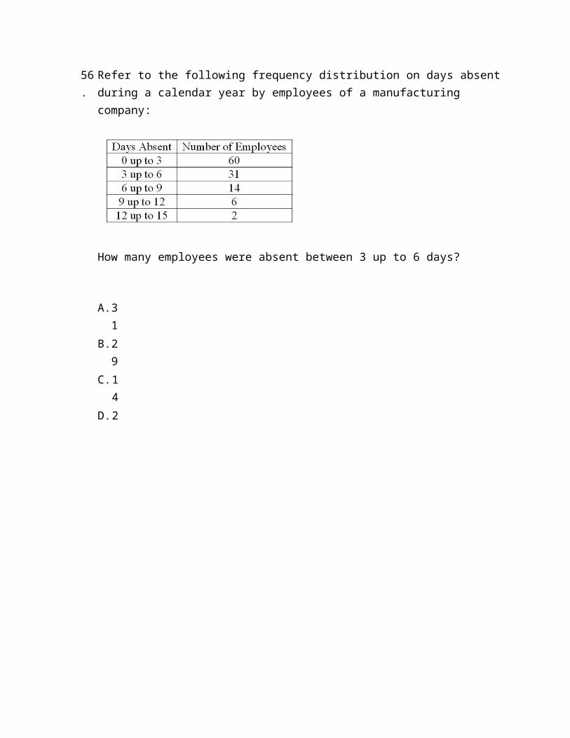
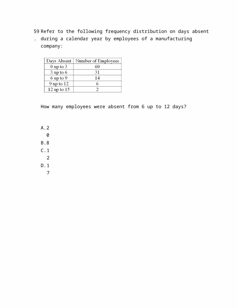
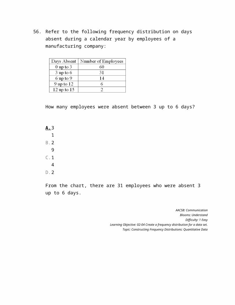
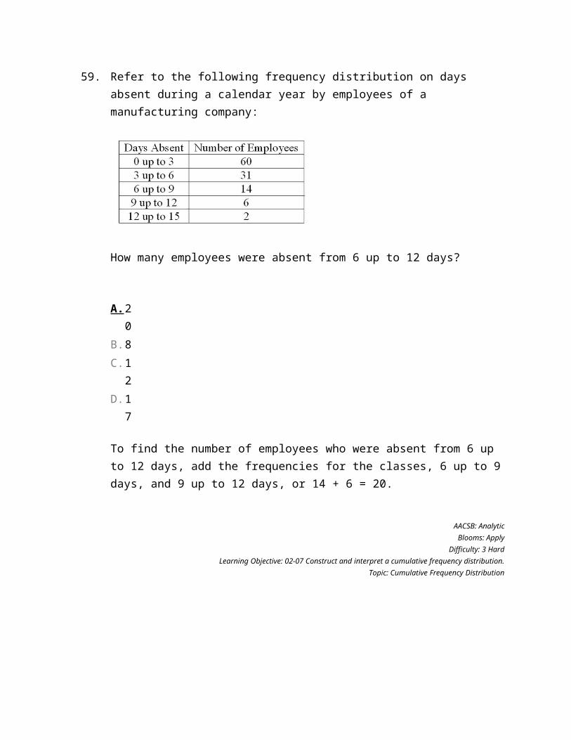
Refer to the following frequency distribution on days absent during a calendar year by employees of a manufacturing company:
How many employees were absent between 3 up to 6 days?
A. 31
B. 29
C. 14
D. 2
57.
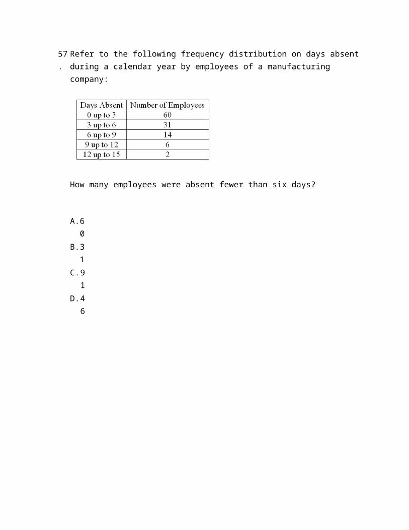
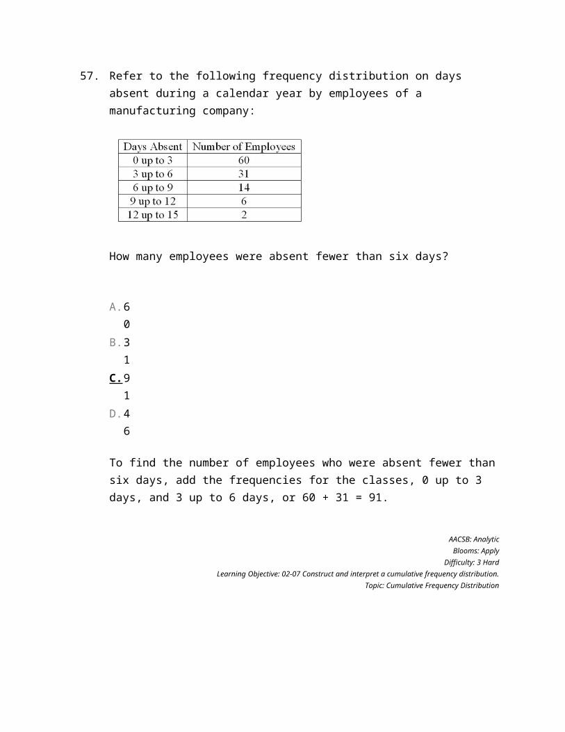
Refer to the following frequency distribution on days absent during a calendar year by employees of a manufacturing company:
How many employees were absent fewer than six days?
A. 60
B. 31
C. 91
D. 46
58.
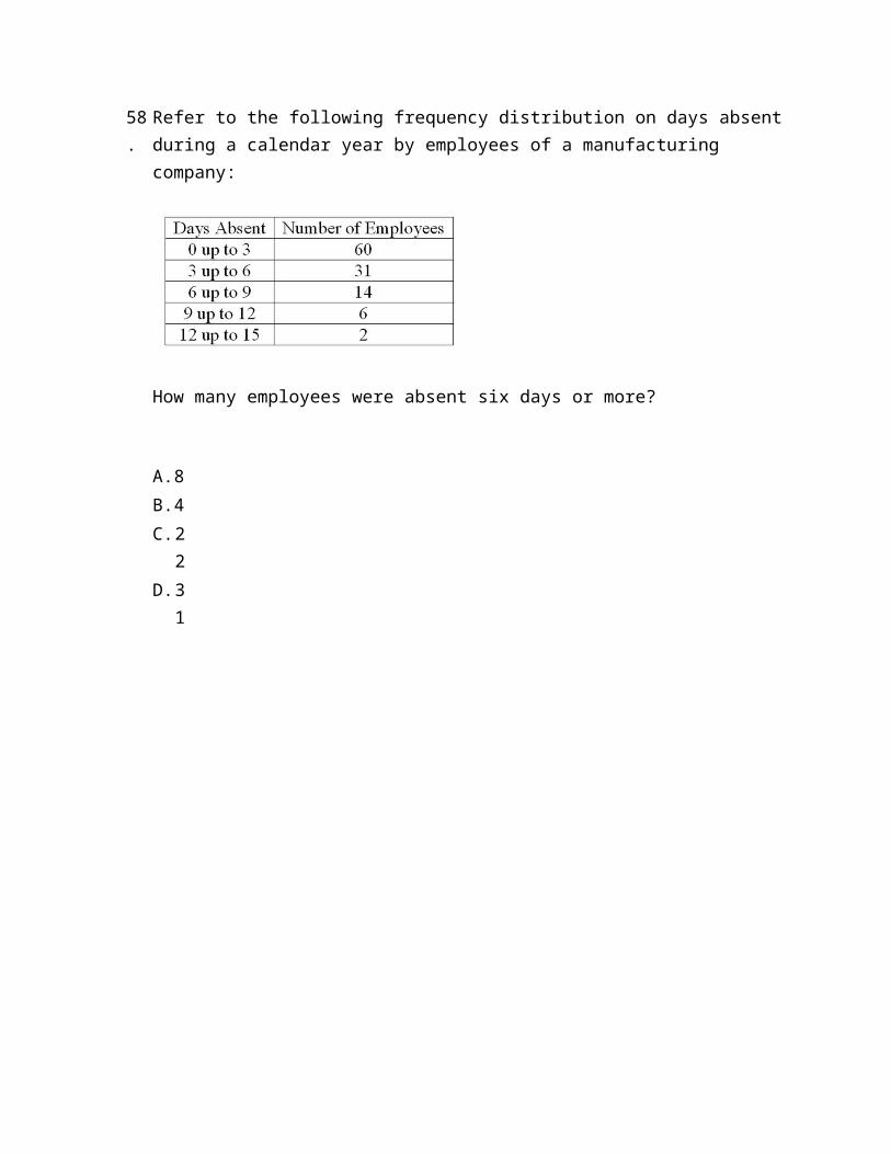
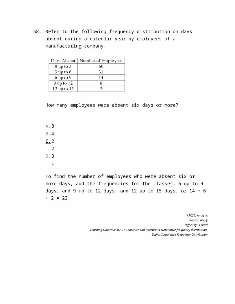
Refer to the following frequency distribution on days absent during a calendar year by employees of a manufacturing company:
How many employees were absent six days or more?
A. 8B. 4C. 2
2D. 3
1
59.
Refer to the following frequency distribution on days absent during a calendar year by employees of a manufacturing company:
How many employees were absent from 6 up to 12 days?
A. 20
B. 8C. 1
2D. 1
7
60.
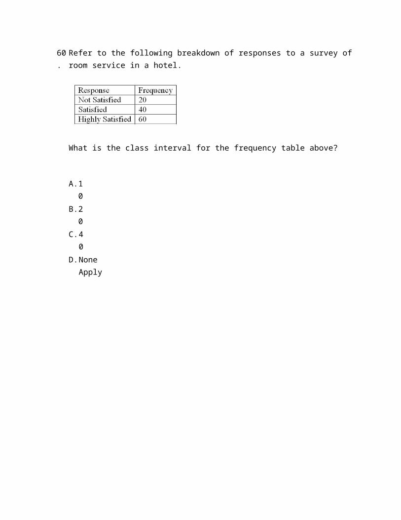
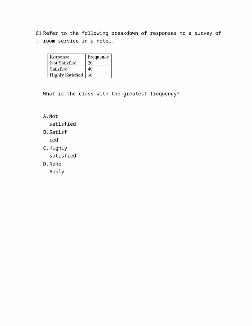
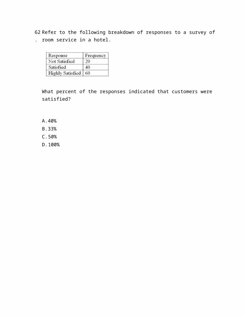
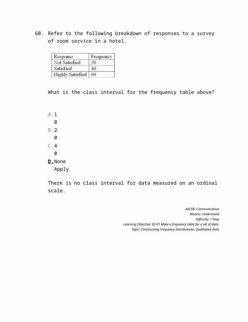
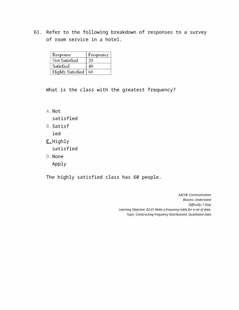
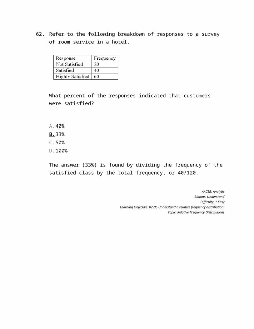
Refer to the following breakdown of responses to a survey of room service in a hotel.
What is the class interval for the frequency table above?
A. 10
B. 20
C. 40
D. None Apply
61.
Refer to the following breakdown of responses to a survey of room service in a hotel.
What is the class with the greatest frequency?
A. Not satisfied
B. Satisfied
C. Highly satisfied
D. None Apply
62.
Refer to the following breakdown of responses to a survey of room service in a hotel.
What percent of the responses indicated that customers were satisfied?
A. 40%
B. 33%
C. 50%
D. 100%
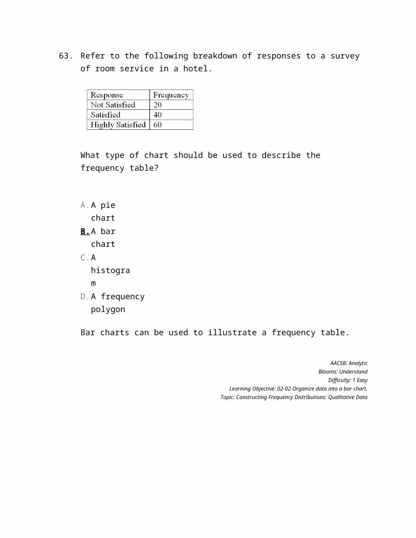
63.
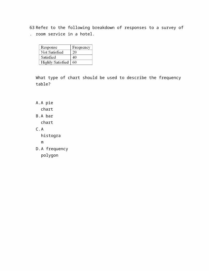
Refer to the following breakdown of responses to a survey of room service in a hotel.
What type of chart should be used to describe the frequency table?
A. A pie chart
B. A bar chart
C. A histogram
D. A frequency polygon
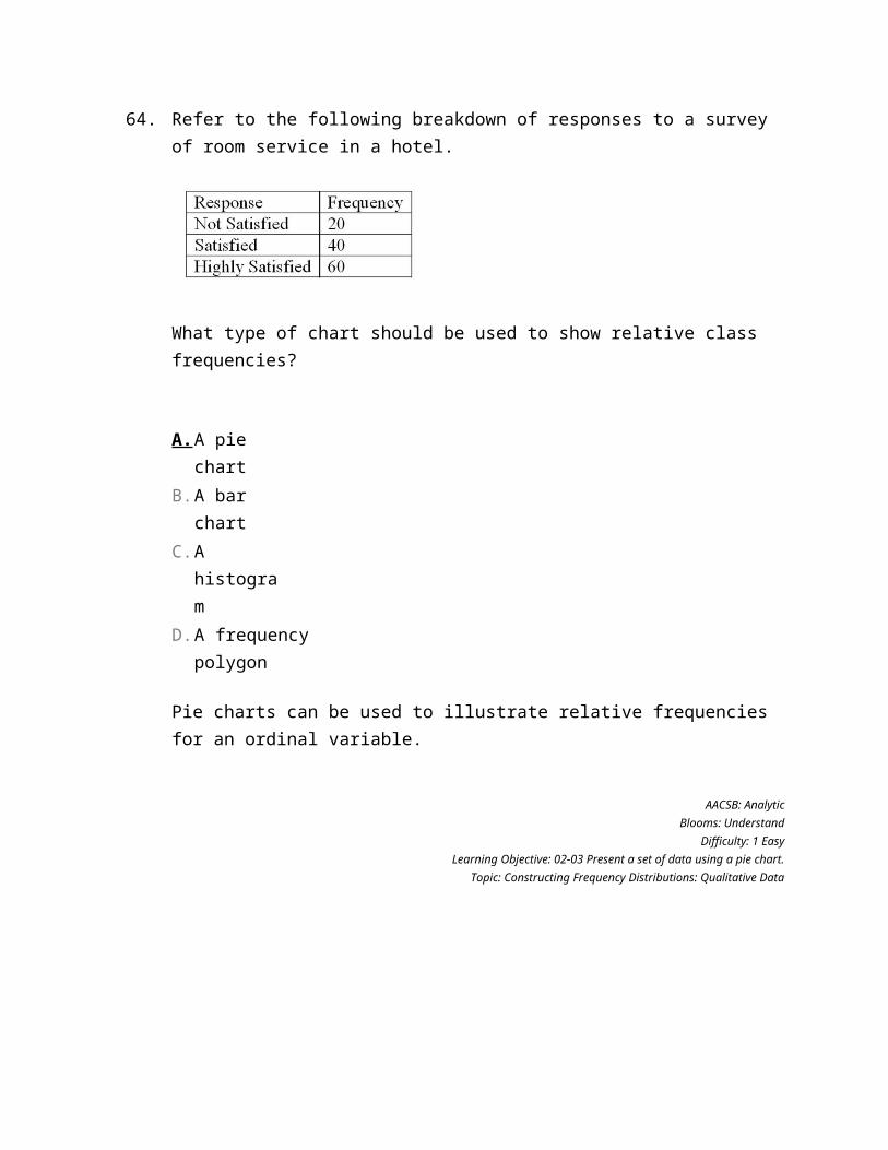
64.
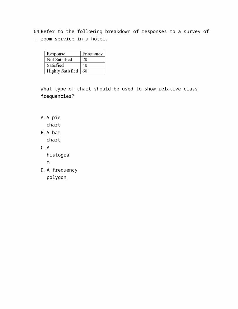
Refer to the following breakdown of responses to a survey of room service in a hotel.
What type of chart should be used to show relative class frequencies?
A. A pie chart
B. A bar chart
C. A histogram
D. A frequency polygon
65.
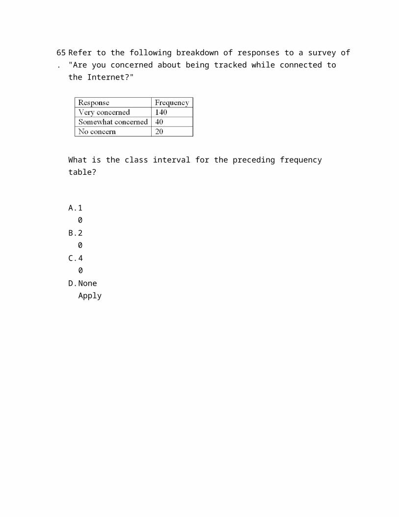
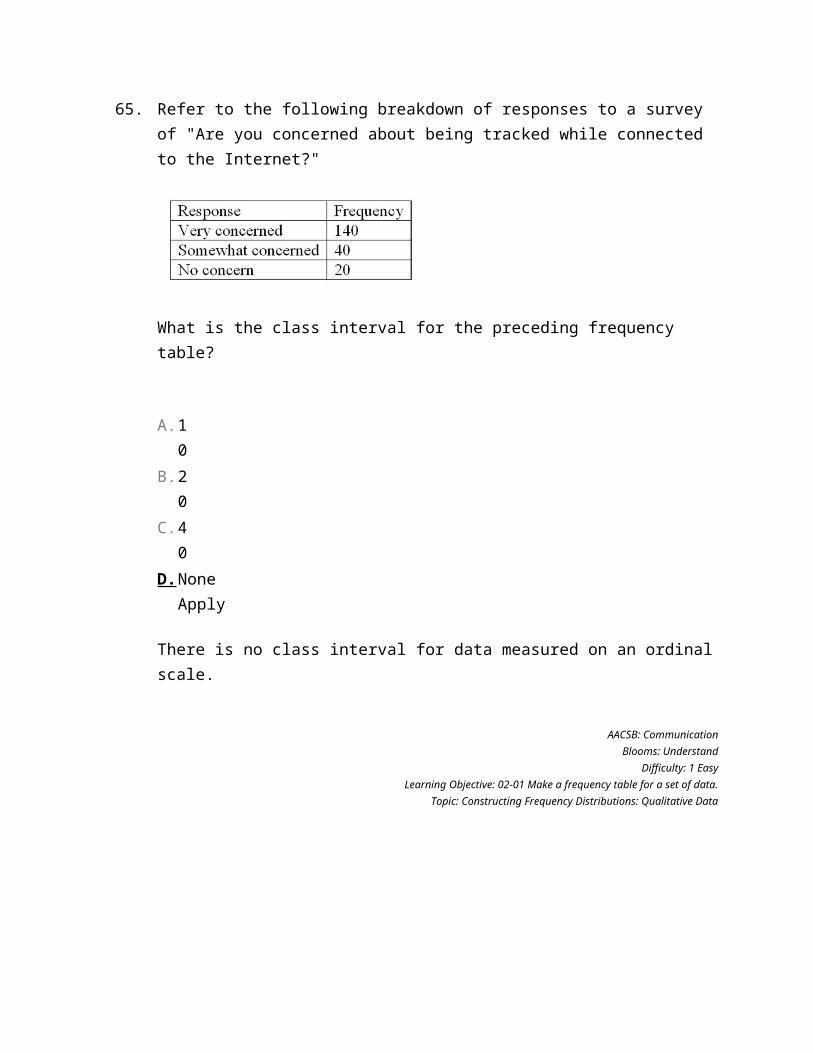
Refer to the following breakdown of responses to a survey of "Are you concerned about being tracked while connected to the Internet?"
What is the class interval for the preceding frequency table?
A. 10
B. 20
C. 40
D. None Apply
66.
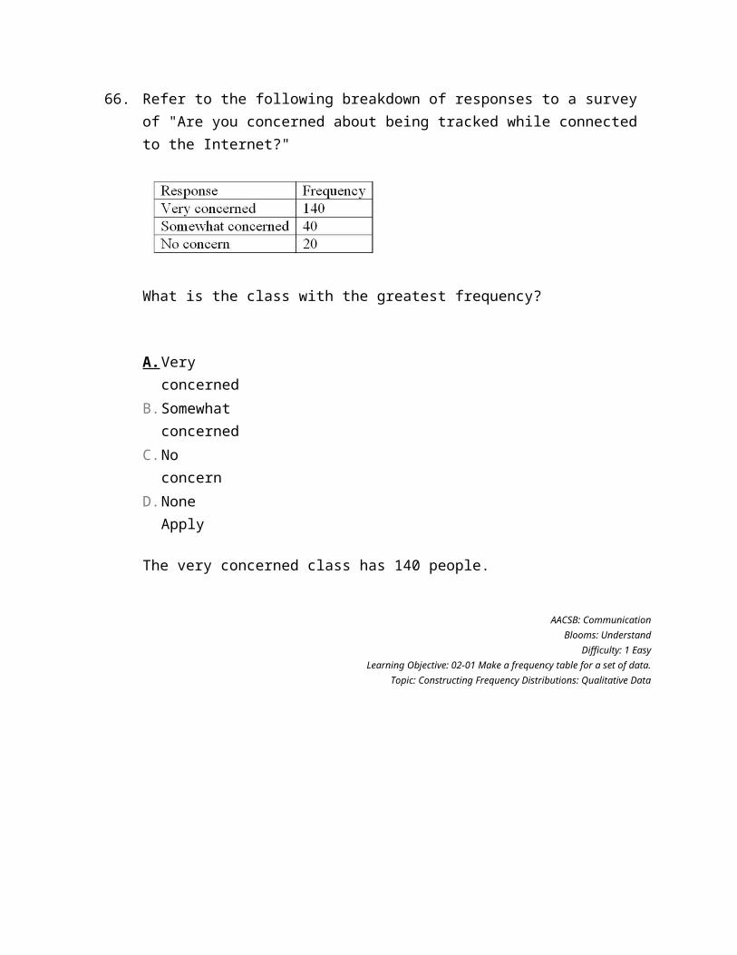
Refer to the following breakdown of responses to a survey of "Are you concerned about being tracked while connected to the Internet?"
What is the class with the greatest frequency?
A. Very concerned
B. Somewhat concerned
C. No concern
D. None Apply
67.
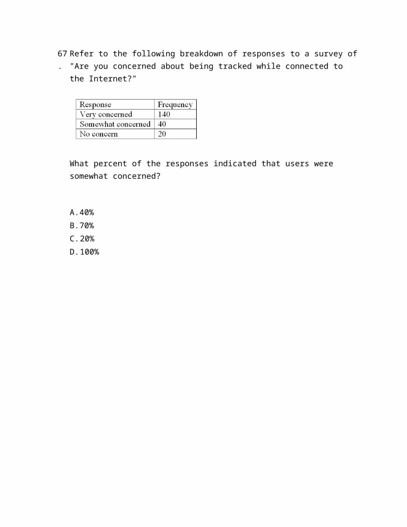
Refer to the following breakdown of responses to a survey of "Are you concerned about being tracked while connected to the Internet?"
What percent of the responses indicated that users were somewhat concerned?
A. 40%
B. 70%
C. 20%
D. 100%
68.
Refer to the following breakdown of responses to a survey of "Are you concerned about being tracked while connected to the Internet?"
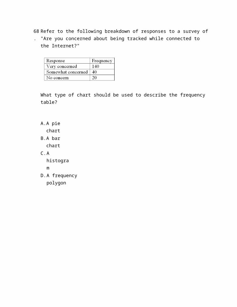
What type of chart should be used to describe the frequency table?
A. A pie chart
B. A bar chart
C. A histogram
D. A frequency polygon
69.
Refer to the following breakdown of responses to a survey of "Are you concerned about being tracked while connected to the Internet?"
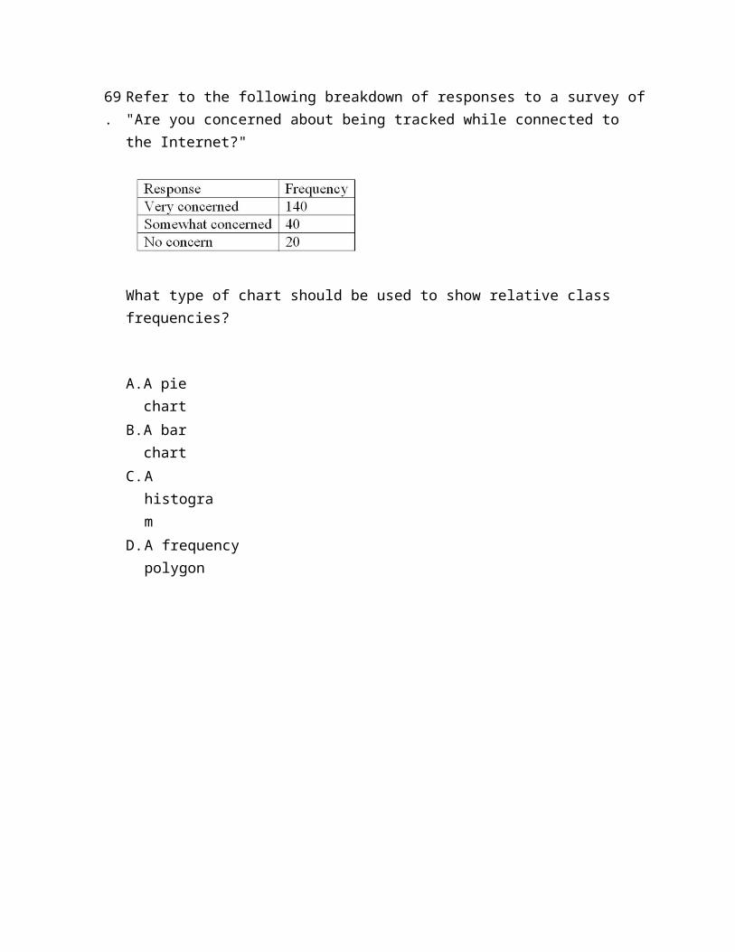
What type of chart should be used to show relative class frequencies?
A. A pie chart
B. A bar chart
C. A histogram
D. A frequency polygon
70.
Refer to the following breakdown of responses to a survey of "How confident are you that you saved enough to retire?"
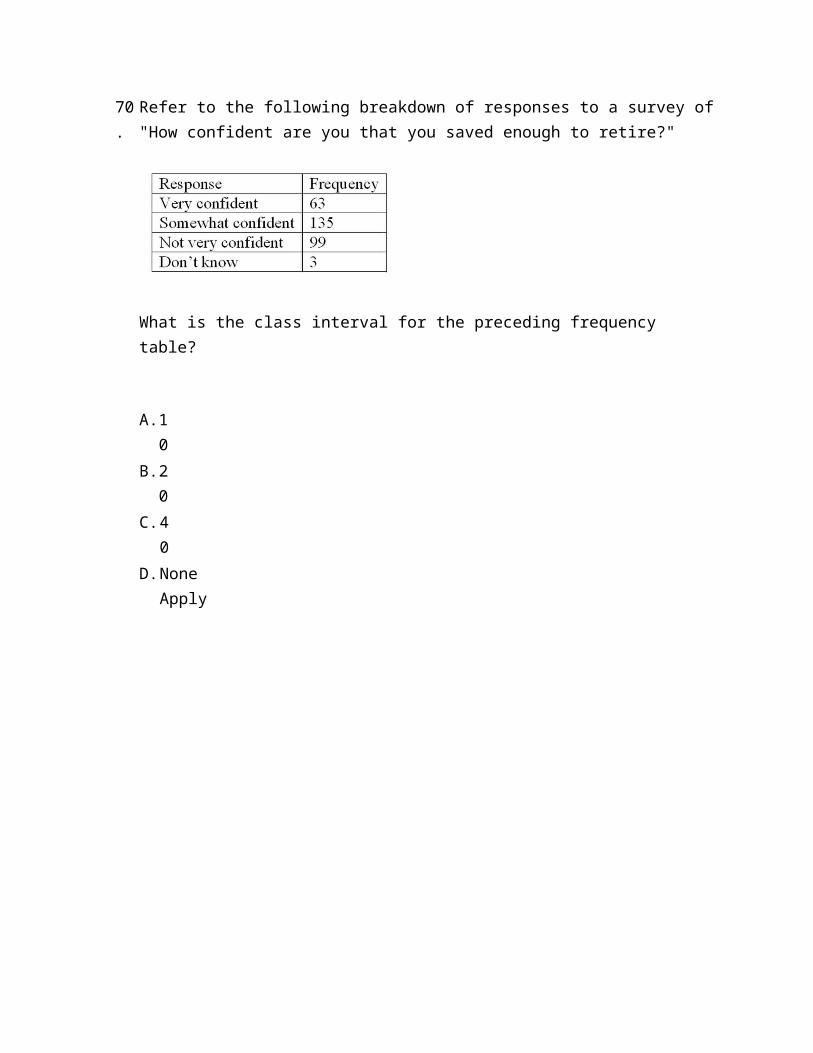
What is the class interval for the preceding frequency table?
A. 10
B. 20
C. 40
D. None Apply
71.
Refer to the following breakdown of responses to a survey of "How confident are you that you saved enough to retire?"
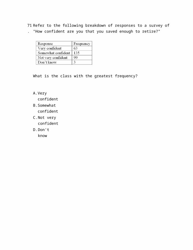
What is the class with the greatest frequency?
A. Very confident
B. Somewhat confident
C. Not very confident
D. Don't know
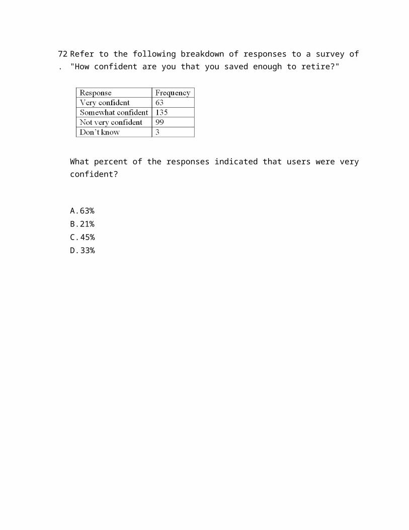
72.
Refer to the following breakdown of responses to a survey of "How confident are you that you saved enough to retire?"
What percent of the responses indicated that users were very confident?
A. 63%
B. 21%
C. 45%
D. 33%
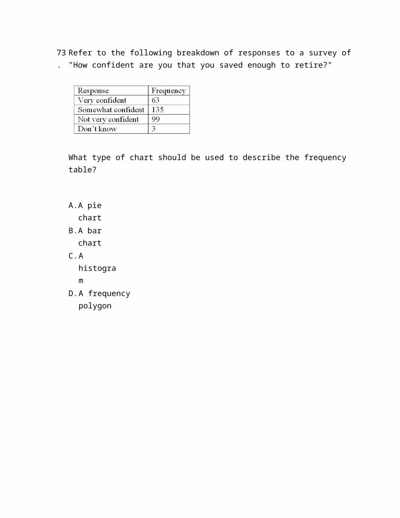
73.
Refer to the following breakdown of responses to a survey of "How confident are you that you saved enough to retire?"
What type of chart should be used to describe the frequency table?
A. A pie chart
B. A bar chart
C. A histogram
D. A frequency polygon
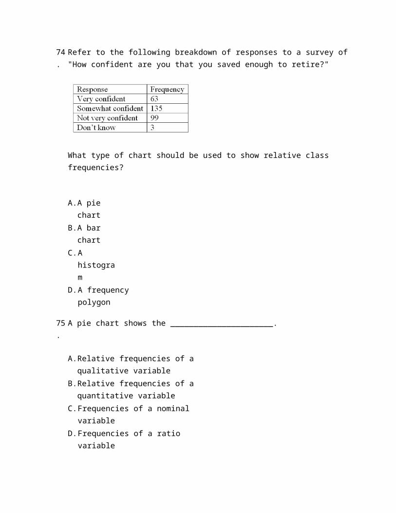
74.
Refer to the following breakdown of responses to a survey of "How confident are you that you saved enough to retire?"
What type of chart should be used to show relative class frequencies?
A. A pie chart
B. A bar chart
C. A histogram
D. A frequency polygon
75.
A pie chart shows the ______________________.
A. Relative frequencies of a qualitative variable
B. Relative frequencies of a quantitative variable
C. Frequencies of a nominal variable
D. Frequencies of a ratio variable
Fill in the Blank Questions

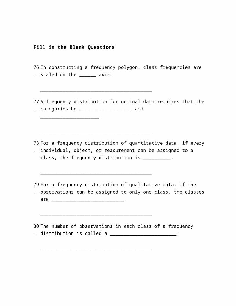
76.
In constructing a frequency polygon, class frequencies are scaled on the ______ axis. ________________________________________
77.
A frequency distribution for nominal data requires that the categories be ___________________ and _____________________. ________________________________________
78.
For a frequency distribution of quantitative data, if every individual, object, or measurement can be assigned to a class, the frequency distribution is __________. ________________________________________
79.
For a frequency distribution of qualitative data, if the observations can be assigned to only one class, the classes are __________________________. ________________________________________
80.
The number of observations in each class of a frequency distribution is called a ________________________. ________________________________________
81.
A ___________ is useful for displaying the relative frequency distribution for a nominal variable. ________________________________________
82.
To calculate a relative frequency, a class frequency is divided by ___________. ________________________________________
83.
In a relative frequency distribution, the sum of the relative class frequencies is _____________________. ________________________________________
84.
A class relative frequency represents a __________ of the total observations in the class. ________________________________________
85.
A _____ chart is useful for displaying a frequency distribution for a qualitative variable. ________________________________________
86.
A _____ chart is useful for displaying a frequency distribution for a nominal variable. ________________________________________
87.
The midpoint of a class interval is also called a class ________. ________________________________________
88.
A table showing the number of observations that have been grouped into each of several classes is called a frequency ________________. ________________________________________
89.
In a cumulative frequency distribution, the percent of the total frequencies that would fall below the upper limit of the highest class would be _________. ________________________________________
90.
Unorganized data is referred to as ________ data. ________________________________________
91.
When classes in a frequency table are constructed so that each observation will fit into only one class, the categories are ______________________. ________________________________________
92.
The suggested class interval for a frequency distribution with data ranges from 100 to 220 with 50 observations would be _______. ________________________________________
93.
If the number of observations is 124, calculate the suggested number of classes using the "2 to the k rule." ________________________________________
94.
In a frequency distribution, a class defined as "Under $100" and "$1,000 and over" is called a(n) ____________. ________________________________________
95.
In a deck of cards, a class of all cards that are hearts and a class of all cards that are kings are NOT _____________. ________________________________________
96.
To construct a histogram, the class frequencies are plotted on the ________. ________________________________________
97.
To construct a bar chart, the class frequencies are plotted on the _________. ________________________________________
98.
To construct a pie chart, the class frequencies are converted to __________. ________________________________________
99.
To summarize the gender of students attending a college in a frequency distribution, a total of at least ______ classes would be required. ________________________________________
100.
A ______ chart is useful for displaying a relative frequency distribution. ________________________________________
Essay Questions
101.
Ages (rounded to the nearest whole year) of employees at a large company were grouped into a distribution with the following class limits:
20 up to 3030 up to 4040 up to 5050 up to 6060 up to 70
The class limits for the class 50 up to 60 are _______ and ______.
102.
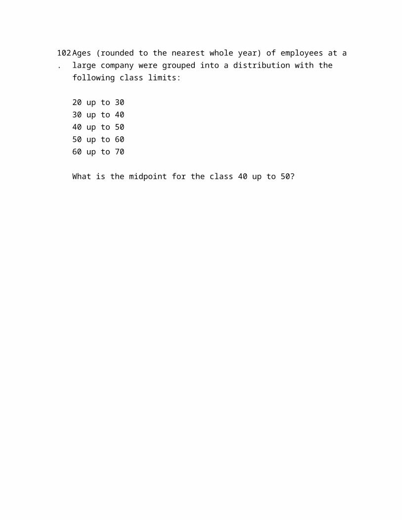
Ages (rounded to the nearest whole year) of employees at a large company were grouped into a distribution with the following class limits:
20 up to 3030 up to 4040 up to 5050 up to 6060 up to 70
What is the midpoint for the class 40 up to 50?
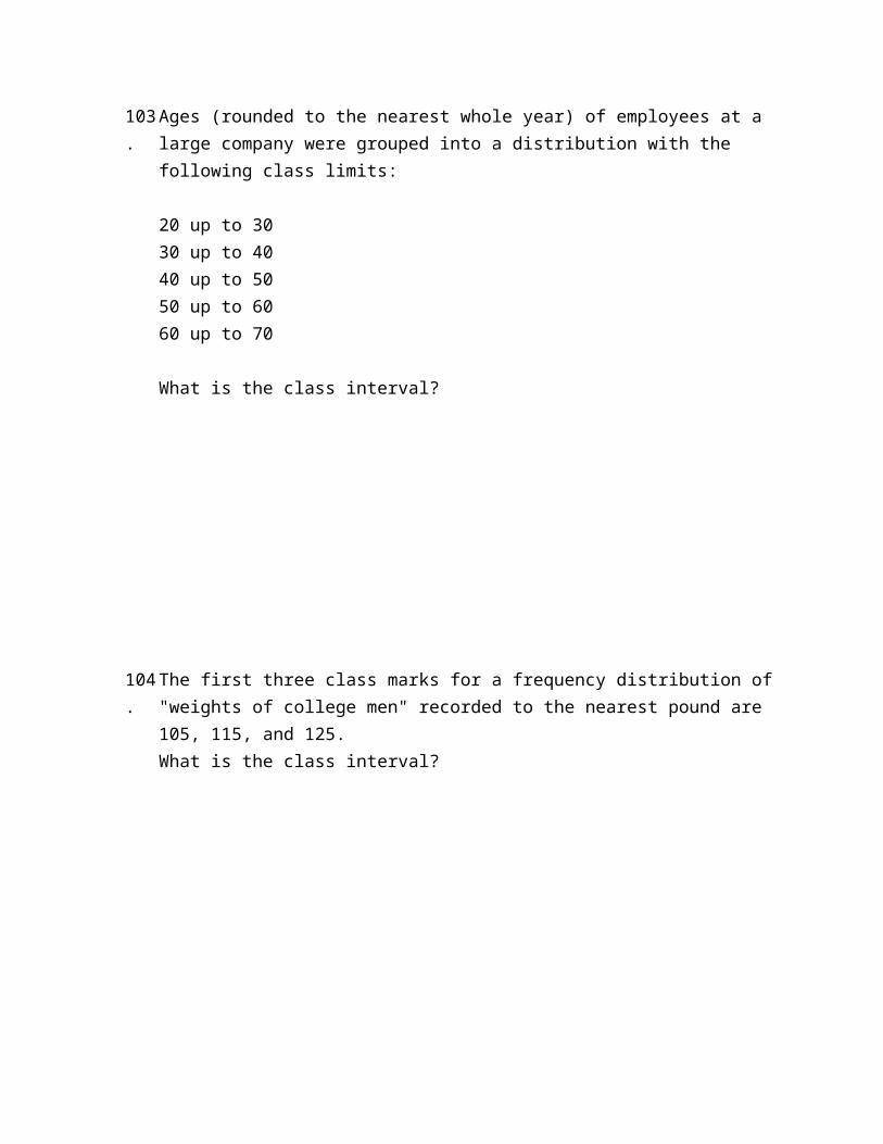
103.
Ages (rounded to the nearest whole year) of employees at a large company were grouped into a distribution with the following class limits:
20 up to 3030 up to 4040 up to 5050 up to 6060 up to 70
What is the class interval?
104.
The first three class marks for a frequency distribution of "weights of college men" recorded to the nearest pound are 105, 115, and 125.What is the class interval?
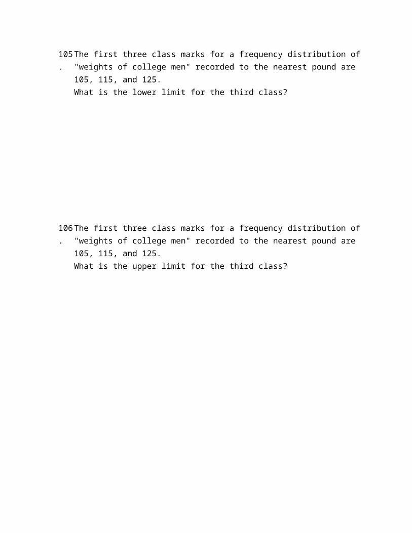
105.
The first three class marks for a frequency distribution of "weights of college men" recorded to the nearest pound are 105, 115, and 125.What is the lower limit for the third class?
106.
The first three class marks for a frequency distribution of "weights of college men" recorded to the nearest pound are 105, 115, and 125.What is the upper limit for the third class?
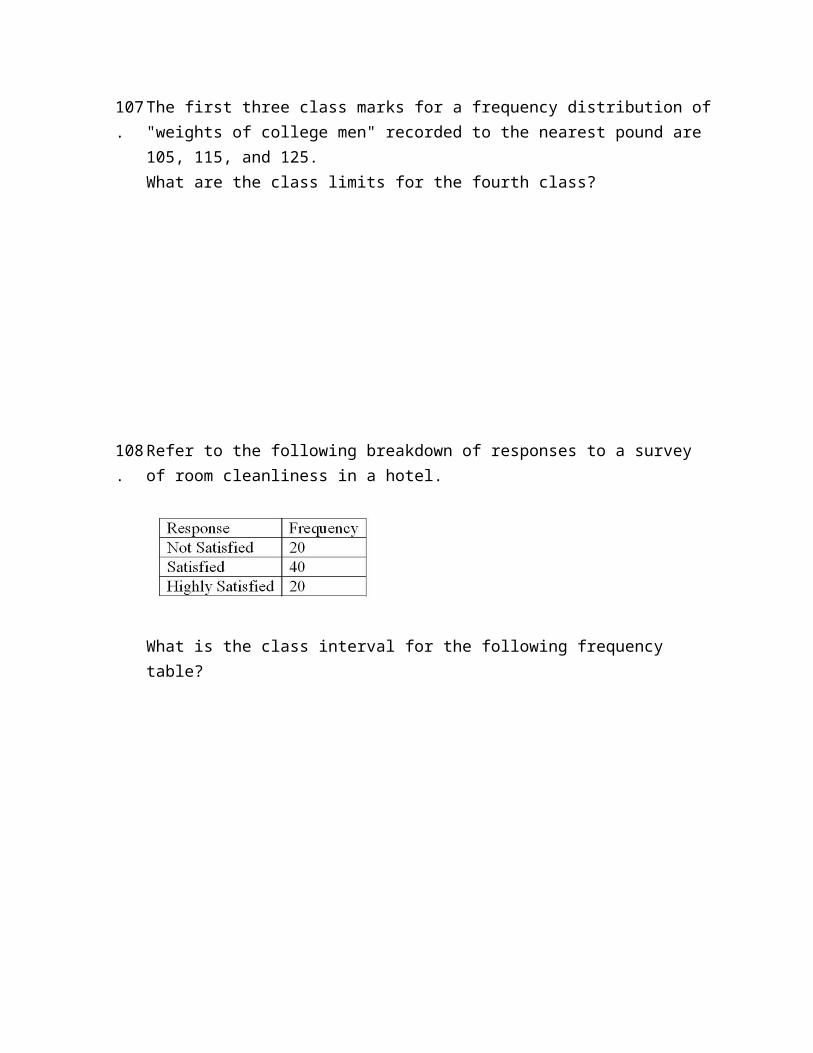
107.
The first three class marks for a frequency distribution of "weights of college men" recorded to the nearest pound are 105, 115, and 125.What are the class limits for the fourth class?
108.
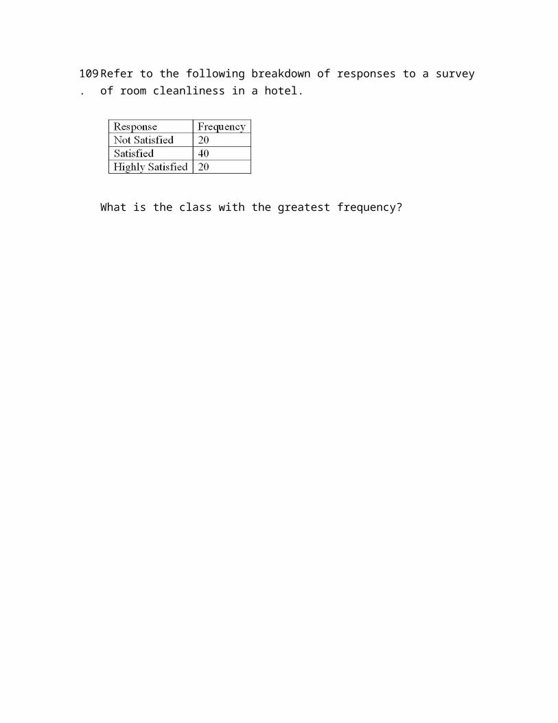
Refer to the following breakdown of responses to a survey of room cleanliness in a hotel.
What is the class interval for the following frequency table?
109.
Refer to the following breakdown of responses to a survey of room cleanliness in a hotel.
What is the class with the greatest frequency?
110.
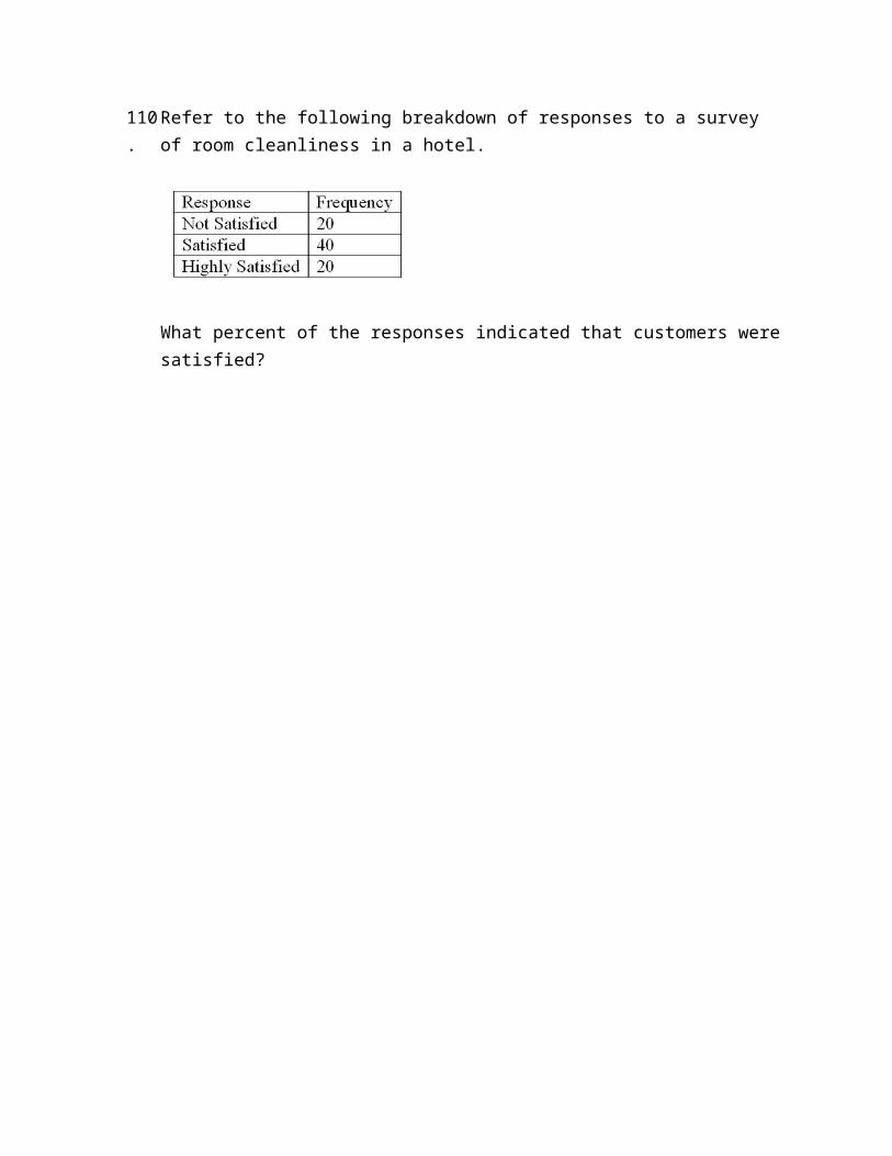
Refer to the following breakdown of responses to a survey of room cleanliness in a hotel.
What percent of the responses indicated that customers were satisfied?
111.
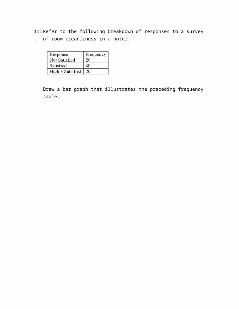
Refer to the following breakdown of responses to a survey of room cleanliness in a hotel.
Draw a bar graph that illustrates the preceding frequency table.
112.
Refer to the following breakdown of responses to a survey of room cleanliness in a hotel.
Draw a bar graph that illustrates the relative frequencies.
113.
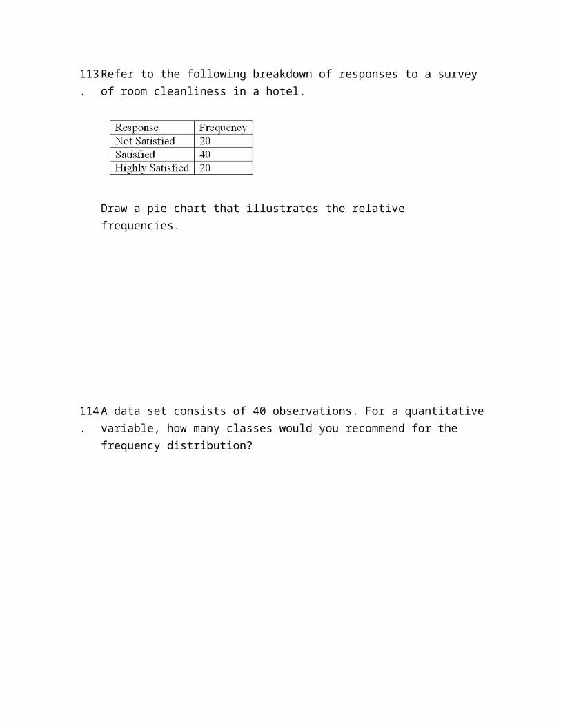
Refer to the following breakdown of responses to a survey of room cleanliness in a hotel.
Draw a pie chart that illustrates the relative frequencies.
114.
A data set consists of 40 observations. For a quantitative variable, how many classes would you recommend for the frequency distribution?
115.
A data set has 100 observations. In the data, a quantitative variable's highest value is 117 and its lowest value is 47. What is the minimum class interval that you would recommend?
116.
A data set has 200 observations. In the data, a quantitative variable's highest value is 1080 and its lowest value is 960. What is the minimum class interval that you would recommend?
117.
A data set has 200 observations. In the data, a qualitative variable's highest value is "extremely satisfied" and its lowest value is "extremely dissatisfied." What is the minimum class interval that you would recommend?
118.
The following frequency distribution shows the distribution of delivery times (in days) for swimstuff.com customer orders during the last month.
How many orders were delivered in less than one day?
119.
The following frequency distribution shows the distribution of delivery times (in days) for swimstuff.com customer orders during the last month.
What is the relative frequency for orders delivered in less than one day?
120.
The following frequency distribution shows the distribution of delivery times (in days) for swimstuff.com customer orders during the last month.
How many orders were delivered in less than three days?
121.
The following frequency distribution shows the distribution of delivery times (in days) for swimstuff.com customer orders during the last month.
What is the relative frequency for orders delivered in less than three days?
122.
The following frequency distribution shows the distribution of delivery times (in days) for swimstuff.com customer orders during the last month.
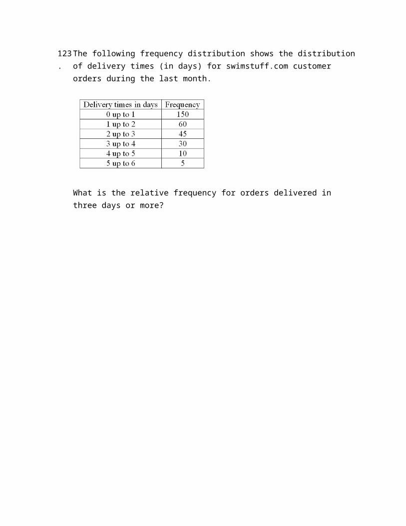
How many orders were delivered in three days or more?
123.
The following frequency distribution shows the distribution of delivery times (in days) for swimstuff.com customer orders during the last month.
What is the relative frequency for orders delivered in three days or more?
124.
The following frequency distribution shows the distribution of delivery times (in days) for swimstuff.com customer orders during the last month.
How many orders were delivered from 1 day up to 3 days?
125.
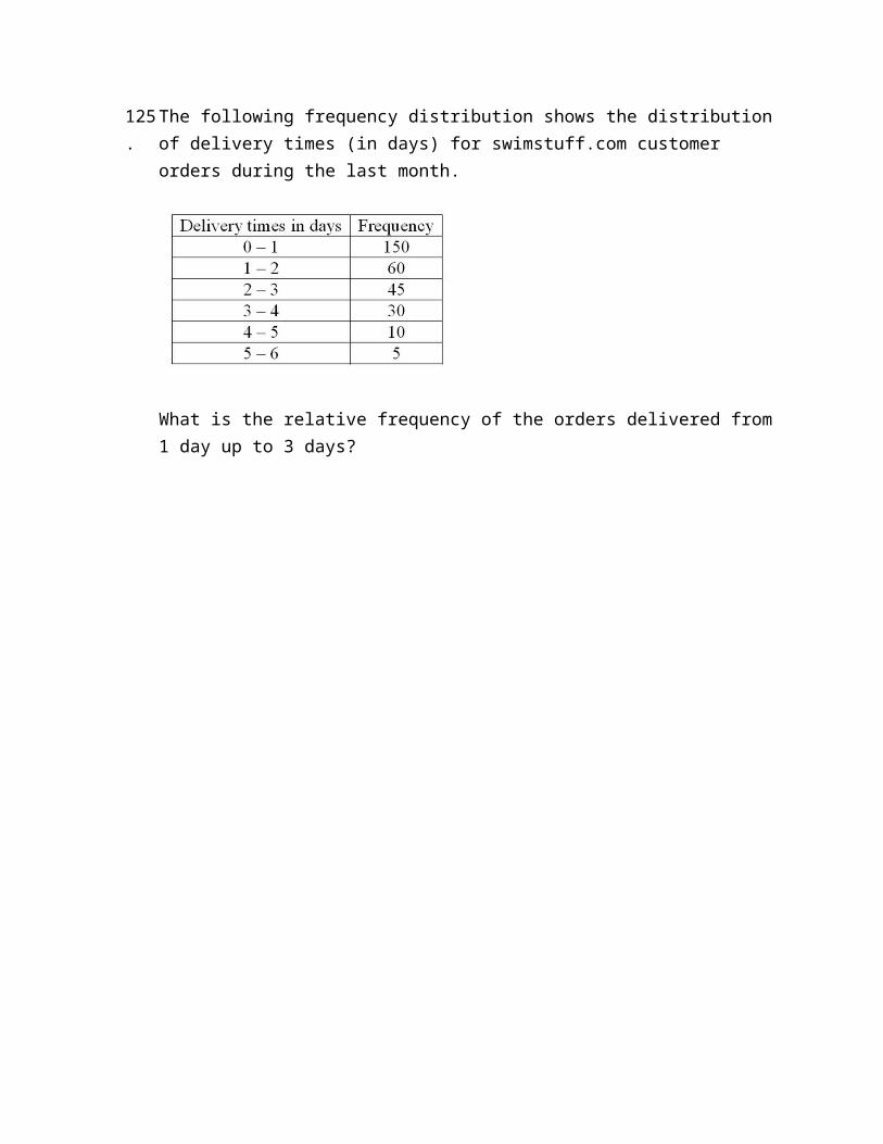
The following frequency distribution shows the distribution of delivery times (in days) for swimstuff.com customer orders during the last month.
What is the relative frequency of the orders delivered from 1 day up to 3 days?
126.
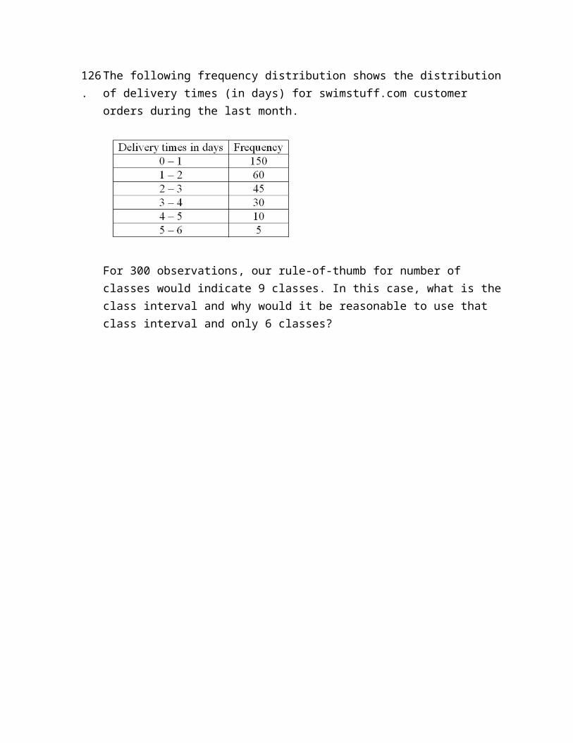
The following frequency distribution shows the distribution of delivery times (in days) for swimstuff.com customer orders during the last month.
For 300 observations, our rule-of-thumb for number of classes would indicate 9 classes. In this case, what is the class interval and why would it be reasonable to use that class interval and only 6 classes?
127.
What is the difference between a bar chart and a pie chart?

128.
What is the difference between a frequency distribution and a cumulative frequency distribution?
129.
In a bar chart, why are there spaces between the bars on the horizontal axis?
Chapter 02 Describing Data: Frequency Tables, Frequency Distributions, and Graphic Presentation Answer Key
True / False Questions
1. A frequency distribution groups data into classes showing the number of observations in each class. TRUE
AACSB: Communication
Blooms: RememberDifficulty: 1 Easy
Learning Objective: 02-04 Create a frequency distribution for a data set.Topic: Frequency Distribution Concepts
2. A frequency distribution for qualitative data has class limits. FALSE
Qualitative data is not numeric, so there cannot be class limits.
AACSB: Communication
Blooms: RememberDifficulty: 1 Easy
Learning Objective: 02-01 Make a frequency table for a set of data.Topic: Constructing Frequency Distributions: Qualitative Data
3. To summarize the gender of students attending a college, the number of classes in a frequency distribution depends on the number of students. FALSE
Gender is a nominal, qualitative variable that has two values. Therefore, there will only be two classes: male and female.
AACSB: Communication
Blooms: UnderstandDifficulty: 1 Easy
Learning Objective: 02-01 Make a frequency table for a set of data.Topic: Constructing Frequency Distributions: Qualitative Data
4. In frequency distributions, classes are mutually exclusive if each individual, object, or measurement is included in only one category. TRUE
AACSB: Communication
Blooms: AnalyzeDifficulty: 1 Easy
Learning Objective: 02-04 Create a frequency distribution for a data set.Topic: Frequency Distribution Concepts
5. In a bar chart, the x-axis is labeled with the values of a qualitative variable. TRUE
AACSB: Communication
Blooms: AnalyzeDifficulty: 1 Easy
Learning Objective: 02-02 Organize data into a bar chart.Topic: Constructing Frequency Distributions: Qualitative Data
6. In a bar chart, the heights of the bars represent the frequencies in each class. TRUE
AACSB: Communication
Blooms: AnalyzeDifficulty: 1 Easy
Learning Objective: 02-02 Organize data into a bar chart.
Topic: Constructing Frequency Distributions: Qualitative Data
7. The midpoint of a class, which is also called a class mark, is halfway between the lower and upper limits. TRUE
AACSB: Communication
Blooms: RememberDifficulty: 1 Easy
Learning Objective: 02-04 Create a frequency distribution for a data set.Topic: Constructing Frequency Distributions: Quantitative Data
8. A class interval, or class width, can be determined by subtracting the lower limit of a class from the lower limit of the next higher class. TRUE
AACSB: Communication
Blooms: RememberDifficulty: 1 Easy
Learning Objective: 02-04 Create a frequency distribution for a data set.Topic: Constructing Frequency Distributions: Quantitative Data
9. To convert a frequency distribution to a relative frequency distribution, divide each class frequency by the sum of the class frequencies. TRUE
AACSB: Communication
Blooms: RememberDifficulty: 1 Easy
Learning Objective: 02-05 Understand a relative frequency distribution.Topic: Relative Frequency Distributions
10. To convert a frequency distribution to a relative frequency distribution, divide each class frequency by the number of classes. FALSE
Relative frequencies are computed by dividing class frequencies by the total of the class frequencies.
AACSB: Communication
Blooms: Remember
Difficulty: 1 EasyLearning Objective: 02-05 Understand a relative frequency distribution.
Topic: Relative Frequency Distributions
11. A pie chart is similar to a relative frequency distribution. TRUE
AACSB: Communication
Blooms: AnalyzeDifficulty: 2 Medium
Learning Objective: 02-03 Present a set of data using a pie chart.Topic: Constructing Frequency Distributions: Qualitative Data
12. A pie chart shows the relative frequency in each class. TRUE
AACSB: Communication
Blooms: AnalyzeDifficulty: 2 Medium
Learning Objective: 02-03 Present a set of data using a pie chart.Topic: Constructing Frequency Distributions: Qualitative Data
13. To construct a pie chart, relative class frequencies are used to graph the "slices" of the pie. TRUE
AACSB: Communication
Blooms: RememberDifficulty: 1 Easy
Learning Objective: 02-03 Present a set of data using a pie chart.Topic: Constructing Frequency Distributions: Qualitative Data
14. A cumulative frequency distribution is used when we want to determine how many observations lie above or below certain values. TRUE
AACSB: Communication
Blooms: UnderstandDifficulty: 1 Easy
Learning Objective: 02-07 Construct and interpret a cumulative frequency distribution.Topic: Cumulative Frequency Distribution
15. A frequency polygon is a very useful graphic technique when comparing two or more distributions. TRUE
AACSB: Communication
Blooms: ApplyDifficulty: 1 Easy
Learning Objective: 02-06 Present data from a frequency distribution in a histogram or frequency polygon.Topic: Constructing Frequency Distributions: Quantitative Data
Multiple Choice Questions
16. Monthly commissions of first-year insurance brokers are $1,270, $1,310, $1,680, $1,380, $1,410, $1,570, $1,180 and $1,420. These figures are referred to as a(n) __________.
A. Histogram
B.Raw data
C. Frequency distribution
D. Frequency polygon
Histograms, frequency distributions, and frequency polygons all summarize data. The data in the question are individual observations or raw data that are not summarized.
AACSB: Communication
Blooms: RememberDifficulty: 1 Easy
Learning Objective: 02-04 Create a frequency distribution for a data set.Topic: Constructing Frequency Distributions: Quantitative Data

17. A small sample of computer operators shows monthly incomes of $1,950, $1,775, $2,060, $1,840, $1,795, $1,890, $1,925, and $1,810. What are these ungrouped numbers called?
A. Histogram
B. Class limits
C. Class frequencies
D.Raw data
Histograms and frequency distributions summarize data. The data in the question are the individual observations that are not summarized.
AACSB: Communication
Blooms: RememberDifficulty: 1 Easy
Learning Objective: 02-04 Create a frequency distribution for a data set.Topic: Constructing Frequency Distributions: Quantitative Data

18. When data is collected using a quantitative, ratio variable, what is true about a frequency distribution that summarizes the data?
A.Upper and lower class limits must be calculated.
B. A pie chart can be used to summarize the data.
C. Number of classes is equal to the number of variable's values.
D. The "5 to the k rule" can be applied.
Choices B and C refer to frequency distributions for qualitative variables. For quantitative, ratio variables, the number of classes, the class interval, and class limits must be computed.
AACSB: AnalyticBlooms: Analyze
Difficulty: 2 MediumLearning Objective: 02-04 Create a frequency distribution for a data set.
Topic: Constructing Frequency Distributions: Quantitative Data
19. When data is collected using a qualitative, nominal variable, what is true about a frequency distribution that summarizes the data?
A. The upper and lower class limits must be calculated.
B.A pie chart can be used to summarize the data.
C. The number of classes is equal to the number of variable's values plus 2.
D. The "5 to the k rule" can be applied.
A pie chart is used to show the relative frequency for a qualitative, nominal variable. Choices A and D apply to quantitative variables.
AACSB: Analytic

Blooms: AnalyzeDifficulty: 2 Medium
Learning Objective: 02-03 Present a set of data using a pie chart.Topic: Constructing Frequency Distributions: Qualitative Data
20. When data is collected using a qualitative, nominal variable (in other words, male or female), what is true about a frequency distribution that summarizes the data?
A. The upper and lower class limits must be calculated.
B. Class midpoints can be computed.
C. The number of classes corresponds to the number of a variable's values.
D. The "2 to the k rule" can be applied.
Gender is a nominal, qualitative variable that has two values. Therefore, the frequency distribution will only have two classes: male and female.
AACSB: AnalyticBlooms: Analyze
Difficulty: 2 MediumLearning Objective: 02-01 Make a frequency table for a set of data.
Topic: Constructing Frequency Distributions: Qualitative Data
21. A student was interested in the cigarette smoking habits of college students and collected data from an unbiased random sample of students. The data is summarized in the following table:
Why is the table NOT a frequency distribution?
A. The number of males does not equal the sum of males that smoke and do not smoke.
B.The classes are not mutually exclusive.
C. There are too many classes.
D. Class limits cannot be computed.
In a frequency distribution, the classes must be mutually exclusive so that each data item can be assigned to only one class. In this example, the classes are not mutually exclusive because a female can be assigned to two classes: females and females who smoke or females who do not smoke.
AACSB: Communication
Blooms: UnderstandDifficulty: 2 Medium
Learning Objective: 02-01 Make a frequency table for a set of data.Topic: Constructing Frequency Distributions: Qualitative Data

22. A student was interested in the cigarette smoking habits of college students and collected data from an unbiased random sample of students. The data is summarized in the following table:
What type of chart best represents the frequency table?
A.Bar chart
B. Box plot
C. Scatter plot
D. Frequency polygon
The variables are nominal and qualitative. The frequency table is best presented with a bar chart.
AACSB: Communication
Blooms: UnderstandDifficulty: 2 Medium
Learning Objective: 02-02 Organize data into a bar chart.Topic: Constructing Frequency Distributions: Qualitative Data
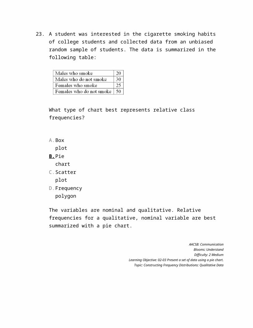
23. A student was interested in the cigarette smoking habits of college students and collected data from an unbiased random sample of students. The data is summarized in the following table:
What type of chart best represents relative class frequencies?
A. Box plot
B.Pie chart
C. Scatter plot
D. Frequency polygon
The variables are nominal and qualitative. Relative frequencies for a qualitative, nominal variable are best summarized with a pie chart.
AACSB: Communication
Blooms: UnderstandDifficulty: 2 Medium
Learning Objective: 02-03 Present a set of data using a pie chart.Topic: Constructing Frequency Distributions: Qualitative Data
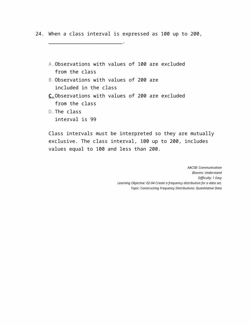
24. When a class interval is expressed as 100 up to 200, _________________________.
A. Observations with values of 100 are excluded from the class
B. Observations with values of 200 are included in the class
C. Observations with values of 200 are excluded from the class
D. The class interval is 99
Class intervals must be interpreted so they are mutually exclusive. The class interval, 100 up to 200, includes values equal to 100 and less than 200.
AACSB: Communication
Blooms: UnderstandDifficulty: 1 Easy
Learning Objective: 02-04 Create a frequency distribution for a data set.Topic: Constructing Frequency Distributions: Quantitative Data
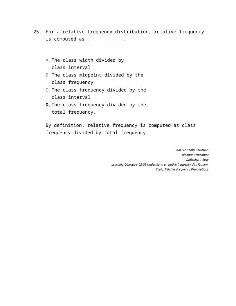
25. For a relative frequency distribution, relative frequency is computed as _____________.
A. The class width divided by class interval
B. The class midpoint divided by the class frequency
C. The class frequency divided by the class interval
D.The class frequency divided by the total frequency.
By definition, relative frequency is computed as class frequency divided by total frequency.
AACSB: Communication
Blooms: RememberDifficulty: 1 Easy
Learning Objective: 02-05 Understand a relative frequency distribution.Topic: Relative Frequency Distributions
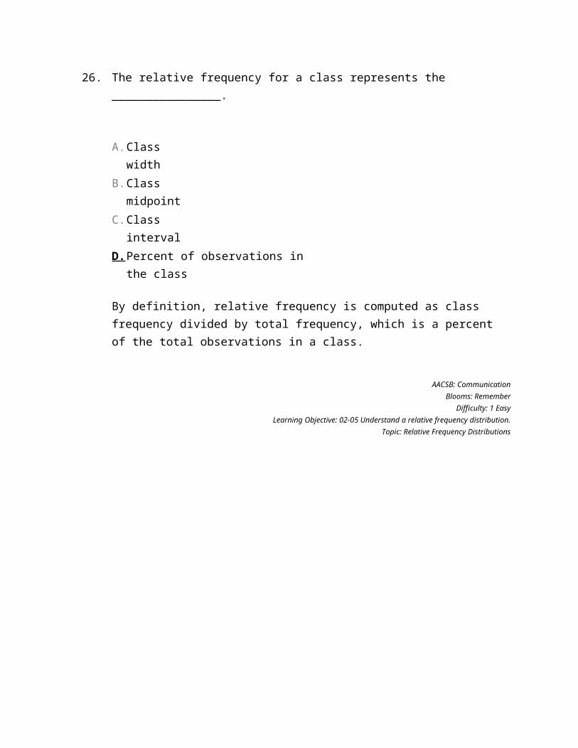
26. The relative frequency for a class represents the ________________.
A. Class width
B. Class midpoint
C. Class interval
D.Percent of observations in the class
By definition, relative frequency is computed as class frequency divided by total frequency, which is a percent of the total observations in a class.
AACSB: Communication
Blooms: RememberDifficulty: 1 Easy
Learning Objective: 02-05 Understand a relative frequency distribution.Topic: Relative Frequency Distributions
27. A group of 100 students was surveyed about their interest in a new International Studies program. Interest was measured in terms of high, medium, or low. In the study, 30 students responded high interest, 40 students responded medium interest, and 30 students responded low interest. What is the relative frequency of students with high interest?
A. .30
B. .50
C. .40
D. .030
For calculations, 30 of the 100 students have a high interest, or 30/100 = .30.
AACSB: Analytic
Blooms: ApplyDifficulty: 2 Medium
Learning Objective: 02-05 Understand a relative frequency distribution.Topic: Relative Frequency Distributions
28. A group of 100 students were surveyed about their interest in a new Economics major. Interest was measured in terms of high, medium, or low. In the study, 30 students responded high interest, 50 students responded medium interest, and 20 students responded low interest. What is the best way to illustrate the relative frequency of student interest?
A. Use a cumulative frequency polygon
B. Use a box plot
C. Use a pie chart
D. Use a frequency table
Interest is a qualitative, nominal variable. The relative frequencies for a qualitative, nominal variable are best summarized with a pie chart.
AACSB: Reflective Thinking
Blooms: AnalyzeDifficulty: 2 Medium
Learning Objective: 02-03 Present a set of data using a pie chart.Topic: Constructing Frequency Distributions: Qualitative Data
29. The monthly salaries of a sample of 100 employees were rounded to the nearest $10. They ranged from a low of $1,040 to a high of $1,720. If we want to condense the data into seven classes, what is the most convenient class interval?
A. $50
B.$100
C. $150
D. $200
($1720 - 1040)/7 = $97.14. Of the answer choices, a class interval of $100 is closest to 97.14.
AACSB: Analytic
Blooms: UnderstandDifficulty: 2 Medium
Learning Objective: 02-04 Create a frequency distribution for a data set.Topic: Constructing Frequency Distributions: Quantitative Data
30. A student was studying the political party preferences of a university's student population. The survey instrument asked students to identify themselves as a Democrat or a Republican. This question is flawed because:
A. Students generally don't know their political preferences.
B. The categories are generally mutually exclusive.
C. The categories are not exhaustive.
D. Political preference is a continuous variable.
The survey is not exhaustive because it does not include all possible party preferences, such as Independent or Libertarian.
AACSB: Communication
Blooms: AnalyzeDifficulty: 2 Medium
Learning Objective: 02-01 Make a frequency table for a set of data.Topic: Constructing Frequency Distributions: Qualitative Data
31. A student was studying the political party preferences of a university's student population. The survey instrument asked students to identify their political preference, for example, Democrat, Republican, Libertarian, or another party. The best way to illustrate the frequencies for each political preference is a __________.
A.Bar chart
B. Box plot
C. Histogram
D. Frequency polygon
Political preference is a qualitative, nominal variable. Frequencies for a qualitative, nominal variable are best presented with a bar chart.
AACSB: Communication
Blooms: AnalyzeDifficulty: 2 Medium
Learning Objective: 02-02 Organize data into a bar chart.Topic: Constructing Frequency Distributions: Qualitative Data
32. A student was studying the political party preferences of a university's student population. The survey instrument asked students to identify their political preference—for example, Democrat, Republican, Libertarian, or another party. The best way to illustrate the relative frequency distribution is a __________.
A. Bar chart
B.Pie chart
C. Histogram
D. Frequency polygon
Political preference is a qualitative, nominal variable. The relative frequencies for a qualitative, nominal variable are best summarized with a pie chart.
AACSB: Communication
Blooms: AnalyzeDifficulty: 2 Medium
Learning Objective: 02-03 Present a set of data using a pie chart.Topic: Constructing Frequency Distributions: Qualitative Data
33. What is the following table called?
A. Histogram
B. Frequency polygon
C. Cumulative frequency distribution
D.Frequency distribution
The table is not a graph, such as a histogram or frequency polygon. The table shows the number of people in each class.
AACSB: Communication
Blooms: RememberDifficulty: 1 Easy
Learning Objective: 02-04 Create a frequency distribution for a data set.Topic: Frequency Distribution Concepts
34. For the following distribution of heights, what are the limits for the class with the greatest frequency?
A. 64 and up to 70
B. 65 and 69
C. 65 and up to 70
D. 69.5 and 74.5
The frequency table has three classes with frequencies of 10, 70, and 20. The class 65" up to 70" corresponds with the greatest frequency of 70.
AACSB: Communication
Blooms: UnderstandDifficulty: 2 Medium
Learning Objective: 02-04 Create a frequency distribution for a data set.Topic: Constructing Frequency Distributions: Quantitative Data
35. In a frequency distribution, the number of observations in a class is called the class ________.
A. Midpoint
B. Interval
C. Array
D.Frequency
By definition, frequency is the number of observations in a class.
AACSB: Communication
Blooms: RememberDifficulty: 1 Easy
Learning Objective: 02-01 Make a frequency table for a set of data.Topic: Constructing Frequency Distributions: Qualitative Data
36. Why are unequal class intervals sometimes used in a frequency distribution?
A.To avoid a large number of empty classes
B. For the sake of variety in presenting the data
C. To make the class frequencies smaller
D. To avoid the need for midpoints
When constructing frequency distributions, sometimes there are extreme or outlier values. Therefore, there would be several classes with zero frequencies. To better summarize the data, a class would be created with extended limits that would include the classes with zero frequencies and all the outlier or extreme values.
AACSB: Reflective Thinking
Blooms: AnalyzeDifficulty: 1 Easy
Learning Objective: 02-04 Create a frequency distribution for a data set.Topic: Constructing Frequency Distributions: Quantitative Data
37. The number of employees less than the upper limit of each class at Lloyd's Fast Food Emporium is shown in the following table:
What is it called?
A. A histogram
B.A cumulative frequency table
C. A pie chart
D. A frequency polygon
The table shows the number of employees in each class or less. So each class frequency is a cumulative total and the table is a cumulative frequency table.
AACSB: Communication
Blooms: RememberDifficulty: 2 Medium
Learning Objective: 02-07 Construct and interpret a cumulative frequency distribution.Topic: Cumulative Frequency Distribution
38. A sample distribution of hourly earnings in Paul's Cookie Factory is:
The limits of the class with the smallest frequency are:
A. $6.00 and $9.00
B. $12.00 and up to $14.00
C. $11.75 and $14.25
D.$12.00 and up to $15.00
The frequency table has three classes with frequencies of 16, 42, and 10. The class $12 up to $15 corresponds with the smallest frequency of 10.
AACSB: Communication
Blooms: UnderstandDifficulty: 2 Medium
Learning Objective: 02-04 Create a frequency distribution for a data set.Topic: Constructing Frequency Distributions: Quantitative Data
39. Refer to the following distribution of commissions:
What is the relative frequency for those salespersons that earn from $1,600 up to $1,800?
A. .02
B. .024
C. .20
D. .24
The number 0.20 is found by 24/120. Here, 120 is the total number of salespeople in the distribution.
AACSB: Analytic
Blooms: UnderstandDifficulty: 2 Medium
Learning Objective: 02-05 Understand a relative frequency distribution.Topic: Relative Frequency Distributions
40. Refer to the following distribution of commissions:
To plot a cumulative frequency distribution, the first coordinate would be _________.
A. X = 0, Y = 600
B. X = 500, Y = 3
C. X = 3, Y = 600
D.X = 600, Y = 0
To plot a cumulative frequency distribution, the first point would show a frequency of zero (Y = 0) at the lower limit of the first class.
AACSB: Analytic
Blooms: ApplyDifficulty: 2 Medium
Learning Objective: 02-07 Construct and interpret a cumulative frequency distribution.Topic: Cumulative Frequency Distribution
41. Refer to the following distribution of commissions:
What is the relative frequency of those salespersons that earn $1,600 or more?
A. 25.5%
B. 27.5%
C. 29.5%
D.30.8%
The figure of 30.8%, or 37/120, is found by taking the total of the frequencies for $1,600 or more (24 + 9 + 4) and dividing by the total of 120.
AACSB: Communication
Blooms: UnderstandDifficulty: 2 Medium
Learning Objective: 02-05 Understand a relative frequency distribution.Topic: Relative Frequency Distributions
42. Refer to the following distribution of commissions:
For the preceding distribution, what is the midpoint of the class with the greatest frequency?
A. 1,400
B.1,500
C. 1,700
D. The midpoint cannot be determined.
The class with the greatest frequency is "1,400 up to 1,600." The class midpoint is the lower limit (1,400) plus one half of the class interval (1/2 × 200 = 100) or 1,400 + 100 = 1,500.
AACSB: Communication
Blooms: UnderstandDifficulty: 2 Medium
Learning Objective: 02-04 Create a frequency distribution for a data set.Topic: Constructing Frequency Distributions: Quantitative Data
43. Refer to the following distribution of commissions:
What is the class interval?
A.200
B. 300
C. 3,500
D. 400
The class interval is 200, found by the difference between any consecutive lower or upper class limits.
AACSB: Communication
Blooms: UnderstandDifficulty: 2 Medium
Learning Objective: 02-04 Create a frequency distribution for a data set.Topic: Constructing Frequency Distributions: Quantitative Data
44. Refer to the following wage breakdown for a garment factory.
What is the class interval for the preceding table of wages?
A. $2
B.$3
C. $4
D. $5
The class interval is $3, found by the difference between any consecutive lower or upper class limits.
AACSB: Analytic
Blooms: UnderstandDifficulty: 1 Easy
Learning Objective: 02-04 Create a frequency distribution for a data set.Topic: Constructing Frequency Distributions: Quantitative Data
45. Refer to the following wage breakdown for a garment factory.
What is the class midpoint for the class with the greatest frequency?
A. $5.50
B.$8.50
C. $11.50
D. $14.50
The class with the greatest frequency is "7 up to 10." The class midpoint is the lower limit (7) plus half of the class interval (1/2 × 3 = 1.5) or $7 + 1.5 = $8.50.
AACSB: Analytic
Blooms: ApplyDifficulty: 2 Medium
Learning Objective: 02-04 Create a frequency distribution for a data set.Topic: Constructing Frequency Distributions: Quantitative Data
46. Refer to the following wage breakdown for a garment factory.
What are the class limits for the class with the smallest frequencies?
A. 3.5 and 6.5
B. 4 and up to 7
C. 13 and up to 16
D. 12.5 and 15.5
This class has the lowest frequency with 6 wage earners in the class.
AACSB: Communication
Blooms: UnderstandDifficulty: 2 Medium
Learning Objective: 02-04 Create a frequency distribution for a data set.Topic: Constructing Frequency Distributions: Quantitative Data
47. Refer to the following distribution of ages:
For the distribution of ages just shown, what is the relative class frequency for the lowest class?
A. .50
B. .18
C. .20
D. .10
The answer .20, or 10/50, is found by dividing 10 by the total of 50.
AACSB: Analytic
Blooms: ApplyDifficulty: 2 Medium
Learning Objective: 02-05 Understand a relative frequency distribution.Topic: Relative Frequency Distributions
48. Refer to the following distribution of ages:
What is the class interval?
A. 9B.1
0C. 10.
5D. 1
1
The class interval is 10, found by the difference between any consecutive lower or upper class limits.
AACSB: Communication
Blooms: UnderstandDifficulty: 2 Medium
Learning Objective: 02-04 Create a frequency distribution for a data set.Topic: Constructing Frequency Distributions: Quantitative Data
49. Refer to the following distribution of ages:
What is the class midpoint of the highest class?
A. 54
B. 55
C. 64
D.65
The highest class is "60 up to 70." The class midpoint is the lower limit (60) plus half of the class interval: ½ × 10 = 5, or $60 + 5 = 65.
AACSB: Analytic
Blooms: ApplyDifficulty: 2 Medium
Learning Objective: 02-04 Create a frequency distribution for a data set.Topic: Constructing Frequency Distributions: Quantitative Data
50. Refer to the following information from a frequency distribution for "heights of college women" recorded to the nearest inch: the first two class midpoints are 62.5" and 65.5". What is the class interval?
A. 1"
B. 2"
C. 2.5"
D.3"
The class interval can be computed as the difference between adjacent class midpoints (65.5 - 62.5 = 3)
AACSB: Communication
Blooms: UnderstandDifficulty: 1 Easy
Learning Objective: 02-04 Create a frequency distribution for a data set.Topic: Constructing Frequency Distributions: Quantitative Data
51. Refer to the following information from a frequency distribution for "heights of college women" recorded to the nearest inch: the first two class midpoints are 62.5" and 65.5". What are the class limits for the lowest class?
A.61 and up to 64
B. 62 and up to 64
C. 62 and 65
D. 62 and 63
Based on the class midpoints, the class interval is 3. The class limit for the lowest class would be the class midpoint less one half of the class interval, or 62.5 - (½ × 3) = 61.
AACSB: AnalyticBlooms: AnalyzeDifficulty: 3 Hard
Learning Objective: 02-04 Create a frequency distribution for a data set.Topic: Constructing Frequency Distributions: Quantitative Data
52. Refer to the following information from a frequency distribution for "heights of college women" recorded to the nearest inch: the first two class midpoints are 62.5" and 65.5". What are the class limits for the third class?
A. 64 and up to 67
B. 67 and 69
C. 67 and up to 70
D. 66 and 68
Based on the class midpoints, the class interval is 3. The class limit for the lowest class would be the class midpoint less half of the class interval, or 62.5 - (½ × 3) = 61. Then adding the class interval, the lower limit of the second class would be 64 and the lower limit of the third class would be 67. Again, applying the class interval, the upper limit of the third class would be 70.
AACSB: AnalyticBlooms: AnalyzeDifficulty: 3 Hard
Learning Objective: 02-04 Create a frequency distribution for a data set.Topic: Constructing Frequency Distributions: Quantitative Data
53. Refer to the following distribution:
What is the relative class frequency for the $25 up to $35 class?
A. .02
B. .04
C. .05
D. .10
The class frequency divided by the total observations: 2/50 = 0.04.
AACSB: Analytic
Blooms: UnderstandDifficulty: 2 Medium
Learning Objective: 02-05 Understand a relative frequency distribution.Topic: Relative Frequency Distributions
54. Refer to the following distribution:
What is the class midpoint for the $45 up to $55 class?
A. 49
B. 49.5
C. 50
D. 50.5
The class midpoint is the lower limit (45) plus half of the class interval ½ × 10 = 5, or 45 + 5 = 50.
AACSB: Analytic
Blooms: ApplyDifficulty: 2 Medium
Learning Objective: 02-04 Create a frequency distribution for a data set.Topic: Constructing Frequency Distributions: Quantitative Data
55. Refer to the following distribution:
What are the class limits for class with the highest frequency?
A. 55 up to 64
B. 54 up to 64
C. 55 up to 65
D. 55 up to 64.5
This class with the highest frequency of 20 observations is "55 up to 65."
AACSB: Communication
Blooms: UnderstandDifficulty: 2 Medium
Learning Objective: 02-04 Create a frequency distribution for a data set.Topic: Constructing Frequency Distributions: Quantitative Data
56. Refer to the following frequency distribution on days absent during a calendar year by employees of a manufacturing company:
How many employees were absent between 3 up to 6 days?
A.31
B. 29
C. 14
D. 2
From the chart, there are 31 employees who were absent 3 up to 6 days.
AACSB: Communication
Blooms: UnderstandDifficulty: 1 Easy
Learning Objective: 02-04 Create a frequency distribution for a data set.Topic: Constructing Frequency Distributions: Quantitative Data
57. Refer to the following frequency distribution on days absent during a calendar year by employees of a manufacturing company:
How many employees were absent fewer than six days?
A. 60
B. 31
C. 91
D. 46
To find the number of employees who were absent fewer than six days, add the frequencies for the classes, 0 up to 3 days, and 3 up to 6 days, or 60 + 31 = 91.
AACSB: Analytic
Blooms: ApplyDifficulty: 3 Hard
Learning Objective: 02-07 Construct and interpret a cumulative frequency distribution.Topic: Cumulative Frequency Distribution
58. Refer to the following frequency distribution on days absent during a calendar year by employees of a manufacturing company:
How many employees were absent six days or more?
A. 8B. 4C. 2
2D. 3
1
To find the number of employees who were absent six or more days, add the frequencies for the classes, 6 up to 9 days, and 9 up to 12 days, and 12 up to 15 days, or 14 + 6 + 2 = 22.
AACSB: Analytic
Blooms: ApplyDifficulty: 3 Hard
Learning Objective: 02-07 Construct and interpret a cumulative frequency distribution.Topic: Cumulative Frequency Distribution
59. Refer to the following frequency distribution on days absent during a calendar year by employees of a manufacturing company:
How many employees were absent from 6 up to 12 days?
A.20
B. 8C. 1
2D. 1
7
To find the number of employees who were absent from 6 up to 12 days, add the frequencies for the classes, 6 up to 9 days, and 9 up to 12 days, or 14 + 6 = 20.
AACSB: Analytic
Blooms: ApplyDifficulty: 3 Hard
Learning Objective: 02-07 Construct and interpret a cumulative frequency distribution.Topic: Cumulative Frequency Distribution
60. Refer to the following breakdown of responses to a survey of room service in a hotel.
What is the class interval for the frequency table above?
A. 10
B. 20
C. 40
D.None Apply
There is no class interval for data measured on an ordinal scale.
AACSB: Communication
Blooms: UnderstandDifficulty: 1 Easy
Learning Objective: 02-01 Make a frequency table for a set of data.Topic: Constructing Frequency Distributions: Qualitative Data
61. Refer to the following breakdown of responses to a survey of room service in a hotel.
What is the class with the greatest frequency?
A. Not satisfied
B. Satisfied
C. Highly satisfied
D. None Apply
The highly satisfied class has 60 people.
AACSB: Communication
Blooms: UnderstandDifficulty: 1 Easy
Learning Objective: 02-01 Make a frequency table for a set of data.Topic: Constructing Frequency Distributions: Qualitative Data
62. Refer to the following breakdown of responses to a survey of room service in a hotel.
What percent of the responses indicated that customers were satisfied?
A. 40%
B.33%
C. 50%
D. 100%
The answer (33%) is found by dividing the frequency of the satisfied class by the total frequency, or 40/120.
AACSB: Analytic
Blooms: UnderstandDifficulty: 1 Easy
Learning Objective: 02-05 Understand a relative frequency distribution.Topic: Relative Frequency Distributions
63. Refer to the following breakdown of responses to a survey of room service in a hotel.
What type of chart should be used to describe the frequency table?
A. A pie chart
B.A bar chart
C. A histogram
D. A frequency polygon
Bar charts can be used to illustrate a frequency table.
AACSB: Analytic
Blooms: UnderstandDifficulty: 1 Easy
Learning Objective: 02-02 Organize data into a bar chart.Topic: Constructing Frequency Distributions: Qualitative Data
64. Refer to the following breakdown of responses to a survey of room service in a hotel.
What type of chart should be used to show relative class frequencies?
A.A pie chart
B. A bar chart
C. A histogram
D. A frequency polygon
Pie charts can be used to illustrate relative frequencies for an ordinal variable.
AACSB: Analytic
Blooms: UnderstandDifficulty: 1 Easy
Learning Objective: 02-03 Present a set of data using a pie chart.Topic: Constructing Frequency Distributions: Qualitative Data
65. Refer to the following breakdown of responses to a survey of "Are you concerned about being tracked while connected to the Internet?"
What is the class interval for the preceding frequency table?
A. 10
B. 20
C. 40
D.None Apply
There is no class interval for data measured on an ordinal scale.
AACSB: Communication
Blooms: UnderstandDifficulty: 1 Easy
Learning Objective: 02-01 Make a frequency table for a set of data.Topic: Constructing Frequency Distributions: Qualitative Data
66. Refer to the following breakdown of responses to a survey of "Are you concerned about being tracked while connected to the Internet?"
What is the class with the greatest frequency?
A.Very concerned
B. Somewhat concerned
C. No concern
D. None Apply
The very concerned class has 140 people.
AACSB: Communication
Blooms: UnderstandDifficulty: 1 Easy
Learning Objective: 02-01 Make a frequency table for a set of data.Topic: Constructing Frequency Distributions: Qualitative Data
67. Refer to the following breakdown of responses to a survey of "Are you concerned about being tracked while connected to the Internet?"
What percent of the responses indicated that users were somewhat concerned?
A. 40%
B. 70%
C. 20%
D. 100%
The answer (20%) is found by dividing the frequency of the somewhat concerned class by the total frequency, or 40/200.
AACSB: Analytic
Blooms: UnderstandDifficulty: 1 Easy
Learning Objective: 02-05 Understand a relative frequency distribution.Topic: Relative Frequency Distributions
68. Refer to the following breakdown of responses to a survey of "Are you concerned about being tracked while connected to the Internet?"
What type of chart should be used to describe the frequency table?
A. A pie chart
B.A bar chart
C. A histogram
D. A frequency polygon
Bar charts can be used to illustrate a frequency table.
AACSB: Analytic
Blooms: UnderstandDifficulty: 1 Easy
Learning Objective: 02-02 Organize data into a bar chart.Topic: Constructing Frequency Distributions: Qualitative Data
69. Refer to the following breakdown of responses to a survey of "Are you concerned about being tracked while connected to the Internet?"
What type of chart should be used to show relative class frequencies?
A.A pie chart
B. A bar chart
C. A histogram
D. A frequency polygon
Pie charts can be used to illustrate relative frequencies for an ordinal variable.
AACSB: Analytic
Blooms: UnderstandDifficulty: 1 Easy
Learning Objective: 02-03 Present a set of data using a pie chart.Topic: Constructing Frequency Distributions: Qualitative Data
70. Refer to the following breakdown of responses to a survey of "How confident are you that you saved enough to retire?"
What is the class interval for the preceding frequency table?
A. 10
B. 20
C. 40
D.None Apply
There is no class interval for data measured on an ordinal scale.
AACSB: Communication
Blooms: UnderstandDifficulty: 1 Easy
Learning Objective: 02-01 Make a frequency table for a set of data.Topic: Constructing Frequency Distributions: Qualitative Data
71. Refer to the following breakdown of responses to a survey of "How confident are you that you saved enough to retire?"
What is the class with the greatest frequency?
A. Very confident
B.Somewhat confident
C. Not very confident
D. Don't know
The Somewhat Confident class with 135 people.
AACSB: Communication
Blooms: UnderstandDifficulty: 1 Easy
Learning Objective: 02-01 Make a frequency table for a set of data.Topic: Constructing Frequency Distributions: Qualitative Data
72. Refer to the following breakdown of responses to a survey of "How confident are you that you saved enough to retire?"
What percent of the responses indicated that users were very confident?
A. 63%
B.21%
C. 45%
D. 33%
The answer (21%) is found by dividing the frequency of the Very Confident class by the total frequency, or 63/300.
AACSB: Analytic
Blooms: UnderstandDifficulty: 1 Easy
Learning Objective: 02-05 Understand a relative frequency distribution.Topic: Relative Frequency Distributions
73. Refer to the following breakdown of responses to a survey of "How confident are you that you saved enough to retire?"
What type of chart should be used to describe the frequency table?
A. A pie chart
B.A bar chart
C. A histogram
D. A frequency polygon
Bar charts can be used to illustrate a frequency table.
AACSB: Analytic
Blooms: UnderstandDifficulty: 1 Easy
Learning Objective: 02-02 Organize data into a bar chart.Topic: Constructing Frequency Distributions: Qualitative Data
74. Refer to the following breakdown of responses to a survey of "How confident are you that you saved enough to retire?"
What type of chart should be used to show relative class frequencies?
A.A pie chart
B. A bar chart
C. A histogram
D. A frequency polygon
Pie charts can be used to illustrate relative frequencies for an ordinal variable.
AACSB: Analytic
Blooms: UnderstandDifficulty: 1 Easy
Learning Objective: 02-03 Present a set of data using a pie chart.Topic: Constructing Frequency Distributions: Qualitative Data
75. A pie chart shows the ______________________.
A.Relative frequencies of a qualitative variable
B. Relative frequencies of a quantitative variable
C. Frequencies of a nominal variable
D. Frequencies of a ratio variable
Pie charts can be used to illustrate relative frequencies for qualitative variables.
AACSB: Analytic
Blooms: UnderstandDifficulty: 1 Easy
Learning Objective: 02-03 Present a set of data using a pie chart.Topic: Constructing Frequency Distributions: Qualitative Data
Fill in the Blank Questions
76. In constructing a frequency polygon, class frequencies are scaled on the ______ axis. Y or vertical (axis)
By definition, the Y or vertical axis is labeled as class frequency, while the X or horizontal axis is labeled with class limits or midpoints.
AACSB: Communication
Blooms: RememberDifficulty: 1 Easy
Learning Objective: 02-06 Present data from a frequency distribution in a histogram or frequency polygon.Topic: Constructing Frequency Distributions: Quantitative Data
77. A frequency distribution for nominal data requires that the categories be ___________________ and _____________________. Exhaustive; mutually exclusive
By definition, every observation must be included in the distribution (exhaustive) and can belong to only one category or class (mutually exclusive).
AACSB: Communication
Blooms: UnderstandDifficulty: 2 Medium
Learning Objective: 02-01 Make a frequency table for a set of data.Topic: Constructing Frequency Distributions: Qualitative Data
78. For a frequency distribution of quantitative data, if every individual, object, or measurement can be assigned to a class, the frequency distribution is __________. Exhaustive
Exhaustive means that all individuals or objects can be assigned to a class in a frequency distribution.
AACSB: Communication
Blooms: RememberDifficulty: 2 Medium
Learning Objective: 02-04 Create a frequency distribution for a data set.Topic: Constructing Frequency Distributions: Quantitative Data
79. For a frequency distribution of qualitative data, if the observations can be assigned to only one class, the classes are __________________________. Mutually exclusive
By definition, every observation can belong to only one category or class.
AACSB: Communication
Blooms: RememberDifficulty: 2 Medium
Learning Objective: 02-01 Make a frequency table for a set of data.Topic: Constructing Frequency Distributions: Qualitative Data
80. The number of observations in each class of a frequency distribution is called a ________________________. Class frequency or frequency
By definition, frequency is the number of times an event occurs within a specific interval.
AACSB: Communication
Blooms: RememberDifficulty: 1 Easy
Learning Objective: 02-04 Create a frequency distribution for a data set.Topic: Constructing Frequency Distributions: Quantitative Data
81. A ___________ is useful for displaying the relative frequency distribution for a nominal variable. Pie chart
In a pie chart, the whole represents 100% that is divided into proportions based on the relative frequencies for each category of a nominal variable.
AACSB: Communication
Blooms: ApplyDifficulty: 2 Medium
Learning Objective: 02-03 Present a set of data using a pie chart.Topic: Constructing Frequency Distributions: Qualitative Data
82. To calculate a relative frequency, a class frequency is divided by ___________. The total number of observations
By definition, relative frequency is equal to the class frequency divided by the total of the class frequencies, or the total frequency.
AACSB: Communication
Blooms: ApplyDifficulty: 2 Medium
Learning Objective: 02-05 Understand a relative frequency distribution.Topic: Relative Frequency Distributions
83. In a relative frequency distribution, the sum of the relative class frequencies is _____________________. 1.00
A relative frequency represents a proportion or percentage of the total. Therefore, the sum of all the relative frequencies must equal the whole, or 1.00.
AACSB: Communication
Blooms: ApplyDifficulty: 2 Medium
Learning Objective: 02-05 Understand a relative frequency distribution.Topic: Relative Frequency Distributions
84. A class relative frequency represents a __________ of the total observations in the class. Proportion or percentage
By definition, a proportion or percentage is part of the whole. So, a relative frequency is a class frequency as a percentage or proportion of the total frequency.
AACSB: Communication
Blooms: ApplyDifficulty: 2 Medium
Learning Objective: 02-05 Understand a relative frequency distribution.Topic: Relative Frequency Distributions
85. A _____ chart is useful for displaying a frequency distribution for a qualitative variable. Bar
For a frequency distribution, frequencies or counts are clearly illustrated with a bar chart.
AACSB: Communication
Blooms: ApplyDifficulty: 2 Medium
Learning Objective: 02-02 Organize data into a bar chart.Topic: Constructing Frequency Distributions: Qualitative Data
86. A _____ chart is useful for displaying a frequency distribution for a nominal variable. Bar
For a frequency distribution, frequencies or counts are clearly illustrated with a bar chart.
AACSB: Communication
Blooms: ApplyDifficulty: 2 Medium
Learning Objective: 02-02 Organize data into a bar chart.Topic: Constructing Frequency Distributions: Qualitative Data
87. The midpoint of a class interval is also called a class ________. Mark
By definition, a class midpoint is the same as a class mark.
AACSB: Communication
Blooms: RememberDifficulty: 2 Medium
Learning Objective: 02-04 Create a frequency distribution for a data set.Topic: Constructing Frequency Distributions: Quantitative Data
88. A table showing the number of observations that have been grouped into each of several classes is called a frequency ________________. Distribution
By definition, organizing data by summarizing frequencies in classes is a frequency distribution.
AACSB: Communication
Blooms: RememberDifficulty: 1 Easy
Learning Objective: 02-04 Create a frequency distribution for a data set.Topic: Constructing Frequency Distributions: Quantitative Data
89. In a cumulative frequency distribution, the percent of the total frequencies that would fall below the upper limit of the highest class would be _________. 100%
In a cumulative frequency distribution, the last class is the sum of all frequencies for all lower classes, or 100% of all observations.
AACSB: Communication
Blooms: UnderstandDifficulty: 2 Medium
Learning Objective: 02-07 Construct and interpret a cumulative frequency distribution.Topic: Cumulative Frequency Distribution
90. Unorganized data is referred to as ________ data. Raw or ungrouped
A listing of measurements for a sample or population of individuals is considered raw or ungrouped data.
AACSB: Communication
Blooms: RememberDifficulty: 1 Easy
Learning Objective: 02-01 Make a frequency table for a set of data.Topic: Constructing Frequency Distributions: Qualitative Data
91. When classes in a frequency table are constructed so that each observation will fit into only one class, the categories are ______________________. Mutually exclusive
By definition, mutually exclusive means that an observation, like the gender of a person is female, eliminates the possibility that the person is male. In a frequency table, a person cannot be classified as both female and male. Therefore, the categories are mutually exclusive.
AACSB: Communication
Blooms: RememberDifficulty: 2 Medium
Learning Objective: 02-01 Make a frequency table for a set of data.Topic: Constructing Frequency Distributions: Qualitative Data
92. The suggested class interval for a frequency distribution with data ranges from 100 to 220 with 50 observations would be _______. 20
The class interval would be (maximum - minimum)/number of classes. Using the "2 to the k rule," there would be 6 classes. So (220 - 100)/6 = 20.
AACSB: Analytic
Blooms: ApplyDifficulty: 2 Medium
Learning Objective: 02-04 Create a frequency distribution for a data set.Topic: Constructing Frequency Distributions: Quantitative Data
93. If the number of observations is 124, calculate the suggested number of classes using the "2 to the k rule." 7 × classes
26 = 64, 27 = 128. Since 124 is less than 128, the rule says that we should use 7 classes.
AACSB: Analytic
Blooms: UnderstandDifficulty: 2 Medium
Learning Objective: 02-04 Create a frequency distribution for a data set.Topic: Constructing Frequency Distributions: Quantitative Data
94. In a frequency distribution, a class defined as "Under $100" and "$1,000 and over" is called a(n) ____________. Open class
Both examples do not have specified upper or lower limits. So they are "open classes."
AACSB: Reflective Thinking
Blooms: UnderstandDifficulty: 1 Easy
Learning Objective: 02-04 Create a frequency distribution for a data set.Topic: Constructing Frequency Distributions: Quantitative Data
95. In a deck of cards, a class of all cards that are hearts and a class of all cards that are kings are NOT _____________. Mutually exclusive
The king of hearts is included in both classes. It is a king and a heart. Therefore, the classes are not mutually exclusive.
AACSB: Reflective Thinking
Blooms: UnderstandDifficulty: 3 Hard
Learning Objective: 02-04 Create a frequency distribution for a data set.Topic: Frequency Distribution Concepts
96. To construct a histogram, the class frequencies are plotted on the ________. Y or vertical axis
To illustrate a frequency distribution with a histogram, class frequencies are plotted on the vertical axis, and the class limits on the horizontal axis.
AACSB: Communication
Blooms: RememberDifficulty: 1 Easy
Learning Objective: 02-06 Present data from a frequency distribution in a histogram or frequency polygon.Topic: Constructing Frequency Distributions: Quantitative Data
97. To construct a bar chart, the class frequencies are plotted on the _________. Y or vertical axis
To illustrate a frequency distribution with a bar chart, class frequencies are plotted on the vertical axis, and the classes on the horizontal axis.
AACSB: Communication
Blooms: RememberDifficulty: 1 Easy
Learning Objective: 02-02 Organize data into a bar chart.Topic: Constructing Frequency Distributions: Qualitative Data
98. To construct a pie chart, the class frequencies are converted to __________. Relative frequencies
Pie charts are used to show relative frequencies. So class frequencies must be divided by total frequencies to compute relative frequencies.
AACSB: Communication
Blooms: RememberDifficulty: 1 Easy
Learning Objective: 02-03 Present a set of data using a pie chart.Topic: Constructing Frequency Distributions: Qualitative Data
99. To summarize the gender of students attending a college in a frequency distribution, a total of at least ______ classes would be required. Two
For nominal variables, such as gender or color, the number of classes corresponds with the number of values for the nominal variable. A frequency distribution for gender would have two classes: male and female. A frequency distribution of primary colors would have three classes: red, yellow, and blue.
AACSB: Communication
Blooms: UnderstandDifficulty: 1 Easy
Learning Objective: 02-01 Make a frequency table for a set of data.Topic: Constructing Frequency Distributions: Qualitative Data
100. A ______ chart is useful for displaying a relative frequency distribution. Pie
Relative frequencies are a percentage or proportion in relation to the whole. A pie chart shows "slices" in proportion to the whole. So a pie chart is useful for displaying a relative frequency distribution.
AACSB: Communication
Blooms: ApplyDifficulty: 2 Medium
Learning Objective: 02-05 Understand a relative frequency distribution.Topic: Relative Frequency Distributions
Essay Questions
101. Ages (rounded to the nearest whole year) of employees at a large company were grouped into a distribution with the following class limits:
20 up to 3030 up to 4040 up to 5050 up to 6060 up to 70
The class limits for the class 50 up to 60 are _______ and ______.
50, 60
Feedback: By definition, the values are 50 and 60.
AACSB: Communication
Blooms: UnderstandDifficulty: 2 Medium
Learning Objective: 02-04 Create a frequency distribution for a data set.Topic: Constructing Frequency Distributions: Quantitative Data
102. Ages (rounded to the nearest whole year) of employees at a large company were grouped into a distribution with the following class limits:
20 up to 3030 up to 4040 up to 5050 up to 6060 up to 70
What is the midpoint for the class 40 up to 50?
45
Feedback: The class interval is 10, so the midpoint for any class would be half of the class interval added to a class lower limit (in this case, 40 + 5 = 45), or subtracted from a class upper limit (50 - 5 = 45).
AACSB: Analytic
Blooms: UnderstandDifficulty: 2 Medium
Learning Objective: 02-04 Create a frequency distribution for a data set.Topic: Constructing Frequency Distributions: Quantitative Data
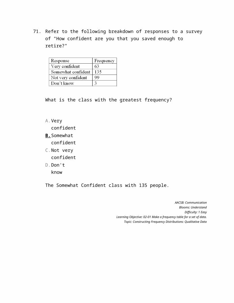
103. Ages (rounded to the nearest whole year) of employees at a large company were grouped into a distribution with the following class limits:
20 up to 3030 up to 4040 up to 5050 up to 6060 up to 70
What is the class interval?
10
Feedback: The class interval is the difference between the lower or upper class limits of adjacent classes.
AACSB: Communication
Blooms: RememberDifficulty: 2 Medium
Learning Objective: 02-04 Create a frequency distribution for a data set.Topic: Constructing Frequency Distributions: Quantitative Data
104. The first three class marks for a frequency distribution of "weights of college men" recorded to the nearest pound are 105, 115, and 125.What is the class interval?
10
Feedback: The class interval is the difference between the class marks or midpoints of adjacent classes. (115 - 105 = 10, or 125 - 115 = 10).
AACSB: Analytic
Blooms: ApplyDifficulty: 3 Hard
Learning Objective: 02-04 Create a frequency distribution for a data set.Topic: Constructing Frequency Distributions: Quantitative Data
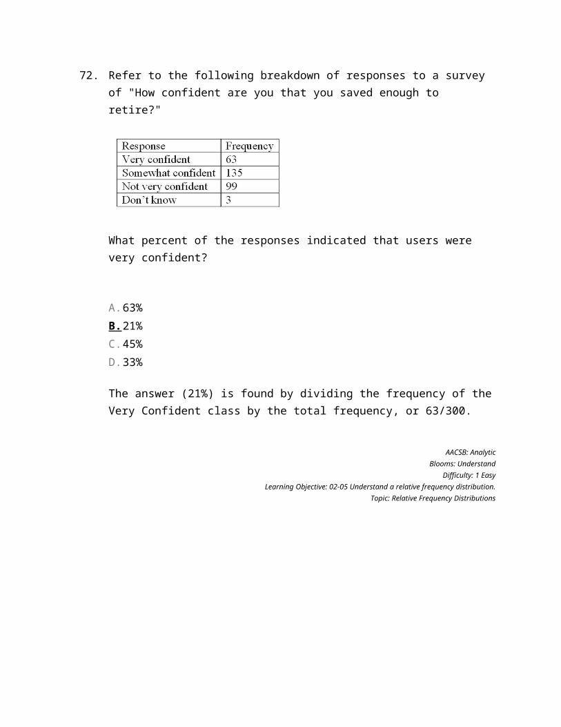
105. The first three class marks for a frequency distribution of "weights of college men" recorded to the nearest pound are 105, 115, and 125.What is the lower limit for the third class?
120
Feedback: The class interval is 10. The class marks are the same as the class midpoints. Therefore, the upper and lower limits for a class are the class mark plus or minus half of the class interval. For the third class, the lower limit is 125 - ½(10) = 120.
AACSB: Analytic
Blooms: ApplyDifficulty: 3 Hard
Learning Objective: 02-04 Create a frequency distribution for a data set.Topic: Constructing Frequency Distributions: Quantitative Data
106. The first three class marks for a frequency distribution of "weights of college men" recorded to the nearest pound are 105, 115, and 125.What is the upper limit for the third class?
130
Feedback: The class interval is 10. The class marks are the same as the class midpoints. Therefore, the upper and lower limits for a class are the class mark plus or minus half of the class interval. For the third class, the upper limit is 125 + ½(10) = 130.
AACSB: Analytic
Blooms: ApplyDifficulty: 2 Medium
Learning Objective: 02-04 Create a frequency distribution for a data set.Topic: Constructing Frequency Distributions: Quantitative Data
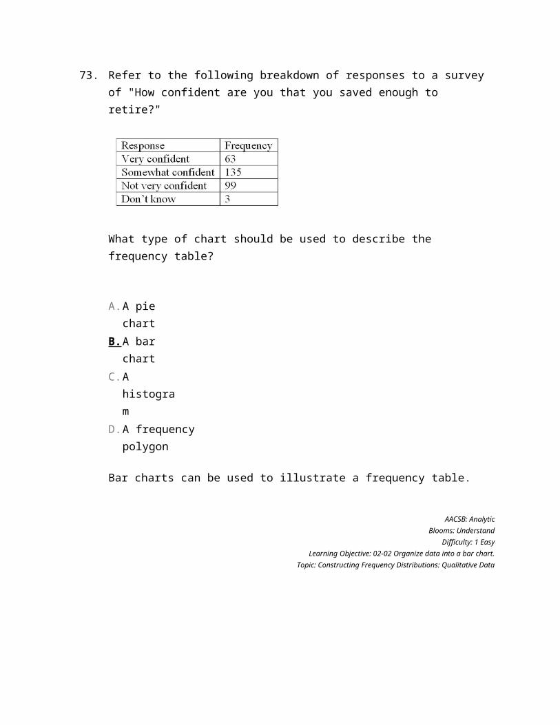
107. The first three class marks for a frequency distribution of "weights of college men" recorded to the nearest pound are 105, 115, and 125.What are the class limits for the fourth class?
130 up to 140
Feedback: The class interval is 10. The class marks are the same as the class midpoints. Therefore, the upper and lower limits for a class are the class mark plus or minus half of the class interval. For the third class, the upper limit is 125 + ½(10) = 130. The upper limit for the third class becomes the lower limit for the fourth class. The class interval, 10, is then added to get the upper limit for the fourth class.
AACSB: AnalyticBlooms: AnalyzeDifficulty: 3 Hard
Learning Objective: 02-04 Create a frequency distribution for a data set.Topic: Constructing Frequency Distributions: Quantitative Data
108. Refer to the following breakdown of responses to a survey of room cleanliness in a hotel.
What is the class interval for the following frequency table?
There is no class interval. The variable is qualitative.
Feedback: There is no class interval for data measured on an ordinal scale.
AACSB: Communication
Blooms: UnderstandDifficulty: 1 Easy
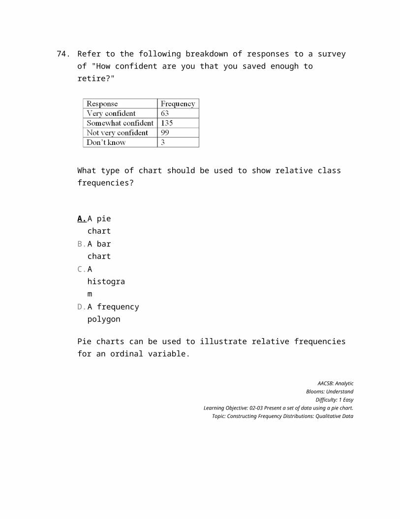
Learning Objective: 02-01 Make a frequency table for a set of data.Topic: Constructing Frequency Distributions: Qualitative Data
109. Refer to the following breakdown of responses to a survey of room cleanliness in a hotel.
What is the class with the greatest frequency?
Satisfied
Feedback: The satisfied class with 40 individuals.
AACSB: Communication
Blooms: UnderstandDifficulty: 1 Easy
Learning Objective: 02-01 Make a frequency table for a set of data.Topic: Constructing Frequency Distributions: Qualitative Data
110. Refer to the following breakdown of responses to a survey of room cleanliness in a hotel.
What percent of the responses indicated that customers were satisfied?
50%
Feedback: The satisfied class accounts for 40 of the 80 total individuals. Therefore, 40/80 (or 50%) of the customers were satisfied.
AACSB: Analytic
Blooms: UnderstandDifficulty: 1 Easy
Learning Objective: 02-01 Make a frequency table for a set of data.Topic: Constructing Frequency Distributions: Qualitative Data
111. Refer to the following breakdown of responses to a survey of room cleanliness in a hotel.
Draw a bar graph that illustrates the preceding frequency table.
Feedback: A graph with appropriate labels on the horizontal (satisfaction) and vertical (frequency) axes. The bar for "satisfied" should be twice as high as the "not satisfied and highly satisfied" categories, and these categories should be equal in height.
AACSB: Communication
Blooms: ApplyDifficulty: 1 Easy
Learning Objective: 02-01 Make a frequency table for a set of data.Topic: Constructing Frequency Distributions: Qualitative Data
112. Refer to the following breakdown of responses to a survey of room cleanliness in a hotel.
Draw a bar graph that illustrates the relative frequencies.
Feedback: A graph with the appropriate labels on the horizontal (satisfaction) and vertical (relative frequency) axes. Bars should show approximate relative frequencies or percentages. The bar for "satisfied" should be twice as high as the "not satisfied and highly satisfied" categories, and these categories should be equal in height.
AACSB: Communication
Blooms: ApplyDifficulty: 1 Easy
Learning Objective: 02-06 Present data from a frequency distribution in a histogram or frequency polygon.Topic: Constructing Frequency Distributions: Qualitative Data
113. Refer to the following breakdown of responses to a survey of room cleanliness in a hotel.
Draw a pie chart that illustrates the relative frequencies.
Feedback: The pie chart should be divided into three slices. The "satisfied" slice should be one half of the pie, and the "not satisfied" and "highly satisfied" slices should each be one quarter of the pie. The slices should be labeled.
AACSB: Communication
Blooms: ApplyDifficulty: 2 Medium
Learning Objective: 02-03 Present a set of data using a pie chart.Topic: Constructing Frequency Distributions: Qualitative Data
114. A data set consists of 40 observations. For a quantitative variable, how many classes would you recommend for the frequency distribution?
Six classes
Feedback: 26 = 64, since 40 is less than 64, the rule says that we should use 6 classes.
AACSB: Analytic
Blooms: ApplyDifficulty: 2 Medium
Learning Objective: 02-04 Create a frequency distribution for a data set.Topic: Constructing Frequency Distributions: Quantitative Data
115. A data set has 100 observations. In the data, a quantitative variable's highest value is 117 and its lowest value is 47. What is the minimum class interval that you would recommend?
The intermediate answer is 7 classes. The difference between the high and low is 70. So, the class interval is 10.
Feedback: The class interval would be (maximum - minimum)/number of classes. Using the "2 to the k rule," there would be 7 classes (100 is less than 27 = 128. So (117 - 47)/7 = 10.
AACSB: Analytic
Blooms: ApplyDifficulty: 3 Hard
Learning Objective: 02-04 Create a frequency distribution for a data set.Topic: Constructing Frequency Distributions: Quantitative Data
116. A data set has 200 observations. In the data, a quantitative variable's highest value is 1080 and its lowest value is 960. What is the minimum class interval that you would recommend?
The intermediate answer is 8 classes. The difference between the high and low is 120. So, the class interval is 15.
Feedback: The class interval would be (maximum - minimum)/number of classes. Using the "2 to the k rule," there would be 8 classes (200 is less than 28 = 256. So (1080 - 960)/8 = 15.
AACSB: Analytic
Blooms: ApplyDifficulty: 3 Hard
Learning Objective: 02-04 Create a frequency distribution for a data set.Topic: Constructing Frequency Distributions: Quantitative Data
117. A data set has 200 observations. In the data, a qualitative variable's highest value is "extremely satisfied" and its lowest value is "extremely dissatisfied." What is the minimum class interval that you would recommend?
There is no class interval because the variable is qualitative, not quantitative.
Feedback: Qualitative data does not have class intervals or class limits.
AACSB: Reflective Thinking
Blooms: AnalyzeDifficulty: 3 Hard
Learning Objective: 02-01 Make a frequency table for a set of data.Topic: Constructing Frequency Distributions: Qualitative Data
118. The following frequency distribution shows the distribution of delivery times (in days) for swimstuff.com customer orders during the last month.
How many orders were delivered in less than one day?
150
Feedback: For the first class, 0 up to 1 day, there are 150 deliveries.
AACSB: Analytic
Blooms: ApplyDifficulty: 1 Easy
Learning Objective: 02-06 Present data from a frequency distribution in a histogram or frequency polygon.Topic: Constructing Frequency Distributions: Quantitative Data
119. The following frequency distribution shows the distribution of delivery times (in days) for swimstuff.com customer orders during the last month.
What is the relative frequency for orders delivered in less than one day?
0.50
Feedback: For the first class, 0 up to 1 day, the relative frequency is 150 divided by the total, 300. Therefore 150/300, or 0.5, is the relative frequency for the first class.
AACSB: Analytic
Blooms: ApplyDifficulty: 1 Easy
Learning Objective: 02-05 Understand a relative frequency distribution.Topic: Relative Frequency Distributions
120. The following frequency distribution shows the distribution of delivery times (in days) for swimstuff.com customer orders during the last month.
How many orders were delivered in less than three days?
255
Feedback: The first three classes account for all the deliveries of less than three days. So summing 150, 60, and 45, there were 255 deliveries of less than three days.
AACSB: Analytic
Blooms: ApplyDifficulty: 1 Easy
Learning Objective: 02-06 Present data from a frequency distribution in a histogram or frequency polygon.Topic: Constructing Frequency Distributions: Quantitative Data
121. The following frequency distribution shows the distribution of delivery times (in days) for swimstuff.com customer orders during the last month.
What is the relative frequency for orders delivered in less than three days?
0.85
Feedback: The first three classes account for all the deliveries of less than three days. So summing 150, 60, and 45, there were 255 deliveries of less than three days. The relative frequency would be 255/300, or 0.85.
AACSB: Analytic
Blooms: ApplyDifficulty: 1 Easy
Learning Objective: 02-05 Understand a relative frequency distribution.Topic: Relative Frequency Distributions
122. The following frequency distribution shows the distribution of delivery times (in days) for swimstuff.com customer orders during the last month.
How many orders were delivered in three days or more?
45
Feedback: The three classes, 3 up to 4, 4 up to 5, and 5 up to 6, account for all the deliveries of three days or more. So summing 30, 10, and 5, there were 45 deliveries of three days or more.
AACSB: Analytic
Blooms: ApplyDifficulty: 1 Easy
Learning Objective: 02-06 Present data from a frequency distribution in a histogram or frequency polygon.Topic: Constructing Frequency Distributions: Quantitative Data
123. The following frequency distribution shows the distribution of delivery times (in days) for swimstuff.com customer orders during the last month.
What is the relative frequency for orders delivered in three days or more?
0.15
Feedback: The three classes, 3 up to 4, 4 up to 5, and 5 up to 6, account for all the deliveries of three days or more. So summing 30, 10, and 5, there were 45 deliveries of three days or more. The relative frequency is 45/300, or 0.15.
AACSB: Analytic
Blooms: ApplyDifficulty: 1 Easy
Learning Objective: 02-05 Understand a relative frequency distribution.Topic: Relative Frequency Distributions
124. The following frequency distribution shows the distribution of delivery times (in days) for swimstuff.com customer orders during the last month.
How many orders were delivered from 1 day up to 3 days?
105
Feedback: The two classes, 1 up to 2, and 2 up to 3, account for all the deliveries from 1 up to 3 days. So summing 60 and 45, there were 105 deliveries from 1 up to 3 days.
AACSB: Analytic
Blooms: ApplyDifficulty: 2 Medium
Learning Objective: 02-04 Create a frequency distribution for a data set.Topic: Constructing Frequency Distributions: Quantitative Data
125. The following frequency distribution shows the distribution of delivery times (in days) for swimstuff.com customer orders during the last month.
What is the relative frequency of the orders delivered from 1 day up to 3 days?
0.35.
Feedback: The two classes, 1 up to 2, and 2 up to 3, account for all the deliveries from 1 up to 3 days. So summing 60 and 45, there were 105 deliveries from 1 up to 3 days. The relative frequency is 105/300, or 0.35.
AACSB: Analytic
Blooms: ApplyDifficulty: 2 Medium
Learning Objective: 02-05 Understand a relative frequency distribution.Topic: Relative Frequency Distributions
126. The following frequency distribution shows the distribution of delivery times (in days) for swimstuff.com customer orders during the last month.
For 300 observations, our rule-of-thumb for number of classes would indicate 9 classes. In this case, what is the class interval and why would it be reasonable to use that class interval and only 6 classes?
The class interval is 1 day. The class interval would be reasonable because that is the level of detail that the company uses to measure delivery time. The number of classes would be limited to 6 because there are no deliveries that take six days or more.
AACSB: Reflective Thinking
Blooms: AnalyzeDifficulty: 3 Hard
Learning Objective: 02-04 Create a frequency distribution for a data set.Topic: Constructing Frequency Distributions: Quantitative Data
127. What is the difference between a bar chart and a pie chart?
A bar chart shows the frequency for the distribution of a qualitative variable. A pie chart shows the relative frequency for the distribution of a qualitative variable. The pie chart is also a great way to make a visual message of the proportions that each variable contributes to the total observations.
AACSB: Reflective Thinking
Blooms: Analyze
Difficulty: 3 HardLearning Objective: 02-01 Make a frequency table for a set of data.
Topic: Constructing Frequency Distributions: Qualitative Data
128. What is the difference between a frequency distribution and a cumulative frequency distribution?
A frequency distribution shows the number of observations in each class. A cumulative frequency distribution shows the sum of the number of observations in a class plus all lower-ranked or -valued classes.
AACSB: Reflective Thinking
Blooms: AnalyzeDifficulty: 3 Hard
Learning Objective: 02-07 Construct and interpret a cumulative frequency distribution.Topic: Cumulative Frequency Distribution
129. In a bar chart, why are there spaces between the bars on the horizontal axis?
A bar chart shows the frequency distribution of a qualitative variable. A qualitative variable is discrete and not continuous. Therefore, placing a space between each bar reflects the fact that a qualitative variable is not continuous.
AACSB: Reflective Thinking
Blooms: AnalyzeDifficulty: 3 Hard
Learning Objective: 02-01 Make a frequency table for a set of data.Topic: Constructing Frequency Distributions: Qualitative Data