Embed Size (px)
Citation preview
3461
Web Page Design
Focus on Usability
3461
Sources
www.useit.com (Jacob Neilsen) www.webpagesthatsuck.com (Vincent Flanders)
http://usability.gov/guidelines/ J. Johnson (2000) GUI Bloopers W. O. Galitz (2002) The Essential Guide to
User Interface Design P. Greenspun (1999) Philip and Alex’s Guide
to Web Publishing
3461
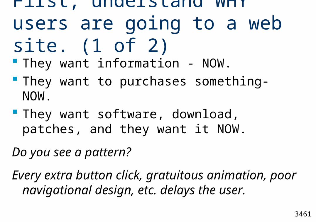
First, understand WHY users are going to a web site. (1 of 2)
They want information - NOW. They want to purchases something- NOW. They want software, download, patches, and
they want it NOW.
Do you see a pattern?
Every extra button click, gratuitous animation, poor navigational design, etc. delays the user.
3461
First, understand WHY users are going to a web site. (2 of 2)
Possible web site exceptions Entertainment sites (movies, games) Nonprofit sites (setting the mood)
However for most websites the user does not wish to be entertained, rather they want something right away.
Remember, a competing web site is just one click away.
3461
A Good Web Site is One That
Where it is easy for users to find what they are looking for.
Loads quickly. Is easy to navigate. Is informative.
3461
Most of these slides are guidelines
They are not fixed rules, rather they are rules of thumb, guidelines, to use when starting with nothing. Numerous exceptions exist which depend upon the user, task, and environment.
These guidelines are not etched in stone, they have differed in the past and will change in the future.
3461
Web Site Usability Guidelines from Philip Greenspun
A richer user interface is always harder to learn. People who are visiting your site don’t want to have to learn.
More cutting edge technologies in a web site generally decreases the usability of a web site.
Don’t break the browser’s navigational buttons. Users should be able to go forward and backwards at any time during their session.
Philip and Alex’s Guide to Web Publishing (1999, Morgan Kaufmann)
3461
Common Web Usability Design Problems
Slow downloads because of large images, many images, unnecessary animation, etc ...
Districting and gratuitous animation that runs continuously in the background
Designs that require users to scroll down or across the page to see important content.
Web sites that format text in fixed-width or proportional-width blocks rather than letting the width of the user’s browser determine the width of the text.
3461
Design Guidelines from Tufte
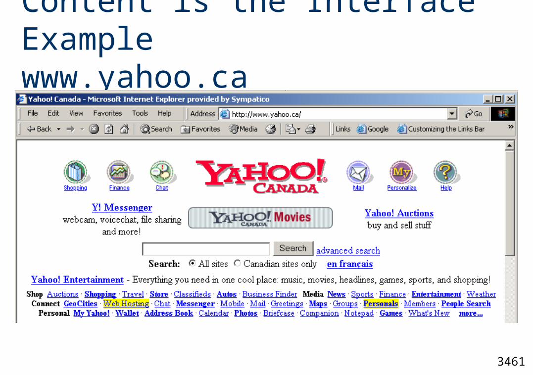
Web pages should contain information, not navigation or administration icons. The information should become the interface.
Give users broad, flat overviews of the information (table of contents), rather than forcing them through sequential screens of choices.
Organize your data according to expected user interest, rather than internal structure of your organization.
Why use icons for navigation when words are clearer and take up less screen space?
Visual Explanations: Images and Quantities, Evidence and Narrative (1997, Graphics Press)
3461
Three Click Rule
The "Three Click Rule" states that all relevant parts of a website should be accessible within three mouse-clicks of the home-page.
Do not use an entry tunnel to your website. Do not dictate the navigational path to your
user.
3461
USA Federal Government Regulations
Federal Government Web sites are required to follow the Section 508 Federal (Web) Accessibility Standards.
http://www.access-board.gov device independence text alternatives to graphics and graphic links user controlled content display
3461
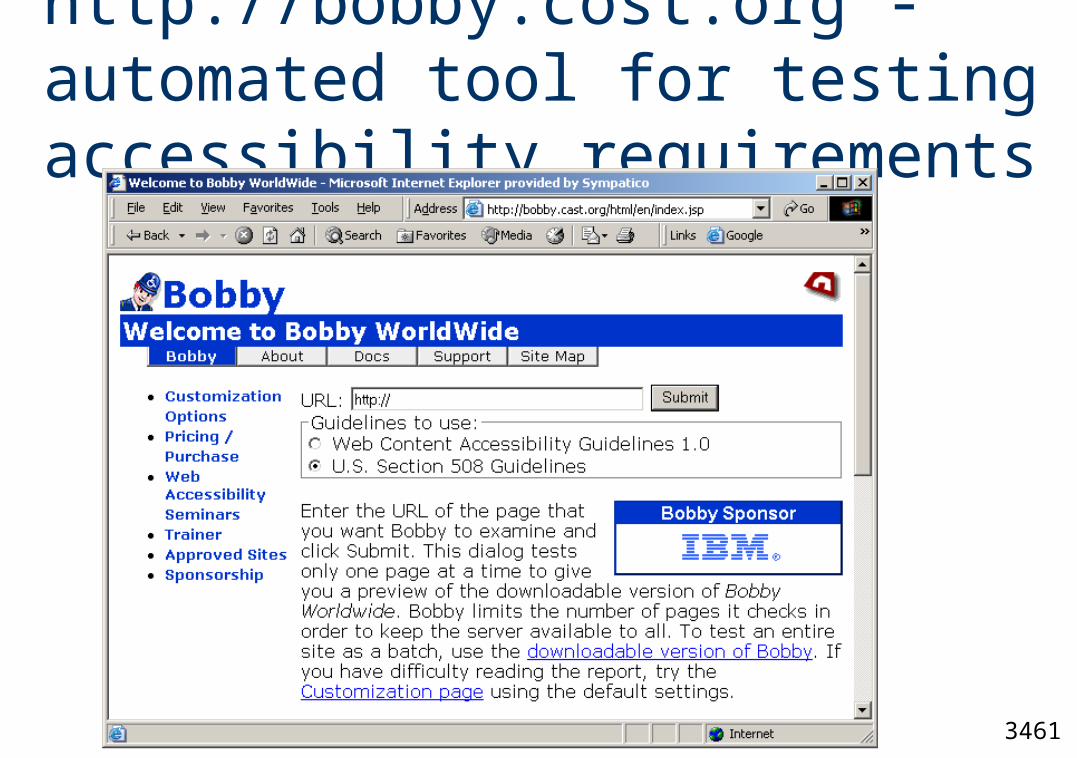
http://bobby.cost.org - automated tool for testing accessibility requirements
3461
GUI vs. Web Page Design
In GUI design the layout of the screen will look exactly as specified (WYSIWYG). However no such guarantee exists for web pages.
3461
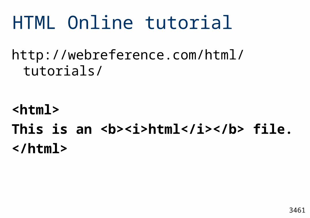
HTML Online tutorial
http://webreference.com/html/tutorials/
<html>
This is an <b><i>html</i></b> file.
</html>
3461
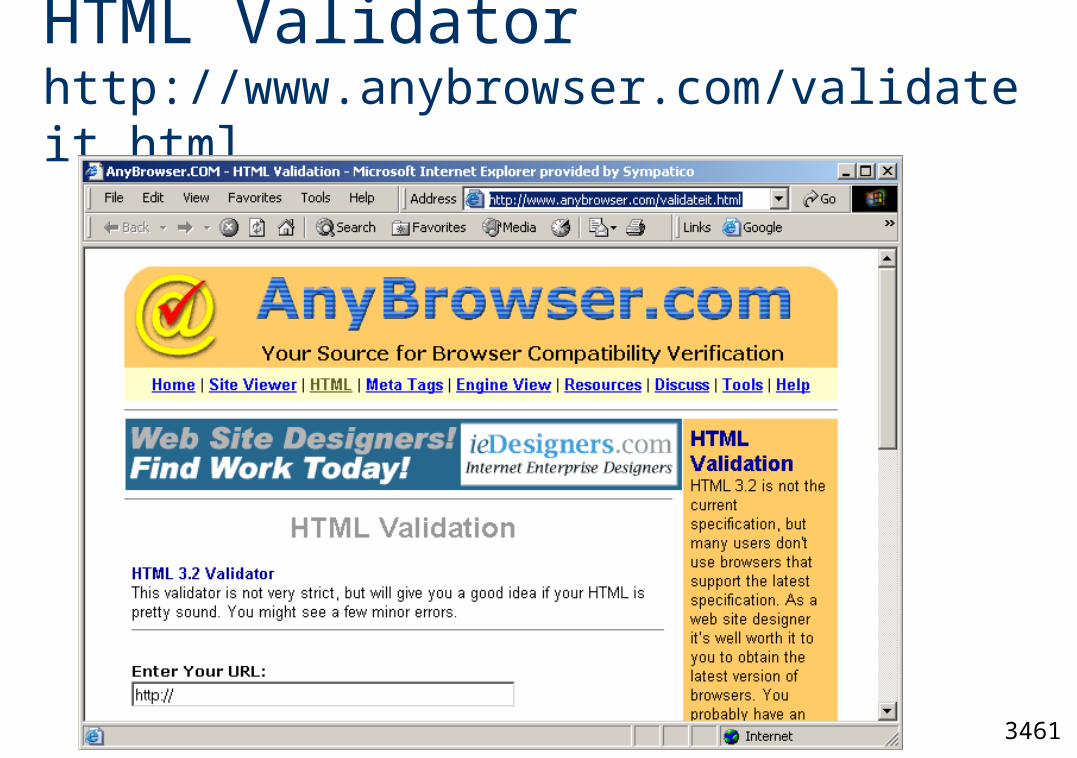
HTML Validator http://www.anybrowser.com/validateit.html
3461
Color Selection
When foreground and background colors are close to the same hue, they may provide insufficient contrast on monochrome displays and for people with certain types of color deficits.
Maximum of four colors on the screen at any one time, and in most cases two or three.
http://usability.gov/guidelines/accessibility.html#one
3461
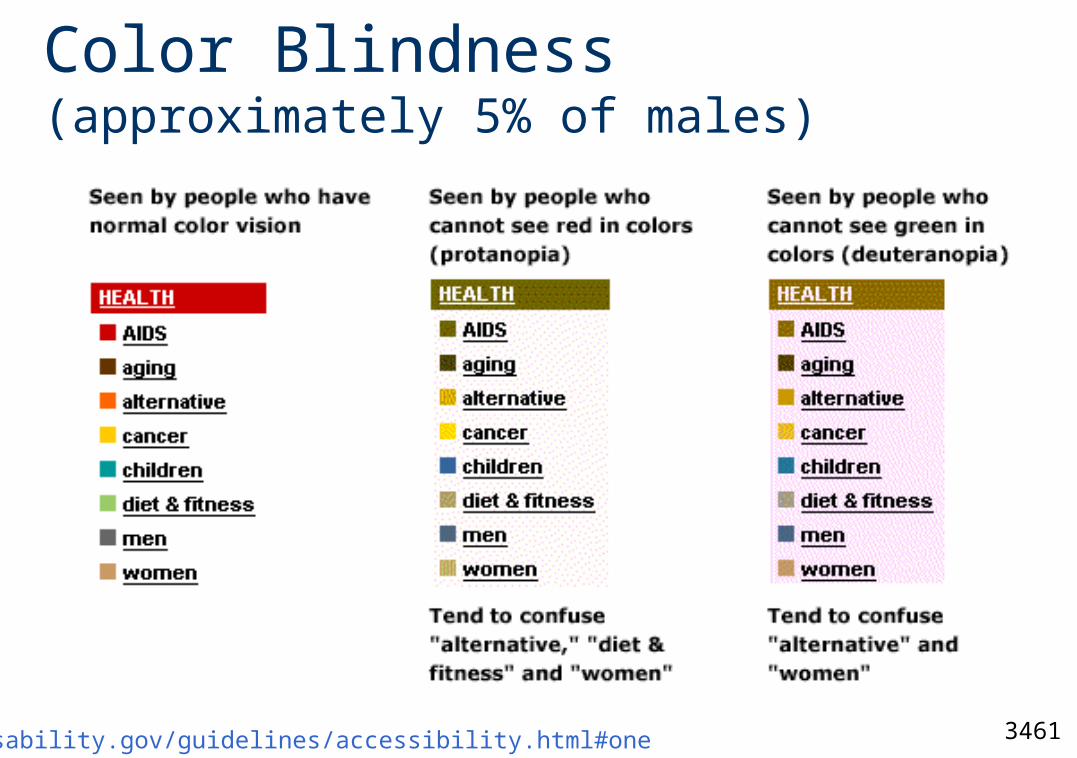
Color Blindness (approximately 5% of males)
http://usability.gov/guidelines/accessibility.html#one
3461
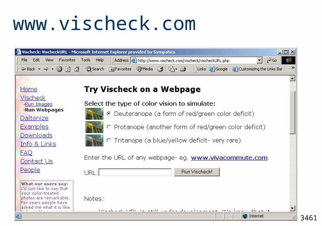
www.vischeck.com
3461
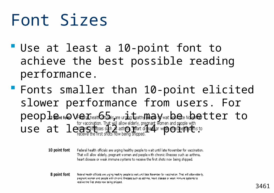
Font Sizes
Use at least a 10-point font to achieve the best possible reading performance.
Fonts smaller than 10-point elicited slower performance from users. For people over 65, it may be better to use at least 12 or 14 point.
3461
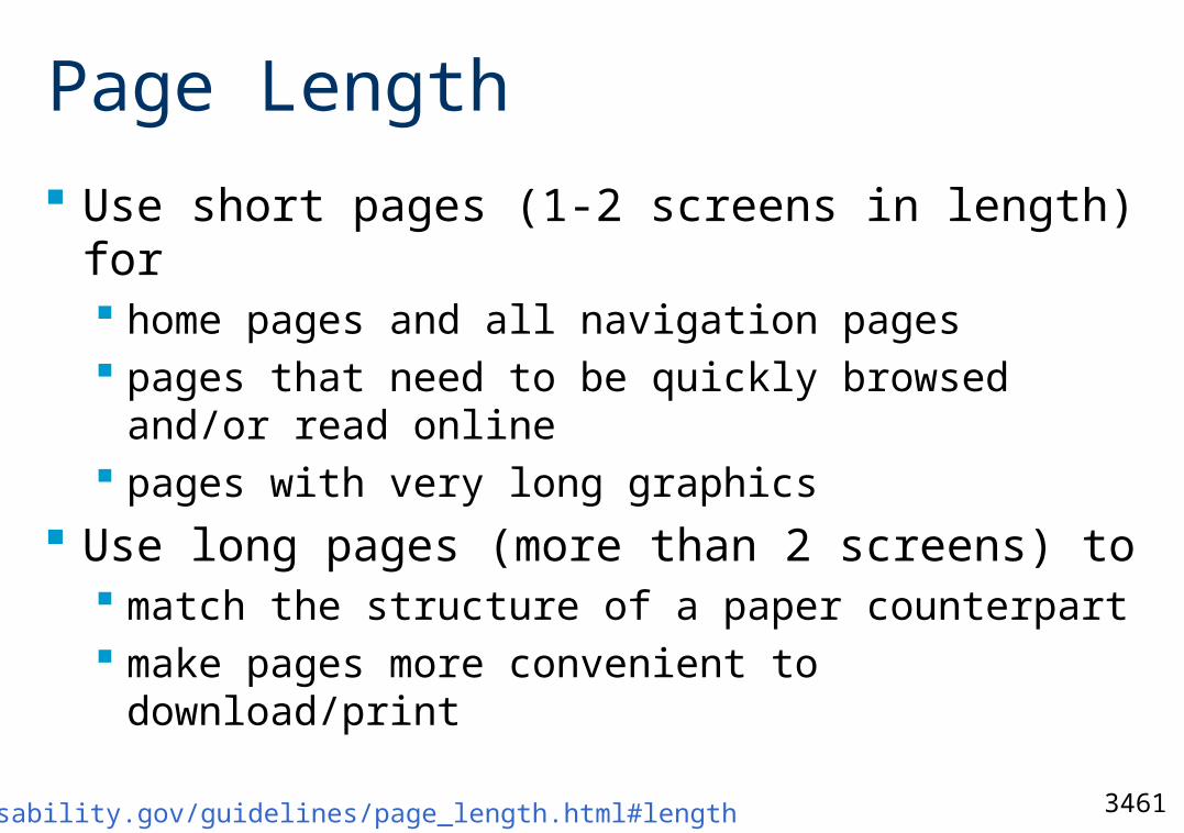
Page Length
Use short pages (1-2 screens in length) for home pages and all navigation pages pages that need to be quickly browsed and/or
read online pages with very long graphics
Use long pages (more than 2 screens) to match the structure of a paper counterpart make pages more convenient to download/print
http://usability.gov/guidelines/page_length.html#length
3461
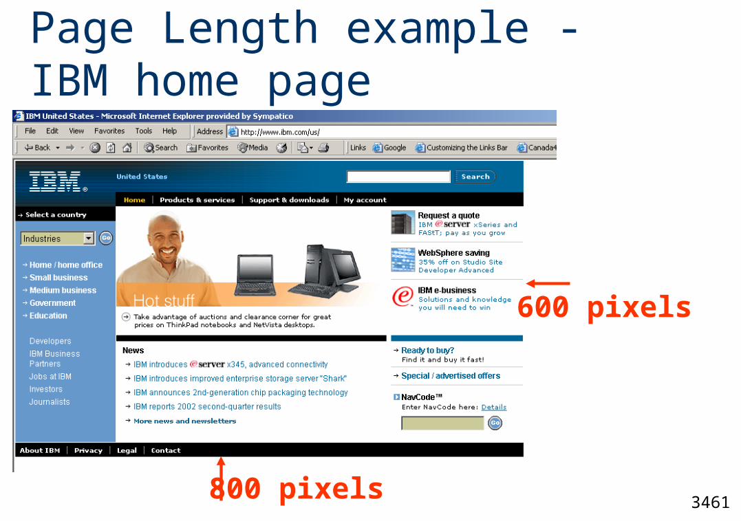
Page Length example -IBM home page
800 pixels
600 pixels
3461
Content is the Interface Examplewww.yahoo.ca
3461
Reasons to avoid using Flash
Flash encourages gratuitous animation Flash breaks web fundamentals
The "Back" button does not work Link colors don't work showing which links you’ve
seen Flash reduces accessibility for users with
disabilities (ex. make text bigger/smaller" button does not work)
Flash integrates poorly with search
3461
Text for Web Pages
Minimize the use of words that call attention to the Web. Examples: “This Web site” “Click here” “Follow this link” How to test? Print out a page, read it and see if it
makes sense.
3461
Graphics on Web Sites (1 of 3)
Use graphics as a supplement to textual content, not as a substitute.
Convey information that can’t be effectively accomplished using text. (photographs, video, diagrams)
Enhance navigation presenting a site overview identifying site pages identifying content areas
3461
Graphics on Web Sites (2 of 3)
Minimize the number of images. More images slower page download
Minimize the size of images restrict single images to 5K restrict page images to 20K provide thumbnail size images
Produce images in the most appropriate format GIF JPEG
3461
Graphics on Web Sites (3 of 3)
GIFs are limited to 256 colors, and exist in either a dithered or nondithered format.
dithered: color-mixing process a computer goes through when it encounters a color not in its palette.Palette colors are mixed to approximate the appearance of the desired color the resulting color may be grainy or unacceptable
nondithered: closest palette colors are chosen may also produced poor results
3461
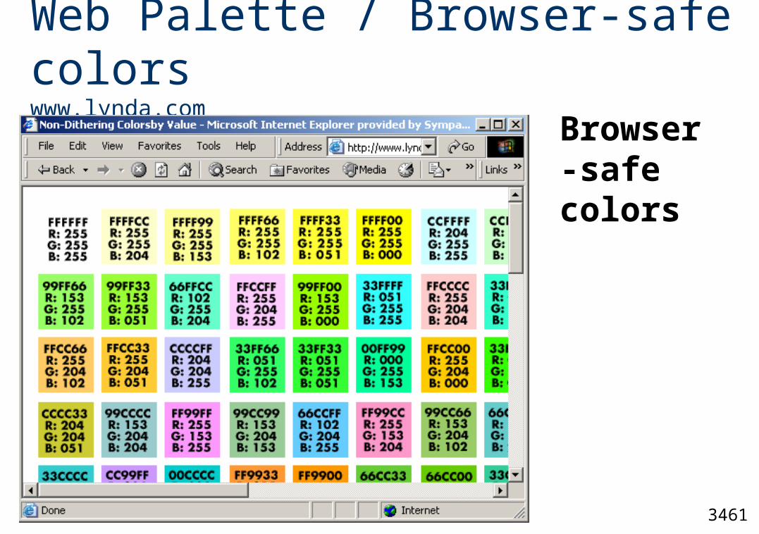
Web Palette / Browser-safe colorswww.lynda.com
Browser-safe colors
3461
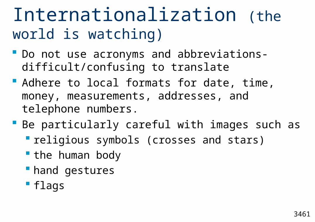
Internationalization (the world is watching)
Do not use acronyms and abbreviations- difficult/confusing to translate
Adhere to local formats for date, time, money, measurements, addresses, and telephone numbers.
Be particularly careful with images such as religious symbols (crosses and stars) the human body hand gestures flags
3461
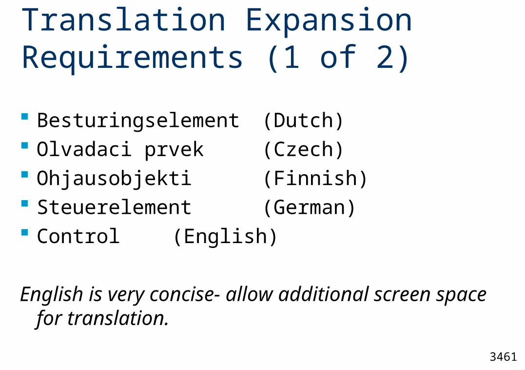
Translation Expansion Requirements (1 of 2)
Besturingselement (Dutch) Olvadaci prvek (Czech) Ohjausobjekti (Finnish) Steuerelement (German) Control (English)
English is very concise- allow additional screen space for translation.
3461
Translation Expansion Requirements (2 of 2)
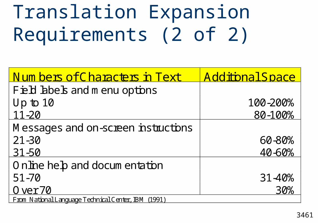
Numbers of Characters in Text Additional SpaceField labels and menu optionsUp to 10 100-200%11-20 80-100%Messages and on-screen instructions21-30 60-80%31-50 40-60%Online help and documentation51-70 31-40%Over 70 30%From National Language Technical Center, IBM (1991)
3461
Mystery Meat Navigation
Vincent Flanders http://www.fixingyourwebsite.com/mysterymeat.html
Goes against the fundamental purposes of a website discussed earlier.
Examples
3461
Web Page Guidelines (1 of 2)
Strike a balance between Textual information Graphics Links
Avoid horizontal scrolling Place critical or important information at the
very top so it is always viewable when the page is opened.
3461
Web Page Guidelines (2 of 2)
Use frames with caution. Don’t break links. Users will bookmark the
page that interests them and not necessarily take the path you create. (search engines)
Provide sufficient white space (minimum 30%) Anticipate page breaks
3461
Home Page Guidelines
Limit to one screen Clearly identify the Web site’s content and
purpose Elements to include:
Site overview or map Navigation links to most (if not all) of the site or
major sections Some useful content
3461
Further Research
When to open a new window browsers, and when to display new content in current browser window?
Literature has not yet adequately answered this question.
Difficult question to answer, highly dependent on the type of user, and the task involved.