Embed Size (px)
Citation preview
POPULARDELUSIONS
IN THIS ISSUE ...
29TH NOVEMBER 2019DYLAN GRICE
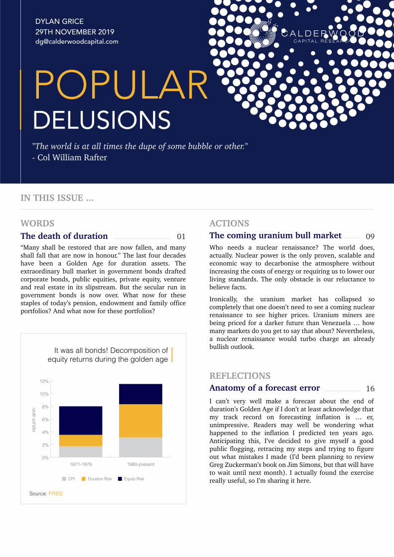
Who needs a nuclear renaissance? The world does, actually. Nuclear power is the only proven, scalable and economic way to decarbonise the atmosphere without increasing the costs of energy or requiring us to lower our living standards. The only obstacle is our reluctance to believe facts.
Ironically, the uranium market has collapsed so completely that one doesn’t need to see a coming nuclear renaissance to see higher prices. Uranium miners are being priced for a darker future than Venezuela … how many markets do you get to say that about? Nevertheless, a nuclear renaissance would turbo charge an already bullish outlook.
ACTIONS09The coming uranium bull market ........
“Many shall be restored that are now fallen, and many shall fall that are now in honour.” The last four decades have been a Golden Age for duration assets. The extraordinary bull market in government bonds drafted corporate bonds, public equities, private equity, venture and real estate in its slipstream. But the secular run in government bonds is now over. What now for these staples of today’s pension, endowment and family office portfolios? And what now for these portfolios?
WORDS01The death of duration
"The world is at all times the dupe of some bubble or other." - Col William Rafter
.............................
I can’t very well make a forecast about the end of duration’s Golden Age if I don’t at least acknowledge that my track record on forecasting inflation is … er, unimpressive. Readers may well be wondering what happened to the inflation I predicted ten years ago. Anticipating this, I’ve decided to give myself a good public flogging, retracing my steps and trying to figure out what mistakes I made (I’d been planning to review Greg Zuckerman’s book on Jim Simons, but that will have to wait until next month). I actually found the exercise really useful, so I’m sharing it here.
REFLECTIONS16Anatomy of a forecast error ..................
It was all bonds! Decomposition ofequity returns during the golden age
0%
2%
4%
6%
8%
10%
12%
1980-present1871-1979
retu
rn a
nn.
Source: FRED
CPI Duration Risk Equity Risk
The death of durationWhat comes after the Golden Age?
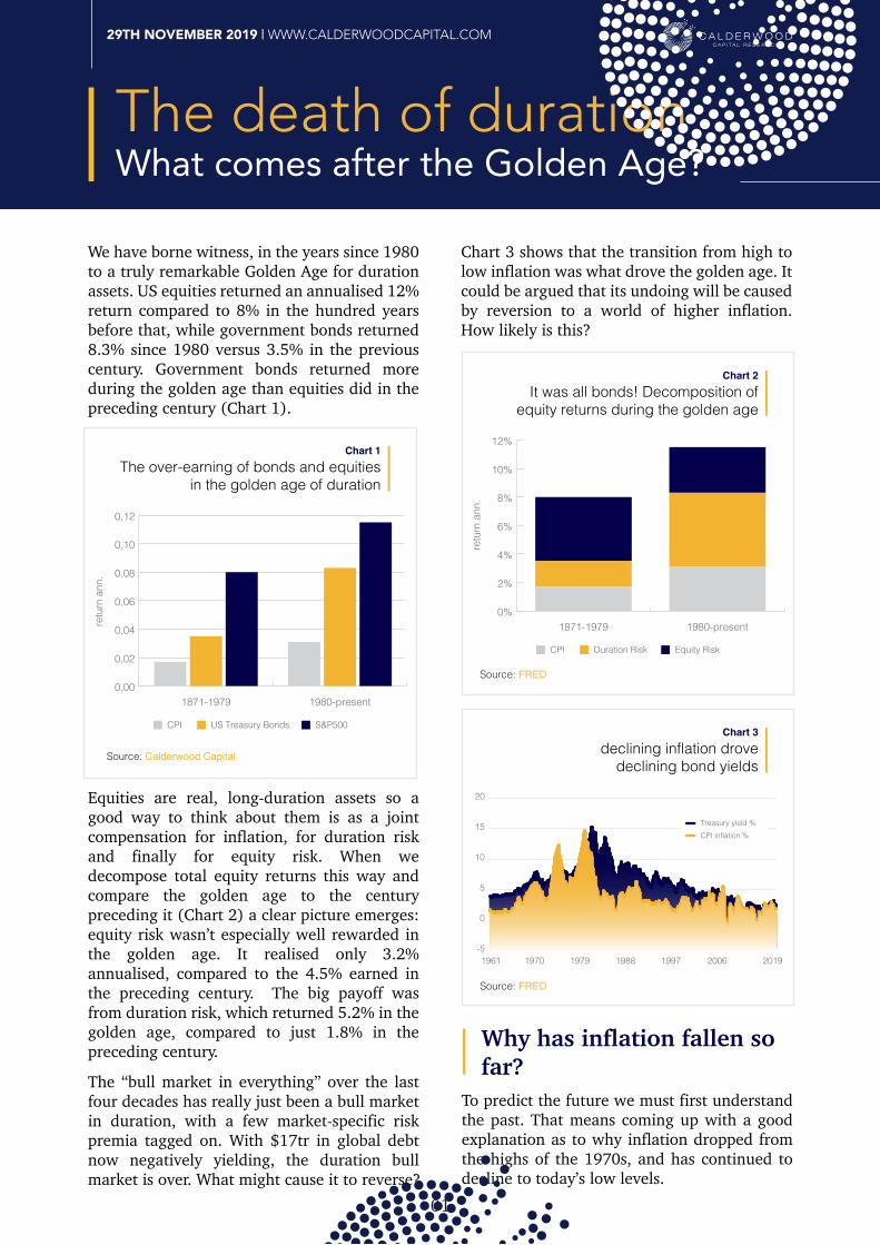
We have borne witness, in the years since 1980 to a truly remarkable Golden Age for duration assets. US equities returned an annualised 12% return compared to 8% in the hundred years before that, while government bonds returned 8.3% since 1980 versus 3.5% in the previous century. Government bonds returned more during the golden age than equities did in the preceding century (Chart 1).
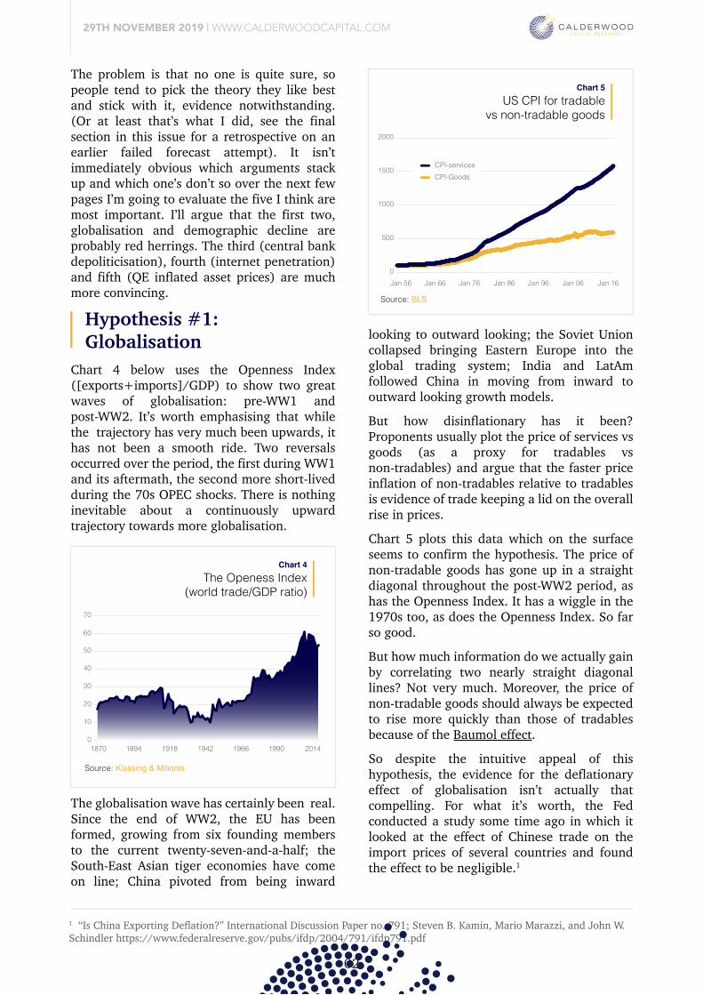
Equities are real, long-duration assets so a good way to think about them is as a joint compensation for inflation, for duration risk and finally for equity risk. When we decompose total equity returns this way and compare the golden age to the century preceding it (Chart 2) a clear picture emerges: equity risk wasn’t especially well rewarded in the golden age. It realised only 3.2% annualised, compared to the 4.5% earned in the preceding century. The big payoff was from duration risk, which returned 5.2% in the golden age, compared to just 1.8% in the preceding century.
The “bull market in everything” over the last four decades has really just been a bull market in duration, with a few market-specific risk premia tagged on. With $17tr in global debt now negatively yielding, the duration bull market is over. What might cause it to reverse?
To predict the future we must first understand the past. That means coming up with a good explanation as to why inflation dropped from the highs of the 1970s, and has continued to decline to today’s low levels.
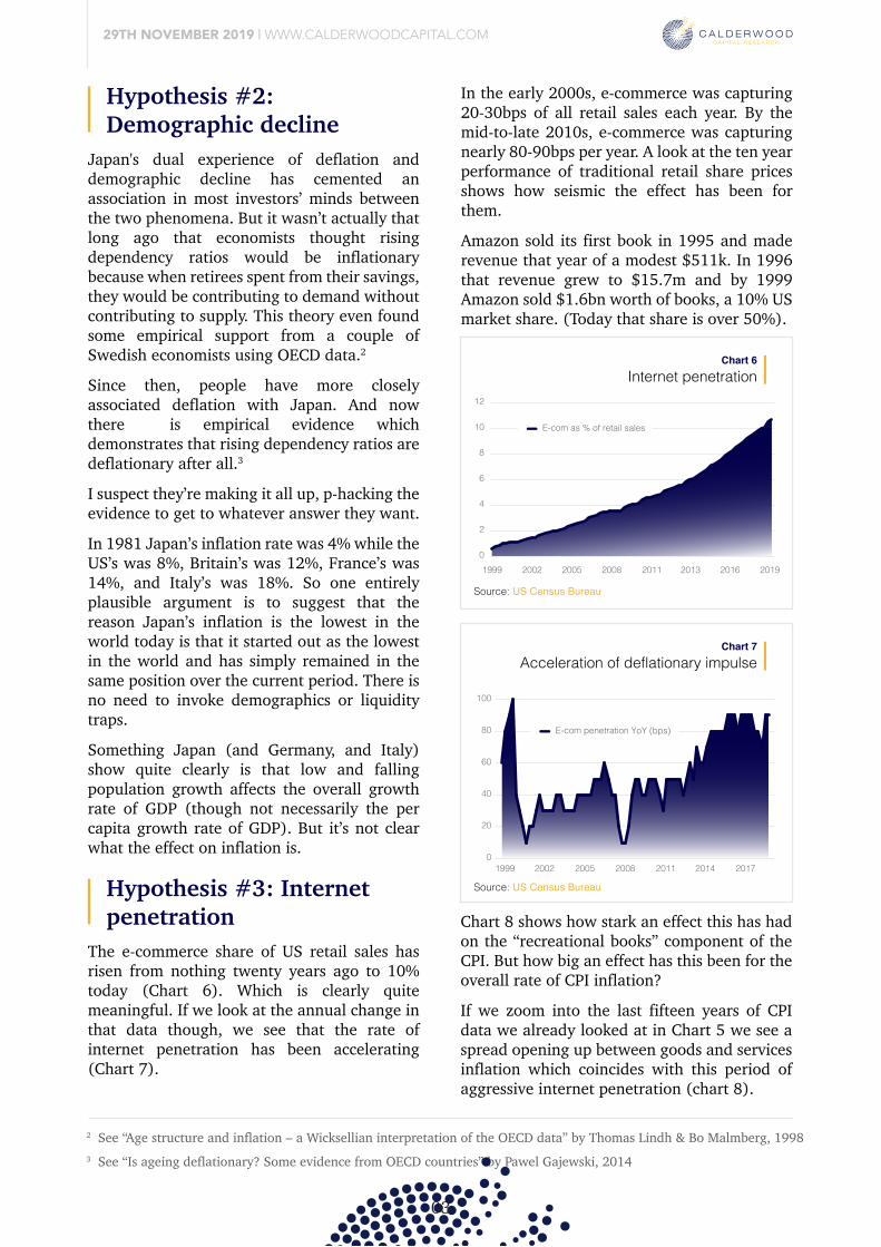
Chart 3 shows that the transition from high to low inflation was what drove the golden age. It could be argued that its undoing will be caused by reversion to a world of higher inflation. How likely is this?
Why has inflation fallen so far?
29TH NOVEMBER 2019 | WWW.CALDERWOODCAPITAL.COM
01
declining inflation drovedeclining bond yields
Chart 3
-5
0
5
10
15
20
1961 1970 1979 1988 1997 2006 2019
Treasury yield %CPI inflation %
The problem is that no one is quite sure, so people tend to pick the theory they like best and stick with it, evidence notwithstanding. (Or at least that’s what I did, see the final section in this issue for a retrospective on an earlier failed forecast attempt). It isn’t immediately obvious which arguments stack up and which one’s don’t so over the next few pages I’m going to evaluate the five I think are most important. I’ll argue that the first two, globalisation and demographic decline are probably red herrings. The third (central bank depoliticisation), fourth (internet penetration) and fifth (QE inflated asset prices) are much more convincing.
The over-earning of bonds and equitiesin the golden age of duration
Chart 1
CPI US Treasury Bonds S&P500
0,00
0,02
0,04
0,06
0,08
0,10
0,12
1980-present1871-1979
retu
rn a
nn.
Source: Calderwood Capital
It was all bonds! Decomposition ofequity returns during the golden age
Chart 2
CPI Duration Risk Equity Risk
0%
2%
4%
6%
8%
10%
12%
1980-present1871-1979
retu
rn a
nn.
Source: FRED
Source: FRED
To predict the future we must first understand the past. That means coming up with a good explanation as to why inflation dropped from the highs of the 1970s, and has continued to decline to today’s low levels.
Hypothesis #1: Globalisation
1 “Is China Exporting Deflation?” International Discussion Paper no. 791; Steven B. Kamin, Mario Marazzi, and John W. Schindler https://www.federalreserve.gov/pubs/ifdp/2004/791/ifdp791.pdf
29TH NOVEMBER 2019 | WWW.CALDERWOODCAPITAL.COM
02
The problem is that no one is quite sure, so people tend to pick the theory they like best and stick with it, evidence notwithstanding. (Or at least that’s what I did, see the final section in this issue for a retrospective on an earlier failed forecast attempt). It isn’t immediately obvious which arguments stack up and which one’s don’t so over the next few pages I’m going to evaluate the five I think are most important. I’ll argue that the first two, globalisation and demographic decline are probably red herrings. The third (central bank depoliticisation), fourth (internet penetration) and fifth (QE inflated asset prices) are much more convincing.
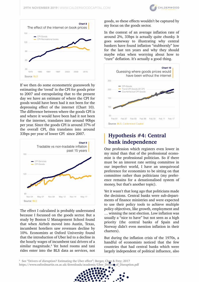
Chart 4 below uses the Openness Index ([exports+imports]/GDP) to show two great waves of globalisation: pre-WW1 and post-WW2. It’s worth emphasising that while the trajectory has very much been upwards, it has not been a smooth ride. Two reversals occurred over the period, the first during WW1 and its aftermath, the second more short-lived during the 70s OPEC shocks. There is nothing inevitable about a continuously upward trajectory towards more globalisation.
The Openess Index(world trade/GDP ratio)
Chart 4
1870 1894 1918 1942 1966 1990 20140
10
20
30
40
50
60
70
Source: Klassing & Milionis
The globalisation wave has certainly been real. Since the end of WW2, the EU has been formed, growing from six founding members to the current twenty-seven-and-a-half; the South-East Asian tiger economies have come on line; China pivoted from being inward
US CPI for tradablevs non-tradable goods
Chart 5
Jan 56 Jan 66 Jan 76 Jan 86 Jan 96 Jan 06 Jan 160
500
1000
1500
2000
CPI-servicesCPI-Goods
looking to outward looking; the Soviet Union collapsed bringing Eastern Europe into the global trading system; India and LatAm followed China in moving from inward to outward looking growth models.
But how disinflationary has it been? Proponents usually plot the price of services vs goods (as a proxy for tradables vs non-tradables) and argue that the faster price inflation of non-tradables relative to tradables is evidence of trade keeping a lid on the overall rise in prices.
Chart 5 plots this data which on the surface seems to confirm the hypothesis. The price of non-tradable goods has gone up in a straight diagonal throughout the post-WW2 period, as has the Openness Index. It has a wiggle in the 1970s too, as does the Openness Index. So far so good. But how much information do we actually gain by correlating two nearly straight diagonal lines? Not very much. Moreover, the price of non-tradable goods should always be expected to rise more quickly than those of tradables because of the Baumol effect.
So despite the intuitive appeal of this hypothesis, the evidence for the deflationary effect of globalisation isn’t actually that compelling. For what it’s worth, the Fed conducted a study some time ago in which it looked at the effect of Chinese trade on the import prices of several countries and found the effect to be negligible.1
Source: BLS
Japan's dual experience of deflation and demographic decline has cemented an association in most investors’ minds between the two phenomena. But it wasn’t actually that long ago that economists thought rising dependency ratios would be inflationary because when retirees spent from their savings, they would be contributing to demand without contributing to supply. This theory even found some empirical support from a couple of Swedish economists using OECD data.2
Since then, people have more closely associated deflation with Japan. And now there is empirical evidence which demonstrates that rising dependency ratios are deflationary after all.3
I suspect they’re making it all up, p-hacking the evidence to get to whatever answer they want.
In 1981 Japan’s inflation rate was 4% while the US’s was 8%, Britain’s was 12%, France’s was 14%, and Italy’s was 18%. So one entirely plausible argument is to suggest that the reason Japan’s inflation is the lowest in the world today is that it started out as the lowest in the world and has simply remained in the same position over the current period. There is no need to invoke demographics or liquidity traps.
Something Japan (and Germany, and Italy) show quite clearly is that low and falling population growth affects the overall growth rate of GDP (though not necessarily the per capita growth rate of GDP). But it’s not clear what the effect on inflation is.
The e-commerce share of US retail sales has risen from nothing twenty years ago to 10% today (Chart 6). Which is clearly quite meaningful. If we look at the annual change in that data though, we see that the rate of internet penetration has been accelerating (Chart 7).
Hypothesis #2: Demographic decline
Hypothesis #3: Internet penetration
2 See “Age structure and inflation – a Wicksellian interpretation of the OECD data” by Thomas Lindh & Bo Malmberg, 19983 See “Is ageing deflationary? Some evidence from OECD countries” by Pawel Gajewski, 2014
29TH NOVEMBER 2019 | WWW.CALDERWOODCAPITAL.COM
03
Internet penetrationChart 6
In the early 2000s, e-commerce was capturing 20-30bps of all retail sales each year. By the mid-to-late 2010s, e-commerce was capturing nearly 80-90bps per year. A look at the ten year performance of traditional retail share prices shows how seismic the effect has been for them. Amazon sold its first book in 1995 and made revenue that year of a modest $511k. In 1996 that revenue grew to $15.7m and by 1999 Amazon sold $1.6bn worth of books, a 10% US market share. (Today that share is over 50%).
1999 2002 2005 2008 2011 2013 2016 2019
E-com as % of retail sales
0
2
4
6
8
10
12
Acceleration of deflationary impulseChart 7
1999 2002 2005 2008 2011 2014 20170
20
40
60
80
100
E-com penetration YoY (bps)
Chart 8 shows how stark an effect this has had on the “recreational books” component of the CPI. But how big an effect has this been for the overall rate of CPI inflation? If we zoom into the last fifteen years of CPI data we already looked at in Chart 5 we see a spread opening up between goods and services inflation which coincides with this period of aggressive internet penetration (chart 8).
If we then do some econometric guesswork by estimating the ‘trend’ in the CPI for goods prior to 2007 and extrapolating that to the present day we have an estimate of where the CPI for goods would have been had it not been for the depressing effect of the internet (Chart 10). The difference between where the goods CPI is and where it would have been had it not been for the internet, translates into around 90bps per year. Since the goods CPI is around 37% of the overall CPI, this translates into around 33bps per year of lower CPI since 2007.
The effect I calculated is probably understated because I focussed on the goods sector. But a study by Boston U Management School found that when Airbnb moved into Austin, Texas, incumbent hoteliers saw revenues decline by 10%. Economists at Oxford University found that the introduction of Uber led to a decline in the hourly wages of incumbent taxi drivers of a similar magnitude.4 Yet hotel rooms and taxi rides enter into the BLS data as services, not
goods, so these effects wouldn’t be captured by my focus on the goods sector. In the context of an average inflation rate of around 2%, 33bps is actually quite chunky. It goes someway to illustrating why central bankers have found inflation “stubbornly” low for the last ten years and why they should maybe relax when worrying about how to “cure” deflation. It’s actually a good thing.
Source: US Census Bureau
Source: US Census Bureau
The e-commerce share of US retail sales has risen from nothing twenty years ago to 10% today (Chart 6). Which is clearly quite meaningful. If we look at the annual change in that data though, we see that the rate of internet penetration has been accelerating (Chart 7).
One profession which registers even lower in my mind than that of the professional econo-mist is the professional politician. So if there must be an interest rate setting committee in our imperfect world, I have an unequivocal preference for economists to be sitting on that committee rather than politicians (my prefer-ence remains for a denationalised system of money, but that’s another topic). Yet it wasn’t that long ago that politicians made the decisions. Central banks were sub-depart-ments of finance ministries and were expected to use their policy tools to achieve multiple policy objectives, like growth, employment and … winning the next election. Low inflation was usually a “nice to have” but not seen as a high priority (the central banks of Spain and Norway didn’t even mention inflation in their charters).
But during the inflation crisis of the 1970s, a handful of economists noticed that the few countries that had central banks which were largely independent of political influence, also
Hypothesis #4: Central bank independence
4 See “Drivers of disruption? Estimating the Uber effect”; Berger, Chen & Frey; 2017https://www.oxfordmartin.ox.ac.uk/downloads/academic/Uber_Drivers_of_Disruption.pdf
29TH NOVEMBER 2019 | WWW.CALDERWOODCAPITAL.COM
04
In the early 2000s, e-commerce was capturing 20-30bps of all retail sales each year. By the mid-to-late 2010s, e-commerce was capturing nearly 80-90bps per year. A look at the ten year performance of traditional retail share prices shows how seismic the effect has been for them. Amazon sold its first book in 1995 and made revenue that year of a modest $511k. In 1996 that revenue grew to $15.7m and by 1999 Amazon sold $1.6bn worth of books, a 10% US market share. (Today that share is over 50%).
Chart 8 shows how stark an effect this has had on the “recreational books” component of the CPI. But how big an effect has this been for the overall rate of CPI inflation? If we zoom into the last fifteen years of CPI data we already looked at in Chart 5 we see a spread opening up between goods and services inflation which coincides with this period of aggressive internet penetration (chart 8).
If we then do some econometric guesswork by estimating the ‘trend’ in the CPI for goods prior to 2007 and extrapolating that to the present day we have an estimate of where the CPI for goods would have been had it not been for the depressing effect of the internet (Chart 10). The difference between where the goods CPI is and where it would have been had it not been for the internet, translates into around 90bps per year. Since the goods CPI is around 37% of the overall CPI, this translates into around 33bps per year of lower CPI since 2007.
The effect of the internet on book pricesChart 8
1979 1985 1991 1997 2003 2009 201530
60
90
120
150CPI-GoodsCPI-Recreational books
The effect I calculated is probably understated because I focussed on the goods sector. But a study by Boston U Management School found that when Airbnb moved into Austin, Texas, incumbent hoteliers saw revenues decline by 10%. Economists at Oxford University found that the introduction of Uber led to a decline in the hourly wages of incumbent taxi drivers of a similar magnitude.4 Yet hotel rooms and taxi rides enter into the BLS data as services, not
Guessing where goods prices wouldhave been without the internet
Chart 10
Feb 81 Feb 87 Feb 93 Feb 99 Feb 05 Feb 11 Feb 1750
100
150
200
250
CPI-GoodsTrend CPI-Goods (81-07)Counterfactual CPI Goods
goods, so these effects wouldn’t be captured by my focus on the goods sector. In the context of an average inflation rate of around 2%, 33bps is actually quite chunky. It goes someway to illustrating why central bankers have found inflation “stubbornly” low for the last ten years and why they should maybe relax when worrying about how to “cure” deflation. It’s actually a good thing.
had the lowest levels of inflation. In 1985, Bade & Parkin created the first objective mea-sure of central bank independence in which central banks were scored according to the extent of government involvement in policy decisions and found that countries with central banks which scored highly for independence from politicians were better at controlling inflation. Moreover, those economies seemed not to have suffered any output loss relative to those with more politicised central banks.
Over the next few years economists tweaked their measures of central bank independence (CBI) and extended the number of central banks in their coverage. And they reached the same conclusion: central bank economists did a better job at making policy decisions than politicians (chart 11). Why? Well imagine the chaos of Trump setting interest rates in the US, Salvini setting them in Italy, or Jeremy Corbyn setting them in the UK. That’s why. As the effect has become clearer, the number of central banks around the world which have been granted greater autonomy has increased steadily each decade and in all regions.
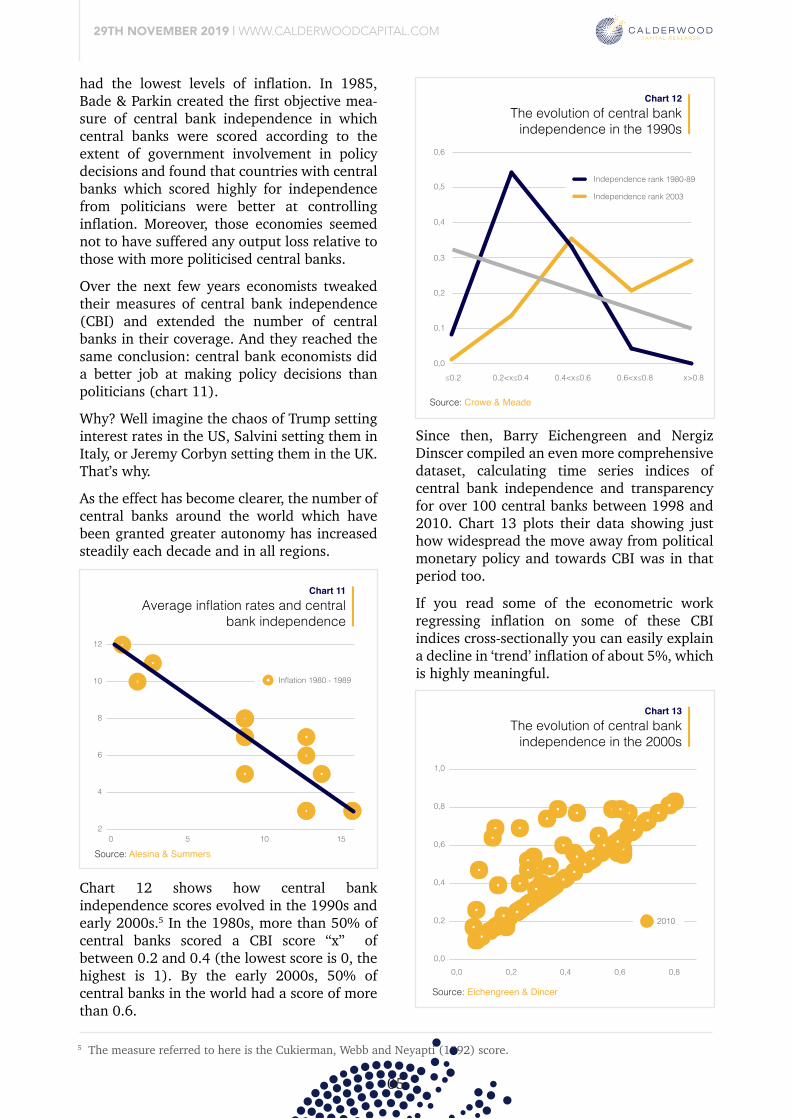
Chart 12 shows how central bank independence scores evolved in the 1990s and early 2000s.5 In the 1980s, more than 50% of central banks scored a CBI score “x” of between 0.2 and 0.4 (the lowest score is 0, the highest is 1). By the early 2000s, 50% of central banks in the world had a score of more than 0.6.
Since then, Barry Eichengreen and Nergiz Dinscer compiled an even more comprehensive dataset, calculating time series indices of central bank independence and transparency for over 100 central banks between 1998 and 2010. Chart 13 plots their data showing just how widespread the move away from political monetary policy and towards CBI was in that period too.
If you read some of the econometric work regressing inflation on some of these CBI indices cross-sectionally you can easily explain a decline in ‘trend’ inflation of about 5%, which is highly meaningful.
But it’s easier to comprehend when you understand that inflation isn’t a ‘normal’ feature of how economies work. If anything, economies are naturally deflationary, with a tendency to produce more with less over time. In other words, inflation isn’t a feature, it’s a bug. It’s a sign of economic incompetence, and removing politicians from monetary policy decisions removed much of that incompetence (there are lessons here beyond monetary policy, I’m sure).
Source: BLS
Source: BLS, Calderwood Capital
Tradable vs non-tradable inflationpast 15 years
Chart 9
Nov 04 May 07 Nov 09 May 12 Nov 14 May 17
CPI-ServicesCPI-Goods
90
120
150
Source: BLS
One profession which registers even lower in my mind than that of the professional econo-mist is the professional politician. So if there must be an interest rate setting committee in our imperfect world, I have an unequivocal preference for economists to be sitting on that committee rather than politicians (my prefer-ence remains for a denationalised system of money, but that’s another topic). Yet it wasn’t that long ago that politicians made the decisions. Central banks were sub-depart-ments of finance ministries and were expected to use their policy tools to achieve multiple policy objectives, like growth, employment and … winning the next election. Low inflation was usually a “nice to have” but not seen as a high priority (the central banks of Spain and Norway didn’t even mention inflation in their charters).
But during the inflation crisis of the 1970s, a handful of economists noticed that the few countries that had central banks which were largely independent of political influence, also
5 The measure referred to here is the Cukierman, Webb and Neyapti (1992) score.
29TH NOVEMBER 2019 | WWW.CALDERWOODCAPITAL.COM
05
had the lowest levels of inflation. In 1985, Bade & Parkin created the first objective mea-sure of central bank independence in which central banks were scored according to the extent of government involvement in policy decisions and found that countries with central banks which scored highly for independence from politicians were better at controlling inflation. Moreover, those economies seemed not to have suffered any output loss relative to those with more politicised central banks.
Over the next few years economists tweaked their measures of central bank independence (CBI) and extended the number of central banks in their coverage. And they reached the same conclusion: central bank economists did a better job at making policy decisions than politicians (chart 11). Why? Well imagine the chaos of Trump setting interest rates in the US, Salvini setting them in Italy, or Jeremy Corbyn setting them in the UK. That’s why. As the effect has become clearer, the number of central banks around the world which have been granted greater autonomy has increased steadily each decade and in all regions.
Average inflation rates and centralbank independence
Chart 11
0 5 10 152
4
6
8
10
12
Inflation 1980 - 1989
The evolution of central bankindependence in the 2000s
Chart 13
Chart 12 shows how central bank independence scores evolved in the 1990s and early 2000s.5 In the 1980s, more than 50% of central banks scored a CBI score “x” of between 0.2 and 0.4 (the lowest score is 0, the highest is 1). By the early 2000s, 50% of central banks in the world had a score of more than 0.6.
The evolution of central bankindependence in the 1990s
Chart 12
0,0
0,1
0,2
0,3
≤0.2 0.2<x≤0.4 0.4<x≤0.6 0.6<x≤0.8 x>0.8
0,4
0,5
0,6
Independence rank 1980-89
Independence rank 2003
Since then, Barry Eichengreen and Nergiz Dinscer compiled an even more comprehensive dataset, calculating time series indices of central bank independence and transparency for over 100 central banks between 1998 and 2010. Chart 13 plots their data showing just how widespread the move away from political monetary policy and towards CBI was in that period too.
If you read some of the econometric work regressing inflation on some of these CBI indices cross-sectionally you can easily explain a decline in ‘trend’ inflation of about 5%, which is highly meaningful.
0,0 0,2 0,4 0,6 0,80,0
0,2
0,4
0,6
0,8
1,0
2010
But it’s easier to comprehend when you understand that inflation isn’t a ‘normal’ feature of how economies work. If anything, economies are naturally deflationary, with a tendency to produce more with less over time. In other words, inflation isn’t a feature, it’s a bug. It’s a sign of economic incompetence, and removing politicians from monetary policy decisions removed much of that incompetence (there are lessons here beyond monetary policy, I’m sure).
Source: Alesina & Summers
Source: Crowe & Meade
Source: Eichengreen & Dincer
One profession which registers even lower in my mind than that of the professional econo-mist is the professional politician. So if there must be an interest rate setting committee in our imperfect world, I have an unequivocal preference for economists to be sitting on that committee rather than politicians (my prefer-ence remains for a denationalised system of money, but that’s another topic). Yet it wasn’t that long ago that politicians made the decisions. Central banks were sub-depart-ments of finance ministries and were expected to use their policy tools to achieve multiple policy objectives, like growth, employment and … winning the next election. Low inflation was usually a “nice to have” but not seen as a high priority (the central banks of Spain and Norway didn’t even mention inflation in their charters).
But during the inflation crisis of the 1970s, a handful of economists noticed that the few countries that had central banks which were largely independent of political influence, also
Hypothesis #5: Inflation showed up in asset prices instead
29TH NOVEMBER 2019 | WWW.CALDERWOODCAPITAL.COM
06
had the lowest levels of inflation. In 1985, Bade & Parkin created the first objective mea-sure of central bank independence in which central banks were scored according to the extent of government involvement in policy decisions and found that countries with central banks which scored highly for independence from politicians were better at controlling inflation. Moreover, those economies seemed not to have suffered any output loss relative to those with more politicised central banks.
Over the next few years economists tweaked their measures of central bank independence (CBI) and extended the number of central banks in their coverage. And they reached the same conclusion: central bank economists did a better job at making policy decisions than politicians (chart 11). Why? Well imagine the chaos of Trump setting interest rates in the US, Salvini setting them in Italy, or Jeremy Corbyn setting them in the UK. That’s why. As the effect has become clearer, the number of central banks around the world which have been granted greater autonomy has increased steadily each decade and in all regions.
Chart 12 shows how central bank independence scores evolved in the 1990s and early 2000s.5 In the 1980s, more than 50% of central banks scored a CBI score “x” of between 0.2 and 0.4 (the lowest score is 0, the highest is 1). By the early 2000s, 50% of central banks in the world had a score of more than 0.6.
Since then, Barry Eichengreen and Nergiz Dinscer compiled an even more comprehensive dataset, calculating time series indices of central bank independence and transparency for over 100 central banks between 1998 and 2010. Chart 13 plots their data showing just how widespread the move away from political monetary policy and towards CBI was in that period too.
If you read some of the econometric work regressing inflation on some of these CBI indices cross-sectionally you can easily explain a decline in ‘trend’ inflation of about 5%, which is highly meaningful.
But it’s easier to comprehend when you understand that inflation isn’t a ‘normal’ feature of how economies work. If anything, economies are naturally deflationary, with a tendency to produce more with less over time. In other words, inflation isn’t a feature, it’s a bug. It’s a sign of economic incompetence, and removing politicians from monetary policy decisions removed much of that incompetence (there are lessons here beyond monetary policy, I’m sure).
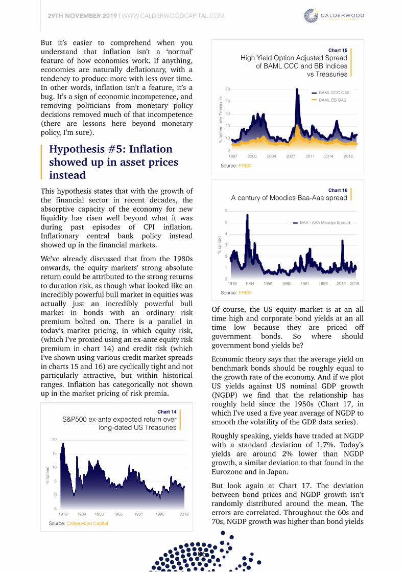
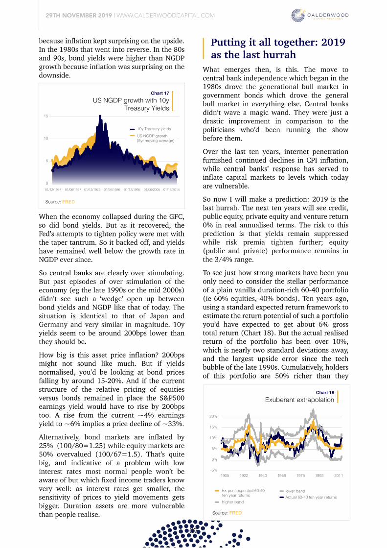
This hypothesis states that with the growth of the financial sector in recent decades, the absorptive capacity of the economy for new liquidity has risen well beyond what it was during past episodes of CPI inflation. Inflationary central bank policy instead showed up in the financial markets. We’ve already discussed that from the 1980s onwards, the equity markets’ strong absolute return could be attributed to the strong returns to duration risk, as though what looked like an incredibly powerful bull market in equities was actually just an incredibly powerful bull market in bonds with an ordinary risk premium bolted on. There is a parallel in today’s market pricing, in which equity risk, (which I’ve proxied using an ex-ante equity risk premium in chart 14) and credit risk (which I’ve shown using various credit market spreads in charts 15 and 16) are cyclically tight and not particularly attractive, but within historical ranges. Inflation has categorically not shown up in the market pricing of risk premia.
S&P500 ex-ante expected return overlong-dated US Treasuries
Chart 14
1919
% s
prea
d
1934 1950 1965 1981 1996 2012-5
0
5
10
15
20
High Yield Option Adjusted Spreadof BAML CCC and BB Indices
vs Treasuries
Chart 15
BAML CCC OASBAML BB OAS
% s
prea
d ov
er T
reas
urie
s
1997 2000 2004 2007 2011 2014 20180
10
20
30
40
50
A century of Moodies Baa-Aaa spreadChart 16
1919 1934 1950 1965 1981 1996 2012 2019
% s
prea
d
0
1
2
3
4
5
6
BAA - AAA Moodys Spread
Of course, the US equity market is at an all time high and corporate bond yields at an all time low because they are priced off government bonds. So where should government bond yields be? Economic theory says that the average yield on benchmark bonds should be roughly equal to the growth rate of the economy. And if we plot US yields against US nominal GDP growth (NGDP) we find that the relationship has roughly held since the 1950s (Chart 17, in which I’ve used a five year average of NGDP to smooth the volatility of the GDP data series).
Roughly speaking, yields have traded at NGDP with a standard deviation of 1.7%. Today’s yields are around 2% lower than NGDP growth, a similar deviation to that found in the Eurozone and in Japan. But look again at Chart 17. The deviation between bond prices and NGDP growth isn’t randomly distributed around the mean. The errors are correlated. Throughout the 60s and 70s, NGDP growth was higher than bond yields
because inflation kept surprising on the upside. In the 1980s that went into reverse. In the 80s and 90s, bond yields were higher than NGDP growth because inflation was surprising on the downside.
When the economy collapsed during the GFC, so did bond yields. But as it recovered, the Fed’s attempts to tighten policy were met with the taper tantrum. So it backed off, and yields have remained well below the growth rate in NGDP ever since. So central banks are clearly over stimulating. But past episodes of over stimulation of the economy (eg the late 1990s or the mid 2000s) didn’t see such a ‘wedge’ open up between bond yields and NGDP like that of today. The situation is identical to that of Japan and Germany and very similar in magnitude. 10y yields seem to be around 200bps lower than they should be.
How big is this asset price inflation? 200bps might not sound like much. But if yields normalised, you’d be looking at bond prices falling by around 15-20%. And if the current structure of the relative pricing of equities versus bonds remained in place the S&P500 earnings yield would have to rise by 200bps too. A rise from the current ~4% earnings yield to ~6% implies a price decline of ~33%. Alternatively, bond markets are inflated by 25% (100/80=1.25) while equity markets are 50% overvalued (100/67=1.5). That’s quite big, and indicative of a problem with low interest rates most normal people won’t be aware of but which fixed income traders know very well: as interest rates get smaller, the sensitivity of prices to yield movements gets bigger. Duration assets are more vulnerable than people realise.
Source: Calderwood Capital
Source: FRED
Source: FRED
Putting it all together: 2019 as the last hurrah
07
This hypothesis states that with the growth of the financial sector in recent decades, the absorptive capacity of the economy for new liquidity has risen well beyond what it was during past episodes of CPI inflation. Inflationary central bank policy instead showed up in the financial markets. We’ve already discussed that from the 1980s onwards, the equity markets’ strong absolute return could be attributed to the strong returns to duration risk, as though what looked like an incredibly powerful bull market in equities was actually just an incredibly powerful bull market in bonds with an ordinary risk premium bolted on. There is a parallel in today’s market pricing, in which equity risk, (which I’ve proxied using an ex-ante equity risk premium in chart 14) and credit risk (which I’ve shown using various credit market spreads in charts 15 and 16) are cyclically tight and not particularly attractive, but within historical ranges. Inflation has categorically not shown up in the market pricing of risk premia.
Of course, the US equity market is at an all time high and corporate bond yields at an all time low because they are priced off government bonds. So where should government bond yields be? Economic theory says that the average yield on benchmark bonds should be roughly equal to the growth rate of the economy. And if we plot US yields against US nominal GDP growth (NGDP) we find that the relationship has roughly held since the 1950s (Chart 17, in which I’ve used a five year average of NGDP to smooth the volatility of the GDP data series).
Roughly speaking, yields have traded at NGDP with a standard deviation of 1.7%. Today’s yields are around 2% lower than NGDP growth, a similar deviation to that found in the Eurozone and in Japan. But look again at Chart 17. The deviation between bond prices and NGDP growth isn’t randomly distributed around the mean. The errors are correlated. Throughout the 60s and 70s, NGDP growth was higher than bond yields
29TH NOVEMBER 2019 | WWW.CALDERWOODCAPITAL.COM
US NGDP growth with 10yTreasury Yields
Chart 17
15
01/12/1957 01/06/1967 01/12/1976 01/06/1986 01/12/1995 01/06/2005 01/12/2014
10
5
0
10y Treasury yieldsUS NGDP growth(5yr moving average)
because inflation kept surprising on the upside. In the 1980s that went into reverse. In the 80s and 90s, bond yields were higher than NGDP growth because inflation was surprising on the downside.
When the economy collapsed during the GFC, so did bond yields. But as it recovered, the Fed’s attempts to tighten policy were met with the taper tantrum. So it backed off, and yields have remained well below the growth rate in NGDP ever since. So central banks are clearly over stimulating. But past episodes of over stimulation of the economy (eg the late 1990s or the mid 2000s) didn’t see such a ‘wedge’ open up between bond yields and NGDP like that of today. The situation is identical to that of Japan and Germany and very similar in magnitude. 10y yields seem to be around 200bps lower than they should be.
How big is this asset price inflation? 200bps might not sound like much. But if yields normalised, you’d be looking at bond prices falling by around 15-20%. And if the current structure of the relative pricing of equities versus bonds remained in place the S&P500 earnings yield would have to rise by 200bps too. A rise from the current ~4% earnings yield to ~6% implies a price decline of ~33%. Alternatively, bond markets are inflated by 25% (100/80=1.25) while equity markets are 50% overvalued (100/67=1.5). That’s quite big, and indicative of a problem with low interest rates most normal people won’t be aware of but which fixed income traders know very well: as interest rates get smaller, the sensitivity of prices to yield movements gets bigger. Duration assets are more vulnerable than people realise.
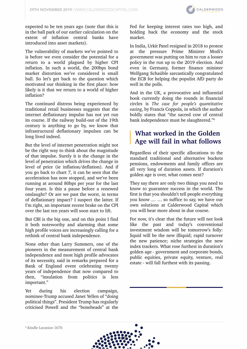
What emerges then, is this. The move to central bank independence which began in the 1980s drove the generational bull market in government bonds which drove the general bull market in everything else. Central banks didn’t wave a magic wand. They were just a drastic improvement in comparison to the politicians who’d been running the show before them. Over the last ten years, internet penetration furnished continued declines in CPI inflation, while central banks’ response has served to inflate capital markets to levels which today are vulnerable. So now I will make a prediction: 2019 is the last hurrah. The next ten years will see credit, public equity, private equity and venture return 0% in real annualised terms. The risk to this prediction is that yields remain suppressed while risk premia tighten further; equity (public and private) performance remains in the 3/4% range.
To see just how strong markets have been you only need to consider the stellar performance of a plain vanilla duration-rich 60-40 portfolio (ie 60% equities, 40% bonds). Ten years ago, using a standard expected return framework to estimate the return potential of such a portfolio you’d have expected to get about 6% gross total return (Chart 18). But the actual realised return of the portfolio has been over 10%, which is nearly two standard deviations away, and the largest upside error since the tech bubble of the late 1990s. Cumulatively, holders of this portfolio are 50% richer than they
Exuberant extrapolationChart 18
1905 1922 1940 1958 1975 1993 2011-5%
0%
5%
10%
15%
20%
Ex-post expected 60-40 ten year returnshigher band
lower bandActual 60-40 ten year returns
expected to be ten years ago (note that this is in the ball park of our earlier calculation on the extent of inflation central banks have introduced into asset markets). The vulnerability of markets we’ve pointed to is before we even consider the potential for a return to a world plagued by higher CPI inflation. In such a world, the 200bps bond market distortion we’ve considered is small ball. So let’s get back to the question which motivated our thinking in the first place: how likely is it that we return to a world of higher inflation?
The continued distress being experienced by traditional retail businesses suggests that the internet deflationary impulse has not yet run its course. If the railway build-out of the 19th century is anything to go by, we know that infrastructural deflationary impulses can be long lived indeed.
But the level of internet penetration might not be the right way to think about the magnitude of that impulse. Surely it is the change in the level of penetration which drives the change in level of price (ie inflation/deflation). And if you go back to chart 7, it can be seen that the acceleration has now stopped, and we’ve been running at around 80bps per year for the last four years. Is this a pause before a renewed onslaught? Or are we past the worst, in terms of deflationary impact? I suspect the latter. If I’m right, an important recent brake on the CPI over the last ten years will soon start to lift.
But CBI is the big one, and on this point I find it both noteworthy and alarming that some high profile voices are increasingly calling for a rethink of central bank independence. None other than Larry Summers, one of the pioneers in the measurement of central bank independence and most high profile advocates of its necessity, said in remarks prepared for a Bank of England event celebrating twenty years of independence that now compared to then, “insulation from politics is less important.”
Yet during his election campaign, nominee-Trump accused Janet Yellen of “doing political things”. President Trump has regularly criticised Powell and the “boneheads” at the
Fed for keeping interest rates too high, and holding back the economy and the stock market. In India, Urkit Patel resigned in 2018 to protest at the pressure Prime Minister Modi’s government was putting on him to run a looser policy in the run up to the 2019 election. And even in Germany, former finance minister Wolfgang Schaüble sarcastically congratulated the ECB for helping the populist AfD party do well in the polls.
And in the UK, a provocative and influential book currently doing the rounds in financial circles is The case for people’s quantitative easing, by Francis Coppola, in which the author boldly states that “the sacred cow of central bank independence must be slaughtered.”6
Source: FRED
Source: FRED
What worked in the Golden Age will fail in what follows
6 Kindle Location 1670
29TH NOVEMBER 2019 | WWW.CALDERWOODCAPITAL.COM
08
What emerges then, is this. The move to central bank independence which began in the 1980s drove the generational bull market in government bonds which drove the general bull market in everything else. Central banks didn’t wave a magic wand. They were just a drastic improvement in comparison to the politicians who’d been running the show before them. Over the last ten years, internet penetration furnished continued declines in CPI inflation, while central banks’ response has served to inflate capital markets to levels which today are vulnerable. So now I will make a prediction: 2019 is the last hurrah. The next ten years will see credit, public equity, private equity and venture return 0% in real annualised terms. The risk to this prediction is that yields remain suppressed while risk premia tighten further; equity (public and private) performance remains in the 3/4% range.
To see just how strong markets have been you only need to consider the stellar performance of a plain vanilla duration-rich 60-40 portfolio (ie 60% equities, 40% bonds). Ten years ago, using a standard expected return framework to estimate the return potential of such a portfolio you’d have expected to get about 6% gross total return (Chart 18). But the actual realised return of the portfolio has been over 10%, which is nearly two standard deviations away, and the largest upside error since the tech bubble of the late 1990s. Cumulatively, holders of this portfolio are 50% richer than they
expected to be ten years ago (note that this is in the ball park of our earlier calculation on the extent of inflation central banks have introduced into asset markets). The vulnerability of markets we’ve pointed to is before we even consider the potential for a return to a world plagued by higher CPI inflation. In such a world, the 200bps bond market distortion we’ve considered is small ball. So let’s get back to the question which motivated our thinking in the first place: how likely is it that we return to a world of higher inflation?
The continued distress being experienced by traditional retail businesses suggests that the internet deflationary impulse has not yet run its course. If the railway build-out of the 19th century is anything to go by, we know that infrastructural deflationary impulses can be long lived indeed.
But the level of internet penetration might not be the right way to think about the magnitude of that impulse. Surely it is the change in the level of penetration which drives the change in level of price (ie inflation/deflation). And if you go back to chart 7, it can be seen that the acceleration has now stopped, and we’ve been running at around 80bps per year for the last four years. Is this a pause before a renewed onslaught? Or are we past the worst, in terms of deflationary impact? I suspect the latter. If I’m right, an important recent brake on the CPI over the last ten years will soon start to lift.
But CBI is the big one, and on this point I find it both noteworthy and alarming that some high profile voices are increasingly calling for a rethink of central bank independence. None other than Larry Summers, one of the pioneers in the measurement of central bank independence and most high profile advocates of its necessity, said in remarks prepared for a Bank of England event celebrating twenty years of independence that now compared to then, “insulation from politics is less important.”
Yet during his election campaign, nominee-Trump accused Janet Yellen of “doing political things”. President Trump has regularly criticised Powell and the “boneheads” at the
Fed for keeping interest rates too high, and holding back the economy and the stock market. In India, Urkit Patel resigned in 2018 to protest at the pressure Prime Minister Modi’s government was putting on him to run a looser policy in the run up to the 2019 election. And even in Germany, former finance minister Wolfgang Schaüble sarcastically congratulated the ECB for helping the populist AfD party do well in the polls.
And in the UK, a provocative and influential book currently doing the rounds in financial circles is The case for people’s quantitative easing, by Francis Coppola, in which the author boldly states that “the sacred cow of central bank independence must be slaughtered.”6
Regardless of their specific allocations to the standard traditional and alternative buckets pensions, endowments and family offices are all very long of duration assets. If duration’s golden age is over, what comes next?
They say there are only two things you need to know to guarantee success in the world. The first is that you shouldn’t tell people everything you know … … so suffice to say, we have our own solutions at Calderwood Capital which you will hear more about in due course.
For now, it’s clear that the future will not look like the past and today’s conventional investment wisdom will be tomorrow’s folly: liquid will be the new illiquid; rapid turnover the new patience; niche strategies the new index trackers. What rose furthest in duration’s golden age - government and corporate bonds, public equities, private equity, venture, real estate - will fall furthest with its passing.
09
29TH NOVEMBER 2019 | WWW.CALDERWOODCAPITAL.COM
The coming uranium bull marketPrices can 5x from here
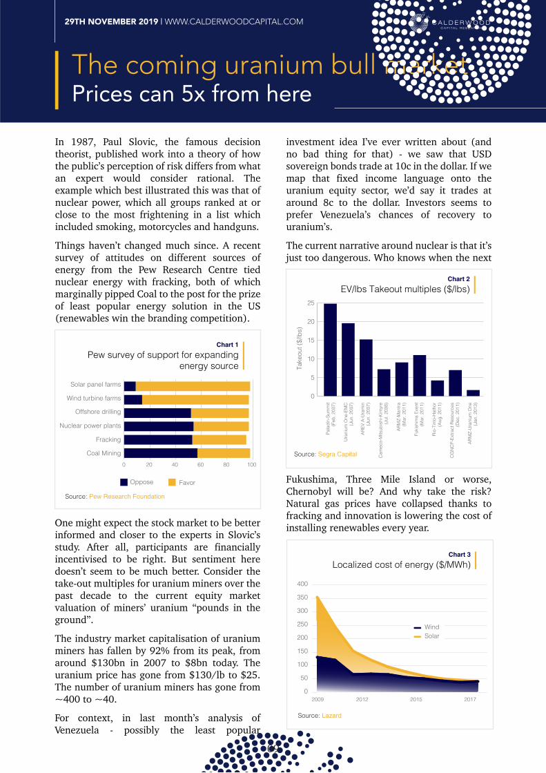
In 1987, Paul Slovic, the famous decision theorist, published work into a theory of how the public’s perception of risk differs from what an expert would consider rational. The example which best illustrated this was that of nuclear power, which all groups ranked at or close to the most frightening in a list which included smoking, motorcycles and handguns. Things haven’t changed much since. A recent survey of attitudes on different sources of energy from the Pew Research Centre tied nuclear energy with fracking, both of which marginally pipped Coal to the post for the prize of least popular energy solution in the US (renewables win the branding competition).
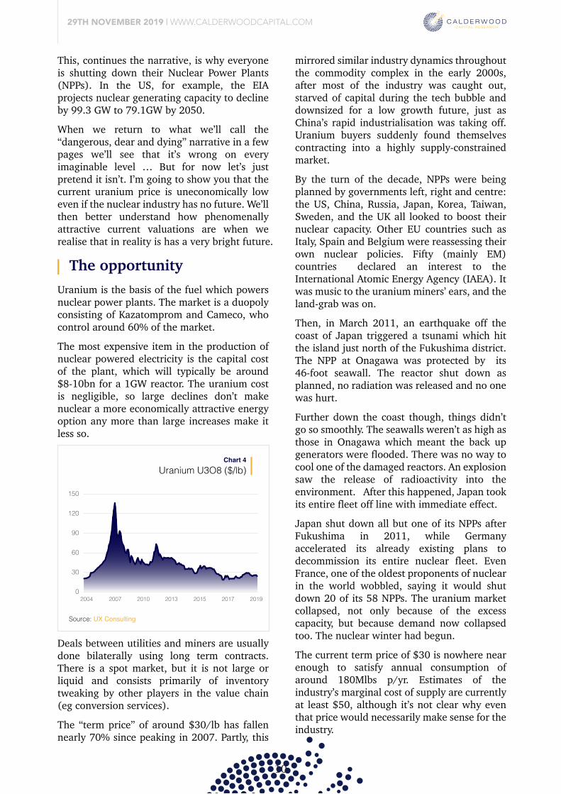
One might expect the stock market to be better informed and closer to the experts in Slovic’s study. After all, participants are financially incentivised to be right. But sentiment here doesn’t seem to be much better. Consider the take-out multiples for uranium miners over the past decade to the current equity market valuation of miners’ uranium “pounds in the ground”.
The industry market capitalisation of uranium miners has fallen by 92% from its peak, from around $130bn in 2007 to $8bn today. The uranium price has gone from $130/lb to $25. The number of uranium miners has gone from ~400 to ~40.
For context, in last month’s analysis of Venezuela - possibly the least popular
investment idea I’ve ever written about (and no bad thing for that) - we saw that USD sovereign bonds trade at 10c in the dollar. If we map that fixed income language onto the uranium equity sector, we’d say it trades at around 8c to the dollar. Investors seems to prefer Venezuela’s chances of recovery to uranium’s.
The current narrative around nuclear is that it’s just too dangerous. Who knows when the next
EV/lbs Takeout multiples ($/lbs)Chart 2
0
5
10
15
20Pa
ladi
n-Su
mm
it(F
eb. 2
007)
Ura
nium
One
-EM
C(J
un. 2
007)
AREV
A-U
ram
in(J
un. 2
007)
Cam
eco-
Mits
ubis
hi-K
inty
re(J
ul. 2
008)
ARM
Z-M
antra
(Mar
. 201
1)
ARM
Z-U
rani
um O
ne(J
an. 2
013)
Fuki
shim
a Ev
ent
(Mar
. 201
1)
Rio-
Tint
o-H
atho
r(A
ug. 2
011)
CG
NC
P-Ex
tract
Res
ourc
es(D
ec. 2
011)
25Ta
keou
t ($/
lbs)
Source: Segra Capital
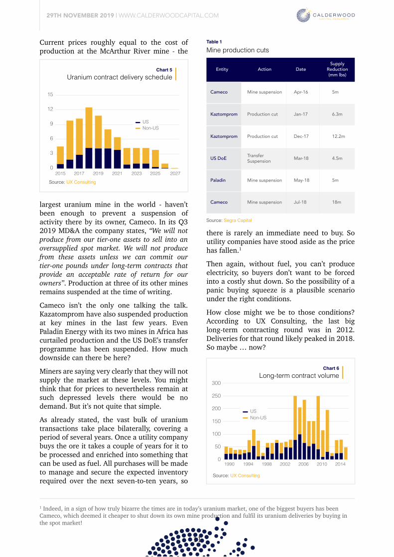
Fukushima, Three Mile Island or worse, Chernobyl will be? And why take the risk? Natural gas prices have collapsed thanks to fracking and innovation is lowering the cost of installing renewables every year.
Localized cost of energy ($/MWh)Chart 3
Source: Lazard
0
50
100
150
200
250
300
350
400
2009 2012 2015 2017
WindSolar
This, continues the narrative, is why everyone is shutting down their Nuclear Power Plants (NPPs). In the US, for example, the EIA projects nuclear generating capacity to decline by 99.3 GW to 79.1GW by 2050.
When we return to what we’ll call the “dangerous, dear and dying” narrative in a few pages we’ll see that it’s wrong on every imaginable level … But for now let’s just pretend it isn’t. I’m going to show you that the current uranium price is uneconomically low even if the nuclear industry has no future. We’ll then better understand how phenomenally attractive current valuations are when we realise that in reality is has a very bright future.
Pew survey of support for expandingenergy source
Chart 1
0
Solar panel farms
Wind turbine farms
Offshore drilling
Nuclear power plants
Fracking
Coal Mining20 40 60 80 100
Oppose Favor
Source: Pew Research Foundation
The opportunity
29TH NOVEMBER 2019 | WWW.CALDERWOODCAPITAL.COM
10
In 1987, Paul Slovic, the famous decision theorist, published work into a theory of how the public’s perception of risk differs from what an expert would consider rational. The example which best illustrated this was that of nuclear power, which all groups ranked at or close to the most frightening in a list which included smoking, motorcycles and handguns. Things haven’t changed much since. A recent survey of attitudes on different sources of energy from the Pew Research Centre tied nuclear energy with fracking, both of which marginally pipped Coal to the post for the prize of least popular energy solution in the US (renewables win the branding competition).
One might expect the stock market to be better informed and closer to the experts in Slovic’s study. After all, participants are financially incentivised to be right. But sentiment here doesn’t seem to be much better. Consider the take-out multiples for uranium miners over the past decade to the current equity market valuation of miners’ uranium “pounds in the ground”.
The industry market capitalisation of uranium miners has fallen by 92% from its peak, from around $130bn in 2007 to $8bn today. The uranium price has gone from $130/lb to $25. The number of uranium miners has gone from ~400 to ~40.
For context, in last month’s analysis of Venezuela - possibly the least popular
investment idea I’ve ever written about (and no bad thing for that) - we saw that USD sovereign bonds trade at 10c in the dollar. If we map that fixed income language onto the uranium equity sector, we’d say it trades at around 8c to the dollar. Investors seems to prefer Venezuela’s chances of recovery to uranium’s.
The current narrative around nuclear is that it’s just too dangerous. Who knows when the next
Fukushima, Three Mile Island or worse, Chernobyl will be? And why take the risk? Natural gas prices have collapsed thanks to fracking and innovation is lowering the cost of installing renewables every year.
This, continues the narrative, is why everyone is shutting down their Nuclear Power Plants (NPPs). In the US, for example, the EIA projects nuclear generating capacity to decline by 99.3 GW to 79.1GW by 2050.
When we return to what we’ll call the “dangerous, dear and dying” narrative in a few pages we’ll see that it’s wrong on every imaginable level … But for now let’s just pretend it isn’t. I’m going to show you that the current uranium price is uneconomically low even if the nuclear industry has no future. We’ll then better understand how phenomenally attractive current valuations are when we realise that in reality is has a very bright future.
Uranium is the basis of the fuel which powers nuclear power plants. The market is a duopoly consisting of Kazatomprom and Cameco, who control around 60% of the market. The most expensive item in the production of nuclear powered electricity is the capital cost of the plant, which will typically be around $8-10bn for a 1GW reactor. The uranium cost is negligible, so large declines don’t make nuclear a more economically attractive energy option any more than large increases make it less so.
Uranium U3O8 ($/lb)Chart 4
Source: UX Consulting
0
30
60
90
120
150
2004 2007 2010 2013 2015 2017 2019
Deals between utilities and miners are usually done bilaterally using long term contracts. There is a spot market, but it is not large or liquid and consists primarily of inventory tweaking by other players in the value chain (eg conversion services).
The “term price” of around $30/lb has fallen nearly 70% since peaking in 2007. Partly, this
mirrored similar industry dynamics throughout the commodity complex in the early 2000s, after most of the industry was caught out, starved of capital during the tech bubble and downsized for a low growth future, just as China’s rapid industrialisation was taking off. Uranium buyers suddenly found themselves contracting into a highly supply-constrained market. By the turn of the decade, NPPs were being planned by governments left, right and centre: the US, China, Russia, Japan, Korea, Taiwan, Sweden, and the UK all looked to boost their nuclear capacity. Other EU countries such as Italy, Spain and Belgium were reassessing their own nuclear policies. Fifty (mainly EM) countries declared an interest to the International Atomic Energy Agency (IAEA). It was music to the uranium miners’ ears, and the land-grab was on.
Then, in March 2011, an earthquake off the coast of Japan triggered a tsunami which hit the island just north of the Fukushima district. The NPP at Onagawa was protected by its 46-foot seawall. The reactor shut down as planned, no radiation was released and no one was hurt.
Further down the coast though, things didn’t go so smoothly. The seawalls weren’t as high as those in Onagawa which meant the back up generators were flooded. There was no way to cool one of the damaged reactors. An explosion saw the release of radioactivity into the environment. After this happened, Japan took its entire fleet off line with immediate effect. Japan shut down all but one of its NPPs after Fukushima in 2011, while Germany accelerated its already existing plans to decommission its entire nuclear fleet. Even France, one of the oldest proponents of nuclear in the world wobbled, saying it would shut down 20 of its 58 NPPs. The uranium market collapsed, not only because of the excess capacity, but because demand now collapsed too. The nuclear winter had begun.
The current term price of $30 is nowhere near enough to satisfy annual consumption of around 180Mlbs p/yr. Estimates of the industry’s marginal cost of supply are currently at least $50, although it’s not clear why even that price would necessarily make sense for the industry.
Current prices roughly equal to the cost of production at the McArthur River mine - the
largest uranium mine in the world - haven’t been enough to prevent a suspension of activity there by its owner, Cameco. In its Q3 2019 MD&A the company states, “We will not produce from our tier-one assets to sell into an oversupplied spot market. We will not produce from these assets unless we can commit our tier-one pounds under long-term contracts that provide an acceptable rate of return for our owners”. Production at three of its other mines remains suspended at the time of writing.
Cameco isn’t the only one talking the talk. Kazatomprom have also suspended production at key mines in the last few years. Even Paladin Energy with its two mines in Africa has curtailed production and the US DoE’s transfer programme has been suspended. How much downside can there be here?
Miners are saying very clearly that they will not supply the market at these levels. You might think that for prices to nevertheless remain at such depressed levels there would be no demand. But it’s not quite that simple.
As already stated, the vast bulk of uranium transactions take place bilaterally, covering a period of several years. Once a utility company buys the ore it takes a couple of years for it to be processed and enriched into something that can be used as fuel. All purchases will be made to manage and secure the expected inventory required over the next seven-to-ten years, so
there is rarely an immediate need to buy. So utility companies have stood aside as the price has fallen.1
Then again, without fuel, you can’t produce electricity, so buyers don’t want to be forced into a costly shut down. So the possibility of a panic buying squeeze is a plausible scenario under the right conditions.
How close might we be to those conditions? According to UX Consulting, the last big long-term contracting round was in 2012. Deliveries for that round likely peaked in 2018. So maybe … now?
It’s even possible that we’ve already seen the canary in the coal mine in other parts of the value chain. The processing and enrichment players followed a similar cycle to the miners: building out too much processing capacity in a fit of collective overexcitement, just as Fukushima forced a rethink of nuclear power and a collapse in demand. The market for conversion services was suddenly badly oversupplied and the prices cratered, bottoming at $5/lb in 2017.
Since then though, a large conversion facility in the US shut down, bemoaning the uneconomic environment. Prices have risen by a factor of four. And this has done so without any nuclear renaissance. Why will the uranium prices be any different? If prices make new highs we’ll be looking at around 5x from current levels. So far, so tantalisingly asymmetric. So let’s now zoom out a bit, and go back to where we started, which was the “nuclear has no future” narrative. Remember? Nuclear is dangerous and uncompetitive given the collapse in the cost of renewable generation, which is why the world is gradually turning off its nuclear plants? Right? Wrong.
29TH NOVEMBER 2019 | WWW.CALDERWOODCAPITAL.COM
1 Indeed, in a sign of how truly bizarre the times are in today’s uranium market, one of the biggest buyers has been Cameco, which deemed it cheaper to shut down its own mine production and fulfil its uranium deliveries by buying in the spot market!
11
Uranium is the basis of the fuel which powers nuclear power plants. The market is a duopoly consisting of Kazatomprom and Cameco, who control around 60% of the market. The most expensive item in the production of nuclear powered electricity is the capital cost of the plant, which will typically be around $8-10bn for a 1GW reactor. The uranium cost is negligible, so large declines don’t make nuclear a more economically attractive energy option any more than large increases make it less so.
Mine production cutsTable 1
Deals between utilities and miners are usually done bilaterally using long term contracts. There is a spot market, but it is not large or liquid and consists primarily of inventory tweaking by other players in the value chain (eg conversion services).
The “term price” of around $30/lb has fallen nearly 70% since peaking in 2007. Partly, this
mirrored similar industry dynamics throughout the commodity complex in the early 2000s, after most of the industry was caught out, starved of capital during the tech bubble and downsized for a low growth future, just as China’s rapid industrialisation was taking off. Uranium buyers suddenly found themselves contracting into a highly supply-constrained market. By the turn of the decade, NPPs were being planned by governments left, right and centre: the US, China, Russia, Japan, Korea, Taiwan, Sweden, and the UK all looked to boost their nuclear capacity. Other EU countries such as Italy, Spain and Belgium were reassessing their own nuclear policies. Fifty (mainly EM) countries declared an interest to the International Atomic Energy Agency (IAEA). It was music to the uranium miners’ ears, and the land-grab was on.
Then, in March 2011, an earthquake off the coast of Japan triggered a tsunami which hit the island just north of the Fukushima district. The NPP at Onagawa was protected by its 46-foot seawall. The reactor shut down as planned, no radiation was released and no one was hurt.
Further down the coast though, things didn’t go so smoothly. The seawalls weren’t as high as those in Onagawa which meant the back up generators were flooded. There was no way to cool one of the damaged reactors. An explosion saw the release of radioactivity into the environment. After this happened, Japan took its entire fleet off line with immediate effect. Japan shut down all but one of its NPPs after Fukushima in 2011, while Germany accelerated its already existing plans to decommission its entire nuclear fleet. Even France, one of the oldest proponents of nuclear in the world wobbled, saying it would shut down 20 of its 58 NPPs. The uranium market collapsed, not only because of the excess capacity, but because demand now collapsed too. The nuclear winter had begun.
The current term price of $30 is nowhere near enough to satisfy annual consumption of around 180Mlbs p/yr. Estimates of the industry’s marginal cost of supply are currently at least $50, although it’s not clear why even that price would necessarily make sense for the industry.
Uranium contract delivery scheduleChart 5
0
3
6
9
12
15
2015 2017 2019 2021 2023 2025 2027
USNon-US
Current prices roughly equal to the cost of production at the McArthur River mine - the
largest uranium mine in the world - haven’t been enough to prevent a suspension of activity there by its owner, Cameco. In its Q3 2019 MD&A the company states, “We will not produce from our tier-one assets to sell into an oversupplied spot market. We will not produce from these assets unless we can commit our tier-one pounds under long-term contracts that provide an acceptable rate of return for our owners”. Production at three of its other mines remains suspended at the time of writing.
Cameco isn’t the only one talking the talk. Kazatomprom have also suspended production at key mines in the last few years. Even Paladin Energy with its two mines in Africa has curtailed production and the US DoE’s transfer programme has been suspended. How much downside can there be here?
Miners are saying very clearly that they will not supply the market at these levels. You might think that for prices to nevertheless remain at such depressed levels there would be no demand. But it’s not quite that simple.
As already stated, the vast bulk of uranium transactions take place bilaterally, covering a period of several years. Once a utility company buys the ore it takes a couple of years for it to be processed and enriched into something that can be used as fuel. All purchases will be made to manage and secure the expected inventory required over the next seven-to-ten years, so
Entity Action DateSupply
Reduction(mm lbs)
Cameco Mine suspension Apr-16 5m
Kaztomprom Production cut Jan-17 6.3m
Kaztomprom Production cut Dec-17 12.2m
US DoE TransferSuspension Mar-18 4.5m
Paladin Mine suspension May-18 5m
Cameco Mine suspension Jul-18 18m
Source: Segra Capital
there is rarely an immediate need to buy. So utility companies have stood aside as the price has fallen.1
Then again, without fuel, you can’t produce electricity, so buyers don’t want to be forced into a costly shut down. So the possibility of a panic buying squeeze is a plausible scenario under the right conditions.
How close might we be to those conditions? According to UX Consulting, the last big long-term contracting round was in 2012. Deliveries for that round likely peaked in 2018. So maybe … now?
It’s even possible that we’ve already seen the canary in the coal mine in other parts of the value chain. The processing and enrichment players followed a similar cycle to the miners: building out too much processing capacity in a fit of collective overexcitement, just as Fukushima forced a rethink of nuclear power and a collapse in demand. The market for conversion services was suddenly badly oversupplied and the prices cratered, bottoming at $5/lb in 2017.
Since then though, a large conversion facility in the US shut down, bemoaning the uneconomic environment. Prices have risen by a factor of four. And this has done so without any nuclear renaissance. Why will the uranium prices be any different? If prices make new highs we’ll be looking at around 5x from current levels. So far, so tantalisingly asymmetric. So let’s now zoom out a bit, and go back to where we started, which was the “nuclear has no future” narrative. Remember? Nuclear is dangerous and uncompetitive given the collapse in the cost of renewable generation, which is why the world is gradually turning off its nuclear plants? Right? Wrong.
Long-term contract volumeChart 6
0
50
100
150
200
250
300
1990 1994 1998 2002 2006 2010 2014
USNon-US
Source: UX Consulting
Source: UX Consulting
The coming nuclear renaissance
29TH NOVEMBER 2019 | WWW.CALDERWOODCAPITAL.COM
12
Uranium is the basis of the fuel which powers nuclear power plants. The market is a duopoly consisting of Kazatomprom and Cameco, who control around 60% of the market. The most expensive item in the production of nuclear powered electricity is the capital cost of the plant, which will typically be around $8-10bn for a 1GW reactor. The uranium cost is negligible, so large declines don’t make nuclear a more economically attractive energy option any more than large increases make it less so.
Price of conversion Services ($/lb)Chart 7
Deals between utilities and miners are usually done bilaterally using long term contracts. There is a spot market, but it is not large or liquid and consists primarily of inventory tweaking by other players in the value chain (eg conversion services).
The “term price” of around $30/lb has fallen nearly 70% since peaking in 2007. Partly, this
mirrored similar industry dynamics throughout the commodity complex in the early 2000s, after most of the industry was caught out, starved of capital during the tech bubble and downsized for a low growth future, just as China’s rapid industrialisation was taking off. Uranium buyers suddenly found themselves contracting into a highly supply-constrained market. By the turn of the decade, NPPs were being planned by governments left, right and centre: the US, China, Russia, Japan, Korea, Taiwan, Sweden, and the UK all looked to boost their nuclear capacity. Other EU countries such as Italy, Spain and Belgium were reassessing their own nuclear policies. Fifty (mainly EM) countries declared an interest to the International Atomic Energy Agency (IAEA). It was music to the uranium miners’ ears, and the land-grab was on.
Then, in March 2011, an earthquake off the coast of Japan triggered a tsunami which hit the island just north of the Fukushima district. The NPP at Onagawa was protected by its 46-foot seawall. The reactor shut down as planned, no radiation was released and no one was hurt.
Further down the coast though, things didn’t go so smoothly. The seawalls weren’t as high as those in Onagawa which meant the back up generators were flooded. There was no way to cool one of the damaged reactors. An explosion saw the release of radioactivity into the environment. After this happened, Japan took its entire fleet off line with immediate effect. Japan shut down all but one of its NPPs after Fukushima in 2011, while Germany accelerated its already existing plans to decommission its entire nuclear fleet. Even France, one of the oldest proponents of nuclear in the world wobbled, saying it would shut down 20 of its 58 NPPs. The uranium market collapsed, not only because of the excess capacity, but because demand now collapsed too. The nuclear winter had begun.
The current term price of $30 is nowhere near enough to satisfy annual consumption of around 180Mlbs p/yr. Estimates of the industry’s marginal cost of supply are currently at least $50, although it’s not clear why even that price would necessarily make sense for the industry.
Current prices roughly equal to the cost of production at the McArthur River mine - the
largest uranium mine in the world - haven’t been enough to prevent a suspension of activity there by its owner, Cameco. In its Q3 2019 MD&A the company states, “We will not produce from our tier-one assets to sell into an oversupplied spot market. We will not produce from these assets unless we can commit our tier-one pounds under long-term contracts that provide an acceptable rate of return for our owners”. Production at three of its other mines remains suspended at the time of writing.
Cameco isn’t the only one talking the talk. Kazatomprom have also suspended production at key mines in the last few years. Even Paladin Energy with its two mines in Africa has curtailed production and the US DoE’s transfer programme has been suspended. How much downside can there be here?
Miners are saying very clearly that they will not supply the market at these levels. You might think that for prices to nevertheless remain at such depressed levels there would be no demand. But it’s not quite that simple.
As already stated, the vast bulk of uranium transactions take place bilaterally, covering a period of several years. Once a utility company buys the ore it takes a couple of years for it to be processed and enriched into something that can be used as fuel. All purchases will be made to manage and secure the expected inventory required over the next seven-to-ten years, so
Source: UX Consulting
there is rarely an immediate need to buy. So utility companies have stood aside as the price has fallen.1
Then again, without fuel, you can’t produce electricity, so buyers don’t want to be forced into a costly shut down. So the possibility of a panic buying squeeze is a plausible scenario under the right conditions.
How close might we be to those conditions? According to UX Consulting, the last big long-term contracting round was in 2012. Deliveries for that round likely peaked in 2018. So maybe … now?
0
5
10
15
20
25
2004 2006 2008 2010 2012 2014 2016 2018
It’s even possible that we’ve already seen the canary in the coal mine in other parts of the value chain. The processing and enrichment players followed a similar cycle to the miners: building out too much processing capacity in a fit of collective overexcitement, just as Fukushima forced a rethink of nuclear power and a collapse in demand. The market for conversion services was suddenly badly oversupplied and the prices cratered, bottoming at $5/lb in 2017.
Since then though, a large conversion facility in the US shut down, bemoaning the uneconomic environment. Prices have risen by a factor of four. And this has done so without any nuclear renaissance. Why will the uranium prices be any different? If prices make new highs we’ll be looking at around 5x from current levels. So far, so tantalisingly asymmetric. So let’s now zoom out a bit, and go back to where we started, which was the “nuclear has no future” narrative. Remember? Nuclear is dangerous and uncompetitive given the collapse in the cost of renewable generation, which is why the world is gradually turning off its nuclear plants? Right? Wrong.
Let’s start with the supposedly growing cheapness of renewables, and note that it’s true the unit cost of solar and wind have fallen sharply over the past ten years, as we already saw in chart 3. The problem is that those lower solar and wind unit costs haven’t translated into lower electricity prices for the countries that have used them.
The problem isn’t related to the cost of the units but their fundamental unreliability. For example, in 2015 and 2016 Germany added 10% more wind capacity but only generated 1% more electricity from wind, because it wasn’t very windy in those years.
Germany’s electricity prices sincerelying on renewables
Chart 8
20
25
30
35
2010 2011 2013 2014 2016 2017 20190
9
18
27
36
German electricity price (c/Kwh)Solar & wind as % of German grid (rhs)
Source: AGEB
Solar, obviously, can only generate electricity when the sun shines. So for most of the year during the morning and evenings, which is peak electricity demand, the supply of solar disappears. During the daytime the opposite happens. Demand is low but sun is abundant, so prices crash. Indeed, on very sunny days solar can overproduce to such an extent that prices go negative.
These intermittency problems put the German grid under significant pressure in 2017 as the country integrated more wind and solar (7% and 12% respectively). More than one hundred times that year electricity prices went negative during the day, as operators had to pay large buyers (usually in neighbouring countries) as much as 6cents/kWh to avoid overloading the grid (standard electricity prices internationally are around 10cents/kWh). This is obviously a huge cost for the operators, which ultimately shows up in the price end-consumers have to pay. Similar types of problems have been encountered in California, which with 10% solar generation has had to offload electricity to Arizona and in China, which has had to vent (“curtail”) coal-produced electricity to give priority on the grid to that created by suddenly strong wind. You might think that batteries would be the solution here, and you’d be right. Except it’s a very, very distant solution. Bill Gates has invested over $1bn into renewables. He said in 2015, “There’s no battery technology that’s even close to allowing us to take all of our energy from renewables and be able to use battery storage in order to deal not only with the 24-hour cycle but also with long periods of time where it’s cloudy and you don’t have sun, or you don’t have wind.”2
In passing, it’s also worth noting that in spite of this growth in renewables, German carbon
emissions have not fallen, being almost exactly the same today as they were ten years ago. Renewables are a welcome and necessary addition. But they are fundamentally ill equipped to be more than 10-15% of most grids. For baseload, which needs to be available for the surges there are only three possibilities: coal, natural gas and nuclear. If you buy into the climate science the need for less polluting electricity generation is obvious. For those of you who think it’s all a hoax (you’re wrong by the way, but that's not the topic here), it’s hard to argue against coal being filthy and carcinogenic. Pollution in major EM cities caused by the burning of coal is becoming both a health and a political issue for this reason. A less polluting source of electricity is desirable for that reason alone. Natural gas is of course cleaner, and dumps only half as much carbon into the atmosphere. But it’s not actually that cheap outside of the US. In China, for example, nuclear is cheaper than gas (0.42RMB/kWh vs 0.57RMB/kWh), and nearly competitive with thermal coal (0.3584RMB/kWh)3. It’s important to highlight that there’s an unknown emerging around natural gas: the leaking of unburned methane, a green house gas that's 80x more potent than carbon dioxide. So, a 1% leak from a natural gas facility would make natural gas dirtier than coal.4 Anyway, nuclear is 100% carbon free, and completely clean.
“Except for the accidents!", you’re probably thinking …
Depending on where you live and how old you are, the nuclear disasters most vivid in the human imagination are Chernobyl in the former Soviet Union, Three Mile Island in the US, and Fukushima in Japan. And it might surprise you to know that in Three Mile Island and Fukushima, the problem wasn’t so much the accident, but our panicked response to it.
According to the UN’s World Health Organisation, the number of fatalities at Fukushima caused by direct radioactive exposure, or likely to die later of cancer caused by exposure, was estimated to be … zero. It was the tsunami, followed by the panicked
evacuation, which killed 18,000 people and caused the damage. According to Tetsuya Ohira, an oncologist at the Fukushima Medical University:
“Evacuation of the inpatients and elderly residents of nursing care facilities was hurriedly carried out by buses shortly after the accident. No medical personnel accompanied the evacuees who were laid down on the seats of the jam-packed buses with full protective suits on. No medical care, even food or water, was provided for many hours during the evacuation. As a result, scores of patients died in an evacuation that was supposedly intended to minimise radiation exposure. The life-threatening risk to these people was not radiation, but discontinuation of daily medical care. A recent study indicated that the severe health risk associated with the rapid evacuation of elderly residents from nursing care facilities after the Fukushima accident was 30 times higher than the radiation risk of the reference levels for evacuation that are recommended by the International Committee for Radiological Protection.”5
The problems caused by the Three Mile Island accident were very similar. When the reactor
partially melted down the container actually worked! No radiation leaked into the surrounding area! The problem, again, was the panic.
The pioneering behavioural psychologist Paul Slovic, mentioned in the introduction, had this to say about the incident:
“…the accident at the Three Mile Island (TMI) nuclear reactor in 1979 provides a dramatic demonstration that factors besides injury, death, and property damage impose serious costs. Despite the fact that not a single person died, and few if any latent cancer fatalities are expected, no other accident in our history has produced such costly societal impacts. The accident at TMI devastated the utility that owned and operated the plant. It also imposed enormous costs on the nuclear industry and on society, through stricter regulation (resulting in increased construction and operation costs), reduced operation of reactors worldwide, greater public opposition to nuclear power, and reliance on more expensive energy sources.”6
Chernobyl was different. Radioactive materials leaked and people died. But how many? The majority of the initial casualties were to those working on the site, or sent to the immediate scene to help in the effort to extinguish the fire. We don’t know how many of the 1,000 or so initial workers died of radiation exposure, but let’s assume the worst and say that all of them died. Ultimately, it’s been estimated that about
600,000 people were registered as emergency recovery workers, and 5,000,000 were inhabitants of designated “contaminated areas”. Of these last figures, virtually none were exposed to any more radiation than background levels, and most suffered less exposure to radiation than a person living high up in a mountain range, where background radiation is higher.
There was an effect on small children who had drunk milk containing radioactive iodine produced by cows eating contaminated grass in the immediate aftermath of the explosion. The thyroids develop quickly in young children and exposure to radioactivity was lethal. By 2002, the exposure had caused 4,000 cases of Thyroid cancer in people who had been children during the accident.
But Soviet political culture was not one of transparent accountability. It was more one of blame avoidance (the consequences of big mistakes could be literally life-threatening) and the slow response of the authorities was therefore partly responsible. In towns where stable iodine was quickly distributed, such as Pripyat close to the plant, the problems were reduced.
Moreover, the Chernobyl model wasn’t even remotely similar to today’s reactors, missing essential features like … a container … so one should be careful with the comparison.
Contrary to expectations, the biodiversity of the wildlife since the accident has not only recovered but flourished, notwithstanding the fallout, and according to the UN, the area is today perfectly inhabitable. The number of cancer cases in the overall population caused by the accident is “difficult to detect.”7
There may have been as many as 5,000 killed by the Chernobyl disaster, which unlike Three Mile Island was a disaster. But 5,000 is roughly how many coal miners died in one year (2006), in one country (China). Moreover, Chernobyl was and is the very worst nuclear power accident which has ever been experienced. In Henan in 1975 the Shinantan Dam burst during a typhoon, killing 171,000 people. Yet few think that good enough reason to cease hydro production.
The current term price of
$30 is nowhere near
enough to satisfy annual
consumption of around
180Mlbs p/yr. Estimates
of the industry’s marginal
cost of supply are
currently at least $50,
although it’s not clear why
even that price would
necessarily make sense
for the industry.
You may well be wondering why, if nuclear is so clean and safe and cheap, the world is scaling back its nuclear ambitions. Well, the answer is … it isn’t.
It may be the case that we pay too much attention to what the US and Germany are doing, extrapolating that into some kind of proxy for what “the world” is doing. Or it may be that we’re just not paying attention. France never did shut down any NPPs, while Japan is bringing its NPPs back on line. More importantly, China is as serious as it ever was, as are Russia and India (note, China’s planned build of nearly 200 NPPs should be seen in the context of a global fleet of 450).
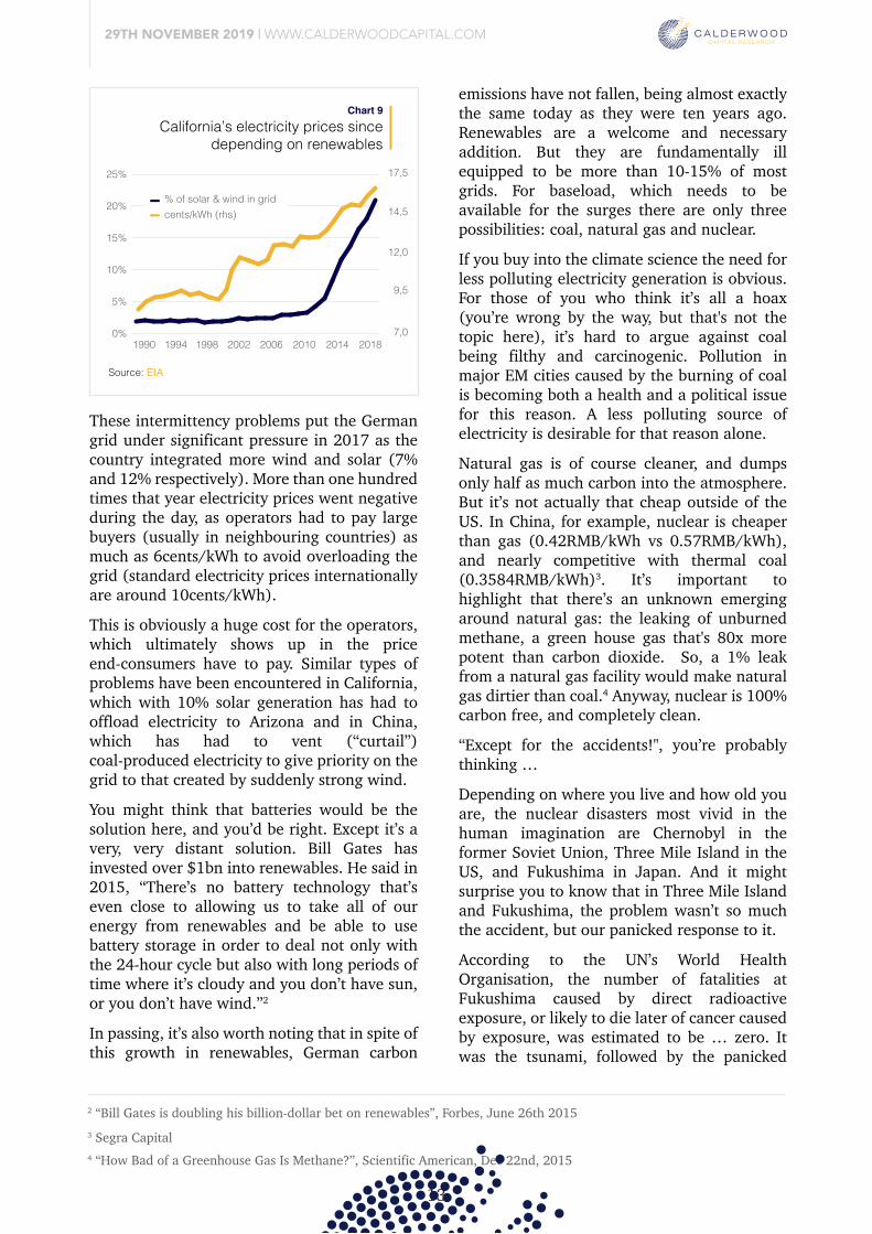
29TH NOVEMBER 2019 | WWW.CALDERWOODCAPITAL.COM
4 “How Bad of a Greenhouse Gas Is Methane?”, Scientific American, Dec 22nd, 2015
3 Segra Capital
2 “Bill Gates is doubling his billion-dollar bet on renewables”, Forbes, June 26th 2015
13
Let’s start with the supposedly growing cheapness of renewables, and note that it’s true the unit cost of solar and wind have fallen sharply over the past ten years, as we already saw in chart 3. The problem is that those lower solar and wind unit costs haven’t translated into lower electricity prices for the countries that have used them.
The problem isn’t related to the cost of the units but their fundamental unreliability. For example, in 2015 and 2016 Germany added 10% more wind capacity but only generated 1% more electricity from wind, because it wasn’t very windy in those years.
California’s electricity prices sincedepending on renewables
Chart 9
Source: EIA
Solar, obviously, can only generate electricity when the sun shines. So for most of the year during the morning and evenings, which is peak electricity demand, the supply of solar disappears. During the daytime the opposite happens. Demand is low but sun is abundant, so prices crash. Indeed, on very sunny days solar can overproduce to such an extent that prices go negative.
1990 1994 1998 2002 2006 2010 2014 20180%
5%
10%
15%
20%
25%
7,0
12,0
14,5
9,5
17,5
% of solar & wind in gridcents/kWh (rhs)
These intermittency problems put the German grid under significant pressure in 2017 as the country integrated more wind and solar (7% and 12% respectively). More than one hundred times that year electricity prices went negative during the day, as operators had to pay large buyers (usually in neighbouring countries) as much as 6cents/kWh to avoid overloading the grid (standard electricity prices internationally are around 10cents/kWh). This is obviously a huge cost for the operators, which ultimately shows up in the price end-consumers have to pay. Similar types of problems have been encountered in California, which with 10% solar generation has had to offload electricity to Arizona and in China, which has had to vent (“curtail”) coal-produced electricity to give priority on the grid to that created by suddenly strong wind. You might think that batteries would be the solution here, and you’d be right. Except it’s a very, very distant solution. Bill Gates has invested over $1bn into renewables. He said in 2015, “There’s no battery technology that’s even close to allowing us to take all of our energy from renewables and be able to use battery storage in order to deal not only with the 24-hour cycle but also with long periods of time where it’s cloudy and you don’t have sun, or you don’t have wind.”2
In passing, it’s also worth noting that in spite of this growth in renewables, German carbon
emissions have not fallen, being almost exactly the same today as they were ten years ago. Renewables are a welcome and necessary addition. But they are fundamentally ill equipped to be more than 10-15% of most grids. For baseload, which needs to be available for the surges there are only three possibilities: coal, natural gas and nuclear. If you buy into the climate science the need for less polluting electricity generation is obvious. For those of you who think it’s all a hoax (you’re wrong by the way, but that's not the topic here), it’s hard to argue against coal being filthy and carcinogenic. Pollution in major EM cities caused by the burning of coal is becoming both a health and a political issue for this reason. A less polluting source of electricity is desirable for that reason alone. Natural gas is of course cleaner, and dumps only half as much carbon into the atmosphere. But it’s not actually that cheap outside of the US. In China, for example, nuclear is cheaper than gas (0.42RMB/kWh vs 0.57RMB/kWh), and nearly competitive with thermal coal (0.3584RMB/kWh)3. It’s important to highlight that there’s an unknown emerging around natural gas: the leaking of unburned methane, a green house gas that's 80x more potent than carbon dioxide. So, a 1% leak from a natural gas facility would make natural gas dirtier than coal.4 Anyway, nuclear is 100% carbon free, and completely clean.
“Except for the accidents!", you’re probably thinking …
Depending on where you live and how old you are, the nuclear disasters most vivid in the human imagination are Chernobyl in the former Soviet Union, Three Mile Island in the US, and Fukushima in Japan. And it might surprise you to know that in Three Mile Island and Fukushima, the problem wasn’t so much the accident, but our panicked response to it.
According to the UN’s World Health Organisation, the number of fatalities at Fukushima caused by direct radioactive exposure, or likely to die later of cancer caused by exposure, was estimated to be … zero. It was the tsunami, followed by the panicked
evacuation, which killed 18,000 people and caused the damage. According to Tetsuya Ohira, an oncologist at the Fukushima Medical University:
“Evacuation of the inpatients and elderly residents of nursing care facilities was hurriedly carried out by buses shortly after the accident. No medical personnel accompanied the evacuees who were laid down on the seats of the jam-packed buses with full protective suits on. No medical care, even food or water, was provided for many hours during the evacuation. As a result, scores of patients died in an evacuation that was supposedly intended to minimise radiation exposure. The life-threatening risk to these people was not radiation, but discontinuation of daily medical care. A recent study indicated that the severe health risk associated with the rapid evacuation of elderly residents from nursing care facilities after the Fukushima accident was 30 times higher than the radiation risk of the reference levels for evacuation that are recommended by the International Committee for Radiological Protection.”5
The problems caused by the Three Mile Island accident were very similar. When the reactor
partially melted down the container actually worked! No radiation leaked into the surrounding area! The problem, again, was the panic.
The pioneering behavioural psychologist Paul Slovic, mentioned in the introduction, had this to say about the incident:
“…the accident at the Three Mile Island (TMI) nuclear reactor in 1979 provides a dramatic demonstration that factors besides injury, death, and property damage impose serious costs. Despite the fact that not a single person died, and few if any latent cancer fatalities are expected, no other accident in our history has produced such costly societal impacts. The accident at TMI devastated the utility that owned and operated the plant. It also imposed enormous costs on the nuclear industry and on society, through stricter regulation (resulting in increased construction and operation costs), reduced operation of reactors worldwide, greater public opposition to nuclear power, and reliance on more expensive energy sources.”6
Chernobyl was different. Radioactive materials leaked and people died. But how many? The majority of the initial casualties were to those working on the site, or sent to the immediate scene to help in the effort to extinguish the fire. We don’t know how many of the 1,000 or so initial workers died of radiation exposure, but let’s assume the worst and say that all of them died. Ultimately, it’s been estimated that about
600,000 people were registered as emergency recovery workers, and 5,000,000 were inhabitants of designated “contaminated areas”. Of these last figures, virtually none were exposed to any more radiation than background levels, and most suffered less exposure to radiation than a person living high up in a mountain range, where background radiation is higher.
There was an effect on small children who had drunk milk containing radioactive iodine produced by cows eating contaminated grass in the immediate aftermath of the explosion. The thyroids develop quickly in young children and exposure to radioactivity was lethal. By 2002, the exposure had caused 4,000 cases of Thyroid cancer in people who had been children during the accident.
But Soviet political culture was not one of transparent accountability. It was more one of blame avoidance (the consequences of big mistakes could be literally life-threatening) and the slow response of the authorities was therefore partly responsible. In towns where stable iodine was quickly distributed, such as Pripyat close to the plant, the problems were reduced.
Moreover, the Chernobyl model wasn’t even remotely similar to today’s reactors, missing essential features like … a container … so one should be careful with the comparison.
Contrary to expectations, the biodiversity of the wildlife since the accident has not only recovered but flourished, notwithstanding the fallout, and according to the UN, the area is today perfectly inhabitable. The number of cancer cases in the overall population caused by the accident is “difficult to detect.”7
There may have been as many as 5,000 killed by the Chernobyl disaster, which unlike Three Mile Island was a disaster. But 5,000 is roughly how many coal miners died in one year (2006), in one country (China). Moreover, Chernobyl was and is the very worst nuclear power accident which has ever been experienced. In Henan in 1975 the Shinantan Dam burst during a typhoon, killing 171,000 people. Yet few think that good enough reason to cease hydro production.
You may well be wondering why, if nuclear is so clean and safe and cheap, the world is scaling back its nuclear ambitions. Well, the answer is … it isn’t.
It may be the case that we pay too much attention to what the US and Germany are doing, extrapolating that into some kind of proxy for what “the world” is doing. Or it may be that we’re just not paying attention. France never did shut down any NPPs, while Japan is bringing its NPPs back on line. More importantly, China is as serious as it ever was, as are Russia and India (note, China’s planned build of nearly 200 NPPs should be seen in the context of a global fleet of 450).
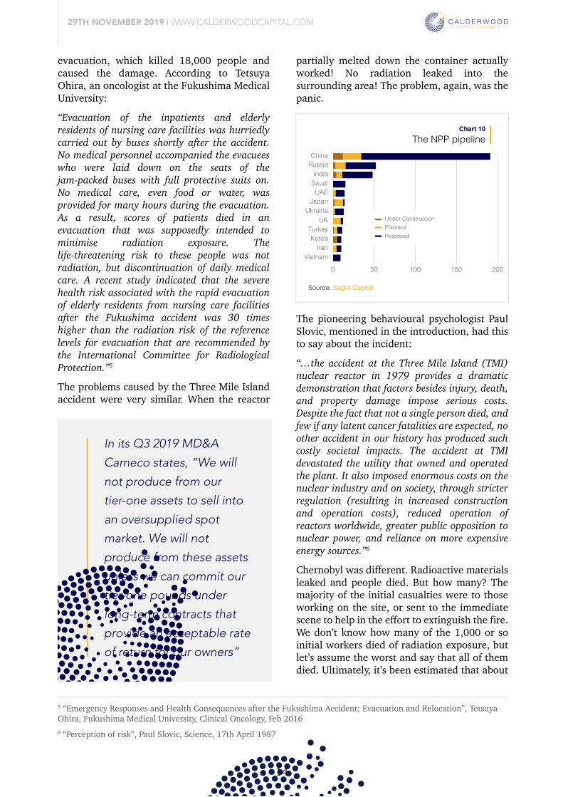
29TH NOVEMBER 2019 | WWW.CALDERWOODCAPITAL.COM
6 “Perception of risk”, Paul Slovic, Science, 17th April 1987
5 “Emergency Responses and Health Consequences after the Fukushima Accident; Evacuation and Relocation”, Tetsuya Ohira, Fukushima Medical University, Clinical Oncology, Feb 2016
14
Let’s start with the supposedly growing cheapness of renewables, and note that it’s true the unit cost of solar and wind have fallen sharply over the past ten years, as we already saw in chart 3. The problem is that those lower solar and wind unit costs haven’t translated into lower electricity prices for the countries that have used them.
The problem isn’t related to the cost of the units but their fundamental unreliability. For example, in 2015 and 2016 Germany added 10% more wind capacity but only generated 1% more electricity from wind, because it wasn’t very windy in those years.
Solar, obviously, can only generate electricity when the sun shines. So for most of the year during the morning and evenings, which is peak electricity demand, the supply of solar disappears. During the daytime the opposite happens. Demand is low but sun is abundant, so prices crash. Indeed, on very sunny days solar can overproduce to such an extent that prices go negative.
These intermittency problems put the German grid under significant pressure in 2017 as the country integrated more wind and solar (7% and 12% respectively). More than one hundred times that year electricity prices went negative during the day, as operators had to pay large buyers (usually in neighbouring countries) as much as 6cents/kWh to avoid overloading the grid (standard electricity prices internationally are around 10cents/kWh). This is obviously a huge cost for the operators, which ultimately shows up in the price end-consumers have to pay. Similar types of problems have been encountered in California, which with 10% solar generation has had to offload electricity to Arizona and in China, which has had to vent (“curtail”) coal-produced electricity to give priority on the grid to that created by suddenly strong wind. You might think that batteries would be the solution here, and you’d be right. Except it’s a very, very distant solution. Bill Gates has invested over $1bn into renewables. He said in 2015, “There’s no battery technology that’s even close to allowing us to take all of our energy from renewables and be able to use battery storage in order to deal not only with the 24-hour cycle but also with long periods of time where it’s cloudy and you don’t have sun, or you don’t have wind.”2
In passing, it’s also worth noting that in spite of this growth in renewables, German carbon
emissions have not fallen, being almost exactly the same today as they were ten years ago. Renewables are a welcome and necessary addition. But they are fundamentally ill equipped to be more than 10-15% of most grids. For baseload, which needs to be available for the surges there are only three possibilities: coal, natural gas and nuclear. If you buy into the climate science the need for less polluting electricity generation is obvious. For those of you who think it’s all a hoax (you’re wrong by the way, but that's not the topic here), it’s hard to argue against coal being filthy and carcinogenic. Pollution in major EM cities caused by the burning of coal is becoming both a health and a political issue for this reason. A less polluting source of electricity is desirable for that reason alone. Natural gas is of course cleaner, and dumps only half as much carbon into the atmosphere. But it’s not actually that cheap outside of the US. In China, for example, nuclear is cheaper than gas (0.42RMB/kWh vs 0.57RMB/kWh), and nearly competitive with thermal coal (0.3584RMB/kWh)3. It’s important to highlight that there’s an unknown emerging around natural gas: the leaking of unburned methane, a green house gas that's 80x more potent than carbon dioxide. So, a 1% leak from a natural gas facility would make natural gas dirtier than coal.4 Anyway, nuclear is 100% carbon free, and completely clean.
“Except for the accidents!", you’re probably thinking …
Depending on where you live and how old you are, the nuclear disasters most vivid in the human imagination are Chernobyl in the former Soviet Union, Three Mile Island in the US, and Fukushima in Japan. And it might surprise you to know that in Three Mile Island and Fukushima, the problem wasn’t so much the accident, but our panicked response to it.
According to the UN’s World Health Organisation, the number of fatalities at Fukushima caused by direct radioactive exposure, or likely to die later of cancer caused by exposure, was estimated to be … zero. It was the tsunami, followed by the panicked
evacuation, which killed 18,000 people and caused the damage. According to Tetsuya Ohira, an oncologist at the Fukushima Medical University:
“Evacuation of the inpatients and elderly residents of nursing care facilities was hurriedly carried out by buses shortly after the accident. No medical personnel accompanied the evacuees who were laid down on the seats of the jam-packed buses with full protective suits on. No medical care, even food or water, was provided for many hours during the evacuation. As a result, scores of patients died in an evacuation that was supposedly intended to minimise radiation exposure. The life-threatening risk to these people was not radiation, but discontinuation of daily medical care. A recent study indicated that the severe health risk associated with the rapid evacuation of elderly residents from nursing care facilities after the Fukushima accident was 30 times higher than the radiation risk of the reference levels for evacuation that are recommended by the International Committee for Radiological Protection.”5
The problems caused by the Three Mile Island accident were very similar. When the reactor
partially melted down the container actually worked! No radiation leaked into the surrounding area! The problem, again, was the panic.
The NPP pipelineChart 10
Source: Segra Capital
ChinaRussia
IndiaSaudiUAE
JapanUkraine
UKTurkeyKorea
IranVietnam
0 50 100 150 200
Under ConstructionPlannedProposed
The pioneering behavioural psychologist Paul Slovic, mentioned in the introduction, had this to say about the incident:
“…the accident at the Three Mile Island (TMI) nuclear reactor in 1979 provides a dramatic demonstration that factors besides injury, death, and property damage impose serious costs. Despite the fact that not a single person died, and few if any latent cancer fatalities are expected, no other accident in our history has produced such costly societal impacts. The accident at TMI devastated the utility that owned and operated the plant. It also imposed enormous costs on the nuclear industry and on society, through stricter regulation (resulting in increased construction and operation costs), reduced operation of reactors worldwide, greater public opposition to nuclear power, and reliance on more expensive energy sources.”6
Chernobyl was different. Radioactive materials leaked and people died. But how many? The majority of the initial casualties were to those working on the site, or sent to the immediate scene to help in the effort to extinguish the fire. We don’t know how many of the 1,000 or so initial workers died of radiation exposure, but let’s assume the worst and say that all of them died. Ultimately, it’s been estimated that about
600,000 people were registered as emergency recovery workers, and 5,000,000 were inhabitants of designated “contaminated areas”. Of these last figures, virtually none were exposed to any more radiation than background levels, and most suffered less exposure to radiation than a person living high up in a mountain range, where background radiation is higher.
There was an effect on small children who had drunk milk containing radioactive iodine produced by cows eating contaminated grass in the immediate aftermath of the explosion. The thyroids develop quickly in young children and exposure to radioactivity was lethal. By 2002, the exposure had caused 4,000 cases of Thyroid cancer in people who had been children during the accident.
But Soviet political culture was not one of transparent accountability. It was more one of blame avoidance (the consequences of big mistakes could be literally life-threatening) and the slow response of the authorities was therefore partly responsible. In towns where stable iodine was quickly distributed, such as Pripyat close to the plant, the problems were reduced.
Moreover, the Chernobyl model wasn’t even remotely similar to today’s reactors, missing essential features like … a container … so one should be careful with the comparison.
Contrary to expectations, the biodiversity of the wildlife since the accident has not only recovered but flourished, notwithstanding the fallout, and according to the UN, the area is today perfectly inhabitable. The number of cancer cases in the overall population caused by the accident is “difficult to detect.”7
There may have been as many as 5,000 killed by the Chernobyl disaster, which unlike Three Mile Island was a disaster. But 5,000 is roughly how many coal miners died in one year (2006), in one country (China). Moreover, Chernobyl was and is the very worst nuclear power accident which has ever been experienced. In Henan in 1975 the Shinantan Dam burst during a typhoon, killing 171,000 people. Yet few think that good enough reason to cease hydro production.
In its Q3 2019 MD&A
Cameco states, “We will
not produce from our
tier-one assets to sell into
an oversupplied spot
market. We will not
produce from these assets
unless we can commit our
tier-one pounds under
long-term contracts that
provide an acceptable rate
of return for our owners”
You may well be wondering why, if nuclear is so clean and safe and cheap, the world is scaling back its nuclear ambitions. Well, the answer is … it isn’t.
It may be the case that we pay too much attention to what the US and Germany are doing, extrapolating that into some kind of proxy for what “the world” is doing. Or it may be that we’re just not paying attention. France never did shut down any NPPs, while Japan is bringing its NPPs back on line. More importantly, China is as serious as it ever was, as are Russia and India (note, China’s planned build of nearly 200 NPPs should be seen in the context of a global fleet of 450).
A more useful narrative
29TH NOVEMBER 2019 | WWW.CALDERWOODCAPITAL.COM
7 “Chernobyl’s Legacy: Health, Environmental and Socio-Economic Impacts”, The Chernobyl Forum 2003-2005
15
Let’s start with the supposedly growing cheapness of renewables, and note that it’s true the unit cost of solar and wind have fallen sharply over the past ten years, as we already saw in chart 3. The problem is that those lower solar and wind unit costs haven’t translated into lower electricity prices for the countries that have used them.
The problem isn’t related to the cost of the units but their fundamental unreliability. For example, in 2015 and 2016 Germany added 10% more wind capacity but only generated 1% more electricity from wind, because it wasn’t very windy in those years.
Solar, obviously, can only generate electricity when the sun shines. So for most of the year during the morning and evenings, which is peak electricity demand, the supply of solar disappears. During the daytime the opposite happens. Demand is low but sun is abundant, so prices crash. Indeed, on very sunny days solar can overproduce to such an extent that prices go negative.
These intermittency problems put the German grid under significant pressure in 2017 as the country integrated more wind and solar (7% and 12% respectively). More than one hundred times that year electricity prices went negative during the day, as operators had to pay large buyers (usually in neighbouring countries) as much as 6cents/kWh to avoid overloading the grid (standard electricity prices internationally are around 10cents/kWh). This is obviously a huge cost for the operators, which ultimately shows up in the price end-consumers have to pay. Similar types of problems have been encountered in California, which with 10% solar generation has had to offload electricity to Arizona and in China, which has had to vent (“curtail”) coal-produced electricity to give priority on the grid to that created by suddenly strong wind. You might think that batteries would be the solution here, and you’d be right. Except it’s a very, very distant solution. Bill Gates has invested over $1bn into renewables. He said in 2015, “There’s no battery technology that’s even close to allowing us to take all of our energy from renewables and be able to use battery storage in order to deal not only with the 24-hour cycle but also with long periods of time where it’s cloudy and you don’t have sun, or you don’t have wind.”2
In passing, it’s also worth noting that in spite of this growth in renewables, German carbon
emissions have not fallen, being almost exactly the same today as they were ten years ago. Renewables are a welcome and necessary addition. But they are fundamentally ill equipped to be more than 10-15% of most grids. For baseload, which needs to be available for the surges there are only three possibilities: coal, natural gas and nuclear. If you buy into the climate science the need for less polluting electricity generation is obvious. For those of you who think it’s all a hoax (you’re wrong by the way, but that's not the topic here), it’s hard to argue against coal being filthy and carcinogenic. Pollution in major EM cities caused by the burning of coal is becoming both a health and a political issue for this reason. A less polluting source of electricity is desirable for that reason alone. Natural gas is of course cleaner, and dumps only half as much carbon into the atmosphere. But it’s not actually that cheap outside of the US. In China, for example, nuclear is cheaper than gas (0.42RMB/kWh vs 0.57RMB/kWh), and nearly competitive with thermal coal (0.3584RMB/kWh)3. It’s important to highlight that there’s an unknown emerging around natural gas: the leaking of unburned methane, a green house gas that's 80x more potent than carbon dioxide. So, a 1% leak from a natural gas facility would make natural gas dirtier than coal.4 Anyway, nuclear is 100% carbon free, and completely clean.
“Except for the accidents!", you’re probably thinking …
Depending on where you live and how old you are, the nuclear disasters most vivid in the human imagination are Chernobyl in the former Soviet Union, Three Mile Island in the US, and Fukushima in Japan. And it might surprise you to know that in Three Mile Island and Fukushima, the problem wasn’t so much the accident, but our panicked response to it.
According to the UN’s World Health Organisation, the number of fatalities at Fukushima caused by direct radioactive exposure, or likely to die later of cancer caused by exposure, was estimated to be … zero. It was the tsunami, followed by the panicked
evacuation, which killed 18,000 people and caused the damage. According to Tetsuya Ohira, an oncologist at the Fukushima Medical University:
“Evacuation of the inpatients and elderly residents of nursing care facilities was hurriedly carried out by buses shortly after the accident. No medical personnel accompanied the evacuees who were laid down on the seats of the jam-packed buses with full protective suits on. No medical care, even food or water, was provided for many hours during the evacuation. As a result, scores of patients died in an evacuation that was supposedly intended to minimise radiation exposure. The life-threatening risk to these people was not radiation, but discontinuation of daily medical care. A recent study indicated that the severe health risk associated with the rapid evacuation of elderly residents from nursing care facilities after the Fukushima accident was 30 times higher than the radiation risk of the reference levels for evacuation that are recommended by the International Committee for Radiological Protection.”5
The problems caused by the Three Mile Island accident were very similar. When the reactor
partially melted down the container actually worked! No radiation leaked into the surrounding area! The problem, again, was the panic.
The pioneering behavioural psychologist Paul Slovic, mentioned in the introduction, had this to say about the incident:
“…the accident at the Three Mile Island (TMI) nuclear reactor in 1979 provides a dramatic demonstration that factors besides injury, death, and property damage impose serious costs. Despite the fact that not a single person died, and few if any latent cancer fatalities are expected, no other accident in our history has produced such costly societal impacts. The accident at TMI devastated the utility that owned and operated the plant. It also imposed enormous costs on the nuclear industry and on society, through stricter regulation (resulting in increased construction and operation costs), reduced operation of reactors worldwide, greater public opposition to nuclear power, and reliance on more expensive energy sources.”6
Chernobyl was different. Radioactive materials leaked and people died. But how many? The majority of the initial casualties were to those working on the site, or sent to the immediate scene to help in the effort to extinguish the fire. We don’t know how many of the 1,000 or so initial workers died of radiation exposure, but let’s assume the worst and say that all of them died. Ultimately, it’s been estimated that about
600,000 people were registered as emergency recovery workers, and 5,000,000 were inhabitants of designated “contaminated areas”. Of these last figures, virtually none were exposed to any more radiation than background levels, and most suffered less exposure to radiation than a person living high up in a mountain range, where background radiation is higher.
There was an effect on small children who had drunk milk containing radioactive iodine produced by cows eating contaminated grass in the immediate aftermath of the explosion. The thyroids develop quickly in young children and exposure to radioactivity was lethal. By 2002, the exposure had caused 4,000 cases of Thyroid cancer in people who had been children during the accident.
But Soviet political culture was not one of transparent accountability. It was more one of blame avoidance (the consequences of big mistakes could be literally life-threatening) and the slow response of the authorities was therefore partly responsible. In towns where stable iodine was quickly distributed, such as Pripyat close to the plant, the problems were reduced.
Moreover, the Chernobyl model wasn’t even remotely similar to today’s reactors, missing essential features like … a container … so one should be careful with the comparison.
Contrary to expectations, the biodiversity of the wildlife since the accident has not only recovered but flourished, notwithstanding the fallout, and according to the UN, the area is today perfectly inhabitable. The number of cancer cases in the overall population caused by the accident is “difficult to detect.”7
There may have been as many as 5,000 killed by the Chernobyl disaster, which unlike Three Mile Island was a disaster. But 5,000 is roughly how many coal miners died in one year (2006), in one country (China). Moreover, Chernobyl was and is the very worst nuclear power accident which has ever been experienced. In Henan in 1975 the Shinantan Dam burst during a typhoon, killing 171,000 people. Yet few think that good enough reason to cease hydro production.
So the “dangerous, dear and dying” narrative is all wrong. But usually, when everything everyone is saying about something is wrong, there’s usually an enormous opportunity at hand. We talked earlier about the extraordinary commodities bull run of the early 2000s, when Chinese demand exploded just as supply had been crunched. Fortunes were made. I think that’s what’s basically about to happen in uranium.
Dear subscribers, we are active investors ourselves and always looking for interesting deals and opportunities. If you are looking at or participating in an investment you think is worth sharing, please send an email to [email protected]. We are accredited investors, and all correspondence will be treated in strict confidence.
Sharing is caring
You may well be wondering why, if nuclear is so clean and safe and cheap, the world is scaling back its nuclear ambitions. Well, the answer is … it isn’t.
It may be the case that we pay too much attention to what the US and Germany are doing, extrapolating that into some kind of proxy for what “the world” is doing. Or it may be that we’re just not paying attention. France never did shut down any NPPs, while Japan is bringing its NPPs back on line. More importantly, China is as serious as it ever was, as are Russia and India (note, China’s planned build of nearly 200 NPPs should be seen in the context of a global fleet of 450).
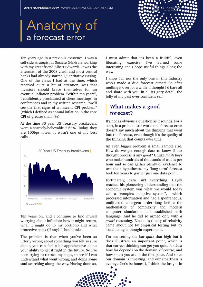
What makes a good forecast?
16
29TH NOVEMBER 2019 | WWW.CALDERWOODCAPITAL.COM
Anatomy ofa forecast error
Ten years ago in a previous existence, I was a sell-side strategist at Société Générale working with my great friend Albert Edwards. It was the aftermath of the 2008 crash and most central banks had already started Quantitative Easing. One of the views I had at the time, which received quite a bit of attention, was that investors should brace themselves for an eventual inflation problem. “Within ten years”, I confidently proclaimed at client meetings, in conferences and in my written research, “we’ll see the first signs of a nascent CPI problem” (which I defined as annual inflation in the core CPI of greater than 4%).
At the time 30 year US Treasury breakevens were a scarcely-believable 2.65%. Today, they are 100bps lower. It wasn’t one of my best calls.
30 Year US Treasury breakevens
Source: FRED
1,5
2,0
2,5
3,0
101/02/2010 01/06/2012 01/10/2014 01/02/2017 01/06/2019
Ten years on, and I continue to find myself worrying about inflation: how it might return, what it might do to my portfolio and what protective steps (if any) I should take. The problem is that when you’ve been so utterly wrong about something you felt so sure about, you can feel a bit apprehensive about your ability to get it right in the future. So I’ve been trying to retrace my steps, to see if I can understand what went wrong, and doing some soul searching along the way. Having done so,
I must admit that it’s been a fruitful, even liberating, exercise. I’ve learned some interesting and I hope useful things along the way. I know I’m not the only one in this industry who’s made a dud forecast either! So after mulling it over for a while, I thought I’d bare all and share with you, in all its gory detail, the folly of my past over-confident self.
It’s not as obvious a question as it sounds. For a start, in a probabilistic world one forecast error doesn’t say much about the thinking that went into the forecast, even though it’s the quality of the thinking that counts over time.
An even bigger problem is small sample size. How do we get enough data to know if our thought process is any good? Unlike Flash Boys who make hundreds of thousands of trades per hour and so can gather plenty of evidence to test their hypotheses, my ‘long-term’ forecast took ten years to garner just one data point. Fortunately, data isn’t everything. Hayek reached his pioneering understanding that the economic system was what we would today call a “complex adaptive system”, which processed information and had a spontaneous, undirected emergent order long before the mathematics of complexity and modern computer simulation had established such language. And he did so armed only with a priori reasoning. Einstein’s theory of relativity came about not by empirical testing but by ‘conducting’ a thought experiment.
I’m not setting the bar quite that high but it does illustrate an important point, which is that correct thinking can get you quite far. Just how far depends on the domain, of course, and how smart you are in the first place. And since our domain is investing, and our smartness is average (let’s be honest), I think the insight in
Charles Ellis’ classic Winning the Loser’s Game might be quite pertinent.
For those of you who aren’t familiar with Ellis, he famously explained that the game of tennis was composed of two games: a ‘winner's' game, played by elite athletes, and a ‘loser’s’ game played by everyone else. Elite athletes win by routinely completing difficult shots, and sometimes completing almost impossible ones. Amateur athletes lose by making more mistakes. They hit the ball into the net, miss the line and repeatedly double fault, as though their opponent is the game of tennis itself rather than the guy across the court. Elite athletes play the ‘winner’s’ game, everyone else plays the ‘loser’s’ game and Ellis argued that nearly all players could improve not by practicing the harder and more spectacular cross-court winners, but by focusing on simply returning the ball safety back over the net. When playing the loser’s game, success goes to those who eliminate systematic mistakes.
When it comes to thinking, Hayek and especially Einstein were obviously players of the intellectual ‘winner’s’ game, playing winning shots with ease. I however feel no shame in admitting that I am playing a loser’s game. There is a great deal of value to be had in not repeating stupid mistakes.
How not to make a prediction
The thesis: “Government insolvency will soon drive inflation”
Mistake #1: Ad hominem fallacy
29TH NOVEMBER 2019 | WWW.CALDERWOODCAPITAL.COM
17
It’s not as obvious a question as it sounds. For a start, in a probabilistic world one forecast error doesn’t say much about the thinking that went into the forecast, even though it’s the quality of the thinking that counts over time.
An even bigger problem is small sample size. How do we get enough data to know if our thought process is any good? Unlike Flash Boys who make hundreds of thousands of trades per hour and so can gather plenty of evidence to test their hypotheses, my ‘long-term’ forecast took ten years to garner just one data point. Fortunately, data isn’t everything. Hayek reached his pioneering understanding that the economic system was what we would today call a “complex adaptive system”, which processed information and had a spontaneous, undirected emergent order long before the mathematics of complexity and modern computer simulation had established such language. And he did so armed only with a priori reasoning. Einstein’s theory of relativity came about not by empirical testing but by ‘conducting’ a thought experiment.
I’m not setting the bar quite that high but it does illustrate an important point, which is that correct thinking can get you quite far. Just how far depends on the domain, of course, and how smart you are in the first place. And since our domain is investing, and our smartness is average (let’s be honest), I think the insight in
Charles Ellis’ classic Winning the Loser’s Game might be quite pertinent.
For those of you who aren’t familiar with Ellis, he famously explained that the game of tennis was composed of two games: a ‘winner's' game, played by elite athletes, and a ‘loser’s’ game played by everyone else. Elite athletes win by routinely completing difficult shots, and sometimes completing almost impossible ones. Amateur athletes lose by making more mistakes. They hit the ball into the net, miss the line and repeatedly double fault, as though their opponent is the game of tennis itself rather than the guy across the court. Elite athletes play the ‘winner’s’ game, everyone else plays the ‘loser’s’ game and Ellis argued that nearly all players could improve not by practicing the harder and more spectacular cross-court winners, but by focusing on simply returning the ball safety back over the net. When playing the loser’s game, success goes to those who eliminate systematic mistakes.
When it comes to thinking, Hayek and especially Einstein were obviously players of the intellectual ‘winner’s’ game, playing winning shots with ease. I however feel no shame in admitting that I am playing a loser’s game. There is a great deal of value to be had in not repeating stupid mistakes.
Before I get down to the self-flagellation I should, in my defence, say that I did actually do something right ten years ago: I did at least make a forecast which was precise enough to be falsifiable. Consider some of the vague predictions one might typically read daily in the news: “Trump risks losing American influence with his trade policy”, or “Consumers risk talking themselves into a recession”, or “Investors ignore the threat posed by Hong Kong’s insurrection at their peril.”
The problem with these, and views you often see which are like them, is that they are framed so vaguely that they are difficult to evaluate. For example, how exactly do we measure American “influence”? If there is a recession, how will we know it was caused by consumers
“talking themselves into it”? And isn’t it a statement of the obvious that you ultimately ignore any risk at your peril, be it in Hong Kong or elsewhere?
Compare that to my own prediction: I had a well defined variable of interest (core CPI); a predicted value (>4%); and a forecast time horizon (10 years). So that was something …
An Ad Hominem attack is when you attack the person making the argument rather than the argument itself. It’s quite an embarrassing one because it's both basic, and frankly quite unattractive. When I’ve seen others making it
My prediction was based on the following thesis:
a) Governments were bust. As Jagadeesh Gokhale showed in a series of papers (which later formed the basis of a book called The Government Debt Iceberg), when the unfunded costs of public sector welfare promises were added to sovereign balance sheets, as any company is required to do by IFRS accounting standards, the true debt of the major economies was several multiples of that which was “on-balance-sheet”.
b) Bankrupt governments had historically resorted to debt monetisation. Here I leant on the work of Reinhart and Rogoff who showed that over the past century, the incidence of sovereign debt crises correlated very closely with that of inflation crises. Rather than cut back (‘default’) on welfare promises, governments typically printed the money to pay for them. c) In Quantitative Easing (QE) this process was already underway. Initially the money created would be contained in financial markets, but since QE would prove an impossible habit for central banks to kick, it would eventually spill out into the CPI.
It seems a cogent enough narrative, and nothing was wrong with it in and of itself. The problem was more to do with how I calibrated that hypothesis (or didn’t, as it turned out), and how I defended it. I made four mistakes (actually more, but these will do for now).
in the past it’s been a red flag, indicating a bad faith player who isn’t actually interested in a rational discussion aimed at getting to the truth. So it was quite an odd feeling to realise that I’d been guilty of making it. Nevertheless, make it I did …
Obvious examples of the Ad Hominem fallacy would be something like “Of course X would say that! You know his parents are rich?” Or, “… well what does Y know about that? I hear she’s a single parent.” Interestingly, the Ad Hominem fallacy can bias thinking towards an incorrect argument too. For example, “Z makes a great point here, he cares so passionately about social justice.”
In what way was I falling into this trap? Well, here’s a quote from a piece I wrote for Société Générale in January 2010 (shudder):
“James Montier said that Bernanke was the worst economist of all time. Now, I’m not sure I agree with James on this one because I can’t make up my mind, sometimes I think it’s the Bernanke, other times I think it’s the Krugman. But usually I think nearly all economists to be the joint worst economists of all time. So I have a lot of sympathy with the idea that if the consensus macroeconomic opinion is worried about something, it probably isn't worth worrying about. In fact, if they worry about deflation, I'm going to worry about inflation.” Those of you who know me know I’m not so keen on economists … the problem is that I have quite a passionate belief that economics is a science, and that the right techniques and tools can (and will) uncover the underlying mathematical structure of how an economic system works. I feel that macroeconomists are bad scientists, and it frustrates me.
But allowing this kind of bias in my thinking wasn’t very smart. Even if I do believe that guys like Paul Krugman and Ben Bernanke are intellectual phoneys whose opinions contain no information, that’s not the same as their opinions having negative information. Taking one side of an argument just because some economists were on the other side was pretty dumb.1
Mistake #2: Denying the premise
Mistake #3: The monocausal fallacy
1 Interestingly, Ad Hominem is an important and valid strategy when it comes to investing, as it is for any other zero-sum game of ability since your opponent’s skill relative to your own directly affects your expected payoff. I’d be far more inclined to take the other side of Bernanke or Krugman’s portfolio decisions.
29TH NOVEMBER 2019 | WWW.CALDERWOODCAPITAL.COM
18
This fallacy says that “A causes B, therefore only A causes B.” One of the most important mistakes I made by focussing so completely on money printing and government solvency was that I ended up ignoring the many other potential explanations which might have
This can be a tricky one too, because on the surface it seems so obvious. Suppose you have an argument A, which leads to conclusion B (“if A then B”). The mistake is to fall into the trap of denying the conclusion because the premise isn’t true (not_A therefore not_B). Consider the statement: “Peter is a man; men like cars” and then let’s evaluate the hypothesis “Anna likes cars”. Since Anna is not a man we know the premise to be untrue. Yet it would be absurd to then conclude that since Anna is not a man, Anna doesn’t like cars. Obviously, this is a simplistic example, and one we’d think would be easy to avoid, but it often crops up in quite subtle ways in the real world, even during what looks and feels like a very rational discussion.
For example, a counter-argument I used to hear very often was, “The problem today is that central banks can’t create inflation, even though they want to. Therefore inflation is unlikely to materialise.”
Now, this argument can be seen to be flawed by considering what would happen if the Fed were to open a bank account for every US citizen and deposit one trillion USD into it. What do you think would happen to CPI inflation then? Answer: it would explode. Therefore, central banks can always create inflation if they really want to. That bit was fine. I think it’s clear the premise is wrong. I fell into the trap of saying that since the premise was not true (“central banks can’t create inflation”), the conclusion (“inflation is unlikely to materialise”) was wrong too. I was falling into the “not_A therefore not_B” trap. I made that one quite a lot.
An Ad Hominem attack is when you attack the person making the argument rather than the argument itself. It’s quite an embarrassing one because it's both basic, and frankly quite unattractive. When I’ve seen others making it
in the past it’s been a red flag, indicating a bad faith player who isn’t actually interested in a rational discussion aimed at getting to the truth. So it was quite an odd feeling to realise that I’d been guilty of making it. Nevertheless, make it I did …
Obvious examples of the Ad Hominem fallacy would be something like “Of course X would say that! You know his parents are rich?” Or, “… well what does Y know about that? I hear she’s a single parent.” Interestingly, the Ad Hominem fallacy can bias thinking towards an incorrect argument too. For example, “Z makes a great point here, he cares so passionately about social justice.”
In what way was I falling into this trap? Well, here’s a quote from a piece I wrote for Société Générale in January 2010 (shudder):
“James Montier said that Bernanke was the worst economist of all time. Now, I’m not sure I agree with James on this one because I can’t make up my mind, sometimes I think it’s the Bernanke, other times I think it’s the Krugman. But usually I think nearly all economists to be the joint worst economists of all time. So I have a lot of sympathy with the idea that if the consensus macroeconomic opinion is worried about something, it probably isn't worth worrying about. In fact, if they worry about deflation, I'm going to worry about inflation.” Those of you who know me know I’m not so keen on economists … the problem is that I have quite a passionate belief that economics is a science, and that the right techniques and tools can (and will) uncover the underlying mathematical structure of how an economic system works. I feel that macroeconomists are bad scientists, and it frustrates me.
But allowing this kind of bias in my thinking wasn’t very smart. Even if I do believe that guys like Paul Krugman and Ben Bernanke are intellectual phoneys whose opinions contain no information, that’s not the same as their opinions having negative information. Taking one side of an argument just because some economists were on the other side was pretty dumb.1
contributed to future inflation. Einstein was right when he said imagination was more important than knowledge.
In extremis, as my trillion USD thought experiment showed, money printing will be the driver of inflation. But most situations aren’t extreme, and in those non-extreme situations (which most of us live in), other forces come into play. Developments I explore elsewhere in this issue, like the post-WW2 wave of globalisation, the relentless penetration of e-commerce or the beginnings of demographic decline were all credible drivers of past disinflation. Where was my analysis of them?
Lessons learned
Mistake #4: The toothbrush problem
29TH NOVEMBER 2019 | WWW.CALDERWOODCAPITAL.COM
19
This fallacy says that “A causes B, therefore only A causes B.” One of the most important mistakes I made by focussing so completely on money printing and government solvency was that I ended up ignoring the many other potential explanations which might have
contributed to future inflation. Einstein was right when he said imagination was more important than knowledge.
In extremis, as my trillion USD thought experiment showed, money printing will be the driver of inflation. But most situations aren’t extreme, and in those non-extreme situations (which most of us live in), other forces come into play. Developments I explore elsewhere in this issue, like the post-WW2 wave of globalisation, the relentless penetration of e-commerce or the beginnings of demographic decline were all credible drivers of past disinflation. Where was my analysis of them?
This might have been the biggest mistake of all. People have a preference for their own ideas, a kind of “endowment effect” for hypotheses. Academics have a name for it too, they call it the “toothbrush problem” because theories are like toothbrushes: everyone prefers their own. The trouble with the behavioural psychology stuff is that being aware of your biases doesn’t seem to be of much help in escaping them. Similarly, I was aware of all of these logical errors at the time, yet still managed to make them. Why?
When I reflect on it, the overriding problem was that I fell in love with my narrative. That was the one which opened the door to the others. I enjoyed presenting it, arguing it and finding more ways to confirm that this alone was the single most important thing everyone had to understand. I drifted into a comfort zone, where the familiar warmth of my own little narrative was easier than the awkward vulnerability you have to embrace when truly wrestling with reality. All these mistakes - the ad hominem fallacy, denying of premises and the simplistic mono-cause, became my comfort blankets.
I see people do it now. I see people “defend” a thesis because they’ve allowed their personality to be somehow wrapped up in it: gold bugs saying the same stuff gold bugs said in the early 1980s without stopping to ask themselves what event would cause them to
change their opinion; “value investors” trotting out the same mantra about the current irrationality of markets, without even questioning how they missed out on the enormous value creation in areas of the market they had sneered at as being for “growth idiots”; macro managers complaining that the Fed had compressed volatility so much they couldn’t make any money; etc etc. We have all done it, and we all do it. But the remedy should be obvious: slow down; evaluate as many arguments as you can as objectively as you can; depersonalise them; be wary what you do with a denied premise! It all sounds so simple, because it is. It’s just not easy. It recalls the depth of Richard Feynman’s insight: “The first principle of science is not to fool yourself. The second principle is that you are the easiest person to fool.”
DISCLAIMER & DISCLOSURE STATEMENTTHIS MATERIAL IS: (I) FOR YOUR PRIVATE INFORMATION, AND WE ARE NOT SOLICITING ANY ACTION BASED UPON IT; (II) NOT TO BE CONSTRUED AS AN OFFER OR A SOLICITATION OF AN OFFER TO BUY OR SELL ANY SECURITY IN ANY JURISDICTION WHERE SUCH OFFER OR SOLICITATION WOULD BE ILLEGAL; AND (III) BASED UPON INFORMATION THAT WE CONSIDER RELIABLE. CALDERWOOD CAPITAL RESEARCH DOES NOT WARRANT OR REPRESENT THAT THE PUBLICATION IS ACCURATE, COMPLETE, RELIABLE, FIT FOR ANY PARTICULAR PURPOSE OR MERCHANTABLE AND DOES NOT ACCEPT LIABILITY FOR ANY ACT (OR DECISION NOT TO ACT) RESULTING FROM THE USE OF THIS PUBLICATION AND RELATED DATA. TO THE MAXIMUM EXTENT PERMISSIBLE ALL WARRANTIES AND OTHER ASSURANCES BY CALDERWOOD CAPITAL RESEARCH ARE HEREBY EXCLUDED AND CALDERWOOD CAPITAL RESEARCH SHALL HAVE NO LIABILITY FOR THE USE, MISUSE, OR DISTRIBUTION OF THIS INFORMATION. The analysis and information presented in this report (Report) by Calderwood Capital Research, is offered for subscriber interest only. The content is intended for sophisticated investors only. By accessing this Report you confirm that you meet these criteria. This Report is not to be used or considered as a recommendation to buy, hold or sell any securities or other financial instruments and does not constitute an investment recommendation or investment advice. The information contained in this Report has been compiled by Calderwood Capital Research from various public and industry sources that we believe to be reliable; no representation or warranty, expressed or implied is made by Calderwood Capital Research, its affiliates or any other person as to the accuracy or completeness of the information. Calderwood Capital Research is not responsible for any errors in or omissions to such information, or for any consequences that may result from the use of such information. Such information is provided with the expectation that it will be read as part of a wider investment analysis and this Report should not be relied upon on a stand-alone basis. Past performance should not be taken as an indication or guarantee of future performance; we make no representation or warranty regarding future performance. The opinions expressed in this Report reflect the judgment of Calderwood Capital Research as of the date hereof and are subject to change without notice. This Report is not, and should not be construed as, an offer or the solicitation of an offer to buy or sell any securities. The offer and sale of securities are regulated generally in various jurisdictions, particularly the manner in which securities may be offered and sold to residents of a particular country or jurisdiction. Securities referenced in this Report may not be eligible for sale in some jurisdictions. To the fullest extent provided by law, neither Calderwood Capital Research nor any of its affiliates, nor any other person accepts any liability whatsoever for any direct or consequential loss, including without limitation, or lost profits arising from any use of this Report or the information contained herein. Calderwood Capital Research is not authorized or regulated in the United Kingdom by the Financial Conduct Authority (FCA) or by any other regulator in any jurisdiction for the provision of investment advice. Specific professional financial and investment advice should be sought from your stockbroker, bank manager, solicitor, accountant or other independent professional adviser authorized pursuant to the Financial Services and Markets Act 2000 if you are resident in the United Kingdom or, if not, another appropriately qualified independent financial adviser who specializes in advising on the acquisition of shares and other securities or investments before any investment is undertaken.
This Report, including the text and graphics, is subject to copyright protection under English law and, through international treaties, other countries. No part of the contents or materials available in this Report may be reproduced, licensed, sold, hired, published, transmitted, modified, adapted, publicly displayed, broadcast or otherwise made available in any way without Calderwood Capital Research's prior written permission. All rights reserved. This document is produced using open sources believed to be reliable. However, their accuracy and completeness cannot be guaranteed. The statements and opinions herein were formed after due and careful consideration for use as information for the purposes of investment. The opinions contained herein are subject to change without notice. The use of any information contained in this document shall be at the sole discretion and risk of the user. Investors should consider this report as only a single factor in making their investment decision and, as such, the report should not be viewed as identifying or suggesting all risks, direct or indirect, that may be associated with any investment decision.
29TH NOVEMBER 2019 | WWW.CALDERWOODCAPITAL.COM
20
No liability whatsoever is accepted for any loss arising whether directly or indirectly as a result of the recipient acting on such information or opinion or estimates. Calderwood Capital Research employees may have or take positions in the markets, securities or other investments mentioned in this document. The stated price of any securities mentioned herein is not a representation that any transaction can be effected at this price. Investing entails risks. The investments referred to are not suitable for all investors and should not be relied upon in substitution for the exercise of independent judgment. This material is not directed at you if Calderwood Capital Research is prohibited or restricted by any legislation or regulation in any jurisdiction from making it available to you. Calderwood Capital Research and its analysts are remunerated for providing independent investment research to financial institutions, corporations, and governments.
DISCLOSURE: This Report is not to be copied, forwarded or otherwise disseminated to non-subscribers in electronic or physical form without prior consent.

THIS MATERIAL IS: (I) FOR YOUR PRIVATE INFORMATION, AND WE ARE NOT SOLICITING ANY ACTION BASED UPON IT; (II) NOT TO BE CONSTRUED AS AN OFFER OR A SOLICITATION OF AN OFFER TO BUY OR SELL ANY SECURITY IN ANY JURISDICTION WHERE SUCH OFFER OR SOLICITATION WOULD BE ILLEGAL; AND (III) BASED UPON INFORMATION THAT WE CONSIDER RELIABLE. CALDERWOOD CAPITAL RESEARCH DOES NOT WARRANT OR REPRESENT THAT THE PUBLICATION IS ACCURATE, COMPLETE, RELIABLE, FIT FOR ANY PARTICULAR PURPOSE OR MERCHANTABLE AND DOES NOT ACCEPT LIABILITY FOR ANY ACT (OR DECISION NOT TO ACT) RESULTING FROM THE USE OF THIS PUBLICATION AND RELATED DATA. TO THE MAXIMUM EXTENT PERMISSIBLE ALL WARRANTIES AND OTHER ASSURANCES BY CALDERWOOD CAPITAL RESEARCH ARE HEREBY EXCLUDED AND CALDERWOOD CAPITAL RESEARCH SHALL HAVE NO LIABILITY FOR THE USE, MISUSE, OR DISTRIBUTION OF THIS INFORMATION. The analysis and information presented in this report (Report) by Calderwood Capital Research, is offered for subscriber interest only. The content is intended for sophisticated investors only. By accessing this Report you confirm that you meet these criteria. This Report is not to be used or considered as a recommendation to buy, hold or sell any securities or other financial instruments and does not constitute an investment recommendation or investment advice. The information contained in this Report has been compiled by Calderwood Capital Research from various public and industry sources that we believe to be reliable; no representation or warranty, expressed or implied is made by Calderwood Capital Research, its affiliates or any other person as to the accuracy or completeness of the information. Calderwood Capital Research is not responsible for any errors in or omissions to such information, or for any consequences that may result from the use of such information. Such information is provided with the expectation that it will be read as part of a wider investment analysis and this Report should not be relied upon on a stand-alone basis. Past performance should not be taken as an indication or guarantee of future performance; we make no representation or warranty regarding future performance. The opinions expressed in this Report reflect the judgment of Calderwood Capital Research as of the date hereof and are subject to change without notice. This Report is not, and should not be construed as, an offer or the solicitation of an offer to buy or sell any securities. The offer and sale of securities are regulated generally in various jurisdictions, particularly the manner in which securities may be offered and sold to residents of a particular country or jurisdiction. Securities referenced in this Report may not be eligible for sale in some jurisdictions. To the fullest extent provided by law, neither Calderwood Capital Research nor any of its affiliates, nor any other person accepts any liability whatsoever for any direct or consequential loss, including without limitation, or lost profits arising from any use of this Report or the information contained herein. Calderwood Capital Research is not authorized or regulated in the United Kingdom by the Financial Conduct Authority (FCA) or by any other regulator in any jurisdiction for the provision of investment advice. Specific professional financial and investment advice should be sought from your stockbroker, bank manager, solicitor, accountant or other independent professional adviser authorized pursuant to the Financial Services and Markets Act 2000 if you are resident in the United Kingdom or, if not, another appropriately qualified independent financial adviser who specializes in advising on the acquisition of shares and other securities or investments before any investment is undertaken.
This Report, including the text and graphics, is subject to copyright protection under English law and, through international treaties, other countries. No part of the contents or materials available in this Report may be reproduced, licensed, sold, hired, published, transmitted, modified, adapted, publicly displayed, broadcast or otherwise made available in any way without Calderwood Capital Research's prior written permission. All rights reserved. This document is produced using open sources believed to be reliable. However, their accuracy and completeness cannot be guaranteed. The statements and opinions herein were formed after due and careful consideration for use as information for the purposes of investment. The opinions contained herein are subject to change without notice. The use of any information contained in this document shall be at the sole discretion and risk of the user. Investors should consider this report as only a single factor in making their investment decision and, as such, the report should not be viewed as identifying or suggesting all risks, direct or indirect, that may be associated with any investment decision.
29TH NOVEMBER 2019 | WWW.CALDERWOODCAPITAL.COM
21
No liability whatsoever is accepted for any loss arising whether directly or indirectly as a result of the recipient acting on such information or opinion or estimates. Calderwood Capital Research employees may have or take positions in the markets, securities or other investments mentioned in this document. The stated price of any securities mentioned herein is not a representation that any transaction can be effected at this price. Investing entails risks. The investments referred to are not suitable for all investors and should not be relied upon in substitution for the exercise of independent judgment. This material is not directed at you if Calderwood Capital Research is prohibited or restricted by any legislation or regulation in any jurisdiction from making it available to you. Calderwood Capital Research and its analysts are remunerated for providing independent investment research to financial institutions, corporations, and governments.
DISCLOSURE: This Report is not to be copied, forwarded or otherwise disseminated to non-subscribers in electronic or physical form without prior consent.