Embed Size (px)
DESCRIPTION
Project, 2d project
Citation preview
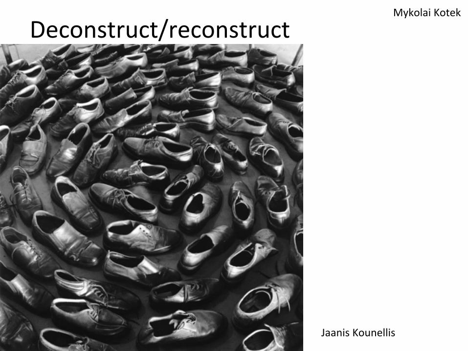
Deconstruct/reconstruct Mykolai Kotek
Jaanis Kounellis
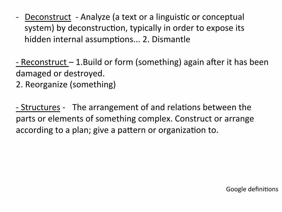
-‐ Deconstruct -‐ Analyze (a text or a linguis:c or conceptual system) by deconstruc:on, typically in order to expose its hidden internal assump:ons... 2. Dismantle
-‐ Reconstruct – 1.Build or form (something) again aIer it has been damaged or destroyed. 2. Reorganize (something)
-‐ Structures -‐ The arrangement of and rela:ons between the parts or elements of something complex. Construct or arrange according to a plan; give a paPern or organiza:on to.
Google defini:ons
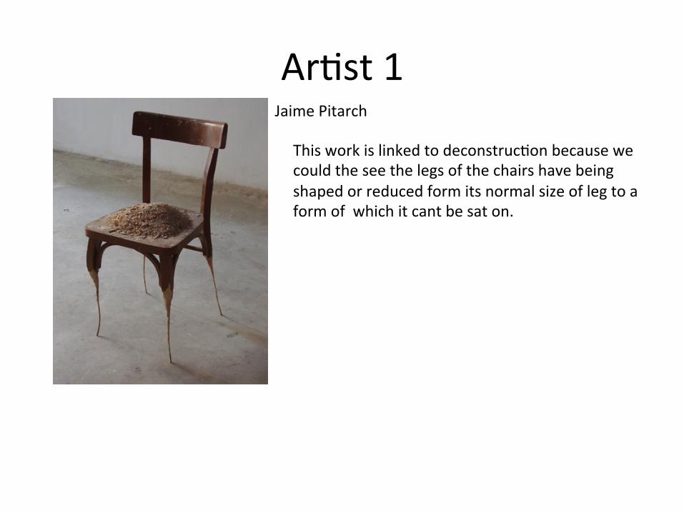
Ar:st 1 Jaime Pitarch
This work is linked to deconstruc:on because we could the see the legs of the chairs have being shaped or reduced form its normal size of leg to a form of which it cant be sat on.
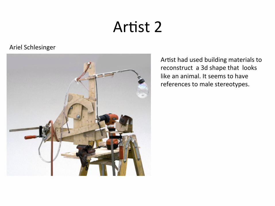
Ar:st 2 Ariel Schlesinger
Ar:st had used building materials to reconstruct a 3d shape that looks like an animal. It seems to have references to male stereotypes.
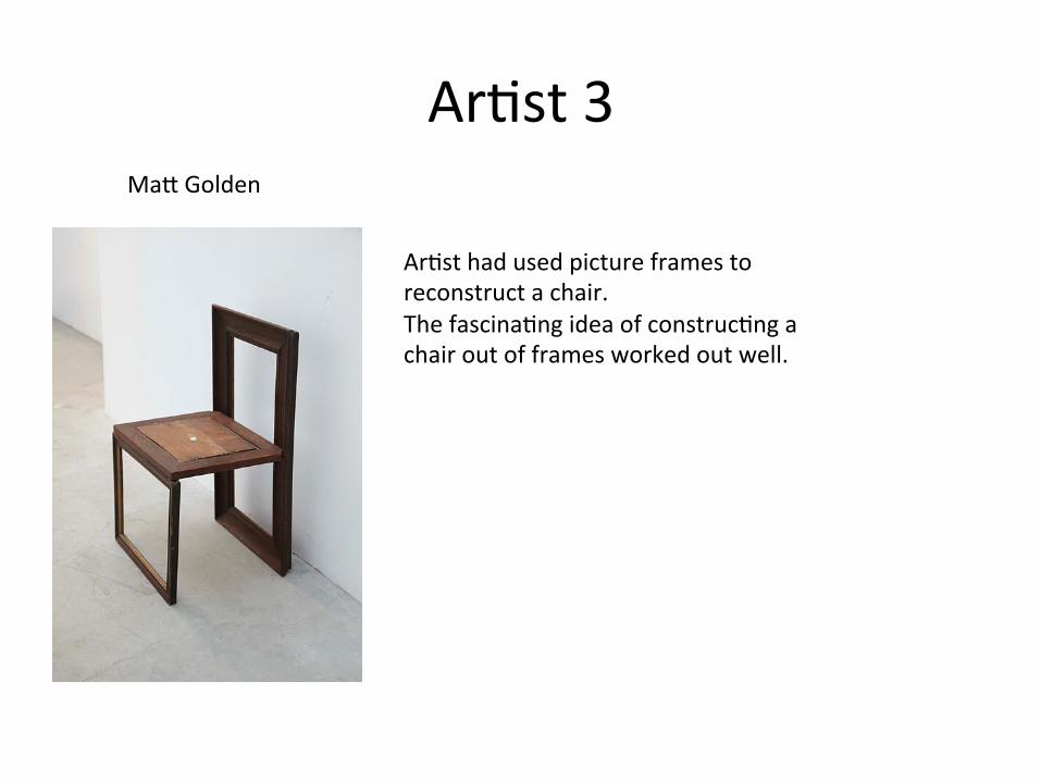
Ar:st 3 MaP Golden
Ar:st had used picture frames to reconstruct a chair. The fascina:ng idea of construc:ng a chair out of frames worked out well.
-‐
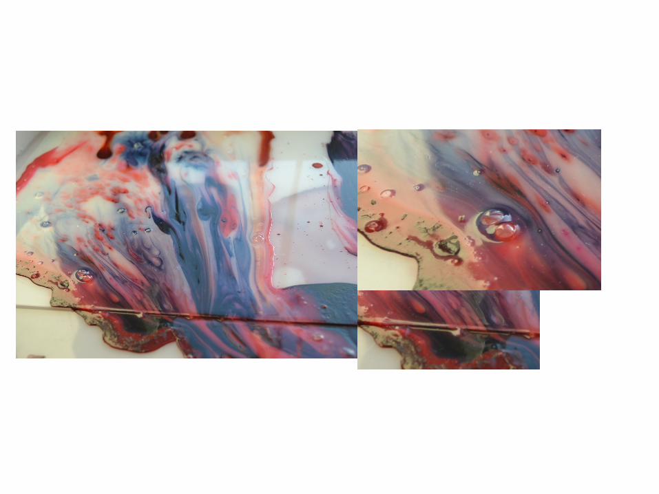
-‐ In my work I have used mul:colors and dominated red colour. This colours make me feel happy. With this colours I associate a childhood. -‐ The marveling that i have done is crea:ng a frame and in that frame there is a red texture. -‐ This crea:ng effect that makes red colour dominated in this work and also emo:ve or for some people violent effect. -‐ The focus on red paint is successful and it reminds me about happy moments in every bodies life. -‐ I am going to try more marbling but I am going to combine it with different styles.
Marbling and Pain:ng
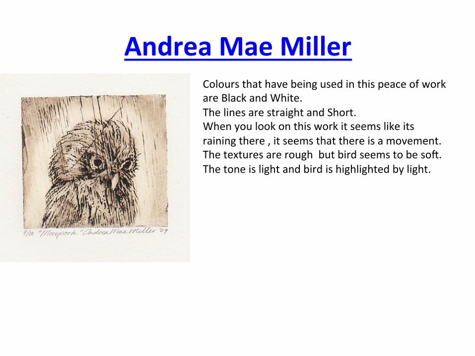
Andrea Mae Miller Colours that have being used in this peace of work are Black and White. The lines are straight and Short. When you look on this work it seems like its raining there , it seems that there is a movement. The textures are rough but bird seems to be soI. The tone is light and bird is highlighted by light.
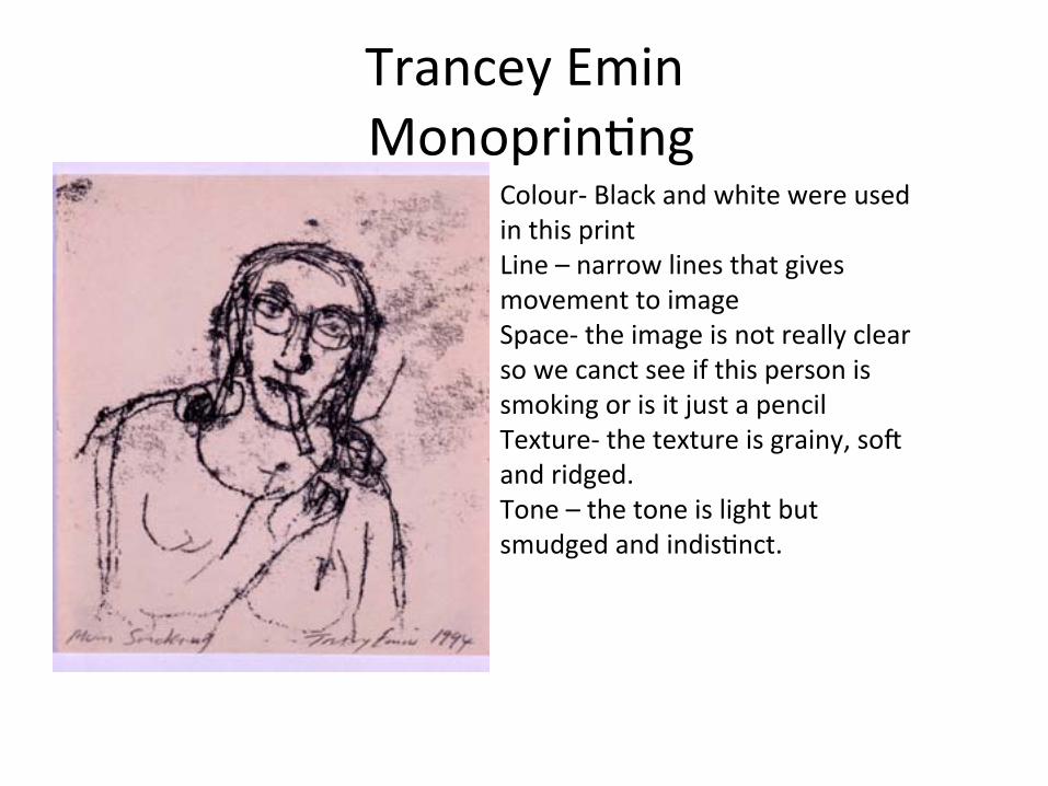
Trancey Emin Monoprin:ng
Colour-‐ Black and white were used in this print Line – narrow lines that gives movement to image Space-‐ the image is not really clear so we canct see if this person is smoking or is it just a pencil Texture-‐ the texture is grainy, soI and ridged. Tone – the tone is light but smudged and indis:nct.
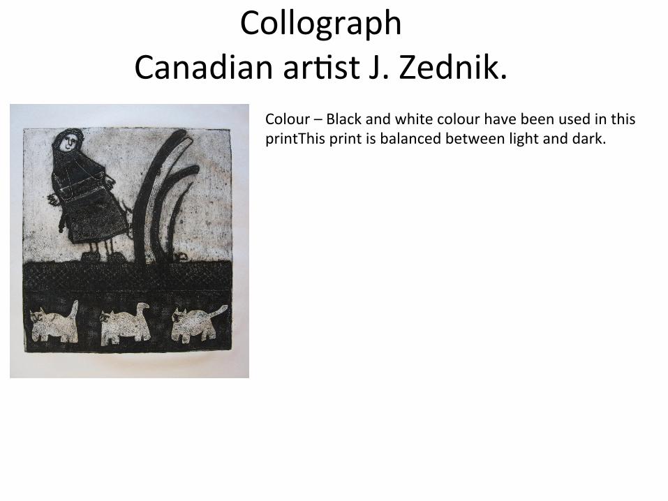
Collograph Canadian ar:st J. Zednik.
Colour – Black and white colour have been used in this printThis print is balanced between light and dark.
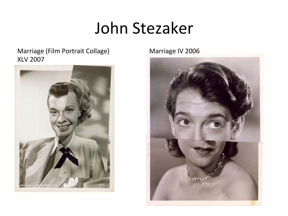
John Stezaker Marriage IV 2006 Marriage (Film Portrait Collage)
XLV 2007
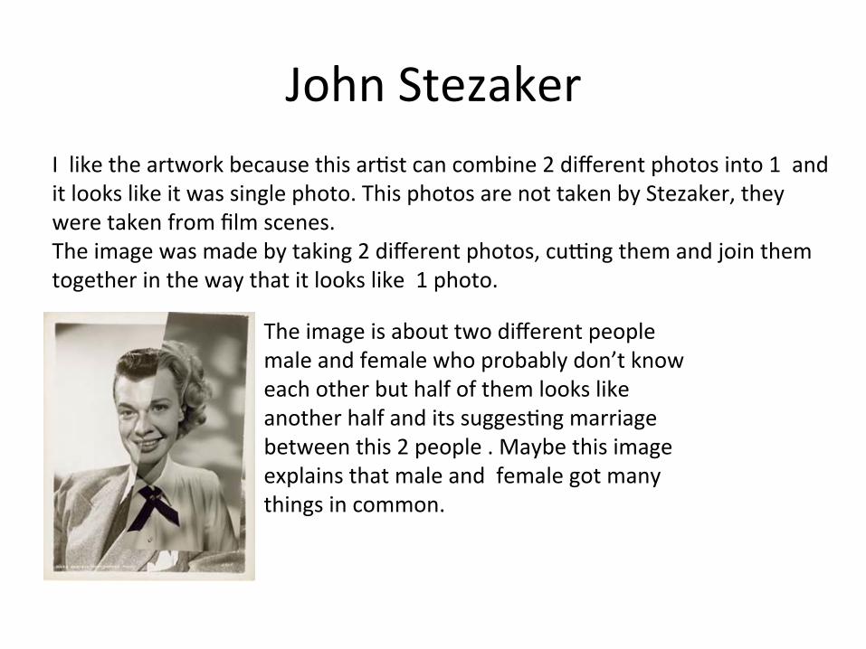
John Stezaker I like the artwork because this ar:st can combine 2 different photos into 1 and it looks like it was single photo. This photos are not taken by Stezaker, they were taken from film scenes. The image was made by taking 2 different photos, cubng them and join them together in the way that it looks like 1 photo.
The image is about two different people male and female who probably don’t know each other but half of them looks like another half and its sugges:ng marriage between this 2 people . Maybe this image explains that male and female got many things in common.
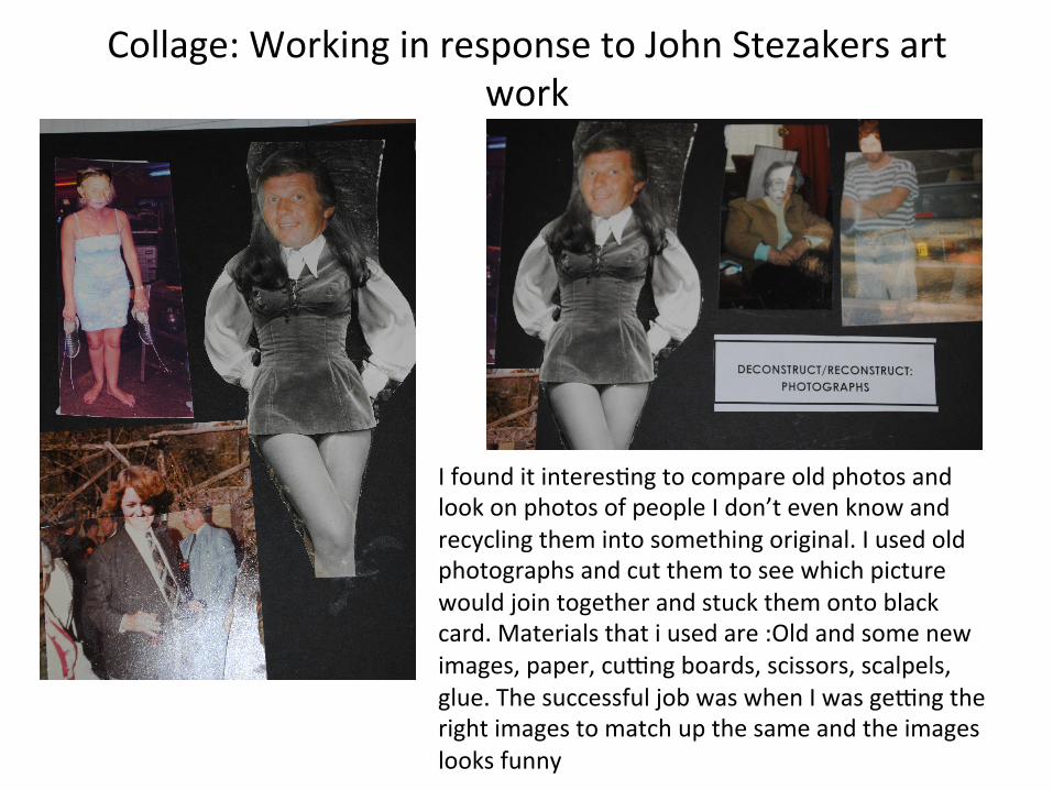
Collage: Working in response to John Stezakers art work
I found it interes:ng to compare old photos and look on photos of people I don’t even know and recycling them into something original. I used old photographs and cut them to see which picture would join together and stuck them onto black card. Materials that i used are :Old and some new images, paper, cubng boards, scissors, scalpels, glue. The successful job was when I was gebng the right images to match up the same and the images looks funny
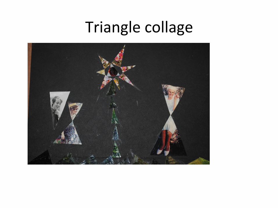
Triangle collage
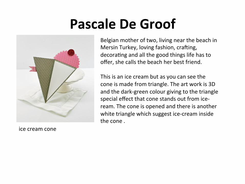
Pascale De Groof Belgian mother of two, living near the beach in Mersin Turkey, loving fashion, craIing, decora:ng and all the good things life has to offer, she calls the beach her best friend. This is an ice cream but as you can see the cone is made from triangle. The art work is 3D and the dark-‐green colour giving to the triangle special effect that cone stands out from ice-‐ream. The cone is opened and there is another white triangle which suggest ice-‐cream inside the cone .
ice cream cone
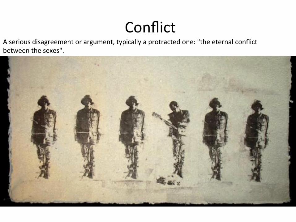
Conflict A serious disagreement or argument, typically a protracted one: "the eternal conflict between the sexes".
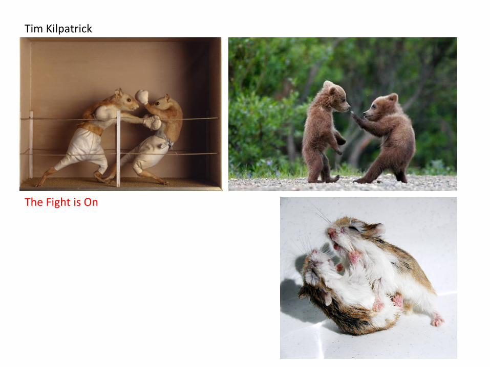
Tim Kilpatrick
The Fight is On
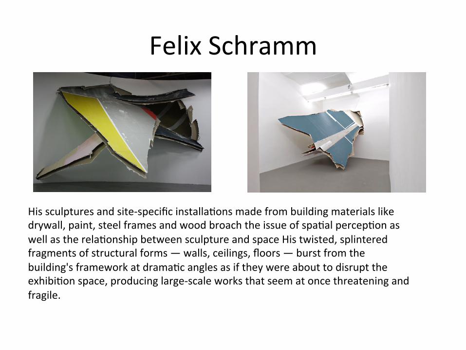
Felix Schramm
His sculptures and site-‐specific installa:ons made from building materials like drywall, paint, steel frames and wood broach the issue of spa:al percep:on as well as the rela:onship between sculpture and space His twisted, splintered fragments of structural forms — walls, ceilings, floors — burst from the building's framework at drama:c angles as if they were about to disrupt the exhibi:on space, producing large-‐scale works that seem at once threatening and fragile.
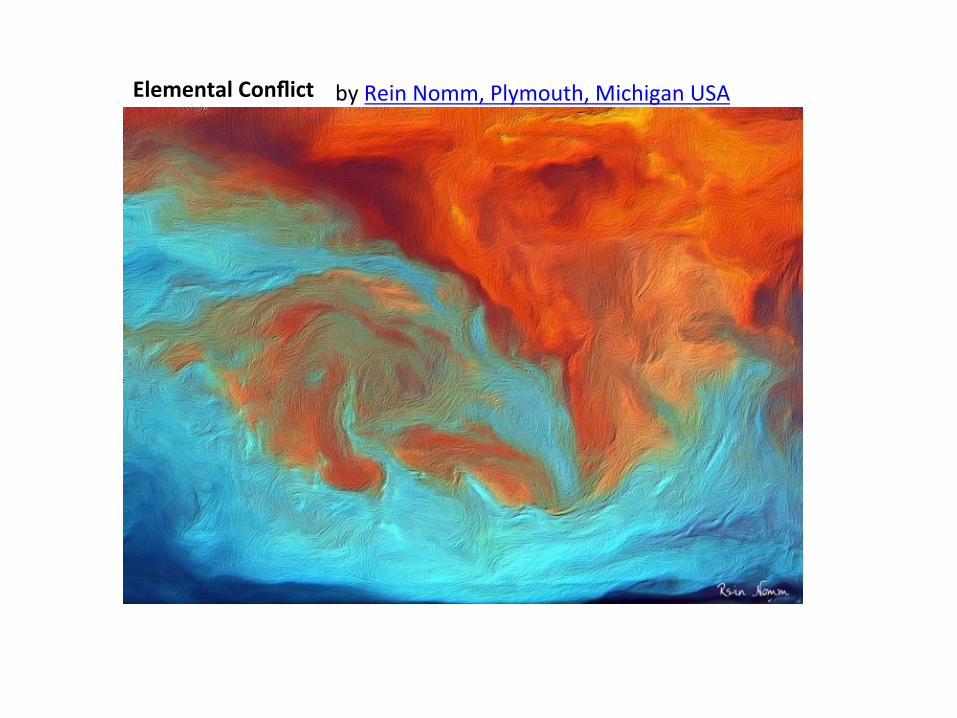
Elemental Conflict by Rein Nomm, Plymouth, Michigan USA
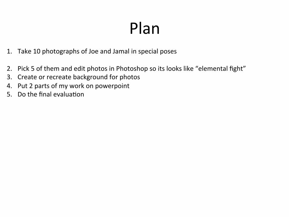
Plan 1. Take 10 photographs of Joe and Jamal in special poses
2. Pick 5 of them and edit photos in Photoshop so its looks like “elemental fight” 3. Create or recreate background for photos 4. Put 2 parts of my work on powerpoint 5. Do the final evalua:on
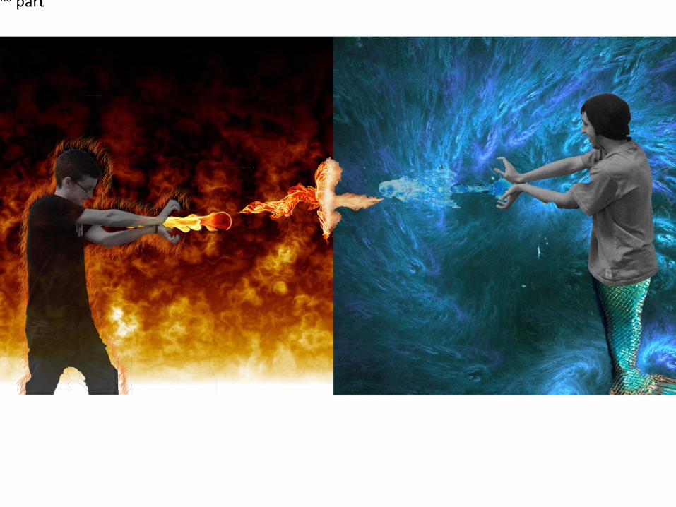
2nd part
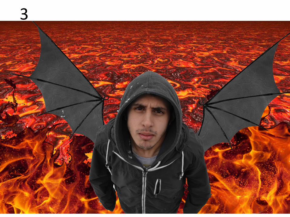
3
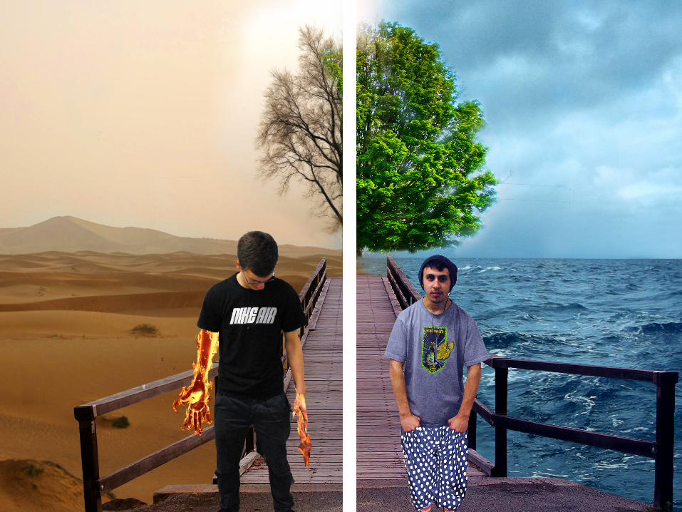
Evalua:on Struggle of man against the elements, that is ancient and an elemental conflict. In modern day there is something inherently different and at odds between two things, and it has been that way and won't change.
For my independent theme I have researched American ar:st Rein Nomm who has got really good elemental conflict work but in his work I could find people so I got the idea to edit people into elemental fight. In my 2D work I have experimented with photography and digital image manipula:on techniques. Both techniques were great, I have enjoyed working in Photoshop and I have discovered some new func:ons. My composi:on of final outcome worked out good but not as I expected some of my photos were too big so I reduced their size but my composi:on have changed , the great thing was that 2 guys are same size now. In my final outcome I have used colours of the fire and water, I have used red, yellow, blue , green and black. Red and yellow make me think about anger, pain and strength, blue and green make me think about peace, mystery and harmony. In my first composi:on there are 2 sides of the world. Dry, violent, dead side of world and fresh, peaceful, live side and people who represent those sides, behind them there is a tree which is half dead and half live with green leaves. You can clearly see the contrast between 2 sides. In second composi:on there is a fight between 2 elements fire and water but it s:ll got the same contrast as 1st composi:on. If I had more :me I would change some tones and colors plus would make more composi:ons.