Embed Size (px)
DESCRIPTION
Â
Citation preview

ArticlesUtherworlds: An interview with Philip Straub
InterviewsAndrée Wallin & Sven Sauer
GalleriesMario Wibisono, Michael Dashow & Soheil Danesh, plus more!
Making Of’sNastya by Alexander Yazynin
TutorialsSpeed Painting by Justin Albers & Emrah Elmasli, plus more!
The talented Nykolai Aleksander concludes her tutorial series on painting the human face by taking elements of what has been taught in the previous two chapters to create this stunning female portrait...
Issue 036 December 2008 $4.50 / €3.25 / £2.25
Concept Art, Digital & Matte Painting Magazine
Image by Nykolai Aleksander
page 2www.2dartistmag.com Issue 036 December 2008
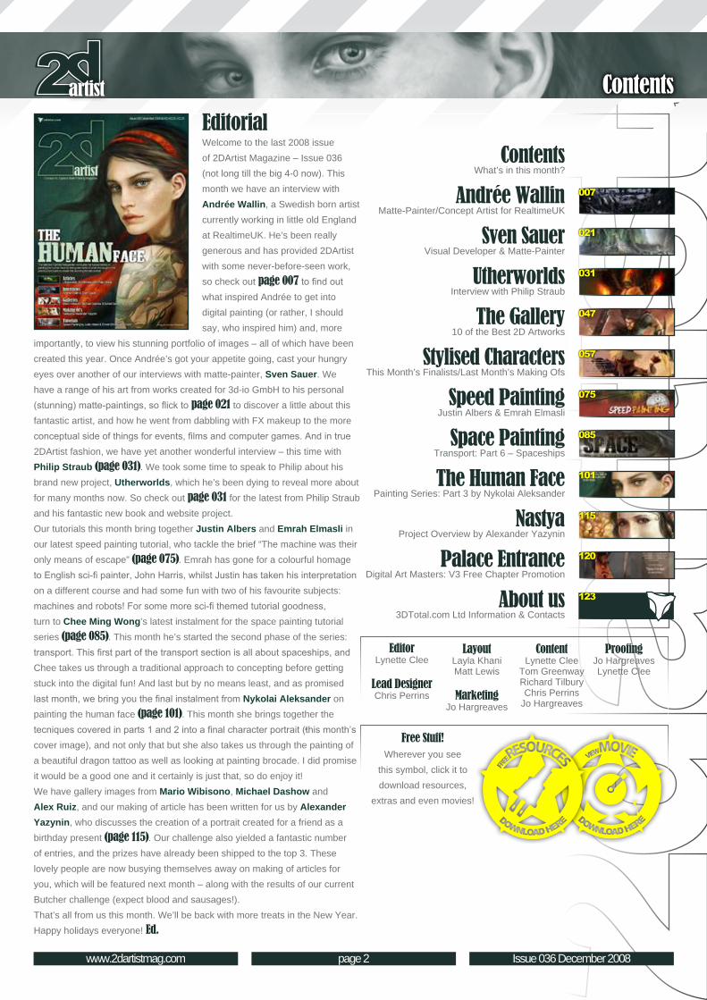
Contents
EditorialWelcome to the last 2008 issue
of 2DArtist Magazine – Issue 036
(not long till the big 4-0 now). This
month we have an interview with
Andrée Wallin, a Swedish born artist
currently working in little old England
at RealtimeUK. He’s been really
generous and has provided 2DArtist
with some never-before-seen work,
so check out page 007 to find out what inspired Andrée to get into
digital painting (or rather, I should
say, who inspired him) and, more
importantly, to view his stunning portfolio of images – all of which have been
created this year. Once Andrée’s got your appetite going, cast your hungry
eyes over another of our interviews with matte-painter, Sven Sauer. We
have a range of his art from works created for 3d-io GmbH to his personal
(stunning) matte-paintings, so flick to page 021 to discover a little about this
fantastic artist, and how he went from dabbling with FX makeup to the more
conceptual side of things for events, films and computer games. And in true 2DArtist fashion, we have yet another wonderful interview – this time with
Philip Straub (page 031). We took some time to speak to Philip about his
brand new project, Utherworlds, which he’s been dying to reveal more about
for many months now. So check out page 031 for the latest from Philip Straub
and his fantastic new book and website project.
Our tutorials this month bring together Justin Albers and Emrah Elmasli in
our latest speed painting tutorial, who tackle the brief “The machine was their
only means of escape” (page 075). Emrah has gone for a colourful homage
to English sci-fi painter, John Harris, whilst Justin has taken his interpretation on a different course and had some fun with two of his favourite subjects:
machines and robots! For some more sci-fi themed tutorial goodness, turn to Chee Ming Wong’s latest instalment for the space painting tutorial
series (page 085). This month he’s started the second phase of the series:
transport. This first part of the transport section is all about spaceships, and Chee takes us through a traditional approach to concepting before getting
stuck into the digital fun! And last but by no means least, and as promised
last month, we bring you the final instalment from Nykolai Aleksander on
painting the human face (page 101). This month she brings together the
tecniques covered in parts 1 and 2 into a final character portrait (this month’s cover image), and not only that but she also takes us through the painting of
a beautiful dragon tattoo as well as looking at painting brocade. I did promise
it would be a good one and it certainly is just that, so do enjoy it!
We have gallery images from Mario Wibisono, Michael Dashow and
Alex Ruiz, and our making of article has been written for us by Alexander
Yazynin, who discusses the creation of a portrait created for a friend as a
birthday present (page 115). Our challenge also yielded a fantastic number
of entries, and the prizes have already been shipped to the top 3. These
lovely people are now busying themselves away on making of articles for
you, which will be featured next month – along with the results of our current
Butcher challenge (expect blood and sausages!).
That’s all from us this month. We’ll be back with more treats in the New Year.
Happy holidays everyone! Ed.
007
021
031
047
057
075
085
101
115
120
123
Contents What’s in this month?
Andrée WallinMatte-Painter/Concept Artist for RealtimeUK
Sven Sauer Visual Developer & Matte-Painter
Utherworlds Interview with Philip Straub
The Gallery 10 of the Best 2D Artworks
Stylised Characters This Month’s Finalists/Last Month’s Making Ofs
Speed Painting Justin Albers & Emrah Elmasli
Space Painting Transport: Part 6 – Spaceships
The Human Face Painting Series: Part 3 by Nykolai Aleksander
NastyaProject Overview by Alexander Yazynin
Palace Entrance Digital Art Masters: V3 Free Chapter Promotion
About us 3DTotal.com Ltd Information & Contacts
EditorLynette Clee
Lead DesignerChris Perrins
Layout Layla Khani Matt Lewis
MarketingJo Hargreaves
Free Stuff!Wherever you see
this symbol, click it to
download resources,
extras and even movies!
Content Lynette Clee
Tom GreenwayRichard TilburyChris Perrins
Jo Hargreaves
ProofingJo HargreavesLynette Clee

Setting up your PDF reader For optimum viewing of the magazine, it is recommended that you
have the latest Acrobat Reader installed.
You can download it for free, here: DOWNLOAD!
To view the many double-page spreads featured in 2DArtist magazine,
you can set the reader to display ‘two-up’, which will show double-
page spreads as one large landscape image:
1. Open the magazine in Reader;
2. Go to the View menu, then Page display;
3. Select Two-up Continuous, making sure that Show Cover Page is also selected.
Get the most out of your
Magazine!If you’re having problems viewing the double-page spreads that we
feature in this magazine, follow this handy little guide on how to set
up your PDF reader!

page 4www.2dartistmag.com Issue 036 December 2008
Contributors
Contributing ArtistsEvery month, many creatives and artists around the world contribut to
3DCreative & 2DArtist Magazine. Here you can read all about them. If you
would like to be a part of 3DCreative or 2DArtist Magazines,
please contact lynette@zoopublishing
Sven Sauer
A CG artist from Wiesbaden,
Germany. He was an art
director at an advertising
agency before getting into the
film and game business. Since 2006, he’s been
working as a visual developer and matte painting
artist, creating styles for feature films.
http://www.mattepainting-studio.com
Andree Wallin 25 years old and currently
working at RealtimeUK as a
matte painter and concept artist.
He’s addicted to Photoshop,
drums, sleeping and travelling; he started studying
3D last year, got a job offer as a 2D artist at Realtime
UK and has been working professionally now for
about 6 months.
http://www.andreewallin.com
Justin Albers
A graduate of the Art Institute of
Dallas and currently working as
a concept artist at Vigil Games
on the Warhammer 40,000
MMO in Austin, Texas. His previous companies
include TKO Software and NCsoft.
http://www.justinalbers.com/
Nykolai AleksanderBorn in 1978, Nykolai spent
the first 17 years of her life
in Germany, then moved to
England to study A-Level
Theatre and Music. She returned to Germany for a
short while after, working on film as a set assistant,
and in 1999 moved to the UK for good. In 2000
Nykolai started drawing. With the discovery of a
Wacom tablet in 2002, her work suddenly took off on
a path she hadn’t quite expected…
http://www.admemento.com
Emrah Elmasli A Turkish concept artist based
in London, UK. He’s working at
Lionhead Studios as a full-time
senior concept artist. Before
coming to the UK, he was a freelance artist living in
Istanbul, Turkey and was working for various clients
like Crystal Dynamics, Irrational Games, CGToolkit
and Fantasy Flight Games, as well as ad agencies.
He then found himself in the UK where he draws
everyday and enjoys the city in his spare time.
http://www.partycule.com

page 5www.2dartistmag.com Issue 036 December 2008page 5www.2dartistmag.com Issue 036 December 2008
Contributors
Rosa HughesCan peel mandarins really fast,
kick a hackysack 32 times,
and animates for a living. She
currently lives in Brisbane,
Australia where she works for a pokies company,
leaving little bits of her soul behind in a shower of
sparkling gold and glittering teeth. One day she
hopes to finish all of the projects she’s started over
her 23 years.
http://www.rosatron.com/
Pawel Somogyi
An electronics engineer
currently working for a
telecommunications company,
designing circuit boards. To
escape from the technical boredom he spends time
digital painting and 3D modelling in his free time, and
says he currently really needs to finish redesigning
the web page he created with his friend.
(He also loves cooking.)
Alexander Yazynin
Graduated Vladivostok
College of Art, then the Far
Eastern State Academy of Art.
He always wanted to make
computer games, and became Elemental Games’
company co-founder, which has since developed
the Space Rangers & Space Rangers: Dominators
games. The company name was later changed to
“Katauri Interactive”, where he also worked on the
recently released Kings Bounty: The Legend game
as the art director for three years.
Dr CM.Wong
Has over 8 years of creative
visualisation and pre-production
experience, having worked
on various independent game
projects, publications and CGI pre-production
artwork. He is currently the CEO of his own digital art
studio, Opus Artz, based in London. Previous work
includes his role as Senior Concept Artist and Visual
Lead for Infinity: The Quest for Earth MMO 2009,
plus numerous commercial publications.
http://www.opusartz.com
PatriBalanovskyProduction/Concept Artist from
Tel-Aviv, in Israel. He’s been
drawing & painting since he can
remember; creating characters,
creatures & fantastic scenes has always been a
passion of his. Telling a whole story through a single
image can be quite a challenge, but he’s always up
for it! Keeping his work fresh & versatile, he explores
all sorts of genres, styles & attitudes.
http://chuckmate.blogspot.com
Would You Like To Contribute To 3DCreative Or 2DArtist Magazines?
We are always looking for tutorial artists, gallery submissions, potential
interviewees, Making Of writers, and more. For more information, please
send a link to your work here: [email protected]

modo is for artists
PMS COLORED
116 U
404 U
TM
3D image created in modo by Luxology. Credit: Gelmi
®
3D image created in modo by Luxology. Credit: Gelmi For more information, visit modo3D.com

Considering that he only started speed painting
back in January 2008, Swedish-born artist
Andrée Wallin is already producing some
amazing pieces of artwork. We recently took
the time to chat to him about his work, why he’s
addicted to Photoshop and what his dream
project would be.
“I started to see that there’s so much more
going on in a speed painting than you initially
see; you can use your imagination to define
certain elements of the drawing that would
otherwise be defined by the artist”

page 8www.2dartistmag.com Issue 036 December 2008
Interview Andree Wallin
out to be the same course that Levente Peterffy
was taking. After looking at his work I got really
inspired to try some speed painting myself, and
so in early January this year I started to make a
few speedies and … here I am! Fortunately for
me, Levente is a great guy and has helped me
out a lot.
Levente Peterffy, now there’s a familiar name
for the readers of 2DArtist! He’s featured several
times in our gallery section recently, and his
amazing work was also showcased in Digital Art
Masters: Volume 3 earlier this year. What was it
like to be able to learn alongside someone like
him?
It’s been really great! He still gives me feedback
and input on my work on occasion and I’d say
that without his help and support I would not be
at the level I am today.
Welcome to 2DArtist, Andrée! Now I’ve been
spending a lot of time on your deviantART page
recently (http://andreewallin.deviantart.com/),
trying to find out more about the man behind the
fantastic artwork that’s up in the gallery there,
but I have to admit I’ve drawn a bit of a blank.
Could you start by telling me (and our readers)
who you are, where you came from and how
you stumbled into the 2D art arena?
Thank you! My name is Andrée, I’m 25 years
old, born in Sweden and currently working in
the UK. I opened Photoshop for the first time
at age of 19, I think, after I stumbled upon a
tutorial made by the great Dhabih Eng. I kept
on drawing occasionally in my spare time,
alongside my regular job. Last year I decided to
move to Stockholm to study 3D, which turned


page 12www.2dartistmag.com Issue 036 December 2008
Interview Andree Wallin
I noticed that you only joined deviantART and
CGSociety a little under a year ago. Was this
the first time you’d come across these websites?
Or simply the first time you’d felt confident
enough to put your artwork out there for the
world to see?
I had heard about deviantART before, but I
never thought my work was good enough for
that kind of exposure. So I just kept posting my
stuff on a few carefully selected forums instead
before I plucked up the courage.
Posting on forums seems to be the classic
way for new artists to get their artwork and
their name “out there”. There’s such a great
community of online artists now, all ready to
provide feedback and constructive criticism.
Was the feedback that you received helpful?
And how much did it affect your approach to
your own artwork and the decisions that you
make?
Of course, most feedback is helpful as long as
you really want to progress and get better. But
it wasn’t until I joined the great speed painting
thread at Sijun.com that I understood the
power of these art communities/forums. I kept
on posting my stuff there until I started getting
comments and feedback from these amazing
guys I’ve admired and looked up to for so long,
and it was just the best feeling in the world!

page 13www.2dartistmag.com Issue 036 December 2008
Andree Wallin Interview
Now while I was nosing around your blog,
I saw that you describe yourself as a
“photoshopaholic”. Care to elaborate on that
one?
While that statement was intended as a joke,
I am pretty addicted to Photoshop since I
basically use it 24/7 nowadays. I guess that’s
pretty sad when you think about it [Laughs]!
Not sad – dedicated! Is Photoshop the main
piece of software you use to create your
artworks, or do you dabble in others too? And
what is it about Photoshop that you find so
addictive?
I only use Photoshop really. I tried Painter
once, but I just can’t think of any good reason
to switch or alternate between the two. CS3 has
everything I need - it’s a simple as that!
Okay, seeing as speed paintings take up the
majority of your gallery, I just have to ask you
about them. Considering how quickly they’ve
all been produced, the quality is consistently
amazing. What attracts you to speed paintings?
And can you tell us a little bit about the tricks
and techniques that you use?
I’ve always enjoyed more detailed and finished
drawings, like the ones of Dan Luvisi (still love
his stuff). But as I looked closer at guys like
Mullins, Snygg, Cole etc I started to see that


page 16www.2dartistmag.com Issue 036 December 2008
Interview Andree Wallin
there’s so much more going on in a speed
painting than you initially see; you can use your
imagination to define certain elements of the
drawing that would otherwise be defined by the
artist. And the atmosphere and overall feeling
of a speed painted scene is just so incredibly
dynamic.
I always try to maintain a certain level of detail
in my drawings, by working with both custom
brushes and photos for texturing. I sometimes
use the Craig Mullins trick; take a photo and
mess it up until you start seeing shapes in the
mess that you can define. And sometimes it’s
just regular sketching on a white background.
There’s a strong sci-fi theme in much of your
work, with loads of the images involving
futuristic settings or some form of robot. What is
it about this genre that you find so inspiring?
Well, not only are they fun to look at, but you
can also play around with colours and shapes
and experiment a lot. There are no boundaries,
you know. I also like mixing rough futuristic
shapes with peaceful settings and colours.
That sense of freedom seems to be the key
element that attracts a lot of artists to the sci-fi
genre, but you seem to have taken it one step
further, with some strong post-apocalyptic
elements creeping into your work at times.

page 17www.2dartistmag.com Issue 036 December 2008
Andree Wallin Interview
Which leads me to something I’ve been wanting
to ask about since I started preparing for this
interview: “Stockholm Aftermath”. I’ve seen
in mentioned all over your site, and there are
several intriguing images up there too, but what
is it actually all about and did you ever finish the
trailer?
It was a school project I did in late 07 / early
08. A trailer about robots coming to town and
going berserk, featuring some very poor CG.
The trailer is available on YouTube, although I
wouldn’t recommend it [Laughs]!
Okay, there’s just time for one last question:
if you could work for any company, or on any
particular project, which company/project would
you choose and why?
Hm... Tough one! Maybe some concept work
for the upcoming Halo movie. That sounds like
something I’d be interested in!
Andrée WallinFor more work by this artist please visit:
http://andreewallin.deviantart.com/
http://www.andreewallin.com
Or contact them at:
Interviewed by: Jo Hargreaves


for more products in our range visit http://www.3dtotal.com/shop
: volume 3
Alon Chou
Damien Canderlé
Gerhard Mozsi
John Wu
Laurent Pierlot
Levente Peterffy
Marek Denco
Neil Blevins
Nathaniel West
Matt Dixon
Buy the book to see just how they create their
incredible imagery!Hardback 21.6cm x 27.9cm in size
288 Full Colour premium paper pages
Features 60 of the finest digital2d and 3d artists working in the indusrty today, from the
likes of:
Available Now Only!UK - £32 USD - $64 EUR - €49

From learning FX make-up at the annual “Halloween-Festival”, to being the Director of
Visual Development for DMPA, we chat with matte painter Sven Sauer about how he
got into art, and his latest work on the adventure game Perry Rhodan.
“Over the years, I was drawn more and more
into the conceptual work. We developed
mechanisms and stage-tools to more effectively
scare the living hell out of the visitors”
page 22www.2dartistmag.com Issue 036 December 2008
Interview Sven Sauer
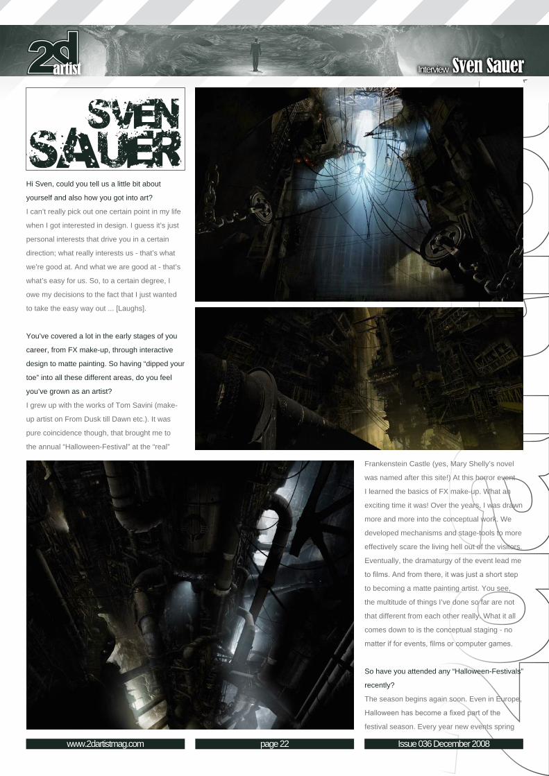
Hi Sven, could you tell us a little bit about
yourself and also how you got into art?
I can’t really pick out one certain point in my life
when I got interested in design. I guess it’s just
personal interests that drive you in a certain
direction; what really interests us - that’s what
we’re good at. And what we are good at - that’s
what’s easy for us. So, to a certain degree, I
owe my decisions to the fact that I just wanted
to take the easy way out ... [Laughs].
You’ve covered a lot in the early stages of you
career, from FX make-up, through interactive
design to matte painting. So having “dipped your
toe” into all these different areas, do you feel
you’ve grown as an artist?
I grew up with the works of Tom Savini (make-
up artist on From Dusk till Dawn etc.). It was
pure coincidence though, that brought me to
the annual “Halloween-Festival” at the “real”
Frankenstein Castle (yes, Mary Shelly’s novel
was named after this site!) At this horror event
I learned the basics of FX make-up. What an
exciting time it was! Over the years, I was drawn
more and more into the conceptual work. We
developed mechanisms and stage-tools to more
effectively scare the living hell out of the visitors.
Eventually, the dramaturgy of the event lead me
to films. And from there, it was just a short step
to becoming a matte painting artist. You see,
the multitude of things I’ve done so far are not
that different from each other really. What it all
comes down to is the conceptual staging - no
matter if for events, films or computer games.
So have you attended any “Halloween-Festivals”
recently?
The season begins again soon. Even in Europe,
Halloween has become a fixed part of the
festival season. Every year new events spring

page 23www.2dartistmag.com Issue 036 December 2008
Sven Sauer Interview
up, all trying to come up with innovative and
creative ways to scare people. It’s cool to see
that the borders between computer games and
live events are vanishing bit by bit, thanks to
the playful multimedia elements that are being
integrated into events. For example: we’re
working on a tracking system that monitors the
movements of visitors and has them followed
by digitally projected spiders. Many of the ideas
like that derive from the gaming industry, but are
slowly becoming separate from the screen and
finding their ways into our real environment. I
can’t wait to see what surprises will be waiting
for us out there this year...
In the “about” section of your website (http://
www.mattepainting-studio.com) it states that
you’re a member of 3D-IO. For the readers out
there that are unfamiliar with this, could you fill
us in on what it is and what you do?
3D-IO and Ambivalenz are two firms that
perfectly complement each other, thanks to
their different core competencies. 3D-IO has
ten years of experience in game development;
Ambivalenz is focused on interactive design and
movie postproduction. Both markets have grown
closer together over the years and therefore
3D-IO and Ambivalenz have developed a strong
partnership, which has resulted in a group of 2D
and 3D artists working hand in hand.

You have currently done a lot of matte paintings
for an adventure game called Perry Rhodan.
Could you tell us a bit about the brief that your
where given in order to create this images? And
how long did you spend on the project?
The production stage of the Perry Rhodan game
took about two years. I got to know 3D-IO’s
owner Igor Posavec during the pre-production
phase, which turned out to take up way more
time than expected. The whole Perry Rhodan
series has been around since 1961, and is
made up of more than 2000 novels, which
makes it the biggest sci-fi series in the world. So
as you can imagine, we were presented with this
mass of information in our briefing, which we
then had to try and sort through. And the later
development of any given element was closely
supervised by the thousands of eyes of a large
fan community.
I didn’t actually start out with the formal
production of matte paintings. Teamed up with
Igor, I developed the game’s visual concept - the
guidelines to ensure that each artwork derived
from the same visual scheme and perfectly fitted
the plot. I had to answer questions like:
- How does colour influence the mood of the
player?
- Which colour is “treason”?
- Which visual analogies will announce a change
in the plot?
At that point, I strongly benefited from my
Halloween-Festival experiences!
While I’m not too familiar with the Perry Rhodan
universe, the visuals that you created certainly
make it look very interesting. Do you feel that
the work that you’ve done on the game does this
sci-fi series justice, and what has the feedback
from the fans been like?
We’ve been working closely together with the
fan community, and the references from the
first graphic developments of the 1960s, which
feature a Buck Rogers kind of charm. While this
material was great, it really needed rejuvenating
to bring it more up-to-date. This turned out to
be somewhat of a tightrope walk, as we aimed
to please the old-school Perry fans as much as
the newer, younger gamers. Space gliders had
to be fitted with different transmission shafts


page 26www.2dartistmag.com Issue 036 December 2008
Interview Sven Sauerhalfway through the development process, after
the fans showed their concern about the basic
technical requirements. Almost every single
element of the game universe had already been
documented in quite detailed sketches over the
last 50 years, and we had to respect that.
Our own vision for the project was strictly
shaped by these existing requirements. Igor
was right when he compared the Perry Rhodan
universe to “Open-Source” developments: you
may bring in your own ideas - as long as you
play by the rules. Working with the fans often
resulted in time-consuming discussions, but
at the same time, it got the community really
hyped up for the release date. Fortunately, the
feedback from the first tests showed that we’d
managed to get things right!
So now that you’re the Director of Visual
Development for DMPA, where do you see your
career heading, and what would you like to be
doing in five years time?
Again, it’s my personal interests that drive
me on. Visual development becomes more
and more the focus of our work each day.

We consult with directors and production
companies, where picture-language will
contribute to a given storyline. Psychology
is certainly a big factor. Certain images, past
experiences - they all trigger hidden emotions
in every one of us, e.g. “smoke towering above
NYC” or “tanks on Tiananmen Square”. To find
and unravel these layers of analogies and to
recombine them in new ways - that’s fascinating.
Waking, going to the cinema or relaxing with
family, these are some of the ways that the
artists we have interviewed like to spend the
time away from the computer screen. So what
are the key things that you look forward to doing
when you get the chance?
“Thrill junkie” - maybe that’s a good term to
describe me in my spare time. There are so
many sports to take part in, film festivals to
attend and so on. One major advantage of my
job is that we create the footage for our matte
paintings ourselves. Travelling to the places you
have in mind for your next project - couldn’t miss
out on that, could I? [Laughs].
Your latest pieces of work entitled “Sundust
Particles” depicts the remains of a futuristic city.
Could you tell us a bit about this project and
your involvement in it?
Sundust is an apocalyptic love story. After a
plane carrying biological weapons crashed
close to a little village on the coastline, most
of its inhabitants died and the few survivors
were evacuated. The director Patrick Fröhlich
consulted with us early on in the production to
develop an emotional opener for the film. I was
inspired by the big blackout in Canada and the
US in 2004. I happened to witness the incident
by chance, as I was visiting Toronto at the time.
The entire city was pitch-black, except for a few
single headlights; I felt surrounded by a ghost
city. Based on that experience, for Sundust we
created a “dying city”, withering like a plant. The
upper floors of the skyscrapers have already
faded; only the lower parts are still filled with life.
page 28www.2dartistmag.com Issue 036 December 2008
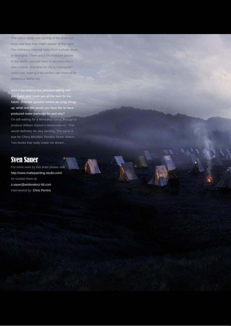
Interview Sven SauerThe colour range and lighting of the shots are
more real than they might appear at first sight.
The reference material came from a photo shoot
in Shanghai. There are a lot of bizarre places
in the world - you just have to put them into a
new context. Shanghai for me is “cyberpunk”
come real, making it the perfect raw material for
showing a fading city.
Well it has been a real pleasure talking with
you Sven, and I wish you all the best for the
future. One last question before we wrap things
up: what one film would you have like to have
produced matte-paintings for and why?
I’m still waiting for a filmmaker daring enough to
produce William Gipson’s Newromancer. That
would definitely be very exciting. The same is
true for China Miévilles’ Perdido Street Station.
Two books that really make me dream...
Sven SauerFor more work by this artist please visit:
http://www.mattepainting-studio.com/
Or contact them at:
Interviewed by: Chris Perrins


“…it’s a book about dreams and nightmares and how conscious and unconscious thought is all connected to the overall balance of the universe.”
Renowned artist
Philip Straub has
enlightened our lives
with his amazing
imagery. We take
a look at his latest
venture and delve
into the world of
Utherworlds.

page 32www.2dartistmag.com Issue 036 December 2008
Interview with Philip Straub Utherworlds
over out there. Now, many of these games are
lots of fun and very well made, but I’m more
interested in creating something with an uplifting
storyline that delivers a positive message in the
end – or, at the very least, an experience that
triggers an individual to think after gameplay is
done.
Utherworlds is your latest project, and you’re
planning on releasing the first book early next
year. Could you tell us the idea behind this
and also can you give us a brief overview of
Utherworlds?
Certainly - it’s a book about dreams and
nightmares and how conscious and unconscious
thought is all connected to the overall balance of
the universe. The book boasts 70+ illustrations,
an original novel of approximately 60,000
words, two unique written languages, an original
spoken language, and a selection of maps
detailing the territories. The book is actually the
diary of the main character, Lucas Sellers and it
details his travels in the Nightmare and Dream
Realms. He’s returned from the Realms to warn
Earth that humans must change their desire for
Hi, Philip. Now it’s been over a year since
2DArtist interviewed you and by the looks of it, a
lot has changed in that time; Chairman/Founder
of Unity Entertainment and the massive new
project you’re working on: Utherworlds. Well
we’ll talk more about Utherworlds in a moment,
but first can you tell us more about Unity
Entertainment and what your goals are?
Yeah - wow time does fly by, doesn’t it?
[Laughs]. I formed Unity Entertainment around
my two intellectual properties, Utherworlds and
Secret Places. Both properties have branded
merchandise already out in the marketplace, but
I wanted to add a much larger mythology and
story to them so that they could be delivered
in some of the new media channels available
today. Development of these properties required
additional employees and cash flow so a
company umbrella made sense. So, Unity was
formed as a canvas for the development of the
properties into new media channels.
There are already tons of shoot ‘em up games
out there, tons of sports games, and lots of the
same gameplay being regurgitated over and


page 34www.2dartistmag.com Issue 036 December 2008
Interview with Philip Straub Utherworlds
lust, greed and hate, or else the universe will lose their dreams and the
concepts of hope and love along with them.
The storyline back-story is as follows: Lucas is a well-known and
respected freelance journalist living in the heart of Los Angeles. He is an
influential creative figure with vast connections within the entertainment
industries, the political landscape, and big business. A once positive,
hopeful, and loving family man, Lucas spirals into depression when his
family disappears while he is on an assignment to uncover the global
effects of war, greed, and climate change. His unique abilities to influence

page 35www.2dartistmag.com Issue 036 December 2008
Utherworlds Interview with Philip Straub
millions with his writing and dire personal situation propels him to the
Realms with no memory of who he was or how he got there.
He falls into the middle of the greatest conflict the universe has ever
seen, with the Realms of Dreams and Nightmares acting as ground zero.
Through Aadyasha, an unlikely companion in the Realms, with a secret
intertwined with his own, Lucas eventually rediscovers his true being.
As Lucas journeys through the Realms of Nightmares and Dreams he
remembers there is still good in him, that he can love, and there is hope in
finding his wife and child. He learns he has the gift to write in the sacred

language of Dreams and, with it, the ability to
change the tides of war in the favour of the
Dream Realm. Ultimately, Lucas realizes that all
Utherworlds (earth and the rest of the planets
with sentient life in the universe) are equally real
and linked – and that he can make a decisive
difference for the better. But Lucas is forced to
make an impossible choice between retrieving
his lost wife and child or playing an important
role in the defence of all living creatures.
The framework for the mythology is the
following: All thought is alive – each hope, fear,
and memory is a part of the whole we call the
universe. Every living creature contributes in
their own unique way to the balance of positive
and negative energy in the world. Just beyond
human consciousness there is a place where
all dreams and desires exist, a world where
unconscious thought dwells and flourishes.
Virtually invisible to human perception and
beyond our physical reality resides the
splendour and malevolence of every thought
ever imagined. This relatively unknown world
is an expanding emotional manifestation that
survives through its symbiotic relationship
with the creatures that support it. As long as
there has been life, these visualisations and
manifestations have existed in delicate balance
with the universe, continually evolving with the
passing of time.
But, the balance has shifted and the natural
order has been disrupted. Sentient beings
have lost their way and have given into the
temptation of negative thought. Hope, empathy,
and truth are being challenged by the growing
forces of greed, hatred, and lust. War, global
climate change, and industrialisation grow with
each passing day unchecked. It is true - the
universe has reached a tipping point. A time of
no return is nearly upon us all. Those who are
open – those with true presence and a belief in
hope - are called upon to reclaim and restore
the balance.

So the story charters Lucas’s journey as he
strives to help Lealinnia restore the balance.
What can we expect to see from Lucas and how
will his character evolve?
Well, without giving too much away, his
character evolves quite a bit over the course of
the story. Keep in mind that when he arrives in
the Realms, he remembers nothing of who he
once was, so he is trying to survive, understand
what kind of man he is, remember his past,
and understand how all this intertwines with his
future. The more he remembers about his past,
the more he becomes drawn into the conflicts of
the Realms. And, the more he remembers, the
more dire the situation becomes around him and
on Earth.
This instalment of the story is only part of a
much larger story – so some things will be
resolved at the conclusion of this book, while
other aspects of the story are still unravelling
as I write this. The website will keep the story
moving until Lucas is able to communicate the
next chapter to the world. Keep in mind, we can
all make a difference and change the fate of the
universe - Lucas cannot do it alone.
With the first book being only a part of a larger
story, how many books are you planning and
how will they be structured? For example The
Lord of the Rings was a trilogy, with each book
having it’s own standalone title. Will you go
down a similar route or try something new?
Good question! Currently I’ve mapped out a
total of three stories with some aspects of the
journey concluding at the close of the third,
but Utherworlds could easily go the way of
The Chronicles of Narnia, with five, six or
even seven books. In addition, since there are
missing pages from the journal (the journal is
essentially the first book) of the lead character
Lucas, I’ve been toying around with the idea
of building a graphic novel of sorts around
that. And, of course, there is the back story
and prequel which I had to write to develop
page 38www.2dartistmag.com Issue 036 December 2008
Interview with Philip Straub Utherworlds
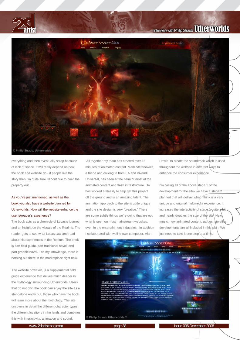
All together my team has created over 15
minutes of animated content. Mark Stefanowicz,
a friend and colleague from EA and Vivendi
Universal, has been at the helm of most of the
animated content and flash infrastructure. He
has worked tirelessly to help get this project
off the ground and is an amazing talent. The
animation approach to the site is quite unique
and the site design is very “creative.” There
are some subtle things we’re doing that are not
what is seen on most mainstream websites,
even in the entertainment industries. In addition
I collaborated with well known composer, Alan
everything and then eventually scrap because
of lack of space. It will really depend on how
the book and website do - if people like the
story then I’m quite sure I’ll continue to build the
property out.
As you’ve just mentioned, as well as the
book you also have a website planned for
Utherworlds. How will the website enhance the
user’s/reader’s experience?
The book acts as a chronicle of Lucas’s journey
and an insight on the visuals of the Realms. The
reader gets to see what Lucas saw and read
about his experiences in the Realms. The book
is part field guide, part traditional novel, and
part graphic novel. Too my knowledge, there is
nothing out there in the marketplace right now.
The website however, is a supplemental field
guide experience that delves much deeper in
the mythology surrounding Utherworlds. Users
that do not own the book can enjoy the site as a
standalone entity but, those who have the book
will learn more about the mythology. The site
uncovers in detail the different character types,
the different locations in the lands and combines
this with interactivity, animation and sound.
Hewitt, to create the soundtrack which is used
throughout the website in different ways to
enhance the consumer experience.
I’m calling all of the above stage 1 of the
development for the site- we have a stage 2
planned that will deliver what I think is a very
unique and original multimedia experience. It
increases the interactivity of stage 1 quite a bit
and nearly doubles the size of the site. New
music, new animated content, games, storyline
developments are all included in this plan. We
just need to take it one step at a time.


I want to talk about the game side of
Utherworlds and the MMO. With games such as
Warhammer: Age of Reckoning and World of
Warcraft dominating the market, how will your
game differ from these and what new elements
will it offer in order to entice gamers to enter
Utherworlds?
There are a bunch of new things that we have
planned for the game(s). All of these things are
long-term goals right now, since I only have so
much time in the day and the book and website
is taking up all of it. But, the delivery of content
across multiple media formats will allow the user
to experience the Utherworlds property in a new
way… a way that is connected to day to day life.
The Utherworlds PC/console game would not
fall into the typical MMO space. I think the
current MMO space is actually quite crowded
and I don’t know if there are that many more
consumers out there that are willing to invest
the amount of time a typical MMO requires. The
plan is to combine social networking, casual
MMO concepts, and interactivity so that the user
can choose how much time they want to invest.
If the user wants to become fully engaged in the
mythology then it is there for them - however, if
they only want to only invest 5-10 minutes then
they will have that opportunity too. I know I’m
being vague here but, I don’t want to give too
much away.
Having chosen to create this link between the
books and website, in order to enhance the
reader’s experience, are you planning on having
a similar aspect to the game where the player
must consult the book/website for help?
But, of course! Who could resist that?
[Laughs]. Every aspect of Utherworlds will be
a standalone experience and also a part of

page 42www.2dartistmag.com Issue 036 December 2008
Interview with Philip Straub Utherworlds
the bigger puzzle. I’ve been looking at utilising
the two secret languages I’ve developed for
the story, producing tarot cards applying the
mythology or trading cards - the list goes on.
Stay tuned!
You have so many wondrous and adventurous
things planned for Utherworlds already, but
I hear that you’re also thinking about feature
films. How do you think the world of Utherworlds
will translate to film considering the complex
environments and characters?
Thank you! I’ve already completed a film
treatment for the Utherworlds story. I’ve pitched
the treatment to a few folks here in Hollywood
and the response has been really positive. I
think the story will translate quite well and as
I’ve been writing and illustrating the book and
website content, I’ve always kept the film in
mind. The only thing that will probably hold
the film back from being produced is the large
budget that would be required to fully realise
the vision. Utherworlds is without a doubt a
100+ million dollar film and until the product
has been proven through book sales, website
traffic, merchandise and game sales, the deals
we’re likely to see in the film space will not be
attractive. So, the idea is to build the IP out
slowly but surely, and hope that people are
interested in it and enjoy it.

page 43www.2dartistmag.com Issue 036 December 2008
Utherworlds Interview with Philip Straub
Thankfully, my philosophy around Utherworlds is
to simply produce a good story that will hopefully
change the way people see the world. Even if I
only affect a few people in a positive way, then
that’s enough for me. That is my goal, I want to
put something good out in the world... Lucas’s
message must be heard.
Do you think it would lend itself better to being
a CGI film or would you go down the live action
route?
I’ve been asked this question a lot. I personally
see Utherworlds as a live-action film - this
is always how I’ve visualised it. It might be
because I want to see the characters in the story
truly come to life and the worlds made real. I
think bringing these worlds, based on human
emotions, in all their realistic glory would be a
pretty incredible sight. But, as I’ve said, I think
the budget for a live-action Utherworlds film
would be over 100 million, so it could be that an
animated adaptation might work - it all depends
on what components might come together to
make the project find the big screen.
Well it has been a pleasure talking with you
Philip and I wish you all the best and I look
forward to reading the book.
Thank you, Sir - I’m looking forward to seeing it
all come together too!

Philip StraubFor more information please visit:
http://www.philipstraub.com
Or contact:
Article courtesy: Chris Perrins


This month we feature:
Anne-marie Hugot
Mario Wibisono
Michael Dashow
Ömür Özgür
Soheil Danesh
Minjuan Zhong
Ejiwa A. Ebenebe
Dmitry Mitsuk
Alex Ruiz
Jose Alves da Silva

page 48www.2dartistmag.com Issue 036 December 2008
10 of the Best The Galleries
Trainwreck FallsAlex Ruiz
http://tarrzan.deviantart.com/
ThunderstormDmitry Mitsuk
http://mitsuk.cgsociety.org/gallery/
© Dmitry Mitsuk

SuperstarMario Wibisono
http://raynkazuya.cgsociety.org
Pepper character copyright Stanley Lau

CargoÖmür Özgür
http://www.omurozgur.net


page 52www.2dartistmag.com Issue 036 December 2008
10 of the Best The Galleries
Mr. ReaperJose Alves da Silva
Beautiful Girl Mingjuan Zhong

Adorable AlienMichael Dashow
http://www.michaeldashow.com
© Michael Dashow

page 54www.2dartistmag.com Issue 036 December 2008
10 of the Best The Galleries
Circus ActAnne-marie Hugot
http://sachan.ultra-book.com/
SnowfallEjiwa A. Ebenebe
http://peppermint-pinwheel.deviantart.com
© Ejiwa A. Ebenebe
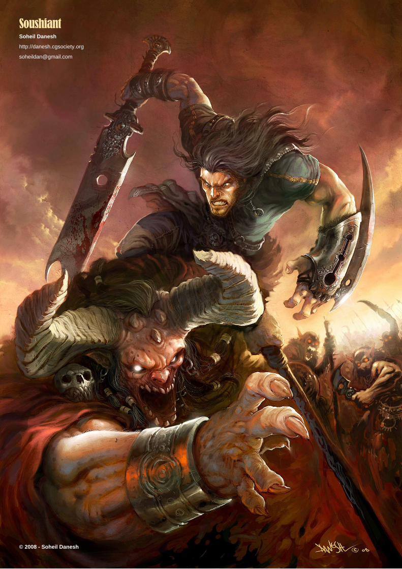
SoushiantSoheil Danesh
http://danesh.cgsociety.org
© 2008 - Soheil Danesh

Welcome to the “Challenge” section of
2DArtist. Every month we run a challenge
in the conceptart.org forums, which is
avaliable for anyone to enter. The winning
entries not only receive prizes from the
www.3dtotal.com shop, but also get
featured in this very magazine! And as
well as displaying the winners from the
previous month’s competition, we also
showcase the “Making Of’s” from the
month before that, so you can see how
these winning pieces of artwork
were created.
ScarecrowStylised Challenge

page 58www.2dartistmag.com Issue 036 December 2008
Stylised Challenge Scarecrow
Marcus Welbey
8th
The ChallengeWelcome to the Super Stylised Monthly
Challenge. Each month we will select an theme
and post some images in the Forum Thread
as reference. All you have to do is to create a
2D image in line with this theme in a stylised
/ abstract / cartoon style, whilst keeping your
image instantly recognisable. We wanted to
publish some content in 2DArtist Magazine on
how to create stylised images, such as you see
in the many feature films and cartoon galleries.
Richard G.D. Baker - The Antarctican
10th
[email protected]://www.cirqus.com
Rosatron
10th
Katie Babkoff - Kit1
9th
[email protected]://kit1.deviantart.com
Char Reed - CharReed
9th
[email protected]://www.charrartist.com
Ramazan Aykilic - Brather
9th
[email protected]://brather.cgsociety.org
We thought this regular competition might bring
in just the images / Making Of’s that we need,
whilst giving away great prizes and exposure.
This month’s theme was “Scarecrow”. Here
you can see the top placed entries, as voted for
by the public.
What are we looking for?Funny and humorous entries which break
the theme down to its most recognisable
components; emphasise these in whichever
ways you think best, and render your stylised
/ abstract / cartoon masterpiece. The rules are
pretty laid back: please submit 1 x 3D render
(minor post work is OK); its up to you if you want
to have a background; include some graphical
elements or text on your image. Renders of the
800 pixel dimension sound about right, but the
winners will be featured in 2DArtist Magazine,
so if you can create some higher res images too
then all the better!

page 59 Issue 036 December 2008
Scarecrow Stylised Challenge
www.2dartistmag.com
Urih pta2
7th
Freddydark
6th
Tom Svoboda - Smot
5th
[email protected]://www.smot.cz
Adrian Zhang - Gnahz
5th
[email protected]://gnahz.deviantart.com/
Fedezz
4th
There will be one competition per month,
with the deadline being the end of the month
(GMT). For a valid entry, just make sure your
final image is posted in the main competition
thread before the deadline. We require the top
three winners to submit “Making Of” overview
articles that will be shown on either 3DTotal or
in 2DArtist Magazine. These need to show the

page 60www.2dartistmag.com Issue 036 December 2008
Stylised Challenge Scarecrow
Robert L. Cron - Madhatter106
2nd
[email protected]://www.costumesketch.com/
4th
Felipe Fernández Morell - Bstsk
3rd
stages of your creation - different elements and some brief explanation
text - of why, and how, you did what you did. We will format this into some
nice-looking pages to give you some great exposure, and us some quality
content. Each competition will have one main thread which starts with
the brief at the top. All entrants should post all WIP’s, give feedback and
generally laugh at the crazy ideas that are emerging each month...
Challenge ThreadThe entire Scarecrow competition can be viewed Here
The current challenge at the voting stage is: Butcher
The current challenge taking place is: Troll
To join the next challenge, or to view previous, and / or current entries,
please visit: www.conceptart.org
Or contact: [email protected]
[email protected]://www.ffilustracion.com
Entroid

page 61 Issue 036 December 2008
Scarecrow Stylised Challenge
www.2dartistmag.com
Ruth Martinez - [email protected]://ruth2m.com
1st

page 62www.2dartistmag.com Issue 036 December 2008
Stylised Challenge Scarecrow
3rd Rosatron
ConceptComing up with the idea for a Frankenstein
picture was easy. Whenever I’m stuck for ideas
on what to do for a themed picture, I just think of
a version of the character that I’d be interested
in watching a TV show about. Maniacal children
make me laugh, which led to the idea of a kid
doing experiments in his bedroom on a teddy
bear.
Step 01I did a horrible little sketch in my work notebook
to get a general feel for his character (Fig.01),
and then scowled at it for ten minutes, trying to
figure out how I could make it good.
Step 02I really liked the idea of dramatic (or
melodramatic) camera angles and lighting,
except that my perspective is dodgy at best. So
I turned to my ugly friend, 3ds Max, to help me
out with the composition. I constructed a basic
room and characters out of basic boxes, using
nothing fancy or complicated. I used mostly
boxes instead of spheres, as I find the obvious
change of plane easier to sketch over. I chucked a camera in the scene,
moving it around until I found a shot I generally liked. I threw some lights
in for fun and rendered out the scene. To render out my wire lines over the
top, I had to collapse the whole scene into a group, duplicate it, and add a
push modifier onto the scene copy. With this modifier and a wire material
applied, I was able to render out my basic shapes along with a pushed out
wire frame sitting just over the top (Fig.02). This is especially handy for
perspective lines and just makes the whole thing easier to sketch over.
Step 03Using my 3D render as a base, I sketched over it in Photoshop to get my
rough line work down (Fig.03). I got some feedback from some fellow

page 63 Issue 036 December 2008
Scarecrow Stylised Challenge
www.2dartistmag.com
ConceptArtisans (thanks very much) to extend my canvas, as it was
looking a bit cramped. I took this on board and did a re-render from 3ds
Max to get some extra information for the background. Then I went back
to Photoshop to paint in some tone. This helped me get a get a further
sense of the composition, which I felt had gotten lost after staring at just
line art and blank white for so long.
Step 04 & 05 After painting in my rough shadows and highlights (Fig.04), I threw in
my flat colour under my shadow layer. I set my line art’s blending mode
to linear burn with 60%, opacity so it would receive the colour beneath
it instead of just being a flat purple. I find this is a gloriously lazy and
easily adjustable way to create coloured lines if you don’t need something
too perfect. I cleaned up my shadow layer and also set it to linear burn
(fill 70%) and mucked around with the hue and saturation until I found
something I was pretty happy with (Fig.05).
Step 06I was ready for rendering and making it all painterly now. I could’ve refined
it more and gone for a cell-shaded look, but I needed the painting practise,
and so I used a hard chalky brush and worked
on the bear first, enjoying the textured, muddy
feel of the brush I was using (Fig.06). I kept
switching from my bear to the general shadow
layer, sometimes cutting bits out of the shadow
layer to merge into other layers where its
general blending mode wasn’t working for me.
In retrospect I think I should’ve experimented
page 64www.2dartistmag.com Issue 036 December 2008
Stylised Challenge Scarecrowwith different brush types for different areas of
the picture, instead of just using the same hard
chalky one just because I liked its feel.
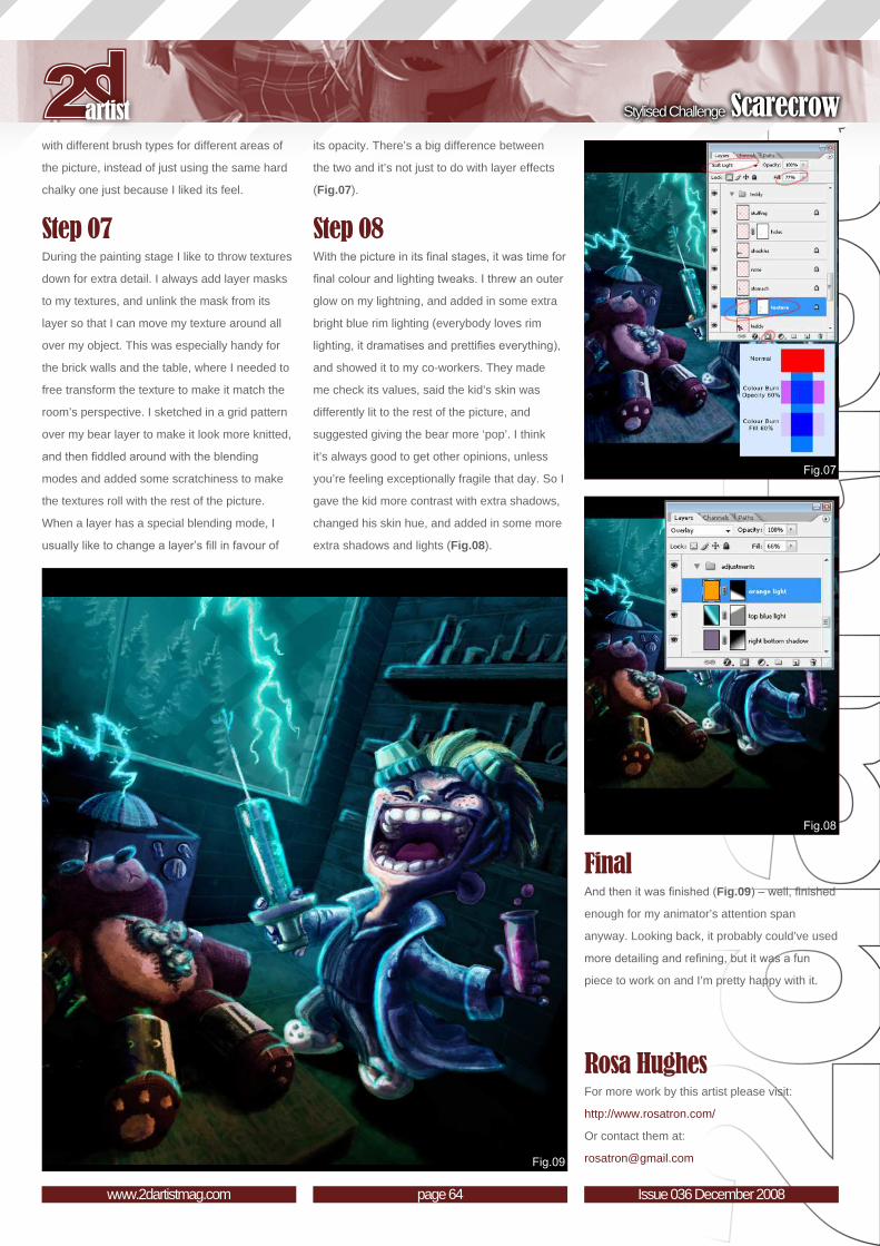
Step 07During the painting stage I like to throw textures
down for extra detail. I always add layer masks
to my textures, and unlink the mask from its
layer so that I can move my texture around all
over my object. This was especially handy for
the brick walls and the table, where I needed to
free transform the texture to make it match the
room’s perspective. I sketched in a grid pattern
over my bear layer to make it look more knitted,
and then fiddled around with the blending
modes and added some scratchiness to make
the textures roll with the rest of the picture.
When a layer has a special blending mode, I
usually like to change a layer’s fill in favour of
its opacity. There’s a big difference between
the two and it’s not just to do with layer effects
(Fig.07).
Step 08 With the picture in its final stages, it was time for
final colour and lighting tweaks. I threw an outer
glow on my lightning, and added in some extra
bright blue rim lighting (everybody loves rim
lighting, it dramatises and prettifies everything),
and showed it to my co-workers. They made
me check its values, said the kid’s skin was
differently lit to the rest of the picture, and
suggested giving the bear more ‘pop’. I think
it’s always good to get other opinions, unless
you’re feeling exceptionally fragile that day. So I
gave the kid more contrast with extra shadows,
changed his skin hue, and added in some more
extra shadows and lights (Fig.08).
FinalAnd then it was finished (Fig.09) – well, finished
enough for my animator’s attention span
anyway. Looking back, it probably could’ve used
more detailing and refining, but it was a fun
piece to work on and I’m pretty happy with it.
Rosa HughesFor more work by this artist please visit:
http://www.rosatron.com/
Or contact them at:

page 65 Issue 036 December 2008
Scarecrow Stylised Challenge
www.2dartistmag.com
2nd Paweu
IntroductionI’ll start off with a few words about the software
I used for this artwork. I always hear of people
using either Photoshop or Painter in regards
to 2D graphics; in 3D it’s usually Maya or 3ds
Max, and for vector art everybody seems to be
using Corel Draw or Adobe Illustrator. Being
the rebel that I am, I use open source software
instead: GIMP, Blender and Inkscape. These
three programmes have evolved over the years,
so much so that they can really compete with
their commercial rivals – on many levels. I’m not
saying that they are better, because they most
certainly lack some useful tools, but they are
very good alternatives for guys that don’t have
too much free cash (yes, they’re free), and also
it’s really fun to see how they change with every
new release, with more and more new options
each time.
So let’s now get onto the creation of the picture.
The basic idea was to combine the two parts
of the subject into one. I wanted to make a
Frankenstein’s monster that hadn’t turned out
too well. The first thing I thought about was the
face; I think my mind was wandering towards
Mel Brooks’s Young Frankenstein, but rather
than the monster I was thinking more of Marty
Feldman’s crazy eyes. I wanted the monster to
look wacky, and eyes like that would certainly
do the trick!
Step 1I usually start by sketching some ideas with a
pencil, or directly in GIMP with a tablet, but this
time I made the sketch of the character’s head
as vector graphics in Inkscape (Fig.01). There
wasn’t any real reason for this; I just wanted to
play with the programme a bit. I focused mainly
on the eyes; I wanted them to look like they’d
been extracted from a Pixar flick. The face was
supposed to be distorted and crazy, but not
really scary.
Step 2I was quite happy with the face, so it was time
to think about the whole picture. I thought that, if
this was a failed experiment, then it would mean
the monster hadn’t come to life. In that case,
the monster would probably end up in a glass
container –filled with formaldehyde or something
like that – and so that was what I wanted to
draw.

page 66www.2dartistmag.com Issue 036 December 2008
Stylised Challenge ScarecrowI opened the face sketch in GIMP and coloured
it roughly. I then added the background layer
and coloured it green – it just felt like the right
colour for the picture. After setting this up, I
started to sketch the body (on a new layer
again). I wanted him to be cramped in a small
space. The monster would have to be naked,
but I didn’t want to invade his privacy too much.
That’s how I ended up with this pose (Fig.02).
Step 3The sketch looked okay, so it was time to make
it a little more precise. I made a new layer and
drew the outlines. I didn’t focus on the quality of
the lines as I didn’t intend to keep them in the
final picture. But it was a really important part of
the work, because it was the last moment when
I could fix everything easily. It’s always very
frustrating for me to find some huge mistakes
too late and end up repainting huge chunks of
a nearly finished picture to make it right, so I
tried to make it right at this stage. I mirrored the
picture a few times and fixed everything that
seemed off. I then added the colour to the body
and the mouth, and for the first time, I could see
this guy as a whole character (Fig.03).
Step 4This was when the real fun started! This step
took probably the most time, but it flew by so
fast that I didn’t even notice. I merged all the
layers, except the background, and just kept
painting over until I was happy with it (Fig.04).
I didn’t add any new colours, just painted the
values to bring out the form as well as I could.
At this stage I painted with one light source in
mind.
Step 5The picture started to look too dark, so I
tweaked the contrast and brightness a little
(Fig.05). The gradient in the background didn’t
look too good, so I added a texture to it. You
can see what I did in Fig.06. I used a filter called
“Plasma Clouds” on a new layer – it created a

page 67 Issue 036 December 2008
Scarecrow Stylised Challenge
www.2dartistmag.com
nice noisy texture. I didn’t want the colours, so I desaturated it. I then set
the layer to Overlay, and the new background was done.
I also added some colour variations to the skin of the monster. I created
the selection from an alpha channel so I didn’t have to worry about
keeping everything inside the shape, then created a new layer again and
painted some random patches of yellow, green and pale red. I also set this
layer to Overlay and decreased the opacity to 50%, because I didn’t want
it to be too strong. You can see how it works in Fig.07.
Step 6In this step I added some green highlights to make the lighting more
interesting. I also wanted to make the liquid look muddier, so I duplicated
the background layer, brought this copy to the front and decreased the
opacity to 40%. I picked the Eraser tool, a large fuzzy brush and erased
this layer in places that I wanted to be more visible – the face and those
parts most in front.
The character was almost finished here, so it was time to paint the
container he was in. I painted the walls, added parts of reflections on the
sides and bubbles (I painted one bubble, copied it and then used it as a
brush because I’m lazy). I then painted a surface and a label. To finish it
off, I added the delicate white reflection (Fig.08).
Step 7 The picture was pretty much done at this point. All I did here was add
some details. The veins were done very quickly: on a new layer I painted
black lines with a fuzzy brush. I then duplicated this layer and inverted the
colour to make it white. I decreased the opacity of both layers, merged
them together and set it to Overlay (Fig.09). The eyes seemed flat and too
bright, so I shaded them a little more. Finally, I gave a few touches to the
teeth and fingers and the picture was done.

page 69 Issue 036 December 2008
Scarecrow Stylised Challenge
www.2dartistmag.com
1st Chuck,mate
Step 1I started off by roughly sketching my character.
As a rule for character design, I try and give
as much personality and life to my design as
I possibly can; I’m looking for a story behind
the facial features, the body language, and so
on. There’s nothing sadder than a wonderfully
rendered guy that has no expression, no story to
tell, no life in him.
For this piece, I was going for a child-like
rendition of a Frankenstein-type monster, who’s
somewhat lost and perhaps also confused and
misunderstood – a Frankenstein teenager if
you will (only without the rotten attitude). I drew
in my character’s environment, which helped
to further enhance the story telling, and it also
grounded my character, so he wasn’t just
floating in midair (Fig.01).
Thinking of my light source from the get go, I drew in a door – an open
passage behind the guy – so that it would serve as a light source coming
from behind, which in contrast left most of this sad, misshapen creature
in the dark. I doodled some more shapes there, just to balance the
composition a bit. I still wasn’t sure at this stage what everything would be.
Step 2On a new layer set to Multiply, I roughly painted in a mid tone, dropping
some shadows and allowing shapes and forms to start to take their place.
I painted quickly, just hinting at what was to come in regards to smaller
shapes and details in the features of my character’s face and arms. I kept
it monochromatic at this point, using the same greyish purple for my rough
sketch (Fig.02).

page 70www.2dartistmag.com Issue 036 December 2008
Stylised Challenge Scarecrow
Step 3I dropped a cold green on top using a Multiply
layer, just to introduce a new colour to the piece
and to darken the whole image. This way I gave
myself more material to work with when carving
shapes, forms and surfaces out from dark to
light. You can also see that I started painting the
light coming from the giant doorway towering
above my main character, allowing me to finely
define the edges and overall silhouette of
Frankie (Fig.03).
Step 4At this point, I was mostly done with the
rendering of the character, in terms of volume,
lighting, shapes and values. The main light
source, being a back light, didn’t mean I had to
lose any of the detail from the face and body, so
I painted in details like scars, seams, wrinkles,
folds and creases, using a “global” lighting
coming from the room itself, bouncing off the
floor, walls, and so on. I also painted more of the
light source coming from the door, defining the
heavy stone lintels from both sides. I blocked
in a dark shape in the bottom left corner, just to
add some depth to the scene, and even at this
point I still wasn’t sure what that was going to be
(Fig.04).
Step 5At this stage you can see that I wasn’t pleased
with the way Frankie’s right arm was coming
along, so I painted in a new one, matching it
much better with the left arm in both size and
shape (Fig.05). I also added an even brighter
colour to the light coming from the door in the
background, further contrasting the main figure,
making him ‘pop out’ slightly more.

page 71 Issue 036 December 2008
Scarecrow Stylised Challenge
www.2dartistmag.com
Step 6Here I painted in the stone lintels, adding details
like grooves and notches, making them grittier
and giving them their proper light and shade –
relying again on where I decided my main light
source was coming from and the secondary light
sources, bouncing off the surroundings. I used
an Overlay yellowish colour layer on top of my
image to crank up the contrast of my image a
notch, and to give the bright areas of the picture
more of a vivid look; less manufactured, a
boring colour – more of a vibrant warm colour. I
lowered this layer’s opacity to about 40%, so it
blended nicely with my image as a whole. I then
erased out the shaded area from this layer, to
bring back some of the dark and moody purples
of it (Fig.06).
FinalThis stage was all about finishing touches
(Fig.07). I added more detail work to pretty
much everything. I gave my character’s torn
shirt a faded red colour that gave some variety
in colour, yet wasn’t too overstated in the piece.
I painted in more small details, like the pattern
on the shoes, tiny veins on the muscles, and
more shade in darker and deeper areas. On
a new layer, I painted some wires/cables in
the right top corner, and also some sort of
chamber/box/machinery in the bottom left corner
(where that big block of dark colour used to
be). I applied a Gaussian Blur filter onto this
layer so it appeared out of focus, thus giving
my scene some more depth. This also helped
balance out the composition a bit more. I gave
my boy a shackle on one hand and some tears
rolling down his face, hinting that perhaps, just
maybe, there’s something unpleasant going
on. I painted some sort of a trap door, or a
lower chamber entrance – or perhaps it’s the
door to that big entrance in the background
that was kicked in earlier at some point? It
doesn’t matter; as long as it gives more texture
(story-wise) to the piece, and as long as it gives
something extra to the story I’m trying to tell, it
doesn’t really have to “be” anything in particular.
Just make sure it doesn’t interfere with any
of the other elements in the picture and keep
it in accordance with the light source and the
composition, and you’re good.
It’s important to remember that this is a
portrait of a stylised character, not a full blown
illustration of a scene in a castle, or a depiction
of a lab and its utensils. So our focus needs to
stay on our character and his story. Just listen
to it!
Patri BalanovskyFor more work by this artist please visit:
http://www.chuckmate.blogspot.com
Or contact them at:


Welcome to the Speed Painting section of the magazine. This
month we’ve asked two artists to produce a speed painting
based on a simple, one-line brief. Here we feature the final
paintings and the overview of the creation processes.
This month our talented artists, Emrah Elmasli
and Justin Albers, tackle the topic:

page 76www.2dartistmag.com Issue 036 December 2008
The machine was their only means of escape Speed Painting
Created In:Adobe Photoshop CS3
Hello everyone! First of all, I would like to let
you know that this month’s speed painting will
be an homage to English sci-fi painter, John
Harris. When I first heard about the theme,
the first thing that came to my mind was this
scene, which is similar to one of John Harris’s
paintings. I thought it would really suit this
theme, so I decided to paint it. It will be very a
simple and graphical composition with strong
use of colour. So let’s get started.
Step 1As usual, I’ll be using Adobe Photoshop
CS3 for this tutorial. It’s going to be a vertical
composition, so I’ll create a new A4 canvas at 150 ppi. Firstly, I need to
block the main shapes and colours in, so I’ll choose a textured flat brush
and start to paint. I won’t be using any fancy brushes for this speedy,
so that it’s easier for you to replicate what I do (hopefully). Anyway, I’m
trying to create a silhouette of a spaceship with basic brush strokes; I’m
trying to be really loose at this step of the painting (Fig.01). I also draw
some perspective lines to create an illusion of depth to help me while I’m
painting, and I’m using a very strong orange on the background because
it’s going to be a huge Sun!
Step 2I create another layer to mask the upper part of the Sun and give it a
nice round curve (Fig.02). I also create an Overlay layer and paint on the
Sun to give it a basic form. Now I can start to paint in the details. I start
with blue smoke coming from the launch pad; blue creates a really good
contrast with the orange at the back. For the foreground I paint in a wide
road going towards the launch pad. Then I pay some more attention to the

page 77www.2dartistmag.com Issue 036 December 2008
Speed Painting The machine was their only means of escape
spaceship and paint in some more details on the
launch pad. Small lights add an illusion of life to
them.
Step 3For the next step I just carry on detailing
(Fig.03). I paint the prominent areas on the Sun
and add detail to the chromosphere (the Sun’s
atmosphere). I’m still not sure about the shape
of the space ship, by the way; I’ll probably try
to define a good shape for it whilst I finish the
painting. I thought a rectangular shape with
sharp edges would look good, but it looks like
a building instead of a ship, so I’ll soften the
edges in the future steps.
Step 4It’s now time to paint the people walking on the
road, who are all heading towards the spaceship
to get the hell out of there, because the Sun is
getting closer! That ship is their only chance
to save them from extinction. As you can see,
I soften the edges of the ship here – it looks
more like a vehicle now. I won’t give any form
to it because I want to keep it like a silhouette
(Fig.04).
FinalAlmost done now! I always adjust colours while I’m painting, so here I
open a new adjustment layer and tweak the colours a little; darkening the
painting by adding some blue to it. This is the way I paint: adding contrast
during the painting process. As a final touch, I apply a texture to the Sun,
using a picture of the Sun that I found on the Internet, and just overlaying
it on the painting. I erase out the parts I don’t want and that’s it – done
(Fig.05)!
I hope you’ve enjoyed this painting process. Thanks for reading!
Emrah Elmasli For more from this artist visit:
http://www.partycule.com
Or contact:


page 79www.2dartistmag.com Issue 036 December 2008
Speed Painting The machine was their only means of escape
Created In:Adobe Photoshop CS2
Step 1This topic was a lot of fun for me to do –
machines and robotic stuff are some of my
favourite things to draw. There were lots of ways
I could approach this topic, so I figure with those
in mind I’ll just get to it and see what develops.
Here I’ve opened up a landscape canvas in
Photoshop CS2. For now I just start laying down
some colours and shapes for the background,
using a few texture brushes for interest. I’m
thinking of having a relatively cool colour palette
with maybe some warmer colours around
whatever the machine ends up being to make
that my focal point (Fig.01).
Step 2Next, I start working in a really, really rough
drawing to start determining the form and
silhouette of this thing. I’m thinking that the
landscape will be harsh and angular, so for
contrast I’m going to make the design of the
machine more rounded and smooth. I’m keeping
the drawing insanely loose because I’m not
ready to commit to a design just yet (Fig.02).
Step 3Here I begin roughing in some colours and filling
in the shapes and silhouettes. I decide to start
out with a sphere so I make a circular selection
and start painting inside the selection over the
rough drawing. Then I deselect the layer and
lock it so that I can keep the shape clean. I also
determine that my light source will be coming in
from the top left (Fig.03).
Step 4I’m starting to lock in the composition of the
piece – my thinking behind this piece is going
to centre on a post-apocalyptic theme. In the
future, the Earth has been ravaged by a world

page 80www.2dartistmag.com Issue 036 December 2008
The machine was their only means of escape Speed Painting war and all the cities are burning and dying
out. The three figures in the painting are a
father, mother and son hurrying to one of the
last remaining ships leaving the planet for the
temporary safety of space. I decide to make
their clothing very ragged and makeshift, mixed
in with some spacesuit elements. The machine
is starting to look a bit more like a robot than a
spacecraft, so I add in the gantry tower on the
left and steam coming out of what I intend to be
the engines and boosters to make it seem more
like a ship waiting to launch. While painting, I
use my navigator window to be sure the piece is
reading from a distance (Fig.04).
Step 5I’m still feeling out the details and trying to
make the story come through in the painting. I
add some incoming missiles heading towards
the fiery city to add a sense of urgency to the
situation. I’m also starting to finalise the design
of the ship – I picture this thing taking off, the
elevator at the bottom rising into the ship as the
boarding hatch closes. The boosters on either
side of the ship would fold down 90 degrees
after lifting off to propel the ship into space and
the legs would fold under the body. The towers
and mechanical bits on top could be sensors
and navigation equipment. Overall, I’m digging
the silhouette of this guy (Fig.05)!
Step 6I give myself a little bit more room on the bottom
of the piece and add more canvas so I can finish
the foreground figures and detail them out. I also
add some details to the burning city and fade
it into the background. I kind of like the blue/
red combination of colours in the foreground;
the red in the clothing and the blue light in the
foreground is working for me, so I’m going
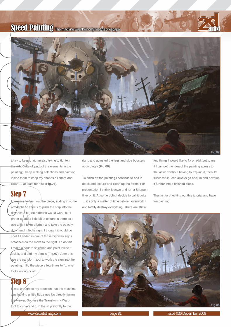
page 81www.2dartistmag.com Issue 036 December 2008
Speed Painting The machine was their only means of escape
to try to keep that. I’m also trying to tighten
the silhouette of each of the elements in the
painting; I keep making selections and painting
inside them to keep my shapes all sharp and
clean … at least for now (Fig.06).
Step 7I continue to flesh out the piece, adding in some
atmospheric effects to push the ship into the
distance a bit. An airbrush would work, but I
prefer to add a little bit of texture in there so I
use a light texture brush and take the opacity
down until it looks right. I thought it would be
cool if I added in one of those highway signs
smashed on the rocks to the right. To do this
I make a square selection and paint inside it,
lock it, and add my details (Fig.07). After this I
use the transform tool to work the sign into the
painting. I flip the piece a few times to fix what
looks wrong or off.
Step 8It was brought to my attention that the machine
was looking a little flat, since it’s directly facing
the viewer. So I use the Transform > Warp
tool to curve and turn the ship slightly to the
right, and adjusted the legs and side boosters
accordingly (Fig.08).
To finish off the painting I continue to add in
detail and texture and clean up the forms. For
presentation I shrink it down and run a Sharpen
filter on it. At some point I decide to call it quits
… it’s only a matter of time before I overwork it
and totally destroy everything! There are still a
few things I would like to fix or add, but to me
if I can get the idea of the painting across to
the viewer without having to explain it, then it’s
successful; I can always go back in and develop
it further into a finished piece.
Thanks for checking out this tutorial and have
fun painting!


Justin AlbersFor more from this artist visit:
http://www.justinalbers.com/
Or contact:

All Animation & Visual Effects programs at Vancouver Film School focus on telling a great story through movement. Choose your discipline: 3D Animation & Visual Effects, Classical Animation or Digital Character Animation.
Under the guidance of industry pioneers, you will work and learn in a studio setting, and create a demo reel or film of your own. When you graduate, you’re ready to work in a production team.
VFS animation is all around you. Every year our graduates start careers at the world’s best production studios. You’ve seen their work in Iron Man, WALL-E, Transformers, Cloverfield, Horton Hears a Who, Lost, Family Guy and Battlestar Galactica.
Visit vfs.com/animationvfx to learn more about our programs and to speak to an advisor.

“Whilst it may seem an obvious choice to produce
symmetrically aligned transport, with the advent of space travel which can hypothetically surmount gravitic issues, it stands
to reason that symmetry and conventional existing
design issue may not necessarily be adhered
to.”
I - Planets and Star fieldsPart 1: Stars & Nebulas–- July 2008Part 2: Barren Worlds - August 2008Part 3: Barren Planets - September 2008Part 4: Gaian Planets - October 2008Part 5: Colonised Planets - November 2008
II - TransportPart 6: Spaceships - December 2008Part 7: Capital Ships - January 2009 Part 8: Space Stations - February 2009
III - EnvironmentsPart 9: Sci-fi Hangar - March 2009Part 10: Space Battle - April 2009Part 11: Mining the Asteroid Fields - May 2009Part 12: Space Colonies - June 2009

page 86www.2dartistmag.com Issue 036 December 2008
Transport: Part 6: Spaceships Space Painting
Created In:Photoshop
IntroductionWelcome to part six of our space and sci-fi
digital painting series, with particular focus
on space transport. This will span over the
next three workshops categorised from small
spaceships, to middle, to large-sized transport
(capital ships), and culminating in design for
space stations. In each tutorial segment, we
will consider simple traditional techniques
and discuss design and function first and
foremost. Effective design is being able to fully
translate your ideas across in an accurate and
inspiring manner towards the recipient, be it a
3D modeller, game designer, art director or a
member of the public (Fig.01).
Form & FunctionSpace transport comes in all forms and can
generally be split into the following:
- Geometric
- Industrial and angular (functional)
- Organic and xenomorphic
The other aspect to consider is whether the
overall shape is symmetrical or asymmetrical.
Whilst it may seem an obvious choice to
produce symmetrically aligned transport,
with the advent of space travel which can
hypothetically surmount gravitic issues, it stands
to reason that symmetry and conventional
existing design issue may not necessarily be
adhered to. Therein lays the challenge: to
produce a convincing design in whatever shape,
form or symmetry.
For the purposes of this tutorial, let’s consider a
functional and partially geometric function (we’ll
cover the more exotic shapes in the ‘capital
ships’ section of the subsequent tutorial).
Fig.01 illustrates various classical and retro
spaceship designs currently known in popular
culture, as follows:
1. Marry Poppins – Yes, I consider her to be
but an android in disguise as a super nanny
(how else can one explain her anti gravitic
vertical takeoff and landing capabilities, via an
umbrella?)
2. Tardis – An unconventionally shaped
spaceship of the time lords (where the
insides are larger than the exterior due to non
Newtonian 4-dimensional capabilities)
3. Classical Space Rocket Ship – e.g. Flash
Gordon
4. Dragonfly/Animal shape – e.g. Firefly/Terran
Trade Federation
5. Doughnut/Horseshoe – e.g. Phantom
Menace/Homeworld/Stargate
6. Industrial – e.g. Space: 1999/Aliens/Pitch
Black
7. UFO/Saucer – e.g. Independence Day
8. Cigar-shaped/Jet fighter-shaped – e.g.
Buck Rogers/Battlestar Galactica/Star Wars/
Thunderbirds
Let’s next consider a fictional spaceship
manufacturer, Azora Dynamics, who will be
designing and producing a multipurpose and
modular space transport. This can be used for
civilian purposes, law enforcement or even deep
space racing (fictitiously named Formula Double
Zero based on the current Earth’s Formula
One). It has been tasked with producing a new
prototype for mass market use, and to be kept
in consideration is that this transport must carry
one to two passengers, and can be used for
atmospheric re-entry. In terms of technology,
gravity has a minimal effect of this space

page 87www.2dartistmag.com Issue 036 December 2008
Space Painting Transport: Part 6: Spaceships
transport, but during atmospheric flight, tiny
aerodynamic adjustments may provide small
advantages, crucial for Formula 00 racing.
PrototypingTraditional Tools Required: Biro/pencil/ink
gel pen, paper (any kind) and imagination (as
standard)
First of all, let’s consider various forms for our
single/twin seater transport (Fig.02). You can
explore these designs in a side view or as show
in 3/4th perspective view. Personally, it appears
to be easier to explore forms in the latter
view, but many folk find it easier with the side
orthographic view. It doesn’t really matter, as
long as the overall shape and form is explored.
These images were rendered with a mixture of a
cheap 37p biro and thick 0.7 gel ink pens. I find
it particularly effective to use stripes and marks
across a vehicle, or along its frontal/posterior
axis, to suggest form (Fig.03).
So, using the example of a sphere, let’s
consider designing a dumbbell-shaped vehicle.
In the designs shown in Fig.03, various cockpit
configurations and some degree of asymmetry
are included within the designs. Spherical
designs look good with a low slung turret/canon.
Alternatively, a twin barrelled cannon can be
mounted above each sphere, or on the far sides.
Once the initial form is considered, it’s sometimes useful to consider the
internal mechanics underneath the external cowling armour plating (as
shown in the singular sphere design in Fig.03).
Designing the prototype XA-332Having decided upon the overall form to be a cigar-shaped shell,
reminiscent of the historic 1950 Grand Prix Formula One front engine
racing cars, let’s attempt to spruce it up towards a probable function and
purpose for space based racing.
In the exploded schematic (Fig.04), a finalised view of the fictitious XA-
332 is rendered using digital markers and marker paper (after years of
resisting the use of marker paper, I finally succumbed when having to
produce proper production art marker renderings, which the thin marker
paper allows to good effect).

page 88www.2dartistmag.com Issue 036 December 2008
Transport: Part 6: Spaceships Space Painting
Working with Markers: a simplified Industrial Design ApproachTraditional Tools Required: Cool grey markers
20%, 30% and 50%, Pilot G-Tec-C4 0.25 and
0.4, Pilot G-2 0.7
Recommended Paper: Any high quality bleed
proof marker pad, e.g. Letraset
The trick here is in the wetness of the mark!
Working with markers, one has to work quickly
and rapidly, whilst the mark is still wet. This
allows you to graduate your various tones
(normally I use a grey tone of 20%, 30% and
50%, primarily) repeatedly over one to two
passes, and then lock the design down in ink (I
prefer using Pilot 0.4 Hi-Tec-C/G-Tec-C4 pens).
Shadows and stripes on the other hand are best
done with grey 70%, produced in one single
pass.
It’s really all down to repeated practise; it’s
normal to destroy 2-4 sheets of paper before
finding a good balance between marker renders
and inks. For inspiration and reference, one
can refer to the great concept art markers
rendered by Doug Chiang and Feng Zhu (my
personal heroes) – their treatment of value
appears simple and yet communicates across
so effectively.
From various experiments, I find it easiest to do
as follows:
1. Basic form and perspective – Loosely mark
down the overall form using a 10-20% cool grey
marker. Take note to plan your vertical and main
axis (the line stretching from the front to the
rear of your transport design). Don’t worry about
leaving residual marks or unsightly construction
lines; the whole idea is to communicate your
overall form using the values established by
your marker pens.
2. Tonal values – Next, whilst the markers are
still moist, proceed to lay down your tones using
30% and 50% cool grey markers. You need to
ensure you have a relatively good idea of your
light source to enable you to show reflectivity.
Some simple observation of how light forms
bands on a cylinder or a shiny parked car can
provide immediate and simple reference.
3. Overall form – You want to outline your
design now with your smallest ink pen available.
If available, use a fine tip 0.25 pen to ghost the
various outlines.
4. Accentuate your lines – You can further
accentuate this with a 0.4 diameter pen,
ensuring that you start blocking in further
details, panel lines and considering how various
parts may interlink to form logical but functional
shapes.
5. Research and Knowledge – These designs
do not require a Master’s degree in engineering,
but some rudimentary knowledge of how
transport is put together, and can be front, rear
or mid-engined, will be helpful. Some basic
reference/research will also stand you in good
stead – in the UK, this is available via the
free Imperial War museum exhibits or various
historic aircraft and motorsport parks/facilities,
e.g. in Duxford (Cambridgeshire), Donnington
Park (Derby), or the Brooklands Museum
(Surrey) to name just a few.
I’ve taken the opportunity to collect and provide
some reference images first hand from the
following locations:
- Imperial War Museum: Engines, Planes
and Decals
- Duxford: Engines and Planes
Basic DesignTraditional Tools Required: Biro, pen or pencil
Let’s now look at how we can approach the
design of a semi elliptical and cylindrical object
(Fig.05). How to draw a cigar, with reference to
Fig.05, the approach (3/4th perspective view) is
broken down into four simple steps, as follows:
1. Blocking in the Form – Ensure the main axes
are drawn first, to suggest a horizontal and
vertical axis relative to the perspective plane
you intend to use. Then roughly outline how
you would like the overall form to appearEnsure
the construction lines start from one side

page 89www.2dartistmag.com Issue 036 December 2008
Space Painting Transport: Part 6: Spaceships
and continue on the other. This ensures that
a modeller can understand how the form is
lathed on both sides, and whether the form is
symmetrical or asymmetrical.
2. Consider Exhausts – Next, try to consider if
there are any external ports, engine exhausts or
thrusters. These will suggest how the transport
will be propelled.
3. Consider Engines – Most of the time the
engines will not be obviously shown externally,
and it may seem strange to consider it at this
point. However, if you consider very simply
that if it will be located in the front, mid or
back, then this allows you to determine where
aspects such as seating, cockpits and avionics,
electronic equipment and countermeasures can
be located. In this instance, the design suggests
a central engine starting with intakes from the
nose and travelling through the underbelly
towards multiple rear housed engines.
4. Redefine Parallel Lines – This last step
means to add panel lines in parallel to the main
axis, and also to add smaller details such as
access hatches, further panelling and plated
areas.
EnginesEngines form a distinctive character towards
any form of transport, in particular aerospace
related vehicles. There are a whole host of
engine types that can be categorised into two
types: funnel-shaped and needle-shaped. Both
may incorporate small adjustable fins to better
control and direct thrust. In addition, engines
tend to feature smaller sets of piping and tubes
that regulate fuel, an oxygen/fuel mixture
and combustion, and multiple pressure valve
controlled feedback loops.
Within our designs, we’ll stick primarily to
circular exhausts, although they may be housed
in different shaped external housing – as both
an aesthetic/aerodynamic consideration.
XA-332 Sunred PrototypeLet’s take a look at some shapes and designs
for the XA-332 (Fig.06 – 08).
Fig.06 – Three part process illustration the
working mechanics of the XA-332 from inwards
to out
Fig.07 – Shows the low shot view of the XA-332
side
Fig.08 – Illustrates the underbelly of the XA-332
Sunred
We’re going to settle on a rudimentary design
which we now need to consider in different
angles, views and perspectives. Sometimes,

page 90www.2dartistmag.com Issue 036 December 2008
Transport: Part 6: Spaceships Space Paintingif your design is going to be considered for
production or initial 3D prototyping, then it’s
useful to consider breaking the design up into
three parts (Fig.06), as follows:
1. Internal engine and mechanics
2. External frame/exoskeleton
3. Full armour plating and final external form
Much like dissecting being required to
understand the anatomy of a species, of bone,
muscle, organs and flesh, we can use a similar
analogy to understand transport design, such
as:
- Organs – Are analogous to the combustion
engine that receives fuel from its storage
parts.
- Fuel – Is analogous to the blood that carries
vital nutrients to supply the organs and
ensure the body/machine has power for
locomotion, sensors, weapons, defence and
life support.
- Bones – The underlying main skeleton that
holds the frame of the machine together;
it tends to be a rigid structure that can be
split into an internal basic frame and a
external exoskeleton frame.
- Flesh – Analogous to the overall rigid
skin of a machine, which can additionally be
toughened with conventional armour plating,
energy fields e.g. force fields, kinetic and
chemical armour.
For the XA-332 Sunred, we have determined
that this will be a multipurpose fighter/civilian
craft that has a central cigar-shaped shell, ideally built for a single seated
pilot (Fig.06). From the inside working our way out we have as follows:
1. Bare bones – Depicts the internal working mechanics, engine and basic
cockpit.
2. Cowling – Depicts the internal frame that shelters the mechanics above
and provides basic protection.
3. Full frame – Shows the full external view that is hardened and built to
withstand the various extremities of the environment.
Having determined the basic working mechanics of your new prototype,
it is now important to consider the main views of your overall structure
(Fig.07 – 08). Take the opportunity to finalise any major design changes

page 91www.2dartistmag.com Issue 036 December 2008
Space Painting Transport: Part 6: Spaceships
and explore the underside of the vehicle (as these are often poorly
designed and prone to attack/prove vulnerable).
Advancing the DesignHaving established the primary design of your prototype, known as the
first and second pass, you have the opportunity to explore different
iterations/variants and finalise your design for production culminating in a
full illustrated production design (Fig.09 – 11).
Fig.09 – Starting with markers (side view)
Fig.10 – Finalised marker design
To consider an alternative design but still enable the XA-332 to function,
let’s take a look at old F1 racing cars. Then let’s look at modern F1 cars
which feature strange 2008 winglets in the front,
and giant front loaded wings as large as the rear
for the 2009 F1 event. F1 requires tremendous
amounts of downward thrust to keep the cars
hugging the road as closely as possible, whilst
hurtling forward at tremendous speeds. With
spacecrafts, the need for aerodynamics can
be arguably minimised. However, the way
to translate a speedy vehicle is to design a
relatively streamlined design.
XA-332Taking a leaf from F1, let’s take the option of
streamlining the XA-332 further with a frontal
nose cone (Fig.09). Included are two large
directional fins situated within obvious sight
directly behind the side engine thrusters.
In view of the inspirational race by Lewis
Hamilton of the final race in Brazil (Grand Prix
2008) which lead to victory by a stroke of a race
thought to be lost, I would like to dedicate the
next design to this inspirational young driver,
and I’ve called it the Hamilton NSF22; think of
it as a Formula Double Zero – aero package
and streamline treatment of the main chassis
XA-332.
In addition, in this initial sketch we’ll briefly
explore the use of two large stabilising vertical
fins. These, however, look perhaps too
conventional and are removed for the final

page 92www.2dartistmag.com Issue 036 December 2008
Transport: Part 6: Spaceships Space Painting
in Photoshop. All you need to do is access
the Image > Adjustment > Levels function tool
(Ctrl + L), and move the sliders in the middle
slightly to the right, and the slider on the far right
towards the level (corresponding to the peak of
the histogram). That should get you a relatively
production design. The start of the design is a
low wash of grey 20% and 50% to bulk out the
form in grey values. The overall feel is kept low
contrast. Only a thin wash of ink outlines the
major key areas in this initial step.
Production ReadyOnce the final key designs are accomplished,
it’s time to produce the finalised marker designs
(Fig.10). A frontal and rear 3/4th perspective
view are chosen to illustrate the XA-332. All
the basic steps are employed, only this time we
wait for the markers to dry out before adding
in further details, and give it a second pass of
markers and inks.
The key thing to note here is to add only an
additional heavier line weight on the bottom of
the transport, to further bulk and accentuate its
overall form. If the line weight is too heavy, it will
contrast dramatically with the overall design, so
a careful maintained balance is necessary.
To finish up, included are three additional
variant designs that explore different engine
designs or placements and accentuate the
overall feel (Fig.11). In this instance, the best
designs are still the earliest designs for both the
XA-332 and Sunred transport.
ScanningWorking with markers can be both a joy and
a pain. The thing about markers is, eventually
the alcohol based ink dries, and the vibrancy
that you get when the ink has just set is not as
discernable 1-2 days later – and much more
faded over the next few weeks, months and
years, until it is but a mere shadow of its initial
glory. So, as advice goes, do try to scan your
designed works in within a few hours to a day at
the most after conception. Nevertheless, even
if it does fade, you can apply a few corrections
with Adobe Photoshop.
In Fig.12, the illustration shows a scan of a
design that was 2-3 days old; some simple
steps were taken to clean and correct its levels
clean marker sheet as good as when it was
freshly created.
To finish off, you can scan in all your marker
designs and present them in a logical and clean
fashion (Fig.13).

page 93www.2dartistmag.com Issue 036 December 2008
Space Painting Transport: Part 6: Spaceships
Storyboard 101We’re two-thirds through our workshop and
the end is in sight. Well … almost! Before
we present our designs to the head chief of
engineering for consideration of use for a
production model, it would help if we could
imagine this transport being used. As such,
we can rely again on simple basic techniques:
storyboarding (Fig.14). Now, you can use any
form of media to storyboard according to your
personal preference. Digital is as good as
traditional. Some folks even use post it notes to
storyboard different beats.
In Fig.14 there are five different views of a
space race taking place on the surface of a
planet/moon, as follows:
1. A – Canyon Run
2. B – Near Collision
3. C – Tight Turn
4. D – Flyby Tower
5. E – Whirlwind Run
With each panel, try to use one to two keywords
to describe the scene. What I find is if the panel
is strong enough, those one or two words are
more than sufficient to describe the whole
scene. In fact, because it is so minimalist, the
headline words can accentuate the story with
great impact.
For our illustration, I would like to go for a
mixture of A (Canyon Run) and C (Tight Turn)
set on a desert surface of a moon.
Space Canyon Race IllustrationGreat, so now that we have spent all this time
preparing for our final illustration and all the
steps are in place, ensure that all the key
transports are scanned in and cleaned – it is the
clean crispness of the edges that determine how
successful the final image is, relative to the line
work.

page 94www.2dartistmag.com Issue 036 December 2008
Transport: Part 6: Spaceships Space PaintingIn addition, be prepared to lose some of the original lines for a more
logical layout.
- Perspective and Layout – Using the established designs and
storyboards, lay out the composition grid and align vehicles
accordingly (Fig.15). Save these grids on a new separate layer, which
you can turn on/ off at will.
We have opted for a three point perspective and an aerial view. One
of the vanishing points is located on the lower third right, so that it is
close enough to follow the rule of thirds but does not conform to it
totally (for a more naturalistic feel).
- Establish horizon line & perspective – Add vehicle drawings on new
layer set to multiply. Clean the edges and make clean selections of
the overall form to save as an alpha mask (Fig.16).
Next, establish the background plane relative to the horizon using flat
washes. In this instance, feel free to use colour directly, to establish
an initial image.
I have taken the liberty of ensuring that
there is both a diffuse light source pooling
down the centre, and a vague shape of an
observation tower (far right) and large
looming structure in the far distance (far
left). The large structure is much shorter,
relatively, to allow for perspective as well.
These both occupy the areas corresponding
to the rule of thirds.
Bring your vehicles into the image (on a
separate layer), and do check again that
their outlines are saved onto an alpha
mask/channel, as you will be constantly
reusing this throughout the whole
illustration.
Colour Tone: Earth & Sky Colour Once the vehicles are included, you need to
consider how to colour and light them. Observe
images of Formula 1 cars, for example, and
then consider how the light reflects off shiny
surfaces – take some photographs as reference
to help you to better understand light, colour
and reflectivity. You can then apply your direct
observations into your painting (Fig.17 – 18), as
follows:

page 95www.2dartistmag.com Issue 036 December 2008
Space Painting Transport: Part 6: Spaceships
1. Block in – Select your main transport and
provide a flat wash of tone; I tend to paint from
neutral dark to light. This is painted directly on a
new layer above your lined art, and this is where
Form and Line are in transition. In an illustration,
the quality of an object is in its overall form,
whereas in a schematic, the line work takes
more precedents. Both are interdependent but
convey different overall aesthetics. Images that
have flat washes of colour and form, and are
outlined with line, are termed graphic design/
images.
.
2. Warm and cold – Once the general shapes
are blocked in, you can use your observation of
warm and cold colours to give light and shadow
to your objects (Fig.17). In general, a shiny
metallic surface reflects a sky tone (whatever
colour the direct ambient light is above), and
similarly the underbelly/underside reflects an
earth tone. Sometimes the reflected or bounced
light for the earth tone can even be as bright as
the direct light.
3. Establish a swatch/palette – Once the
basic forms are blocked in, it can be useful
to establish a colour palette for use (Fig.18).
This is like an immediate colour guide (handy
paint by numbers colour) to apply from areas
above and below. Once you have worked out
the colour tones, it saves a lot of additional
guesswork and can lead to very methodical
workflows.
4. Selections – Try to establish selections of
flat areas that share the same tone/shade. This
allows you to quickly apply flat washes of colour
or graduated gradients to help you suggest form
quickly and relatively painlessly.
Bringing it all together1. Background Environment – This is probably
the most important step to help sell/support
the image you are presenting (Fig.19). An
interesting background or environment for your

page 96www.2dartistmag.com Issue 036 December 2008
Transport: Part 6: Spaceships Space Paintingvehicles will lend it an appearance of being
within an illustration.
2. Instant Contrast – So far our background
has been mainly neglected and relatively low
contrast and indistinct. That is alright though,
because by rapidly copying the whole layer
onto a new layer (set to multiply), you can
subsequently erase out areas that are too dark
to produce a quick fire environment.
3. Check – Ensure your perspective and
composition work by bringing up your
established perspective grids.
4. Block it out – Similar to the transport, use the
largest brush size you can tolerate, and quickly
work out some general shapes in block form.
All these do is to add some suggestion to the
background. Try not to add any details as such.
We want to keep it loose but also realistic (in the
sense, objects in the distance appear blurred
and just general shapes, however our brain fills
in all the missing details from its established
database of forms and established shapes).
5. Focal lighting – We darken the whole image
(on a new layer) to allow for more focal lighting.
In reference to Fig.20, we are allowing light to
suggest the form across both the transports and
the environments.
6. Rim lights and tightening up – Now that we’ve
reincorporated the transports into the image,
we need to establish the areas which have the
highlights and the areas which reside in shadow.
Please note that all areas covered by a shadow
should have the same tone and saturation
unless it varies by distance (or local effects e.g.
local fire).
7. Bounced ambient light – Ensure that the
underside is also reasonably lit from the
bounced ambient light.
Almost There!The overall image is almost complete now,
and it’s just a matter of taking that extra step of
ensuring details are correctly in place.
1. Add jet wash – I choose to use some
diamond-shaped thrusts based on existing
research by XCOR/JPL/NASA using methane
rocket engines. Ideally, some more exotic
engine washes like laser or light propulsion
emissions which may feature doughnuts on
a string appearance may feature (but in this
instance, may be too far from the general
public’s perceived idea of an engine wash). The

page 97www.2dartistmag.com Issue 036 December 2008
Space Painting Transport: Part 6: Spaceships
vehicle in the distance features a more bluish
engine wash, characteristic of ion engines.
2. Add motion blur – Using the motion blur
filter, copy the whole image onto a new layer by
selecting the whole canvas (Ctrl + A). Copy all
the layers (Ctrl + Shift + C) and subsequently
paste as normal (Ctrl + V). Ensure the blur
occurs in the general direction of the vehicles
(in this instance, the blur is almost running from
9 o’clock to 3 o’clock). You can then lower the
overall opacity (20-40%). Ensure that you erase
out the blur from the transport to provide you
with a freeze frame capture image (similar to
taking a 1/800 s shot).
3. Smudge leading edges – For the final
touches, ensure you smudge lightly various
edges and try to blend the vehicle and
environment together well. The use of some
atmospheric perspective (dust) may help.
4. Optional – Decals may help accentuate the
overall feel; however, in this instance, none
were used.
5. Finish – A few colour corrections and subtle
lighting changes, and you are finally finished
(Fig.20 – 21).
Final ThoughtsTo conclude this initial spaceship workshop, I
have taken you through the basics of industrial
design; we’ve talked briefly about form, and how
to establish and present form using light, colour
and temperature using both traditional media
(which can be low cost, relatively cheap and
straightforward) and digital to present your ideas
across effectively. At the end of the day, it’s
about effective communication – communicated
effectively.
In the next instalment we’ll take a look at giant
destroyers and capital ships. As always, I hope
this has been helpful and informative.

page 98www.2dartistmag.com Issue 036 December 2008
Transport: Part 6: Spaceships Space Painting
Dr Chee Ming WongFor more from this artist visit:
http://www.opusartz.com
Or contact:
page 99www.2dartistmag.com Issue 036 December 2008
Space Painting Transport: Part 6: Spaceships

“Quite often I see portraits where the ears or hairline are too high on the head, or too low; where the eyes are too far apart, the mouth too small or the nose too long in proportion to the rest of the head. ”
Have you ever wondered how to achieve
that extra level of realism in your
character’s face? Or simply wanted to
brush up on your knowledge of facial
anatomy? Then this excellent, three-part
tutorial from Nykolai Aleksander could be
just what you were looking for! In these
tutorials, Nykolai will take us through
several step-by-step guides to creating
various realistic facial features - finishing
this month with how to create a portrait.
Interested? Read on to find out more!
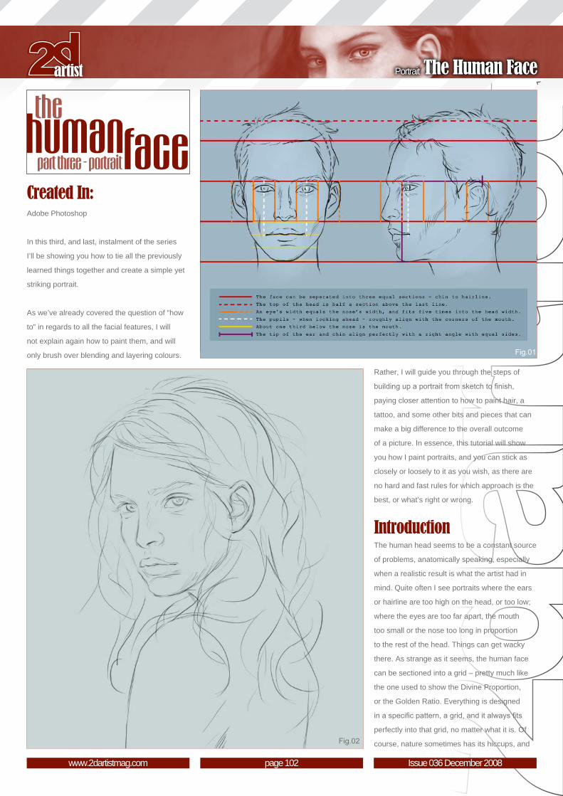
page 102www.2dartistmag.com Issue 036 December 2008
Portrait The Human Face
Created In:Adobe Photoshop
In this third, and last, instalment of the series
I’ll be showing you how to tie all the previously
learned things together and create a simple yet
striking portrait.
As we’ve already covered the question of “how
to” in regards to all the facial features, I will
not explain again how to paint them, and will
only brush over blending and layering colours.
Rather, I will guide you through the steps of
building up a portrait from sketch to finish,
paying closer attention to how to paint hair, a
tattoo, and some other bits and pieces that can
make a big difference to the overall outcome
of a picture. In essence, this tutorial will show
you how I paint portraits, and you can stick as
closely or loosely to it as you wish, as there are
no hard and fast rules for which approach is the
best, or what’s right or wrong.
IntroductionThe human head seems to be a constant source
of problems, anatomically speaking, especially
when a realistic result is what the artist had in
mind. Quite often I see portraits where the ears
or hairline are too high on the head, or too low;
where the eyes are too far apart, the mouth
too small or the nose too long in proportion
to the rest of the head. Things can get wacky
there. As strange as it seems, the human face
can be sectioned into a grid – pretty much like
the one used to show the Divine Proportion,
or the Golden Ratio. Everything is designed
in a specific pattern, a grid, and it always fits
perfectly into that grid, no matter what it is. Of
course, nature sometimes has its hiccups, and

page 103www.2dartistmag.com Issue 036 December 2008
The Human Face Portrait
somebody’s features may not adhere exactly to
the grid – I know my ears don’t – but knowing
about it helps, and will serve as a general guide
for the right proportions (Fig.01).
Let’s Paint!Open a new file, and make it nice and big.
The bigger you make it, the more detail you
can put into it later. 2500 pixels either side is
really the minimum, especially if you want to
print it in high resolution afterwards. Fill your
canvas with a neutral colour and add a new
layer for the sketch. Pick your default round
hard Paintbrush, with Opacity and Size Jitter
set to Pen Pressure, and you’re ready to start
sketching. Use references if you’re not that good
yet at freehand sketching – in fact I urge you to
use references, especially if you are just starting
out with painting people, as that way you’ll see
lots of different features, and learn about angles
and proportions by looking at faces, as well as
how lighting and shadows affect things. When
sketching freehand I tend to do a very scribbly
sketch, and when I’m happy with it, I add another layer and draw it again.
However, this time I’m going to be a lot less scribbly; I’m just going to draw
a few clean lines to give me a very basic line drawing (Fig.02).
Now add a new layer beneath the sketch layer and continue with your
round Paintbrush, though you may want to switch off the Size Jitter. Block
in your character, using a medium skin tone as the base, a slightly lighter
one to hint at highlights, a darker one to roughly paint in the shadows,
and a slightly more blush tone for the lips and cheeks. At this point you
should work out your light source, or it will get messy later. Switch to the
background layer and add some more colour there, too. It will give you a
better idea of how the skin tones are working with the surroundings you
have in mind (Fig.03).
Back to your character layer: refine the blocked in colours using a round
softer brush; you may want to change the Opacity manually to be able
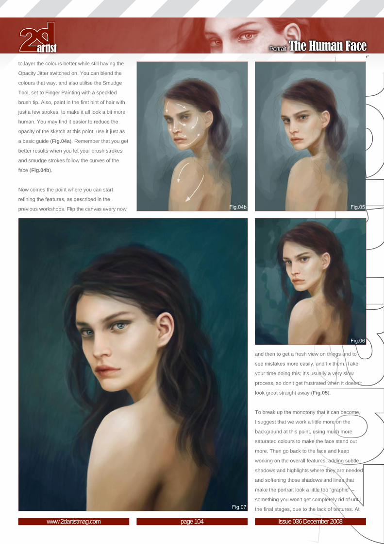
page 104www.2dartistmag.com Issue 036 December 2008
Portrait The Human Faceto layer the colours better while still having the
Opacity Jitter switched on. You can blend the
colours that way, and also utilise the Smudge
Tool, set to Finger Painting with a speckled
brush tip. Also, paint in the first hint of hair with
just a few strokes, to make it all look a bit more
human. You may find it easier to reduce the
opacity of the sketch at this point; use it just as
a basic guide (Fig.04a). Remember that you get
better results when you let your brush strokes
and smudge strokes follow the curves of the
face (Fig.04b).
Now comes the point where you can start
refining the features, as described in the
previous workshops. Flip the canvas every now
and then to get a fresh view on things and to
see mistakes more easily, and fix them. Take
your time doing this; it’s usually a very slow
process, so don’t get frustrated when it doesn’t
look great straight away (Fig.05).
To break up the monotony that it can become,
I suggest that we work a little more on the
background at this point, using much more
saturated colours to make the face stand out
more. Then go back to the face and keep
working on the overall features, adding subtle
shadows and highlights where they are needed
and softening those shadows and lines that
make the portrait look a little too “graphic” –
something you won’t get completely rid of until
the final stages, due to the lack of textures. At

page 105www.2dartistmag.com Issue 036 December 2008
The Human Face Portrait
this stage things will still seem to go very slowly, as all you’ll be doing is
blending, refining, and flipping the canvas.
It’s also a good idea to also start painting more of the hair with a shade
that you know will be the medium shade of her hair, to see if you really like
it as it was in the sketch. As you can see, I am still using the basic round
brush for this, which gives me a good base to work off in the next step
(Fig.06).
Laying down the hair instantly gives your portrait a new dimension. Pick a
speckled brush with Spacing set to 2-5%, Opacity Jitter to Pen Pressure,
and Size Jitter switched off. It’s important to remember that when painting
hair, you will not really paint every single hair. Think of it as strands and
those strands make up the hairstyle. As you already have the base of
the hair, choose a lighter shade for some highlights, and paint in some
strands. In this case I want her to have unruly hair, so the strands won’t
be smooth at all, and almost look like dreadlocks. For the hair that comes
out behind her face, add a new layer beneath
the portrait – it’s much easier to paint that way,
as you won’t have to worry about painting over
anything. Also, continue to work on the face,
smoothing it out and really paying attention to
details that you want to stand out, and refine her
upper body (Fig.07).
We can now concentrate on the hair. Pick your
speckled brush again, but manually reduce its
size a little to get finer strands. Here the fun
starts: you can add a new layer and paint part of
the hair on it, then blur it slightly using either the
Gaussian Blur Filter (use with care!), the Median
Filter, or smudging it slightly to soften it here
and there. Add more layers and paint layers
of strands on them, refining your hair. There
really is no fast lane trick for this; each strand is
painted and more or less refined. Use some of
the background colours in your hair “reflections”,
as well as the skin colour, as it ties everything
together nicely. Dark hair is often easier to paint
than light hair, and when painting dark hair you
also get away with just adding a few well-placed
highlights in an otherwise one-tone block of

hair. There is absolutely no need – even for
light hair – to paint every single strand in fine
detail. Choosing to detail one focal strand of hair
is enough to create the illusion of realistic hair
(Fig.08).
Continue working on the hair, bringing out the
detail. You can add more layers as you go
along, but you may also want to merge layers
that you’re done with, to reduce the size of
your painting. Switch from the speckled brush
to a round brush with a ragged edge, and set
the Size Jitter and Opacity to Pen Pressure for
some stray hairs here and there that do not
conform to the flow of the strands. I mainly used
some of the skin colours for the strong highlights
where the light hits it directly, while still retaining
some of the dark turquoise tones towards the
back of the head and hair, where it comes into
contact with the background and a possible
secondary light source. Gently softening some
of the flyaway hairs with the Smudge Tool helps
a great deal to make it look realistic (Fig.09).
When you’re happy with the hair, it’s time to
focus on the eyebrows and eyelashes, using
the technique I explained in the first part of this
series. Also enhance the shadows around the
eyes and the shadow side of the face, adding
a little bit of the background colour to the skin
(Fig.10).
The painting looks pretty good already, but
we’re far from done. It’s still quite bare, which
can be nice, but also a bit boring. If you’re
painting fictional characters, like I am in this
case, it’s good if you know their story – be it just
in your own head. This helps you determine
what you can add into a portrait, something to
outwardly show their personality, something to
tell their story to the viewer. I want her to have
a tattoo of a water serpent, coiling over and
around her shoulder: a statement, not a fashion
accessory. To start with that, add a new layer
and sketch the serpent, bearing in mind the
curve of her shoulder and arm. You don’t want
the tattoo to look projected onto her skin – it
should be part of it (Fig.11a). Once you’ve got
that, add another new layer, and using the round
Paintbrush with Opacity set to Pen Pressure
and Opacity Jitter switched off, draw the clean
outlines. Take your time with this; you want it to

page 107www.2dartistmag.com Issue 036 December 2008
The Human Face Portrait
be as clean as possible, as it will be the “inked”
outline of her tattoo (Fig.11b).
To colour the tattoo, add a new layer beneath
the tattoo sketch. Choose a colour that works
with your painting as the base colour; I picked
one from the background. Using the round brush
simply paint the dragon in one flat colour without
any transparency, then lock the Transparent
Pixels in the Layers Palette – it’s the chequered
button at the top left of your Layers Palette.
What it does is … exactly what it says on the
box: it locks all the pixels that have nothing on
them, which makes it very easy to just paint on
those things you’ve already painted, without
going over the edges (Fig.12).
Picking more colours from the background and
the character’s eyes, paint the dragon. For
the tongue I picked colours from the girl’s lips.
Use your usual brushes for this, as well as the
speckled Smudge Tool. Be as realistic or as
cartoony as you like here, it’s a tattoo after all
(Fig.13).
We want the tattoo to be part of the skin, rather
than look like body paint, so switch the layer to
Overlay. This will cause it to look very bright,
so an adjustment of the Levels is needed, and
utilising the Variations is also quite useful.
Duplicating the layer and setting it to Soft light
will add more colour intensity and depth to it.

page 108www.2dartistmag.com Issue 036 December 2008
Portrait The Human Face
You can adjust the Opacity as you see fit – here it is 65% for the Overlay
layer, and 100% for Soft light (Fig.14a). It already looks pretty decent, but
still too smooth, so let’s add some texture. We can do this by duplicating
the colour layer, locking Transparent Pixels, and filling it with white. Then
add texture (you can use a photo texture, or a textured brush) in a dark
colour, and unlock the Transparent Pixels again. Setting the layer to
Multiply will let it blend in, and reducing the Opacity also works well here.
As a finishing touch, add a light shadow around the outlines of the tattoo –
not so much as to actually see it as a shadow, but enough to really make
it look like its part of the skin (Fig.14b). You can also adjust the levels of
the figure slightly to make the colours a tad more striking, then add more
shadow at her back, and a blue tinge at the front. Add some more subtle
shadows on the face and refine the right eye a little more to finish things
off.
Now that the tattoo is done – bar some gentle blurring that will happen
later to make it blend in with the figure even little better – look over the
portrait and try to see if something is missing. It’s always good to step
away for a little while at this stage, if you’re unsure where to go with it. In
this case, the tattoo almost overpowers the face, which is something you
do not want unless your painting is about the tattoo. So we need to look at
doing something about that. The best thing here is to add a really vibrant,
complementary colour to the top part of the piece: a mix of orange and
red. This not only draws the focus back onto the face, but complements
the red tones used in the tattoo and the girl’s lips. Any other colour would

page 109www.2dartistmag.com Issue 036 December 2008
The Human Face Portrait
on a filter; if you use one, always touch up the
result by hand. We also want the tattoo to look
slightly more part of the skin, so blur the outlines
using the Blur Tool, especially where it vanishes
under the hair, and wraps around her arm and
shoulder. You will also notice that I added some
backlight to the hair (Fig.16b).
blend in too much with the rest of the painting,
or would simply look out of place. So let’s give
her a hair band, on a new layer, choosing a
nice, vibrant, warm orange (Fig.15).
Before working properly on the hair band, I
decided that I wanted to change the composition
to a bigger canvas with horizontal orientation.
It gives the character more space, and I have a
plan for that space. So once we’ve re-sized the
canvas, work on the background colours to fill
everything in. Then let the hair band become
a headscarf, to bring some movement into the
picture, and also to aid the composition. Of
course, if the scarf is flowing like this, the hair
has to as well, or so the rules of physics dictate
(Fig.16a). Work on the scarf and flying strands
of hair. As the hair is moving, we don’t need to
detail it as much as before, and can even paint
over most of what we’ve previously done. The
scarf has to get a “motion blur”, and indeed,
this is most easily achieved with the Motion Blur
filter. However, be careful with it. Never rely fully
It already looks pretty much finished at this
point, and if you wanted, you could leave it as it
is. I’m a bit of a perfectionist though, so it’s time
for the finishing touches: textures. Add a new
layer and select a textured brush with Opacity
Jitter switched off and Angle Jitter set to 50%;
this will make it look less tiled. Choose a very

page 110www.2dartistmag.com Issue 036 December 2008
Portrait The Human Face
light colour – a light warm yellow works usually
best for warm results – and stamp the texture
onto the figure. Erase all the bits that go over
the edges with a soft round brush. Set the layer
to Overlay and change the Opacity to something
you’re happy with. Erase more as and where
needed. Repeat this with a dark colour on
another new layer. You can add freckles and
other skin markings in the same way. I’ve also
added a bit of a glow on her cheek, brow,
forehead, jaw line and nose with a speckled
brush as described in the first part of this series
(Fig.17).
Looking it over, it seems that the scarf really
needs something more, such as some brocade.
So, for those of you who won’t take “Paint
brocade and be done with it” for an answer,
here’s how to do that:
Open a new file big enough in relation to the
portrait, add a new layer and draw the brocade
pattern using a round brush with Opacity and
Size Jitter set to Pen Pressure (Fig.18a).
Transfer this onto the scarf, then duplicate and
turn the layer repeatedly, moving it around
on the scarf to get a covering pattern. Erase
the bits going over the edges, and also where

page 111www.2dartistmag.com Issue 036 December 2008
The Human Face Portrait
the fabric folds over. If you do not pay attention to this, it will look badly
pasted. Deform the pattern where needed to match the curve of the fabric
– either by using the Free Transform Tool, or the Liquify Filter using the
Forward Warp Tool. Once that is done, apply the Median Filter to soften
the pattern a bit, or Gaussian Blur. Again, be careful with this, as you only
want the pattern to look part of the fabric, not wash it out. Also, apply a
Motion Blur to those parts of pattern that need it; if the scarf is moving and
blurred, the patterns has to be, too (Fig.18b).
If this is still not enough texture for you, or you want to really go grunge,
overlay a photo texture and play around with the opacity setting. Overlay
or Soft light often work best. And as a last step, if you want to boost
the colours, adjust the Levels slightly, and maybe even play with the
Variations to give it an overall different hue. And your portrait is done!
(Fig.19)
Some Final Words…It still amazes me just how much time you can spend on a portrait, by
paying endless attention to the tiniest details. However, over the years
I’ve found that too much detail can often ruin a painting – it can start to
look static, lifeless and forced. So let go every now and then. Don’t fill in
all the blanks. Give the viewer something to exercise their imagination.
Even when you do not go down the minimalist path, and love lots of
embellishment and complicated hair-dos, the rule of thumb still stands:
less is more. This shouldn’t be an excuse for sloppiness though, as even
hinted-at things need some thought and a little attention.
Now go grab my custom brushes and get painting. Enjoy!
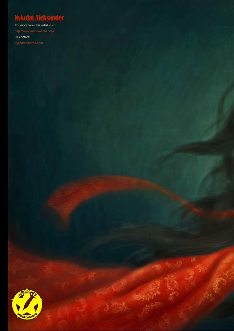
Nykolai AleksanderFor more from this artist visit:
http://www.admemento.com/
Or contact:


Zoo Publishing presents the new issue of 3dcreativemagazine: a downloadable monthly magazine for concept art, digital & matte painting for only $4.50US
visit www.3dcreativemag.com to download the free ‘lite’ issue, the full issue, subscription offers and to purchase back issues.

Alexander Yazynin
shares how he created
this image by using
both Painter and
Photoshop.
“One of the main tasks in this piece was to stylise the image of the girl, in order to give her a tender and pictorial look - I didn’t want the piece to be just another picture made from her photo. ”

page 116www.2dartistmag.com Issue 036 December 2008
Making Of Nastya
to Kaliningrad (the time zones are eight hours
apart). Being so far away from her, I wanted
to surprise her with something that I’d made
myself, which could be sent to her by e-mail.
PreparationThe main idea for this piece was to convey a
slightly altered image of a real person into an old
stylised painting, whilst keeping the character
recognisable. Unfortunately, the photos that I
had of her were very small and of poor quality,
but even so I managed to choose a good angle
from them.
SketchingThe first sketch was just to fix the idea and
composition; it was simply three by four
centimetres in size and consisted of a few rough
lines. Once I had defined the environment
in which I wanted to place her, and what the
composition would be, I started to make the
basic composition and work on the tonal values
by placing concise spots on the canvas. It was
basically a spontaneous process – all done on
one layer (Fig.01).
All of the work in the black-and-white stage was
done in Painter Classic, which was distributed
with my tablet. I used only one round brush, just
changing its size and transparency. Almost all of
the black-and-white work was completed in just
one session – because it was so exciting! Over
the following several evenings I finalised the
details in black-and-white.
One of the main tasks in this piece was to stylise
the image of the girl, in order to give her a
tender and pictorial look - I didn’t want the piece
Created In:Painter
IntroductionHello everyone, I’m Alexander Yazynin and I’m
an art director at Katauri Interactive, which has
recently been working on King’s Bounty: The
Legend game. The image I’m going to discuss
in this article, however, is not part of my job, as
you might have already guessed.
I came up with the idea for this piece as an
unusual birthday present for a girl that I liked,
who I went to school with as a child. Twelve
years later, we happened to meet up again
when we became neighbours - which was a
pleasant surprise for me! Unfortunately it didn’t
stay that way for long; I recently moved to the
far side of my country, from native Vladivostok

page 117www.2dartistmag.com Issue 036 December 2008
Nastya Making Of
to be just another picture made from her photo.
For this task, I removed irrelevant realistic
anatomical details, made her eyes bigger,
added some soft lighting, and blended her in
with the environment. My first priority was her
eyes; if they looked slightly odd then the image
of her would have been ruined! She had to be
able to recognise herself.
The grapes were painted simply from my
imagination, and from my idea of how they
should look in a painting. For the accuracy of the
leaves’ shapes, I referred to images, but it was
not necessary to make them look too realistic –
the main point was to create a beautiful, fantasy
style environment with a feeling of depth.
ColoursI started working on the colours next, in
Photoshop. I planned to make the final version
desktop sized, so I reduced the grayscale
version from 4000 by 3000 pixels to 1280 by
960, and continued working in this resolution.
To add colour, I used a large, soft brush and
layers with Colour, Softlight and Overlay
properties. At first I was just looking for a basic
colour theme; I put a cold green colour on top of
the entire picture. I then added warm colours in
the centre, on the face, and on the leaves with
the grapes (Fig.02).
When the basic colours were all in place I
started searching for more interesting variations
with Hue/Saturation, Replace Colour and
Curves (Fig.03). When I was satisfied, I merged
the layers and created new ones – to make
the colours even more varied – and worked
more closely on the defining parts of the
picture. When I was happy with the colours I
started adding final details and increasing the
complexity of the texture of the face, leaves and
grapes using a small brush in Scattering mode.
I later added water drops on leaves – and a bug
as a final touch (Fig.04).
Thank you for reading. I hope it has been useful!
Alexander YazyninFor more details about this artist please contact:

InterviewsTomasz Morano
Jim Maxwell
ArticlesSketchbook of Justin Albers
TutorialsUnderstanding
Composition by Joel Carlo
Speed Painting: “The approaching swarm
appeared biblical in scale and straight from a nightmare”
Galleries
10 of the Best images featuring
Plus Loads More!All for only
$4.50!go to www.2dartistmag.com for full
details and to purchase current, back
issues and 6 & 12 month subscriptions
Image © 2008 - Soheil Danesh

image: Andrée Wallin
www.2dartistmag.com
SUBSCRIBE NOW&SAVE UP TO 25% on this already amazing value publication!
12 ISSUES FOR THE PRICE OF 9Subscription $39.39 – Save $12 (25%)
6 ISSUES FOR THE PRICE OF 5Subscription $21.93 – Save $4 (16%)
Have your 2DArtist Magazine download link delivered automatically to your inbox every month......and have it before anyone else!
Concept Art, Digital & Matte Painting Magazine
Issue 036 December 2008 $4.50 / €3.24 / £2.25
artist

With the release of 3DTotal’s new book,
Digital Art Masters: Volume 3, we have
some exclusive chapters for you...
This book is more than just an artwork
book. Not only does it feature
full-colour, full-page images, but each
artist has given a detailed description, in
their own words, of the creation process
behind each piece of published artwork.
And they’ve done it especially for
this book!
This month we feature:
“Palace Entrance” by James Paick

The following shots of the “Palace Entrance” book pages are featured here in full-resolution and can be read by zooming in...
2DArtist readers can purchase Digital Art Masters: Volume 1, 2 & 3 with a special 20% Discount
To claim your discount simply purchase here:
http://www.3dtotal.com/books/
(Note: if a security dialogue box appears, tick ‘Remember’, then click ‘Allow’)
page 123www.2dartistmag.com Issue 036 December 2008
3DTotal About us
3DTotal is a resource website for the CG
community; amongst our growing number of
products for CG artists, we produce two monthly
downloadable PDF magazines – 2DArtist
and 3DCreative. We are based in the West
Midlands, in the UK, and our intention with
our magazines is to make each issue as full of
great articles, images, interviews and tutorials
as possible. If you would like more information
on 3DTotal or our magazines, or if you have a
question for one our team, please use the links
below.
Contact Informationhttp://www.3dtotal.com
http://www.3dcreativemag.com
http://www.2dartistmag.com
Editor & Content Manager > Lynette Clee
Lead Designer > Chris Perrins
Marketing > Jo Hargreaves
PartnersIf you have a CG community website and would
like to support 3DCreative and/or 2DArtist
magazine by showing our banners, please
contact Lynette Clee at the email address above