Embed Size (px)
Citation preview
1
Paper 295-2011
Present Text-Based Graph Components
Using SAS 9.2 Graph Template Language (GTL)
Zhuoye Xu, Genentech, a member of Roche family, South San Francisco, CA
ABSTRACT
SAS/Graph 9.2 includes ODS Graphics and traditional SAS/GRAPH. Both SAS statistical analysis procedures and SG procedures have Graph Template Language (GTL) executed as background for graph generation. GTL is a powerful and flexible tool to create the customized graphs with different customized text-based components, especially when SG procedures and statistical analysis procedures cannot meet your needs. In the traditional SAS/GRAPH, data driven text-based components are usually generated by annotation facility. In this case, any changes regarding the restructuring are relatively static and require quite complicated annotation coding change rather than dynamic updates. SAS/Graph 9.2 ODS Graphics does not support annotation facility however certain powerful features available in ODS Graphics GTL is equally or even more effective than the traditional SAS/GRAPH annotation facility. This paper will focus on how to create each type of customized text-based components using GTL step by step.
INTRODUCTION
The same sample data (SASHELP.CLASS displayed below) will be used as input data to demonstrate the generation of each type of text-based component in the following sections. The sample data is so straightforward that readers with diverse backgrounds should understand the structure and contents. Also the sample code and output graph will be provided to demonstrate the related GTL (Graph Template Language) statement and options. Sample Dataset:
Like we did as above, using the sample data, you can start to design your graph about what you would like to know from the data in your mind first to figure out which LAYOUT can be the container for your dream graph and get plot statements to generate the plot contents to fill the LAYOUT container. From there, with your draft version of your dream graph, we will start our journey of exploring how to create various text-
Sample dataset contain one ID variable (NAME), one categorical variable (SEX) and three continuous variables (AGE, WEIGHT and HEIGHT). We want to have a quick preview if linear relationship exists between WEIGHT and HEIGHT. The output graph displayed on right below was created by executing the GLT code on left below. Note: no title, footnote, legend are created by default. Axes labels use the variable name as the default Value. Sample Figure 1.1 as below
Reporting and Information VisualizationSAS Global Forum 2011
2
based components to present data in different ways. This paper assumes the basic knowledge about GLT LAYOUT and plot statements. Basic GTL Syntax and logic are briefly introduced in the sample code annotation points 1-4 as above.
OVERVIEW OF GRAPH TEXT-BASED COMPONENTS
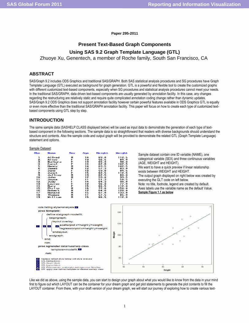
Text-based components (such as legend label, data label, curve label, ticker value, Axis label, free text, column header for panel plots, etc.) play crucial role to concisely demonstrate analysis results for reviewers. Even more, text-based components sometimes are part of the plot itself (so called plot marker text-based components). We will categorize text-based components into two major categories: single-cell graph related and multi-cell graph related.
SINGLE-CELL GRAPH RELATED TEXT-BASED COMPONENTS
GTL graph is layout dependent. Most of the single-cell graph related text-based components also apply for the individual cell of multi-cell graph. However certain restriction/interaction due to multiple-cell layout may exist. For example, DATAPANEL and DATALATTICE layout can only place the legend in SIDEBAR area instead of inside of each cell‟s plot area as single-cell graph. The single-cell graph related components can be further categories as below. Single-cell graph related components diagram
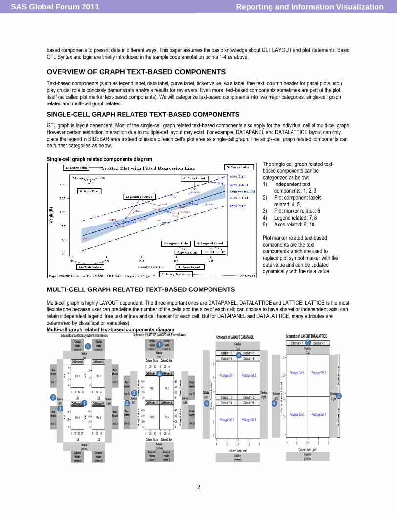
MULTI-CELL GRAPH RELATED TEXT-BASED COMPONENTS
Multi-cell graph is highly LAYOUT dependent. The three important ones are DATAPANEL, DATALATTICE and LATTICE. LATTICE is the most flexible one because user can predefine the number of the cells and the size of each cell; can choose to have shared or independent axis; can retain independent legend, free text entries and cell header for each cell. But for DATAPANEL and DATALATTICE, many attributes are determined by classification variable(s). Multi-cell graph related text-based components diagram
The single cell graph related text-based components can be categorized as below: 1) Independent text
components: 1, 2, 3 2) Plot component labels
related: 4, 5, 3) Plot marker related: 6 4) Legend related: 7, 8 5) Axes related: 9, 10 Plot marker related text-based components are the text components which are used to replace plot symbol marker with the data value and can be updated dynamically with the data value updates.
Reporting and Information VisualizationSAS Global Forum 2011
3
Multi-cell graph related text-based components include: (1) column header, (2) row header, (3) side bar and (4) cell header as numbered in the diagram above. The cell header for DATAPANEL and the column header and row header for DATALATTICE are mainly determined by classification variable(s). Regardless using internal or external axes, most of the components for LATTICE can be defined by user. In the following sections, for each type of text-based components, the demonstration will follow the steps (a)-(d) as below.
(a) Identifying the focus (which text component) (b) Listing the related key statements and supporting GTL options with syntax (c) Demonstrating the usage through sample data and output with GTL code (d) Key points summary
1. INDEPENDENT TEXT COMPONENTS
(A) Independent text is the text component is fully defined by the developer rather than the input data. It includes title, footnote, and free text such as summary statistics, general comments, etc. Each text statement can be any combination of (a) string quoted in quotation marks, (b) dynamic value, (c) macro variables, (d) text expressions enclosed in EVEL function or (e) text command enclosed in braces.
(B) The following GTL text statements and the supporting options can be used to create text components with control of appearance from many perspectives. The supporting statement options highlighted in red can only apply for text statement ENTRY. The prefix options need to be used before the text string; text command need to be used on text string and suffix options have to be used after the text string with „/‟. TEXTATTRS can be used as both prefix and suffix options.
Statement Description Syntax ENTRYTITLE Display Graph Title ENTRYTITLE text-item <…<text-item>> </option(s)>;
ENTRYFOOTNOTE Display Grapy Footnote ENTRYFOOTNOTE text-item <…<text-item>> </option(s)>;
ENTRY Displays a line of text in the plot area. Can be used to create side bar, cell header, row/column header.
ENTRY text-item <…<text-item>> </option(s)>;
Supporting options Prefix Options Text Command Suffix Options
HALIGN, TEXTATTRS {SUB},{SUP}, {UNICODE} AUTOALIGN, BACKGROUNDCOLOR, BORDER, BORDERATTRS, OPAQUE, PAD, ROTATE, TEXTATTRS, VALIGN
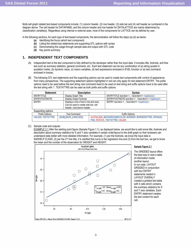
(C) Sample code and outputs: EXAMPLE 2.1 After the starting point figure (Sample Figure 1.1), as displayed below, we would like to add some title, footnote and description about summary statistics for X and Y axis variables in certain order/layout to the draft graph so that reviewers can understand data better with more detailed information. For example, (1) per the footnote, we know the input data is SASHELP.CLASS; (2) per the 2nd line title, it is clarified that curve is the regression line and (3) from the text box, we get to know the mean and the number of the observation for WEIGHT and HEIGHT.
Sample Figure 2.1
The GRIDDED layout offers the best way to nest a table of information inside another layout. In our case, LAYOUT GRIDDED in conjunction with four ENTRY statements nested in LAYOUT OVERALY created a gridded text table with 4 cells which contains the summary statistics for X and Y axis variables. Each ENTRY statement creates the text content for each cell.
Reporting and Information VisualizationSAS Global Forum 2011
4
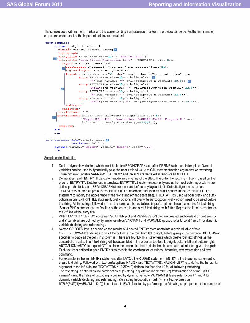
The sample code with numeric marker and the corresponding illustration per marker are provided as below. As the first sample output and code, most of the important points are explained.
Sample code illustration
1. Declare dynamic variables, which must be before BEGINGRAPH and after DEFINE statement in template. Dynamic variables can be used to dynamically pass the user defined value to GTL statement/option arguments or text string. Three dynamic variable VARNAM1, VARNAM2 and CASEN are declared in template MODELFIT.
2. Define titles. Each ENTRYTITLE statement defines one line of the titles. The order the text line in title is based on the order of ENTRYTITLE statement in template. ENTRYTITLE statement can only use at the most outer layer within the define-graph block (after BEGINGRAPH statement) and before any layout block. Default alignment is center. TEXTATRRS is used as prefix in first ENTRYTITLE statement and used as suffix options in the 2nd ENTRYTITLE statement to modify the appearance of the text string (change text size). If TEXTATTRS used as both prefix and suffix options in one ENTRYTITLE statement, prefix options will overwrite suffix option. Prefix option need to be used before the string. All the strings followed remain the same attributes defined in prefix options. In our case, size 12 text string „Scatter Plot‟ is created as the first line of the entry title and size 8 text string „with Fitted Regression Line‟ is created as the 2nd line of the entry title.
3. Within LAYOUT OVERLAY container, SCATTER plot and REGRESSION plot are created and overlaid on plot area. X and Y variables are defined by dynamic variables VARNAM1 and VARNAM2 (please refer to point 1 and 8 for dynamic variable declaring and referencing).
4. Nested GRIDDED layout assembles the results of 4 nested ENTRY statements into a gridded table of text. ORDER=ROWMAJOR defines to fill all the columns in a row, from left to right, before going to the next row. COLUMN=2 specifies to place all the cells in 2 columns. There are four ENTRY statements which create four text strings as the content of the cells. The 4 text string will be assembled in the order as top-left, top-right, bottom-left and bottom-right. AUTOALIGN=AUTO to request GTL to place the assembled text table in the plot area without interfering with the plots. Each text item defined in each ENTRY statement is the combination of strings, dynamics, text expression and text command.
5. For example, in the first ENTRY statement after LAYOUT GRIDDED statement. ENTRY is the triggering statement to create text string. Followed with two prefix options HALIGN and TEXTATTRS, HALIGN=LEFT is to define the horizontal alignment to the left side and TEXTATTRS = (SIZE=10) defines the font size 10 for all following text string.
6. The text string is defined as the combination of (1) string in quotation mark: “N=”, (2) text function on string : {SUB varnam1} and the value of text string is passed by dynamic variable VARNAM1 (Please refer to point 1 and 8 for dynamic variable declaring and referencing), (3) a string in quotation mark: „=‟, (4) Text expression STRIP(PUT(N(VARNAM1),12.0)) is enclosed in EVAL function by performing the following steps: (a) count the number of
Reporting and Information VisualizationSAS Global Forum 2011
5
observation of a predefined variable using function N() from the input dataset directly (b) convert the results to character using function PUT (c) enclosed character value in function EVAL to display.
7. Define the footnotes. Each ENTRYTFOOTNOTE statement defines one footnote. The order of the text is determined by the order of ENTRYFOOTNOTE statements in template. ENTRYTFOOTNOTE statement can only use at the most outer layer within the graph block after the layout block close statement (ENDLAYOUT) and before ENDGRAPH statement. HALIGN prefix options are used to define the position for all the strings followed until redefining before other text string. TEXTATRRS used as prefix options to define the smaller size and bold font. The DYNAMIC variable CASEN is used to pass the user defined value in the footnote as string after „#‟. The text expression PUT (TODAY (), MMDDYYD.) in function EVAL is to display today‟s date with right side alignment because HALIGN = RIGHT is reset before text expression.
8. SGRENDER procedure associates the appropriate data with the template to create the graph. In this case, the input dataset SASHELP.CLASS is associated with the defined template MODELFIT. DYNAMIC statement passes the user defined value to each dynamic variable. In this case VARNAM1 will pass the value „weight‟ to all the locations where VARNAM1 is referenced, such as the X axis variable name referred in SCATTERPLOT and REGRESSIONPLOT statement. VARNAM2 will pass the value „height‟ to all the locations where VARNAM2 is referenced. CASEN will pass the value of „2.1‟ to all the locations where CASEN is referenced, such as „2.1‟ will be displayed in footnote to indicate the output number. Declaring dynamic variables in template before GTL graph block and passing user defined value to dynamic variable in SG procedure, we can associate the same template with different data to create the same type graph without modifying the template. You can consider the template is a macro with parameters. Declared dynamic variables can be considered as macro parameters. Lastly SGRENDER procedure is the macro call with specified value for the macro parameters.
(D) Key points summary:
ENTRYTITLE, ENTRYFOOTNOTE and ENTRY share the prefix options, text command and most of the suffix options. ENTRYTITLE and ENTRYFOOTNOTE only can place the text strings in particular graph location (title and footnote area). ENTRY can create text contents in different locations such as inside or outside of plot area, row header and column header for multi-cell graph. TEXTATTRS control the appearance attributes for size, color, font and font weight. DYNAMICS and macro variables can be used to pass the strings dynamically to create dynamic title, footnote or other general comments. By now we have created title, footnote and added the summary statistics on the plot for more clarification for reviewers and we are one step closer to our dream graph.
(2) PLOT COMPONENTS LABEL RELATED TEXT-BASED COMPONENTS
(A) Plot component label related text-based components are the text description for certain plot components, such as curves/lines and data points. Distinct from legends, the text cannot be identified by plot symbols directly. The association to the corresponding plot component is usually achieved by the close location to the plot component. For example, data label is very close the data point marker.
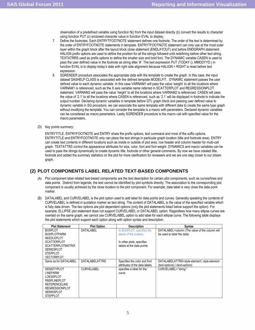
(B) DATALABEL and CURVELABEL is the plot option used to add label for data points and curves. Generally speaking the contents of CURVELABEL is defined in quotation marker as text string. The content of DATALABEL is the value of the specified variable which is fully data driven. The two options are plot dependent options (only the plot statements listed below support the option). For example, ELLIPSE plot statement does not support CURVELABEL or DATALABEL option. Regardless how many ellipse curves are overlaid on the same graph, we cannot use CURVELABEL option to add label for each ellipse curve. The following table displays the plot statements which support each option along with option syntax and description.
Plot Statement Plot Option Description Syntax
BOXPLOT BOXPLOTPARM NEEDLEPLOT SCATTERPLOT SCATTERPLOTMATRIX SERIESPLOT STEPPLOT VECTORPLOT
DATALABEL In BOXPLOT, specifies the . labels of the outliers
In other plots, specifies labels at the data points.
DATALABEL=column (The value of the column will be used to label the data)
Same as for DATALABEL DATALABELATTRS Specifies the color and font attributes of the data labels.
DATALABELATTRS=style-element | style-element (text-options) | (text-options)
DENSITYPLOT LINEPARM LOESSPLOT PBSPLINEPLOT REFERENCELINE REGRESSIONPLOT SERIESPLOT STEPPLOT
CURVELABEL specifies a label for the curve
CURVELABEL="string"
Reporting and Information VisualizationSAS Global Forum 2011
6
Same as for CURVELABEL
CURVELABELATTRS Specifies the color and font attributes of the curve labels. Option CURVELABEL must also be used before to activate CURVELATTRS
CURVELABELATTRS=style-element | style-element (text-options) | (text-options)
Same as for CURVELABEL
CURVELABELLOCATION Specifies the location of the curve labels relative to the plot area.
CURVELABELLOCATION=INSIDE | OUTSIDE
Same as for CURVELABEL
CURVELABELPOSITION Specifies the position of the curve label relative to the curve line
CURVELABELPOSITION=AUTO | MAX | MIN | START | END AUTO: positioned automatically near the end series line along unused axes whenever possible (typically Y2 or X2) to avoid collision with tick values MAX: Forces the curve label to appear near maximum series values (typically, to the right) MIN: Forces the curve label to appear near minimum series values (typically, to the left) START: Only used when CURVELABELLOCATION=INSIDE. Forces the curve label to appear near the beginning of the curve. Particularly useful when the curve line has a spiral shape. END: Only used when CURVELABELLOCATION=INSIDE. Forces the curve label to appear near the end of the curve Particularly useful when the curve line has a spiral shape.
BANDPLOT MODELBAND
CURVELABELLOWER Specifies a label for the lower band limit.
CURVELABELLOWER= "string" | column (1) For non-grouped data, use "string". (2) For grouped data, use a column to define the lower band labels for each group value.
BANDPLOT MODELBAND
CURVELABELUPPER Specifies a label for the upper limit.
CURVELABELUPPER= "string" | column (1) For non-grouped data, use "string". (2) For grouped data, use a column to define the lower
(C) Sample code and outputs
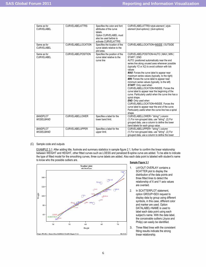
EXAMPLE 3.1: After adding title, footnote and summary statistics in sample figure 2.1, further to confirm the linear relationship between WEIGHT and HEIGHT, other fitted curves such as LOESS and penalized B-spline curve are added. To be able to indicate the type of fitted model for the smoothing curves, three curve labels are added. Also each data point is labeled with student‟s name to know who the possible outliers are.
Sample Figure 3.1
1. LAYOUT OVERLAY contains a SCATTER plot to display the distribution of the data points and three fitted lines to detect the relationship of X and Y axis values are overlaid.
2. In SCATTERPLOT statement, option GROUP=SEX request to display data by group using different symbols, in this case, different color and marker are used. Option DATALABEL=NAME is used to label each data point using each subject‟s name. With the data label, the conceivable outliers (Joyce and Philip) can easily be identified.
3. Three fitted lines with the consistent fitting results indicate the strong
linear relationship.
Reporting and Information VisualizationSAS Global Forum 2011
7
Sample GTL code to create the major contents of the sample figure 3.1
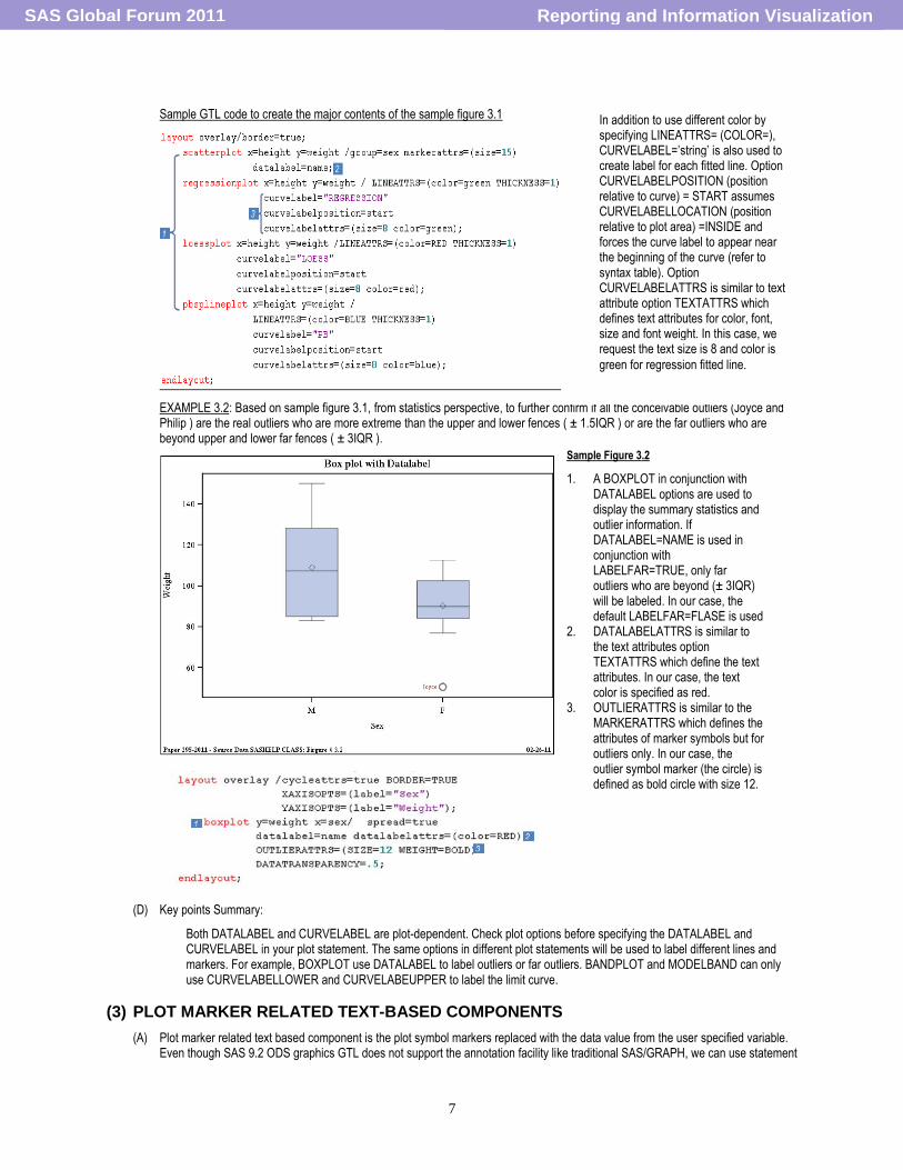
EXAMPLE 3.2: Based on sample figure 3.1, from statistics perspective, to further confirm if all the conceivable outliers (Joyce and Philip ) are the real outliers who are more extreme than the upper and lower fences ( ± 1.5IQR ) or are the far outliers who are beyond upper and lower far fences ( ± 3IQR ).
(D) Key points Summary:
Both DATALABEL and CURVELABEL are plot-dependent. Check plot options before specifying the DATALABEL and CURVELABEL in your plot statement. The same options in different plot statements will be used to label different lines and markers. For example, BOXPLOT use DATALABEL to label outliers or far outliers. BANDPLOT and MODELBAND can only use CURVELABELLOWER and CURVELABEUPPER to label the limit curve.
(3) PLOT MARKER RELATED TEXT-BASED COMPONENTS
(A) Plot marker related text based component is the plot symbol markers replaced with the data value from the user specified variable. Even though SAS 9.2 ODS graphics GTL does not support the annotation facility like traditional SAS/GRAPH, we can use statement
Sample Figure 3.2
1. A BOXPLOT in conjunction with DATALABEL options are used to display the summary statistics and outlier information. If DATALABEL=NAME is used in conjunction with LABELFAR=TRUE, only far outliers who are beyond (± 3IQR) will be labeled. In our case, the default LABELFAR=FLASE is used
2. DATALABELATTRS is similar to the text attributes option TEXTATTRS which define the text attributes. In our case, the text color is specified as red.
3. OUTLIERATTRS is similar to the MARKERATTRS which defines the attributes of marker symbols but for outliers only. In our case, the outlier symbol marker (the circle) is defined as bold circle with size 12.
In addition to use different color by specifying LINEATTRS= (COLOR=), CURVELABEL=‟string‟ is also used to create label for each fitted line. Option CURVELABELPOSITION (position relative to curve) = START assumes CURVELABELLOCATION (position relative to plot area) =INSIDE and forces the curve label to appear near the beginning of the curve (refer to syntax table). Option CURVELABELATTRS is similar to text attribute option TEXTATTRS which defines text attributes for color, font, size and font weight. In this case, we request the text size is 8 and color is
green for regression fitted line.
Reporting and Information VisualizationSAS Global Forum 2011
8
and options mentioned below to create text-based plot marker to display the specified data values at specified location which serve the quite similar purpose as traditional SAS/GRAPH annotation facility. Furthermore, the structure change, such as adding one new data column between the two existing annotated data columns, require re-calculating the space and updating the annotations settings for each cell in traditional SAS/GRAPH, which is quite complicated and quite amount of work. But on the other hand GTL statement/options can use one or two argument to dynamically accomplish the change request.
(B) Both MARKERCHARACTER plot option in conjunction with the supported plot statements such as SCATTERPLOT and In other words, certain data value can be placed at certain location as plot symbol marker.
Plot Statement
Plot Option Description Syntax
SCATTERPLOT SCATTERPLOTMATRIX
MARKERCHARACTER Specifies a column that defines strings to be used instead of marker symbols
MARKERCHARACTER=column | expression
SCATTERPLOT SCATTERPLOTMATRIX
MARKERCHARACTERATTRS Specifies the color and font attributes of the marker character specified on the MARKERCHARACTER=option.
MARKERCHARACTERATTRS=style-element | style-element (text-options) | (textoptions)
BLOCKPLOT is another GTL plot statement which can replace the plot marker with the value of user defined input data variable. The differences from SCATTERPLOT includes BLOCKPLOT (1) do not need any option (2) can only display the data value as plot marker; (3) One BLOKPLOT can create one rectangular strip over X values.
Plot Statement Description Syntax
BLOCKPLOT Creates one or more strips of rectangular blocks containing text values. The width of each block corresponds to specified numeric intervals
BLOCKPLOT X = column | expression BLOCK = column | expression </option(s)>;
LABEL, LABELATTRS, VALUEATTRS, VALUEHALIGN and VALUEVALIGN
(C) Sample code and outputs
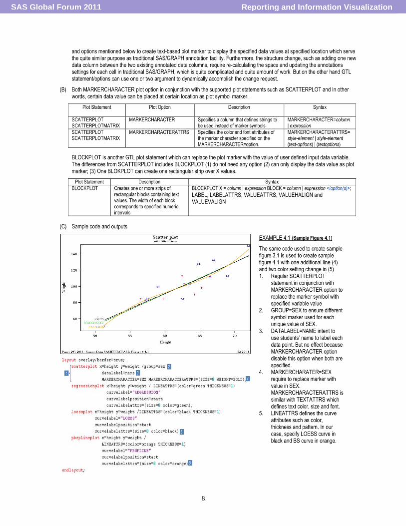
EXAMPLE 4.1 (Sample Figure 4.1)
The same code used to create sample figure 3.1 is used to create sample figure 4.1 with one additional line (4) and two color setting change in (5) 1. Regular SCATTERPLOT
statement in conjunction with MARKERCHARACTER option to replace the marker symbol with specified variable value
2. GROUP=SEX to ensure different symbol marker used for each unique value of SEX.
3. DATALABEL=NAME intent to use students‟ name to label each data point. But no effect because MARKERCHARACTER option disable this option when both are specified.
4. MARKERCHARATER=SEX require to replace marker with value in SEX. MARKERCHARACTERATTRS is similar with TEXTATTRS which defines text color, size and font.
5. LINEATTRS defines the curve attributes such as color, thickness and pattern. In our case, specify LOESS curve in black and BS curve in orange.
Reporting and Information VisualizationSAS Global Forum 2011
9
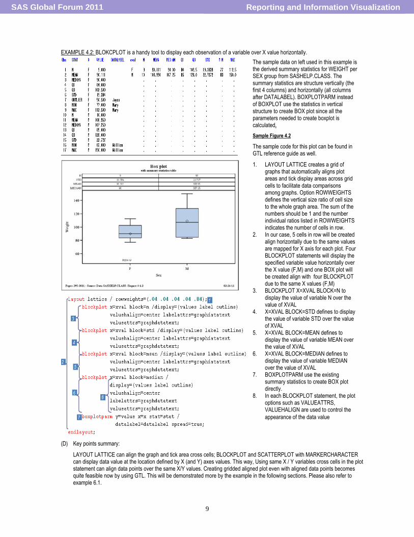
EXAMPLE 4.2: BLOKCPLOT is a handy tool to display each observation of a variable over X value horizontally.
(D) Key points summary:
LAYOUT LATTICE can align the graph and tick area cross cells; BLOCKPLOT and SCATTERPLOT with MARKERCHARACTER can display data value at the location defined by X (and Y) axes values. This way, Using same X / Y variables cross cells in the plot statement can align data points over the same X/Y values. Creating gridded aligned plot even with aligned data points becomes quite feasible now by using GTL. This will be demonstrated more by the example in the following sections. Please also refer to example 6.1.
The sample data on left used in this example is the derived summary statistics for WEIGHT per SEX group from SASHELP.CLASS. The summary statistics are structure vertically (the first 4 columns) and horizontally (all columns after DATALABEL). BOXPLOTPARM instead of BOXPLOT use the statistics in vertical structure to create BOX plot since all the parameters needed to create boxplot is calculated.
Sample Figure 4.2
The sample code for this plot can be found in GTL reference guide as well.
1. LAYOUT LATTICE creates a grid of graphs that automatically aligns plot areas and tick display areas across grid cells to facilitate data comparisons among graphs. Option ROWWEIGHTS defines the vertical size ratio of cell size to the whole graph area. The sum of the numbers should be 1 and the number individual ratios listed in ROWWEIGHTS indicates the number of cells in row.
2. In our case, 5 cells in row will be created align horizontally due to the same values are mapped for X axis for each plot. Four BLOCKPLOT statements will display the specified variable value horizontally over the X value (F,M) and one BOX plot will be created align with four BLOCKPLOT due to the same X values (F,M)
3. BLOCKPLOT X=XVAL BLOCK=N to display the value of variable N over the value of XVAL
4. X=XVAL BLOCK=STD defines to display the value of variable STD over the value of XVAL
5. X=XVAL BLOCK=MEAN defines to display the value of variable MEAN over the value of XVAL
6. X=XVAL BLOCK=MEDIAN defines to display the value of variable MEDIAN over the value of XVAL
7. BOXPLOTPARM use the existing summary statistics to create BOX plot directly.
8. In each BLOCKPLOT statement, the plot options such as VALUEATTRS, VALUEHALIGN are used to control the
appearance of the data value
Reporting and Information VisualizationSAS Global Forum 2011
10
(4) LEGEND ASSOCIATED COMPOMEN
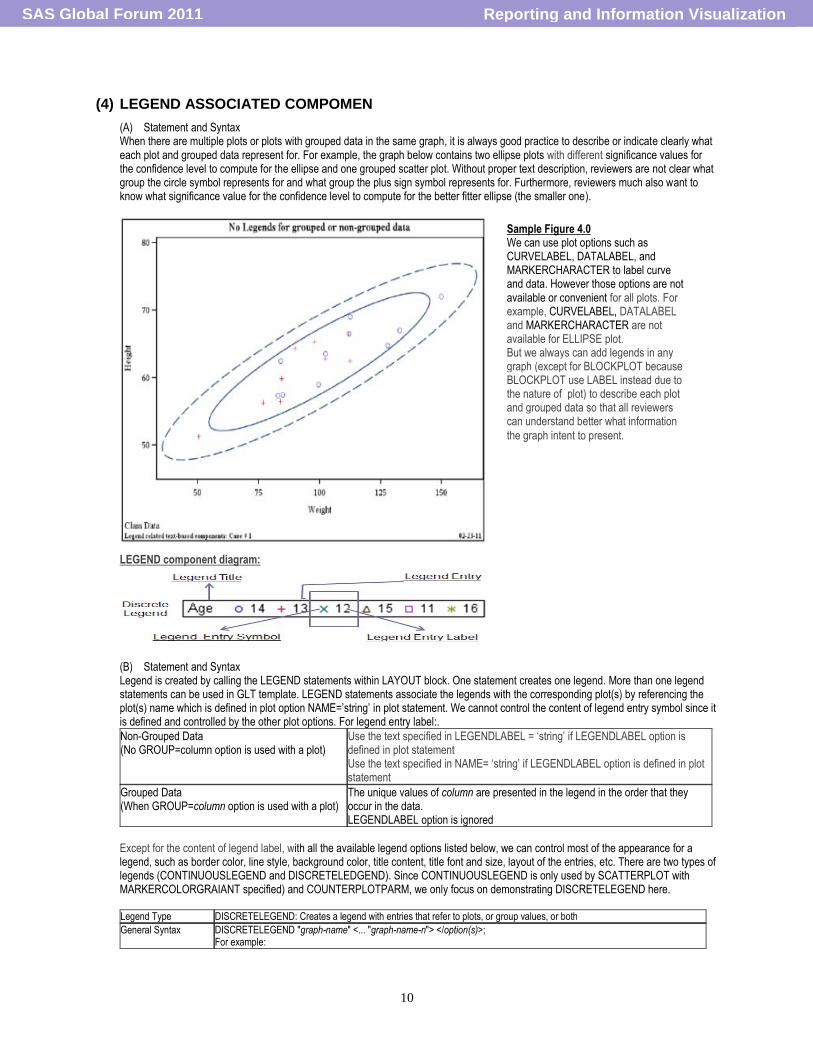
(A) Statement and Syntax When there are multiple plots or plots with grouped data in the same graph, it is always good practice to describe or indicate clearly what each plot and grouped data represent for. For example, the graph below contains two ellipse plots with different significance values for the confidence level to compute for the ellipse and one grouped scatter plot. Without proper text description, reviewers are not clear what group the circle symbol represents for and what group the plus sign symbol represents for. Furthermore, reviewers much also want to know what significance value for the confidence level to compute for the better fitter ellipse (the smaller one).
LEGEND component diagram:
(B) Statement and Syntax Legend is created by calling the LEGEND statements within LAYOUT block. One statement creates one legend. More than one legend statements can be used in GLT template. LEGEND statements associate the legends with the corresponding plot(s) by referencing the plot(s) name which is defined in plot option NAME=‟string‟ in plot statement. We cannot control the content of legend entry symbol since it is defined and controlled by the other plot options. For legend entry label:.
Non-Grouped Data (No GROUP=column option is used with a plot)
Use the text specified in LEGENDLABEL = „string‟ if LEGENDLABEL option is defined in plot statement Use the text specified in NAME= „string‟ if LEGENDLABEL option is defined in plot statement
Grouped Data (When GROUP=column option is used with a plot)
The unique values of column are presented in the legend in the order that they occur in the data. LEGENDLABEL option is ignored
Except for the content of legend label, with all the available legend options listed below, we can control most of the appearance for a legend, such as border color, line style, background color, title content, title font and size, layout of the entries, etc. There are two types of legends (CONTINUOUSLEGEND and DISCRETELEDGEND). Since CONTINUOUSLEGEND is only used by SCATTERPLOT with MARKERCOLORGRAIANT specified) and COUNTERPLOTPARM, we only focus on demonstrating DISCRETELEGEND here. Legend Type DISCRETELEGEND: Creates a legend with entries that refer to plots, or group values, or both
General Syntax DISCRETELEGEND "graph-name" <... "graph-name-n"> </option(s)>; For example:
Sample Figure 4.0 We can use plot options such as CURVELABEL, DATALABEL, and MARKERCHARACTER to label curve and data. However those options are not available or convenient for all plots. For example, CURVELABEL, DATALABEL and MARKERCHARACTER are not available for ELLIPSE plot. But we always can add legends in any graph (except for BLOCKPLOT because BLOCKPLOT use LABEL instead due to the nature of plot) to describe each plot and grouped data so that all reviewers can understand better what information
the graph intent to present.
Reporting and Information VisualizationSAS Global Forum 2011
11
scatterplot x=petallength1 y=petalwidth1 /group=species name="s1"; scatterplot x=petallength2 y=petalwidth2 /group=species name="s2"; discretelegend "s1" "s2"/ order=columnmajor down=1 title="Species:";
Legend statement Options
Overall Legend Location relative to the plot:
LOCATION= INSIDE | OUTSIDE
AUTOALIGN=NONE|AUTO|(location list: TOP TOPLEFT TOPRIGHT LEFT CENTER RIGHT BOTTOMLEFT BOTTOM BOTTOMRIGHT).
HALIGN = LEFT | CENTER | RIGHT
VALIGN = TOP | CENTER | BOTTOM Overall Legend Appearance:
OPAQUE = TRUE | FALSE (default is TRUE when LOCATION=OUTSIDE and is FALSE when LOCATION=INSIDE)
BACKGROUNDCOLOR=
BORDER= TRUE | FALSE
BORDERATTRS= style-element | style-element (line-options) | (line-options) Legend Entry location relative to legend border
PAD=dimension | (pad-options) e.g PAD=(left=10 px top=20 px) Legend entry layout
ORDER=ROWMAJOR | COLUMNMAJOR
ACROSS=Specifies the number of legend entries that are placed horizontally before the next row begins when ORDER=ROWMAJOR
DOWN=Specifies the number of legend entries that are placed vertically before the next column begins when ORDER=COLUMNMAJOR
Legend title
TITLE= "string"
TITLEATTRS= style-element | style-element (text-options) | (text-options)
TITLEBORDER= TRUE | FALSE
BORDERATTRS = style-element | style-element (line-options) | (line-options) Legend Entry Value:
VALUEATTRS== style-element | style-element (text-options) | (text-options)
Option Interaction
AUTOALIGN has effect and overrides HALIGN and VALIGN only when LOCATION=INSIDE. HALIGN and VALIGN cannot be set to „CENTER‟ at same time when LOCATION=OUTSIDE. OPAQUE=TRUE must be in effect for the color set for BACKGROUNDCOLOR to be seen.
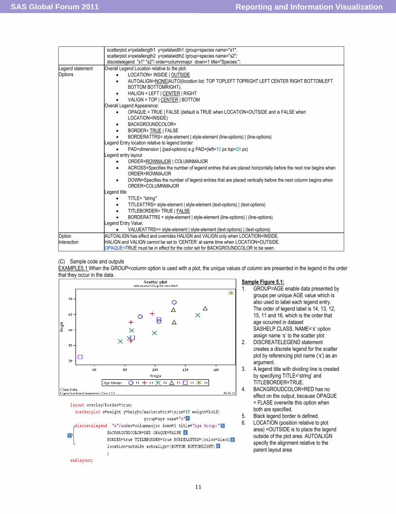
(C) Sample code and outputs EXAMPLE5.1 When the GROUP=column option is used with a plot, the unique values of column are presented in the legend in the order that they occur in the data.
Sample Figure 5.1: 1. GROUP=AGE enable data presented by
groups per unique AGE value which is also used to label each legend entry. The order of legend label is 14, 13, 12, 15, 11 and 16, which is the order that age occurred in dataset SASHELP.CLASS. NAME=‟s‟ option assign name „s‟ to the scatter plot
2. DISCREATELEGEND statement creates a discrete legend for the scatter plot by referencing plot name („s‟) as an argument.
3. A legend title with dividing line is created by specifying TITLE=‟string‟ and TITLEBORDER=TRUE.
4. BACKGROUDCOLOR=RED has no effect on the output, because OPAQUE = FLASE overwrite this option when both are specified.
5. Black legend border is defined. 6. LOCATION (position relative to plot
area) =OUTSIDE is to place the legend outside of the plot area. AUTOALIGN specify the alignment relative to the
parent layout area
Reporting and Information VisualizationSAS Global Forum 2011
12
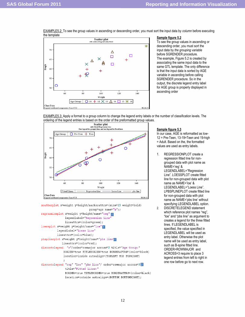
EXAMPLE5.2: To see the group values in ascending or descending order, you must sort the input data by column before executing the template
EXAMPLE5.3: Apply a format to a group column to change the legend entry labels or the number of classification levels. The ordering of the legend entries is based on the order of the preformatted group values.
Sample figure 5.2 To see the group values in ascending or descending order, you must sort the input data by the grouping variable before SGRENDER procedure. The example, Figure 5.2 is created by associating the same input data to the same GTL template. The only difference is that the input data is sorted by AGE variable in ascending before calling SGRENDER procedure. So in the output, the discrete legend entry label for AGE group is properly displayed in
ascending order
Sample figure 5.3 In our case, AGE is reformatted as low-12 = Pre-Teen, 13-19=Teen and 19-high = Adult. Based on the, the formatted values are used as entry labels. 1. REGRESSIONPLOT create a
regression fitted line for non-grouped data with plot name as NAME=‟reg‟ & LEGENDLABEL=”Regression Line”. LOESSPLOT create fitted line for non-grouped data with plot name as NAME=‟loe‟ & LEGENDLABEL=”Loess Line”. LPBSPLINEPLOT create fitted line for non-grouped data with plot name as NAME=‟pbs line‟ without specifying LEGENDLABEL option.
2. DISCRETELEGEND statement which reference plot names “reg”, “loe” and “pbs line” as argument to creates a legend for the three fitted lines. If LEGENDLABEL is specified, the value specified in LEGENDLABEL will be used as entry label. Otherwise the plot name will be used as entry label, such as B-spine fitted line. ORDER=ROWMAJOR and ACROSS=3 require to place 3 legend entries from left to right in
one row before go to next row.
Reporting and Information VisualizationSAS Global Forum 2011
13
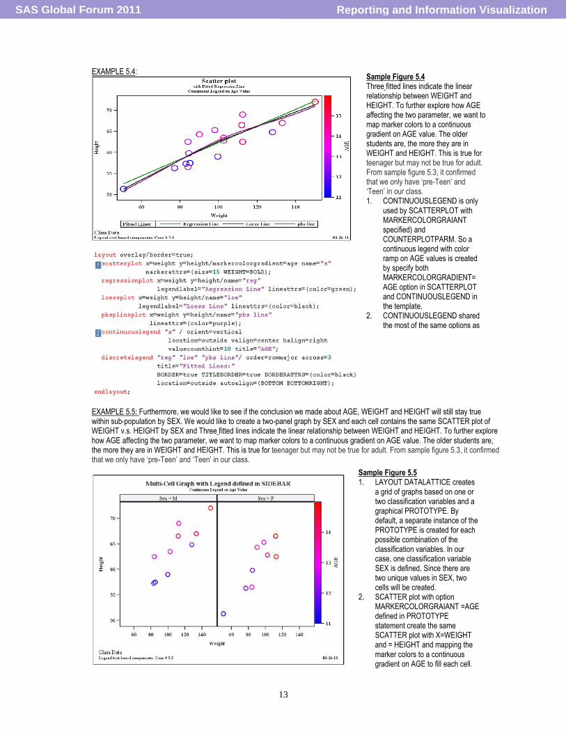
EXAMPLE 5.4:
EXAMPLE 5.5: Furthermore, we would like to see if the conclusion we made about AGE, WEIGHT and HEIGHT will still stay true within sub-population by SEX. We would like to create a two-panel graph by SEX and each cell contains the same SCATTER plot of WEIGHT v.s. HEIGHT by SEX and Three fitted lines indicate the linear relationship between WEIGHT and HEIGHT. To further explore how AGE affecting the two parameter, we want to map marker colors to a continuous gradient on AGE value. The older students are, the more they are in WEIGHT and HEIGHT. This is true for teenager but may not be true for adult. From sample figure 5.3, it confirmed that we only have „pre-Teen‟ and „Teen‟ in our class.
Sample Figure 5.4 Three fitted lines indicate the linear relationship between WEIGHT and HEIGHT. To further explore how AGE affecting the two parameter, we want to map marker colors to a continuous gradient on AGE value. The older students are, the more they are in WEIGHT and HEIGHT. This is true for teenager but may not be true for adult. From sample figure 5.3, it confirmed that we only have „pre-Teen‟ and „Teen‟ in our class. 1. CONTINUOUSLEGEND is only
used by SCATTERPLOT with MARKERCOLORGRAIANT specified) and COUNTERPLOTPARM. So a continuous legend with color ramp on AGE values is created by specify both MARKERCOLORGRADIENT= AGE option in SCATTERPLOT and CONTINUOUSLEGEND in the template.
2. CONTINUOUSLEGEND shared the most of the same options as DISCRETELEGEND to control
Sample Figure 5.5 1. LAYOUT DATALATTICE creates
a grid of graphs based on one or two classification variables and a graphical PROTOTYPE. By default, a separate instance of the PROTOTYPE is created for each possible combination of the classification variables. In our case, one classification variable SEX is defined. Since there are two unique values in SEX, two cells will be created.
2. SCATTER plot with option MARKERCOLORGRAIANT =AGE defined in PROTOTYPE statement create the same SCATTER plot with X=WEIGHT and = HEIGHT and mapping the marker colors to a continuous gradient on AGE to fill each cell.
Reporting and Information VisualizationSAS Global Forum 2011
14
(D) Key points summary Single-cell graph can contain both CONTINUOUSLEGEND and DISCRETELEDGEND for different plots. Ordering Legend entry: Usually there are more than one legend entries. The order of legend entry is determined by the order of the plot names displayed in legend statement and the data order for the grouping value.
Grouped Data (When GROUP=column option is used with a plot)
The unique values of column are presented in the legend in the order that they occur in the data.
To see the group values in ascending or descending order, you must sort the input data by column before executing the template.
You can apply a format to a group column to change the legend entry labels or the number of classification levels. The ordering of the legend entries is based on the order of the preformatted group values.
Non-Grouped Data (No GROUP=column option is used with a plot)
When plots are overlaid and you want to distinguish them in a legend, you must assign each plot a name and then reference the name in the legend statement. The order in which the plot names appear on the legend statement controls the ordering of the legend entries for the plots
(5) AXIS AND MULTI-CELL RELATED TEXT-BASED COMPOMENTS
(A) Step 1: GTL axes are highly layout-dependent. We may not be able to properly define axes without good understanding about layout containers. For example, LAYOUT LATTICE allow each graph cell to share the same or use different X and Y variables, LAYOUT DATAPANEL/DATALATTICE only allow each cell share the same X and Y with subset of data points. So choosing proper LAYOUT can be considered as 1st step. Step 2: There are two sets of axis for each plot: primary and secondary. Usually X on the bottom and Y on the left side is the primary set of axis; X2 on the top and Y2 on the right side are the secondary set. The two sets and any combination of two sets (XY, X2Y, XY2 and X2Y2) can be chosen to display as axes. Choosing primary or secondary axis can be considered as the 2nd step. Step 3: Depending on the input data and analysis purpose, there are four types of axes system: LINEAR, DISCRETE, TIME and LOG. Usually the type of axis is determined by the data type? Axis for AGE is LINEAR type and axis for AGE group is DISCRETE type. So choosing type of axis can be considered as 3rd step.
(B) Syntax and supporting options
Based on the three steps above, we would need to use the different axis statements depending on the LAYOUT.
LAYOUT AXIS Statement and Syntax Important Supporting Options and syntax
OVERLAY XAXISOPTS= (axis-options) YAXISOPTS= (axis-options) X2AXISOPTS= (axis-options) Y2AXISOPTS= (axis-options)
Type related options:
TYPE=AUTO | DISCRETE | LINEAR | TIME | LOG
LINEAROPTS=( linear-axis-options )
LOGOPTS=( log-axis-options )
TIMEOPTS=( time-axis-options ) Type independent options:
DISPLAYS= NONE|ALL|\STANDARD|( LINE TICKS TICKVALUES LABEL )
DISPLAYSECONDARY= NONE | ALL | STANDARD | ( LINE TICKS TICKVALUES LABEL )
LABEL=”string”
LABELATTRS= LABELATTRS=style-element | style-element (text-options) | (text-options)
TICKSTYLE=OUTSIDE | INSIDE | ACROSS
REVERSE=TRUE|FLASE
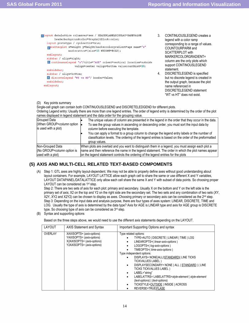
3. CONTINUOUSLEGEND creates a legend with a color ramp corresponding to a range of values. COUNTOURPARM and SCATTERPLOT with MARKERCOLORGRADIENT= column are the only plots which support CONTINOUSLEGEND statement.
4. DISCRETELEGEND is specified but no discrete legend is created in the output graph, because the plot name referenced in DISCRETELEGEND statement
“WT vs HT” does not exist.
Reporting and Information VisualizationSAS Global Forum 2011
15
TICKVALUEATTRS=style-element | style-element (text-options) | (text-options)
LATTICE COLUMNAXIS /external-axis-options ROWAXIS /external-axis-options
Same with LAYOUT OVERLAY except for TICKSTYLE and REVERSE
DATALATTICE DATAPANEL
COLUMNAXISOPTS= (axis-option(s)) ROWAXISOPTS= (axis-option(s))
Same with LAYOUT OVERLAY except for TICKSTYLE
Multi-cell related statement and supporting options.
LAYOUT AXIS Statement and Syntax
LATTICE <COLUMNHEADERS; GTL-statement(s); ENDCOLUMNHEADERS> <COLUMN2HEADERS; GTL-statement(s); COLUMN2HEADERS> <ROWHEADERS; GTL-statement(s); ENDROWHEADERS> <ROW2HEADERS; GTL-statement(s); ENDROW2HEADERS> <CELLHEADER; GTL-statement(s); ENDCELLHEADER ;>
SIDEBAR </ ALIGN= BOTTOM | TOP | LEFT | RIGHT>; GTL-statement(s); ENDSIDEBAR;
DATALATTICE, DATAPANEL SIDEBAR </ ALIGN= BOTTOM | TOP | LEFT | RIGHT>; GTL-statement(s); ENDSIDEBAR;
(C) Sample code and outputs
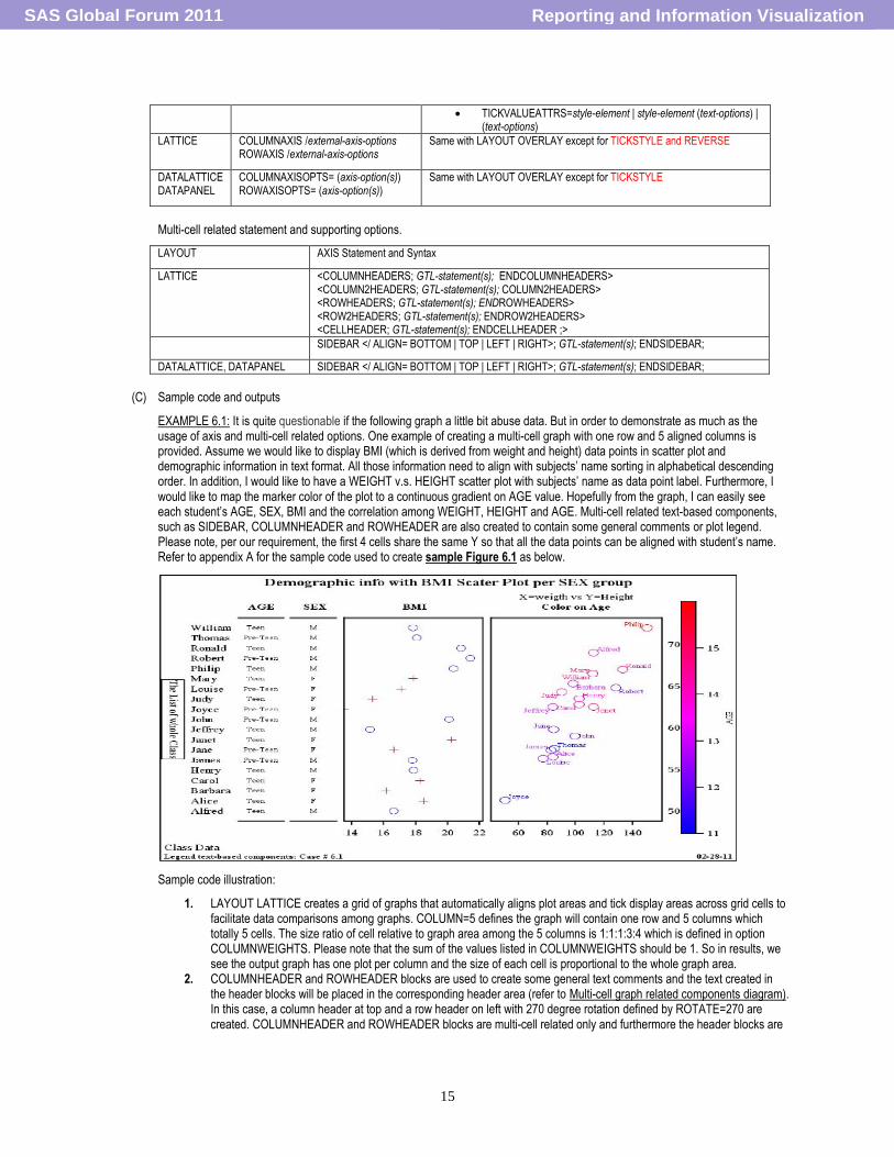
EXAMPLE 6.1: It is quite questionable if the following graph a little bit abuse data. But in order to demonstrate as much as the usage of axis and multi-cell related options. One example of creating a multi-cell graph with one row and 5 aligned columns is provided. Assume we would like to display BMI (which is derived from weight and height) data points in scatter plot and demographic information in text format. All those information need to align with subjects‟ name sorting in alphabetical descending order. In addition, I would like to have a WEIGHT v.s. HEIGHT scatter plot with subjects‟ name as data point label. Furthermore, I would like to map the marker color of the plot to a continuous gradient on AGE value. Hopefully from the graph, I can easily see each student‟s AGE, SEX, BMI and the correlation among WEIGHT, HEIGHT and AGE. Multi-cell related text-based components, such as SIDEBAR, COLUMNHEADER and ROWHEADER are also created to contain some general comments or plot legend. Please note, per our requirement, the first 4 cells share the same Y so that all the data points can be aligned with student‟s name. Refer to appendix A for the sample code used to create sample Figure 6.1 as below.
Sample code illustration:
1. LAYOUT LATTICE creates a grid of graphs that automatically aligns plot areas and tick display areas across grid cells to facilitate data comparisons among graphs. COLUMN=5 defines the graph will contain one row and 5 columns which totally 5 cells. The size ratio of cell relative to graph area among the 5 columns is 1:1:1:3:4 which is defined in option COLUMNWEIGHTS. Please note that the sum of the values listed in COLUMNWEIGHTS should be 1. So in results, we see the output graph has one plot per column and the size of each cell is proportional to the whole graph area.
2. COLUMNHEADER and ROWHEADER blocks are used to create some general text comments and the text created in the header blocks will be placed in the corresponding header area (refer to Multi-cell graph related components diagram). In this case, a column header at top and a row header on left with 270 degree rotation defined by ROTATE=270 are created. COLUMNHEADER and ROWHEADER blocks are multi-cell related only and furthermore the header blocks are
Reporting and Information VisualizationSAS Global Forum 2011
16
only supported by LAYOUT LATTICE. Other multi-cell layout such as LAYOUT DATALATTICE and LAYOUT DATAPANEL does not support header blocks because no special area for column and row header.
3. SIDEBAR block are the common multi-cell graph statement which can be used to place the text string or legends. It is supported by LAYOUT LATTICE, DATAPANEL and DATALATTICE. In our case, a continuous color ramp legend on AGE is created in the right side bar area. Each defined graph areas are quite independent. The graph component can be placed into different area for different presentation purpose, such as the legend can be displayed in SIDEBAR area or inside of the last cell by nesting the CONTINUOUSLEGEND statement in the last LAYOUT OVERLAY.
4. LAYOUT OVERLAY defined the 1st cell for the graph. A scatter plot is created which need to map value 1 to X and the value of subjects‟ names to Y. MARKERATTRS=(SIZE=0) define all the symbols are invisible. YAXIS=Y2 to define right side Y axis as primary one. Y2AXISOPTS=(TYPE=DISCREATE DISPLAY=TICKVALUE)defines the primary Y axis is DISCREATE type and only display tick value, in this case, which is the value of subjects‟ name. XAXISOPTS=(DISPLAY=NONE) defines no X axis will be display for this plot. In result, only the tick value (the subejcts‟ name) is displayed for the whole plot.
5. LAYOUT OVERLAY defines the 2nd cell for the graph. A scatter plot with the same X and Y as 4 is created by calling SCATTERPLOT statement. MARKERCHARATER=AGE option replace the plot marker with the value of AGE variable. YAXISOPTS= (DISPLAY=NONE TYPE=DISCREATE) define Y axis is DISCREATE type but not to display Y. XAXISOPTS= (DISPLAY= (LINE) DISPLAYSECONDARY= (LINE) defines display the axis line only for both primary (on bottom) and secondary (on top) X axis. In results, you will see the formatted age value displayed align with the plot in the 1st cell without Y axis displayed and only line displayed for both X axis.
6. Same logic is used to create the 3rd cell for the graph to display the value of SEX. 7. The same logic is used to create the 4th cell for the graph to display the BMI but the difference is that marker is not
replaced by the actual BMI value and rather, the BMI value is mapped to X axis. GROUP=SEX option is used to display data by sex group. In results, scatter plot with different color symbols representing the different SEX group. Y axis still aligns with plot in 1st and 2nd cell.
8. LAYOUT OVERALY defines the 5th cell for the graph. SCATTERPLOT X=WEIGHT Y=HEIGHT map the value of WEIGHT on X axis and map the value of HEIGHT on Y axis. Not like the scatter plot in cell 1-4, Y is LINEAR type rather DISCREATE type axis now. DATALABEL=NAME to request label each data symbol with subjects‟ name. YAXIS=Y2 to define right side Y axis as primary one. NAME=‟s2‟ is used to assign name „s2‟ to the scatter plot. The name is referenced in CONTINUOUSLEGEND statement in SIDEBAR block to associate the created legend to this plot. MARKERCOLORGRADIENT=AGE use the specified column AGE to map marker colors to a continuous gradient.
9. Because this cell has the different X and Y axis value from the scatter plot in cell 1-4, display the X and Y tick value is necessary for clarifying the different data range. YAXISOPTS= (DISPLAY= (LINE)) defines only line displayed to be well connected with the 4th cell. Y2AXISOPTS= (DISPLAY= (LINE TICKVALUES)) defines to display the line and tick values to show the data range for HEIGHT. XAXISOPTS= (DISPLAY= (LINE TICKS TICKVALUES)) defines to display line, tick mark and tick values on the default primary X axis which is the one at bottom. In results, a scatter plot with labeled markers and the independent X and Y axis are created. The markers of this scatter plot do not align with the subjects names as the other plots defined in cell 1-4.
(D) Key points summary
Multi-cell layout such as LAYOUT LATTICE allocates the specific area for column header, row header, cell header and side bar. The contents are not predefined by the input data. Developer can control the contents and appearance. More importantly, each area is pretty independent. For example, if a long string used as column header, the string will be only truncated rather than borrow the space from other area and this make it easier to debug. Axes are high LAYOUT dependent. Choosing LAYOUT should be prior to choosing axes system.
CONCLUSION
GTL can be a very powerful tool to create complicated customized graphs with a short learning curve compare to the traditional SAS/GRAPH because (1) the syntax logic is quite simple. Basically it is 4 layer building blocks. (2) Data structure for input dataset is very loose. You can just dump all the variables needed into one dataset and call the variable whenever is needed. (3) Graph components are quite independent but well synchronized. This paper is more like self-learning summary document which walk you through some examples by highlighting the important usage of GTL statements so that you can gain the knowledge of utilizing GTL to create customized text-based component for your dream graph quicker than you think.
REFERENCES
SAS/GRAPH® 9.2 Graph Template Language Reference. Second Edition SAS/GRAPH® 9.2 Graph Template Language User‟s Guide, Second Edition
CONTACT INFORMATION
Your comments and questions are valued and encouraged. Contact the author at:
Reporting and Information VisualizationSAS Global Forum 2011
17
Name: Zhuoye Xu Enterprise: Address: City, State ZIP: South San Francisco, CA Work Phone: 650-467-0403 E-mail: [email protected]
SAS and all other SAS Institute Inc. product or service names are registered trademarks or trademarks of SAS Institute Inc. in the USA and other countries. ® indicates USA registration.
Other brand and product names are trademarks of their respective companies.
Appendix A: Sample Data and Code to for sample Figure 6.1
Reporting and Information VisualizationSAS Global Forum 2011
18
Reporting and Information VisualizationSAS Global Forum 2011
19
Reporting and Information VisualizationSAS Global Forum 2011