Embed Size (px)
Citation preview
Paper 294-2010
It’s All About Variation:Improving Your Business Process with Statistical Thinking
Robert N. RodriguezSAS Institute Inc., Cary, NC
ABSTRACT
This paper explains how statistical thinking and statistical process monitoring, which have been practiced in manufacturingfor the past thirty years, are proving valuable for process improvement in business environments that range from healthcare to financial services. Basic examples drawn from real scenarios introduce the statistical concepts and show howto get started with SAS/QC® software. The concepts also apply to complex systems that involve large volumes ofmultivariate data with multiple sources of variation. The examples demonstrate the use of graphical displays, createdwith ODS Statistical Graphics, for visualizing and analyzing the variation in a process and for explaining results to clientsand management.
THE AMERICAN QUALITY REVOLUTION
Thirty years ago, an NBC television documentary ignited a revolution in American industry with a provocative title,“If Japan Can ... Why Can’t We?” The documentary explained how Japanese manufacturers in the automotive andelectronics industries had overtaken their American competitors by using a management system that emphasizedcontinuous improvement of quality. Viewers were surprised to learn that it was an American statistician, Dr. W. EdwardsDeming, who had taught Japanese companies to apply statistical thinking and statistical methods as the foundation fora systematic approach to manufacturing. In an interview during the documentary, Dr. Deming explained, “Statisticalthinking and statistical methods are to Japanese production workers, foremen, and all the way through the company,a second language. In statistical control you have a reproducible product hour after hour, day after day. And see howcomforting that is to management: they now know what they can produce, they know what their costs are going to be.”
The documentary launched Dr. Deming into national prominence as a widely sought-after management consultantand speaker. At his seminars, the message he preached was that top management—not the work force—is directlyresponsible for 85% of all problems, and he presented 14 principles for management, which he later expanded in hisbook Out of the Crisis. Deming was once asked whether he could reduce his 14 principles to a single sentence, and hisresponse was, “It’s all about understanding variation.”
Continuous improvement requires that management measure, understand, and act upon the variability in businessprocesses. “Statistical thinking”—a term that Deming often used—starts with the recognition that all processes aresubject to variability and that improvement comes about through understanding and reducing variability. Wheeler andPolling (1998) explain that “instead of focusing on outcomes, such as expenses and profits, this better way focuses onthe processes and systems that generate the outcomes. Rather than trying to directly manipulate the results, it works toimprove the system that causes the results. Rather than distorting . . . the data, it seeks to use the data to understand thesystem as a basis for improving the system.” More recently, Hoerl and Snee (2002) have defined statistical thinking asthe integration of process thinking, understanding of variation, and data-based decision making.
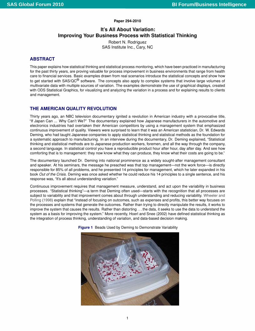
Figure 1 Beads Used by Deming to Demonstrate Variability
1
BI Forum/Business IntelligenceSAS Global Forum 2010
UNDERSTANDING AND ACTING ON PROCESS VARIATION
Although Deming did not teach statistical methods in his seminars, his management principles were based on the workof Walter A. Shewhart (1891–1967), a pioneer in the field of industrial statistics, who made fundamental contributions tothe understanding of variation in manufacturing processes. Shewhart recognized that every process displays variation,and he distinguished two types of variation: chance cause variation, which is naturally present in all processes, andassignable cause variation, which is sporadic and not present at all times. By eliminating assignable cause variation,the process can be brought into a state of statistical control, which provides the stability that is essential for predictingfuture output and assessing improvements. In 1924, Shewhart introduced the control chart as a statistical technique fordeciding when assignable causes are present.
In order to emphasize the levels of accountability for acting on the two types of variation, Deming renamed chance causevariation as common cause variation and assignable cause variation as special cause variation. Deming stressed that itis the responsibility of top management to address common cause variation because only at this level can the entiresystem be improved. On the other hand, workers, supervisors, and middle managers have direct knowledge of specialcauses of variation and are best equipped to fix these problems.
Interest in Deming’s management philosophy declined following his death in 1993, but his emphasis on statistical processcontrol (SPC) has had a lasting influence on manufacturing practice. This is especially the case in the automotive,electronics, and semiconductor industries, where control charts and process capability analysis are standard tools. Atsome companies the Six Sigma movement, which began in the 1980s, has succeeded in spreading the implementation ofSPC and related methods through a systematic approach to quality management which relies on executive sponsorship,training, consulting, and teamwork.
IS THE QUALITY REVOLUTION OVER?
In recent years, the Six Sigma approach has been criticized for promoting process improvement at the expense ofinnovation and productivity. The cover article of the June 6, 2007, issue of BusinessWeek faulted the introduction of SixSigma at 3M for disrupting the company’s culture of innovation (Hindo 2007). While the article clearly acknowledgedthe role of statistical analysis in helping to “produce better quality, lower costs, and more efficiency,” it questioned therelevance of the Six Sigma approach in the current economy, where new ideas and designs, rather than quality, aredriving competition. The article concluded that “while process excellence demands precision, consistency, and repetition,innovation calls for variation, failure, and serendipity.”
Has the quality revolution come to an end? Recent headlines about safety recalls by a Japanese automotive manufacturerdemonstrate once again that quality and reliability require continuous improvement of internal processes, and that theresponsibility for leading this effort lies with top management (Maynard 2010). In many industrial settings, the need forbasic statistical thinking and SPC is growing, and more advanced statistical techniques are being developed to deal withincreasingly complex manufacturing processes (Ramirez and Tobias 2007), massive volumes of process data that arecollected automatically, and new regulatory requirements (Peterson et al. 2009).
At the same time, the power of statistical thinking and statistical process improvement is being demonstrated in businessenvironments that range from health care to financial services. This paper discusses several of these applications usingexamples from actual scenarios.
HEALTH CARE: A NEW FRONTIER FOR QUALITY IMPROVEMENT
Improving the quality of patient care is a major component of health care reform in the United States. Hospitals and otherhealth care providers face the challenges of retaining qualified staff and containing costs. Institute of Medicine studiesshow that over half of medical deaths in hospitals are preventable, and statewide data reveal variability in hospital quality.In 2000, a landmark publication titled To Err Is Human (Institute of Medicine 2000) exposed the impact of hospital errors.A follow-up report, Crossing the Quality Chasm (Institute of Medicine 2001), listed six areas in which health care systemsperform at low levels:
� avoiding unintended injuries to patients
� providing evidence-based services where needed
� ensuring that patients’ values are respected
� reducing harmful delays that affect both patients and providers
� avoiding waste of materials and time
� providing a consistent level of care to all patients
2
BI Forum/Business IntelligenceSAS Global Forum 2010
In order to improve performance in these areas, many hospitals have turned to the quality management philosophies ofW. Edwards Deming, Joseph Juran, and others.
Although the health care industry generates large amounts of patient-specific data, few organizations are able to usethese data to identify unusual variability in staff and physician performance, cost of care, and preventable incidents thataffect the outcome of a patient’s care. SAS® Performance Management for Healthcare provides the ability to accessmultiple data sources and create analysis-ready data (SAS Institute Inc. 2009). Statistical process control can then beused to identify variability due to special causes and focus further study to reduce variability. These techniques leadto improvements in quality of care, reduction of costs, opportunities to grow market share, and negotiation of betterthird-party payment.
In their 1990 book Curing Health Care, Berwick, Godfrey, and Roessner illustrated the basic tools of quality improvementand especially the use of SPC for improving hospital processes. Since then these applications have grown rapidly.Although an overview of the literature is outside the scope of this paper, several publications are especially relevant tothe topics considered here. Benneyan (2001a, b) introduced specialized control charts for monitoring adverse effects.Woodall (2006) surveyed the use of control charts in health care. The 20th anniversary issue of Quality Engineering isdedicated to statistical quality control in health care: some of the articles in this issue focus on control chart methods(Limaye, Mastrangelo, and Zerr 2008) and other articles cover topics in syndromic surveillance (Tsui et al. 2008).
Rodriguez and Lewellen (2004), recently updated by Rodriguez and Ransdell (2010), provide examples that explain theuse of SAS/QC software to analyze health care data with a variety of SPC methods. The two examples that follow areborrowed from this paper and illustrate how to construct a basic control chart.
Example 1: Basic u Chart for Rate of CAT Scans
This example introduces the use of the SHEWHART procedure in SAS/QC software to construct a u chart, which is oneof several standard control charts for count data. In manufacturing, u charts are typically used to analyze the number ofdefects per inspection unit in samples that contain arbitrary numbers of units. In general, the event that is counted neednot be a defect. A u chart is applicable when the counts can be scaled by some measure of opportunity for the event tooccur, and when the counts can be modeled statistically by the Poisson distribution. The SHEWHART syntax for thisexample is described in detail since it extends to other charts that can be constructed with the procedure, as indicated insubsequent examples.
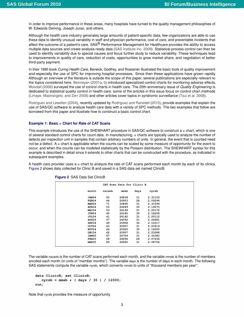
A health care provider uses a u chart to analyze the rate of CAT scans performed each month by each of its clinics.Figure 2 shows data collected for Clinic B and saved in a SAS data set named ClinicB.
Figure 2 SAS Data Set ClinicB
CAT Scan Data for Clinic B
month nscanb mmsb days nyrsb
JAN04 50 26838 31 2.31105FEB04 44 26903 28 2.09246MAR04 71 26895 31 2.31596APR04 53 26289 30 2.19075MAY04 53 26149 31 2.25172JUN04 40 26185 30 2.18208JUL04 41 26142 31 2.25112AUG04 57 26092 31 2.24681SEP04 49 25958 30 2.16317OCT04 63 25957 31 2.23519NOV04 64 25920 30 2.16000DEC04 62 25907 31 2.23088JAN05 67 26754 31 2.30382FEB05 58 26696 28 2.07636MAR05 89 26565 31 2.28754
The variable nscanb is the number of CAT scans performed each month, and the variable mmsb is the number of membersenrolled each month (in units of “member months”). The variable days is the number of days in each month. The followingSAS statements compute the variable nyrsb, which converts mmsb to units of “thousand members per year”:
data ClinicB; set ClinicB;nyrsb = mmsb * ( days / 30 ) / 12000;
run;
Note that nyrsb provides the measure of opportunity.
3
BI Forum/Business IntelligenceSAS Global Forum 2010
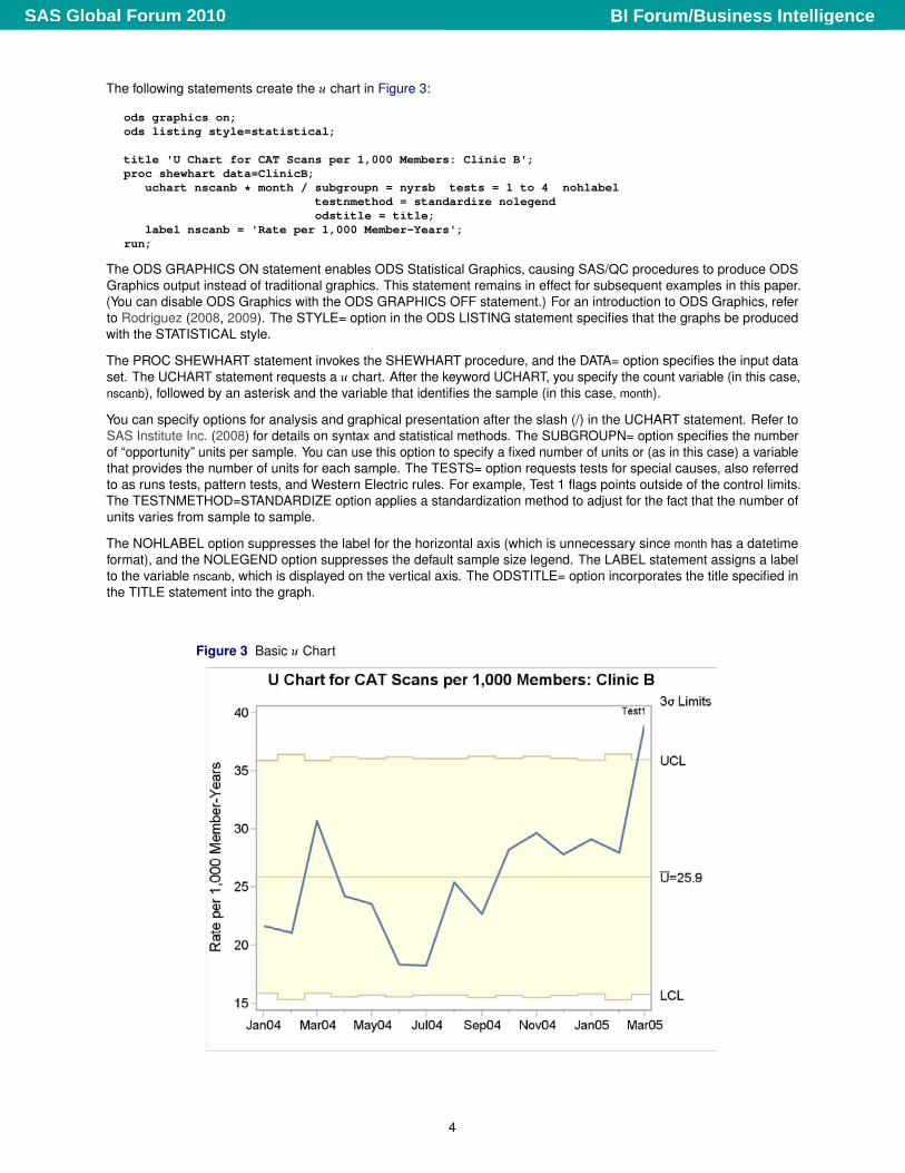
The following statements create the u chart in Figure 3:
ods graphics on;ods listing style=statistical;
title 'U Chart for CAT Scans per 1,000 Members: Clinic B';proc shewhart data=ClinicB;
uchart nscanb * month / subgroupn = nyrsb tests = 1 to 4 nohlabeltestnmethod = standardize nolegendodstitle = title;
label nscanb = 'Rate per 1,000 Member-Years';run;
The ODS GRAPHICS ON statement enables ODS Statistical Graphics, causing SAS/QC procedures to produce ODSGraphics output instead of traditional graphics. This statement remains in effect for subsequent examples in this paper.(You can disable ODS Graphics with the ODS GRAPHICS OFF statement.) For an introduction to ODS Graphics, referto Rodriguez (2008, 2009). The STYLE= option in the ODS LISTING statement specifies that the graphs be producedwith the STATISTICAL style.
The PROC SHEWHART statement invokes the SHEWHART procedure, and the DATA= option specifies the input dataset. The UCHART statement requests a u chart. After the keyword UCHART, you specify the count variable (in this case,nscanb), followed by an asterisk and the variable that identifies the sample (in this case, month).
You can specify options for analysis and graphical presentation after the slash (/) in the UCHART statement. Refer toSAS Institute Inc. (2008) for details on syntax and statistical methods. The SUBGROUPN= option specifies the numberof “opportunity” units per sample. You can use this option to specify a fixed number of units or (as in this case) a variablethat provides the number of units for each sample. The TESTS= option requests tests for special causes, also referredto as runs tests, pattern tests, and Western Electric rules. For example, Test 1 flags points outside of the control limits.The TESTNMETHOD=STANDARDIZE option applies a standardization method to adjust for the fact that the number ofunits varies from sample to sample.
The NOHLABEL option suppresses the label for the horizontal axis (which is unnecessary since month has a datetimeformat), and the NOLEGEND option suppresses the default sample size legend. The LABEL statement assigns a labelto the variable nscanb, which is displayed on the vertical axis. The ODSTITLE= option incorporates the title specified inthe TITLE statement into the graph.
Figure 3 Basic u Chart
4
BI Forum/Business IntelligenceSAS Global Forum 2010
In Figure 3, the upper and lower control limits are 3� limits estimated by default from the data; the limits vary becausethe number of opportunity units changes from month to month. The increase in the rate of CAT scans for March 2004 isinterpreted as common cause variation because it lies within the control limits, whereas the increase for March 2005should be investigated.
You can use the SHEWHART procedure to create a wide variety of control charts. Each of the standard chart typesis created with a different chart statement (for example, you use the PCHART statement to create p charts). Onceyou have learned the basic syntax for a particular chart statement, you can use the same syntax for all the other chartstatements.
Example 2: Control Limits for a u Chart with a Known Shift in Rate
This example illustrates the construction of a u chart in situations where the process rate is known to have shifted,requiring multiple sets of control limits.
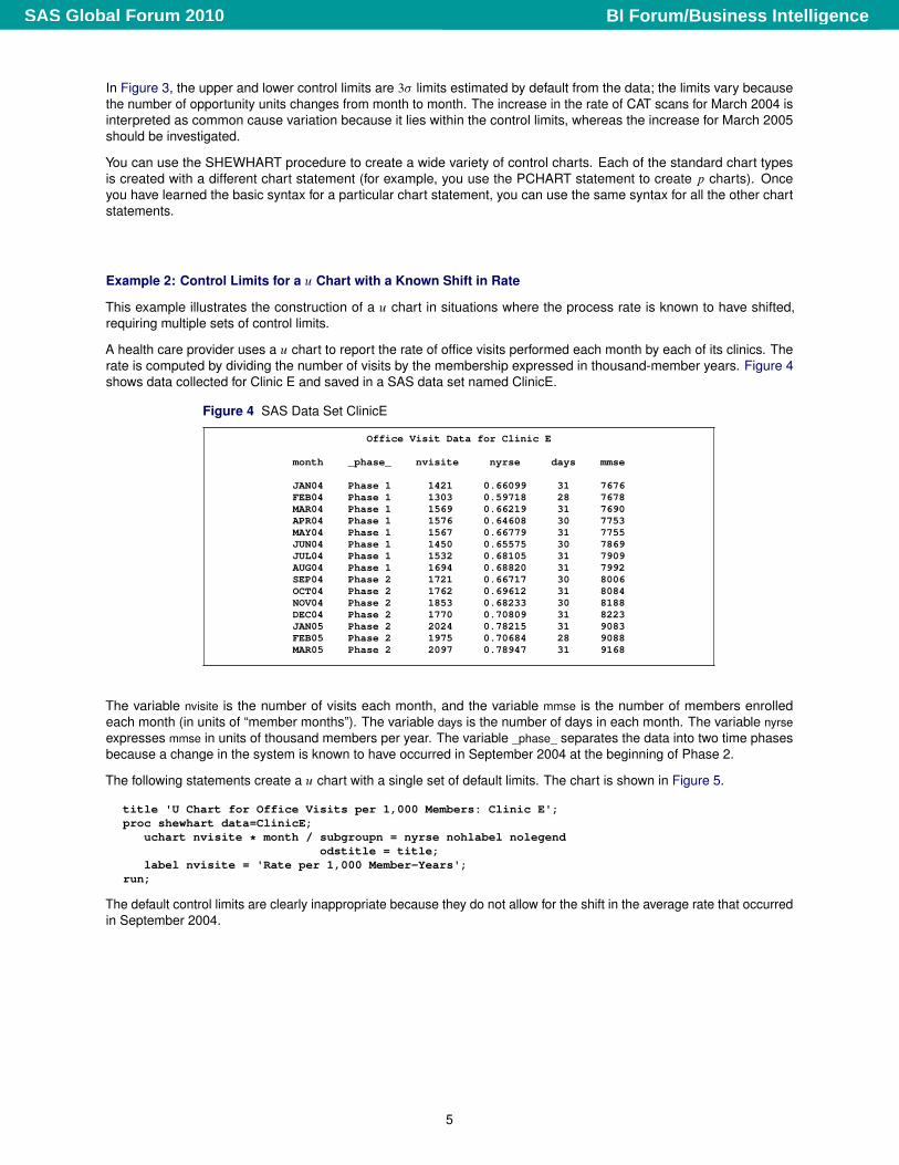
A health care provider uses a u chart to report the rate of office visits performed each month by each of its clinics. Therate is computed by dividing the number of visits by the membership expressed in thousand-member years. Figure 4shows data collected for Clinic E and saved in a SAS data set named ClinicE.
Figure 4 SAS Data Set ClinicE
Office Visit Data for Clinic E
month _phase_ nvisite nyrse days mmse
JAN04 Phase 1 1421 0.66099 31 7676FEB04 Phase 1 1303 0.59718 28 7678MAR04 Phase 1 1569 0.66219 31 7690APR04 Phase 1 1576 0.64608 30 7753MAY04 Phase 1 1567 0.66779 31 7755JUN04 Phase 1 1450 0.65575 30 7869JUL04 Phase 1 1532 0.68105 31 7909AUG04 Phase 1 1694 0.68820 31 7992SEP04 Phase 2 1721 0.66717 30 8006OCT04 Phase 2 1762 0.69612 31 8084NOV04 Phase 2 1853 0.68233 30 8188DEC04 Phase 2 1770 0.70809 31 8223JAN05 Phase 2 2024 0.78215 31 9083FEB05 Phase 2 1975 0.70684 28 9088MAR05 Phase 2 2097 0.78947 31 9168
The variable nvisite is the number of visits each month, and the variable mmse is the number of members enrolledeach month (in units of “member months”). The variable days is the number of days in each month. The variable nyrseexpresses mmse in units of thousand members per year. The variable _phase_ separates the data into two time phasesbecause a change in the system is known to have occurred in September 2004 at the beginning of Phase 2.
The following statements create a u chart with a single set of default limits. The chart is shown in Figure 5.
title 'U Chart for Office Visits per 1,000 Members: Clinic E';proc shewhart data=ClinicE;
uchart nvisite * month / subgroupn = nyrse nohlabel nolegendodstitle = title;
label nvisite = 'Rate per 1,000 Member-Years';run;
The default control limits are clearly inappropriate because they do not allow for the shift in the average rate that occurredin September 2004.
5
BI Forum/Business IntelligenceSAS Global Forum 2010
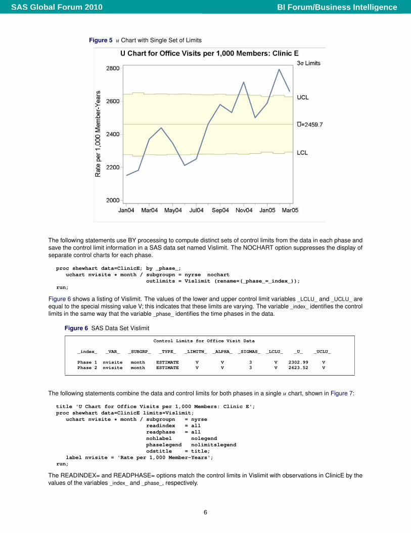
Figure 5 u Chart with Single Set of Limits
The following statements use BY processing to compute distinct sets of control limits from the data in each phase andsave the control limit information in a SAS data set named Vislimit. The NOCHART option suppresses the display ofseparate control charts for each phase.
proc shewhart data=ClinicE; by _phase_;uchart nvisite * month / subgroupn = nyrse nochart
outlimits = Vislimit (rename=(_phase_=_index_));run;
Figure 6 shows a listing of Vislimit. The values of the lower and upper control limit variables _LCLU_ and _UCLU_ areequal to the special missing value V; this indicates that these limits are varying. The variable _index_ identifies the controllimits in the same way that the variable _phase_ identifies the time phases in the data.
Figure 6 SAS Data Set Vislimit
Control Limits for Office Visit Data
_index_ _VAR_ _SUBGRP_ _TYPE_ _LIMITN_ _ALPHA_ _SIGMAS_ _LCLU_ _U_ _UCLU_
Phase 1 nvisite month ESTIMATE V V 3 V 2302.99 VPhase 2 nvisite month ESTIMATE V V 3 V 2623.52 V
The following statements combine the data and control limits for both phases in a single u chart, shown in Figure 7:
title 'U Chart for Office Visits per 1,000 Members: Clinic E';proc shewhart data=ClinicE limits=Vislimit;
uchart nvisite * month / subgroupn = nyrsereadindex = allreadphase = allnohlabel nolegendphaselegend nolimitslegendodstitle = title;
label nvisite = 'Rate per 1,000 Member-Years';run;
The READINDEX= and READPHASE= options match the control limits in Vislimit with observations in ClinicE by thevalues of the variables _index_ and _phase_, respectively.
6
BI Forum/Business IntelligenceSAS Global Forum 2010
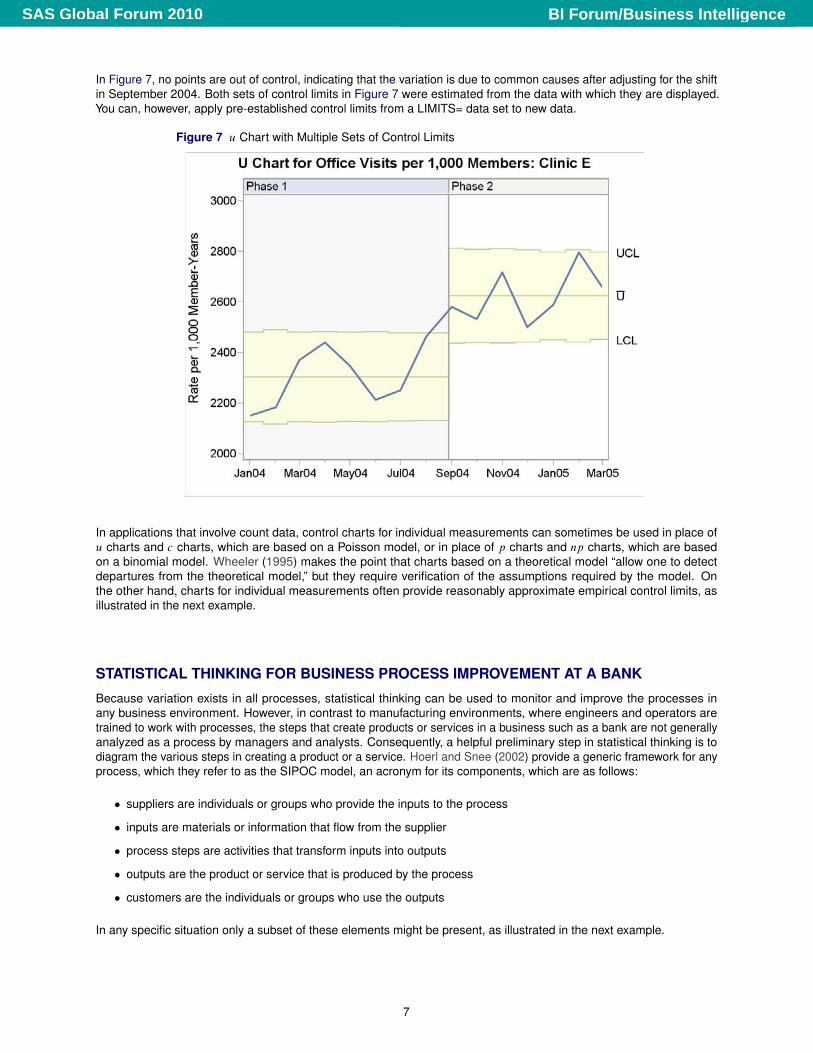
In Figure 7, no points are out of control, indicating that the variation is due to common causes after adjusting for the shiftin September 2004. Both sets of control limits in Figure 7 were estimated from the data with which they are displayed.You can, however, apply pre-established control limits from a LIMITS= data set to new data.
Figure 7 u Chart with Multiple Sets of Control Limits
In applications that involve count data, control charts for individual measurements can sometimes be used in place ofu charts and c charts, which are based on a Poisson model, or in place of p charts and np charts, which are basedon a binomial model. Wheeler (1995) makes the point that charts based on a theoretical model “allow one to detectdepartures from the theoretical model,” but they require verification of the assumptions required by the model. Onthe other hand, charts for individual measurements often provide reasonably approximate empirical control limits, asillustrated in the next example.
STATISTICAL THINKING FOR BUSINESS PROCESS IMPROVEMENT AT A BANK
Because variation exists in all processes, statistical thinking can be used to monitor and improve the processes inany business environment. However, in contrast to manufacturing environments, where engineers and operators aretrained to work with processes, the steps that create products or services in a business such as a bank are not generallyanalyzed as a process by managers and analysts. Consequently, a helpful preliminary step in statistical thinking is todiagram the various steps in creating a product or a service. Hoerl and Snee (2002) provide a generic framework for anyprocess, which they refer to as the SIPOC model, an acronym for its components, which are as follows:
� suppliers are individuals or groups who provide the inputs to the process
� inputs are materials or information that flow from the supplier
� process steps are activities that transform inputs into outputs
� outputs are the product or service that is produced by the process
� customers are the individuals or groups who use the outputs
In any specific situation only a subset of these elements might be present, as illustrated in the next example.
7
BI Forum/Business IntelligenceSAS Global Forum 2010
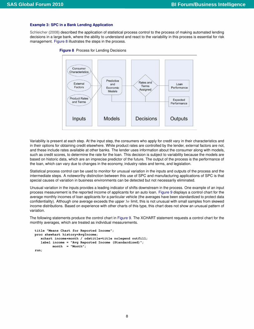
Example 3: SPC in a Bank Lending Application
Schleicher (2008) described the application of statistical process control to the process of making automated lendingdecisions in a large bank, where the ability to understand and react to the variability in this process is essential for riskmanagement. Figure 8 illustrates the steps in the process.
Figure 8 Process for Lending Decisions
Variability is present at each step. At the input step, the consumers who apply for credit vary in their characteristics andin their options for obtaining credit elsewhere. While product rates are controlled by the lender, external factors are not,and these include rates available at other banks. The lender uses information about the consumer along with models,such as credit scores, to determine the rate for the loan. This decision is subject to variability because the models arebased on historic data, which are an imprecise predictor of the future. The output of the process is the performance ofthe loan, which can vary due to changes in the economy, industry rates and terms, and legislation.
Statistical process control can be used to monitor for unusual variation in the inputs and outputs of the process and theintermediate steps. A noteworthy distinction between this use of SPC and manufacturing applications of SPC is thatspecial causes of variation in business environments can be detected but not necessarily eliminated.
Unusual variation in the inputs provides a leading indicator of shifts downstream in the process. One example of an inputprocess measurement is the reported income of applicants for an auto loan. Figure 9 displays a control chart for theaverage monthly incomes of loan applicants for a particular vehicle (the averages have been standardized to protect dataconfidentiality). Although one average exceeds the upper 3� limit, this is not unusual with small samples from skewedincome distributions. Based on experience with other charts of this type, this chart does not show an unusual pattern ofvariation.
The following statements produce the control chart in Figure 9. The XCHART statement requests a control chart for themonthly averages, which are treated as individual measurements.
title "Means Chart for Reported Income";proc shewhart history=AvgIncome;
xchart income*month / odstitle=title nolegend outfill;label income = "Avg Reported Income (Standardized)";
month = "Month";run;
8
BI Forum/Business IntelligenceSAS Global Forum 2010
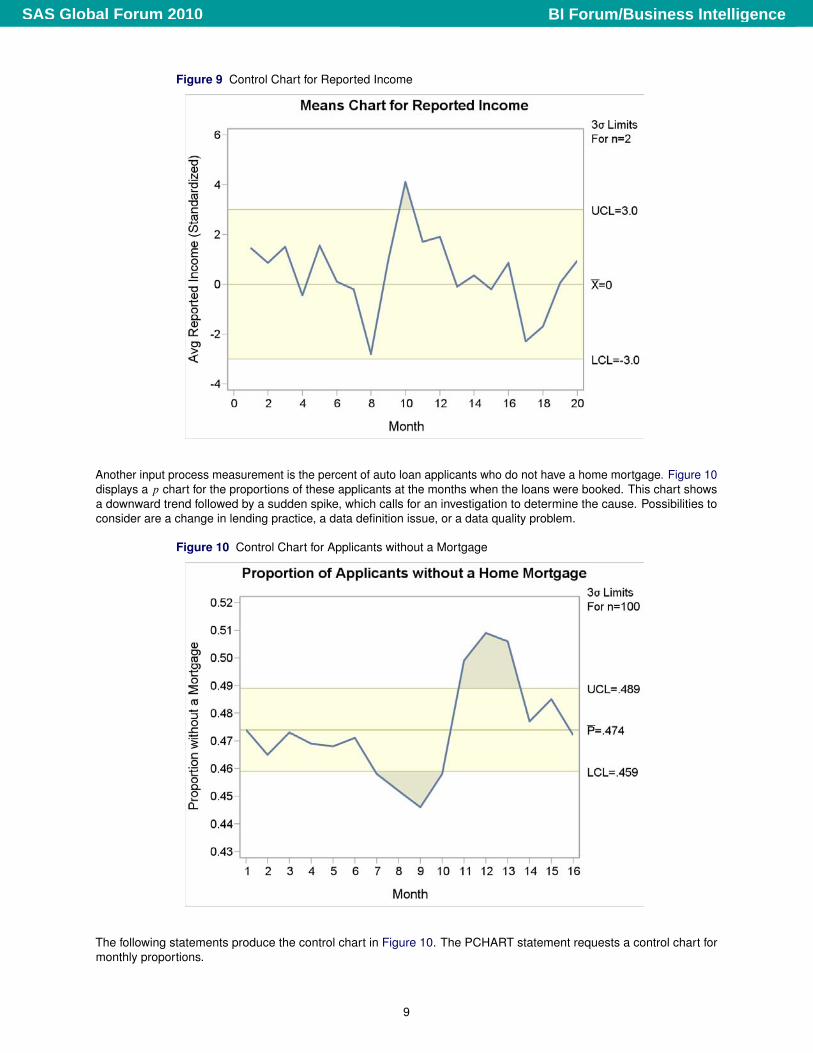
Figure 9 Control Chart for Reported Income
Another input process measurement is the percent of auto loan applicants who do not have a home mortgage. Figure 10displays a p chart for the proportions of these applicants at the months when the loans were booked. This chart showsa downward trend followed by a sudden spike, which calls for an investigation to determine the cause. Possibilities toconsider are a change in lending practice, a data definition issue, or a data quality problem.
Figure 10 Control Chart for Applicants without a Mortgage
The following statements produce the control chart in Figure 10. The PCHART statement requests a control chart formonthly proportions.
9
BI Forum/Business IntelligenceSAS Global Forum 2010
title "Proportion of Applicants without a Home Mortgage";proc shewhart data=missprop limits=misslim;
pchart pmiss*id / subgroupn=100 nolegend odstitle=title outfill;label pmiss = "Proportion without a Mortgage";label month = "Month";
run;
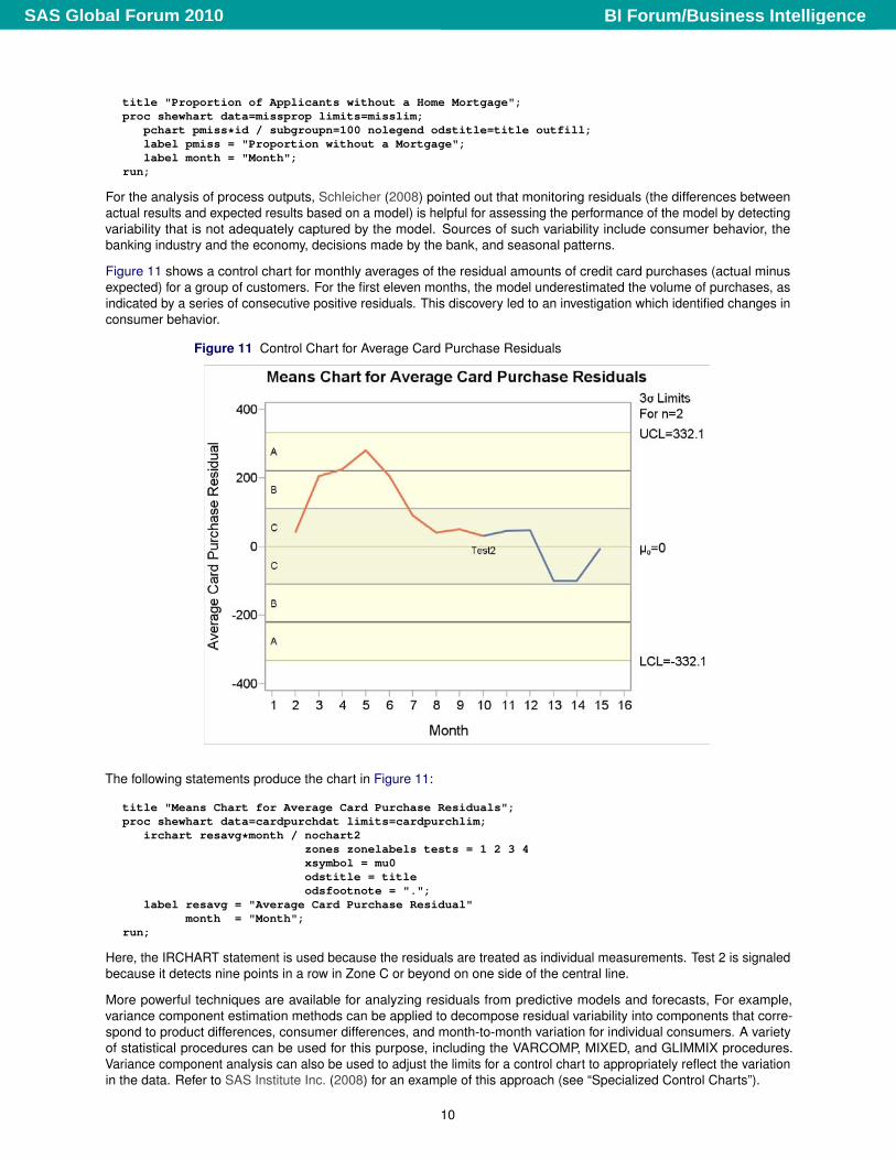
For the analysis of process outputs, Schleicher (2008) pointed out that monitoring residuals (the differences betweenactual results and expected results based on a model) is helpful for assessing the performance of the model by detectingvariability that is not adequately captured by the model. Sources of such variability include consumer behavior, thebanking industry and the economy, decisions made by the bank, and seasonal patterns.
Figure 11 shows a control chart for monthly averages of the residual amounts of credit card purchases (actual minusexpected) for a group of customers. For the first eleven months, the model underestimated the volume of purchases, asindicated by a series of consecutive positive residuals. This discovery led to an investigation which identified changes inconsumer behavior.
Figure 11 Control Chart for Average Card Purchase Residuals
The following statements produce the chart in Figure 11:
title "Means Chart for Average Card Purchase Residuals";proc shewhart data=cardpurchdat limits=cardpurchlim;
irchart resavg*month / nochart2zones zonelabels tests = 1 2 3 4xsymbol = mu0odstitle = titleodsfootnote = ".";
label resavg = "Average Card Purchase Residual"month = "Month";
run;
Here, the IRCHART statement is used because the residuals are treated as individual measurements. Test 2 is signaledbecause it detects nine points in a row in Zone C or beyond on one side of the central line.
More powerful techniques are available for analyzing residuals from predictive models and forecasts, For example,variance component estimation methods can be applied to decompose residual variability into components that corre-spond to product differences, consumer differences, and month-to-month variation for individual consumers. A varietyof statistical procedures can be used for this purpose, including the VARCOMP, MIXED, and GLIMMIX procedures.Variance component analysis can also be used to adjust the limits for a control chart to appropriately reflect the variationin the data. Refer to SAS Institute Inc. (2008) for an example of this approach (see “Specialized Control Charts”).
10
BI Forum/Business IntelligenceSAS Global Forum 2010
Example 4: Exploring Process Variation in a Call Center Application
The managers of a call center operation at a bank are interested in handling calls more effectively in order to improvecustomer satisfaction and reduce costs. One measure of the call-handling process is the time (in seconds) required tohandle the call.
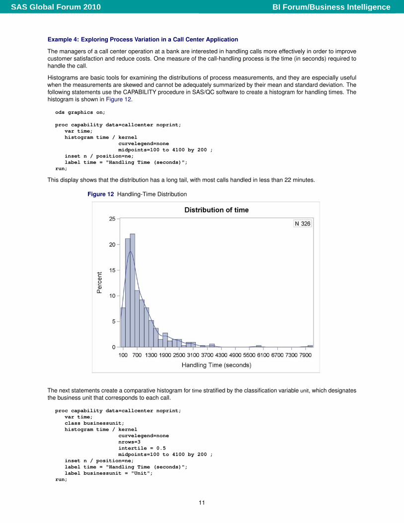
Histograms are basic tools for examining the distributions of process measurements, and they are especially usefulwhen the measurements are skewed and cannot be adequately summarized by their mean and standard deviation. Thefollowing statements use the CAPABILITY procedure in SAS/QC software to create a histogram for handling times. Thehistogram is shown in Figure 12.
ods graphics on;
proc capability data=callcenter noprint;var time;histogram time / kernel
curvelegend=nonemidpoints=100 to 4100 by 200 ;
inset n / position=ne;label time = "Handling Time (seconds)";
run;
This display shows that the distribution has a long tail, with most calls handled in less than 22 minutes.
Figure 12 Handling-Time Distribution
The next statements create a comparative histogram for time stratified by the classification variable unit, which designatesthe business unit that corresponds to each call.
proc capability data=callcenter noprint;var time;class businessunit;histogram time / kernel
curvelegend=nonenrows=3intertile = 0.5midpoints=100 to 4100 by 200 ;
inset n / position=ne;label time = "Handling Time (seconds)";label businessunit = "Unit";
run;
11
BI Forum/Business IntelligenceSAS Global Forum 2010
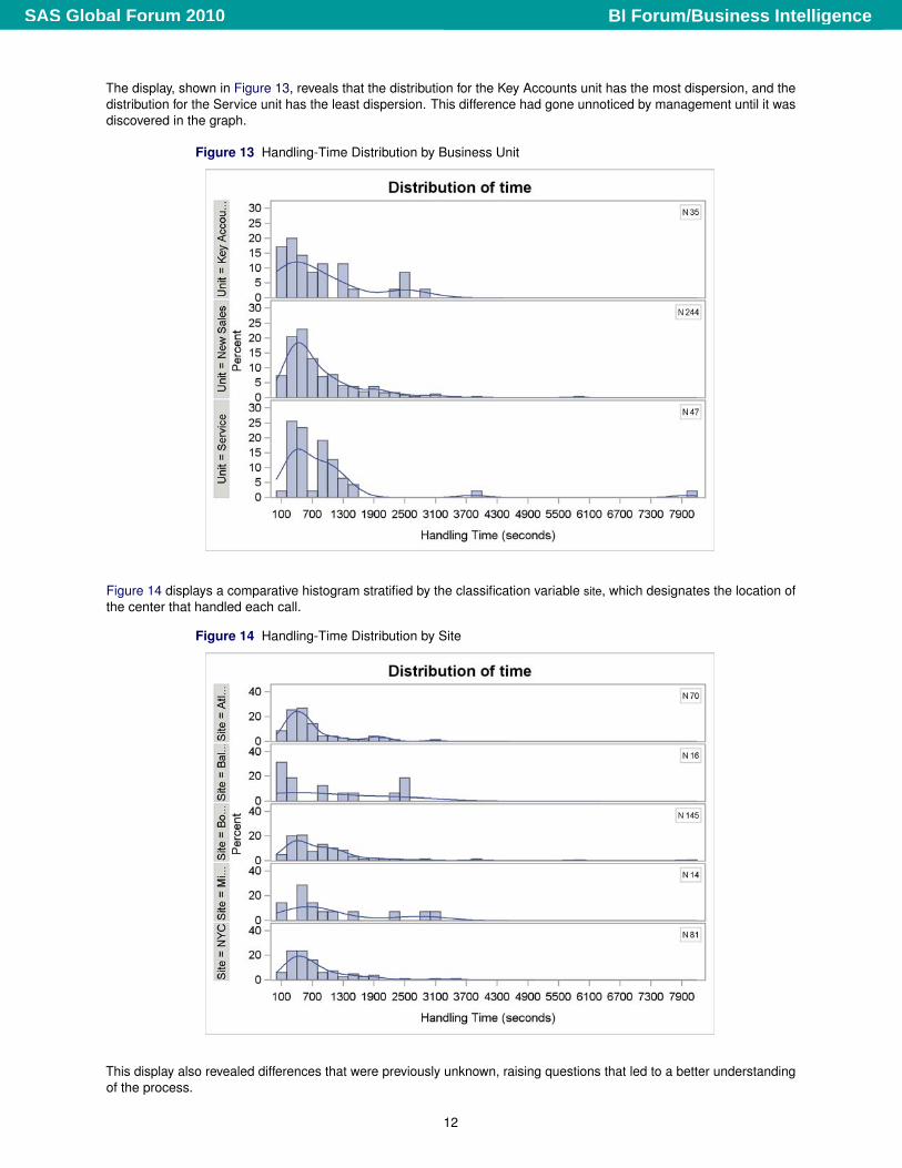
The display, shown in Figure 13, reveals that the distribution for the Key Accounts unit has the most dispersion, and thedistribution for the Service unit has the least dispersion. This difference had gone unnoticed by management until it wasdiscovered in the graph.
Figure 13 Handling-Time Distribution by Business Unit
Figure 14 displays a comparative histogram stratified by the classification variable site, which designates the location ofthe center that handled each call.
Figure 14 Handling-Time Distribution by Site
This display also revealed differences that were previously unknown, raising questions that led to a better understandingof the process.
12
BI Forum/Business IntelligenceSAS Global Forum 2010
MULTIVARIATE PROCESS MONITORING WITH COMPLEX SYSTEMS
The control charts constructed in the previous sections are based on simple statistical models for the common causevariation in a single process variable, such as the Poisson distribution for the u chart in Example 1, the normal distributionfor the NX chart in Example 2, and the binomial distribution for the p chart in Example 2. These models work well inShewhart’s framework, where process measurements are univariate and where common cause variation is viewed as aseries of chance disturbances away from an average level that is assumed to be constant over short periods of time.
In contrast, the application of statistical process monitoring to complex systems—both in manufacturing applications andin business environments—requires methods that work well with large volumes of multivariate data collected over time,often from disparate sources and databases. In addition, a much richer set of statistical models is needed to characterizethe expected variation in the data, which, in addition to common cause variation, can include effects such as correlationamong process variables, time-dependent behavior, and multiple sources of variation. More extensive models are alsoneeded in situations where a set of internal process variables is used to construct a predictive model for a set of externalmeasures, such as product quality, reliability, and customer satisfaction.
Example 5: Multivariate Process Monitoring in a Regulatory System
To illustrate the modeling issues that arise with a large number of process variables observed over months, consider theproblem facing a regulatory organization responsible for monitoring 6,000 securities firms for unusual activities. Each firmsubmits data on more than 100 variables at regular time intervals, including the number of sales representatives, revenueper representative, customer complaints per representative, and customer complaints per sales volume. Examiners usethis data to investigate financial problems and questionable sales practices, but because of the large volume of the data,statistical process monitoring is used to screen the data for unusual patterns that occur over time measured in days.
Multivariate process monitoring based on a principal components model is an effective approach for dealing withhundreds or thousands of correlated process variables. This approach is one of many techniques that were introducedduring the mid 1990s by chemometricians for applications within the chemical process and pharmaceutical industries,which range from modeling the quality of paper pulp from digester process variables to the development of structure-activity relationships for new drug compounds. The multivariate monitoring approach outlined here is patterned after thework of Kourti and MacGregor (1995, 1996), and it is discussed in more detail by Rodriguez and Tobias (2001).
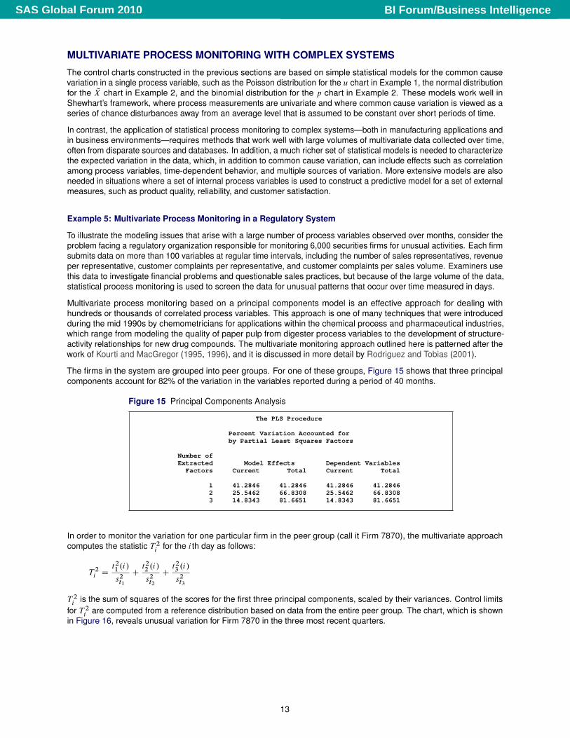
The firms in the system are grouped into peer groups. For one of these groups, Figure 15 shows that three principalcomponents account for 82% of the variation in the variables reported during a period of 40 months.
Figure 15 Principal Components Analysis
The PLS Procedure
Percent Variation Accounted forby Partial Least Squares Factors
Number ofExtracted Model Effects Dependent Variables
Factors Current Total Current Total
1 41.2846 41.2846 41.2846 41.28462 25.5462 66.8308 25.5462 66.83083 14.8343 81.6651 14.8343 81.6651
In order to monitor the variation for one particular firm in the peer group (call it Firm 7870), the multivariate approachcomputes the statistic T 2
i for the i th day as follows:
T 2i D
t21 .i/
s2t1
Ct22 .i/
s2t2
Ct23 .i/
s2t3
T 2i is the sum of squares of the scores for the first three principal components, scaled by their variances. Control limits
for T 2i are computed from a reference distribution based on data from the entire peer group. The chart, which is shown
in Figure 16, reveals unusual variation for Firm 7870 in the three most recent quarters.
13
BI Forum/Business IntelligenceSAS Global Forum 2010
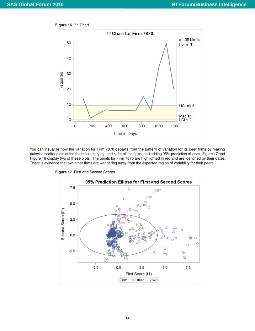
Figure 16 T 2 Chart
You can visualize how the variation for Firm 7870 departs from the pattern of variation for its peer firms by makingpairwise scatter plots of the three scores t1, t2, and t3 for all the firms, and adding 95% prediction ellipses. Figure 17 andFigure 18 display two of these plots. The points for Firm 7870 are highlighted in red and are identified by their dates.There is evidence that two other firms are wandering away from the expected region of variability for their peers.
Figure 17 First and Second Scores
14
BI Forum/Business IntelligenceSAS Global Forum 2010
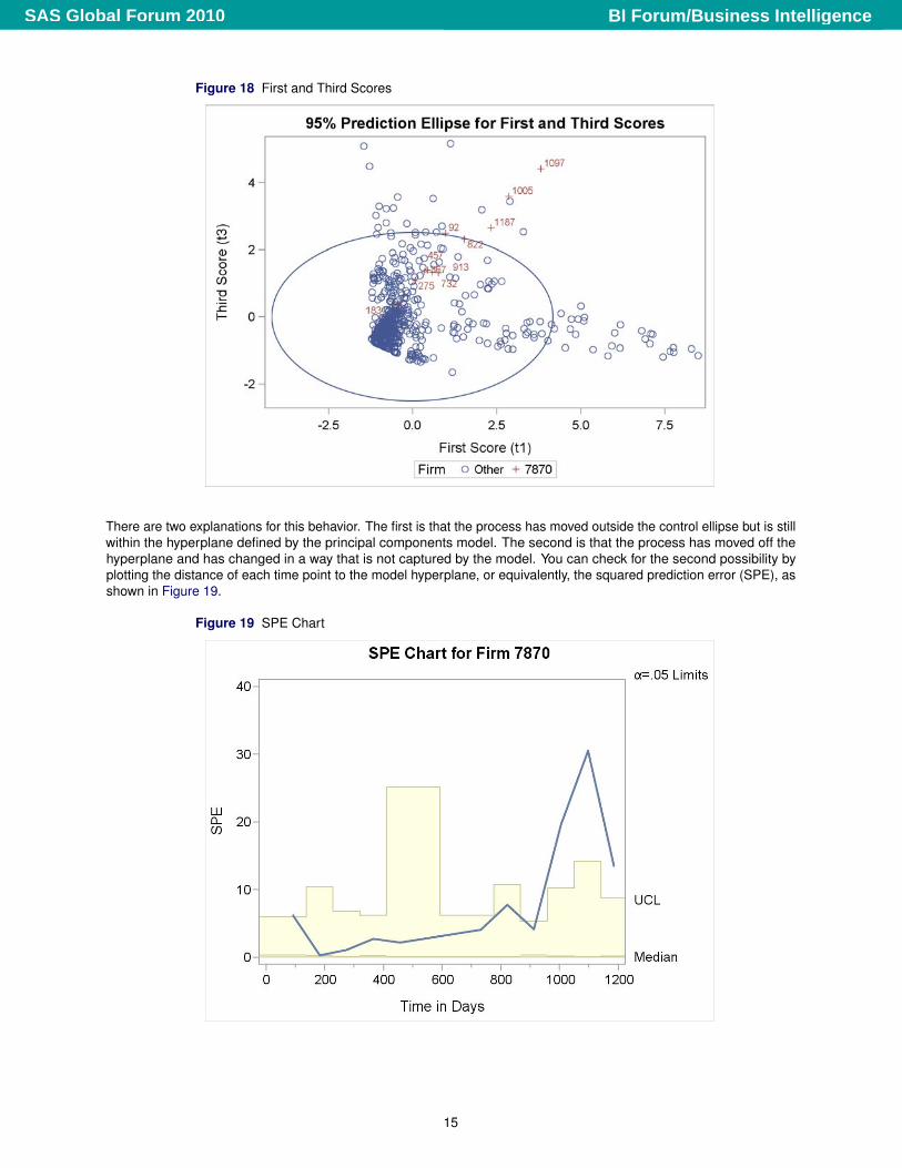
Figure 18 First and Third Scores
There are two explanations for this behavior. The first is that the process has moved outside the control ellipse but is stillwithin the hyperplane defined by the principal components model. The second is that the process has moved off thehyperplane and has changed in a way that is not captured by the model. You can check for the second possibility byplotting the distance of each time point to the model hyperplane, or equivalently, the squared prediction error (SPE), asshown in Figure 19.
Figure 19 SPE Chart
15
BI Forum/Business IntelligenceSAS Global Forum 2010
Here the control limits for SSE are computed using all the firms in the peer family as a reference normal data set(Nomikos and MacGregor 1995). The chart indicates that the process has moved off the model plane. Not only is thisfirm’s behavior diverging from the common cause variation exhibited by its peers, it is also diverging in a new way withvariation not observed in the data that were used to develop the model. This indicates the need for constructing a newmodel.
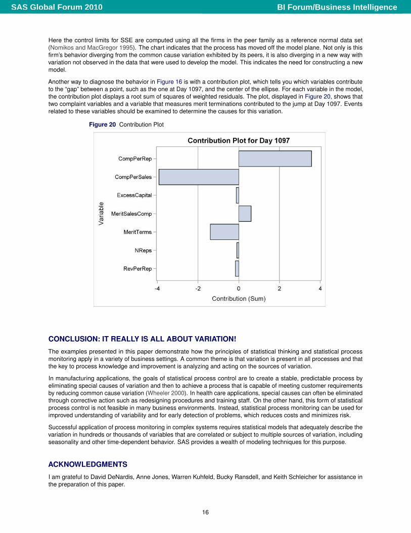
Another way to diagnose the behavior in Figure 16 is with a contribution plot, which tells you which variables contributeto the “gap” between a point, such as the one at Day 1097, and the center of the ellipse. For each variable in the model,the contribution plot displays a root sum of squares of weighted residuals. The plot, displayed in Figure 20, shows thattwo complaint variables and a variable that measures merit terminations contributed to the jump at Day 1097. Eventsrelated to these variables should be examined to determine the causes for this variation.
Figure 20 Contribution Plot
CONCLUSION: IT REALLY IS ALL ABOUT VARIATION!
The examples presented in this paper demonstrate how the principles of statistical thinking and statistical processmonitoring apply in a variety of business settings. A common theme is that variation is present in all processes and thatthe key to process knowledge and improvement is analyzing and acting on the sources of variation.
In manufacturing applications, the goals of statistical process control are to create a stable, predictable process byeliminating special causes of variation and then to achieve a process that is capable of meeting customer requirementsby reducing common cause variation (Wheeler 2000). In health care applications, special causes can often be eliminatedthrough corrective action such as redesigning procedures and training staff. On the other hand, this form of statisticalprocess control is not feasible in many business environments. Instead, statistical process monitoring can be used forimproved understanding of variability and for early detection of problems, which reduces costs and minimizes risk.
Successful application of process monitoring in complex systems requires statistical models that adequately describe thevariation in hundreds or thousands of variables that are correlated or subject to multiple sources of variation, includingseasonality and other time-dependent behavior. SAS provides a wealth of modeling techniques for this purpose.
ACKNOWLEDGMENTS
I am grateful to David DeNardis, Anne Jones, Warren Kuhfeld, Bucky Ransdell, and Keith Schleicher for assistance inthe preparation of this paper.
16
BI Forum/Business IntelligenceSAS Global Forum 2010
REFERENCES
Benneyan, J. (2001a), “Number-Between g-Type Statistical Control Charts,” Health Care Management Science, 4,305–318.
Benneyan, J. (2001b), “Performance of Number-Between g-Type Statistical Control Charts for Monitoring AdverseEvents,” Health Care Management Science, 4, 319–336.
Berwick, D. M., Godfrey, A. B., and Roessner, J. (1990), Curing Health Care, New Strategies for Quality Improvement,San Francisco, CA: Jossey—Bass.
Deming, W. E. (1982), Out of the Crisis, Cambridge, MA: Massachusetts Institute of Technology, Center for AdvancedEngineering Study.
Hindo, B. (2007), “At 3M, A Struggle between Efficiency and Creativity,” Business Week, last accessed February 13,2010.URL http://www.businessweek.com/magazine/content/07_24/b4038406.htm?chan=top+news_top+news+index_best+of+bw
Hoerl, R. W. and Snee, R. D. (2002), Statistical Thinking: Improving Business Performance, Belmont, CA: Brooks/Cole.
Institute of Medicine (2000), To Err Is Human: Building a Safer Health System, Washington, DC: National AcademyPress.
Institute of Medicine (2001), Crossing the Quality Chasm: A New Health System for the 21st Century, Washington, DC:National Academy Press.
Kourti, T. and MacGregor, J. F. (1995), “Process Analysis, Monitoring and Diagnosis, Using Multivariate ProjectionMethods,” Chemometrics and Intelligent Laboratory Systems, 28, 3–21.
Kourti, T. and MacGregor, J. F. (1996), “Multivariate SPC Methods for Process and Product Monitoring,” Journal ofQuality Technology, 28, 409–428.
Limaye, S. S., Mastrangelo, C. M., and Zerr, D. M. (2008), “A Case Study in Monitoring Hospital-Associated Infectionswith Count Control Charts,” Quality Engineering, 20, 404–413.
Maynard, M. (2010), “An Apology From Toyota’s Leader,” New York Times, http://www.nytimes.com/2010/02/25/business/global/25toyota.html, last accessed February 25, 2010.
Nomikos, P. and MacGregor, J. F. (1995), “Multivariate SPC Charts for Monitoring Batch Processes,” Technometrics, 37,41–59.
Peterson, J. J., Snee, R. D., McAllister, P. R., Schofield, T. L., and Carella, A. J. (2009), “Statistics in PharmaceuticalDevelopment and Manufacturing,” Journal of Quality Technology, 41(2), 111–147.
Ramirez, J. G. and Tobias, R. (2007), “Split and Conquer! Using SAS/QC to Design Quality into Complex Manufacturing,”in Proceedings of the SAS Global Forum 2007 Conference, Cary, NC: SAS Institute Inc.
Rodriguez, R. N. (2008), “Getting Started with ODS Statistical Graphics in SAS 9.2,” in Proceedings of the SAS GlobalForum 2008 Conference, Cary, NC: SAS Institute Inc.
Rodriguez, R. N. (2009), Getting Started with ODS Statistical Graphics in SAS 9.2—Revised 2009, Technical report,SAS Institute Inc.URL http://support.sas.com/rnd/app/papers/intodsgraph.pdf
Rodriguez, R. N. and Lewellen, S. B. (2004), “SAS SPM Solution for Healthcare: Quality Improvement for Providers UsingStatistical Process Control,” in Proceedings of the Twenty-ninth Annual SAS Users Group International Conference,Cary, NC: SAS Institute Inc.
Rodriguez, R. N. and Ransdell, B. (2010), “Statistical Process Control for Health Care Quality Improvement UsingSAS/QC Software,” http://support.sas.com/rnd/app/papers/papers_qc.html.
Rodriguez, R. N. and Tobias, R. D. (2001), “Multivariate Methods for Process Knowledge Discovery: The Power to KnowYour Process,” in Proceedings of the Twenty-sixth Annual SAS Users Group International Conference, Cary, NC: SASInstitute Inc.URL http://www2.sas.com/proceedings/sugi26/p252-26.pdf
SAS Institute Inc. (2008), SAS/QC 9.2 User’s Guide, Cary, NC: SAS Institute Inc.
SAS Institute Inc. (2009), “SAS Performance Management for Health Care,” http://www.sas.com/industry/healthcare/spm/index.html.
17
BI Forum/Business IntelligenceSAS Global Forum 2010
Schleicher, K. (2008), “SPC for Lending,” Presentation at the 2008 Fall Technical Conference sponsored by the AmericanStatistical Association and the American Society for Quality.
Tsui, K. L., Chiu, W., Gierlich, P., Goldman, D., Liu, X., and Maschek, T. (2008), “A Review of Healthcare, Public Health,and Syndromic Surveillance,” Quality Engineering, 20, 435–450.
Wheeler, D. J. (1995), Advanced Topics in Statistical Process Control, Knoxville, TN: SPC Press.
Wheeler, D. J. (2000), Understanding Variation: The Key to Managing Chaos, Second Edition, Knoxville, TN: SPC Press.
Wheeler, D. J. and Polling, S. R. (1998), Building Continual Improvement: A Guide for Business, Knoxville, TN: SPCPress.
Wikipedia (2010), “If Japan Can... Why Can’t We?” http://en.wikipedia.org/wiki/If_Japan_Can..._Why_Can’t_We%3F, last accessed February 13, 2010.
Woodall, W. H. (2006), “The Use of Control Charts in Health-Care and Public-Health Surveillance,” Journal of QualityTechnology, 38(2), 89–104.
Contact Information
Robert N. RodriguezSAS Institute Inc.SAS Campus DriveCary, NC 27513(919) [email protected]
SAS and all other SAS Institute Inc. product or service names are registered trademarks or trademarks of SAS InstituteInc. in the USA and other countries. ® indicates USA registration.
Other brand and product names are registered trademarks or trademarks of their respective companies.
18
BI Forum/Business IntelligenceSAS Global Forum 2010