Embed Size (px)
Citation preview

2.4 GHz Wi-Fi Airborne Measurements
Evidence for coexistence studies between Wi-Fi and satellites at 5 GHz
Research Document
Publication date: V3.1 22/04/2015


Ofcom – 2.4 GHz Wi-Fi Airborne Measurements
Contents
Section Page 1 Executive Summary 1
2 Airborne Measurements and Preliminary Observations of 2.4 GHz Wi-Fi Emissions 3
3 Comparing Airborne Measurements with the SE24 Aggregate Wi-Fi Emissions Model 8
Annex Page
1 Airborne Measurement Equipment 11
2 Estimating RLAN Aggregate Power Density 12
3 Estimating the Airborne Measurement Footprint 17
4 Comparing Measured Data with Modelling Estimates 22

Section 1 - Executive Summary
Section 1
1 Executive Summary 1.1 Purpose
We are providing new evidence for coexistence studies between satellites and Wi-Fi at 5 GHz and we are seeking to use results from our airborne measurements to reduce the uncertainties associated with the current Wi-Fi emissions modelling by CEPT WG-SE24. In this work we present airborne measurements of aggregate Wi-Fi emissions and develop a methodology to relate these measurements to the coexistence models which were developed by SE24. We believe that these results show that the more “optimistic” input assumptions to the model might be closest to reality. This report was presented to SE24 in December 2015 in Mainz. 1.2 Summary of Analysis
We measured aggregate 2.4 GHz Wi-Fi emissions from an aircraft over central London and rural and suburban areas to the west of London on two separate days. We took measurements over central London because we believe that this represents a “worst case” for Wi-Fi emissions. London has the second highest population and employment density in Europe, exceeded only by Paris. Our rationale for measuring the 2.4GHz band is that it is a mature and relatively saturated band in terms of use, and thus will provide a sensible proxy for future use of 5GHz band. Our analysis of the data falls into two broad categories:
We observed 2.4 GHz Wi-Fi from an aircraft and confirmed our basic
assumptions about use of the band
See Section 2 and Annex 1
1 We observed aggregate Wi-Fi emissions in the 2.4 GHz band from less than 100 m above the ground all the way up to 7 km. We knew that Wi-Fi was the dominant source of emissions at 2.4 GHz because we could see the distinctive Wi-Fi channelling and the “non-overlapping” channels 1, 6 and 11 were clearly visible. Aggregate Wi-Fi power varied along our flight path with almost 10 dB difference between more rural and suburban areas and the peak power we measured over central London.
We compared measured emissions with a version of the SE24 model we
modified for airborne measurements
See Section 3 and Annexes 2 to 4
2
Figure 1: The modelled power values at the aircraft receiver for optimistic, pessimistic and more “central” input assumptions and the actual value measured at 2.4 GHz
We modified the SE24 5 GHz Wi Fi / satellite coexistence model so we could compare the values it produced with our 2.4 GHz airborne measurements. We found that the measured Wi-Fi aggregate emissions were towards the more optimistic values
-80
-70
-60
-50
-90
-100
dBm
/ 40
MHz
-76
-56
-87
-68
-75
-94
-84
2.4 GHz 5 GHz
2.4 GHzmeasured
implies
central London modelling
1

Ofcom – 2.4 GHz Wi-Fi Airborne Measurements
predicted by the modified SE24 model and some 20 dB lower than those predicted by the most pessimistic case. This implies that the more optimistic Wi-Fi aggregate emissions cases under consideration by SE24 are the ones closest to reality as illustrated in Figure 1.
2
Section 2 - Airborne Measurements and Preliminary Observations of 2.4 GHz Wi Fi Emissions
Section 2
2 Airborne Measurements and Preliminary Observations of 2.4 GHz Wi-Fi Emissions 2.1 We took measurements over highly populated areas in the
South-East of the UK
We measured aggregate 2.4 GHz Wi-Fi emissions from an aircraft over central London and rural and suburban areas to the west of London on two separate days. We collected this data in order to understand how emissions from Wi-Fi devices aggregate and propagate towards satellites in the sky. The current Wi-Fi / satellite coexistence studies are at 5 GHz, but we believe that 2.4 GHz is already saturated in London and the South-East of the UK and so these measurements are a reasonable proxy for what emissions at 5 GHz might look like in the future when use of the band has matured. In this section we discuss some of our initial observations before the more detailed analysis we carry out in subsequent chapters. At the end of this section we show the routes we flew and spectrograms with a log of the important waypoints and our observations. We describe our measurement setup in Annex 1. 2.2 Our initial observations generally confirmed our basic
assumptions about devices using the 2.4 GHz band
Wi-Fi aggregation was measurable when fairly close to the ground
3 We began to see aggregate 2.4 GHz Wi-Fi signals very soon after take-off when we had risen by no more than 100m. This is likely to be because we used an approximately omnidirectional antenna which would be able to “see” many Wi-Fi devices once we were above ground clutter.
We saw that the Wi-Fi power levels were fairly independent of height. This is not intuitively obvious, but we predicted this in our modelling because both propagation losses and footprint size (and therefore aggregation gain) both scale with the square of the measurement height.
Our measurement set-up was particularly sensitive with a measured noise floor of about -142 dBm / 500 Hz. This was only 5 dB above the thermal noise limit, -147 dBm / 500 Hz.
Wi-Fi was the dominant source of emissions in the 2.4 GHz band
See Figures 2 to 4
4 We could clearly see the characteristic Wi-Fi centre notch and 22 MHz bandwidth channels which indicate that Wi-Fi is the dominant source of skyward emissions at 2.4 GHz. Furthermore, we could also see that most Wi-Fi devices used channels 1, 6 and 11, the “non-overlapping” channels. This agrees with evidence about channel planning provided to us by Wi-Fi operators and broadband suppliers such as BT and Sky. Channel 1 was particularly heavily used, some two decibels more power than in channels 6 and 11, which suggests that some equipment might default to using this channel.
We also observed some power from other, lower bandwidth systems. Looking closely at the spectrograms we can see narrowband signals in 2400 to 2405 MHz and 2470 to 2483 MHz
3

Ofcom – 2.4 GHz Wi-Fi Airborne Measurements
which could be Bluetooth which we know uses these spectrum bands for advertising channels because it avoids the more heavily used Wi-Fi bands. However, the emissions from these technologies were very low and Wi-Fi was by far the dominant source of aggregate emissions.
Aggregate Wi-Fi emissions peaked when we flew over central London
See Figure 4
5 When over rural and suburban areas we observed Wi-Fi power levels which peaked at about 10 dB above the noise floor. This rose to 20 dB above the noise floor when we were over central London as we might expect because there will be a much greater density of active Wi-Fi devices.
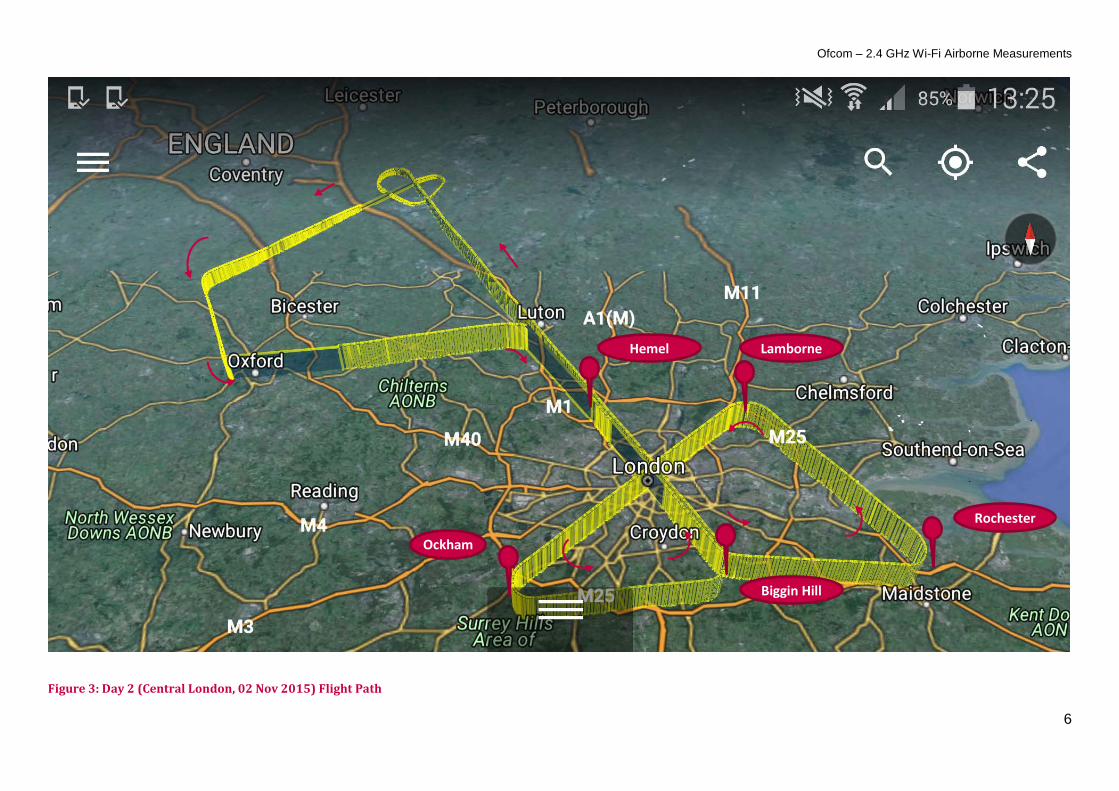
We were able to fly over central London between four air traffic beacons: HEMEL, BIGGIN HILL, LAMBORNE and OCKHAM in a “bow-tie” shape. We made three passes across London and flew the HEMEL to BIGGIN HILL leg in both directions to help us assess repeatability. As you can see in the Figure 4, both of these passes closely mirror one another.
We were able to maintain a constant altitude of 21,000 ft (~6.4km) when flying to the west of London and 22,800 ft (~7 km) for our measurements over central London with an error of only a few tens of feet. We chose these heights because the pilot advised us that these altitudes would make it easier for us to get permission from air traffic control to fly over London. These heights put us well above the landing aircraft (which gives us an absolute floor of 12,000 ft) and below aircraft cruising over the UK (at 30,000 ft).
The area in our measurement footprint was fairly large
6 The size of the measurement footprint will be very important when comparing the measured power levels with those predicted by the SE24 modelling. Our initial results suggested that the measurement footprint might be fairly large, several tens of kilometres across, and probably not symmetrical. As you can see from Figure 4, Wi-Fi aggregate power climbed quickly once we reached HEMEL which is some 35 km from central London. The asymmetry came from a fin running down the centre of the aircraft as can be seen in Annex 1. We took this into account in our further analysis when estimating the size of our measurement footprint.
4

Section 2 - Airborne Measurements and Preliminary Observations of 2.4 GHz Wi Fi Emissions
Figure 2: Day 1 (West of London, 30 Sept 2015) Spectrogram and Flight Path
Tim
e (H
H:M
M)
Frequency (MHz)
2400 2420 2440 2460 2480
14:4514:4714:4914:5114:5314:5514:5714:5915:0115:0315:0515:0715:0915:1115:1315:1515:1715:1915:21
RMS Signal Strength (dBm / 500 Hz)-145 -140 -135 -130 -125 -120 -115
The peak of the first Wi-Fi aggregate power “hump” was between Bracknell, Maidenhead and Reading (51.472, 0.798)
The peak of the second, smaller Wi-Fi aggregate power “hump” was between Luton and Milton Keynes (51.947, -0.642)
N
5
Ofcom – 2.4 GHz Wi-Fi Airborne Measurements
Figure 3: Day 2 (Central London, 02 Nov 2015) Flight Path
Ockham
Rochester
Biggin Hill
Lamborne Hemel
6

Section 2 - Airborne Measurements and Preliminary Observations of 2.4 GHz Wi Fi Emissions
Figure 4: Day 2 (Central London, 02 Nov 2015) Spectrum Log
Take-Off Wi-Fi channels 1,6 and 11 clearly visible soon after take-off, when only a few hundreds of metres off the ground.
Fly past Croughton
It’s not clear why the signal level rises here; aggregating Northampton and Oxford together, perhaps?
Permission granted to fly across London from HEMEL to BIGGIN HILL. Cruising altitude of 22.8k ft reached.
HEMEL Wi-Fi power begins to rise towards a peak as we begin aggregating in large areas of London. Channels 1, 6, and 11 are still clearly visible with Channel 1 a few dB higher than the others. Is this because people choose Channel 1 by default, perhaps?
BIGGIN HILL Discontinuity caused by sharp turn and the antenna is shielded from London by the “fin” running down the centre of the aircraft.
ROCHESTER We headed out east to allow the Wi-Fi power levels to drop off before recording another run over central London
LAMBORNE
OCKHAM
BIGGIN HILL We are now heading back along the same line we used to approach London, so we expect the pattern in power levels to be roughly the opposite of that we observed on the approach.
HEMEL
LANDING There was a Wi-Fi surge just before we landed. We’re not sure what caused this. Flying low over a town or village, perhaps?
Tim
e
Frequency (MHz)
2400 2420 2440 2460 2480
15:1615:1815:2015:2215:2415:2615:2815:3015:3215:3415:3615:3815:4015:4215:4415:4615:4815:5015:5215:5415:5615:5816:0016:0216:0416:0616:0816:1016:1216:1416:1616:1816:2016:2216:2416:2616:2816:3016:3216:3416:3616:3816:40
RM
S Si
gnal
Stre
ngth
(dBm
/ 50
0 H
z)
-145
-140
-135
-130
-125
-120
-115
7

Ofcom – 2.4 GHz Wi-Fi Airborne Measurements
Section 3
3 Comparing Airborne Measurements with the SE24 Aggregate Wi-Fi Emissions Model 3.1 We needed to adapt the existing SE24 Wi-Fi / satellite
coexistence model for airborne measurements
The SE24 Wi-Fi aggregate emissions model is designed for assessing coexistence between 5 GHz Wi-Fi devices and geostationary satellite receivers some thirty-six thousand kilometres above the Earth’s surface. These satellites have a footprint which might be continental in size or even cover half the globe and so the SE24 group believes that these satellites are likely to view some three to five hundred million Wi-Fi access points in Europe alone by 2025. Our airborne measurements were at a far lower altitude, between 6.4 and 7 km above ground level over London and the South-East of the UK, and measuring 2.4 GHz Wi-Fi rather than 5 GHz. We did this because we believe that 2.4 GHz Wi-Fi is already saturated in London and the South-East of the UK and so provides a good proxy for what emissions for 5 GHz Wi-Fi might look like in future. In the rest of this section we discuss the changes we made to the analysis and how we came to the conclusion that measured aggregate Wi-Fi emissions were towards the more optimistic levels predicted by the modelling. There were three main steps which we describe in full detail in Annexes 2 to 4:
• The first was to adjust the Wi-Fi emissions model to calculate aggregate emissions from the ground at 2.4 GHz;
• the second was to calculate the footprint of our airborne measurements so we could relate the emissions predicted at ground level to what we would expect at the airborne receiver;
• and the final step was to compare the measured values with those the predicted by the modelling.
3.2 We adapted the existing Wi-Fi aggregate emissions model to
accommodate 2.4 GHz airborne measurements
See Annex 2 In order to compare measured aggregate Wi-Fi emissions values with those predicted by the current SE24 model we needed to modify the model to reflect the differences between airborne and satellite receivers as well as emissions from 2.4 GHz and 5 GHz Wi-Fi devices. We give full details of our modifications in Annex 2 of this document and outline the three major changes here:
We altered the output of the model to give an aggregate Wi-Fi power
density at ground level
1 The current model used by SE24 outputs the number of Wi-Fi devices which might coexist with the different 5 GHz satellites in a large combination of possible Wi-Fi aggregate emissions cases. We have modified this to give an aggregate Wi-Fi power density at
8
Section 3 - Comparing Airborne Measurements with the SE24 Aggregate Wi-Fi Emissions Model
ground level which we refer to our airborne receiver in further analysis. We have also reduced the number of case studies to three: one using all the most pessimistic assumptions currently in the scope of SE24; one using all the most optimistic assumptions and a more “central” case. This is so we can understand where measured values sit between the most pessimistic and optimistic cases currently under consideration.
We adjusted the device assumptions for 2.4 GHz Wi-Fi devices
2 The 2.4 GHz band is narrower than the 5 GHz band and 2.4 GHz devices are limited to 100 mW in Europe so we adjusted the model to take these differences into account. The band loading factor (how much traffic is over 2.4 GHz or 5 GHz) is also different between the two bands which results in a greater difference between the most optimistic and pessimistic values predicted by the 2.4 GHz model.
We adjusted the propagation assumptions for 2.4 GHz airborne
measurements
3 5 GHz signals are attenuated by some 6.4 dB more than 2.4 GHz signals in free space and we take this into account in our later analysis. We also reduced the building penetration loss because 2.4 GHz signals travel better through roofs and walls than 5 GHz signals. We did not include clutter in the model because the dominant sources of Wi-Fi emissions towards the aircraft tended to be at relatively high elevation angles (within a few kilometres or ten of kilometres of the point directly beneath the aircraft).
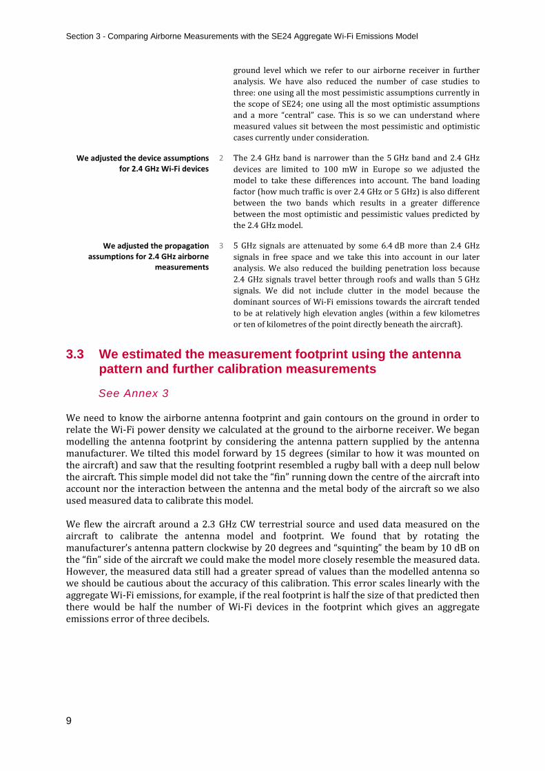
3.3 We estimated the measurement footprint using the antenna
pattern and further calibration measurements
See Annex 3 We need to know the airborne antenna footprint and gain contours on the ground in order to relate the Wi-Fi power density we calculated at the ground to the airborne receiver. We began modelling the antenna footprint by considering the antenna pattern supplied by the antenna manufacturer. We tilted this model forward by 15 degrees (similar to how it was mounted on the aircraft) and saw that the resulting footprint resembled a rugby ball with a deep null below the aircraft. This simple model did not take the “fin” running down the centre of the aircraft into account nor the interaction between the antenna and the metal body of the aircraft so we also used measured data to calibrate this model. We flew the aircraft around a 2.3 GHz CW terrestrial source and used data measured on the aircraft to calibrate the antenna model and footprint. We found that by rotating the manufacturer’s antenna pattern clockwise by 20 degrees and “squinting” the beam by 10 dB on the “fin” side of the aircraft we could make the model more closely resemble the measured data. However, the measured data still had a greater spread of values than the modelled antenna so we should be cautious about the accuracy of this calibration. This error scales linearly with the aggregate Wi-Fi emissions, for example, if the real footprint is half the size of that predicted then there would be half the number of Wi-Fi devices in the footprint which gives an aggregate emissions error of three decibels.
9

Ofcom – 2.4 GHz Wi-Fi Airborne Measurements
3.4 We compared the Wi-Fi emissions predicted by the model with those we measured
See Annex 4 We combined the results from the modified SE24 Wi-Fi emissions model and our estimated airborne footprint to calculate the Wi-Fi emissions we might expect at the aircraft. We studied the results we got on both day 1 (west of London) and day 2 (central London) and chose the locations where we measured the greatest Wi-Fi emissions on both days. We only modelled the urban area within the footprint because we believe this dominates over Wi-Fi emissions from rural areas. This is because the footprint of the aircraft antenna was large and the south-east of the UK is densely populated so we almost always had some urban area in view at any given time. The modelling estimates that there are some eight million 2.4 GHz Wi-Fi access points in our footprint over central London. We believe that this might be slightly conservative because of the particularly high level of development in London but it is a good approximation.
Studying both measurement days, we found that the measured Wi-Fi aggregate emissions were towards the more optimistic values predicted by the modified SE24 model and almost 20 dB lower than those predicted by the most pessimistic case. We believe that this indicates that the more optimistic values currently predicted at 5 GHz are likely to be more realistic. We show the most optimistic, most pessimistic and “central” values produced by the models in the diagram below along with the values we actually measured at 2.4 GHz. As we identified above, the main reason the 2.4 GHz models predict higher values than the 5 GHz models is because there are lower propagation and building penetration losses at 2.4 GHz than at 5 GHz. The dynamic range between the most optimistic and pessimistic cases are larger at 2.4 GHz than at 5 GHz mainly because of the greater relative variation in the band-loading factor assumptions at 2.4 GHz (3.5 to 50% of Wi-Fi traffic using 2.4 GHz versus 50 to 96.5% of Wi-Fi traffic using 5 GHz).
Figure 5: The modelled power spectral density values at the aircraft receiver for optimistic, pessimistic
and more “central” input assumptions and the actual values measured at 2.4 GHz.
-80
-70
-60
-50
-90
-100
dBm
/ 40
MHz
-76
-61
-91
-73
-56
-87
-68
-75
-94
-84
2.4 GHzcentral London
2.4 GHzwest of London
5 GHzcentral London
2.4 GHzmeasured
-81-77
-97
-86
5 GHzwest of London
10

Annex 1 - Airborne Measurement Equipment Annex 1
1 Airborne Measurement Equipment
Figure 6: We mounted the antenna towards the back of the aircraft. The antenna is approximately omni-directional and we discuss its gain pattern in more detail in Annex 3. Note the “fin” shielding the antenna on the left side which is almost but not exactly parallel to the antenna and also the forward slope of the antenna mounting; we made sure to take these into account in our subsequent analysis. This antenna is connected to a Rohde & Schwarz FSW spectrum analyser inside the aircraft taking one RMS power scan every 10 seconds. We also used a mini-circuits ZFBP-2400 (2300 – 2500 MHz) filter to reduce the risk of overload from aeronautical transmitters on the aircraft itself.
11

Ofcom – 2.4 GHz Wi-Fi Airborne Measurements Annex 2
2 Estimating RLAN Aggregate Power Density 2.1 We estimated the aggregate power density at the ground using the SE24
model and London demographics
We used inner London demographic data for “suburban” and “central London”
estimation cases
2.2 We used data from the UK Office for National Statistics to estimate the resident and business population for “suburban” and “central London” cases. These cases were chosen for comparison with the two airborne measurement days: day one to the west of London and day two over central London.
We used the method developed by the JRC to estimate RLAN AP density
2.3 We fed the London demographic data into the JRC model to estimate the RLAN AP density in central London for both 2.4 GHz only RLAN APs and dual-band APs.
Central
London Suburban
2.4 GHz RLAN AP density 4.3 2.7 Thousands per km2
Dual-Band RLAN AP density 2.2 1.4 Thousands per km2
We carried out the “generic” power estimation step from the SE24 model
2.4 For this step we simplified the multiple cases currently under consideration by SE24 by considering the most optimistic and pessimistic values suggested as well as a more “central” set of assumptions.
FSS Step 1 is largely incorporated into the previous step
2.5 Step 1 in the SE24 model covers losses due to service / geographic apportionment, clutter and polarisation. We have taken building loss into account to some extent and for the moment we will not consider these effects further in our analysis, but may need to in future if they prove significant. We did not take clutter into account because the dominant Wi-Fi power into the aircraft antenna is likely to be from devices at a fairly high elevation angle (i.e. a few kilometres to tens of kilometres from directly below the aircraft).
FSS Step 2 introduces the largest variation between the most optimistic and
pessimistic cases
2.6 Step 2 in the SE24 model further discounts the “generic” aggregate EIRP by introducing factors which attempt to take real Wi-Fi network duty cycles and bandwidths into account. This introduces a variation between the most optimistic and pessimistic power estimation cases, some 23 dB dynamic range at 2.4 GHz and 15 dB dynamic range at 5 GHz.
The difference in the dynamic range between the 2.4 and 5 GHz models is almost entirely the band loading factor which determines what proportion of traffic will use 2.4 GHz or 5 GHz. The model assumes between 3.5 to 50% of Wi-Fi traffic is at 2.4 GHz (11.5 dB variation in log terms) and between 50 to 96.5% of Wi-Fi traffic is at 5 GHz (2.9 dB variation in log terms).
We combined all these steps to find the final aggregate power density estimate
2.7 Combining these steps gave the values shown below. There is a fairly large range between the most optimistic and pessimistic cases. In the following sections of this annex we provide some more details on the input assumptions used and calculations carried out to arrive at these final values.
2.4 GHz 5 GHz
Central
London Suburban Central London Suburban
Aggregate power density at the ground
dBW / 40 MHz / km2
(-5.2) (-7.1) (-14.3) (-16.2)
low / high (-23.8) / 6.8 (-25.7) / 4.9 (-24.7) / (-5.0) (-26.7) / (-7.0)
12

Annex 2 - Estimating RLAN Aggregate Power Density 2.2 Inner London Data from the UK Office for National Statistics (ONS) Inner London Boroughs and the City of London
Population Density
Area inc. water1
Area exc. water1
Population2 Number of Households3
Employee Density
Number of employees in
businesses with fewer
than 10 employees4
Number of employees in
businesses with 10 or
more employees4
Number of businesses with fewer
than 10 employees5
Number of businesses with 10 or
more employees5
Thousands per km2 exc. water km2 km2
Thousands
Thousands
Thousands per km2 exc. water Thousands
Thousands Thousands Thousands
Camden 10.1 21.8 21.8 220.1 97.5 13.0 39.3 243.1 21.1 4.4 City of London 2.5 3.1 2.9 7.4 4.4 121.8 23.8 329.9 13.0 4.4
Hackney 13.0 19.0 19.0 247.2 101.7 4.8 19.8 72.1 10.9 1.6 Hammersmith & Fulham 8.6 29.6 29.6 255.5 80.6 4.2 18.0 105.0 10.4 2.0 Haringey 11.1 17.2 16.4 182.4 102.0 3.7 14.8 45.2 8.7 1.1 Islington 13.9 14.9 14.9 206.3 93.6 12.1 23.1 157.4 12.6 2.7 Kensington and Chelsea 13.1 12.4 12.1 158.3 78.5 9.2 20.3 91.8 11.0 2.1 Lambeth 11.4 27.2 26.8 304.5 130.0 4.7 16.4 109.9 13.1 1.7 Lewisham (Suburban Case) 7.9 35.3 35.1 276.9 116.1 1.7 11.3 47.3 7.1 0.9 Newham 8.6 38.6 36.2 310.5 101.5 2.1 11.6 65.4 6.6 1.3 Southwark 10.0 29.9 28.9 288.7 120.4 6.4 21.8 162.4 11.3 2.6 Tower Hamlets 12.9 21.6 19.8 256.0 101.3 11.6 20.4 209.8 11.4 2.2 Wandsworth 9.0 35.2 34.3 307.7 130.5 3.0 22.1 81.7 13.8 1.7 Westminster 10.2 22.0 21.5 219.6 105.8 28.7 83.6 532.8 39.2 10.2 Inner London Overall (Central London Case)
10.2 327.9 319.3 3,241.1 1,363.8 8.1 346.3 2,253.8 190.1 39.0
1 "Standard area measurement (SAM) for 2012 local authority districts (UK)". UK Standard Area Measurements (SAM). Office for National Statistics. 31 December 2012. Retrieved 07 August 2015. http://www.ons.gov.uk/ons/guide-method/geography/products/other/uk-standard-area-measurements--sam-/index.html 2 "Table 8a Mid-2011 Population Estimates: Selected age groups for local authorities in England and Wales; estimated resident population;". Population Estimates for England and Wales, Mid 2011 (Census Based). Office for National Statistics. 25 September 2012. Retrieved 22 November 2012. http://www.ons.gov.uk/ons/rel/pop-estimate/population-estimates-for-england-and-wales/mid-2011--2011-census-based-/rft---mid-2011--census-based--population-estimates-for-england-and-wales.zip 3 "Table H01UK 2011 Census: Households with at least one usual resident, household size and average household size, local authorities in the United Kingdom", Office for National Statistics, 21 March 2013. Retrieved 07 August 2015; http://www.ons.gov.uk/ons/publications/re-reference-tables.html?edition=tcm%3A77-294273 4 "Size of firms in London local authorities by enterprise size, 2001-12", Office for National Statistics, 19 July 2013, Retrieved 07 August 2015; http://www.ons.gov.uk/ons/taxonomy/index.html?nscl=Size+of+Workplace#tab-data-tables" 5 "Table 2.1: UK Business: Activity, Size and Location, 2013", Office for National Statistics, 12 March 2013, Retrieved 07 August 2015; http://www.ons.gov.uk/ons/taxonomy/index.html?nscl=Businesses+by+Region#tab-data-tables 13

Ofcom – 2.4 GHz Wi-Fi Airborne Measurements 2.3 Estimating the RLAN AP density
These values were estimated using the approach outlined in the JRC submission to SE246. The input data are from the previous section.
Central London
(Inner London) Suburban
(Lewisham)
Population 3,241.1 276.9 Thousands
Number of households 1,363.8 116.1 Thousands
Average household RLAN penetration7 73% 73%
Number of RLAN households 995.6 84.7 Thousands
Average number of RLAN APs per household 1 1
Total number of residential RLAN APs 995.6 84.7 Thousands
Number of businesses
Number of businesses with fewer than 10 employees 190.1 7.1 Thousands
Number of businesses with 10 and more employees 39.0 0.9 Thousands
Number of employees
Employees in businesses with fewer than 10 employees 346.3 11.3 Thousands
Employees in businesses with 10 or more employees 2,253.8 47.3 Thousands
Average enterprise RLAN penetration
Businesses with fewer than 10 employees 86% 86%
Businesses with 10 or more employees 95% 95%
Number of RLAN APs per business (businesses with fewer than 10 employees only)8
1 1
Number of employees per RLAN AP (businesses with 10 or more employees only)9
9 9
Total number of business RLAN APs 401.4 11.1 Thousands
Total number of residential and business RLAN APs 1,396.9 95.9 Thousands
Area10 327.9 35.1 km2
RLAN AP density (2.4 GHz) 4.3 2.7 Thousands per km2
% of RLANS which are Dual Band (e.g. 2.4 & 5 GHz)11 51% 51% Dual-Band RLAN AP density 2.2 1.4 Thousands per km2
6 “Estimation of the number of RLANs deployed in Europe in 2025”, European Commission, Joint Research Centre, UPDATE, 08 July 2015, http://www.cept.org/Documents/se-24/25709/SE24(15)070R0_WI52_number-of-RLAN-JRC 7 We assume that everyone with a fixed broadband internet connection will use an RLAN for the "last meter" connection with devices. This value might be conservative given London penetration is likely to be higher than overall UK penetration: Figure 4.65, "Communications Market Report 2015", Ofcom, 06 August 2015, http://stakeholders.ofcom.org.uk/binaries/research/cmr/cmr15/CMR_UK_2015.pdf 8 For businesses with fewer than 10 employees the assumption is that each business with Wi-Fi will have one AP. 9 For business with 10 or more employees the assumption is that business will have an AP for every nine employees. 10 Area is including water. 11 Figure 4-5, "Future use of Licence Exempt Radio Spectrum", 14th July 2015, Plum Consulting
14
Annex 2 - Estimating RLAN Aggregate Power Density 2.4 “Generic” Aggregate Power Assessment Before Applying Further
Discounts
These values were calculated by following Table 48 in the draft ECC report12. The “generic” step assumes that at least one device will always be on in any particular Wi-Fi network. First we calculate the per-device contribution to aggregate EIRP, discounting for the fact that not all devices will be outside and not all will be able to support the full regulatory power: EIRP + indoor-outdoor distributions 2.4 GHz 5 GHz EIRP 100 1,000 200 80 50 25 mW Indoor 94.7 0.0 18.0 25.6 14.2 36.9 % Outdoor 5.3 0.3 1.0 1.4 0.8 2.0 % Building loss13 8.4 14.5 dB low / high 5.9/10.9 12/17 Per-device EIRP (mainbeam) 19.0 9.4 mW low / high 13.0/30.0 8.3/11.4 We also calculate the bandwidth distribution and correction factors: Bandwidth distribution and correction 2.4 GHz 5 GHz RLAN bandwidth 20 40 20 40 80 160 MHz Distribution 50 50 10 25 50 15 % Average bandwidth correction factor 0.7 0.5 0.7 0.5 0.5 0.25 Transponder bandwidth 40 40 MHz
Bandwidth correction factor 0.600 0.483 We can now calculate the “generic” aggregate EIRP at the ground for each measurement scenario: 2.4 GHz 5 GHz Central London
(Inner London) Suburban
(Lewisham) Central London (Inner London)
Suburban (Lewisham)
RLAN density 4.3 2.7 2.2 1.4 Thou. per km2 Aggregate EIRP (mainbeam) 80.9 51.8 20.5 13.1 W per km2 low / high 55.4 / 126.3 35.4 / 80.8 18.0 / 24.9 11.5 / 15.9 Aggregate EIRP (bandwidth correction) 48.5 31.1 9.9 6.3 W per km2 low / high 33.2 / 75.8 21.3 / 48.5 8.7 / 12.0 5.6 / 7.7 Aggregate EIRP (bandwidth correction) 16.9 14.9 9.9 8.0 dBW per km2 low / high 15.2 / 18.8 13.3 / 16.9 9.4 / 10.8 7.5 / 8.9 Antennas and Propagation RLAN antenna discrimination (-2) (-2) (-2) (-2) dB low / high (-4) / 0 (-4) / 0 (-4) / 0 (-4) / 0 “Generic” aggregate power at the ground
14.9 12.9 7.9 6.0 dBW per km2
low / high 11.2 / 18.8 9.3 / 16.9 5.4 / 10.8 3.5 / 8.9
2.5 FSS Parameters: Step 1
Step 1 in the SE24 model covers losses due to service / geographic apportionment, clutter and polarisation. We have taken building loss into account to some extent and for the moment we will not consider these effects further in our analysis, but may need to in future if they prove significant. We did not take clutter into account because the dominant Wi-Fi power into the aircraft antenna is likely to be from devices at a fairly high elevation angle (i.e. directly below the aircraft).
12 http://www.cept.org/ecc/groups/ecc/wg-se/se-24/client/meeting-documents/file-history?fid=25725 13 At 2.4 GHz we’ve used the value we’ve used in our other Wi-Fi studies such as for 2.3 GHz LTE / 2.4 GHz Wi-Fi coexistence. At 5 GHz we’ve used the range already under considering by SE24. 15
Ofcom – 2.4 GHz Wi-Fi Airborne Measurements 2.6 FSS Parameters: Step 2
Step 2 in the SE24 model further discounts the “generic” aggregate EIRP by introducing factors which attempt to take real Wi-Fi network duty cycles and bandwidths into account. This discount falls in this range:
Stage 4 to 7 Stage 4 Stage 5 Stage 6 Stage 7 Total Step 2 discounts
2.4 GHz 5 GHz
Busy hour
population 2.4 GHz
Factor 5 GHz factor
Activity Factor
2.4 GHz into FSS 40 MHz
5 GHz into FSS 40 MHz dB dB
Step 2 discount (-20.1) (-22.2) 62.7% 26.0% 74.0% 10.0% 60.6% 12.9% low (-12.0) (-15.8) 70.0% 50.0% 96.5% 30.0% 60.6% 12.9%
high (-35.0) (-30.1) 50.0% 3.5% 50.0% 3.0% 60.6% 12.9%
2.7 Final Aggregate Power Density Estimate
Finally, we add the Step 2 discounts to the “generic” assessment to get an estimate for the aggregate Wi-Fi power density at the ground: 2.4 GHz 5 GHz Central London
(Inner London) Suburban
(Lewisham) Central London (Inner London)
Suburban (Lewisham)
Aggregate power density at the ground (-5.2) (-7.1) (-14.3) (-16.2) dBW / 40 MHz / km2
low / high (-23.8) / 6.8 (-25.7) / 4.9 (-24.7) / (-5.0) (-26.7) / (-7.0)
16

Annex 3 - Estimating the Airborne Measurement Footprint Annex 3
3 Estimating the Airborne Measurement Footprint 3.1 We used manufacturer data and calibration measurements to estimate
the footprint of our airborne measurements
In this annex we show how we estimated the footprint of our airborne measurements. We used two main steps: firstly we calculated what the antenna pattern and aircraft footprint from information provided by the antenna manufacturer; secondly we flew the aircraft around a 2.3 GHz CW terrestrial source and used data measured on the aircraft to calibrate the antenna model and footprint. 3.2 We calculated the antenna pattern and footprint from manufacturer data
Get manufacturer’s measured data
1. We used the manufacturer’s measured antenna patterns as a basis for estimating the footprint of the Wi-Fi airborne measurements. We used the trace taken at 2.5 GHz where the peak gain in the “roll” dimension was some 6 dB higher than that in the “pitch” dimension. This means that we might expect the footprint to stretch far from the sides of the plane but not so far front-to-back.
Generate 3D model of antenna
2. We used simple linear interpolation to generate a 3D mesh of the antenna from the manufacturer’s data. This pattern gives a fairly flat gain towards the ground with a “deaf spot” right in the centre. We can more clearly see here how the gain to the left and right tends to be higher than that towards the front and back of the aircraft.
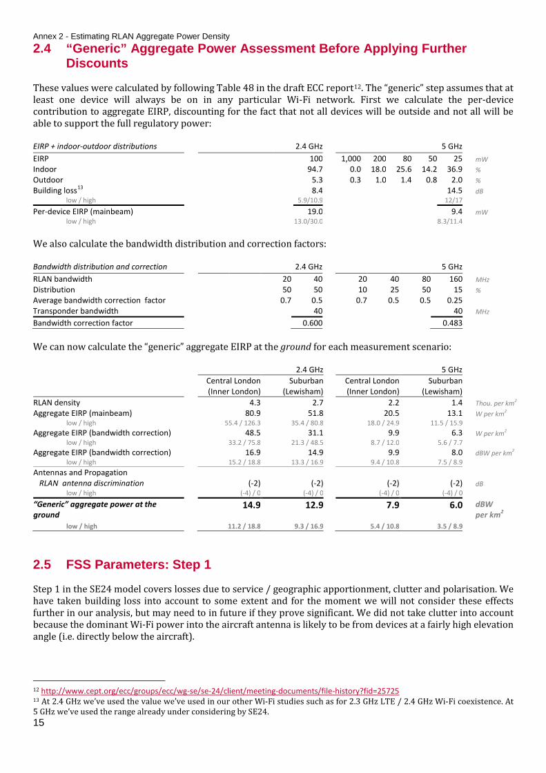
This diagram views the antenna pattern from below and slightly behind the aircraft with gain in dBi.
Left
Right
Front
Back
Down
Up
Pitch Roll
17

Ofcom – 2.4 GHz Wi-Fi Airborne Measurements
Project gain towards the ground
3. We took the 3D antenna pattern and projected it towards the ground from a nominal height of 7 km. The “deaf spot” is a clearly visible and is a few kilometres wide in the centre of the plot. The highest gain, as we expected, is some 15 km to the left and right of the aircraft. However, we still need to add propagation loss and correct the tilt of the antenna.
This diagram views the antenna gain towards the ground from above.
Add propagation loss and tilt forward
4. We considered simple free space path loss from each pixel on a plain to an aircraft 7 km above that plain. We then adjusted the antenna pattern to take into account the 15° forward tilt of the antenna. We added the free space path loss to the tilted antenna pattern to get the total loss at the aircraft.
This diagram views the combined antenna gain and propagation loss on the ground from above.
View as contour map 5. We created a contour map to make it easier to determine the footprint. The combined propagation loss and antenna gain pattern is approximately “rugby ball” shaped.
We can now understand the shape and area of the footprint we would expect from the aircraft. For example, the -121 dB contour contains an area of 576 km2.
This contour plot views the combined antenna gain and propagation loss in decibels on the ground from 7 km above at 2.45 GHz.
(km)
(km
)
20 40 60 80 100
10
20
30
40
50
60
70
80
90
100
Ante
nna
Gai
n (d
Bi)
-25
-20
-15
-10
-5
0
5
(km)
(km
)
20 40 60 80 100
10
20
30
40
50
60
70
80
90
100
Prop
. + A
nt. G
ain
(dB)
-140
-135
-130
-125
-120
-115
-130
-130
-130 -130
-130
-130
-130 -130
-130-127
-127
-127-127
-127
-127-127
-127
-124
-124-124
-124
-124 -124
-121-121
-121
-121
-118
-118
(km)
(km
)
10 20 30 40 50 60 70 80 90 100
10
20
30
40
50
60
70
80
90
100
Front
Back
Left Right
Left
Back
Front
Right
Left Right
Front
Back
18

Annex 3 - Estimating the Airborne Measurement Footprint 3.3 We used measured CW data to calibrate the antenna model and to
re-calculate the footprint
Read in CW calibration data
See Figure 7
6 We took CW measurements in the aircraft from a known 2.3 GHz source on the ground. They used these measurements to plot the spread of antenna gains at different values of azimuth around the aircraft. We have taken a sub-set of these measurements from around 3 km altitude (2 500 to 3 500 m) so that the spread of elevation values is not too great.
There is a clustering of values around -110 and 70 degrees where the aircraft tended to be on a single bearing. The values in between these clusters are mostly from the “orbitals”; clockwise rotations taken by the aircraft in fairly steep circles.
Compare with existing model
See Figure 8
7 We used model we developed from the manufacturer’s data to predict the antenna gain for the elevation and azimuth points gathered in the calibration data. Comparing the predicted with the measured we can see that the clusters at -110 and 70 degrees have a similar shape but there are three important differences in the overall pattern:
Firstly, the most obvious difference is the lower measured values at 70 degrees compared with the predicted. This is likely to be because of the metal “fin” running down the centre of the aircraft which shielded emissions approaching the antenna from the left.
Secondly, the measured data peaks at -110 and 70 degrees whilst the model peaks at ± 90 degrees. This might be because the antenna is interacting with the metal “fin” running down the centre of the aircraft and steering the beam.
Thirdly, the measured data has a greater gain spread than that predicted by the model. This is likely because the aircraft was occasionally rolling, especially during the orbitals, which we have not taken account of in our modelling. The spread is much more accurately modelled when the aircraft is level, as we can see in the clusters at -110 and 70 degrees.
Modify the model
See Figure 9
8 We calibrated the model by rotating the antenna pattern by 20 degrees in the azimuth and “squinting” the beam on the left side of the aircraft by 10 dB. By doing this we saw the predicted gain pattern match the measured gain pattern more closely.
We believe that we cannot make more accurate modifications to the model without more detailed data. In a perfect world we would be able to measure the aircraft and antenna in an anechoic chamber but the cost associated with this might be extraordinarily high. This calibration allows us to understand the antenna footprint to a fairly good degree and make sure that the impact of the “fin” running down the centre of the aircraft has been taken into account.
19

Ofcom – 2.4 GHz Wi-Fi Airborne Measurements
Figure 7: Antenna calibration data taken between 2.5 and 3.5 km above
ground level
Figure 8: Antenna pattern associated with initial model
developed in section 3.2
Figure 9: Antenna pattern of the with adapted model which takes
calibration data into account
-180 -135 -90 -45 0 45 90 135 180-30
-25
-20
-15
-10
-5
0
5
10
Gai
n (d
Bi)
Azimuth (degrees)
-180 -135 -90 -45 0 45 90 135 180-30
-25
-20
-15
-10
-5
0
5
10
Gai
n (d
Bi)
Azimuth (degrees)
-180 -135 -90 -45 0 45 90 135 180-30
-25
-20
-15
-10
-5
0
5
10
Gai
n (d
Bi)
Azimuth (degrees)
Front Left Right
Front Left Right
Front Left Right
20
Annex 3 - Estimating the Airborne Measurement Footprint
View the calibrated antenna pattern
9 We can see that our modified 3D gain pattern now has a “shrivelled lobe” on the left side of the aircraft.
This diagram views the antenna pattern from below and slightly behind the aircraft with gain in dBi.
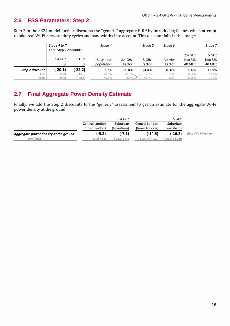
View the new footprint
10 We can now use this calibrated antenna pattern model to estimate the footprint for our airborne Wi-Fi measurements over London. Using the same assumptions as previously, a centre frequency of 2450 MHz and an altitude of 7 km, we recalculated the footprint. We can see that the calibrated model has a single major lobe off to the right of the aircraft and pointing slightly back off the wing. This matches the observations that we made on the day.
This contour plot views the combined antenna gain and propagation loss in decibels on the ground from 7 km above at 2.45 GHz.
Sum the area within each contour
11 We need to know the area within each contour in order to estimate the number of RLANs in view in each contour. We calculated the area by summing the number of 1 km2 pixels falling within each contour range.
Contour -121
to -118 -124
to -121 -127
to -124 -130
to -127 -133
to -130 dB
Area 270 464 915 1 793 3 163 km2
-130
-130
-130
-130
-130
-130
-130 -130-127
-127
-127
-127
-127
-127
-127
-127
-124
-124
-124
-124
-121
-121 -121
(km)
(km
)
10 20 30 40 50 60 70 80 90 100
10
20
30
40
50
60
70
80
90
100
Down
Up
Left
Back
Front
Right
Front
Left Right
Back
21

Ofcom – 2.4 GHz Wi-Fi Airborne Measurements Annex 4
4 Comparing Measured Data with Modelling Estimates 4.1 We compared our airborne measurements data with estimates produced
by the modified SE24 model
In this annex we use the analyses from annexes 2 and 3 to estimate what Wi-Fi emissions power we might expect to measure at the aircraft and then compare these values with what was actually measured. In annex 2 we calculated the expected Wi-Fi aggregate power density at the ground and in annex 3 we calculated the expected footprint and gain contours of the airborne antenna. The rest of this annex describes this analysis for both measurement days in detail and how we estimated the Wi-Fi emissions using the modified SE24 model. This analysis follows three main steps: firstly, we identify where the greatest Wi-Fi emissions were measured; secondly, we estimate the urban area in the footprint of the aircraft antenna; thirdly we estimate the Wi-Fi emissions we would expect to measure according the modified SE24 model and compare this value with the value measured. Overall we found that in both the central London and West of London cases the measured power falls between the most optimistic and “central” values predicted by the modified SE24 model. Measured Wi-Fi emissions were almost 20 dB lower than those predicted in the worst case.
Central London
West of London
Measured Power -76 -81 dBm / 40 MHz
Modelled Power -68 -73 dBm / 40 MHz
low -85 -90 high -58 -63
22

Annex 4 - Comparing Measured Data with Modelling Estimates 4.2 On day 2 (central London) we measured Wi-Fi power levels which were
around the more optimistic estimations of the modified SE24 model
Identify point of highest measured
Wi-Fi power
12 We measured three distinct and sustained Wi-Fi power peaks coinciding with the three passes we made over London. On our return leg from BIGGIN HILL to HEMEL we measured the strongest Wi-Fi signals, -73 dBm / 83.5 MHz, when we were over Soho (51.520, -0.175), a popular entertainment area in London.
This plot shows the measured aggregate Wi-Fi power summed across the whole 2.4 GHz band from take-off to landing.
Get urban area in footprint
13 In Annex 3 we calculated the area in the footprint of the calibrated antenna. We can see in the final table (in Step 11) that the increase in area of the footprint approximately doubles for every 3 dB extra propagation loss. This means that if we assume a uniform RLAN density we might expect the aggregation gain and the propagation loss to cancel each other out and there won’t be a neat “edge” of the antenna footprint. Therefore, the main constraint on the power aggregated into the antenna becomes the level of urbanisation, with the aggregate power likely to fall off sharply outside of the M25 (the motorway which runs in a circle around London and is informally considered the boundary of London).
We overlaid the footprint contours on our 50 m infoterra clutter map centred on Soho in order to get the urban area in the footprint. We included infoterra codes 1 to 6 and 8, excluding forest, open and water, but including parks/recreation and open in urban because these are included in our modified implementation of the SE24 model.
This plot views the combined airborne antenna gain and propagation loss on the ground from 7 km above Soho (London) at 2.45 GHz. Only the urban pixels are shown.
15:16 15:26 15:36 15:46 15:56 16:06 16:16 16:26 16:36-95
-90
-85
-80
-75
-70X: 16:20:22Y: -73.06
Aggr
egat
e 2.
4 GH
z Sig
nal L
evel
(dBm
/ 83
.5 M
Hz)
Time (HH:MM)
Pixels (50 m)
Pixe
ls (5
0 m
)
500 1000 1500 2000 2500 3000 3500 4000
500
1000
1500
2000
2500
3000
3500
4000
Prop
. + A
nt. G
ain
(dB)
-135
-130
-125
-120
-115
23

Ofcom – 2.4 GHz Wi-Fi Airborne Measurements
Compare SE24 modelled power with
measured power
14 We used the SE24 model which we modified for aircraft measurements as described in Annex 2, using the “central London” Wi-Fi aggregate power density. We calculated the aggregate power from each 3 dB footprint contour before summing the total power, taking the increasing propagation loss of each footprint contour into account. We considered five contours in our footprint because the contribution of the fifth (-81.5 dB) to the total aggregate power at the airborne receiver was almost 10 dB lower than that of the first (-72.4 dB) so further contours were unlikely to contribute significantly to the total.
Using central assumptions, the model predicted we might see total aggregate power at the aircraft receiver of -68.5 dBm / 40 MHz and values in the range -85.4 to -58.4 dBm / 40 MHz in the most optimistic and pessimistic cases.
At the beginning of this analysis (step 12) we saw the highest measured power was -73 dBm / 83.5 MHz which is approximately -76 dBm / 40 MHz. This value is some eight decibels lower than the value predicted by the modified SE24 model using central assumptions and some ten decibels above the most optimistic assumptions.
Contour
-121 to
-118
-124 to
-121
-127 to
-124
-130 to
-127
-133 to
-130 dB
Area 270 464 915 1 793 3 163 km2
Urban Area 242 290 413 607 471 km2
No. RLANs 1.03 1.24 1.76 2.59 2.01 millions
Power at Ground
48.6 49.4 51.0 52.6 51.5 dBm / 40 MHz
low 30.1 30.9 32.4 34.1 33.0 high 60.7 61.5 63.0 64.7 63.6
Power at Airborne Rx
-72.4 -74.6 -76.0 -77.4 -81.5 dBm / 40 MHz
low -90.9 -93.1 -94.6 -95.9 -100.0 high -60.3 -62.5 -64.0 -65.3 -69.4
Tot. Pwr. at Airborne Rx
-68.4 dBm / 40 MHz
low -87.0 high -56.4
This table uses the modified SE24 model to calculate the estimated aggregate Wi-Fi power at the aircraft. We described this modified model in previous notes.
24

Annex 4 - Comparing Measured Data with Modelling Estimates 4.3 On day 1 (suburban west of London) we also measured Wi-Fi power
levels which were around the more optimistic estimates of the model
We selected the location with the
highest Wi-Fi power
1 We measured a sustained and distinct rise in Wi-Fi power when passing between Reading and London. We measured the strongest Wi-Fi signals, -78 dBm / 83.5 MHz, when we were between Bracknell, Maidenhead and Reading (51.472, -0.798).
This plot shows the measured aggregate Wi-Fi power summed across the whole 2.4 GHz band from take-off to just before landing.
We found the urban area in the footprint
2 As before, we overlaid the footprint contours on our 50 m urban infoterra clutter map centred on the location where we measured the highest aggregate Wi-Fi power. These measurements were taken some 600 m lower than those we took over central London so we have corrected for this.
This plot views the combined antenna gain and propagation loss on the ground from 6.4 km above Berkshire (51.472, 0.798) at 2.45 GHz. Only the urban pixels are shown.
14:45 14:55 15:05 15:15-92
-90
-88
-86
-84
-82
-80
-78
-76X: 15:07:27Y: -78.16
Time (HH:MM)Ag
greg
ate
2.4
GHz S
igna
l Lev
el(d
Bm /
83.5
MHz
)
Pixels (50 m)
Pixe
ls (5
0 m
)
500 1000 1500 2000 2500 3000 3500 4000
500
1000
1500
2000
2500
3000
3500
4000
Prop
. + A
nt. G
ain
(dB)
-135
-130
-125
-120
-115
25

Ofcom – 2.4 GHz Wi-Fi Airborne Measurements
We compared the model power with
measured power
3 Using the same modified SE24 model as in Annex 2 and the “suburban” Wi-Fi aggregate power density, we calculated the estimated Wi-Fi emissions within the footprint of the aircraft. As before, we considered Wi-Fi aggregation within five contours of the footprint spaced three decibels apart. We assumed that the RLAN density in the urban pixels in the footprint would be the same as the London borough of Lewisham which is a fairly suburban area.
We noticed that the power contribution of each additional contour does not fall away as fast as when we flew directly over London. For example, we can see in the table opposite that the power contribution of the fifth contour (-82.9 dB) is only some five decibels less than that of the first contour (-78.4 dB). This is because the density of RLANs is distributed differently to our previous measurements with London stretching several tens of kilometres to the east. However, we decided not to consider further contours because they would cover areas which would be further away from the aircraft where the elevation angle will be much lower and therefore we might expect there to be significant additional clutter attenuation.
Using central assumptions, the model predicted we might see total aggregate power at the aircraft receiver of -72.7 dBm / 40 MHz and values in the range -89.7 to -62.6 dBm / 40 MHz in the most optimistic and pessimistic cases. This “central” modelled value is some eight decibels higher than the -81 dBm / 40 MHz value measured by our aircraft.
Contour
-121 to
-118
-124 to
-121
-127 to
-124
-130 to
-127
-133 to
-130 dB
Area 298 461 941 1 726 3 064 km2
Urban Area 95 175 307 428 523 km2
No. RLANs 0.26 0.48 0.84 1.17 1.43 millions
Power at Ground
42.6 45.3 47.7 49.2 50.1 dBm / 40 MHz
low 24.1 26.7 29.2 30.6 31.5 high 54.7 57.3 59.8 61.2 62.1
Power at Airborne Rx
-78.4 -78.7 -79.3 -80.8 -82.9 dBm / 40 MHz
low -96.9 -97.3 -97.8 -99.4 -101.5 high -66.3 -66.7 -67.2 -68.8 -70.9
Tot. Pwr. at Airborne Rx
-72.7 dBm / 40 MHz
low -91.3 high -60.7
This table uses the modified SE24 model to calculate the estimated aggregate Wi-Fi power at the aircraft. We described this modified model in previous notes.
26