Embed Size (px)
Citation preview

1
Ocean Conveyor Belt Background and worksheetsOne of the most noticeable features of a map, globe, or picture of the Earth is that the oceans cover the vast majority of the planet’s surface. Most people’s experience with the ocean is confined to the near shore and/or the upper portion of the water column, and their understanding of the ocean is based on this limited exposure. It is easy to imagine that below the waves, the ocean acts like a big bowl of stagnant water. This couldn’t be further from the truth! The ocean is a vast, dynamic environment in constant motion. Waves, swells, tides, and currents move huge quantities of water long distances. Trying to understand the complexities of all the small‐scale movements can seem daunting. However, there is an overall global circulation pattern that explains the general flow of the ocean. This overall pattern is known as the ocean conveyor belt and is an extremely important factor in determining climate, the distribution of marine organisms, and chemical cycles.
To understand ocean dynamics, oceanographers collect water samples from a range of sites and an array of depths. They measure many factors, including temperature, salinity, dissolved gases, nutrients, and chlorophyll. The temperature and salinity of seawater determine density and affect how nutrients and gases dissolve. By monitoring these variables, scientists can establish baselines of ocean features and processes, track how the ocean is changing, and make predictions of future trends. The lessons in this kit incorporate the variables italicized above to help explain some large‐scale ocean characteristics and circulation patterns. Some background information on these italicized words, as well as a few additional terms, is provided below.
TemperatureA slight change in water temperature can have a large effect on the density of water and the amount of gases and particles that can dissolve in water. The density differences caused by changes in temperature can allow water to sink in water. For example, colder water is denser than warmer water; therefore, cold water tends to sink when added to the surface of warm water. The relationship between water temperature and density isn’t strictly linear, however. The density of water increases with decreasing temperature until the water temperature reaches 4°C; this is the temperature at which water is densest. As water continues to cool below 4°C, the density begins to decrease. In this kit, we use the simplification that cold water is denser than warm water and set aside the finer details.
SalinitySeawater is composed of 96.5% pure water and 3.5% other materials, such as salts, dissolved gases, organic and inorganic materials, and suspended particles. Salinity is the measure of the amount of dissolved salts in seawater. The most well-known salt is table salt (sodium chloride, or NaCl). Most of the salt in the ocean is NaCl (86%), but there are numerous other salts in seawater. The major components that make the ocean salty are sodium (Na+), chloride (Cl‐),
2
magnesium (Mg2+), sulfate (SO42‐), calcium (Ca2+), and potassium (K+). These
ions make up 99% of the materials that make seawater salty. The remaining 1% consists of a number of varying trace elements. The really interesting thing about the major ions is that they are always found in the same ratio to each other no matter where in the open ocean the water is sampled. The constancy of this ratio allows for easier measurements of salinity. There are several different units for salinity. Historically, salinity was defined as the sum of all dissolved salts found inseawater expressed in g/kg. The average seawater salinity is 35 g/kg which means that for every kg of seawater, there are 35 g of salts. Salinity can also be expressed in parts per thousand (ppt): 35 g of salt per 1000 g of seawater means that 35 out of 1000 parts water are salts (35 ppt). Salinity can also be inferred. Scientists discovered that the conductivity of seawater is directly related to salinity. Conductivity is a measure of how well a substance can carry an electrical current: the saltier the water, the more conductive it is. The units of salinity are interchangeable, so salinities of 35 ppt and 35 g/kg are equivalent. Practical salinity units (psu) can also be used to represent salinity: 35 psu is equivalent to 35 ppt and 35 g/kg.
DensityWater in the ocean is stratified (layered). The layers occur due to differences in density, which is defined as mass per unit volume. Temperature and salinity are the major variables that determine the density of seawater. Cold, salty water is denser than warm, fresh water. One liter of seawater weighs about 1.025 kg (2.25 lbs) whereas one liter of freshwater weighs about 1.000 kg (2.20 lbs). Pressure is another factor that affects density; deeper water is slightly denser due to the weight of the water above. Small horizontal differences in density set up strong currents, and changes in surface water density near the poles are responsible for initiating the ocean conveyor belt.
Dissolved GasesSeawater contains small amounts of dissolved gases: many of these gases originated in the atmosphere and got mixed into the water at the surface by waves and wind. The gases that are most important to oceanographers are oxygen (O2) and carbon dioxide (CO2) because of their roles in regulating respiration, photosynthesis, and climate. Phytoplankton and marine algae produce O2 through photosynthesis and can be thought of as “the plants of the sea”. Other organisms such as zooplankton and fish consume O2 and expel CO2.
Dissolved oxygen in the ocean comes from two processes: it is generated by photosynthetic marine and terrestrial organisms, and is mixed into the ocean through interactions with the atmosphere. Both of these processes only occur within the surface layer, where water contacts the atmosphere and where there is enough light for photosynthesis. Below about 200 m, no new oxygen is added to the water; instead it is only utilized in respiration and decomposition.The “age” of seawater, defined as the amount of time the seawater has been out of contact with the surface layer, can be calculated by measuring oxygen concentrations.

3
The clock starts when the water sinks below the surface layer: once it is below this layer, no new oxygen can be added. The longer a water mass remains below the surface layer, the more time organisms have to consume oxygen, and the concentration of dissolved oxygen becomes lower. Therefore, the “older” the water, the lower the concentration of dissolved oxygen. This concept of the “age” of water is discussed in Lesson 4: Nutrients and Ocean Circulation.
NutrientsNutrients are substances that an organism must obtain from its surroundings for growth and survival. In the ocean, nutrients for phytoplankton and algae consist of organic and inorganic compounds. The most common nutrients measured are phosphorus (P) and nitrogen (N). Phosphorus is an important component of DNA, ATP, and cell membranes. Nitrogen is an important component of DNA, proteins, and enzymes. The topic of nutrients is discussed in Lesson 3: Using Data to Explore Ocean Processes and Lesson 4: Nutrients and Ocean Circulation.
ChlorophyllChlorophyll is a common pigment that allows plants to take energy from the sun and produce carbohydrates. Most of the primary producers in the ocean are microscopic phytoplankton, and chlorophyll measurements are a quick way to estimate their abundance. The greater the concentration of chlorophyll, the larger the number of photosynthetic organisms present. In vertical profiles of chlorophyll, the maximum chlorophyll peak occurs at depth. This deepchlorophyll maximum could indicate a higher abundance of photosynthetic organisms or greater chlorophyll content in phytoplankton living in a darker environment.
Depth and PressureOceanographers study the ocean three‐dimensionally. Therefore, they need to know where the samples were collected geographically and from what depth. The surface measurements are based on the geographical coordinate system, latitude and longitude. Depth is always measured from the surface downwards, and the surface is considered the zero point. The simplest way to measure depth is to use a piece of rope with measured markings, tie a weight on the end, lower the weight into the water, and read the depth from the markings. However, this method is rarely precise, accurate, or practical (think about measuring 2000m from a swaying boat), so depth is usually measured indirectly by measuring pressure. Pressure increases as you go deeper into the ocean because of the weight of the overlying water. Ten meters (10 m) of seawater is equivalent to 1 bar of pressure, therefore 1 m of seawater is equivalent to 1 decibar (dbar). Graphs of vertical oceanographic data are plotted with pressure in dbar on the y‐axis and one (or more) of the variables discussed above on the x‐axis. Pressure (dbar) is converted to depth (m) because they are equivalent and it is easier to conceptualize data in terms of depth. Graphs from Lesson 4: Nutrients and Ocean Circulation use depth (m) on the y-axis.

4
OCEAN CONVEYOR BELT SURVEY – LESSONS 1 and 2Check one:Pre‐survey Name:Post‐survey
Directions:This survey is both a pre‐ and post‐ survey. Put a check mark at the top of this paper next to the survey you are doing(pre‐ or post‐ survey). Please answer each question to the best of your ability. Circle the most correct answer.1. Deep ocean currents are driven by .a. tidesb. densityc. windd. boats
2. In general, the oceans are _______________.a. pretty much the same from the surface to the bottomb. stratified into two distinct layersc. separated into different disconnected basins such as the Atlantic, Pacific, and Indian oceans
3. Water can sink in water.a. Trueb. False
4. Circulation in the Atlantic Ocean causes the climate in Western Europe to be________________.a. a few degrees warmerb. a few degrees colderc. unchanged
5. Cold water is ________________than hot water.a. lighterb. saltierc. denserd. less dense
6. The oceans affect climate by_______________.a. exchanging heat and gases with the atmosphereb. transferring heat from the equator to the polesc. acting as a sink for carbon dioxide (CO2)d. all of the abovee. none of the above7. CTD stands for Conductivity, Temperature, and Depth. Conductivity is measured todetermine_______________.a. pressureb. nutrientsc. oxygend. salinity
5
SALINITY APPROXIMATION TABLELesson 1: Water Stratification
50 ml 100 ml 200 ml 800 ml 1000 ml 1400 ml
1/4 tsp 31.7 16.6 9.2 2.7 1.8 1.6
1/2 tsp ** 30.4 18.1 5.1 3.8 2.9
3/4 tsp ** 44.4 26.0 7.5 5.7 4.1
1 tsp ** ** 34.2 9.5 7.6 5.5
1 1/4 tsp ** ** 41.4 11.6 9.3 6.8
1 1/2 tsp ** ** 47.8 13.6 11.1 8.1
1 3/4 tsp ** ** ** 15.8 12.8 9.3
2 tsp ** ** ** 17.9 14.6 10.8
2 1/4 tsp ** ** ** 20.0 16.5 12.0
2 1/2 tsp ** ** ** 22.0 18.0 13.2
2 3/4 tsp ** ** ** 24.0 19.6 14.4
1Tbsp ** ** ** 25.9 21.2 15.7
* This table gives the approximate salinity in parts per thousand (ppt) for a level measurement of salt added to the indicated volume of water. The leftmost column lists the amount of salt and the top row indicates the volume of water in milliliters (ml). For example, if ½ tsp of salt is added to 800 ml of water, the salinity of the water becomes approximately 5.1 ppt.**A salinity of 50 ppt or greater is beyond the range of the salinity meter used.

6
Name: Group Members:STUDENT WORKSHEET
Lesson 1: Water StratificationUsing the materials provided, try to recreate the colored layers shown in the demonstration tank. Before you begin, take a minute to discuss amongst your group what you plan to do, and answer question 1. You can select one person torecord data in the table in question 2, but all group members must have that information and answer the questions on their own worksheets.
1. What do you think you will have to do to make the bottom layer?
2. Fill in the table to document your experiment.Color Water Properties Notes
Starting water Clear
1st Water Added
2nd Water Added
3. Describe what happened when you added your first water.
4. Describe what happened when you added your second water.
5. Were you able to produce layers? Explain your answer.
6. Were you able to exactly replicate the demo?
7. What layer is on the bottom? What are the properties of that layer?
8. Explain why this layer is on the bottom.

7
Group ExperimentsThese two group experiments test how salinity and temperature vary with depth.Group Experiment 1 – Testing variations in salinity:Use the Surface, Middle, and Bottom lines as the y axis coordinates when graphing the salinity ‐and temperature data.Salinity (ppt)Group Experiment 2 – Testing variations in temperature:Volume (ml) Temperature (°C) Salinity (ppt) Color NotesWater AWater BWater CWater DTemperature (°C)Where else might you find systems that are stratified like this?

8
Global Warming May Alter Atlantic Currents, Study SaysJohn Roach for National Geographic NewsArticle accessed online 10 January 2010In the 2004 eco-disaster film The Day After Tomorrow, Europe and North America are gripped by a deep freeze after global warming halts the circulation of a North Atlantic ocean current. The film is pure Hollywood hyperbole.But some scientists say the current is vulnerable to rising temperatures.Acting like a conveyor belt, the current transports warm, surface waters toward the Poles and cold, deep waters toward the Equator. In the Atlantic Ocean, these warm surface waters push northward, releasing heat into the atmosphereand becoming cooler and denser. As they do, the waters sink and flow southward in the deep ocean. "The Atlantic circulation moves heat toward the Arctic, and this helps moderate wintertime temperatures in the high-latitude Northern Hemisphere," said Ruth Curry, a physical oceanography research specialist at the Woods Hole Oceanographic Institution on Cape Cod, Massachusetts.Curry noted that excessive amounts of freshwater dumped into the North Atlantic could alter seawater density and, in time, affect the flow of the North Atlantic ocean current. (Global warming has boosted freshwater runoff in the form of glacier meltwater and additional precipitation, Curry said.) Just how much extra freshwater it would take to alter the circulation system, known as the Atlantic Meridional Overturning Circulation, is a gray area of climate science.
Broken Belt?Suffice it to say that the conveyor belt continues to work today. But freshwater runoff into the North Atlantic has increased in recent decades, and runoff is expected to increase further as global temperatures climb higher, Curry said.Curry and research colleague Cecilie Mauritzen of the Norwegian Meteorological Institute in Oslo estimate that it will take about a century, at present rates, for the circulation pattern to be seriously affected by the increase in freshwater runoff.The scientists conclude that it would take about two centuries for freshwater runoff to halt the North Atlantic conveyor belt entirely. Curry and Mauritzen published their findings in the June 17 issue of the research journal Science.Stefan Rahmstorf, a professor of ocean physics at Potsdam University in Germany, said the researchers' calculations appear accurate. But he emphasized that their findings do not provide a forecast; they only give an impression of the amount of freshwater required to alter or halt the North Atlantic ocean current. "It is of course very unlikely that the freshening [freshwater inflow] will simply continue at the same rate it has for the past few decades," he wrote in an e-mail to National Geographic News. Rahmstorf said the freshening could be part of a natural fluctuation in Earth's climate system that will stop and reverse. He added, however, that if the phenomenon is due to global warming, which he said is likely, then the freshening will probably accelerate as glaciers melt and more rain falls at high latitudes in response to rising temperatures.

9
Unpredictable ClimateAccording to Curry, scientists are uncertain as to the exact course global warming will take and how it will affect the amount of freshwater flowing in the North Atlantic. A particular wild card, she noted, is Greenland."As it does melt, it will release freshwater into the Nordic seas"—water bodies found between Iceland, Greenland, and Norway—"and that probably represents the biggest source of freshwater that could have an impact on the conveyor belt," she said. There are a number of mechanisms that could inject large amounts of freshwater into the Nordic seas at the precise region that is critical to the conveyor belt. They include
• pooling and release of glacial meltwater,• collapse of an ice shelf followed by a surge in glacier movement, or• [decreased friction along] a glacier's base through increased melting
[basal sliding].According to an unpublished survey by Potsdam University researchers Kirsten Zickfeld and Anders Levermann, expert scientific opinion varies widely on the likelihood that excess freshwater runoff from the Arctic will alter the North Atlantic conveyor belt in this century. Some scientists consulted for the survey said there is no chance that the current will break down. Others estimated that the chance of a complete shutdown exceeds 50 percent if global warming climbs by 7.2° to 9° Fahrenheit (4° to 5° Celsius) by 2100. Rahmstorf believes the chance of a circulation shutdown is as high as 30 percent. He said any possibility of such a scenario, even if slight, is cause for concern. "Nobody would accept expanding nuclear power if there was a 5 percent risk of a major accident," he said. "Why would we accept expanding oil and coal power if there is a 5 percent risk of a major climate accident?"© 1996-2008 National Geographic Society. All rights reserved.
10
Name: STUDENT WORKSHEETLesson 2: Ocean Circulation ArticleRead the NATIONAL GEOGRAPHIC NEWS article titled Global Warming May Alter Atlantic Currents, Study Says and answer the questions below using complete sentences.1. How is circulation in the Atlantic Ocean related to Europe’s climate?
2. What happens to Atlantic Ocean water when it reaches the Arctic? Why does this happen?
3. What do scientists suggest may affect ocean circulation in the North Atlantic?
4. Infer from the article what water properties scientists most commonly measure to study ocean circulation. Name at least two properties and explain why they are measured.
5. Name four processes that may accelerate the addition of freshwater to the Atlantic Ocean at high latitudes?
6. The article ends with a comment from Dr. Stefan Rahmstorf. To what climate accident is he referring and how is this type of accident related to expanding oil and coal power?
11
Name: STUDENT WORKSHEET – POWERPOINT
Lesson 3: Using Data to Explore Ocean Processes1. What three variables does a CTD measure? (Hint: what do the letters CTD stand for?)
2. What are the bottles that surround a CTD used for?
3. Using words and/or chemical symbols, fill in the blank spaces of the reaction for photosynthesis:_______________ + _______________ + _______________ _______________ + _______________
4. Nitrate is an essential nutrient used to make important molecules such as _________________.
5. The process in which bacteria break down organic matter and regenerate nutrients for phytoplankton to use isreferred to as .a. photosynthesisb. absorptionc. decompositiond. dissolution
6. A study that measures how environmental variables change over time is called a .
7. A horizontal temperature profile allows you to study how temperature changes _____________. (Circle one.)
over time with depth

12
Name: Group Member(s):STUDENT WORKSHEET – HOT‐DOGSLesson 3: Using Data to Explore Ocean ProcessesNow, you will investigate data collected at Station ALOHA by the Hawai‘i Ocean Time‐series (HOT) program to determine how different variables (temperature, phytoplankton, and nutrients) change over time. HOT cruises have been operating almost every month since October 1988, so you have a long‐term dataset to work with.
Part 1: Temperature1. In Part 1, you will determine which season has the warmest water temperatures in the upper ocean (0–200 m) at Station ALOHA. First, generate a hypothesis by circling one of the options below to complete the following sentence. If we measured water temperatures at Station ALOHA over an entire year, we would expect water temperature to be warmest in the ________________________.
spring summer fall winterExplain your answer.
2. Navigate to http://hahana.soest.hawaii.edu/hot/hot‐dogs/ to use the Hawai‘i Ocean Time‐series Data Organization and Graphical System (HOT‐DOGS).3. From the menu at the top of the screen, go to Horizontal Profiles > Time‐Series > Bottle.4. Change the Function option from Integral to Mean/StDev. There have been over 200 HOT cruises to Station ALOHA since 1988, with approximately ten cruises per year. By selecting the Mean/StDev option, the program will display the average water temperature (with standard deviation) for each cruise.5. Leave the remaining fields as they are and click on Submit Query. Please allow time for the graph to load.6. The figure output should look like the graph below. This graph displays the average water temperature of the upper 200 m in the ocean over a 20‐year period. The vertical lines above and below each data point indicate variability about the average, this is a measure called standard deviation. The x‐axis represents time in years, and the y‐axis represents temperature in International Temperature Scale (ITS‐90) units. ITS‐90 is a precise measurement of temperature and, for our purposes, can be regarded as equivalent to degrees Celsius (oC).

13
7. Briefly study the figure. Does this figure help you test your prediction as to which season will have the highest water temperature? Explain your answer.
8. Go Back one page on your Internet browser.9. Change the Grouping option to Month. This tells the HOT DOGS program to display the ‐average temperature by the month sampled rather than the date of the cruise. Click on Submit Query. Please allow time for the graph to load.10. Draw the resulting graph on the grid below. To make it easier, do not include the standard deviation bars for each point. Label your axes, and include units if applicable.
11. Based on these data, which month has the highest average water temperature at Station ALOHA? ___________12. Go Back one page on your Internet browser.13. Change the Grouping option to Season. This tells the HOT DOGS program to display ‐the average temperature by the season sampled rather than the month of the cruise. Click on Submit Query. Please allow time for the graph to load.14. Draw the resulting graph on the grid below. Again, do not include the standard deviation bars. Label your axes, and include units if applicable.
15. Based on these data, which season has the highest average water temperature at Station ALOHA? How does this compare with your hypothesis?
16. Why do you think the average water temperature is the highest during this season?

14
17. It is important to recognize that how you graph your data is critical, as it can affect how you interpret the results and the conclusions that you make. Use your three graphs to answer the questions below. For each question, indicate which graph you used AND explain why you chose that graph.
a. Over what part of the year does the ocean show the least variation in temperature? Which graph did you use to answer the question? Why did you choose that graph?
b. In general, does it appear that the ocean is getting warmer, cooler, or staying the same? Which graph did you use to answer the question? Why did you choose that graph?
Part 2: Phytoplankton18. In Part 2, you will investigate which season has the highest phytoplankton abundance in the upper ocean at Station ALOHA. Remember that phytoplankton are like plants and have chlorophyll to conduct photosynthesis. Therefore, by measuring chlorophyll, we can estimate the amount of phytoplankton in the ocean. First, generate a hypothesis by circling one of the options below to complete the following sentence.If we measured chlorophyll a concentrations over an entire year, then we would expect chlorophyll concentrations to be highest in the ________________________.
spring summer fall winterExplain your answer.
19. Go Back one page on your Internet browser.20. Change the Operator to TD‐700 Chlorophyll a. (Chlorophyll a is the main type of chlorophyll required for photosynthesis to occur.)21. Click on Submit Query and draw the resulting graph on the grid below. To make it easier, do not include the standard deviation bars for each point. Label your axes, and include units if applicable. Please allow time for the graph to load.
22. According to the graph, which season has the highest chlorophyll a concentration at Station ALOHA? How does this compare to your hypothesis?
15
Part 3: Nutrients23. Nitrogen is an essential nutrient for phytoplankton growth. In Part 3, you will investigate how nitrogen (which is most commonly measured in the ocean as nitrate and nitrite combined) varies seasonally in the upper ocean at Station ALOHA.
First, generate a hypothesis by circling one of the options below to complete the sentence. If we measured nitrate and nitrite concentrations over an entire year, then we would expect nitrogen concentrations to be lowest in the ________________________.
spring summer fall winterExplain your answer.
24. Go Back one page on your Internet browser.25. Change the Operator to Nitrate + Nitrite.26. Click on Submit Query and draw the resulting graph on the grid below. To make it easier, do not include the standard deviation bars for each point. Label your axes, and include units if applicable. Please allow time for the graph to load.
27. Which season had the lowest concentration of nitrogen at Station ALOHA? How does this compare with your hypothesis?
28. Why do you think you would observe the lowest nitrogen concentration during this season at Station ALOHA?
29. Notice that nutrients gradually increase from the summer to winter and reach their maximum in the spring.
a. Circle the process that is responsible for regenerating nitrogen at Station ALOHA.Photosynthesis Precipitation Decomposition of organic matter Weathering of rocks
b. What type of organism is responsible for this process? Circle your answer.Bacteria Fungi Fish Coral

16
OCEAN CONVEYOR BELT SURVEY – LESSON 4Check one:Pre survey ‐ Name:Post survey‐Directions:This survey is both a pre and post survey. Put a check mark at the top of this paper next to the ‐ ‐survey you are doing (pre or post survey). Please answer each question to the best of your ‐ ‐ability. Circle the most correct answer.
1. Deep water in the Atlantic Ocean is ______________ the water in the Pacific Ocean.a. older thanb. younger thanc. the same age as
2. Nutrients, such as phosphate and nitrate, generally have _______________concentrations in the surface oceanwhen compared to the deep ocean.a. higherb. lowerc. the same
3. In the oceans, nutrients are regenerated and made available for phytoplankton by _______________.a. evaporationb. photosynthesisc. precipitationd. decomposition of organic matter
4. The primary producers in the marine food web are_______________.a. sharksb. zooplanktonc. phytoplanktond. jellyfish
5. Oxygen concentrations, in general, are highest in the surface ocean because of_______________.a. respirationb. remineralizationc. photosynthesisd. decomposition

17
Name: Group Member(s):STUDENT WORKSHEET
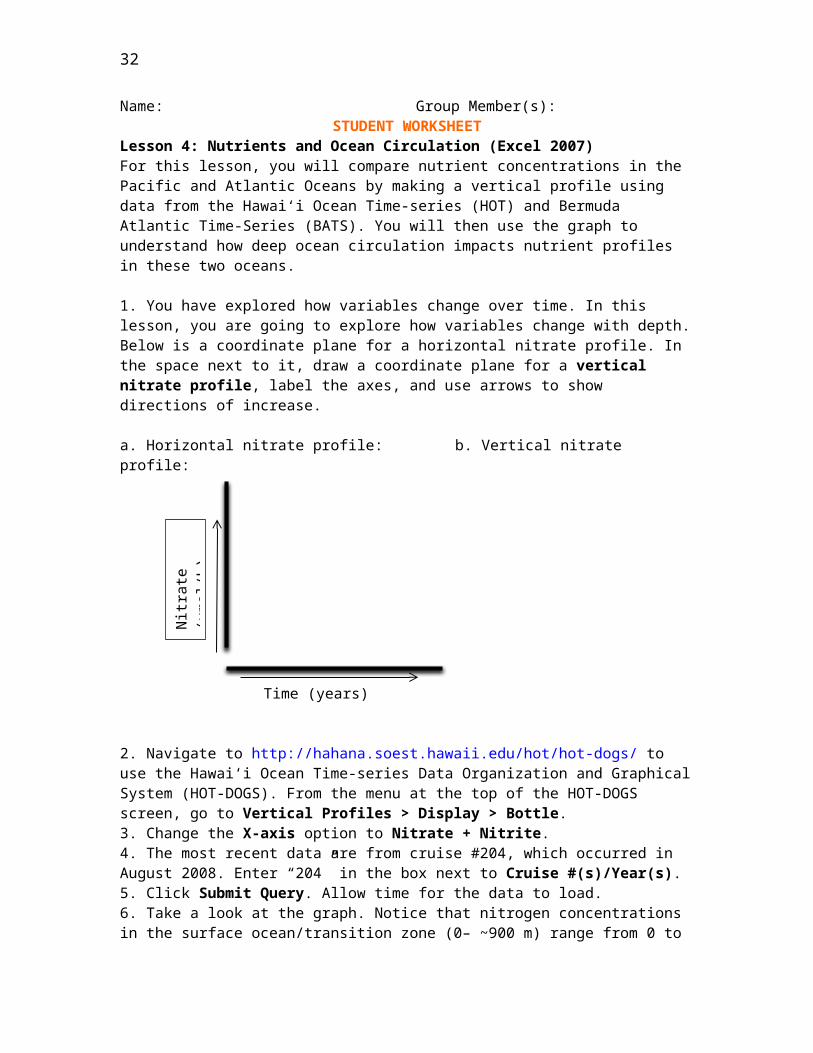
Lesson 4: Nutrients and Ocean Circulation (Excel 2003)For this lesson, you will compare nutrient concentrations in the Pacific and Atlantic Oceans by making a vertical profile using data from the Hawai‘i Ocean Time series (HOT) and Bermuda ‐Atlantic Time Series (BATS). You will then use the graph to understand how deep ocean ‐circulation impacts nutrient profiles in these two oceans.1. You have explored how variables change over time. In this lesson, you are going to investigate how variables change with depth. Below is a coordinate plane for a horizontal nitrate profile. In the space next to it, draw a coordinate plane for a vertical nitrate profile, label the axes, and use arrows to show directions of increase.a. Horizontal nitrate profile: b. Vertical nitrate profile:
Time (years)
2. Navigate to http://hahana.soest.hawaii.edu/hot/hot dogs/ ‐ to use the Hawai‘i Ocean Time‐series Data Organization and Graphical System (HOT DOGS). From the menu at the top of the ‐HOT DOGS screen, go to ‐ Vertical Profiles > Display > Bottle.3. Change the X‐axis option to Nitrate + Nitrite.4. The most recent data are from cruise #204, which occurred in August 2008. Enter “204” in the box next to Cruise #(s)/Year(s).5. Click Submit Query. Allow time for the data to load.6. Take a look at the graph. Notice that nitrogen concentrations in the surface ocean/transition zone (0– ~900 m) range from 0 to 42 μmol/kg. On the other hand, nitrogen concentrations in the deep ocean (~900–4800 m) are generally much higher and range from 35 to 42 μmol/kg. Discuss the processes of photosynthesis, decomposition, and mixing to explain why the deep ocean has more nutrients than the surface ocean in 2–3 comprehensive paragraphs.
Nitr
ate
(μm
ol/ L
)
18
7. You will use data from the HOT and BATS programs to investigate nitrogen concentrations (as measured by combined nitrate and nitrite). First, generate a hypothesis by circling the one of the options below to complete the sentence.If we measured nitrogen concentrations from the surface to depth in the Pacific and Atlantic Oceans, then we would expect nitrogen concentrations in the Pacific to be _____________________ those in the Atlantic Ocean.
the same as higher than less thanExplain your answer.
8. Now you are going to compile data extracted from the HOT and BATS websites and make a graph comparing nitrogen concentrations in the Atlantic and Pacific Oceans. Check off the boxes on the left as you go to keep track of where you are in the activity.
• On your computer desktop, there may be an Excel file called HOT‐BATS. If this file is not on yourdesktop, your teacher may instruct you to download it from http://cmore.soest.hawaii.edu/education/teachers/documents/HOT‐BATS.xls.
• Double click on HOT‐BATS to open this Excel file. You will see four columns of data. The two leftmostcolumns are nitrogen (column A) and depth (column B) data from the HOT program, and the two right most columns are nitrogen ‐(column D) and depth (column E) data from the BATS program. Both sets of data were collected in August 2008.
• Select columns A and B (the HOT data) and click on the colorful Graph Wizard icon to make a graph.
• Under the “Chart type”, select XY (Scatter), and then select the bottom right chart sub type called ‐ Scatter with data points connected by
lines without markers . Click Next.• Select the Series tab at the top of the window.• Click in the Name box, delete the contents of this box, and then type “HOT
(Pacific)” in the empty box.• Click Add, and in the new empty Name box, type “BATS (Atlantic)”.• In the X Values box, select the icon with the red arrow , go to your
spreadsheet, click and drag to select cells D2–D65, and then click on the arrow icon .
• Repeat this procedure for the Series Y Values box, selecting cells E2–E65.• Click Next.• Select the Titles tab at the top of the Chart Options window.• In the Chart title box, type in “Comparison of nitrogen concentrations in
Atlantic vs. Pacific Oceans”.• In the Value (X) axis box, type in “Nitrate + nitrite (μmol/kg)”.• In the Value (Y) axis box, type in “Depth (m)”.• Click Finish. Your graph should look like the following figure.

19
• In order for the y axis to show depth from top to bottom, you’ll need to ‐reverse the order of the values:
o Right click on the y axis numbers, and you will get a pop up window ‐ ‐that says Format Axis at the top. Click on the Format Axis.
o Under the Scale tab, check the box in front of Values in reverse order.
o Change the Maximum value to “5000”, and then click OK.• Get rid of the grey background by right clicking on the grey background and ‐
selecting Format Plot Area… from the dropdown menu. Select None under Area and click OK.
• Save your file!
9. Draw the resulting graph on the grid below. Include a title and legend and label your axes (include units).
20

21
10. Interpret your graph. Which ocean basin has a higher nitrogen concentration? How does this compare to your hypothesis?
11. Return to your deep ocean circulation map from Lesson 2. Label the locations of the HOT and BATS programs on your map.
12. Why do you think one ocean basin may have more nutrients than the other? How would old versus new seawater (deep water formation sites) differ in terms of nutrients? Why? In your answer, discuss the importance of primary productivity and decomposition by bacteria in relation to the global conveyor belt in 2–3 comprehensive paragraphs.

22
Name: Group Member(s):STUDENT WORKSHEET
Lesson 4: Nutrients and Ocean Circulation (Excel 2007)For this lesson, you will compare nutrient concentrations in the Pacific and Atlantic Oceans by making a vertical profile using data from the Hawai‘i Ocean Time series (HOT) and Bermuda ‐Atlantic Time Series (BATS). You will then use the graph to understand how deep ocean ‐circulation impacts nutrient profiles in these two oceans.
1. You have explored how variables change over time. In this lesson, you are going to explore how variables change with depth. Below is a coordinate plane for a horizontal nitrate profile. In the space next to it, draw a coordinate plane for a vertical nitrate profile, label the axes, and use arrows to show directions of increase.
a. Horizontal nitrate profile: b. Vertical nitrate profile:
Time (years)
2. Navigate to http://hahana.soest.hawaii.edu/hot/hot dogs/ ‐ to use the Hawai‘i Ocean Time‐series Data Organization and Graphical System (HOT DOGS). From the menu at the top of the ‐HOT DOGS screen, go to ‐ Vertical Profiles > Display > Bottle.3. Change the X‐axis option to Nitrate + Nitrite.4. The most recent data are from cruise #204, which occurred in August 2008. Enter “204” in the box next to Cruise #(s)/Year(s).5. Click Submit Query. Allow time for the data to load.6. Take a look at the graph. Notice that nitrogen concentrations in the surface ocean/transition zone (0– ~900 m) range from 0 to 42 μmol/kg. On the other hand, nitrogen concentrations in the deep ocean (~900–4800 m) are generally much higher and range from 35 to 42 μmol/kg. Discuss the processes of photosynthesis, decomposition, and mixing to explain why the deep ocean has more nutrients than the surface ocean in 2–3 comprehensive paragraphs.
Nitr
ate
(μm
ol/ L
)

23
7. You will use data from the HOT and BATS programs to investigate nitrogen concentrations (as measured by combined nitrate and nitrite). First, generate a hypothesis by circling the one of the options below to complete the sentence.
If we measured nitrogen concentrations from the surface to depth in the Pacific and Atlantic Oceans, then we would expect nitrogen concentrations in the Pacific to be _____________________ those in the Atlantic Ocean.the same as higher than less than
Explain your answer.
8. Now you are going to compile data extracted from the HOT and BATS websites and make a graph comparing nitrogen concentrations in the Atlantic and Pacific Oceans. Check off the boxes on the left as you go to keep track of where you are in the activity.
• Look on your computer desktop for an Excel file called HOT‐BATS. Double click to open it. If this file is not on your desktop, your teacher may instruct you to download it from http://cmore.soest.hawaii.edu/education/teachers/documents/HOT‐BATS.xls or to extract the data yourself. If you are told to extract the data yourself, first complete the steps listed on STUDENT INSTRUCTIONS – Lesson 4 Extension: Data Extraction, and then return to this page.
In the HOT‐BATS file, you will see four columns of data. The two left‐most columns are nitrogen (column A) and depth (column B) data from the HOT program, and the two right‐most columns are nitrogen (column D) and depth (column E) data from the BATS program. Both sets of data were collected in August 2008.
• Highlight columns A and B and select the Insert menu at the top of the screen.
• Select Scatter > Scatter with Straight Lines . Your graph should look like the following figure.

24
• In order for the y axis to show depth with the surface at the top of the graph ‐and getting deeper as you go down, you’ll need to reverse the order of the values. If you do not see the Chart Tools at the top of the screen (Design, Layout, and Format), then click on your graph to highlight it.
o Select Layout > Axes > Primary Vertical Axis > More Primary Vertical Axis Options …
o Check the box next to Values in reverse order.o Near the top of the same window, next to Maximum, click on
Fixed.o Enter “5000” in the field next to Fixed, and then click Close.
• Now you need to add the BATS data to your graph:o Select Design > Select Data .o Under the Legend Entries (Series) box, click Add.
In the Series name box, type “BATS (Atlantic)”.o In the Series X Values box, select the icon with the red arrow ,
go to your spreadsheet, click and drag to select cells D2–D65, and then click on the arrow icon .
o Repeat this procedure for the Series Y Values box, selecting cells E2–E65; click OK.
• While the Select Data Source box is still open, change the name of your HOT data series:
o Under the Legend Entries (Series) box, click on the Depth series, and then click Edit.
o In the Series name box, type “HOT (Pacific)” and click OK. Click OK again.
• You are ready to add chart and axis titles to your graph. If you do not see the Chart Tools at the top of the screen (Design, Layout, and Format), then click on your graph to highlight it.
o Select Layout>Chart Title>Above Chart.o Click anywhere in the Chart Title box that is now above your
graph. Highlight Chart Title and then type in “Comparison of nitrogen concentrations in Atlantic vs. Pacific Oceans”.
o Click anywhere outside the Chart title box .o While still in Layout select Axis Titles > Primary
Horizontal Axis Title > Title Below Axis.o Highlight Axis Title and then type in “Nitrate + Nitrite (μmol/kg)”.o While still in Layout select Axis Titles > Primary Vertical
Axis Title > Rotated Title.

25
o Click anywhere in the Axis Title box that is now along your y axis ‐on your graph. Highlight Axis Title, and then type in “Depth (m)”.
• Save your file!• 9. Draw the resulting graph on the grid below. Include a title and legend and label your
axes (include units).
10. Interpret your graph. Which ocean basin has a higher nitrogen concentration? How does this compare to your hypothesis?
11. Return to your deep ocean circulation map from Lesson 2. Label the locations of the HOT and BATS programs on your map.
12. Why do you think one ocean basin may have more nutrients than the other? How would old versus new seawater (deep water formation sites) differ in terms of nutrients? Why? In your answer, discuss the importance of primary productivity and decomposition by bacteria in relation to the global conveyor belt in 2–3 comprehensive paragraphs.

26
STUDENT INSTRUCTIONSLesson 4 Extension: Data Extraction (Excel 2007)Can I go to the online time series databases and download the data myself? Yes, but you'll have ‐to process it first! These instructions walk you through the steps of extracting and processing data from the Hawai‘i Ocean Time series (HOT) and Bermuda Atlantic Time Series (BATS). Check‐ ‐ off the boxes as you go to keep track of where you are.HOT ProgramA. Extracting the data
o Navigate to http://hahana.soest.hawaii.edu/hot/hot dogs/ ‐ to use the Hawai‘i Ocean Time series‐
o Data Organization and Graphical System (HOT DOGS).‐o From the menu at the top of the screen, go to Vertical Profiles >
Display > Bottle.o In the Cruise #(s) / Year(s) box, enter “204” (for the August 2008
cruise).o Leave Station #(s) as 2.o Select X and Y axis variables:‐ ‐o X axis: ‐ Nitrate + Nitriteo Y axis: ‐ Pressure (equivalent to depth in meters)o Set Output type as text. Leave other boxes blank.o Click Submit Query. Allow time for data to load. The data will be
displayed in the following format:jday, crn, stn, cast, ros, nit, press#, #, #, #, #, umol/kg, dbar7260, 204, 2, 3, 24, 0.02, 7.07260, 204, 2, 3, 23, 28.86, 500.77260, 204, 2, 3, 22, 40.56, 750.67260, 204, 2, 3, 21, 41.42, 999.57260, 204, 2, 3, 20, 41.51, 1199.97260, 204, 2, 3, 19, 41.45, 1401.47260, 204, 2, 3, 18, 40.97, 1600.87260, 204, 2, 3, 17, 40.38, 1800.37260, 204, 2, 3, 16, 40.02, 2000.47260, 204, 2, 3, 15, 39.58, 2200.27260, 204, 2, 3, 14, 39.16, 2399.87260, 204, 2, 3, 13, 38.71, 2599.27260, 204, 2, 3, 12, 38.25, 2800.37260, 204, 2, 3, 11, 37.78, 2999.47260, 204, 2, 3, 10, 37.63, 3199.67260, 204, 2, 3, 9, 36.97, 3399.27260, 204, 2, 3, 8, 36.90, 3600.97260, 204, 2, 3, 7, 36.59, 3800.97260, 204, 2, 3, 6, 36.21, 3999.87260, 204, 2, 3, 5, 36.04, 4200.77260, 204, 2, 3, 4, 35.97, 4399.77260, 204, 2, 3, 3, 36.13, 4500.47260, 204, 2, 3, 2, 36.11, 4601.07260, 204, 2, 3, 1, 35.79, 4806.27260, 204, 2, 4, 24, 0.04, 6.27260, 204, 2, 4, 23, 0.08, 50.9

27
7260, 204, 2, 4, 22, 0.08, 75.97260, 204, 2, 4, 21, 0.06, 111.47260, 204, 2, 4, 20, 0.58, 149.17260, 204, 2, 4, 19, 2.04, 207.47260, 204, 2, 4, 18, 4.95, 258.07260, 204, 2, 4, 17, 8.12, 302.07260, 204, 2, 4, 16, 11.61, 344.87260, 204, 2, 4, 15, 15.52, 380.77260, 204, 2, 4, 14, 22.14, 437.47260, 204, 2, 4, 13, 28.99, 504.5
o Highlight all of displayed data, including titles (CTRL+A), and copy it (CTRL+C). The data should now be highlighted and on the clipboard.
o Open a Notepad document (to find Notepad, go to Start > All Programs > Accessories > Notepad).
o Paste the data into Notepad (CTRL+V).o Save the data (CTRL+S) as “HOT” in a location specified by your teacher.
B. Importing the data into Excelo Open Excel. Click the Office button in the upper left corner and click Open
in the dropdown menu.o At the bottom of the Open dialog box, where it says Files of type: All
Excel Files, click and select All files.o Locate your Notepad document labeled “HOT”, select it, and then click
Open.o A Text Import Wizard box will open. Select Delimited for
Original Data Type and click Next.o Add Comma as a delimiter by clicking on the box next to Comma, and
then click Finish.o Once the data have been imported, save the file as an Excel Workbook. Click
the Office button, and select Save As. In the Save As dialog box, under the Save as Type menu, select Excel Workbook. If you are asked to replace “HOT.txt”, click yes.
BATS ProgramA. Extracting the data
o Navigate to http://bats.bios.edu/ to access the online data system.o In the left hand menu, click on ‐ Bottle Data.o Change the following:
o Enter Cruise Number: “10238” (for the August 2008 cruise)o In the Discrete Data section, check all of the following:
Deployed: Year Month Day

28
Depth (m) (already checked) and Nitrate + Nitrite (μmol/kg)
Leave other settings as they are.
o Click Get Bottle Data.o A table called Details of Extracted Bottle Data will appear. At the
bottom of the page, select Click Here to View Data.
The data will be displayed in a similar format to that of the HOT data shown above, but notice that there are different columns. Because we are comparing the same type of data from different sources, there are differences in the way the samples are numbered and displayed. Later, we will pull out just the data that we need.
o Highlight the displayed data (CTRL+A) and copy it (CTRL+C). The data should now be highlighted and on the clipboard.
o Open a Notepad document (to find Notepad, go to Start > All Programs > Accessories > Notepad).
o Paste the data into Notepad (CTRL+V).o Save the file (CTRL+S) as “BATS” in a location specified by your teacher.
B. Importing the data into Excelo Go to Excel. Click the Office button , and then click Open.o In the Open dialog box, where it says All Excel Files in the lower right
corner, click and select All files.o Locate your Notepad document called “BATS”, select it, and then click
Open.o A Text Import Wizard box will open. Select Delimited for
Original Data Type, then click Next.o Add the Comma as a delimiter by clicking on the box next to it, and then
click Finish.o Once the data have been imported, save the file as an Excel Workbook. Click
the Office button, and select Save As. In the Save As dialog box, select Excel Workbook under the Save as Type menu. If you are asked to replace “BATS.txt”, click yes.
Note: In column A, you may see the data displayed as exponents (1.02E+08) because the numbers are longer than the column width. To see the entire number, put your cursor on the line between columns A and B so that the cursor looks like this: , and then double click to automatically adjust column width.
C. Filtering the data in Excel

29
We extracted the data from every CTD cast during BATS cruise 10238, but nitrogen samples were not collected for every bottle from every cast. The BATS data system reports depths without a measured nitrogen concentration as ‐9.99. Before graphing the BATS data in Excel, the depths with no nitrogen data need to be removed.
o Highlight column D (labeled NO3) by clicking on the D.o Click on the Data menu at the top of the screen, and then select Filter .
Arrows for dropdown menus will appear in row 1 of your spreadsheet.o Click on the arrow next to NO3.o In the dialog box, click on Select All (which will uncheck all of the values),
check the ‐9.99 box, and click OK. Only the rows with a NO3 value of 9.99 ‐will be showing.
Now you need to delete rows 2 through 271 (because they are all 9.99):‐o Put your cursor on row 2 (the number 2 on the left hand side) so that it ‐
looks like this: Click and drag the cursor down to highlight all the rows through row 271.
o Right click on the row labels (the numbers on the left hand side).‐ ‐o Select Delete Row.
o Click on the arrow next to NO3.o In the dialog box, click on Select All, and then click OK. The remaining
data should reappear.o While all the data is still highlighted, sort the data by depth.o Click on Data > Sort .o In the Sort by drop box (on the left), click on Depth, and then click
OK.o Save your file!
HOT & BATS: Organizing the data in ExcelNow you are going to compile the data extracted from the HOT and BATS websites.
A. Compiling the data into one spreadsheeto Open a new Excel worksheet by clicking the Office button, and then
clicking New. Select the Blank Workbook, and then click Create.o Save the file as “HOT BATS”.‐
Return to your “HOT” Excel worksheet, and copy the nit (Nitrate + Nitrite) and press (Depth) columns:
o Select both columns by first placing your cursor over the letter at the top of column F so that it looks like this: . Then click and drag the cursor to the right to highlight both columns F and G.

30
o Copy the columns (CTRL+C), and then go to your new “HOT BATS” ‐spreadsheet, select the first two columns, and paste the data (CTRL+V).
Remove the cells in the second row that contain umol/Kg and dbar:o Put your cursor on row 2 (the number 2 on the left hand side) so that it ‐
looks like this:o Right click and select delete.‐
Rename the columns: click on cell A1 and type “HOT”, and then click on cell B1 and type “Depth”. Remember that in this case, press (pressure) is equivalent to depth in meters.
Return to your “BATS” Excel spreadsheet and copy the NO3 (Nitrate + Nitrite) column:
o Select the column by placing your cursor over the letter at the top of column D, and left click.
o Copy the column (CTRL+C), and then go to your new “HOT BATS” ‐worksheet, select column D, and paste the data (CTRL+V).
o Rename the column “BATS”.o Go back to your “BATS” Excel spreadsheet, copy (CTRL+C) the Depth
column (column C), and paste it (CTRL+V) into column E in your “HOT‐BATS” spreadsheet.
o Save your work (CTRL+S).
B. Making a graphNow that you have successfully imported and filtered the data from both the HOT and BATS websites, you can make a graph comparing the data from these two studies.
In your Excel worksheet called “HOT BATS” sort your HOT data according to ‐depth:
o Highlight columns A and B and select Data > Sort .o Under Sort by, choose Depth and select OK.
Now you are ready to return to step #8 on your STUDENT WORKSHEET – Lesson 4: Nutrients and Ocean Circulation (Excel 2007).

31
GLOSSARYbasal sliding The sliding of a glacier over the surface it rests on. Basal sliding is accelerated when meltwater decreases friction between the glacier and the surface the ice is on.
chlorophyll a The molecule that enables plants to use sunlight to make food. Chlorophyll also gives plants their green color.
conductivity A measure of how well a substance can move electricity. In water, conductivity increases with increasing salinity. Instruments measure conductivity and make calculations to report the value as salinity.
CTD An instrument used to measure Conductivity, Temperature, and Depth of seawater.
current The steady flow of surface ocean water in a given direction.
decomposition The process by which tissues of a dead organism and other organic matter are broken down, usually by bacteria, into simpler forms of matter.
density The mass of a substance per unit volume (density = mass/volume).
dissolved organic A diverse group of compounds that include fats, sugars, proteins, vitamins, and other matter molecules produced by living organisms. These compounds are released into the ocean when cells die and break down, or through the excretion of waste material.
Hawai‘i Ocean An oceanographic research program that studies long term changes in the ‐Time‐series (HOT) marine chemistry, biology, and physics at Station ALOHA. Established in 1988, the HOT program conducts research cruises almost every month.
Möbius Strip A continuous closed surface with only one side. It is formed from a rectangular strip by rotating one end 180° and joining it with the other end.
model A representation of a complex system in a simple form.
Niskin bottles (niss kin); Canisters that are used to collect water samples from various ‐depths. These are often used in combination with a CTD.
nutrient A substance that an organism must obtain from its surroundings to survive and grow. Example: nitrogen, which is needed by every organism to make proteins and DNA.
organism A living thing.
parts per thousand A measure of the concentration of a substance out of a total of 1000. Example: Seawater (ppt) has an average salinity of 35 ppt, which means that there are 35 g of salts in every 1000 g of water.
photosynthesis (foe toe sinth uh sis); The way that plants make food. Photosynthesis ‐ ‐ ‐ ‐requires sunlight, carbon dioxide and water, and produces sugar and oxygen.
32
pycnocline The location in the water column where the density changes rapidly with depth; pycno means dense or thick and cline means change or slope.
respiration The process by which organisms convert nutrients into energy (for example, forlocomotion).
salinity The concentration of dissolved salts found in a sample of water, measured in parts per thousand (ppt).
Station ALOHA A deep water study area in the Pacific Ocean, located approximately 60 ‐miles north of the Hawaiian island of O‘ahu. Station ALOHA is the primary study site of the Hawai‘i Ocean Time‐series (HOT) program.
stratification The process of arranging or becoming arranged in distinct layers.
thermocline The location in the water column where the temperature changes markedly with depth; thermo means heat and cline means change or slope.
upwelling The vertical movement of water from depth up to the surface.
water column A conceptual cylinder of water from the surface to the bottom of a stream, lake, or ocean

33