Embed Size (px)
DESCRIPTION
Design journal for Studio AIR 2012, semester 1, at the University of Melbourne.
Citation preview
ARCHITECTURE DESIGN STUDIO: AIRINVESTIGATIONS INTO DIGITAL DESIGNTHE UNIVERSITY OF MELBOURNESEMESTER 1, 2012
ISABEL DEAKIN
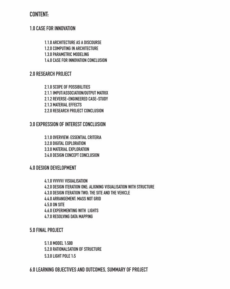
CONTENT:
1.0 CASE FOR INNOVATION
1.1.0 ARCHITECTURE AS A DISCOURSE 1.2.0 COMPUTING IN ARCHITECTURE 1.3.0 PARAMETRIC MODELING 1.4.0 CASE FOR INNOVATION CONCLUSION
2.0 RESEARCH PROJECT
2.1.0 SCOPE OF POSSIBILITIES 2.1.1 IMPUT/ASSOCIATION/OUTPUT MATRIX 2.1.2 REVERSE-ENGINEERED CASE-STUDY 2.1.3 MATERIAL EFFECTS 2.2.0 RESEARCH PROJECT CONCLUSION
3.0 EXPRESSION OF INTEREST CONCLUSION
3.1.0 OVERVIEW: ESSENTIAL CRITERIA 3.2.0 DIGITAL EXPLORATION 3.3.0 MATERIAL EXPLORATION 3.4.0 DESIGN CONCEPT CONCLUSION
4.0 DESIGN DEVELOPMENT
4.1.0 VVVVV/ VISUALISATION 4.2.0 DESIGN ITERATION ONE: ALIGNING VISUALISATION WITH STRUCTURE 4.3.0 DESIGN ITERATION TWO: THE SITE AND THE VEHICLE 4.4.0 ARRANGEMENT: MASS NOT GRID 4.5.0 ON SITE 4.6.0 EXPERIMENTING WITH LIGHTS 4.7.0 RESOLVING DATA MAPPING
5.0 FINAL PROJECT
5.1.0 MODEL 1:500 5.2.0 RATIONALSATION OF STRUCTURE 5.3.0 LIGHT POLE 1:5
6.0 LEARNING OBJECTIVES AND OUTCOMES, SUMMARY OF PROJECT
1.0. CASE FOR INNOVATION
1.1.0 ARCHITECTURE AS A DISCOURSE
State of the art projects engage with topical discussions in architecture with the aim of influencing and enhancing the evolution of architectural practice. The following professional project 1.1.2 and 1.1.3 have received enormous public and professional attention.
These projects serve as example of visually stimulating designs achieve through a commitment to innovation. They contribute to architectural discourse despite the fact that they are not currently on display. A similar commitment to innovation by the Gateways project will result in a design that satisfies the brief for ‘an exciting and eye catching design’ as well as developing an ‘ongoing interest in the Western Interchange by encouraging further reflection about the installation beyond a first glance.’
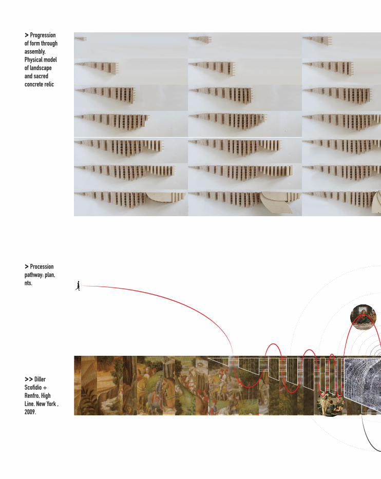
> Progression of form through assembly. Physical model of landscape and sacred concrete relic
> Procession pathway: plan, nts.
>> Diller Scofidio + Renfro, High Line. New York , 2009.
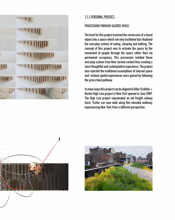
1.1.1 PERSONAL PROJECT:
PROCESSION THROUGH SACRED SPACE
The brief for this project involved the conversion of a found object into a space which not only facilitated but ritualised the everyday actions of eating, sleeping and bathing. The concept of this project was to activate the space by the movement of people through the space rather then via permanent occupancy. This procession isolated these everyday actions from their normal context thus creating a more thoughtful and contemplative experience. The project also rejected the traditional assumptions of internal space and instead spatial experiences were gained by following the prescribed pathway.
In many ways this project can be aligned to Diller Scofidio + Renfro High Line project in New York opened in June 2009. The High Line project rejuvenated an old freight railway track. Visitor can now walk along this elevated walkway experiencing New York from a different perspective.
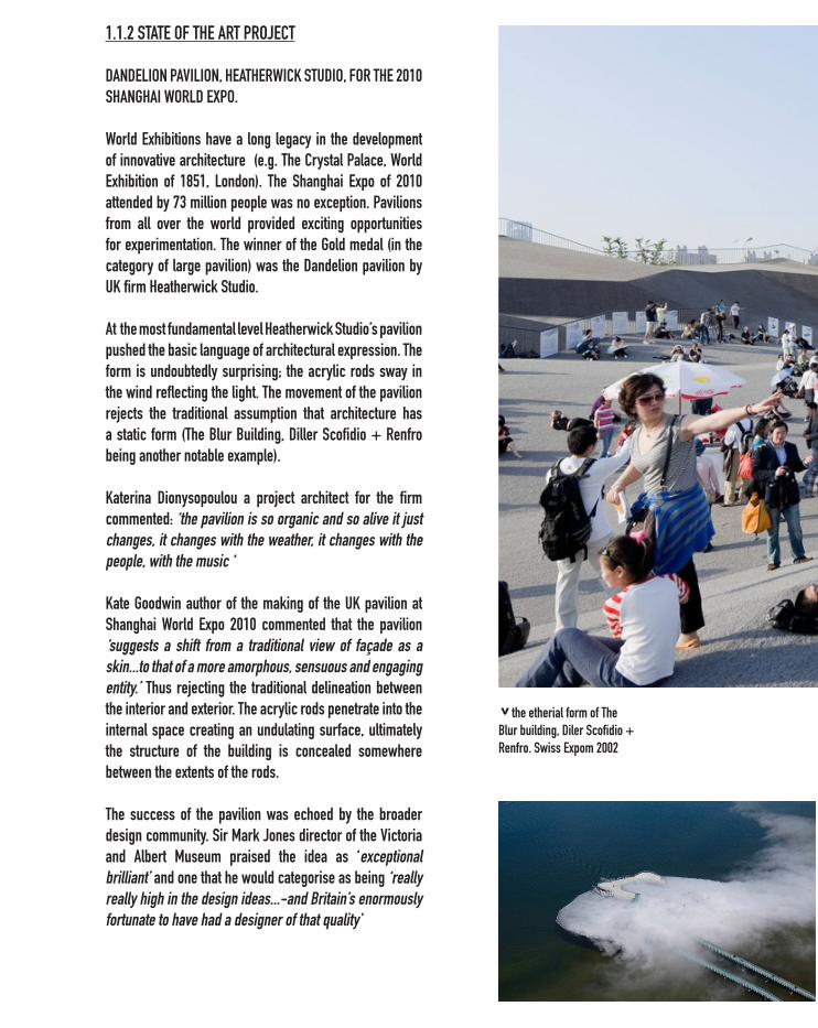
1.1.2 STATE OF THE ART PROJECT
DANDELION PAVILION, HEATHERWICK STUDIO, FOR THE 2010 SHANGHAI WORLD EXPO.
World Exhibitions have a long legacy in the development of innovative architecture (e.g. The Crystal Palace, World Exhibition of 1851, London). The Shanghai Expo of 2010 attended by 73 million people was no exception. Pavilions from all over the world provided exciting opportunities for experimentation. The winner of the Gold medal (in the category of large pavilion) was the Dandelion pavilion by UK firm Heatherwick Studio.
At the most fundamental level Heatherwick Studio’s pavilion pushed the basic language of architectural expression. The form is undoubtedly surprising; the acrylic rods sway in the wind reflecting the light. The movement of the pavilion rejects the traditional assumption that architecture has a static form (The Blur Building, Diller Scofidio + Renfro being another notable example).
Katerina Dionysopoulou a project architect for the firm commented: ‘the pavilion is so organic and so alive it just changes, it changes with the weather, it changes with the people, with the music ‘
Kate Goodwin author of the making of the UK pavilion at Shanghai World Expo 2010 commented that the pavilion ‘suggests a shift from a traditional view of façade as a skin...to that of a more amorphous, sensuous and engaging entity.’ Thus rejecting the traditional delineation between the interior and exterior. The acrylic rods penetrate into the internal space creating an undulating surface, ultimately the structure of the building is concealed somewhere between the extents of the rods.
The success of the pavilion was echoed by the broader design community. Sir Mark Jones director of the Victoria and Albert Museum praised the idea as ‘exceptional brilliant’ and one that he would categorise as being ‘really really high in the design ideas...-and Britain’s enormously fortunate to have had a designer of that quality’
v the etherial form of The Blur building, Diler Scofidio + Renfro. Swiss Expom 2002
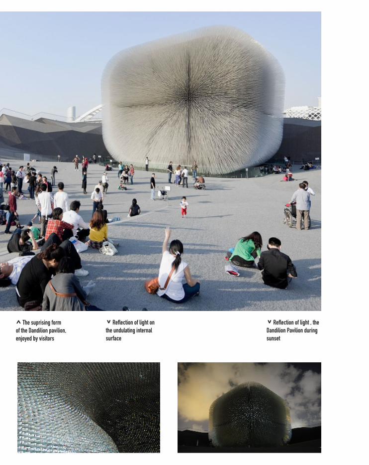
v Reflection of light on the undulating internal surface
^ The suprising form of the Dandilion pavilion, enjoyed by visitors
v Reflection of light , the Dandilion Pavilion during sunset
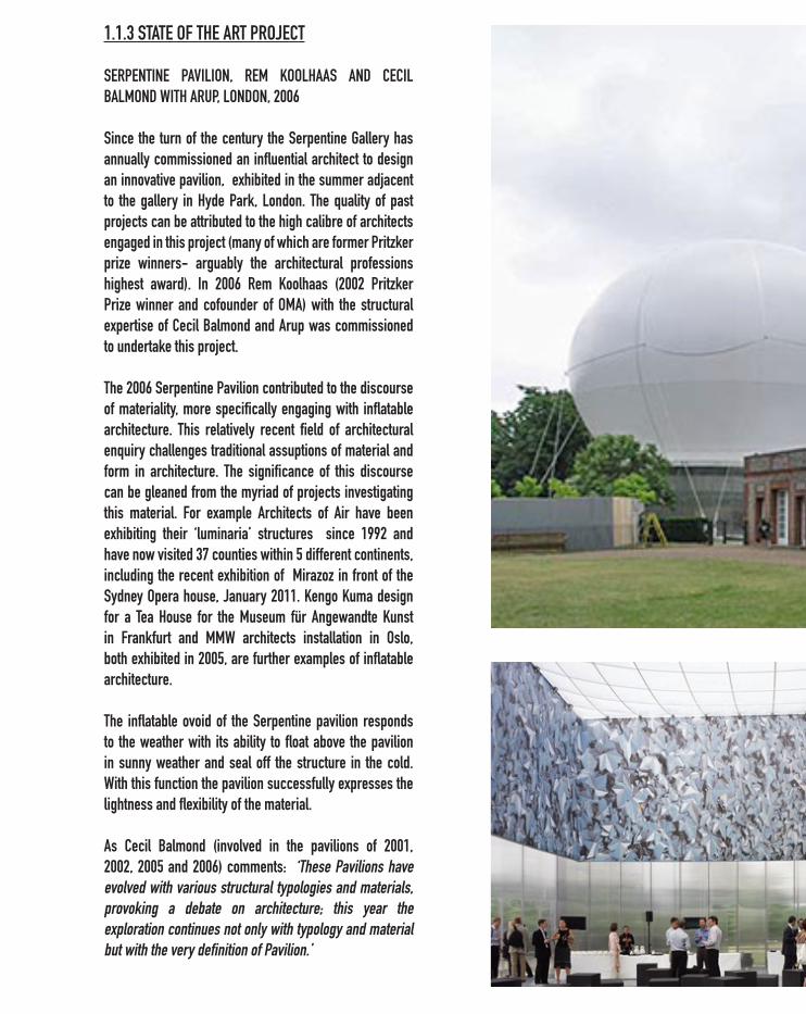
1.1.3 STATE OF THE ART PROJECT
SERPENTINE PAVILION, REM KOOLHAAS AND CECIL BALMOND WITH ARUP, LONDON, 2006
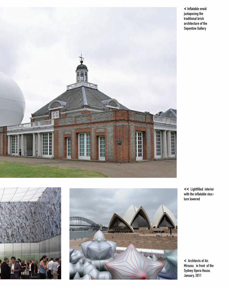
Since the turn of the century the Serpentine Gallery has annually commissioned an influential architect to design an innovative pavilion, exhibited in the summer adjacent to the gallery in Hyde Park, London. The quality of past projects can be attributed to the high calibre of architects engaged in this project (many of which are former Pritzker prize winners- arguably the architectural professions highest award). In 2006 Rem Koolhaas (2002 Pritzker Prize winner and cofounder of OMA) with the structural expertise of Cecil Balmond and Arup was commissioned to undertake this project.
The 2006 Serpentine Pavilion contributed to the discourse of materiality, more specifically engaging with inflatable architecture. This relatively recent field of architectural enquiry challenges traditional assuptions of material and form in architecture. The significance of this discourse can be gleaned from the myriad of projects investigating this material. For example Architects of Air have been exhibiting their ‘luminaria’ structures since 1992 and have now visited 37 counties within 5 different continents, including the recent exhibition of Mirazoz in front of the Sydney Opera house, January 2011. Kengo Kuma design for a Tea House for the Museum für Angewandte Kunst in Frankfurt and MMW architects installation in Oslo, both exhibited in 2005, are further examples of inflatable architecture. The inflatable ovoid of the Serpentine pavilion responds to the weather with its ability to float above the pavilion in sunny weather and seal off the structure in the cold. With this function the pavilion successfully expresses the lightness and flexibility of the material.
As Cecil Balmond (involved in the pavilions of 2001, 2002, 2005 and 2006) comments: ‘These Pavilions have evolved with various structural typologies and materials, provoking a debate on architecture; this year the exploration continues not only with typology and material but with the very definition of Pavilion.’
<< Lightfilled interior with the inflatable stuc-ture lowered
< Architects of Air, Mirazoz, in front of the Sydney Opera House, January, 2011
< Inflatable ovoid juxtaposing the traditional brick architecture of the Sepentine Gallery

REFERENCES: 1.0
1.1.1 > http://www.thehighline.orgs> http://www.dezeen.com1.1.2> Goodwin, Kate, (2011) The Making of the UK Pavillion at Shanghai World Expo 2010, (London: British Council) > http://archidose.blogspot.com.au1.1.3 > http://www.serpentinegallery.org> http://www.architects-of-air.com> http://www.core77.com
1.2. COMPUTING IN ARCHITECTURE
Innovative architecture can actively participate in architectural discourse it is, however, necessary to enter into a specific discussion. In this regards this Expression of Interest advocates engagement with the field of computational design as an emerging field that offers potential but still lacks built examples.
The use of computers within architecture is simultaneous ubiquitous and minimal depending on the area in question. Construction is increasingly relying on digital technologies (the previously mentioned Dandelion pavilion relied on CNC technologies to ensure the correct angle and position of each acrylic rod). In relation to design conception, however, digitalisation is still rather unknown.
The two topics explored in this section attempt to identify the potential of computers in the use of design not simply manufacturing. The first two case studies presented under each heading 1.2.1A and 1.2.2A are limited in the sense that the designs are 2D. The later examples (B) represent more integrated uses of 3D software, however, both within certain limitations, certainly 1.2.2B was never realised.
The lack of formal restrictions for the Gateways project enables an exploration of computational design which can often be severely curtailed by program requirements. The following projects aim to highlight exciting ideas developing in this area.
1.2.1 DESIGNING WITH DATA
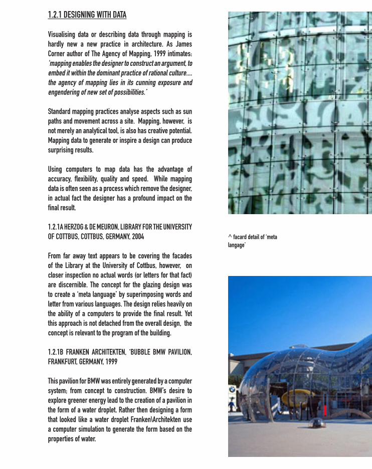
Visualising data or describing data through mapping is hardly new a new practice in architecture. As James Corner author of The Agency of Mapping, 1999 intimates: 'mapping enables the designer to construct an argument, to embed it within the dominant practice of rational culture....the agency of mapping lies in its cunning exposure and engendering of new set of possibilities.’ Standard mapping practices analyse aspects such as sun paths and movement across a site. Mapping, however, is not merely an analytical tool, is also has creative potential. Mapping data to generate or inspire a design can produce surprising results.
Using computers to map data has the advantage of accuracy, flexibility, quality and speed. While mapping data is often seen as a process which remove the designer, in actual fact the designer has a profound impact on the final result.
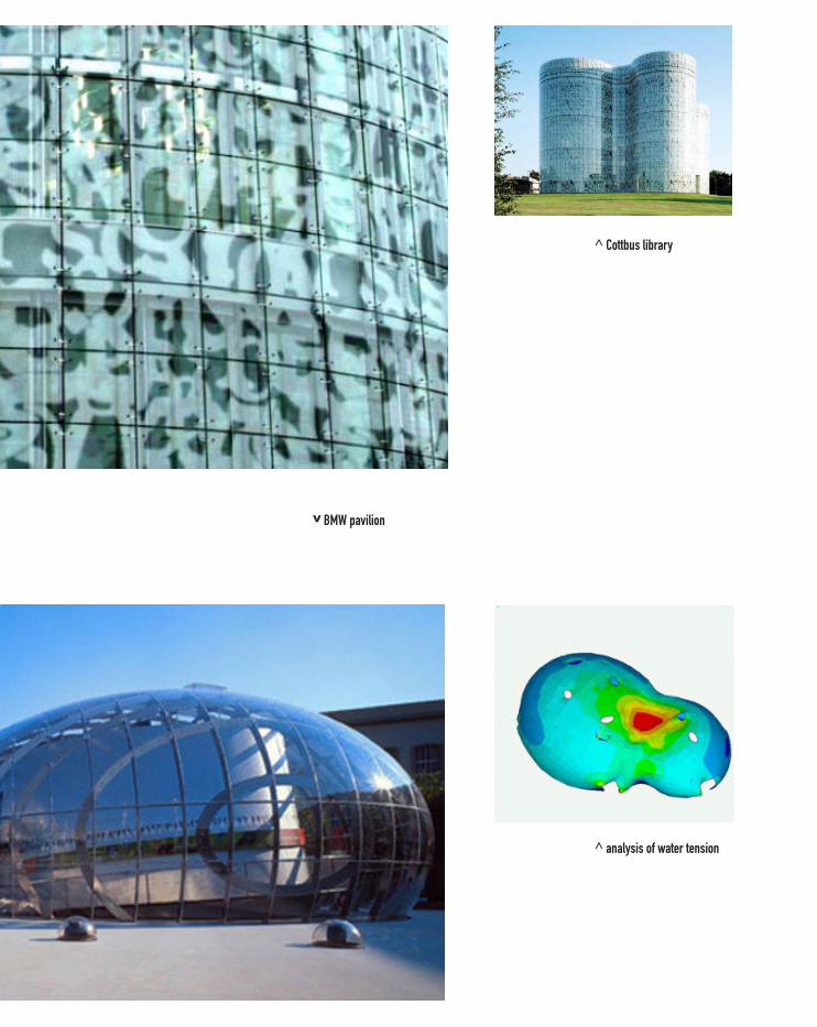
1.2.1A HERZOG & DE MEURON, LIBRARY FOR THE UNIVERSITY OF COTTBUS, COTTBUS, GERMANY, 2004
From far away text appears to be covering the facades of the Library at the University of Cottbus, however, on closer inspection no actual words (or letters for that fact) are discernible. The concept for the glazing design was to create a ‘meta language’ by superimposing words and letter from various languages. The design relies heavily on the ability of a computers to provide the final result. Yet this approach is not detached from the overall design, the concept is relevant to the program of the building.
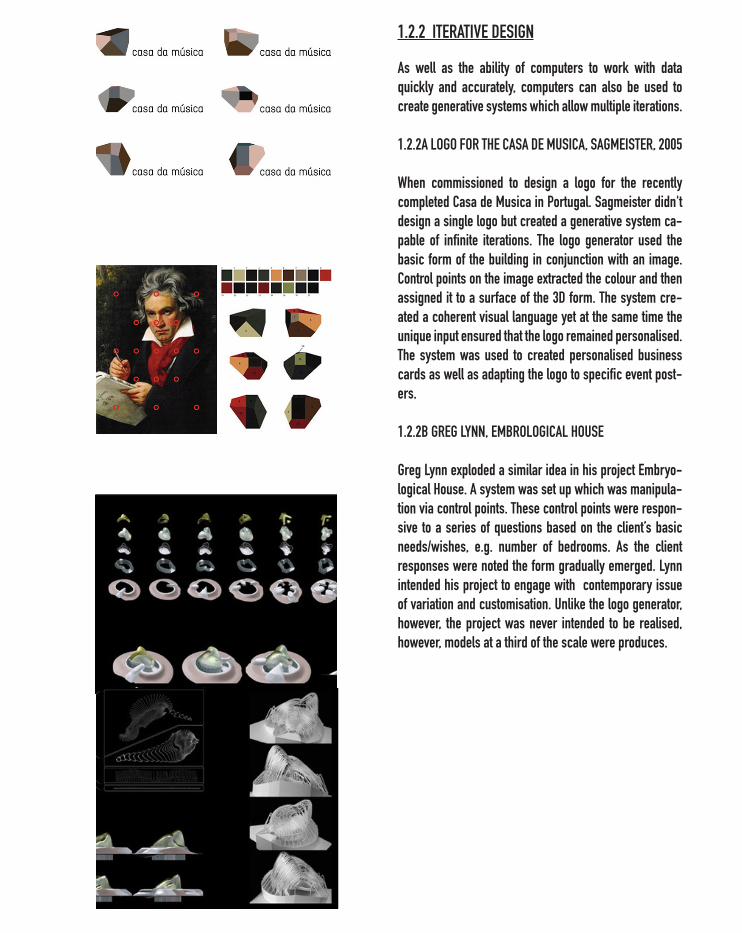
1.2.1B FRANKEN ARCHITEKTEN, ‘BUBBLE BMW PAVILION, FRANKFURT, GERMANY, 1999
This pavilion for BMW was entirely generated by a computer system; from concept to construction. BMW’s desire to explore greener energy lead to the creation of a pavilion in the form of a water droplet. Rather then designing a form that looked like a water droplet Franken\Architekten use a computer simulation to generate the form based on the properties of water.
^ facard detail of ‘meta langage’
v BMW pavilion
^ Cottbus library
^ analysis of water tension
1.2.2 ITERATIVE DESIGN
As well as the ability of computers to work with data quickly and accurately, computers can also be used to create generative systems which allow multiple iterations.
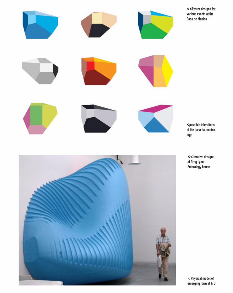
1.2.2A LOGO FOR THE CASA DE MUSICA, SAGMEISTER, 2005
When commissioned to design a logo for the recently completed Casa de Musica in Portugal. Sagmeister didn't design a single logo but created a generative system ca-pable of infinite iterations. The logo generator used the basic form of the building in conjunction with an image. Control points on the image extracted the colour and then assigned it to a surface of the 3D form. The system cre-ated a coherent visual language yet at the same time the unique input ensured that the logo remained personalised. The system was used to created personalised business cards as well as adapting the logo to specific event post-ers.
1.2.2B GREG LYNN, EMBROLOGICAL HOUSE Greg Lynn exploded a similar idea in his project Embryo-logical House. A system was set up which was manipula-tion via control points. These control points were respon-sive to a series of questions based on the client’s basic needs/wishes, e.g. number of bedrooms. As the client responses were noted the form gradually emerged. Lynn intended his project to engage with contemporary issue of variation and customisation. Unlike the logo generator, however, the project was never intended to be realised, however, models at a third of the scale were produces.
<<iterative designs of Greg Lynn Embrology house
< Physical model of emerging form at 1: 3
<<Poster designs for various events at the Casa de Musica
<possible interations of the casa da musica logo

REFERENCES: > 1,2 James Corner (1999), The Agency of Mapping, (London: Reaktion Books,) >1.2.1A Kolarevic, Branko (2009) Architecture in the Digital Age. (New York: Spon Press)> 1.2.2A http://www.sagmeister.com> 1.2.2A http://www.moma.org> 1.2.2BLynn, Greg. (2006) Predator, (Seoul, Korea: DAMDI)
1.3 PARAMETRIC MODELING
The use of parametirc modeling for the Gateways project has the potential to exploit the practical aspects of computational design allowing for material and time efficiency. More importantly, however, the Gateways project can explore computational design as a new framework of design.
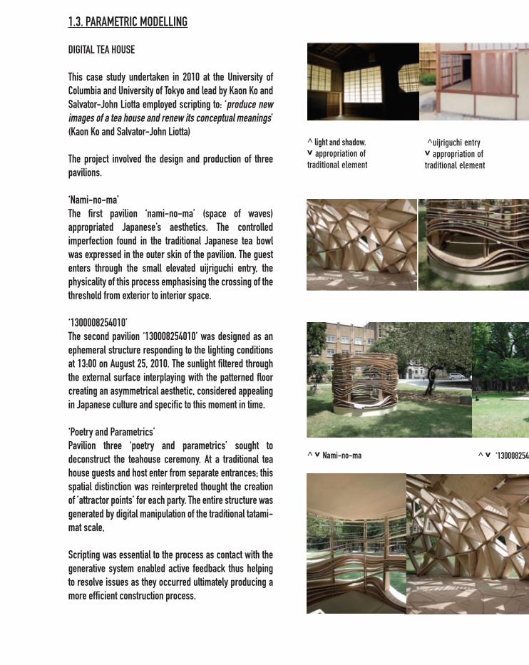
1.3. PARAMETRIC MODELLING
DIGITAL TEA HOUSE
This case study undertaken in 2010 at the University of Columbia and University of Tokyo and lead by Kaon Ko and Salvator-John Liotta employed scripting to: ‘produce new images of a tea house and renew its conceptual meanings’ (Kaon Ko and Salvator-John Liotta)
The project involved the design and production of three pavilions.
‘Nami-no-ma’The first pavilion ‘nami-no-ma’ (space of waves) appropriated Japanese’s aesthetics. The controlled imperfection found in the traditional Japanese tea bowl was expressed in the outer skin of the pavilion. The guest enters through the small elevated uijriguchi entry, the physicality of this process emphasising the crossing of the threshold from exterior to interior space.
‘1300008254010’The second pavilion ‘130008254010’ was designed as an ephemeral structure responding to the lighting conditions at 13:00 on August 25, 2010. The sunlight filtered through the external surface interplaying with the patterned floor creating an asymmetrical aesthetic, considered appealing in Japanese culture and specific to this moment in time.
‘Poetry and Parametrics’Pavilion three ‘poetry and parametrics’ sought to deconstruct the teahouse ceremony. At a traditional tea house guests and host enter from separate entrances; this spatial distinction was reinterpreted thought the creation of ’attractor points’ for each party. The entire structure was generated by digital manipulation of the traditional tatami-mat scale,
Scripting was essential to the process as contact with the generative system enabled active feedback thus helping to resolve issues as they occurred ultimately producing a more efficient construction process.
^ light and shadow. v appropriation of traditional element
^uijriguchi entryv appropriation of traditional element
^ v Nami-no-ma ^ v ‘130008254010’
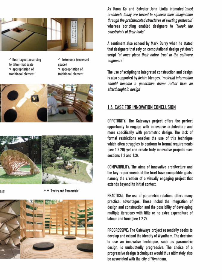
As Kaon Ko and Salvator-John Liotta intimated:’most architects today are forced to squeeze their imagination through the prefabricated structures of existing protocols’ whereas scripting enabled designers to ‘tweak the constraints of their tools’
A sentiment also echoed by Mark Burry when he stated that designers that rely on computational design yet don’t script ‘at once place their entire trust in the software engineers’
The use of scripting to integrated construction and design is also supported by Achim Menges: ‘material information should become a generative driver rather than an afterthought in design’
1.4. CASE FOR INNOVATION CONCLUSION
OPPOTUNITY: The Gateways project offers the perfect opportunity to engage with innovative architecture and more specifically with parametric design. The lack of formal restrictions enables the use of this technique which often struggles to conform to formal requirements (see 1.2.2B) yet can create truly innovative projects (see sections 1.2 and 1.3).
COMPATIBILITY: The aims of innovative architecture and the key requirements of the brief have compatible goals; namely the creation of a visually engaging project that extends beyond its initial context.
PRACTICAL: The use of parametric relations offers many practical advantages. These includ the integration of design and construction and the possibility of developing multiple iterations with little or no extra expenditure of labour and time (see 1.2.2).
PROGRESSIVE: The Gateways project essentially seeks to develop and extend the identity of Wyndham. The decision to use an innovative technique, such as parametric design, is undoubtedly progressive. The choice of a progressive design techniques would thus ultimately also be associated with the city of Wynhdam.
^ floor layout accorsing to tatmi-mat scalev appropriation of traditional element
^ v ‘130008254010’ ^ v ‘Poetry and Parametric’
^ tokonoma (recessed space) v appropriation of traditional element

REFERENCES: > Ko, Kaon and Salvator-John Liotta (2011). Decoding Culture Parametrically: Diigital Tea House Case Study, (International journal of architecual computing, 4, vol. 9, p325-338)> Burry, Mark (2011). Scripting Cultures: Architectural Design and Programming (Chichester: Wiley), pp. 8 - 71.
2.0 RESEARCH PROJECT
2.1.0 SCOPE OF POSSIBILITIES
The following section investigate the potential of parametric architecture through a series of exercises and case studies. The purpose is to investigate the scope of possibilities which lie within the range of this project.
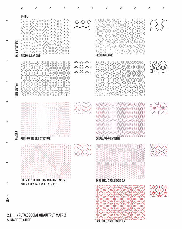
2.1.1 refers to the text Yehuda E. Kalay (2004) Architecture’s New Media : Principles, Theories, and Methods of Computer-Aided Design (Cambridge, Mass.: MIT Press,)
BASI
C STU
CTUR
E IN
TERS
ECTIO
NSH
ADER
S
RECTANGULAR GRID HEXAGONAL GRID
2.1.1. INPUT/ASSOCIATION/OUTPUT MATRIXSURFACE STUCTURE
GRIDS
DEPT
H
REINFORCING GRID STUCTURE
THE GRID STUCTURE BECOMES LESS EXPLICIT WHEN A NEW PATTERN IS OVERLAYED
OVERLAPPING PATTERNS
BASE GRID, CIRCLE RADIS 0.7
BASE GRID, CIRCLE RADIS 1.7
>
>
>
>
>
>
>
>
>
> > > > > > > > > > >
BOOLEAN PATTERN
FRONT VIEW: CLEAR STUCTURE
CIRCULAR ORGAINSATION: T, F, T, T, T
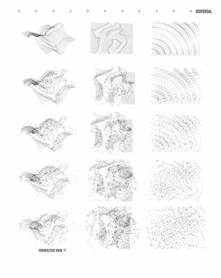
This exercise uses Kalay’s technique of ‘Search’ to develop a range of design possibili-ties. According to Kalay the ‘search process involves two step: (1) producing candidate solutions for consideration, and (2) choosing the ‘right’ solutions for further consid-eration and development.’ Without specific criteria it is not possible to define a ‘right’ solution, however, this task seeks to explore a range of possibilities organising them into a rational matrix of possibilities. The first matrix explores surface structure initially investigating breadth. The second matrix investigated depth first, exploring the sugges-tive possibilities of the data driven rotation component.
BREADTH
ANGLED FRONT VIEW: CLEAR STUCTURE
SIDE VIEW: CLEAR STUCTURE
TRUE, FALSE, TRUE : DIAGONAL ORGANISATION
LINEAR ORGANISATION: T, F, T, T
FRONT VIEW: UNCLEAR STUCTURE
ANGLED FRONT VIEW: UNCLEAR STUCTURE
SIDE VIEW: UNCLEAR STUCTURE
> > > > > > > > > > >
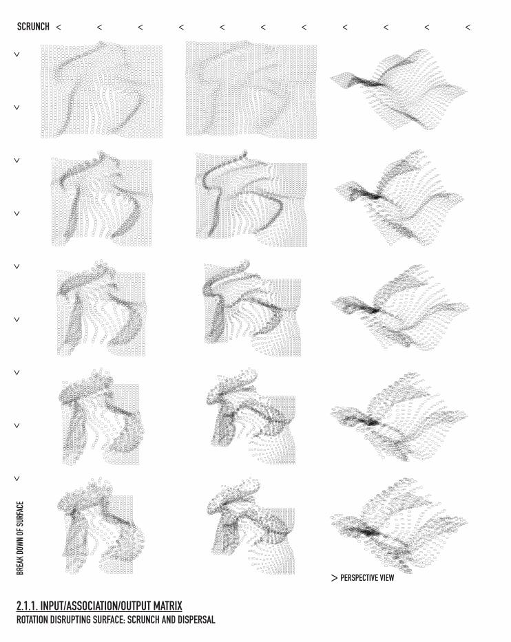
BREA
K DO
WN O
F SUR
FACE
SCRUNCH
2.1.1. INPUT/ASSOCIATION/OUTPUT MATRIXROTATION DISRUPTING SURFACE: SCRUNCH AND DISPERSAL
PERSPECTIVE VIEW>
> > > > > > > > > > >
>
>
>
>
>
>
>
>
>
PERSPECTIVE VIEW
DISPERSAL
>
> > > > > > > > > > >
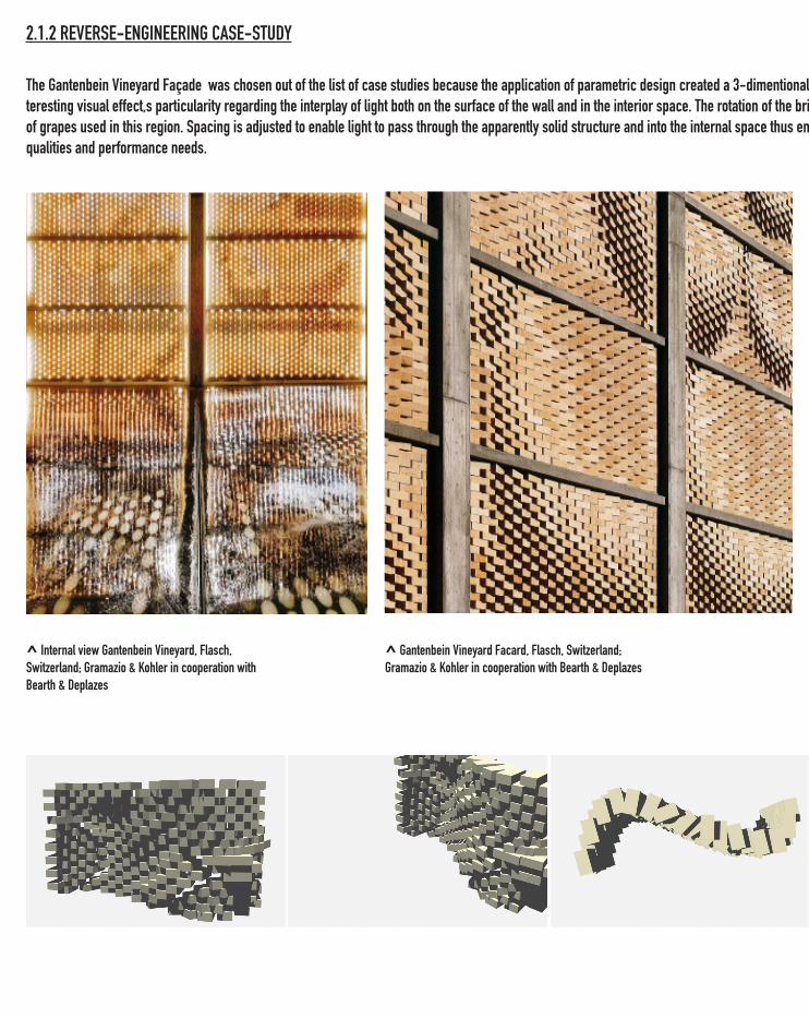
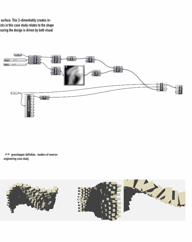
2.1.2 REVERSE-ENGINEERING CASE-STUDY
^ Internal view Gantenbein Vineyard, Flasch, Switzerland; Gramazio & Kohler in cooperation with Bearth & Deplazes
The Gantenbein Vineyard Façade was chosen out of the list of case studies because the application of parametric design created a 3-dimentional surface. This 3-dimentiality creates in-teresting visual effect,s particularity regarding the interplay of light both on the surface of the wall and in the interior space. The rotation of the bricks in this case study relates to the shape of grapes used in this region. Spacing is adjusted to enable light to pass through the apparently solid structure and into the internal space thus ensuring the design is driven by both visual qualities and performance needs.
^ Gantenbein Vineyard Facard, Flasch, Switzerland; Gramazio & Kohler in cooperation with Bearth & Deplazes
The Gantenbein Vineyard Façade was chosen out of the list of case studies because the application of parametric design created a 3-dimentional surface. This 3-dimentiality creates in-teresting visual effect,s particularity regarding the interplay of light both on the surface of the wall and in the interior space. The rotation of the bricks in this case study relates to the shape of grapes used in this region. Spacing is adjusted to enable light to pass through the apparently solid structure and into the internal space thus ensuring the design is driven by both visual qualities and performance needs.
^v grasshopper definition, renders of reverse-engineering case study,
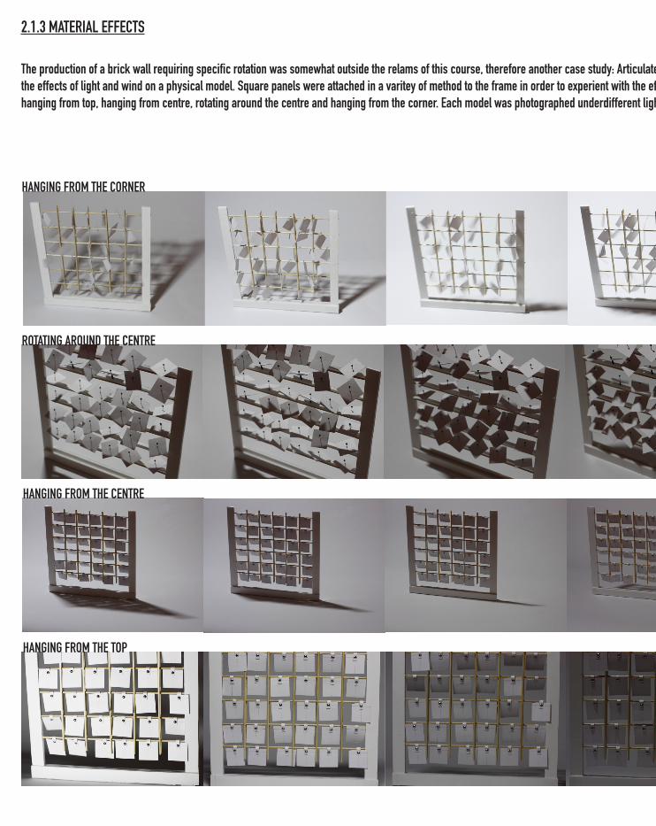
2.1.3 MATERIAL EFFECTS
The production of a brick wall requiring specific rotation was somewhat outside the relams of this course, therefore another case study: Articulated Cloud, Ned Kahn was used to investigage the effects of light and wind on a physical model. Square panels were attached in a varitey of method to the frame in order to experient with the effect of wind. Connection types included: hanging from top, hanging from centre, rotating around the centre and hanging from the corner. Each model was photographed underdifferent light and wind conditions.
HANGING FROM THE CORNER
ROTATING AROUND THE CENTRE
HANGING FROM THE CENTRE
HANGING FROM THE TOP
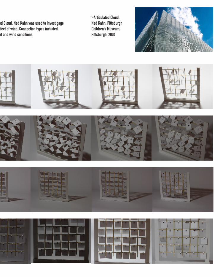
The production of a brick wall requiring specific rotation was somewhat outside the relams of this course, therefore another case study: Articulated Cloud, Ned Kahn was used to investigage the effects of light and wind on a physical model. Square panels were attached in a varitey of method to the frame in order to experient with the effect of wind. Connection types included: hanging from top, hanging from centre, rotating around the centre and hanging from the corner. Each model was photographed underdifferent light and wind conditions.
>Articulated Cloud, Ned Kahn, Pittsburgh Children’s Museum, Pittsburgh, 2004
2.2.0 RESEARCH PROJECT CONCLUSION
The research project displays techniques currently in use and within the range of this project. The final section of this project, fabricate, has been omitted due to the design criteria outlined in part 3.0, and has been replaced with further material exploration also in part 3.0. While the research projects haven’t spe-cifically effected the design criteria they were useful in developing skills, both digital and physical.
3.0 EXPRESSION OF INTEREST CONCLUSION: COMPETITIVE ADVANTAGE3.1.0 OVERVIEW: ESSENTIAL CRITERIA
SITE CRITERIA> viewed from a car at 100km: must be able to be understood quickly> depth in design: effective both from afar and close up> low maintenance once installed: longevity of design> consider visibility at night> Vic-roads safety restrictions: limiting proximity to road (also consider issue of reflection and potential distraction to drivers)
DESIGN PHILOSOPHY: >Actively experiment through digital technologies>Engages and contribute to the broader architectural discourse >Allow breadth in design to invite inter-disciplinary discussion
BRIEF CRITERIA>exciting an eye-catching>create an identity for the city (Wyndham)>relate and engages the community>find a happy medium between abstraction and accessibility>encourage reflection beyond the site
DESIGN CRITERIA: 1. the design is primarily concerned with the creative potentials of data mapping (see 1.2.1). By collecting data directly from Wyndham city a tangible link will be created. 2. the design should be visually engaging and should be interesting to the entire community. A live and changing data stream will offer this visual stimulus. Real time data mapping will allow for a visual representation of parametric relations which can be displayed on site via a projector3. the design is to be represented beyond the site thus extending the identity of Wyndham city and also promoting discourse on parametric design. The design should be developed beyond the site to serves both the design community (e.g. website of the project) and the Wyndham city council (e.g. on tourist publications such as postcards)
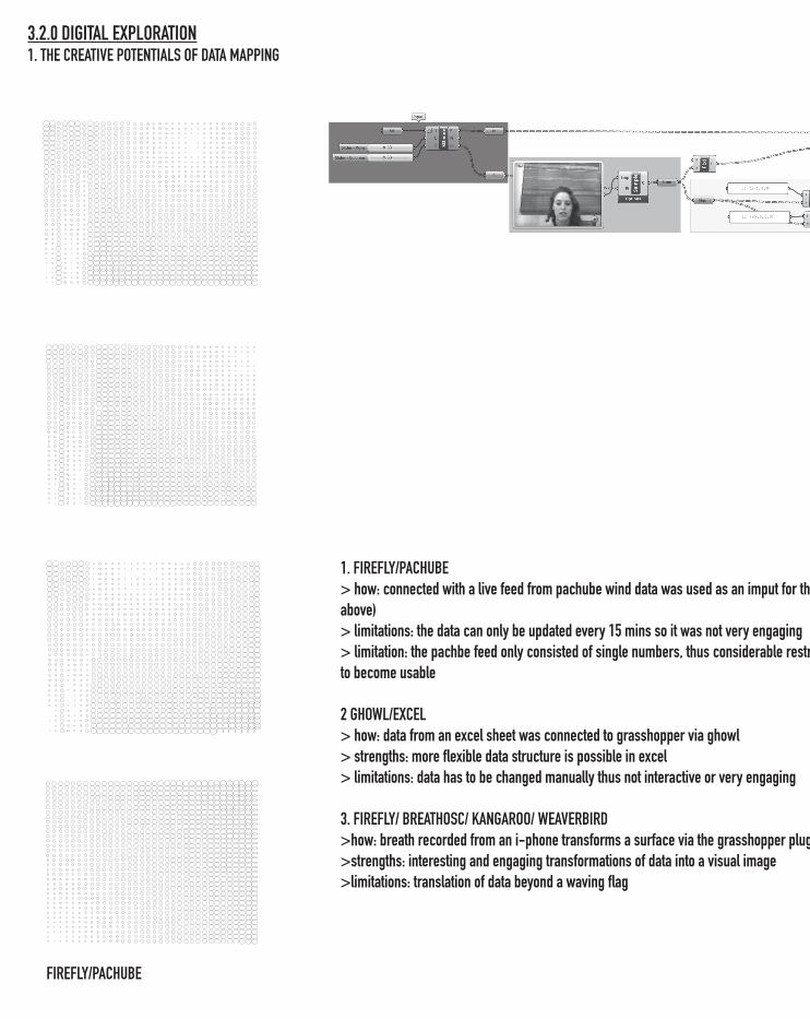
FIREFLY/PACHUBE
1. FIREFLY/PACHUBE> how: connected with a live feed from pachube wind data was used as an imput for the attractor points (see definitions above)> limitations: the data can only be updated every 15 mins so it was not very engaging> limitation: the pachbe feed only consisted of single numbers, thus considerable restructuring is required for the data to become usable
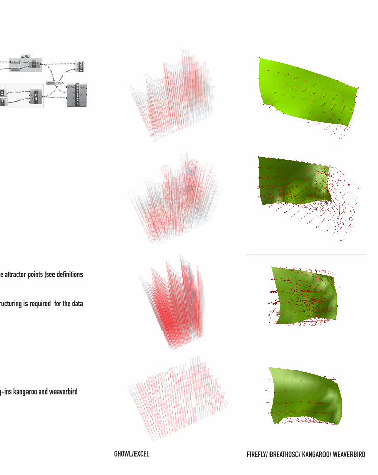
2 GHOWL/EXCEL> how: data from an excel sheet was connected to grasshopper via ghowl> strengths: more flexible data structure is possible in excel> limitations: data has to be changed manually thus not interactive or very engaging
3. FIREFLY/ BREATHOSC/ KANGAROO/ WEAVERBIRD>how: breath recorded from an i-phone transforms a surface via the grasshopper plug-ins kangaroo and weaverbird>strengths: interesting and engaging transformations of data into a visual image>limitations: translation of data beyond a waving flag
3.2.0 DIGITAL EXPLORATION1. THE CREATIVE POTENTIALS OF DATA MAPPING
GHOWL/EXCEL FIREFLY/ BREATHOSC/ KANGAROO/ WEAVERBIRD
1. FIREFLY/PACHUBE> how: connected with a live feed from pachube wind data was used as an imput for the attractor points (see definitions above)> limitations: the data can only be updated every 15 mins so it was not very engaging> limitation: the pachbe feed only consisted of single numbers, thus considerable restructuring is required for the data to become usable
2 GHOWL/EXCEL> how: data from an excel sheet was connected to grasshopper via ghowl> strengths: more flexible data structure is possible in excel> limitations: data has to be changed manually thus not interactive or very engaging
3. FIREFLY/ BREATHOSC/ KANGAROO/ WEAVERBIRD>how: breath recorded from an i-phone transforms a surface via the grasshopper plug-ins kangaroo and weaverbird>strengths: interesting and engaging transformations of data into a visual image>limitations: translation of data beyond a waving flag
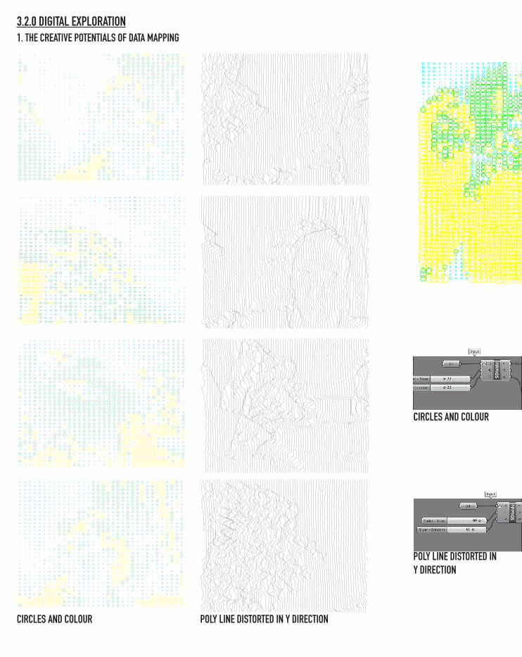
CIRCLES AND COLOUR POLY LINE DISTORTED IN Y DIRECTION
CIRCLES AND COLOUR
POLY LINE DISTORTED IN Y DIRECTION
3.2.0 DIGITAL EXPLORATION1. THE CREATIVE POTENTIALS OF DATA MAPPING
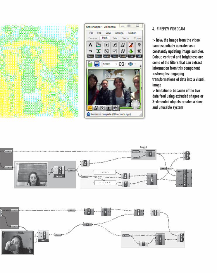
4. FIREFLY/ VIDEOCAM
> how: the image from the video cam essentially operates as a constantly updating image sampler. Colour, contrast and brightness are some of the filters that can extract information from this component>strengths: engaging transformations of data into a visual image> limitations: because of the live data feed using extruded shapes or 3-dimential objects creates a slow and unusable system
POLY LINE DISTORTED IN Y DIRECTION
> >
>>
>
>
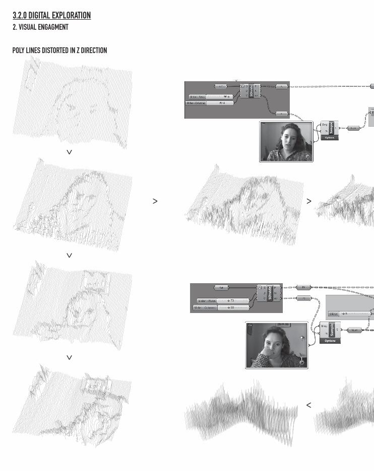
3.2.0 DIGITAL EXPLORATION2. VISUAL ENGAGMENT
POLY LINES DISTORTED IN Z DIRECTION
>
>>
>>>
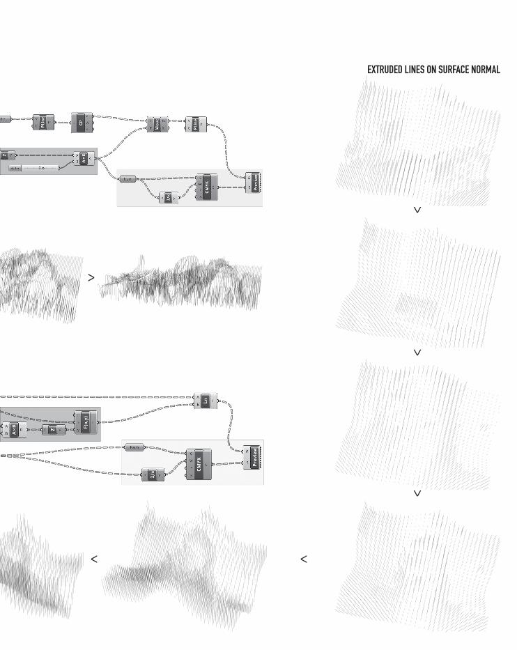
EXTRUDED LINES ON SURFACE NORMAL
3.3.0 MATERIAL EXPLORATION2. VISUAL ENGAGMENT
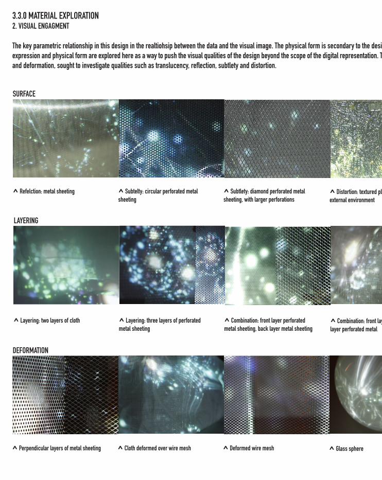
The key parametric relationship in this design in the realtiohsip between the data and the visual image. The physical form is secondary to the design and not necessarily parametric. Material expression and physical form are explored here as a way to push the visual qualities of the design beyond the scope of the digital representation. The tests presented here of surface, layering and deformation, sought to investigate qualities such as translucency, reflection, subtlety and distortion.
^ Refelction: metal sheeting ^ Subtelty: circular perforated metal sheeting
^ Distortion: textured plactic, in a light external environment
^ Subtlety: diamond perforated metal sheeting, with larger perforations
^ Layering: two layers of cloth ^ Layering: three layers of perforated metal sheeting
^ Combination: front layer cloth, back layer perforated metal
^ Combination: front layer perforated metal sheeting, back layer metal sheeting
^ Perpendicular layers of metal sheeting ^ Cloth deformed over wire mesh ^ Glass sphere^ Deformed wire mesh
SURFACE
LAYERING
DEFORMATION
3.3.0 MATERIAL EXPLORATION2. VISUAL ENGAGMENT
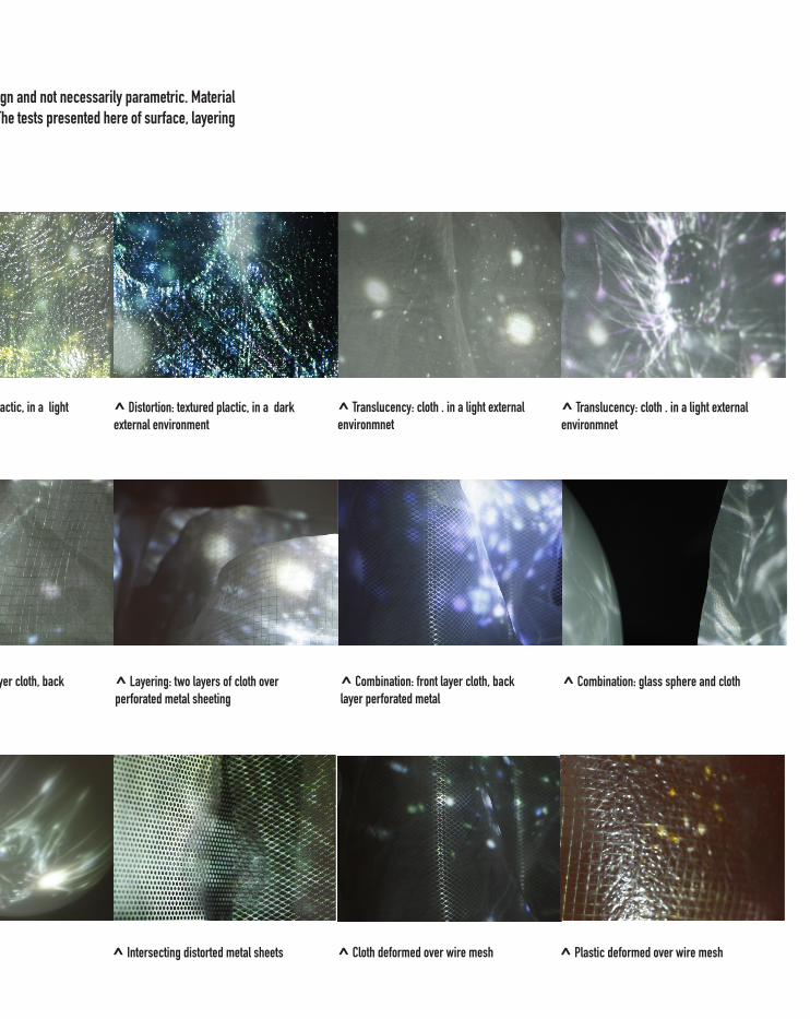
The key parametric relationship in this design in the realtiohsip between the data and the visual image. The physical form is secondary to the design and not necessarily parametric. Material expression and physical form are explored here as a way to push the visual qualities of the design beyond the scope of the digital representation. The tests presented here of surface, layering and deformation, sought to investigate qualities such as translucency, reflection, subtlety and distortion.
^ Distortion: textured plactic, in a light external environment
^ Distortion: textured plactic, in a dark external environment
^ Translucency: cloth . in a light external environmnet
^ Translucency: cloth . in a light external environmnet
^ Combination: front layer cloth, back layer perforated metal
^ Layering: two layers of cloth over perforated metal sheeting
^ Combination: front layer cloth, back layer perforated metal
^ Combination: glass sphere and cloth
^ Glass sphere ^ Intersecting distorted metal sheets ^ Cloth deformed over wire mesh ^ Plastic deformed over wire mesh
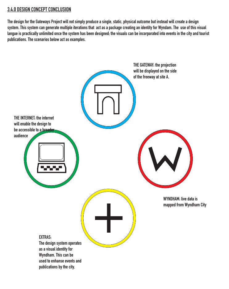
3.4.0 DESIGN CONCEPT CONCLUSION
The design for the Gateways Project will not simply produce a single, static, physical outcome but instead will create a design system. This system can generate multiple iterations that act as a package creating an identity for Wyndam. The use of this visual langue is practically unlimited once the system has been designed; the visuals can be incorporated into events in the city and tourist publications. The scenarios below act as examples.
THE GATEWAY: the projection will be displayed on the side of the freeway at site A.
THE INTERNET: the internet will enable the design to be accessible to a broader audience
WYNDHAM: live data is mapped from Wyndham City
EXTRAS:The design system operates as a visual identity for Wyndham. This can be used to enhanse events and publications by the city.
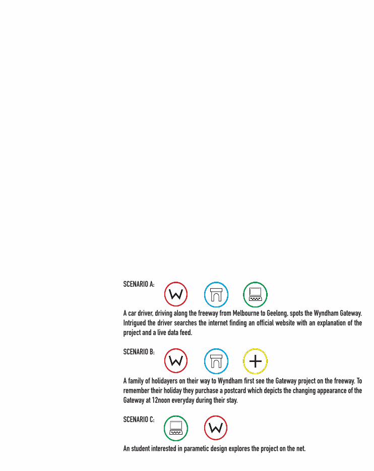
SCENARIO A:
A car driver, driving along the freeway from Melbourne to Geelong, spots the Wyndham Gateway. Intrigued the driver searches the internet finding an official website with an explanation of the project and a live data feed.
SCENARIO B:
A family of holidayers on their way to Wyndham first see the Gateway project on the freeway. To remember their holiday they purchase a postcard which depicts the changing appearance of the Gateway at 12noon everyday during their stay.
SCENARIO C:
An student interested in parametic design explores the project on the net.


4.0 DESIGN DEVELOPMENT
This section charts the development of the design proposal which sought to materialise the EOI. The pro-posal was developed over a three week period.
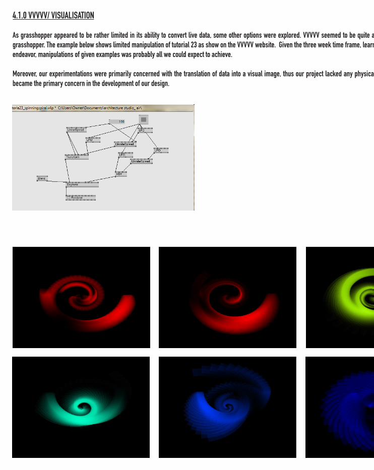
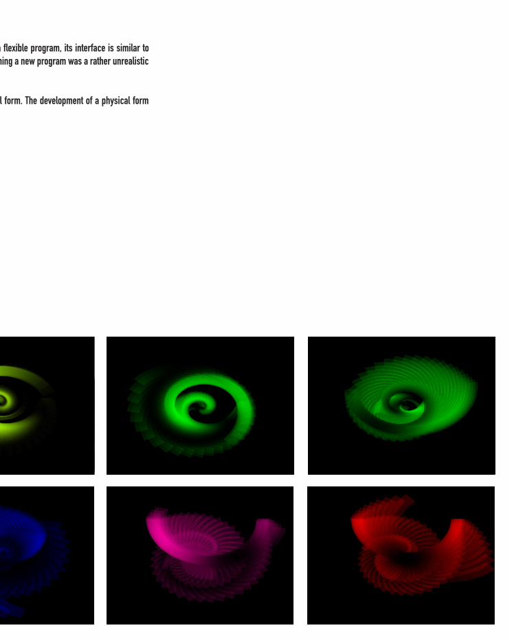
4.1.0 VVVVV/ VISUALISATION
As grasshopper appeared to be rather limited in its ability to convert live data, some other options were explored. VVVVV seemed to be quite a flexible program, its interface is similar to grasshopper. The example below shows limited manipulation of tutorial 23 as show on the VVVVV website. Given the three week time frame, learning a new program was a rather unrealistic endeavor, manipulations of given examples was probably all we could expect to achieve.
Moreover, our experimentations were primarily concerned with the translation of data into a visual image, thus our project lacked any physical form. The development of a physical form became the primary concern in the development of our design.
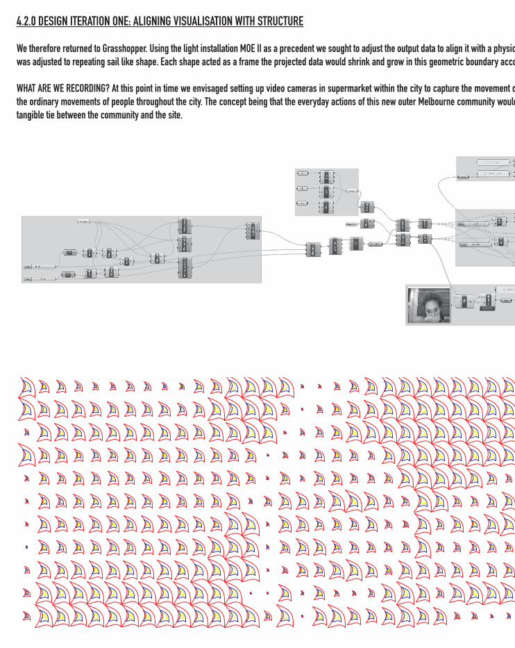
4.2.0 DESIGN ITERATION ONE: ALIGNING VISUALISATION WITH STRUCTURE
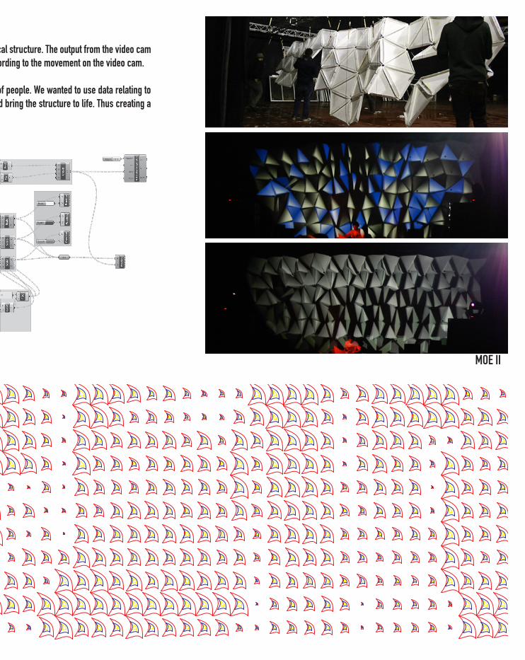
We therefore returned to Grasshopper. Using the light installation MOE II as a precedent we sought to adjust the output data to align it with a physical structure. The output from the video cam was adjusted to repeating sail like shape. Each shape acted as a frame the projected data would shrink and grow in this geometric boundary according to the movement on the video cam.
WHAT ARE WE RECORDING? At this point in time we envisaged setting up video cameras in supermarket within the city to capture the movement of people. We wanted to use data relating to the ordinary movements of people throughout the city. The concept being that the everyday actions of this new outer Melbourne community would bring the structure to life. Thus creating a tangible tie between the community and the site.
4.2.0 DESIGN ITERATION ONE: ALIGNING VISUALISATION WITH STRUCTURE
We therefore returned to Grasshopper. Using the light installation MOE II as a precedent we sought to adjust the output data to align it with a physical structure. The output from the video cam was adjusted to repeating sail like shape. Each shape acted as a frame the projected data would shrink and grow in this geometric boundary according to the movement on the video cam.
WHAT ARE WE RECORDING? At this point in time we envisaged setting up video cameras in supermarket within the city to capture the movement of people. We wanted to use data relating to the ordinary movements of people throughout the city. The concept being that the everyday actions of this new outer Melbourne community would bring the structure to life. Thus creating a tangible tie between the community and the site.
MOE II
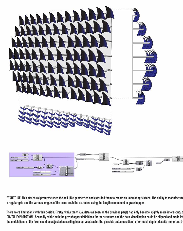
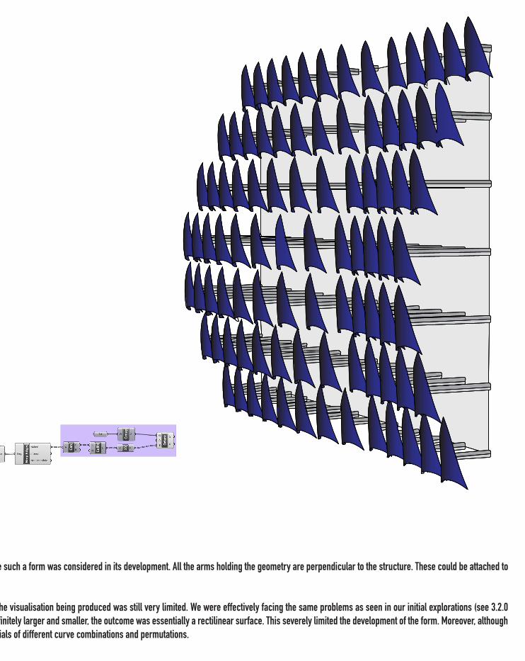
STRUCTURE: This structural prototype used the sail-like geometries and extruded them to create an undulating surface. The ability to manufacture such a form was considered in its development. All the arms holding the geometry are perpendicular to the structure. These could be attached to a regular grid and the various lengths of the arms could be extracted using the length component in grasshopper.
There were limitations with this design. Firstly, while the visual data (as seen on the previous page) had only become slightly more interesting; the visualisation being produced was still very limited. We were effectively facing the same problems as seen in our initial explorations (see 3.2.0 DIGITAL EXPLORATION). Secondly, while both the grasshopper definitions for the structure and the data visualisation could be aligned and made infinitely larger and smaller, the outcome was essentially a rectilinear surface. This severely limited the development of the form. Moreover, although the undulations of the form could be adjusted according to a curve attractor the possible outcomes didn’t offer much depth- despite numerous trials of different curve combinations and permutations.
3M
1M
13M- min distance of constuction
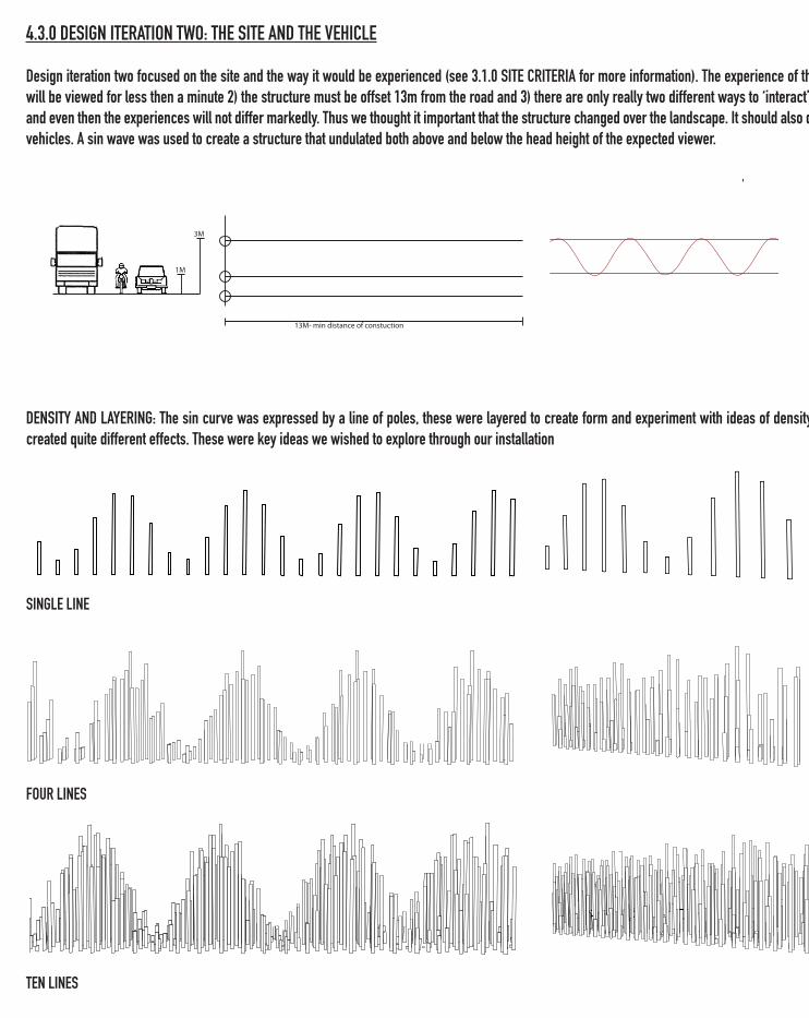
4.3.0 DESIGN ITERATION TWO: THE SITE AND THE VEHICLE
Design iteration two focused on the site and the way it would be experienced (see 3.1.0 SITE CRITERIA for more information). The experience of the structure is very limited 1) the installation will be viewed for less then a minute 2) the structure must be offset 13m from the road and 3) there are only really two different ways to ‘interact’ with the structure; as a driver or passenger and even then the experiences will not differ markedly. Thus we thought it important that the structure changed over the landscape. It should also deal directly with the eye line of people in the vehicles. A sin wave was used to create a structure that undulated both above and below the head height of the expected viewer.
DENSITY AND LAYERING: The sin curve was expressed by a line of poles, these were layered to create form and experiment with ideas of density. As can be seen the layering of these lines created quite different effects. These were key ideas we wished to explore through our installation
SINGLE LINE
FOUR LINES
TEN LINES
3M
1M
13M- min distance of constuction
4.3.0 DESIGN ITERATION TWO: THE SITE AND THE VEHICLE
Design iteration two focused on the site and the way it would be experienced (see 3.1.0 SITE CRITERIA for more information). The experience of the structure is very limited 1) the installation will be viewed for less then a minute 2) the structure must be offset 13m from the road and 3) there are only really two different ways to ‘interact’ with the structure; as a driver or passenger and even then the experiences will not differ markedly. Thus we thought it important that the structure changed over the landscape. It should also deal directly with the eye line of people in the vehicles. A sin wave was used to create a structure that undulated both above and below the head height of the expected viewer.
DENSITY AND LAYERING: The sin curve was expressed by a line of poles, these were layered to create form and experiment with ideas of density. As can be seen the layering of these lines created quite different effects. These were key ideas we wished to explore through our installation
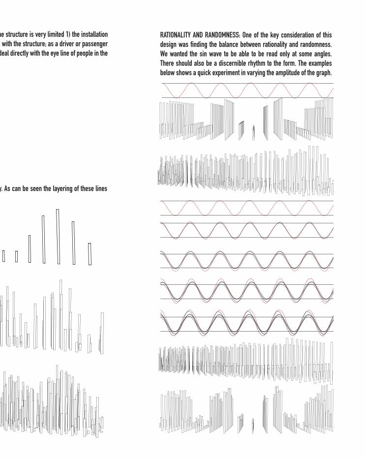
RATIONALITY AND RANDOMNESS: One of the key consideration of this design was finding the balance between rationality and randomness. We wanted the sin wave to be able to be read only at some angles. There should also be a discernible rhythm to the form. The examples below shows a quick experiment in varying the amplitude of the graph.
3M
1M
13M- min distance of constuction
3M
1M
13M- min distance of constuction
PLAN
FRON
T PER
SEPC
TIVE
FRON
T PER
SPEC
TIVE A
NGLE
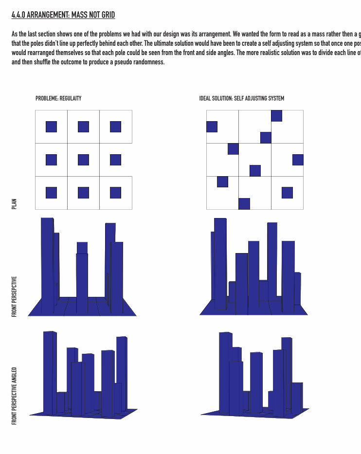
D4.4.0 ARRANGEMENT: MASS NOT GRID
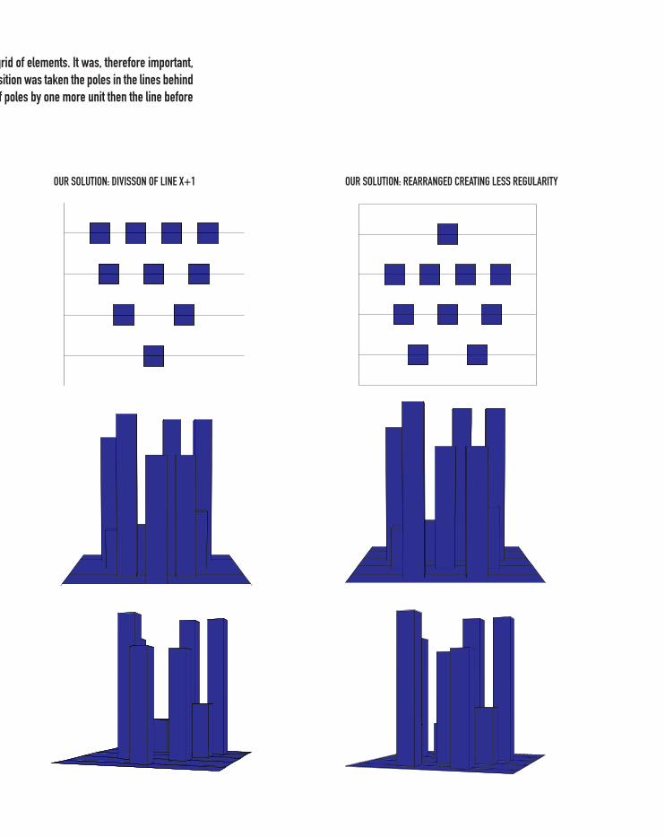
As the last section shows one of the problems we had with our design was its arrangement. We wanted the form to read as a mass rather then a grid of elements. It was, therefore important, that the poles didn’t line up perfectly behind each other. The ultimate solution would have been to create a self adjusting system so that once one position was taken the poles in the lines behind would rearranged themselves so that each pole could be seen from the front and side angles. The more realistic solution was to divide each line of poles by one more unit then the line before and then shuffle the outcome to produce a pseudo randomness.
PROBLEME: REGULAITY IDEAL SOLUTION: SELF ADJUSTING SYSTEM
4.4.0 ARRANGEMENT: MASS NOT GRID
As the last section shows one of the problems we had with our design was its arrangement. We wanted the form to read as a mass rather then a grid of elements. It was, therefore important, that the poles didn’t line up perfectly behind each other. The ultimate solution would have been to create a self adjusting system so that once one position was taken the poles in the lines behind would rearranged themselves so that each pole could be seen from the front and side angles. The more realistic solution was to divide each line of poles by one more unit then the line before and then shuffle the outcome to produce a pseudo randomness.
OUR SOLUTION: DIVISSON OF LINE X+1 OUR SOLUTION: REARRANGED CREATING LESS REGULARITY
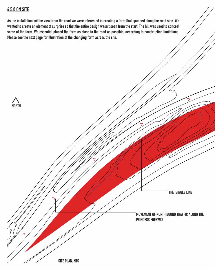
4.5.0 ON SITE
As the installation will be view from the road we were interested in creating a form that spanned along the road side. We wanted to create an element of surprise so that the entire design wasn’t seen from the start. The hill was used to conceal some of the form. We essential placed the form as close to the road as possible, according to construction limitations. Please see the next page for illustration of the changing form across the site.
SITE PLAN: NTS
>
>
>
>
>
MOVEMENT OF NORTH BOUND TRAFFIC ALONG THE PRINCESS FREEWAY
>
NORTH
THE SINGLE LINE
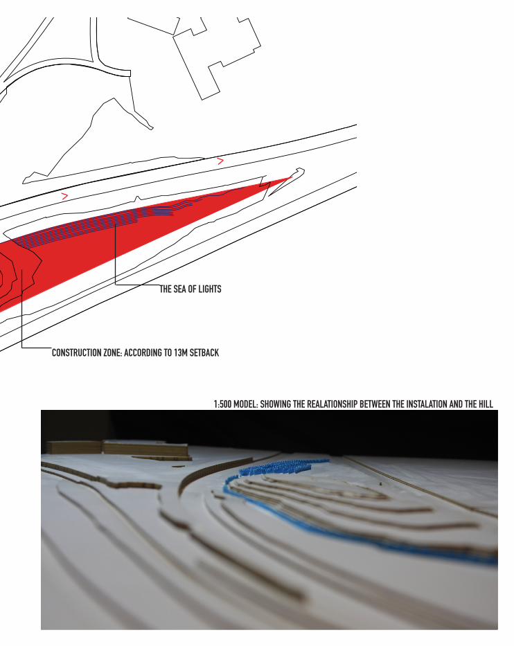
1:500 MODEL: SHOWING THE REALATIONSHIP BETWEEN THE INSTALATION AND THE HILL
>
>
CONSTRUCTION ZONE: ACCORDING TO 13M SETBACK
THE SEA OF LIGHTS
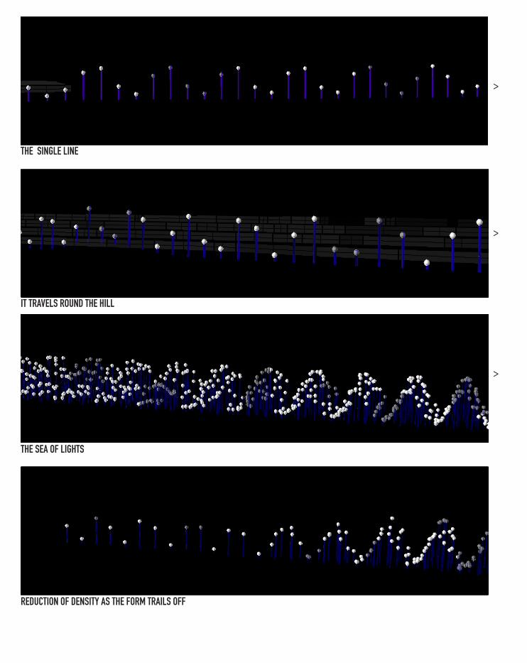
THE SINGLE LINE
IT TRAVELS ROUND THE HILL
THE SEA OF LIGHTS
REDUCTION OF DENSITY AS THE FORM TRAILS OFF
> >
> >
> >
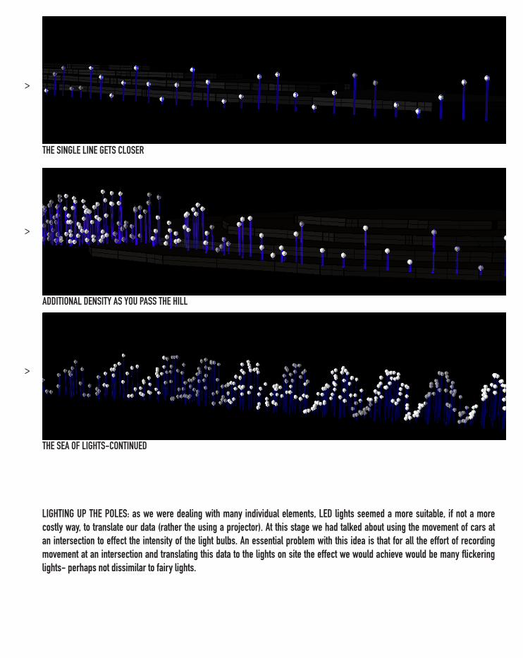
THE SINGLE LINE GETS CLOSER
ADDITIONAL DENSITY AS YOU PASS THE HILL
THE SEA OF LIGHTS-CONTINUED
LIGHTING UP THE POLES: as we were dealing with many individual elements, LED lights seemed a more suitable, if not a more costly way, to translate our data (rather the using a projector). At this stage we had talked about using the movement of cars at an intersection to effect the intensity of the light bulbs. An essential problem with this idea is that for all the effort of recording movement at an intersection and translating this data to the lights on site the effect we would achieve would be many flickering lights- perhaps not dissimilar to fairy lights.
> >
> >
> >
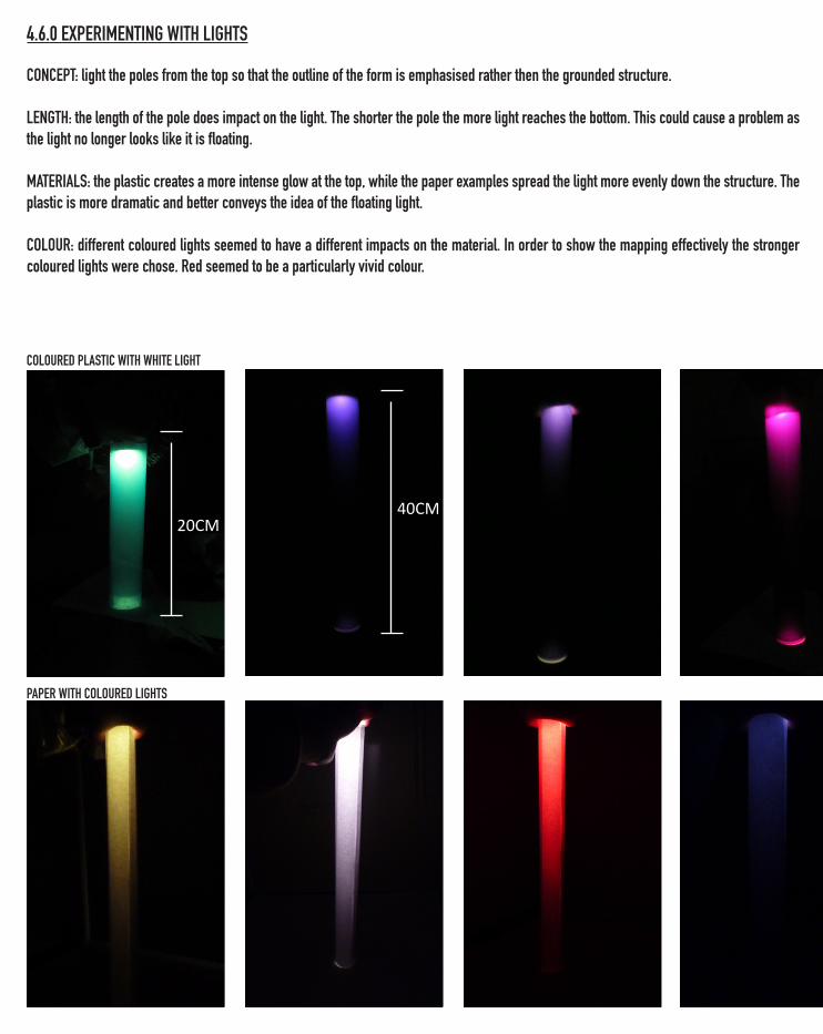
COLOURED PLASTIC WITH WHITE LIGHT
PAPER WITH COLOURED LIGHTS
20CM40CM
CONCEPT: light the poles from the top so that the outline of the form is emphasised rather then the grounded structure.
LENGTH: the length of the pole does impact on the light. The shorter the pole the more light reaches the bottom. This could cause a problem as the light no longer looks like it is floating.
MATERIALS: the plastic creates a more intense glow at the top, while the paper examples spread the light more evenly down the structure. The plastic is more dramatic and better conveys the idea of the floating light.
COLOUR: different coloured lights seemed to have a different impacts on the material. In order to show the mapping effectively the stronger coloured lights were chose. Red seemed to be a particularly vivid colour.
4.6.0 EXPERIMENTING WITH LIGHTS
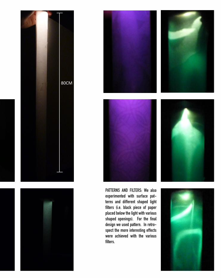
80CM
PATTERNS AND FILTERS: We also experimented with surface pat-terns and different shaped light filters (i.e. black piece of paper placed below the light with various shaped openings). For the final design we used pattern. In retro-spect the more interesting effects were achieved with the various filters.
>>>
>>>
>>>
>>>
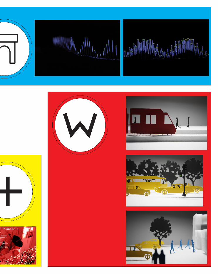
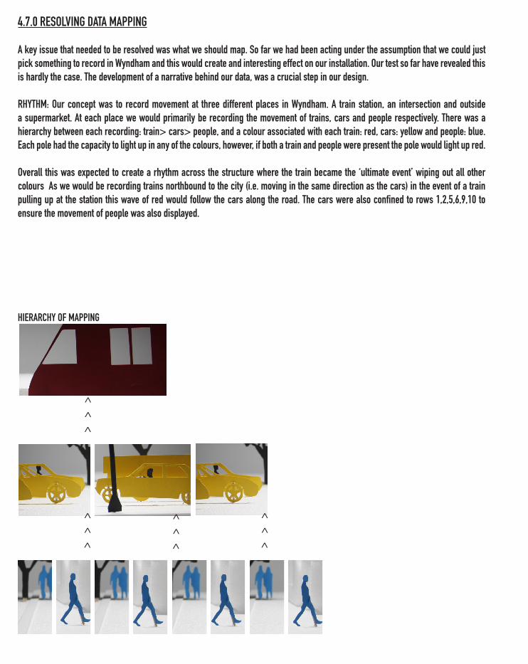
4.7.0 RESOLVING DATA MAPPING
A key issue that needed to be resolved was what we should map. So far we had been acting under the assumption that we could just pick something to record in Wyndham and this would create and interesting effect on our installation. Our test so far have revealed this is hardly the case. The development of a narrative behind our data, was a crucial step in our design.
RHYTHM: Our concept was to record movement at three different places in Wyndham. A train station, an intersection and outside a supermarket. At each place we would primarily be recording the movement of trains, cars and people respectively. There was a hierarchy between each recording: train> cars> people, and a colour associated with each train: red, cars: yellow and people: blue. Each pole had the capacity to light up in any of the colours, however, if both a train and people were present the pole would light up red.
Overall this was expected to create a rhythm across the structure where the train became the ‘ultimate event’ wiping out all other colours As we would be recording trains northbound to the city (i.e. moving in the same direction as the cars) in the event of a train pulling up at the station this wave of red would follow the cars along the road. The cars were also confined to rows 1,2,5,6,9,10 to ensure the movement of people was also displayed.
HIERARCHY OF MAPPING
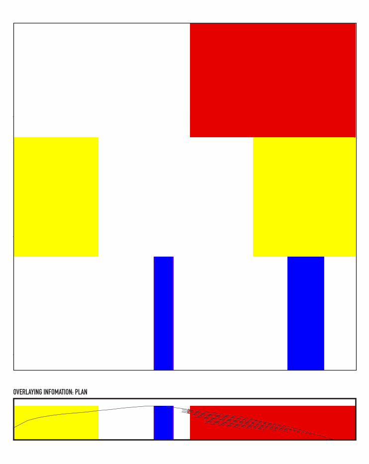
OVERLAYING INFOMATION: PLAN
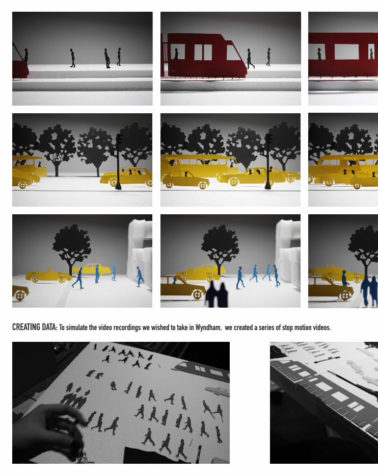
CREATING DATA: To simulate the video recordings we wished to take in Wyndham, we created a series of stop motion videos.
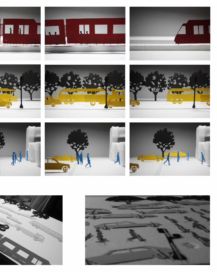
CREATING DATA: To simulate the video recordings we wished to take in Wyndham, we created a series of stop motion videos.

5.0 FINAL PROJECT
This section records the decisions involved in making the models for the final presentation.
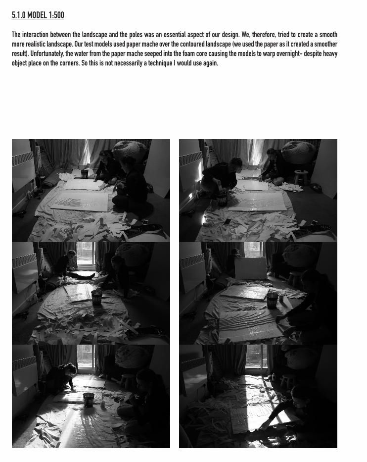
5.1.0 MODEL 1:500
The interaction between the landscape and the poles was an essential aspect of our design. We, therefore, tried to create a smooth more realistic landscape. Our test models used paper mache over the contoured landscape (we used the paper as it created a smoother result). Unfortunately, the water from the paper mache seeped into the foam core causing the models to warp overnight- despite heavy object place on the corners. So this is not necessarily a technique I would use again.
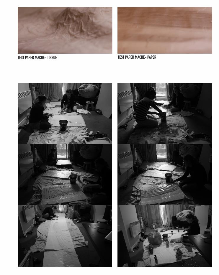
TEST PAPER MACHE- PAPERTEST PAPER MACHE- TISSUE
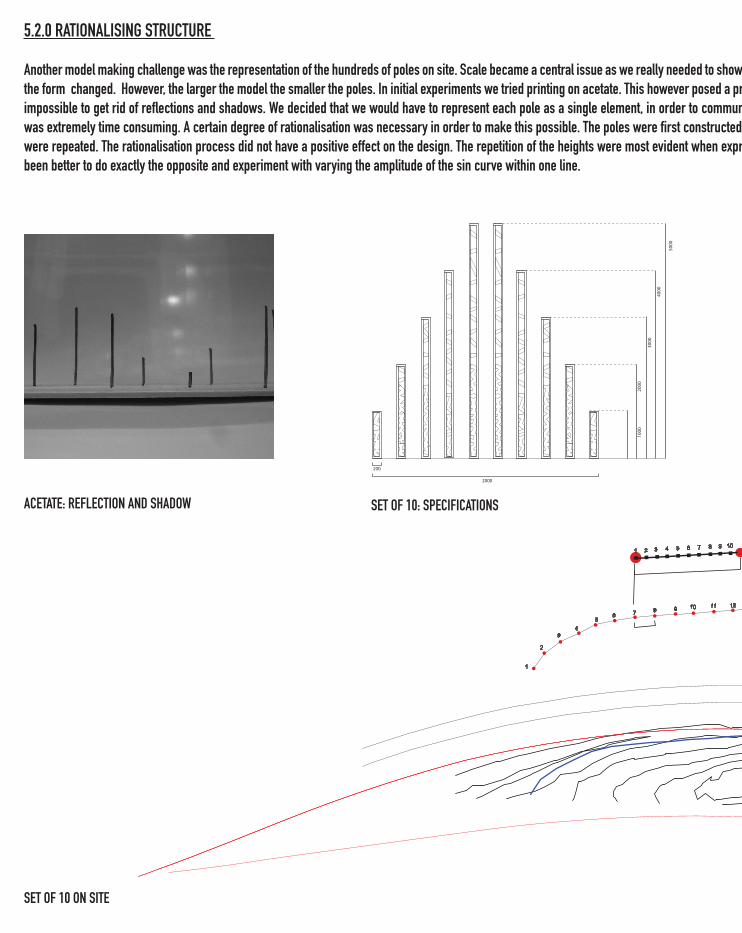
5.2.0 RATIONALISING STRUCTURE
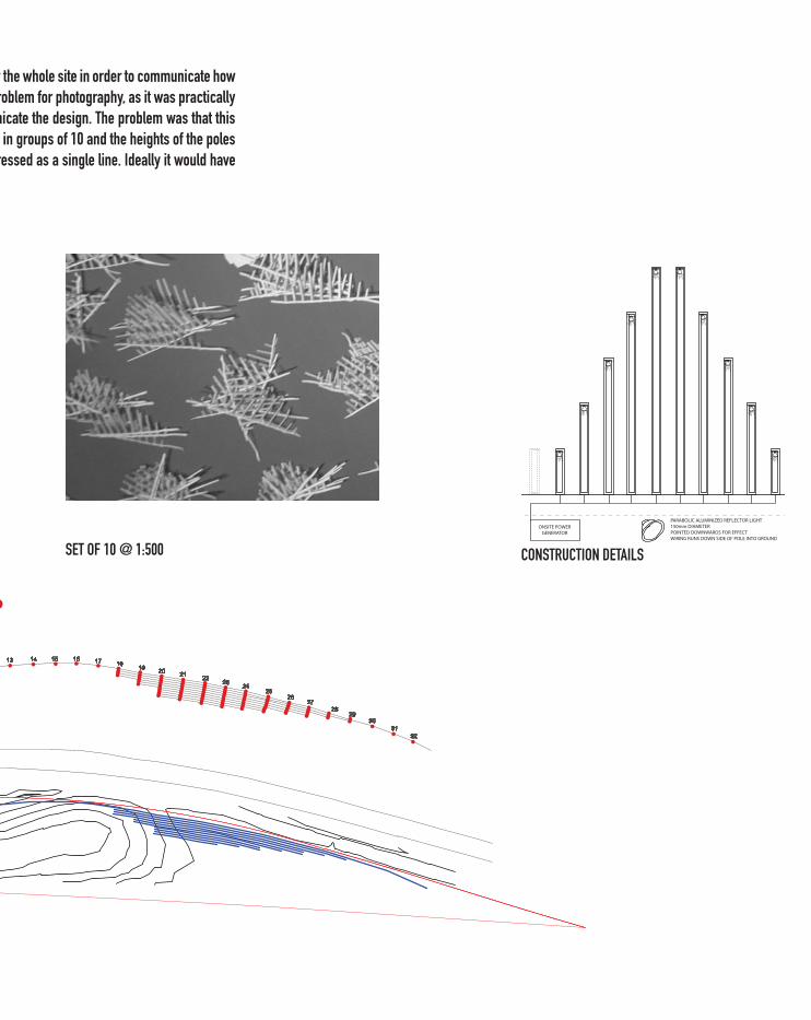
Another model making challenge was the representation of the hundreds of poles on site. Scale became a central issue as we really needed to show the whole site in order to communicate how the form changed. However, the larger the model the smaller the poles. In initial experiments we tried printing on acetate. This however posed a problem for photography, as it was practically impossible to get rid of reflections and shadows. We decided that we would have to represent each pole as a single element, in order to communicate the design. The problem was that this was extremely time consuming. A certain degree of rationalisation was necessary in order to make this possible. The poles were first constructed in groups of 10 and the heights of the poles were repeated. The rationalisation process did not have a positive effect on the design. The repetition of the heights were most evident when expressed as a single line. Ideally it would have been better to do exactly the opposite and experiment with varying the amplitude of the sin curve within one line.
ACETATE: REFLECTION AND SHADOW
5000
4000
3000
2000
1000
2000
200
SET OF 10: SPECIFICATIONS
SET OF 10 ON SITE
5.2.0 RATIONALISING STRUCTURE
Another model making challenge was the representation of the hundreds of poles on site. Scale became a central issue as we really needed to show the whole site in order to communicate how the form changed. However, the larger the model the smaller the poles. In initial experiments we tried printing on acetate. This however posed a problem for photography, as it was practically impossible to get rid of reflections and shadows. We decided that we would have to represent each pole as a single element, in order to communicate the design. The problem was that this was extremely time consuming. A certain degree of rationalisation was necessary in order to make this possible. The poles were first constructed in groups of 10 and the heights of the poles were repeated. The rationalisation process did not have a positive effect on the design. The repetition of the heights were most evident when expressed as a single line. Ideally it would have been better to do exactly the opposite and experiment with varying the amplitude of the sin curve within one line.
ONSITE POWERGENERATOR
PARABOLIC ALUMINIZED REFLECTOR LIGHT150mm DIAMETER POINTED DOWNWARDS FOR EFFECTWIRING RUNS DOWN SIDE OF POLE INTO GROUND
CONSTRUCTION DETAILSSET OF 10 @ 1:500
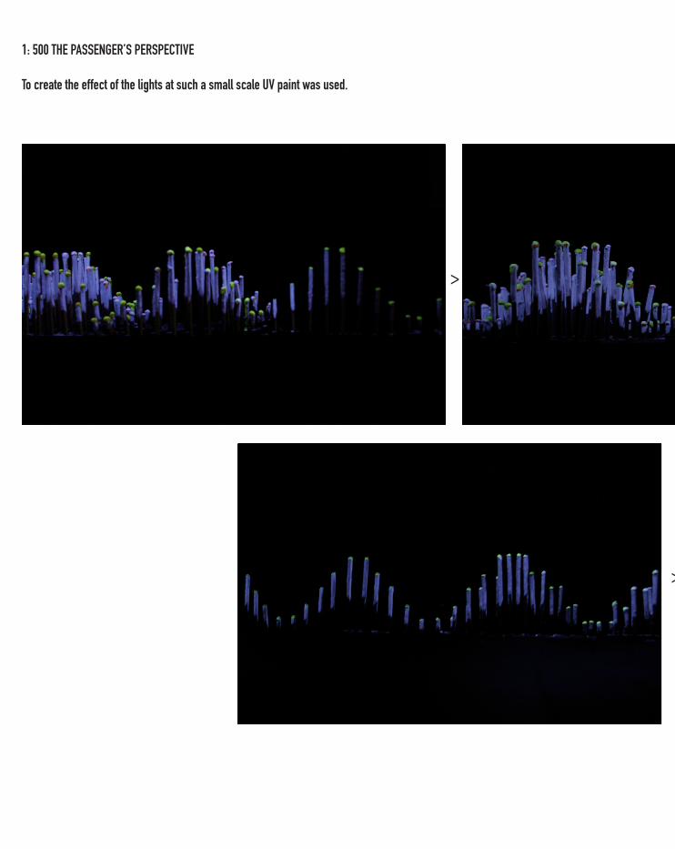
1: 500 THE PASSENGER’S PERSPECTIVE
To create the effect of the lights at such a small scale UV paint was used.
>
>
1: 500 THE PASSENGER’S PERSPECTIVE
To create the effect of the lights at such a small scale UV paint was used.
>
>
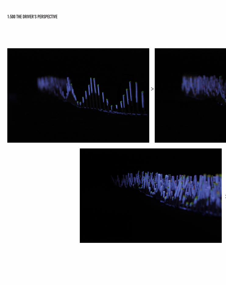
1:500 THE DRIVER’S PERSPECTIVE
>
>
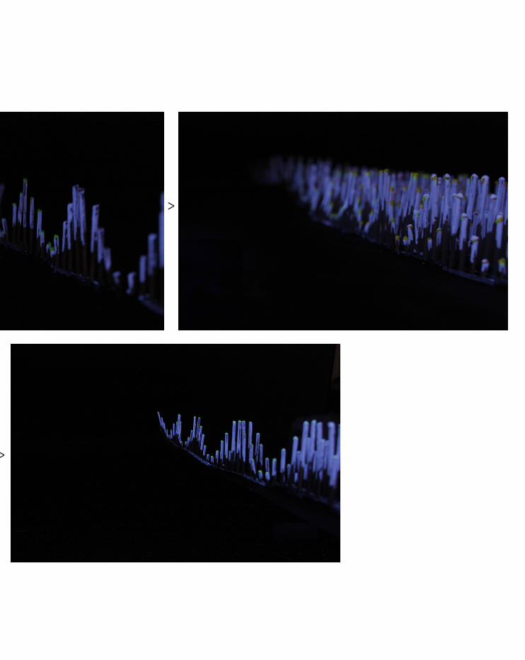
1:500 THE DRIVER’S PERSPECTIVE
>
>
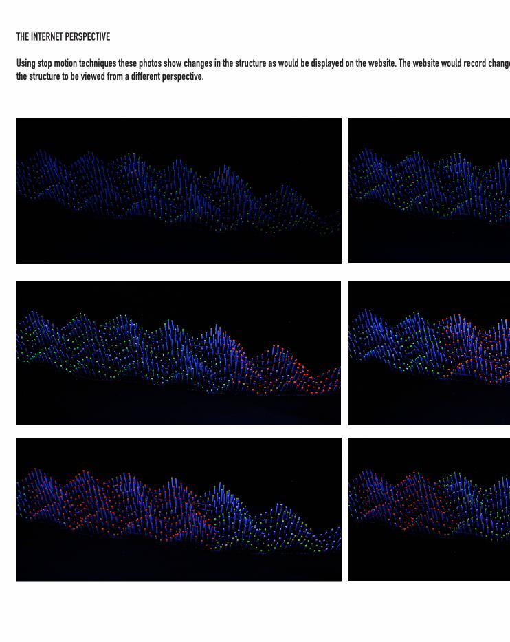
THE INTERNET PERSPECTIVE
Using stop motion techniques these photos show changes in the structure as would be displayed on the website. The website would record changes in the structure from above thus allowing the structure to be viewed from a different perspective.
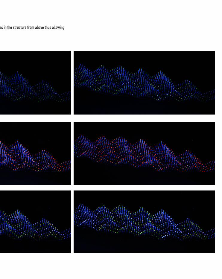
THE INTERNET PERSPECTIVE
Using stop motion techniques these photos show changes in the structure as would be displayed on the website. The website would record changes in the structure from above thus allowing the structure to be viewed from a different perspective.
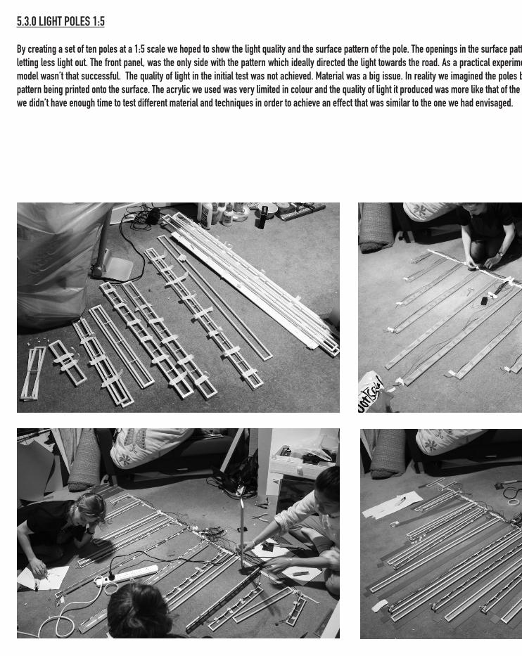
5.3.0 LIGHT POLES 1:5
By creating a set of ten poles at a 1:5 scale we hoped to show the light quality and the surface pattern of the pole. The openings in the surface pattern got smaller as they went down the pole letting less light out. The front panel, was the only side with the pattern which ideally directed the light towards the road. As a practical experiment this was useful, however, ultimately this model wasn’t that successful. The quality of light in the initial test was not achieved. Material was a big issue. In reality we imagined the poles being made out of moulded acrylic, with the pattern being printed onto the surface. The acrylic we used was very limited in colour and the quality of light it produced was more like that of the paper tests rather then the plastic. In reality we didn’t have enough time to test different material and techniques in order to achieve an effect that was similar to the one we had envisaged.
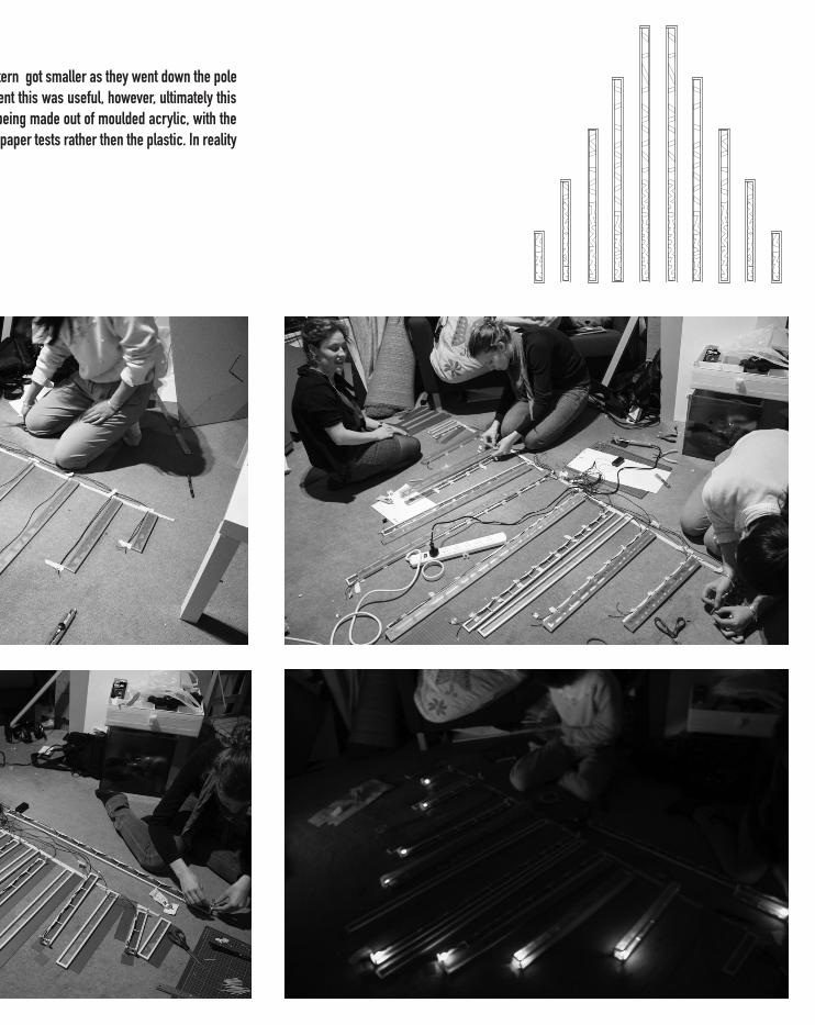
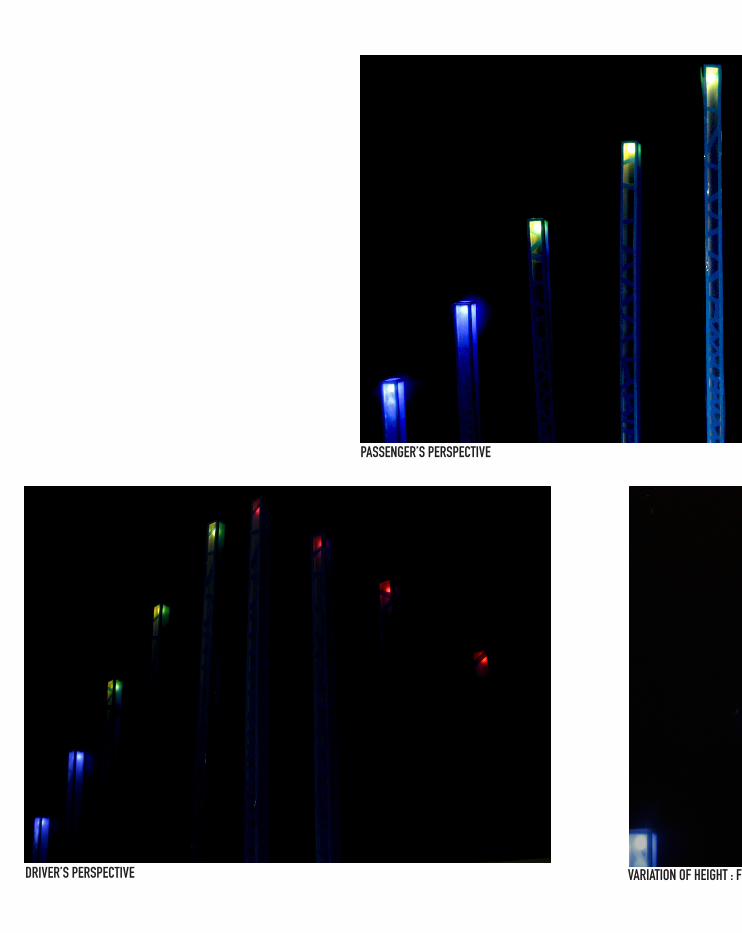
PASSENGER’S PERSPECTIVE
DRIVER’S PERSPECTIVE VARIATION OF HEIGHT : FROM THE VEHICLE EYE LEVEL
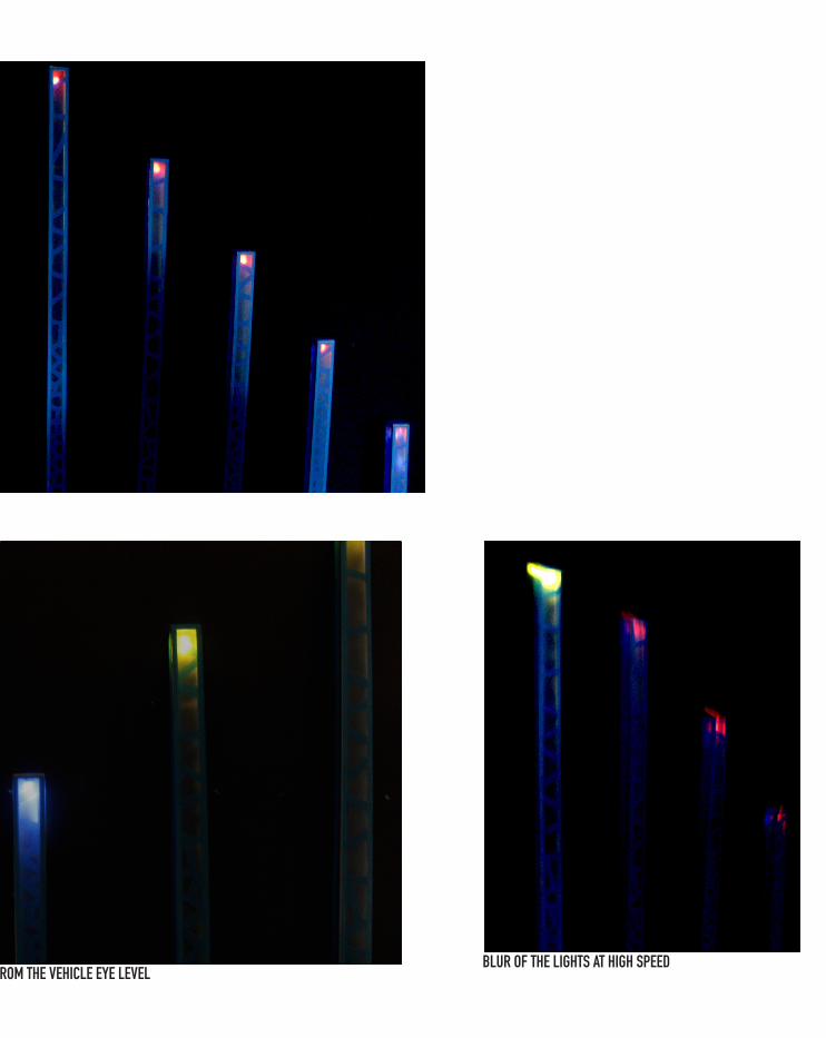
BLUR OF THE LIGHTS AT HIGH SPEEDVARIATION OF HEIGHT : FROM THE VEHICLE EYE LEVEL
PART III. LEARNING OBJECTIVE AND OUTCOMES
PERSONAL BACKGROUD AND LEARNING OBJECTIVES I had no previous experience in Grasshopper and a limited exposure to concepts of digital design. As such my first objective was to understand the basic principals behind digital design and acquire some basic skills. I was also keen to explore a range of techniques in order to workout if their were any areas I would be keen to develop after the course.
LEARNING PROCESSWhile we were able to test most of the goals set out in the EOI, I feel that each task was performed quite superficially. This obviously has to do will time limitations, as well as this, we probably should have been more selective about what areas to investigate. Some of the critical aspects of our design were not that well suited to the structure of the course meaning that while we experimented a lot outside the course, we really missed the opportunity to test digital fabrication techniques.
I found that it was quite easy to engage with projects using digital design. It was, however, also easy to use digital technologies in a rather thoughtless way- which may initially produce an appealing effect but really the outcome was quite limited. I think this was in part due to a misconception that the computer will ‘do it for you’ as discussed in 4.6.0 (RESOLVING DATA MAPPING). We spent quite a bit of time trying to find the right data to use (see 3.2.0 DIGITAL EXPLORATION), when we probably should have spent this time thinking about how this data was meant to enhance the structure and how it could be effectively expressed.
Concerns for whether we would be able to produce something was sometimes considered to early in the design process curtailing creativity. Iteration One (see 4.2.0 DESIGN ITERATION: ONE), for instance, steamed for a desire to create something that we knew we could achieve. The translation of the design into a physical model proved a challenge. Despite our efforts we weren’t really able to find an effective technique (see section 5.1 MODEL 1:500) and even digital fabrication didn’t offer us any real solutions. I think we were also unclear at certain points about whether we had to prove that we could do something or if we could simply say that it would be done (e.g. did we need to design a website, or just say that it would be done -maybe producing an image that showed the proposed interface).
LEARNING OUTCOMESEssentially I achieved my learning outcomes. This can be seen in the journal, rather then the final project. I have developed technical skills in grasshopper both through the weekly tasks and the design project. I also have a greater understanding of other programs and plugin that are available. The process of doing has definitely taught me a lot including skills unrelated to digital design: e.g. how to produce a stop motion.
RESPONSE TO CRITThe main response at the crit, (apart from representation issues discussed above) was an ambience to the commercial aspect of our idea. While I understand the fear that commercialism will ‘dumb down’ a project rather then offer critical discourse, I believe that architectures should be interested in this area. Projects such as the Sagmeister logo for the Casa da Musica (see 1.2.2A) demonstrate more creative solutions to commercial ventures. Moreover, OMA’s counterpart AMO which has done numerous projects investigating visual identity (for example the ‘Barcode’ for the European Union) demonstrates that architectural practice is engaging with these ideas. Personally, I think that by engaging with ideas such as visual identity commercial projects will be improved and secondly it ensures architecture remains connected to broader discussions and a broader cross section of the community. This is particularly important as rarely do architects themselves have much control over which projects actually get built.
FUTURE WORK
I found the studio engaging, as such there are various aspects I would like to investigate further. In particular I found that it was very hard to express parametric relations in 3dimentional forms- the final design was essential a layering of lines. Mapping is anther area I would like to push while digital fabrication is any area I would like to start investigating. I imagine that skills and ideas discussed in this studio will be useful in a broader sense hopefully to encourage more criticality design development and providing new techniques with which to explore and represent future projects.
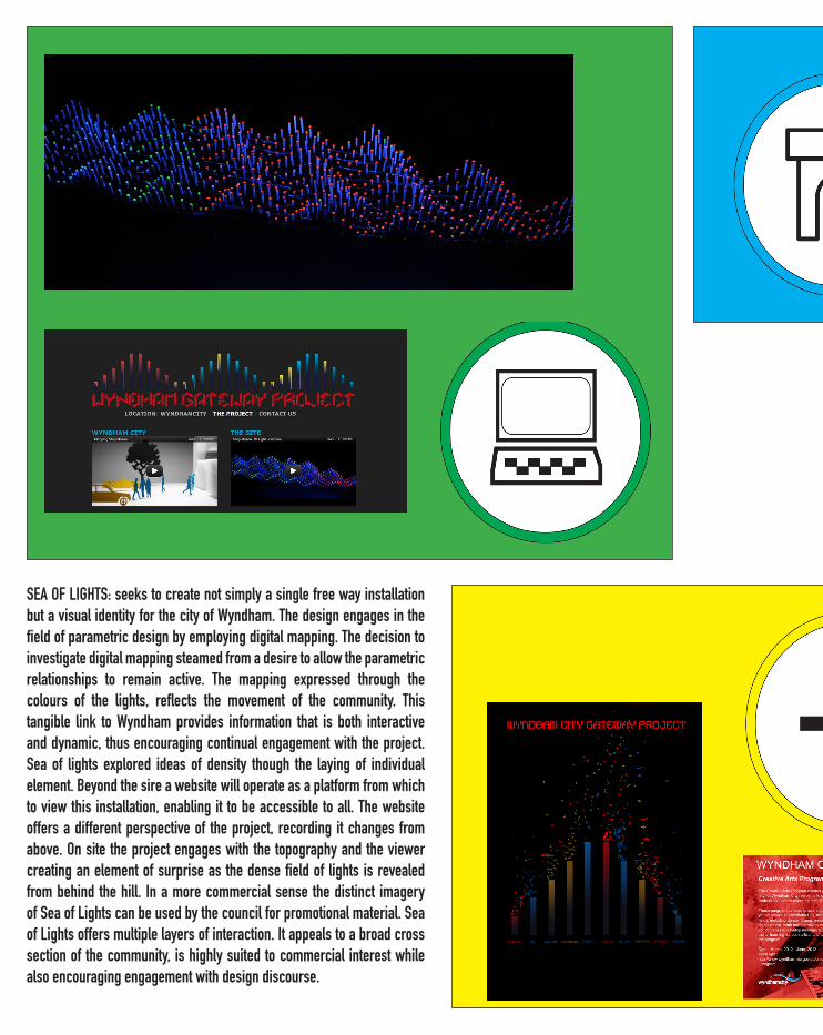
SEA OF LIGHTS: seeks to create not simply a single free way installation but a visual identity for the city of Wyndham. The design engages in the field of parametric design by employing digital mapping. The decision to investigate digital mapping steamed from a desire to allow the parametric relationships to remain active. The mapping expressed through the colours of the lights, reflects the movement of the community. This tangible link to Wyndham provides information that is both interactive and dynamic, thus encouraging continual engagement with the project. Sea of lights explored ideas of density though the laying of individual element. Beyond the sire a website will operate as a platform from which to view this installation, enabling it to be accessible to all. The website offers a different perspective of the project, recording it changes from above. On site the project engages with the topography and the viewer creating an element of surprise as the dense field of lights is revealed from behind the hill. In a more commercial sense the distinct imagery of Sea of Lights can be used by the council for promotional material. Sea of Lights offers multiple layers of interaction. It appeals to a broad cross section of the community, is highly suited to commercial interest while also encouraging engagement with design discourse.