Embed Size (px)
DESCRIPTION
Claire Balderston, Belle Wuthrich and Brian Tong's eBook process book.
Citation preview
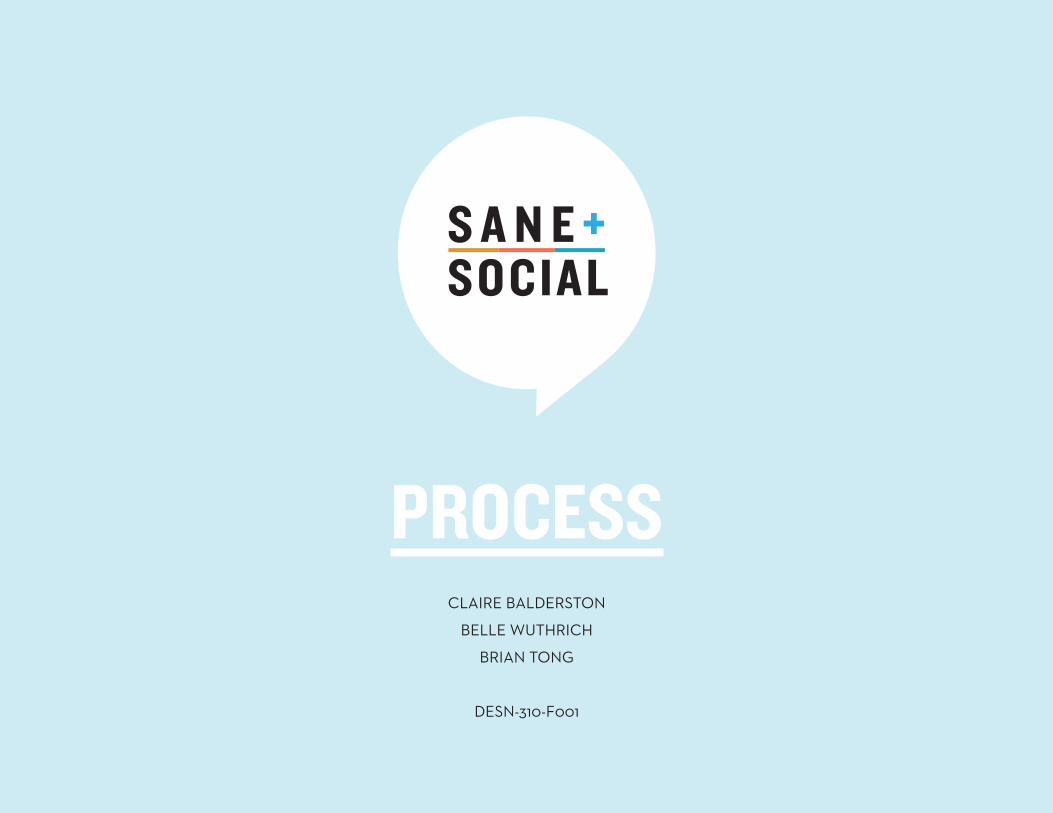
CLAIRE BALDERSTON
BELLE WUTHRICH
BRIAN TONG
DESN-310-F001
PROCESS
CONTENTS1 Brief
2 Context
3 Visual Research
4 Exploration
5 Refinement + Development
6 Final Solution
7 Reflection
THE BRIEFUsing the text provided by Alexandra Samuel, we were to create an iPad applica-
tion that successfully delivers the content of Sane + Social, while still reflecting the
character of her writing style. We were to push the boundaries of what an ebook
can be and were to imagine this application for future generations of iPad technol-
ogy. Through this application, users will learn how to navigate and be comfortable
with the numerous popular social networking programs.
This project is designed for the iPad, which is an extremely functional tool for
those who are new to computers. Being a happy medium between the computer
and the iPhone, the iPad is popular amongst the Baby Boomer generation, who are
predominantly in their 40’s and 50’s. The majority of that population are financially
well-off, therefore able to afford gadgets like the iPad. Through this new technolo-
gy, these older consumers are being introduced and connected to the online social
network.
After selecting the target audience, we wanted to direct this project toward people
who are new to social media, while remaining accessible to people who are more
familiar with the various networks.
A resource that helped us in determining our target audience was
www.apps4boomers.com. Dick Stroud, creator of this website, also runs the com-
pany 20plus30, which is a consultancy that advises companies about all aspects of
marketing the 50-plus. This helped us determine what features were popular and
we tailored our design accordingly.
CONTEXT
CONTEXTOur goals:
• Gender neutral
• Easy to follow/understand
• Intuitive interface
• Nonlinear format
• Multiple user oriented
With our target demographic in mind, we aimed to create a simple interface where
every element had a specific purpose. We aimed to steer clear of anything gim-
micky, but still wanted to create something that was attractive and used the capa-
bilities of an iPad to its advantage.
We used a gender-neutral color palette that would be appealing for people of all
ages. We also generated a system of organizing information that would be just as
easy for a new user to use than it was an experienced user.
CONTEXTOur design, in context with other eBooks, is unique. eBooks designed for the iPad
have the capability to be nonlinear, yet most are linear. With this observation we
aimed to create an interface that allows the user to move around within the space,
giving them a greater sense of control.
The material that we were given to work with was a linear word document, which
made it difficult for us to visualize how it could be arranged in a nonlinear format.
We printed the file and rearranged the text into new categories. This led to the
creation of our funnelling system which allowed the user to choose the amount of
information viewed. However, users still have the option of reading the content in a
linear format in the side bar.
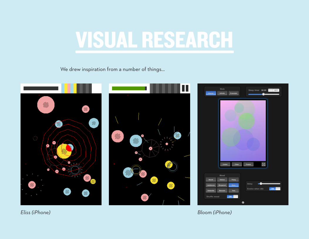
VISUAL RESEARCHWe drew inspiration from a number of things…
VISUAL RESEARCH
Eliss (iPhone) Bloom (iPhone)
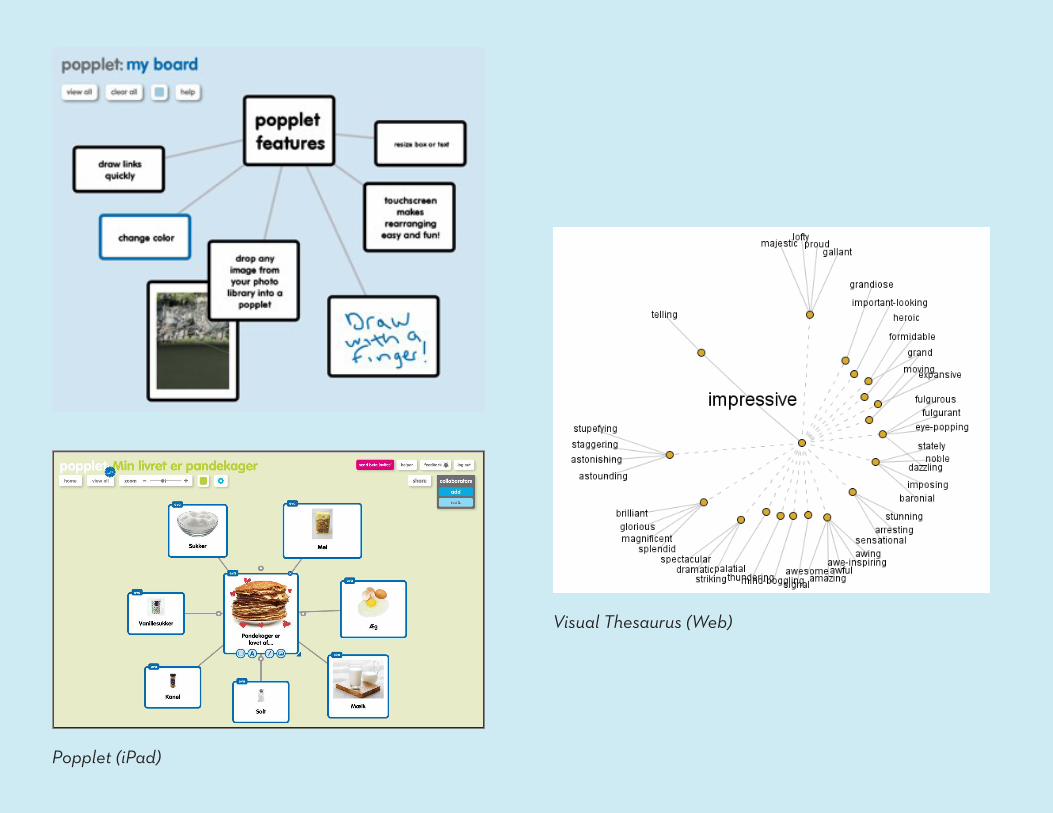
Popplet (iPad)
Visual Thesaurus (Web)
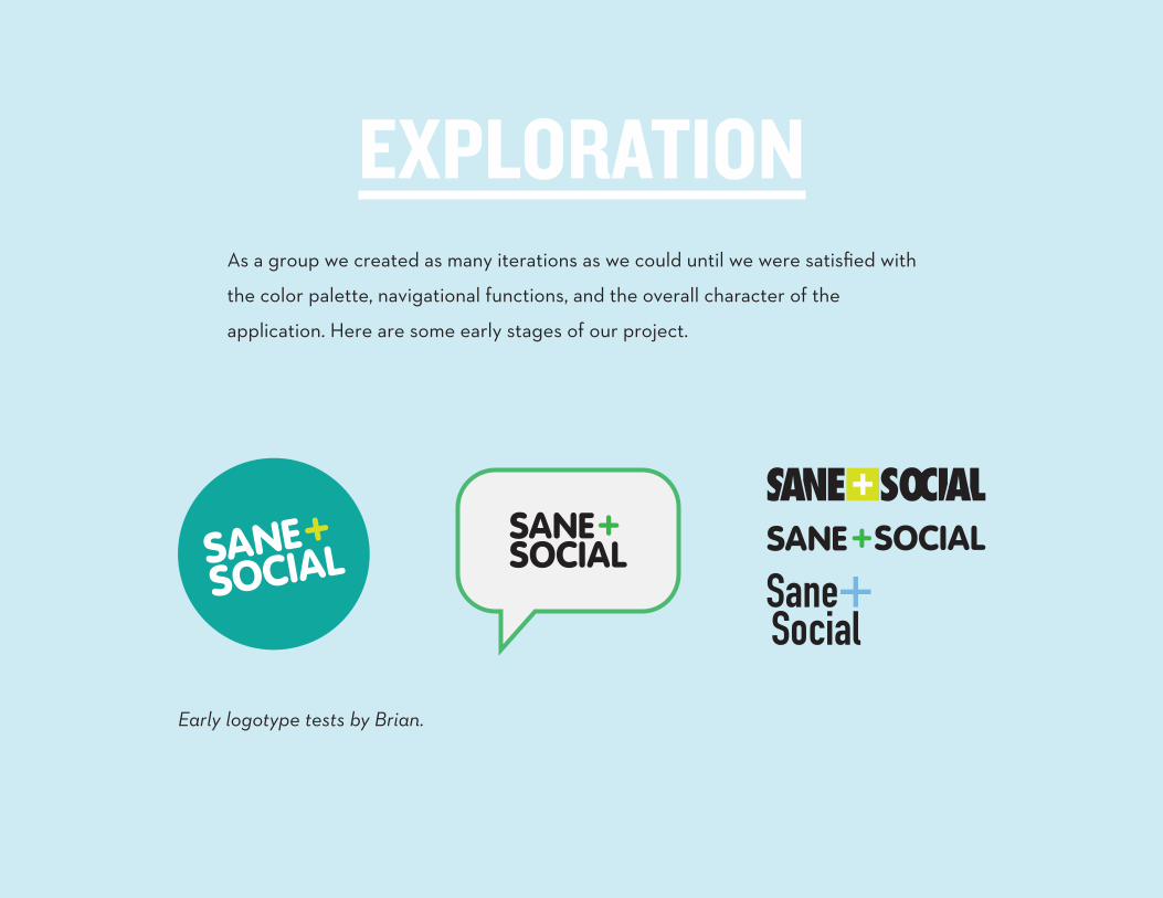
EXPLORATIONAs a group we created as many iterations as we could until we were satisfied with
the color palette, navigational functions, and the overall character of the
application. Here are some early stages of our project.
Early logotype tests by Brian.
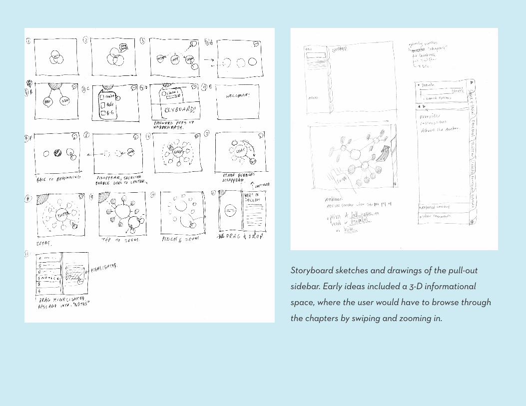
Storyboard sketches and drawings of the pull-out
sidebar. Early ideas included a 3-D informational
space, where the user would have to browse through
the chapters by swiping and zooming in.
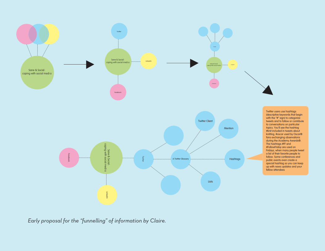
Early proposal for the “funnelling” of information by Claire.
Sane & Social:coping with social medi a
Sane & Social :coping with social medi a
Sane & Social :coping with social medi a
Twitter Client
Mention
Sane & Social:
coping with social m
edia
Twitte
r
A Twitter Glossary Hashtags
Lists
Twitter users use hashtags (descriptive keywords that begin with the “#” sign) to categorize tweets and to follow or contribute to conversations on particulartopics. You’ll see the hashtag #knit included in tweets about knitting, #oscar used by Oscar®fans exchanging observations during the Academy Awards®. The hashtags #FF and #FollowFriday are used on Fridays, when many people tweet a list of their favorite people to follow. Some conferences and public events even create a special hashtag so you can keep up with news updates and your fellow attendees
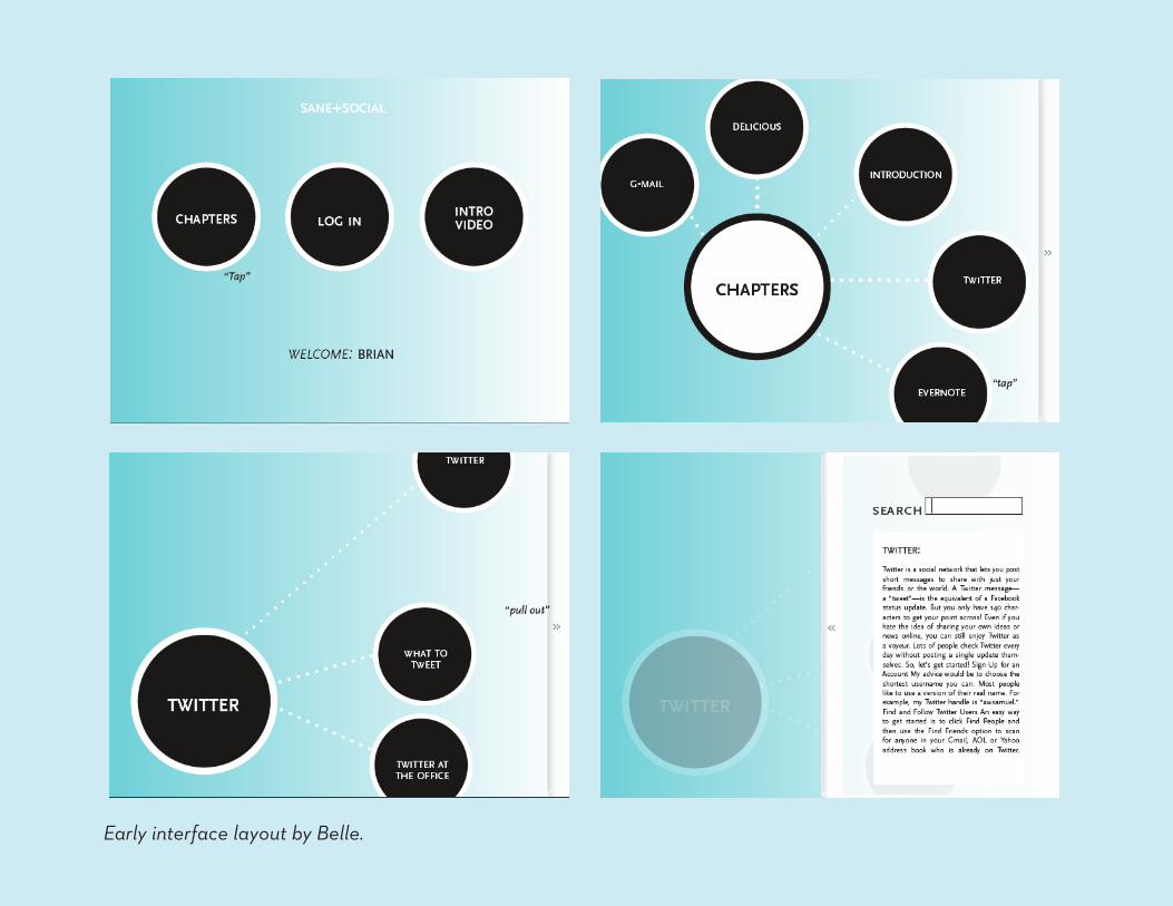
Early interface layout by Belle.
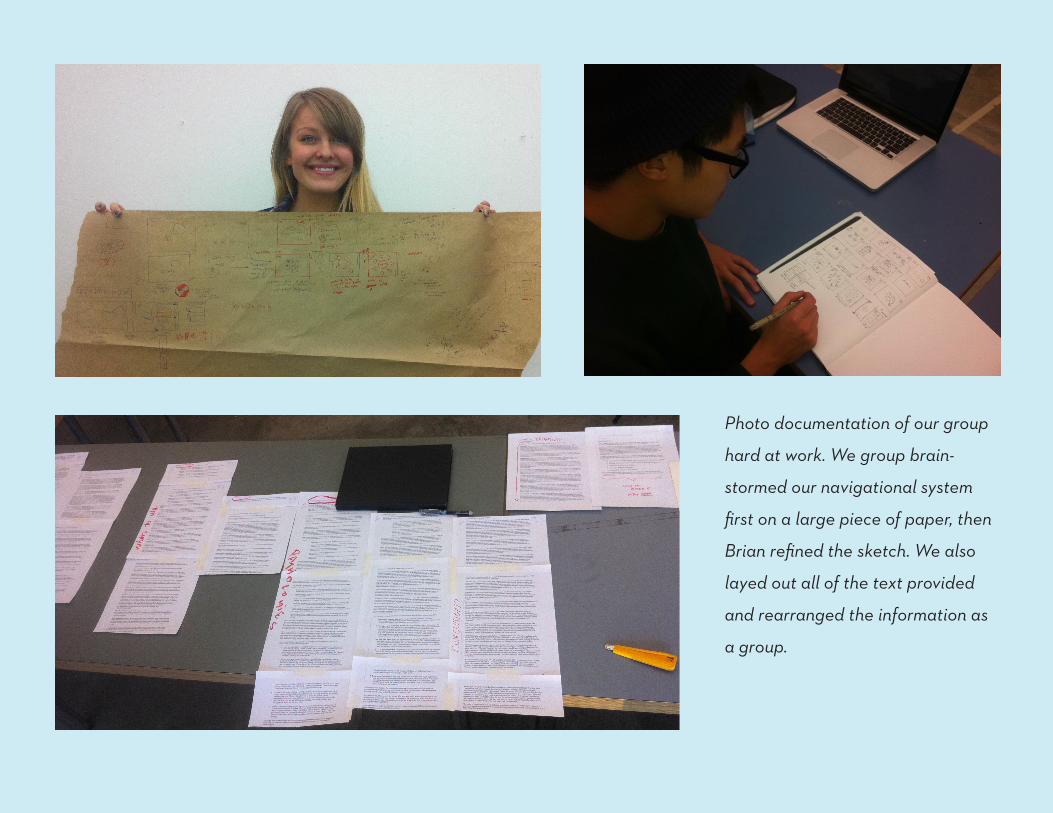
Photo documentation of our group
hard at work. We group brain-
stormed our navigational system
first on a large piece of paper, then
Brian refined the sketch. We also
layed out all of the text provided
and rearranged the information as
a group.
REFINEMENT+DEVELOPMENTCreating a maquette helped us visualise how the various steps might be organ-
ized. It allowed us to physically engage with and rearrange the components of the
interface. Being able to move things around made it easier to imagine how the app
would function and be the most intuitive. It also aided in determining the scale of
the visual components in relation to the iPad.
Through this maquette, we considered what sort color palette would be appropri-
ate. We also realized that circles were the most successful shape, as they were
fluid, unintimidating and fit well with the idea of a social circle. The circles also
reflected the friendly nature of Alex’s writing style.
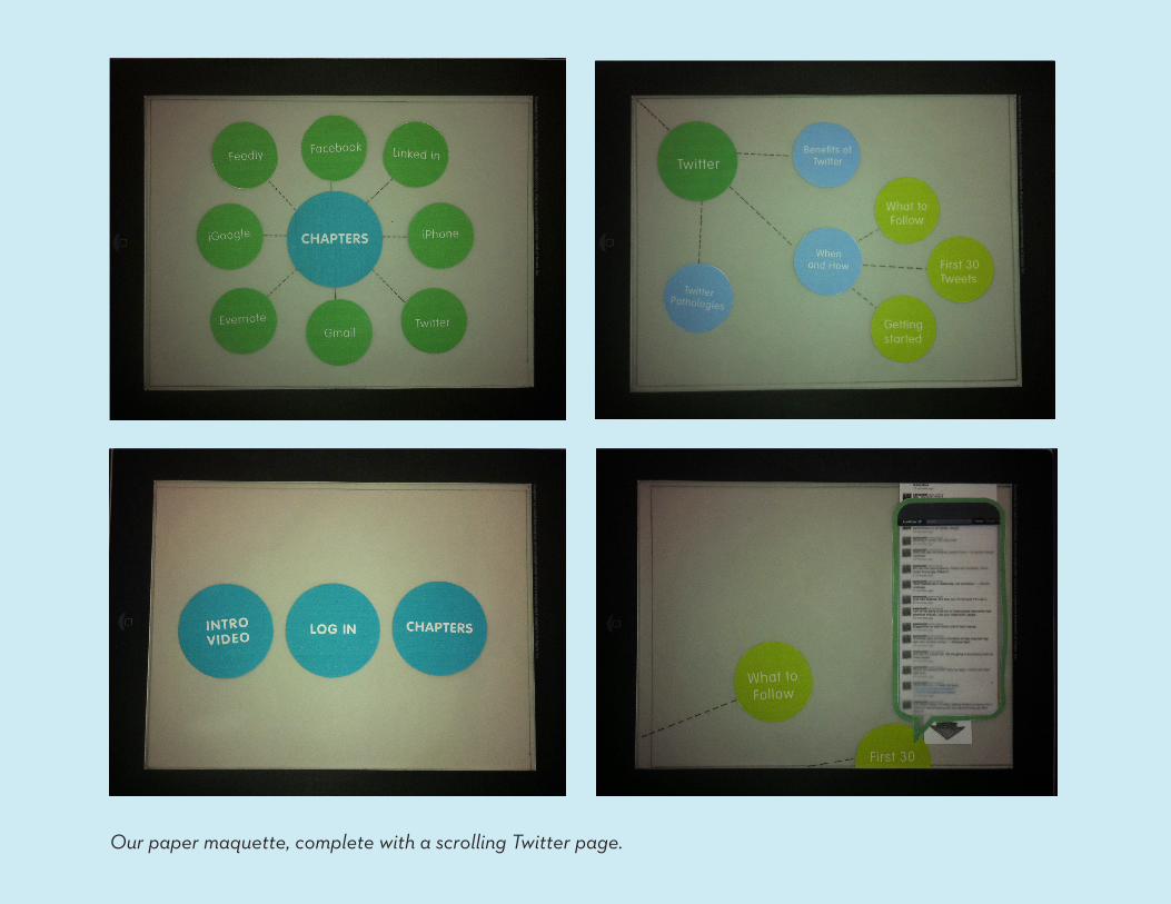
Our paper maquette, complete with a scrolling Twitter page.
FINAL SOLUTIONOur final outcome is a simple interface that allows the user to freely navigate a
nonlinear ebook. The navigation is intuitive, but we included the option of a back,
forward and home button if the user loses his way within the app.
The user also has options of three modes of reading. The user can preview a pas-
sage by pinch-and-expand into a circle. To read a quick summary of it, the user
can pinch-and-expand further into the circle. If the user would like to read the full
passage, the user simply drags the circle and drops it into the sidebar. The sidebar
would then pop out, revealing the whole passage in a linear format.
We also integrated an aspect of social media within the app by creating a “friend
web”. This is a visual map of Sane + Social readers with whom the user is friends
with on their various social networks. Here, the user can share their notes, read
their friends’ notes on certain passages, and develop an online community of
Sane + Social readers.
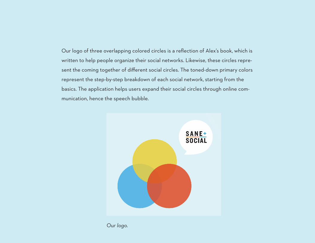
Our logo.
Our logo of three overlapping colored circles is a reflection of Alex’s book, which is
written to help people organize their social networks. Likewise, these circles repre-
sent the coming together of different social circles. The toned-down primary colors
represent the step-by-step breakdown of each social network, starting from the
basics. The application helps users expand their social circles through online com-
munication, hence the speech bubble.
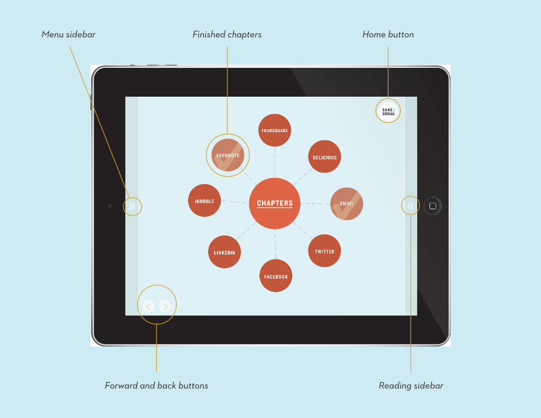
Reading sidebarForward and back buttons
Home buttonFinished chaptersMenu sidebar
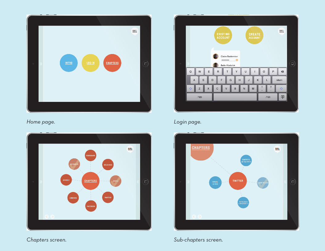
Home page.
Chapters screen.
Login page.
Sub-chapters screen.
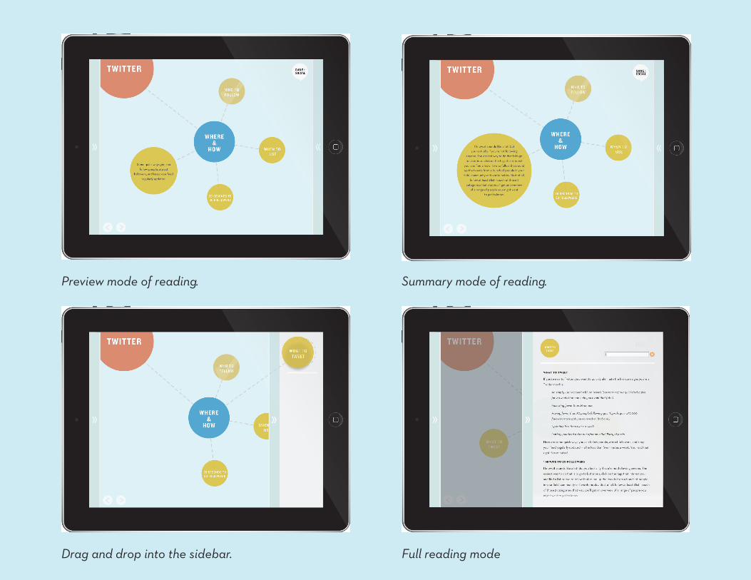
Preview mode of reading.
Full reading modeDrag and drop into the sidebar.
Summary mode of reading.
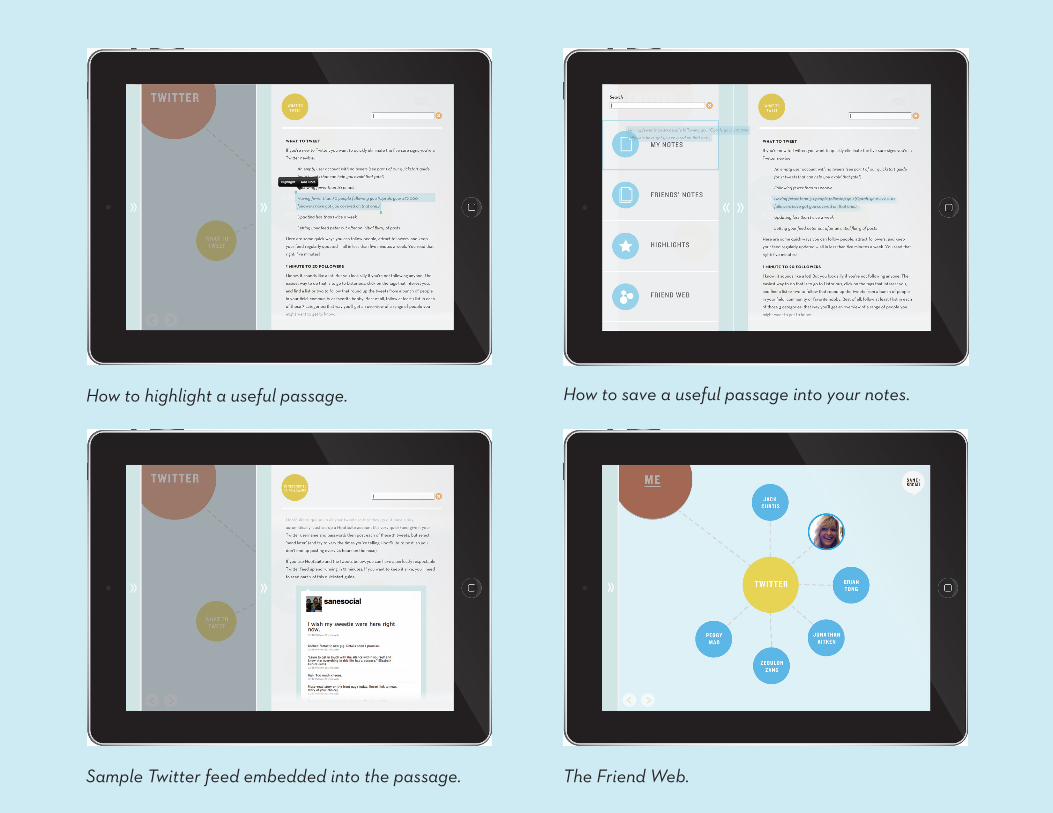
Sample Twitter feed embedded into the passage.
How to save a useful passage into your notes.
The Friend Web.
How to highlight a useful passage.
REFLECTIONThough this collaboration feels more rushed than the Mustang project, we are
satisfied with our final outcome. After breaking down Alex’s book, we feel as if we
captured the essence of her writing and made it accessible to a broad audience.
If given more time we would have liked to further develop certain aspects. The
friend web, for example, is interesting in concept but lacking in function. If we were
capable of programming the app there are many things that would be quite differ-
ent. For instance, user interaction would be further developed as it would be easier
to see how intuitive the program was.
We would have liked to animate our application in our final presentation, but were
unable to due to our lack of experience with Flash.