Embed Size (px)
Citation preview
Music Magazine Information
Henrietta Dent
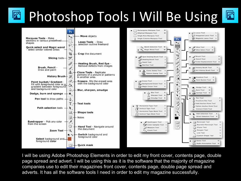
Photoshop Tools I Will Be Using
I will be using Adobe Photoshop Elements in order to edit my front cover, contents page, double page spread and advert. I will be using this as it is the software that the majority of magazine companies use to edit their magazines front cover, contents page, double page spread and adverts. It has all the software tools I need in order to edit my magazine successfully.
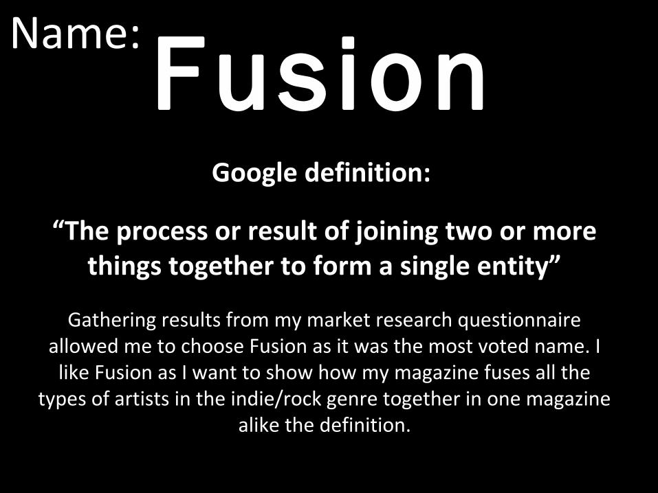
Name: Fusion
Google definition:
“The process or result of joining two or more things together to form a single entity”
Gathering results from my market research questionnaire allowed me to choose Fusion as it was the most voted name. I
like Fusion as I want to show how my magazine fuses all the types of artists in the indie/rock genre together in one magazine
alike the definition.
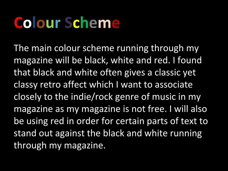
Colour SchemeThe main colour scheme running through my magazine will be black, white and red. I found that black and white often gives a classic yet classy retro affect which I want to associate closely to the indie/rock genre of music in my magazine as my magazine is not free. I will also be using red in order for certain parts of text to stand out against the black and white running through my magazine.
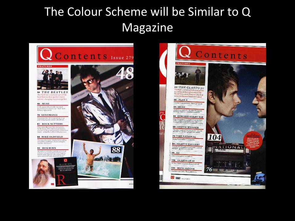
The Colour Scheme will be Similar to Q Magazine
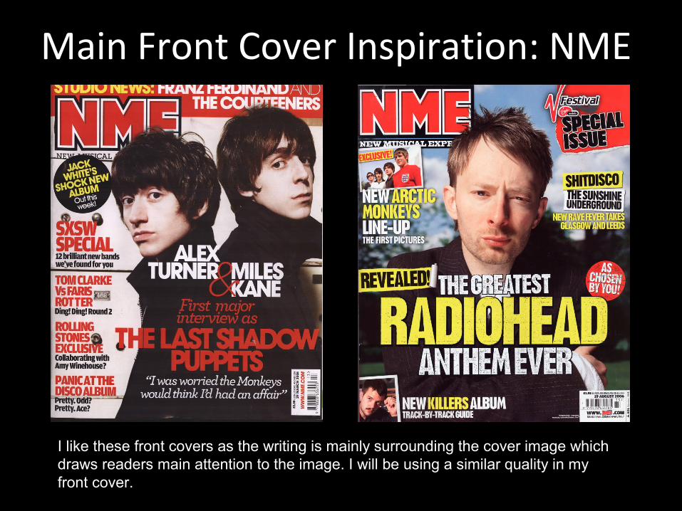
Main Front Cover Inspiration: NME
I like these front covers as the writing is mainly surrounding the cover image which draws readers main attention to the image. I will be using a similar quality in my front cover.
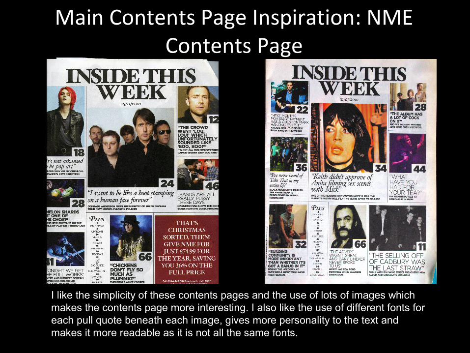
Main Contents Page Inspiration: NME Contents Page
I like the simplicity of these contents pages and the use of lots of images which makes the contents page more interesting. I also like the use of different fonts for each pull quote beneath each image, gives more personality to the text and makes it more readable as it is not all the same fonts.
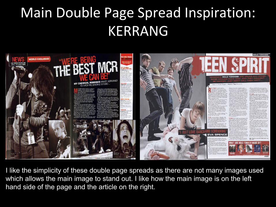
Main Double Page Spread Inspiration: KERRANG
I like the simplicity of these double page spreads as there are not many images used which allows the main image to stand out. I like how the main image is on the left hand side of the page and the article on the right.
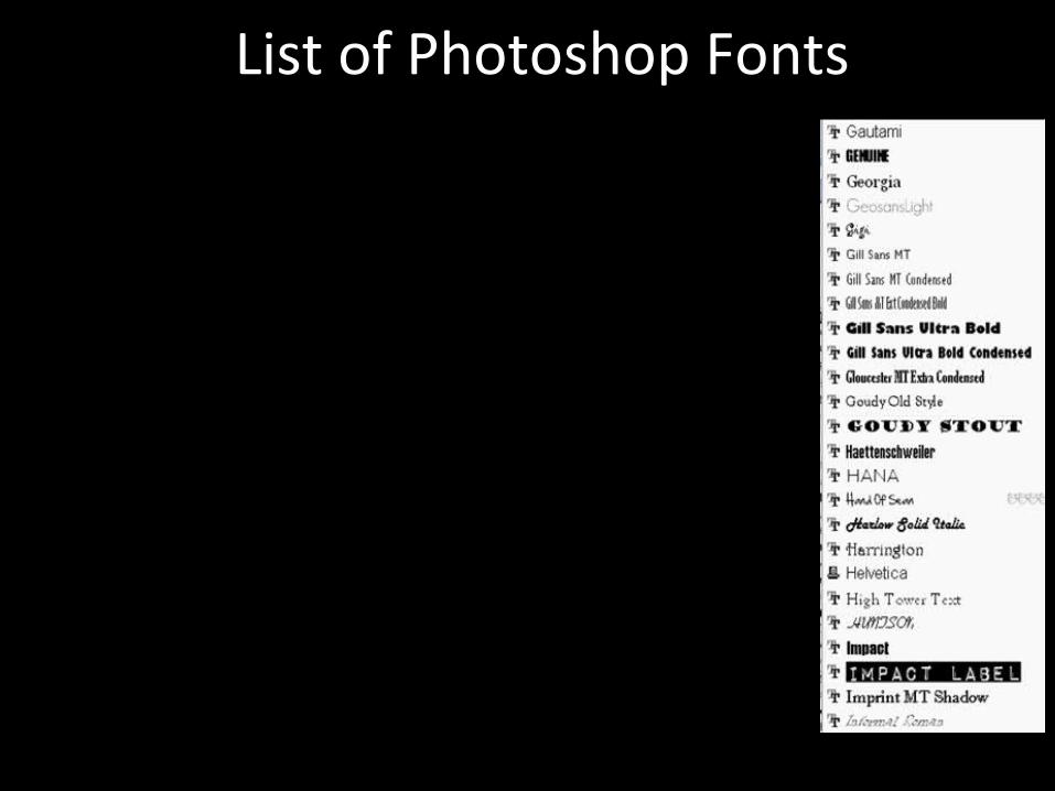
List of Photoshop Fonts
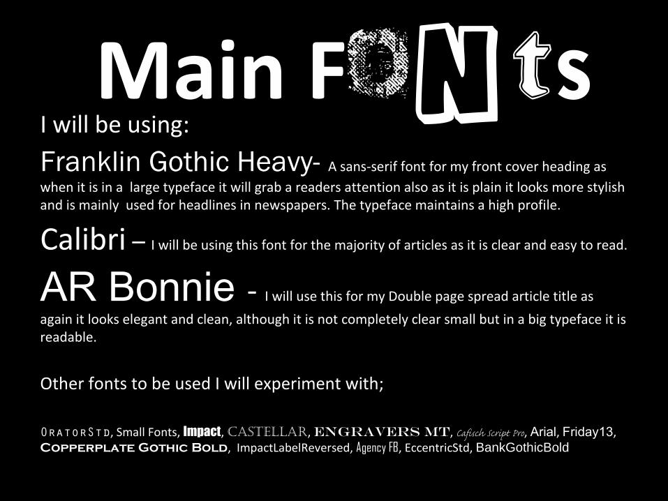
Main FontsI will be using:
Franklin Gothic Heavy- A sans-serif font for my front cover heading as when it is in a large typeface it will grab a readers attention also as it is plain it looks more stylish and is mainly used for headlines in newspapers. The typeface maintains a high profile.
Calibri – I will be using this font for the majority of articles as it is clear and easy to read.
AR Bonnie - I will use this for my Double page spread article title as
again it looks elegant and clean, although it is not completely clear small but in a big typeface it is readable.
Other fonts to be used I will experiment with;
OratorStd, Small Fonts, Impact, Castellar, Engravers Mt, Cafisch Script Pro, Arial, Friday13, Copperplate Gothic Bold, ImpactLabelReversed, Agency FB, EccentricStd, BankGothicBold