Embed Size (px)
Citation preview

18ECONOMICS AND THE ENVIRONMENT
HOW THE PRODUCTION AND DISTRIBUTION OF GOODS AND SERVICES AFFECTS THE FRAGILE BIOSPHERE OF OUR PLANET, AND HOW THE RESULTING ENVIRONMENTAL PROBLEMS CAN BE ADDRESSED• Production and distribution of goods and services unavoidably alter the biosphere• Climate change resulting from economic activity is a major threat to future human
wellbeing, and it illustrates many of the challenges of designing and implementing appropriate environmental policies
• Environmental policy should implement least-cost ways of abating environmental damages. In selecting the level of abatement it should balance the cost of reducing environmental damage against the opportunity costs of doing so
• Policies should be evaluated on the grounds of efficiency and fairness, taking account of the distribution of costs and benefits among different groups in a society, citizens of different countries, and people in future generations
• Some policies work by using taxes, subsidies or other policies to alter prices so that people internalise the external effects of their production and consumption decisions; other policies directly prohibit or limit the use of environmentally damaging materials and practices
• Environmental policies can act as a stimulus to “green” innovation• Social preferences may make the implementation of environmental policies easier if
economic actors (citizens, consumers and owners of firms) place a positive value on the environment, and on the wellbeing of others—including future generations
Beta February 2016 version
See www.core-econ.org for the full interactive version of The Economy by The CORE Project. Guide yourself through key concepts with clickable figures, test your understanding with multiple choice
questions, look up key terms in the glossary, read full mathematical derivations in the Leibniz supplements, watch economists explain their work in Economists in Action – and much more.

coreecon | Curriculum Open-access Resources in Economics 2
In 1980, one of the most famous bets in science history took place. Paul Ehrlich, a biologist, predicted that rapidly increasing population would make natural resources scarcer. Julian Simon, an economist, thought that humanity would never run out of anything because higher prices would stimulate the search for new reserves, and ways of economising on the use of resources. Ehrlich bet Simon that the price of a basket of five commodities—copper, chromium, nickel, tin, and tungsten—would increase in real terms over the decade, reflecting increased scarcity.
On 29 September 1980 they bought $200 of each of the five commodities (a total wager of $1,000). If prices of these resources went up faster than inflation over the next 10 years, Simon would pay Ehrlich the difference between the inflation-adjusted prices and $1,000. If real prices fell, Ehrlich would pay Simon the difference. During that time, the global population increased by 846 million (19%). Also during that time, income per person increased by $753 (15%, adjusted for inflation in 2005 dollars). Yet, in those 10 years, the inflation-adjusted prices of the commodities fell from $1,000 to $423.93. Ehrlich lost the bet and sent Simon a cheque for $576.07.
The Ehrlich-Simon bet was motivated by the question of whether the world was “running out” of natural resources, but an interval of 10 years is unlikely to tell us much about the long-run scarcity of raw materials. The basic framework of supply and demand (see Units 8 and 9) tells us why. Commodities such as copper or chromium generally have inelastic (steep) short-run demand and supply curves, because there are substitutes for these resources. This means that relatively small demand and supply shocks generate large and sudden changes in the market-clearing price.
The market for crude oil clearly demonstrates this. Figure 18.1a plots, for 1861 to 2014, the real price of oil in world markets in constant 2014 US dollars and, from 1965, the total quantity consumed globally in million barrels per day. The price of oil shows large fluctuations, but the path of world oil consumption is much smoother. To understand what drives these fluctuations, we need to use the supply and demand model.
Figure 18.1b shows an index of global commodity prices since 1960. You can easily see the effect of oil price shocks in the 1970s and 2000s. In the 1970s, supply disruptions were responsible for a leftward shift of the supply curve. The 2000s was a period of rapid economic growth in industrialising countries, especially China and India. The result was a shift to the right of the demand curve. When global growth slowed sharply with the crisis of 2008-9, the demand curve shifted left.

UNIT 18 | ECONOMICS AND THE ENVIRONMENT 3
140
120
100
80
60
40
20
0
120,000
60,000
30,0001861 1881 1901 1921 1941 1961 1981 2001 2011
$ pe
r ba
rrel
, 201
4 U
S do
llars
Thou
sand
s of
bar
rels
per
day
Prices (le� axis)Consumption (right axis, ratio scale)
End of WWI: 1918
End of WWII: 1945
Start of Great Depression: 1929
First oil shock:
1973-74
Second oil shock:
1979-80
Dissolution of the Soviet Union: 1990
Start of global financial crisis: 2008
Figure 18.1a World oil price in constant prices (1865-2014) and global oil consumption (1965-2014).
Source: BP Global. 2015. ‘Statistical Review: Energy Economics.’
140
120
100
80
60
40
20
01960 1970 1980 1990 2000 2010
Wor
ld B
ank
Com
mod
ity
Pric
e In
dex
(201
0 =
100) First oil shock:
1973-74
Second oil shock: 1979-80
Dissolution of the Soviet Union: 1990
Simon - Ehrlich bet
Start of global financial crisis: 2008
Figure 18.1b Global commodity prices (1960-2014).
Source: The World Bank. 2015. ‘Commodity Price Data.’
What the two were really betting on was the race between two influences on commodity prices:
• Ehrlich: Increases in demand due to population growth and growing affluence would outstrip supply.
• Simon: The discovery of technologies to find new resources and extract them more efficiently would outstrip increases in demand.

coreecon | Curriculum Open-access Resources in Economics 4
From the year of the bet in 1981 until 2014, world reserves of oil more than doubled to 1.7 trillion barrels—in spite of the fact that more than 1 trillion barrels was extracted and consumed over those years.
At the time of the Ehrlich-Simon wager, some people were more concerned with the impact of population and economic growth on habitat destruction and biodiversity loss, pollution, degradation of environmental amenities and global climate change than on the price of nickel. You already know from Unit 1 that, had the bet been placed on whether the world was warmer in 1990 than in 1980, Ehrlich would have won. And he would have won a similar bet had he struck it in most of the decades since 1850.
The transformation of living standards since the Industrial Revolution has been possible because of the combination of human ingenuity and available resources in the form of air, water, soil, metals, hydrocarbons like coal and oil, fish stocks and so on. These were all once abundant and, apart from the costs of extraction, they were free. Some, like hydrocarbons, are still abundant; others, like unpolluted air and water, are becoming scarce.
In some cases the fragility of our environment under pressure from the growth of economic activity can lead not only to progressive degradation, but also to accelerating, self-reinforcing collapse. An example is the Grand Banks cod fishery, in the north of the Atlantic Ocean. In the 18th and 19th centuries, legendary schooners such as the Bluenose (Figure 18.2) raced back to port to sell their catch to be the first on the market, and to offer fresh fish. By the late 20th century, the Grand Banks had sustained the livelihoods of US and Canadian fishing communities for 300 years.
cc by MacAskill, commons.wikimedia.org
Figure 18.2 The Grand Banks fishing schooner, The Bluenose.

UNIT 18 | ECONOMICS AND THE ENVIRONMENT 5
Then, suddenly, the fishing industry in the Grand Banks died, as did many of the old fishing towns. Figure 18.3 gives the quantity of cod caught over 163 years, showing a gradual upward trend and a pronounced spike coinciding with the introduction of industrial fishing less than 50 years before the eventual disappearance of cod from the Grand Banks. We do not know if the cod will come back in their previous numbers in the Atlantic, although North Sea fisheries are now recovering after governments imposed restrictions on fishing.
800000
700000
600000
500000
400000
300000
200000
100000
01851 1871 1891 1911 1931 1951 1971 1991 2011
Tonn
es
Figure 18.3 The Grand Banks (North Atlantic) fisheries: Cod landings in tons (1851-2014).
Source: Millennium Ecosystem Assessment. 2005. Ecosystems and Human Well-Being: Synthesis. Washington, DC: Island Press.
Ecosystem collapse hasn’t happened only in the Grand Banks. We hear about the “death” of lakes, or the threat to the Amazon rainforest as a result of the deforestation from the expansion of farming, for example. These cataclysmic and rapid changes are an environmental vicious circle. In the Amazon, for example, change may become self-reinforcing:
• Farming reduces forest area.• Deforestation reduces rainfall.• Drought conditions increase the likelihood of fires.• The forest dies back further, eventually passing a tipping point.• Cumulative, self-reinforcing deforestation occurs independent of any further
expansion of farming.
Similarly, the process of global warming can be self-reinforcing due to its impact on Arctic ice cover:

coreecon | Curriculum Open-access Resources in Economics 6
• Warming reduces the extent of sea ice cover.• Open water reflects less solar radiation than sea ice.• This is an additional contribution to global warming.• It further reduces the extent of sea ice cover.
Ecologists concerned about the impact of a growing economy on the planet sometimes liken our situation to that of a pond being taken over by a pondweed that would kill everything else in the water (and, ultimately, the pondweed itself). Suppose that each morning there’s twice as much pondweed as there was the day before, and we know that in 30 days the pond would be choked with the weed if we didn’t do anything.
But say we preferred to wait until the pond was half-choked with weed until we did anything about it. How much time would we have to act? When would the pond be half full of weeds?
On the 29th day.
We would have a single day to save the pond.
To many ecologists, the moral of this story is that time is running out. If we act like pondweed, the planet (our pond) cannot possibly sustain our increasing production and consumption of resources.
But as James Boyce, an environmental economist, also points out, we are not pondweed:
“Each pondweed organism is pretty much like any other. But humans differ greatly from one another, both in their impacts on the environment and in their ability to shield themselves from these impacts.” James K. Boyce, Economics, the Environment and Our Common Wealth (2012)
We differ from pondweed (and other nonhuman organisms) because we can reason about the merits of possible remedies to abate the impacts we have on our environment, and because we have the potential to adopt policies to address these problems.
ENVIRONMENTAL TIPPING POINT
• On one side of a tipping point, processes of environmental degradation are self-limiting.
• On the other side, positive feedbacks lead to self-reinforcing, runaway environmental degradation.

UNIT 18 | ECONOMICS AND THE ENVIRONMENT 7
DISCUSS 18.1: SELF-REINFORCING PROCESSES
Self-reinforcing processes such as the ones described above do not just happen in nature. In Unit 17, for example, we discussed how increases in house prices can reinforce a boom and become self-sustaining.
Explain in what ways the cumulative self-reinforcing processes described by environmental scientists are similar to (or different from) processes that occur in a housing or stock price bubble.
18.1 EXTERNAL EFFECTS, INCOMPLETE CONTRACTS AND MISSING MARKETS
In Unit 1, we saw that the production and distribution of goods and services—economic activity—takes place within the biological and physical system. In this unit we investigate the nature of the global ecosystem that sustains us by providing the resources that feed economic processes, and also the sinks where we dispose our wastes. As we saw in Figure 1.8 and Figure 1.18, the economy is embedded within our society, but also within the ecosystem. Resources (matter and energy) flow from nature into the human economy. Waste, such as carbon dioxide (CO2) emissions, or toxic sewage produced by firms and households, flows back into nature—mainly into the atmosphere and the ocean. Scientific evidence suggests that the planet has a limited capacity to absorb the pollutants that the human economy generates.
In Unit 4 we introduced environmental problems at a local level among people who were similar in most respects. Anil and Bala were neighbouring landowners with a pest management problem. They could choose between an environmentally damaging pesticide and a benign pest management system. The outcome was inefficient—and environmentally destructive—because they could not make a binding agreement (a complete and enforceable contract) about how they would act in advance. In Unit 4 we also discovered that contributing to sustaining the quality of the environment is, to some extent, a public good, and that there are strong self-interested motives to free ride on the activities of others. So, while everyone would benefit if we all contributed to protecting the environment, we often do not.

coreecon | Curriculum Open-access Resources in Economics 8
However, when just a few individuals interact, we saw that informal agreements and social norms (a concern for the others’ wellbeing, for example) might be sufficient to address environmental problems. Examples found in real life included irrigation systems and the management of common land.
In Unit 10 we expanded the scope of environmental problems to include two classes of people pursuing different livelihoods. We considered a hypothetical pesticide called Weevokil (based, again, on real-world cases) and its effects on fishing and the jobs of workers who produce bananas. In this case markets were missing—the plantation owners did not buy the right to pollute the fisheries. They could do it for free. This is just another case of an incomplete contract.
In cases like this, taxes that increase the polluter’s marginal private cost of production so that it equals the marginal social cost achieve an efficient reduction in production (and pollution). In this case solutions to the environmental problems—the external effects of the pesticide on the downstream fisheries—included bargaining between the organisations of fishermen and the plantation owners, and legislation. (In the real world case that inspired our Weevokil model, the government eventually banned the chemical).
The segment of Figure 10.11 that we reproduce in Figure 18.4 summarises the nature of market failures in interactions of economic actors with the environment, and some possible remedies.
THE DECISION HOW IT AFFECTSOTHERS
COST ORBENEFIT
MARKET FAILURE(MISALLOCATIONOF RESOURCES)
POSSIBLE REMEDIES
TERMS APPLIEDTO THIS TYPE OFMARKET FAILURE
A firm uses a pesticide that runs off into waterways
Downstreamdamage
Private benefit,external cost
Overuse ofpesticide andoverproductionof crop in whichit is used
Taxes, quotas,bans,bargaining,commonownership ofall affectedassets
Negativeexternal effect,environmentalspillovers(Section 10.1)
You take aninternationalflight
Increase inglobalcarbonemissions
Private benefit,external cost
Overuse ofair travel
Taxes, quotas Public bad, negativeexternal effect(Section 10.5)
Figure 18.4 External environmental effects.
In this unit we consider the problem of climate change. Returning to the wager between Simon and Ehrlich, we can see that if they wanted to bet on climate change instead of mineral resources, there’s immediately a problem: they could not have bet on a price. Climate does not have a price. Climate change is a problem of a

UNIT 18 | ECONOMICS AND THE ENVIRONMENT 9
missing market that is global in scope. It involves people with vastly differing interests, ranging from those whose entire nation may be submerged by rising sea levels to those who profit from the production and use of carbon-based energy that contributes to global climate change. We will see that many of the concepts developed already—feasible sets and indifference curves—apply in these cases as well. But some new concepts will be necessary.
We move from asking why environmental problems arise to studying what might be done about them. To begin, we take the same approach to this problem as we did when we asked how Alexei the student or Angela the farmer decides how many hours to study or to work, or how the firm decides what price to set. In all cases we want to do the best we can when facing trade-offs between competing objectives.
First we ask, given that environmental quality is one among many goods that people prefer and that having more of one may require having less of another, how do we decide what mix of environmental quality and the other goods we would like to have? In later sections we consider conflicts of interest when we determine the level of environmental quality, and the policies that we might adopt to reach that goal.
18.2 CLIMATE CHANGE
From the US atom bomb attacks on Hiroshima and Nagasaki at the end of the second world war, until the end to the Cold War half a century later, nuclear holocaust was the Armageddon—the nightmare of total destruction—that haunted humanity.
Today, cataclysmic climate disruptions due to global warming are a similar nightmare. Like nuclear war, an Armageddon of climate change remains unlikely. But it cannot be ruled out; and many scientists now see climate change as the greatest threat to human wellbeing in our future.
Climate change is not the only serious environmental problem. Others include:
• The loss of biodiversity through species extinctions• Lack of access to clean water• The limits of the waste-carrying capacity of the globe’s oceans• Loss of natural assets due to desertification, deforestation, degradation of fresh
water bodies (through chemical runoffs) and other processes

coreecon | Curriculum Open-access Resources in Economics 10
We focus on climate change because of its importance as a problem, and because it illustrates the difficulties of designing and implementing adequate environmental policies. This problem tests our framework of efficiency and fairness to the limit, because of four distinctive features:
• Capping emissions is not sufficient: The science of climate change indicates that the external effects of greenhouse gas emissions arise from the accumulation of carbon and other greenhouse gases in the atmosphere rather than from the annual flow of emissions. Stabilising emissions at current levels will not be enough, because the stock of greenhouses gases would continue to increase.
• The worst-case scenario: Experts are uncertain about the scale, timing and global pattern of the effects of climate change, but few rule out the small chance of a catastrophic and or irreversible outcome. Therefore a best guess or average of the scientific forecasts linking the concentration of greenhouse gases, global temperature and its effects should not be the only guide to policy.
• A global problem requiring cooperation: The contributions to climate change come from all parts of the world, and its effects will be felt by almost 200 autonomous nations. It will be solved only by unprecedented cooperation among at least the largest and most powerful nations.
• Conflicts of interest: The impacts of climate change differ across the globe and arise from different past activities. Future generations will experience the effects of today’s emissions, and the actions we take to reduce them. How should we think about the costs it is fair to bear today, to take account of the lives and needs of total strangers from entirely different cultures and future generations?
Climate change and economic activity
The last 250 years of the 100-year climate hockey stick in Figure 18.5 reminds us of the connection between the industrial revolution and the concentration of carbon in the atmosphere. Figure 18.5 shows the data on the stock of CO2 (in parts per million) using the right-hand scale, and global temperature (as the deviation from the average over the period 1961-1990) using the left-hand scale, for the period since 1750.
Burning fossil fuels for power generation and industrial use leads to emissions of CO2 into the atmosphere. These activities, with CO2 emissions from land-use changes, generate greenhouse gases equivalent to around 36 billion tonnes of CO2 each year. Concentrations of CO2 in the atmosphere have increased from 280 parts per million in 1800 to 400 parts per million, currently rising at 2-3 parts per million each year. CO2 allows incoming sunlight to pass through it, but traps reflected heat on Earth, leading to increases in atmospheric temperatures and changes in climate. Some CO2 also gets absorbed into the oceans. This increases the acidity of the oceans, killing marine life.

UNIT 18 | ECONOMICS AND THE ENVIRONMENT 11
0.7
0.5
0.3
0.1
-0.1
-0.3
-0.5
-0.7
400
380
360
340
320
300
280
2601750 1775 1800 1825 1850 1875 1900 1925 1950 1975 2000
Dev
iati
on fr
om 1
961-
1990
ave
rage
tem
pera
ture
A tm
osph
eric
CO
2, par
ts p
er m
illio
n
Deviation from 1961-1990 average temperature (le axis)CO2 , parts per million (right axis)
Figure 18.5 Global atmospheric concentration of carbon dioxide and global temperature (1750-2010).
Source: Years 1010-1975: Etheridge, D. E., L. P. Steele, R. J. Francey, and R. L. Langenfelds. 2012. ‘Historical Record from the Law Dome DE08, DE08-2, and DSS Ice Cores.’ Division of Atmospheric Research, CSIRO, Aspendale, Victoria, Australia. Years 1976-2010: Data from Mauna Loa observatory. Boden, T. A., G. Marland, and R. J. Andres. 2010. ‘Global, Regional and National Fossil-Fuel CO2 Emissions.’ Carbon Dioxide Information Analysis Center (CDIAC) Datasets. Note: This data is the same as in Figures 1.7a and 1.7b. Temperature is average Northern hemisphere temperature.
We can emit only a further 1 to 1.5 trillion tonnes of CO2 into the atmosphere to give reasonable odds of limiting the increase in temperature to 2C more than pre-industrial levels. Should we manage to achieve this limit on emissions, there is still a probability of around 1% that temperature increases would be more than 6C, causing a global economic catastrophe. If we exceed the limit and temperature rises to 3.4C above pre-industrial levels, the probability of a climate-induced economic catastrophe would rise to 10%.
Figure 18.6 shows the temperature increase arising from the CO2 emitted, which would be generated at different levels of use of the fossil fuel reserves (which can be technologically and economically extracted) and resources (estimated total amounts) in the Earth’s crust.
Figure 18.6 indicates that keeping the warming to 2C implies that the majority of fossil fuel reserves and resources would remain in the ground.

coreecon | Curriculum Open-access Resources in Economics 12
Trillions of tonnes of CO2
0 10 20 30 40 50 60
Fossil resources
Reserves Resources
Gas
Temperature increase relative
to 1861-1880 (°C)2° 3°4°5°
Oil Coal/lignite
Figure 18.6 Amount of carbon dioxide in fossil fuel reserves and resources exceeds the atmospheric capacity of the Earth as indicated by the extent of temperature increase.
Source: Calculations by Alexander Otto of the Environmental Change Institute, University of Oxford, based on: Aurora Energy Research. 2014. ‘Carbon Content of Global Reserves and Resources’; Bundesanstalt für Geowissenschaften und Rohstoffe (The Federal Institute for Geosciences and Natural Resources). 2012. Energy Study 2012; IPCC. 2013. Climate Change 2013: The Physical Science Basis. Contribution of Working Group I to the Fifth Assessment Report of the Intergovernmental Panel on Climate Change. Cambridge: Cambridge University Press; Hepburn, Cameron, Eric Beinhocker, J. Doyne Farmer, and Alexander Teytelboym. 2014. ‘Resilient and Inclusive Prosperity within Planetary Boundaries.’ China & World Economy 22 (5): 76–92.
DISCUSS 18.2: CLIMATE CHANGE CAUSES AND EVIDENCE
Use information that from the National Aeronautics and Space Administration web page on climate change, and the latest report of the Intergovernmental Panel on Climate Change to answer the following questions:
1. Explain what climate scientists believe to be the main causes of climate change.2. What evidence is there to suggest that climate change is already occurring?3. Name and explain three potential consequences of climate change in the future.4. Discuss why the three consequences you have listed may lead to disagreements
and conflicts of interest about climate policy.

UNIT 18 | ECONOMICS AND THE ENVIRONMENT 13
18.3 THE ABATEMENT OF ENVIRONMENTAL DAMAGES
Climate change—like other environmental problems—can be addressed by environmental damage abatement policies such as:
• Discovering and adopting less-polluting technologies• Choosing to consume fewer or less environmentally damaging goods• Banning or limiting the use of environmentally harmful substances or activities
Policies may limit negative impacts on the environment by directly or indirectly inducing decision-makers to take account of the negative external effects that their choices impose on others. The cost of entirely eliminating the negative effects on the environment would surely exceed the benefits.
What environmental abatement policies should a nation adopt?
This is in part an economic question. It involves trade-offs between the goals of producing and consuming more, while enjoying a less degraded environment.
It is also an ethical question. It involves trade-offs between our consumption now and other people’s environmental quality both now and in future generations. Therefore our policy choices raise questions not only of efficiency but also of fairness.
If we ask citizens about their views of the correct environmental policies, we expect their responses will differ because a deteriorating environment affects different people in different ways. Your point of view may depend on whether you work outdoors (you will benefit from a less polluted local environment) or in fossil fuel production (you may lose your job if the polluting firm shuts down as a result of higher abatement costs levied on the firm); it may depend on whether you have no choice but to live near a source of air pollution, or are wealthy enough to have a second home in the countryside.
Your opinion about how much we should spend today to protect future environments would no doubt differ from the values of those who make up the distant future generations that would be affected by our choices, if we could ask them. People’s views are strongly influenced by their self-interest but, as you would expect from the behavioural experiments in Unit 4, not totally so. We worry about the effect on others, even total strangers.
For simplicity, we firstly set aside these differences and consider a population composed of identical individuals. We ignore future generations, or optimistically assume that we will all live forever. We will also assume that environmental quality

coreecon | Curriculum Open-access Resources in Economics 14
is a pure public good: everyone enjoys (or suffers) the same level of environmental quality. Later in this unit we will look at what changes when we do not make these assumptions.
As economists, how can we reason about the level of environmental quality that we would like to enjoy, knowing that people may have to consume less so they can enjoy a better environment? The first thing to think about is the actions that we can take and their consequences: the feasible set of outcomes.
To do this we need to consider the ways that the resources of the society could be diverted from their current uses to abate the environmentally degrading effects of economic activity. The nation may adopt abatement policies to limit environmental damage. Abatement policies include taxes on emissions of pollutants, and incentives to use fuel-efficient cars.
Abatement costs and the feasible set
To get some idea of how economists assess abatement policy options, we look at the cost of reduction of greenhouse gas emissions in Figure 18.7. The figure shows the relationship between potential abatement (measured in gigatonnes of CO2 equivalent, a unit used to measure abatement by the International Panel on Climate Change), using specific changes in how economies across the globe work, and its cost per tonne. These estimates were made by the consultancy McKinsey. The science in this field is young, and technologies are continuously developing. As knowledge advances, the estimated abatement cost curve will change.
To interpret the data, note that for each method of reducing CO2 emissions, a short bar means that there’s a lot of abatement per dollar spent. A wider bar means that this method has a higher potential to abate emissions. A policymaker looks for short, wide bars.
We order the policies from the least abatement per dollar spent on the left to most abatement per dollar spent on the right. Policies to convert agriculture toward lower emissions are most efficient by this measure, through nuclear, wind, solar photovoltaic, and at the top retrofitting gas-fired power plants for carbon capture and storage, the highest-cost policy.
GLOBAL GREENHOUSE GAS ABATEMENT COST CURVE
This shows the total cost of abating greenhouse gas emissions using abatement policies ranked from the most cost-effective to the least.

UNIT 18 | ECONOMICS AND THE ENVIRONMENT 15
15 20 25 30 35 38
Abatement potential GtCO2e per year
60
50
40
30
20
10
0
Abat
emen
t cos
t €
per
tCO
2e
Redu
ced
slas
h an
d bu
rnag
ricul
ture
con
vers
ion
Low
pen
etra
tion
win
dCa
rs p
lug-
in h
ybrid
Deg
rade
d la
nd re
stor
atio
nPa
stur
elan
d aff
ores
tatio
n
Nuc
lear
Deg
rade
d fo
rest
refo
rest
atio
n
2nd g
ener
atio
n bi
ofue
lsBu
ildin
g eff
icie
ncy
new
bui
ld
Gas
pla
nt C
CS re
trof
it
Coal
CCS
new
bui
ld
Iron
and
stee
l CCS
new
bui
ld
Pow
er p
lant
bio
mas
s co
-firin
g
Coal
CCS
retr
ofit
Redu
ced
inte
nsiv
eag
ricul
ture
con
vers
ion
Hig
h pe
netr
atio
n w
ind
Sola
r PV
Sola
r CSP
Redu
ced
past
urel
and
conv
ersi
on
Gr a
ssla
nd m
anag
emen
tG
eoth
erm
alO
rgan
ic s
oil r
esto
ratio
n
Figure 18.7 Global greenhouse gas abatement curve: Abatement in 2030 compared with business as usual.
Source: McKinsey & Company. 2013. Pathways to a Low-Carbon Economy: Version 2 of the Global Greenhouse Gas Abatement Cost Curve. McKinsey & Company.
But even focusing on only the most efficient bars, implementing abatement policies would divert resources from the production of other goods and services: the opportunity cost of an improved environment would be reduced consumption. (If you are wondering if this is always the case, look forward to section 18.9, and in particular, Figures 18.26 and 18.27).
We can use data like that in Figure 18.7 to estimate how much abatement we get for any level of expenditure, assuming we implement the most efficient methods first. These calculations give Figure 18.8. We would start by implementing the cheap and effective measures, such as land management and conversion policies. Having exhausted these policies, the curve becomes flatter at higher levels of expenditure, where we would be devoting resources to less efficient methods such as carbon capture and storage (CCS) modifications to power stations. See our Einstein section on marginal abatement costs and the total productivity of abatement expenditures for more detail on the calculations.
The curve in the figure is like a production function for abatement. It is a relationship between an input—in this case abatement expenditures—and an output—an improved environment. It is similar to the function describing Alexei’s hours of study and the grade he gets, or Angela’s work and the grain she produces.

coreecon | Curriculum Open-access Resources in Economics 16
Gas plant CCS retrofitCoal CCS retrofit
Coal CCS new buildSolar PV
Solar CSPLow penetration wind
Degraded forest reforestation
Nuclear2nd generation biofuels
Building efficiency new buildGeothermal
Reduced pastureland conversion
Cost of abatement, A.Billions € = cost per tonne abated x gigatonnes abated
Envi
ronm
enta
l qua
lity,
E(a
mou
nt a
bate
d) g
TCO
2
Feasible set
Figure 18.8 The feasible set for climate change constructed from Figure 18.7: Abatement in 2030 compared with business as usual.
Source: McKinsey & Company. 2013. Pathways to a Low-Carbon Economy: Version 2 of the Global Greenhouse Gas Abatement Cost Curve. McKinsey & Company.
Using figures like 18.8, we can establish all of the possible combinations of consumption and environmental quality that are feasible. The available abatement technology is shown by the shaded set of points in Figure 18.9. In this figure the horizontal axis measures the expenditure on abatement (for example, the cost per tonne of greenhouse gases abated, multiplied by the number of tonnes abated). The vertical axis measures environmental quality, or equivalently, abatement achieved. The zero point on the vertical axis is a situation in which zero abatement occurs.
400
3025
600
Envi
ronm
enta
l qua
lity
(E)
Total cost of abatement
A
A''
A'Amount abated (gTCO2)
E with zero abatement
E (A)
Figure 18.9 The trade-off between consumption and environmental quality: Environmental quality rises as abatement costs are incurred (total cost of abatement is cost per tonne abated, multiplied by the number of tonnes abated).

UNIT 18 | ECONOMICS AND THE ENVIRONMENT 17
The shaded area is the feasible set of abatement expenditures and environmental outcomes. Points like A in the interior of the set are inefficient abatement policies. At A, we can see that there are alternative measures that would achieve the same level of abatement (25 gigatonnes) at lower cost (€400bn rather than €600bn). Similarly, for expenditure of €600bn, the choice of the most cost-effective abatement techniques would deliver 30 tonnes of CO2 abatement and higher environmental quality than at point A. Economists say that a point like A is dominated by points A’ and A’’ and all the points in between. This means that at any of these other points there could be lesser abatement costs and as much abatement (A’), or greater abatement at the same cost (A’’).
How would an inefficient point like A in Figure 18.9 occur? In Figure 18.8 the policies were ordered so that the first expenditures on abatement are devoted to the most effective abatement policy. After exhausting the potential of each policy we moved to the next, less effective policy.
Figure 18.10 shows the abatement options based on the data in Figure 18.8, but with more costly policies adopted first. If a society has committed to spend €8.37bn on abatement, and spends it all on coal carbon capture, nuclear, and other less effective options, then the abatement cost curve would be as shown in Figure 18.10.
Coal CCS retrofit
Coal CCS new build
Solar PVHigh penetration wind
Low penetration wind
Iron and Steel CCS new build
Nuclear
Cost of abatement, A.Billions € = cost per tonne abated x gigatonnes abated
Envi
ronm
enta
l qua
lity,
E(a
mou
nt a
bate
d) g
TCO
2
Least cost abatementcost curve
8.3 billion Euros
4.9
gTCO
211.2
gTC
O2
A
Figure 18.10 An abatement cost curve in which more costly technologies are adopted first.
We can see that if €8.37bn were spent on abatement, the level of abatement would be 4.94 gigatonnes of CO2 not emitted, rather than the abatement of 11.2 gigatonnes that would have been possible had the society implemented least-cost policies, as shown in Figure 18.8.

coreecon | Curriculum Open-access Resources in Economics 18
Figures 18.8 and 18.10 send a clear message about priorities: if we have a limited amount to spend on abatement, it says, focus on agriculture. According to Figure 18.8, we should focus on nuclear power, solar and wind ahead of new coal plants or retrofitting old ones for carbon capture and storage.
To study environment-consumption trade-offs, we invert the abatement production function, just as we did with the grade and grain production functions in Unit 3. Suppose that, after a given level of government expenditure on other policies and also a given level of investment, the maximum amount that people could consume in the economy, that is, if no abatement is implemented, is $500bn of goods and services. Then the feasible choices are the shaded portion of Figure 18.11.
In Figure 18.11, the vertical axis still measures the quality of the environment, but the horizontal axis now measures the goods available for consumption after abatement costs. So abatement expenditures are measured from right to left. We assume that neither the economy nor the population is growing, so that consumption per person will be proportional to the total amount of consumption.
Consumption of goods and services (€bn)
Qua
lity
of th
e en
viro
nmen
t (E)
X62
450
100
500
Feasible consumption frontier (given abatement technology)
Abatement costs = €50bn
Maximum level of consumption, zero abatementFeasible set
E with zero abatement
If no abatement policies are adopted
If abatement costs are zero, the nation can have €500bn of consumption.
€50bn of abatement costs
The nation is at point X after spending this amount.
Figure 18.11 The trade-off between consumption and environmental quality.

UNIT 18 | ECONOMICS AND THE ENVIRONMENT 19
The abatement choice problem now looks familiar. The policymaker wishes to select from among the alternatives on the feasible frontier. Recall from the earlier units that the slope of the feasible frontier, also known as the marginal rate of transformation (MRT), is how much of the quantity on the vertical axis that results if one gives up one unit of the quantity on the horizontal axis. In the consumption-environment feasible frontier, this is the marginal rate of transformation of foregone consumption into environmental quality. The steeper (the greater the slope) the less the opportunity cost in foregone consumption of further environmental improvements.
marginal rate of transformation = increase in environmental quality
decrease in consumption
increase in environmental qualityincrease in abatement cost
=
Environment-consumption indifference curves
Which point on the feasible set will the policymaker choose? How much consumption are we willing to trade off to get improved environmental quality? The answer can be found by studying the policymaker’s environment-consumption indifference curves in Figure 18.12.
15 20 25 30 35 38
Abatement potential GtCO2e per year
605040302010
0
Abat
emen
t cos
t €
per
tCO
2e
Redu
ced
slas
h an
d bu
rnag
ricul
ture
con
vers
ion
Low
pen
etra
tion
win
dCa
rs p
lug-
in h
ybrid
Deg
rade
d la
nd re
stor
atio
nPa
stur
elan
d aff
ores
tatio
nN
ucle
ar
Deg
rade
d fo
rest
refo
rest
atio
n
2nd g
ener
atio
n bi
ofue
lsBu
ildin
g eff
icie
ncy
new
bui
ld
Gas
pla
nt C
CS re
trof
it
Coal
CCS
new
bui
ld
Iron
and
stee
l CCS
new
bui
ld
Pow
er p
lant
bio
mas
s co
-firin
g
Coal
CCS
retr
ofit
Redu
ced
inte
nsiv
eag
ricul
ture
con
vers
ion
Hig
h pe
netr
atio
n w
ind
Sola
r PV
Sola
r CSP
Redu
ced
past
urel
and
conv
ersi
onG
rass
land
man
agem
ent
Geo
ther
mal
Org
anic
soi
l res
tora
tion
Gas plant CCS retrofitCoal CCS retrofit
Coal CCS new buildSolar PV
Solar CSPLow penetration wind
Degraded forest reforestation
Nuclear2nd generation biofuels
Building efficiency new buildGeothermal
Reduced pastureland conversion
Cost of abatement, A.Billions € = cost per tonne abated x gigatonnes abated
Envi
ronm
enta
l qua
lity,
E(a
mou
nt a
bate
d) g
TCO
2
Feasible set
Consumption of goods and services (€bn)
Qua
lity
of th
e en
viro
nmen
t (E)
Z
Y
67
430
100
500
Feasible consumption frontier (given abatement technology)
Abatement costs = €70bn
Maximum level of consumption, zero abatementFeasible set
E with zero abatement
Citizen’s indifference curves including cost paid for abatement
Businesses’ indifference curves including cost paid for abatement
Consumption of goods and services (€bn)
Qua
lity
of th
e en
viro
nmen
t (E)
€
X
X
B
B
62
100 Feasible frontier(Slope = MRT)
Marginal productivity of abatement expenditure (MRT)
Opportunity cost of abatement (MRS)
Policymaker’s indifference curves (Slope = MRS)
A*Abatement costs
Maximum level of consumption, zero abatement
Feasible set
450 500
E with zero abatement
E*
Figure 18.12 The choice of the abatement level by an ideal policymaker.
coreecon | Curriculum Open-access Resources in Economics 20
Although the problem looks familiar, there are two differences that we need to keep in mind:
• Environmental quality is a public good: It is the same for everyone (for example the effect of the abatement of CO2 emissions).
• The costs of abatement are spread across the population: In our example with identical citizens, each pays 1/n of the total cost of abatement.
To think about what an ideal policy would be, we suppose that the policymaker takes account of the preferences of all of the citizens, counting them equally. This means that if citizens decide to value environmental quality more, then the indifference curves of the policymaker will reflect this.
We can write the slope of the indifference curve, the marginal rate of substitution (MRS) as:
marginal rate of substitution = increase in environmental quality
decrease in consumption
marginal utility of consumptionmarginal utility of environmental quality
=
marginal disutility of abatement spendingmarginal utility of environmental quality
=
In Figure 18.12, the indifference curves are straight lines because we have assumed for simplicity that the marginal utility of consumption and the marginal utility of environmental quality are both constant; that is, they do not depend on the quantity of consumption or environmental quality. We have done this because it makes it easier to discuss the MRS if it is constant.
The policymaker’s MRS will be high (a steep indifference curve) if the consumption foregone was valued highly by the citizens (a large marginal utility of consumption) and the environmental quality that is sufficient to compensate for the loss of consumption is not highly valued (marginal utility of environmental quality is low).
From this definition of the slope of the indifference curve we can see that, if abatement imposes a large cost on the citizen, the policymaker’s MRS will be greater and the curve steeper. If the citizen values an improved environment more, the MRS will be less and the curve less steep. To show how we make the calculations that allow us to sketch the indifference curves in Figure 18.12, see the Einstein section.
The ideal policymaker chooses an abatement level
Our policymaker uses two principles to make a decision about the level of abatement:
• She considers only abatement policies on the frontier of the feasible set: This eliminates higher-cost abatement policies that are inside the shaded area.

UNIT 18 | ECONOMICS AND THE ENVIRONMENT 21
• She chooses the combination of environmental quality and consumption that puts her on the highest possible indifference curve.
To satisfy both conditions, she finds the point on the feasible frontier that equates the MRT (the slope of the feasible frontier) and the MRS (the slope of her highest possible indifference curve).
We can see from Figure 18.12 that point X (allocating $50bn to abatement) is the level of environmental protection that the policy maker will wish to implement. This policy implies giving up €50bn of consumption to achieve environmental quality of 62 (on this index).
The second panel of Figure 18.12 shows the same information as the top panel, but now expressed in terms of the slopes of the feasible frontier and the indifference curves.
• The marginal productivity of abatement expenditures: This is the slope of the feasible frontier (MRT)—the marginal rate of transformation of abatement costs into improved environment. Remember: this is how much environmental improvement can be accomplished by devoting one unit of output not to consumption, but instead to abatement.
• The opportunity cost of abatement expenditures: This is the slope of the policymaker’s indifference curve (MRS)—the marginal rate of substitution of consumption for environmental quality. Remember: this is the value the policymaker places on the consumption of goods that the citizens will have to give up if abatement policies are adopted, relative to their enjoyment of environmental quality.
In the bottom panel we can see that the marginal productivity of abatement is equal to the opportunity cost of abatement at point X. We can also see that with a lower level of abatement, indicated by point B, there are welfare losses due to insufficient abatement. At B, the marginal productivity of abatement is greater than the opportunity cost of abatement: this indicates that resources should be switched into abatement until the MRT is equal to the MRS at point X.
What would produce a different choice of abatement level?
• Different values: If the citizens cared less about the environment than the curves shown in Figure 18.12 indicate, then the indifference curves would be steeper at each level of abatement. From the lower panel, we can see that this would shift the opportunity cost of greater abatement up and imply that the policymaker would optimally choose a policy with a lower level of abatement.
• Different costs of abatement: If abatement became cheaper than shown in Figure 18.12, then the feasible set would be steeper at each level of abatement. From the lower panel, we can see that this would shift the marginal productivity of abatement curve up and imply that the policymaker would optimally choose a policy with a higher level of abatement.

coreecon | Curriculum Open-access Resources in Economics 22
DISCUSS 18.3: OPTIMISTIC AND PESSIMISTIC POLICIES
In Figure 18.12 we described how a policymaker representing a uniform group of identical citizens chooses the optimal amount of abatement.
1. Draw the indifference curves of the policymaker if she were to represent two different groups of citizens (again, we assume that all citizens in each group are identical). In the first group, citizens care a lot about environmental quality, and in the other group the citizens care more about consumption of goods and services. Indicate which level of abatement costs the policymaker would advocate in each case, and explain why they might disagree.
In reality, there is uncertainty about the effectiveness of abatement expenditure and hence how costly abatement of environmental damage will be.
2. On a new diagram, draw the feasible consumption frontier based on an optimistic assessment of the costs of abatement.
3. Now draw the feasible consumption frontier based on a pessimistic assessment of the costs of abatement on the same diagram.
4. By adding the policymaker’s indifference curves to your diagram in each case (assuming all citizens are identical), show how actual environmental quality chosen by the policymaker will differ, depending on whether costs of abatement are assessed optimistically or pessimistically.
18.4 CONFLICTS OF INTEREST: WHO BEARS THE COST OF PROTECTING THE ENVIRONMENT?
In the previous section, we greatly simplified the problem of deciding how much abatement to do by assuming that all citizens were identical. We also invented an ideal policymaker, who even-handedly added up the benefits and costs accruing to all citizens in order to determine her preferences and the indifference curves that represented them.
Once we introduce differences among people, there are necessarily winners and losers when a society implements costly measures, or chooses to do nothing, to protect the environment.

UNIT 18 | ECONOMICS AND THE ENVIRONMENT 23
We study two reasons for conflicts of interest:
• Abatement costs are not equally shared among a population: Raising taxes on automobile fuel to reduce emissions due to driving affects rural people more than urban residents, who can use public transportation. Limitations on carbon emissions by firms to protect the environment for future generations will raise costs to consumers today, and reduce the profits of the affected companies.
• Abatement benefits are not equally shared among a population: Environmental quality is not entirely a public good, as we assumed. We are all affected by climate change, though not to the same extent. Other environmental threats, such as living close to a factory producing toxic emissions, are local, and people with superior resources can entirely avoid localised threats.
This means there will be conflicts of interest. In this section we will continue to assume that the benefits of abatement are equally shared, but costs are not, to investigate who pays for abatement expenditures.
In our model there are two groups of people:
• “Businesses”: These people own and receive profits from firms whose emissions contribute to climate instability and warming.
• “Citizens”: People in this group make their living in other ways.
Imagine now that the businesses and the citizens are both trying to influence environmental policy. To see how they would want the policymaker to adopt different policies, let’s consider what the policymaker’s indifference curves would look like if she were to represent only the businesses (labelled “Businesses’ indifference curves” in Figure 18.13) or only the citizens (labelled “Citizens’ indifference curves”).
We assume that a larger share of the costs of abatement when the policy is implemented will be paid by the businesses currently profiting from the external effects that they freely impose on all members of the society in the absence of abatement policies. This could occur because of the implementation of what is called the polluter pays principle.
If the polluter pays, the opportunity cost of abatement in terms of reduced consumption is higher for the business because it pays a higher share of abatement costs. To see how this affects the indifference curves, recall that:
marginal rate of substitution = marginal disutility of abatement spendingmarginal utility of environmental quality
Having to pay the costs of abatement makes the disutility of abatement spending greater for the businesses than it is for the citizens. This means that at any combination of environmental quality and consumption, the MRS is larger for the business than it is for the citizen.

coreecon | Curriculum Open-access Resources in Economics 24
MRSbusiness > MRScitizen
So the indifference curve is steeper for business, as we can see in Figure 18.13. The result is that the level of abatement chosen by the citizen (at point Z) is greater than that chosen by the business (at point Y). To see how to draw indifference curves when the costs of abatement are not equally shared, see this unit’s Einstein section.
Thinking of the lower panel in Figure 18.12, the opportunity cost curve of the business would be higher, leading to the selection of a point like B with lower abatement.
The policy adopted when society is composed of groups with two differing levels of preferred abatement will depend on which group has the greater power to influence the policymaking process. The ideal policymaker in the previous section would simply have added up the preferences of all of the owners and all of the citizens.
But this is not how the conflicting interests of citizens, business and others come to bear on public policy. Court cases, competition for political office and bargaining among the affected parties are all involved, as the next two examples show.
Consumption of goods and services (€bn)
Qua
lity
of th
e en
viro
nmen
t (E)
Z
Y
67
430
100
500
Feasible consumption frontier (given abatement technology)
Abatement costs = €70bn
Maximum level of consumption, zero abatementFeasible set
E with zero abatement
Citizens’ indifference curves including cost paid for abatement
Businesses’ indifference curves including cost paid for abatement
Figure 18.13 The trade-off between consumption and environmental quality: Conflicts of interest when a policymaker represents businesses and citizens.

UNIT 18 | ECONOMICS AND THE ENVIRONMENT 25
18.5 CONFLICTS OF INTEREST: WHO BEARS THE COST OF A DEGRADED ENVIRONMENT?
The other conflicts of interest arise because environmental quality is never truly a public good. Some benefit or suffer more than others, depending on their location and income.
Here are two examples of how costs and benefits are not equally shared. In 2008 and 2009, two oil spills in the Niger River delta, resulting from the activities of the Royal Dutch Shell Company’s extraction of oil, destroyed fisheries. Lawyers for the Ogoni people who suffered these external effects brought a lawsuit against the company in British courts, because the company is headquartered in the UK. In 2015, Shell settled out of court and paid £3,525 per person, of which £2,200 was paid to each individual, and the rest to support community public goods. This is more than the Ogoni people would earn in a year. Lawyers representing the community helped to set up bank accounts for the 15,600 beneficiaries.
The transfers may have compensated the Ogoni for the loss of their environment. For Royal Dutch Shell, the settlement at least partially internalises the external effects of their policies, and might lead the company’s owners (and others extracting oil in the delta) to consider a change in policy.
In 1974 a giant lead, silver and zinc smelter owned by the Bunker Hill Company was the only major employer in the town of Kellogg, in the American state of Idaho, employing 2,300 people. Many children in the town developed flu-like symptoms. Doctors discovered that they were the result of high lead levels in their blood—high enough to impair cognitive and social development of the child.
Three of the children of Bill Yoss, a welder at the smelter, had been found to have dangerously high levels of lead poisoning. “I don’t know where we’ll end up,” he told a reporter, “We may pull out of the state.”
The company refused to release its own tests of the smelter’s lead emission levels. Unless the state’s emissions regulations were relaxed, it said, the smelter would shut down.
The smelter closed in 1981. Former employees looked for work elsewhere. The value of the homes and businesses in the town fell to a third of its earlier level. The local schools—supported by property taxes—did not have the funding to cope with those who remained.

coreecon | Curriculum Open-access Resources in Economics 26
We model this problem by considering a hypothetical town, Brownsville, with a single business that employs the entire labour force but whose toxic emissions are a threat to the health of the citizens. The firm can vary the level of emissions that it imposes on the town, but at a cost of capture and storage that means lost profits. The single owner of the firm (who bears the costs of reducing the level of emissions) lives far enough away that the level of emissions he selects does not affect the quality of his environment. Therefore citizens and the business will have a conflict of interest over environmental quality (the level of emissions) in the town. They also have a conflict over the wages paid.
The citizens of the town have some bargaining power because each is free to leave Brownsville and seek employment elsewhere. So the business must offer them a package of environmental quality and a wage that is at least as desirable as their reservation option, which is what they might expect were they to take their chances elsewhere. We call this limit on what the business must offer the citizens the “leave-town condition”.
The business owner has bargaining power, too, because the wage and environment package that he offers must result in profits high enough that the firm does not simply shut down or relocate (we call this the “firm’s shut-down condition”). The citizens cannot demand more than this wage, or they would be unemployed (there are no other firms in Brownsville). Thus the firm’s reservation option places limits on the bargain that the citizens can strike with the firm.
We represent the relationship between the business and the citizens in Figure 18.14. The wage paid to the employees of the plant is on the horizontal axis. The level of environmental quality experienced by the citizens is on the vertical axis.
• Citizens are identical and so experience the same environmental quality: For the citizens, environmental quality is a pure public good.
• The owner is not affected by the level of pollution: For him the environmental external effects resulting from his decision about emissions are borne by others. Pollution for him is a private good, and he does not consume any of it.
You will probably have noticed that this figure is very similar to Figure 5.9a, in which Angela the farmer and Bruno the landowner were bargaining over the amount of grain that would be transferred to Bruno.
Here the conflict is about the amount of emissions that the townspeople will suffer. The company’s profits depend on the emissions, and profits are greater if it can dispose of more toxic materials freely.

UNIT 18 | ECONOMICS AND THE ENVIRONMENT 27
100
Wagesw*
Emin
Emax
E*
Qua
lity
of th
e en
viro
nmen
t
Citizen’s shut-it-down conditionSlope of business unit isocost = MRT
Firm’s shut-down condition
A
B
C
Firm shuts down
Citizens leave town
Citizen’s reservation indifference curve: leave-town condition
Slope of citizen’sindifference curves = MRS
Figure 18.14 Conflicts of interest: Whom does pollution hurt?
The citizen’s reservation indifference curve gives all the combinations of wages and environmental quality that would be barely sufficient to induce the citizen to stay in Brownsville (we call this the representative citizen’s “leave-town condition”). Its position depends on what the citizen would expect to get in some other location. If she could find a high-paying job in a non-toxic community it would be higher and to the right of what is shown, for example. Its slope—the marginal rate of substitution—is the citizen’s marginal utility of higher wages, divided by the marginal utility of environmental quality.
citizen’s MRS = increase in environmental quality
decrease in wage
marginal utility of wagemarginal utility of environmental quality
=
We assume that the citizen’s marginal valuation of improvements in the environment is constant but (in contrast to the previous model) a citizen has diminishing marginal utility of receiving higher wages. At high wages (and very poor environment) on the far right of the reservation indifference curve, the MRS is small (the line is almost flat) because citizens would not care much about wages (they are already getting paid a high wage) but they are very concerned about the poor environment. At low wages the curve is steep, because they place a high value on wage increases.
The firm’s shut-down condition shows the combinations of wages and environmental quality offered by the firm that would barely keep the firm in Brownsville. All of the points on this line have the same cost of producing a unit of output and, as a result, the same profit rate. It is like the isocost curve in Unit 2, and the isoprofit curve in Unit 6.

coreecon | Curriculum Open-access Resources in Economics 28
business’s MRS = decrease in environmental quality
increase in wage
marginal cost of a higher wagemarginal cost of environmental quality
=
The cost of raising the wage by $1 is $1. The cost incurred by the owner if he reduces emissions (per unit of improved environment) is p. So the MRS = 1/p. If the line is steep this is because p is small—avoiding emissions and thereby allowing a healthier environment is cheap.
The firm faces a trade-off: if it is at point B in the figure, it pays wages and produces emissions at a level that makes it barely profitable enough to stay in business. Therefore, if it offers a higher-quality environment to the citizens, it can only do this by offering a lower wage to them too. The opportunity cost of one unit of a better environment is p in reduced wages.
The portions of the figure above the firm’s shut-down condition and below the citizen’s leave-town condition are infeasible. But any combination of wages and environmental quality in the shaded portion of the figure is a feasible outcome of this conflict.
We cannot say which feasible outcome will occur, though, unless we know more about the bargaining power of the citizens and the company.
The firm has all the bargaining power
If the company could simply announce a take-it-or-leave-it ultimatum then it would find the wage and environmental quality package that minimised its costs while not violating the leave-town condition. To do this it would find the point on the citizen’s reservation indifference curve at which the vertical distance between the firm’s shut-down condition and the citizen’s leave-town condition was the greatest. This will occur when:
business’s MRS = 1p
marginal utility of wagemarginal utility of environmental quality
=
= citizen’s MRS
This is point A in Figure 18.14. The firm will offer a wage w* and environmental quality Emin. The firm’s costs will then be well below the shut-down level of costs in this case for they will be freely emitting sufficient toxic materials to reduce the citizen’s environmental quality from Emax, the least emissions (and highest quality) consistent with the firm staying in business, to Emin. This difference (Emax - Emin) shows up as cost reductions, and hence profits, in the company’s accounts. It also shows up as exposure to health hazards in the medical records of the people who live in the town.

UNIT 18 | ECONOMICS AND THE ENVIRONMENT 29
Citizens have all the bargaining power
What if the bargaining power had been reversed? Suppose the citizens could impose a legally enforceable level of environmental quality in the town. What level would they impose? To determine the answer we use the citizen’s indifference curves and ask: What is the highest indifference curve the citizens could be on without losing their jobs, that is, while avoiding the firm shutting down? We can see from the figure that they would impose Emax.
Dividing the mutual gains
The difference between Emax and Emin is a measure of the extent of mutual gains the townspeople and the business may enjoy. Any outcome between A and B on the figure is preferable to the next best alternative for the business (shut down) and the citizens (leave town). You can think this as the cake that the citizens and the business owner will divide. How these mutual gains are divided up between the two depends, as we have seen in Units 4 and 5, on the bargaining power between the two.
A point such as C in Figure 18.14 might be possible if the citizens, acting jointly through their town government, imposed a legal minimal level of environmental quality for the business to continue to operate. Acting together, the citizens would have more bargaining power than they get if they used the threat to leave town as individuals: they could require that the business meet at least the citizens’ “shut-it-down condition” shown in Figure 18.14.
Thus bargaining power in this case would be affected by not only by the two parties’ reservation options but also by:
• Enforcement capacity: The town government may not have enforcement capacities to impose an emissions limit on the company.
• Verifiable information: The citizens may not have sufficient information about the levels and dangers of emissions to win a case in court. In this case, an agreed-upon emissions level would not be complied with by the company or enforced by the town.
• Citizen consensus: If the town’s citizens were not in agreement about the dangers of the emissions, the elected officials of the town who legislate an emissions limit might not be re-elected.
• Lobbying: The business may be able to convince the citizens that their health concerns were misplaced, or had little to do with the company’s emissions.
• Legal recourse: The company may be legally entitled to emit any level of emissions that it finds profitable (perhaps subject to having purchased permits allowing it to do this).
So far we have focused on the question of how much abatement there should be. We have seen that there are trade-offs in selecting the preferred level of environmental abatement even if there are no conflicts of interest among the affected parties, and there are differences in the level of abatement that different parties will favour.

coreecon | Curriculum Open-access Resources in Economics 30
Now we consider a second question: how should this be accomplished?
18.6 THE ECONOMIC LOGIC OF ENVIRONMENTAL POLICIES
Remember that we want to achieve the desired amount of effective abatement at minimum cost. In Figure 18.12, the amount of effective abatement achieved at the chosen point, X, is the vertical distance E*. The cost of abatement in terms of foregone consumption is the horizontal distance marked as A*. There are two types of policies available:
• Price-based policies: These achieve E* by using prices to change the signal about how resources should be allocated.
• Quantity-based policies: These achieve E* by using bans and regulations.
To study how these policies work we introduce a new model to be used by the policymaker, who is now deciding how to implement abatement for an entire country.
To clarify her options, the policymaker considers a single typical citizen who values both environmental quality and his own consumption. The citizen engages in some activities that pollute the environment, producing a public “bad” of the type we studied in Unit 4 and section 18.3. The additional pollution that he contributes harms everyone to the same extent. This means that abatement (reducing the public “bad”) produces a public good.
In deciding how to act, the citizen does not consider the benefits that abating his own pollution would confer on others. He considers only that he is harmed by his own polluting activities, and so he would benefit if he polluted less.
He also considers the private costs that he will incur in abating his pollution. Recall that the private cost is the cost to the private decision-makers, whether they are households deciding how to heat their homes, or business owners deciding how to dispose of pollution.
PRICE- AND QUANTITY-BASED POLICIES
Environmental policies can be split into two types:
• Price-based policies use taxes and subsidies to influence our choices
• Quantity-based policies use bans, caps and regulations instead
UNIT 18 | ECONOMICS AND THE ENVIRONMENT 31
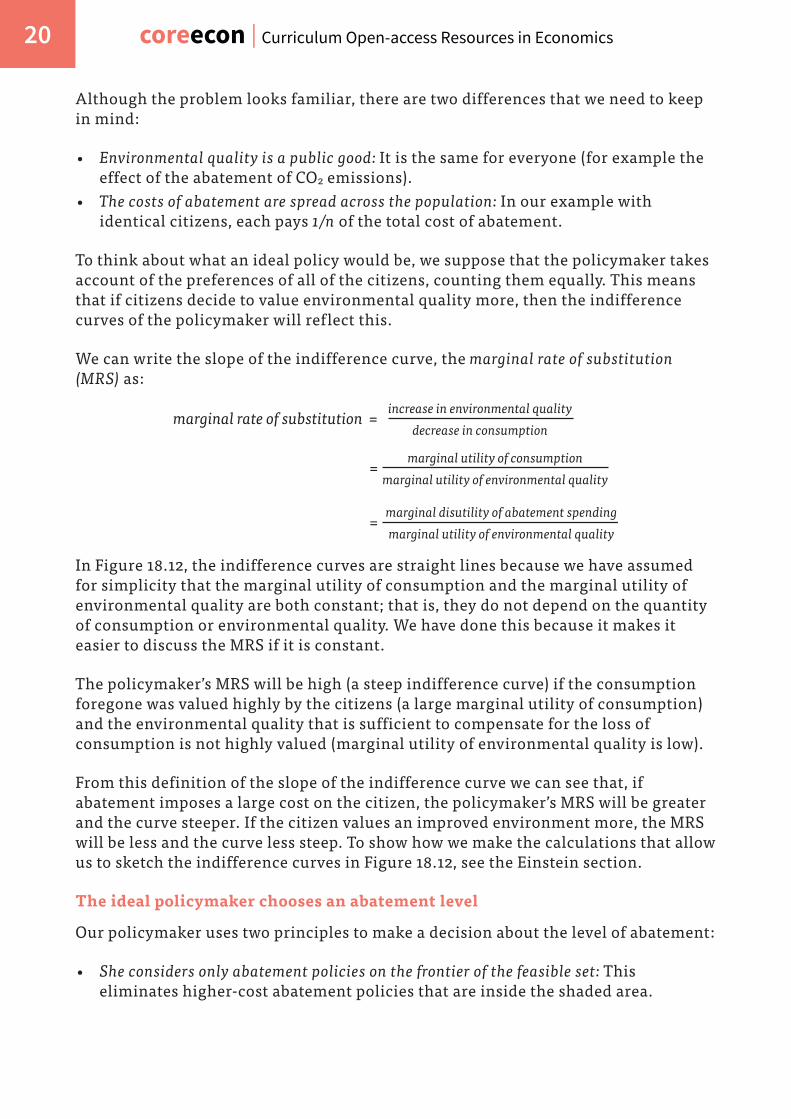
Suppose that there is a level of environmental quality that the members of a society would prefer, and which the policymaker wishes to implement (Figure 18.12). To implement a total desired abatement of E for the society as a whole, the policymaker must find a way to get the typical citizen to implement his share of this total, which we will call e.
To analyse environmental policies using this model, we now draw a new diagram with effective abatement by the citizen, e, on the horizontal axis and marginal costs and benefits of abatement on the vertical axis. They are measured in dollars (or some other monetary unit—we consider how we measure benefits and costs in units of money in the next section). While we consider only a typical citizen, we assume that all other citizens would respond in the same way.
Marginal private costs and benefits of abatement
The marginal private cost of abatement curve in Figure 18.15a gives, for every level of effective abatement on the horizontal axis, the addition to the citizen’s total private cost of abatement of adding one unit of environmental quality through effective abatement. It slopes upward because the cost of additional abatement is high when abatement is already high. This reflects what we have seen in the feasible frontier where, as the level of abatement increases, the marginal cost of achieving a unit of abatement rises.
MC
, MB
of e
nvir
onm
enta
l qua
lity
($)
Effective abatement, e (for example units of CO2 abated)
Marginal private cost of abatement (MPCA)
Marginal private benefit of abatement (MPBA)
Marginal social benefit of abatement (MSBA)
e*, desiredabatement
e in the absenceof policies
Z
B
e-
Figure 18.15a The economic logic of environmental policy.
The marginal private benefit of abatement curve is based on information from the indifference curves of the citizen. These differ from the indifference curves the policymaker considered in section 18.3 because they concern only the environmental benefits and costs that he experiences, not those of everyone else. He values his private benefit, namely, the contribution that his abatement will make to the

coreecon | Curriculum Open-access Resources in Economics 32
environment that he experiences. But this private benefit does not include the equivalent benefit that would be enjoyed by all other citizens. He does not take their enjoyment of a better environment into account, which is why the marginal social benefits of his abatement exceed the marginal private benefits of abatement.
The private marginal benefit of abatement curve slopes downward because the value of further environmental quality (compared to how much people value other objectives) declines as the quality of the environment improves.
Abatement with and without environmental policies
To understand how much abatement the citizen will do in the absence of environmental policies, imagine that he were to abate at the level given by e- in Figure 18.15a, and he considers altering his abatement level. Should he abate more? Yes, we can see that the private marginal benefit of abatement exceeds the marginal cost, so he will abate more. Reasoning in this way, his private incentives lead him to abate up to the level at point B, which is well below the level that the policymaker would like to implement.
Under what conditions would he choose to implement e*, the target amount? Just as a thought experiment, imagine that the citizen was an extraordinary altruist and valued the benefits that his abatement would confer on each of the other citizens exactly as he values his own benefits. This is shown in the figure by the marginal social benefits curve, labelled MSBA.
The assumption of complete altruism is unrealistic, but it allows us to see that if he were to fully internalise the benefits of his abatement actions to others (just as the ideal planner did in previous sections), the desired level of abatement would be implemented privately (that is, by his own incentives at point Z). There would be no need for the policymaker to intervene.
As we know from Unit 4, many people care about the effects of their actions on others, so we might expect the typical citizen to consider at least some of the external effect of his abatement. The policymaker would also consider using persuasion and education to make people aware of the environmental effects of their actions on others. These policies might shift the marginal private benefits curve upward, as shown by the curve labelled “effects of education, persuasion on MPBA” in Figure 18.15b.

UNIT 18 | ECONOMICS AND THE ENVIRONMENT 33
B
MC
, MB
of e
nvir
onm
enta
l qua
lity
($)
e in the absenceof policies
Effective abatement, e (for example units of CO2 abated)
Marginal private costof abatement (MPCA)
Marginal private benefit of abatement (MPBA)
The outcome without intervention
We begin with the intersection of the private marginal benefit and marginal cost curves: this shows the outcome in the absence of government intervention (point B).
B
Z
MC
, MB
of e
nvir
onm
enta
l qua
lity
($)
e*, desiredabatement
e in the absenceof policies
Marginal social benefit of abatement (MSBA)
Effective abatement, e (for example units of CO2 abated)
Marginal private costof abatement (MPCA)
Marginal private benefit of abatement (MPBA)
The chosen level of abatement
This could be achieved by private action if the citizen internalises the benefits to everyone of his own abatement, so the MSBA intersects the MPCA at point Z...

coreecon | Curriculum Open-access Resources in Economics 34
B
Y
MC
, MB
of e
nvir
onm
enta
l qua
lity
($)
e*, desiredabatement
e in the absenceof policies
MPCA withtaxes, subsidies
Effective abatement, e (for example units of CO2 abated)
Marginal private costof abatement (MPCA)
Marginal private benefit of abatement (MPBA)
... Or by taxes and subsidies that shift the MPCA down (point Y)...
B W
MC
, MB
of e
nvir
onm
enta
l qua
lity
($)
Effective abatement, e (for example units of CO2 abated)
Marginal private costof abatement (MPCA)
Marginal private benefit of abatement (MPBA)
e*, desiredabatement
e in the absenceof policies
MPCA withtaxes, subsidies
Effect of education, persuasion on MPBA
... Or by a combination of education and persuasion on the one hand, and taxes and subsidies on the other (for example, point W).
Figure 18.15b The economic logic of environmental policy.

UNIT 18 | ECONOMICS AND THE ENVIRONMENT 35
Other policies can reduce the net private costs of abatement, shifting the MPCA curve downward. By net costs we mean:
• The cost of the abatement itself (such as the cost of installing and using solar panels).
• … Subtracting the cost of whatever energy source she is now using (for example, oil).• … Also subtracting any subsidy for adopting a renewable energy source that she may
receive.
Sticking with the solar panel example, policies that can reduce the net costs and shift the MPCA curve downward include:
• Subsidies for R&D into, and production of, solar panels: These lower the cost of the abatement technology.
• A tax on the use of fossil fuels: This raises the cost of the environmentally damaging technology.
• A subsidy offered to users of solar power: This offsets some of the private cost of using the abatement technology.
Cap and trade: Creating a market for emissions
A policy called cap and trade combines a quantity-based limit on emissions with the price-based approach of placing a cost on damaging production or consumption decisions.
Environmental external effects arise because of missing markets. So why not create a market in which firms have to pay to emit CO2 by buying a permit? Their incentive to abate will be increased. It’s as if they were paying a tax on emissions.
To show how this works, we first find the Pareto-efficient level of emissions (or, equivalently, the total level of abatement required, E*) using the MCA/MBA analysis in Figure 18.15b. This is shown by the length of the horizontal axis in Figure 18.16.
Work through the slideline in Figure 18.16 to see what happens if the number of permits is initially divided equally between two firms with different costs of abatement.
CAP AND TRADE
A policy through which a limited number of permits to pollute are issued, and can be bought and sold on a market. Cap and trade combines:
• A quantity-based limit on emissions
• A price-based approach that places a cost on environmentally damaging decisions

coreecon | Curriculum Open-access Resources in Economics 36
C
D
Abatement by A
Abatement by B
Abat
emen
t cos
ts, f
irm
B ($
)
Abat
emen
t cos
ts, f
irm
A ($
)MPCA, Firm A
MPCA, Firm B
50-50 initial split of permits
Total abatement required, E* (for example, units of CO2 abated)
The MCA of firm A
This is measured in the usual way from the left-hand axis: it rises as its cost of abatement increases.
The MCA of firm B
This is measured from the right-hand axis: it rises from the right origin as B engages in more abatement.
Permits split 50-50
Let’s see what happens if the permits to pollute are initially split 50-50 between the two firms. Firm B has a higher MCA; this creates gains from the trade in permits. Firm B wishes to pollute more since its cost of abatement is so high.
X
C
D
Split a�ertrading
50-50 initial split of permits
Total abatement required, E* (for example, units of CO2 abated)
Abat
emen
t cos
ts, f
irm
B ($
)
P*Abatement by A Abatement
by B
Abat
emen
t cos
ts, f
irm
A ($
)
MPCA, Firm A
MPCA, Firm B

UNIT 18 | ECONOMICS AND THE ENVIRONMENT 37
Firm B will buy permits from A
A will receive the revenue from selling permits to B and abatement will take place at X, where the MCA is the same in each firm.
The gains from trade
The shaded triangle shows the gains from trade created by the market for permits. P* is the permit price and is equal to the marginal cost of abatement in the economy.
Figure 18.16 Hybrid policy: Tradable permits to pollute.
The trading of permits achieves the Pareto-efficient level of abatement at least cost of resources to the economy. P* is the permit price and is equal to the marginal cost of abatement in the economy.
For cap and trade to operate successfully:
• The government or governments set the total level of abatement required: This is called the cap.
• The government creates permits: The number of permits issued allows total emissions to equal the size of the cap.
• The government allocates permits: They can be given to the firms operating in industries emitting the pollutant, or they can be auctioned.
• The permits are traded: The market-clearing permit price, P*, does not depend on how the initial permits are distributed. Trading will take place to eliminate the gains from trade.
Allocating the permits by an auction raises revenue for the government. Another benefit of an auction of permits is that the revenue can be used to reduce taxes that create distortions in the allocation of resources, such as business taxes that are based on the number of workers that firms hire. These taxes discourage firms from hiring.
Cap and trade: Examples of emissions trading schemes
One of the earliest successful emissions trading schemes was the sulphur dioxide (SO2) cap and trade scheme in the US, implemented in the 1990s and intended to reduce acid rain. The allowances were free: the most polluting power plants received the most permits. By 2007, annual SO2 emissions had declined by 43% from 1990 levels, despite electricity generation from coal-fired power plants increasing more than 26% during the same period.
The European Union Emissions Trading Scheme (EU ETS), launched in 2005, is the largest CO2 cap and trade scheme in the world, and now covers 12,000 polluting installations across the EU. National governments auction 57% of permits in the

coreecon | Curriculum Open-access Resources in Economics 38
EU ETS, and the overall emission cap is tightened every year. Some of the auction proceeds are used to fund low-carbon energy innovation. Similar carbon trading schemes exist in other countries and regions.
The EU ETS has been less successful than the US SO2 scheme. Some analysts think this is due largely to the fact that the permitted level of emissions was too high (too large a cap). After the financial crisis in Europe, lower aggregate demand caused the demand for electric power to shrink. Firms did not want to produce levels of output that would generate carbon above the cap, so the price of permits fell dramatically. This allowed firms to pollute without regulation and at low cost, as shown in Figure 18.17.
Jan08
Jan09
Jan10
Jan11
Jan12
Jan13
Jan14
Jan15
10
20
0
5
15
25
30
35
Pric
e (€
/t)
EUA spot (phase II)
EUA daily future (phase III)
Figure 18.17 Permit prices in the European Union Emissions Trading Scheme (EU ETS).
Source: Data provided by SendeCO2 based on prices from Bloomberg Business.
Although in the short run emissions are below E*, the reason is poor performance of the aggregate economy. This highlights a drawback of cap and trade. The price signal is not necessarily a reliable guide for future abatement investment decisions. In Germany, for example, this led to several high-emitting coal power plants re-opening, because dirty technology was profitable again.
As long as the cap is binding, a tax on carbon emissions and a cap and trade policy obtain the same outcome: the Pareto-efficient level of abatement, E*, by setting the right price for carbon emissions. In both cases the policymaker must decide on E* first, before selecting the most appropriate policy. Note also that emission trading schemes do not need to leave the market entirely free. The UK, for example, uses a carbon price floor, which sets a minimum price for British participants in the Emissions Trading Scheme.

UNIT 18 | ECONOMICS AND THE ENVIRONMENT 39
DISCUSS 18.4: A SUCCESSFUL TRADABLE EMISSIONS PERMIT PROGRAMME
The cap and trade sulphur dioxide permit programme in the US successfully reduced emissions. The programme costs were approximately one fiftieth of the estimated benefits.
Read this article.
1. In the view of the authors, why are cap and trade systems such powerful tools to achieve reductions in emissions?
Now read this paper by Richard Schmalensee and Robert Stavins.
2. Summarise the evolution of permit prices using Figure 2 in the article.3. How well can the price movements in permit prices be explained by the analysis
in Figure 18.16?
Look again at Hayek’s explanation of prices as messages (Unit 9), the analyses of asset price bubbles (Unit 9) and housing bubbles (Unit 17).
4. Could we use similar reasoning to explain price movements in Figure 2 of the paper by Schmalensee and Stavins?
18.7 MEASURING THE COSTS AND BENEFITS OF ABATEMENT
To implement environmental policies using the marginal costs and benefits framework, we need to measure the costs and benefits of abatement.
• Measuring costs of abatement: As we saw in Figure 18.7, this requires that we know the range of technologies used in electricity generation, agriculture or other industries that emit CO2, and the cost of reducing emissions in each industry. The data demands for other forms of abatement range from the extremely challenging—preserving biodiversity, protecting the oceans—to the relatively routine—ensuring drinking water to urban populations, curbing acid rain. Below, a natural experiment is used to uncover one element that is needed to measure the costs of air pollution: its effects on life expectancy.

coreecon | Curriculum Open-access Resources in Economics 40
HOW ECONOMISTS LEARN FROM FACTS
THE EFFECT OF AIR POLLUTION IN CHINA
Figure 18.18 China: the Huai River policy boundary and locations of disease survey points (1991-2000).
Source: Chen, Yuyu, Avraham Ebenstein, Michael Greenstone, and Li Hongbin. 2013. ‘Evidence on the Impact of Sustained Exposure to Air Pollution on Life Expectancy from China’s Huai River Policy.’ Proceedings of the National Academy of Sciences 110 (32): 12936–41.
China’s local air pollution is having an impact on life expectancy, but how do we estimate how much would be gained by abatement? In 2013 economists Yuyu Chen, Avraham Ebenstein, Michael Greenstone and Hongbin Li used Chinese mortality data between 1991 and 2000 to estimate that an increase in particulate concentration of 100µg/m3 leads to a decline in life expectancy of three years, mostly due to fatal heart attacks. China’s particulate concentration in large cities is typically 400 µg/m3!
How did they estimate this effect? They could have collected data on particulate concentration and mortality for every city, and simply looked at whether cities with higher particulate concentration have higher mortality. But, since cities with higher particulate concentration could be systematically different from cities with lower particulate concentration—for example they could be poorer, which researchers may not be able to observe—this would not tell us the causal effect of particulate concentration on mortality.
The researchers noticed that between 1950 and 1980 the government provided free coal for winter heating to homes and offices north of the Huai river. Figure 18.18 shows the black line that formed the boundary of the policy, which follows the Huai River and the Qinling mountain range. Cheaper coal and greater heating needs meant that homes in northern China used a lot more coal, which increased concentration of harmful particulates in the air.
UNIT 18 | ECONOMICS AND THE ENVIRONMENT 41
The Huai river policy should affect mortality only through its effect on particulate concentration: for example, other sources of air pollution are roughly similar north and south of the Huai river.
Location North or South
Higher concentrationof particulates
Mortality
So the researchers looked at the relationship between particulate concentration as predicted only by whether a city was north or south of the Huai river (as well as its latitude and other city-specific characteristics) and mortality. This strips out all the unobservable (to researchers) things that can affect both mortality and particulate concentration, such as poverty, and allows researchers to identify the causal effect of particulate concentration on mortality. What they found was that the concentration of particulate matter was 55% higher north of the river and life expectancy was 5.5 years lower.
• Measuring the benefits of abatement: Placing a value on the benefits of abatement is challenging because we are dealing with missing markets for environmental quality. What is the value of preserving a wilderness, saving a threatened species, creating better air or less noise?
Economists have used creative methods to measure the benefits of abatement. We examine three here: hedonic pricing, contingent valuation, and adjusting GDP to account for the environmental external effects of production.
Contingent valuation
Among the simplest and most widely used methods of valuing the benefits of abatement is just to ask people. For example, after the 1989 Exxon Valdez oil spill in Alaska, which released 11 million gallons (42 million litres) of crude oil into beautiful Prince William Sound, the court used contingent valuation to assess the value of the losses (such as the value of natural beauty) caused by the spill. They did this in a survey by asking respondents how much they would be willing to pay to prevent a new spill. The study estimated the lost value in 1990 to be at least $2.8bn. Exxon eventually paid $1bn in damages in a settlement with the governments of Alaska and the United States.
Researchers used contingent valuation techniques to get a quantitative estimate of the value of elephant conservation in Sri Lanka. Farmers were killing elephants to protect crops and homes. The researchers wanted to know how much Sri Lankans

coreecon | Curriculum Open-access Resources in Economics 42
would be willing to pay to the farmers as compensation for the damages caused by the elephants, if the farmers stopped killing them. This would be a Pareto improvement: if implemented, it would make both citizens and farmers better off, or at least not worse off (not to mention the effect on the elephants).
Contingent evaluation is called a stated preference approach because it is survey-based and accepts the respondents’ statements of their values as indicative of their true preferences. This is not the case for hedonic pricing.
Hedonic pricing
Hedonic pricing is called a revealed preference approach because it uses people’s economic behaviour (not their statements) to reveal what their preferences are. Laboratory experiments are a similar method of studying revealed preferences, as we saw in Unit 4. But lab experiments are not very useful in valuing the environment.
An example of hedonic pricing: how much is it worth to you to not have your residence bombarded by the sound of airplanes flying overhead? Economists answer this starting with the observation that houses under aircraft flight paths are sold for less than equivalent houses in quieter locations. By comparing data on house prices, we can calculate the amount people are prepared to pay to avoid the noise pollution.
This technique was used in the UK to set the tax for landfill waste. The marginal benefits of abatement were estimated in a study that used data on more than half a million housing transactions over the period 1991-2000. By controlling for a large number of factors that can account for the variation in house prices, the researchers then tested whether any of the variation left unexplained could be accounted for by the proximity of the house to a landfill site. The researchers found that being within a quarter of a mile (400m) of a working landfill site reduced house prices by 7%. They calculated that the marginal benefit from reducing the proximity to a landfill site was £2.86 per tonne of waste (in 2003 prices).
Adjusting GDP
Environmental degradation is not explicitly measured in national accounts, yet. The World Bank estimates that natural capital comprises 36% of wealth in developing countries.
Remember that income is the most a person, or a nation, could consume without reducing its capacity to produce in the future. This was the message of the bathtub in Unit 11: income is the flow of water into the tub minus the amount of evaporation that is reducing the total amount of water in the tub. Income according to this definition is gross income minus depreciation.
Recall also that depreciation refers to the wearing out or using up of the capital goods used in production. But when it comes to a nation’s natural capital, this is not how income is measured. The portion of a nation’s capital that is used up in any year is not subtracted.

UNIT 18 | ECONOMICS AND THE ENVIRONMENT 43
Below you will learn about how some economists are changing this by placing a monetary value on the use of natural assets.
HOW ECONOMISTS LEARN FROM FACTS
GDP MEASURED WITH ENVIRONMENTAL LOSSES
How much money is natural degradation or biodiversity loss worth? In order to take natural capital loss into account (often referred to as a green adjustment of national accounts) we must figure out how much it will cost (per year) to replace the lost natural capital and subtract it from the annual GDP figure. Firms routinely estimate the depreciation of their assets through wear and tear. When Indonesian government policy generated a timber boom between 1979 and 1982, Robert Repetto and his colleagues from the World Resources Institute estimated that the country sacrificed more than $2bn of potential forest revenues.
Repetto and his co-authors also showed that, considering oil depletion, soil erosion and deforestation, Indonesia’s average annual economic growth rate—originally reported as 7.1% from 1971 to 1984—was in reality only 4%. The impact of natural resource destruction on GDP was calculated by assigning a monetary value to those losses (for example the cost of replacing the assets), considering the total loss as a negative investment, and subtracting it from the official figures.
A similar exercise was carried out for Sweden between 1993 and 1997 where the loss of natural assets was around 1% of GDP per year.
DISCUSS 18.5: WEALTH AND NATURAL CAPITAL
Use the World Bank data in The Changing Wealth of Nations report. Download the total wealth of nations data.
1. For 10 countries of your choice, calculate the change in natural capital between 1995 and 2000 and between 2000 and 2005 in absolute terms. Summarise and interpret your results.
Go to The World Bank data. Find and download GDP (in constant prices) for your chosen countries for 1995, 2000 and 2005.
2. Calculate the change in GDP between these periods. You may want to draw a scatter plot that compares the two sets of data. Does it look like there is a relationship in the data between the change in GDP and the change in natural capital for these countries?
3. Suggest explanations for any relationship you find.

coreecon | Curriculum Open-access Resources in Economics 44
WHEN ECONOMISTS DISAGREE
WILLINGNESS TO PAY VERSUS THE RIGHT TO A LIVEABLE ENVIRONMENT
The Constitution of the Republic South Africa enshrines the citizen’s “right to an environment which is not detrimental to his or her health or wellbeing”. The Supreme Court of India ruled that the “right to life” guaranteed by the Constitution of India “includes the right to enjoyment of pollution free water and air…” Similar rights are granted in at least 13 other constitutions, including Portugal, Turkey, Chile and South Korea. Use this web site to check the constitution of your country, or any other in which you are interested, to see if you can find these guarantees.
Political movements opposing the privatisation of water supply have evoked similar language: access to clean water, they argue, is a human right.
When a feature of the environment such as proximity to a landfill, noise pollution, or toxic emissions from a smelter is valued in monetary terms using the methods described above, this ignores the principle advanced by many that people have a right to an environment free of these hazards.
But in response, others ask: why should the quality of the environment that you experience be any different from the quality of the car that you drive or the food that you eat? You get what you pay for, and if you are unwilling to pay, then why should the policymaker worry about your values? If you believe this, the benefits of abatement policies can be measured by the citizens’ willingness to pay for the improved environment that the abatement will allow.
The willingness to pay measure is criticised by some economists and citizens because it implies that people with hardly any money place a limited value on the environment, just as they have a limited willingness to pay for anything else. It is not that they lack the will; they lack the way. Therefore using willingness to pay as the method of estimating the benefits of abatement—for example, when either contingent valuation or hedonic pricing is used—means that policies that improve environmental hazards that mostly affect the poor, like ensuring safe drinking water in urban areas, will be valued less than policies that raise the environmental quality experienced by rich people, like pristine rivers, lakes and oceans to enjoy while boating.
If a safe environment is a right, an economist would term it a merit good, which you may recall from Unit 10. It is like the right to vote, or legal representation in court, or an adequate education: a good that should be available to all citizens irrespective of their wealth.

UNIT 18 | ECONOMICS AND THE ENVIRONMENT 45
The advantage of the approach based on willingness to pay is that it makes use of information on how people value the environment. This should be relevant to how much we invest in environmental quality. Defining the environment as a right has the advantage that it does not give priority to the preferences of those with higher incomes in shaping environmental policy.
18.8 ENVIRONMENTAL DYNAMICS: FUTURE TECHNOLOGIES AND LIFESTYLES
The trade-offs given by the feasible sets and indifference curves we have used in our analysis will change as people adopt new values and lifestyles and develop new technologies, and as our impact on the environment intensifies. Our discussion of the economic logic of environmental policy made it clear that a policymaker’s objectives include changing people’s preferences and improving the technologies that define what is feasible today.
Prices, quantities and green innovation
Improvements in technology can enlarge the feasible set. Some improvements may make abatement more efficient, lowering the opportunity cost of an improved environment. Others may improve methods in producing other goods, reducing the environmental costs of more consumption as a result. Figure 18.19 illustrates the effect of a technological improvement in abatement, which improves the marginal rate of transformation of foregone consumption into improved environment. By increasing the marginal productivity of abatement expenditure, it makes the feasible frontier steeper. This would appear in Figure 18.15 as a shift downward in the marginal cost of abatement.
DISCUSS 18.6: AN IMPROVEMENT IN TECHNOLOGY
Redraw Figure 18.19 showing an improvement in the technology for producing consumption goods, and show the new combination of the two goods chosen by the citizen.

coreecon | Curriculum Open-access Resources in Economics 46
Consumption of goods and services (€bn)
Qua
lity
of th
e en
viro
nmen
t (E)
D
A62
450
100
500
FF (new abatement technology)
FF (initial abatement technology
Citizens’ indifferencecurve (higher utility)
Citizens’ indifference curve
Abatement costs = €50bn
Maximum level of consumption
Feasible set
Figure 18.19 The abatement technology changes.
In Unit 2 you learned how the rents from innovation drive progress and the improvement of productivity. If the right incentives exist to create innovation rents, we would expect technological breakthroughs that can deliver substitutes for some resources that would be used up, or that need to stay in the ground if temperature increase is to be safely contained. One such case is the technological progress achieved in solar energy.
Increased use of solar power by firms, with subsidies to firms producing the panels and other equipment, has resulted in fast declines in the cost of generating solar power. Figures 18.20a and 18.20b show that, over the last few decades, we have seen a dramatic improvement in photovoltaic cell efficiency, which implies a reduction in the cost of producing solar electricity. Already in the United States many renewable energy technologies can compete with fossil fuel generation, in terms of the cost of new electricity generation capacity, without subsidies. (Note: we can only generate wind power when the wind blows, and solar power when the sun shines, which makes them harder to integrate into the energy system. It is likely that the electricity system of the future will need several renewable technologies side-by-side as well as plenty of energy storage.)

UNIT 18 | ECONOMICS AND THE ENVIRONMENT 47
2008 2009 2010 2011 2012 2013 2014 20150
50
100
150
200
250
300
350
400 Nuclear
WindCrystalline Utility Scale SolarCoal
Gas Combined cycle
Cos
t (U
S do
llars
per
MW
h)
Coal
Solar
Figure 18.20a Cost of generating electricity (new capacity) from different sources in the US (2008-2015).
Source: Lazard. 2015. ‘Levelized Cost of Energy Analysis 9.0.’ Lazard.com. November 17.
Cos
t (20
05 U
S do
llars
per
kW
h)
1976 1980 1984 1988 1992 1996 2000 2004 20080
2
4
6
8
10
12
Figure 18.20b Cost of generating electricity (new capacity) using photovoltaic cells in the US over time.
Source: Nemet, Gregory F. 2006. ‘Beyond the Learning Curve: Factors Influencing Cost Reductions in Photovoltaics.’ Energy Policy 34 (17): 3218–32; Nagy, Béla, J. Doyne Farmer, Quan M Bui, and Jessika E Trancik. 2013. ‘Statistical Basis for Predicting Technological Progress.’ PLoS ONE 8 (2). Public Library of Science (PLoS).
After the oil crises of the 70s, many oil-dependent countries spent public resources on basic research in renewable energy. Now, following 20 years of neglect, support for basic energy research is back on the public agenda. As governments aim to promote positive spillovers from innovation and learning in renewable energy, which technologies should they support? Should they let costs of technologies come down further before they give them more support, or should they pick winners early? As you will see in Unit 20, technological breakthroughs can be unpredictable and mistakes can be costly, but government subsidies for basic research can accelerate the pace of technological change.
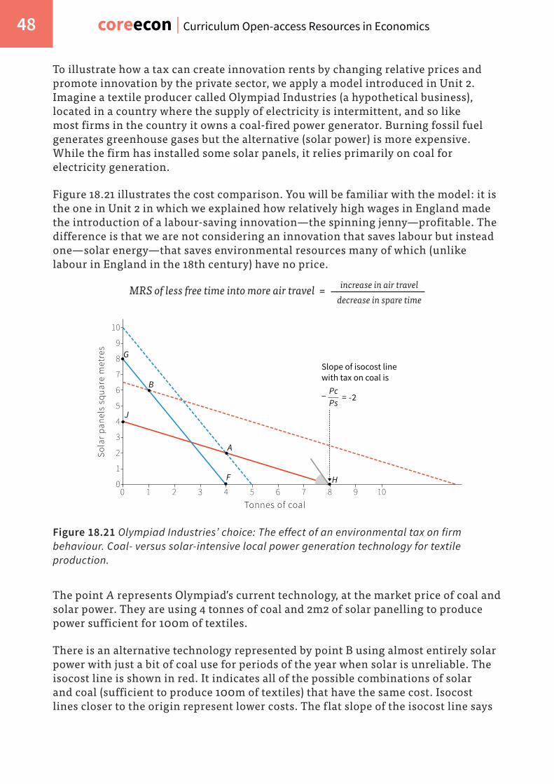
coreecon | Curriculum Open-access Resources in Economics 48
To illustrate how a tax can create innovation rents by changing relative prices and promote innovation by the private sector, we apply a model introduced in Unit 2. Imagine a textile producer called Olympiad Industries (a hypothetical business), located in a country where the supply of electricity is intermittent, and so like most firms in the country it owns a coal-fired power generator. Burning fossil fuel generates greenhouse gases but the alternative (solar power) is more expensive. While the firm has installed some solar panels, it relies primarily on coal for electricity generation.
Figure 18.21 illustrates the cost comparison. You will be familiar with the model: it is the one in Unit 2 in which we explained how relatively high wages in England made the introduction of a labour-saving innovation—the spinning jenny—profitable. The difference is that we are not considering an innovation that saves labour but instead one—solar energy—that saves environmental resources many of which (unlike labour in England in the 18th century) have no price.
MRS of less free time into more air travel = increase in air traveldecrease in spare time
B
A
J
F H
G
0
1
2
3
4
5
6
7
8
9
10
1 2 3 4 5 6 7 8 9 100
Sola
r pa
nels
squ
are
met
res
Tonnes of coal
Slope of isocost line with tax on coal is
= -2PcPs
−
Figure 18.21 Olympiad Industries’ choice: The effect of an environmental tax on firm behaviour. Coal- versus solar-intensive local power generation technology for textile production.
The point A represents Olympiad’s current technology, at the market price of coal and solar power. They are using 4 tonnes of coal and 2m2 of solar panelling to produce power sufficient for 100m of textiles.
There is an alternative technology represented by point B using almost entirely solar power with just a bit of coal use for periods of the year when solar is unreliable. The isocost line is shown in red. It indicates all of the possible combinations of solar and coal (sufficient to produce 100m of textiles) that have the same cost. Isocost lines closer to the origin represent lower costs. The flat slope of the isocost line says

UNIT 18 | ECONOMICS AND THE ENVIRONMENT 49
that coal is a bargain. The solar alternative (point B) is on an isocost line indicating a higher cost for producing the same level of output than coal, which is why the owner of Olympiad has decided to stick with coal despite his concerns about climate change.
But now suppose that the environmental policymaker has imposed a tax on electricity produced using fossil fuels. This means that for the same cost as 4 tonnes of coal, the company could now be using 8 solar panels. The new blue isocost line shows that B, the solar alternative, is now cheaper than A, the status quo coal-based technology, for producing 100m of textiles. The dashed blue line represents the isocost line after tax for which the firm has the same cost as using input combination A. Now you can see that the new isocost line through B is now inside (a lower cost) the dashed blue isocost line through A.
This gives the owner of Olympiad a reason to adopt solar technology. Here the tax has changed the message sent by prices. It now says that you can make a profit by using renewable sources of energy. It also says: sticking with coal may mean being undercut by your competitors, if they switch to the lower-cost technology.
Environmental policy and long-term changes in a way of life
In the long run, in addition to the role of policy in green innovation, how much we value the goods that contribute to our wellbeing can also change. Environmental and other policies can contribute to changes that reduce the negative impacts of our choices on the environment.
In Figure 3.1 you saw that production workers in the Netherlands worked much less than half as many hours in the year 2000 as they had in 1900. In 2000 they enjoyed a lot more free time and consumed less than half as many goods and services as they would have done had they continued working more than 3,000 hours a year, as they did in 1900. Were they still working long hours and consuming twice as much as they do now, their adverse impact on the environment would be larger.
Look ahead to Figure 18.25a, which shows the CO2 emissions and GDP per capita for a wide range of countries. As a thought experiment, imagine that the Netherlands were twice as rich as it is in that graph. What would be the environmental impact in terms of CO2 emissions? In that figure the Netherlands is slightly below the “predicted” line and so if we assume that this was also true of our hypothetical workaholic Dutch nation, we can determine the level of CO2 emissions using the predicted line. Instead of emitting 11 tonnes of CO2 per capita per year, they would be emitting more than 20 tonnes. This would make the Netherlands among the top polluters in the world.
The Netherlands experienced an unusually large fall in its work hours (Figure 3.1 shows that work hours in France and the US fell, but not on the Dutch scale). But even for these and other countries, had free time not expanded at the opportunity cost of less consumption, the impact on global climate change would have been worse.

coreecon | Curriculum Open-access Resources in Economics 50
A lifestyle that is rich in free time, and less rich than it could be in goods and services produced in the economy, is a “greener” lifestyle. Environmental policies can contribute to people adopting this lifestyle.
To see how, imagine that Omar is considering how much air travel to do on his holiday. Omar has enough income to fly anywhere, but he knows that burning aviation fuel is a major source of greenhouse gases. He would also like to have more free time, but realises that a shorter working week would mean he has less money for his next holiday.
We represent the trade-offs affecting his choice in Figure 18.22. On the horizontal axis we measure hours of free time per year that he would have, if he worked just long enough so that he could pay for all of the other things he spends money on (clothing, rent, food, and entertainment). On the vertical axis we indicate his kilometres of air travel during the year. The red line gives the total amount of air travel that he can afford for each of the hours of free time (the shorter work week) that he might select. So the red line is his feasible air travel-free time frontier.
B
A
0
10
20
30
40
50
60
70
80
90
6,610 6,660 6,710 6,760 6,810 6,860 6,910 6,9606,560
Hours of free time per year
Slope : -wage/price = -(50/0.25) = -200
Slope : -wage/(price+tax) = -(50/0.5) = -100
Hours of free time remaining a�er working to purchase ‘other expenses’
IC1
IC2
Km o
f air
trav
el p
er y
ear
(tho
usan
ds) (
$)
A tax on air travel is introduced.
Figure 18.22 Omar’s choice: The effect of an environmental tax on consumer behaviour as air travel and free time.
The feasible frontier is constructed as follows. Suppose Omar makes $50 an hour after taxes and that he is free to set his own hours of work. He spends $90,000 on things other than air travel and, to earn this amount, he must work 1,800 hours during the year. So, from the 8,760 hours in the year that he could give to work (as in Unit 3), he chooses to work 1800 hours. Thus he has 6,960 hours of free time if he takes no air travel at all: this is the horizontal axis intercept of the frontier. How much air travel will he choose if $1 buys 4km of air travel for the kinds of trips Omar would consider making?

UNIT 18 | ECONOMICS AND THE ENVIRONMENT 51
DISCUSS 18.7: THE PRICE ELASTICITY OF DEMAND
A study of vehicle use and gasoline prices in California estimated that the short-run price elasticity of demand for the number of miles a car is driven is -0.22. Suppose the price of gas is now $3 per gallon and a proposed tax would raise the price to $4 per gallon.
1. What is the predicted reduction in the miles driven if the tax is implemented?
The same study found that people with higher incomes responded more to gas price changes than people with lower incomes.
2. Can you think of reasons why this may be the case?3. Sketch two demand curves: one for high-income people and one for low-income
people. Show why the tax will impose a larger cost on the low-income group.
To answer this question we have to ask: what is the MRT of foregone free time into feasible air travel? This is the slope of the feasible frontier. The hour of work that he does by giving up an hour of free time gets Omar $50, and each dollar gets him 4km, so the MRT is 200: giving up an hour of free time gets him 200km of feasible air travel.
Omar’s preferences for free time and air travel are given by the indifference curves shown. The slope of the indifference curve indicates how much he values free time relative to air travel, that is, his MRS of free time for air travel.
We can see that the highest indifference curve that Omar can reach (at point A) results from his choosing to work 200 extra hours so as to have 6,760 hours of free time and 40,000km of air travel.
To Omar, the private cost of a mile of air travel is $0.25. But we know that the social costs—the private costs plus the costs of the emissions due to burning aviation fuel and other external effects—are not included in his private cost calculation. Now imagine that a policy is adopted with the objective of inducing Omar to internalise the full social cost of his vacation choices, by raising the price of air travel so that the private cost to Omar is equal to the social cost. A tax is levied on aviation fuel, so a dollar spent on a ticket now purchases only 2km. The new feasible frontier and feasible set is shown in the figure as the dashed line. The new marginal rate of transformation is 100km of travel per hour of free time given up.

coreecon | Curriculum Open-access Resources in Economics 52
How will the tax affect Omar’s decision? As before, Omar chooses the point on the feasible frontier that is on the highest indifference curve, which is now point B. He flies less. There are two reasons for the change:
• The income effect: Omar is less well-off than before because the price of something that he consumes has gone up. His real income has fallen.
• The substitution effect: The tax has increased the relative price of air travel, leading Omar to substitute other ways of having a good life, by consuming other goods, possibly by working less, or both.
18.9 WHY IS ADDRESSING CLIMATE CHANGE SO DIFFICULT?
While scientists agree that climate change is occurring and that our economic activity is contributing to it, there are large gaps in scientific understanding of the processes involved and the costs of containing them.
Moreover, as we have seen in sections 18.4 and 18.5, conflicts of interest over the extent and methods of abatement make it difficult for national governments to adopt broadly supported strategies for mitigating environmental degradation. These conflicts often take the form of disagreements about what climate science has shown. In the United States in 2015, 64% of Democratic Party supporters were of the opinion that global warming both is occurring and is a result of human activity. The similar fraction among Republicans was 22%.
Owners and employees of companies producing or using fossil fuels anticipate income losses as the result of policies to reduce emissions, and spend heavily to influence public opinion on environmental questions. You can read about the impact of this here and here.
Partly as a result, few citizens around the world place a higher value on environmental problems than on the economy, as shown in Figure 18.23.

UNIT 18 | ECONOMICS AND THE ENVIRONMENT 53
% a
s th
e m
ost i
mpo
rtan
tis
sue
in th
e co
untr
y
Nor
way
Swed
en
Taiw
an
Sout
h Ko
rea
Ger
man
y(f
orm
er W
est)
Fran
ce
Ger
man
y(f
orm
er E
ast)
Mex
ico
Russ
ia US
Japa
n
UK
Spai
n
Sout
h Af
rica
Phili
ppie
ns
0
10
20
30
40
50
60The environmentThe economy
Figure 18.23 Survey views on the importance of the environment and the economy as an issue.
Source: ISSP Research Group. 2012. ‘International Social Survey Programme: Environment III - ISSP 2010’, August. GESIS Data Archive, Cologne. Note: The question asked was “Which of these issues is the most important for [COUNTRY] today?”
Lack of adequate information and conflicts of interest are impediments to good public policy in many areas, not just climate change. But addressing climate change faces two unusual challenges: the problem cannot be solved by national governments acting alone, and those affected by our choices today include generations in the distant future.
International cooperation
Using the tools of game theory in Unit 4, we saw that avoiding the tragedy of the commons that afflicts the supply of public goods depends on the rules of the game (the institutions). Where there are repeated interactions of the players and there are opportunities to punish those who do not contribute to the public good, the socially optimal outcome can be sustained. The presence in several continents of sustainable water-use systems or fish stocks shows that the tragedy of the commons is not inevitable.
In the case of climate change, game theory helps us understand the obstacles to its solution. Recall the way we modelled the climate change game as a prisoners’ dilemma in which two countries (the US and China) can either restrict carbon emissions or continue with business as usual (see Figure 4.17). Self-interest makes the business as usual scenario the dominant strategy equilibrium.
To understand how an international agreement might be negotiated to avoid the business as usual outcome, we introduced inequality aversion and reciprocity. If citizens of the US and China give some weight to the wellbeing of citizens in the other

coreecon | Curriculum Open-access Resources in Economics 54
country or experience less wellbeing when inequality rises, and if they are willing to implement costly measures as long as this is done in the other country, then an outcome where both countries restrict emissions is possible.
Our hypothetical model of climate change negotiations between China and the US gave rise to two Nash equilibria if citizens had both inequality aversion and reciprocity. It is not completely unrealistic: after intense negotiations following failed talks and a non-binding agreement in Copenhagen in 2009, all countries committed to eventual emission cuts at the United Nations Conference on Climate Change in Paris in December 2015 with the goal of stabilising global temperatures at 2C above pre-industrial levels. Virtually all countries also submitted their individual plans for cutting emissions, but these plans are not yet consistent with this temperature stabilisation goal.
Unrepresented generations
Our economic activity today will be felt in climate changes in the distant future. So we are essentially creating consequences that others will bear. This is just an extreme form of external effects that we have studied throughout the course. It is extreme not only in its potential consequences, but also in that those who will suffer the consequences are future generations.
In many countries public policies have been adopted to address other kinds of environmental external effects—such as local pollution—under pressure from voters bearing the costs of these effects. If you look ahead at Figure 18.25b, you will notice that many of the stars (well above the line) on the Environmental Performance Index are, and have long been, electoral democracies. This is not the case for most of the low performers.
The future generations that will bear the consequences of our decisions are unrepresented in the policymaking process today. The only way the wellbeing of these unrepresented generations will be taken into account at the environmental bargaining tables around the world is the fact that—as we have seen in Unit 4—people (at least most of us, some of the time) care about, and would like to behave ethically toward, others.
This is what lies behind the debates among economists about how much we should value the future benefits and costs of the decisions about climate that we make today.
DISCOUNTING FUTURE GENERATIONS’ COSTS AND BENEFITS
A measure of how we value today the benefits of our actions to other people who will live in the future.
• Note this is not a measure of individual impatience about one’s own future benefits and costs

UNIT 18 | ECONOMICS AND THE ENVIRONMENT 55
In considering alternative environmental policies, how much we value the wellbeing of future generations is commonly measured by an interest rate: it is literally the rate at which we discount (literally, count less) future people’s costs or benefits. There are, however, debates about how this discounting process should be done.
WHEN ECONOMISTS DISAGREE
THE DISCOUNTING DILEMMA: HOW SHOULD WE ACCOUNT FOR FUTURE COSTS AND BENEFITS?
When considering policies, economists seek to compare the benefits and costs of alternative approaches. Doing this presents especially great challenges when the policy problem is climate change. The reason is that the costs will be borne by the present generation but the benefits of a successful abatement policy will be enjoyed by people in the future, many of them not yet alive.
Put yourself in the shoes of the impartial policymaker we studied earlier and ask yourself: are there any reasons why, in summing up the benefits and costs of an abatement policy, I should value the benefits expected to be received by future generations any less than the benefits and costs that will be borne by people today? Two reasons come to mind:
• Technological progress: The people in the future may have either greater or lesser needs than we do today. For example, as a result of continuing technical improvements, they may be richer (either in goods or free time) than we are today, so it might seem fair that we should not value the benefits they will receive from our policies as highly as we value the costs that we will bear as a result.
• Extinction of the human species: There is a small possibility that the future generations will not exist because humanity becomes extinct.
These are good reasons why we might discount the benefits received by future generations. Notice that neither of these reasons for discounting is related to impatience.
This was the approach adopted in the 2006 Stern Review on the Economics of Climate Change (read the executive summary here). Nicholas Stern, an economist, selected a discount rate to take account of the likelihood that people in the future would be richer: based on an estimate of future productivity increases, Stern discounted the benefits to future generations by 1.3% per annum. To this he added a 0.1% per annum discount rate to account for the risk that in any future year there might no longer be surviving generations.
coreecon | Curriculum Open-access Resources in Economics 56
Based on this assessment, Stern advocated policies that would have implemented substantial abatement investments today to protect the environment of the future.
Several economists, including William Nordhaus, criticised the Stern Review for its low discount rate. Nordhaus wrote that Stern’s choice of discount rate “magnifies impacts in the distant future”. He concluded that, with a higher discount rate, “the Review’s dramatic results disappear”.
Nordhaus advocated the use of a discount rate of 4.3%. (The next box illustrates what a big difference from Stern’s number this really is.) Discounting at this rate means that a $100 benefit occurring 100 years from now is worth $1.48 today. At Stern’s 1.4% rate it would be worth $24.90. This means a policymaker using Nordhaus’ discount rate would approve of a project that would save future generations $100 in environmental damages if it cost less than $1.48 today. A policymaker using Stern’s 1.4% would approve the project if it cost less than $24.90.
Not surprisingly, then, Nordhaus’ recommendations for climate change abatement were far less extensive and less costly than those proposed by Stern. To deter the use of fossil fuels, for example, Nordhaus advocated a carbon price of $35 per tonne in 2015. Stern recommended a price of $360.
Why did the two economists differ by so much? They agreed on the need to discount for the likelihood that future generations would be better off. But Nordhaus had an additional reason to discount future benefits: impatience.
Reasoning as we did in Unit 11 for Julia’s and Marco’s consumption now or later, Nordhaus used estimates based on market interest rates as measures of how people today value future versus present consumption. Using this method he came up with a discount rate of 3% to measure the way people discount future benefits and costs that they themselves may experience. Nordhaus included this in his discount rate, which is why Nordhaus’ discount rate (4.3%) is so much higher than Stern’s (1.4%).
Critics of Nordhaus pointed out that in evaluating the claims that future generations should have on our concern, a psychological fact like our own impatience is not a reason to discount the needs and aspirations of other people in future generations.
Stern‘s approach counts all generations as equally worthy of our concern for their wellbeing. Nordhaus, in contrast, takes the current generation’s point of view and counts future generations as less worthy of our concern than the current generation, much in the way that, for reasons of impatience, we typically value current consumption more highly than our own future consumption.
Is the debate resolved? The discounting question ultimately requires adjudicating between the competing claims of different individuals at different points of time. This involves questions of ethics on which economists will continue to disagree.
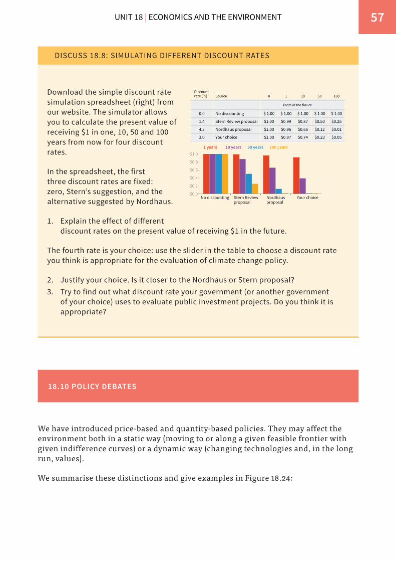
UNIT 18 | ECONOMICS AND THE ENVIRONMENT 57
DISCUSS 18.8: SIMULATING DIFFERENT DISCOUNT RATES
$0.6
$0.4
$0.2
$0.0
$0.8
$1.0
No discounting Stern Reviewproposal
Nordhausproposal
Your choice
1 years 10 years 50 years 100 years
$ 1.00
$0.01
$0.25
$0.05
100
0.0
4.3
1.4
3.0
Discount rate (%)
$ 1.00
$0.12
$0.50
$0.23
50
$ 1.00
$0.66
$0.87
$0.74
10
$ 1.00
$0.96
$0.99
$0.97
1
$ 1.00
$1.00
$1.00
$1.00
No discounting
Nordhaus proposal
Stern Review proposal
Your choice
0Source
Years in the future
Download the simple discount rate simulation spreadsheet (right) from our website. The simulator allows you to calculate the present value of receiving $1 in one, 10, 50 and 100 years from now for four discount rates.
In the spreadsheet, the first three discount rates are fixed: zero, Stern’s suggestion, and the alternative suggested by Nordhaus.
1. Explain the effect of different discount rates on the present value of receiving $1 in the future.
The fourth rate is your choice: use the slider in the table to choose a discount rate you think is appropriate for the evaluation of climate change policy.
2. Justify your choice. Is it closer to the Nordhaus or Stern proposal?3. Try to find out what discount rate your government (or another government
of your choice) uses to evaluate public investment projects. Do you think it is appropriate?
18.10 POLICY DEBATES
We have introduced price-based and quantity-based policies. They may affect the environment both in a static way (moving to or along a given feasible frontier with given indifference curves) or a dynamic way (changing technologies and, in the long run, values).
We summarise these distinctions and give examples in Figure 18.24:
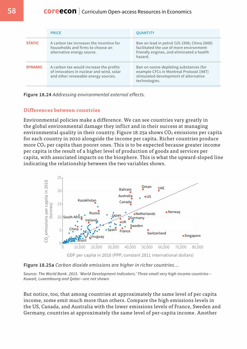
coreecon | Curriculum Open-access Resources in Economics 58
STATIC
DYNAMIC
PRICE QUANTITY
A carbon tax increases the incentive for households and firms to choose an alternative energy source.
Ban on lead in petrol (US 1996; China 2000) facilitated the use of more environment- friendly engines, and eliminated a health hazard.
A carbon tax would increase the profits of innovators in nuclear and wind, solar and other renewable energy sources.
Ban on ozone-depleting substances (for example CFCs in Montreal Protocol 1987) stimulated development of alternative technologies.
Figure 18.24 Addressing environmental external effects.
Differences between countries
Environmental policies make a difference. We can see countries vary greatly in the global environmental damage they inflict and in their success at managing environmental quality in their country. Figure 18.25a shows CO2 emissions per capita for each country in 2010 alongside the income per capita. Richer countries produce more CO2 per capita than poorer ones. This is to be expected because greater income per capita is the result of a higher level of production of goods and services per capita, with associated impacts on the biosphere. This is what the upward-sloped line indicating the relationship between the two variables shows.
CO2
emis
sion
s pe
r ca
pita
in 2
010
(ton
nes)
0
5
10
10,000 20,000 30,000 40,000 50,000 60,000 70,000 80,0000
15
20
25
GDP per capita in 2010 (PPP, constant 2011 international dollars)
Kazakhstan
Uruguay
Spain
Brazil
Switzerland
Germany
Sweden
Japan
France
UK
Norway
Singapore
UAEOmanBahrain
Australia USCanada
NetherlandsRussia
Ireland
China
South Africa
Figure 18.25a Carbon dioxide emissions are higher in richer countries…
Source: The World Bank. 2015. ‘World Development Indicators.’ Three small very high-income countries—Kuwait, Luxembourg and Qatar—are not shown.
But notice, too, that among countries at approximately the same level of per capita income, some emit much more than others. Compare the high emissions levels in the US, Canada, and Australia with the lower emissions levels of France, Sweden and Germany, countries at approximately the same level of per-capita income. Another

UNIT 18 | ECONOMICS AND THE ENVIRONMENT 59
way to read the graph is horizontally: Norway has the same emissions level that would be predicted (by the line) for a country $20,000 poorer in per capita income. Russia pollutes as much as would be expected from a country $20,000 richer.
Singapore is an high-performing outlier. It is a high-income city-state with an effective public transport network and a commercial rather than industrial economic base, resulting in limited levels of pollution. In addition to public transportation, the government has adopted other effective environmental policies. For example, if you want to use a car in Singapore, you are first required to purchase a permit for a car at an auction, and then pay the congestion charge (a tax) every time you drive into the city.
0
20
30
10
40
50
60
70
80
90
100
10,000 20,000 30,000 40,000 50,000 60,000 70,000 80,0000
Envi
rom
enta
l Per
form
ance
Inde
x (2
014)
SwitzerlandZimbabweNorwayUK
Singapore
Equatorial Guinea
Sweden
FranceJapan
Russia
ChinaIndia Iraq
Australia
Germany
Angola
Mali
Oman
US
UAESpain
EstoniaSerbia
GDP per capita in 2010 (PPP, constant 2011 international dollars)
Brazil
Figure 18.25b …but so is the quality of the local environment.
Source: Development Indicators; EPI. 2014. ‘Environmental Protection Index 2014.’ Yale Center for Environmental Law & Policy (YCELP) and the Center for International Earth Science Information Network.
Though richer countries emit more CO2 per capita, they have also adopted more effective policies to manage their own environmental resources, such as forests, soil, biodiversity and water. Figure 18.25b plots the Environmental Performance Index (EPI) against GDP per capita. The EPI is a broad index of country-level environmental health and ecosystem vitality, including the state of wastewater treatment, fisheries and forests. It brings together 20 different country-level indicators including trends in carbon emissions, fish stocks, changes in forest cover, quality of wastewater treatment, access to sanitation, air pollution and child mortality. In this case a curved rather than straight line fits the data better, indicating that differences in per capita income are associated with major differences in the EPI for very poor countries, but not as major for the richer countries, on average.
As in the previous figure, Russia underperforms, with the environmental performance index expected of a country half as rich. Germany, Sweden and Switzerland are high performers. Notice that Australia, which is an unusually big

coreecon | Curriculum Open-access Resources in Economics 60
emitter of CO2 (Figure 18.25a), is a top performer on the national environmental amenities measured by the EPI. A good part of the environmental damage done by economic activity in Australia is thus imposed as a cost on those outside the country.
The message of this figure is similar to the previous one: countries—even at similar levels of income per capita—differ greatly in their environmental performance. Compare Switzerland with the US or Spain with Russia, for example. Both India and China are substantially below the line. These country differences suggest the importance of the kinds of policies that are adopted and enforced.
DISCUSS 18.9: HIGH AND LOW PERFORMERS
Consider the labelled countries above the best-fit line in Figure 18.25b and those below the line.
1. What facts about the countries do you think might explain their status as high and low performers respectively?
2. Find out about environmental policies and political systems of these countries using The World Bank Development Indicators and Freedom in The World 2016. What information from these sources helps you to explain the differences between high and low performers, and how does it help?
Evaluating market-based policies
Market-based policies make use of the information often not available to governments but which is contained in prices that (when adjusted by environmental taxes and subsidies) ideally reflect the marginal costs and benefits that should be taken into account when a firm or individual is considering an action with external environmental effects.
But as in the case of housing and financial assets, the environmentally relevant prices often diverge considerably from this ideal, as we have seen in the collapse in the price of carbon emissions permits after the financial crisis.
Among the market-based policies, taxes and the sale of permits can raise significant amounts of government revenue that can then either fund socially valuable projects or allow the elimination of sources of revenue—taxes that discourage employers to hire, or invest—that impose deadweight losses on the economy.
The case for market-based policies is typically made by reference to an equilibrium in which the relevant actors have exploited all gains; but as we have seen in Unit 9 the state of the economy is often far from an equilibrium of this sort. In Figure 18.26 we look again at the estimates of the marginal abatement costs that we previously saw

UNIT 18 | ECONOMICS AND THE ENVIRONMENT 61
in Figure 18.7 (note that we have rotated the axes 90 degrees clockwise so that we can fit new information on it). In Figure 18.7 we included only costly policies that could be promoted as an objective of government policy. Figure 18.26 additionally includes actions that would accomplish significant abatement, and would also have monetary benefits greater than the costs. In the figure, when the monetary benefit is greater than the cost, the bar extends to the left. When cost is greater, it extends to the right.
25
35
38
30
20
15
10
5
0
Abat
emen
t pot
enti
al G
tCO
2e pe
r ye
ar
100 20 30 40 50 60-10-20-30-40-50-60-70-80-90-100Abatement cost € per tCO2e
Small hydro1st generation biofuelsRice Management
Efficiency improvements other industry
Electricity from landfill gasWaste recycling
Clinker substitution by fly ashCars full hybridInsulation retrofit (residential)
Tillage and residue mgmtCropland nutrient managementRetrofit residential HVACMotor systems efficiencyResidential appliancesInsulation retrofit (commercial)Residential electronics
Lighting-switch incandescent to LED (residential)
Low penetration wind
Cars plug-in hybrid
Degraded land restoration
Pastureland afforestation
Nuclear
Degraded forest reforestation
2nd generation biofuels
Building efficiency new build
Gas plant CCS retrofit
Coal CCS new build
Iron and steel CCS new build
Power plant biomass co-firing
Coal CCS retrofit
Reduced intensive agriculture conversion
High penetration wind
Solar PV
Solar CSP
Reduced pastureland conversion
Grassland management
Geothermal
Organic soil restoration
Reduced slash and burn agriculture
Figure 18.26 Global greenhouse gas abatement curve: Abatement in 2030 as compared with business as usual.
Source: McKinsey & Company. 2013. Pathways to a Low-Carbon Economy: Version 2 of the Global Greenhouse Gas Abatement Cost Curve. McKinsey & Company.

coreecon | Curriculum Open-access Resources in Economics 62
Replacing incandescent light bulbs by LED bulbs in our houses would be the most cost-saving policy of all but it is a narrow bar, meaning it does not have a big abatement potential. Fuel-efficient vehicles, insulation in houses and offices, and other technologies with bars to the left are also cost-saving. Note that if we were to adopt only cost-saving policies between now and 2030, we would still achieve more than a quarter of the total potential abatement.
We can represent the unrealised abatement potential of these changes in the feasible set figure. Start at point C on the horizontal axis in Figure 18.27. The evidence from Figure 18.26 is that implementing the measures (starting on the left in Figure 18.26, with replacement of incandescent bulbs by LEDs) will generate abatement benefits and at the same time allow for higher consumption of other goods and services. This produces the positively sloped part of the feasible frontier, with both environmental quality and consumption rising from C to D. Once all the measures have been introduced that reduce costs, at D, it begins to be costly to achieve further abatement and the feasible frontier is negatively-sloped, as we saw when we analysed the implications of Figure 18.7. Point D corresponds to the point of maximum consumption and zero abatement (at €500bn) that we saw in Figure 18.12.
Consumption of goods and services (€bn)
Qua
lity
of th
e en
viro
nmen
t
D
C
Z
100
550
Feasible frontier (given abatement technology)
Abatement benefits = €50bn
Maximum level of consumption
500
Implementing abatement along the feasible frontier
Moving from D to Z takes the quality of the environment above E but at the cost of lower consumption.
Figure 18.27 Is there always a trade-off between consumption and environmental quality?

UNIT 18 | ECONOMICS AND THE ENVIRONMENT 63
The unrealised abatement potential of these changes, despite the fact that they would save money for the individuals or firms implementing them, suggests that implementation by market incentives may be slow and incomplete. There are two responses to this:
• We could try to understand why people do not take environment-friendly actions even when they are cost-reducing.
• Complement market-based policies with quantity-based policies.
Evaluating quantity-based policies
A primary advantage of quantity-based policies, when the government has the necessary information and enforcement capacities, is that implementation can be rapid and complete. An example is the dramatic reduction in the use of lead in petrol in many countries around the world following a ban.
The information necessary for a government to enforce a ban is typically far less than that required to implement a tax and subsidy policy.
Quantity measures, in isolation, do not make use of the valuable (if not ideal) information that private economic actors reveal through the prices at which they are willing to transact.
Fairness
It is widely accepted that fairness is an important standard to judge outcomes, though some economists consider these judgements to lie outside of economics. The controversy surrounds value judgements of fairness like those often associated with the polluter pays principle.
This principle can be interpreted as an application of the basic economics of environmental policies. Environmental external effects often impose costs on others, and making the polluter pay for these external effects is a way to internalise (and therefore eliminate) them.
This could be accomplished by taxing the polluting activity so as to raise the private marginal cost to correspond to the marginal social cost, as was shown in Figures 18.15a and 18.15b. This may be an efficient way to abate the pollution. But notice from those figures that the same abatement could be accomplished by providing the firm with a subsidy for the use of an alternative technology that resulted in a lower level of emissions.
The firm’s-eye view of these two policies may be that the tax is the stick and the subsidy the carrot. The tax, which reflects the polluter pays principle, lowers the profits of the firm. A subsidy raises the firm’s profits. Whether the carrot or the stick is the right policy depends on such things as:
• The feasibility and cost of the implementing the subsidy compared to the tax.

coreecon | Curriculum Open-access Resources in Economics 64
• Reasons (not necessarily stemming from environmental concerns) that a policymaker would want to raise or lower the firm’s profits in this way.
Examples of reasons for changing the firm’s profits include a desire to provide incentives for the firm to invest or a concern for fairness, motivating policies to redistribute income from those who receive profits to those are less well off.
The polluter pays principle is not always a good guide to the best policy. Think of a large city in a low-income country in which much of the cooking is still done over wood fires, generating high levels of airborne particulate matter and causing asthma and other respiratory illnesses.
• Fairness: It is mostly poor families who lack the income or access to electricity that would allow them to cook and heat their homes with fewer external environmental effects. Many would object in this case on fairness grounds to making the polluters pay, and instead favour subsidising kerosene or providing a better electricity supply.
• Effectiveness: Subsidising kerosene is likely to be cost-effective in reducing smog compared to tracking down and extracting payments from hundreds of thousands of people who are polluting the city’s air with wood fires.
This example is helpful because it shows not only the value of considering fairness as well as efficiency, but also the importance of being clear about which objective we are pursuing when we design policies.
18.11 CONCLUSION
For 100,000 years or more, humans—like other animals—lived in ways that modified the biosphere but did not substantially and irreversibly degrade its capacity to support life on the planet. Starting 200 years ago, humans learned how to use the energy available from nature to transform how we produced goods and services, radically increasing the productivity of our labour. The capitalist economy provided both the carrots and the sticks that made the technological revolution profitable to private firms and hence a permanent feature of our lives. The result was a sustained increase in the output of goods and services per person.
In many countries the extension of the vote to people who worked as employees and their organisation into trade unions and political parties enhanced the bargaining power and the wages of workers. The increasing cost of hiring labour provided
UNIT 18 | ECONOMICS AND THE ENVIRONMENT 65
particular incentives for owners of firms to seek innovations that would use less labour, substituting machinery and the non-human energy of coal and other fuels that powered them for labour.
The result of this process—increased productivity and bargaining power of labour—was in many countries the growing affluence of workers. But the substitution of non-human energy to power the machines for human labour also led to the impoverishment of nature.
The impoverishment of nature cannot be reversed, however, by the same mechanism that created this affluence. Workers were their own advocates, and their success in pursuing their private interests in seeking a higher living standard led to the wage increases, resulting in a pattern of technological change in which less labour was used in production. Future generations and non-human elements of the contemporary biosphere are not capable of advocating for saving nature the way workers indirectly advocated for saving labour.
The imposition of prices on the use of nature sufficient to deter the degrading external effects of the production of goods and services today will require public policies as well as private bargaining. Should this occur, it will be propelled not by the silent voices of the biosphere and generations unborn, but by people today, concerned not primarily about their private interests, but about the preservation of a flourishing biosphere in the future.
CONCEPTS INTRODUCED IN UNIT 18
Before you move on, review these definitions:
• Abatement • Abatement policies • Natural resources and reserves • Global greenhouse gas
abatement cost curve • Environment-consumption
indifference curve • Marginal productivity and
opportunity cost of abatement expenditures
• Price- and quantity-based environmental policies
• Cap and trade • Contingent valuation • Hedonic pricing • Discounting future generations’
costs and benefits • The polluter pays principle • Tipping point• Austerity policy

coreecon | Curriculum Open-access Resources in Economics 66
Key points in Unit 18
The biosphere
The economy is part of the Earth’s biosphere, which has limited capacity to sustain a growing economy that relies on fossil fuels.
How much abatement?
The extent to which environmental damages should be abated depends on both the costs of abatement and the benefits of a sustainable environment relative to other valued objectives.
Costs and benefits of abatement
These costs and benefits are summarised in the marginal rate of transformation of foregone consumption into environmental quality (based on the marginal abatement cost curve) and the marginal rate of substitution between consumption and environmental quality.
Conflicts of interest
Conflicts over the extent and methods of abatement arise because different people do not share equally the costs or the benefits of a less degraded environment.
The polluter pays
A major objective of environmental policy is that consumption or production activities that degrade the environment should bear the environmental costs, so that the prices that affect our decisions more closely approximate the marginal social costs (including environmental external effects).
Abatement policies
Policies that accomplish this objective when addressing climate change include carbon taxes and tradable carbon emissions permits.
Future lifestyles
These policies also will promote low-carbon technologies and lifestyles in the future.
Putting a price on the environment
Economists measure the costs of a degraded environment using contingent valuation and hedonic pricing. A shortcoming of both is that the preferences of those with less wealth are counted less than those of the better off. Others consider a healthy environment to be a merit good.
Future generations
Economists do not agree on how best to value the environmental benefits of future generations.

UNIT 18 | ECONOMICS AND THE ENVIRONMENT 67
18.12 EINSTEIN
Marginal abatement costs and the total productivity of abatement expenditures
How do we construct the line segments that define the boundary of the feasible set in Figure 18.8 from the data in Figure 18.7?
Let the height of the first bar (the most cost-effective abatement expenditure) in Figure 18.7 be y and the width of that bar be x. Then, in Figure 18.8:
• The initial slope of the curve is 1/y• The horizontal axis value of the first point is xy• This point’s vertical axis value is x
The other line segments making up the curve in Figure 18.8 are constructed in the same way.
Environment-consumption indifference curves and the marginal rate of substitution
In Figure 18.12, suppose that each citizen places a value of 1 on each unit of consumption that he or she can enjoy, and a value of μ on the quality of the environment. The quality of the environment is E and the amount each citizen can consume (C) is total income (Y) minus total abatement costs (A) divided by the total population (n). So the citizens’ utility (u) is:
u = μE + C
= μE + (Y – A)
n
In other words, the utility of an individual is the value placed on environmental quality multiplied by the quality of the environment (in units of abatement achieved), plus the consumption of goods and services per person.
This equation makes clear the difference between the public good (E) and the private good (C): the former is something that is consumed by everyone, the latter is divided up among the members of the population.
Indifference curves based on this utility function have slopes equal to the ratio of the marginal utility of a better environment μ, to the marginal disutility of a greater total societal expenditure on the environment which is the fraction of the expenditure the citizen will pay (1/n), multiplied by the value of the consumption that will be forgone if more is spent on abatement, which is 1.
Thus the marginal rate of substitution (the slope of the indifference curve) is:

coreecon | Curriculum Open-access Resources in Economics 68
MRS = marginal disutility of abatement spendingmarginal utility of improved environment
1/nμ=
Indifference curves when the costs of abatement are not equally shared
In Figure 18.13, assume businesses pay a fraction β of the costs of abatement and citizens pay 1- β. For simplicity, think about a population with just two individuals: a citizen and a business. The polluter pays principle means that β > 0.5. The citizen gets a share w of the total income (the business gets the remainder), so her utility function is:
uc = μE + wY – (1 – β)A
In other words, the citizen’s utility is the utility from the quality of the environment, plus wage income, minus her contribution to cost of abatement.
The business has utility:
ub = μE + (1 – w)Y – βA
Which means that the business has utility equal to the utility from the quality of the environment (the same as citizen’s), plus profit income, minus the contribution to cost of abatement (which is greater than the citizen’s).
To allow us to concentrate on the implications of conflicts of interest over who pays for abatement, we assume that both the citizen and the business care equally about the environment. This is represented in the model by μE.
Then the marginal utility of environmental quality is μ for both of them. They differ only in who bears the cost of abatement. The marginal disutility of abatement expenditures for the citizen is now (1 - β), which is less than that for the business (β). This shows up when we compare the slopes of the indifference curves:
MRS = marginal disutility of abatement spending
marginal utility of environmental improvement
For the business:
MRSb = βμ
For the citizen:
MRSc = (1 – β)μ
Because β > 1/2 (the business pays more of the cost of abatement), we know that :

UNIT 18 | ECONOMICS AND THE ENVIRONMENT 69
βμ
1/2μ> > (1 – β)
μ
This means that the indifference curve for the business is steeper (less “green”) than for the citizen.
READ MORE
Bibliography
1. Allcott, Hunt, and Sendhil Mullainathan. 2010. ‘Behavior and Energy Policy.’ Science 327 (5970): 1204–5.
2. Aurora Energy Research. 2014. ‘Carbon Content of Global Reserves and Resources.’
3. BP Global. 2015. ‘Statistical Review: Energy Economics.’ 4. Boyce, James K. 2012. ‘Is Inequality Bad for the Environment?’ In Economics, the
Environment and Our Common Wealth, by James K Boyce. Cheltenham: Edward Elgar Publishing.
5. Bundesanstalt für Geowissenschaften und Rohstoffe (The Federal Institute for Geosciences and Natural Resources). 2012. Energy Study 2012.
6. Burtraw, Dallas. 2000. ‘Innovation Under the Tradable Sulfur Dioxide Emission Permits Program in the U.S. Electricity Sector.’ Resources for the Future Discussion Paper 00–38.
7. Chen, Yuyu, Avraham Ebenstein, Michael Greenstone, and Li Hongbin. 2013. ‘Evidence on the Impact of Sustained Exposure to Air Pollution on Life Expectancy from China’s Huai River Policy.’ Proceedings of the National Academy of Sciences 110 (32): 12936–41.
8. EPI. 2014. ‘Environmental Protection Index 2014.’ Yale Center for Environmental Law & Policy (YCELP) and the Center for International Earth Science Information Network.
9. Etheridge, D.M., L.P. Steele, R.L. Langenfelds, R.J. Francey, J-M. Barnola, and V.I. Morgan. 1996. ‘Natural and Anthropogenic Changes in Atmospheric CO2 over the Last 1000 Years from Air in Antarctic Ice and Firn.’ Journal of Geophysical Research 101: 4115–28.
10. Freedom House. 2016. Freedom in the World 2016.11. Gillingham, Kenneth. 2014. ‘Identifying the Elasticity of Driving: Evidence from
a Gasoline Price Shock in California.’ Regional Science and Urban Economics 47 (July): 13–24.
12. Goulder, Lawrence H, and Roberton C Williams. 2012. ‘The Choice of Discount Rate for Climate Change Simulation.’ Climate Change Economics 03 (04): 1250024.

coreecon | Curriculum Open-access Resources in Economics 70
13. Hepburn, Cameron, Eric Beinhocker, J. Doyne Farmer, and Alexander Teytelboym. 2014. ‘Resilient and Inclusive Prosperity within Planetary Boundaries.’ China & World Economy 22 (5): 76–92.
14. IPCC. 2013. Climate Change 2013: The Physical Science Basis. Contribution of Working Group I to the Fifth Assessment Report of the Intergovernmental Panel on Climate Change. Cambridge: Cambridge University Press.
15. ISSP Research Group. 2012. ‘International Social Survey Programme: Environment III - ISSP 2010’, August. GESIS Data Archive, Cologne.
16. Kristof, Nicholas D. 2013. ‘This Is Your Brain on Toxins.’ The New York Times, October 16.
17. Lazard. 2015. ‘Levelized Cost of Energy Analysis 9.0.’ Lazard.com. November 17.18. McKinsey & Company. 2013. Pathways to a Low-Carbon Economy: Version 2 of the
Global Greenhouse Gas Abatement Cost Curve. McKinsey & Company.19. Millennium Ecosystem Assessment. 2005. Ecosystems and Human Well-Being:
Synthesis. Washington, DC: Island Press.20. Nagy, Béla, J. Doyne Farmer, Quan M Bui, and Jessika E Trancik. 2013. ‘Statistical
Basis for Predicting Technological Progress.’ PLoS ONE 8 (2). Public Library of Science.
21. Nemet, Gregory F. 2006. ‘Beyond the Learning Curve: Factors Influencing Cost Reductions in Photovoltaics.’ Energy Policy 34 (17): 3218–32.
22. Nordhaus, William D. 2007. ‘A Review of the Stern Review on the Economics of Climate Change.’ Journal of Economic Literature 45 (3): 686–702.
23. OpenSecrets.org. 2015. ‘Lobbying Spending Database Chemical & Related Manufacturing.’
24. Porter, Michael E, and Claas van der Linde. 1995. ‘Toward a New Conception of the Environment-Competitiveness Relationship.’ Journal of Economic Perspectives 9 (4): 97–118.
25. Schmalensee, Richard, and Robert N Stavins. 2013. ‘The SO2 Allowance Trading System: The Ironic History of a Grand Policy Experiment.’ Journal of Economic Perspectives 27 (1): 103–22.
26. Skånberg, Kristian. 2001. Constructing a Partially Environmentally Adjusted Net Domestic Product for Sweden 1993 and 1997. UN Committee of Experts on Environmental-Economic Accounting (UNCEEA).
27. Smith, Stephen. 2011. Environmental Economics: A Very Short Introduction. Oxford: Oxford University Press.
28. Stavins, Robert N, Gabriel Chan, Robert Stowe, and Richard Sweeney. 2012. ‘The US Sulphur Dioxide Cap and Trade Programme and Lessons for Climate Policy.’ VoxEU.org. August 12.
29. Stern, Nicholas. 2007. The Economics of Climate Change: Stern Review on the Economics of Climate Change. Cambridge: Cambridge University Press.
30. Stokes, Bruce, Richard Wike, and Jill Carle. 2015. Global Concern about Climate Change, Broad Support for Limiting Emissions. Pew Research Center’s Global Attitudes Project.

UNIT 18 | ECONOMICS AND THE ENVIRONMENT 71
31. The World Bank. 2011. ‘The Changing Wealth of Nations Database.’32. The World Bank. 2015. ‘Commodity Price Data.’ 33. The World Bank. 2015. ‘World Development Indicators.’34. Wagner, Gernot, and Martin L. Weitzman. 2015. Climate Shock: The Economic
Consequences of a Hotter Planet. Princeton, NJ: Princeton University Press.
The Economy by CORE Project is licensed under a Creative Commons Attribution-NonCommercial-NoDerivatives 4.0 International License. Permissions beyond the scope of this license may be available at http://core-econ.org