Embed Size (px)
Citation preview
8/8/2019 15 Advanced Line Drawing
http://slidepdf.com/reader/full/15-advanced-line-drawing 1/54
Advanced line drawing
and tonal painting
. Famous Artists Course
Famous Artists Schools, lnc., Westport, Connecticut
Lesson
A lb ert D orn e
F re d L u de ke ns
N orm an R ock well
B en S ta hl
S te va n D oh an os
J on Wh itc omb
R .obe rt F awce tt
P ete r H eic k
G eo rg e G iu sti
A u st in B rig gs
H aro ld V on S ch midt
COPYRIGHT © 1960, FAMOUS ARTISTS SCHOOLS, Inc.P ri nte d i n U.S.A,
8/8/2019 15 Advanced Line Drawing
http://slidepdf.com/reader/full/15-advanced-line-drawing 2/54
-
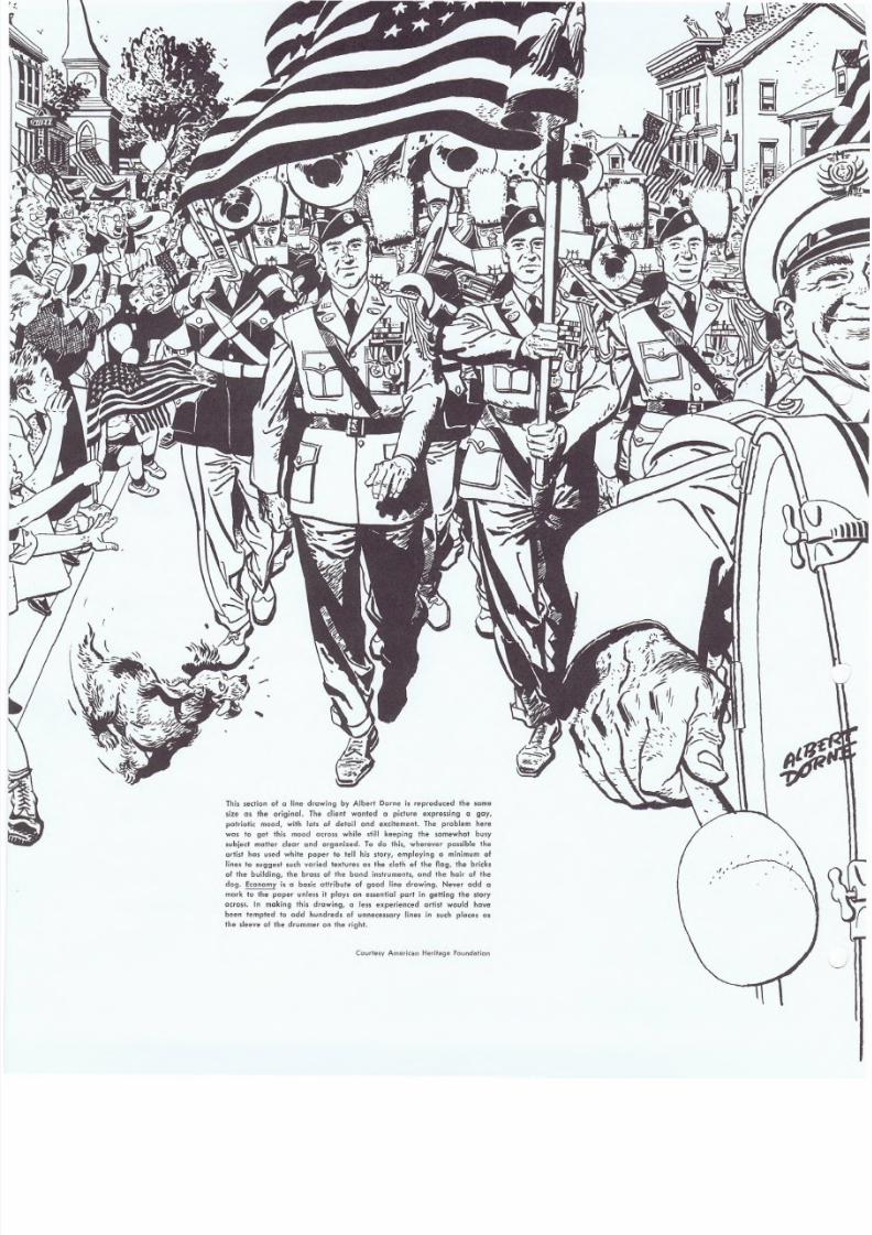
This sect ion of a l ine drawing by Albert Dorn e is rep roduced the some
size as the oriqinal, The dient wanted a picture expressing " Stly,
patrioti c mood, w ith lo ts of deto il and excitement. The probl em here
was to get this mood across while still keeping the somewhot busy
subject mott er clear and org an ized. To do this, wherever possi ble the
artist hos used white paper to tell his story, employing a mi·nimum of
li ne, to suggesl such varied t extures as t he cl oth o f the fl ag, the bricks
of the building, the brass of the bond instruments, and the hair of the
dog. Economy is a basic attribute of good line drawing. Never odd a
mark to the paper unless it plays an essential port in getting the story
acro ss. In making thi s draw ing, a less experi e·nced artist woul d h ave
been tempted to add hundreds of unnecessary Jines in such places as
th e sleeve o f the drummer on the rig ht.
Courtesy American Heritage founda'tion
8/8/2019 15 Advanced Line Drawing
http://slidepdf.com/reader/full/15-advanced-line-drawing 3/54
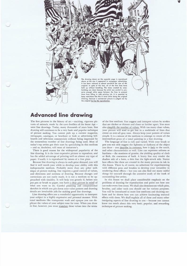
The drawing shown on the opposite page is rep roduced
above ct the s ize it appeared in newspaper adver ti si ng.
It has been reduced to almost one-third the size of the
original. In spite of this fact, all of the fine lines have
held up wilhout breaking. The ·tones created by cross-
hatch ing are clecn because · the ar ti st was careful to pre-
serve enough white 'pace between the lines 10 preventthem from filling in with prinling ink. It is essential to
keep restr ic tions l ike this in mind whi le doing the origina l
drawing, because 0 commercia l pi ctu re i s j udged not by
the origina l but by the reproduction.
Advanced line drawingThe first pictures in the history of art - exciting, vigorous pic-
tures of animals, made by the cave dwellers of the Stone Age -
were line drawings. Today, many thousands of years later, line
drawing still continues to be a very basic and popular technique
of picture making. You cannot pick up a current magazine,
newspaper, catalogue, or brochure or look at advertising bill-
boards and television commercials without being impressed by
the tremendous number of line drawings being used. Most of
today's top artists got their start by specializing in this medium
- and so, doubtless, will most of tomorrow's.
There is good reason for the widespread popularity of the
line drawing. Itis the least expensive picture to reproduce, and
has the added advantage of printing well on almost any type of
paper. Usually it is reproduced by means of a line plate.
Because line drawing is always in such great demand, you will
find it well worth your while to develop your ability with this
indispensable medium. Probably more tban any ?ther tech-
nique of picture making, line requires a good control of values,
and directness and sureness of drawing. Because changes and
corrections are not easily made, it is not a medium to be ap'
pro ached with timidity. It will help you greatly if, before you
put pen or brush to paper, you have a clear picture in mind of
what you want to do.: Careful planning and compositional
sketches in which you pin down your value pattern and drawing
details are invaluable aids for making good line drawings.
Line drawing offers you a wonderful opportunity to interpret
your subject in a highly expressive and personal manner. 'Vith
tonal mediums like transparent wash and opaque you can du-
plicate the values of your subject tone for tone. When you draw
in line, however, you must translate these values into the terms
of the line medium. You suggest and interpret values by strokes
that are thicker or thinner and closer or further apart. You must
also simplify the number of values. With too many close values,
your picture will tend to get lost in a multitude of lines that
create an over-all gray tone. Always keep your pattern of values
simple. It is a misuse of the medium to attempt to create all the
intermediate grays of a tonal painting in a line drawing.
The language of line is rich and varied. With your brush or
pen you not only suggest the lightness or darkness of the object
YOll draw - you describe its contours, how it feels to the touch,
and other characteristics as well. Line can represent softness or
hardness - the stoniness of granite, the yielding quality of cloth
or flesh, the coarseness of bark. A heavy line may render the
shadow side of a form, a thin line the light-struck side. Notice
how effects like these are created in the many pictures in ink in
this lesson. There is, of course, no substitute for experimenting
with different pens and brushes to develop your versatility in
rendering these effects - but you can also find out many useful
things for yourself through the attentive study of the work of
outstanding line artists.
In this lesson we shall place considerable emphasis on the
problems of drawing for reproduction and point out how you
can make every line count. VIleshall also demonstrate which pens,
brushes, and other tools you should use for various purposes.
You will be introduced to more line mediums and drawing sur-
faces and be shown how you can achieve fascinating textural
effects with them. We shall explain all of these and many other
intriguing aspects of line drawing to you - because you cannot
know too much about this very basic, popular, and rewarding
technique of picture making.

8/8/2019 15 Advanced Line Drawing
http://slidepdf.com/reader/full/15-advanced-line-drawing 4/54
Lesson 1 S f amou s Art is 1 s C o u r s e
A.dvanC!ed \ in e drawtng and tonal pa in ti ng
Representing form in line drawings
Your line drawings will never be any better than the solid form,
design, and composition you give them. A good line il lustration
is composed of 90 per cent thought and drawing - and only 10
per cent ink!Although line drawings are the easiest to reproduce, they are
the hardest to draw well! This simple statement may not im-
press you and, as you become immersed in exploring the fas-
cinating and almost endless possibilities of l ine, as explained in
this lesson, you are more and more likely to forget it. There
will be a strong tempta tion to spend your time developing tricky
line techniques for the sheer pleasure of putting lines on paper,
while forgetting more basic things. For this reason we are going
to emphasize these more basic things here and now.
Line is the most sophisticated of all methods of drawing. Per-
haps you have not realized it, but there are no lines around the
forms we see. There are tones or values in nature, and colors
and edges. But there are no outlines! When the artist draws an
outline to establish a form, he is using an arbitrary symbol
which other artists have developed for the purpose of expression
over centuries of artist ic experiment. Because line is an arti ficialconven tion, it must be handled with skil l ancl understanding if
it is to be effective.
A single line may be used for three different purposes. First,
it "contains" the subject, establishing the contours within which
the subject is understood to exist. Second, it can be used in rela-
tion to thicker and thinner lines to create the illusion of three-
dimensional form and to suggest texture. Third, it may be used
Here is the F igure as you see it when draw-
ing from model or photograph. It provides
you with outhentic, detailed information
about the form and position of the subject
- bul, like all the material you work from,
il should nol be copied in precise delail.
Rearrange and interpret os necessary, to
express your idea better.
Your firsl step will be 10 "think through"
and lid raw thr-ouqh " the fi9ure~ reducing
it to its salid, basic forms. Make any
chonges now which will improve Ihe de-
sign while making the uction cleorer and
more positive. Notice how the figure hos
been given added grace by moving the
hands away Irom the body.
with other lines to create a compositional pattern and to con-
tribute life and movement to that pattern. Often, in the most
subtle line drawings, a single line may be used to do all these
things at once. Itcontains the form, it models the form, and itcreates movement in a compositional pattern.
When you realize that a single line may be entrusted with so
much responsibility, it is easy to understand that finding pre-
cisely the right line is a job that requires thought and practice.
The more simple and economical the drawing, the more precise
your thinking must be.
Not all line drawings are simple. The line reproduction
method is also used to print a variety of drawings which are not
so much pure line drawings as they are tonal drawings rendered
in line, Such pictures, by ingenious exploitation of crosshatch-
ing and other line effects, may almost suggest a tonal drawing
of the subject while still retaining the feeling of line.
vVhether your drawing is to be done with the most economical
means - a single line - or is to employ thousands of lines to tell
its story, one fact is obvious: The drawing must have in back
of it your full understanding of the three-dimensional form youare depicting. The minute you lose the sure sense of solid form
in your drawing, you run the danger of having nothing left but
meaningless lines on paper. No matter how cleverly these lines
may be applied from the standpoint of line technique, in the
end you will find that technique is not enough. Always remem-
ber that you are depicting form in line, and technique will fol-
low almost automatically out of the subject itself.
f \- .The forms of the clothing must be designed
and drown just ~fully as the forms
of the figure itself. Apply all the inform a-
tion you have learned about drawing
clolhing and i+s various folds. Remember
thaI the folds of the clothing must always
be designed rather than copied from the
ph ol ogr ap h or mode l.
Every good line drawing should refle
clearly the preliminary Ihinking and draw
ing shown in the pre<eding sketches. T
following poges will show you many
teresting line techniques. However, yo
line drawing will be a failure unless it
based on solid,. well-constructed, end ca
fu ll y pr opo rt ione d f orms.
8/8/2019 15 Advanced Line Drawing
http://slidepdf.com/reader/full/15-advanced-line-drawing 5/54
l e s s o n
I : )I UII l \ J IJ~ rill' '' '' ' ...." ..,••
~d'lanted \ i n e d r a w \n g a n d t o n a l ~ a \ n t \ n 9
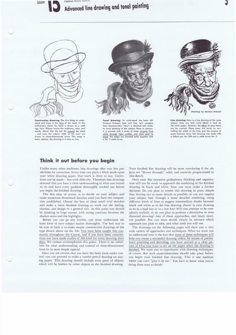
Construdion drawing: The forst thing to under-
sland and draw is the form of the head. In this
preliminary sketch the head is drawn as a solid
eg9 form. Ellipse, locale the eyebrows, nose, and
mouth. Notice the+ the hal' fits around the head
~ and even the lubular folds of the scarf are
drawn as three-dimensional forms. This stcqe ls
basic, whether Ihe drawing is in tone or line.
Tonal drawing: To undersland the basic dif-
ferences between tone and line, let's. compare
their c:haroc:leristics. H ere's [] detailed and re o lls-
lie tonal painting of the subject. Done in opaque,
it is pC'in!ed with a series of tones ranging from
white through light, middle, and dark gray to
black. The edges are blended softly together with
a No.3 soble brush.
Think it out before you begin
Unlike many other mediums, line drawings offer very few pos-
sibilities for correction. Every time you place a black mark upon
your white drawing paper, that mark is there to stay. Correc-
tions can be made - but with difficulty. Therefore line drawings
demand that you have a clear understanding of what you intend
to do and have every problem thoroughly worked out before
you begin the finished drawing.
The first step, of course, is to decide on your subject and
make numerous thumbnail sketches until you have the composi-
tion established. Choose the best of these small trial sketches
and make a more finished drawing to work out the feeling,
rhythm, and design in a general way. At this point you should
be thinking in large masses, with .strong contrasts between the
shadow areas and the highl ights.
Before you can go any further, you must understand the
basic form of your subject matter thoroughly. The best way to
be sure of form is to make simple construction drawings of the
type shown above on the left. You have been taught this con-
stantly throughout the Course, and if you have been conscien-
tious you have made studies of this kind for every drawing since
then. v'lTecannot overemphasize this point: There is no substi-
tute for clear understanding and control of three-dimensional
form in i ts most simple aspects!
Once you are certain that you have the basic form under con-
trol, you can proceed to make a careful pencil drawing on trac-
ing paper. This drawing should include even parts of objects
which win be hidden by other objects in the finished drawing.
Line drawing, Here is a line drawing of th
subject. Only one tone (solid block) is u
the while paper. However, tho effect of gray
con be created. These tones ~ made b
trolling the width of the lines and the amo
space between them. This drawing was mod
a Gillott pen No. 290 and a soble brush No
Your finished line drawing will be more convincing if the ob-
jects are "drawn through," solid, and correctly proportioned in
this sketch.
Only alter this extensive preliminary thinking and organiza-
tion will you be ready to approach the rendering of the finished
drawing in black an.d white. Now you must make a further
decision: Do you plan to render this drawing in pure, simple
line, leaving ou t as many details as possible, or can you express
your subject best through a more detailed rendering, using
different kinds of lines to suggest intermediate shades between
black and white as in the line drawing above? Is your drawing
to be in a high key or in a low key? Will you attempt to be com-
pletely realistic, or do you plan to produce a decorative or even
distorted drawing? Any of these approaches, and many more,
are possible. But you must decide clearly in advance which
approach you plan to take, and what tools you will use.
The drawings on the following pages will show you a very
wide variety of approaches and techniques. 'l\That we want you
to understand now is the fact that none o E these technigues will
help you create a successful drawing unless, by means of prelim-
inary planning and sketching, you have arrived at a clear pic-
ture of what you want to see on the paper when the drawing is
finished. We want you to experiment with drawing techniques,
of course. But such experimentation should take place before
you begin your finished line drawing. This is one medium
where you can't "play it by ear." You have to know what you're
doing from start to finish!
8/8/2019 15 Advanced Line Drawing
http://slidepdf.com/reader/full/15-advanced-line-drawing 6/54
famous Art is 's Course
Advanted lin e d r a w \ n g a n d ~ o n Q \l l u \ n t \ n g
Choosing your approach
EveTY draturi line should
count as an expressiue [orce showing
the true contours of the [orm,
BE STAHL
The drawings 011 this spread and the page
following demonstrate some of the many
different approaches you can take to a spe-
cific subject. Those shown in Figures 1 to 5
are realistic, and range from the full tonal
rendering in Figure 1 to the most econom-
ical and restrained expression in Figure 5.
On the other hand, the drawings in Figures
6 to 10 are stylized, but the tonal handling
is essentially the same as in the drawings
directly above them. On page 8 you will
find a further group of drawings. These are
all modeled as solid forms, but each one
has been executed in an unusual and dis-
tinct ive line techniq Lie.
"~Yeshow YOLl these three sets of drawings
to demonstrate the following 'points: First,
the same basic, solid form underlies every
one of these drawings, no matter how styl-
ized or exaggerated the treatment may be
in some respects. Second, the artist decided,
before he began each sketch, exactly what
kind of drawing he intended to make-
whether realistic or stylized, and to what
degree. Third, he settled in advance such
questions as the over-all lightness or dark-
ness of the drawing, the tools he would use,
the general direction of lines in specific
areas, and the style. As a result the drawings
have consis tency and qual ity.
It is not enough to begin a sketch with
the simple idea "I am going to make a line
drawing." Every important problem should
be worked out in experimental drawings
before YOll take lip pen, pencil, or brush to
make the finished picture. Your ideas may
change as the final drawing progresses, but
it is important to have complete control of
the drawing at every stage. This is true
whether yOll are drawing a single figure or
a parade. You must think through and work
throug'h your drawing before YOLI start, mak-
ing preliminary studies and deciding what
you want to sa y and how to say it.
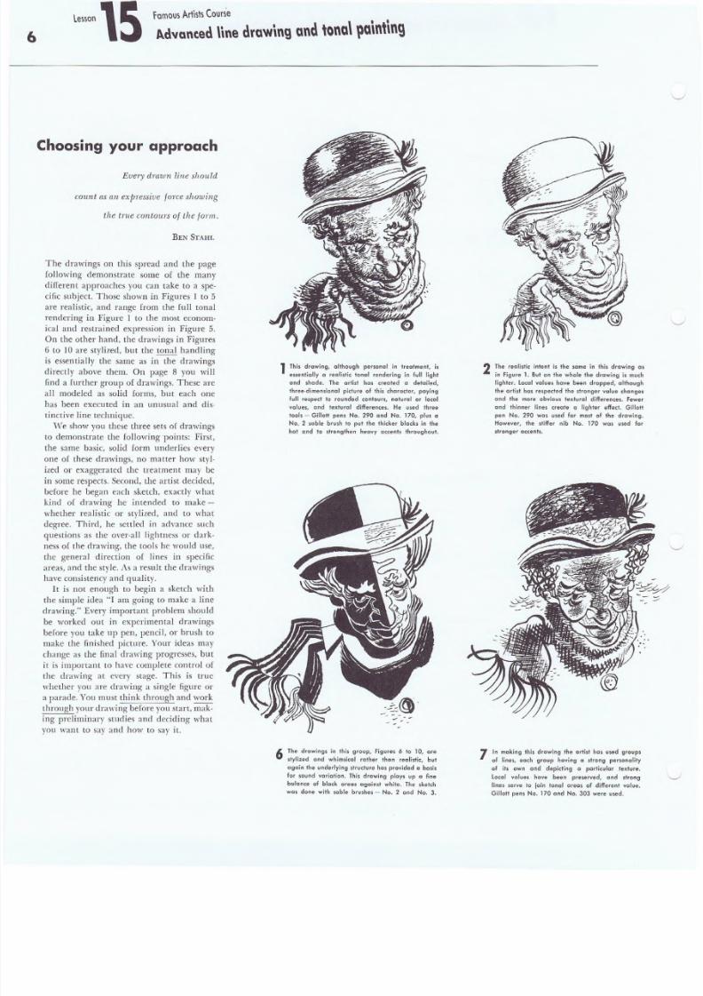
1 This d'awing. although personal in treatment, is
essentially 0 realistic tonal rendering in full light
and shade. The orfist has created a detailed,
three-dimensional picture of this character, paying
full respect to rounded contours, natural 0' loeolvalues, and textural differences. He used three
tools - Gillott pens No. 290 and No. 170, plus a
No.2 sable brush to put the thicker blacks in the
hat and to strengthen heavy accents throughout.
6 The drawings in this group, Figures 6 to 10, are
stylized and whimsical rather than realistic, but
again the underlying structure has provided a basis
for sound variation. This drawing plays up a fine
bolonce of block areas against white. The sketch
was done with sable brushes - No.2 ond No.3.
2 The realistic intent is the same in this drawing
in Figure 1. But on the whole the drawing is mu
lighter. local values have been dropped, although
the artist has respected the stronger value change.
and the more obvious textural differences. fewe
and thinner line • • reote a lighter effe,t. Gillo
pen No. 290 WaS used for most of the drawing.
However, the stiffer nib No. 170 was used f
stronger necents,
7 In making this drawing the artist has used groups
of lines. each group having a strong personality
of its own and depicting a particular texture.
Locol values have been preserved, and strong
lines serve to join tonal oreas of different value.
Gillott pen. No. 170 and No. 303 were used.
8/8/2019 15 Advanced Line Drawing
http://slidepdf.com/reader/full/15-advanced-line-drawing 7/54
F a m o u s A r ti s l s C o u r s e
~d"anted n n e d r a w i n g a n d , o n a l ~a\n ' \n9
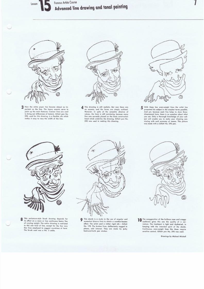
3 Now Ihe white paper has become almost a. im-
portont as the line. The heavy accents serve to
point up the main features. Coarser lines are used
t o br ing ou l dif fer ence s of t extu re. Gil lot t pen No.
290, used for thi s d rawing , is a f lex ibl e nib which
makes i l easy 10 vary the width of the line.
8 This cari calure· ,tyl e b rush drawing depends for
its effect on a more or less continuous. hecvy line
of varying weight. The ent ire drawing is restr ic ted
to this one kind of line, except for the few very
fine lines employed to sugges t roundness o f form.
The brush used was a No. 3 sable.
4 This drawing is still realistic. But now there are
no accents, and the forms are simply outlined.
However, in spite of the complete absence of
values , the form i s st ill c onv inci ng because every
l ine was correct ly placed on the basic const ruct ion
head which under lies the d rawing . Gil lott pen No .
290 was used in making this drawing.
9 This sketch is a study in the use of angular and
somewhat bizarre lines to obtain a wecther-becten
effect. The artisl used a rather rigid nib - Gillot!
No. 170 . The b roken li nes , de libe rale ly ragged in
places, add inlerest. They are made by jerky
back·and·forth pen strokes.
5 With these few even-weight lines the artist
presenled his subject in the simplest terms possib
And yet, because each line helps to show thr
dimensional form, there is no question about w
you see. Only a thorough knowledge of your s
ject will enable you to make your drawing c
vincing with such economy of means. This pic t
was made wit h a Gil lot t No. 290 pen .
]0 The exaggerati on of t he bu lbous nose and craggy
. . eyebrows gives this one the qualify of a car
icat ure . The trea tment i s li ght and rhythmical.
keeping with the intended spirit of the skelch
Continuous, even-weight l ines l ike these require
sens if ive con trol. Gill ott pen No . 290 was used .
Drawings by Michael Mitche
8/8/2019 15 Advanced Line Drawing
http://slidepdf.com/reader/full/15-advanced-line-drawing 8/54
8
famous Artists Course
Advanc.ed line drawing and tonal. painting
Same subject-
same tonal effect - but
different· techniques
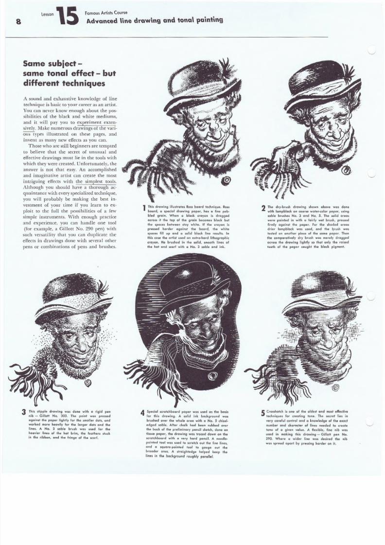
A sound and exhaustive knowledge of line
technique is basic to your career as an artist.
You can never know enough about the pos-
sibilities of the black and white mediums,
and it will pay you to experiment exten-
sively. Make numerous drawings of the vari-
ous types illustrated on these pages, and
invent as many new effects as you can.
Those who are still beginners are tempted
to believe that the secret of unusual and
effective drawings must lie in the tools with
which they were created. Unfortunately, the
answer is not that easy. An accomplished
and imaginative artist can create the most
intriguing effects with the simplest tools.
Although you should have a thorough ac-quaintance with every specialized technique,
you will probably be making the best in-
vestment of your time if you learn to ex-
ploit to the full the possibilities of a few
simple instruments. With enough practice
and experience, you can handle one tool
(for example, a Gillott No. 290 pen) with
such versatility that you can duplicate the
effects in drawings done with several other
pens or combinations of pens and brushes.
3 This stipple drawing was dane with a rigid pen
nib - Gillott No. 303. The point was pressed
against th e p ap er li ghtly for th e smal ler dots, and
worked more heavily for the larger dots and the
Ilnes, A No. 3 sable brush was used for the
heavier lines of the hat brim, the feathers stuck
in the ribbon, and the fringe of the scarf.
1 This drawing illus trates Rossboard technique. Ross
board, a special drawing paper, has a fine peb-
bled grain. When a black crayon is dragged
across it the lop of the grain becomes black but
the spaces between stay white. If the crayon is
pressed harder against the board, the white
spaces fill up and a solid black line results. In
thi s ca se the ar ti st used an exi ra -hard l ithograph ic
crayon. He brushed in the solid, smooth lines of
the hat and scarf with a No. 3 sable and ink.
2 The dry-brush drawing shown above was done
with lampblack On coarse water-color perper, using
sable brushes No. 3 and No.5. The solid areas
were pointed in with a fairly wet brush, pressed
firmly against the paper. For the shaded area'
drier lampblack was used, and Ihe brush was
tested on another piece of Ihe same paper. Then
the compar at ively dry brush was mere ly dragged
across the d rawing ligh tly so thaI only the rai sed
tooth of the paper caughl Ihe black pigmenl.
4 Special scratch bo ard p aper was u sed as the basis
for this drawing. A solid ink background was
brushed over the whole area with a No.5 chisel-
edged sable. After chalk had been rubbed over
the back o f t he prel imin ary pencil sketch, d one on
tissue paper, the drawing was traced down on the
scrat ch board wit h a v ery hard pencil. A needl e-
pointed 1001 was used 10 s cra tch out the fine l ines ,
and a square-pointed tool to gouge out the
broader ones. A straightedge helped keep the
l ines in the background roughly par al le l.
5 Crossha tch i s one of the o ldest and most e ff ec tive
lechniques for creating tone. The secret: lies in
ver y car efu l con lr ol and a ' knowledge of the exect
number and charact er of li nes needed 10 creole
lone of a given value. A flexible. fine nib was
used in making this drawing - Gillott pen No.
290. Where a wider line was desired the nib
was spread apart by pressing harder on it.
8/8/2019 15 Advanced Line Drawing
http://slidepdf.com/reader/full/15-advanced-line-drawing 9/54
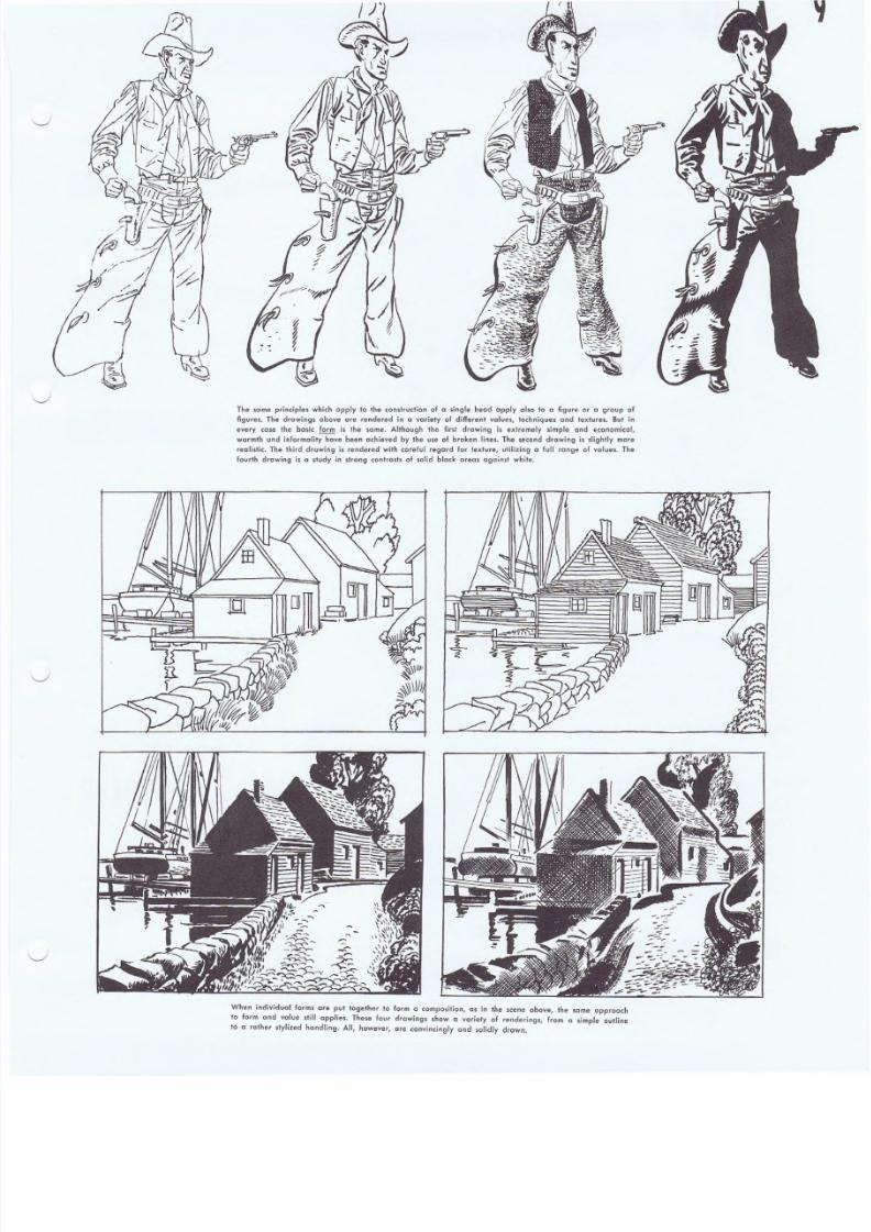
The some principle. which apply to the construction of a single heod apply also to a figure or a group of
figures. The drawings above are rendered in " variety of different values, techniques and textures. But in
every case the basic form is the some. Although the first drawing is extremely simple and economical,
warmth and informality have been achieved by the use of broken lines, The second drawing is slightly more
realistic. The third drawing [s rendered with carelul regard for texture, utilizing a full range of values. The
fourth drawing is a study in slrong centros+s of solid black oreos against white.
When individual forms are put together to form a composition, as in the scene above, the so rna approach
to form and value still applies. These four drawings show a variety of renderings, from a simple outline
to a rather sfylized handling. All, however, are convincingly and solidly drawn.
8/8/2019 15 Advanced Line Drawing
http://slidepdf.com/reader/full/15-advanced-line-drawing 10/54
\0
f amous Artists Cour se
A.dvanced line drawing and tona\ pointing
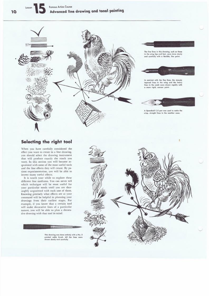
Selecting the right tool.
When you have carefully considered the
effect YOll want to create in a line drawing,
you should select the drawing instrument
that will produce exactly the result you
want. In this section you will become ac-
quainted with some of the most useful tools
and the Iine effects they will create. By pa-
tient experimentation, you will be able to
invent many useful effects . .
It is worth your while to explore these
different line mediums. You can never tell
which technique will be most useful for
your particular needs until you are thor-
oughly acquainted with each one of them.
Knowing precisely what effects are at your
command will be helpful in planning your
drawings from their earliest stages. For
example, if you know that a certain tool
will make decorative lines of a particular
nature, you will be able to plan a decora-
tive drawing with that tool in mind.
This drawing wcs done ent ire ly with a No.3
pointed soble brush. All the lines were
drawn slowly and carefully.
The f ine l ines in thi s d rawing , such as thosei n the wing tips and feet , were done sl owly
and ca re fu lly with a f lexible, f ine point .
In con trast wit h the fin e lines, the sh arply
tapered lines in the wing and the heavy
line. in th e comb were drawn rapidly wit h
a more rigid. coarser point.
A Speedball C·5 pen was used to make the
c ri sp , st ra ight l ines in the wea ther vane.
8/8/2019 15 Advanced Line Drawing
http://slidepdf.com/reader/full/15-advanced-line-drawing 11/54
ce lSon \S tomou~ A r t i s h Cour~e
A .dvanted nne draw\ngand t o n a l \ l u \ n ' \ n g
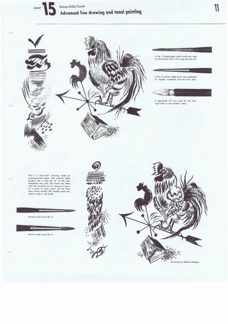
This is c "dry-brush" drawing, mode on
cccrse-pru lne d pap er with pointed sable,
brushes (No.3 and No.5). In this case
lampblack was u sed . The bru sh was fil led
and then brushed out to required dryness
on a piece 01 scrap paper. All the lines
were drawn rapidl y. The weather van e Was
ruled in with a wet brush.
Point ed scble bru sh Na. 3
Pointed sable brush No.5
A No .5 chi sel -edqed sab le b rush was usedfor th e brood lines i n t he wi ng and the tail .
A No .3 po inted sable brush was empl oyed
for st lppl e, cro sshat ch and the fin er li nes.
A Speedball C·2 was used for the firm,
rigi d lin es in th e weat her vane.
,.;
Drawings by Michael Mitchell
8/8/2019 15 Advanced Line Drawing
http://slidepdf.com/reader/full/15-advanced-line-drawing 12/54
12.
Famous A r ti st s C ou rs e
Advanced line drawing and tonal painting
•••
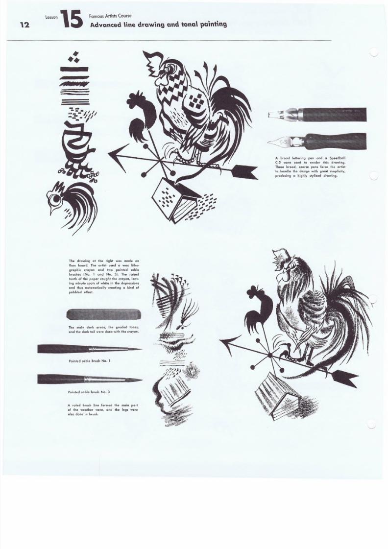
The drawing at the right wns made on
Ross board. The artist used a wax litho-
graphic crayon and two pointed seble
brushes (No. 1 and No.3). The raised
tooth of t he paper caught the crayon, leav-
ing minute spots of white in the depress ions
and thus automaficafly creating a kind ofpebbled eflect.
The main dark areas, the graded tones,
and the dark tai l were done with the c rayon.
Pointed sable brush No.1
Pointed sable brush No.3
A ruled brush line formed the main part
of the weather vane, and the legs were
a lso done in brush .
A broad lettering pen and a Speedball
C·5 were used 10 r ende r thi s d rawing .
These broad, coarse pens force the arlisl
to handle the des ign with great s impl ic ity,
p roducing a h ighly styl ized drawing .
8/8/2019 15 Advanced Line Drawing
http://slidepdf.com/reader/full/15-advanced-line-drawing 13/54
Lesson \S f a m o u s A r f l s \s C o u r se
Advanced \\n e d raw ing a n d ' a n a \ \ 1 Q \ n ,\ n g
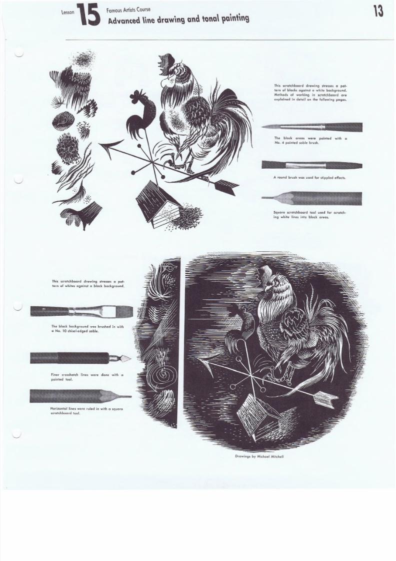
This scrctchbcord drawing stresses a pat-
tern of whites against a black background.
The black background was brushed in with
a No.1 0 chlsel-e dqe d sable.
Finer crosshatch lines were done with a
p oi nt ed 1 00 1.
Horizontal lines were ruled in with a square
scrat ch boa rd too l.
This scratchboard drawing stresses a pat-
lern of blacks against" white background.
Methods of working in scratch board are
explained in detail on the following pages.
The black areas were painted with a
No.4 pointed sable brush.
A round brush was used for stippled effects.
Square scratchboord tool used for scratch-
iog white lines into black areas.
D rawi ngs b y Mic ha el Mit ch el l
8/8/2019 15 Advanced Line Drawing
http://slidepdf.com/reader/full/15-advanced-line-drawing 14/54
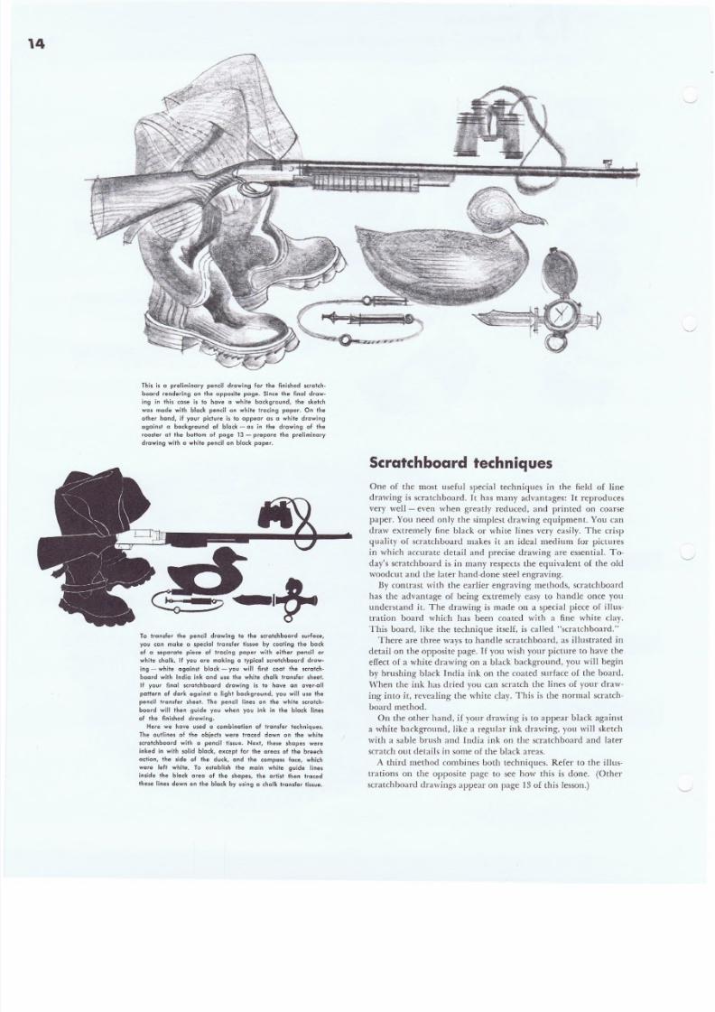
This i s a pre limina ry penci l d rawing for the f in ished scr alch-
board rendering on the opposite page. Si nce the final drew -
ing in this case is to have a while baCKground, the sketch
was mode with black pencil on white tracing paper. On the
ather hand, if your picture is to oppear as a white drawing
against a background of black - as in the drawing of the
rooster at the bollom of page 13 - prepare the preliminary
drawing with a .whi te penci l on b lock paper .
To t ransfer the pencil drawing to the scratch board surface,
you can make a special transfer tissue by con firrq Ihe bo ck
of a seporcte piece of tracing paper wilh either pencil or
white chalk. If you are making a typical scretchbcerd drow-
ing - white against black - you will first (oat the scretch-
board wit h India ink and use the white chalk Iran sfer sheet.
If your final scralchboard drawing is to have an ovar-oll
pall ern of dark against a l ight background, you wi ll use the
pencil transfer sheet. The pencil lines on the while scro+ch-
board will then guide you when you ink in the black lines
of the fini shed drawing .
Here we have used a combination of transfer techniques.
The outlines of the objects were traced down on Ihe while
scralchboard w ith a pencil ti ssue. Nexl , these shapes were
ink ed in wit h so lid bl ock, excep l for the areas of the breech
action, the side of Ihe duck, and the camperss face, which
were left while. To establish the main white guide lines
inside the black area of the shapes. the artist then traced
these l ines down on the b lack by using a cha lk t ransf er t is sue.
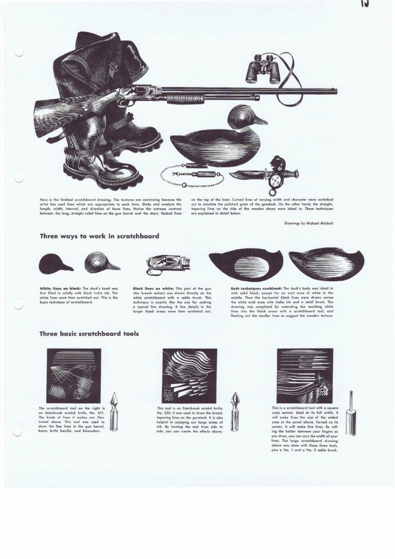
Scratchboard techniques
One of the most useful special techniques in the field of line
drawing is scratchboard. It has many advantages: It reproduces
very well - even when greatly reduced, and printed on coarse
paper. You need only the simplest drawing equipment. You can
draw extremely fine black or white lines very easily. The crisp
quality of scratchboard makes it an ideal medium for pictures
in which accurate detail and precise drawing are essential. To-
day's scratchboard is in many respects the equivalent of the old
woodcut and the later hand-done steel engraving.
By contrast with the earlier engraving methods, scratchboard
has the advantage of being extremely easy to handle once you
understand it. The drawing is made on a special piece of illus-
n-ation board which has been coated with a fine white clay.
This board, like the technique itself, is called "scratchboard."
There are three ways to handle scratchboard, as illustrated in
detail on the opposi te page. Ifyou wish your picture to have the
effect of a white drawing on a black background, you will begin
by brushing black India ink on the coated surface of the board.
'When the ink has dried you can scratch the lines of your draw-
ing into it, revealing the white clay. This is the normal scratch-
board method.On the other hand, if your drawing is to appear black against
a white background, like a regular ink drawing, you will sketch
with a sable brush and India ink on the scratchboard and later
scratch ou t details in some of the black areas.
A third method combines both techniques. Refer to the illus-
trations on the opposite page to see how this is done. (Other
scratchboard drawings appear on page 13 of this lesson.)
8/8/2019 15 Advanced Line Drawing
http://slidepdf.com/reader/full/15-advanced-line-drawing 15/54
8/8/2019 15 Advanced Line Drawing
http://slidepdf.com/reader/full/15-advanced-line-drawing 16/54
16L e s s o n lS F am o u s A r ti s ts C o u r s e
Advanced \ine drawing a nd ton a' p ain tin g
HowImake an illustration in line-~",""~4_
To me the underlying "black pattern" - the structural basis of
the drawing in frank, strong accents of pure black - is probably
the most compelling and distinctive feature of a good line draw-
ing. But black and whi t e are at opposite ends of the value scale.
The eye seeks intermediate values of gray to help it bridge this
gap. Therefore I feel that the use of intermediate values in com-
bination with the black pattern is almost equally important.
If the basic structure and design of the black pattern are right,
i t is a comparatively simple matter to relate intermediate values
to this framework. These gray in-between values are obtained
by interpreting in texture the forms and surfaces. Sometimes a
few dots or a line or two will suffice to suggest a surface and give
"color" to an area, or dimension to a form. At other times a'
more finished interpretation may be advisable. These areas of
tone may be either larger or smaller than the pure black or
white areas. The extent to which you will wish to introduce Lex-
ture with intermediate values will depend to a large extent on
the subject and design.
To illustrate these points, I will discuss in detail my method
of producing a picture drawn in line.
The Subject: I am using as an example a drawing which will
occupy about half a page in the SaluTday Evening Post . The
story to be illustrated is pan of a serial. The action takes place
in the high country of New Mexico about J885. A wagon train
has been burned by a group of Indians. A wounded girl is found,
bleeding but alive. She is carried out of a Hat valley by a rider
on horseback. The text to be illustrated reads: " ... she could
distinguish certain sounds, a horse's slow hoofbeat, the creak of
saddle leather. Her body felt cramped and she was aware of her
shoulders being tightly held."
A strong design is the key. The blacks hold the structure and are used in large areas to give force to the illustration.
There are three things I wan,t to get into my line drawing: (1) The character and mood of the subject. (2) Variety in the
arrangement of black, white and grays. (3) A picture pattern with strength, clarity and simplicity.
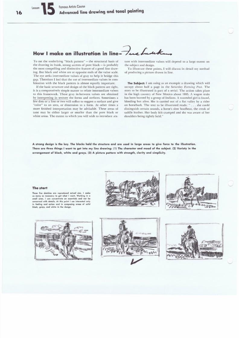
The start
The,elive sketches ere reproduced cctue] ,ize. I make
cs many as ne cesscry to get what I want. Working in a
small oreo, I con concentrate on essential. and not be
concerned wi th det ai ls. A t thi s poi nt I om in terested only
in feeling ond action ond in composing areas of solid
black, gray s, and whit e in th e design.
v
8/8/2019 15 Advanced Line Drawing
http://slidepdf.com/reader/full/15-advanced-line-drawing 17/54
F a m o u s A r t i s ts C o u r s e
A.dvanted Unedrawing and tonal lla \nt\ng
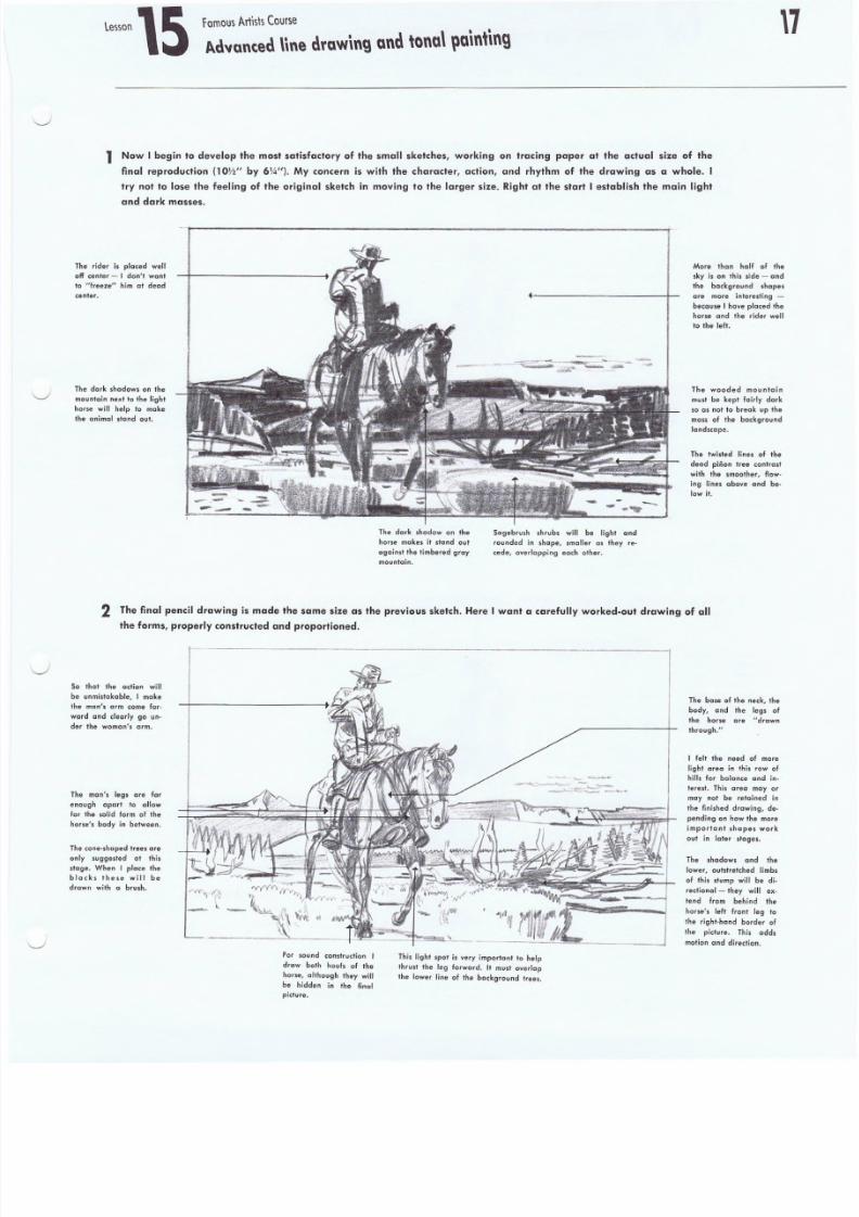
1 Now I begin to develop the most satisfactory of the small sketches, working on tracing paper at the actual size of the
final reproduction (1ow' by 6\4"). My concern is with the character, action, and rhythm of the drawing as a whole. I
try not fo lose the feeling ·of the original sketch in moving to the larger size. Right at the start I establish the main light
and dark masses.
The rider is placed well
off center _. I d on i, want
to I'freeze lt him at dead
center.
The dark sh adows on th e
mounta in nex t to the l ight
horse will help to make
the an imal stand ou t.
-. .-_-- - -
More than half of th
sky is on Ihis side - an
the background shape
are more interesting -
because I have p laced th
horse and the rider we
to the left .
The dark shadow on the
horse makes it .tand out
oqcinst the timbered gray
mountain.
Sagebrush shrubs will be light and
rounded in shape. smaller as they re-
cede, ove rlappi ng each o ther.
The wooded mountai n
must be kep t fairly dark
so as not to break up th
mas s of the backgroundlandscape.
The twisted lines of the
dead p inon t ree con tra st
with th", smoothe r, f low
ing lines above and be
low it.
2 The final pencil drawing is made the same size as the previous sketch. Here f want a carefully worked-out drawing of all
the forms, properly constructed and prepcrrlened.
So that the action will
be unmistakable, Imake
the mcn/s arm come For-
ward and clearly go un-
der the womnn's arm.
The man'. legs are far
enough apart to allow
for the solid form of the
hors e' s body in between .
The cone-shaped trees are
only suggested at this
stage. When I place the
black. these will be
drawn with a brush.
For sound constructio n I
draw both hoofs of the
hor se , a lthough they wil l
be hidden in .he final
picture.
This ligh' spot is very impor tant '0 help
thr us t the leg f orward . It must overlap
th e lower line of th e backg round trees.
Th e bose of the neck, t he
body, and the legs of
the horse ore "drewn
thrcuqh."
I felt the need of more
light area in this row of
hills for balance and in-
.erest. Th is area mayor
may not be retained in
the fini shed drawing , de-
pend ing on how th e mo re
impo rfu nt .hapes work
out in later stages.
The shadows and the
lower , outstretched limbs
of this stump will be di-
rectional - they will ex-
tend from behind the
horse's left front leg '0th e righ. -hand border of
the picture. This adds
motion and direelion.
8/8/2019 15 Advanced Line Drawing
http://slidepdf.com/reader/full/15-advanced-line-drawing 18/54
18lesson 15 Famous Art is ts Course
Advanced nne drawing and tonal painting
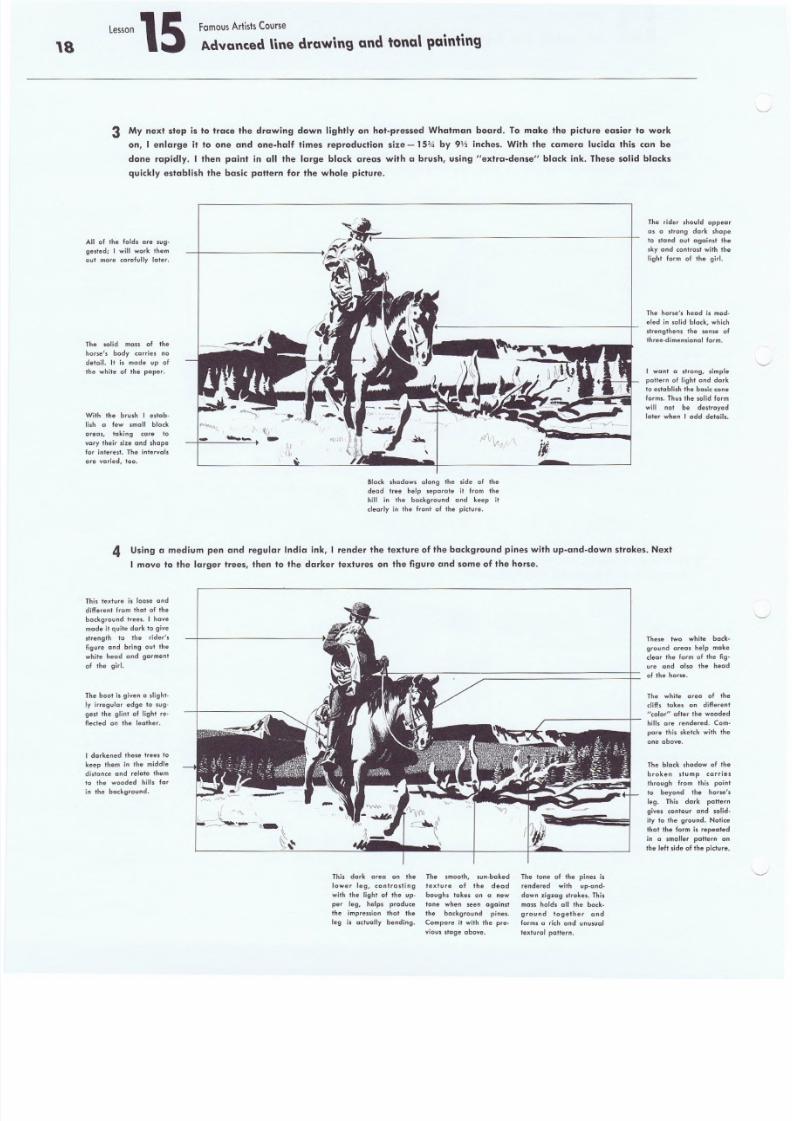
3 My next step is to trace the drawing down lightly on hot-pressed Whatman board. To make the picture easier to work
on, I enlarge it to one and one-half times .reproduction size - 15* by 9Y:zinches. With the camera lucida this con be
done rapidly. I then paint in 0 1 1 the large black a'reas with a brush, using "extra-dense" black ink. These solid blacks
quickly establish the basic pottern for the whole picture.
All of the folds are sug-
gested; I will work them
out more carefully later.
The solid mass of the
horse's body carries no
detail. It is mode up of
the white of the paper.
With the brush I estab-
lish a few smoll block
areas, taking care 10
vary their size and shape
f or i nt er es t. The in te rva ls
o,re var ied, too.
~'.. ~)
-.. ._ - fI V 1 _ " • . \
r ,
The rider should appe
as a strong dark sh
to stond out agoinst
'ky and contrast with
light form of the gir
The horse's head is m
eled in solid block. wh
s tr en gt hens t he sense
+ hre e- dirn en sic ne l f orm
I want' a strong, sim
pallern of light and d
to e st abl ish th e b as ic cform s. Thus th e s ol id f
will not be destroye
later when I odd detai
4 Using a medium pen and regular India ink, I render the texture of the background pines with up-and-down strokes. Next
I move to the larger trees, then to the darker textures on the figure and some of the horse.
This texture is loose and
different from that of the
background tree s. I hove
made it quite dark to give
strength to the rider',
figure ond bring out the
white head and garment
of the girl.
The boot is given a slight-
ly irregular edge to sug-
gest the glint of light reo
flected on the leather.
I darkened these trees to
keep them in the middle
distonce and relate them
to the wooded hill. for
in the backg round.
\
Block shadows along the side of the
dead tree help separote it from the
hill in the background and keep il
clearly in the front of the picture.
This dark area on the
lower leg, contrasting
with the light of the up-
per leg, help, produce
the impression that the
leg is actually bending,
The smooth, sun-be ked
texture of the dead
bough, tokes on a new
tone when seen against
the background pines,
Compare it with the pre-
v iou s st age a bov e.
The tone of the pines is
rendered with up-und-
down zigzag stroke s. This
rna s s holds all the bock-
ground together and
forms a rich end onusucl
textural pattern.
These two white ba
ground areas help m
clear the form of the
ure and also the he
of t he hor se .
The white area of
cliff. tokes on differe
"co lcr" af ter the wood
hill, are rendered. C
pore this sketch with
one above .
The black shadow of
broken stump carri
through from this p
to beyond the hor
leg. This dark potte
give, contour and so
ity to the ground. No
thaI the form is repecte
in " smeller pattern
t he le ft s id e of th e p ict u
8/8/2019 15 Advanced Line Drawing
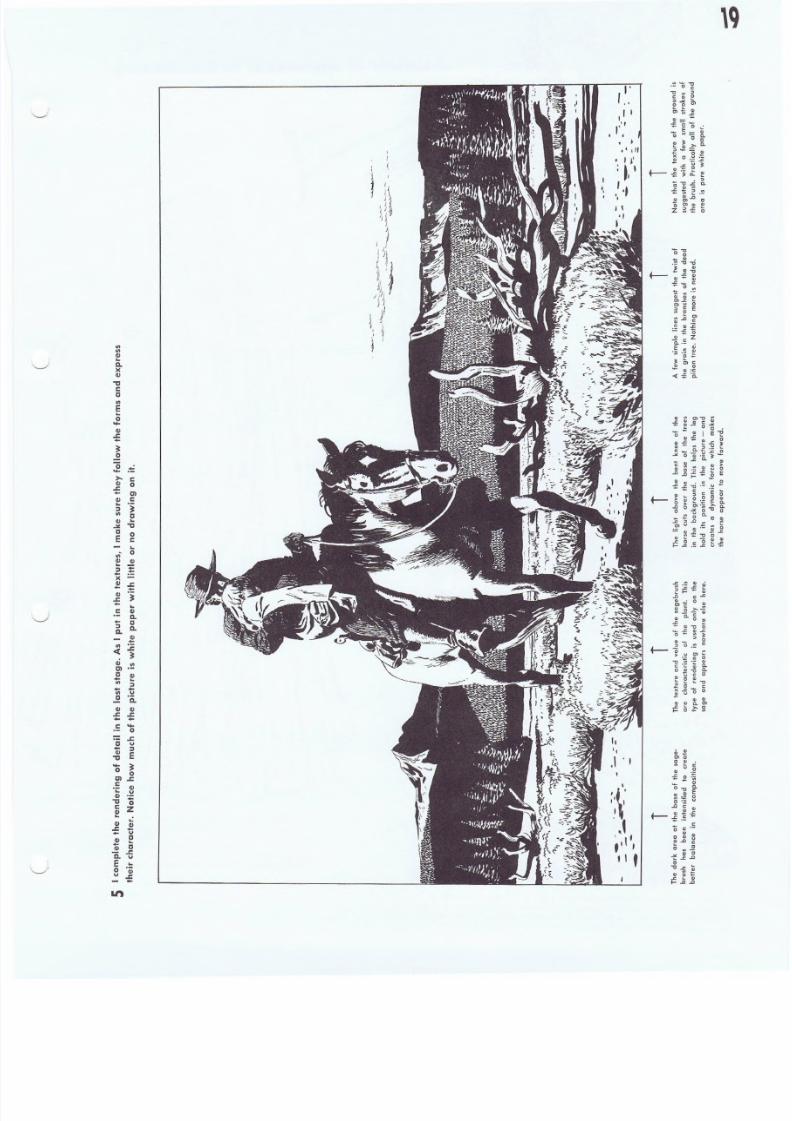
http://slidepdf.com/reader/full/15-advanced-line-drawing 19/54
II>II>II). .Q.)(
II)
-ac, 1 : 1
II>
E. . . .
.fII)
J:.. . .~o
"0. . . .>-C IJJ:.. . .II). .~II>
II)
.JI!
C
E
. .
I"I 'r"," ,II
, J!'
: I , I
"
.~,
t-
. . .c0
Cle·i
t-
tl. .-a0e.. .0
C IJ
:;
. . . .C II)
C....C
~ Q.
.~II> J:.
< C ~
e liCl .~
C. .II>
C IJ II)
.s: J:.. . . . .C ....
oJ:.
, 1 : 1 . . .. . . ~~ E. . . . ~o 0
al.r.C. ; : eIV .=
-g 0
l! ! Z.:
1~... u
II) ~
Q j cIi "5Eo II)
u J:.. . .
't
.l ' I
8/8/2019 15 Advanced Line Drawing
http://slidepdf.com/reader/full/15-advanced-line-drawing 20/54
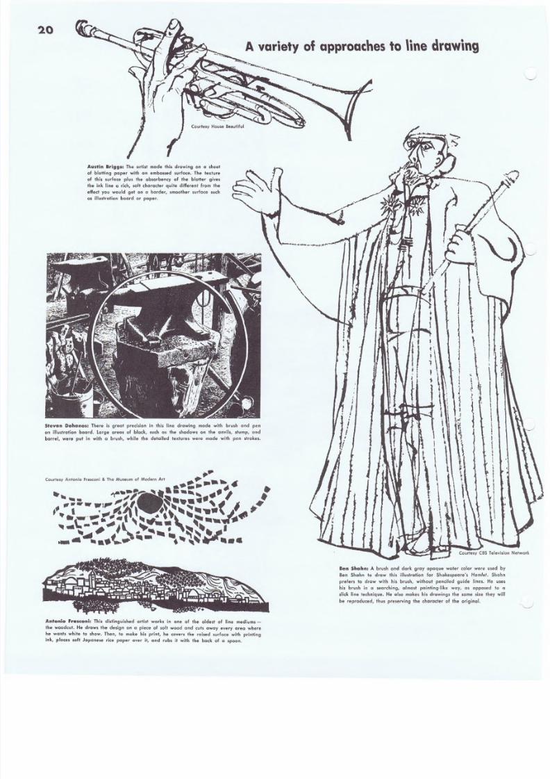
2.0
A variety of approaches to lin e d raw in g
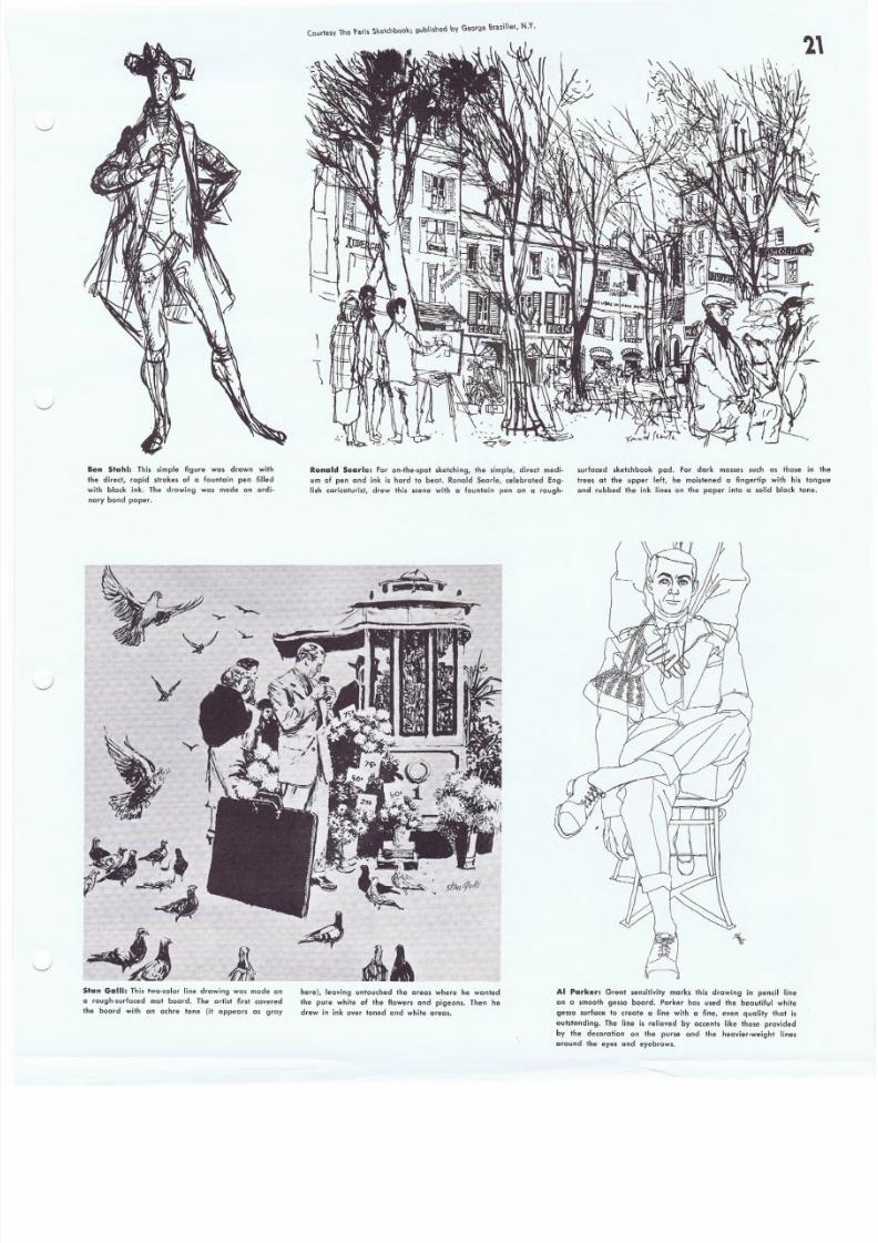
Austin Brigg.: The arlist made t his drawi ng on a sheet
o f b lo tt ing paper with on embossed surface . The ' tex tu re
of Ihis surface plus the absorbency of the blotter gives
the ink li ne a rich, soft character quit e different from the
effect you would get on a harder, smoother surface such
as i llust ra tion boa rd or paper.
Sfevan Dohanos: There is great precision in this line drawing made with brush and pen
on illustration board. large areas of black, such as the shadows on the anvils, slump, and
barrel, were put in with a brush, while the detailed textures were made with pen strokes.
i
I1I
1
11,
)
1I
iI
1" \
1~
I~.• ~i t 1
t 1I I
JI
tr
,.i. r
f
~ \, I,I,j~
j\ j,
1
Ben ShllJhn.A brush and dark gray opaque water color were used
Ben Shahn to draw thi s i llustration for Shakespeare' s Hamlet. Sha
prefers to draw with hi. brush, without penciled guide lines. He u
his brush in a sea.rehing, almost painting.like way, as opposed to
slick line technique. He also makes his d rawings the same size they w
be r eproduced, thus pres erv ing the char ac te r o f Ihe origina l.
Antonio Frasconi: Th is distinguished art ist works in one of th e oldest of line mediums-
the woodcut. He draws the design on a piece of salt wood end cuts away every area where
he wants whit e to show. Then, t o make his print, he covers th e rai sed surface with printin g
ink, places soft Japanese rice paper over it, and rub. it wilh the bock of a spoon.
8/8/2019 15 Advanced Line Drawing
http://slidepdf.com/reader/full/15-advanced-line-drawing 21/54
8/8/2019 15 Advanced Line Drawing
http://slidepdf.com/reader/full/15-advanced-line-drawing 22/54
22 ~i ...
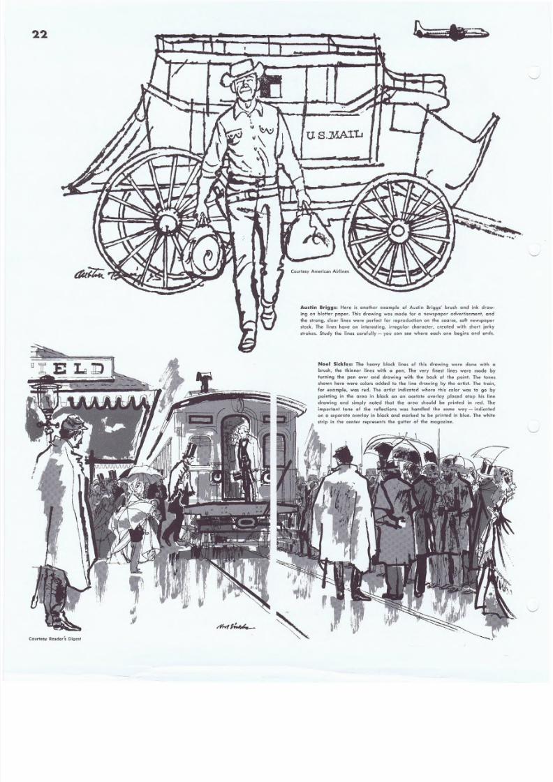
Austin B~i99S: Here is another example of Auslln 8rigg.' brush and ink ch-ew-
ing on blotter paper. This drawing was made for a newspaper advertisement, and
the strong} clecr l ines were perfect for reproduction on the coarse, sof t newspaper
stack. The lines have an interesting, irregular character, created with shorl. jerky
strokes. Study the lines carefully - you can see where each one begins and ends.
Noel Sickles: The heavy black lines of this drawing were done with a
brush, the thinner lines with " pen. The very finest lines were made by
turning the pen over and drawing with the back of the point. The tones
shown here were colors added to the line drawing by the artist.. The train,
for example, waS red. The artist indicated where this color was to go by
painting in the area in black on an acetate overlay placed atop his line
drawing and simply noted that the area should be printed in red. The
important tone of the reAections was handled the same way - indicated
on a separate overlay in black and marked to be printed in blue. The while
strip in the center represents the gutter of the magazine.
Courtesy Reader's. 0 ig est
8/8/2019 15 Advanced Line Drawing
http://slidepdf.com/reader/full/15-advanced-line-drawing 23/54
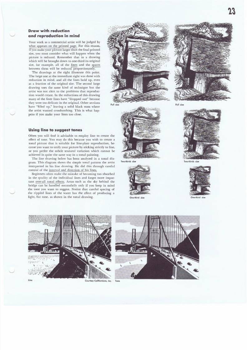
Using line to suggest tones
Often you will find it advisable to employ line to create the
effect of tone. You may do this because you wish to create a
tonal picture that is suitable for line-plate reproduction, be-
cause you want to unify your picture by sticking strictly to line,
or you prefer the subtle textural variation which cannot be
achieved in quite the same way in a tonal painting.
The line drawing below has been analyzed in a tonal dia-
gram ..This diagram shows the simple tonal pattern the artist
interpreted in his line drawing. He did this through careful
control of the interval and direction of his lines.
Beginners often make the mistake of becoming too absorbed
in the quality of the individual lines and forget more impor-
tant over-all tonal effects. Areas such as the sky behind the
bridge can be handled successfully only if you keep in mind
the tone you want to suggest. Notice that careful spacing of
the rippled lines of the water has the effect of producing a
light, flat tone, as shown in the tonal drawing.
Draw with reduction
and reproduction in mind
Your work as a commercial artist will be judged by
what appears on the printed page. For this reason,
if you make your picture larger than the final printed
size, you must consider what will happen when the
picture is reduced. Remember that in a drawing
which will be brought down to one-third its original
size, for example, all of the lines and the spaces
between them will be reduced proportionatery.--
The drawings at the right illustrate this point.
The large one at the immediate right was done with
reduction in mind, and all the lines hold up, even
at a fraction of the original size. The second large
drawing uses the same kind of technique but the
artist was not alert to the problems that reproduc-
tion would create. In the reductions of this drawing
many of the finer lines have "dropped out" because
they were too delicate in the original. Other sections
have "filled up," leaving a solid black mass where
the artist wanted crosshatching. This is what hap-
pens if you make your lines too close.
full s ize
Two-thirds size
One-third s ize
line .
full s ize
Two-thirds size
One-third s ize
Courtesy Cal ifo rn ians , lne . Tone
8/8/2019 15 Advanced Line Drawing
http://slidepdf.com/reader/full/15-advanced-line-drawing 24/54
24
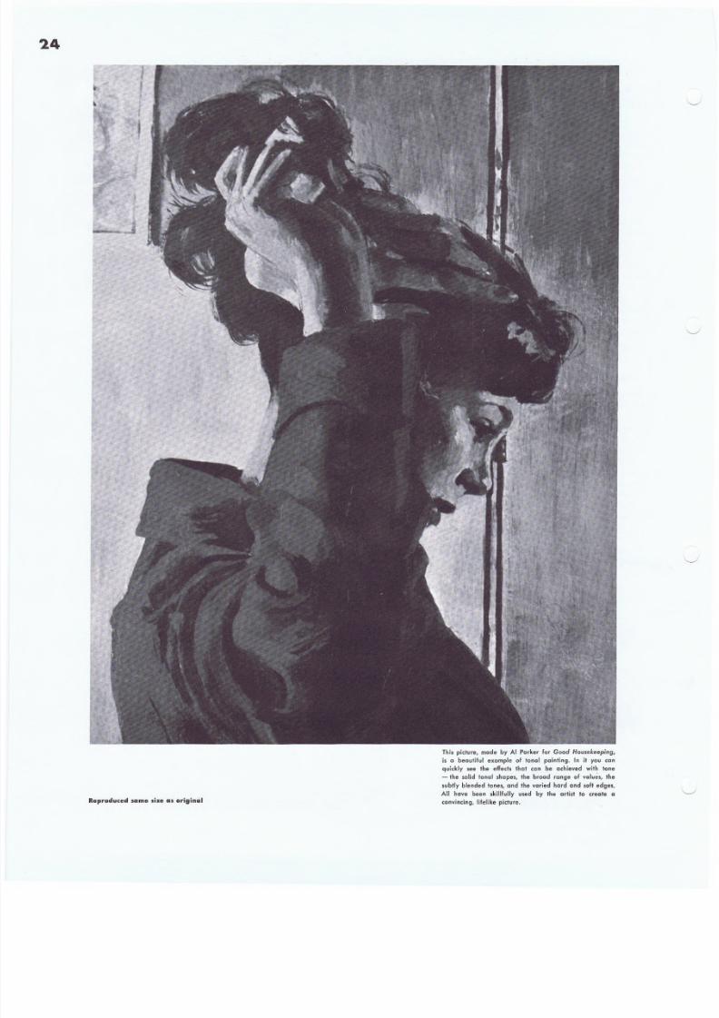
Reproduced s ame s ize a s original
Thi s picture, made by AI Parker for Good Housekeeping,
is a beautiful example of lanai painting. In it you can
quickly see the effeds that Can be achieved with tone
- the solid lonal shapes, the broad range of values, the
subt ly b lended tones , and the var ied hard and soft edges .
All have been skillfully used by the artist to create a
convincing, lifelike picture.
8/8/2019 15 Advanced Line Drawing
http://slidepdf.com/reader/full/15-advanced-line-drawing 25/54
Advanced tonal painting
Drawing in ink holds its special kind of fascination for the
artist - but painting in tone has qualities that are just as unique
and appealing. For one thing, tone is the best medium for creat-
ing a convincing illusion. With transparent wash, Qpaque, and
other tonal mediums you can duplicate the whole range of
values and textures you find in your subjects, and make in-
credibly real or natura1istic pictures. You can quickly mix any
value of gray you wish instead of having to suggest this gray
with many individual ink lines. Painting in tone also gives you
great ease and control in handling edges in all their variety.
Finally, of course, tonal mediums are the only practical ones
for making full-color pictures.
Because tonal paintings do not contain merely black and
white, but also include gradated tones of gray or color, they can-
not be reproduced by line engraving. Instead, they are made
into halftone engravings or printed by offset lithography. Today,
halftone reproduction, particularly by offset lithography, has
become so highly perfected that it is possible to reproduce with
complete accuracy drawings made in just about any medium-
pencil, pastel, and crayon, as well as the more conventional
mediums of wash, opaque, casein, oil, and, of course, many
different combinations of these.
In this part of the lesson you will study ways to use a variety
of tonal mediums to full advantage in your pictures - explore
the possibilities of these mediums as well as their limitations.
New tonal mediums, techniques, and painting surfaces are con-
stantly being developed and every wide-awake artist should at
least be familiar with the main methods of working in tone
which we will show you. You should try them all. Remember,
however, that no single medium and no technique, no matter
how tricky or clever, will ever be a substitute for good drawing
and composition. At the same time, you should be sure th_atyou
are working with a medium and in a manner that you find com-
fortable. There are plenty of picture-making problems to be
solved on every job and there is no reason for adding a problem
of technique to them.
No matter what medium you are using, certain basic points
must be considered. The first and most essential concerns a plan
or method of procedure. A picture which contains many shapes
and many different tones can easily get out of hand unless you
have some organized, methodical way of going about your work
and controlling the factors that enter into it.
In step-by-step demonstrations on the following pages you
will see the methods of procedure used by different members of
your Faculty in painting with the ton~l mediums that are most
popular in today's illustration. Each artist's method varies, like
his work, but all build up the picture from start to finish in a
logical, orderly manner developed through a constant search for
better ways of working. In general, most professional artists be-
lieve in getting the large, simple masses of the picture under
control first - making these masses, in their design and arrange-
ment, tell as much of the story as possible. The demonstration
by Peter Helek is an excellent example of this. When the artist
is satisfied that he has his large masses right - and not before
then - he goes on to put in the details.
We cannot emphasize too strongly the importance of estab-
lishing your pattern of masses and values at the start. Without
a good design that clearly expresses the mood and feeling of
your picture, details mean very little.
This is one point where students frequently stumble. They
tend to overlook the need for this over-all design and, instead,
spend endless hours working on details in the mistaken notion
that careful surface rendering is what makes a good picture-
or can save a bad one. Since the effect of the basic composition
depends entirely on the skillful arrangement of the tonal areas
and shapes, such effort is simply a waste of time. It is like trying
to finish a room by applying wallpaper over the rough framing.
If you skip the vital step of establishing a strong, coherent pat-
tern of shapes and values or fail to maintain this strong pattern,
you will inevitably end up with a picture that is weak as a com-
position and spotty and broken up in value.
Another basic point in working with tone is to keep all parts
of your picture developing at the same time. Do not let yourself
be tempted to finish up one small area of the picture before you
have even put down all of your basic tones in the rest of it. It's
much wiser to keep the over-all painting moving along at an
even rate. This helps greatly in controlling the values and forms
and is also a far more efficient way of keeping in touch with
your whole picture.
Here we will also turn our attention to the effect of light and
consider some interesting ways it may be used to reveal forms
and also to establish the mood and character of the over-all pic-
ture. You will see how the so-called "local color" values or na-
tural tones are influenced by lighting. In addition, we'll take a
careful look at the part played by edges in our painting. Next
to shapes and values, edges are the most important things to
consider in drawing in tone. The hard, sharp edge, which tends
to come forward in the picture and attracts attention, as op-
posed to the soft, diffused edge, which stays back and takes a
subordinate place - we will go into both of these in detail.
The last portion of the lesson will show you examples of
mixed mediums - pencil and pastel, line and wash, pencil and
opaque, and others. Since the goal here is an interesting effect
or picture, there are no rules as to which mediums may be used
together. We want you to experiment with and tryout, both
singly and in combination, the different mediums we demon-
strate here. Work boldly and directly and put down the tones
you feel are appropriate for the effect you want. This will help
you to overcome any timidity in working with new mediums or
in using familiar ones in new ways - to achieve control of the
whole picture space and the tones within it and create paintings
that are highly original and expressive.
8/8/2019 15 Advanced Line Drawing
http://slidepdf.com/reader/full/15-advanced-line-drawing 26/54
26
Interpreting tones in
the model or photograph
Before you can paint a tonal subject well you must study and
understand it thoroughly. You must recognize the tones or
values that you see on the model or in the reference photo and
what causes them. These tones are quite simple to analyze and,
once you understand them, you can work with confidence,
changing and rearranging values as will best suit the purpose ofyour picture.
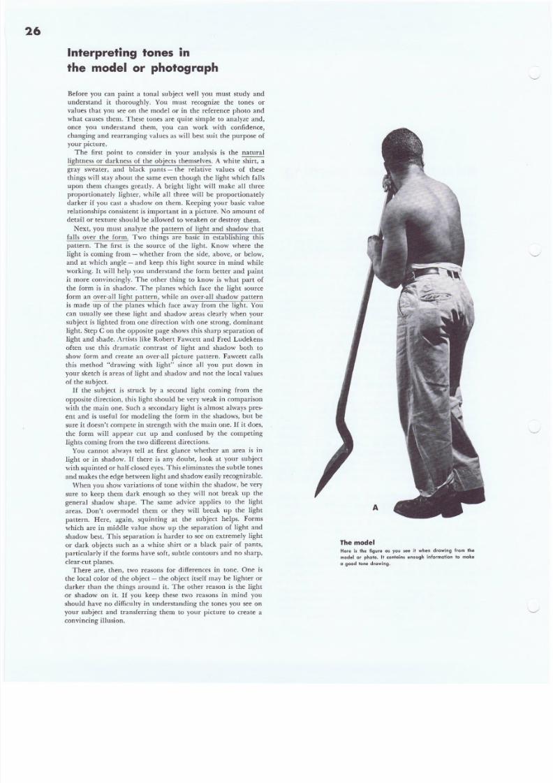
The first point to consider in your analysis is the natural
lightness or darkness of the objects themselves. A white shin, a
gray sweater, and black pants - the relative values of these
things will stay about the same even though the light which falls
upon them changes greatly. A bright light will make all three
proportionately lighter, while a ll three will be proportionately
darker if you cast a shadow on them. Keeping your basic value
relationships consistent is important in a picture. No amount of
detail or texture should be allowed to weaken or destroy them.
Next, you must analyze the pattern of light and shadow that
falls over the form_ Two things are basic in establishing this
pattern. The first is the source of the light. Know where the
light is coming from - whether from the side, above, or below,
and at which angle - and keep this light source in mind while
working. It will help you understand the form better and paintit more convincingly. The other thing to know is what part of
the form is in shadow. The planes which face the light source
form an over-aU light pattern, while an over-all shadow pattern
is made up of the planes which face away from the light. You
can usually see these light and shadow areas clearly when your
subject is lighted from one direction with one strong, dominant
light. Step C on the opposite page shows this sharp separation of
light and shade. Artists like Robert Fawcett and Fred Ludekens
often use this dramatic contrast of light and shadow both to
show form and create an over-all picture pattern. Fawcett calls
this method "drawing with light" since all you put down in
your sketch is areas of light and shadow and not the local values
of the subject.
If the subject is struck by a second light coming from the
opposite direction, this light should be very weak in comparison
with the main one. Such a secondary light is almost always pres-ent and is useful for modeling the form in the shadows, but be
sure it doesn't compete in strength with the main one. If it does,
the form will appear cut up and confused by the competing
lights coming from the two different directions.
You. cannot always tell at first glance whether an area is in
light or in shadow. If there is any doubt, look at your subject
with squinted or half-closed eyes. This eliminates the subtle tones
and makes the edge between l ight and shadow easi ly recognizable.
When you show variations of tone within the shadow, be very
sure to keep them dark enough so they will not break up the
general shadow shape. The same advice applies to the light
areas. Don't overmodel them or they will break up the light
pattern. Here, again, squinting at the subject helps. Forms
which are in middle value show lip the separation of light and
shadow best. This separation is harder to see on extremely light
or dark objects such as a white shirt or a black pair of pants,particularly if the forms have soft, subtle contours and no sharp,
clear-cut planes.
There are, then, two reasons for differences in tone. One is
the local color of the object - the object itself may be lighter or
darker than the things around it. The other reason is the light
-or shadow on it. If you keep these two reasons in mind yOll
should have no difficulty in understanding the tones you see on
your subject and transferring them to your picture to create a
convincing illusion.
ThemodelHere is the figure as you see it when drawing from the
model or photo. It contains enough information to make
D goo d t one d rawin g.
8/8/2019 15 Advanced Line Drawing
http://slidepdf.com/reader/full/15-advanced-line-drawing 27/54
~Qmous A. r ti s 'sC our se
Advanced Une drawing and tonal painting
The local valuesHere you see Ihe nalural or local color values on the
model. The effeci of lig hl and shade i s no l shown. Not ice
the value relationships. The hair, belt, and shoes are
darkesl, Ihe skin ls eomewhc+ l ight er, Ih e shovel sti ll
lighler, and the trousers are lightest of all. You should
have a cl ear p icture of these v alue relation sh ips before
you beg in to. d raw.
Light and shadow patternThis is a pure form drawing. Think of it as a light and
sh adow chart wh ich shows you th e size, shape, and po si -
tion of the pl anes which are struck by the li ght and tho se
which are in shadow . The lo cal co lor val ues are i gnored
comple te ly . Th is [ s I he k ind of a drawing you would make
with a plaster casl or statu e as a model.
Light and shadow IPluslocal coloHere is the finished drawing. The artist co
local color values of B with the pure form
C 10 complete the illus ion of real three-dlmens
Noli celhat th e l ight s and shadows hav e b ee
conl rol led so th ey would not d est roy the natu
8/8/2019 15 Advanced Line Drawing
http://slidepdf.com/reader/full/15-advanced-line-drawing 28/54
28
famous Ar'lsts COUTse
Advanced line drawing and tonal painting
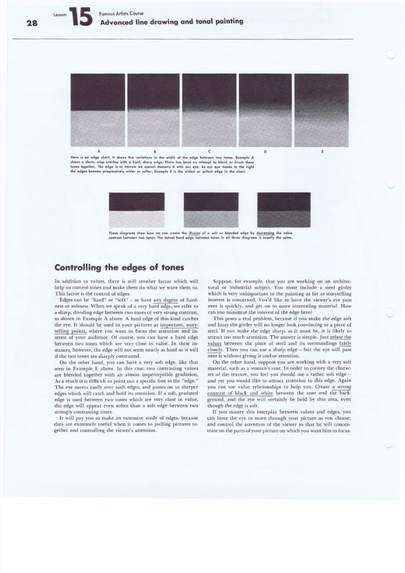
A B c D E
Here is an edge chart. It shows five variations in the width 01 Ihe edge between two lanes. Example A
shows a clean, crisp overlap with a herd, sharp edge. There has been no ollempt to blend or brush these
tones together. The edge is so narrow we cannol measure it with our eye. As our eye moves to the right
Ihe edges become progressively wider o r so fter. Example E is the widest o r so fte.1 edge in the ch art.
These diagrams show how we can create th e illusion 01 a soft or blended edge by decreosing the value
conlrast belween two tones. The actual hard edg e between tones in "II three diagrams i s exactly the same.
Controlling the edges of tones
In addition to values, there is still another factor which will
help us control tones and make them do what we want them to.
This factor is the control of edges.
Edges can be "hard" or "soft" - or have any degree of hard-
ness or softness. When we speak of a very hard edge, we refer to
a sharp, dividing edge between two tones of very strong contrast ,
as shown in Example A above. A hard edge of this kind catches
the eye. It should be used in your pictures at important, story-
telling points, where you want to focus the attention and in-
terest of your audience. Of course, you can have a hard edge
between two tones which are very close in value. In these in-
stances, however, the edge will not seem nearly as hard as it will
if the two tones are sharply contrasted.
On the other hand, you can have a very soft edge, like that
seen in Example E above. In this case, two contrasting values
are blended together with an almost imperceptible gradation.
As a result it is difficult to point out a specific line as the "edge."
The eye moves easily over such edges, and passes on to sharper
edges which will catch and hold its attention. If a soft. gradated
edge is used between two tones which are very close in value,the edge will appear even softer than a soft edge between two
strongly contrasting tones.
It will pay you to make an extensive study of edges, because
they are extremely useful when it comes to pulling pictures to-
gether and controlling the viewer's attention.
Suppose, for example, that you are working on an architec-
tural or industrial subject. You must include a steel girder
which is very unimportant to the painting as far as storytelling
interest is concerned. You'd like to have the viewer's eye pass
over it quickly, and get on to more interesting material. How
can you minimize the interest of the edge here?
This poses a real problem, because if you make the edge soft
and fuzzy the girder will no longer look convincing as a piece of
steel. If you make the edge sharp, as it must be, it is likely to
attract too much attention. The answer is simple. Just relate the
values between the piece of steel and its surroundings fairly
closely. Then you can use a sharp edge - but the eye will pass
over i t without giving it undue attention.
On the other hand, suppose you are working with a very soft
material, such as a woman's coat. In order to convey the charac-
ter of the texture, you feel you should use a rather soft edge -
and yet you would like to attract attention to this edge. Again
you can use value relationships to help you. Create a strong
contrast of black and white between the coat and the back-
ground, and the eye will certainly be held by this area, eventhough the edge is soft.
H you master this interplay between values and edges, you
can force the eye to move through your picture as you choose,
and control the attention of the viewer so that he will concen-
trate on the parts of your picture on which you want him to focus.
8/8/2019 15 Advanced Line Drawing
http://slidepdf.com/reader/full/15-advanced-line-drawing 29/54
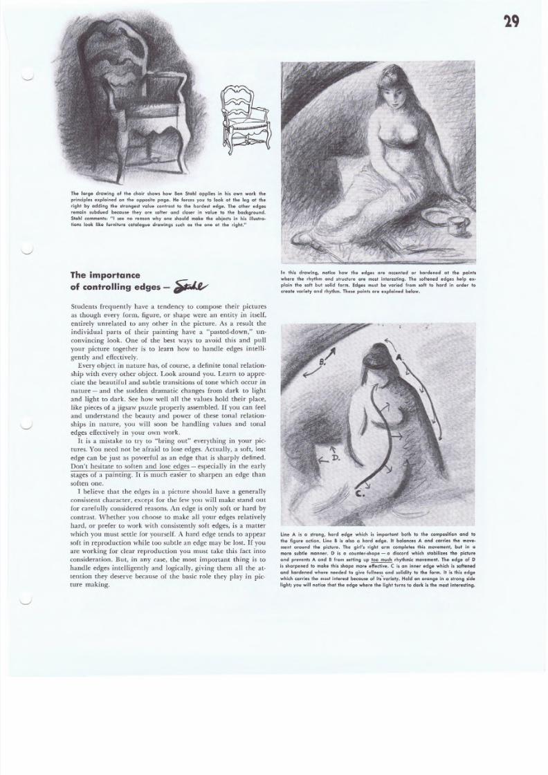
The large drawing of the chair show. how Ben Stahl applies in his own work the
principles explained on the opposite page. He forces you to look at the leg at the
right by adding the strongest value contrast to the hardest edge. The other edges
remain subdued because they are softer and closer in value to the background.
Stahl comments: "I see no reason why one should make the objects in his illustre-
tions look l ike furniture cqtalogu e drawi ngs such as the one at the right ."
The importance
of controlling edges - ~
Students frequently have a tendency to compose their pictures
as though every form, figure, or shape were an entity in itself,
entirely unrelated to any other in the picture. As a result the
individual parts of their painting have a "pasted-down," un-
convincing look. One of the best ways to avoid this and pull
your picture together is to learn how to handle edges intelli-
gently and effectively.
Every object in nature has, of course, a definite tonal relation-
ship with every other object. Look around you. Learn to appre-
ciate the beautiful and subtle transitions of tone which occur in
nature - and the sudden dramatic changes from dark to light
and light to dark. See how wen all the values hold their place,
like pieces of a jigsaw puzzle properly assembled. If you can feel
ami understand the beauty and power of these tonal relation-
ships in nature, you will soon be handling values and tonal
edges effectively in your own work.
It is a mistake to try to "bring out" everything in your pic-
tures. You neeel not be afraid to lose edges. Actually, a soft, lost
edge can be just as powerful as an edge that is sharply defined.
Don't hesitate to soften and lose edges - especially in the early
stages of a painting. It is much easier to sharpen an edge than
soften one.
I believe that the edges in a picture should have a generally
consistent character, except for the few you will make stand out
for carefully considered reasons. An edge is only soft or hard by
contrast. Whether you choose to make all your edges relatively
hard, or prefer to work with consistently soft edges, is a matter
which you must settle for yourself. A hard edge tends to appear
soft in reproduction while too subtle an edge may be lost. If you
are working for clear reproduction you must take this fact into
consideration ..But, in any case .• the most important thing is to
handle edges inteIligently and logically, giving them all the at-
tention they deserve because of the basic role they play in pic-
ture making.
In this drawing, notice how the edges are accented or hardened at the points
where the rhyt hm and stru ct ure are most i nteresting . The softened edges help ex-
plain the soft but solid form. Edges must be varied from soft to hard in order to
create var iety and rhythm. These points are explained below.
Line A is a strong, hard edge which is important both to the eempesltien and to
Ihe figure action. Line B is also a hard edge. It balances A and carries the move-
ment around the picture. The girl's right arm completes this movement, but in a
more subtle manner. D is a counter-shepe - a d is cord which s tabi li ze s the p ic tu re
and prevents A and B from sellin g up too much rhyth rnlc movement. Th e edge of D
is sharp en ed t o make this shape more effective. C is an inner edge which i s s oft en ed
and hardened where needed to g ive fu llness and sol id ity 10 the form. It is this edge
which carr ie s the most intere st because of i ts -var ie ty . Hold an orange in a sl rong s ide
l ight ; you wil l not ice tha t the edge where the l ight tur ns to dar k i s the mos t intere st ing.
8/8/2019 15 Advanced Line Drawing
http://slidepdf.com/reader/full/15-advanced-line-drawing 30/54
30
The over-all design comes first
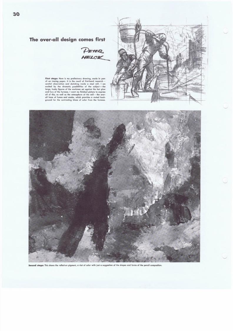
First stager Here ls my preliminary d rawi ng, mode i n pen-
ci l o n tracing p aper. It i s the result o f first-h and research-
careful observation and .kelching 'inside a steel mill. I am
excited by the dramatic possibilities of the subject - the
large, h usky figures of the workmen set agoin st the hot glow
and fur y of the furnace. I WQntmy fini shed p idure to expre ss
all of this, as well as the atmosphere of the mill - the over-
QII h aze of fumes and smoke, whi ch p rov ides a muted b eck-
ground lor the cont rastin g blaze of col or from th e fu rneee.
Second $tager This shows the ro ll ed-on p igment , a riot o f color with jus t a suggest ion of the .hapes and forms of the penci l composi tion .
8/8/2019 15 Advanced Line Drawing
http://slidepdf.com/reader/full/15-advanced-line-drawing 31/54
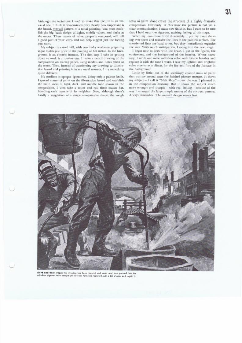
Although the technique 1 use(\ to make this picture is an un-
usual one, I think it demonstrates very clearly how important is
the broad, over-all pattern of a tonal painting. You must estab-
lish the big, basic design of lights, middle values, and darks at
the outset. These masses of value, properly composed, will tell
a good part of your story, and can help suggest just the feeling
you want.
My subject is a steel mill , with two husky workmen preparing
ingot molds just prior to the pouring of hot metal. In the back-
ground is an electric furnace. The first step I take in getting
down to work is a routine one. I make a pencil drawing of thecomposition on tracing paper, using models and notes taken at
the scene. Then, instead of transferring my drawing to illustra-
tion board and painting it in my usual manner, I try something
quite different.
My medium is opaque (gouache). Using only a palette knife,
I spread masses of paint on the illustration board and establish
the main areas of light, dark, and middle tone shown in the
composition. I then take a roller and roll these masses flat,
blending each mass with its neighbor. Now, although there's
hardly a suggestion of a single recognizable shape, the rough
areas o f paint a lon e cre ate th e stru ctu re of a highly dramaticcomposition. Obviously, at this stage the picture is not yet a
clear communication. I must now finish it, but I want to be sure
that I hold onto the vigorous, exciting feeling of this stage.
When my tones have dried thoroughly, I put my tissue draw-
ing over them and transfer the lines to the painted surface. The
transferred lines are hard to see, but they immediately organize
the area. With much anticipation, I swing into the next stage.
I begin now to draw with the brush. I put in the figures, the
equipment, and the background of the interior. Where neces-
sary, I scrub out some rolled-on color with bristle brushes andreplace it with the tone I want. I save my lightest and brightest
color accents as a climax for the fire and fury of the furnace in
the background.
Little by Iittle, out of the seemingly chaotic mass of paint
that was my second stage the finished picture emerges. Itshows
my subject -I call it "Melt Shop" - just the way I planned it
in the composition drawing. But it shows the subject much
more strongly and sharply - with real feeling - because of the
way I arranged the large, simple masses of the abstract pattern.
Always remember: The over-all design comes first .
Th ird and final stage: The drawing has been restared and order and form pointed into the
ro ll ed-on p igment . With opaque you can lase f arm and restore it, ruin a bit of color and regain il.
8/8/2019 15 Advanced Line Drawing
http://slidepdf.com/reader/full/15-advanced-line-drawing 32/54
32large paill ter's brush
for 'onl119 the ,ur{ace
and po. in ti n 9 large
Valspar
varnish
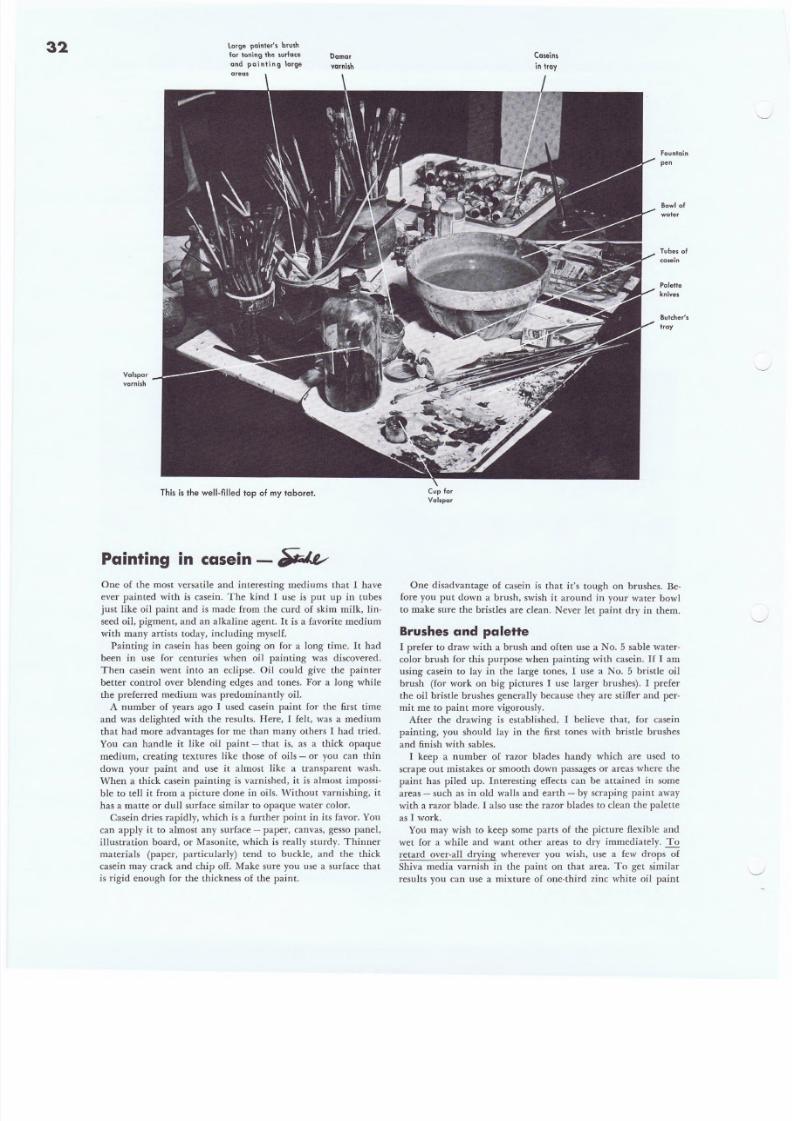
This is the we ll-f illed top of my taboret.
Painting in casein - ~
One of the most versatile and interesting mediums that I haveever painted with is casein. The kind I use is put up in tubes
just like oil paint and is made from the curd of skim milk, lin-
seed oil, pigment, and an alkaline agent. It is a favorite medium
with many artists today, including myself.
Painting in casein has been going on for a long time. It had
been in use for centuries when oil painting was discovered.
Then casein went into an eclipse. Oil could give the painter
better control over blending edges and tones. For a long while
the preferred medium was predominantly oil.
A number of years ago I used casein paint for the first time
and was delighted with the results. Here, I felt, was a medium
that had more advantages for me than many others I had tried.
You can handle it like oil paint - that is, as a thick opaque
medium, creating textures like those of oils - or you can thin
down your paint and use it almost like a transparent wash.
When a thick casein painting is varnished, it is almost impossi-ble to tell it from a picture done in oils. Without varnishing, it
has a matte or dull surface similar to opaque water color.
Casein dries rapidly, which is a further point in its favor. You
can apply it to almost any surface - paper, canvas, gesso panel,
illustrat ion board, or Masonite, which is really sturdy. Thinner
materials (paper, particularly) tend to buckle, and the thick
casein may crack and chip off. Make sure you use a surface that
is rigid enough for the thickness of the paint.
Caseins
i n t ray
Fountain
pe n
Bowl of
we+er
Tubes 01
casein
Palette
knives
Butcher's
tray
Cup for
Val.par
One disadvantage of casein is that it's tough on brushes. Be-fore you put down a brush, swish it around in your' water bowl
to make sure the bristles are clean. Never let paint dry in them.
Brushesand palette
I prefer to draw with a brush and often use a No.5 sable water-
color brush for this purpose when painting with casein. If I am
using casein to lay in the large tones, '1 use a No. 5 bristle oil
brush (for work on big pictures I use larger brushes). I prefer
the oil bristle brushes generally because they are stiffer and per-
mit me to paint more vigorously.
After the drawing is established, I believe that, for casein
painting, you should lay in the first tones with bristle brushes
and finish with sables.
I keep a number of razor blades handy which are used to
scrape out mistakes or smooth down passages or areas where the
paint has piled up. Interesting effects can be attained in someareas - such as in old walls and earth - by scraping paint away
with a razor blade. I also use the razor blades to clean the palette
as I work.
You may wish to keep some parts of the picture flexible and
wet for a while and want other areas to dry immediately. To
retard over-all drying wherever you wish, use a few drops of
Shiva media varnish in the paint on that area. To get similar
results you can use a mixture of one-third zinc white oil paint
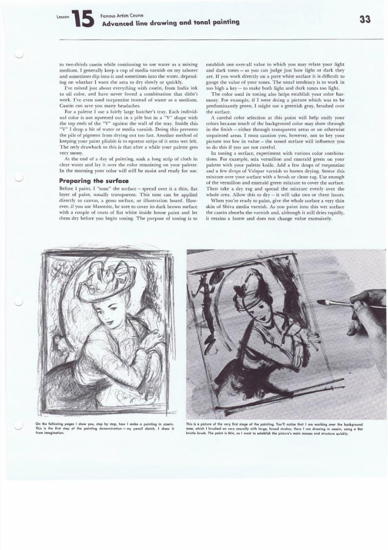
8/8/2019 15 Advanced Line Drawing
http://slidepdf.com/reader/full/15-advanced-line-drawing 33/54
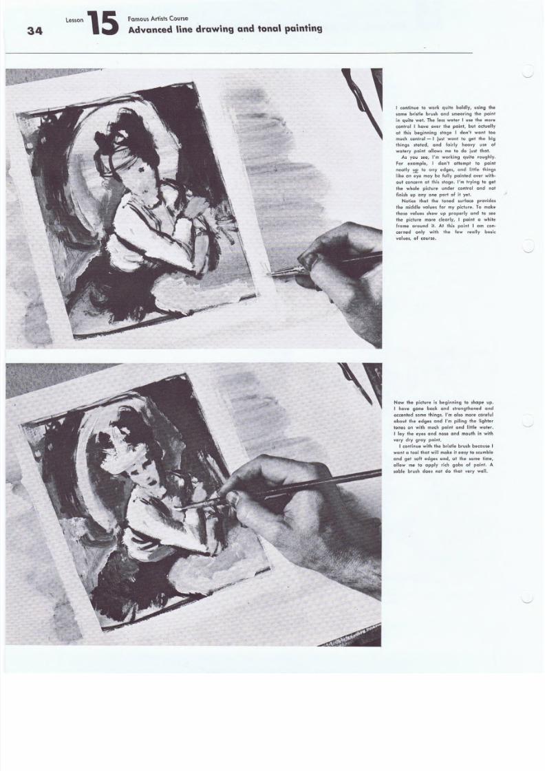
8/8/2019 15 Advanced Line Drawing
http://slidepdf.com/reader/full/15-advanced-line-drawing 34/54
Lesson15 famous Artists Course
Advanced line drawing and tonal painting34
I continue to work quite boldly, using the
same bristle brush and smearing the paint
in quite wet. The less water I use the more
control I have over the paint, but oclually
at this beginning stage J don't want toomuch control - I just want to get the big
things stated, and fairly heavy use o
watery paint allows me to do just that.
As you see, I'm working quite roughly.
For examp le , J don't attempt to paint
neatly ~ to any edges. and little things
like an eye may be fully painted over with-
out concern at this stage. I'm trying to get
the whole picture under control and no
finish up anyone part of it yet.
Notice that the toned surface provides
the middle values for my picture. To make
these values show up properly and to see
the picture more clearly, I paint a white
frame around it. At this point I am con-
cerned only with the few really basic
.v alues, o f c ::ourse.
Now the picture is beginning to shape up.
I have gone back and strengthened and
accented some t hi ng s. I' m al so mo re c are ful
about the edges and I'm piling the lighter
tones on with much paint and little water.
r lay the eyes and nose and mouth in with
very dry gray paint.
I continue with the bristle brush because I
want a tool that will make it easy to scumble
and get soft edges and, at the same time,
allow me to apply rich gobs of paint. A
sable brush does not do that very well.
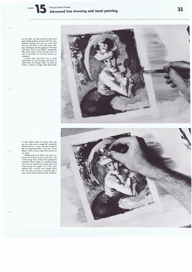
8/8/2019 15 Advanced Line Drawing
http://slidepdf.com/reader/full/15-advanced-line-drawing 35/54
Lesson \5 ramous' A.rtists Course
Advanced line drawing and tonal painting
At this point my big strudural lines have
been a lmost ent Ir ely covered with the more
finished painting, but you can sense that
t hey are still there. I have also been work-
ing at bringing out the planes in the headand body. One 01 the things I par ticularly
like about casein ls that you don't have to
wait a long time for it to dry before you
overpaint.
I switch back and forth from a small
soble brush to an oil bristle and then, as
shown here, 10 a larger sable. I'm tryin g to
create a variety of edge. wit h t hese tools.
A razor blade comes in handy. Here yousee me using one to scrape off excessively
pi led-up paint. I scrape off onl y enough to
get an in terest ing ef fect . I also use a razor
blade to kill a brush sl roke t hat st and s oul
too much.
I d isl ike p ic tu re . in which I am more con-
sci ous of th e cl ev er brush strokes than I am
of t he thi ngs these strok es are supposed to
r epre sen t. Brush marks in a p ic tu re shou ld
var y. Na two should look exact ly a like , and
many should not appear a, if they were
applied with a brush, even though that's
the way they were done. Scraping with a
rozcr blade helps eliminate these problems.
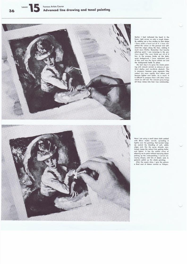
8/8/2019 15 Advanced Line Drawing
http://slidepdf.com/reader/full/15-advanced-line-drawing 36/54
36
,."on 15 Famous Artists Course
Advanced lin.edrawing and tonal painting
Earlier I had indkated the hand in the
lower right corner as only a rough shope.
By adding just a few strokes to that shape
I have made a hand oul of it. I have sim-
plified Ihe· values on the parasol and soft-ened t.he edges along the face, making it
much more lifelike. Remember that heavily
piled-up paint I was removing in Ihe pre-
vious stcrqe? The razor blade got rid of it
but, in the process, broke up Ihe dark,
quiet background. I have repainted port
of thls, and now the figure stands out and
the background hold. its place.
My next step is to spray the whole point-
i ng w it h r eto uc h va rn is h (0 mixture of one-
third shellcc and two-thirds clcohcl) .. This
is ne.cesscry because some pigments (like
umber) dry more rapidly than others and
become lighter and duller. As " result, it
is difficult to compare them wilh other tones
which are still wet. The retouch sproy bring.
01 1 t hes e v al ues in to t he ir t rue r el n+ ion sh ip .
Here I om using a small deem cloth soaked
with Shive media vcr-ni sh, spreoding it
lightly over the painting. The! vcrni sh helps
me control the blending of soft, subtle
edges end, like the sproy alreody men-
tioned. keep. Ihe vctlues fr om g et tin g du lle r
end lighter. II has the added virlue of
allowing me 10 paint without worrying aboul
pi<king up the underpainling. I corred an-
noying ,hapes, add bits of detail, and, in
general. polish up the whole painting.
After the casein dries, I give the picture
a finaJ coat of damar vcrrn i sh or Vclspcr.
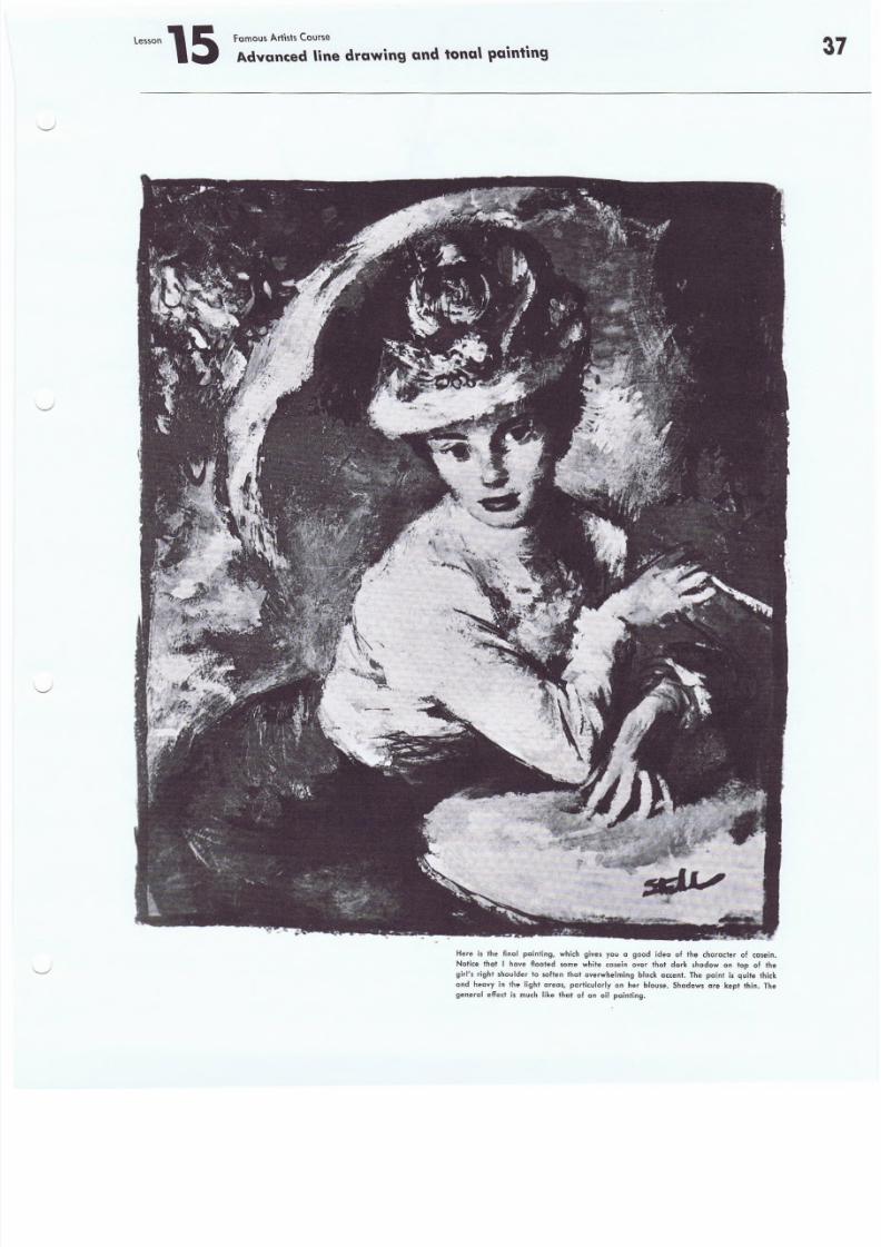
8/8/2019 15 Advanced Line Drawing
http://slidepdf.com/reader/full/15-advanced-line-drawing 37/54
Fornous Artists Course
Advanced \ine drawing and tona' painting
Here is the final painting, which gives you a good idea of the character of ccsein.
Notice that I have floated sorne white casein over thot dark shadow on top of the
g irl 's r ight shou lder +o soften tha t overwhelming b lack accen t. The paint i s qui te thiek
and heo.vy i n th e ligh l cre cs, part icularly on her blouse. Shadows are k ep t thin . The
gen .e ra l e ffect i s much l ike tha t 01 an oil painting.
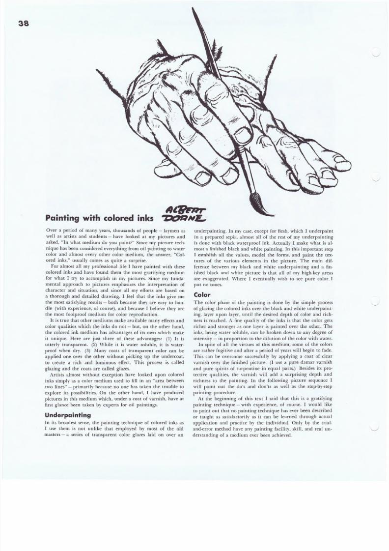
8/8/2019 15 Advanced Line Drawing
http://slidepdf.com/reader/full/15-advanced-line-drawing 38/54
38
Painting with colored inks
Over a period of many years, thousands of people - laymen as
well as artists and students - have looked at my pictures and
asked, "In what medium do you paint?" Since my picture tech-
nique has been considered everything from oil painting to water
color and almost every other color medium, the answer, "Col-
ored inks," usually comes as quite a surprise.
For almost all my professional life I have painted with these
colored inks and have found them the most gratifying medium
for what I try to accomplish in my pictures. Since my funda-
mental approach to pictures emphasizes the interpretation of
character and situation, and since all my efforts are based on
a thorough and detailed drawing, I feel that the inks give me
the most satisfying results - both because they are easy to han-
dle (with experience, of course), and because I believe they are
the most foolproof medium for color reproduction.
It is true that other mediums make available many effects and
color qualities which the inks do not - but, on the other hand,
the colored ink medium has advantages of its own which make
it unique. Here are just three of these advantages: (1) It is
utterly transparent. (2) While it is water soluble, it is water-
proof when dry. (3) Many coats of transparent color can be
applied one over the other without picking up the undercoat,
to create a rich and luminous effect. This process is called
glazing and the coats are called glazes.
Artists almost without exception have looked upon colored
inks simply as a color medium used to fill in an "area between
two lines" - p~imarily because no one has taken the trouble to
explore its possibilities. On the other hand, I have produced
pictures in this medium which, under a coat of varnish, have at
first glance been taken by experts for oil paintings.
Underpainting
In its broadest sense, the painting technique of colored inks as
I lise them is not unlike that employed by most of the old
masters - a series of transparent color glazes laid on over an
underpainting. In my case, except for flesh, which I underpaint
in a prepared sepia, almost all of the rest of my underpainting
is done with black waterproof ink. Actually I make what is al-
most a finished black and white painting. In this important step
I establish all the values, model the forms, and paint the tex-
tures of the various elements in the picture. The main dif-
ference between my black and white underpainting and a fin-
ished black and white picture is that all of my high-key areas
are exaggerated. Where I eventually wish to see pure color. I
put no tones.
Color
The color phase of the painting is done by the simple process
of glazing the colored inks over the black and white underpaint-
ing, layer upon layer, until the desired depth of color and rich-
ness is reached. A fine quali ty of the inks is that the color gets
richer and stronger as one layer is painted over the other. The
inks, being water soluble, can be broken down to any degree of
intensity - in proportion to the dilution of the color with water.
In spite of all the virtues of this medium, some of the colors
are rather fugitive and after a period of years will begin to fade.
This can be overcome successfully by applying a coat of dear
varnish over the finished picture. (I use a pure damar varnish
and pure spirits of turpentine in equal parts.) Besides its pro·
tective qualities, the varnish will add a surprising depth and
richness to the painting. In the following picture sequence I
will point out the do's and don'ts as well as the step-by-step
painting procedure.
At the beginning of this text I said that this is a gratifying
painting technique - with experience, of course .. I would like
to point out that no painting technique has ever been described
or taught as satisfactorily as it can be learned through actual
application and practice by the individual. Only by the trial-
and-error method have any painting facility, skill, and real un-
derstanding of a medium ever been achieved.
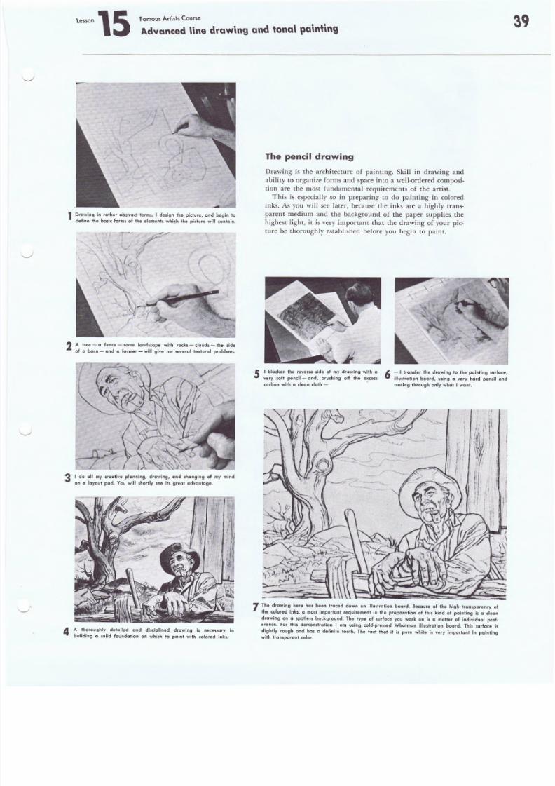
8/8/2019 15 Advanced Line Drawing
http://slidepdf.com/reader/full/15-advanced-line-drawing 39/54
Lessen 15 Fomous ArHsts Course
Advanced line drawing and tonal painting
1 Drawing in rather cbstroet terms, I design the picture, end begin to
define the basic forms of the elements which the picture will contain,
2 A .ftrebE l- a fendce -f,ome land~lclap,e with rocks -I doud'l- the
bl
side
a a arn - an a ermer - WI g IVe me s ev er a textueo pro ems.
3 I do all my creative planning, drawing, and changing of my mind
on a leyout pad. You will shortly see ils great advantage.
4 A thoroughly detailed and disciplined drawing is necessary in
building c solid foundation on which to paint with colored inks.
The pencil drawing
Drawing is the architecture of painting, Skill in drawing and
ability to organize forms and space into a well-ordered composi-
tion are the most fundamental requirements of the artist.
This is especially so in preparing to do painting in colored
inks. As you will see later, because the inks are a highly trans-
parent medium and the background of the paper supplies the
highest light, it is very important that the drawing of your pic-
ture be thoroughly established before you begin to paint.
5 I blacken the reverse side of my drawing with CI
very soft penci] - and, brushing off the e~cess
carbon with a clean cloth -
6 - I Iransfer the drawing to the pointing surface
lllus+rction board, using a very hard pencil an
Iracing Ihrough only what I want.
7 The drawing here has been traced down on illustration board. Because of the high transparency of
the colored inks, a most imporlant requirement in the preparation of this kind of painting is a clean
drawing on a spotless background. The type of surface you work on is a matter of individual pref-
erence, For this demonstration I am using cold-pressed Whatman illustration board. This surface is
slightly rough and has 0 definite tooth. The feci thai it is pure white is very important in painting
w ith t ra ns par en t co lo r.
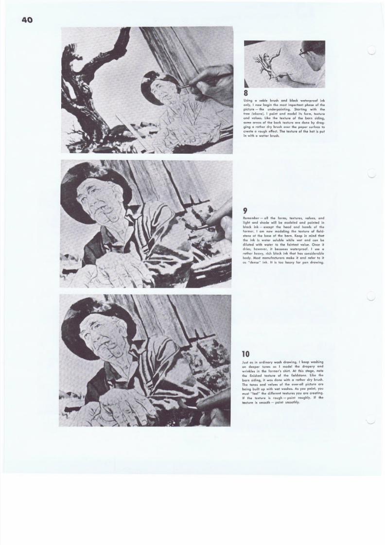
8/8/2019 15 Advanced Line Drawing
http://slidepdf.com/reader/full/15-advanced-line-drawing 40/54
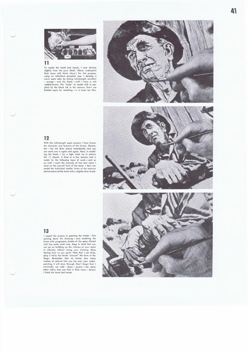
8/8/2019 15 Advanced Line Drawing
http://slidepdf.com/reader/full/15-advanced-line-drawing 41/54
11To model the head and hcnd s, I now deviate
.'ight'y from the pure black. (Never underpaint
flesh tones wilh block alone.) For this purpose,
using an individual porcelain cup, I develop a
warm sepia color by mixing lull-strength vermilion
- orange - and the black - unlil I have a rich
reddish-brawn. The "body" to model with is sup-
plied by the black ink in the mixture. Don't use
bottled sepia for modeling - it is much too thin.
12With the full-strength sepio mixture I have drown
the character and features of the farmer. Remem-
ber - the ink dries almost immediately and you
can work over it again and again. Next, in model-
ing the head, I lay a light wash (as in picture
No. 11 above). It dries in a few minutes and is
ready for the following layer of wo sh - and so
on until I' reach the intensity of hue and value I
want on the over-all form of the head. I then can
model the individual smaller forms 01 the feature,
and structure of the head with a .lightly drier brush.
13I repeat the process in painting the hands - first
pinning dawn the drawing - next modeling the
forms with progressive shades of the sepia diluted
with less water each time. Keep in mind that you
can go on building up the richness of your sepia
in intensity without losing your drawing. Keep
feeling form as you paint. Note that I am drag-
ging a fairly dry brush "around" the form of the
finger. Remember that no matter how many
washes of coJored inks you layover your under-
painting, it will show through. Don't forget that I
eventually use reds - blues - greens - the many
other colors that you find in flesh tones - before
I finish the head and hond s,
8/8/2019 15 Advanced Line Drawing
http://slidepdf.com/reader/full/15-advanced-line-drawing 42/54
42.
14Now back to the black ink to finish the under.
painting. The tree in this step appears completed
in form and texf ur'e - aduaUy c+ ihi.s stage' i1 [S
almost a finished black and while painting. I
h ove b eg un 10 paint in the forms of the douds,
trying to get the feel of the billowing cloud forms
with my brush strokes. As each layer of ink wash
dries, I keep '''pealing layer upon loyer, con-
s ta nt ly mode li ng t he b il low in g ef fec l.
1 5Do not be of raid to go quite black in the areas
in which you want to achieve a deep, rich quality
~ as I have done in the cloud formations. The
lower left orea has been modeled and textured.
The boulden, grass, and fence ~ like the rest of
the picture - are now being painted wah a com-
binalion of dry ond wet washes. You must remern-
ber always to plan ahead. Always keep in mind
the effect of light and color you wish 10 end up
with in the orec or' parts you ere work!ng on.
16Aside from the sepia used to model the head and
hands, we now have virtually a finished black and
while painting ~ with one important diflerence.
While all the values have been washed in, on
exaggerated contrnst of Ihese values is quite
obvious. In the areas where I eventually want
pure color, I have been coreful to leave pure
white paper. F'or example ~ the farmer's shirt ~
the lower holl of the sky - and the light "reas
01 Ihe Iormer/s face end hend s. And, finelly, I
have completely modeled and textured ell the
elements and forms in this black and white under.
painting. We ere now ready for color.
8/8/2019 15 Advanced Line Drawing
http://slidepdf.com/reader/full/15-advanced-line-drawing 43/54
17The tools ore simple. Bottles of colored ink - a
few sabl .. brushes - a. porcelain sectional palette
- a nest of mixing cup. - and plenty of water.
Vou will also need a kneaded eraser to keep
your paper surface deon - and an ink eraser to
rub oul mislakes or make changes. A most im-
port ent considerat ion in co lored-ink pain ting is
the quality of your paper. Cheap or .oft papers
will not do. The.e inks are not dyes and they will
not stein Whatman or other fine·quality hard
papers. Since the inks are waterproof when dry,
you cannot wash a color out (as in woter color)
- you must gently erase it down to the white
poper surfoce. My own palette of colars consists
of severcl brand. of inks. You will find from your
own experi ence that cert ain manufacturers vary
the sc me colors slightly - after a while you will
develop your own personal preference s.
18A small comprehensive color sketch establishing
y our basic color arrangement is important, to
guide you when you begin glazing, Becau,,, the
inks are so transparent, every color is affected by
those Over whlch it is woshed. Once c color is
down if is difficuU to change 11. For .hese reasons
a color sketch does double duty in helping you to
get the colors right the first time. I have begun
'0 paint the barn siding with pure vermilion red.
First I washed on a ligh. lone of red diluted with
water, to condition the poper surface. In a few
minutes, when il was dry, I washed another and
deeper coo+ of red over the first (001, I repeated
this once more and, finally, I am now putting on
pure vermilion red - and right out of the bailie.
19Don'l get scored if the textures and forms you
worked on so hard in your underpainting seem to
be disappearing as you apply the colored inks-
the inks look much darker and more opaque while
they are still wet. They will dry and all the lex-
lures and forms will show through, no matter how
many cools of ink you put .on, Experience willshow you how sharply you should define your lex-
tures and forms - much depends on whether you
will eventually use a light color tone or full-
strenglh color over the object. I am painting al-
most a full-slrength cobalt blue into the cloud
formations. It looks almost solid now, because it
is wet, but in Ihe last picture you can see how
I ronspa rent ly i t d ri ed ,
8/8/2019 15 Advanced Line Drawing
http://slidepdf.com/reader/full/15-advanced-line-drawing 44/54
44
20In p ainti ng col or int o th e g round area and rock s,
I used many co lors, some pure, some di luted with
water - mixed in a secti onal palet te. Because t he
area was small, I could keep them all wet and
"going" at the same time in a we' -in -wet blending
effect - much as in woter color. The colors were
orange, two greens, turquo is e, cobal t b lue, yel low
and i ndigo. Remember thi .: Becau se th e i nks dry
rapidly, thi s wet ·in·wet techn ique can be used only
in smaller areos - and you must work fast. Don't
keep wo rki ng over on orea t oo l ong, because i nks
become tacky as th ey d ry.
21I have ju st pain ted the lo cal col or o f t he farmer' .
shirt. As when coloring the barn siding, I first
"conditi oned" the paper with a li ght wash of b lue
- then a deeper wash o~ver thot when dry. After
this I worked purer ond deeper color into the
deep gray folds and wrinkles. turning them into
deep blue by forcing color into these areas by
pai ntin g fai rly d ry and w ith pressure on my brush
as I wo rked . A vari ety of browns and warm colors
were painted into the dark areas of the tree in
the same way - many coots of color, glazed one
over the other as they dried, lilerally forced the
color into these deep areas. Remember that 011
the f orms wil l become whoteve r colors a re g lazed
over them - while still retaining their original
value relationships.
22The head was pointed lost. You will recall that I
had o lready modeled the forms i n li ght and sh ad e
with sepia color. I now painted into the forms of
the nose and cheeks with diluted woshes of pure
r eds and p inks - keeping these colors qui te brigh t.
In the same manner I painted in the jowls and
beard areas with blues and greens. Ochres and
sienna, were used to model the chin and neck
areas - all pure color. Next I laid a light washof burnt sienna over the entire light area. Under
this wash of local color, all the small areas of
brigh t co lor pu lled t ogeth er i nto a un iform co lor
relat ionshi p. Another lig ht wash of burn t sienna
made the skin more luminous. Fi nally, t o cool the
warm s ienna. and sep ic in the shodow areas , I used
light washes of blues and cool greens - and our
demons tra tion of color ed ink paint ing i s f in ished .
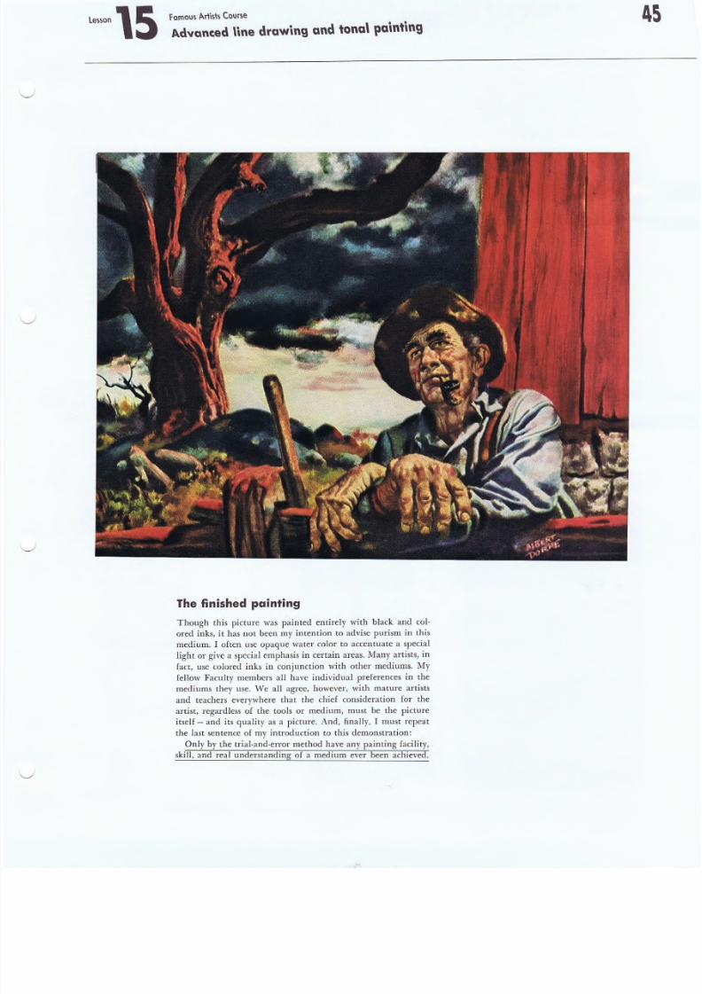
8/8/2019 15 Advanced Line Drawing
http://slidepdf.com/reader/full/15-advanced-line-drawing 45/54
F amou s A r 1i st sCou rs e
Advanced \inedrawing and tona\palnting
The finished painting
Though this picture was painted entirely with black and col-
ored inks, it has not been my intention to advise purism in this
medium, I often use opaque water color to accentuate a special
light or give a special emphasis in certain areas. Many artists, in
fact, use colored inks in conjunction with other mediums. My
fellow Faculty members all have individual preferences in the
mediums they use. 'IVe all agree, however, with mature artistsand teachers everywhere that the chief consideration for the
artist, regardless of the tools .or medium, must be the picture
itseIf- and its quality as a picture. And, finally, I must repeat
the last sentence of my introduction to this demonstration:
Only by the trial-anel-error method have any painting facility,
skill, and real understanding of a medium ever been achieved .
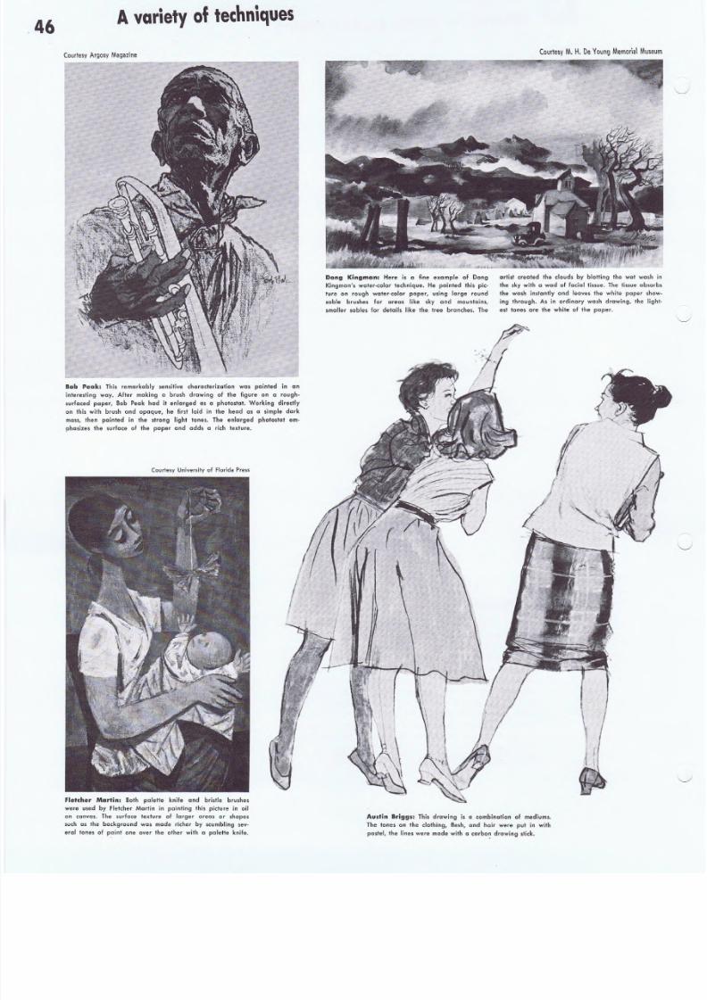
8/8/2019 15 Advanced Line Drawing
http://slidepdf.com/reader/full/15-advanced-line-drawing 46/54
46A variety of t e c h n i q u e s
( ou rl ew A rg os y M a g~ ~ in eCourtesy M . H . De '{ o u n g M e m o ri a l
Dang K;ngman: Here is a fine, excmple of Dong
Kingmon'. water-color technique. He painted Ihis pic-
ture on rough water-color pc per-, us.ing large' round
sable brushes, for areas like sky and mountains,
smaller sables lor details like the Iree branches. The
artist crealedthe douds by blotting the wet w
the sky with a wad 01 facial ti as ue , The tissue a
the wash instantly end leave, the white poper
ing through. A, in ordinary wash drawing, the
e st foncs are the white of the paper.
Bob Peak: This remarkably sensitive characterization was painted in an
interesting way. Aft"r making a brush drawing of the figure on a rough-
surfaced' paper, Bob Peak had it enlarged as a photostat. Working directly
on this with brush and opaque, he first laid in the head a. a simple dark
mass, then painted in the strong light lanes. The enlorged photostat em-
phasizes the surface of the paper and add, a rich texture.
Cou rt esy Unive rs ity o f F lo rida P re ss
fletcher Mllrtin: Both paletle knife and bristle brush".
were used by fletcher Martin in painting this picture in oil
on canvas. The surfcce fexture of larger areas or shapes.
such as Ihe background was made richer by scumbling sev-
eral tones of paint one Ovet the other with a palette knife.
Aus,t,in Brig9s: This drawing is a combinotlon of medium s.
The tones on the clothing, flesh, and hair were put in with
pastel, the lines were made with a carbo~ drawing stick,
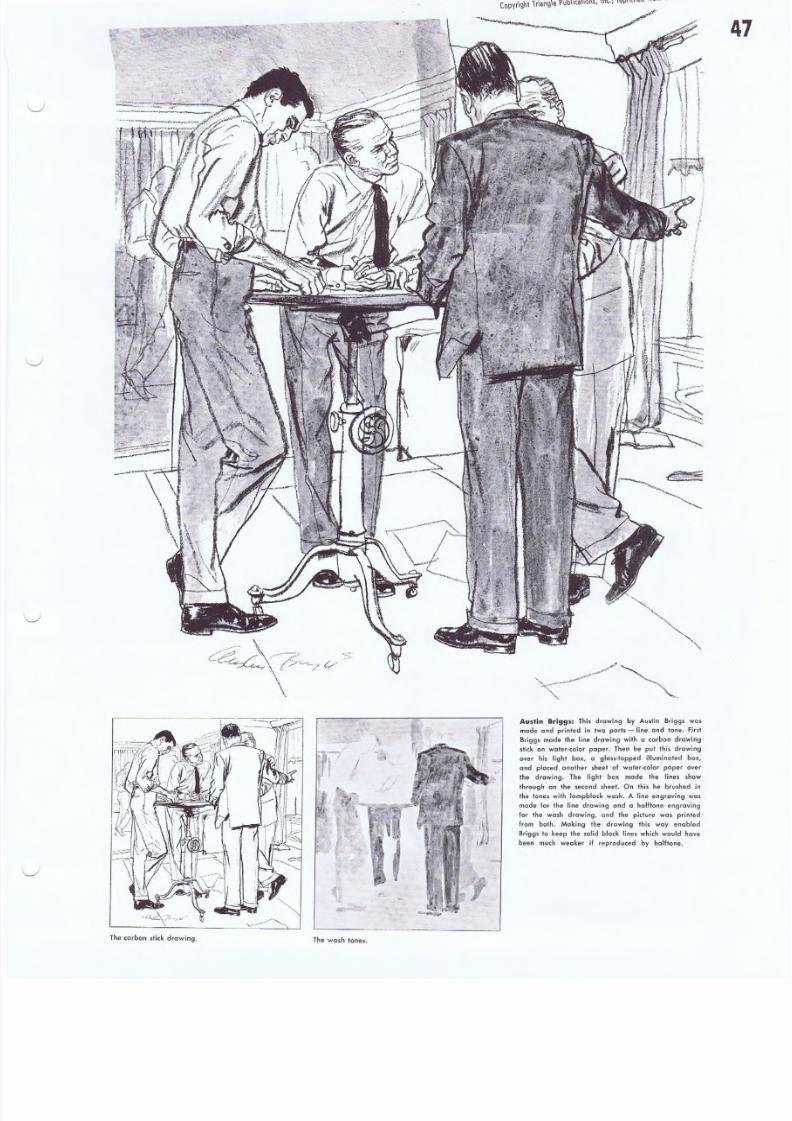
8/8/2019 15 Advanced Line Drawing
http://slidepdf.com/reader/full/15-advanced-line-drawing 47/54
Copyrighllr iang\e l'\)b\\callol\~, II\C.; r~fJ!I \ \ '~" "'0'" .
The c ar bo n st ick dr aw ing . The wash tones.
Austin Briggs: This drawing by Austin Brigg. wc s
made and printed in two ports - Hne and tone. First
Briggs made the line drawing with a carbon drawing
stick 'an water-color paper. Then he put Ihis drawing
over his light box, a glass-lopped illuminated box,
and placed oncther sheet of water-colo, paper over
rhe drawing. The light box made the lines show+hrouqh on the second sheel. On this he brushed in
the tones with lampblack wash. A line eng,aving was
made lor Ihe line drawing and a halftone engraving
lor rhe wash drawing, and the picture was printed
from both. Making Ihe drawing this way enabled
Briggs 10 keep Ihe solid black lines which would have
been much weaker if reproduced by halftone.
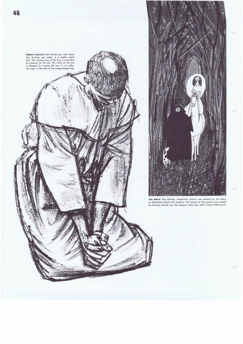
8/8/2019 15 Advanced Line Drawing
http://slidepdf.com/reader/full/15-advanced-line-drawing 48/54
Robert Fawcett: The fe lt -n ib pen , with which
this drawing was made, is a highly useful
tool . Th e vary ing ton e of the l ine is controll edby pressure on the nib. The width of the line
is changed by turning the pen to use either
t he edge or flat si de of t he wedge-sh aped nib,
48
Jan Balet: This delicat e, imag inati ve pict ure was pain ted by Jon
on i llustratio n board w ith tempera. The t exture of the ground was cr
by d rawing d irect ly over the temper" (when dry ) wi th a black Wo lff p
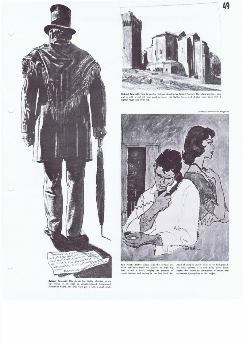
8/8/2019 15 Advanced Line Drawing
http://slidepdf.com/reader/full/15-advanced-line-drawing 49/54
Raber' "aw~ett: This simp le but high ly effecti ve pictu re
was drown in in k wash an smoo th-surfaced {ho t-p ressed}
i llustratio n board. The li nes Were pu t in with a small sable.
- ----.-,\i
I
Robert Fawcett: Here is anoth er felt ·pen draw ing by Robert Fawcett. The b lack shadow. were
put in wilh a wet nib and good pressure. The lighter tones and strokes were done with
ligh ter lau ch and d rier nib .
Courtesy Cosmopolitan
Bob .Pe¢lk: Blotter paper was the surface on
which Bob Peak mode this picture. He drew his
lines in with a brush, varying Ihe pressure to
create interest and variety in the line itself. l n-
stead of using a smoo th wash in th e back
the artist painted it in with bold, direc
strokes that create on atmosphere of dram
excitement appropriate 10 the subject.
8/8/2019 15 Advanced Line Drawing
http://slidepdf.com/reader/full/15-advanced-line-drawing 50/54
s o
Although the sketch above cont ains many figures and much cction, it
is held t ogether by a well .org anized tonal pattern. If this complicated
sketch had been slarled without first establishing the main areas of
light and dark. the picture pattern wauld be weak and confusing. The
diagram at the righl shows you the 'basic arrangement of shapes and
values underlying the detai ls o f the ske tch.
Things to remember
about tonal. painting
DO keep the tones in your picture clear and
organized so thai all Ihe elements are easily
recognizable.
Don't lose sight of the bask tones and break
up t he p at tern by overmodeling or overwork.
ing details.
Do eslablish a good contrasl of value between your important elements and their
background so the p icture wil l t el l your slory c lear ly .
Do establish a cenler of interest or
giv e th e elements in your compositi on
an order of lmpcr tcnce.
Don't make a number of I hings equ
importan t. Here e lements compete
the eye jumps a round the p ic tu re .
Don't confuse the things which are important to your picture idea by pulling them
"goinst complicated or camouflaging backgrounds.
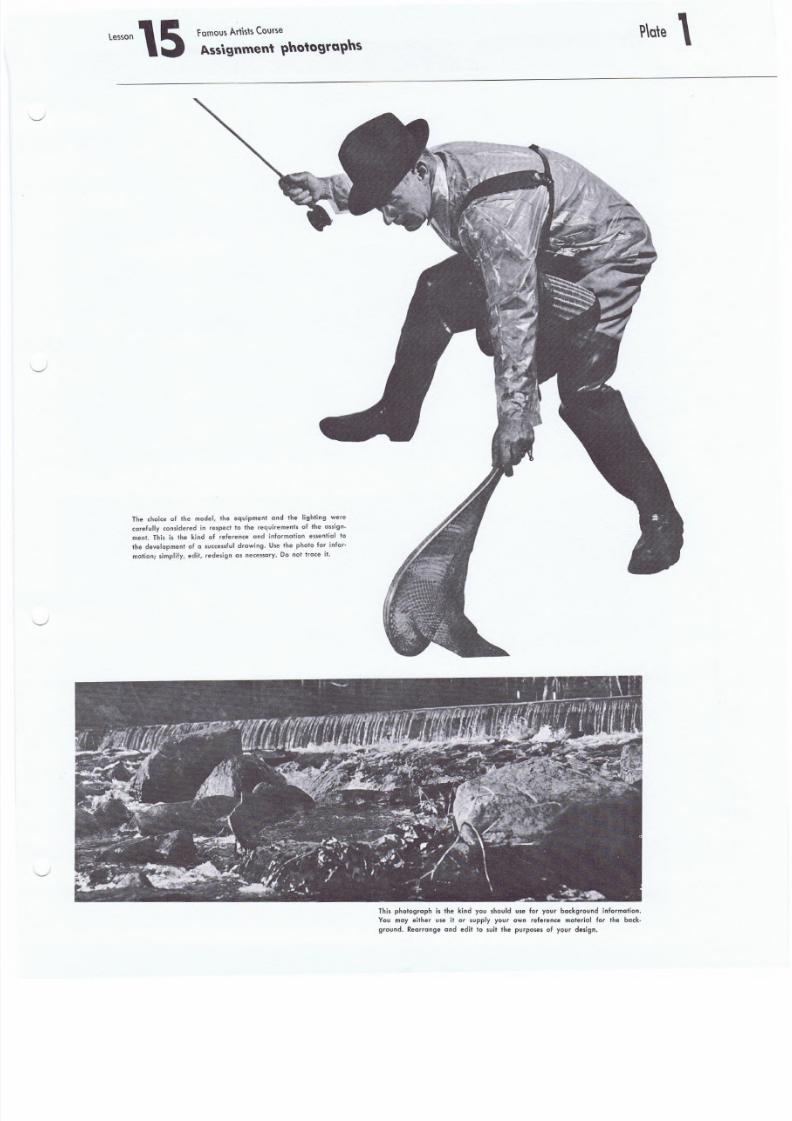
8/8/2019 15 Advanced Line Drawing
http://slidepdf.com/reader/full/15-advanced-line-drawing 51/54
f amo lJ s A r \h \s C o u rs e
A.ss\gnment \1hotogtGllns
The choice of the model, the equipment and the lighting were
ca ref ul ly conside red in re spect to the r equi rements of the ass ign-
ment. This is the kind of reference and information essent ial to
the development of a succes sf ul d rawing . Use the photo for info r-
mat ion; simpli fy , edi t, redes ign as necessa ry . Do not t race i t.
Thi s pho tograph i s the k ind you should use for your background inf oqnat ion.
You may either use it or supply your awnrelerence material for the back-
ground. Rearrange and edit to suit the purposes of your design .
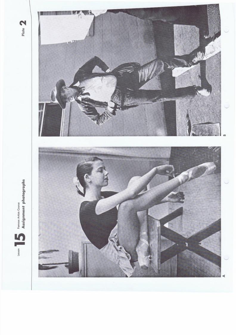
8/8/2019 15 Advanced Line Drawing
http://slidepdf.com/reader/full/15-advanced-line-drawing 52/54
VI
..ca.aI.
m0. .0..c
Q) a.VI.. . . .:::l0 Cu
G)VI
Et;
" fC< mIII
:::l .-0 II)
E VI0 <tu..
IttI::
0VI
'"Q)--'
Q)+-
oQ..
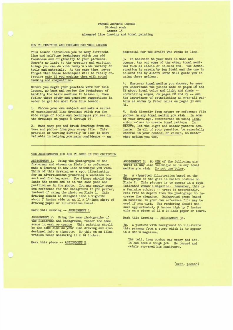
8/8/2019 15 Advanced Line Drawing
http://slidepdf.com/reader/full/15-advanced-line-drawing 53/54
F AM O US A RT IS TS C OU RSE
S tu den t wo~ k
Lesson 15Advanced line drawing a n d t on al p ai n~ in g
HOW ' i l l PRAC TICE AND PREPA RE FUR THIS LE SSON
This lesson introduces you toma.ny different
line a n d halftone techniques which can add
fr es 'hn ess a nd. or igi na lit y to y ou r pic tur es .There's no limit to the creative and exciting
things you can do with today' S liide variety of
tools and materials. At the same time, neverforget that these techniques will be realJ:y e f -fective only if you ,combine them 'W'it~ sounddmying and composition.
Before you begin your practice ¥fork.for this
lesson, go back and review the techniques of
handling the basic mediums in Lesson I} thenfOllow these study and p:ractice suggestrtons in
order -to get the most from this l.esson.
L Choose your own subject and make a series
of eXperimental line drawings which run the
wide range of tools and techniques you See inthe drawings on pages 6 through 15.
2 • Make many pen and brush dXawingsfrom na-ture and photos from your scrap f~le.. This
prac-tice of working directly in line is most
valuable in helping you gain conf'fdence -- an
essential for the artist who works in line.
3. In additiOn to your work i n wash andopaque, try out some of the other tonal medi-
umssuch as casein or colored ink. The demon-
stration in casei.n by Ben Stahl and the one in
colored ink by Albert borne will guide you inusing these mediums.
4. Whatever tonal medi urn you choose, be Sure
you. understand. the pOints made on pages 26 and
2 7 about local color and light and shade --
eon.trolling edges , on pages 28 and 29 -- andthe importance of establishing an over-all pat-
tern as shown by Peter Helck. On pages 30 and
3 l .
5 . Work. directly from nature or reference file
photos in any- tonal medium you wish. In sottleof yoUr drawings, concentrate on using local
color values t.o create tonal p~tte.rn. In
others, let the light and shadow pattern dom-
inate. In all or, your practice, be es-pe~J.ally
c~eful_in your c0ntrol of values, no Diatter
what medium you: use.
~ ASSIGNMENTS yOU ARE TO SEND IN FOR CRITICISM
A SSIG NM E N T 1 ; Using the photographs of the
fisherman and stream on Plate 1 as reference,
make a drawing in any llnetechnique you wish.
Think of this draw.ing as a spot illustrationfor an advertisement promoting a vacation re-sort and fishing area • The ;figure should dom-
inate the scene and be in the same pose and
position as in the photo. You may su pp ly y our
own reference for the background if you prefer,instead of using the photo on Plate 1. This
d rav 1ng s hou ld be designed into a Vignette
about 7 inches wide on a n 11 x~4-inch sheet ofdrawing paper or illUstration bOard.
Mark this drawing - - ~SIG~T : 1 , . .
ASSIGNMENT 2. Using the same photographs of
t he f is he rm an and background, render the same
scene in wash Or opaque. This painting should
be the same size as your line drawing and also
designed into a Vignette. Do this on. an illus-
trationboard measuring II x 14 inches.
Mark this piece -- ASSIGNMENT 2.
ASSIGNMRNT 3. Do ONE of the follOWing pic-tures in any l in e t ec hn iq ue 61' in .any tonaJ.
medium you wiSh. Do n ot \ !s ec ol or .
3 A . A vignetted illustration based on thePhotogra~h of the girl ~n ballet costume On
Plate 2. This picture is to appear in a soph-
isticated woma.n's magazine. :Remember} this isa feminine subject -- treat it accordingly.
Feel free to depart from the photograph to in-crease the elegance. Background props based
on material. in your own reference 'file may be
used if you wish. The rendering sh.ould mea-
s u re a p pr o xi m at e ly 9 inches high by 7 incheswide on a piece of 11 x ~4-inch paper or board.
Mark th1 s drawing -- ASSIGNMENT 3A.
3B. A picture \lith background to illustrate
this passage from a story which is to appearin a manis magazine;
The tall, lean cowboy was 'Weary and hot.
It had been a tough job. He turned and
c al m. ly s ur ve ye d h is h an di wo rk .
(ove:r,please)
8/8/2019 15 Advanced Line Drawing
http://slidepdf.com/reader/full/15-advanced-line-drawing 54/54
Student~work -- iess0p 15
." - , , ~ J . , . J r .
e,'.!'I ', I
~'.'
~~j
• ~,
'1 . . · ' 1... .- , r ,"
J
",'( _ . . I
"
Your illustrati6n should featUre the cowboy
ana his feelings.
Use the posed photogr.aph of the male model orr
Plate 2 as reference. T h e figUre should dom-
lnate the picture, as shown in the art direc-
torr s layout at the righ:f;. Use your own re(er-
ence for the background. Make sure the Sceneryindicates the southwestern lla.:rt of the U. S.
fl--How creat~ve~ and effectively yO~
have llandJ._edyour tq\?ls -and mediums.
_...Tlie eoundaess of the basf,c dI'Av:bng
and comp~sition of your pictures.
I •
Make your picture 12 inches high by 8 incheS
wide on an 11 x 14-inch illustrat.ic:Jn board or
heavy pa:ger.
Mark this draWing -- ASSIGNMENT3B..J
In judging your asSignmen't.sfor thi!S .Lesson,
we will 'be chiefly interested -in seeing:
" ,-
.... J
.'~ .~......J'.t I I i: J. .:, ~(
".1
. . , . . . . . -,
J,. - . . '
IMPORTANT:Be sure to 'letter your name, adtlress,
aila st1).q.ent numbe.r'""ne.at'1ya~::-the,.lower left-hand
corner of each aSsignmeni!. In tHe loyer right
c'ClTner, place t-he -le.as6rr number' and assignment
num15er.
Page 2
, '
"L
It,. f'
l'
l ~ 4 '. :. "-r try
~ 1·
.,• . 0 1 .. I
A
,, ' I , , - f
,;.'
1:"
. .. .i
L
L ,
~ .. - - !.....~.;
, I
IYour~lesson carto~ should confiafn:
. .,Ass~'gnmeht l _
AS,sigmnen_!;2 .l't.,~ .: ~ ......_ Il-:
:Assignment 3E O~.)B
I Return shfpp:i,ngJr_label filled out.....-
. . Mall his carton to:
FAMOUSAR~STS lCOURSE, WESTPORT~ CONN.
• J . . , ~ ~ L
"1I , :- ~ ~,,rL • J,
i l L · . .. .\,<
1 1 v '/
.'.
r:
1
. "<
. , .-.7
.~~ 1·
." ! .""'.l
~ J o . .
. . .
"
~ ; r , : - t~
1 ..... 0-\
'.1
J
'" J 1