Embed Size (px)
Citation preview
11. Correlation and linear regression
The goal in this chapter is to introduce correlation and linear regression. These are the standardtools that statisticians rely on when analysing the relationship between continuous predictors andcontinuous outcomes.
11.1
Correlations
In this section we’ll talk about how to describe the relationships between variables in the data. To dothat, we want to talk mostly about the correlation between variables. But first, we need some data.
11.1.1 The data
Table 11.1: Descriptive statistics for the parenthood data.
variable min max mean median std. dev IQRDan’s grumpiness 41 91 63.71 62 10.05 14Dan’s hours slept 4.84 9.00 6.97 7.03 1.02 1.45
Dan’s son’s hours slept 3.25 12.07 8.05 7.95 2.07 3.21. . . . . . . . . . . . . . . . . . . . . . . . . . . . . . . . . . . . . . . . . . . . . . . . . . . . . . . . . . . . . . . . . . . . . . . . . . . . . . . . . . . . . . . . . . . .
Let’s turn to a topic close to every parent’s heart: sleep. The data set we’ll use is fictitious,but based on real events. Suppose I’m curious to find out how much my infant son’s sleeping habitsaffect my mood. Let’s say that I can rate my grumpiness very precisely, on a scale from 0 (notat all grumpy) to 100 (grumpy as a very, very grumpy old man or woman). And lets also assumethat I’ve been measuring my grumpiness, my sleeping patterns and my son’s sleeping patterns for
- 251 -
quite some time now. Let’s say, for 100 days. And, being a nerd, I’ve saved the data as a filecalled parenthood.csv. If we load the data into JASP we can see that the file contains four variablesdan.sleep, baby.sleep, dan.grump and day. Note that when you first load this data set JASP maynot have guessed the data type for each variable correctly, in which case you should fix it: dan.sleep,baby.sleep, dan.grump and day can be specified as continuous variables, and ID is a nominal(integer)variable.
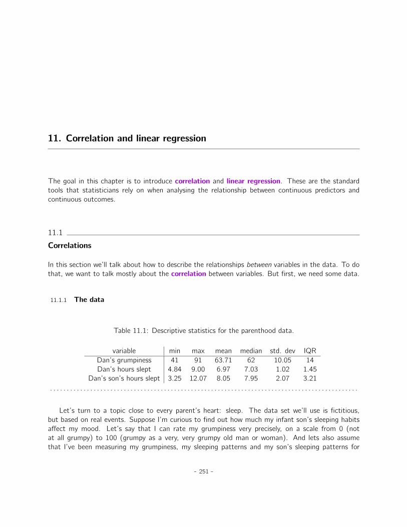
Next, I’ll take a look at some basic descriptive statistics and, to give a graphical depiction of whateach of the three interesting variables looks like, Figure 11.1 plots histograms. One thing to note:just because JASP can calculate dozens of different statistics doesn’t mean you should report all ofthem. If I were writing this up for a report, I’d probably pick out those statistics that are of mostinterest to me (and to my readership), and then put them into a nice, simple table like the one inTable 11.1.1 Notice that when I put it into a table, I gave everything “human readable” names. Thisis always good practice. Notice also that I’m not getting enough sleep. This isn’t good practice, butother parents tell me that it’s pretty standard.
My grumpiness
Fre
qu
en
cy
40 50 60 70 80 90
05
10
15
20
My sleep (hours)
Fre
qu
en
cy
5 6 7 8 9
05
10
15
20
The baby’s sleep (hours)
Fre
qu
en
cy
4 6 8 10 12
05
10
15
20
(a) (b) (c)
Figure 11.1: Histograms for the three interesting variables in the parenthood data set.. . . . . . . . . . . . . . . . . . . . . . . . . . . . . . . . . . . . . . . . . . . . . . . . . . . . . . . . . . . . . . . . . . . . . . . . . . . . . . . . . . . . . . . . . . . .
11.1.2 The strength and direction of a relationship
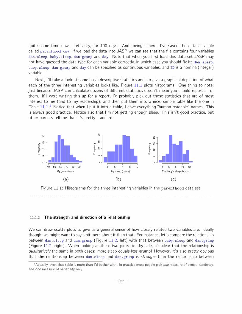
We can draw scatterplots to give us a general sense of how closely related two variables are. Ideallythough, we might want to say a bit more about it than that. For instance, let’s compare the relationshipbetween dan.sleep and dan.grump (Figure 11.2, left) with that between baby.sleep and dan.grump(Figure 11.2, right). When looking at these two plots side by side, it’s clear that the relationship isqualitatively the same in both cases: more sleep equals less grump! However, it’s also pretty obviousthat the relationship between dan.sleep and dan.grump is stronger than the relationship between
1Actually, even that table is more than I’d bother with. In practice most people pick one measure of central tendency,and one measure of variability only.
- 252 -
5 6 7 8 9
40
50
60
70
80
90
My sleep (hours)
My
gru
mp
ine
ss
4 6 8 10 12
40
50
60
70
80
90
The baby’s sleep (hours)
My
gru
mp
ine
ss(a) (b)
Figure 11.2: Scatterplots showing the relationship between dan.sleep and dan.grump (left) and therelationship between baby.sleep and dan.grump (right).. . . . . . . . . . . . . . . . . . . . . . . . . . . . . . . . . . . . . . . . . . . . . . . . . . . . . . . . . . . . . . . . . . . . . . . . . . . . . . . . . . . . . . . . . . . .
baby.sleep and dan.grump. The plot on the left is “neater” than the one on the right. What it feelslike is that if you want to predict what my mood is, it’d help you a little bit to know how many hoursmy son slept, but it’d be more helpful to know how many hours I slept.
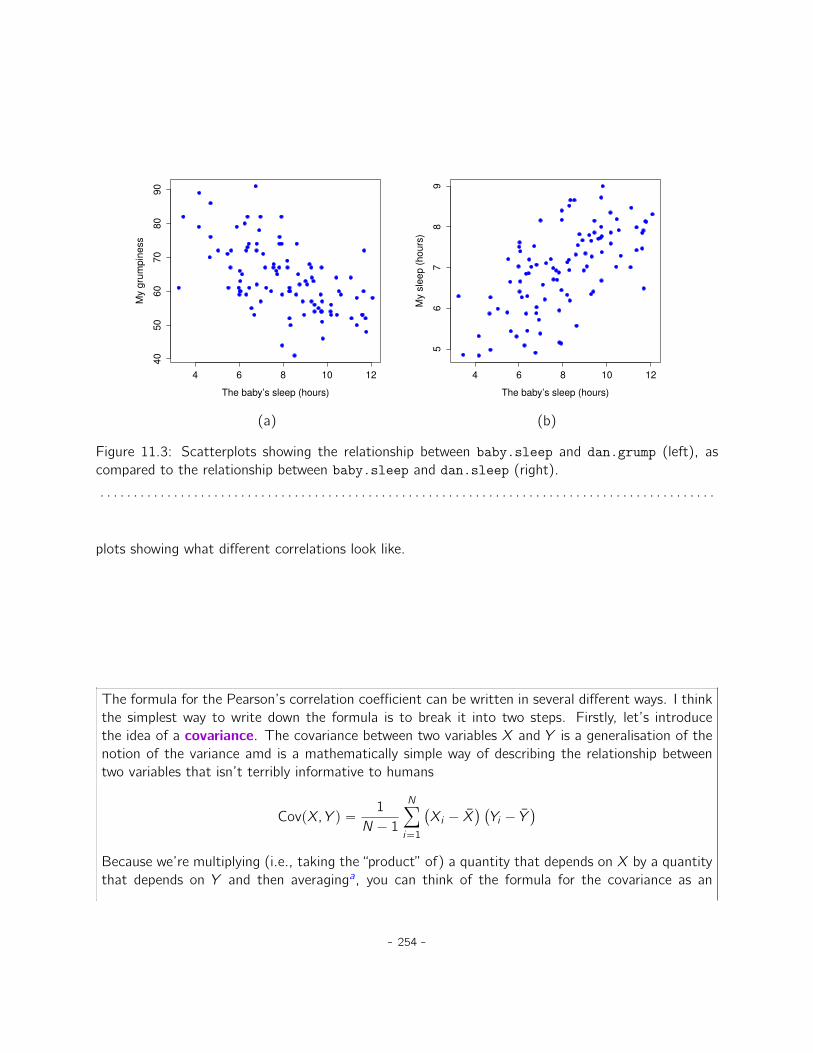
In contrast, let’s consider the two scatterplots shown in Figure 11.3. If we compare the scatterplotof “baby.sleep v dan.grump” (left) to the scatterplot of “ ‘baby.sleep v dan.sleep” (right), the overallstrength of the relationship is the same, but the direction is different. That is, if my son sleeps more,I get more sleep (positive relationship, right hand side), but if he sleeps more then I get less grumpy(negative relationship, left hand side).
11.1.3 The correlation coefficient
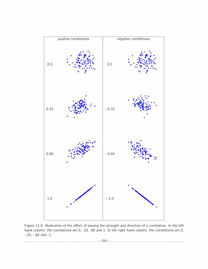
We can make these ideas a bit more explicit by introducing the idea of a correlation coefficient(or, more specifically, Pearson’s correlation coefficient), which is traditionally denoted as r . Thecorrelation coefficient between two variables X and Y (sometimes denoted rXY ), which we’ll definemore precisely in the next section, is a measure that varies from ´1 to 1. When r “ ´1 it meansthat we have a perfect negative relationship, and when r “ 1 it means we have a perfect positiverelationship. When r “ 0, there’s no relationship at all. If you look at Figure 11.4, you can see several
- 253 -
4 6 8 10 12
40
50
60
70
80
90
The baby’s sleep (hours)
My
gru
mp
ine
ss
4 6 8 10 12
56
78
9
The baby’s sleep (hours)
My
sle
ep
(h
ou
rs)
(a) (b)
Figure 11.3: Scatterplots showing the relationship between baby.sleep and dan.grump (left), ascompared to the relationship between baby.sleep and dan.sleep (right).. . . . . . . . . . . . . . . . . . . . . . . . . . . . . . . . . . . . . . . . . . . . . . . . . . . . . . . . . . . . . . . . . . . . . . . . . . . . . . . . . . . . . . . . . . . .
plots showing what different correlations look like.
The formula for the Pearson’s correlation coefficient can be written in several different ways. I thinkthe simplest way to write down the formula is to break it into two steps. Firstly, let’s introducethe idea of a covariance. The covariance between two variables X and Y is a generalisation of thenotion of the variance amd is a mathematically simple way of describing the relationship betweentwo variables that isn’t terribly informative to humans
CovpX, Y q “ 1
N ´ 1Nÿ
i“1
`Xi ´ ¯X
˘ `Yi ´ ¯Y
˘
Because we’re multiplying (i.e., taking the “product” of) a quantity that depends on X by a quantitythat depends on Y and then averaginga, you can think of the formula for the covariance as an
- 254 -
positive correlations negative correlations
0.0 0.0
0.33 ´0.33
0.66 ´0.66
1.0 ´1.0
Figure 11.4: Illustration of the effect of varying the strength and direction of a correlation. In the lefthand column, the correlations are 0, .33, .66 and 1. In the right hand column, the correlations are 0,-.33, -.66 and -1.. . . . . . . . . . . . . . . . . . . . . . . . . . . . . . . . . . . . . . . . . . . . . . . . . . . . . . . . . . . . . . . . . . . . . . . . . . . . . . . . . . . . . . . . . . . .- 255 -
“average cross product” between X and Y .
The covariance has the nice property that, if X and Y are entirely unrelated, then the covarianceis exactly zero. If the relationship between them is positive (in the sense shown in Figure 11.4) thenthe covariance is also positive, and if the relationship is negative then the covariance is also negative.In other words, the covariance captures the basic qualitative idea of correlation. Unfortunately, theraw magnitude of the covariance isn’t easy to interpret as it depends on the units in which X and Yare expressed and, worse yet, the actual units that the covariance itself is expressed in are really weird.For instance, if X refers to the dan.sleep variable (units: hours) and Y refers to the dan.grumpvariable (units: grumps), then the units for their covariance are “hours ˆ grumps”. And I have nofreaking idea what that would even mean.
The Pearson correlation coefficient r fixes this interpretation problem by standardising the co-variance, in pretty much the exact same way that the z-score standardises a raw score, by dividingby the standard deviation. However, because we have two variables that contribute to the covari-ance, the standardisation only works if we divide by both standard deviations.b In other words, thecorrelation between X and Y can be written as follows:
rXY “ CovpX, Y q�X �Y
aJust like we saw with the variance and the standard deviation, in practice we divide by N ´ 1 rather than N.bThis is an oversimplification, but it’ll do for our purposes.
By standardising the covariance, not only do we keep all of the nice properties of the covariancediscussed earlier, but the actual values of r are on a meaningful scale: r “ 1 implies a perfect positiverelationship and r “ ´1 implies a perfect negative relationship. I’ll expand a little more on this pointlater, in Section 11.1.5. But before I do, let’s look at how to calculate correlations in JASP.
11.1.4 Calculating correlations in JASP
Calculating correlations in JASP can be done by clicking on the ‘Regression’ - ‘Correlation Matrix’button. Transfer all four continuous variables across into the box on the right to get the output inFigure 11.5. Notice that each correlation (denoted ‘Pearson’s r ’) is paired with a p-value. Clearly,something is being tested here, but ignore it for now. We’ll talk more about that soon!
11.1.5 Interpreting a correlation
Naturally, in real life you don’t see many correlations of 1. So how should you interpret a correlationof, say, r “ .4? The honest answer is that it really depends on what you want to use the data for,and on how strong the correlations in your field tend to be. A friend of mine in engineering onceargued that any correlation less than .95 is completely useless (I think he was exaggerating, even for
- 256 -
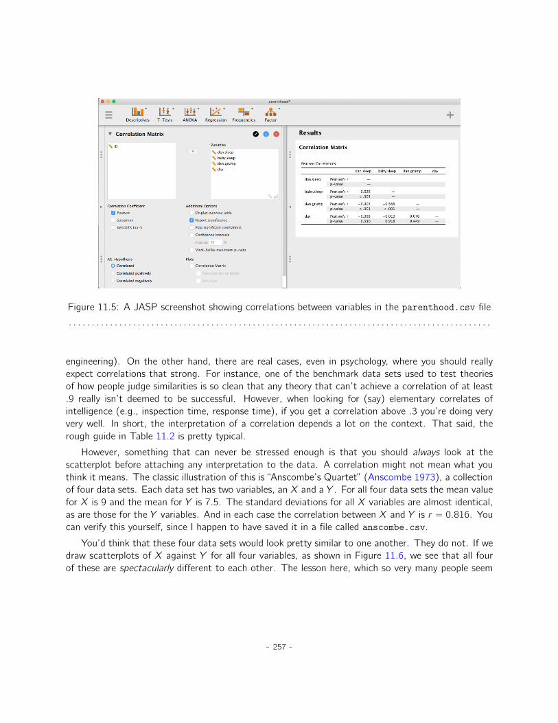
Figure 11.5: A JASP screenshot showing correlations between variables in the parenthood.csv file. . . . . . . . . . . . . . . . . . . . . . . . . . . . . . . . . . . . . . . . . . . . . . . . . . . . . . . . . . . . . . . . . . . . . . . . . . . . . . . . . . . . . . . . . . . .
engineering). On the other hand, there are real cases, even in psychology, where you should reallyexpect correlations that strong. For instance, one of the benchmark data sets used to test theoriesof how people judge similarities is so clean that any theory that can’t achieve a correlation of at least.9 really isn’t deemed to be successful. However, when looking for (say) elementary correlates ofintelligence (e.g., inspection time, response time), if you get a correlation above .3 you’re doing veryvery well. In short, the interpretation of a correlation depends a lot on the context. That said, therough guide in Table 11.2 is pretty typical.
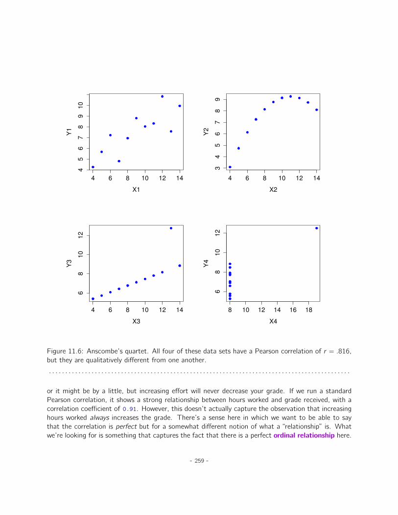
However, something that can never be stressed enough is that you should always look at thescatterplot before attaching any interpretation to the data. A correlation might not mean what youthink it means. The classic illustration of this is “Anscombe’s Quartet” (Anscombe 1973), a collectionof four data sets. Each data set has two variables, an X and a Y . For all four data sets the mean valuefor X is 9 and the mean for Y is 7.5. The standard deviations for all X variables are almost identical,as are those for the Y variables. And in each case the correlation between X and Y is r “ 0.816. Youcan verify this yourself, since I happen to have saved it in a file called anscombe.csv.
You’d think that these four data sets would look pretty similar to one another. They do not. If wedraw scatterplots of X against Y for all four variables, as shown in Figure 11.6, we see that all fourof these are spectacularly different to each other. The lesson here, which so very many people seem
- 257 -
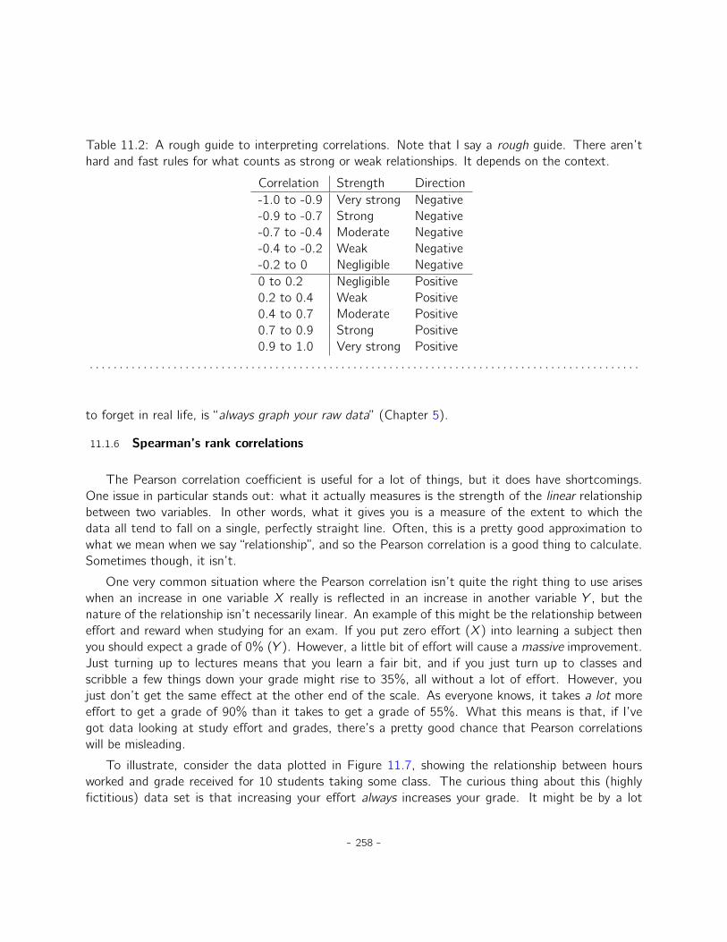
Table 11.2: A rough guide to interpreting correlations. Note that I say a rough guide. There aren’thard and fast rules for what counts as strong or weak relationships. It depends on the context.
Correlation Strength Direction-1.0 to -0.9 Very strong Negative-0.9 to -0.7 Strong Negative-0.7 to -0.4 Moderate Negative-0.4 to -0.2 Weak Negative-0.2 to 0 Negligible Negative0 to 0.2 Negligible Positive0.2 to 0.4 Weak Positive0.4 to 0.7 Moderate Positive0.7 to 0.9 Strong Positive0.9 to 1.0 Very strong Positive
. . . . . . . . . . . . . . . . . . . . . . . . . . . . . . . . . . . . . . . . . . . . . . . . . . . . . . . . . . . . . . . . . . . . . . . . . . . . . . . . . . . . . . . . . . . .
to forget in real life, is “always graph your raw data” (Chapter 5).
11.1.6 Spearman’s rank correlations
The Pearson correlation coefficient is useful for a lot of things, but it does have shortcomings.One issue in particular stands out: what it actually measures is the strength of the linear relationshipbetween two variables. In other words, what it gives you is a measure of the extent to which thedata all tend to fall on a single, perfectly straight line. Often, this is a pretty good approximation towhat we mean when we say “relationship”, and so the Pearson correlation is a good thing to calculate.Sometimes though, it isn’t.
One very common situation where the Pearson correlation isn’t quite the right thing to use ariseswhen an increase in one variable X really is reflected in an increase in another variable Y , but thenature of the relationship isn’t necessarily linear. An example of this might be the relationship betweeneffort and reward when studying for an exam. If you put zero effort (X) into learning a subject thenyou should expect a grade of 0% (Y ). However, a little bit of effort will cause a massive improvement.Just turning up to lectures means that you learn a fair bit, and if you just turn up to classes andscribble a few things down your grade might rise to 35%, all without a lot of effort. However, youjust don’t get the same effect at the other end of the scale. As everyone knows, it takes a lot moreeffort to get a grade of 90% than it takes to get a grade of 55%. What this means is that, if I’vegot data looking at study effort and grades, there’s a pretty good chance that Pearson correlationswill be misleading.
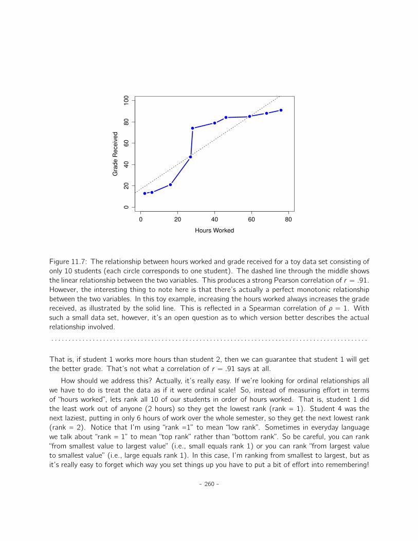
To illustrate, consider the data plotted in Figure 11.7, showing the relationship between hoursworked and grade received for 10 students taking some class. The curious thing about this (highlyfictitious) data set is that increasing your effort always increases your grade. It might be by a lot
- 258 -
4 6 8 10 12 14
45
67
89
10
X1
Y1
4 6 8 10 12 14
34
56
78
9
X2
Y2
4 6 8 10 12 14
68
10
12
X3
Y3
8 10 12 14 16 18
68
10
12
X4
Y4
Figure 11.6: Anscombe’s quartet. All four of these data sets have a Pearson correlation of r “ .816,but they are qualitatively different from one another.. . . . . . . . . . . . . . . . . . . . . . . . . . . . . . . . . . . . . . . . . . . . . . . . . . . . . . . . . . . . . . . . . . . . . . . . . . . . . . . . . . . . . . . . . . . .
or it might be by a little, but increasing effort will never decrease your grade. If we run a standardPearson correlation, it shows a strong relationship between hours worked and grade received, with acorrelation coefficient of 0.91. However, this doesn’t actually capture the observation that increasinghours worked always increases the grade. There’s a sense here in which we want to be able to saythat the correlation is perfect but for a somewhat different notion of what a “relationship” is. Whatwe’re looking for is something that captures the fact that there is a perfect ordinal relationship here.
- 259 -
0 20 40 60 80
02
04
06
08
01
00
Hours Worked
Gra
de
Re
ce
ive
d
Figure 11.7: The relationship between hours worked and grade received for a toy data set consisting ofonly 10 students (each circle corresponds to one student). The dashed line through the middle showsthe linear relationship between the two variables. This produces a strong Pearson correlation of r “ .91.However, the interesting thing to note here is that there’s actually a perfect monotonic relationshipbetween the two variables. In this toy example, increasing the hours worked always increases the gradereceived, as illustrated by the solid line. This is reflected in a Spearman correlation of ⇢ “ 1. Withsuch a small data set, however, it’s an open question as to which version better describes the actualrelationship involved.. . . . . . . . . . . . . . . . . . . . . . . . . . . . . . . . . . . . . . . . . . . . . . . . . . . . . . . . . . . . . . . . . . . . . . . . . . . . . . . . . . . . . . . . . . . .
That is, if student 1 works more hours than student 2, then we can guarantee that student 1 will getthe better grade. That’s not what a correlation of r “ .91 says at all.
How should we address this? Actually, it’s really easy. If we’re looking for ordinal relationships allwe have to do is treat the data as if it were ordinal scale! So, instead of measuring effort in termsof “hours worked”, lets rank all 10 of our students in order of hours worked. That is, student 1 didthe least work out of anyone (2 hours) so they get the lowest rank (rank = 1). Student 4 was thenext laziest, putting in only 6 hours of work over the whole semester, so they get the next lowest rank(rank = 2). Notice that I’m using “rank =1” to mean “low rank”. Sometimes in everyday languagewe talk about “rank = 1” to mean “top rank” rather than “bottom rank”. So be careful, you can rank“from smallest value to largest value” (i.e., small equals rank 1) or you can rank “from largest valueto smallest value” (i.e., large equals rank 1). In this case, I’m ranking from smallest to largest, but asit’s really easy to forget which way you set things up you have to put a bit of effort into remembering!
- 260 -
Okay, so let’s have a look at our students when we rank them from worst to best in terms of effortand reward:
rank (hours worked) rank (grade received)student 1 1 1student 2 10 10student 3 6 6student 4 2 2student 5 3 3student 6 5 5student 7 4 4student 8 8 8student 9 7 7student 10 9 9
Hmm. These are identical. The student who put in the most effort got the best grade, the studentwith the least effort got the worst grade, etc. As the table above shows, these two rankings areidentical, so if we now correlate them we get a perfect relationship, with a correlation of 1.0.
What we’ve just re-invented is Spearman’s rank order correlation, usually denoted ⇢ to distinguishit from the Pearson correlation r . We can calculate Spearman’s ⇢ using JASP simply by clicking the‘Spearman’ check box in the ‘Correlation Matrix’ screen.
11.2
Scatterplots
Scatterplots are a simple but effective tool for visualising the relationship between two variables, likewe saw with the figures in the section on correlation (Section 11.1). It’s this latter application thatwe usually have in mind when we use the term “scatterplot”. In this kind of plot each observationcorresponds to one dot. The horizontal location of the dot plots the value of the observation on onevariable, and the vertical location displays its value on the other variable. In many situations you don’treally have a clear opinions about what the causal relationship is (e.g., does A cause B, or does Bcause A, or does some other variable C control both A and B). If that’s the case, it doesn’t reallymatter which variable you plot on the x-axis and which one you plot on the y-axis. However, in manysituations you do have a pretty strong idea which variable you think is most likely to be causal, orat least you have some suspicions in that direction. If so, then it’s conventional to plot the causevariable on the x-axis, and the effect variable on the y-axis. With that in mind, let’s look at how todraw scatterplots in JASP, using the same parenthood data set (i.e. parenthood.csv) that I usedwhen introducing correlations.
Suppose my goal is to draw a scatterplot displaying the relationship between the amount of sleepthat I get (dan.sleep) and how grumpy I am the next day (dan.grump). The way in which we canuse JASP to get this plot is to use the ‘Plots’ option under the ‘Regression’ - ‘Correlation Matrix’
- 261 -
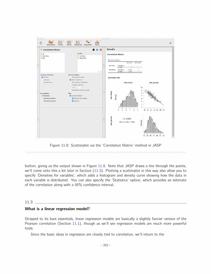
Figure 11.8: Scatterplot via the ‘Correlation Matrix’ method in JASP. . . . . . . . . . . . . . . . . . . . . . . . . . . . . . . . . . . . . . . . . . . . . . . . . . . . . . . . . . . . . . . . . . . . . . . . . . . . . . . . . . . . . . . . . . . .
button, giving us the output shown in Figure 11.8. Note that JASP draws a line through the points,we’ll come onto this a bit later in Section (11.3). Plotting a scatterplot in this way also allow you tospecify ‘Densities for variables’, which adds a histogram and density curve showing how the data ineach variable is distributed. You can also specify the ‘Statistics’ option, which provides an estimateof the correlation along with a 95% confidence interval.
11.3
What is a linear regression model?
Stripped to its bare essentials, linear regression models are basically a slightly fancier version of thePearson correlation (Section 11.1), though as we’ll see regression models are much more powerfultools.
Since the basic ideas in regression are closely tied to correlation, we’ll return to the
- 262 -
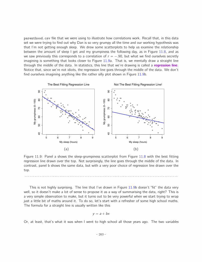
parenthood.csv file that we were using to illustrate how correlations work. Recall that, in this dataset we were trying to find out why Dan is so very grumpy all the time and our working hypothesis wasthat I’m not getting enough sleep. We drew some scatterplots to help us examine the relationshipbetween the amount of sleep I get and my grumpiness the following day, as in Figure 11.8, and aswe saw previously this corresponds to a correlation of r “ ´.90, but what we find ourselves secretlyimagining is something that looks closer to Figure 11.9a. That is, we mentally draw a straight linethrough the middle of the data. In statistics, this line that we’re drawing is called a regression line.Notice that, since we’re not idiots, the regression line goes through the middle of the data. We don’tfind ourselves imagining anything like the rather silly plot shown in Figure 11.9b.
5 6 7 8 9
40
50
60
70
80
90
The Best Fitting Regression Line
My sleep (hours)
My
gru
mp
ine
ss (
0−
10
0)
5 6 7 8 9
40
50
60
70
80
90
Not The Best Fitting Regression Line!
My sleep (hours)
My
gru
mp
ine
ss (
0−
10
0)
(a) (b)
Figure 11.9: Panel a shows the sleep-grumpiness scatterplot from Figure 11.8 with the best fittingregression line drawn over the top. Not surprisingly, the line goes through the middle of the data. Incontrast, panel b shows the same data, but with a very poor choice of regression line drawn over thetop.. . . . . . . . . . . . . . . . . . . . . . . . . . . . . . . . . . . . . . . . . . . . . . . . . . . . . . . . . . . . . . . . . . . . . . . . . . . . . . . . . . . . . . . . . . . .
This is not highly surprising. The line that I’ve drawn in Figure 11.9b doesn’t “fit” the data verywell, so it doesn’t make a lot of sense to propose it as a way of summarising the data, right? This isa very simple observation to make, but it turns out to be very powerful when we start trying to wrapjust a little bit of maths around it. To do so, let’s start with a refresher of some high school maths.The formula for a straight line is usually written like this
y “ a ` bx
Or, at least, that’s what it was when I went to high school all those years ago. The two variables
- 263 -
are x and y , and we have two coefficients, a and b.2 The coefficient a represents the y -interceptof the line, and coefficient b represents the slope of the line. Digging further back into our decayingmemories of high school (sorry, for some of us high school was a long time ago), we remember thatthe intercept is interpreted as “the value of y that you get when x “ 0”. Similarly, a slope of b meansthat if you increase the x-value by 1 unit, then the y -value goes up by b units, and a negative slopemeans that the y -value would go down rather than up. Ah yes, it’s all coming back to me now. Nowthat we’ve remembered that it should come as no surprise to discover that we use the exact sameformula for a regression line. If Y is the outcome variable (the DV) and X is the predictor variable(the IV), then the formula that describes our regression is written like this
ˆYi “ b0 ` b1Xi
Hmm. Looks like the same formula, but there’s some extra frilly bits in this version. Let’s make surewe understand them. Firstly, notice that I’ve written Xi and Yi rather than just plain old X and Y .This is because we want to remember that we’re dealing with actual data. In this equation, Xi is thevalue of predictor variable for the ith observation (i.e., the number of hours of sleep that I got on dayi of my little study), and Yi is the corresponding value of the outcome variable (i.e., my grumpinesson that day). And although I haven’t said so explicitly in the equation, what we’re assuming is thatthis formula works for all observations in the data set (i.e., for all i). Secondly, notice that I wroteˆYi and not Yi . This is because we want to make the distinction between the actual data Yi , and theestimate ˆYi (i.e., the prediction that our regression line is making). Thirdly, I changed the letters usedto describe the coefficients from a and b to b0 and b1. That’s just the way that statisticians like torefer to the coefficients in a regression model. I’ve no idea why they chose b, but that’s what theydid. In any case b0 always refers to the intercept term, and b1 refers to the slope.
Excellent, excellent. Next, I can’t help but notice that, regardless of whether we’re talking aboutthe good regression line or the bad one, the data don’t fall perfectly on the line. Or, to say it anotherway, the data Yi are not identical to the predictions of the regression model ˆYi . Since statisticianslove to attach letters, names and numbers to everything, let’s refer to the difference between themodel prediction and that actual data point as a residual, and we’ll refer to it as "i .3 Written usingmathematics, the residuals are defined as
"i “ Yi ´ ˆYi
which in turn means that we can write down the complete linear regression model as
Yi “ b0 ` b1Xi ` "i
- 264 -
5 6 7 8 9
40
50
60
70
80
90
Regression Line Close to the Data
My sleep (hours)
My
gru
mp
ine
ss (
0−
10
0)
5 6 7 8 9
40
50
60
70
80
90
Regression Line Distant from the Data
My sleep (hours)
My
gru
mp
ine
ss (
0−
10
0)
(a) (b)
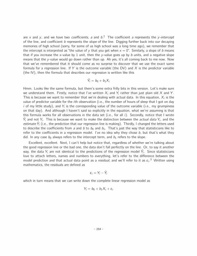
Figure 11.10: A depiction of the residuals associated with the best fitting regression line (panel a),and the residuals associated with a poor regression line (panel b). The residuals are much smaller forthe good regression line. Again, this is no surprise given that the good line is the one that goes rightthrough the middle of the data.. . . . . . . . . . . . . . . . . . . . . . . . . . . . . . . . . . . . . . . . . . . . . . . . . . . . . . . . . . . . . . . . . . . . . . . . . . . . . . . . . . . . . . . . . . . .
11.4
Estimating a linear regression model
Okay, now let’s redraw our pictures but this time I’ll add some lines to show the size of the residualfor all observations. When the regression line is good, our residuals (the lengths of the solid blacklines) all look pretty small, as shown in Figure 11.10a, but when the regression line is a bad one theresiduals are a lot larger, as you can see from looking at Figure 11.10b. Hmm. Maybe what we “want”in a regression model is small residuals. Yes, that does seem to make sense. In fact, I think I’ll goso far as to say that the “best fitting” regression line is the one that has the smallest residuals. Or,better yet, since statisticians seem to like to take squares of everything why not say that:
The estimated regression coefficients, ˆb0 and ˆb1, are those that minimise the sum of thesquared residuals, which we could either write as
∞ipYi ´ ˆYiq2 or as
∞i "i2.
Yes, yes that sounds even better. And since I’ve indented it like that, it probably means that this is the2Also sometimes written as y “ mx ` b where m is the slope coefficient and b is the intercept (constant) coefficient.3The " symbol is the Greek letter epsilon. It’s traditional to use "i or ei to denote a residual.
- 265 -
right answer. And since this is the right answer, it’s probably worth making a note of the fact that ourregression coefficients are estimates (we’re trying to guess the parameters that describe a population!),which is why I’ve added the little hats, so that we get ˆb0 and ˆb1 rather than b0 and b1. Finally, Ishould also note that, since there’s actually more than one way to estimate a regression model, themore technical name for this estimation process is ordinary least squares (OLS) regression.
At this point, we now have a concrete definition for what counts as our “best” choice of regressioncoefficients, ˆb0 and ˆb1. The natural question to ask next is, if our optimal regression coefficients arethose that minimise the sum squared residuals, how do we find these wonderful numbers? The actualanswer to this question is complicated and doesn’t help you understand the logic of regression.4 Thistime I’m going to let you off the hook. Instead of showing you the long and tedious way first andthen “revealing” the wonderful shortcut that JASP provides, let’s cut straight to the chase and justuse JASP to do all the heavy lifting.
11.4.1 Linear regression in JASP
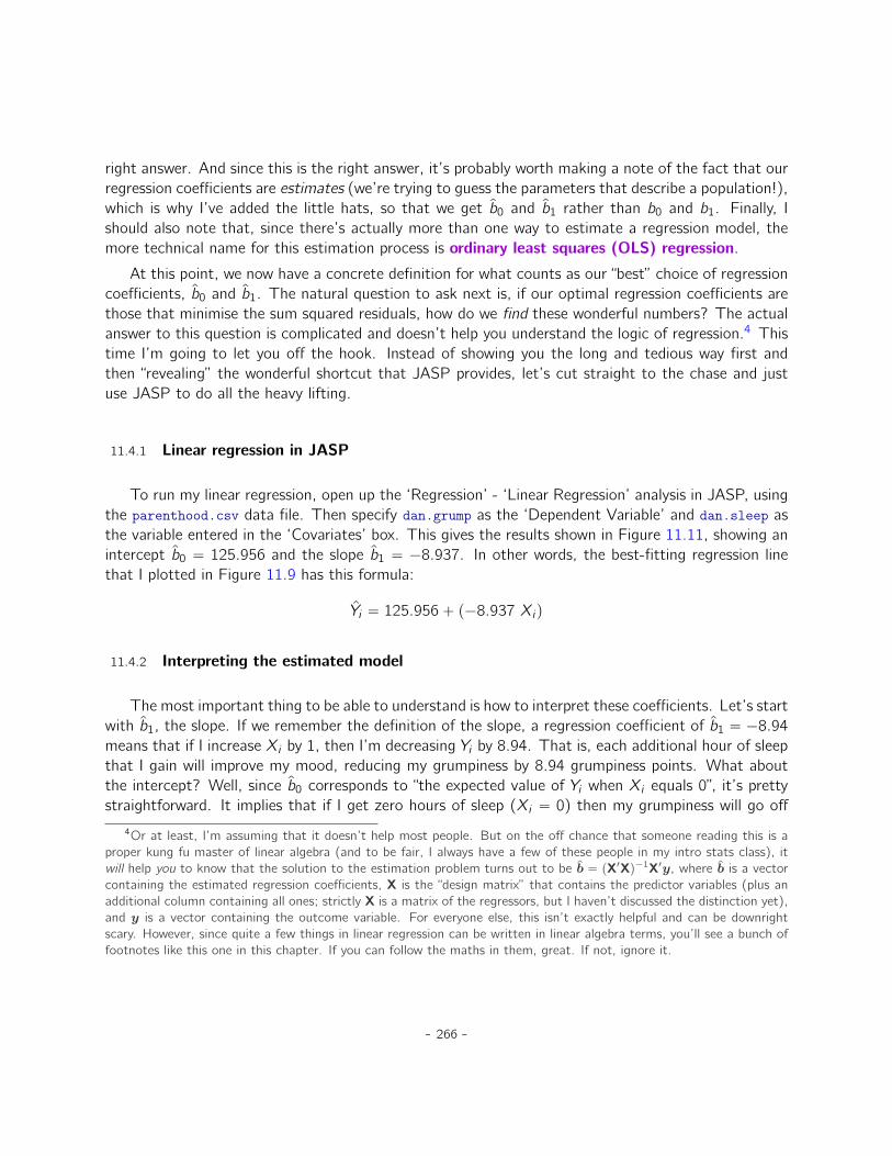
To run my linear regression, open up the ‘Regression’ - ‘Linear Regression’ analysis in JASP, usingthe parenthood.csv data file. Then specify dan.grump as the ‘Dependent Variable’ and dan.sleep asthe variable entered in the ‘Covariates’ box. This gives the results shown in Figure 11.11, showing anintercept ˆb0 “ 125.956 and the slope ˆb1 “ ´8.937. In other words, the best-fitting regression linethat I plotted in Figure 11.9 has this formula:
ˆYi “ 125.956` p´8.937 Xiq
11.4.2 Interpreting the estimated model
The most important thing to be able to understand is how to interpret these coefficients. Let’s startwith ˆb1, the slope. If we remember the definition of the slope, a regression coefficient of ˆb1 “ ´8.94means that if I increase Xi by 1, then I’m decreasing Yi by 8.94. That is, each additional hour of sleepthat I gain will improve my mood, reducing my grumpiness by 8.94 grumpiness points. What aboutthe intercept? Well, since ˆb0 corresponds to “the expected value of Yi when Xi equals 0”, it’s prettystraightforward. It implies that if I get zero hours of sleep (Xi “ 0) then my grumpiness will go off
4Or at least, I’m assuming that it doesn’t help most people. But on the off chance that someone reading this is aproper kung fu master of linear algebra (and to be fair, I always have a few of these people in my intro stats class), itwill help you to know that the solution to the estimation problem turns out to be b “ pX1Xq´1X1y, where b is a vectorcontaining the estimated regression coefficients, X is the “design matrix” that contains the predictor variables (plus anadditional column containing all ones; strictly X is a matrix of the regressors, but I haven’t discussed the distinction yet),and y is a vector containing the outcome variable. For everyone else, this isn’t exactly helpful and can be downrightscary. However, since quite a few things in linear regression can be written in linear algebra terms, you’ll see a bunch offootnotes like this one in this chapter. If you can follow the maths in them, great. If not, ignore it.
- 266 -
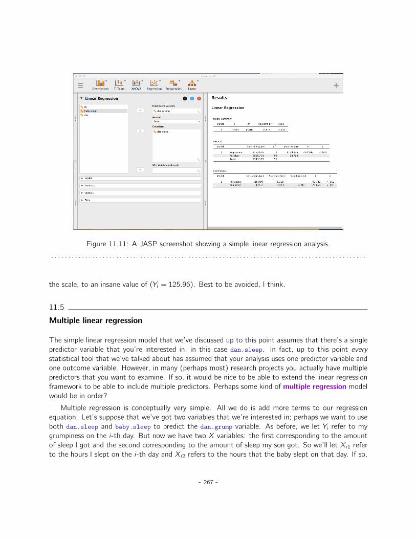
Figure 11.11: A JASP screenshot showing a simple linear regression analysis.. . . . . . . . . . . . . . . . . . . . . . . . . . . . . . . . . . . . . . . . . . . . . . . . . . . . . . . . . . . . . . . . . . . . . . . . . . . . . . . . . . . . . . . . . . . .
the scale, to an insane value of (Yi “ 125.96). Best to be avoided, I think.
11.5
Multiple linear regression
The simple linear regression model that we’ve discussed up to this point assumes that there’s a singlepredictor variable that you’re interested in, in this case dan.sleep. In fact, up to this point everystatistical tool that we’ve talked about has assumed that your analysis uses one predictor variable andone outcome variable. However, in many (perhaps most) research projects you actually have multiplepredictors that you want to examine. If so, it would be nice to be able to extend the linear regressionframework to be able to include multiple predictors. Perhaps some kind of multiple regression modelwould be in order?
Multiple regression is conceptually very simple. All we do is add more terms to our regressionequation. Let’s suppose that we’ve got two variables that we’re interested in; perhaps we want to useboth dan.sleep and baby.sleep to predict the dan.grump variable. As before, we let Yi refer to mygrumpiness on the i-th day. But now we have two X variables: the first corresponding to the amountof sleep I got and the second corresponding to the amount of sleep my son got. So we’ll let Xi1 referto the hours I slept on the i-th day and Xi2 refers to the hours that the baby slept on that day. If so,
- 267 -
then we can write our regression model like this:
Yi “ b0 ` b1Xi1 ` b2Xi2 ` "i
As before, "i is the residual associated with the i-th observation, "i “ Yi ´ ˆYi . In this model, we nowhave three coefficients that need to be estimated: b0 is the intercept, b1 is the coefficient associatedwith my sleep, and b2 is the coefficient associated with my son’s sleep. However, although the numberof coefficients that need to be estimated has changed, the basic idea of how the estimation worksis unchanged: our estimated coefficients ˆb0, ˆb1 and ˆb2 are those that minimise the sum squaredresiduals.
11.5.1 Doing it in JASP
Multiple regression in JASP is no different to simple regression. All we have to do is add addi-tional variables to the ‘Covariates’ box in JASP. For example, if we want to use both dan.sleep andbaby.sleep as predictors in our attempt to explain why I’m so grumpy, then move baby.sleep acrossinto the ‘Covariates’ box alongside dan.sleep. By default, JASP assumes that the model shouldinclude an intercept. The coefficients we get this time are:
(Intercept) dan.sleep baby.sleep125.966 -8.950 0.011
The coefficient associated with dan.sleep is quite large, suggesting that every hour of sleep I losemakes me a lot grumpier. However, the coefficient for baby.sleep is very small, suggesting that itdoesn’t really matter how much sleep my son gets. What matters as far as my grumpiness goes ishow much sleep I get. To get a sense of what this multiple regression model looks like, Figure 11.12shows a 3D plot that plots all three variables, along with the regression model itself.
11.5.2 Formula for the general case
The equation that I gave above shows you what a multiple regression model looks like when youinclude two predictors. Not surprisingly, then, if you want more than two predictors all you have todo is add more X terms and more b coefficients. In other words, if you have K predictor variablesin the model then the regression equation looks like this
Yi “ b0 `˜Kÿ
k“1bkXik
¸
` "i
- 268 -
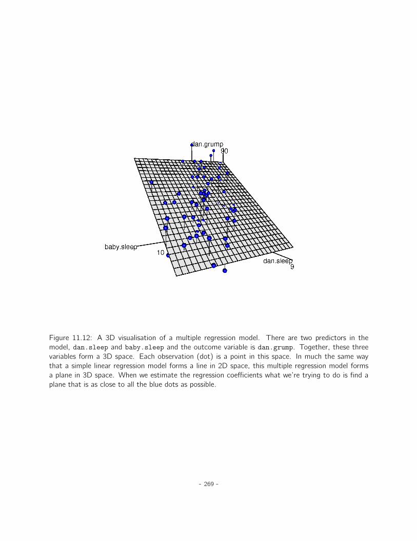
Figure 11.12: A 3D visualisation of a multiple regression model. There are two predictors in themodel, dan.sleep and baby.sleep and the outcome variable is dan.grump. Together, these threevariables form a 3D space. Each observation (dot) is a point in this space. In much the same waythat a simple linear regression model forms a line in 2D space, this multiple regression model formsa plane in 3D space. When we estimate the regression coefficients what we’re trying to do is find aplane that is as close to all the blue dots as possible.
- 269 -
11.6
Quantifying the fit of the regression model
So we now know how to estimate the coefficients of a linear regression model. The problem is, wedon’t yet know if this regression model is any good. For example, the regression model that weconstructed in section 11.4.1 claims that every hour of sleep will improve my mood by quite a lot, butit might just be rubbish. Remember, the regression model only produces a prediction ˆYi about whatmy mood is like, but my actual mood is Yi . If these two are very close, then the regression model hasdone a good job. If they are very different, then it has done a bad job.
11.6.1 The R2 value
Once again, let’s wrap a little bit of mathematics around this. Firstly, we’ve got the sum of thesquared residuals
SSres “ÿ
i
pYi ´ ˆYiq2
which we would hope to be pretty small. Specifically, what we’d like is for it to be very small incomparison to the total variability in the outcome variable
SStot “ÿ
i
pYi ´ ¯Y q2
While we’re here, let’s calculate these values ourselves, not by hand though. I have constructed a JASPfile called parenthood_rsquared.jasp, which you can open from the book’s data folder. You’ll noticethat this data file has 5 variables; two of them are the original dan.sleep and dan.grump variables thatwe’ve already been using. The other three are calculated variables:
1. Y.pred is the predicted value of grumpiness using the regression equation. It is calculated usingthe formula ‘125.97 + (-8.94 * dan.sleep)’.
2. resid is a measure of the residual error "i “ Yi ´ ˆYi , which represents the difference between ourpredicted value of grumpiness and our actual value of grumpiness. It is calculated using the formula‘dan.grump - Y.pred’.
3. sq.resid is the square of the residual, and is calculated using the formula ‘resid2’.
Since SSres is the sum of these squared residuals, we can use JASP to find the sum of the sq.residcolumn. Simply click ‘Descriptives’ - ‘Descriptive Statistics’ and move sq.resid to the ‘Variables’ box.You’ll then need to select ‘Sum’ from the ‘Statistics’ options below. This should give you a value of‘1838.714’.
Wonderful. A big number that doesn’t mean very much. Still, let’s forge boldly onwards anywayand calculate the total sum of squares as well. That’s also pretty simple. Let’s calculate SStotsimilarly. This time, you’ll need to create a new computed column. Click the “+” symbol to start. For
- 270 -
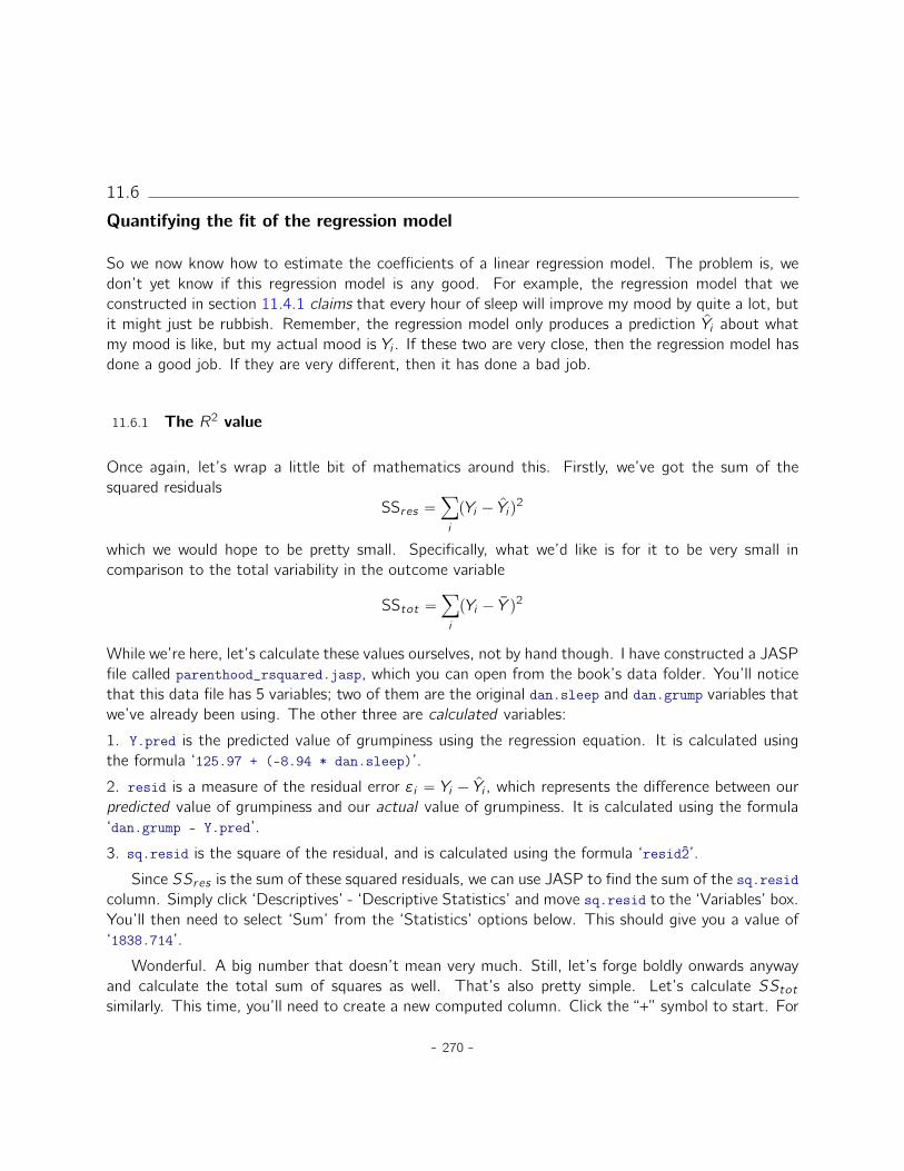
‘Name’, let’s type ‘sq.resid2’ (you’ll see why in a minute). Be sure to select the “R” button, thenclick ‘Create Column’. For your R code, type the following (see Figure 11.13):
(dan.grump - mean(dan.grump))^2
Then click ‘Compute column’. This will produce a column of values that are themselves residuals,but they are residuals (errors) against a really bad predictive model; that is, the model that justpredicts grumpiness using the mean of all grumpiness values. To find SStot , we need to compute thesum of sq.resid2, just like we did above.
Figure 11.13: A JASP screenshot showing a residual computation in R.. . . . . . . . . . . . . . . . . . . . . . . . . . . . . . . . . . . . . . . . . . . . . . . . . . . . . . . . . . . . . . . . . . . . . . . . . . . . . . . . . . . . . . . . . . . .
This should give you a value of ‘9998.590’. Hmm. Well, it’s a much bigger number than thelast one, so this does suggest that our regression model was making good predictions (that is, it hasgreatly reduced the residual error compared to the model that uses the mean as a single predictor).But it’s not very interpretable.
- 271 -
Perhaps we can fix this. What we’d like to do is to convert these two fairly meaningless numbersinto one number. A nice, interpretable number, which for no particular reason we’ll call R2. What wewould like is for the value of R2 to be equal to 1 if the regression model makes no errors in predictingthe data. In other words, if it turns out that the residual errors are zero. That is, if SSres “ 0 thenwe expect R2 “ 1. Similarly, if the model is completely useless, we would like R2 to be equal to 0.What do I mean by “useless”? Tempting as it is to demand that the regression model move out of thehouse, cut its hair and get a real job, I’m probably going to have to pick a more practical definition.In this case, all I mean is that the residual sum of squares is no smaller than the total sum of squares,SSres “ SStot . Wait, why don’t we do exactly that? The formula that provides us with our R2 valueis pretty simple to write down,
R2 “ 1´ SSresSStot
and equally simple to calculate by hand:
R2 “ 1´ SSresSStot
“ 1´ 1838.7149998.590
“ 1´ 0.1839“ 0.8161.
The R2 value, sometimes called the coefficient of determination5 has a simple interpretation: it isthe proportion of the variance in the outcome variable that can be accounted for by the predictor. So,in this case the fact that we have obtained R2 “ .8161 means that the predictor (dan.sleep) explains81.61% of the variance in the outcome (dan.grump).
Naturally, you don’t actually need to do all these computations by hand if you want to obtain theR2 value for your regression model. It turns out that JASP gives you this by default! Take a look atFigure 11.11 again; notice that in the top table labeled ‘Model Summary’, the value of R2 is alreadythere!
11.6.2 The relationship between regression and correlation
At this point we can revisit my earlier claim that regression, in this very simple form that I’vediscussed so far, is basically the same thing as a correlation. Previously, we used the symbol r todenote a Pearson correlation. Might there be some relationship between the value of the correlationcoefficient r and the R2 value from linear regression? Of course there is: the squared correlation r2 isidentical to the R2 value for a linear regression with only a single predictor. In other words, running a
5And by “sometimes” I mean “almost never”. In practice everyone just calls it “R-squared”.
- 272 -
Pearson correlation is more or less equivalent to running a linear regression model that uses only onepredictor variable.
11.6.3 The adjusted R2 value
One final thing to point out before moving on. It’s quite common for people to report a slightlydifferent measure of model performance, known as “adjusted R2”. The motivation behind calculatingthe adjusted R2 value is the observation that adding more predictors into the model will always causethe R2 value to increase (or at least not decrease).
The adjusted R2 value introduces a slight change to the calculation, as follows. For a regressionmodel with K predictors, fit to a data set containing N observations, the adjusted R2 is:
adj. R2 “ 1´ˆ
SSresSStot
ˆ N ´ 1N ´K ´ 1
˙
This adjustment is an attempt to take the degrees of freedom into account. The big advantage ofthe adjusted R2 value is that when you add more predictors to the model, the adjusted R2 value willonly increase if the new variables improve the model performance more than you’d expect by chance.The big disadvantage is that the adjusted R2 value can’t be interpreted in the elegant way that R2
can. R2 has a simple interpretation as the proportion of variance in the outcome variable that isexplained by the regression model. To my knowledge, no equivalent interpretation exists for adjustedR2.
An obvious question then is whether you should report R2 or adjusted R2. This is probably amatter of personal preference. If you care more about interpretability, then R2 is better. If you caremore about correcting for bias, then adjusted R2 is probably better. Speaking just for myself, I preferR2. My feeling is that it’s more important to be able to interpret your measure of model performance.Besides, as we’ll see in Section 11.7, if you’re worried that the improvement in R2 that you get byadding a predictor is just due to chance and not because it’s a better model, well we’ve got hypothesistests for that.
11.7
Hypothesis tests for regression models
So far we’ve talked about what a regression model is, how the coefficients of a regression modelare estimated, and how we quantify the performance of the model (the last of these, incidentally, isbasically our measure of effect size). The next thing we need to talk about is hypothesis tests. Thereare two different (but related) kinds of hypothesis tests that we need to talk about: those in which wetest whether the regression model as a whole is performing significantly better than a null model, and
- 273 -
those in which we test whether a particular regression coefficient is significantly different from zero.
11.7.1 Testing the model as a whole
Okay, suppose you’ve estimated your regression model. The first hypothesis test you might try isthe null hypothesis that there is no relationship between the predictors and the outcome, and thealternative hypothesis that the data are distributed in exactly the way that the regression modelpredicts.
Formally, our “null model” corresponds to the fairly trivial “regression” model in which we include 0predictors and only include the intercept term b0:
H0 : Yi “ b0 ` "i
If our regression model has K predictors, the “alternative model” is described using the usual formulafor a multiple regression model:
H1 : Yi “ b0 `˜Kÿ
k“1bkXik
¸
` "i
How can we test these two hypotheses against each other? The trick is to understand that it’spossible to divide up the total variance SStot into the sum of the residual variance SSres and theregression model variance SSmod . I’ll skip over the technicalities, since we’ll get to that later whenwe look at ANOVA in Chapter 12. But just note that
SSmod “ SStot ´ SSres
And we can convert the sums of squares into mean squares by dividing by the degrees of freedom.
MSmod “ SSmoddfmod
MSres “ SSresdfres
So, how many degrees of freedom do we have? As you might expect the df associated with themodel is closely tied to the number of predictors that we’ve included. In fact, it turns out thatdfmod “ K. For the residuals the total degrees of freedom is dfres “ N ´K ´ 1.
- 274 -
Now that we’ve got our mean square values we can calculate an F -statistic like this
F “ MSmodMSres
and the degrees of freedom associated with this are K and N ´K ´ 1.
We’ll see much more of the F statistic in Chapter 12, but for now just know that we can interpretlarge F values as indicating that the null hypothesis is performing poorly in comparison to the alternativehypothesis. In a moment I’ll show you how to do the test in JASP the easy way, but first let’s have alook at the tests for the individual regression coefficients.
11.7.2 Tests for individual coefficients
The F -test that we’ve just introduced is useful for checking that the model as a whole is performingbetter than chance. If your regression model doesn’t produce a significant result for the F -test thenyou probably don’t have a very good regression model (or, quite possibly, you don’t have very gooddata). However, while failing this test is a pretty strong indicator that the model has problems, passingthe test (i.e., rejecting the null) doesn’t imply that the model is good! Why is that, you might bewondering? The answer to that can be found by looking at the coefficients for the multiple regressionmodel we have already looked at in section 11.5 above, where the coefficients we got were:
(Intercept) dan.sleep baby.sleep125.966 -8.950 0.011
I can’t help but notice that the estimated regression coefficient for the baby.sleep variable is tiny(0.011), relative to the value that we get for dan.sleep (-8.950). Given that these two variables areabsolutely on the same scale (they’re both measured in “hours slept”), I find this illuminating. In fact,I’m beginning to suspect that it’s really only the amount of sleep that I get that matters in order topredict my grumpiness.
We can re-use a hypothesis test that we discussed earlier, the t-test. The test that we’re interestedin has a null hypothesis that the true regression coefficient is zero (b “ 0), which is to be tested againstthe alternative hypothesis that it isn’t (b ‰ 0). That is:
H0 : b “ 0H1 : b ‰ 0
How can we test this? Well, if the central limit theorem is kind to us we might be able to guessthat the sampling distribution of ˆb, the estimated regression coefficient, is a normal distribution withmean centred on b. What that would mean is that if the null hypothesis were true, then the samplingdistribution of ˆb has mean zero and unknown standard deviation. Assuming that we can come up witha good estimate for the standard error of the regression coefficient, sepˆbq, then we’re in luck. That’sexactly the situation for which we introduced the one-sample t-test way back in Chapter 10. So let’s
- 275 -
define a t-statistic like this
t “ˆb
sepˆbqI’ll skip over the reasons why, but our degrees of freedom in this case are df “ N´K´1. Irritatingly,the estimate of the standard error of the regression coefficient, sepˆbq, is not as easy to calculateas the standard error of the mean that we used for the simpler t-tests in Chapter 10. In fact, theformula is somewhat ugly, and not terribly helpful to look at.6 For our purposes it’s sufficient topoint out that the standard error of the estimated regression coefficient depends on both the predictorand outcome variables, and it is somewhat sensitive to violations of the homogeneity of varianceassumption (discussed shortly).
In any case, this t-statistic can be interpreted in the same way as the t-statistics that we discussedin Chapter 10. Assuming that you have a two-sided alternative (i.e., you don’t really care if b ° 0 orb † 0), then it’s the extreme values of t (i.e., a lot less than zero or a lot greater than zero) thatsuggest that you should reject the null hypothesis.
11.7.3 Running the hypothesis tests in JASP
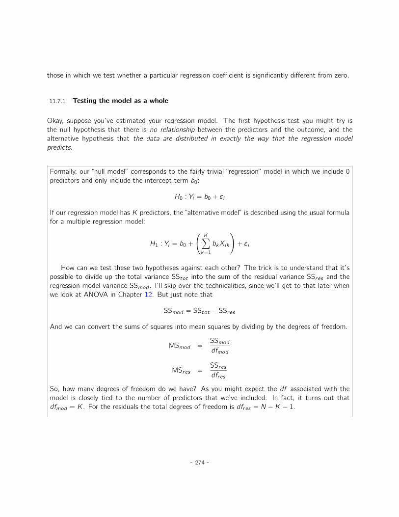
To compute all of the statistics that we have talked about so far, all you need to do is make surethe relevant options are checked in JASP and then run the regression. Fortunately, these options areusually selected by default. As you can see in Figure 11.14, we get a whole bunch of useful output.
The ‘Coefficients’ at the bottom of the JASP analysis results shown in 11.14 provides the coeffi-cients of the regression model. Each row in this table refers to one of the coefficients in the regressionmodel. The first row is the intercept term, and the later ones look at each of the predictors. Thecolumns give you all of the relevant information. The first column (labeled ‘Unstandardized’) is theactual estimate of b (e.g., 125.966 for the intercept, and -8.950 for the dan.sleep predictor). Thesecond column is the standard error estimate �b. The third column provides a ‘Standardized’ regres-sion coefficient; more about this in Section 11.8. The fourth column gives you the t-statistic, and it’sworth noticing that in this table t “ ˆb{sepˆbq every time. Finally, the last column gives you the actualp-value for each of these tests.7
The only thing that the coefficients table itself doesn’t list is the degrees of freedom used in the t-test, which is always N´K´1 and is listed in the table in the middle of the output, labelled ‘ANOVA’.We can see from this table that the model performs significantly better than you’d expect by chance(F p2, 97q “ 215.238, p † .001), which isn’t all that surprising: the R2 “ .816 value indicate thatthe regression model accounts for 81.6% of the variability in the outcome measure. However, when
6For advanced readers only. The vector of residuals is " “ y´Xb. For K predictors plus the intercept, the estimatedresidual variance is �2 “ "1"{pN ´ K ´ 1q. The estimated covariance matrix of the coefficients is �2pX1Xq´1, the maindiagonal of which is sepbq, our estimated standard errors.
7Note that, although JASP has done multiple tests here, it hasn’t done any sort of correction for multiple comparisons.These are standard one-sample t-tests with a two-sided alternative. If you want to make corrections for multiple tests,you need to do that yourself.
- 276 -
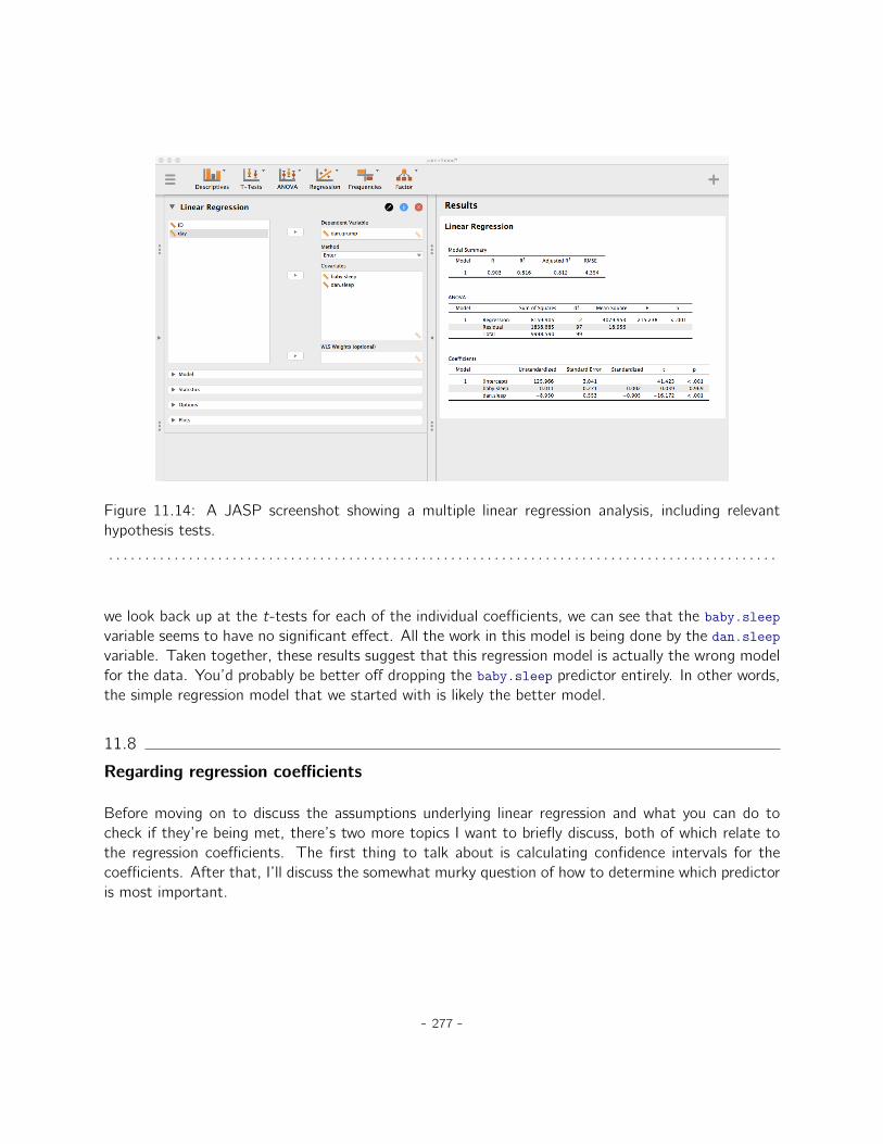
Figure 11.14: A JASP screenshot showing a multiple linear regression analysis, including relevanthypothesis tests.. . . . . . . . . . . . . . . . . . . . . . . . . . . . . . . . . . . . . . . . . . . . . . . . . . . . . . . . . . . . . . . . . . . . . . . . . . . . . . . . . . . . . . . . . . . .
we look back up at the t-tests for each of the individual coefficients, we can see that the baby.sleepvariable seems to have no significant effect. All the work in this model is being done by the dan.sleepvariable. Taken together, these results suggest that this regression model is actually the wrong modelfor the data. You’d probably be better off dropping the baby.sleep predictor entirely. In other words,the simple regression model that we started with is likely the better model.
11.8
Regarding regression coefficients
Before moving on to discuss the assumptions underlying linear regression and what you can do tocheck if they’re being met, there’s two more topics I want to briefly discuss, both of which relate tothe regression coefficients. The first thing to talk about is calculating confidence intervals for thecoefficients. After that, I’ll discuss the somewhat murky question of how to determine which predictoris most important.
- 277 -
11.8.1 Confidence intervals for the coefficients
Like any population parameter, the regression coefficients b cannot be estimated with complete pre-cision from a sample of data; that’s part of why we need hypothesis tests. Given this, it’s quite usefulto be able to report confidence intervals that capture our uncertainty about the true value of b. Thisis especially useful when the research question focuses heavily on an attempt to find out how stronglyvariable X is related to variable Y , since in those situations the interest is primarily in the regressionweight b.
Fortunately, confidence intervals for the regression weights can be constructed in the usual fashion
CIpbq “ ˆb ˘`tcr it ˆ sepˆbq
˘
where sepˆbq is the standard error of the regression coefficient, and tcr it is the relevant critical valueof the appropriate t distribution. For instance, if it’s a 95% confidence interval that we want, thenthe critical value is the 97.5th quantile of a t distribution with N ´ K ´ 1 degrees of freedom. Inother words, this is basically the same approach to calculating confidence intervals that we’ve usedthroughout.
In JASP we can display confidence intervals by selecting ‘Confidence intervals’ from the ‘Statistics’menu in our regression model dialog. The default is 95% CI, but we could easily choose somethingdifferent, say 99%, if that is what we decided on.
11.8.2 Calculating standardised regression coefficients
One more thing that you might want to do is to calculate “standardised” regression coefficients,often denoted �. The rationale behind standardised coefficients goes like this. In a lot of situations,your variables are on fundamentally different scales. Suppose, for example, my regression model aimsto predict people’s IQ scores using their educational attainment (number of years of education) andtheir income as predictors. Obviously, educational attainment and income are not on the same scales.The number of years of schooling might only vary by 10s of years, whereas income can vary by 10,000sof dollars (or more). The units of measurement have a big influence on the regression coefficients. Theb coefficients only make sense when interpreted in light of the units, both of the predictor variables andthe outcome variable. This makes it very difficult to compare the coefficients of different predictors.Yet there are situations where you really do want to make comparisons between different coefficients.Specifically, you might want some kind of standard measure of which predictors have the strongestrelationship to the outcome. This is what standardised coefficients aim to do.
The basic idea is quite simple; the standardised coefficients are the coefficients that you would
- 278 -
have obtained if you’d converted all the variables to z-scores before running the regression.8 The ideahere is that, by converting all the predictors to z-scores, they all go into the regression on the samescale, thereby removing the problem of having variables on different scales. Regardless of what theoriginal variables were, a � value of 1 means that an increase in the predictor of 1 standard deviationwill produce a corresponding 1 standard deviation increase in the outcome variable. Therefore, ifvariable A has a larger absolute value of � than variable B, it is deemed to have a stronger relationshipwith the outcome. Or at least that’s the idea. It’s worth being a little cautious here, since this doesrely very heavily on the assumption that “a 1 standard deviation change” is fundamentally the samekind of thing for all variables. It’s not always obvious that this is true.
Leaving aside the interpretation issues, let’s look at how it’s calculated. What you could do isstandardise all the variables yourself and then run a regression, but there’s a much simpler way todo it. As it turns out, the � coefficient for a predictor X and outcome Y has a very simple formula,namely
�X “ bX ˆ �X�Y
where �X is the standard deviation of the predictor, and �Y is the standard deviation of the outcomevariable Y . This makes matters a lot simpler.
To make things even simpler, JASP computes the � coefficients by default, as you can see the thirdcolumn of the ‘Coefficients’ table in Figure 11.14. This clearly shows that the dan.sleep variable hasa much stronger effect than the baby.sleep variable. However, this is a perfect example of a situationwhere it would probably make sense to use the original coefficients b rather than the standardisedcoefficients �. After all, my sleep and the baby’s sleep are already on the same scale: number of hoursslept. Why complicate matters by converting these to z-scores?
11.9
Assumptions of regression
The linear regression model that I’ve been discussing relies on several assumptions. In Section 11.10we’ll talk a lot more about how to check that these assumptions are being met, but first let’s have alook at each of them.
• Normality. Like many of the models in statistics, basic simple or multiple linear regression relieson an assumption of normality. Specifically, it assumes that the residuals are normally distributed.It’s actually okay if the predictors X and the outcome Y are non-normal, so long as the residuals" are normal. See Section 11.10.3.
8Strictly, you standardise all the regressors. That is, every “thing” that has a regression coefficient associated withit in the model. For the regression models that I’ve talked about so far, each predictor variable maps onto exactly oneregressor, and vice versa. However, that’s not actually true in general and we’ll see some examples of this in Chapter 13.But, for now we don’t need to care too much about this distinction.
- 279 -
• Linearity. A pretty fundamental assumption of the linear regression model is that the relationshipbetween X and Y actually is linear! Regardless of whether it’s a simple regression or a multipleregression, we assume that the relationships involved are linear.
• Homogeneity of variance. Strictly speaking, the regression model assumes that each residual"i is generated from a normal distribution with mean 0, and (more importantly for the currentpurposes) with a standard deviation � that is the same for every single residual. In practice, it’simpossible to test the assumption that every residual is identically distributed. Instead, what wecare about is that the standard deviation of the residual is the same for all values of ˆY , and (ifwe’re being especially paranoid) all values of every predictor X in the model.
• Uncorrelated predictors. The idea here is that, in a multiple regression model, you don’t wantyour predictors to be too strongly correlated with each other. This isn’t “technically” an as-sumption of the regression model, but in practice it’s required. Predictors that are too stronglycorrelated with each other (referred to as “collinearity”) can cause problems when evaluating themodel.
• Residuals are independent of each other. This is really just a “catch all” assumption, to theeffect that “there’s nothing else funny going on in the residuals”. If there is something weird(e.g., the residuals all depend heavily on some other unmeasured variable) going on, it mightscrew things up.
• No “bad” outliers. Again, not actually a technical assumption of the model (or rather, it’s sortof implied by all the others), but there is an implicit assumption that your regression modelisn’t being too strongly influenced by one or two anomalous data points because this raisesquestions about the adequacy of the model and the trustworthiness of the data in some cases.See Section 11.10.2.
11.10
Model checking
The main focus of this section is regression diagnostics, a term that refers to the art of checkingthat the assumptions of your regression model have been met, figuring out how to fix the model if theassumptions are violated, and generally to check that nothing “funny” is going on. I refer to this as the“art” of model checking with good reason. It’s not easy, and while there are a lot of fairly standardisedtools that you can use to diagnose and maybe even cure the problems that ail your model (if thereare any, that is!), you really do need to exercise a certain amount of judgement when doing this. It’seasy to get lost in all the details of checking this thing or that thing, and it’s quite exhausting to tryto remember what all the different things are. This has the very nasty side effect that a lot of peopleget frustrated when trying to learn all the tools, so instead they decide not to do any model checking.This is a bit of a worry!
- 280 -
In this section I describe several different things you can do to check that your regression model isdoing what it’s supposed to. It doesn’t cover the full space of things you could do, but it’s still muchmore detailed than what I see a lot of people doing in practice, and even I don’t usually cover all ofthis in my intro stats class either. However, I do think it’s important that you get a sense of whattools are at your disposal, so I’ll try to introduce a bunch of them here. Finally, I should note thatthis section draws quite heavily from the Fox and Weisberg (2011) text, the book associated with thecar package that is used to conduct regression analysis in R. The car package is notable for providingsome excellent tools for regression diagnostics, and the book itself talks about them in an admirablyclear fashion. I don’t want to sound too gushy about it, but I do think that Fox et al. (2011) is wellworth reading, even if some of the advanced diagnostic techniques are only available in R and notJASP.
11.10.1 Three kinds of residuals
The majority of regression diagnostics revolve around looking at the residuals, and by now you’veprobably formed a sufficiently pessimistic theory of statistics to be able to guess that, precisely becauseof the fact that we care a lot about the residuals, there are several different kinds of residual thatwe might consider. In particular, the following three kinds of residuals are referred to in this section:“ordinary residuals”, “standardised residuals”, and “Studentised residuals”. There is a fourth kind thatyou’ll see referred to in some of the Figures, and that’s the “Pearson residual”. However, for the modelsthat we’re talking about in this chapter the Pearson residual is identical to the ordinary residual.
The first and simplest kind of residuals that we care about are ordinary residuals. These are theactual raw residuals that I’ve been talking about throughout this chapter so far. The ordinary residualis just the difference between the fitted value ˆYi and the observed value Yi . I’ve been using the notation"i to refer to the i-th ordinary residual, and darn it, I’m going to stick to it. With this in mind, wehave the very simple equation
"i “ Yi ´ ˆYiThis is of course what we saw earlier, and unless I specifically refer to some other kind of residual,this is the one I’m talking about. So there’s nothing new here. I just wanted to repeat myself. Onedrawback to using ordinary residuals is that they’re always on a different scale, depending on what theoutcome variable is and how good the regression model is. That is, unless you’ve decided to run aregression model without an intercept term, the ordinary residuals will have mean 0 but the variance isdifferent for every regression. In a lot of contexts, especially where you’re only interested in the patternof the residuals and not their actual values, it’s convenient to estimate the standardised residuals,which are normalised in such a way as to have standard deviation 1.
The way we calculate these is to divide the ordinary residual by an estimate of the (population)standard deviation of these residuals. For technical reasons, mumble mumble, the formula for this
- 281 -
is"1i “ "i�
?1´ hi
where � in this context is the estimated population standard deviation of the ordinary residuals, andhi is the “hat value” of the ith observation. I haven’t explained hat values to you yet (but have nofear,a it’s coming shortly), so this won’t make a lot of sense. For now, it’s enough to interpret thestandardised residuals as if we’d converted the ordinary residuals to z-scores. In fact, that is moreor less the truth, it’s just that we’re being a bit fancier.
aOr have no hope, as the case may be.
The third kind of residuals are Studentised residuals (also called “jackknifed residuals”) and they’reeven fancier than standardised residuals. Again, the idea is to take the ordinary residual and divide itby some quantity in order to estimate some standardised notion of the residual.
The formula for doing the calculations this time is subtly different
"˚i “ "i�p´iq
?1´ hi
Notice that our estimate of the standard deviation here is written �p´iq. What this corresponds to isthe estimate of the residual standard deviation that you would have obtained if you just deleted theith observation from the data set. This sounds like the sort of thing that would be a nightmare tocalculate, since it seems to be saying that you have to run N new regression models (even a moderncomputer might grumble a bit at that, especially if you’ve got a large data set). Fortunately,some terribly clever person has shown that this standard deviation estimate is actually given by thefollowing equation:
�p´iq “ �dN ´K ´ 1´ "1
i2
N ´K ´ 2Isn’t that a pip?
Before moving on, I should point out that you don’t often need to obtain these residuals yourself,even though they are at the heart of almost all regression diagnostics. Most of the time the variousoptions that provide the diagnostics, or assumption checks, will take care of these calculations foryou. Even so, it’s always nice to know how to actually get hold of these things yourself in case youever need to do something non-standard.
11.10.2 Three kinds of anomalous data
One danger that you can run into with linear regression models is that your analysis might bedisproportionately sensitive to a smallish number of “unusual” or “anomalous” observations. I discussed
- 282 -
Predictor
Ou
tco
me
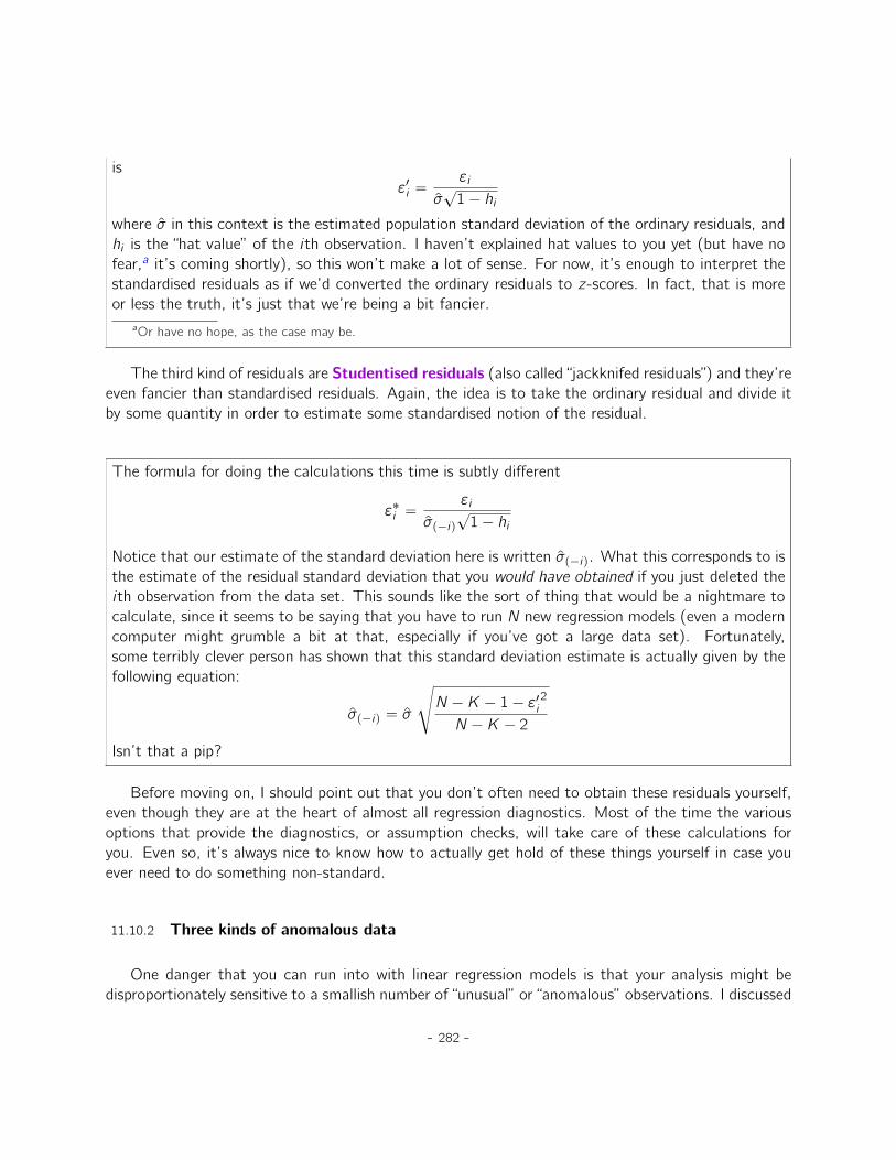
Outlier
Figure 11.15: An illustration of outliers. The dotted lines plot the regression line that would havebeen estimated without the anomalous observation included, and the corresponding residual (i.e.,the Studentised residual). The solid line shows the regression line with the anomalous observationincluded. The outlier has an unusual value on the outcome (y axis location) but not the predictor (xaxis location), and lies a long way from the regression line.. . . . . . . . . . . . . . . . . . . . . . . . . . . . . . . . . . . . . . . . . . . . . . . . . . . . . . . . . . . . . . . . . . . . . . . . . . . . . . . . . . . . . . . . . . . .
this idea previously in Section 5.2 in the context of discussing the outliers that get automaticallyidentified by the boxplot option under ‘Exploration’ - ‘Descriptives’, but this time we need to be muchmore precise. In the context of linear regression, there are three conceptually distinct ways in whichan observation might be called “anomalous”. All three are interesting, but they have rather differentimplications for your analysis.
The first kind of unusual observation is an outlier. The definition of an outlier (in this context) isan observation that is very different from what the regression model predicts. An example is shownin Figure 11.15. In practice, we operationalise this concept by saying that an outlier is an observationthat has a very large Studentised residual, "˚
i . Outliers are interesting: a big outlier might correspondto junk data, e.g., the variables might have been recorded incorrectly in the data set, or some otherdefect may be detectable. Note that you shouldn’t throw an observation away just because it’s anoutlier. But the fact that it’s an outlier is often a cue to look more closely at that case and try to
- 283 -
Predictor
Ou
tco
me
High leverage
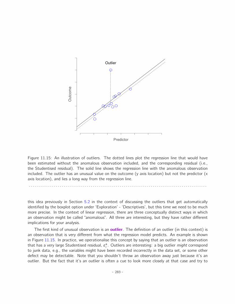
Figure 11.16: An illustration of high leverage points. The anomalous observation in this case isunusual both in terms of the predictor (x axis) and the outcome (y axis), but this unusualness is highlyconsistent with the pattern of correlations that exists among the other observations. The observationfalls very close to the regression line and does not distort it.. . . . . . . . . . . . . . . . . . . . . . . . . . . . . . . . . . . . . . . . . . . . . . . . . . . . . . . . . . . . . . . . . . . . . . . . . . . . . . . . . . . . . . . . . . . .
find out why it’s so different.
The second way in which an observation can be unusual is if it has high leverage, which happenswhen the observation is very different from all the other observations. This doesn’t necessarily haveto correspond to a large residual. If the observation happens to be unusual on all variables in preciselythe same way, it can actually lie very close to the regression line. An example of this is shown inFigure 11.16. The leverage of an observation is operationalised in terms of its hat value, usuallywritten hi . The formula for the hat value is rather complicated9 but its interpretation is not: hi is ameasure of the extent to which the i-th observation is “in control” of where the regression line ends
9Again, for the linear algebra fanatics: the “hat matrix” is defined to be that matrix H that converts the vector ofobserved values y into a vector of fitted values y, such that y “ Hy. The name comes from the fact that this is the matrixthat “puts a hat on y”. The hat value of the i-th observation is the i-th diagonal element of this matrix (so technicallyI should be writing it as hi i rather than hi). Oh, and in case you care, here’s how it’s calculated: H “ XpX1Xq´1X1.Pretty, isn’t it?
- 284 -
up going.
In general, if an observation lies far away from the other ones in terms of the predictor variables,it will have a large hat value (as a rough guide, high leverage is when the hat value is more than 2-3times the average; and note that the sum of the hat values is constrained to be equal to K`1). Highleverage points are also worth looking at in more detail, but they’re much less likely to be a cause forconcern unless they are also outliers.
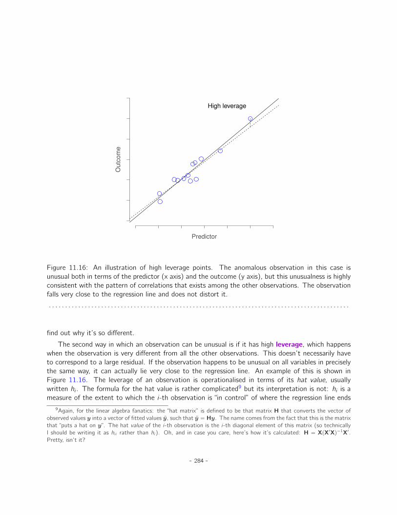
This brings us to our third measure of unusualness, the influence of an observation. A highinfluence observation is an outlier that has high leverage. That is, it is an observation that is verydifferent to all the other ones in some respect, and also lies a long way from the regression line. Thisis illustrated in Figure 11.17. Notice the contrast to the previous two figures. Outliers don’t movethe regression line much and neither do high leverage points. But something that is both an outlierand has high leverage, well that has a big effect on the regression line. That’s why we call these
Predictor
Ou
tco
me
High influence
Figure 11.17: An illustration of high influence points. In this case, the anomalous observation ishighly unusual on the predictor variable (x axis), and falls a long way from the regression line. Asa consequence, the regression line is highly distorted, even though (in this case) the anomalousobservation is entirely typical in terms of the outcome variable (y axis).. . . . . . . . . . . . . . . . . . . . . . . . . . . . . . . . . . . . . . . . . . . . . . . . . . . . . . . . . . . . . . . . . . . . . . . . . . . . . . . . . . . . . . . . . . . .
- 285 -
points high influence, and it’s why they’re the biggest worry. We operationalise influence in terms ofa measure known as Cook’s distance.
Di “ "˚i2
K ` 1 ˆ hi1´ hi
Notice that this is a multiplication of something that measures the outlier-ness of the observation(the bit on the left), and something that measures the leverage of the observation (the bit on theright).
In order to have a large Cook’s distance an observation must be a fairly substantial outlier andhave high leverage. As a rough guide, Cook’s distance greater than 1 is often considered large (that’swhat I typically use as a quick and dirty rule).
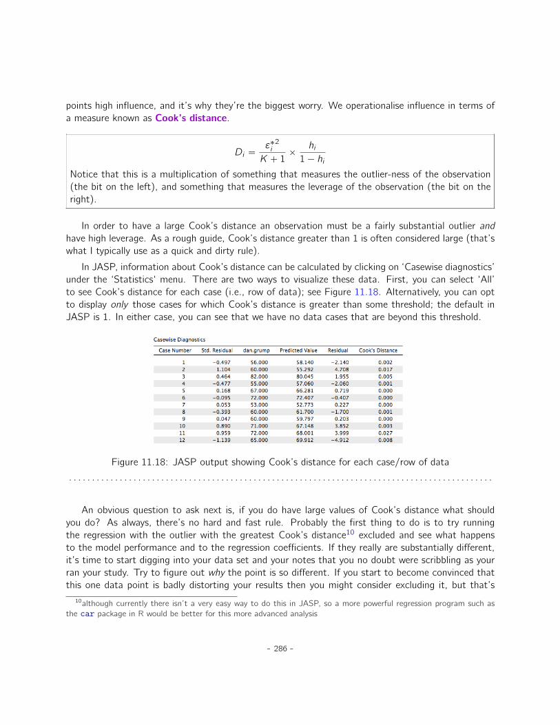
In JASP, information about Cook’s distance can be calculated by clicking on ‘Casewise diagnostics’under the ‘Statistics‘ menu. There are two ways to visualize these data. First, you can select ‘All’to see Cook’s distance for each case (i.e., row of data); see Figure 11.18. Alternatively, you can optto display only those cases for which Cook’s distance is greater than some threshold; the default inJASP is 1. In either case, you can see that we have no data cases that are beyond this threshold.
Figure 11.18: JASP output showing Cook’s distance for each case/row of data. . . . . . . . . . . . . . . . . . . . . . . . . . . . . . . . . . . . . . . . . . . . . . . . . . . . . . . . . . . . . . . . . . . . . . . . . . . . . . . . . . . . . . . . . . . .
An obvious question to ask next is, if you do have large values of Cook’s distance what shouldyou do? As always, there’s no hard and fast rule. Probably the first thing to do is to try runningthe regression with the outlier with the greatest Cook’s distance10 excluded and see what happensto the model performance and to the regression coefficients. If they really are substantially different,it’s time to start digging into your data set and your notes that you no doubt were scribbling as yourran your study. Try to figure out why the point is so different. If you start to become convinced thatthis one data point is badly distorting your results then you might consider excluding it, but that’s
10although currently there isn’t a very easy way to do this in JASP, so a more powerful regression program such asthe car package in R would be better for this more advanced analysis
- 286 -
less than ideal unless you have a solid explanation for why this particular case is qualitatively differentfrom the others and therefore deserves to be handled separately.
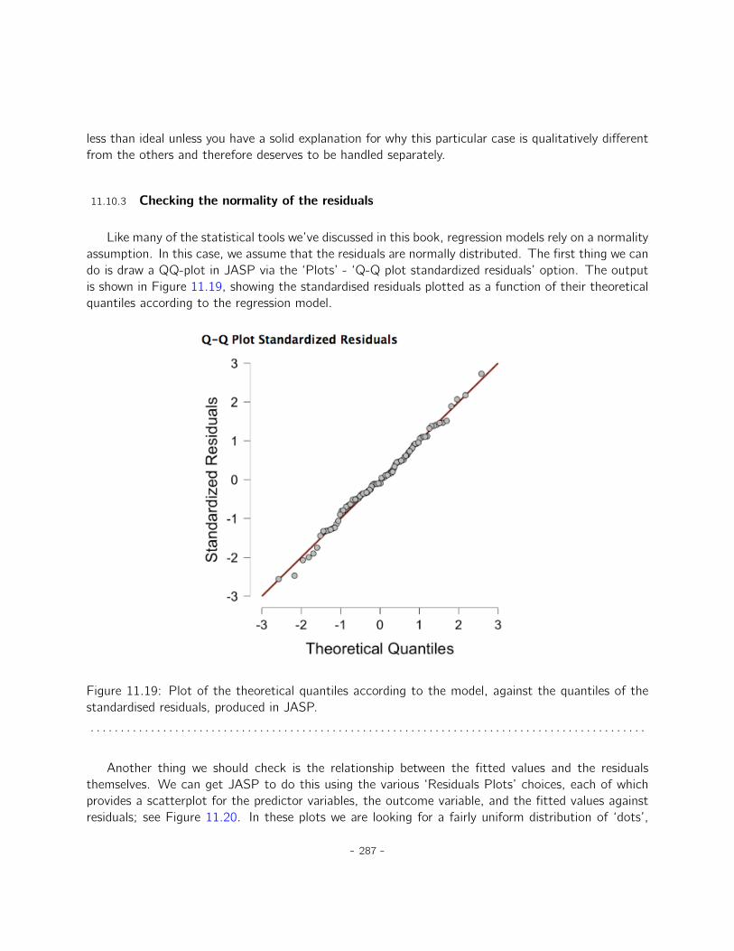
11.10.3 Checking the normality of the residuals
Like many of the statistical tools we’ve discussed in this book, regression models rely on a normalityassumption. In this case, we assume that the residuals are normally distributed. The first thing we cando is draw a QQ-plot in JASP via the ‘Plots’ - ‘Q-Q plot standardized residuals’ option. The outputis shown in Figure 11.19, showing the standardised residuals plotted as a function of their theoreticalquantiles according to the regression model.
Figure 11.19: Plot of the theoretical quantiles according to the model, against the quantiles of thestandardised residuals, produced in JASP.. . . . . . . . . . . . . . . . . . . . . . . . . . . . . . . . . . . . . . . . . . . . . . . . . . . . . . . . . . . . . . . . . . . . . . . . . . . . . . . . . . . . . . . . . . . .
Another thing we should check is the relationship between the fitted values and the residualsthemselves. We can get JASP to do this using the various ‘Residuals Plots’ choices, each of whichprovides a scatterplot for the predictor variables, the outcome variable, and the fitted values againstresiduals; see Figure 11.20. In these plots we are looking for a fairly uniform distribution of ‘dots’,
- 287 -
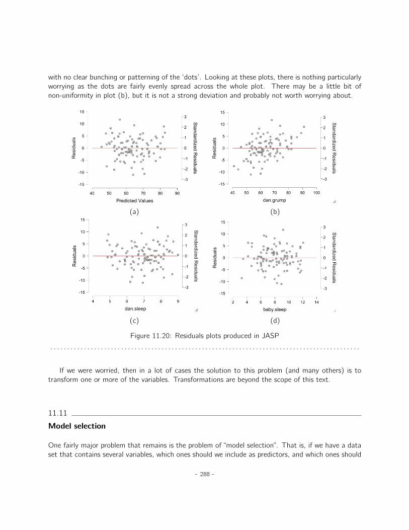
with no clear bunching or patterning of the ‘dots’. Looking at these plots, there is nothing particularlyworrying as the dots are fairly evenly spread across the whole plot. There may be a little bit ofnon-uniformity in plot (b), but it is not a strong deviation and probably not worth worrying about.
(a) (b)
(c) (d)
Figure 11.20: Residuals plots produced in JASP. . . . . . . . . . . . . . . . . . . . . . . . . . . . . . . . . . . . . . . . . . . . . . . . . . . . . . . . . . . . . . . . . . . . . . . . . . . . . . . . . . . . . . . . . . . .
If we were worried, then in a lot of cases the solution to this problem (and many others) is totransform one or more of the variables. Transformations are beyond the scope of this text.
11.11
Model selection
One fairly major problem that remains is the problem of “model selection”. That is, if we have a dataset that contains several variables, which ones should we include as predictors, and which ones should
- 288 -
we not include? In other words, we have a problem of variable selection. In general, model selection isa complex business but it’s made somewhat simpler if we restrict ourselves to the problem of choosinga subset of the variables that ought to be included in the model. Nevertheless, I’m not going to trycovering even this reduced topic in a lot of detail. Instead, I’ll talk about two broad principles thatyou need to think about, and then discuss one concrete tool to help you select a subset of variablesto include in your model. First, the two principles:
• It’s nice to have an actual substantive basis for your choices. That is, in a lot of situations youthe researcher have good reasons to pick out a smallish number of possible regression modelsthat are of theoretical interest. These models will have a sensible interpretation in the contextof your field. Never discount the importance of this. Statistics serves the scientific process, notthe other way around.
• To the extent that your choices rely on statistical inference, there is a trade off between simplicityand goodness of fit. As you add more predictors to the model you make it more complex. Eachpredictor adds a new free parameter (i.e., a new regression coefficient), and each new parameterincreases the model’s capacity to “absorb” random variations. So the goodness of fit (e.g., R2)continues to rise, sometimes trivially or by chance, as you add more predictors no matter what.If you want your model to be able to generalise well to new observations you need to avoidthrowing in too many variables.
This latter principle is often referred to as Ockham’s razor and is often summarised in terms of thefollowing pithy saying: do not multiply entities beyond necessity. In this context, it means don’t chuckin a bunch of largely irrelevant predictors just to boost your R2. Hmm. Yeah, the original was better.
In any case, what we need is an actual mathematical criterion that will implement the qualitativeprinciple behind Ockham’s razor in the context of selecting a regression model. As it turns out thereare several possibilities. The one that I’ll talk about is the Akaike information criterion (AIC; Akaike1974); currently, it is not part of JASP’s standard output, but it is quite easy to compute with themodel fit data that JASP does produce.
In the context of a linear regression model, the AIC for a model that has n observations and Kpredictor variables (not including the intercept) can be computeda as
AIC “ n lnpSSresq ` 2KaStrictly speaking, this formula is not completely correct. Akaike’s original definition was in terms of something
called a maximum likelihood estimate for the model, and as such, there are some other terms that appear in thecomputation. However, many of them don’t depend on the model, and given that the purpose of the AIC is tocompare models, these terms will be present in all models and will mathematically “wash out”. Thus, I am presentinga ‘bare bones’ version of the formula that is sufficient for our purposes.
Here’s the basic principle behind using AIC for model comparison: the smaller the AIC value, thebetter the model performance. If we ignore the low level details it’s fairly obvious what the AIC does.
- 289 -
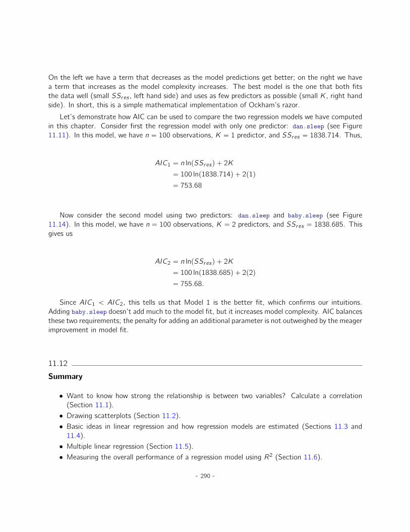
On the left we have a term that decreases as the model predictions get better; on the right we havea term that increases as the model complexity increases. The best model is the one that both fitsthe data well (small SSres , left hand side) and uses as few predictors as possible (small K, right handside). In short, this is a simple mathematical implementation of Ockham’s razor.
Let’s demonstrate how AIC can be used to compare the two regression models we have computedin this chapter. Consider first the regression model with only one predictor: dan.sleep (see Figure11.11). In this model, we have n “ 100 observations, K “ 1 predictor, and SSres “ 1838.714. Thus,
AIC1 “ n lnpSSresq ` 2K“ 100 lnp1838.714q ` 2p1q“ 753.68
Now consider the second model using two predictors: dan.sleep and baby.sleep (see Figure11.14). In this model, we have n “ 100 observations, K “ 2 predictors, and SSres “ 1838.685. Thisgives us
AIC2 “ n lnpSSresq ` 2K“ 100 lnp1838.685q ` 2p2q“ 755.68.
Since AIC1 † AIC2, this tells us that Model 1 is the better fit, which confirms our intuitions.Adding baby.sleep doesn’t add much to the model fit, but it increases model complexity. AIC balancesthese two requirements; the penalty for adding an additional parameter is not outweighed by the meagerimprovement in model fit.
11.12
Summary
• Want to know how strong the relationship is between two variables? Calculate a correlation(Section 11.1).• Drawing scatterplots (Section 11.2).• Basic ideas in linear regression and how regression models are estimated (Sections 11.3 and
11.4).• Multiple linear regression (Section 11.5).• Measuring the overall performance of a regression model using R2 (Section 11.6).
- 290 -

• Hypothesis tests for regression models (Section 11.7)• Calculating confidence intervals for regression coefficients and standardised coefficients (Sec-
tion 11.8).• The assumptions of regression (Section 11.9) and how to check them (Section 11.10).• Selecting a regression model (Section 11.11).
- 291 -