Embed Size (px)
Citation preview
10 KEY SALES CHARTS TO HAVE ON YOUR CRM DASHBOARD
According to statistics aggregator Statista, worldwide CRM software revenue swelled to $23 billion in 2014 from just $16 billion in 2011. In terms of percentage growth, that’s a massive increase of 44% over that time period. When we’re talking about revenue in the billions, if a single company realized 44% growth, it would be extraordinary to say the least. When an entire industry vertical increases its revenue by 44% though, it’s a paradigm shift.
A 31% increase in revenue for a single business is remarkable. When an entire industry vertical increases market share by a third, though, it qualifies as a mega-trend.
Sales and marketing professionals have always sought software advantages. But major innovations in the areas of cloud-computing, business intelligence, and mobility have converged to turn contemporary CRM software into something of a prerequisite for managing sales data.
Why is CRM software so in-demand?
Business management software applications generally offer one of two benefits (or both):
• The ability to do things faster • The ability to do things smarter.
CRM software gives users both advantages.
At the most basic level, CRM software streamlines sales activities with a single integrated environment for communicating with prospects and customers, managing the sales process, executing orders, and providing backend service. More importantly, they provide a business intelligence platform where sales managers can analyze the sales process and optimize processes based on real, live data.
Any business can convert an extemporaneous sales management approach into a data-driven system of continual sales development, with the right KPIs in place. This whitepaper identifies the KPIs and report views that B2B sales teams should have on their dashboard.
Introduction
A 31% increase in revenue for a single business is remarkable. When an entire industry vertical increases market share by a third, though, it qualifies as a mega-trend.
2
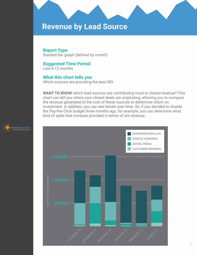
WANT TO KNOW which lead sources are contributing most to closed revenue? This chart can tell you where your closed deals are originating, allowing you to compare the revenue generated to the cost of these sources to determine return on investment. In addition, you can see trends over time. So, if you decided to double the Pay-Per-Click budget three months ago, for example, you can determine what kind of spike that increase provided in terms of win revenue.
Revenue by Lead Source
Report TypeStacked bar graph (defined by month)
Suggested Time PeriodLast 6-12 months
What this chart tells youWhich sources are providing the best ROI
3
500,000
1,000,000
1,500,000
SUM
OF
TOTA
L A
MO
UNT
OCTOBER ‘15
NOVEMBER ‘15
DECEMBER ‘15
JANUARY ‘16
FEBRUARY ‘16
MARCH ‘16
INSOURCELEADS.com
GOOGLE ADWORDS
SOCIAL MEDIA
CUSTOMER REFERRAL
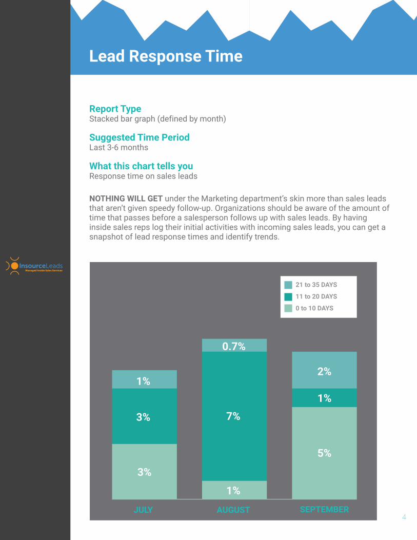
NOTHING WILL GET under the Marketing department’s skin more than sales leads that aren’t given speedy follow-up. Organizations should be aware of the amount of time that passes before a salesperson follows up with sales leads. By having inside sales reps log their initial activities with incoming sales leads, you can get a snapshot of lead response times and identify trends.
Report TypeStacked bar graph (defined by month)
Suggested Time PeriodLast 3-6 months
What this chart tells youResponse time on sales leads
4
21 to 35 DAYS
11 to 20 DAYS
0 to 10 DAYS
JULY AUGUST SEPTEMBER
3%
3%
1%
1%
7%
0.7%
2%
1%
5%
Lead Response Time

DO YOU WANT TO KNOW who the stone-cold closers are on your team? This report and chart will help determine who the good closers are and who may need some improvement. After all, if you can incrementally improve a closers conversion percentage, it can have a huge impact on your team’s performance, in aggregate. In addition, the aggregated data in the line graph will help you determine trends in your win ratio – are the increasing, decreasing or staying the same?
Report TypeLine graph driven by matrix report (defined by sales rep)
Suggested Time PeriodLast 5-6 months
What this chart tells youWhat your close rate is on active opportunities
4
JAN ‘15 FEB ‘15 MAR ‘15 APR ‘15 MAY ‘15
5%
10%
15%
20%
25%
CLOSE RATEOPPORTUNITY OWNER
CLOSE MONTH1/15 2/15 3/15 4/15 5/15
FRED
TOM
HARRY
MARY
BETTY
20%
15%
15%
25%
10%
21%
16%
18%
26%
18%
22%
25%
19%
30%
17%
23%
17%
22%
22%
15%
25%
20%
23%
18%
20%
AVERAGE 17% 19.8% 22.6% 19.8% 21.2%
AVG
22%
19%
24%
16%
20%
20%
Opportunity Conversion Ratio
OPPORTUNITY CONVERSION RATIO
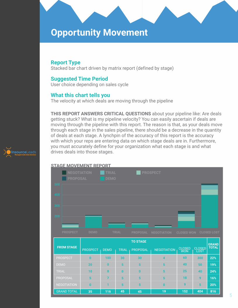
THIS REPORT ANSWERS CRITICAL QUESTIONS about your pipeline like: Are deals getting stuck? What is my pipeline velocity? You can easily ascertain if deals are moving through the pipeline with this report. The reason is that, as your deals move through each stage in the sales pipeline, there should be a decrease in the quantity of deals at each stage. A lynchpin of the accuracy of this report is the accuracy with which your reps are entering data on which stage deals are in. Furthermore, you must accurately define for your organization what each stage is and what drives deals into those stages.
Report TypeStacked bar chart driven by matrix report (defined by stage)
Suggested Time PeriodUser choice depending on sales cycle
What this chart tells youThe velocity at which deals are moving through the pipeline
5
PROSPECT DEMO TRIAL PROPOSAL NEGOTIATION
FROM STAGEPROSPECT DEMO TRIAL PROPOSAL NEGOTIATION
PROSPECT
DEMO
TRIAL
PROPOSAL
NEGOTIATION
0
20
10
5
0
100
0
8
7
1
30
5
0
5
5
30
5
0
5
5
4
5
5
5
0
GRAND TOTAL 35 116 45 45 19
GRANDTOTAL
60
40
25
18
9
152
Opportunity Movement
CLOSEDWON
CLOSEDLOST
300
50
40
9
5
404
22%
19%
24%
16%
20%
816
200
300
400
500
CLOSED WON CLOSED LOST
TO STAGE
NEGOTIATIONPROPOSAL
TRIALDEMO
PROSPECT
STAGE MOVEMENT REPORT
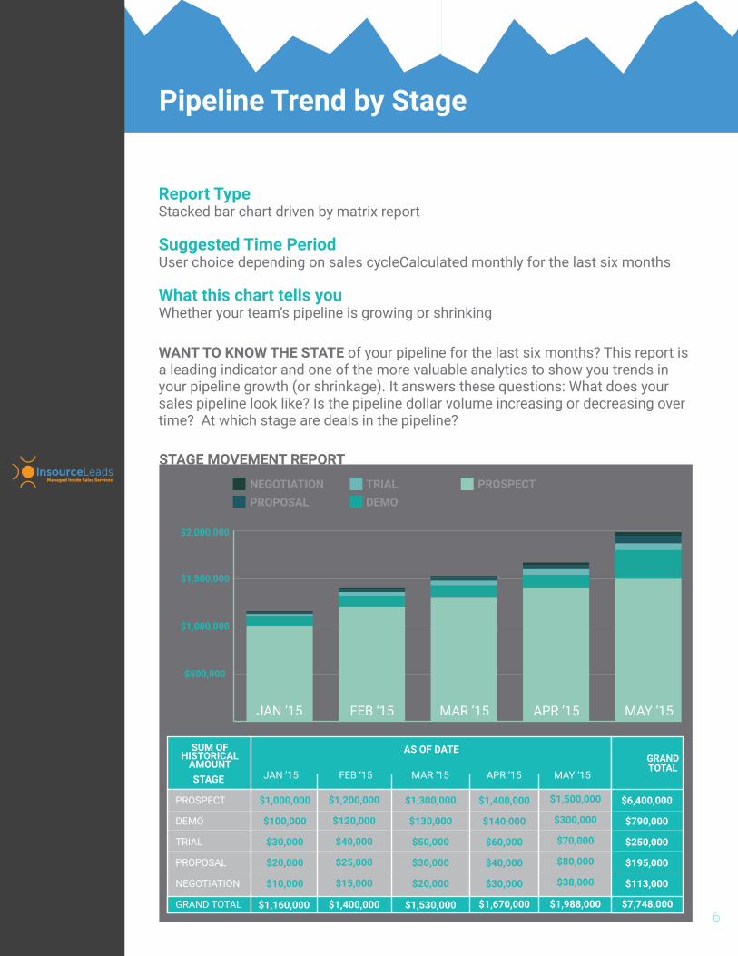
WANT TO KNOW THE STATE of your pipeline for the last six months? This report is a leading indicator and one of the more valuable analytics to show you trends in your pipeline growth (or shrinkage). It answers these questions: What does your sales pipeline look like? Is the pipeline dollar volume increasing or decreasing over time? At which stage are deals in the pipeline?
Report TypeStacked bar chart driven by matrix report
Suggested Time PeriodUser choice depending on sales cycleCalculated monthly for the last six months
What this chart tells youWhether your team’s pipeline is growing or shrinking
6
SUM OFHISTORICAL
AMOUNTJAN ‘15 FEB ‘15 MAR ‘15 APR ‘15 MAY ‘15
PROSPECT
DEMO
TRIAL
PROPOSAL
NEGOTIATION
$1,000,000
$100,000
$30,000
$20,000
$10,000
$1,200,000
$120,000
$40,000
$25,000
$15,000
$1,300,000
$130,000
$50,000
$30,000
$20,000
$1,400,000
$140,000
$60,000
$40,000
$30,000
GRAND TOTAL $1,160,000 $1,400,000 $1,530,000 $1,670,000
GRANDTOTAL
$1,500,000
$300,000
$70,000
$80,000
$38,000
$1,988,000
Pipeline Trend by Stage
$7,748,000
$6,400,000
$790,000
$250,000
$195,000
$113,000
AS OF DATE
NEGOTIATIONPROPOSAL
TRIALDEMO
PROSPECT
$500,000
$1,000,000
$1,500,000
$2,000,000
STAGE
JAN ‘15 FEB ‘15 MAR ‘15 APR ‘15 MAY ‘15
STAGE MOVEMENT REPORT

WHAT A SIMPLE WAY to prioritize key opportunities. This report helps you keep your eye on the prize (or the biggest prizes, at least). Depending on the size of your team, you can set the number of opportunities to display at ten, twenty, or whatever you prefer. Sales managers love this report as it gives them quick access to deals their teams should be concentrating on.
Report TypeOpportunity list report
Suggested Time PeriodN/A
What this chart tells youHow to prioritize key accounts and opportunities
7
Top XX Open Opportunities
TOP 10 ACCOUNTSACCOUNT SUM OF AMOUNT
WAYNE ENTERPRISES
PRESTIGE WORLDWIDE
WONKA INDUSTRIES
STERLING COOPER DRAPER PRICE
STARK INDUSTRIES
THE BLUTH COMPANY
DUNDER MIFFLIN
LOS POLLOS HERMANOS
GRINGOTTS
$20,000
$18,000
$17,000
$16,000
$15,000
$14,000
$12,000
$11,000
$9,000
ACCOUNTS WITH OPEN OPPORTUNITIES
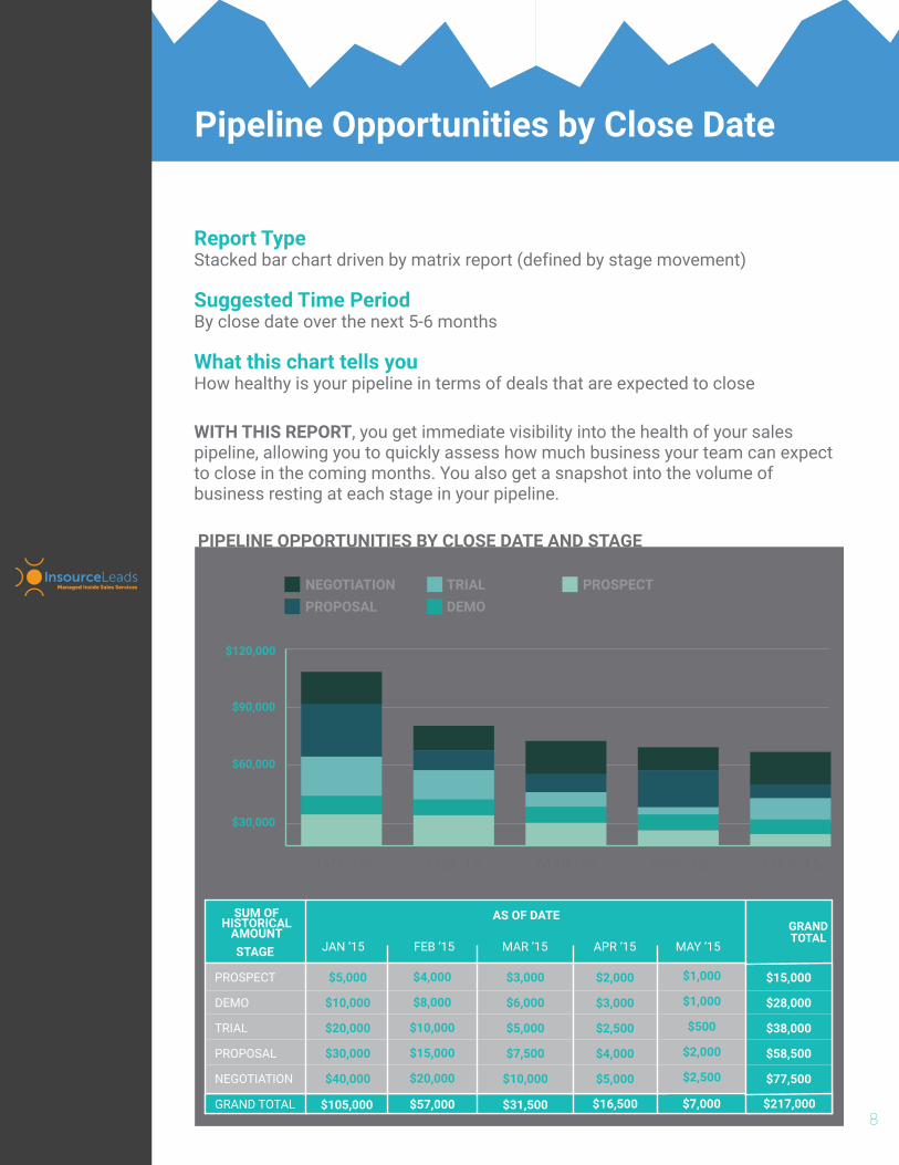
WITH THIS REPORT, you get immediate visibility into the health of your sales pipeline, allowing you to quickly assess how much business your team can expect to close in the coming months. You also get a snapshot into the volume of business resting at each stage in your pipeline.
Report TypeStacked bar chart driven by matrix report (defined by stage movement)
Suggested Time PeriodBy close date over the next 5-6 months
What this chart tells youHow healthy is your pipeline in terms of deals that are expected to close
8
Pipeline Opportunities by Close Date
SUM OFHISTORICAL
AMOUNTJAN ‘15 FEB ‘15 MAR ‘15 APR ‘15 MAY ‘15
PROSPECT
DEMO
TRIAL
PROPOSAL
NEGOTIATION
$5,000
$10,000
$20,000
$30,000
$40,000
$4,000
$8,000
$10,000
$15,000
$20,000
$3,000
$6,000
$5,000
$7,500
$10,000
$2,000
$3,000
$2,500
$4,000
$5,000
GRAND TOTAL $105,000 $57,000 $31,500 $16,500
GRANDTOTAL
$1,000
$1,000
$500
$2,000
$2,500
$7,000 $217,000
$15,000
$28,000
$38,000
$58,500
$77,500
AS OF DATE
NEGOTIATIONPROPOSAL
TRIALDEMO
PROSPECT
$30,000
$60,000
$90,000
$120,000
STAGE
JAN ‘15 FEB ‘15 MAR ‘15 APR ‘15 MAY ‘15
PIPELINE OPPORTUNITIES BY CLOSE DATE AND STAGE
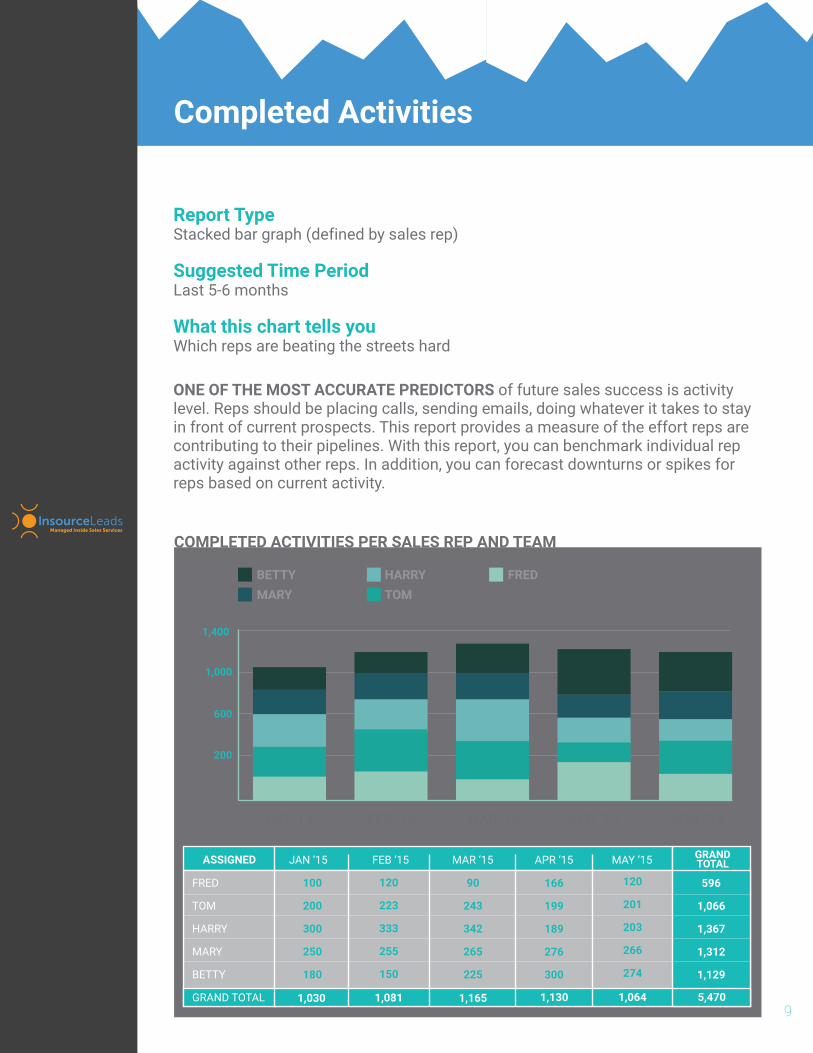
ONE OF THE MOST ACCURATE PREDICTORS of future sales success is activity level. Reps should be placing calls, sending emails, doing whatever it takes to stay in front of current prospects. This report provides a measure of the effort reps are contributing to their pipelines. With this report, you can benchmark individual rep activity against other reps. In addition, you can forecast downturns or spikes for reps based on current activity.
Report TypeStacked bar graph (defined by sales rep)
Suggested Time PeriodLast 5-6 months
What this chart tells youWhich reps are beating the streets hard
9
Completed Activities
JAN ‘15 FEB ‘15 MAR ‘15 APR ‘15 MAY ‘15
FRED
TOM
HARRY
MARY
BETTY
100
200
300
250
180
120
223
333
255
150
90
243
342
265
225
166
199
189
276
300
GRAND TOTAL 1,030 1,081 1,165 1,130
GRANDTOTAL
120
201
203
266
274
1,064 5,470
596
1,066
1,367
1,312
1,129
BETTYMARY
HARRYTOM
FRED
200
600
1,000
1,400
ASSIGNED
JAN ‘15 FEB ‘15 MAR ‘15 APR ‘15 MAY ‘15
COMPLETED ACTIVITIES PER SALES REP AND TEAM
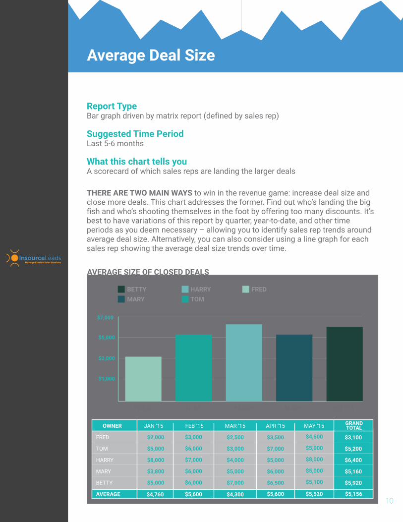
THERE ARE TWO MAIN WAYS to win in the revenue game: increase deal size and close more deals. This chart addresses the former. Find out who’s landing the big fish and who’s shooting themselves in the foot by offering too many discounts. It’s best to have variations of this report by quarter, year-to-date, and other time periods as you deem necessary – allowing you to identify sales rep trends around average deal size. Alternatively, you can also consider using a line graph for each sales rep showing the average deal size trends over time.
Report TypeBar graph driven by matrix report (defined by sales rep)
Suggested Time PeriodLast 5-6 months
What this chart tells youA scorecard of which sales reps are landing the larger deals
10
Average Deal Size
JAN ‘15 FEB ‘15 MAR ‘15 APR ‘15 MAY ‘15
FRED
TOM
HARRY
MARY
BETTY
$2,000
$5,000
$8,000
$3,800
$5,000
$3,000
$6,000
$7,000
$6,000
$6,000
$2,500
$3,000
$4,000
$5,000
$7,000
$3,500
$7,000
$5,000
$6,000
$6,500
AVERAGE $4,760 $5,600 $4,300 $5,600
GRANDTOTAL
$4,500
$5,000
$8,000
$5,000
$5,100
$5,520 $5,156
$3,100
$5,200
$6,400
$5,160
$5,920
BETTYMARY
HARRYTOM
FRED
$1,000
$3,000
$5,000
$7,000
OWNER
FRED TOM HARRY MARY BETTY
AVERAGE SIZE OF CLOSED DEALS
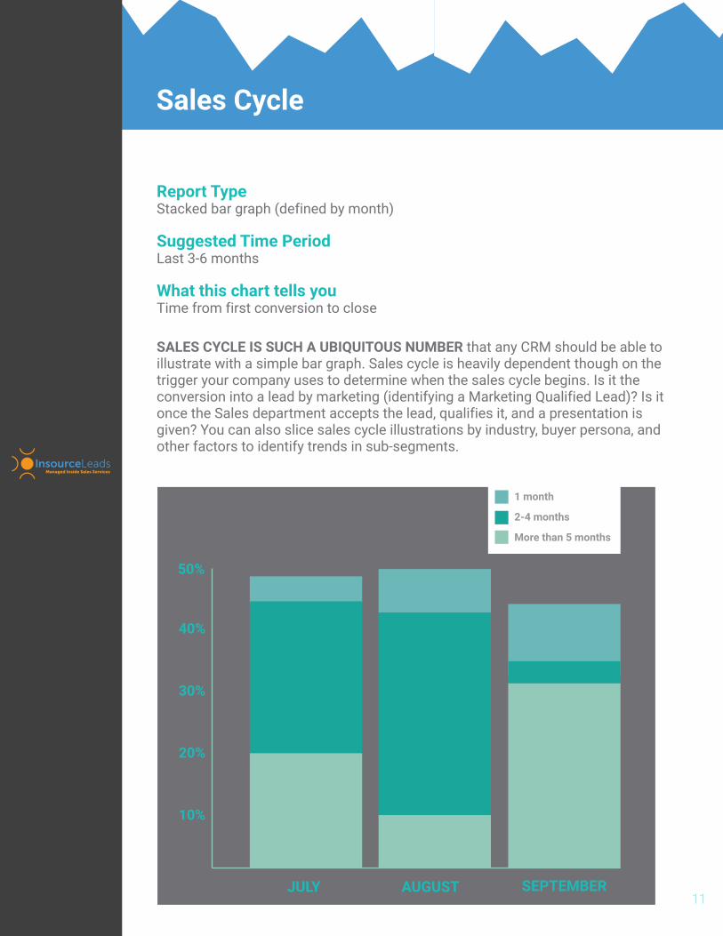
SALES CYCLE IS SUCH A UBIQUITOUS NUMBER that any CRM should be able to illustrate with a simple bar graph. Sales cycle is heavily dependent though on the trigger your company uses to determine when the sales cycle begins. Is it the conversion into a lead by marketing (identifying a Marketing Qualified Lead)? Is it once the Sales department accepts the lead, qualifies it, and a presentation is given? You can also slice sales cycle illustrations by industry, buyer persona, and other factors to identify trends in sub-segments.
Report TypeStacked bar graph (defined by month)
Suggested Time PeriodLast 3-6 months
What this chart tells youTime from first conversion to close
11
1 month
2-4 months
More than 5 months
JULY AUGUST SEPTEMBER
Sales Cycle
40%
50%
20%
30%
10%