Embed Size (px)
Citation preview
1
Web-Enabled Decision Support Systems
Windows Forms and Controls
Prof. Name [email protected] (123) 456-7890University Name
2
Overview 13.1 Introduction 13.2 The Controls 13.3 The Label and LinkLabel Controls 13.4 The TextBox Control: In Depth 13.5 The Button Control 13.6 The CheckBox Control 13.7 The ListBox Control: In Depth 13.8 The ComboBox Control 13.9 The CheckedListBox Control 13.10 The DateTimePicker Control 13.11 The TreeView Control 13.12 Arranging Controls on a Form 13.13 The Start-up Object 13.14 In-Class Assignment 13.15 Summary
3
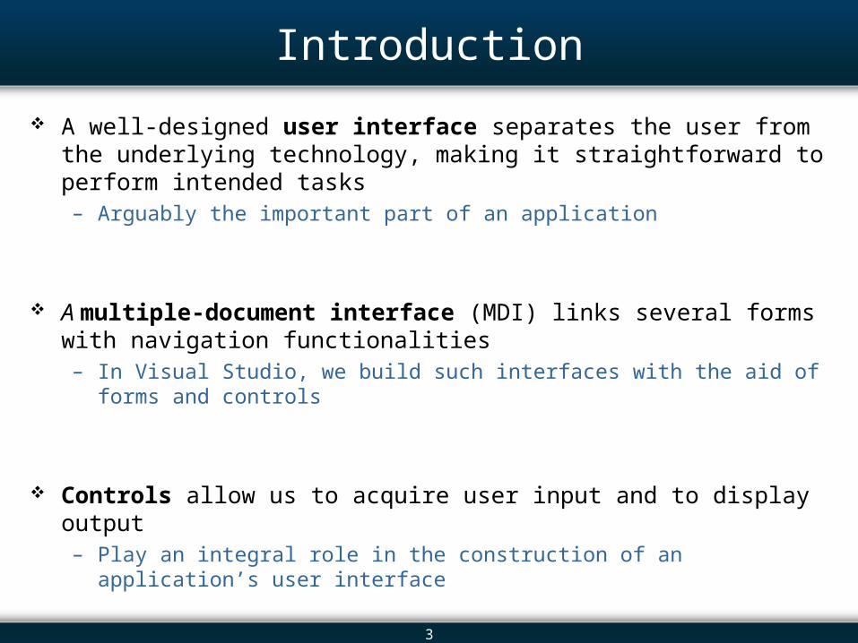
Introduction
A well-designed user interface separates the user from the underlying technology, making it straightforward to perform intended tasks – Arguably the important part of an application
A multiple-document interface (MDI) links several forms with navigation functionalities– In Visual Studio, we build such interfaces with the aid of forms and controls
Controls allow us to acquire user input and to display output– Play an integral role in the construction of an application’s user interface
4
Overview 13.1 Introduction 13.2 The Controls 13.3 The Label and LinkLabel Controls 13.4 The TextBox Control: In Depth 13.5 The Button Control 13.6 The CheckBox Control 13.7 The ListBox Control: In Depth 13.8 The ComboBox Control 13.9 The CheckedListBox Control 13.10 The DateTimePicker Control 13.11 The TreeView Control 13.12 Arranging Controls on a Form 13.13 The Start-up Object 13.14 In-Class Assignment 13.15 Summary
5
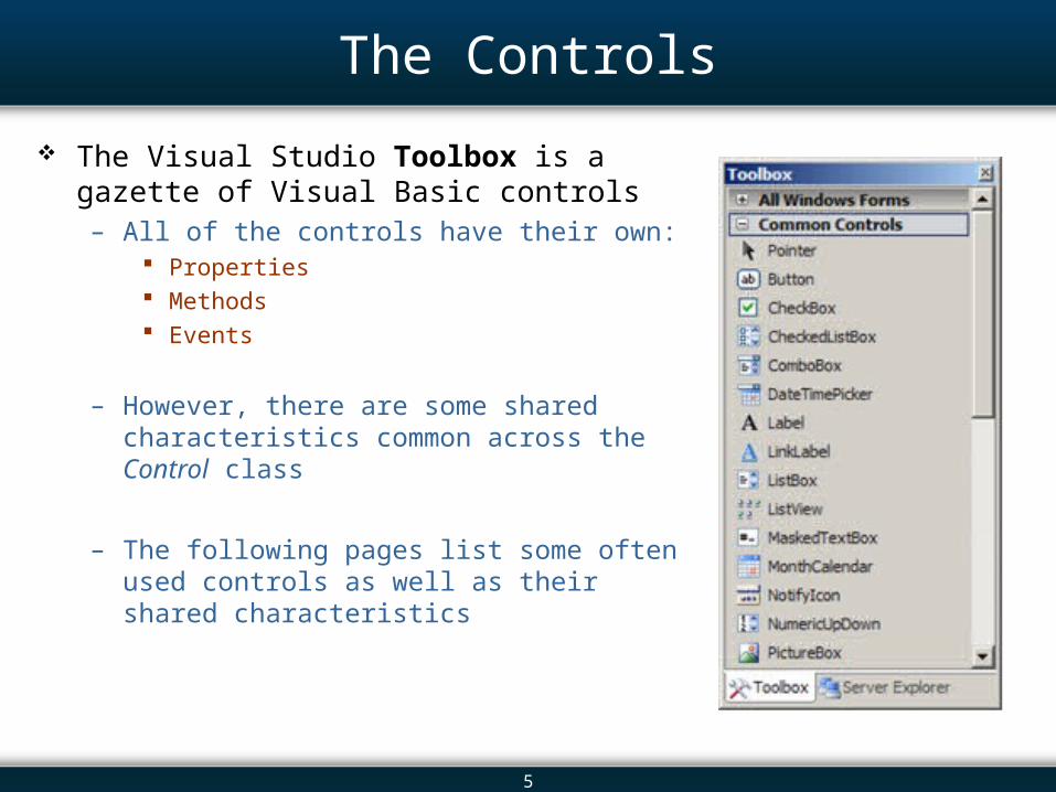
The Controls
The Visual Studio Toolbox is a gazette of Visual Basic controls – All of the controls have their own:
Properties Methods Events
– However, there are some shared characteristics common across the Control class
– The following pages list some often used controls as well as their shared characteristics
6
Common Controls
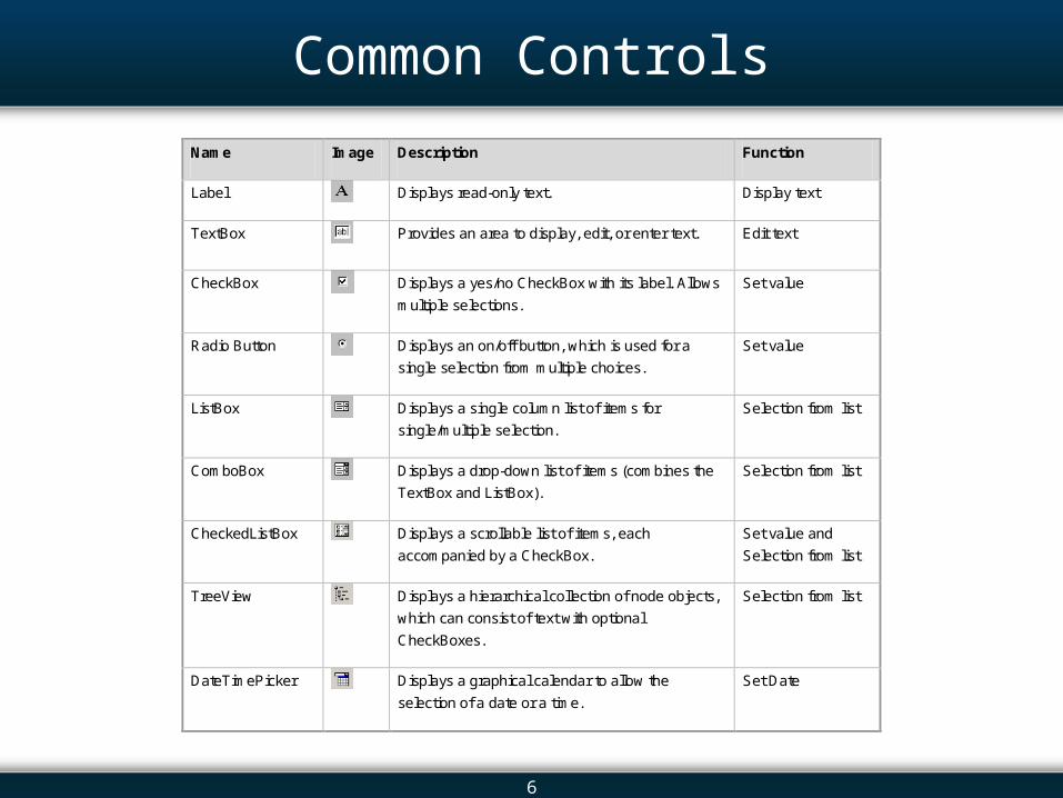
Name Image Description Function
Label Displays read-only text. Display text
TextBox Provides an area to display, edit, or enter text. Edit text
CheckBox Displays a yes/no CheckBox with its label. Allows
multiple selections.
Set value
Radio Button Displays an on/off button, which is used for a
single selection from multiple choices.
Set value
ListBox Displays a single column list of items for
single/multiple selection.
Selection from list
ComboBox Displays a drop-down list of items (combines the
TextBox and ListBox).
Selection from list
CheckedListBox Displays a scrollable list of items, each
accompanied by a CheckBox.
Set value and
Selection from list
TreeView Displays a hierarchical collection of node objects,
which can consist of text with optional
CheckBoxes.
Selection from list
DateTimePicker Displays a graphical calendar to allow the
selection of a date or a time.
Set Date
7
Control Class - Properties
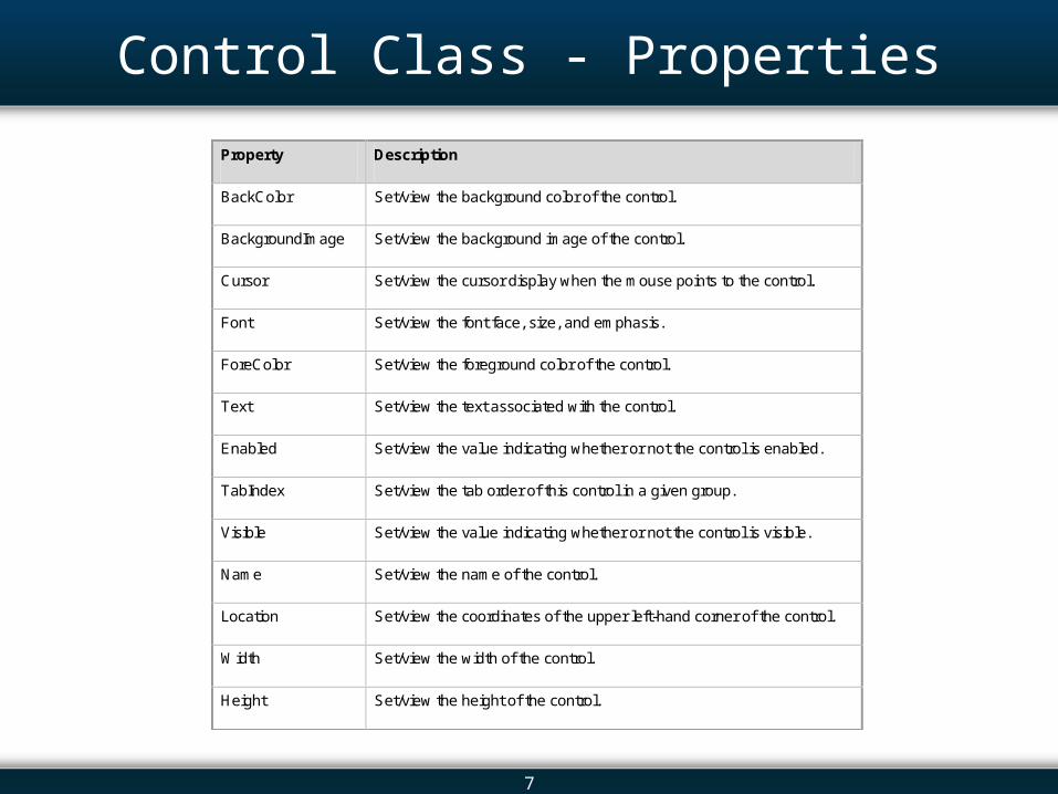
Property Description
BackColor Set/view the background color of the control.
BackgroundImage Set/view the background image of the control.
Cursor Set/view the cursor display when the mouse points to the control.
Font Set/view the font face, size, and emphasis.
ForeColor Set/view the foreground color of the control.
Text Set/view the text associated with the control.
Enabled Set/view the value indicating whether or not the control is enabled.
TabIndex Set/view the tab order of this control in a given group.
Visible Set/view the value indicating whether or not the control is visible.
Name Set/view the name of the control.
Location Set/view the coordinates of the upper left-hand corner of the control.
Width Set/view the width of the control.
Height Set/view the height of the control.
8
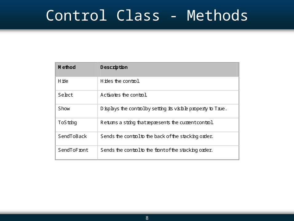
Control Class - Methods
Method Description
Hide Hides the control.
Select Activates the control.
Show Displays the control by setting its visible property to True.
ToString Returns a string that represents the current control.
SendToBack Sends the control to the back of the stacking order.
SendToFront Sends the control to the front of the stacking order.
9
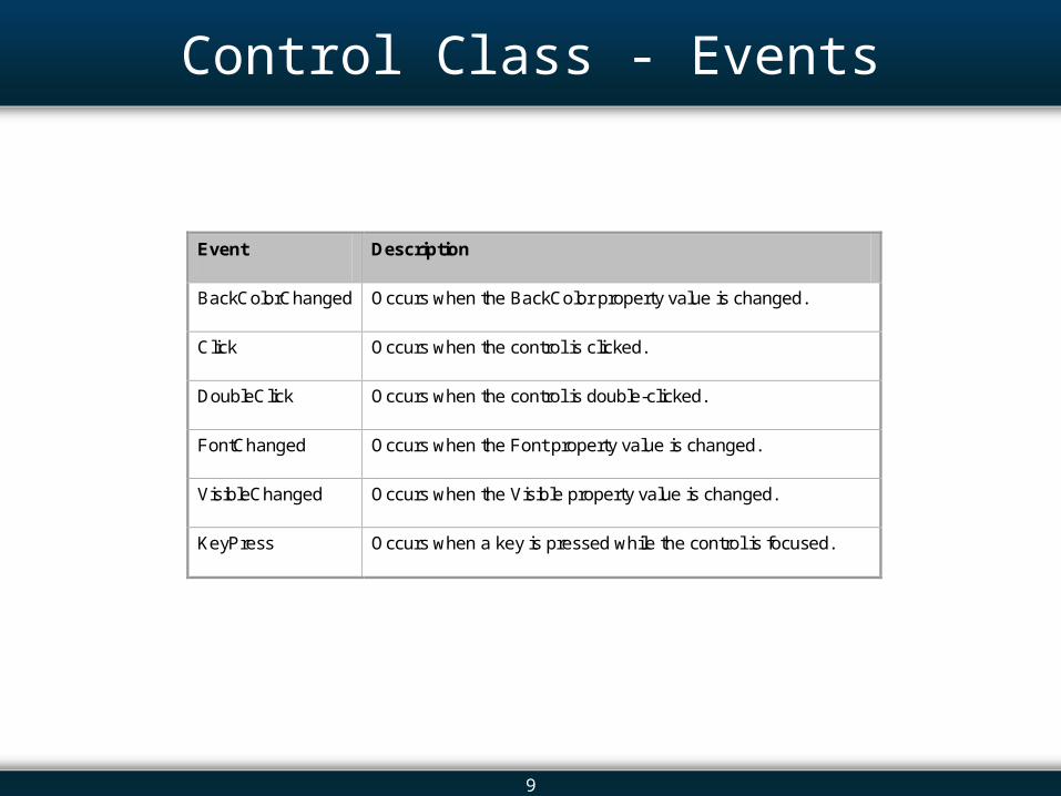
Control Class - Events
Event Description
BackColorChanged Occurs when the BackColor property value is changed.
Click Occurs when the control is clicked.
DoubleClick Occurs when the control is double-clicked.
FontChanged Occurs when the Font property value is changed.
VisibleChanged Occurs when the Visible property value is changed.
KeyPress Occurs when a key is pressed while the control is focused.
10
Overview 13.1 Introduction 13.2 The Controls 13.3 The Label and LinkLabel Controls 13.4 The TextBox Control: In Depth 13.5 The Button Control 13.6 The CheckBox Control 13.7 The ListBox Control: In Depth 13.8 The ComboBox Control 13.9 The CheckedListBox Control 13.10 The DateTimePicker Control 13.11 The TreeView Control 13.12 Arranging Controls on a Form 13.13 The Start-up Object 13.14 In-Class Assignment 13.15 Summary
11
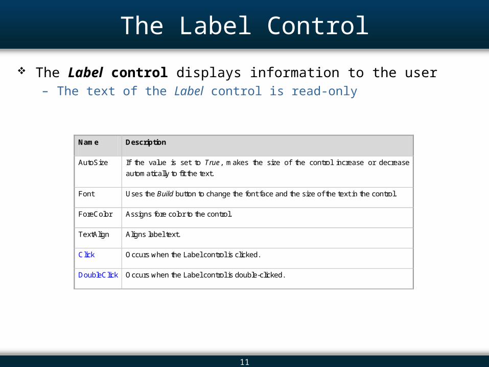
The Label Control
The Label control displays information to the user – The text of the Label control is read-only
Name Description
AutoSize If the value is set to True, makes the size of the control increase or decrease
automatically to fit the text.
Font Uses the Build button to change the font face and the size of the text in the control.
ForeColor Assigns fore color to the control.
TextAlign Aligns label text.
Click Occurs when the Label control is clicked.
DoubleClick Occurs when the Label control is double-clicked.
12
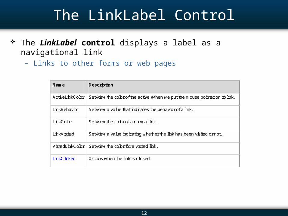
The LinkLabel Control
The LinkLabel control displays a label as a navigational link – Links to other forms or web pages
Name Description
ActiveLinkColor Set/view the color of the active (when we put the mouse pointer on it) link.
LinkBehavior Set/view a value that indicates the behavior of a link.
LinkColor Set/view the color of a normal link.
LinkVisited Set/view a value indicating whether the link has been visited or not.
VistedLinkColor Set/view the color for a visited link.
LinkClicked Occurs when the link is clicked.
13
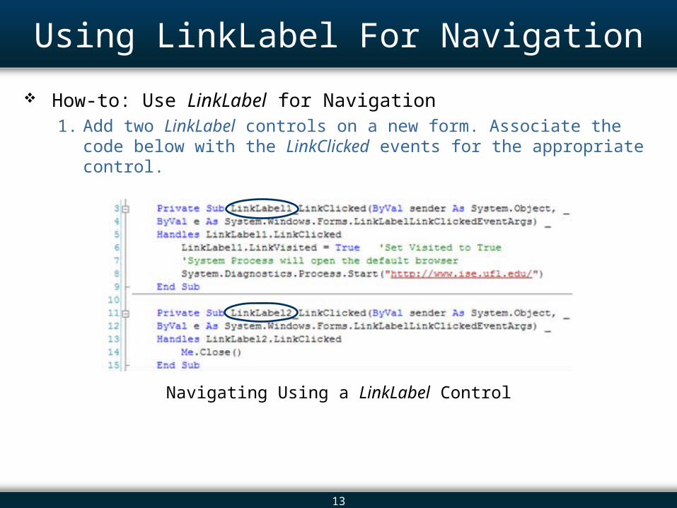
Using LinkLabel For Navigation
How-to: Use LinkLabel for Navigation1. Add two LinkLabel controls on a new form. Associate the code below with
the LinkClicked events for the appropriate control.
Navigating Using a LinkLabel Control
14
Overview 13.1 Introduction 13.2 The Controls 13.3 The Label and LinkLabel Controls 13.4 The TextBox Control: In Depth 13.5 The Button Control 13.6 The CheckBox Control 13.7 The ListBox Control: In Depth 13.8 The ComboBox Control 13.9 The CheckedListBox Control 13.10 The DateTimePicker Control 13.11 The TreeView Control 13.12 Arranging Controls on a Form 13.13 The Start-up Object 13.14 In-Class Assignment 13.15 Summary
15
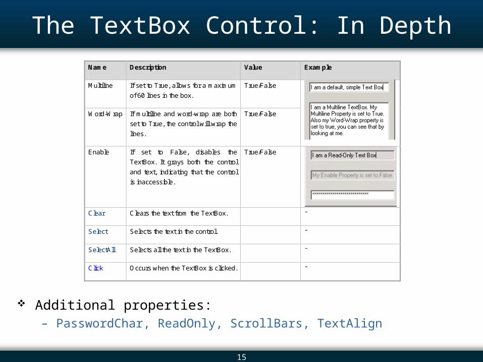
The TextBox Control: In Depth
Additional properties:– PasswordChar, ReadOnly, ScrollBars, TextAlign
Name Description Value Example
Multiline If set to True, allows for a maximum
of 60 lines in the box.
True/False
Word-Wrap If multiline and word-wrap are both
set to True, the control will wrap the
lines.
True/False
Enable If set to False, disables the
TextBox. It grays both the control
and text, indicating that the control
is inaccessible.
True/False
Clear Clears the text from the TextBox. -
Select Selects the text in the control. -
SelectAll Selects all the text in the TextBox. -
Click Occurs when the TextBox is clicked. -
16
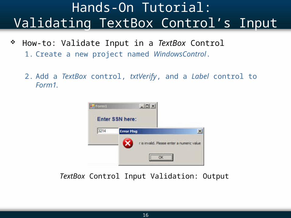
Hands-On Tutorial: Validating TextBox Control’s Input
How-to: Validate Input in a TextBox Control 1. Create a new project named WindowsControl.
2. Add a TextBox control, txtVerify, and a Label control to Form1.
TextBox Control Input Validation: Output
17
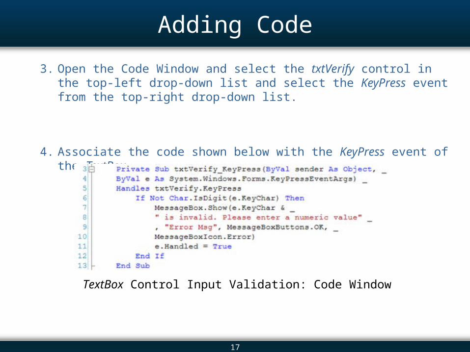
Adding Code
3. Open the Code Window and select the txtVerify control in the top-left drop-down list and select the KeyPress event from the top-right drop-down list.
4. Associate the code shown below with the KeyPress event of the TextBox.
TextBox Control Input Validation: Code Window
18
Overview 13.1 Introduction 13.2 The Controls 13.3 The Label and LinkLabel Controls 13.4 The TextBox Control: In Depth 13.5 The Button Control 13.6 The CheckBox Control 13.7 The ListBox Control: In Depth 13.8 The ComboBox Control 13.9 The CheckedListBox Control 13.10 The DateTimePicker Control 13.11 The TreeView Control 13.12 Arranging Controls on a Form 13.13 The Start-up Object 13.14 In-Class Assignment 13.15 Summary
19
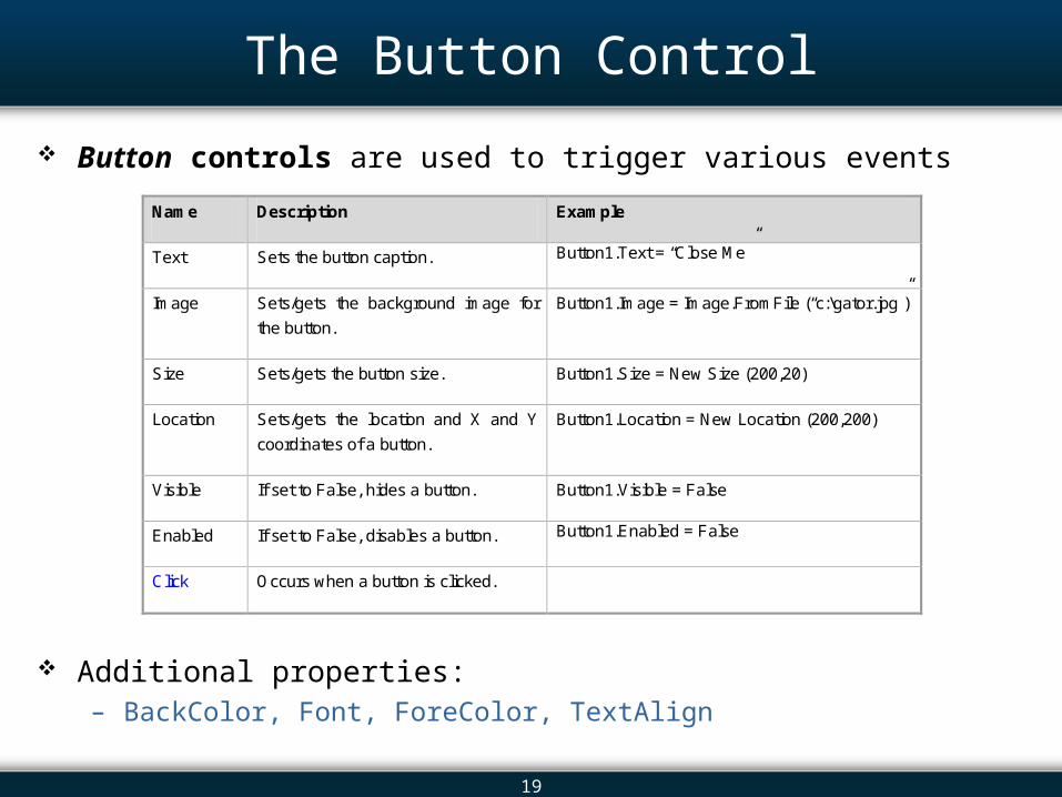
The Button Control
Button controls are used to trigger various events
Additional properties:– BackColor, Font, ForeColor, TextAlign
Name Description Example
Text Sets the button caption. Button1.Text = “Close Me”
Image Sets/gets the background image for
the button.
Button1.Image = Image.FromFile (“c:\gator.jpg”)
Size Sets/gets the button size. Button1.Size = New Size (200,20)
Location Sets/gets the location and X and Y
coordinates of a button.
Button1.Location = New Location (200,200)
Visible If set to False, hides a button. Button1.Visible = False
Enabled If set to False, disables a button. Button1.Enabled = False
Click Occurs when a button is clicked.
20
Overview 13.1 Introduction 13.2 The Controls 13.3 The Label and LinkLabel Controls 13.4 The TextBox Control: In Depth 13.5 The Button Control 13.6 The CheckBox Control 13.7 The ListBox Control: In Depth 13.8 The ComboBox Control 13.9 The CheckedListBox Control 13.10 The DateTimePicker Control 13.11 The TreeView Control 13.12 Arranging Controls on a Form 13.13 The Start-up Object 13.14 In-Class Assignment 13.15 Summary
21
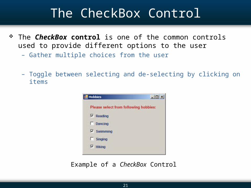
The CheckBox Control
The CheckBox control is one of the common controls used to provide different options to the user – Gather multiple choices from the user
– Toggle between selecting and de-selecting by clicking on items
Example of a CheckBox Control
22
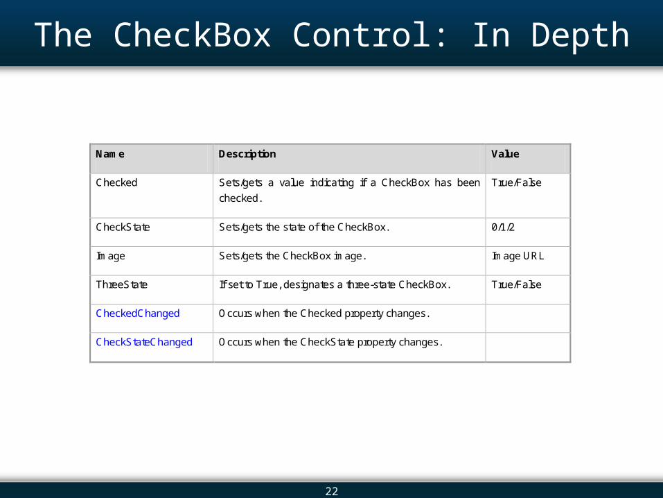
The CheckBox Control: In Depth
Name Description Value
Checked Sets/gets a value indicating if a CheckBox has been
checked.
True/False
CheckState Sets/gets the state of the CheckBox. 0/1/2
Image Sets/gets the CheckBox image. Image URL
ThreeState If set to True, designates a three-state CheckBox. True/False
CheckedChanged Occurs when the Checked property changes.
CheckStateChanged Occurs when the CheckState property changes.
23
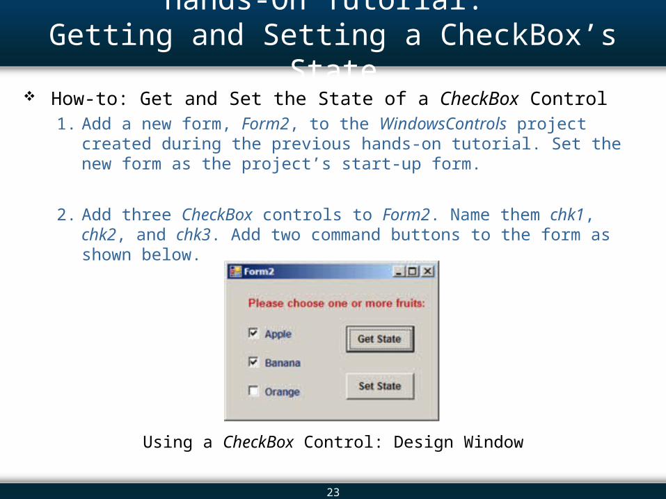
Hands-On Tutorial: Getting and Setting a CheckBox’s State
How-to: Get and Set the State of a CheckBox Control1. Add a new form, Form2, to the WindowsControls project created during the
previous hands-on tutorial. Set the new form as the project’s start-up form.
2. Add three CheckBox controls to Form2. Name them chk1, chk2, and chk3. Add two command buttons to the form as shown below.
Using a CheckBox Control: Design Window
24
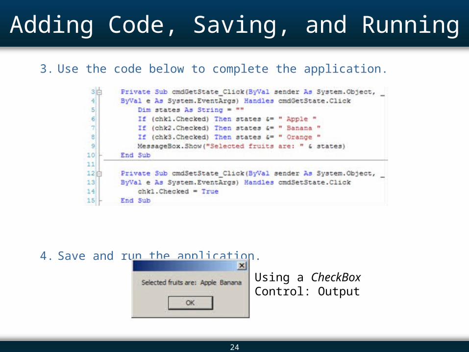
Adding Code, Saving, and Running
3. Use the code below to complete the application.
4. Save and run the application.
Using a CheckBox Control: Output
25
Overview 13.1 Introduction 13.2 The Controls 13.3 The Label and LinkLabel Controls 13.4 The TextBox Control: In Depth 13.5 The Button Control 13.6 The CheckBox Control 13.7 The ListBox Control: In Depth 13.8 The ComboBox Control 13.9 The CheckedListBox Control 13.10 The DateTimePicker Control 13.11 The TreeView Control 13.12 Arranging Controls on a Form 13.13 The Start-up Object 13.14 In-Class Assignment 13.15 Summary
26
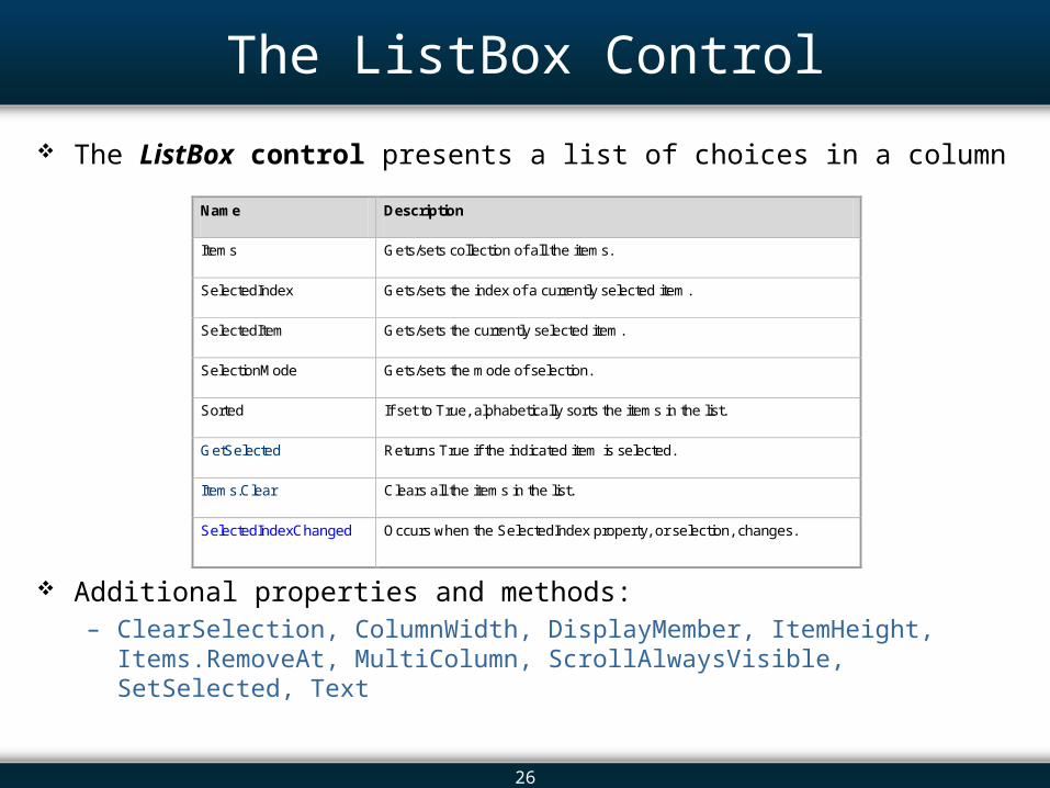
The ListBox Control
The ListBox control presents a list of choices in a column
Additional properties and methods:– ClearSelection, ColumnWidth, DisplayMember, ItemHeight, Items.RemoveAt,
MultiColumn, ScrollAlwaysVisible, SetSelected, Text
Name Description
Items Gets/sets collection of all the items.
SelectedIndex Gets/sets the index of a currently selected item.
SelectedItem Gets/sets the currently selected item.
SelectionMode Gets/sets the mode of selection.
Sorted If set to True, alphabetically sorts the items in the list.
GetSelected Returns True if the indicated item is selected.
Items.Clear Clears all the items in the list.
SelectedIndexChanged Occurs when the SelectedIndex property, or selection, changes.
27
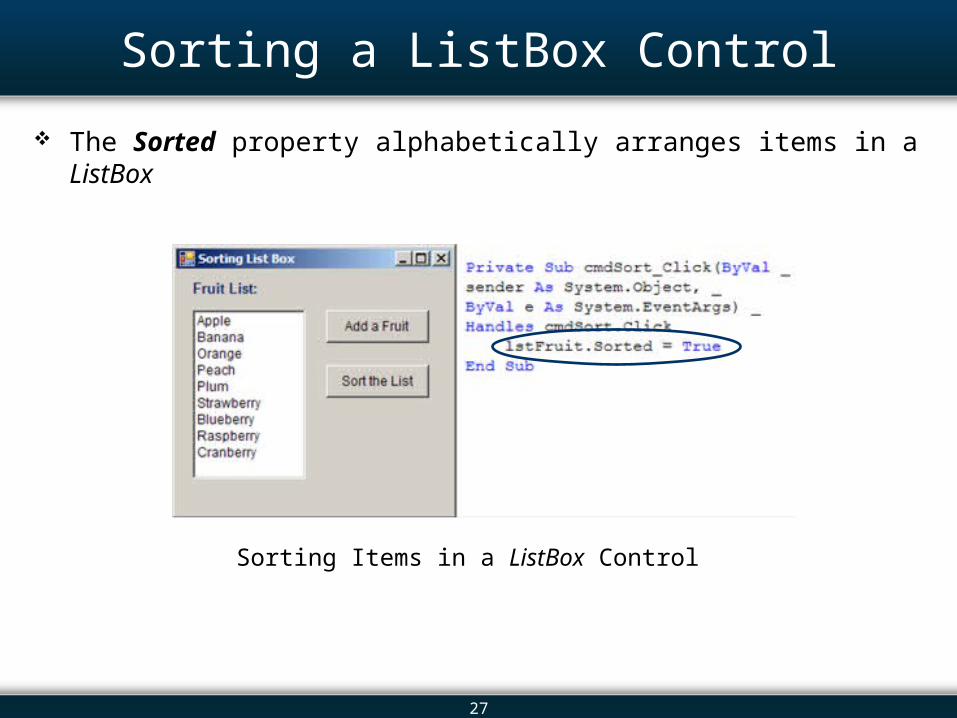
Sorting a ListBox Control
The Sorted property alphabetically arranges items in a ListBox
Sorting Items in a ListBox Control
28
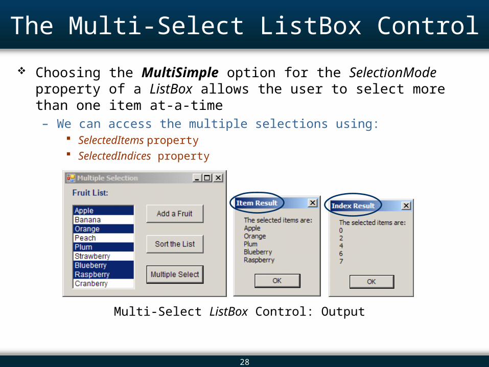
The Multi-Select ListBox Control
Choosing the MultiSimple option for the SelectionMode property of a ListBox allows the user to select more than one item at-a-time – We can access the multiple selections using:
SelectedItems property SelectedIndices property
Multi-Select ListBox Control: Output
29
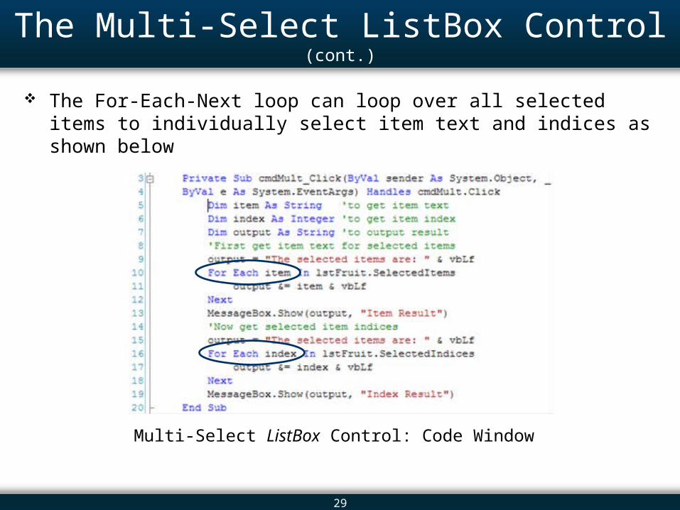
The Multi-Select ListBox Control (cont.)
The For-Each-Next loop can loop over all selected items to individually select item text and indices as shown below
Multi-Select ListBox Control: Code Window
30
Overview 13.1 Introduction 13.2 The Controls 13.3 The Label and LinkLabel Controls 13.4 The TextBox Control: In Depth 13.5 The Button Control 13.6 The CheckBox Control 13.7 The ListBox Control: In Depth 13.8 The ComboBox Control 13.9 The CheckedListBox Control 13.10 The DateTimePicker Control 13.11 The TreeView Control 13.12 Arranging Controls on a Form 13.13 The Start-up Object 13.14 In-Class Assignment 13.15 Summary
31
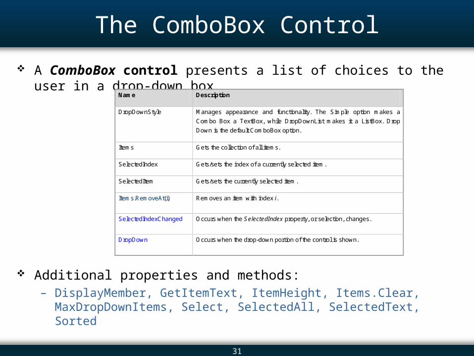
The ComboBox Control
A ComboBox control presents a list of choices to the user in a drop-down box
Additional properties and methods:– DisplayMember, GetItemText, ItemHeight, Items.Clear, MaxDropDownItems,
Select, SelectedAll, SelectedText, Sorted
Name Description
DropDownStyle Manages appearance and functionality. The Simple option makes a
Combo Box a TextBox, while DropDownList makes it a ListBox. Drop
Down is the default ComboBox option.
Items Gets the collection of all items.
SelectedIndex Gets/sets the index of a currently selected item.
SelectedItem Gets/sets the currently selected item.
Items.RemoveAt(i) Removes an item with index i.
SelectedIndexChanged Occurs when the SelectedIndex property, or selection, changes.
DropDown Occurs when the drop-down portion of the control is shown.
32
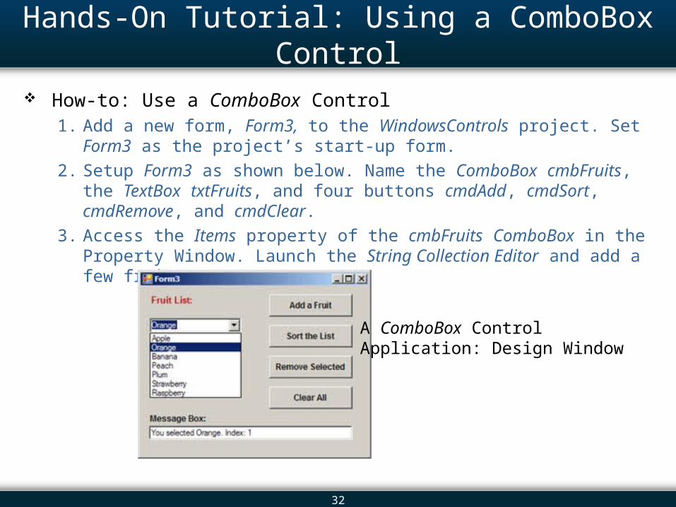
Hands-On Tutorial: Using a ComboBox Control
How-to: Use a ComboBox Control1. Add a new form, Form3, to the WindowsControls project. Set Form3 as the
project’s start-up form.
2. Setup Form3 as shown below. Name the ComboBox cmbFruits, the TextBox txtFruits, and four buttons cmdAdd, cmdSort, cmdRemove, and cmdClear.
3. Access the Items property of the cmbFruits ComboBox in the Property Window. Launch the String Collection Editor and add a few fruit names.
A ComboBox Control Application: Design Window
33
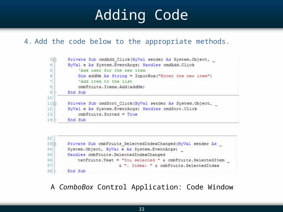
Adding Code
4. Add the code below to the appropriate methods.
A ComboBox Control Application: Code Window
34
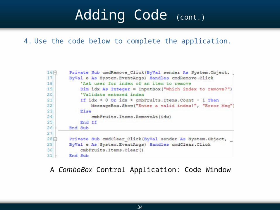
Adding Code (cont.)
4. Use the code below to complete the application.
A ComboBox Control Application: Code Window
35
Overview 13.1 Introduction 13.2 The Controls 13.3 The Label and LinkLabel Controls 13.4 The TextBox Control: In Depth 13.5 The Button Control 13.6 The CheckBox Control 13.7 The ListBox Control: In Depth 13.8 The ComboBox Control 13.9 The CheckedListBox Control 13.10 The DateTimePicker Control 13.11 The TreeView Control 13.12 Arranging Controls on a Form 13.13 The Start-up Object 13.14 In-Class Assignment 13.15 Summary
36
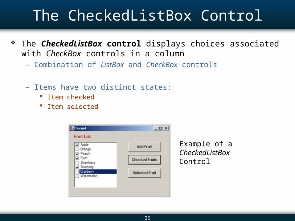
The CheckedListBox Control
The CheckedListBox control displays choices associated with CheckBox controls in a column– Combination of ListBox and CheckBox controls
– Items have two distinct states: Item checked Item selected
Example of a CheckedListBox Control
37
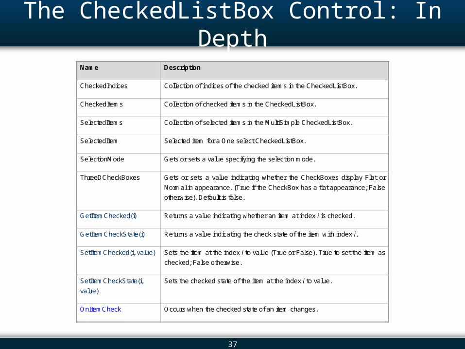
The CheckedListBox Control: In Depth
Name Description
CheckedIndices Collection of indices of the checked items in the CheckedListBox.
CheckedItems Collection of checked items in the CheckedListBox.
SelectedItems Collection of selected items in the MultiSimple CheckedListBox.
SelectedItem Selected item for a One select CheckedListBox.
SelectionMode Gets or sets a value specifying the selection mode.
ThreeDCheckBoxes Gets or sets a value indicating whether the CheckBoxes display Flat or
Normal in appearance. (True if the CheckBox has a flat appearance; False
otherwise). Default is false.
GetItemChecked(i) Returns a value indicating whether an item at index i is checked.
GetItemCheckState(i) Returns a value indicating the check state of the item with index i.
SetItemChecked(i, value) Sets the item at the index i to value (True or False). True to set the item as
checked; False otherwise.
SetItemCheckState(i,
value)
Sets the checked state of the item at the index i to value.
OnItemCheck Occurs when the checked state of an item changes.
38
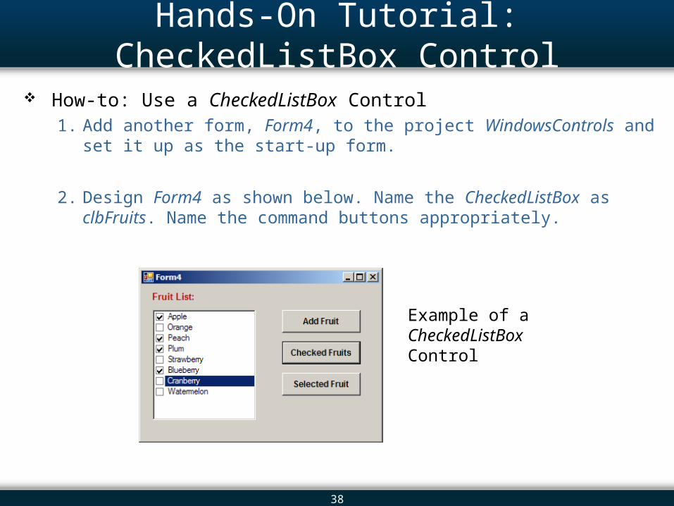
Hands-On Tutorial: CheckedListBox Control
How-to: Use a CheckedListBox Control1. Add another form, Form4, to the project WindowsControls and set it up as
the start-up form.
2. Design Form4 as shown below. Name the CheckedListBox as clbFruits. Name the command buttons appropriately.
Example of a CheckedListBox Control
39
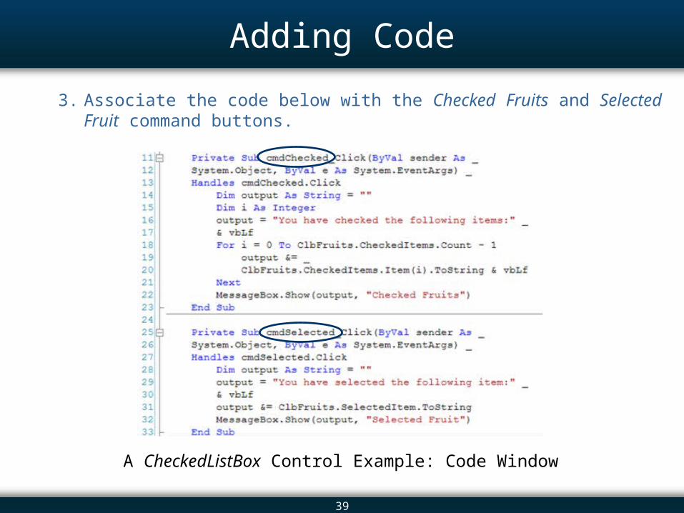
Adding Code
3. Associate the code below with the Checked Fruits and Selected Fruit command buttons.
A CheckedListBox Control Example: Code Window
40
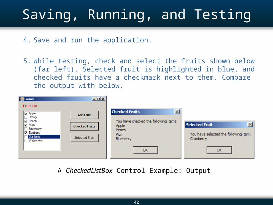
Saving, Running, and Testing
4. Save and run the application.
5. While testing, check and select the fruits shown below (far left). Selected fruit is highlighted in blue, and checked fruits have a checkmark next to them. Compare the output with below.
A CheckedListBox Control Example: Output
41
Overview 13.1 Introduction 13.2 The Controls 13.3 The Label and LinkLabel Controls 13.4 The TextBox Control: In Depth 13.5 The Button Control 13.6 The CheckBox Control 13.7 The ListBox Control: In Depth 13.8 The ComboBox Control 13.9 The CheckedListBox Control 13.10 The DateTimePicker Control 13.11 The TreeView Control 13.12 Arranging Controls on a Form 13.13 The Start-up Object 13.14 In-Class Assignment 13.15 Summary
42
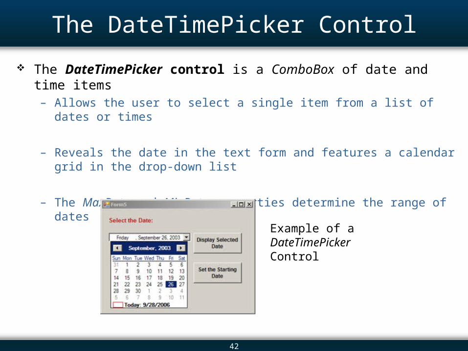
The DateTimePicker Control
The DateTimePicker control is a ComboBox of date and time items – Allows the user to select a single item from a list of dates or times
– Reveals the date in the text form and features a calendar grid in the drop-down list
– The MaxDate and MinDate properties determine the range of dates
Example of a DateTimePicker Control
43
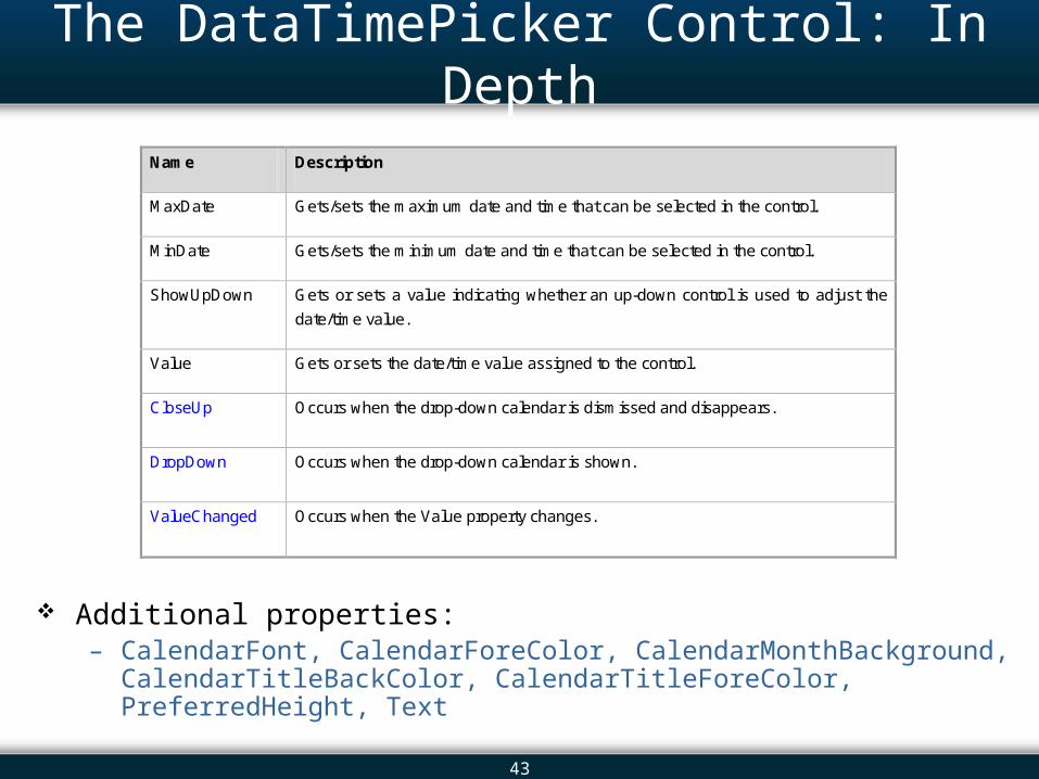
The DataTimePicker Control: In Depth
Additional properties:– CalendarFont, CalendarForeColor, CalendarMonthBackground,
CalendarTitleBackColor, CalendarTitleForeColor, PreferredHeight, Text
Name Description
MaxDate Gets/sets the maximum date and time that can be selected in the control.
MinDate Gets/sets the minimum date and time that can be selected in the control.
ShowUpDown Gets or sets a value indicating whether an up-down control is used to adjust the
date/time value.
Value Gets or sets the date/time value assigned to the control.
CloseUp Occurs when the drop-down calendar is dismissed and disappears.
DropDown Occurs when the drop-down calendar is shown.
ValueChanged Occurs when the Value property changes.
44
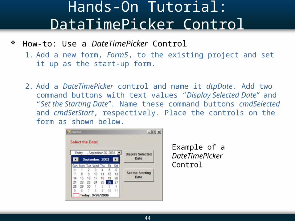
Hands-On Tutorial: DataTimePicker Control
How-to: Use a DateTimePicker Control1. Add a new form, Form5, to the existing project and set it up as the start-up
form.
2. Add a DateTimePicker control and name it dtpDate. Add two command buttons with text values “Display Selected Date” and “Set the Starting Date”. Name these command buttons cmdSelected and cmdSetStart, respectively. Place the controls on the form as shown below.
Example of a DateTimePicker Control
45
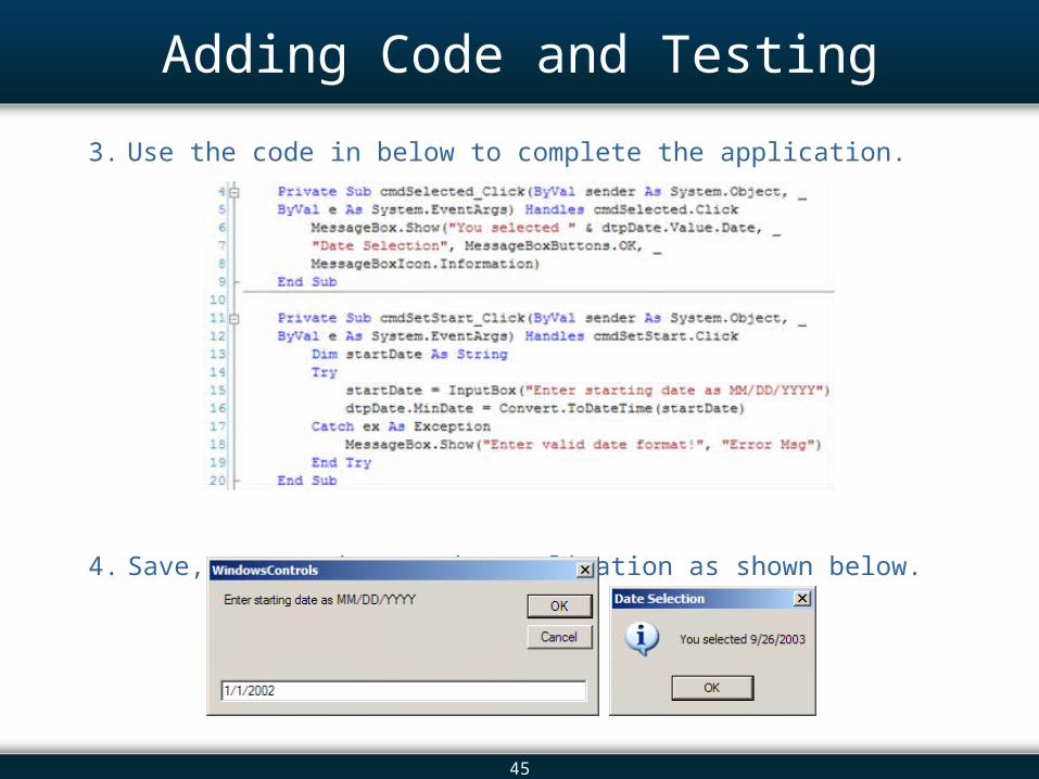
Adding Code and Testing
3. Use the code in below to complete the application.
4. Save, run, and test the application as shown below.
46
Overview 13.1 Introduction 13.2 The Controls 13.3 The Label and LinkLabel Controls 13.4 The TextBox Control: In Depth 13.5 The Button Control 13.6 The CheckBox Control 13.7 The ListBox Control: In Depth 13.8 The ComboBox Control 13.9 The CheckedListBox Control 13.10 The DateTimePicker Control 13.11 The TreeView Control 13.12 Arranging Controls on a Form 13.13 The Start-up Object 13.14 In-Class Assignment 13.15 Summary
47
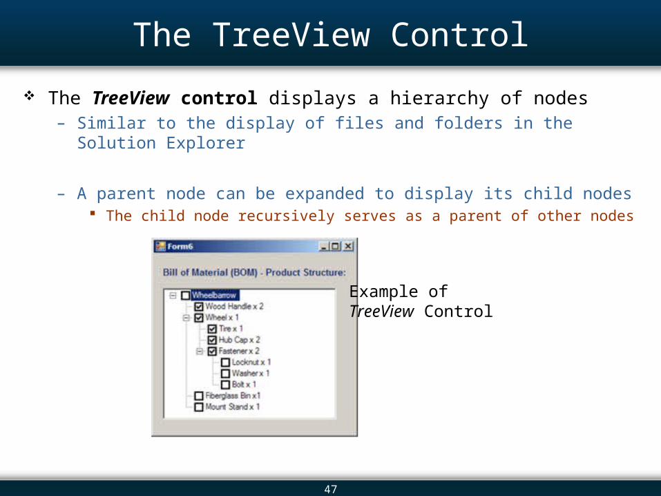
The TreeView Control
The TreeView control displays a hierarchy of nodes – Similar to the display of files and folders in the Solution Explorer
– A parent node can be expanded to display its child nodes The child node recursively serves as a parent of other nodes
Example of TreeView Control
48
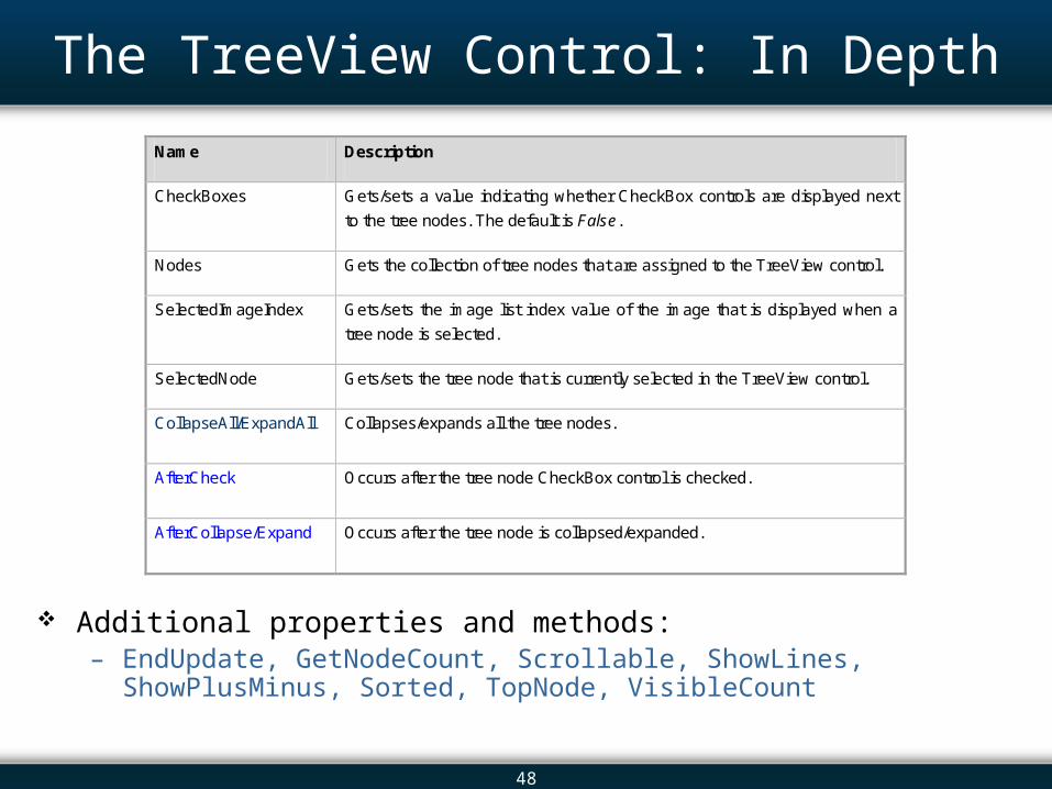
The TreeView Control: In Depth
Additional properties and methods:– EndUpdate, GetNodeCount, Scrollable, ShowLines, ShowPlusMinus, Sorted,
TopNode, VisibleCount
Name Description
CheckBoxes Gets/sets a value indicating whether CheckBox controls are displayed next
to the tree nodes. The default is False.
Nodes Gets the collection of tree nodes that are assigned to the TreeView control.
SelectedImageIndex Gets/sets the image list index value of the image that is displayed when a
tree node is selected.
SelectedNode Gets/sets the tree node that is currently selected in the TreeView control.
CollapseAll/ExpandAll Collapses/expands all the tree nodes.
AfterCheck Occurs after the tree node CheckBox control is checked.
AfterCollapse/Expand Occurs after the tree node is collapsed/expanded.
49
Overview 13.1 Introduction 13.2 The Controls 13.3 The Label and LinkLabel Controls 13.4 The TextBox Control: In Depth 13.5 The Button Control 13.6 The CheckBox Control 13.7 The ListBox Control: In Depth 13.8 The ComboBox Control 13.9 The CheckedListBox Control 13.10 The DateTimePicker Control 13.11 The TreeView Control 13.12 Arranging Controls on a Form 13.13 The Start-up Object 13.14 In-Class Assignment 13.15 Summary
50
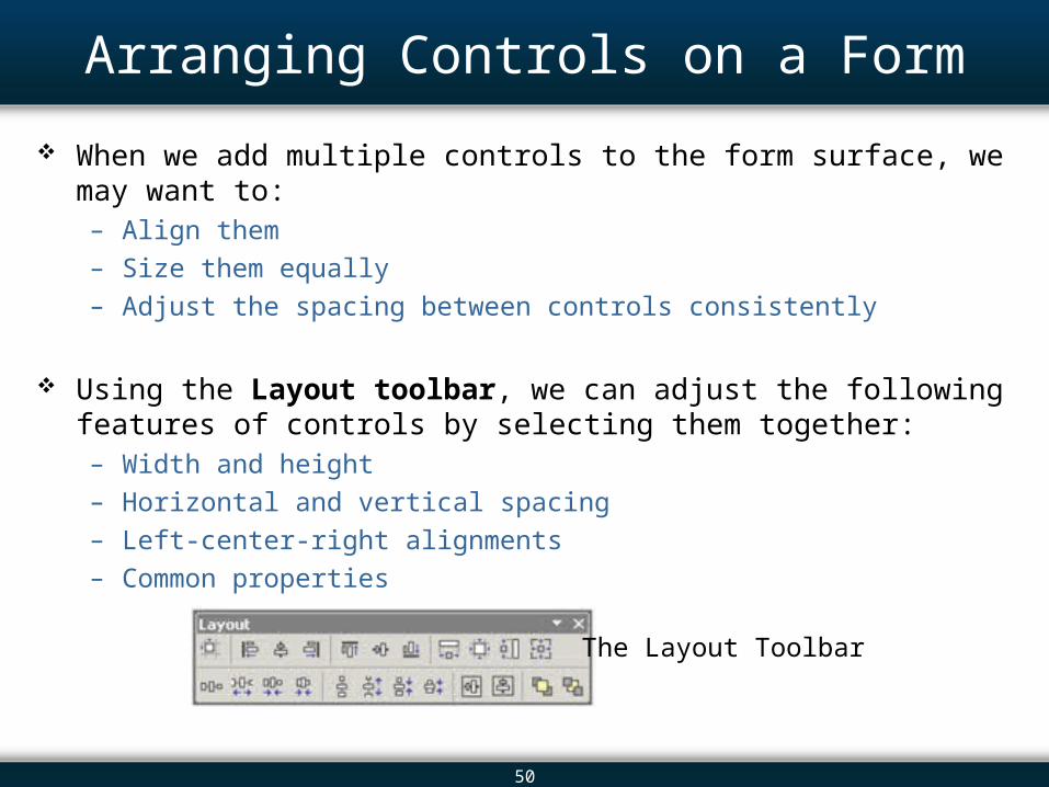
Arranging Controls on a Form
When we add multiple controls to the form surface, we may want to: – Align them
– Size them equally
– Adjust the spacing between controls consistently
Using the Layout toolbar, we can adjust the following features of controls by selecting them together:– Width and height
– Horizontal and vertical spacing
– Left-center-right alignments
– Common properties
The Layout Toolbar
51
Overview 13.1 Introduction 13.2 The Controls 13.3 The Label and LinkLabel Controls 13.4 The TextBox Control: In Depth 13.5 The Button Control 13.6 The CheckBox Control 13.7 The ListBox Control: In Depth 13.8 The ComboBox Control 13.9 The CheckedListBox Control 13.10 The DateTimePicker Control 13.11 The TreeView Control 13.12 Arranging Controls on a Form 13.13 The Start-up Object 13.14 In-Class Assignment 13.15 Summary
52
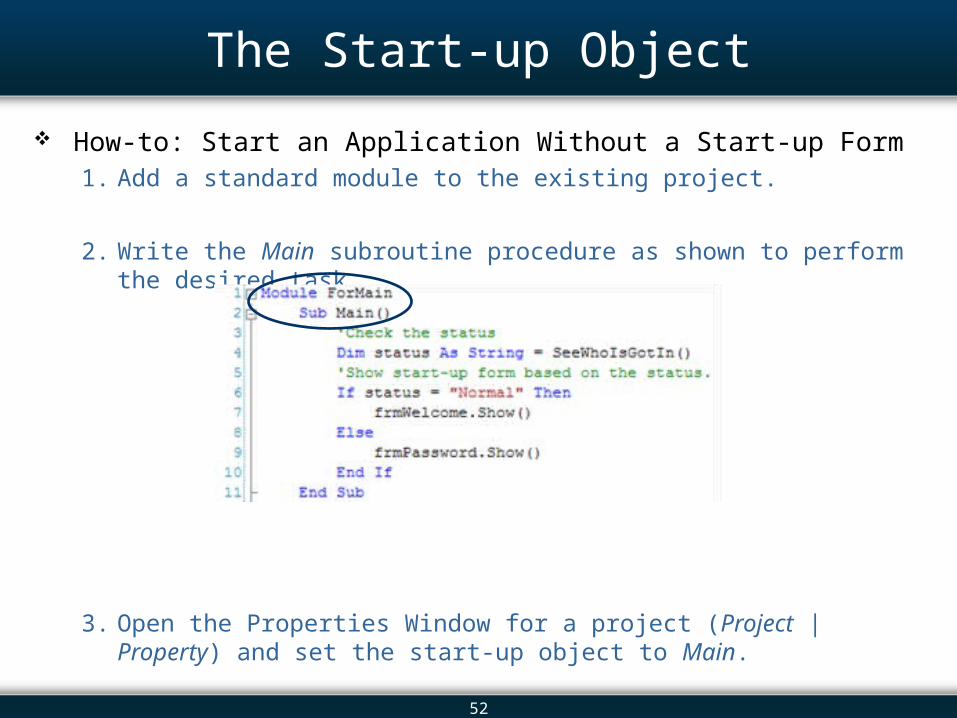
The Start-up Object
How-to: Start an Application Without a Start-up Form1. Add a standard module to the existing project.
2. Write the Main subroutine procedure as shown to perform the desired task.
3. Open the Properties Window for a project (Project | Property) and set the start-up object to Main.
53
Displaying a Splash Screen
A splash screen is a form that displays the name of the application, the copyright details, and a simple image– Adds an attractive appearance to an application
– Buys time to load large elements Database values Images
– Typically contains code for a time delay of a few seconds
54
Overview 13.1 Introduction 13.2 The Controls 13.3 The Label and LinkLabel Controls 13.4 The TextBox Control: In Depth 13.5 The Button Control 13.6 The CheckBox Control 13.7 The ListBox Control: In Depth 13.8 The ComboBox Control 13.9 The CheckedListBox Control 13.10 The DateTimePicker Control 13.11 The TreeView Control 13.12 Arranging Controls on a Form 13.13 The Start-up Object 13.14 In-Class Assignment 13.15 Summary
55
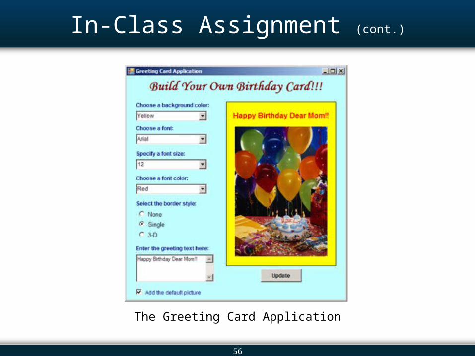
In-Class Assignment
In this in-class assignment, we aim at developing a greeting card application– Assists in the creation of customized birthday greeting cards
– User will select the various parameters of the card: Background color Font type and size Fore color Border style Text
– Provide these options using various Windows controls
– Once the user has selected his/her likings, the greeting card is developed Use a Panel control for the greeting card itself
56
In-Class Assignment (cont.)
The Greeting Card Application
57
Overview 13.1 Introduction 13.2 The Controls 13.3 The Label and LinkLabel Controls 13.4 The TextBox Control: In Depth 13.5 The Button Control 13.6 The CheckBox Control 13.7 The ListBox Control: In Depth 13.8 The ComboBox Control 13.9 The CheckedListBox Control 13.10 The DateTimePicker Control 13.11 The TreeView Control 13.12 Arranging Controls on a Form 13.13 The Start-up Object 13.14 In-Class Assignment 13.15 Summary
58
Summary
The user interface is perhaps the most important part of an application. – To users, it is the most visible part of an application.
– Controls play an important role in the construction of a user interface.
Label controls display information. – The text of the Label control is read-only.
– We use labels to: Convey the meaning of other controls. Display calculated information to a user. Display titles and headings.
59
Summary (cont.)
The CheckBox control is one of the common controls that are used to provide different options to a user. – If a box has been selected, a check sign appears.
– We can toggle between selecting and deselecting a CheckBox by simply clicking on it.
– Used to obtain true/false or yes/no options from a user.
The ListBox control goes beyond the CheckBox and RadioButton controls to present a list of choices to the user.– Users can select one or more choices from the ListBox control.
60
Summary (cont.)
The ComboBox control presents a list of choices to the user in a drop-down box.– Combination of the TextBox and ListBox controls.
– Allows the user to select an item either by typing text into the drop-down box or by selecting it from the list.
A CheckedListBox control presents a list of choices with a CheckBox control next to each item.– Combination of the CheckBox and ListBox.
– Has two distinct states: Item checked Item selected
– Select an item by clicking on it.
– Check an item by putting a check mark in its CheckBox control.
61
Summary (cont.)
The DateTimePicker control is a ComboBox of date and time items. – Allows the user to select a single item from a list of dates or times.
– The control reveals the date in the text form and features a calendar grid in the drop-down list.
The TreeView control displays a hierarchy of nodes in a manner similar to the display of files and folders in the Solution Explorer– A parent node can be expanded to display its child nodes
Which recursively serves as a parent of other nodes
The Properties Window allows us to specify a project’s start-up form or object. – A Main procedure can be used when we would like to display different forms
at the start-up depending on the user type.