Embed Size (px)
Citation preview

1
6.S897/HST.956 Machine Learning for Healthcare
Lecture 3: Deep Dive into Clinical DataInstructors: David Sontag, Peter Szolovits
Understanding Clinical Data
To start understanding Clinical Data, we begin with an example from the distribution of heart rates fromthe MIMIC-III database [EWJJPS+16] (as recorded in Careview), shown in Figure 1. This data involvesaround 600,000 admissions over a period of 12 years.
Figure 1: The distribution of heart rates in the Careview medical system.
Unusually for biological data like heart rate, the data is bimodal (we’d typically expect a distributioncloser to normal). Why might this be? As it turns out, the hospital that provides this data switched caresystems, from Careview to Metavision, and the old and new systems don’t record data in exactly the sameway. A comparison of the two systems can be seen in Figure 2.
Figure 2: A comparison of the heart rate data in the two different systems.
6.S897/HST.956 Machine Learning for Healthcare — Lec3 — 1

The data from the Metavision looks closer to normal and is not bimodal, so it looks much more likewe would expect. Further investigation reveals two major ways the first system differes from the second.First, under Careview, natal intensive care unit data was added to overall data set, while that data was notincluded in Metavision. Second, everyone over the age of 90 in the Carevision was listed as 300 years oldupon their first visit to the system, in order to protect their identities in compliance with HIPPA regulations.These data are shown in Figure 3.
Figure 3: Heart Rate vs Age (Careview).
Once these differences are accounted for, the data actually look quite similar, which one can see inFigure 4. The lesson here is ”be careful with data.” There are many strange issues with how it’s collectedand stored that can be confusing without additional information.
Figure 4: Heart Rate vs Age for adults.
Types of Data
There are many types of health care data we can use, including:
• Demographics – This includes data like age, sex, race, etc.
• Vital signs – These data are basically measurements a nurse would take during a regular check up, likeweight, height, blood pressure, etc.
6.S897/HST.956 Machine Learning for Healthcare — Lec3 — 2
2

• Medications – These data cover over-the-counter drugs one takes, as well as illegal drugs and alcohol.This is an area that patients could lie about, particularly when illegal drugs are involved. However,with lab results one can get a more accurate picture of the substances a person uses, in a process called”medication reconciliation.”
• Lab test results – Components of different bodily fluids, including blood, stool, urine, etc.
• Pathology – This involves qualitative and quantitative examinations of any body tissues, includingcell-level measurements such as cell-surface antigens. A rule of thumb is that if something is taken outof you during surgery, it’s probably going to Pathology.
• Microbiology – This involves growing organisms, typically from cultures, to test their sensitivity tovarious antibiotics, at various dilutions, etc.
• Notes – There notes at the end of medical reports, which can be quite long, and contain informationlike the kind of drugs a patient will be prescribed, whether there was a referring physician who sent thepatient in, whether the patient has been advised to seek a specialist, whether the patient will receivein-home care, etc.
• Billing – All the information about what was billed by the hospital. There can be a large amountof information here, because hospitals in general will want to bill for as much as they justifiably can.Includes ICD9/10 codes, procedure codes, etc.
• Administrative data – This involves which service you’re on. An example of where this comes upwould be that you need cardiology intensive care, but that service is full, and instead you get a bedin pulmonary intensive care. You would still be listed as getting cardiology service, even though yourbed is in pulmonary.
• Imaging data – this includes x-rays, ultrasounds, etc.
• Quantified self data – Data that come from wearable devices, including steps walked, elevation change,heart rate, diet, blood sugar, etc.
2.1 Example Chart
An example of the kinds of charts we might deal with is in Figure 5, which is a chart going over the care of a person in an intensive care unit from their admittance to their death.
6.S897/HST.956 Machine Learning for Healthcare — Lec3 — 3

Figure 5: An example medical chart.
The top row of the chart covers the amount the patient wants doctors to try to keep them alive ifsomething goes wrong at the time in intensive care. ”Full code” means that they want every effort to bemade to keep them alive, while ”Comfort measures” means that they want doctors to allow them to die iftheir condition worsens. In the chart, when the patient is admitted their code status is”full code,” but astime progresses they change to ”comfort measures.”
The second section measures the physical capabilities of the patient, such as their ability to speak, theirmotor control, and their eye movements. While at the beginning of their admission they are in full bodilycontrol, their condition deteriorates over their time in intensive care.
The third section covers fluid measurements over the course of the visit, such as platelet count.The fourth section covers various medications that were administered to the patient over the course of
their admission, including the doses involved.Finally, a chart covers various vital measurement over the course of the visit, such as heart rate and O2
saturation.
2.2 Demographic Comparison
As part of an exploratory analysis, one can plot how demographic variables relate to each other to try tobetter understand subpopulations of the patients. For example, you could plot age of admission segmentedby admission type (elective, emergency, or urgent), as seen in Figure 6. In this case, the distribution of agedoes not change very much depending on their admission type.
6.S897/HST.956 Machine Learning for Healthcare — Lec3 — 4
MIMIC-III, a freely accessible critical care database. Johnson AEW, Pollard TJ, Shen L, Lehman L, Feng M, Ghassemi M, Moody B, Szolovits P, Celi LA, and Mark RG. Scientific Data (2016). DOI: 10.1038/sdata.2016.35. Available at: http://www.nature.com/articles/sdata201635

Figure 6: Age of admission, by admission type.
As another example, in Figure 7 we plot age segmented by insurance type. There is a clear change in agedistribution here, as self paying customers skew younger, and most people switch to Medicare after age 65.
Figure 7: Age of admission, by insurance type.
More examples of these plots can be found in the lecture slides.One can also investigate how mortality is influenced by demographic information. In Figure 8 we have
the results of generalized linear model trained on the health care data to predict mortality, with significantvariables indicated by stars.
6.S897/HST.956 Machine Learning for Healthcare — Lec3 — 5

3
Figure 8: Age of admission, by insurance type.
Age being significant makes sense, as the older someone is the more likely they are to die. The statisticallysignificant ethnicity variables are those that indicate ethnicity information is missing for some reason, whichis difficult to explain – the information is missing frequently enough that it is unlikely it’s missing becausepeople die before being able to identify their ethnicity. The remaining significant variables are knowingEnglish or Spanish, which indicates being able to communicate with doctors more easily leads to lowermortality.
Different Medical Standards
There are a wide variety of medical standards, for everything from prescriptions given to procedures andmore. For example, in Figure 9, we see two patients with the same diagnosis given very different treatments.
6.S897/HST.956 Machine Learning for Healthcare — Lec3 — 6

Figure 9: Two different treatments for the same diagnosis.
One can also identify different medical standards by looking at the most common prescriptions in thedatabase, as seen in Figure 9. For example, there are two different rows containing D5W, one with anNDC code and one without, along with several other examples of prescriptions without their NDC codes.Thus, even though ways of recording prescriptions like NDC codes are standardized across the US, the wayshospitals report what they prescribe are not necessarily standardized.
Figure 10: Most common prescriptions.
3.1 Different Medication Coding Systems
There are a large number of medication coding systems, including:
• National Drug Code (NDC) – A 10 number identification code for a drug where the first four numbersidentify who produced it, the next four the form of the drug, and the last two the number of doses.This coding system has the difficulty that it has run out of numbers for both the drug producers andthe form of the drug, and attempts to expand it have not been applied systematically.
• MedDRA – An identification system created by the International Council for Harmonisation of Tech-nical Requirements for Pharmaceuticals for Human Use. It isn’t compatible with NDC codes.
• CPT Codes – The codes in the range 90281- 99607 give a variety of medicine codes.
• 2019 Healthcare Common Procedure Coding System (HCPCS) – Used by Medicare and Medicaidpatients.
• Commercial Coding Systems – While often redundant, Medi-Span and First Data Bank also havecreated medication codes.
6.S897/HST.956 Machine Learning for Healthcare — Lec3 — 7
4
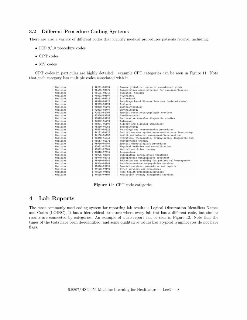
3.2 Different Procedure Coding Systems
There are also a variety of different codes that identify medical procedures patients receive, including:
• ICD 9/10 procedure codes
• CPT codes
• MV codes
CPT codes in particular are highly detailed – example CPT categories can be seen in Figure 11. Notethat each category has multiple codes associated with it.
Figure 11: CPT code categories.
Lab Reports
The most commonly used coding system for reporting lab results is Logical Observation Identifiers Namesand Codes (LOINC). It has a hierarchical structure where every lab test has a different code, but similarresults are connected by categories. An example of a lab report can be seen in Figure 12. Note that thetimes of the tests have been de-identified, and some qualitative values like atypical lymphocytes do not haveflags.
6.S897/HST.956 Machine Learning for Healthcare — Lec3 — 8

5
Figure 12: Lab results for a patient.
Chart Events
Chart Events capture a variety of vital sign features. Figure 13 contains some examples of such events.Some, like heart rate, appear twice. This could be an indication of two systems being combined to get thesecodes, which is something to watch out for.
Figure 13: Chart events for a patient.
There are also charts that capture patient outputs, like urine or stool samples. An example can be seenin Figure 14.
6.S897/HST.956 Machine Learning for Healthcare — Lec3 — 9

Figure 14: Outputs for a patient.
There are also tables for patient inputs, which include medications provided to them. Two examplesof this type of table, one for CareVue and one for MetaVision), can be seen in Figure 15 and Figure 16respectively.
Figure 15: Inputs for a patient (CareVue).
6.S897/HST.956 Machine Learning for Healthcare — Lec3 — 10

6
Figure 16: Inputs for a patient (MetaVision).
Using Medical Process Measures to Make Predictions
The required reading for this class, Biases in electronic health record data due to processes within the health-care system [AKW18], showed that for many lab results, process measures of the data (such as the time alab result was taken) are more important than actual values in predicting outcomes. While these resultscannot be replicated exactly with the MIMIC III database, there are some proxies we can use to try to getsimilar results, such as white blood cell (WBC) counts. Looking at the fractions of abnormal white bloodcell counts per hour, for example, matches the paper’s findings that tests taken in the early morning such as4:00 am are connected to a person being unhealthy. The graph of this relationship can be seen in Figure 17.
6.S897/HST.956 Machine Learning for Healthcare — Lec3 — 11

Figure 17: Proportion of abnormal WBC measurements per hour.
One can also build a regression model to predict mortality from number of WBC measurements andnumber abnormal WBC measurements per hour. This can be found in Figure 18.
Figure 18: Results for using regression to predict mortality from number of WBC measurements andnumber abnormal WBC measurements per hour.
While there are some significant hours here, the fact that only some hours are significant and not othersis not what one would expect based on [AKW18]. For example, if 8:00 am were a significant time to get a labtest done, one would think 7:00 am and 9:00 am would also be significant times, but in this regression thatis not the case. Thus, it seems like there is some noise in the data causing the times to appear insignificant.
We can use the MIMIC data to confirm that lab result values do vary by time of day, as the tables inFigure 19 show. This is one example of many tables in the lecture slides showing how lab tests results change
6.S897/HST.956 Machine Learning for Healthcare — Lec3 — 12

7
over the day depending on the time it is performed. While there are several possible explanations for this,such as diurnal human body changes or changes in care throughout the day, these results do align with theresults from [AKW18] that the time a test is taken provides valuable information alongside the test results.
Figure 19: Mean lab result values plotted against time for several lab tests.
Clinical Notes in MIMIC
There are a wide variety of types of clinical notes – counts for the number of clinical notes taken by type ofprofessional or visit in the data set can be found in Figure 20.
6.S897/HST.956 Machine Learning for Healthcare — Lec3 — 13

Figure 20: Different counts of the number of clinical notes in the MIMIC database by profession or reasonfor visit.
These notes can be very long. The empirical counts of the lengths of these notes taken by type ofprofession can be found in Figure 21 – average counts of 1000 words or more are not uncommon.
Figure 21: The distribution of the lengths of the clinical notes by profession or reason for visit.
An example nursing note can be found in the lecture slides.
6.S897/HST.956 Machine Learning for Healthcare — Lec3 — 14

8 Data Encoding Standards
OHDSI is the standard data encoding method. It is often used with Fast Healthcare Interoperability Re-sources (FHIR), which allows hospitals to share healthcare information electronically. The goal of FHIR isto provide the minimum amount of information a doctor needs to know to start treating a patient. Figure 22shows an example of the form of healthcare information shared – various applications make the form easierfor humans to parse.
Figure 22: The distribution of the lengths of the clinical notes by profession or reason for visit.
Resources for Various Terminologies
All of the terminology standards, such as LOINC, ICD9/10, etc., are gathered in the UMLS Metathesaurusat https://uts.nlm.nih.gov/home.html.
6.S897/HST.956 Machine Learning for Healthcare — Lec3 — 15
9
© source unknown. All rights reserved. This content is excluded from our Creative Commons license. For more information, see https://ocw.mit.edu/help/faq-fair-use/

10 Key Takeaways
• ”Know your data”
• Harmonising all the different types of data is difficult and time consuming
• For some areas, standards don’t exist at all
References
[AKW18] Denis Agniel, Isaac S Kohane, and Griffin M Weber. Biases in electronic health record data due to processes within the healthcare system: retrospective observational study. BMJ, 361, 2018.
[EWJJPS+16] Alistair Edward William Johnson, Tom Joseph Pollard, Lu Shen, Li-wei Lehman, Mengling Feng, Mohammad Ghassemi, Benjamin Edward Moody, Peter Szolovits, Leo Anthony G. Celi, and Roger G. Mark. Mimic-iii, a freely accessible critical care database. Scientific Data, 3:160035, 05 2016.
6.S897/HST.956 Machine Learning for Healthcare — Lec3 — 16

MIT OpenCourseWare https://ocw.mit.edu
6.S897 / HST.956 Machine Learning for Healthcare Spring 2019
For information about citing these materials or our Terms of Use, visit: https://ocw.mit.edu/terms