Embed Size (px)
Citation preview
1
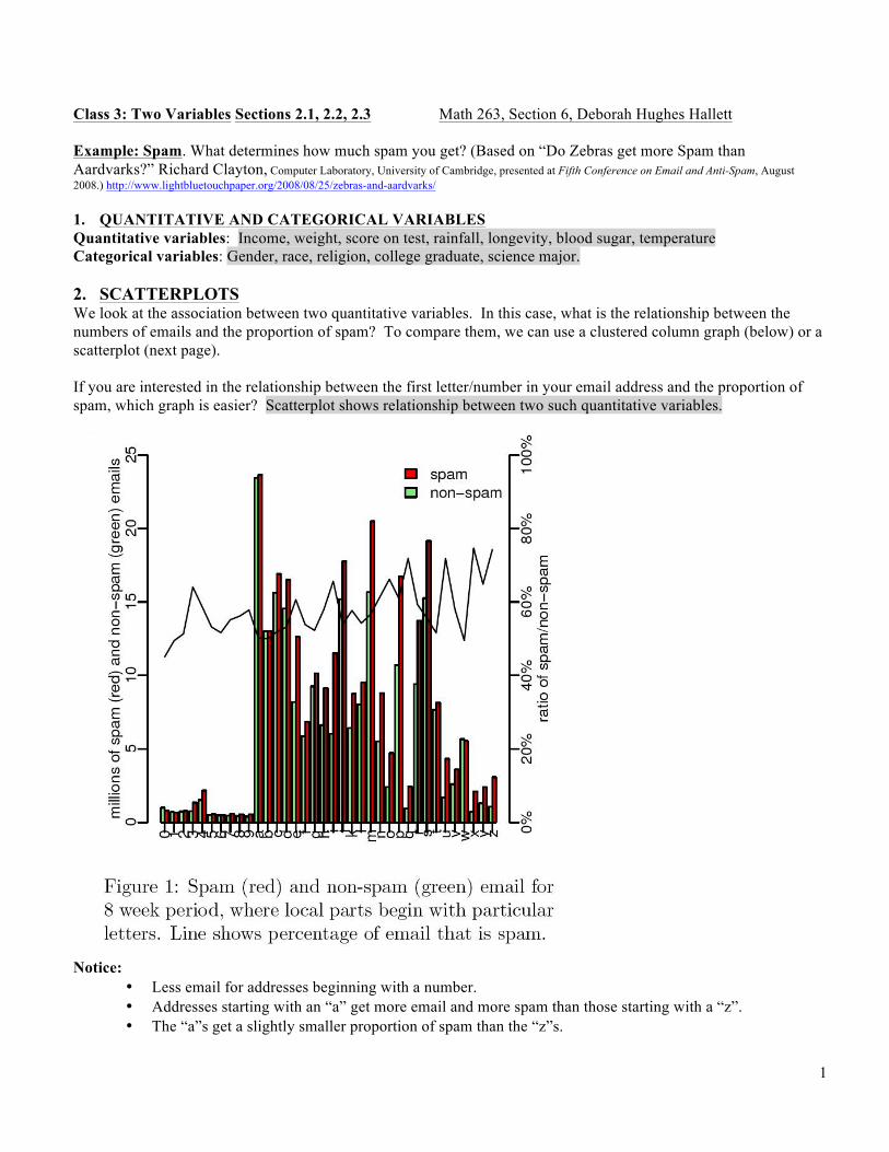
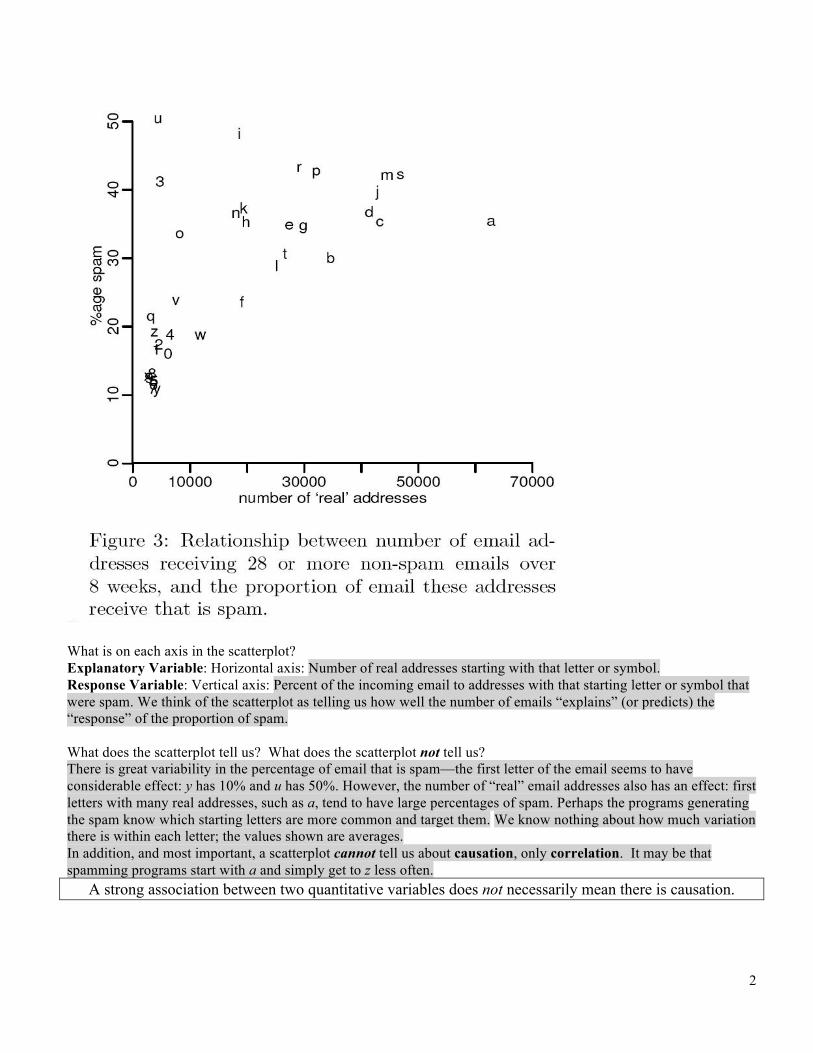
Class 3: Two Variables Sections 2.1, 2.2, 2.3 Math 263, Section 6, Deborah Hughes Hallett Example: Spam. What determines how much spam you get? (Based on “Do Zebras get more Spam than Aardvarks?” Richard Clayton, Computer Laboratory, University of Cambridge, presented at Fifth Conference on Email and Anti-Spam, August 2008.) http://www.lightbluetouchpaper.org/2008/08/25/zebras-and-aardvarks/ 1. QUANTITATIVE AND CATEGORICAL VARIABLES Quantitative variables: Income, weight, score on test, rainfall, longevity, blood sugar, temperature Categorical variables: Gender, race, religion, college graduate, science major. 2. SCATTERPLOTS We look at the association between two quantitative variables. In this case, what is the relationship between the numbers of emails and the proportion of spam? To compare them, we can use a clustered column graph (below) or a scatterplot (next page). If you are interested in the relationship between the first letter/number in your email address and the proportion of spam, which graph is easier? Scatterplot shows relationship between two such quantitative variables.
Notice:
• Less email for addresses beginning with a number. • Addresses starting with an “a” get more email and more spam than those starting with a “z”. • The “a”s get a slightly smaller proportion of spam than the “z”s.
2
What is on each axis in the scatterplot? Explanatory Variable: Horizontal axis: Number of real addresses starting with that letter or symbol. Response Variable: Vertical axis: Percent of the incoming email to addresses with that starting letter or symbol that were spam. We think of the scatterplot as telling us how well the number of emails “explains” (or predicts) the “response” of the proportion of spam. What does the scatterplot tell us? What does the scatterplot not tell us? There is great variability in the percentage of email that is spam—the first letter of the email seems to have considerable effect: y has 10% and u has 50%. However, the number of “real” email addresses also has an effect: first letters with many real addresses, such as a, tend to have large percentages of spam. Perhaps the programs generating the spam know which starting letters are more common and target them. We know nothing about how much variation there is within each letter; the values shown are averages. In addition, and most important, a scatterplot cannot tell us about causation, only correlation. It may be that spamming programs start with a and simply get to z less often.
A strong association between two quantitative variables does not necessarily mean there is causation.
3
3. NUMERICAL DESCRIPTORS: Strength of an association given by the correlation coefficient, r. What is formula for r? Suppose there are 𝑛 data points, 𝑥!, 𝑦! , 𝑥!, 𝑦! , etc. Let a typical x-value be 𝑥! and a typical 𝑦-value be 𝑦! and the corresponding means be 𝑥 and 𝑦. Writing 𝑠! for the standard deviation of the 𝑥-values and 𝑠! for the standard deviation of the 𝑦-values, the formula for the correlation coefficient is
𝑟 =1
𝑛 − 1(𝑥! − 𝑥)𝑠!
!!!
!!!
∙(𝑦! − 𝑦)𝑠!
.
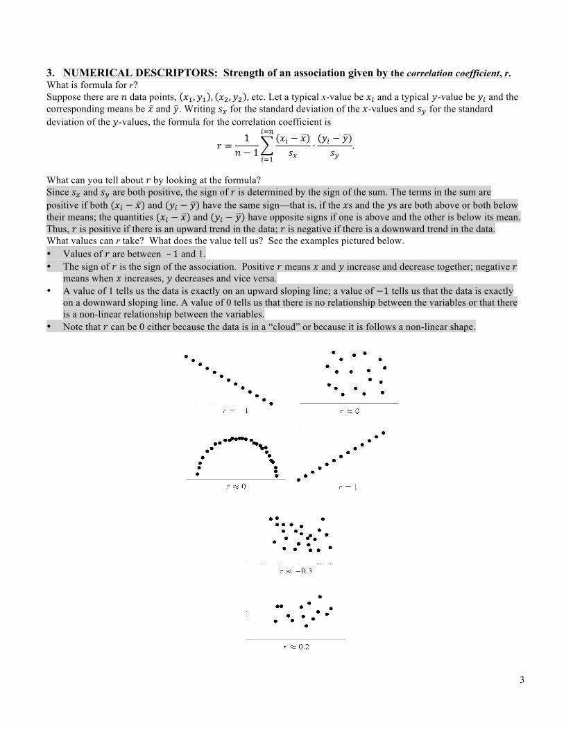
What can you tell about 𝑟 by looking at the formula? Since 𝑠! and 𝑠! are both positive, the sign of 𝑟 is determined by the sign of the sum. The terms in the sum are positive if both (𝑥! − 𝑥) and (𝑦! − 𝑦) have the same sign—that is, if the 𝑥s and the 𝑦s are both above or both below their means; the quantities (𝑥! − 𝑥) and (𝑦! − 𝑦) have opposite signs if one is above and the other is below its mean. Thus, 𝑟 is positive if there is an upward trend in the data; 𝑟 is negative if there is a downward trend in the data. What values can r take? What does the value tell us? See the examples pictured below. • Values of 𝑟 are between – 1 and 1. • The sign of 𝑟 is the sign of the association. Positive 𝑟 means 𝑥 and 𝑦 increase and decrease together; negative 𝑟
means when 𝑥 increases, 𝑦 decreases and vice versa. • A value of 1 tells us the data is exactly on an upward sloping line; a value of −1 tells us that the data is exactly
on a downward sloping line. A value of 0 tells us that there is no relationship between the variables or that there is a non-linear relationship between the variables.
• Note that 𝑟 can be 0 either because the data is in a “cloud” or because it is follows a non-linear shape.
4
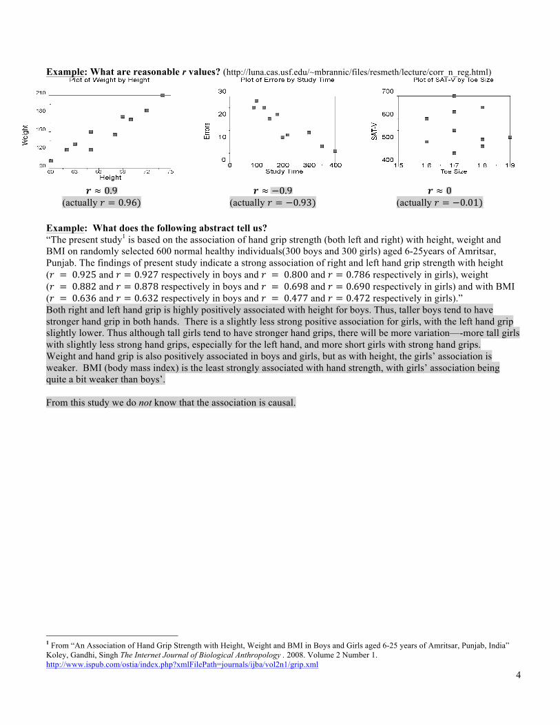
Example: What are reasonable r values? (http://luna.cas.usf.edu/~mbrannic/files/resmeth/lecture/corr_n_reg.html)
𝒓 ≈ 0.9
(actually 𝑟 = 0.96) 𝒓 ≈ −0.9
(actually 𝑟 = −0.93) 𝒓 ≈ 0
(actually 𝑟 = −0.01) Example: What does the following abstract tell us? “The present study1 is based on the association of hand grip strength (both left and right) with height, weight and BMI on randomly selected 600 normal healthy individuals(300 boys and 300 girls) aged 6-25years of Amritsar, Punjab. The findings of present study indicate a strong association of right and left hand grip strength with height (𝑟 = 0.925 and 𝑟 = 0.927 respectively in boys and 𝑟 = 0.800 and 𝑟 = 0.786 respectively in girls), weight (𝑟 = 0.882 and 𝑟 = 0.878 respectively in boys and 𝑟 = 0.698 and 𝑟 = 0.690 respectively in girls) and with BMI (𝑟 = 0.636 and 𝑟 = 0.632 respectively in boys and 𝑟 = 0.477 and 𝑟 = 0.472 respectively in girls).” Both right and left hand grip is highly positively associated with height for boys. Thus, taller boys tend to have stronger hand grip in both hands. There is a slightly less strong positive association for girls, with the left hand grip slightly lower. Thus although tall girls tend to have stronger hand grips, there will be more variation—-more tall girls with slightly less strong hand grips, especially for the left hand, and more short girls with strong hand grips. Weight and hand grip is also positively associated in boys and girls, but as with height, the girls’ association is weaker. BMI (body mass index) is the least strongly associated with hand strength, with girls’ association being quite a bit weaker than boys’. From this study we do not know that the association is causal.
1 From “An Association of Hand Grip Strength with Height, Weight and BMI in Boys and Girls aged 6-25 years of Amritsar, Punjab, India” Koley, Gandhi, Singh The Internet Journal of Biological Anthropology . 2008. Volume 2 Number 1. http://www.ispub.com/ostia/index.php?xmlFilePath=journals/ijba/vol2n1/grip.xml
5
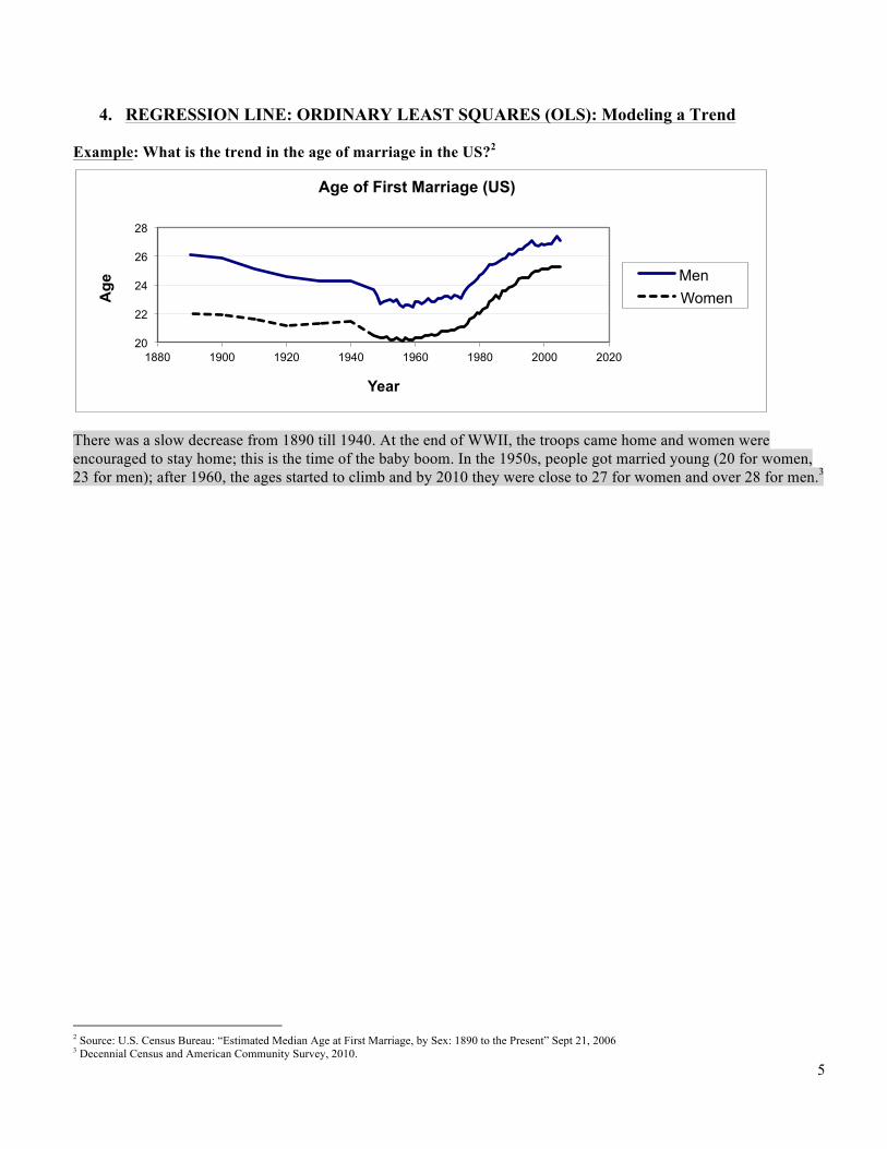
4. REGRESSION LINE: ORDINARY LEAST SQUARES (OLS): Modeling a Trend Example: What is the trend in the age of marriage in the US?2
There was a slow decrease from 1890 till 1940. At the end of WWII, the troops came home and women were encouraged to stay home; this is the time of the baby boom. In the 1950s, people got married young (20 for women, 23 for men); after 1960, the ages started to climb and by 2010 they were close to 27 for women and over 28 for men.3
2 Source: U.S. Census Bureau: “Estimated Median Age at First Marriage, by Sex: 1890 to the Present” Sept 21, 2006 3 Decennial Census and American Community Survey, 2010.
20
22
24
26
28
1880 1900 1920 1940 1960 1980 2000 2020
Age
Year
Age of First Marriage (US)
Men Women
6
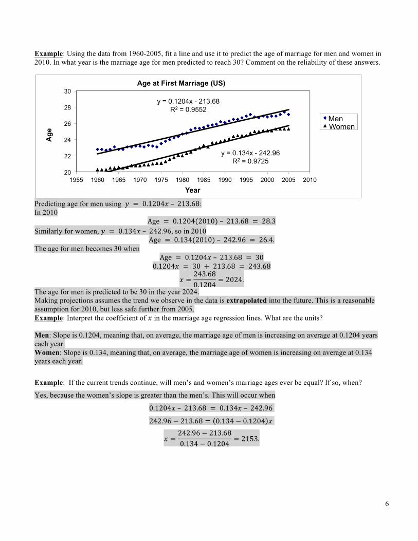
Example: Using the data from 1960-2005, fit a line and use it to predict the age of marriage for men and women in 2010. In what year is the marriage age for men predicted to reach 30? Comment on the reliability of these answers.
Predicting age for men using 𝑦 = 0.1204𝑥 – 213.68: In 2010
Age = 0.1204(2010) – 213.68 = 28.3 Similarly for women, 𝑦 = 0.134𝑥 – 242.96, so in 2010
Age = 0.134(2010) – 242.96 = 26.4. The age for men becomes 30 when
Age = 0.1204𝑥 – 213.68 = 30 0.1204𝑥 = 30 + 213.68 = 243.68
𝑥 =243.680.1204
= 2024. The age for men is predicted to be 30 in the year 2024. Making projections assumes the trend we observe in the data is extrapolated into the future. This is a reasonable assumption for 2010, but less safe further from 2005. Example: Interpret the coefficient of 𝑥 in the marriage age regression lines. What are the units? Men: Slope is 0.1204, meaning that, on average, the marriage age of men is increasing on average at 0.1204 years each year. Women: Slope is 0.134, meaning that, on average, the marriage age of women is increasing on average at 0.134 years each year.
Example: If the current trends continue, will men’s and women’s marriage ages ever be equal? If so, when?
Yes, because the women’s slope is greater than the men’s. This will occur when
0.1204𝑥 – 213.68 = 0.134𝑥 – 242.96
242.96 − 213.68 = 0.134 − 0.1204 𝑥
𝑥 =242.96 − 213.680.134 − 0.1204
= 2153.
y = 0.1204x - 213.68 R2 = 0.9552
y = 0.134x - 242.96 R2 = 0.9725
20
22
24
26
28
30
1955 1960 1965 1970 1975 1980 1985 1990 1995 2000 2005 2010
Age
Year
Age at First Marriage (US)
Men Women
7
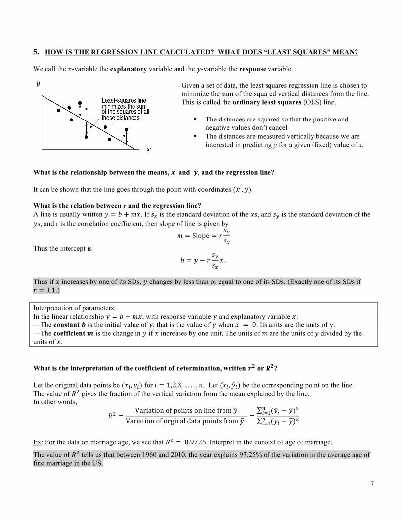
5. HOW IS THE REGRESSION LINE CALCULATED? WHAT DOES “LEAST SQUARES” MEAN? We call the 𝑥-variable the explanatory variable and the 𝑦-variable the response variable.
Given a set of data, the least squares regression line is chosen to minimize the sum of the squared vertical distances from the line. This is called the ordinary least squares (OLS) line.
• The distances are squared so that the positive and negative values don’t cancel
• The distances are measured vertically because we are interested in predicting y for a given (fixed) value of x.
What is the relationship between the means, 𝒙 and 𝒚, and the regression line? It can be shown that the line goes through the point with coordinates (𝑥 , 𝑦). What is the relation between r and the regression line? A line is usually written 𝑦 = 𝑏 +𝑚𝑥. If 𝑠! is the standard deviation of the 𝑥s, and 𝑠! is the standard deviation of the 𝑦s, and r is the correlation coefficient, then slope of line is given by
𝑚 = Slope = 𝑟𝑠!𝑠!
Thus the intercept is
𝑏 = 𝑦 − 𝑟𝑠!𝑠!𝑥 .
Thus if 𝑥 increases by one of its SDs, 𝑦 changes by less than or equal to one of its SDs. (Exactly one of its SDs if 𝑟 = ±1.) Interpretation of parameters: In the linear relationship 𝑦 = 𝑏 +𝑚𝑥, with response variable 𝑦 and explanatory variable 𝑥: —The constant 𝒃 is the initial value of 𝑦, that is the value of 𝑦 when 𝑥 = 0. Its units are the units of y. —The coefficient 𝒎 is the change in 𝑦 if 𝑥 increases by one unit. The units of 𝑚 are the units of 𝑦 divided by the units of 𝑥.
What is the interpretation of the coefficient of determination, written 𝒓𝟐 or 𝑹𝟐? Let the original data points be (𝑥! , 𝑦!) for 𝑖 = 1,2,3,… . . , 𝑛. Let (𝑥! , 𝑦!) be the corresponding point on the line. The value of 𝑅! gives the fraction of the vertical variation from the mean explained by the line. In other words,
𝑅! =Variation of points on line from 𝑦
Variation of orginal data points from 𝑦 =
(𝑦! − 𝑦)!!!!!(𝑦! − 𝑦)!!
!!!
Ex: For the data on marriage age, we see that 𝑅! = 0.9725. Interpret in the context of age of marriage.
The value of 𝑅! tells us that between 1960 and 2010, the year explains 97.25% of the variation in the average age of first marriage in the US.