Embed Size (px)
Citation preview

1
Lesson 5.3.1Lesson 5.3.1
Analyzing GraphsAnalyzing Graphs

2
Lesson
5.3.1Analyzing GraphsAnalyzing Graphs
California Standards:Statistics, Data Analysis, and Probability 1.1Compute the range, mean, median, and mode of data sets.
Statistics, Data Analysis, and Probability 2.3Analyze data displays and explain why the way in which the question was asked might have influenced the results obtained and why the way in which the results were displayed might have influenced the conclusions reached.
What it means for you:You’ll meet some useful types of graphs. You’ll see how to take information from those graphs, including finding the mode and range of the data set shown.
Key words:• data set• frequency table• bar graph• line plot• pictograph• mode• range

3
Lesson
5.3.1Analyzing GraphsAnalyzing Graphs
When you have lots of data in a long list, it’s not always easy to figure out what it means.
These can show you what the spread of the data is like, and which value is most common.
That’s why it’s often converted into a graph or chart.

4
Data Can Be Recorded on a Frequency Table
Lesson
5.3.1Analyzing GraphsAnalyzing Graphs
Frequency is the number of times something happens.
This frequency table shows the results of a survey. A group of students was asked how many movies they each saw last month.
A frequency table is a way to record and organize data.
As each student is questioned, one tally mark is added in the row that matches their answer.
The total number of students who gave each answer is added up when the survey is complete. This total is the frequency.

5
Lesson
5.3.1Analyzing GraphsAnalyzing Graphs
You can use graphs and charts to show frequency data.
On a bar graph, each bar has a label which tells you what group that bar represents.
The size of a bar tells you how large that group is.
The scale shows that the height of the bars represents the number of students.
The height of the bar labeled “None” is 2. So 2 students saw no movies last month.
6
Lesson
5.3.1Analyzing GraphsAnalyzing Graphs
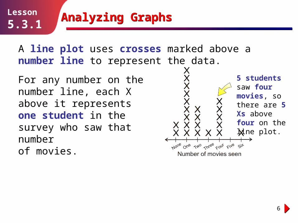
A line plot uses crosses marked above a number line to represent the data.
For any number on the number line, each X above it represents one student in the survey who saw that number of movies.
5 students saw four movies, so there are 5 Xs above four on the line plot.

7
Lesson
5.3.1Analyzing GraphsAnalyzing Graphs
A pictograph uses pictures or symbols to show the data. On a pictograph, each symbol often has a value of more than one unit. You need to look at the key before you can read the graph.
Only 1 student saw three movies. One half-symbol is used to show 1 student in that row.
Each symbol on this pictograph represents 2 students.

8
Guided Practice
Solution follows…
Lesson
5.3.1Analyzing GraphsAnalyzing Graphs
This line plot shows the number of goals scored in the soccer matches played by a school team this year.
1. In how many matches did the team score 0 goals?
3. How many matches did the team play this year?
2. In how many matches did the team score 2 or more goals?
3
4
12

9
Guided Practice
Solution follows…
Lesson
5.3.1Analyzing GraphsAnalyzing Graphs
This pictograph shows the number of pumpkins sold by a grocery store during five days in November.
4. When were the most pumpkins sold?
6. On which day were exactly 30 pumpkins sold?
5. How many pumpkins were sold on Wednesday?
Friday
15
Thursday

10
Guided Practice
Solution follows…
Lesson
5.3.1Analyzing GraphsAnalyzing Graphs
In a survey, some students were asked which of six colors they like best. This bar graph shows the results.
9. How many students said their favorite color was either red, yellow, or blue?
8. Which two colors were the least popular?
7. Which color was the favorite of 3 students?Green
Orange and yellow
14

11
A Graph Can Tell You the Range and Mode
Lesson
5.3.1Analyzing GraphsAnalyzing Graphs
The mode of a data set is the value that occurs most often.
So if a data set is made into a line plot, bar graph, or pictograph, the mode is the value with the most crosses, the biggest bar, or the most symbols.

12
Example 1
Solution follows…
Lesson
5.3.1Analyzing GraphsAnalyzing Graphs
What is the mode of the data set shown on this line plot?
Solution
The mode is the value on the line plot that has the greatest number of Xs above it.
The number 19 has the most Xs above it.
So the mode is 19.

13
Lesson
5.3.1Analyzing GraphsAnalyzing Graphs
The range of a data set is the difference between the greatest and least values in the set.
So it’s easier to find the range from a graph than from the raw data set because you can clearly see the least and greatest values.

14
Example 2
Solution follows…
Lesson
5.3.1Analyzing GraphsAnalyzing Graphs
Solution
What is the range of the data set shown on this bar graph?
The different values in the data set are the labels on the bars of the graph.
So the least value in the data set is 25, and the greatest is 31.
31 – 25 = 6, so the range = 6.

15
Guided Practice
Solution follows…
Lesson
5.3.1Analyzing GraphsAnalyzing Graphs
This pictograph shows the ages of the cars parked in a parking lot, to the nearest year.
11. Find the range of the ages of the cars.
10. What is the mode of the ages of the cars? 7 years
10 years

16
Guided Practice
Solution follows…
Lesson
5.3.1Analyzing GraphsAnalyzing Graphs
The graph below shows the points out of 20 that the students in one class scored on a math quiz.
13. What is the range of quiz scores?
12. What was the mode for the quiz scores? 14
14

17
Analyzing GraphsAnalyzing Graphs
Independent Practice
Solution follows…
Lesson
5.3.1
A number of dog owners were asked how many times they had taken their dog to the veterinarian in the past month.The results are shown on the pictograph below.
1. How many dog owners took their dog to the vet exactly once?
4. What is the range?
3. What is the mode of the data?
2. How many dog owners were interviewed in total?
5 owners
20 owners
0 visits
3 visits

18
Analyzing GraphsAnalyzing Graphs
Independent Practice
Solution follows…
Lesson
5.3.1
The bar graph below shows the number of lunches sold each day by a restaurant.
5. Find the mode of the data.
7. For how many days was this data collected?
6. Find the range of the data.
30 lunches
6 lunches
17 days
Number of lunches sold
Nu
mb
er
of d
ays

19
Analyzing GraphsAnalyzing Graphs
Independent Practice
Solution follows…
Lesson
5.3.1
Which of the line plots below have:
8. a range of 8?
9. a mode of 2?
A B
C D
B
A and C

20
Analyzing GraphsAnalyzing Graphs
Independent Practice
Solution follows…
Lesson
5.3.1
10. Explain the advantages of looking at data on a line plot instead of in a data set.
In a line plot, the data values are already arranged in order, so finding the median and the range has one less step involved.
The Xs make it easy to visually see the mode in a quick glance and also compare the number of times each data value occurs.

21
Analyzing GraphsAnalyzing GraphsLesson
5.3.1
Round UpRound Up
You should be able to see how useful these graphs can be.
As you’ll see in the next Lesson, that can help you to find the mean and the median of the data set too.
Not only that, they organize the data.
They make it much easier to spot the mode and find the range of a data set.


![5.3.1 Index [jspmntc.edu.in]](https://img.pdfslide.us/doc/110x75/61bd22f561276e740b0fbaf4/531-index-.jpg)