Embed Size (px)
Citation preview
’s
Gold – Silver – Shares Markets
David Kerly’s
David Kerly’s - Gold-Silver-Shares-Markets - Unique - Insightful - Independent 1 February 2016
No sooner had the ink dried on our January newsletter,
than gold began to rise and World stock markets began
collapsing. Not quite as bad as last August, but the
declines will still go down in history as one of the worst
January’s on record. The DJIA fell 911 points, or more
than 5%, its worst four-day percentage loss to start a
year on record, at least since 1897. These declines took
most people by surprise, but as we have pointing out for
some months now, the writing has been on the wall for
stocks. The US stock market has been defying gravity
for longer than most, but they (in the US) are beginning
to realise that the game is up and a lot of investors took
a rush for the exits last month. There are still some that
think this is only a correction, but clearly they cannot
have looked at all the evidence. Some will have
certainly done so, but have chosen to ignore it, or even
disbelieve it. Denial is a dangerous game to play, as the
truth always outs in the end. Below we show a table of
key market performances last month. We also show the
worst point of January (20th) and the double digit
percentage declines to those points. For Gold and Silver
we show the high point (27th).
Market 31 Dec Jan
low/hi
%
chge
29 Jan %
chge Gold $1062.6 $1127.9 +6.1 $1117.7 +5.2
Silver $13.88 $14.55 +4.8 $14.24 +2.6
FTSE 100 6244 5600 lo -10.3 6124 - 2.0
Nikkei 225 18831 15798 lo -16.1 17863 - 5.1
S&P 500 2058 1811 lo -12.0 1936 - 6.0
DJIA 17554 15775 lo -10.1 16431 - 6.4
DAX 10688 9833 lo -13.4 9251 - 8.0
01 FEBRUARY 2016 A monthly newsletter on gold, silver, shares, and stock markets utilising chart and fundamental analysis Issue 8
Stock market uptrends are history and the bear is awakened.
Astute investors will sell into the current temporary bounce.
The HUI Index (unhedged gold shares) outperforms the XAU
Index (hedged gold and silver shares).
Last month’s panic in stocks is giving way to a sucker rally.
Gold gains 5% and completes a triple bottom base versus the
Dow Jones Transport Index.
Junk bonds are bouncing as well but the chart looks dreadful.
Deflation, not inflation, is the problem as the FED will come
to realise, if they haven’t already.
Gold posts its first higher low versus the FTSE All World Stock
Market Index in over four years.
George Osborne needs to buy back our gold, foolishly sold by
Gordon Brown (but very quietly if he can).

David Kerly’s - Gold-Silver-Shares-Markets - Unique - Insightful - Independent 1 February 2016
Gold has given us a clue that the main trend priced in
US$ is starting to shift from down to up. Currently, to
confirm a trend change, the sequence of lower highs and
lower lows needs to be broken, the latest being the 14th
October 2015 rally high of $US1191.42 or US$1183.45
(daily close basis). However, the first clue of a trend
change comes from gold’s chart versus the Dow Jones
Transport Index. This is shown below.
A 30% outperformance by gold over the transports in
the last two months took it well clear of a year long
triple bottom base pattern. The 40 week (200 day)
moving average had already stopped falling mid-2015
and it has now turned up. In the near term, there may be
a dip back, but this should find support from the upper
region of the year long base area before the advance
resumes. We do realise of course that this does reflect a
greater decline in the Transport Index than the
corresponding rise for gold. Transport stocks have
fallen by an average of 22.4% since early December
while gold has risen by around 8% over the same time
frame.
THE DOW JONES TRANSPORT INDEX IS A
LEADING INDICATOR
As we mentioned in our last newsletter (4th January)
the Transport Index has also been underperforming the
Dow Jones Industrials, almost exactly as it did in the run
up to the 2008 crash. The Transport Index is a leading
indicator and we think it is providing a very strong
warning of serious trouble ahead. Gold’s recent rise is a
combination of short covering, but lumped in there too
will be new longs. We get the feeling that the safe haven
status of gold, and silver to a degree - though that is still
lagging gold because of its part “industrial use tag”, is
starting to be taken more seriously. Maybe the start of a
new year has focussed investors’ minds and they are
starting to not like what they see for the US and also the
world economy generally.
The next chart we show is the HUI Index (gold shares
that don’t hedge their gold production or at least very
minimally), versus the XAU Index (gold and some
silver companies that do). The chart goes back 16 years
to 2000.
OUTPERFORMANCE BY THE HUI INDEX
OVER THE XAU INDEX IS A LEADING
INDICATOR OF GOLD PRICE STRENGTH
Here we can see how unhedged gold shares rose far
more than their hedged brothers in gold’s great bull
market that lasted for 10 years from 2001 to 2011. The
outperformance was staggering. The XAU Index rose
by a very nice 459% in those ten years, far far better
than stocks. However, the unhedged HUI Index rose by
an amazing 1664% in the same period. Such
outperformance makes perfect sense as those
companies with 100% exposure to a rising gold price
will make a lot more money than those companies
which have less. So with that in mind it naturally
follows that when the HUI Index starts to outperform
the XAU Index that is a sign that the main direction for
the gold price is shifting to the upside.
We can see on the chart above that the HUI Index has
in the last several months, and particularly January, left
their hedged brothers far behind. The early 2015 rally
peak has been well cleared and the four year downtrend
has been breached. Not only that but there are five
waves down from the 2011 high. So, three down (the 2nd
being the longest or third wave from mid-2012 to end
2014) and two corrective up. Confirmation in Elliott
Wave terms that the bear leg is finished. Of course,
unhedged gold shares now look overbought on a near
term basis (notice the level of the MACD) and could
retrace some of their recent gains. However, such
weakness should prove an opportunity to get into or
even add to existing long positions in those gold stocks.
David Kerly’s - Gold-Silver-Shares-Markets - Unique - Insightful - Independent 1 February 2016
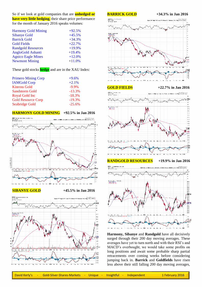
So if we look at gold companies that are unhedged or
have very little hedging, their share price performance
for the month of January 2016 speaks volumes:
Harmony Gold Mining +92.5%
Sibanye Gold +45.5%
Barrick Gold +34.3%
Gold Fields +22.7%
Randgold Resources +19.9%
AngloGold Ashanti +19.4%
Agnico Eagle Mines +12.0%
Newmont Mining +11.0%
These gold stocks hedge and are in the XAU Index:
Primero Mining Corp +9.6%
IAMGold Corp +2.1%
Kinross Gold -9.9%
Sandstorm Gold -13.3%
Royal Gold Inc -18.3%
Gold Resource Corp -19.3%
Seabridge Gold -25.6%
HARMONY GOLD MINING +92.5% in Jan 2016
SIBANYE GOLD +45.5% in Jan 2016
BARRICK GOLD +34.3% in Jan 2016
GOLD FIELDS +22.7% in Jan 2016
RANDGOLD RESOURCES +19.9% in Jan 2016
Harmony, Sibanye and Randgold have all decisively
surged through their 200 day moving averages. These
averages have yet to turn north and with their RSI’s and
MACD’s overbought, we would take some profits on
long positions and await some probable sharp partial
retracements over coming weeks before considering
jumping back in. Barrick and Goldfields have risen
less above their still falling 200 day moving averages,

David Kerly’s - Gold-Silver-Shares-Markets - Unique - Insightful - Independent 1 February 2016
but they have more underlying support, and in closer
proximity, than the other three gold stocks. Still, we
would expect downward corrective phases over the
coming weeks as well for these two.
ANGLOGOLD ASHANTI +19.4% in Jan 2016
AGNICO EAGLE MINES +12.0% in Jan 2016
NEWMONT MINING +11.0% in Jan 2016
Anglogold, Agnico and Newmont have risen between
11% and nearly 20% but are still within developing
probable basing trading ranges. They have yet to break
out on the upside, unlike their aforementioned brethren.
A dip back into the mid to lower side of their sideways
ranges seems likely during coming weeks.
PRIMERO MINING CORP +9.6% in Jan 2016
IAMGOLD Corp +2.1% in Jan 2016
Primero and IAMGOLD are both in the XAU index of
hedged producers and failed to see a gain of at least 10%
over the month, unlike their eight unhedged
counterparts as shown ahead of them. Primero posted
a new low in January, though managed to stage a rally,
taking it back into its downward sloping trading range.
This could turn out to be a base pattern, though the price
really needs to get over the October high and break the
falling 200 day moving average to suggest it is and avert
new lows. IAMGOLD tested the July 2015 low but
managed to recover slightly by month end. The pattern
since then could be a double bottom base, but the share
price really needs to get over the early January high and
ideally the October rally peak to suggest it is and avert
the risk of new lows.

David Kerly’s - Gold-Silver-Shares-Markets - Unique - Insightful - Independent 1 February 2016
KINROSS GOLD -9.9% in Jan 2016
SANDSTORM GOLD -13.3% in Jan 2016
ROYAL GOLD Inc -18.3% in Jan 2016
Kinross, Sandstorm and Royal Gold broke to new
lows in January, the latter gold share in particular in
spectacular style. These three stocks are in clear and
remorseless downward trends, though of course their
ultimate lows may not be that far away, relatively
speaking. However, we would steer well clear until
signs of a turnaround appear. We can though count five
Elliott Waves for Royal Gold. The fifth wave, i.e the
final third downleg, which appears to have begun from
the October 2015 high, is probably approaching its
zenith. That may mean a final plunge under the January
low ahead of a recovery. One to keep an eye on for the
more adventurous of you.
GOLD RESOURCE CORP -19.3% in Jan 2016
SEABRIDGE GOLD Inc -25.6% in Jan 2016
The chart of Gold Resource Corp has no redeeming
features other than the trend is very strong, DOWN.
However, it is oversold and potentially due a rebound.
We would not though hang our hat on it and would give
it a wide berth. Seabridge Gold on the other hand does.
The plunge in July 2015 looked like capitulation,
particularly with the equally sharp move to the upside
the next month. It has though double topped just under
the January 2015 high and would appear to need to
establish further support near to around current levels
before a challenge of the double top peaks is
forthcoming. Losing the end September low, just under
the recent low, could though trigger a plunge towards
last summer’s lows.

David Kerly’s - Gold-Silver-Shares-Markets - Unique - Insightful - Independent 1 February 2016
US$ GOLD CHART
Gold moved up strongly last month, gaining 5.2% to
close at US$1127.9 after ending 2015 at US$1062.6.
The advance really began from the mid-December low
of US$1047.55 and was in three distinct phases, giving
a five wave move which retraced just over 50%
(US$1118.8) of the drop from the October high but just
shy of the 61.8% level (US$1136.0). It may attempt to
move up a little more in the very short term, possibly
testing the 61.8% level and falling 200 day moving
average. However, we note that the daily
stochastic has just turned down from
overbought, so the risk of a corrective
phase is perhaps the more likely. Support
levels come in at US$1096.75 and
US$1087.12, with the US$1080 area
particularly strong.
GOLD MAY BE FORMING A
HEAD AND SHOULDERS BASE
PATTERN
We said last month that the December
lows near US$1050 may mark the
bottom of a head and shoulders base
pattern. The latest price action and the
way the stochastic indicator is finding
support around the 50 level, thus keeping
in the bullish half of the scale, is
particularly encouraging. Also, we note
that the ‘gap’ between the commercials
and large specs is still quite narrow. This
has plenty of scope to widen out towards
the -20000 and +20000 boundaries in the
next few months. All told then, there is
definitely a very good chance that gold
will have a crack at the key October 2015
high of US$1191.42, but a near term
corrective phase is likely first.
US$ SILVER CHART (Chart below)
Silver rallied in January, albeit in
choppy fashion, to end the month up
2.6%, but only half the rise of gold, after
being ahead 4.8% last Wednesday. Price
action since the 2nd week of November
has been contained in a tight range of
US$13.625 to US$14.626, the low and
high for December. The daily stochastic
has, like gold’s, turned down, though it
does look medium term bullish, if not
quite as bullish as gold’s because the low
points since December are not as high.
The day silver made its rally high of US$14.553 on
Wednesday it left a “doji” candlestick, signaling
indecision and a possible reversal. That near term trend
change now appears to be underway and silver could
move back towards the December and January lows at
US$13.625/US$13.727, respectively. While the “gap”
between commercials and large specs has widened there
is scope for a greater difference in coming months. If
silver can breach the 38.2% level of US$14.66 later on,
a base would be completed for a return towards the
61.8% retracement level at US$15.30.

David Kerly’s - Gold-Silver-Shares-Markets - Unique - Insightful - Independent 1 February 2016
GOLD HAS POSTED A HIGHER LOW
VERSUS THE FTSE ALL WORLD
STOCKMARKET INDEX FOR THE
FIRST TIME IN OVER FOUR YEARS
Gold has outperformed most of the stock markets in
the world over the last two months. Again this more
reflects the declines in global stocks, but it does
highlight only too well that the trend for investors
globally are beginning to shift in favour of the asset of
last resort. We would not be surprised to see gold and
silver within the next two to three years being used as a
currency, particularly if we are right about the collapse
in stock markets and possibly fiat currencies that lies
ahead.
LONG TERM CHART OF GOLD VS FTSE ALL
WORLD STOCK MARKET INDEX
The chart at the bottom of the page puts the recent
higher low into context, the latest rise also breaking
above the 400 day moving average. The attempt to do
this in October 2015 was repelled by the average but
this time the outperformance from the first higher low
since 2011 has been enough to break the downward bias
and this long term moving average. The shorter 200 day
moving average (compared to the 400 day that is) was
pierced several times since 2014 but the trend resumed
lower. A quick glance at the chart on the left however
shows that the red 200 day moving average has now
begun to turn up. The MACD and RSI are both turning
down from overbought so we see gold going on the back
burner for a while as stock market rallies around the
world begin to gather a bit of pace.
We will visit various stock market index charts later in
the newsletter, but first we take a look at the US Dollar
Index.
Since the early December plunge
(despite better than forecast non-
farm payrolls - 210,000 vs f/c
200,000), but much lower than the
prior 271,000, the US dollar has
struggled to recover. By rights if
the dollar was going to breach the
key 100.71, March 2015 high,
resistance and sustain a run to the
103.00 area, the final fifth wave
(wave one began in 2011), then it
should not have taken the eight
weeks or so that it has, and not
even back to test 100.60/100.71
yet.
This may reflect that the market is
skeptical that further interest rate
rises are going to be forthcoming

David Kerly’s - Gold-Silver-Shares-Markets - Unique - Insightful - Independent 1 February 2016
given that “inflation” is not going to be the problem and
that the Federal Reserve is starting to acknowledge that
fact. Indeed at last week’s FOMC meeting last week
when surprise surprise they kept the federal funds rate
the same, they said - “The committee identified low
inflation in the near term, resulting in part from the
recent drop in oil prices, as well as weakness abroad
and in financial markets as the primary risks to its
outlook. While conditions could certainly improve
prior to the committee’s next meeting in March, if
these issues continue to pose similar risks at that time,
it will be difficult for the committee to pull the trigger
on a rate hike at that time.” If stock markets have
recovered a bit further by then and not broken down again,
which we think is a distinct possibility, then another rate
hike will surely send investors scurrying for the exits
again.
LONG TERM CHART OF QUARTERLY US GDP
GROWTH
This very long term chart shows how quarterly GDP
growth in the US has been on a declining trend since the
early 1950’s. However, also notice that since 2000 when
growth was nudging 8%, the average of the peaks between
the 2002 and 2008 recessions was markedly lower than in
the 10 year run up to the year 2000.
Since 2008 GDP growth has not quite managed to hit 5%,
a feat which the economy managed to do for three quarters
in the mid-2000’s. Lately of course GDP has been sinking
rapidly and a glance at the ten year chart will show that
GDP is due to go negative very soon. This will be for the
third time since the disaster of 2008. There is plenty of
evidence to suggest that this time GDP growth, or rather
the lack of it, will be at least as bad as 2008, if not worse.
Following the recent release of 4th quarter GDP figures,
showing that the US economy rose at an annualized rate of
just 0.7%, Rob Carnell of ING Bank said the following:
“The trend in US growth has clearly slowed. Even
allowing for the fact that this data is choppy, and
considering the last two quarters as a moving average,
growth is now barely 1.5%, and is probably consistent
with a widening, not a closing output gap. If this feeds
through into softer hiring trends, then we can forget
further rate hikes from the Fed anytime soon.”
Also,“The slowdown in growth is mainly based on a
slowdown in domestic demand (…) Investment is
another key element of domestic demand that has
declined, with business investment of -2.5%QoQ in
4Q15 a worrying new development – though admittedly
following very strong 3Q15 growth” So, a distinct drop
in business investment!!
COMPANIES ARE STRUGGLING TO GROW
ORGANICALLY SO LETS GO AND TAKE
SOMEONE OUT AND STRIP OUT ALL THE
DEADWOOD SO WE CAN “GROW THAT
WAY”, SEEING AS WE CAN’T GROW OUR
OWN BUSINESS IN THE NORMAL WAY!
Now we know why there was such a vast amount of
Merger and Acquisition activity globally and in
particular in the US last year – companies are struggling
to grow organically! “The search for growth amidst
divergent global economic conditions and technology-
led disruption across many sectors provided a catalyst
for such deals.” Source – capitalinsights.ey.com.
Also, “The results for global M & A activity in H1 2015
for instance, continued the pace set in 2014. With
US$2.27 trillion’s worth of transactions, it was the
second-highest overall deal value for a first half of the
year – just shy of the all-time first half high of US$2.59
trillion set in 2007. The pace didn’t drop in the second
half of the year and 2015 finished with the highest value
M & A statistics on record.“ Source –
capitalinsights.ey.com. The mere comparison with 2007
sends shivers up my spine. Last one out turn out the
lights!
JUNK BONDS (another leading indicator)

David Kerly’s - Gold-Silver-Shares-Markets - Unique - Insightful - Independent 1 February 2016
Well, what can we say about the chart at the bottom
of the previous page? Basically it’s Junk! The Barclays
high yield Bond ETF peaked about a year before the
S&P 500 and the Dow Jones Industrial Index, which
along with the Transport Index (though peaked a few
months later towards the end of 2014) are classic
leading indicators for the US stock market.
We’d say that looking at his chart, there is a very strong
likelihood that it’s on its way to the October 2011 low
of 26.13. That is a drop of nearly 23% from where the
ETF is currently, or a fall of 31.5% from the 2014 high
of 38.15. That implies that investors will be demanding
higher and higher yields, despite US interest rates that
are still only scraping along the bottom.
Given the 16.4% decline already seen (to the recent low
of 31.88) investors are clearly building an aversion to
company issued bonds, because of the risk of default,
which can only increase as the year progresses. In the
immediate term however, a corrective rally is getting
underway. We show a shorter term chart on the right.
Notice how far the falling 200 day moving average is
away from the price and the bullish divergence on the
daily MACD and RSI compared with the lower lows of
LONG TERM MONTHLY CHART OF THE
FTSE 100 INDEX
the ETF at 33.03 then 31.88. A bullish two day island
reversal from 31.88 also adds to the scope for a further
rebound. However, we wouldn’t have thought it could
extend much further than a 38.2% retracement (34.20)
of the drop from the May 2015 highs near 38.00. It
could do 34.90 (50%) but that may be stretching it a bit.
The MACD and RSI on the longer term chart (bottom
of the previous page) look permanently locked down in
the bearish zone. That signals renewed weakness to
come.

David Kerly’s - Gold-Silver-Shares-Markets - Unique - Insightful - Independent 1 February 2016
THE FTSE 100 INDEX LOOKS AWFUL
On the bottom half of the previous page we show a
long term chart of the FTSE 100 Index. As you can see
it very much looks like 2001 and 2008 all over again.
That was when the UK stock market broke below the
key 6000 level, the neckline support of big multi-month
top patterns. Ominously the same thing appears to be
underway again. We have added 13 month and 34
month moving averages and red and blue arrows where
bullish and bearish crossovers occurred. Since the crash
of 1987 there have been three buy signals and four sell
signals. We have recently been given a sell signal. Apart
from the false sell signal after the crash of 1987, quickly
followed by a correct buy signal, the remaining signals,
particularly the sells, have been very reliable and got
you in or out of the market at the early stages of major
trend changes.
The sells work better than the buys because it takes a
long time to build a top and the more gradual
deterioration in the market will be enough to generate
the sell signal before the trend has turned down
significantly. These particular length averages “lag” the
price a lot and given that bottoms such as those in 2003
and 2008 when “vee” bottoms occurred, (panic and fear
being stronger emotions than greed), then a bullish
crossover of the two averages will be far slower to get
you back in the market.
The best solution is to use MACD and Stochastics such
as shown at the bottom of the FTSE100 chart. Currently
the market is in rally mode and has regained the key
6000 level. However, we are sure that it will not last for
very long before the next down wave is unleashed. Two
false upward breaks occurred last year, when firstly the
Index failed to hold over the year 2000 high and then
saw failure to hold over the 2014 highs. The first target
has been reached, the bottom of the trading range prior
to the failed break, in this instance the 6000 level. The
market has yet to fulfill the second. So, the second target
is the bottom of the trading range that preceded the
failed upward break. In this instance it is the 2003 and
2009 lows between 3280 and 3460, as marked within
the two red horizontal lines on the chart.
Finally we can make an estimation of when the index
will get to that support area. Notice the green vertical
lines and black arrows. The first two green vertical lines
show when the market bottomed and the first two black
arrows shows when the moving average sell signals
were generated. Notice where the latest black arrow is
in relation to the stochastic indicator – starting to
approach the bottom of the scale like it did in 2001 and
early in 2008. Based on how long it took from those two
points for the market to reach its ultimate lows we have
drawn two green vertical lines from the current position.
These sit at September 2016 and July 2017. Thus on
past performance the market should bottom any time in
the next eight to eighteen months. If it is the former then
we will have a massive crash on our hands. If it is the
latter (which we suspect it will be) then the bear market
will be more laboured, though not without some very
nasty sell-offs along the way. If the latter is correct then
you can be sure that many market “professionals” will
still be talking of tremendous value in stocks after each
sell-off. They can only decimate their investors
pensions and portfolios along the way, or until they take
a dose of reality. Unfortunately for many that may come
much further down the line, when other shrewd
investors will have been reaping the benefits from
cashing up far far earlier and having already put a large
chunk of that money in gold and silver bullion and
selected gold and silver mining shares.
THE FTSE 350 INDEX IS SIMILARLY BEARISH
The FTSE350 Index has also left two false upward
breaks. For this Index, there is a slightly upward sloping
trading range which captures the 2003 and 2009 lows
and the 2000 and 2007 highs. The red upsloping line
that runs parallel with the upper boundary line marks
the key pivot line, currently around 3400, which equates
to the 6000 level on the FTSE100 Index. The target
from the first failed break was this 3400 region which
has been met. A rally attempt has been underway, but
this too should soon give way to a fresh downward leg.
Our target is the 2100 area, on the lower boundary line
of the multi-decade trading range.
On the next page we show a long term chart of the
German DAX Index.

David Kerly’s - Gold-Silver-Shares-Markets - Unique - Insightful - Independent 1 February 2016
The German DAX Index broke over its 2000 and 2007
highs and unlike the FTSE100 Index continues to trade
above them. However, this is very misleading as the six
year bull market from the March 2009 low can be
clearly be identified as a completed elliott wave five
wave structure. That strongly indicates that a three wave
decline should follow. While we note that the 13 and 34
month moving averages have yet to give a sell signal,
the MACD and stochastic indicators have. Also, note
that the fifth and final wave that peaked over 12,000 was
a classic elliott wave throw over above the trend line
that connected the top of waves one and three. In
essence a false upward break as the Index is now back
beneath that line, and in fact reversed down from it at
the end of last year after a corrective rally in October
and November 2015.
The level to watch is the horizontal red line that
connects the 2000 and 2007 highs around 8170. A break
under there, which looks likely, will open up a target
back down to the 2009 low around 3590.
UPDATE ON THE WEBSITE
The loading of fundamental content continues to take up
a lot of time to build the website but this is nearing the
end and will be very useful for those who wish to know
important information relevant to each of the gold and
silver mining shares that we will be following in depth.
Such information includes company descriptions,
location of mines, geographical, political and economic
information that each company operates in. Five year
financial information including revenue, production,
attributable earnings, eps, dividends, all in sustaining
costs, cash/debt position. We also identify those that
hedge and those that don’t. Rankings for AISC’s and
AISC margins over average gold price received, plus
production growth, reserves and resources, expansion
and exploration plans, life of mines, quality of
management, history of delivering on production
guidance and mine development. We will also show
relevant information to gold and silver itself, including
central bank holdings, Dow/gold ratio, gold/silver ratio
etc. Importantly we will provide frequent detailed
technical analysis of individual gold and silver shares,
utilizing candlestick charts, elliott wave where there is
a clear wave count, Fibonacci retracements and
projections plus the conventional forms of technical
analysis such as trends, patterns, gaps, moving
averages, MACD, RSI, and stochastics.
DISCLAIMER
Gold-Silver-Shares Markets expresses our views and
opinions on precious metals, shares and other financial
markets and are subject to change without notice. Trading or
investing in stocks or any other financial market carries a high
degree of risk and it is possible that an investor may lose part
or all of their investment. The information in this newsletter
is expressed in good faith, but is not guaranteed. A market
service that is completely accurate100% of the time does not
exist. Please ask your broker or investment advisor to explain
the risks involved before making any trading and investing
decisions.


![INVESTOR FACT SHEET - Denver Gold Group Resources Fact...Shareholding [1] (shares in millions) Public Float 161.7 Silver Standard Shares 17.0 Total Issued & Outstanding Shares 178.8](https://img.pdfslide.us/doc/110x75/5e7178c6fb707741215015b0/investor-fact-sheet-denver-gold-group-resources-fact-shareholding-1-shares.jpg)