Embed Size (px)
Citation preview
1
DESIGN ELEMENTS THAT CREATE CONSISTENT VISUAL IDENTITIES IN ADVERTISING: A QUALITATIVE CONTENT ANALYSIS OF BEAUTY PRODUCT
CAMPAIGNS COMPARING MAGAZINE ADVERTISEMENTS WITH THEIR WEB SITES
By
JACLYN SHERMAN RHOADS
A THESIS PRESENTED TO THE GRADUATE SCHOOL OF THE UNIVERSITY OF FLORIDA IN PARTIAL FULFILLMENT
OF THE REQUIREMENTS FOR THE DEGREE OF MASTER OF ADVERTISING
UNIVERSITY OF FLORIDA
2007
2
© 2007 Jaclyn Sherman Rhoads
3
To my husband Jesse, my soulmate, my friend, my guiding star And, to my parents, for all of their support and guidance throughout my life
4
ACKNOWLEDGMENTS
The completion of this thesis could not have been realized without the help of many
people. First of all, I thank my chair, Dr. Debbie Treise for her support, professionalism, and
leadership. I thank her from the bottom of my heart for being there for me and for helping me
achieve my goals. I also thank committee member Professor Elaine Wagner for helping me
formulate my ideas and providing me with guidance about design theories. Her suggestions and
attention to detail helped me create a study I am proud of. I also thank committee member Dr.
Julie Dodd, who through my undergraduate and graduate studies has always been there to listen
and offer suggestions. Once again, she was there for me when I needed her most. I truly
appreciate having a mentor like her through my college career. Also, I thank Jody Hedge who
was always available to answer my questions and to offer a muchneeded smile.
I thank my loving husband Jesse for supporting me and being my stress reliever. It’s been
a long two years working fulltime and going to school, and I appreciate all his shoulder rubs,
pep talks, and for just being there for me. I love him very much.
I also thank my parents, Richard and Marcia Sherman; my grandmother, Cecile Sherman;
my brother, Lee Sherman; and Jesse’s mom, Gail Rhoads, for their unconditional love and
support through my life and especially graduate school.
And finally, I thank Karen Fenton, my fellow classmate. Together, we made it through
and I appreciate her always being there as we made the stressful journey that is graduate school,
together.
5
TABLE OF CONTENTS
page
ACKNOWLEDGMENTS...........................................................................................................4
LIST OF FIGURES ....................................................................................................................8
ABSTRACT ...............................................................................................................................9
CHAPTER
1 INTRODUCTION .............................................................................................................10
Overview ...........................................................................................................................10 Purpose ..............................................................................................................................12 Rationale............................................................................................................................12 Significance of Study .........................................................................................................13
2 LITERATURE REVIEW...................................................................................................14
Overview of IMC...............................................................................................................14 Brand Identity and Brand Image.........................................................................................14 Creating Brand Identity ......................................................................................................15 Managing a Brand’s Identity ..............................................................................................16 What is Design? .................................................................................................................17 Design: An Important Element to Brand Image ..................................................................19 Elements of Design ............................................................................................................21
Typography.................................................................................................................21 Color...........................................................................................................................22 Logo ...........................................................................................................................23 Layout and Illustration Style........................................................................................24
Types of layout formats........................................................................................25 Other layout elements...........................................................................................26
Incorporating Design into Brand Identity............................................................................27 Consistency through Design...............................................................................................28 Design and the Internet.......................................................................................................31 Consistency Across Traditional Communication Activities and the Internet .......................32 Incorporating Print and Web ..............................................................................................33 Gap of Knowledge .............................................................................................................34
3 METHODOLOGY.............................................................................................................36
Focus and Method..............................................................................................................36 Qualitative Content Analysis ..............................................................................................36 Sample ...............................................................................................................................38 Materials (Apparatus).........................................................................................................40 Items Coded Within Study .................................................................................................41
6
Print Ad ......................................................................................................................41 Elements of Print Ad ...................................................................................................41 Layout in Print Ad.......................................................................................................42 Design Elements in Print Ad .......................................................................................42 Product Web site .........................................................................................................42 Elements of product Web site ......................................................................................42 Layout of Web site ......................................................................................................43 Design Elements of Web site.......................................................................................43
Procedure...........................................................................................................................43
4 FINDINGS.........................................................................................................................45
ALMAY Hydracolor Lipstick ............................................................................................45 ALMAY’s Print Advertisement...................................................................................45 The ALMAY Web Site ...............................................................................................46 ALMAY Overview .....................................................................................................47
Aveeno Active Naturals Daily Moisturizing Body Wash ....................................................48 Aveeno’s Print Advertisement .....................................................................................48 The Aveeno Web Site..................................................................................................49 Aveeno Overview........................................................................................................49
Avon Skin So Soft Fusions Body Wash..............................................................................50 Avon’s Print Advertisement ........................................................................................50 The Avon Web Site .....................................................................................................51 Avon Overview...........................................................................................................52
CoverGirl Advanced Radiance Restorative Cream Foundation...........................................52 CoverGirl’s Print Advertisement .................................................................................52 The CoverGirl Web Site ..............................................................................................53 CoverGirl Overview....................................................................................................54
Dove ProAge .....................................................................................................................55 Dove’s Print Advertisement ........................................................................................55 The Dove ProAge Web Site ........................................................................................56 Dove Overview ...........................................................................................................57
Garnier Nutritioniste UltraLift cream ................................................................................57 Garnier’s Print Advertisement .....................................................................................57 The Garnier Nutritioniste Web Site .............................................................................58 Garnier Overview........................................................................................................59
Infusium 23........................................................................................................................60 Infusium 23’s Print Advertisement ..............................................................................60 The Infusium 23 Web Site...........................................................................................61 Infusium 23 Overview.................................................................................................62
L’Oreal Paris Age Perfect ProCalcium..............................................................................62 L’Oreal’s Print advertisement......................................................................................62 The L’Oreal Web Site .................................................................................................64 L’Oreal Overview .......................................................................................................65
NIVEA body Age Defying Moisturizer ..............................................................................65 NIVEA’s Print Advertisement .....................................................................................65 The NIVEA Web Site..................................................................................................66
7
NIVEA Overview........................................................................................................67 RoC Protient Fortify Life and Define Night Cream ............................................................67
RoC’s Print Advertisement..........................................................................................67 The RoC Web site .......................................................................................................68 RoC Overview ............................................................................................................69
5 CONCLUSIONS AND DISCUSSION...............................................................................70
Overall Design Trends of the Sampled Products.................................................................70 Visuals in Print Advertisements versus Visuals Online................................................70 Typography in Print Advertisements versus Typography Online .................................71 Color in Print Advertisements versus Color Online .....................................................71 Logos in Print Advertisements versus Logos Online....................................................72 Layout Style in Print Advertisements versus Layout Style Online ...............................73 Web URL’s .................................................................................................................73 Using Flash on the Brand Home Page..........................................................................74 Using Design to Maintain Consistent Brand Identity ...................................................75
Limitations and Future Research ........................................................................................77
APPENDIX
A CODEBOOK .....................................................................................................................80
B CODESHEET....................................................................................................................83
C LAYOUT EXAMPLES .....................................................................................................86
D COLLECTED SAMPLES..................................................................................................88
E CODESHEETS FOR PRODUCTS ..................................................................................100
LIST OF REFERENCES ........................................................................................................139
BIOGRAPHICAL SKETCH...................................................................................................145
8
LIST OF FIGURES
Figure page
C1 Examples of layout formats ...............................................................................................86
C2 Examples of layout formats ...............................................................................................87
D1 Almay samples collected...................................................................................................88
D2 Aveeno samples collected .................................................................................................89
D3 Avon samples collected.....................................................................................................90
D4 CoverGirl samples collected..............................................................................................91
D5 Dove samples collected .....................................................................................................92
D6 Garnier samples collected..................................................................................................93
D7 Infusium 23 samples collected...........................................................................................95
D8 L’Oreal samples collected .................................................................................................96
D9 NIVEA samples collected .................................................................................................97
D10 RoC samples collected ....................................................................................................99
9
Abstract of Thesis Presented to the Graduate School of the University of Florida in Partial Fulfillment of the Requirements for the Degree of Master of Advertising
DESIGN ELEMENTS THAT CREATE CONSISTENT VISUAL IDENTITIES IN ADVERTISING: A QUALITATIVE CONTENT ANALYSIS OF BEAUTY PRODUCT
CAMPAIGNS COMPARING MAGAZINE ADVERTISEMENTS WITH THEIR WEB SITES
By
Jaclyn Sherman Rhoads
August 2007
Chair: Debbie Treise Major: Advertising
In the growing retail market, companies are looking to differentiate themselves from
increasing competition online and in stores. Advertisers have to differentiate themselves in the
minds of consumers in order to create an effective brand image and identity. Design that is
specific to a brand can help with this. Certain design elements are able to make the transition
from print to the fastest growing medium ever: the Internet. My study first explores the concept
of brand identity, brand image, and design and how those concepts lead to creating and
maintaining a cohesive brand identity through print and Web. The current study describes themes
used to design elements to determine the similarities and differences in campaign design within
the beauty product category using qualitative content analysis. The research found that most of
the brands examined effectively used design elements to their advantage to create a consistent
brand identity between print and their online counterpart: their product Web site.
10
CHAPTER 1 INTRODUCTION
Overview
Competition is evolving and changing in the retail world with companies looking for ways
to stand out from an increasing influx of competitors both online and in physical stores. For a
brand to reach its target audience in this evergrowing market, companies are examining how to
reach consumers more effectively and with more impact through newer media. With $102.1
billion in sales at ecommerce sites in 2006 (Burns, 2007), the Internet is increasingly becoming
the medium of choice for consumers to shop, find information, and to engage with a product or
brand. In order to stand above the competition and obtain optimum impact in a consumer’s mind,
Integrated Marketing Communications, or IMC, emphasizes the need to integrate consistent
messages across multichannel environments (Rowley, 2004).
For IMC and its impact to turn into something tangible for consumers, brand identity must
be created and consistently used to help reinforce the brand’s message to those consumers. Brand
identity is how the company sees itself or how it wants its brand to be perceived, while brand
image is how consumers perceive the brand (Vaid, 2003). Brand image is defined as “the
associations and perceptions that consumers have about a particular brand. The brand image
reflects the current relationship between the product and the consumer” (Vaid, 2003, p. 186). A
brand’s identity uses the physical qualities of the product, and the company’s corporate identity
(including Web sites) to represent what the brand stands for (Cagan & Vogel, 2002). Brand
identity and image have received considerable attention from companies because having them
provides the power to help a product obtain an advantage over its competitors (Alessandri &
Alessandri, 2004). Because of this advantage, companies have built distinctive brand identities,
which is evident in their print advertisements and Web sites (Keller, 2002; Lindstrom &

11
Anderson, 2000). Brand Web sites have become powerful tools for promoting brand identities
and building relationships with audiences. A brand’s Web site is an extension of the brand itself,
whether it functions as a virtual store or just a place to retrieve important information about the
product.
The Internet has become a vital tool for a company’s success by abolishing the constraints
of time and space, enabling brands to be open locally and internationally 24 hours a day, 365
days a year (Kapferer, 2001). As the Internet evolves with technological advances, and as it
becomes more accessible to households, consumers are finding products and product information
in new ways. It is not as simple as going to brickandmortar stores, reading traditional print
media, or listening and seeing broadcast media. They are visiting retail stores’ Web sites,
investigating online stores, and going directly to corporate Web sites.
In order to survive in such a competitive environment, companies attempt to differentiate
themselves and their products in the mind of consumers through brand identity efforts (Schultz &
Schultz, 2004). One of the ways to achieve this differentiation and to create a consistent
representation of a brand’s identity across different channels is through design. For the purpose
of my study, the term design is more limited to the planning and laying out of visual elements to
create a consistent brand image in advertising and marketing efforts. Design is implemented in
many of a product’s communication materials such as packaging, pointofsale displays,
advertising, and Web sites. “Brand design is no longer a monologue, but a dialog between
companies and customers… It’s essential that designers remain at the center of this dialogue as
they are responsible for designing the message and making it attractive to emerging audiences”
(Vaid, 2003, p. 17). Design provides form to the advertising message, or what the company
wants to convey about its brand. Used alone, design may be individual elements such as
12
photographs, words, and colors, but integrated together as a whole layout, design can help tie a
campaign together. “It takes discipline to maintain graphic continuity in a longrunning
campaign, especially when new ads are developed halfway through the campaign’s run. This is
when you really have to understand how the various elements interact to form the whole.
Without that understanding, your campaign can visually fall apart” (Altstiel & Grow, 2005, pp.
126127).
This paper first explores the concept of brand identity, brand image, and design and how
those concepts lead to creating and maintaining a cohesive brand identity through print and Web.
It then presents a qualitative content analysis on how companies in the beauty industry create
consistent advertising campaigns by having the design of their product’s print advertisements
parallel the corresponding brand Web sites.
Purpose
The purpose of my study is to analyze how print advertisements and Web site design can
support a consistent brand identity. This is done by comparing design variables in magazine
advertisements for beauty products to the same design variables on the products’ Web sites.
Specifically, my study identifies the design elements important to maintaining consistency within
a campaign, and whether there is consistency of the Web site in relation to the original print
advertisement. The terms brand and product will be interchangeable since the term product
management is interchangeable with brand management as stated by the American Marketing
Association’s Dictionary of Marketing Terms.
Rationale
The rationale behind my study is that crossmedia campaigns and integrated marketing
communications are gaining in popularity with the rise of integrating Web sites into traditional
print advertising campaigns. According to Graphic Arts Monthly (2004), TrendWatch conducted
13
a survey in the summer of 2004 and voted crossmedia campaigns as the number two sales
opportunity overall, cited by 73% of respondents. That was up from 61% from the prior survey,
and lower levels were present even before that. By understanding characteristics of campaign
continuity through print and the Web, brand managers and companies will be able to see the
importance of having a cohesive visual brand identity. This will offer insight in creating more
effective advertising to reach the 1.3 billion people using the Internet in 2007 (Morgan Stanley
Co., 2006).
Significance of Study
My study is important because it supports the concept that consistent use of design both in
print and online helps maintain brand identities for a company’s products. As shown in Chapter
4, it will reinforce the importance of using design consistently to maintain brand identity, and the
importance of carrying a cohesive look to its online presence – which is maintained by the “look
and feel” of their brand’s Web site. Collecting a sample of beauty industry companies that
purchase print advertising in magazines and comparing those ads with their online counterpart
will reveal whether there is cohesiveness between the print and Web campaigns.
In the following sections, relevant literature is first reviewed. Then, the theoretical
framework of the study is established. The research methodology is then explained in detail, and
is followed by the description of the results, and a discussion of the research findings. In the
conclusion, the implications of the findings are summarized. Finally, the limitations of my study
are discussed and suggestions for further research are made.
14
CHAPTER 2 LITERATURE REVIEW
Overview of IMC
The goal of IMC is for a company to reach its target audience through various media, but
with the same message that is closely tied to a brand’s identity and is consistently conveyed
(Morrison, 2002). One of the major components of IMC theory and practice is that consistency
in the brand image and message, at all levels of communication, has become of utmost
importance (Johnson & Lee, 2005). There often is a gap between what a company believes about
its brand and what the consumers think about that brand (Schultz & Schultz, 2003). However, to
close this gap, a company can strive to meet its consumers’ needs and wants by creating brand
recognition, or having its brand identity match the brand image consumers have in their minds.
Brand Identity and Brand Image
In order to help facilitate the brand recognition process, a company must create and
maintain a brand identity or brand image. According to Schultz and Schultz (2003), brand
identity and brand image are the views or impressions held about a brand by the brand owners as
well as customers and prospects. “Both identity and image are based on the values, attributes,
traits, and personalities associated with the brand by the various stakeholder groups” (Schultz &
Schultz, 2003, p. 307).
With the potential that a specific brand identity can give a company a boost over the
competition and provide entry into new markets, it is obvious that companies must devote time
and money to building a brand and its identity (Flynn, 2005). Since differentiation through brand
identity is so important to a company and the brand itself, it is necessary to discuss how a brand
identity is created and maintained.
15
Creating Brand Identity
Perry (2003) believes a brand’s identity is its fundamental state of just being itself while
brand image is all about perception. Perry (2003) highlights four purposes for brand identity:
• To bring the brand to life through adding personality through design • To enhance brand recognition among consumers • To differentiate the brand from the competition • To tie all brand elements together with the same look and feel
When creating a brand identity, Perry (2003) recommends starting with elements that can
help stimulate brand recognition. These elements include items such as logos, typography, and
catchphrases, which first help create a brand identity for a product; and then second, create a
brand image for consumers to grasp onto. For example, a swoosh logo creates instant recognition
of the Nike brand identity. Visual cues such as logos, color, or typography can help a consumer
identify a brand instantly by recognition. Once a brand identity is created, it must be
maintainable and sustainable so that it can continue to grow in the present and in the future.
An important step to creating brand identity is to utilize design. By aligning a brand’s
goals with design, an environment can be created for a brand identity to flourish for a long time.
One of the main goals of using design as a part of branding efforts is to seek continually to meet
the needs of the end user. “Good design in branding can and should thrive, as long as it combines
serious business practices with innovation and vision” (Naddaff, 2004).
Upshaw (1995) states that minding a brand’s identity is very crucial with the influx of new
brands, products, and marketing techniques. The best approach to sustain a brand and the loyalty
that comes along with it is to ensure that the product/service represented by that brand lives up to
or exceeds the customer’s expectations. “The brand must be managed so that it is continuously
reinforced with new identity replenishments that maintain and build on its strengths as a brand”
(Upshaw, 1995, p. 31). For example, Nintendo’s Wii videogaming system has capitalized on the
16
wireless age with handheld, interactive controllers rather than ones that attach to the gaming
console.
The success of a design goes beyond use of colors and logos; true brand consistency
through design also has to address a brand’s values (Baxley, 2002; Moser, 2003). Maintaining a
consistent visual identity that accurately portrays a brand’s value system is a longterm
commitment, so it is important to look at how to manage a brand and its identity over time.
Managing a Brand’s Identity
Managing a brand and its identity became very important in the 1940s and 1950s as
corporations began to venture into global markets, “…corporate design began to be recognized
for the first time as an important tool that could help address the need of presenting an
unequivocal corporate voice through a cohesive visual identity to the world markets” (Gobé &
Zyman, 2001, p. 124). Identity refers to the degree in which a firm has achieved a distinct and
coherent image in its aesthetic output (Marcus, Schmitt, & Simonson, 1995). The term ‘corporate
aesthetics’ is used to refer to a company’s visual output in the form of packaging, logos, Web
sites, advertisements, and other corporate elements that have the potential of providing aesthetic
gratification (Marcus et al., 1995). Of course, one of the most visible, recognizable parts of a
brand is its logo—the symbol or words that denote what a company is about. Consistent use of a
logo in its exact colors, typography, and overall design style provide the allimportant, subtle
consistent reinforcement of a brand (Smith & Taylor, 2004).
To maintain consistency, when a brand is created, a graphic design firm may develop the
basic design system rules for a company and/or a product (colors, signage, logotypes, placement
of statements, etc.) (Marcus et al., 1995). These rules are then disseminated to all staff handling
design and publication of materials to ensure a unified, consistent look for a brand and its
product. Many companies have stylebooks and guidelines on how to design for their products.
17
According to Van Wagener (2003), most corporations have strict rules that govern the use of
type, color, and logos for anything that is published. Van Wagener also says, “It’s part of brand
recognition and sending a consistent message about who they are” (Van Wagener, 2003, para. 7).
Before continuing on to an explanation of consistency in brand identity, it is necessary to explain
what design is and the major elements that comprise it.
What is Design?
“Design is a visual language that is built on fundamental principles and elements. The
principles are the organizational rules used in conjunction with the elements to create order and
visual interest” (Evans & Thomas, 2003, p. 3). Evans and Thomas (2003) show that individual
elements such as color, logos, typography, etc. work together by using the principles (or rules) of
layout to create design. These individual design elements will be discussed further in this
chapter. Resnick (2003) defines design in a modern manner as the “art” of communication. “…to
inform, educate, influence, persuade, and provide a visual experience – one that combines art and
technology to communicate messages vital to our daily lives. It is simply a cultural force”
(Resnick, 2003, p.15).
Gestalt Theory is an important aspect of design in this context (Choi, Kim, & Park, 2005;
Arnheim, 1983; Lupton, 1999). Gestalt is a German word for “shape” or “form,” and is based on
two concepts. The first concept states that parts of a visual image have their own values and
meanings and, therefore, can be considered, analyzed, and evaluated as distinct components
(Wagner, 2006). The second concept of the theory states: “the whole is greater than the sum of
its parts” (Arnheim, 1983; Koffka, 1955). When individual elements are interpreted together,
there is a more important meaning. When designing advertisements and Web sites, art directors
and graphic designers plan and select individual elements to communicate a specific message or
18
image. Those elements (shapes) and specific visual presentation (forms) include logos, images,
typefaces, and colors. They are considered individually, but together create a layout.
Bennett (2006) suggests that artbased elements such as contrast, hierarchy, repetition, and
alignment are their own theories proven through experimentation. These artbased elements have
been tested and retested through professional practice so many times that these theories should
be considered principles of design (Bennett, 2006).
Throughout literature on design, terminology related to art and design is not consistent.
Many design terms overlap and visual concepts are called different things by different authors
and experts. Graphic design was once thought of as commercial art rather than its own distinct
field. Newark (2002) believes art and design are now seen as two distinct fields, although they
may share the same language. “Art is connotative, associative, implicative… [while] design is
precise, denotative, explicit” (Newark, 2002, p. 28). The design terms in my study are not
universal terms; however, they do represent universal principles and meanings.
Specific attention must be given to graphic design, which is “closely related to and
dependent on culture, background, and yes, even the taste of those developing the ‘creative
product.’ … [graphic design is] Subjectivity, pure and simple” (Schultz & Schultz, 2004, p. 80).
Design experts each have their own views as to what comprises design, and whether theory or
artbased principles play a role. Experts such as White (2002) think of design as an abstract form
by considering seven design components to be important: unity, gestalt, space, dominance,
hierarchy, balance, and color.
Design also can be seen in more tangible terms. Moser (2003) writes about three important
factors to design: logos, color, and typography. A company’s logo is the very emblem of its
business that is easily recalled, while color instantly communicates messages about a company’s
19
brand (Moser, 2003). For example, an eggshell blue box in an advertisement instantly tells the
viewer it is a Tiffany & Co. advertisement. It was not the box that told the viewer it was from
Tiffany & Co., it was the use of their signature color.
Design can not stand alone; it has to be understood in a communication context rather than
by itself. According to Bennett (2006), graphic design exists because someone has something to
communicate to someone else. “Graphic design is the activity that organizes visual
communication in society” (Bennett, 2006, p. 28). Design, in relation to advertising, is expected
to make people buy products or services, with the purchase itself being the real measure of the
graphic design’s performance. The main purpose of design in advertising is to communicate the
brand’s message quickly and effectively to the right target audience at the right time (Drewniany
& Jewler, 2005).
While design plays an important role in differentiation, it must also work together with
branding efforts in order to create the ultimate goal: the consumer’s purchase. Since design and
branding go handinhand, it is necessary to discuss how design can help build a better brand
image.
Design: An Important Element to Brand Image
Most brands have a strategy or plan in place to secure a competitive advantage in
consumers’ minds with some form of brand image. Buss (2006) believes the integration of
design with advertising can make a brand even stronger in consumers’ minds. According to John
Grace, a global branding consultant; “Industry is recognizing that design is strategy, and strategy
is design – they’re not separated” (Buss, 2006, p. 11). Design and aesthetics can add value and
equity to a brand. The forms and shapes, the colors and materials, and the visual and auditory
communications of an organization express its culture and values (Marcus, Schmitt, &
Simonson, 1995).
20
Wheeler (2003) believes that design is essential to brand personality. She believes design
in advertising should convey the brand’s personality, align with the brand’s positioning strategy,
create a unique look and feel, be viable across all media, demonstrate an understanding of the
target customer, and help differentiate a brand from the competition. In addition to
differentiation, design can also be used to highlight a brand’s unique attributes.
Moser (2003) maintains that a company’s advertisements should have a distinct visual
technique; a quick way to stand out in a cluttered environment. For example, J. Peterman
Company uses loose illustrations instead of photographs in its catalog. According to Moser
(2003), this technique is unique and distinctive within the fashion industry and helped the
company stand out. J. Peterman Company’s Web site mimics the look and feel of its catalogs by
using the same unique illustrations.
Previous studies such as Y.K. Kim’s (2001) have shown how individual design elements
such as shape, layout, and logos operate in advertising and other media while J. S. Kim’s (2002)
study of the role of color in branding suggested using a specific color for the target brand
personality. Gestalt Theory emphasizes, instead, that visual elements should be examined as a
whole. To expand on these studies, it will be helpful to investigate what design elements should
be present to establish advertising campaign continuity, and what should be integrated into a
product’s Web site design to establish a cohesive branding effort. Before analyzing design and
its role in creating a consistent visual identity, it is important to briefly investigate design
elements such as typography, color, logo, and layout format.
21
Elements of Design
Art, typography, design, color, and overall style should all work together as a “unified
whole” to reinforce a brand’s message (Conover & Ryan, 2003). Before layout can be further
discussed, individual design elements must be examined.
Typography
Typography is a part of graphic design used to convey a message through the structuring
and arranging of visual language (Baines & Haslam, 2002). Typography is comprised of
typefaces and fonts. The terms typeface and font often are used interchangeably, but Baines and
Haslam (2002) define typeface as a set of fonts of related design and font as another name for a
weight or style of a typeface. In basic terms, typefaces can fall into two categories: serif or sans
serif. A serif is the “cross stroke at the end of main strokes of a specific classification of type
design called ‘serif types’” (Wagner, 2006, p. 97) such as Times New Roman or Bookman.
However, sans serif typefaces do not have these additional strokes; examples of sans serif
typefaces include Helvetica and Verdana.
Using typography in print design is different from using typography on a Web site. In print
advertisements, serif typefaces are useful for large bodies of text for easier readability; however,
on screen, the detail of the serif stroke often looks rough on some computer monitors because of
low resolution (Bickner, 2003). Sans serif typefaces in print ads are usually reserved for
headlines and other bold elements, while online their clean lines offer high readability and,
therefore, are perfect for body copy on Web sites (Bickner, 2003).
As part of graphic design, typography is more than words on a page or typeface—it is part
of the overall layout. “Typography is the art of printing with type and involves the style and
layout of printed material” (Sprankle, 2001, p. 42).
22
Typography is a major executional element crucial to communication design. Selecting
appropriate typefaces can help create a consistent look among all aspects of a brand’s
communication. Besides consistency, typography should also create and establish recognition
(Conover & Ryan, 2003). Moser (2003) agrees by saying that typography is a critical element in
developing a brand. Typefaces can portray what a brand is about and reinforce a brand’s
message. They also can play a major role in recognition and processing advertising messages.
McCarthy and Mothersbaugh (2002) assert that typography has the potential to significantly
influence motivation, opportunity, and ability to process advertising messages. In their study of
typographic effects in advertisingbased persuasion, they found that not only is typography
capable of affecting consumer ability to process adbased brand information, but that the effects
of various typographic characteristics are highly interactive (McCarthy & Mothersbaugh, 2002).
Typography alone can not define a brand, but used with color, a brand identity can start to form.
Color
A brand’s image can be defined through the use of color (Blakeman, 2004). A design may
use many colors or a combination of colors—either way, color consistency over time can place a
brand image at the forefront of the consumer’s mind (Ries & Ries, 2002). To preserve color
identity and maintain consistent use of color, many brands use the Pantone Matching System
(PMS), an “international reference for selecting, specifying, matching and controlling ink colors”
(Pantone, 2007). Color also is a major factor in influencing the mood or style of an
advertisement. According to Moser (2003), colors can be simple or sophisticated. Simple colors
are the primary (red, yellow, and blue) and secondary colors (green, orange, and purple). Moser
(2003) considers all other designer colors such as taupe, sage, lavender, pumpkin, sky blue, etc.
as sophisticated colors. Brands such as Tiffany & Co., Louis Vuitton, and Clinique use
sophisticated colors that quickly communicate their brand messages and identity. In fact, Tiffany
23
& Co.’s “little blue box” is so important to its brand identity that the shade of robin’s egg blue
(which bears the PMS number 1837, the year Tiffany & Co. was founded) is trademarked.
Brands such as Target, Southwest Airlines, and Microsoft use more basic colors to communicate
that their products and services are targeted to everyday consumers. Moser (2003) uses the
example that Starbucks’ use of rich colors creates a much different coffee experience than the
simple colors of McDonald’s. This use of color in differentiating a coffee experience contributes
to how a consumer views a brand. Color can also be used to reflect a brand’s personality. Simple
colors such as red and orange can help reinforce an aggressive, loud, funloving brand while
sophisticated colors work well with reserved and thoughtful brands (Moser, 2003).
Color on the Web is different from color in print because they are created differently.
According to Cohen (2003), colors in print are created by adding varying quantities of the four
process colors (cyan, magenta, yellow, and black) to white paper. However, a lightbased
medium like a computer screen creates different colors by using red, green, and blue. Some
colors, like metallic colors, appear dull on screen and do not translate well from print to the Web.
Online, vibrant colors such as fluorescent pink or electric blue work well; however, they cannot
be produced on paper using the standard process colors. They can only be replicated by using the
Pantone system. “Design for your primary medium, but be aware that some things won’t
translate” (Jim Frew in Cohen, 2003, p. 149).
Color instantly communicates a brand’s message to consumers (Moser, 2003), so it is
important to always utilize consistent color in the “face” of a product: the logo.
Logo
According to the American Marketing Association, a logo is “a name, term, sign, symbol,
or design, or a combination of them, intended to identify the goods or services of one seller or
group of sellers and to differentiate them from those of competitors” (Walser, 2004, p. 25).
24
Corporations realize their identity is the very soul of their business. The use of a simple,
powerful, easily recalled symbolic form of a logo or logotype is very important (Gobé & Zyman,
2001). Vaid (2003) agrees logos are the most powerful and familiar visual expressions of a
brand. “Logos denote the business visually, and link brands with their historical predecessors.
Ultimately, logos should capture and translate the company’s values and mission” (Vaid, 2003,
p. 58). Color, typography, and style also are not only elements that comprise a layout, but also
can be part of a logo as well.
Consistent use of a logo also helps customers recognize a brand more easily. Rowley
(2004) asserts that on a Web site, the logo should be displayed on the home page, and anywhere
else on the site where it adds value. “The logo is the shorthand for everything that the brand
stands for….its recurrence in several locations on the site will help to fix the logo in the
customer’s mind” (Rowley, 2004). Cohen (2003) agrees that every page on a brand’s Web site
should include the brand’s logo. “People habitually scan Web pages the way designers have
traditionally arranged them: with site identity topleft (the logo)…Users typically glance at the
top of the page to orient themselves…” (Cohen, 2003, p. 86). However, in print ads, there is not
a standard when it comes to logo placement—balance is the key element to consider when
placing a logo in a particular area of a print ad (Conover & Ryan, 2003). “It isn’t an accident that
print ads ‘sign off’ or finish the ad by placing the client’s logo lower right. It provides (the
brand) one last shot to remind the reader whose ad it is–and to increase their brand awareness”
(Conover & Ryan, 2003, p. 147).
Layout and Illustration Style
A brand’s visual identity is also created through the use of layout and/or illustrative style.
“An ad’s personality can be expressed through the layout style, or how its components are
25
featured within the design” (Blakeman, 2004, p. 60). Style can be subjective and is comprised of
many elements and expressions.
Style can refer to the use of an organizational layout system or pattern. Altstiel and Grow
(2005) describe three systems: grids, columns, and chaotic. Grid layouts (also known as
Mondrian layouts) are a systematic way of dividing space using geometric patterns that allow the
designer to see how elements of a layout might be organized (Altstiel & Grow, 2005). Columns
are similar to grids, but are used in a vertical fashion. Chaotic layouts use alignment and
proximity to bring organization to an overwhelming layout.
Transferring a print layout format to work on a Web site is an exercise in approximation
(Baxley, 2002). This constraint simply means that designers must be aware of the medium with
which they are communicating. “HTML does not, will not, and cannot provide a level of control
on par with print design. In the same way that print designers have to accommodate a printing
press’ constraints and abilities, Web designers have to accommodate HTML” (Baxley, 2002, p.
351).
Types of layout formats
See Appendix C for examples of layout formats.
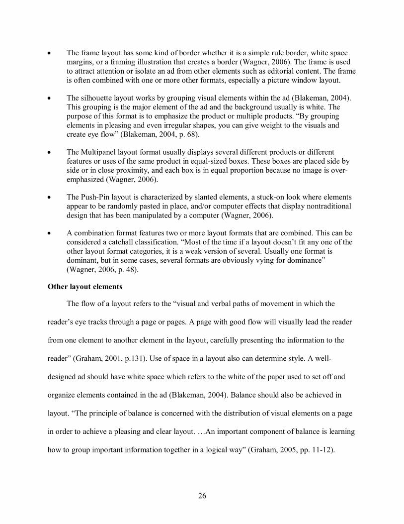
• The Mondrian Layout format does not focus on eye flow, but looks at visual size and color to lead the consumer’s eye to the largest photo or brightest color (Blakeman, 2004). When an advertiser wants to display several different products, emphasize different selling points, or explain different uses of the same product, a Mondrian layout is typically used. Mondrian Layout is recognizable by having at least one illustration emphasized as a large dominating rectangle, however “variations can use frames, have partial bleeds, overlap elements, or add shapes other than rectangles” (Wagner, 2006, p. 46).
• Distinctive and identifiable photography or illustrations can also dictate format. Also, the use of text atop a photograph in the picture window layout method invites the viewer to become part of the photograph and see themselves with the product (Blakeman, 2004). The picture window format usually features a large illustration depicting a portion of life or showing the product in a setting. Variations of the picture window format may show it combined with other formats.
26
• The frame layout has some kind of border whether it is a simple rule border, white space margins, or a framing illustration that creates a border (Wagner, 2006). The frame is used to attract attention or isolate an ad from other elements such as editorial content. The frame is often combined with one or more other formats, especially a picture window layout.
• The silhouette layout works by grouping visual elements within the ad (Blakeman, 2004). This grouping is the major element of the ad and the background usually is white. The purpose of this format is to emphasize the product or multiple products. “By grouping elements in pleasing and even irregular shapes, you can give weight to the visuals and create eye flow” (Blakeman, 2004, p. 68).
• The Multipanel layout format usually displays several different products or different features or uses of the same product in equalsized boxes. These boxes are placed side by side or in close proximity, and each box is in equal proportion because no image is over emphasized (Wagner, 2006).
• The PushPin layout is characterized by slanted elements, a stuckon look where elements appear to be randomly pasted in place, and/or computer effects that display nontraditional design that has been manipulated by a computer (Wagner, 2006).
• A combination format features two or more layout formats that are combined. This can be considered a catchall classification. “Most of the time if a layout doesn’t fit any one of the other layout format categories, it is a weak version of several. Usually one format is dominant, but in some cases, several formats are obviously vying for dominance” (Wagner, 2006, p. 48).
Other layout elements
The flow of a layout refers to the “visual and verbal paths of movement in which the
reader’s eye tracks through a page or pages. A page with good flow will visually lead the reader
from one element to another element in the layout, carefully presenting the information to the
reader” (Graham, 2001, p.131). Use of space in a layout also can determine style. A well
designed ad should have white space which refers to the white of the paper used to set off and
organize elements contained in the ad (Blakeman, 2004). Balance should also be achieved in
layout. “The principle of balance is concerned with the distribution of visual elements on a page
in order to achieve a pleasing and clear layout. …An important component of balance is learning
how to group important information together in a logical way” (Graham, 2005, pp. 1112).
27
Stemming from the use of photography and illustrations, layouts also can make use of a
certain theme such as modern, fantasy, fun, etc. throughout the ad and campaign. For example, in
January 2007, Disney launched its “Where Dreams Come True” campaign featuring celebrities
as fairy tale characters. One of the print advertisements portrays Scarlett Johansson as Cinderella
running down a flight of stairs as the clock strikes midnight and she leaves her glass slipper
behind. The tagline reads, “Where every Cinderella story comes true” (PRNewswire, 2007). The
use of simple typography and a large, captivating photo (also a picture window layout) lets the
viewer fall into the fairy tale theme and see that it is possible for real people, and not fictitious
characters, to take part in Disney’s “The Year of a Million Dreams” celebration.
Newark (2002) believes that style limits choices by creating a related set of design
decisions. For example, GAP advertisements usually feature model(s) in GAP clothing and the
corporate logo. Its ads completely revolve around a simplistic style based solely on the use of
photography and logo recognition. Design also can make a brand’s personality come to life
which is important because no purchase is devoid of emotion (Cooper & Press, 2003).
Incorporating Design into Brand Identity
There is compelling evidence that businesses using brand identity and design together
perform better. According to Bailey (2006), The Design Council found that a group of
companies recognized as effective users of design (based on their being nominated for and
winning designrelated awards) outperformed key FTSE indices by 200%. The study also shows
that while 90%t of rapidly growing businesses say design is integral or significant to them, only
26% of slowgrowth companies use design to their advantage. These findings provide evidence
that design impacts sales and purchases of brands (Bailey, 2006).
Troubled companies usually think a new advertising campaign will solve their problems.
Instead, it often makes things worse. McKee (2005) found that inconsistency in marketing is a

28
mistake that too many make. Struggling companies often try to find an advertising silver bullet to
a product, pricing, or competitive issue, and when a new campaign doesn’t immediately turn
things around, they toss it aside and look for the next big idea (McKee, 2005).
The most violated law to building a brand image is the law of consistency (Ries & Ries,
2002). Market conditions may change, but a brand’s image and message should not.
Consistency through Design
In order to build a brand image in the minds of consumers, a brand must create a specific
identity and build a relationship with customers by using the same “look and feel” in every
instance. According to Lindstrom (2001), the more elements (i.e. logos, icons, etc.) a consumer
can recognize and relate to a brand, the more effective a brand will be. Lindstrom (2001) says
consistency is the vital ingredient to building a brand and a necessity in all of a brand’s
communications. “Consistency builds familiarity, reliability, and, in the end, renders your brand,
ultimately, trustworthy” (Lindstrom, 2001, p. 153).
Attractive design across all parts of a brand enhances the impact of marketing
communications because it creates a tightly woven cohesion in consumers’ minds. Since design
and layout are an integral part of building a powerful brand, Moser (2003) feels a company’s
advertising should have cohesiveness to it, even if the advertising is spread across different
media. He asserts that certain colors should be apparent, design elements should repeat
themselves, the designs should either be rigid or fluid, layouts should either be visually oriented
or textoriented, and there should be consistency in photography. Other experts such as Marcus
et al. (1995) believe a brand’s marketing efforts should feature key characteristics such as brand
name, the prime colors and shapes of the packaging, and the central image positioning of the
brand. These features might remain identical in various markets, thus reducing communication
costs while creating a cohesive campaign.
29
Many companies realize the importance of consistency in their advertisements and strive to
maintain a consistent look through different means. Some companies restrict their
dealers/resellers to certain advertising agencies in order to preserve a consistent look to their ads.
For example, Suzuki strived for a consistent look and feel in its national and regional advertising
(Jackson, 2003). Jackson interviewed Tom Carnet, Suzuki’s American marketing director: “We
want to have a common theme with (our ads) now” says Carney. Suzuki is only one of many
companies in the auto industry that wants its dealers to adhere to advertising guidelines to
maintain brand identity. According to Jackson (2003), Chrysler group dealers must use the
company’s national ad agency BBDO Detroit to qualify for coop funds.
Another benefit to using design to create consistency is that a unified campaign can
actually soothe a consumer (Smith & Taylor, 2004). On a subconscious level, the same logo,
typography, and colors on all visuals help reassure the consumer while reinforcing a company’s
identity. Smith and Taylor (2004) looked at design in the airline industry and how these design
elements used in a consistent manner actually soothe the traveler. “Without this coordinated
corporate identity, cognitive dissonance can set in. There is a subconscious unease or discomfort
created by the inconsistent messages. A coordinated identity reduces this often unconscious
tension, which in turn creates a more satisfied passenger” (Smith & Taylor, 2004, p. 663). Smith
and Taylor say that the cohesive identity helps at a subconscious level next time the consumer
has to choose between two similar companies.
Other aspects to consistency are the concepts of unity and similarity. Using the same
colors, typefaces, and photo styles is not enough to be consistent; instead, all elements should be
unified and flow together. Unity refers to the overall cohesion and collection of a layout’s parts,
especially as each separate element relates to the rest of the design’s parts (Conover & Ryan,
30
2003). “Headlines, text, artwork, and the other graphic nuances of the page should fuse, be in
harmony or at the very least, be compatible with one another” (Conover & Ryan, 2003, p. 152).
Similarity means that elements that resemble each other in terms of color, size, or texture are
perceived to associate together (Koffka, 1955). In order for consistency in marketing to take
place, similar elements should carry over in all marketing materials, including Web sites.
Unity, consistency, cohesiveness, continuity – whichever term chosen, they all represent
that a campaign should flow together seamlessly. “The concept of continuity is, in large part,
why we seek visual order. It allows us to make sense of our environment, or understand that
things go together” (Conover & Ryan, 2003, p. 152). According to Conover and Ryan (2003), an
advertising campaign must be cohesive in order for the ads to reinforce one another and function
not just by themselves, but together over the period of the campaign. Besides concept, Conover
and Ryan (2003) believe that continuity is the single most important quality of an advertising
campaign. “… there must be strident similarities in each of the ads to hold them all together…
There are a lot of visual tools in the arsenal, including size, format, shape, color, typography,
spatial arrangements, photographic style, the voice and tone of the headlines, and copy”
(Conover & Ryan, 2003, p.180).
Although most companies use a variety of media to promote their brand message, many
companies such as The Absolut Spirits company rely mostly on magazine ads (Conover & Ryan,
2003). However, the increase of the Internet as the allinclusive medium is changing this. A
corporate Web site devoted to a company’s product is the one medium that companies can no
longer be without. The Web is now the place consumers turn to for instant information about
products. With 203.82 million people in the United States using the Internet in 2005 (ClickZ,
2007), it is vital for companies to have a presence online. More importantly, as the number of
31
consumer product’s Web sites increase, it benefits a brand to create a consistent visual identity to
differentiate itself from the competition.
Companies are realizing the importance of the Web and many have begun to research as to
how to ensure that their brand is represented consistently in a visual manner, especially on the
Internet.
Design and the Internet
Choi et al. (2005) states “visual representation is particularly important for Web sites
because most of the content and interactivities are eventually conveyed to the users through
visual stimuli.” In a study by Schenkamn and Jonsson (2000), they found that Internet users
formulated their first impressions of a brand based on the overall design of the brand’s Web
page. Lavie and Tractinsky (2004) developed a scale to measure the overall aesthetic quality of
Web pages based on visual factors (Choi et al., 2005).
However, because design can be a subjective topic, it is difficult to measure accurately the
effects of Web site design on consumers. According to Pearson and van Schaik (2003),
guidelines and standard design procedures for designing Web pages are not conclusively backed
by empirical evidence. One reason for this is due to the conflicting results obtained from
experimental studies thus calling for the need to further investigate so that accurate design
guidelines can be produced (Pearson & van Schaik, 2003). In addition, few studies have
suggested how to establish brand personality through the visual design of Web sites (Choi et al.,
2005). Therefore, it is difficult to find empirical research that suggests the importance of Web
design elements and their attributes for building a consistent, cohesive campaign for a brand.
32
Consistency Across Traditional Communication Activities and the Internet
In commercial environments, it can be difficult to communicate an online brand in the
absence of preconceptions already established through other channels (Rowley, 2004), thus
creating the need for a campaign to reinforce the same brand message by featuring a consistent
visual identity. Web sites are especially important to creating and maintaining consistent brand
identities of onlinebased products and services, such as eBay and iTunes. Consumers conduct
their entire business transaction on these Web sites, usually without any aid from a company
representative. Lindstrom (2006) found that up to 25% of Web users who fail to use an online
site successfully never return.
Design continuity and shared visual elements between a print advertisement and a brand’s
Web site can provide reassuring cues to the consumer when making a purchase online. The Web
site should leverage the traditional offline brand by including the same logo, color palette, and
typefaces, thus providing consumers with the same continuity and brand recognition online as
they see in the print advertisements. Consumers should easily recognize that the Web site is
legitimate, professional, and representative of the brand they trust, thus hopefully increasing
brand equity to consumers and/or increasing potential purchases. According to Whittle (2006),
Financial Times’ Web Site, FT.com, has simple and consistent presentation, and maintains its
brand elements by dominant usage of brand colors and related banners in every linked Web page
which makes the design very pleasant for the user. Nokia is another brand that recently made
changes to its brand identity in the 15 years since it entered the mobile phone market. Nokia
began its global brand revitalization with subtle changes of typefaces and typography to provide
more consistency across the brand’s territories while more emphasis was also given to its
“Connecting people” slogan (Carter, 2005).
33
According to Pearse (2006), BacardiMartini is overhauling the digital strategy for its
Martini brand in order to make the drink’s global profile more cohesive. A redesigned Martini
Web site is integrated with its new ‘Mondo Martini’ ad campaign, and acts as a portal, giving
individuals from Martini’s different markets a single product view that fits into the campaign.
McKee (2005) believes the king of consistency is Absolut Spirits. Absolut’s bottle campaign
began in 1980, and the series now has over 1,400 ads. There is even a Web site devoted to the
campaign (http://www.absolutads.com/). The consistency of this campaign is one reason Absolut
grew by nearly 15,000% in 15 years (McKee, 2005).
To create a full, comprehensive brand, a company must have a solid brand philosophy.
This philosophy or base should allow the brand to grow in all directions, covering all disciplines,
and all media channels (Lindstrom, 2006).
The importance of consistency needs to apply across a company’s entire communications
spectrum. Advertising that is not integrated into a company’s brand identity “is like a rogue
elephant” according to Campaign magazine in 1988 (Smith & Taylor, 2004). Adding a
company’s Web site to print marketing is yet another way to achieve an integrated campaign.
Companies need to think of their Web sites as an extension of their advertising campaign; in fact,
most print advertisements nowadays feature a Web address for consumers to visit for more
information. For this reason, it is necessary to examine how and why the brand’s Web site should
be an extension of the print advertising campaign.
Incorporating Print and Web
Advertisers also can use traditional media such as print advertising to connect a Web site
to a campaign by including the Uniform Resource Locator (URL) in a print ad. Evidence
suggests that the use of mixedmedia strategy such as promoting a Web site in magazine ads has
increased at a nearly exponential rate (Kanfer, Schlosser, & Ryan, 1996, as found in Schumann
34
and Thorson, 1999). The first URL for a commercial Web site appeared in PC Computing in
November 1994, and about a year later, 50% of all advertisements in PC Computing contained a
URL, with similar growth rates in other publications (Schumann & Thorson, 1999). In addition,
preliminary research suggests that using magazines to locate sites on the Internet is far from
uncommon; 65% of respondents reported finding out about Web sites through magazines
(Schumann & Thorson, 1999 as found in Gupta, 1995).
The way advertisers incorporate their Web sites into print advertising varies. For example,
many advertised URLs take the consumer to the company’s homepage, which may or may not
directly link to the product advertised in the print ad. The prominence and context of the URL in
the print ad, the degree to which the print ad attempts to persuade consumers to visit the Web
site, and the amount of information describing the Web site also varies considerably (Schumann
& Thorson, 1999). Companies should also utilize the “three click” rule in the navigation of their
Web sites in order to be userfriendly. This rule states that “no page of your site should be more
than two clicks away from any other page” (Haig, 2001, p. 34).
Gap of Knowledge
The most prominent gap in previous research is how design as a whole effects brand
identity. Researchers in the design field typically only focus on the use of individual design
elements when it comes to building brand identity and consistency. For example, it is generally
suggested that color, symbol or logo, shape, and layout are important visual elements in printed
materials [Choi et al., 2005 (Bedford, 2003; Bevlin, 1997; Marcus et al., 1995; No & Lim,
1999)]. Breakenridge (2001), J.S. Kim (2002), and Lindstrom and Andersen (2000) suggested
that design elements such as color and logos are the primary elements for embodying brand
personality on Web sites (Choi et al., 2005). However, these studies rely on subjective data and
anecdotal experience, rather than on empirical results. For example, J.S. Kim’s (2002) study of
35
the role of color in branding suggested using a specific color for the target brand personality.
However, the article mainly described the researcher’s subjective impressions, without the
support of a theoretical framework or empirical data (Choi et al., 2005). These types of
omissions make it difficult to explain why a particular design element is crucial to campaign
cohesiveness. To provide practical guidelines on how a brand can be cohesive in print, online,
and in other media, more research is required. This need is the focus behind the current research,
which concentrates on the relationship between design elements crucial to a successful print
campaign, and how that carries over to the Web.
As shown in previous literature, there are many aspects to a successful, welldesigned
advertising campaign. Because the Internet plays a major role on influencing consumers’
purchase intentions (Donnelly & Peter, 2004), a brand’s Web site is now an important tool to
communicate brand image; therefore, it is important to achieve a consistent visual identity in a
campaign. My study attempts to further understand how advertisers are using design elements to
create consistent visual identities between traditional advertising and the Internet.
36
CHAPTER 3 METHODOLOGY
Focus and Method
As discussed in previous chapters, my study utilizes a descriptive qualitative content
analysis while incorporating a designer’s perspective in order to investigate the following
research question: How are design and certain design elements in magazine print advertisements
reflected in the Web sites of the products advertised in order to create a consistent brand
identity? My study will examine common themes and divergences conveyed in both print and
online visual aspects of beauty product advertisements and Web sites.
Qualitative Content Analysis
My study employs a descriptive qualitative content analysis. Quantitative content analysis
“is the systematic and replicable examination of symbols of communication, which have been
assigned numeric values according to valid measurement rules, and the analysis of relationships
involving those values using statistical methods…” (Riffe et al., 1998, p. 20). Qualitative content
analysis differs from quantitative because it employs inductive, subjective, theorygenerating
processes while quantitative research deals with processes that are deductive, objective, and
theorytesting (McNabb, 2002). According to Babbie & Rubin (2005), qualitative analysis
predates quantitative analysis and employs “methods for examining social research data without
converting them to numerical format” (p. 527). The aim of qualitative content analysis is to be
structured and systematic, but still be analytic by looking at the depth and breadth of the data
being analyzed. Maxwell (2005) suggested that the main strategy behind qualitative research is
coding, and the goal of coding is to take the data and “rearrange them into categories that
facilitate comparison between things in the same category and that aid in the development of
theoretical concepts” (p. 96).
37
Krippendorff (2004) provides a basic definition of quantitative content analysis in defining
it as “a research technique for making replicable and valid inferences from texts (or other
meaningful matter) to the contexts of their use” (p. 18). However, Wimmer and Dominick (2005)
state that content analysis is “a method of studying and analyzing communication in a
systematic, objective, and quantitative manner for the purposes of measuring variables” (p. 150).
In addition, Krippendorff (2004) also identifies four primary advantages of content analysis: it is
unobtrusive; it is context sensitive and therefore allows the researcher to process data that is
significant, meaningful, informative, and representational of others; it can cope with large
volumes of data; and most importantly, it is unstructured which preserves the conceptions of the
data’s sources. According to McMillan (2000), “… advantages seem to apply equally to the Web
as to media such as newspapers and television. The capability of coping with large volumes of
data is a distinct advantage in terms of Web analysis.”
Content analysis, both quantitative and qualitative, has been criticized for its limitations.
The findings for a particular content are limited to the framework of the categories and the
definitions employed in that analysis (Wimmer & Dominick, 2005). In order to minimize this
limitation, quantitative content analysis requires that categories should be defined precisely so
that other researchers can apply the same tools to the same data and achieve the same results
(Wimmer & Dominick, 2005, p.151). Content analysis is also limited, in that there is a lack of
messages relevant to the research; it can be time consuming and expensive, because analyzing
and classifying large volumes of content is both laborintensive and tedious (p. 154).
When applying content analysis techniques to the Web, researchers need to carefully
consider each of the primary research steps: formulating research questions and/or hypotheses,
38
sampling, data collection and coding, training coders and checking the reliability of their work,
and analyzing and interpreting data (McMillan, 2000).
Sample
For the purposes of my study, a purposive sampling technique was used. Barber and Burt
(1996) define a purposive sample as one in which the researcher uses personal judgment to
determine if certain items of a population best serve the purpose of the study. Dominick and
Wimmer (2005) confirm the importance of purposive sampling in content analysis as they found
that from 1971 to 1995, 68% of Journalism Quarterly content analyses used a purposive sample.
Purposive sampling is especially useful when “you want to construct a historical reality, describe
a phenomenon, or develop something about which only a little is known” (Kumar, 2005, p. 179).
The researcher makes deliberate choices in purposive sampling, although this does not suggest
any bias in the nature of the choices made (Ritchie & Lewis, 2003). “The process of purposive
samplings requires clear objectivity so that the sample stands up to independent scrutiny”
(Ritchie & Lewis, 2003, p. 80).
For my study, the sample consisted of beautyrelated ads from the top three women’s
magazines in the U.S. market ranked by average circulation for the first six months of 2006 (as
reported by the Audit Bureau of Circulation for the Magazine Publishers of America) because
the list reflects a variety of publications with varying types of advertisements. In rank order, the
list provided, Better Homes and Gardens, Good Housekeeping, and Ladies’ Home Journal.
According to Better Homes and Gardens’ Web site (2007), the magazine’s readership is
80.2% women with most of its readership falling into the 25 to 54 age range (60.8%). Good
Housekeeping’s audience is 89.1% women with 57.4% of its readers in the 25 to 54 age
category, and 51.7% in the 50plus category (GoodHousekeeping.com, 2007). According to
39
Ladies’ Home Journal’s Web site (2007), its readership is 100% women and 92% of its readers
are over 30.
Beautyrelated advertisements were chosen because the cosmetics and toiletries industry is
experiencing high levels of growth. According to Euromonitor International reports, the cosmetic
industry is expected to reach global sales of more than $300 billion by 2010. In addition, the
personal care product category spent $2.9 billion in 2006 on advertising, a 3.1% growth from
2005 (TNS, 2006). Women’s magazines were used to obtain the sample advertisements as they
usually feature many beauty and cosmeticrelated advertisements.
The first four fullpage advertisements for beauty, skincare, hair care, or makeup products
from the March 2007 issue of Better Homes and Gardens and the first three fullpage
advertisements related to beauty products from Good Housekeeping and Ladies’ Home Journal
were chosen for coding (refer to Appendix D for samples collected). In addition, if a duplicate ad
or brand was present, the ad featured in the higherranking magazine was used. A total of 10 ads
and their corresponding 10 Web sites were chosen based if the advertised product featured a
beauty, skincare, makeup, or hair care element. The brands examined included Dove, Avon,
Infusium, Garnier, Cover Girl, Aveeno, Almay, L’Oreal, RoC, and NIVEA.
Once the print advertisements were selected, their corresponding Web sites automatically
were chosen because URLs appeared in all 10 print ads. The Web sites were collected during the
calendar dates of February 21 and March 24, 2007.
It was decided to choose these magazines during one month rather than a few magazines
over a particular time period for two reasons. First, there is no baseline measurement of Web
presence and print advertising strategy. Second, the Web is constantly changing, making any
timesensitive study difficult. The Web is evolving so quickly that to investigate Web presence
40
in print advertisements, even a oneyear time period is questionable. That is, what Web
advertising looks like in December of one year may be very different from what it looked like 11
months earlier. Therefore, it was decided to focus on a specific month to gain an understanding
of the exact state of advertising during that particular timeframe. This can provide a point to
compare against for future studies.
Materials (Apparatus)
Materials required to conduct my study included a recording instrument or code sheet (see
Appendix A), and a codebook (see Appendix B). In addition, issues of the magazines from which
the ads appeared were needed to obtain the sample. Once the advertisements were obtained from
the physical issues of the magazines, an Internetenabled computer was then used as a resource
for reaching the advertised products’ Web sites.
After the ads were obtained, the ads were analyzed using codes established solely by the
researcher due to the lack of research done in the area of design consistency. Since no exisiting
instrument was found, the researcher focused on design principles to establish the codes. The
researcher conducted a preliminary examination of the samples to help determine what common
elements to analyze. The following study examines typography, color, layout style, photographic
illustration, and corresponding Web site characteristics.
The coding sheet for the print ads focused on design elements: presence of logo (both in
advertisement alone and/or on the product itself); color schemes; typography style; photographic
style; and presence of the Web address. For the Web sites, the coding sheet also examined design
elements such as logo, color, typography, and photographic style. Also, whether the URL listed
in the print advertisement took the user directly to the product’s home page, or a general
corporate page was noted. In addition, my study investigated whether the Web site not only
41
featured a consistent visual identity, but also whether it was running the same ad campaign that
appeared in the print advertisement.
This coding instrument allowed the observer to analyze each advertisement in order to
study and compare similarities and differences between integrated advertising campaigns.
Analyzing the results of the coding will produce a list of design elements that are most
commonly found in magazine advertisements. It will also accentuate differences between the
visual identity found in print ads and the respective brand’s Web site.
Items Coded Within Study
Below are definitions of each item the researcher examined and the directions to be
followed during the coding process. The following categories will be coded for within each ad in
order to uncover commonalities and differences:
Print Ad
• Source of Ad: List magazine title, year, month.
• Brand/product: Describe what it is, how it is used, and any other pertinent information
• Industry: Please circle whether the ad is for skincare, haircare, makeup, or other
• Show Product: Does the ad physically display the product being advertised?
• Packaging: Describe how the brand is defined by the look of the package/product
• Product positioning: state if known; if not, can you assume from what you see?
• Target Audience: Who is the main target consumer? How do you know? (Assumption? Stated in a corporate document? Explain if from the ad itself; by looking at model used, typeface, colors, etc.)
Elements of Print Ad
• Headline: Is there a headline present to draw the viewer in? Or is it just the product name?
• Visual (photograph/art/other): Is a visual used? Illustration or actual photo? If so. describe photograph/visual. Is the visual in color or another form such as sepia or black and white?

42
• Copy: Is there copy present? Promotional text? Disclosures? Tagline? Is there a URL present in the copy?
• Logo: Record whether a logo is used within the ad. Does the logo stand alone in the ad? Is the logo visible on the product or anywhere else in the ad? Is the logo an image only, or does it include text?
• Other: Is there another element present in the ad? A sample to try the product? A coupon?
Layout in Print Ad
• What type of format is used in the ad?
Design Elements in Print Ad
• Rules/Borders/Panels: Are any of these elements present?
• Color: Is there a color scheme present in the advertisement? Does the ad feature color in the text? Does color used in the ad appear to be a main focus? Does the ad use one color, spot color, or full color? Please describe and explain. Also record the colors emphasized, if any. This code does not refer to color photos.
• Typography: Is there a specific/unique typestyle used in the advertisement? This code does not refer to typography used in the logo
• Overall Design principles: Brief discussion of what the art director wanted the reader to look at based on: Unity, balance (symmetrical vs. asymmetrical placement; right/left weight), proportion (size comparison), contrast (value and color comparison) and movement.
• Definition of the brand: based on the ad, what is the definition of the brand?
Product Web site
• Web URL: List URL and date accessed. Does the URL take the user directly to the product Web page?
• Show Product: Does the Web site physically display the product being advertised?
• Campaign: Is the same campaign used online as in the print advertisement?
Elements of product Web site
• Headline: Is there a headline present to draw the viewer in? Or is it just the product name?
43
• Visual (photograph/art/other): Is a visual used? Illustration or actual photo? If so. describe photograph/visual. Is the visual in color or another form such as sepia or black and white?
• Copy: Is there copy present? Promotional text? Disclosures? Tagline? Other copy such as product reviews/testimonials etc?
• Logo: Record whether a logo is used on the Web site. Does the logo stand alone on the site? Is the logo visible on the product if the product is shown online? Is the logo different or the same from that in the print ad?
• Other: Is there another element present on the Web site? A coupon?
Layout of Web site
• Does the Web site fit into a particular layout format?
Design Elements of Web site
• Rules/Borders/Panels: Are any of these elements present?
• Color: Is there a color scheme present on the Web site? Does the Web site the same colors as the print ad? Does the Web site feature color in the text? Does color used in the Web site appear to be a main focus? Does the Web site use one color, spot color, or full color? Please describe and explain. Also record the colors emphasized, if any. This code does not refer to color photos.
• Typography: Is there a specific/unique typestyle used on the Web site? This code does not refer to typography used in the logo
• Overall impression: Is there consistency between the print ad and the Web site? Does the advertising promote a consistent brand identity? Please describe overall impressions of how the print ad’s use of design along with the Web site’s use of design do or do not perpetuate a cohesive brand identity.
Procedure
After the code sheet and code book were constructed, all 10 advertisements and their
respective Web sites’ content were qualitatively analyzed. Common themes, similarities, and
differences were recorded and described in detail in order to compare and contrast ways that
brands maintained brand identity by use of design. After the analysis was completed, results
44
were reported in general terms, but then print ads and Web sites best exemplifying each finding
were chosen for detailed explanation and description.
45
CHAPTER 4 FINDINGS
This section presents the results of a descriptive content analysis of 10 advertisements for
beauty products and their Web sites based on the items discussed in the methods chapter. Within
each section, a discussion of the similarities and differences between an ad and its Web
counterpart is used to show the general patterns presented that help achieve consistency in brand
identity.
ALMAY Hydracolor Lipstick
ALMAY’s Print Advertisement
The target consumers for ALMAY’s hydracolor lipstick are women 25 to 54 (based on
Good Housekeeping’s main readership) who want moist lips with a choice of colors. In the full
page print advertisement (see Appendix D, Figure D1), the art director displays a closeup
photographic illustration of what may be assumed to be all lipsticks in the product line. The
packaging is sprinkled with droplets of water to visualize the moistness of hydracolor lipstick.
As the illustration ends at the page margins, some of the lipsticks are cropped, giving the
impression there are more colors than can be shown in this one ad. In fact, there are 32 colors in
the product line, and only 28 are pictured. Since print ads may be more targeted to someone who
plans to go to a brickandmortar store, the consumer may be curious to know if she might find
other shades of lipstick she would be interested in purchasing. The entire lipstick package is
included as a second illustration inset into the main background illustration.
The art director chose to use a picture window layout format to display the large
illustration of a variety of product colors; a silhouetted image of the packaging was included to
give cues as to what the consumer should look for on the shelves while shopping; and the white
space margin frame format may be because bleeds are not in the advertiser’s budget.

46
To emphasize an upbeat and fun message, the copywriter chose exciting words such as
revitalizes, nourishes, refreshing, rich and sensation. While most type elements in the print ad are
set in a simple sans serif typeface, the headline is much larger and in a Modern Roman Serif
typeface, the same found on the product package.
All type except the word “new” is dark blue. “New” is highlighted as a reversal in a bright
pink panel; the blue body copy is on a transparentwhite panel.
The ALMAY logo is the same dark blue printed within the main illustration. It almost acts
as a caption to identify the lipstick as an ALMAY product. The lowercase “a” is used on the
packaging as a secondary logo.
The art director rounded the top right and bottom left corners of the illustration, as well as
the left side of the transparentwhite type panel. These act as a unifying device to repeat the
shape of the lipstick in the main illustration.
The URL in the print ad (almay.com) takes you to the home page where this campaign
does appear. The URL to the product page is too long and it makes sense to bring the reader to
the home page.
The ALMAY Web Site
The use of a rotating Flash feature on the home page allows multiple campaigns to be
featured, so no matter which ad the readers saw in print, they get the same campaign on the Web.
Flash is a multimedia authoring and playback system from Adobe and is responsible for most
advertisements, animations, and video components found on today’s Web sites.
The same illustration of the lipsticks is on the home page of ALMAY’s Web site as in the
print ad (see Appendix D, Figure D1); however, the image is not as tightly cropped. On the
product page link for the hydracolor line, the art director uses the image of the sealed packaging,
as well as swatches of all 32 shades. Showing all colors on the Web site will help the consumer
47
make purchase decisions before going to a brickandmortar store, or when going to an online
retailer.
Layout formats are not as structured on Web sites (Baxley, 2002), but there is a suggestion
of picture window display on the ALMAY homepage with a white panel for the copy. The
lipstick product page displays a silhouette in an upright position similar to the inset image in the
print ad. The hydracolor product Web page uses the same rounded corner that was in the print ad
and is used on the top right of the product page and home page, adding unity between the print
ad and the Web site design.
The ALMAY home page and product page includes the same sans serif typeface as the
print ad, even though the only place a Modern Roman Serif type is seen is the lowercase “a”
secondary logo in a panel highlighting the ALMAY product guide and on a side panel
emphasizing “hypoallergenic.” Some of the copywriting is the same or similar to the print
version; however, the product Web page does not have the “Hydration sensation” headline.
The main color system is carried from the print ad to the Web site, although the blue is
only in the navigation elements, and the basic text is black. The sans serif blue ALMAY
logotype is not tied to the illustration on the Web site; but is used as a heading on the home page
and product page. The lowercase “a” is also used as a secondary logo on those pages.
ALMAY Overview
ALMAY’s advertising promotes a consistent brand identity by using the same illustration,
typefaces, logo and secondary logo, similar layout formats, repetition of colors, and basic
copywriting words and phrases to emphasize the revitalizing, refreshing, and beautiful image.
ALMAY’s Hydrating Lipstick positioning and message: “so your lips feel as beautiful as they
look” achieves its goal for the consumer to realize that their product will provide smooth, moist
lips.
48
Aveeno Active Naturals Daily Moisturizing Body Wash
Aveeno’s Print Advertisement
The target consumers for Aveeno Active Naturals Daily Moisturizing Body Wash are
women 25 to 54 (based on Good Housekeeping’s main readership) who are interested in having
clean, healthy skin by using a product with natural ingredients. In the fullpage print
advertisement (see Appendix D, Figure D2), the art director displays a halfpage, closeup,
color photograph of a brunette woman in her late twenties in the shower. The packaging is on the
bottom right of the ad and features soap suds running down the left side of the bottle. As the
model in the photograph is looking down to the right, it is as if she’s angling her eyes to the
bottle at the bottom of the page. Sprigs of oats and an illustration showing water droplets to
depict the moisture your skin will obtain when you use the product are included as additional
illustrations inset into the main background.
The art director chose to use a picture window layout format to display the large
photograph of the woman enjoying her shower with Aveeno; a silhouetted image of the
packaging was included to give cues as to what the consumer should look for on the shelves
while shopping.
To emphasize a soothing and smoothskin message, the copywriter chose naturalrelated
words: natural, replenishes, oatmeal, sunflower oils, and dermatologists. All of the type elements
in the print ad are set in a simple sans serif typeface, including those on the product package.
All type except the type in the illustration is black. “Natural oatmeal formula” and
“replenishes moisture” are highlighted as a reversal in a green panel. The black body copy is on a
cream panel. The Aveeno logo, a serif typeface, is black and is printed within the cream
background panel as well as on the packaging.
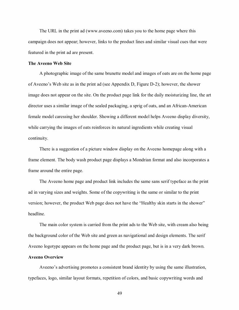
49
The URL in the print ad (www.aveeno.com) takes you to the home page where this
campaign does not appear; however, links to the product lines and similar visual cues that were
featured in the print ad are present.
The Aveeno Web Site
A photographic image of the same brunette model and images of oats are on the home page
of Aveeno’s Web site as in the print ad (see Appendix D, Figure D2); however, the shower
image does not appear on the site. On the product page link for the daily moisturizing line, the art
director uses a similar image of the sealed packaging, a sprig of oats, and an AfricanAmerican
female model caressing her shoulder. Showing a different model helps Aveeno display diversity,
while carrying the images of oats reinforces its natural ingredients while creating visual
continuity.
There is a suggestion of a picture window display on the Aveeno homepage along with a
frame element. The body wash product page displays a Mondrian format and also incorporates a
frame around the entire page.
The Aveeno home page and product link includes the same sans serif typeface as the print
ad in varying sizes and weights. Some of the copywriting is the same or similar to the print
version; however, the product Web page does not have the “Healthy skin starts in the shower”
headline.
The main color system is carried from the print ads to the Web site, with cream also being
the background color of the Web site and green as navigational and design elements. The serif
Aveeno logotype appears on the home page and the product page, but is in a very dark brown.
Aveeno Overview
Aveeno’s advertising promotes a consistent brand identity by using the same illustration,
typefaces, logo, similar layout formats, repetition of colors, and basic copywriting words and

50
phrases to emphasize the natural, healthier, smoother image. By using colors found in nature,
highlighting the use of natural ingredients, and by showing images of oats both on the Web and
in the print ad, Aveeno brings its products back to the original source of beauty: nature.
Aveeno’s Active Naturals Daily Moisturizing Body Wash positioning and message: “discover
nature’s secret for healthy, beautiful skin” achieves its goal for the consumer to realize that their
product will provide smooth, moistureladen skin.
Avon Skin So Soft Fusions Body Wash
Avon’s Print Advertisement
The target consumers for Avon’s Skin So Soft Fusions Body Wash are women 25 to 54
(based on Better Homes and Garden’s main audience profile) who are Avon users and who want
soft skin from a unique product — a dualaction body wash. In the fullpage print advertisement
(see Appendix D, Figure D3), the art director displays a closeup, halfpage illustration of the
body wash being squeezed from the bottle onto a white body puff.
Water is splashed around the packaging to visualize it in the shower and represents the
product in action. As the photograph bleeds at the top of the page, some of the bottle is cropped,
giving the impression that there is a hand squeezing the product out. Since Avon is not available
in stores, this print ad shows the product in action for the consumer to see what she can purchase.
The art director chose to use a silhouette layout format to display the large illustration of
the body wash in action. This silhouetted image of the packaging was included to give cues as to
what the consumer can expect to receive after she calls her Avon Representative.
To emphasize a feminine and smooth message, the copywriter chose descriptive words
such as silky, polishing, soften, and hydrate. All of the type elements in the print ad are set in a
simple sans serif typeface, including those on the product package.
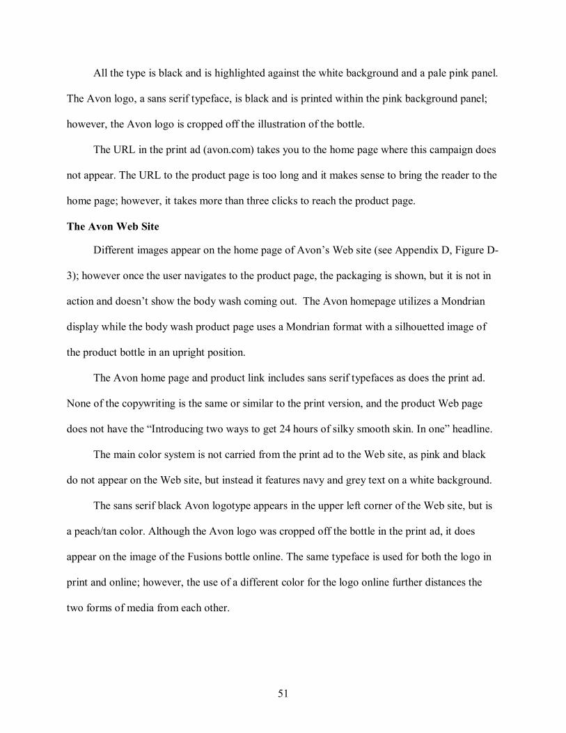
51
All the type is black and is highlighted against the white background and a pale pink panel.
The Avon logo, a sans serif typeface, is black and is printed within the pink background panel;
however, the Avon logo is cropped off the illustration of the bottle.
The URL in the print ad (avon.com) takes you to the home page where this campaign does
not appear. The URL to the product page is too long and it makes sense to bring the reader to the
home page; however, it takes more than three clicks to reach the product page.
The Avon Web Site
Different images appear on the home page of Avon’s Web site (see Appendix D, Figure D
3); however once the user navigates to the product page, the packaging is shown, but it is not in
action and doesn’t show the body wash coming out. The Avon homepage utilizes a Mondrian
display while the body wash product page uses a Mondrian format with a silhouetted image of
the product bottle in an upright position.
The Avon home page and product link includes sans serif typefaces as does the print ad.
None of the copywriting is the same or similar to the print version, and the product Web page
does not have the “Introducing two ways to get 24 hours of silky smooth skin. In one” headline.
The main color system is not carried from the print ad to the Web site, as pink and black
do not appear on the Web site, but instead it features navy and grey text on a white background.
The sans serif black Avon logotype appears in the upper left corner of the Web site, but is
a peach/tan color. Although the Avon logo was cropped off the bottle in the print ad, it does
appear on the image of the Fusions bottle online. The same typeface is used for both the logo in
print and online; however, the use of a different color for the logo online further distances the
two forms of media from each other.
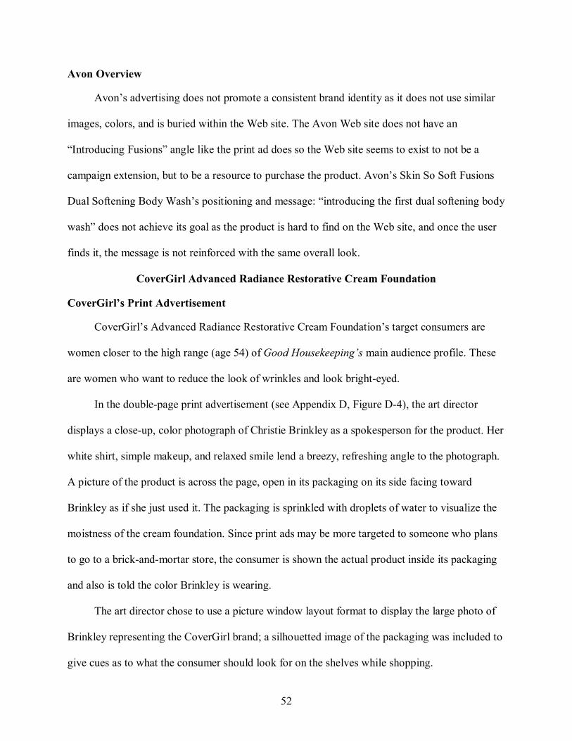
52
Avon Overview
Avon’s advertising does not promote a consistent brand identity as it does not use similar
images, colors, and is buried within the Web site. The Avon Web site does not have an
“Introducing Fusions” angle like the print ad does so the Web site seems to exist to not be a
campaign extension, but to be a resource to purchase the product. Avon’s Skin So Soft Fusions
Dual Softening Body Wash’s positioning and message: “introducing the first dual softening body
wash” does not achieve its goal as the product is hard to find on the Web site, and once the user
finds it, the message is not reinforced with the same overall look.
CoverGirl Advanced Radiance Restorative Cream Foundation
CoverGirl’s Print Advertisement
CoverGirl’s Advanced Radiance Restorative Cream Foundation’s target consumers are
women closer to the high range (age 54) of Good Housekeeping’s main audience profile. These
are women who want to reduce the look of wrinkles and look brighteyed.
In the doublepage print advertisement (see Appendix D, Figure D4), the art director
displays a closeup, color photograph of Christie Brinkley as a spokesperson for the product. Her
white shirt, simple makeup, and relaxed smile lend a breezy, refreshing angle to the photograph.
A picture of the product is across the page, open in its packaging on its side facing toward
Brinkley as if she just used it. The packaging is sprinkled with droplets of water to visualize the
moistness of the cream foundation. Since print ads may be more targeted to someone who plans
to go to a brickandmortar store, the consumer is shown the actual product inside its packaging
and also is told the color Brinkley is wearing.
The art director chose to use a picture window layout format to display the large photo of
Brinkley representing the CoverGirl brand; a silhouetted image of the packaging was included to
give cues as to what the consumer should look for on the shelves while shopping.
53
To emphasize a quality product and “obtain youthful skin now” message, the copywriter
chose restorative words: wake up tired eyes, reduce the look of wrinkles, agedefier, rested,
young, and glows. This is further perpetuated by the use of Christie Brinkley’s quote which runs
across the ad, “Think of it as instant beauty sleep in a jar.” While most type elements in the print
ad are set in a simple serif typeface, Brinkley’s quote attribution and the product name are a sans
serif typeface, the same found on the product package.
The photograph of Brinkley and the product provides most of the color in the print ad;
however, grey is used for all text and the product name and Brinkley’s quote attribution are in
shades of blue. The CoverGirl logotype is a sans serif typeface, and appears in white while
running across the top of Brinkley’s head, which is difficult to read against her blond hair and
white background. An abbreviated version of the logo, CG, appears on the lid of the packaging
as a secondary logo.
The URL in the print ad (covergirl.com) takes you to the home page where this campaign
does appear on a rotating Flash feature. The URL to the product page is too long, and it makes
sense to bring the reader to the home page.
The CoverGirl Web Site
The use of a rotating Flash feature on the home page allows multiple campaigns to be
featured, so no matter which ad the readers saw in print, they get the same campaign on the Web.
The same photographic image of Christie Brinkley and the packaging appear on the home page
of CoverGirl’s Web site as in the print ad (see Appendix D, Figure D4). On the product page
link for the Restorative Cream Foundation, the art director uses the same image of the sealed
packaging. The product line page also shows the other Advanced Radiance products in similar
packaging. Showing the other products in the line on the Web site will help make the consumer
54
become more familiar with the brand and can also encourage purchase decisions for the rest of
the product line.
Online, the product page for Advanced Radiance Restorative Cream Foundation uses a
Mondrian format. Compared with its print ad, the product Web site has some Flash “picture
window elements” inside the Mondrian layout, but itself is not a picture window format.
The CoverGirl home page and product link includes the same sans serif typeface as the
print ad; however, the serif typeface in the print ad does not appear on the Web site. Some of the
copywriting is the same or similar to the print version. However, on the CoverGirl Web site,
several headlines are used: the home page and the product page treat “Advanced Radiance” as
the headline while the product line page uses “Defy the signs of aging.” The product line page
does use “Think of it as instant beauty sleep in a jar.”
The main color system is carried from the print ad to the Web site, with black text and
navigational elements in shades of blue and grey highlighted against a white background. The
sans serif CoverGirl logotype is present on the top left of all Web pages, but is in navy blue.
CoverGirl Overview
CoverGirl’s advertising promotes a consistent brand identity by using the same images,
typefaces, logo, similar layout formats, repetition of colors, and basic copywriting words and
phrases to emphasize the restorative, refreshing, and beautiful image. CoverGirl treats its Web
site as an extension of the print ad, but with multiple opportunities to find out more about the
entire Advanced Radiance line. CoverGirl’s Advanced Radiance Restorative Cream Foundation
positioning and message: “easy, breezy, beautiful CoverGirl” achieves its goal for the consumer
to realize that the product will reduce wrinkles while giving the user that young, rested look.
55
Dove ProAge
Dove’s Print Advertisement
Dove ProAge’s target consumers are the older women (age 54) of Better Homes and
Garden’s main audience profile; these women are interested in using a product made just for
them. In the multipage, foldout print advertisement (see Appendix D, Figure D5), the art
director displays fullpage color photos of middleaged, naked, greyhaired women of different
races in nonsuggestive poses. The images of these middleaged women represent the “true”
consumer – those who have imperfections, but are comfortable in their skin. Due to the foldout
feature of the ad, the photograph of the AfricanAmerican woman is the only visible one until the
user flips open the other pages. A silhouette photo of the ProAge collection of products stands
out against the allwhite background of the righthand page.
The art director chose to use a picture window layout format to display the large images of
the naked, middleaged women – a rarity in advertising where skinny models are the norm; a
silhouetted image of the packaging was included to give cues as to what the consumer should
look for on the shelves while shopping.
To emphasize its different approach to hair and skincare products, the copywriter chose to
say what Dove ProAge is, is not, and to introduce it: antiage, too old, new and that Dove is pro
age. All of the type elements in the print ad are set in a simple sans serif typeface, except for a
serif typeface found on the product package.
The print ad features gray and maroon text on a white panel while reverse text appears over
the photographs. The Dove ad does not use its logo in a large format. The Dove logo is visible
only on the product packaging. To tie the page together, the designer pulled out the small gray
dove in the logo and placed it next to the URL.
56
The art director uses the headline “too old to be in an antiaging ad,” which works as a
caption in this ad as it runs across the three panels of the advertisement. This acts as a unifying
device to bring the three images together.
The URL in the print ad (doveproage.com) takes you to the home page where this
campaign does appear. Since Dove created a dedicated Web site for this product line, its
branding effort begins the moment the user reaches the Web site.
The Dove ProAge Web Site
The same photographic image of the AfricanAmerican woman is on the home page of
Dove’s Web site as in the print ad (see Appendix D, Figure D5); however, the image is cropped
tighter. In addition, similar images of the product line are used on the product page. On the
product line page for ProAge, the art director uses similar images of the packaging that appeared
in the print ad. Showing the packaging of the entire line on the Web site further reinforces brand
identity which can help encourage purchase decisions in the store.
On the Web, the Flash element on the home page uses the same image of the African
American woman in the print ad. This creates a picture window element, but the actual layout of
the product page on the Web site uses a Mondrian format. The products alternate from being on
the left and right side of the pages with the text directly next to it.
The Dove home page and product link includes the same sans serif typeface as the print ad;
however, product names are in a lowercase serif typeface which helps to add differentiation on
the page. Because the copy in the print ad is minimal, the same angle appears online, but is not
wordforword. However, neither the home page nor the product line page has the “too old to be
in an antiaging ad” headline.
The main color system is carried from the print ad to the Web site, with the Web site
featuring gray body copy, product names and links in maroon all against a white background.
57
The serif grey Dove logo is present on the top left of the home page and product page. The image
of the dove is also used as a secondary logo on those pages beside the “click here to learn more”
links.
Dove Overview
Dove’s advertising promotes a consistent brand identity by using similar images,
typefaces, logo and secondary logo, similar layout formats, repetition of colors, and basic
copywriting words and phrases to emphasize the daring, positive, and diverse angle to its brand.
Dove treats its Web site as a very important part of the campaign as it is a detailed source that
not only expands upon the campaign, but also brings in new elements like casting calls for
ProAge women and links to try the new line of products. Dove’s ProAge positioning and
message: “beauty has no age limit” achieves its goal for the consumer to realize that all women
can feel beautiful no matter their age, color, or size and that Dove’s ProAge will help them do
that.
Garnier Nutritioniste UltraLift cream
Garnier’s Print Advertisement
The target consumers for Garnier Nutritioniste’s UltraLift cream are women 25 to 54
(based on Better Homes and Garden’s main audience profile) who are interested in firming their
skin and using nutrients found in nature to help their skin. In the doublepage print advertisement
(see Appendix D, Figure D6), the art director displays an isolated, closeup photograph of a
vibrant salmoncolored piece of sushi with a pair of dark grey chopsticks lying in front. On the
opposite page is the bottle of “UltraLift” with a silver spoon laying in front of it with a small
dollop of the cream in it. A small piechart illustration of vitamin capsules, a slice of kiwi, and
part of a molecular chain is included as a second illustration inset into the copy block area. Since
print ads are usually targeted to the consumer who plans to go to a brickandmortar store, the
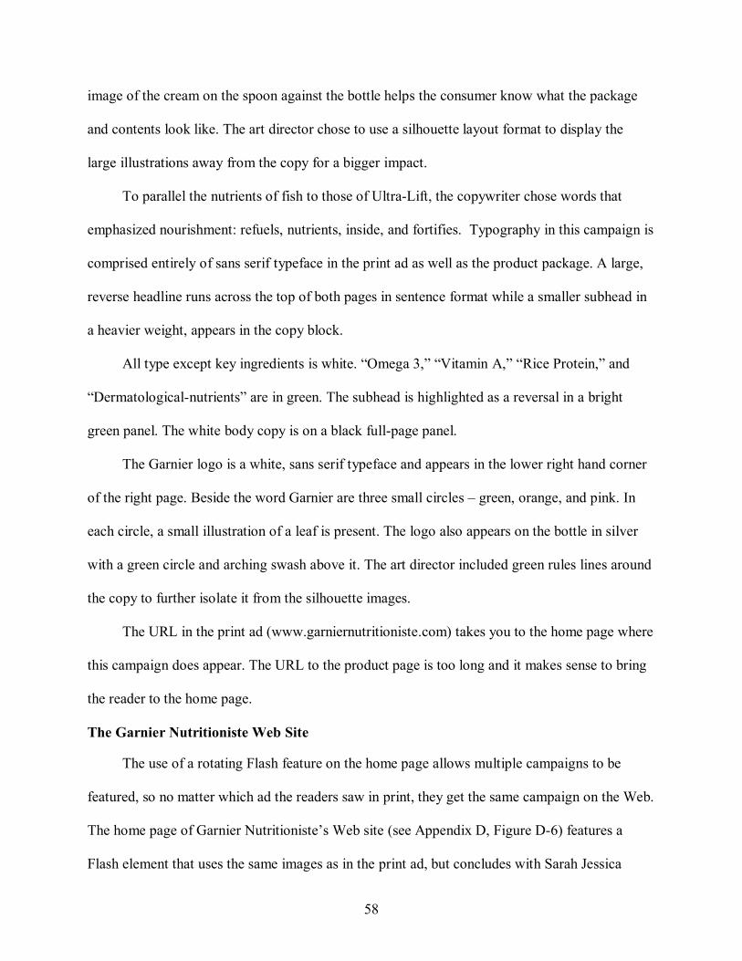
58
image of the cream on the spoon against the bottle helps the consumer know what the package
and contents look like. The art director chose to use a silhouette layout format to display the
large illustrations away from the copy for a bigger impact.
To parallel the nutrients of fish to those of UltraLift, the copywriter chose words that
emphasized nourishment: refuels, nutrients, inside, and fortifies. Typography in this campaign is
comprised entirely of sans serif typeface in the print ad as well as the product package. A large,
reverse headline runs across the top of both pages in sentence format while a smaller subhead in
a heavier weight, appears in the copy block.
All type except key ingredients is white. “Omega 3,” “Vitamin A,” “Rice Protein,” and
“Dermatologicalnutrients” are in green. The subhead is highlighted as a reversal in a bright
green panel. The white body copy is on a black fullpage panel.
The Garnier logo is a white, sans serif typeface and appears in the lower right hand corner
of the right page. Beside the word Garnier are three small circles – green, orange, and pink. In
each circle, a small illustration of a leaf is present. The logo also appears on the bottle in silver
with a green circle and arching swash above it. The art director included green rules lines around
the copy to further isolate it from the silhouette images.
The URL in the print ad (www.garniernutritioniste.com) takes you to the home page where
this campaign does appear. The URL to the product page is too long and it makes sense to bring
the reader to the home page.
The Garnier Nutritioniste Web Site
The use of a rotating Flash feature on the home page allows multiple campaigns to be
featured, so no matter which ad the readers saw in print, they get the same campaign on the Web.
The home page of Garnier Nutritioniste’s Web site (see Appendix D, Figure D6) features a
Flash element that uses the same images as in the print ad, but concludes with Sarah Jessica
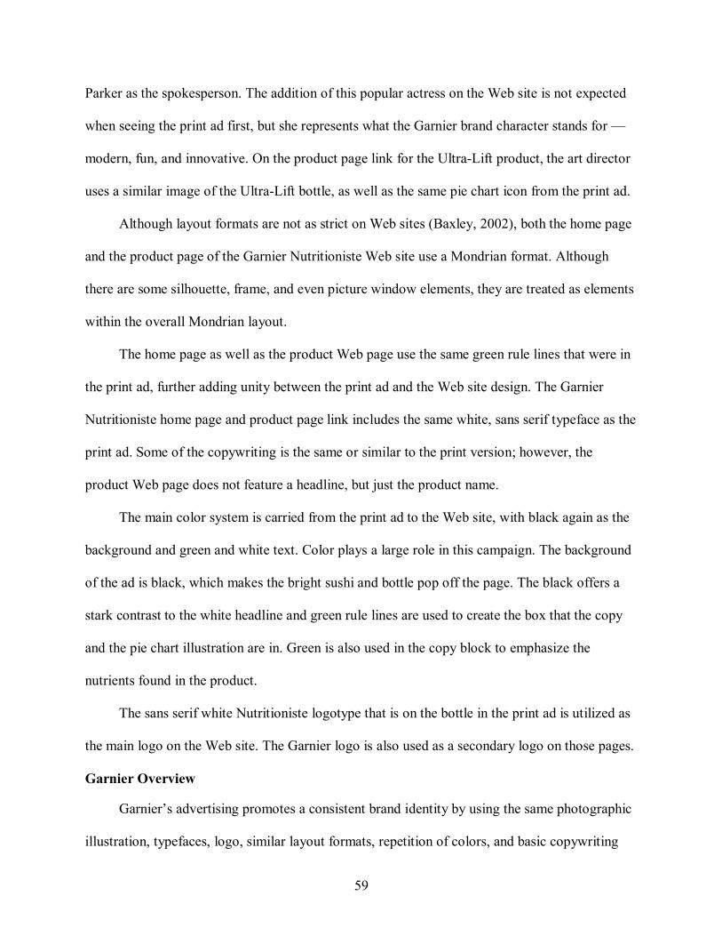
59
Parker as the spokesperson. The addition of this popular actress on the Web site is not expected
when seeing the print ad first, but she represents what the Garnier brand character stands for —
modern, fun, and innovative. On the product page link for the UltraLift product, the art director
uses a similar image of the UltraLift bottle, as well as the same pie chart icon from the print ad.
Although layout formats are not as strict on Web sites (Baxley, 2002), both the home page
and the product page of the Garnier Nutritioniste Web site use a Mondrian format. Although
there are some silhouette, frame, and even picture window elements, they are treated as elements
within the overall Mondrian layout.
The home page as well as the product Web page use the same green rule lines that were in
the print ad, further adding unity between the print ad and the Web site design. The Garnier
Nutritioniste home page and product page link includes the same white, sans serif typeface as the
print ad. Some of the copywriting is the same or similar to the print version; however, the
product Web page does not feature a headline, but just the product name.
The main color system is carried from the print ad to the Web site, with black again as the
background and green and white text. Color plays a large role in this campaign. The background
of the ad is black, which makes the bright sushi and bottle pop off the page. The black offers a
stark contrast to the white headline and green rule lines are used to create the box that the copy
and the pie chart illustration are in. Green is also used in the copy block to emphasize the
nutrients found in the product.
The sans serif white Nutritioniste logotype that is on the bottle in the print ad is utilized as
the main logo on the Web site. The Garnier logo is also used as a secondary logo on those pages.
Garnier Overview
Garnier’s advertising promotes a consistent brand identity by using the same photographic
illustration, typefaces, logo, similar layout formats, repetition of colors, and basic copywriting
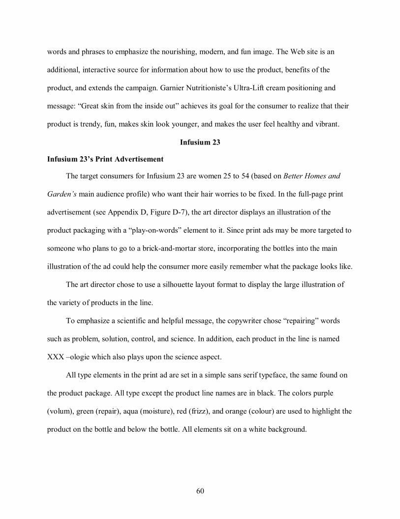
60
words and phrases to emphasize the nourishing, modern, and fun image. The Web site is an
additional, interactive source for information about how to use the product, benefits of the
product, and extends the campaign. Garnier Nutritioniste’s UltraLift cream positioning and
message: “Great skin from the inside out” achieves its goal for the consumer to realize that their
product is trendy, fun, makes skin look younger, and makes the user feel healthy and vibrant.
Infusium 23
Infusium 23’s Print Advertisement
The target consumers for Infusium 23 are women 25 to 54 (based on Better Homes and
Garden’s main audience profile) who want their hair worries to be fixed. In the fullpage print
advertisement (see Appendix D, Figure D7), the art director displays an illustration of the
product packaging with a “playonwords” element to it. Since print ads may be more targeted to
someone who plans to go to a brickandmortar store, incorporating the bottles into the main
illustration of the ad could help the consumer more easily remember what the package looks like.
The art director chose to use a silhouette layout format to display the large illustration of
the variety of products in the line.
To emphasize a scientific and helpful message, the copywriter chose “repairing” words
such as problem, solution, control, and science. In addition, each product in the line is named
XXX –ologie which also plays upon the science aspect.
All type elements in the print ad are set in a simple sans serif typeface, the same found on
the product package. All type except the product line names are in black. The colors purple
(volum), green (repair), aqua (moisture), red (frizz), and orange (colour) are used to highlight the
product on the bottle and below the bottle. All elements sit on a white background.
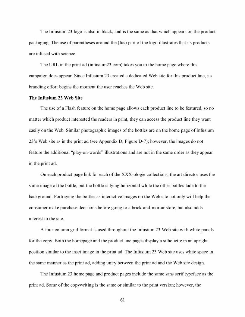
61
The Infusium 23 logo is also in black, and is the same as that which appears on the product
packaging. The use of parentheses around the (fus) part of the logo illustrates that its products
are infused with science.
The URL in the print ad (infusium23.com) takes you to the home page where this
campaign does appear. Since Infusium 23 created a dedicated Web site for this product line, its
branding effort begins the moment the user reaches the Web site.
The Infusium 23 Web Site
The use of a Flash feature on the home page allows each product line to be featured, so no
matter which product interested the readers in print, they can access the product line they want
easily on the Web. Similar photographic images of the bottles are on the home page of Infusium
23’s Web site as in the print ad (see Appendix D, Figure D7); however, the images do not
feature the additional “playonwords” illustrations and are not in the same order as they appear
in the print ad.
On each product page link for each of the XXXologie collections, the art director uses the
same image of the bottle, but the bottle is lying horizontal while the other bottles fade to the
background. Portraying the bottles as interactive images on the Web site not only will help the
consumer make purchase decisions before going to a brickandmortar store, but also adds
interest to the site.
A fourcolumn grid format is used throughout the Infusium 23 Web site with white panels
for the copy. Both the homepage and the product line pages display a silhouette in an upright
position similar to the inset image in the print ad. The Infusium 23 Web site uses white space in
the same manner as the print ad, adding unity between the print ad and the Web site design.
The Infusium 23 home page and product pages include the same sans serif typeface as the
print ad. Some of the copywriting is the same or similar to the print version; however, the
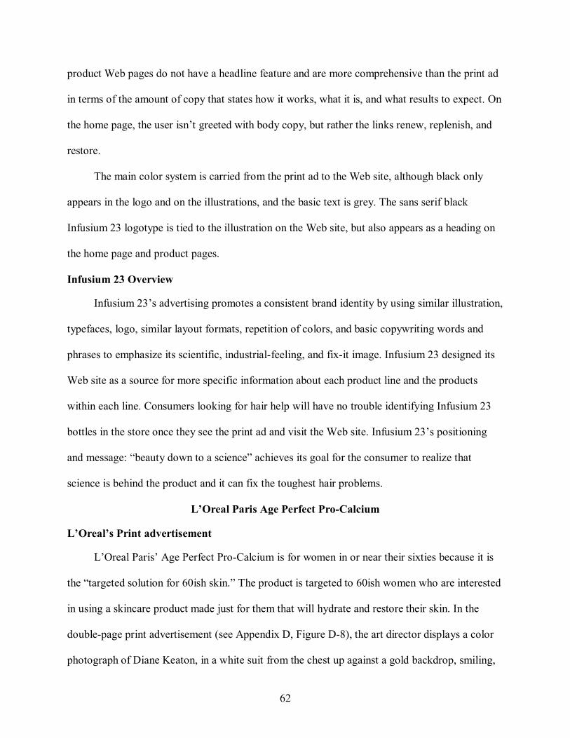
62
product Web pages do not have a headline feature and are more comprehensive than the print ad
in terms of the amount of copy that states how it works, what it is, and what results to expect. On
the home page, the user isn’t greeted with body copy, but rather the links renew, replenish, and
restore.
The main color system is carried from the print ad to the Web site, although black only
appears in the logo and on the illustrations, and the basic text is grey. The sans serif black
Infusium 23 logotype is tied to the illustration on the Web site, but also appears as a heading on
the home page and product pages.
Infusium 23 Overview
Infusium 23’s advertising promotes a consistent brand identity by using similar illustration,
typefaces, logo, similar layout formats, repetition of colors, and basic copywriting words and
phrases to emphasize its scientific, industrialfeeling, and fixit image. Infusium 23 designed its
Web site as a source for more specific information about each product line and the products
within each line. Consumers looking for hair help will have no trouble identifying Infusium 23
bottles in the store once they see the print ad and visit the Web site. Infusium 23’s positioning
and message: “beauty down to a science” achieves its goal for the consumer to realize that
science is behind the product and it can fix the toughest hair problems.
L’Oreal Paris Age Perfect ProCalcium
L’Oreal’s Print advertisement
L’Oreal Paris’ Age Perfect ProCalcium is for women in or near their sixties because it is
the “targeted solution for 60ish skin.” The product is targeted to 60ish women who are interested
in using a skincare product made just for them that will hydrate and restore their skin. In the
doublepage print advertisement (see Appendix D, Figure D8), the art director displays a color
photograph of Diane Keaton, in a white suit from the chest up against a gold backdrop, smiling,
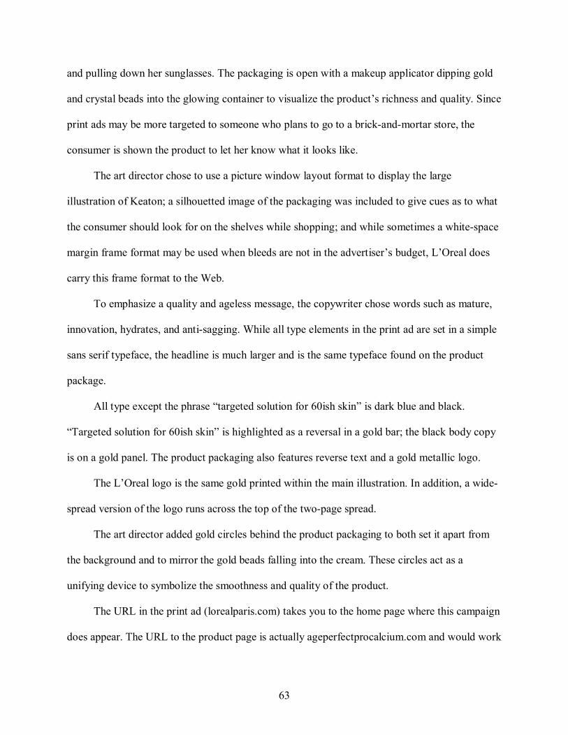
63
and pulling down her sunglasses. The packaging is open with a makeup applicator dipping gold
and crystal beads into the glowing container to visualize the product’s richness and quality. Since
print ads may be more targeted to someone who plans to go to a brickandmortar store, the
consumer is shown the product to let her know what it looks like.
The art director chose to use a picture window layout format to display the large
illustration of Keaton; a silhouetted image of the packaging was included to give cues as to what
the consumer should look for on the shelves while shopping; and while sometimes a whitespace
margin frame format may be used when bleeds are not in the advertiser’s budget, L’Oreal does
carry this frame format to the Web.
To emphasize a quality and ageless message, the copywriter chose words such as mature,
innovation, hydrates, and antisagging. While all type elements in the print ad are set in a simple
sans serif typeface, the headline is much larger and is the same typeface found on the product
package.
All type except the phrase “targeted solution for 60ish skin” is dark blue and black.
“Targeted solution for 60ish skin” is highlighted as a reversal in a gold bar; the black body copy
is on a gold panel. The product packaging also features reverse text and a gold metallic logo.
The L’Oreal logo is the same gold printed within the main illustration. In addition, a wide
spread version of the logo runs across the top of the twopage spread.
The art director added gold circles behind the product packaging to both set it apart from
the background and to mirror the gold beads falling into the cream. These circles act as a
unifying device to symbolize the smoothness and quality of the product.
The URL in the print ad (lorealparis.com) takes you to the home page where this campaign
does appear. The URL to the product page is actually ageperfectprocalcium.com and would work

64
well in the ad to send the user directly to the product page. However sending the user to the
home page allows her to view the other campaigns and products L’Oreal is featuring.
The L’Oreal Web Site
The use of a rotating Flash feature on the home page allows multiple campaigns to be
featured, so no matter which ad the readers saw in print, they get the same campaign on the Web.
The same photographic image of Diane Keaton is on the home page of L’Oreal’s Web site as in
the print ad (see Appendix D, Figure D8); however, the image is cropped slightly tighter. On the
product page link for Age Perfect ProCalcium, the art director uses the same illustration of the
open packaging with gold and crystal beads dropping into it.
Although layout formats do not transfer well from print to the Web (Baxley, 2002) ,
L’Oreal’s Web site layout parallels the print ad layout with a picture window format surrounded
by a frame format. The Age Perfect ProCalcium product Web page uses the same gold circles
that were in the print ad behind the packaging, adding unity between the print ad and the Web
site design.
The L’Oreal home page and product page include the same sans serif typeface as the print
ad. Some of the copywriting is the same or similar to the print version including the use of the
same quote from Keaton which appeared in the print ad.
The main color system is carried from the print ad to the Web site, although the blue is also
used in navigation elements, and some body copy is gold. The sans serif gold L’Oreal logotype is
not tied to the illustration on the Web site; but is used as a heading across the top on the home
page in a reversal against a black panel. On the product page, the same gold logo from the print
ad appears on the top right of the page.
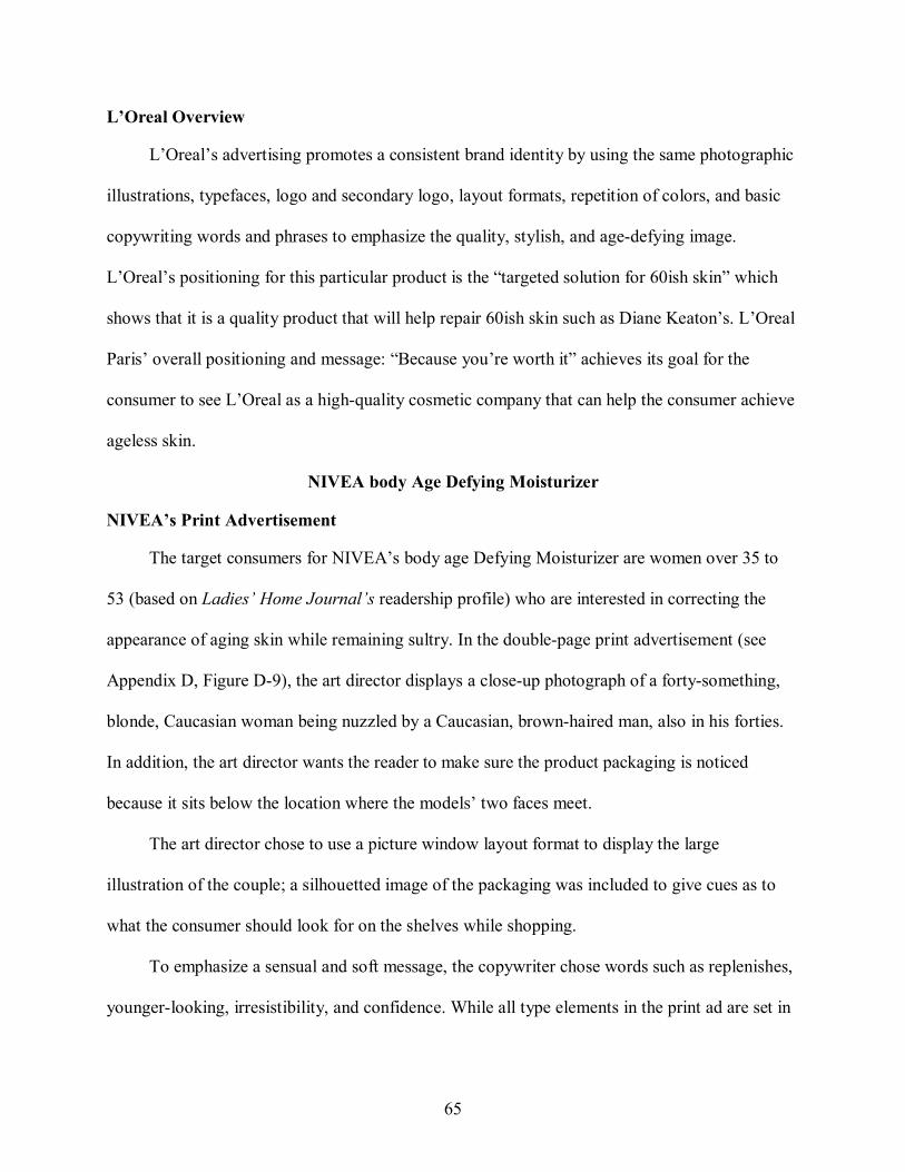
65
L’Oreal Overview
L’Oreal’s advertising promotes a consistent brand identity by using the same photographic
illustrations, typefaces, logo and secondary logo, layout formats, repetition of colors, and basic
copywriting words and phrases to emphasize the quality, stylish, and agedefying image.
L’Oreal’s positioning for this particular product is the “targeted solution for 60ish skin” which
shows that it is a quality product that will help repair 60ish skin such as Diane Keaton’s. L’Oreal
Paris’ overall positioning and message: “Because you’re worth it” achieves its goal for the
consumer to see L’Oreal as a highquality cosmetic company that can help the consumer achieve
ageless skin.
NIVEA body Age Defying Moisturizer
NIVEA’s Print Advertisement
The target consumers for NIVEA’s body age Defying Moisturizer are women over 35 to
53 (based on Ladies’ Home Journal’s readership profile) who are interested in correcting the
appearance of aging skin while remaining sultry. In the doublepage print advertisement (see
Appendix D, Figure D9), the art director displays a closeup photograph of a fortysomething,
blonde, Caucasian woman being nuzzled by a Caucasian, brownhaired man, also in his forties.
In addition, the art director wants the reader to make sure the product packaging is noticed
because it sits below the location where the models’ two faces meet.
The art director chose to use a picture window layout format to display the large
illustration of the couple; a silhouetted image of the packaging was included to give cues as to
what the consumer should look for on the shelves while shopping.
To emphasize a sensual and soft message, the copywriter chose words such as replenishes,
youngerlooking, irresistibility, and confidence. While all type elements in the print ad are set in
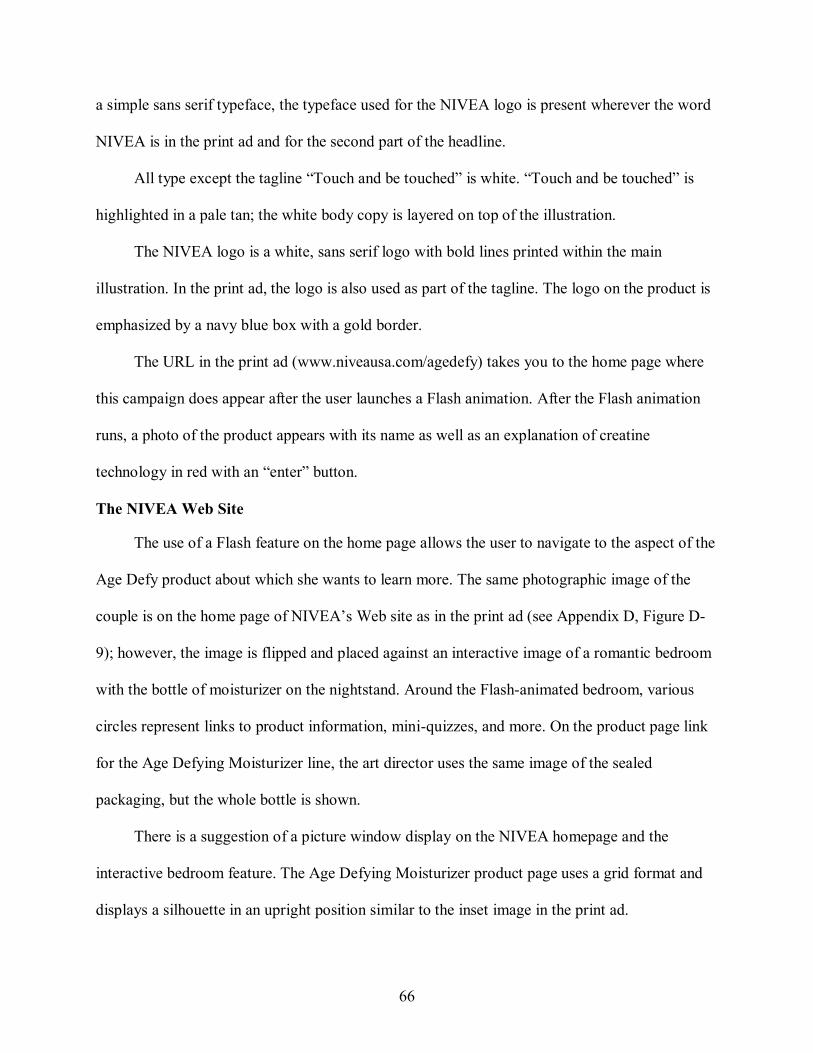
66
a simple sans serif typeface, the typeface used for the NIVEA logo is present wherever the word
NIVEA is in the print ad and for the second part of the headline.
All type except the tagline “Touch and be touched” is white. “Touch and be touched” is
highlighted in a pale tan; the white body copy is layered on top of the illustration.
The NIVEA logo is a white, sans serif logo with bold lines printed within the main
illustration. In the print ad, the logo is also used as part of the tagline. The logo on the product is
emphasized by a navy blue box with a gold border.
The URL in the print ad (www.niveausa.com/agedefy) takes you to the home page where
this campaign does appear after the user launches a Flash animation. After the Flash animation
runs, a photo of the product appears with its name as well as an explanation of creatine
technology in red with an “enter” button.
The NIVEA Web Site
The use of a Flash feature on the home page allows the user to navigate to the aspect of the
Age Defy product about which she wants to learn more. The same photographic image of the
couple is on the home page of NIVEA’s Web site as in the print ad (see Appendix D, Figure D
9); however, the image is flipped and placed against an interactive image of a romantic bedroom
with the bottle of moisturizer on the nightstand. Around the Flashanimated bedroom, various
circles represent links to product information, miniquizzes, and more. On the product page link
for the Age Defying Moisturizer line, the art director uses the same image of the sealed
packaging, but the whole bottle is shown.
There is a suggestion of a picture window display on the NIVEA homepage and the
interactive bedroom feature. The Age Defying Moisturizer product page uses a grid format and
displays a silhouette in an upright position similar to the inset image in the print ad.
67
The NIVEA home page and product page includes the same sans serif typeface as the print
ad. Some of the copywriting is the same or similar to the print version; however, the product
Web page goes one step further and states what the consumer can expect in two weeks with
continued use of the product. The tagline “Touch and Be Touched” is not present on the product
page and only appears during the introductory Flash animation.
The main color system is carried from the print ad, although blue panels are used to
highlight white text. The sans serif white NIVEA logotype is not tied to the illustration on the
Web site; but is used as a subheading on the home page and product page. The version of the
NIVEA logo used online has a silver border rather than the goldbordered logo that appears on
the packaging.
NIVEA Overview
NIVEA’s advertising promotes a consistent brand identity by using the same images,
typefaces, logo, similar layout formats, repetition of colors, and basic copywriting words and
phrases to emphasize the sultry, smooth, and sensual image. NIVEA’s body Age Defying
Moisturizer positioning and message: “Nivea. Touch and Be Touched” achieves its goal for the
consumers to realize that their product will provide smooth, sultry, youngerlooking skin.
RoC Protient Fortify Life and Define Night Cream
RoC’s Print Advertisement
The target consumers for RoC’s Protient Fortify Life and Define Night Cream are women
35 to 54 (based on Ladies’ Home Journal’s readership profile) who are interested in reducing
aging in their face. In the fullpage print advertisement (see Appendix D, Figure D10), the art
director displays a closeup, black and white photograph of a fortysomething, darkhaired,
Caucasian woman who is smiling slightly and staring directly at the reader.
68
The entire night cream package is included as a second illustration inset into the main
background illustration. Since print ads may be more targeted to someone who plans to go to a
physical store, it is helpful to show the product packaging in the ad.
The art director chose to use a Mondrian layout format for the ad, with the illustrations
overlaying the columns; a silhouetted image of the packaging was included to give cues as to
what the consumer should look for on the shelves while shopping.
To emphasize an agedefying and quality message, the copywriter chose clinical words
such as performance, firming, lifts and defines, and technology. While all type elements in the
print ad are set in a simple sans serif typeface, they are in all caps the same as on the product
package. A small disclosure at the bottom is present in white text, but is not easily readable
against the navy background.
Most of the type is white except the small subheadings such as “clinically shown” and
“immediately,” which are in yellow. The white body copy is on a navy blue panel; “New” is
highlighted in the same navy as the body copy panel and lies on top of a yellow panel.
The RoC logo is an illustration of the mortar and pestle used in drugstores long ago. The
logo sits in the bottom right hand corner of the ad. On the side of the mortar and pestle, RoC is in
a navy blue font and beneath it, in a small point size, is “France, 1957.” The URL in the print ad
(rocskincare.com) takes you to the home page where a link to the Lift and Define product line
does appear.
The RoC Web site
A similar black and white photographic image of a darkhaired woman is on the home
page of RoC’s Web site as in the print ad (see Appendix D, Figure D10). On the product page
for the Night Cream, the art director uses the same image of the sealed packaging except this
version features a mirrored reflection against a white background. In addition, the rest of the
69
product line is present on this page. Showing all products in the line on the Web site could help
the consumer make additional purchase decisions.
The Mondrian layout format is used on the RoC homepage with a white transparent panel
for copy and navigation. The Night Cream product page displays a silhouette of the product
similar to the inset image in the print ad.
The RoC home page and product page includes the same sans serif typeface as the print ad.
Some of the copywriting is the same or similar to the print version; however, the product Web
page does not have basic introductory copy about the product line. The main color system is
carried from the print ad to the Web site, although the blue is only in the navigation and accent
elements, and the basic text is black.
The RoC logotype is not tied to the illustration on the Web site; but is used as a heading on
the home page and product page. The Protient Fortify Lift and Define Night Cream packaging
does not have the RoC logo on it; however, all the other products in this line have the RoC logo
visible on them.
RoC Overview
RoC’s advertising promotes a consistent brand identity by using the same illustration,
typefaces, logo and secondary logo, similar layout formats, repetition of colors, and basic
copywriting words and phrases to emphasize its oldfashioned, clinical, and beautiful image. The
product page is more of an informational page rather than a branding effort.
RoC’s Protient Fortify Lift and Define Night Cream positioning and message: “We Keep
our Promises” achieves its goal for consumers to realize that their product is wellestablished and
offers timeless beauty.
70
CHAPTER 5 CONCLUSIONS AND DISCUSSION
My study was designed to assess the use of critical design elements in print advertisements
and product Web sites with regard to consistency of the visual identity. Ten advertisements and
10 Web sites were examined.
Overall Design Trends of the Sampled Products
Visuals in Print Advertisements versus Visuals Online
Almost all of the print advertisements (90%) used fullcolor photographic illustrations with
the exception of RoC. Most of the brands (70%) used the same image whether in its entirety or
cropped on the brand home page. The brand best exemplifying this finding was CoverGirl.
CoverGirl’s print ad, home page, product page, and even the Advanced Radiance product line
page were structured similarly, with the same image of Christie Brinkley appearing on the home
and product line pages. The fullpage photo of Brinkley demands the viewers’ attention, and they
see the “face” of the product. The viewer’s eye then moves to the open jar of cream that is
horizontally aligned with Brinkley’s smile on the facing page. Besides just showing the product,
the positioning of the product helps the reader see both the packaging and the cream itself. In
addition to the consistent use of images, CoverGirl’s consistent use of typography, layout, copy,
and colors across both media also contributes to its consistent brand identity.
According to Newark (2002), visual style limits a brand’s design choices by creating a
related set of design decisions. Most of the brands examined implemented similar design
decisions for their Web sites’ images compared with those in their print ads thus helping to
reinforce a consistent message or identity for each brand. Therefore, visuals proved to be a major
design element that helped create a consistent brand identity for almost all of the researched
brands.
71
Typography in Print Advertisements versus Typography Online
In a general examination of the overall typefaces utilized within the print ads, results
showed that 90% of the ads utilized a sans serif typeface for the main body copy except the
CoverGirl ad. However, Dove was the only brand to utilize a serif type online on its product
page where it used a serif typeface for its brand name.
The advertisement for CoverGirl best shows the contrast between using a serif and sans
serif type within a print ad. In the print ad, a serif typeface is used for the headline and the body
copy, while sans serif is used for Christie’s quote attribution and the product name – New
Advanced Radiance Restorative Cream Foundation. The copy appears on the right page,
centered, and immediately tells the reader the name of the product and what it does and by how
much. There is also a caption to Brinkley’s photo that is in a serif font: Christie glows in
Advanced Radiance Creamy Natural. However, on the product Web page for this CoverGirl
product, only sans serif fonts are used. Although serif typefaces work well with readability in
print, it was surprising to see that only CoverGirl utilized a serif type in its ad copy. Overall, sans
serif typefaces were the most popular in my study both online and in print.
According to Moser (2003), typography is a critical element in developing a brand because
typefaces portray what a brand is about and reinforces the brand’s message. All the brands
examined used similar typefaces on their Web sites compared with those in their print ads thus
helping to reinforce a consistent message or identity for each brand. Therefore, typography
proved to be a major design element that helped create a consistent brand identity for all the
researched brands.
Color in Print Advertisements versus Color Online
Color must be one of the first details of the ad that is noticeable (Moser, 2003). Emphasis
on color was defined as an ad that used color as a main tool or primary focus rather than colors in
72
a photograph or illustration. Overall, most brands consistently used color in both their print
advertisement and Web site. Surprisingly, “feminine” colors such as pink and purple were not
frequently present in the ads or online, but rather shades of blue were popular. Ninety percent of
the ads used similar colors on their product Web sites, while the only product that did not was
Avon Skin So Soft Fusions. While pink and black are the main colors of the print ad, the product
Web page for the body wash featured navy and grey text. Overall, Avon’s Skin So Soft Fusions
Web page did not have a cohesive look when paired with its print ad.
According to Ries and Ries (2002), consistent use of color can place a brand image at the
forefront of consumers’ minds. Most of the brands examined used the same colors on their Web
sites as those in their print ads thus reinforcing a consistent brand identity. Therefore, color also
proved to be a major design element that helped create a consistent brand identity for most of the
researched brands.
Logos in Print Advertisements versus Logos Online
All of the ads featured the brand’s logo whether it was on the packaging, in the ad, or both.
The brand best exemplifying this finding was that of L’Oreal Age Perfect ProCalcium. The logo
appears on the product, in the lower right corner of the ad, and fills the frame space across the
top of this doublepage ad. The placement of the logo on the L’Oreal Web site was structured
similarly, with the logo appearing across the top of the home page, in the upper right of the
product page, and again on the product packaging. It is interesting that logos changed color for
some brands when reaching their Web sites. Avon featured a black logo in its print ad, while on
the product page for the body wash advertised, a peach logo was used. CoverGirl also utilized
different colors in its logo usage; white in print and blue online. Although experts such as Moser
(2003) insist that a logo should never use varying color schemes, these major brands did.
73
Overall, all the researched brands created familiar visual expressions (Vaid, 2003) by
featuring their logos both online and in print; they also “fixed” their logos in consumers’ minds
with multiple recurrences on their respective Web sites (Rowley, 2004). Therefore, logo usage
has proved to be a major design element that helped create a consistent brand identity for all the
researched brands.
Layout Style in Print Advertisements versus Layout Style Online
Baxley (2002) said that transferring a print layout format to a Web site is an exercise in
approximation. My study also shows that layout formats are not as structured on Web sites;
however there were several suggestions of print layout styles on some of the homepages and
product pages. The ads from this sample used all but two layout styles researched: pushpin and
multipanel. Sixty percent of ads used the picture window format in print and 20% of those ads
combined the picture window style with frame. The L’Oreal ad exemplifies the picture window
and frame layout styles. Nivea and L’Oreal are the only two brands that use the same layout style
both in print and online: picture window. Seventy percent of the other brands use a Mondrian
format for their online counterpart.
According to Newark (2002), layout style helps to limit design options by allowing only a
related set of design decisions. While only two brands used similar layout design decisions both
in print and online, the other brands’ Web layouts varied from their print counterparts. Because
layout formats are not as structured on Web sites, layout style did not prove to be a major design
element in creating a consistent brand identity for most of the researched brands.
Web URL’s
All the print advertisements featured URLs. However, Dove ProAge and Infusium 23
were the only brands that created an entire Web site devoted to its product line rather than taking
the user to the brand or corporate Web site. The other ads featured URLs that took the user to the
74
brand home page, and from there, users had to navigate to the product Web page. Dove’s Pro
Age campaign did the best job of bringing the print ad to life online in the form of a Web site. It
had a dedicated product URL to a site that was devoted entirely to the ProAge line. On the home
page, the user is greeted with the same image of the AfricanAmerican model used in the print ad
as well as a similar image of the Dove ProAge bottles. The colors and use of same typefaces also
helped bring the print and Web campaigns together.
Haig (2001) says that designers should follow the “three click” rule when designing Web
site navigation in order to optimize the users’ experience. Most brands followed this rule;
however, it took more than three clicks to get to the product pages for both Avon’s Skin So Soft
Fusions Body Wash and Aveeno’s Active Naturals Daily Moisturizing Wash.
Brands are promoting their Web sites in their magazine ads more, and research suggests
that consumers do use magazines to locate sites on the Internet (Schumann & Thorson, 1999).
All of the print ads examined featured a web address for the brand’s Web site. Some URLs
brought users to a Web site devoted to a product line (such as Dove’s ProAge), or featured the
product on its overall brand Web site (such as Almay).
Using Flash on the Brand Home Page
Four of 10 brands used a rotating Flash element on their home page in order to feature
multiple campaigns. Two of these were makeup products: CoverGirl and Almay; the other two
were skincare: Nivea and Garnier. The use of the rotating Flash feature on the home page allows
multiple campaigns to be featured, so if a consumer saw an ad for Advanced Radiance or an ad
for CoverGirl’s Limited Edition Spring Forecast line, no matter which ad she saw in print, on the
Web she had a chance of seeing the same campaign in the rotation.
Brands implement mixed media strategies to reach the most consumers among varying
markets. Therefore, the brands that hosted a rotating Flash feature on their home page provided
75
the opportunity for more potential consumers to relate to the particular print campaign they saw
with similar visuals online thus helping to reassure the consumer while reinforcing the brand’s
identity (Smith & Taylor, 2004)
Using Design to Maintain Consistent Brand Identity
After analyzing the sample ads and their Web sites, the majority of brands recognize the
importance of maintaining a consistent brand identity across communication channels. The use
of similar or the exact same images and colors are the most commonly used design elements to
tie a campaign together. Although typography can help make a brand recognizable and tie it
together, the use of serif or san serif typefaces in the brands analyzed shows that designers do not
use decorative type to create recognition. Converting a layout style used in print to the Web is
not always feasible, so designers use as many elements as possible to help create that cohesive
look: color, visuals, logo, and similar body copy. Most of the Web sites have a similar look and
feel as their print ad counterparts, so the users know they are still enveloped in the campaign.
Again, Dove ProAge and Infusium 23’s devoted entire Web sites to their product line – with no
major attempts to have the consumer find out about the other brands under their corporate
umbrellas – which helps create a recognizable look from the minute the user loads the page.
Avon was the only brand that did not translate its Fusions campaign to the Web. This may
be due to the fact that Avon is marketed differently because it is not available in stores. Avon’s
Web site’s main purpose is to actually sell the product, not to be an information source or an
extension of a campaign.
Magazines usually want their advertisers to submit ads a few months in advance to prepare
an issue; however, the Web offers a chance for brands to quickly update their campaigns online.
This can be useful for different times of the year when a brand would not want total consistency.
My study examined ads and their Web sites in March; if the study was conducted using
76
magazines from December, consistency results may have varied due to the nature of the holiday
season. The Web allows brands to quickly add or remove elements from their Web sites. For
example, a brand could feature a limitededition product for Christmas both in a December issue
of a women’s magazine and on its Web site. On December 26, the brand could remove that
campaign from the Web; however, the print ad would already be printed and would now be
outdated.
The Web is a great tool to promote a brand because of items such as interactivity and a
seemingly infinite amount of space. Web sites allow brands to do more than a print ad can do by
providing links to additional products, coupons, contact information, and other features. This
further expands a brand’s depth and breadth and provides the consumer with more information
than a print ad can provide. However, the print ad is an important piece to the puzzle because the
Web address printed in the ad directs the user to the correct site. Using a promotion code in the
print ad or something similar could drive even more consumers to a product’s site. In addition,
traffic to a Web site is trackable and a great measurement tool for companies to see what
consumers are looking at on their product Web sites.
Overall, the findings reveal that most of the brands’ designers realize that design continuity
and shared visual elements between a print advertisement and a brand’s Web site can create a
solid brand identity. Most of the Web sites did leverage the traditional offline brand by including
the same logo, color palette, photographs, and typefaces, thus providing consumers with the
same continuity and brand recognition online as they see in the print advertisements.
From the findings, if a new beauty product wanted to enter the market, the researcher’s
recommendations on how to consistently utilize design when creating a brand identity are:
77
• Use a recognizable spokesperson consistently throughout all media channels to create a face for the brand such as L’Oreal and CoverGirl.
• Sophisticated colors can be used to communicate a product’s quality as well as its brand identity. Again, L’Oreal’s use of gold and white in its advertising portrays it as rich, high quality brand. In a growing beauty product industry, brands need to prove they are better than the competition and using rich colors can help set them apart.
• Use the picture window format both online and in print to draw readers in. This allows them to connect to a product and see themselves using it.
• In addition, featuring a silhouetted image of the product helps the consumer become familiar with the product’s packaging. Since many beauty products are not available to test before purchasing, it is helpful for the image of the product to be open to show consumers what it looks like.
From my study, brand managers and designers can see that consistent use of design
elements such as color, logo, typography, and photographic style can create an overall
cohesiveness between print advertising and the brand Web site; therefore, creating a solid brand
identity. Once that brand identity is created, it is important to maintain it so the identity and the
brand itself can continue to grow and evolve into a topofmindawareness brand.
Limitations and Future Research
As with any study, some limitations should be noted. First, according to Wimmer &
Dominick’s (2005), the findings for this particular content analysis are limited to the framework
of the categories and the definitions employed in the analysis. In order to minimize this
limitation, categories were defined precisely so that other researchers could apply the same tools
to the same data.
Second, because graphic design interpretation is subjective, this adds to the limitations of
the study. According to Schultz and Schultz (2004), graphic design is subjective because it is
dependent on culture, background, and creative taste. Experts each have their own views as to
what comprises design, and design itself can be a difficult concept to measure accurately.
78
In addition, my study did not explore how consistent visual identities are represented
among different industries. De Jong et al. (2006) found that profitmaking organizations were
more successful at maintaining a consistent visual identity, while nonprofitmaking
organizations needed to put more effort into managing their visual identities. Therefore, future
research could examine how different industries can strive to maintain a consistent corporate
visual identity.
For future research, consistent visual identities in other media should be explored because
a campaign is not just made up of print advertisements and an online presence. Television, radio,
mobile advertising, outdoor advertising, promotional items, and storefronts are some possible
media to explore for use of consistent design elements.
Future studies could also look at how a brand’s physical store could mirror its Web site’s
layout and flow thus creating one more element to tie the brand together in look and feel.
According to Harvard Business Review (2006), customers now expect the same ease when they
shop in a physical store as they experience when shopping that same store’s Web site. Besides
creating loyalty and familiarity, this concept would create a realworld version of the Web site
that customers could taste, smell, and touch. According to Harvard Business Review, Staples’
test store in Framingham, Massachusetts is already implementing this new branding idea by
focusing on the theme of “pure information.” Like its Web site, the store features clear, visible,
and well thoughtout signage, with logical and consistent naming and arrangement of product
categories.
Measuring purchase intentions could provide better insights about how consumers make
purchase decisions after they have viewed the same campaign in different media. Thus, future
79
studies could measure purchase intentions to ascertain what design elements used in a consistent
manner perpetuate a purchase.
Future researchers could also look at the effect of campaign consistency on other
dependent variables such as recall or recognition. Examining recall or recognition in future
studies could provide data on how the consistent use of design elements affect consumers’
tendency to recall or recognize a brand in advertisements, online, or in purchasing situations.
Additionally, researchers could examine consumers’ preferences on how they like to see
beauty products advertised. Researchers could observe if consumers prefer beauty product
advertisements that use models who look like them (example: Dove ProAge); if they like seeing
spokespeople or celebrity endorsers in ads (example: L’Oreal’s Age Perfect line); or if they
prefer to just see the product highlighted (example: Avon).
Future research could also examine the emotional effects of a consistent visual identity.
Different design strategies could have different emotional effects for similar companies. For
example, Smith and Taylor (2004) examined the use of design in the airline industry and how the
consistent use of design elements soothed travelers. Therefore, it would be useful if future
research on consistent visual identity focused on emotions since many purchase intentions are
emotionally based.
Finally, design concepts may be subjective and thus may not be a proper indicator of
consistency within a visual identity. Examining how design is used in additional media,
emotional response, purchase intention, or even using visual tests such as Eyetrack may be better
indicators of consistent visual identities.
80
APPENDIX A CODEBOOK
Print ad
Source of Ad: List magazine title, year, month.
Brand/product: Describe what it is, how it is used, and any other pertinent information
Industry: Please circle whether the ad is for skincare, hair care, makeup, or other
Show Product: Does the ad physically display the product being advertised?
Packaging: Describe how the brand is defined by the look of the package/product
Product positioning: state if known; if not, can you assume from what you see?
Target Audience: Who is the main target consumer? How do you know? (Assumption? Stated in a corporate document? Explain if from the ad itself; by looking at model used, typeface, colors, etc.)
Elements of Print Ad
Headline: Is there a headline present to draw the viewer in? Or is it just the product name?
Visual (photograph/art/other): Is a visual used? Illustration or actual photo? If so. describe photograph/visual. Is the visual in color or another form such as sepia or black and white?
Copy: Is there copy present? Promotional text? Disclosures? Tagline? Is there a URL present in the copy?
Logo: Record whether a logo is used within the ad. Does the logo stand alone in the ad? Is the logo visible on the product or anywhere else in the ad? Is the logo an image only, or does it include text?
Other: Is there another element present in the ad? A sample to try the product? A coupon?
Layout in Print Ad What type of format is used in the ad?
Design Elements in Print Ad Rules/Borders/Panels: Are any of these elements present?
Color: Is there a color scheme present in the advertisement? Does the ad feature color in the text? Does color used in the ad appear to be a main focus? Does the ad use one color, spot color, or
81
full color? Please describe and explain. Also record the colors emphasized, if any. This code does not refer to color photos.
Typography: Is there a specific/unique typestyle used in the advertisement? This code does not refer to typography used in the logo
Overall Design principles: Brief discussion of what the art director wanted the reader to look at based on: Unity, balance (symmetrical vs. asymmetrical placement; right/left weight), proportion (size comparison), contrast (value and color comparison) and movement.
Definition of the brand: based on the ad, what is the definition of the brand?
Product Web site Web URL: List URL and date accessed. Does the URL take the user directly to the product Web page?
Show Product: Does the Web site physically display the product being advertised?
Campaign: Is the same campaign used online as in the print advertisement?
Elements of product Web site
Headline: Is there a headline present to draw the viewer in? Or is it just the product name?
Visual (photograph/art/other): Is a visual used? Illustration or actual photo? If so. describe photograph/visual. Is the visual in color or another form such as sepia or black and white?
Copy: Is there copy present? Promotional text? Disclosures? Tagline? Other copy such as product reviews/testimonials etc?
Logo: Record whether a logo is used on the Web site. Does the logo stand alone on the site? Is the logo visible on the product if the product is shown online? Is the logo different or the same from that in the print ad?
Other: Is there another element present on the Web site? A coupon?
Layout of Web site Does the Web site fit into a particular layout format?
Design Elements of Web site Rules/Borders/Panels: Are any of these elements present?
Color: Is there a color scheme present on the Web site? Does the Web site the same colors as the print ad? Does the Web site feature color in the text? Does color used in the Web site appear to
82
be a main focus? Does the Web site use one color, spot color, or full color? Please describe and explain. Also record the colors emphasized, if any. This code does not refer to color photos.
Typography: Is there a specific/unique typestyle used on the Web site? This code does not refer to typography used in the logo
Overall impression: Is there consistency between the print ad and the Web site? Does the advertising promote a consistent brand identity? Please describe overall impressions of how the print ad’s use of design along with the Web site’s use of design do or do not perpetuate a cohesive brand identity.
83
APPENDIX B CODESHEET
Source of Ad _________________________________________________________
Brand/product: ______________________________________________________________
_____________________________________________________________
Industry: Skincare Hair care Makeup Other
Show Product: Yes No
Packaging: ________________________________________________
Product positioning: _______________________________________________________
Target Audience: ______________________________________________________________
Elements of Print Ad
Headline (Please describe):
Visual (photograph/art/other) (Please describe):
Copy (Please describe):
Logo (Please describe):
Other (Please describe):
Layout in Print Ad (Please describe):
84
Rules/Borders/Panels (Please describe):
Color (Please describe):
Typography (Please describe):
Overall Design principles (Please describe):
Definition of the brand (Please describe):
Product Web site Web URL (Please describe):
Show Product (Please describe):
Campaign (Please describe):
Headline (Please describe):
Visual (photograph/art/other) (Please describe):
Copy (Please describe):
85
Logo (Please describe):
Other (Please describe):
Layout of Web site (Please describe):
Rules/Borders/Panels (Please describe):
Color (Please describe):
Typography (Please describe):
Overall impression (Please describe):
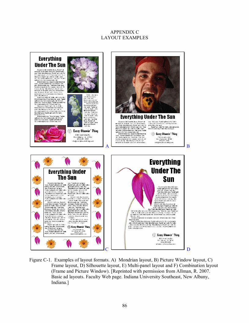
86
APPENDIX C LAYOUT EXAMPLES
A B
C D
Figure C1. Examples of layout formats. A) Mondrian layout, B) Picture Window layout, C) Frame layout, D) Silhouette layout, E) Multipanel layout and F) Combination layout (Frame and Picture Window). [Reprinted with permission from Allman, R. 2007. Basic ad layouts. Faculty Web page. Indiana University Southeast, New Albany, Indiana.]
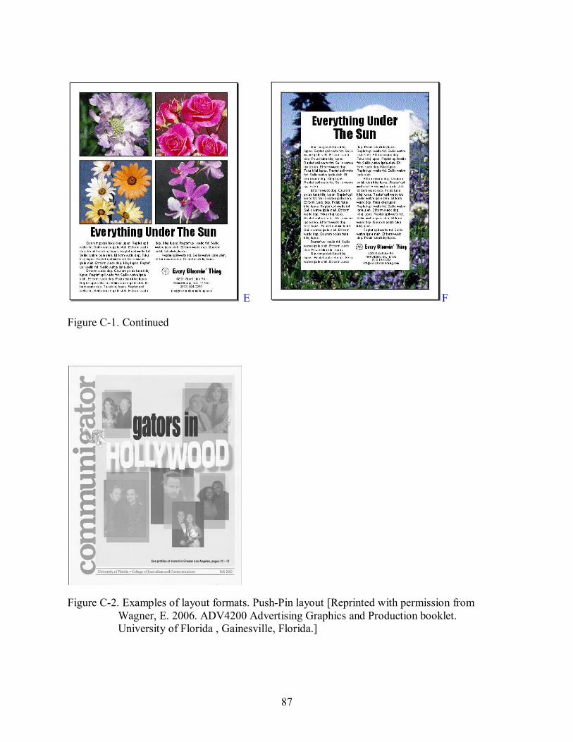
87
E F
Figure C1. Continued
Figure C2. Examples of layout formats. PushPin layout [Reprinted with permission from Wagner, E. 2006. ADV4200 Advertising Graphics and Production booklet. University of Florida , Gainesville, Florida.]
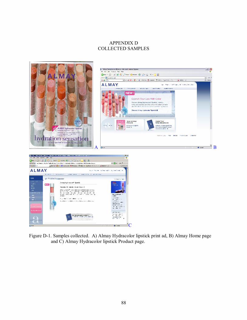
88
APPENDIX D COLLECTED SAMPLES
A B
C
Figure D1. Samples collected. A) Almay Hydracolor lipstick print ad, B) Almay Home page and C) Almay Hydracolor lipstick Product page.
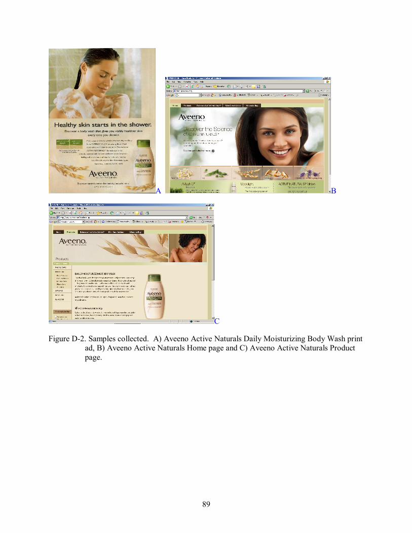
89
A B
C
Figure D2. Samples collected. A) Aveeno Active Naturals Daily Moisturizing Body Wash print ad, B) Aveeno Active Naturals Home page and C) Aveeno Active Naturals Product page.
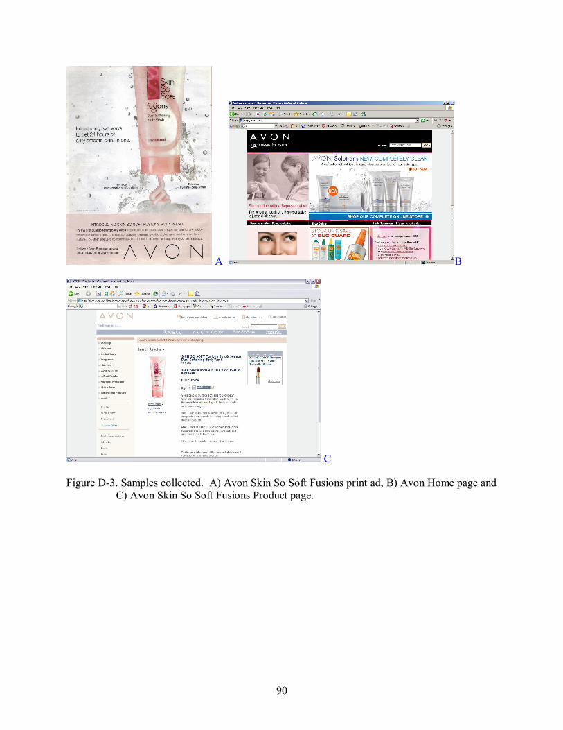
90
A B
C
Figure D3. Samples collected. A) Avon Skin So Soft Fusions print ad, B) Avon Home page and C) Avon Skin So Soft Fusions Product page.
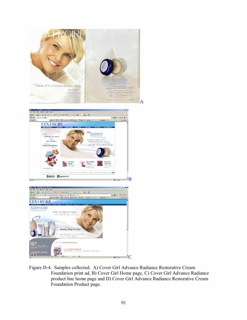
91
A
B
C
Figure D4. Samples collected. A) Cover Girl Advance Radiance Restorative Cream Foundation print ad, B) Cover Girl Home page, C) Cover Girl Advance Radiance product line home page and D) Cover Girl Advance Radiance Restorative Cream Foundation Product page.
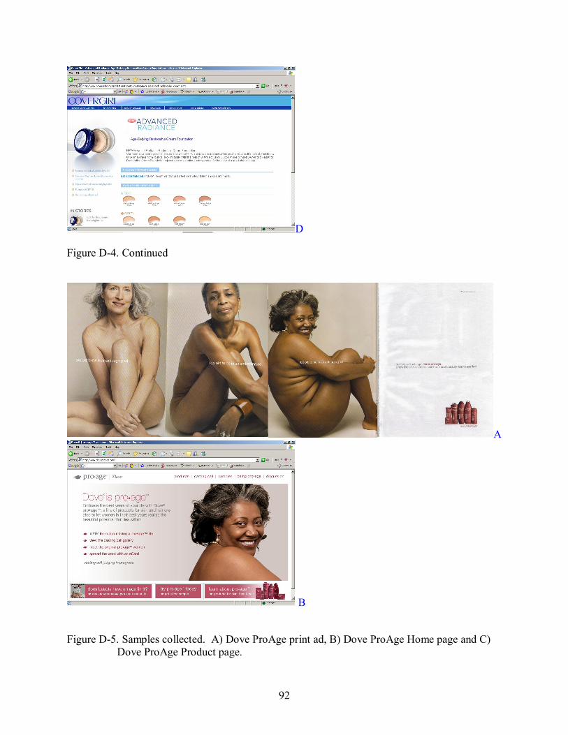
92
D
Figure D4. Continued
A
B
Figure D5. Samples collected. A) Dove ProAge print ad, B) Dove ProAge Home page and C) Dove ProAge Product page.
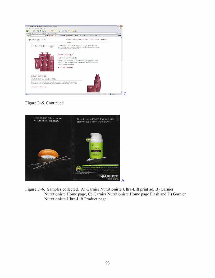
93
C
Figure D5. Continued
A
Figure D6. Samples collected. A) Garnier Nutritioniste UltraLift print ad, B) Garnier Nutritioniste Home page, C) Garnier Nutritioniste Home page Flash and D) Garnier Nutritioniste UltraLift Product page.
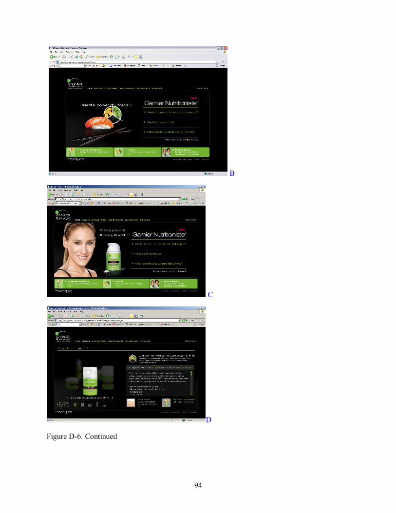
94
B
C
D
Figure D6. Continued

95
A B
C
Figure D7. Samples collected. A) Infusium 23 print ad, B) Infusium 23 Home page and C) Infusium 23 Product page.
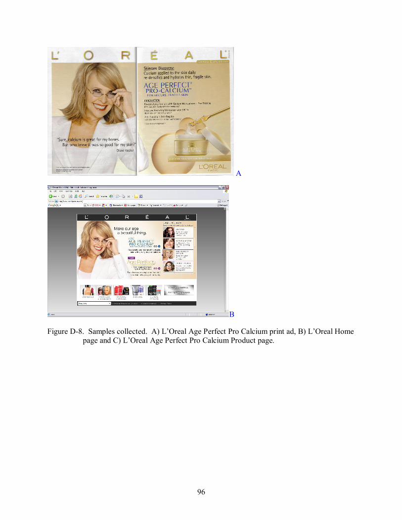
96
A
B
Figure D8. Samples collected. A) L’Oreal Age Perfect Pro Calcium print ad, B) L’Oreal Home page and C) L’Oreal Age Perfect Pro Calcium Product page.
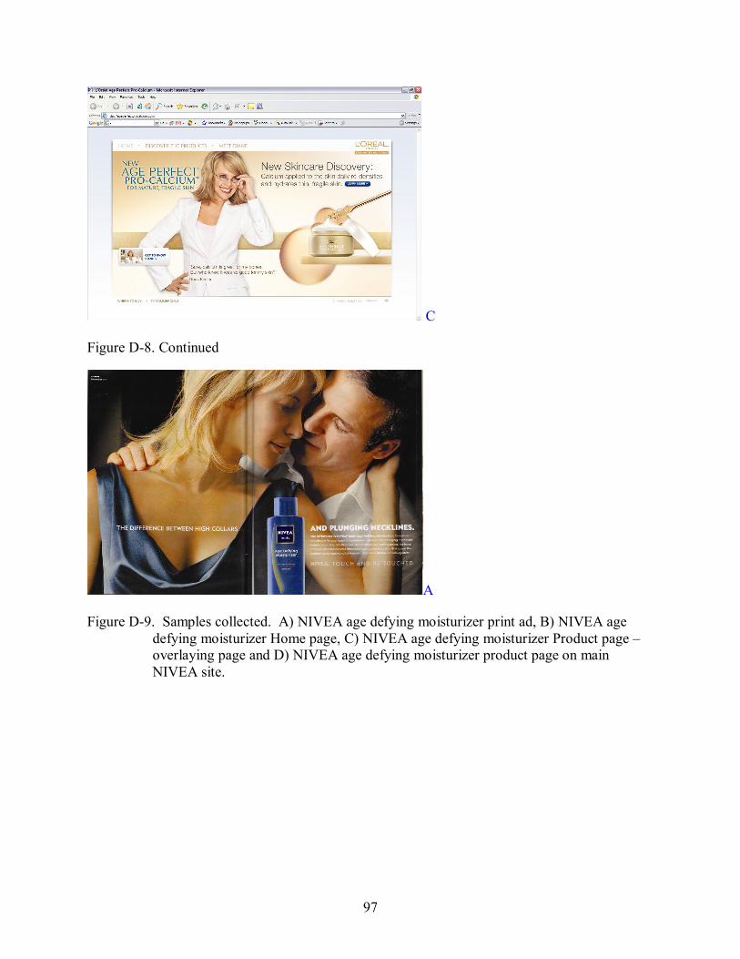
97
C
Figure D8. Continued
A
Figure D9. Samples collected. A) NIVEA age defying moisturizer print ad, B) NIVEA age defying moisturizer Home page, C) NIVEA age defying moisturizer Product page – overlaying page and D) NIVEA age defying moisturizer product page on main NIVEA site.
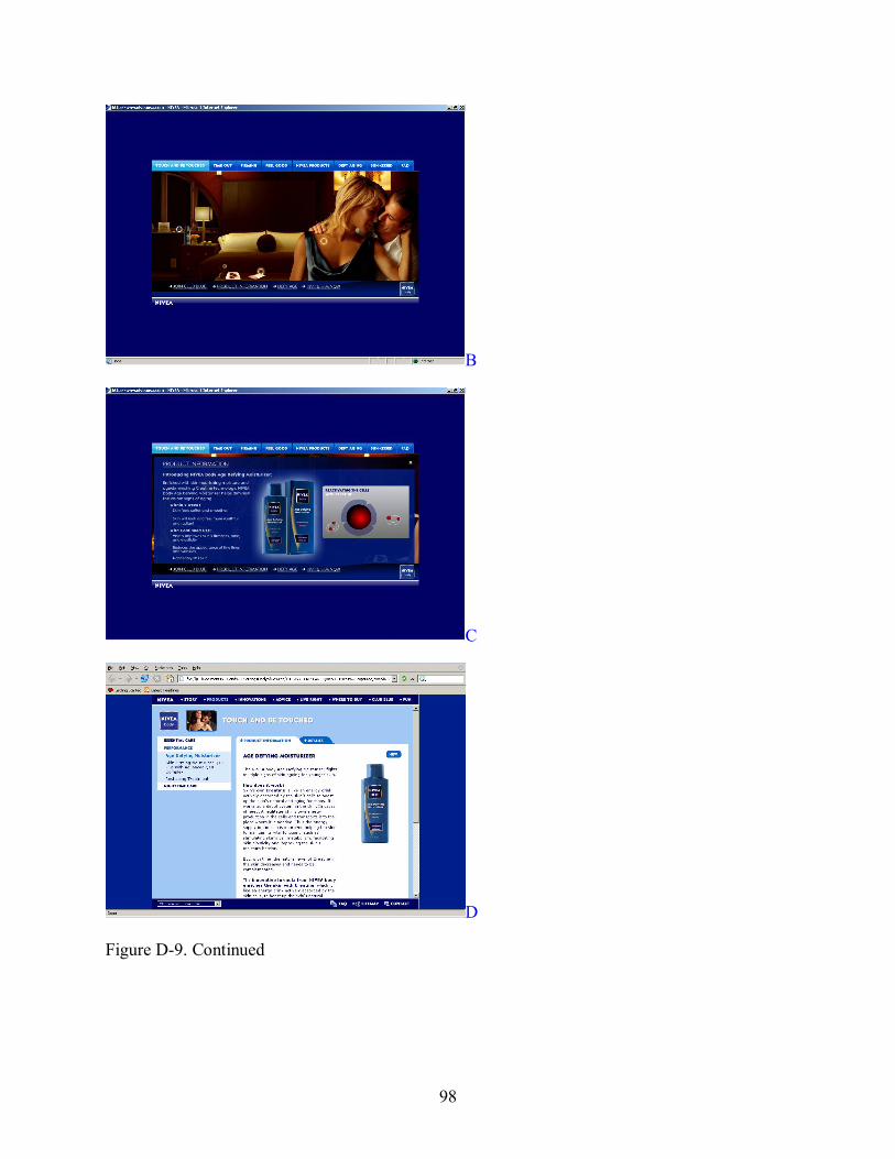
98
B
C
D
Figure D9. Continued
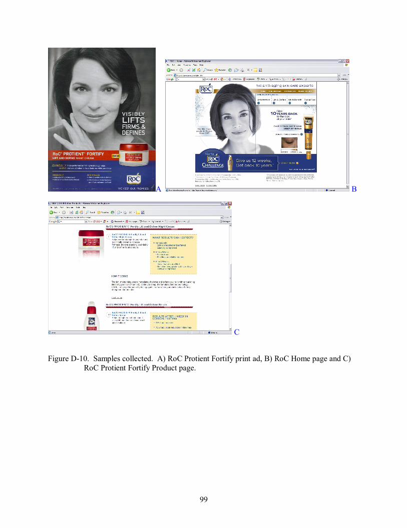
99
A B
C
Figure D10. Samples collected. A) RoC Protient Fortify print ad, B) RoC Home page and C) RoC Protient Fortify Product page.
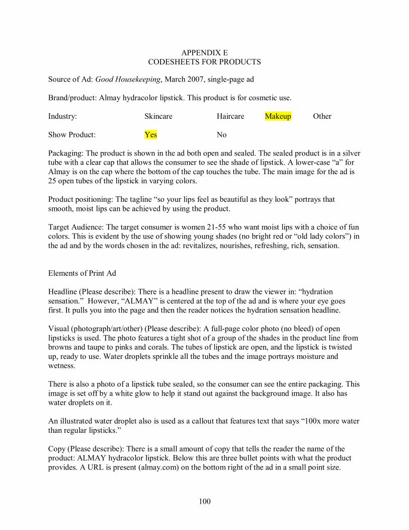
100
APPENDIX E CODESHEETS FOR PRODUCTS
Source of Ad: Good Housekeeping, March 2007, singlepage ad
Brand/product: Almay hydracolor lipstick. This product is for cosmetic use.
Industry: Skincare Haircare Makeup Other
Show Product: Yes No
Packaging: The product is shown in the ad both open and sealed. The sealed product is in a silver tube with a clear cap that allows the consumer to see the shade of lipstick. A lowercase “a” for Almay is on the cap where the bottom of the cap touches the tube. The main image for the ad is 25 open tubes of the lipstick in varying colors.
Product positioning: The tagline “so your lips feel as beautiful as they look” portrays that smooth, moist lips can be achieved by using the product.
Target Audience: The target consumer is women 2155 who want moist lips with a choice of fun colors. This is evident by the use of showing young shades (no bright red or “old lady colors”) in the ad and by the words chosen in the ad: revitalizes, nourishes, refreshing, rich, sensation.
Elements of Print Ad
Headline (Please describe): There is a headline present to draw the viewer in: “hydration sensation.” However, “ALMAY” is centered at the top of the ad and is where your eye goes first. It pulls you into the page and then the reader notices the hydration sensation headline.
Visual (photograph/art/other) (Please describe): A fullpage color photo (no bleed) of open lipsticks is used. The photo features a tight shot of a group of the shades in the product line from browns and taupe to pinks and corals. The tubes of lipstick are open, and the lipstick is twisted up, ready to use. Water droplets sprinkle all the tubes and the image portrays moisture and wetness.
There is also a photo of a lipstick tube sealed, so the consumer can see the entire packaging. This image is set off by a white glow to help it stand out against the background image. It also has water droplets on it.
An illustrated water droplet also is used as a callout that features text that says “100x more water than regular lipsticks.”
Copy (Please describe): There is a small amount of copy that tells the reader the name of the product: ALMAY hydracolor lipstick. Below this are three bullet points with what the product provides. A URL is present (almay.com) on the bottom right of the ad in a small point size.
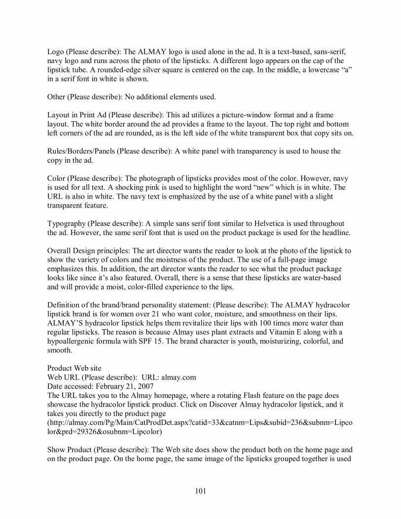
101
Logo (Please describe): The ALMAY logo is used alone in the ad. It is a textbased, sansserif, navy logo and runs across the photo of the lipsticks. A different logo appears on the cap of the lipstick tube. A roundededge silver square is centered on the cap. In the middle, a lowercase “a” in a serif font in white is shown.
Other (Please describe): No additional elements used.
Layout in Print Ad (Please describe): This ad utilizes a picturewindow format and a frame layout. The white border around the ad provides a frame to the layout. The top right and bottom left corners of the ad are rounded, as is the left side of the white transparent box that copy sits on.
Rules/Borders/Panels (Please describe): A white panel with transparency is used to house the copy in the ad.
Color (Please describe): The photograph of lipsticks provides most of the color. However, navy is used for all text. A shocking pink is used to highlight the word “new” which is in white. The URL is also in white. The navy text is emphasized by the use of a white panel with a slight transparent feature.
Typography (Please describe): A simple sans serif font similar to Helvetica is used throughout the ad. However, the same serif font that is used on the product package is used for the headline.
Overall Design principles: The art director wants the reader to look at the photo of the lipstick to show the variety of colors and the moistness of the product. The use of a fullpage image emphasizes this. In addition, the art director wants the reader to see what the product package looks like since it’s also featured. Overall, there is a sense that these lipsticks are waterbased and will provide a moist, colorfilled experience to the lips.
Definition of the brand/brand personality statement: (Please describe): The ALMAY hydracolor lipstick brand is for women over 21 who want color, moisture, and smoothness on their lips. ALMAY’S hydracolor lipstick helps them revitalize their lips with 100 times more water than regular lipsticks. The reason is because Almay uses plant extracts and Vitamin E along with a hypoallergenic formula with SPF 15. The brand character is youth, moisturizing, colorful, and smooth.
Product Web site Web URL (Please describe): URL: almay.com Date accessed: February 21, 2007 The URL takes you to the Almay homepage, where a rotating Flash feature on the page does showcase the hydracolor lipstick product. Click on Discover Almay hydracolor lipstick, and it takes you directly to the product page (http://almay.com/Pg/Main/CatProdDet.aspx?catid=33&catnm=Lips&subid=236&subnm=Lipco lor&prd=29326&osubnm=Lipcolor)
Show Product (Please describe): The Web site does show the product both on the home page and on the product page. On the home page, the same image of the lipsticks grouped together is used
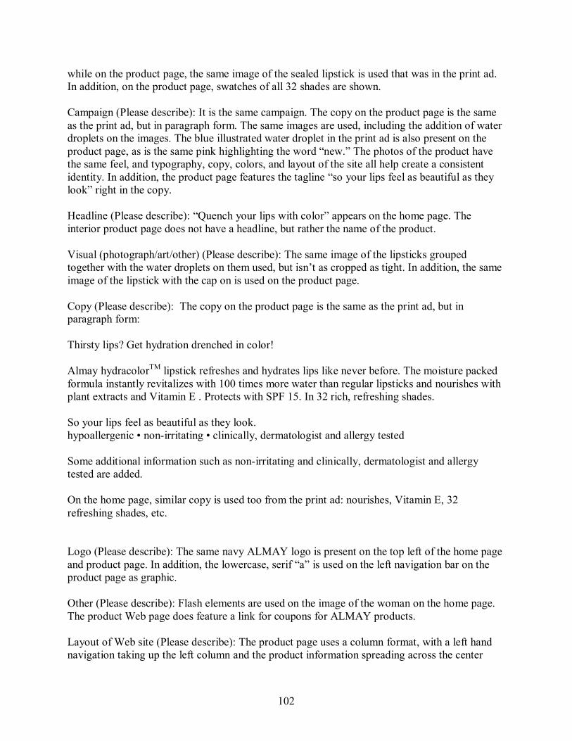
102
while on the product page, the same image of the sealed lipstick is used that was in the print ad. In addition, on the product page, swatches of all 32 shades are shown.
Campaign (Please describe): It is the same campaign. The copy on the product page is the same as the print ad, but in paragraph form. The same images are used, including the addition of water droplets on the images. The blue illustrated water droplet in the print ad is also present on the product page, as is the same pink highlighting the word “new.” The photos of the product have the same feel, and typography, copy, colors, and layout of the site all help create a consistent identity. In addition, the product page features the tagline “so your lips feel as beautiful as they look” right in the copy.
Headline (Please describe): “Quench your lips with color” appears on the home page. The interior product page does not have a headline, but rather the name of the product.
Visual (photograph/art/other) (Please describe): The same image of the lipsticks grouped together with the water droplets on them used, but isn’t as cropped as tight. In addition, the same image of the lipstick with the cap on is used on the product page.
Copy (Please describe): The copy on the product page is the same as the print ad, but in paragraph form:
Thirsty lips? Get hydration drenched in color!
Almay hydracolor TM lipstick refreshes and hydrates lips like never before. The moisture packed formula instantly revitalizes with 100 times more water than regular lipsticks and nourishes with plant extracts and Vitamin E . Protects with SPF 15. In 32 rich, refreshing shades.
So your lips feel as beautiful as they look. hypoallergenic • nonirritating • clinically, dermatologist and allergy tested
Some additional information such as nonirritating and clinically, dermatologist and allergy tested are added.
On the home page, similar copy is used too from the print ad: nourishes, Vitamin E, 32 refreshing shades, etc.
Logo (Please describe): The same navy ALMAY logo is present on the top left of the home page and product page. In addition, the lowercase, serif “a” is used on the left navigation bar on the product page as graphic.
Other (Please describe): Flash elements are used on the image of the woman on the home page. The product Web page does feature a link for coupons for ALMAY products.
Layout of Web site (Please describe): The product page uses a column format, with a left hand navigation taking up the left column and the product information spreading across the center
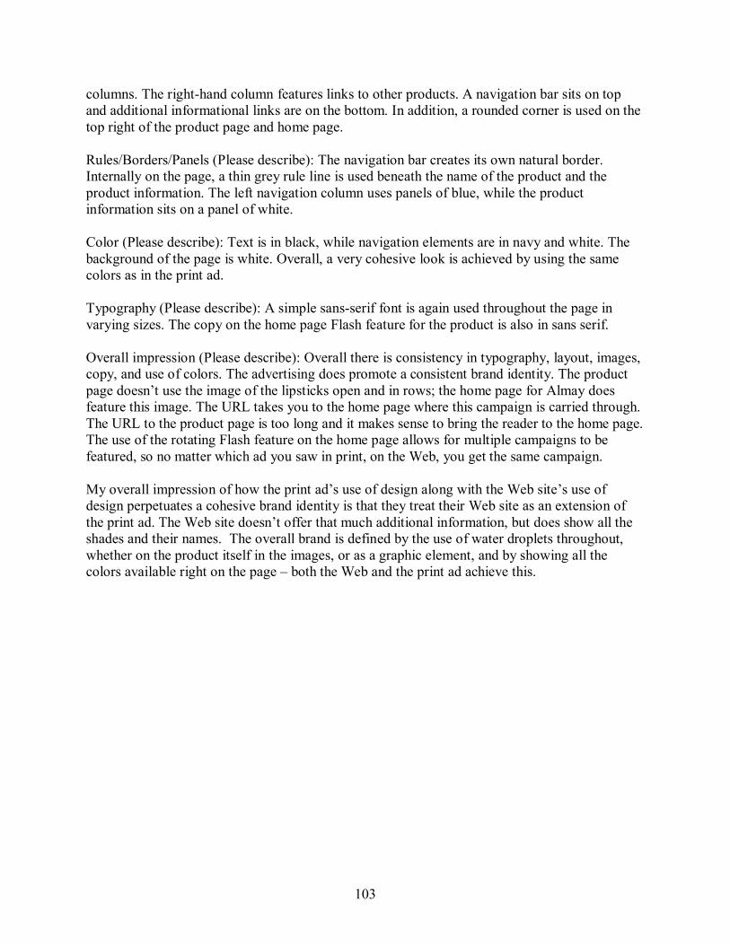
103
columns. The righthand column features links to other products. A navigation bar sits on top and additional informational links are on the bottom. In addition, a rounded corner is used on the top right of the product page and home page.
Rules/Borders/Panels (Please describe): The navigation bar creates its own natural border. Internally on the page, a thin grey rule line is used beneath the name of the product and the product information. The left navigation column uses panels of blue, while the product information sits on a panel of white.
Color (Please describe): Text is in black, while navigation elements are in navy and white. The background of the page is white. Overall, a very cohesive look is achieved by using the same colors as in the print ad.
Typography (Please describe): A simple sansserif font is again used throughout the page in varying sizes. The copy on the home page Flash feature for the product is also in sans serif.
Overall impression (Please describe): Overall there is consistency in typography, layout, images, copy, and use of colors. The advertising does promote a consistent brand identity. The product page doesn’t use the image of the lipsticks open and in rows; the home page for Almay does feature this image. The URL takes you to the home page where this campaign is carried through. The URL to the product page is too long and it makes sense to bring the reader to the home page. The use of the rotating Flash feature on the home page allows for multiple campaigns to be featured, so no matter which ad you saw in print, on the Web, you get the same campaign.
My overall impression of how the print ad’s use of design along with the Web site’s use of design perpetuates a cohesive brand identity is that they treat their Web site as an extension of the print ad. The Web site doesn’t offer that much additional information, but does show all the shades and their names. The overall brand is defined by the use of water droplets throughout, whether on the product itself in the images, or as a graphic element, and by showing all the colors available right on the page – both the Web and the print ad achieve this.
104
Source of Ad: Good Housekeeping, March 2007, singlepage ad
Brand/product: Aveeno Active Naturals Daily Moisturizing Body Wash. This product is a moisturizing body cleanser.
Industry: Skincare Haircare Makeup Other
Show Product: Yes No
Packaging: The package is shown in the ad. It is a cream colored curved, plastic bottle with a moss green pop cap. The logo is present on the bottle, as well as a faint image of oats. “Daily Moisturizing Body Wash” is in white on top of a green rectangle.
Product positioning: The tagline “discover nature’s secret for healthy, beautiful skin” illustrates that this product uses natural ingredients and that Aveeno can show the user that secret.
Target Audience: The target consumer is women 2555 who are interested in having clean, healthy skin by using a product with natural ingredients. This is evident by the use of a young woman in her late twenties, the colors, and the words chosen in the ad: natural, replenishes, oatmeal, sunflower oils, dermatologists, etc.
Elements of Print Ad
Headline (Please describe): There is a headline present under the photo: “Healthy skin starts in the shower.” It is centered and in a black, sans serif font. Beneath that, in the same font, but smaller, is a subhead that reads “Discover a body wash that gives you visibly healthier skin every time you shower.”
Visual (photograph/art/other) (Please describe): A halfpage color photo features a young brunette woman in the shower. Her eyes are closed as she uses a bath puff to lather the Aveeno wash on her shoulders. The photo is cropped from her chest up. The shower spray and green tile can be seen in the background. She has a relaxed smiled on her face and neutral makeup on.
There is also a photo of the product’s bottle on the bottom right of the ad. Soap suds run down the left side of the bottle. In front of the bottle are a sprig oats, which also appears on the left side of the ad. In addition, an illustration showing water droplets to depict replenish moisture is used. These two small rectangles are green and beige and highlight two main features of the product: “natural oatmeal formula” and “replenishes moisture.”
Copy (Please describe): There is a fair amount of copy present that introduces this product from Aveeno. It compares it to other body washes that leave skin dry and flaky. It lists some of the ingredients that help replenish skin’s natural moisture such as colloidal oatmeal and sunflower oils. It also says it’s the brand dermatologists have recommended for 60 years. A URL is present beneath the tagline (www.aveeno.com) “Discover nature’s secret for healthy, beautiful skin.
105
Logo (Please describe): The logo is used alone in the ad. The logo is also visible on the product packaging. The Aveeno logo is a serif font with very slight serif extensions. It is in black and is lowercase except for the first “A.” The product line “Active Naturals” is in the same font, but is smaller and is in all caps.
Other (Please describe): N/A
Layout in Print Ad (Please describe): This ad utilizes a picturewindow format by inviting the viewer to experience the moistureladen shower.
Rules/Borders/Panels (Please describe): A panel of cream is used on the bottom half of the ad as a background to the copy. In addition, a strip of cream runs along the rightside of the photo. Green panels of color are used in the illustration that depicts the two main features of the product. This mirrors the green panel on the bottle that highlights the product name.
Color (Please describe): There is a color scheme present in the advertisement – cream, green, and black. The ad features black text, and picks up the green from the bottle in the illustration. The entire background of the ad is cream.
Typography (Please describe): A simple sans serif font similar to Helvetica is used throughout the entire ad in varying sizes, bold, and italic.
Overall Design principles: The art director wants the reader to look at the photo of the woman in the shower to show what you can experience when you use Active Naturals. In addition, the art director wants the reader to see what the product looks like since it’s featured in its package as well as in use. The use of sprigs of oats also represents the natural ingredients. Overall, there is a sense that this is a reputable product because the copy gives ingredients, says it’s been recommended by dermatologists for 60 years, and because it is all natural.
Definition of the brand/brand personality statement: (Please describe): Aveeno’s Active Naturals Daily Moisturizing Body Wash is for women over 25 who want healthy, moist skin. Aveeno’s Active Naturals Daily Moisturizing Body Wash is a product that helps women achieve visibly healthier skin in as little as 2 weeks. The reason is because Aveeno uses natural ingredients such as oatmeal and sunflower oils and is a brand recommended by dermatologist for the past 60 years. The brand character is natural, moisturizing, reputable, and healthy. The model represents naturalness, youth, relaxation, and cleanliness.
Product Web site Web URL (Please describe): URL: www.aveeno.com Date accessed: February 21, 2007 The URL takes you to the Aveeno home page. Click on products, then body care, then daily moisturizing. This takes you to the entire product line. From there, click on the body wash and it takes you to this product’s Web page.
106
Show Product (Please describe): The Web site does show a similar image of the daily body wash, but without the suds on the bottle. The home page for Aveeno does not show this product.
Campaign (Please describe): It is the same campaign. Although the image of the woman in the shower is missing from the Web site, the typography, colors, image of the product and oats, all tie the look together. The copy at the top of the page fits right into the print ad campaign’s feel. The woman on the home page looks like the same model that was used in the print ad, so although it’s a different image, there is some continuity.
Headline (Please describe): “Discover the science of active naturals” appears on the home page. The interior product page does not have a headline, but rather just the name of the product.
Visual (photograph/art/other) (Please describe): A similar image of the package is used on the product page. In addition, the top of the product page features a photo of a sprig of oats and another of an AfricanAmerican female model caressing her shoulder. The home page features a brunette model smiling and below her are images of some of Aveeno’s natural ingredients, including an image of oats.
Copy (Please describe): The same angle the copy took in the print ad is also on the Web page. However, some additional information is present such as: And, it's even gentle enough for sensitive skin. Additional Product Benefits Include: lightly fragranced, soap free, dye free, hypoallergenic.
The tagline isn’t present on the page, but the dermatologists have recommended it for 60 years is present.
Logo (Please describe): The same Aveeno Active Naturals logo is present on the top left of the home page and product page.
Other (Please describe): Some Flash elements are used on the ingredients on the home page. The product Web page does feature a link “to see how it works” in regards to the oatmeal in the product.
Layout of Web site (Please describe): The product page uses a column format, with a left hand navigation taking up the left column and the product information spreading across the center columns. A navigation bar sits on top and additional informational links are on the bottom. In addition, a frame is used around the entire page. The home page uses a picture window format, along with a frame.
Rules/Borders/Panels (Please describe): Rules are used to separate navigation items as well as the center box where most of the product information is held. There is a cream border on this page that acts like a frame. There are several panels of color (shades of beige, brown, cream, and green) that serve to separate navigation elements, as well as serving as design.
107
Color (Please describe): Varying shades of cream are used throughout the page. Text is in black. The background of the page is cream. Panels of green are used in the navigation bar and as divisional elements. Overall, a very cohesive look is achieved by using the same colors as in the print ad.
Typography (Please describe): A simple sansserif font is again used throughout the page in varying sizes and weights. Subheads are in all caps and bold.
Overall impression (Please describe): Overall there is consistency in typography, layout, copy, and use of colors. The advertising does promote a consistent brand identity. Although the product page doesn’t use the image of the model but a similar image of the packaging, the home page for Aveeno does feature a brunette.
My overall impression of how the print ad’s use of design along with the Web site’s use of design perpetuates a cohesive brand identity is that they treat their Web site as a resource to find out more about Aveeno’s natural ingredients. Rather than seeing examples of what happens when you use the body wash or highly promoting other items in the line, the product page as well as the home page emphasizes that the reader find out more about the ingredients Aveeno uses. The overall brand is defined by the colors cream, green, and black and the use of female models who are fresh looking as well as highlighting the use of natural ingredients by showing images of oats – both the Web and the print ad achieve this.
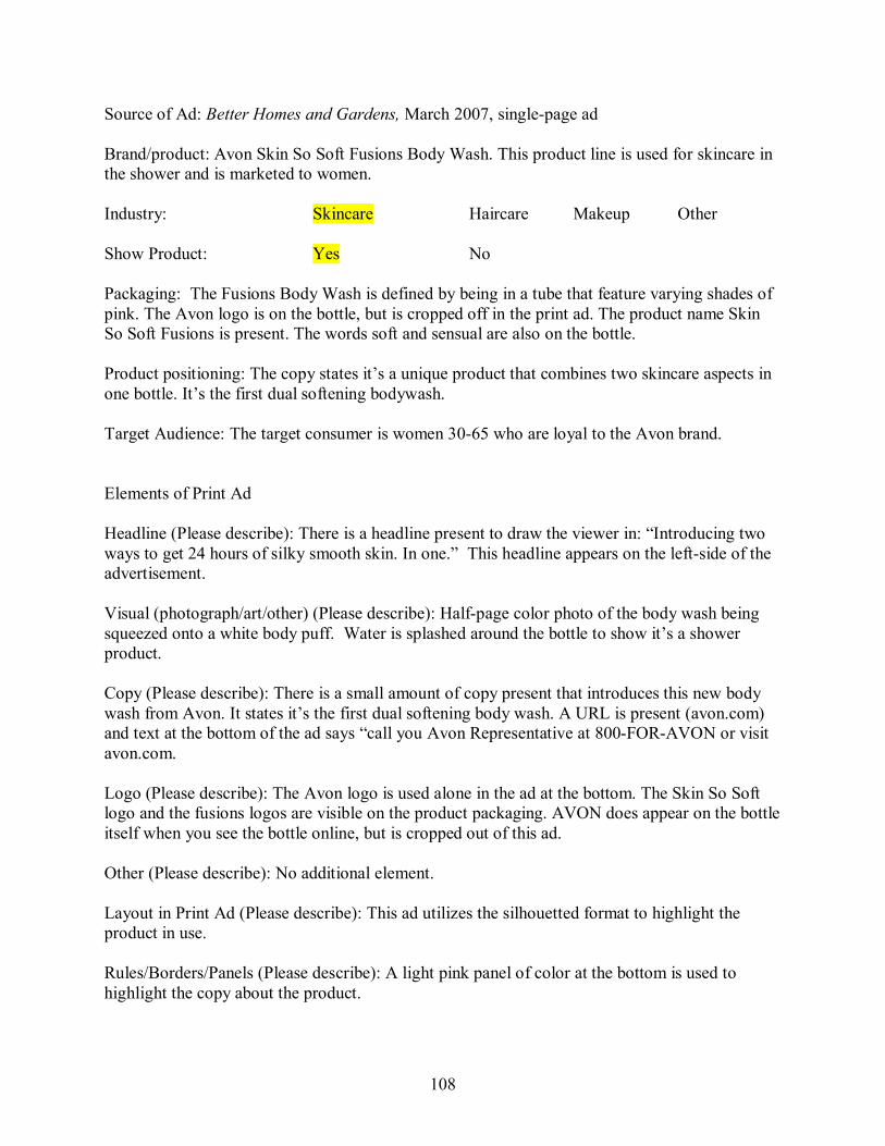
108
Source of Ad: Better Homes and Gardens, March 2007, singlepage ad
Brand/product: Avon Skin So Soft Fusions Body Wash. This product line is used for skincare in the shower and is marketed to women.
Industry: Skincare Haircare Makeup Other
Show Product: Yes No
Packaging: The Fusions Body Wash is defined by being in a tube that feature varying shades of pink. The Avon logo is on the bottle, but is cropped off in the print ad. The product name Skin So Soft Fusions is present. The words soft and sensual are also on the bottle.
Product positioning: The copy states it’s a unique product that combines two skincare aspects in one bottle. It’s the first dual softening bodywash.
Target Audience: The target consumer is women 3065 who are loyal to the Avon brand.
Elements of Print Ad
Headline (Please describe): There is a headline present to draw the viewer in: “Introducing two ways to get 24 hours of silky smooth skin. In one.” This headline appears on the leftside of the advertisement.
Visual (photograph/art/other) (Please describe): Halfpage color photo of the body wash being squeezed onto a white body puff. Water is splashed around the bottle to show it’s a shower product.
Copy (Please describe): There is a small amount of copy present that introduces this new body wash from Avon. It states it’s the first dual softening body wash. A URL is present (avon.com) and text at the bottom of the ad says “call you Avon Representative at 800FORAVON or visit avon.com.
Logo (Please describe): The Avon logo is used alone in the ad at the bottom. The Skin So Soft logo and the fusions logos are visible on the product packaging. AVON does appear on the bottle itself when you see the bottle online, but is cropped out of this ad.
Other (Please describe): No additional element.
Layout in Print Ad (Please describe): This ad utilizes the silhouetted format to highlight the product in use.
Rules/Borders/Panels (Please describe): A light pink panel of color at the bottom is used to highlight the copy about the product.
109
Color (Please describe): Pink and black are the main colors of the ad. In addition, the image sits against a white background. The ad features all black text.
Typography (Please describe): Simple sans serif fonts are used throughout the ad in varying sizes.
Overall Design principles: The art director wants the reader to look at the photo of the body wash in action. Squeezing the product out onto a waiting body puff while water is splashed around it, draws the eye to the creamy product. Overall, there is a sense that this product is refreshing and feminine.
Definition of the brand/brand personality statement: (Please describe): Avon’s Skin So Soft Fusions Body Wash is for women over 30 who are Avon users that want soft skin from a unique product. Avon’s Skin So Soft Fusions Body Wash helps women achieve silky skin in a dual action body wash. The reason is because Avon uses jojoba oil to soften and hydrate and a polishing cleanser to exfoliate. The brand character is creamy, feminine, and driven by quality.
Product Web site Web URL (Please describe): URL: avon.com Date accessed: February 21, 2007 The URL does not take you directly to the Sin So Soft Fusions page. This site was very difficult to find information. It took 34 clicks depending on how you navigated to get more information on this product. By typing in Fusions in the search feature off the home page, it came up quicker, but there were other options in this line called renew and fresh and light and lush. The soft and sensual text on the packaging is the name of this particular product, not just a statement.
This Soft and Sensual Fusions’ Web page is offers a bit more information such as statistics of women who have used the product, but mostly this site is just a means to actually order the product.
Show Product (Please describe): The Web site does show the product packaging, but it is not in action and doesn’t show the body wash coming out.
Campaign (Please describe): It is not the same campaign. The Avon home page does not have an “Introducing Fusions” feature like the ad does. The Avon Web site doesn’t exist to be a campaign extension, but to be a resource to purchase the product.
Headline (Please describe): Skin So Soft/Fusions is not featured on the home page except for a link. The interior product page does not have a headline, but rather just the name of the product.
Visual (photograph/art/other) (Please describe): The Web site does show the product, but it is not in action and doesn’t show the body wash coming out. Copy (Please describe): There is a small amount of copy present that states what it is and what other women have seen as a result of using the product.
None of the text from the print ad appears online.

110
Logo (Please describe): The Avon logo is in the upper left corner and is in a peach/tan color. The Skin So Soft and Fusions logo is not present except on the packaging.
Other (Please describe): No other elements.
Layout of Web site (Please describe): The product page uses a fourcolumn format, with elements overlapping each column. A navigation bar sits on top and additional informational links are on the bottom. The righthand column features small ads to other products on the site while the left column is additional navigation. The two middle columns feature the photo of the product and some text and shopping cart information.
Rules/Borders/Panels (Please describe): The navigation panels are in shades of blue and peach. Rules are used within these panels to separate navigational elements.
Color (Please describe): Text is in navy and grey and the background of the page is white. Overall, this Web page does not have a cohesive look when paired with its print ad. Besides the bottle, pink and black isn’t used on the page.
Typography (Please describe): A simple sansserif font is again used throughout the page in varying sizes.
Overall impression (Please describe): Overall there isn’t consistency in layout, copy, photos, and use of colors. The advertising does not promote a consistent brand identity. My overall impression of how the print ad’s use of design along with the Web site’s use of design perpetuates a cohesive brand identity is that they don’t work together at all. The Web site is used just as a shopping tool, and not as a campaign or brand extension. The overall brand from the print ad is defined by the color pink and the use of the body wash in action. The Web site uses neither.
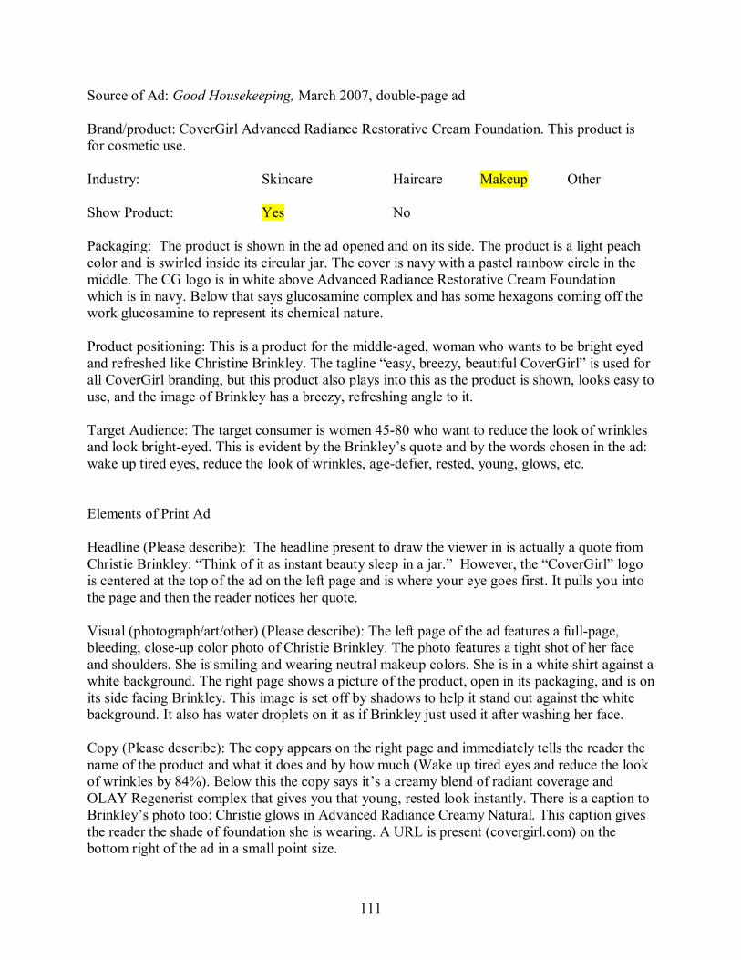
111
Source of Ad: Good Housekeeping, March 2007, doublepage ad
Brand/product: CoverGirl Advanced Radiance Restorative Cream Foundation. This product is for cosmetic use.
Industry: Skincare Haircare Makeup Other
Show Product: Yes No
Packaging: The product is shown in the ad opened and on its side. The product is a light peach color and is swirled inside its circular jar. The cover is navy with a pastel rainbow circle in the middle. The CG logo is in white above Advanced Radiance Restorative Cream Foundation which is in navy. Below that says glucosamine complex and has some hexagons coming off the work glucosamine to represent its chemical nature.
Product positioning: This is a product for the middleaged, woman who wants to be bright eyed and refreshed like Christine Brinkley. The tagline “easy, breezy, beautiful CoverGirl” is used for all CoverGirl branding, but this product also plays into this as the product is shown, looks easy to use, and the image of Brinkley has a breezy, refreshing angle to it.
Target Audience: The target consumer is women 4580 who want to reduce the look of wrinkles and look brighteyed. This is evident by the Brinkley’s quote and by the words chosen in the ad: wake up tired eyes, reduce the look of wrinkles, agedefier, rested, young, glows, etc.
Elements of Print Ad
Headline (Please describe): The headline present to draw the viewer in is actually a quote from Christie Brinkley: “Think of it as instant beauty sleep in a jar.” However, the “CoverGirl” logo is centered at the top of the ad on the left page and is where your eye goes first. It pulls you into the page and then the reader notices her quote.
Visual (photograph/art/other) (Please describe): The left page of the ad features a fullpage, bleeding, closeup color photo of Christie Brinkley. The photo features a tight shot of her face and shoulders. She is smiling and wearing neutral makeup colors. She is in a white shirt against a white background. The right page shows a picture of the product, open in its packaging, and is on its side facing Brinkley. This image is set off by shadows to help it stand out against the white background. It also has water droplets on it as if Brinkley just used it after washing her face.
Copy (Please describe): The copy appears on the right page and immediately tells the reader the name of the product and what it does and by how much (Wake up tired eyes and reduce the look of wrinkles by 84%). Below this the copy says it’s a creamy blend of radiant coverage and OLAY Regenerist complex that gives you that young, rested look instantly. There is a caption to Brinkley’s photo too: Christie glows in Advanced Radiance Creamy Natural. This caption gives the reader the shade of foundation she is wearing. A URL is present (covergirl.com) on the bottom right of the ad in a small point size.
112
Logo (Please describe): The CoverGirl logo is used alone in the ad. It is a textbased, sansserif, white logo and runs across the top of Brinkley’s head. A different logo appears on the lid of the foundation – it’s an abbreviated version: CG. Of note, the logo across Brinkley’s head is difficult to read as it’s white and runs over her blond hair as well as the white background. In addition, another logo from another brand is used, Olay, within the copy block.
Other (Please describe): No additional elements used.
Layout in Print Ad (Please describe): This ad utilizes a picturewindow format on the left page and a silhouette format on the right page.
Rules/Borders/Panels (Please describe): There aren’t any rules or borders present. The right page uses a fullpage panel of a shade of white.
Color (Please describe): The photograph of Brinkley and the product provides most of the color. However, grey is used for all text and shades of blue make up the product name. The word “new” is also in white. The quote is in grey while Brinkley’s name is in blue.
Typography (Please describe): A serif font used throughout the ad except for Christie’s quote attribution and the product name.
Overall Design principles: The art director wants the reader to look at the photo of Brinkley to show the “face” of the product. The use of a fullpage image emphasizes this. The eye then looks at the open jar of cream that is aligned on the following page. In addition, the art director wants the reader to see what the product package looks like since it’s also featured. Overall, there is a sense that this foundation will provide the user with a fresh, beautiful face.
Definition of the brand/brand personality statement: (Please describe): CoverGirl’s Advanced Radiance Restorative Cream Foundation is for women over 45 who want to reduce the appearance of wrinkles and look refreshed, CoverGirl’s Advanced Radiance Restorative Cream Foundation helps women defy age and exhibit skin’s radiance. The reason is because CoverGirl uses Olay’s Regenerist Complex in a cream form to help skin look young and rested instantly. Using Christie Brinkley as the spokesmodel portrays the brand character as agedefying, radiant, refreshed, and smooth.
Product Web site Web URL (Please describe): URL: covergirl.com Date accessed: February 21, 2007 The URL takes you to the CoverGirl homepage, where a rotating Flash feature on the page does showcase the Advanced Radiance foundation. Click on it, and you are taken to the Advanced Radiance product line page. From there select the Restorative Cream Foundation and the user is taken to the product page. http://www.covergirl.com/cgcollection/face/foundation/mini_advanced_radiance/index.jhtml (Product line page)
113
http://www.covergirl.com/cgcollection/face/foundation/mini_advanced_radiance/ar_cream.jhtml (actual product page for foundation)
Show Product (Please describe): The Web site does show the product on the home page, the product line page, and on the product page. Throughout, the same image of the open jar on its side is used that was in the print ad. In addition, on the product page, swatches of all 15 shades are shown.
Campaign (Please describe): It is the same campaign. The copy throughout the pages is the same as the print ad. The same image of Christie Brinkley is used, as well as the same image of the product. The typography, copy, colors, and layout of the site all create a consistent identity.
Headline (Please describe): There are several headlines throughout. The home page and the product page treat Advanced Radiance as the headline while the product line page uses “Defy the signs of aging.” However the product line page does use “Think of it as instant beauty sleep in a jar.”
Visual (photograph/art/other) (Please describe): The same image of Christie Brinkley is used on the home page and product line page. The same image of the product is used on all three pages. The product line page also shows the other Advanced Radiance products.
Copy (Please describe): The copy on the product page is the same as the print ad mostly: NEW Advanced Radiance Restorative Cream Foundation Our most advanced agedefier yet protects with SPF 10 and provides radiant coverage and reduces the look of wrinkles by 84% on average, for a younger look instantly. With the help of Olay's exclusive Glucosamine complex, Advanced Radiance Restorative Cream Foundation rejuvenates and continuously hydrates, for the glow of a good night's sleep.
Some additional information such as SPF 10 is added.
On the home page, similar copy is used too from the print ad: “reduces wrinkles by 84% and wake up tired eyes…”
Logo (Please describe): The same navy CoverGirl logo is present on the top left of all Web pages in navy blue.
Other (Please describe): Flash elements are used on the home page and product line page. The product Web page does feature a link to get color matched for your perfect shade. Layout of Web site (Please describe): The product page uses a column format, with a left hand navigation taking up the left column and the product information spreading across the center columns. The righthand column features links to other products. A navigation bar sits on top and additional informational links are on the bottom.
Rules/Borders/Panels (Please describe): The navigation bar creates its own natural border. Internally on the page, rules are used to separate shade categories and also are used as design
114
elements on navigational icons. A blue panel sits on the top of the page and the logo sits on top of that. Small blue panels are used as section headers for the shade categories.
Color (Please describe): Text is in black, while navigation elements are in shades of blue and grey. The background of the page is white. Overall, a very cohesive look is achieved by using the same colors as in the print ad.
Typography (Please describe): A simple sansserif font is again used throughout the page in varying sizes. The copy on the home page Flash feature for the product is also in sans serif.
Overall impression (Please describe): Overall there is consistency in typography, layout, images, copy, and use of colors. The advertising does promote a consistent brand identity. The product page doesn’t use the image of Brinkley, but the home page and the product line page does. The URL takes you to the home page where this campaign is carried through. The URL to the product page is too long and it makes sense to bring the reader to the home page. The use of the rotating Flash feature on the home page allows for multiple campaigns to be featured, so no matter which ad you saw in print, on the Web, you get the same campaign.
My overall impression of how the print ad’s use of design along with the Web site’s use of design perpetuates a cohesive brand identity is that they treat their Web site as an extension of the print ad but with multiple opportunities to find out more about the entire Advanced Radiance line. The Web site doesn’t offer that much additional information about the foundation, but does show all the shades and their names. The overall brand is defined by the use of Brinkley as a spokesmodel, and the use of the same copy that reiterates that the product helps you look younger.
115
Source of Ad: Better Homes and Gardens, March 2007, doublepage ad with foldout feature
Brand/product: Dove ProAge. This product line is used for skin and hair and is marketed for women of all ages.
Industry: Skincare Haircare Makeup Other
Show Product: Yes No
Packaging: The ProAge product line is defined by being in maroon, curved plastic bottles. The logo is present on all of the product line.
Product positioning: This is a product that a grandmother, mother, and young woman would all be able to use, no matter their size, shape, or color. The tagline “beauty has no age limit” also portrays that all women can feel beautiful and that Dove will help them do that.
Target Audience: The target consumer is women 3575 who are interested in using a product made just for them. This is evident by the use of 50+ women and the words chosen in the ad: lifts, firms, defines, skin elasticity, etc.
Elements of Print Ad
Headline (Please describe): There is a headline present to draw the viewer in: “Too old to be in an antiaging ad.” This headline appears on three panels of this foldout advertisement.
Visual (photograph/art/other) (Please describe): Fullpage color photos are used on this multi page ad. The photos feature middleaged, naked, greyhaired women of different races in non suggestive poses. They are smiling and have glowing skin and shiny hair. Their images fill up three fullpage panels.
There is also a photo of the ProAge collection of products that stands out against the allwhite background (use of silhouette) of the final page of the ad.
Copy (Please describe): There is a small amount of copy present that introduces this new line of products from Dove: “but this isn’t antiage. this is proage. a new line of skin and hair care from dove. beauty has no age limit.” A URL is present (doveproage.com) and text under the photo of the product says “new dove proage.”
Logo (Please describe): The logo is not used alone in the ad. The logo is visible on the product packaging and there is a small gray dove by the URL. But the words “Dove” and the image of the dove are not present in a logo in the ad itself.
Other (Please describe): The use of a foldout, multipage ad format can be considered an additional element.
116
Layout in Print Ad (Please describe): This ad utilizes a lot of white space and uses the picture window format. In addition the way the product is showcased uses a silhouette format.
Rules/Borders/Panels (Please describe): No rules, borders, or panels are present.
Color (Please describe): There is a color scheme present in the advertisement – white, maroon, and a silver/gray. The ad features gray and maroon text, and reverse text over the photos. Color is emphasized against the striking images as well as on the use of white space.
Typography (Please describe): A simple sans serif font similar to Helvetica is used. All text is in lowercase.
Overall Design principles: The art director wants the reader to look at the photos of the naked women to showcase what real women are all about. The use of fullpage images emphasizes this. In addition, the art director wants the reader to see what the product looks like since it’s isolated on a mostly allwhite page on the right. Overall, there is a sense that these women and the women who use Dove are defying age and not settling for the stereotypical views of aging.
Definition of the brand/brand personality statement: (Please describe): Dove’s ProAge is for women over 35 who are concerned that age defines who they are and what they are able to use. Dove’s ProAge product line of skin and haircare products helps middleaged women defy the aging process while giving them quality skin and hair results. The reason is because Dove uses ingredients that don’t focus on antiaging, but quality and how to bring that quality to life. The real women with nonperfect bodies used in the ad represent the brand character which is being positive about getting older, be proud of your body, diversity is beautiful, and quality matters.
Product Web site Web URL (Please describe): URL: doveproage.com Date accessed: February 21, 2007 The URL does take you directly to the proage home page. One click on Products, takes you directly to specific information about the product line.
This product line’s Web page is a gateway to even more specific information about each part of the ProAge line.
Show Product (Please describe): The Web site does show similar images of groupings of products like in the print ad, and there’s even a similar image in the bottom right of the Web page like in the print ad.
Campaign (Please describe): It is the same campaign. The copy at the top of the page fits right into the print ad campaign’s feel: Dove created new pro∙age products that reflect the unique needs of women in their best years. Formulated to nourish and condition, pro∙age helps revive and renew skin and hair.” The photos of the product have the same feel, while the typography, copy, colors, and layout of the site all create a consistent identity.
117
Headline (Please describe): “Dove is ProAge, are you?” appears on the home page. The interior product page does not have a headline, but rather the introductory text as stated above.
Visual (photograph/art/other) (Please describe): The same image of the AfricanAmerican woman from the print ad is used on the home page, but is closely cropped to her face. In addition, similar images of the product line are used on the product page.
Copy (Please describe): There is copy present that states how it works, what it is, and what results to expect. The same format is used for the other products on the page. There is basic introductory copy that introduces the reader to the page.
The tagline Beauty has no age limit isn’t present on the page, but a link at the bottom phrases it as a question: Does beuaty have an age limit? View the commercial.”
Logo (Please describe): The same grey Dove logo is present on the top left of the home page and product page.
Other (Please describe): Flash elements are used on the image of the woman on the home page. The product Web page does feature a link “to try proage”
Layout of Web site (Please describe): The product page uses a horizontal grid format. The products alternate from being on the left and right side of the pages with the text directly next to it. A navigation bar sits on top and additional informational links are on the bottom.
Rules/Borders/Panels (Please describe): The navigation bar creates its own natural border. Internally on the page, grey rule lines are used to separate the products’ names and their descriptions.
Color (Please describe): Text is in grey, product names in maroon, and links for additional information also in maroon. The background of the page is white. Overall, a very cohesive look is achieved by using the same colors as in the print ad.
Typography (Please describe): A simple sansserif font is again used throughout the page in varying sizes. Product names are in a serif font – in all lowercase letters.
Overall impression (Please describe): Overall there is consistency in typography, layout, copy, and use of colors. The advertising does promote a consistent brand identity. Although the product page doesn’t use the image of the models, the home page for Dove features a Flash element that uses the same image of the AfricanAmerican woman from the print ad closely cropped from the shoulders up.
My overall impression of how the print ad’s use of design along with the Web site’s use of design perpetuates a cohesive brand identity is that they treat their Web site as a very important part of their campaign. The Web site is a detailed source that not only expands upon the campaign but also brings in new elements like casting calls for proage women and links to try the new line of products. The overall brand is defined by the colors grey, maroon, and white and

118
the daring, refreshing way of photographing middleaged women who have imperfections who are comfortable in their skin – both the Web and the print ad achieve this.
119
Source of Ad: Better Homes and Gardens, March 2007, doublepage ad
Brand/product: Garnier Nutritioniste UltraLift cream. This product helps firm wrinkles, add moisture, and provide soft skin
Industry: Skincare Haircare Makeup Other
Show Product: Yes No
Packaging: The product is defined by being in a lime green plastic bottle with a white pump top (about 4 oz). The green circle from the Garnier logo (normal logo has 3 circles: green, orange, and pink), is present on this bottle at the left end of an arched silver swash. Garnier is in silver and Nutritioniste is in black. The name of the product “UltraLift” is in white over a black bar with red rules on the top and bottom of the bar. “Antiwrinkle firming moisture cream” is in black, and “SPF 15 Sunscreen” is in black with a faded yellow spot behind it.
Product positioning: The tagline “Great skin from the inside out” refers to the nutrients in the product that soak into your skin and work their magic. Using an image of sushi (a hip way to consume fish and its nutrients) and the product in a similar “pose” to infer that the product does the same thing helps portrays the product as modern and eclectic.
Target Audience: The target consumer is women over 30 who are interested in firming their skin and using nutrients found in nature to help their skin. This is evident by using the image of a piece of sushi to parallel its nutrients to those of the UltraLift. In addition, the words chosen in the ad: refuels, nutrients, inside, fortifies – can all refer to nutrition you take in internally.
Elements of Print Ad
Headline (Please describe): Headline is present across the top of the pages. It runs across both pages with “Omega 3 in fish is proven to fight heart disease” on the left, and “Now it’s in skincare that actually lifts wrinkles from the inside out” on the right. The headline is in white against the all black background. The headline is in sentence form in a sansserif type and in white. A subheadline appears in the copy block: “Nutrition + Dermatology = A 1 st from Garnier”
Visual (photograph/art/other) (Please describe): A vibrant salmoncolored piece of sushi is isolated on the left page with a slight reflection. Lying in front of it is a pair of dark grey chopsticks. On the right page, mirroring this style is the bottle of “UltraLift” with a silver spoon laying in front of it with a small dollop of the cream in it. A green transparent circle touches the bottle with the word “new” in white. In addition, a small piechart illustration of vitamin capsules, a slice of kiwi, and part of a molecular chain is in the ad near the copy.
120
Copy (Please describe): There is copy present that highlights the ingredients in the moisturizer. There also is a proven study fact: “A clinical study proves: in 3 weeks wrinkles are visibly lifted and skin in noticeably firmer.” The URL is listed above the logo in green type.
Logo (Please describe): The Garnier logo is in the lower right hand corner of the right page. It is a white, sansserif font. Beside the word Garnier, on the left and aligned with the top of the “g” in Garnier, are three small circles – green, orange, and pink. In each circle, a small illustration of a leaf is present. The tagline “Take Care” is beneath the logo, and aligned on the right. In addition, the Garnier logo is in silver on the product and only the green circle is on the bottle.
Other (Please describe): There are no other special elements to the ad.
Layout in Print Ad (Please describe): This ad utilizes the Silhouette format. The photos are isolated and the copy (both headlines and body text) are away from the main images.
Rules/Borders/Panels (Please describe): Green rule lines are used to create the box that the copy and the pie chart illustration are in. A horizontal green panel highlights the subhead. Black is used as a fullpage, double spread panel.
Color (Please describe): The background of the ad is black, which makes the bright sushi and bottle pop off the page. The black offers a stark contrast to the white headline and the green rule lines and panel. The main colors of the ad are black, green, and white. Green is used in the copy block to emphasize the nutrients found in the product.
Typography (Please describe): The ad is comprised of all sansserif fonts. All copy and copy on the bottle is in sans serif fonts.
Overall Design principles: The art director wants the reader to compare the photos first, and then read the headlines. There definitely is an emphasis for the reader to realize that Omega 3 in fish is healthy = Omega 3 in Nutritioniste is healthy. In addition, the art director wants the reader to make the connection that this is nutrition and dermatology working together = not just another skin cream.
Definition of the brand/brand personality statement: (Please describe): Garnier Nutritioniste’s Ultra Lift antiwrinkle firming moisture cream is for women over 30 who are concerned with having firm, wrinklefree skin. Garnier Nutritioniste’s Ultra Lift antiwrinkle firming moisture cream is the skincare that helps women have firm skin, banish wrinkles, and lock in moisture. The reason is because Garnier Nutritioniste uses Omega 3 to lock in moisture to refuel cells at the deepest surface layers in the skin. The brand character is modern, nutritious, fun, and innovative.
Product Web site Web URL (Please describe): URL: www.garniernutrioniste.com Date accessed: February 21, 2007 The URL does not take you directly to the product page. The home page features a rotating Flash animation that highlights the products. The UltraLift Flash feature displays the sushi and
121
chopsticks image and ends with Sarah Jessica Parker smiling next to the same image that was used of the product in the print ad. The user then has to click “products” on the home page. This takes you to a selection of three product categories. The icon that takes you to the UltraLift site is the same pie chart graphic. Once that is clicked, the user chooses the product in the line. The actual URL for this product is: http://www.garniernutritioniste.com/en/#products/ultralift/firming_moisture_cream_spf
Show Product (Please describe): The Web site does show the product and it’s in the same package as featured in the print ad. The online version does not show the cream on a spoon, but does show the bottle with a clear plastic cap on.
Campaign (Please describe): It is the same campaign. There are many of the same elements such as the text used to describe the product, the image of the product, the colors, typography, and the use of layout style. The Web site is an additional interactive source for the consumer to obtain additional information.
Headline (Please describe): No specific headline except for the product name.
Visual (photograph/art/other) (Please describe): On the product page, there is an image of the UltraLift bottle, but it’s got the cap on. The same pie chart icon is on the product page too. The home page features the same exact images as in the print ad plus Sarah Jessica Parker as a spokesperson.
Copy (Please describe): There is a general description under the name of the product that is similar to the print ad. There is copy present under subheads: “Is it right for me? How is it different? How do I use it? Results.” In addition, the Web site shows how it works, the other products in the line, and the opportunity to try a sample. The tagline “Great Skin from the Inside Out” is not present on the product page, but appears on the Nutritioniste home page.
Logo (Please describe): Both the logo that is present on the bottle and the version with the 3 circles are on the Web page. The top left features the logo for Nutritioniste, while the bottom left has the general Garnier logo.
Other (Please describe): The Flash animation and interactivity adds another dimension to the Web site.
Layout of Web site (Please describe): The Web site for this product uses a column format. The navigation bar stretches across all the columns, while the content holder is divided into 2 large columns. The right column on the UltraLift product page is then divided again, with some content in each column, and the copy about the product stretching over the 2 columns.
Rules/Borders/Panels (Please describe): A green rule line is used to separate the content from the navigation bar. In addition, the content box is offset by a thin, feathered white border. The content box with the product information is in a shade of black thus creating a color panel.
122
Color (Please describe): A black Web page with green and white text and accents are the main colors of the site. Additional colors are brought in on the images on the site, as is the case in the print ad.
Typography (Please describe): A simple sansserif font is again used throughout the page in varying sizes.
Overall there is consistency in typography, visuals, layout, copy, and use of colors. The advertising does promote a consistent brand identity. The product page utilizes a similar image of the product while the pie chart icon is found throughout the site to take the user to the UltraLift product line. The home page is very consistent with the branding effort of the print ad and lets the viewer immediately “know” they have reached the right site.
My overall impression of how the print ad’s use of design along with the Web site’s use of design perpetuates a cohesive brand identity is that they treat their Web site as an additional, interactive source for information and not as just posting their print ads in an electronic format. The Web site is an additional source for information about how to use the product, benefits of the product, and extends the campaign. The Web site is fun to use with its Flash elements and modern design. The overall brand design is defined by using the colors black, green, and white and continuing to use the same images. The use of the pie chart graphic as an icon to the product line further ties the print ad and Web site together. Overall, this campaign portrays Garnier Nutritioniste UltraLift as a trendy, fun brand that makes your skin look younger, and makes you feel healthy and vibrant.
123
Source of Ad: Better Homes and Gardens, March 2007, singlepage ad
Brand/product: Infusium 23. This product line is used for hair and is marketed for women of all ages.
Industry: Skincare Haircare Makeup Other
Show Product: Yes No
Packaging: The Infusium 23 product line is defined by being in grey plastic bottles with black poptops. The logo is present on all of the product line and runs vertically along the bottle. Each hair treatment has its own color associated with it: i.e. (volum)ologie conditioner is labeled in purple while (colour)ologie conditioner is in orange.
Product positioning: The product’s branding gives off an industrial, scientific, wecanfixit feeling. The way each product in the line is named XXX –ologie also plays upon the science world. The tagline “beauty down to a science” also portrays that science is behind the product and it’s going to fix women’s hair problems.
Target Audience: The target consumer is women 2555 who want their hair worries to be fixed. This is evident by the use of illustration throughout the ad and the words chosen in the ad: problem, solution, control, science, etc.
Elements of Print Ad
Headline (Please describe): There is a headline present to draw the viewer in: “Problem hair. Meet your solution.” Above that a small subhead states “The redesigned Infusium 23”.
Visual (photograph/art/other) (Please describe): Photos of each bottle of treatment are used. The photos feature a slight reflection. These photos are turned into illustrations by adding a type of “playonwords” element to them. The (volum)ologie conditioner has a megaphone coming out of the top of the bottle, while the (repair)ologie leavein treatment has a wrench twisting the cap. The (moisture)ologie treatment has a faucet with running water pouring into it and the (frizz)ologie has an umbrella coming out of the bottle. Finally the (colour)ologie conditioner has a paint brush with orange paint (same color as the product name) dripping into the bottle. These images portray that Infusium 23 protects your hair and puts into its products items that will save your hair.
In addition, a small illustration of damaged hair and hair treated with Infusium 23 is used.
Copy (Please describe): There is a small amount of copy present that introduces this new specialized line of products from Infusium 23. A URL is present on the bottom left of the page (infusium23.com).

124
Logo (Please describe): The logo is used alone in the ad as well as featured on each bottle. The logo is textbased, in black, and is in a sans serif font: in(fus)ium. The number 23 is below it in grey. The use of parentheses (which are in grey) highlight the fact that their products are infused with science. The tagline “beauty down to a science” is in lowercase, sans serif, and sits below it under the “m” in in(fus)ium.
Other (Please describe): No additional elements
Layout in Print Ad (Please describe): This ad utilizes a lot of white space and uses a silhouette illustration format to feature the products.
Rules/Borders/Panels (Please describe): A rule line is present at the bottom of the ad. The rule line is centered and runs right next to the 23 in the logo which is aligned right on the right side of the page. The rule line also separates the URL and tagline from the rest if the ad, but with its proximity to the logo, is used as a feature in the logo.
Color (Please describe): The colors in the ad are white (background), grey, and black. The colors purple (volum), green (repair), aqua (moisture), red (frizz), and orange (colour) are used to highlight the product on the bottle and below the bottle and are used as a distinguishing factor since the bottles are all the same.
Typography (Please describe): A simple sans serif font similar to Helvetica is used.
Overall Design principles: The art director wants the reader to look at the photos of the bottles to see what Infusium 23 can do for you by isolating the photos on an allwhite background. The use of illustrating in literal terms of what Infusium 23 does creates a visualization of repair, fixing, and replenishing for the viewer. In addition, the art director wants the reader to see all the products in the line and distinguish between them with by pulling their names off the bottle and highlighting them below in color. Overall, there is a sense that this product will get the job done and is serious about repairing hair.
Definition of the brand/brand personality statement: (Please describe): Infusium 23’s line of haircare products is for women over 25 who have serious hair problems. Infusium 23 helps women repair damaged hair while providing the comfort that science and research is behind it all. The reason is because Infusium 23 uses ingredients that enhance the texture and condition of hair and is not a frilly product, but gets the job done right through the use of science. The brand character is scientific, modern, and industrial.
Product Web site Web URL (Please describe): URL: infusium23.com Date accessed: February 21, 2007 The URL does take you directly to the Infusium 23 home page. Each product line is showcased on the home page and when you roll over the bottle, it becomes a link to each line (frizz, repair, moistur, volum, colour).
125
This product line’s Web page is a gateway to even more specific information about each part of the Infusium 23 line.
Show Product (Please describe): The Web site does show similar images of the products like in the print ad, but there’s no additional illustration. The bottles are the main feature throughout the Web site. Also, the same use of a reflection effect from the bottles is used on the Web site.
Campaign (Please describe): For the most part, it is the same campaign. The only difference is the absence of additional illustrations. The bottles are the main focus of Infusium’s branding efforts. Using the bottles online and in the print ad, reinforces this. Infusium 23 does a really good job of carrying over the scientific, metallic, look to its Web site and also by highlighting the different product lines by only the use of their respective colors.
Headline (Please describe): “Beauty down to a science” appears on the home page. The interior product pages do not have headlines, but rather just the name of the product collection.
Visual (photograph/art/other) (Please describe): Similar images of bottles are used in different ways. On the home page, they are lined up (incidentally, not in the same lefttoright order as in the print ad). When you click on a bottle, it takes you to that collection’s page. Once on the collection page, choose the exact product (conditioner, shampoo, etc) and it takes you to another page. On that page, the bottle turns horizontal and the other bottles fade to the background. All throughout, the same reflection effect is used.
Copy (Please describe): There is copy present that states how it works, what it is, and what results to expect on internal pages. The same format is used for the other products on the pages. There isn’t basic introductory copy that introduces the reader to the home page, but rather the links renew, replenish, restore.
Logo (Please describe): The same in(fus)ium 23 logo is present on the top left of the home page and product pages.
Other (Please describe): Flash elements are used on the image of the bottles on the home page and throughout the site.
Layout of Web site (Please describe): The product page uses a fourcolumn format, with elements overlapping each column. A navigation bar sits on top and additional informational links are on the bottom. The righthand column is additional links to renew, replenish, restore, while the three other columns feature the bottles that take up almost half of the screen.
Rules/Borders/Panels (Please describe): The navigation bar creates its own natural rule. On the home page, the right column has many rule lines and boxers separating each link. Internally on each product page, light grey panels are used as a backdrop that the bottles are in front of.
Color (Please describe): Except for the product lines in their respective colors, the entire site is grey, white, and black. Text is in shades of grey; rule lines, bars, and panels are also in grey; and
126
the background is white. The only black appears in the logo and in the images of the bottles. Overall, a very cohesive look is achieved by using the same colors as in the print ad.
Typography (Please describe): A simple sansserif font is again used throughout the pages in varying sizes.
Overall impression (Please describe): Overall there is consistency in typography, layout, copy, photos, and use of colors. The advertising does promote a consistent brand identity. Both the home page and each product page focuses on the bottles and pulls out the color from the bottle that represents that product.
My overall impression of how the print ad’s use of design along with the Web site’s use of design perpetuates a cohesive brand identity is that they treat their Web site as a source for more specific information about each product line and the products within each line. The Web site is a detailed source that expands upon the campaign by using the same sciencedriven feel. The overall brand is defined by the colors grey, white, black, and the product individual colors and the focus on the bottles themselves. Consumers looking for hair help will have no trouble identifying Infusium 23 bottles in the store once they see the print ad and visit the Web site. Design plays a role for Infusium 23 by reinforcing what the product does and what it looks like.
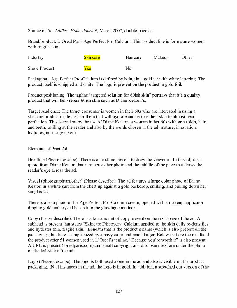
127
Source of Ad: Ladies’ Home Journal, March 2007, doublepage ad
Brand/product: L’Oreal Paris Age Perfect ProCalcium. This product line is for mature women with fragile skin.
Industry: Skincare Haircare Makeup Other
Show Product: Yes No
Packaging: Age Perfect ProCalcium is defined by being in a gold jar with white lettering. The product itself is whipped and white. The logo is present on the product in gold foil.
Product positioning: The tagline “targeted solution for 60ish skin” portrays that it’s a quality product that will help repair 60ish skin such as Diane Keaton’s.
Target Audience: The target consumer is women in their 60s who are interested in using a skincare product made just for them that will hydrate and restore their skin to almost near perfection. This is evident by the use of Diane Keaton, a woman in her 60s with great skin, hair, and teeth, smiling at the reader and also by the words chosen in the ad: mature, innovation, hydrates, antisagging etc.
Elements of Print Ad
Headline (Please describe): There is a headline present to draw the viewer in. In this ad, it’s a quote from Diane Keaton that runs across her photo and the middle of the page that draws the reader’s eye across the ad.
Visual (photograph/art/other) (Please describe): The ad features a large color photo of Diane Keaton in a white suit from the chest up against a gold backdrop, smiling, and pulling down her sunglasses.
There is also a photo of the Age Perfect ProCalcium cream, opened with a makeup applicator dipping gold and crystal beads into the glowing container.
Copy (Please describe): There is a fair amount of copy present on the rightpage of the ad. A subhead is present that states “Skincare Discovery: Calcium applied to the skin daily redensifies and hydrates thin, fragile skin.” Beneath that is the product’s name (which is also present on the packaging), but here is emphasized by a navy color and made larger. Below that are the results of the product after 51 women used it. L’Oreal’s tagline, “Because you’re worth it” is also present. A URL is present (lorealparis.com) and small copyright and disclosure text are under the photo on the leftside of the ad.
Logo (Please describe): The logo is both used alone in the ad and also is visible on the product packaging. IN al instances in the ad, the logo is in gold. In addition, a stretched out version of the
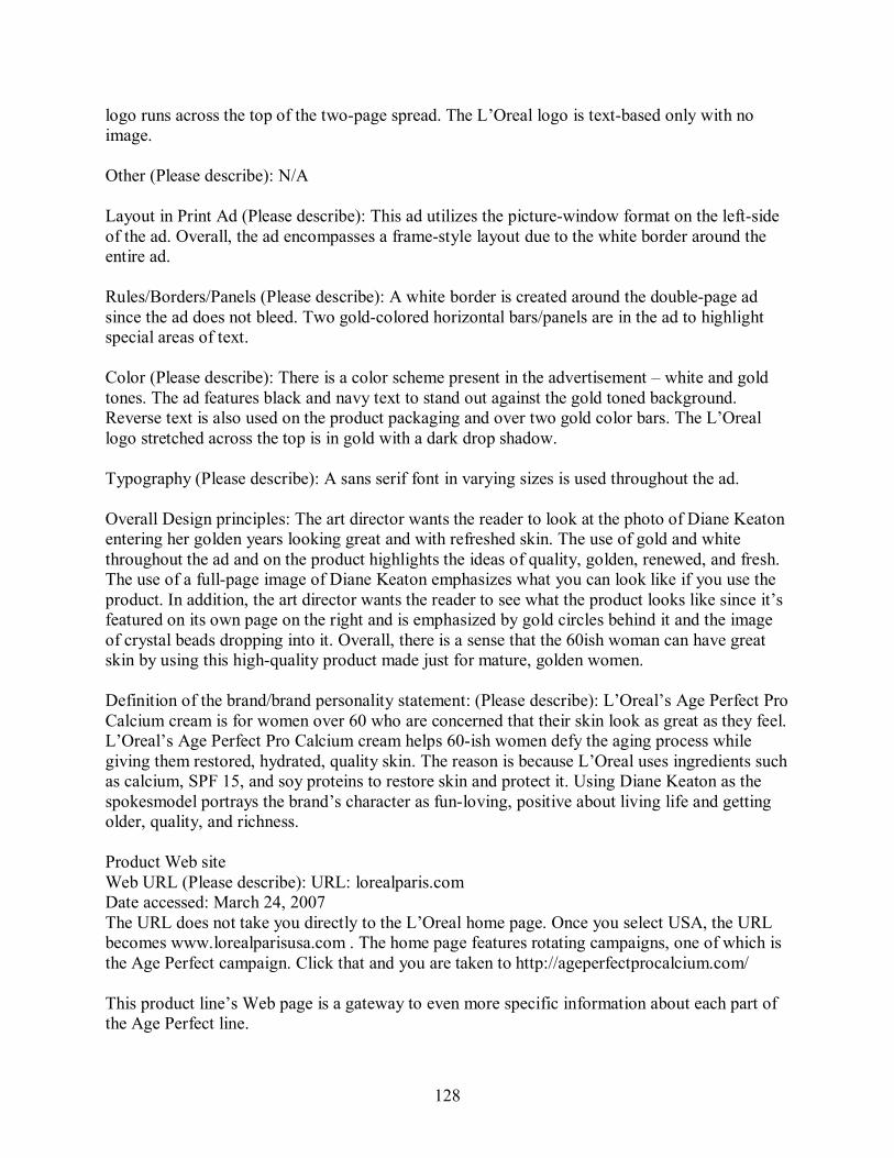
128
logo runs across the top of the twopage spread. The L’Oreal logo is textbased only with no image.
Other (Please describe): N/A
Layout in Print Ad (Please describe): This ad utilizes the picturewindow format on the leftside of the ad. Overall, the ad encompasses a framestyle layout due to the white border around the entire ad.
Rules/Borders/Panels (Please describe): A white border is created around the doublepage ad since the ad does not bleed. Two goldcolored horizontal bars/panels are in the ad to highlight special areas of text.
Color (Please describe): There is a color scheme present in the advertisement – white and gold tones. The ad features black and navy text to stand out against the gold toned background. Reverse text is also used on the product packaging and over two gold color bars. The L’Oreal logo stretched across the top is in gold with a dark drop shadow.
Typography (Please describe): A sans serif font in varying sizes is used throughout the ad.
Overall Design principles: The art director wants the reader to look at the photo of Diane Keaton entering her golden years looking great and with refreshed skin. The use of gold and white throughout the ad and on the product highlights the ideas of quality, golden, renewed, and fresh. The use of a fullpage image of Diane Keaton emphasizes what you can look like if you use the product. In addition, the art director wants the reader to see what the product looks like since it’s featured on its own page on the right and is emphasized by gold circles behind it and the image of crystal beads dropping into it. Overall, there is a sense that the 60ish woman can have great skin by using this highquality product made just for mature, golden women.
Definition of the brand/brand personality statement: (Please describe): L’Oreal’s Age Perfect Pro Calcium cream is for women over 60 who are concerned that their skin look as great as they feel. L’Oreal’s Age Perfect Pro Calcium cream helps 60ish women defy the aging process while giving them restored, hydrated, quality skin. The reason is because L’Oreal uses ingredients such as calcium, SPF 15, and soy proteins to restore skin and protect it. Using Diane Keaton as the spokesmodel portrays the brand’s character as funloving, positive about living life and getting older, quality, and richness.
Product Web site Web URL (Please describe): URL: lorealparis.com Date accessed: March 24, 2007 The URL does not take you directly to the L’Oreal home page. Once you select USA, the URL becomes www.lorealparisusa.com . The home page features rotating campaigns, one of which is the Age Perfect campaign. Click that and you are taken to http://ageperfectprocalcium.com/
This product line’s Web page is a gateway to even more specific information about each part of the Age Perfect line.
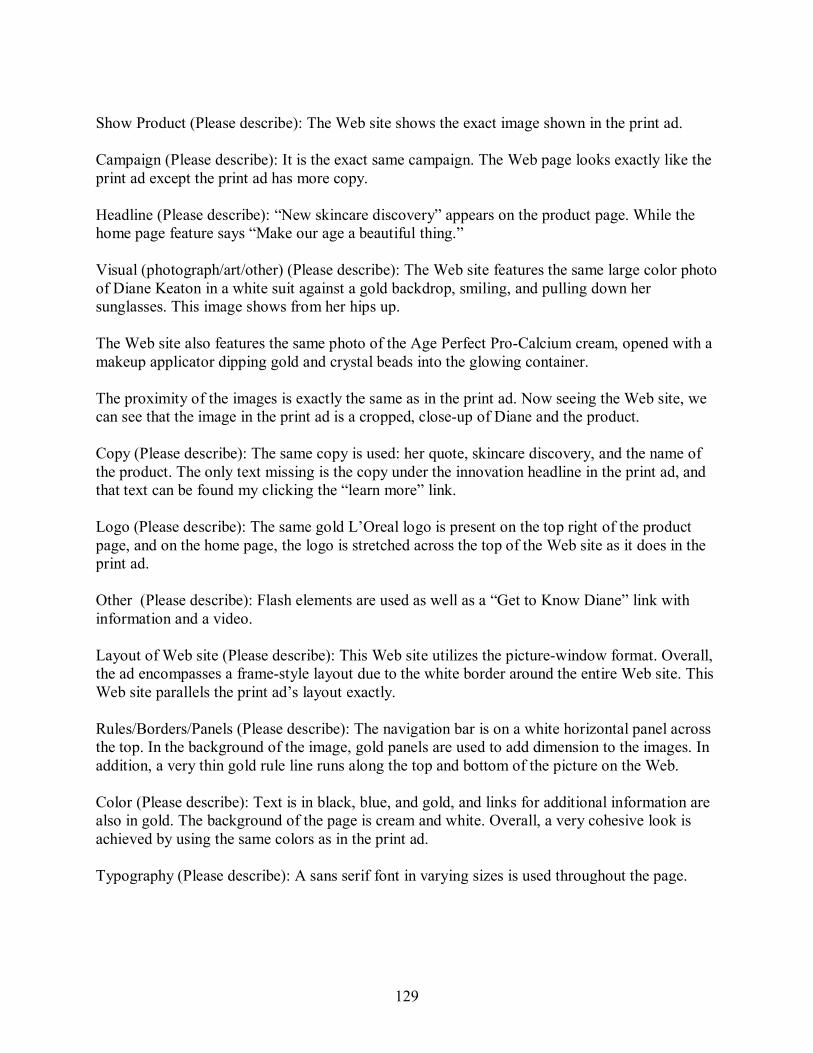
129
Show Product (Please describe): The Web site shows the exact image shown in the print ad.
Campaign (Please describe): It is the exact same campaign. The Web page looks exactly like the print ad except the print ad has more copy.
Headline (Please describe): “New skincare discovery” appears on the product page. While the home page feature says “Make our age a beautiful thing.”
Visual (photograph/art/other) (Please describe): The Web site features the same large color photo of Diane Keaton in a white suit against a gold backdrop, smiling, and pulling down her sunglasses. This image shows from her hips up.
The Web site also features the same photo of the Age Perfect ProCalcium cream, opened with a makeup applicator dipping gold and crystal beads into the glowing container.
The proximity of the images is exactly the same as in the print ad. Now seeing the Web site, we can see that the image in the print ad is a cropped, closeup of Diane and the product.
Copy (Please describe): The same copy is used: her quote, skincare discovery, and the name of the product. The only text missing is the copy under the innovation headline in the print ad, and that text can be found my clicking the “learn more” link.
Logo (Please describe): The same gold L’Oreal logo is present on the top right of the product page, and on the home page, the logo is stretched across the top of the Web site as it does in the print ad.
Other (Please describe): Flash elements are used as well as a “Get to Know Diane” link with information and a video.
Layout of Web site (Please describe): This Web site utilizes the picturewindow format. Overall, the ad encompasses a framestyle layout due to the white border around the entire Web site. This Web site parallels the print ad’s layout exactly.
Rules/Borders/Panels (Please describe): The navigation bar is on a white horizontal panel across the top. In the background of the image, gold panels are used to add dimension to the images. In addition, a very thin gold rule line runs along the top and bottom of the picture on the Web.
Color (Please describe): Text is in black, blue, and gold, and links for additional information are also in gold. The background of the page is cream and white. Overall, a very cohesive look is achieved by using the same colors as in the print ad.
Typography (Please describe): A sans serif font in varying sizes is used throughout the page.
130
Overall impression (Please describe): Overall there is a very high level of consistency in typography, layout, copy, photo images, and use of colors. The advertising does promote a consistent brand identity.
My overall impression of how the print ad’s use of design along with the Web site’s use of design perpetuates a cohesive brand identity is that they treat their Web site as a virtual extension of the print ad. The Web site is an interactive form of the ad. After seeing the ad, you feel you know your way around the Web site because you’ve already been exposed to it. The design used for the Web and in the print ad is very cohesive which helps define the brand. Besides using the color gold throughout, having Diane Keaton be the spokesperson embodies the definition of the product – a product made for a stylish, goodlooking, mature woman who knows who she is and what she wants and L’Oreal Age Perfect helped her get there.
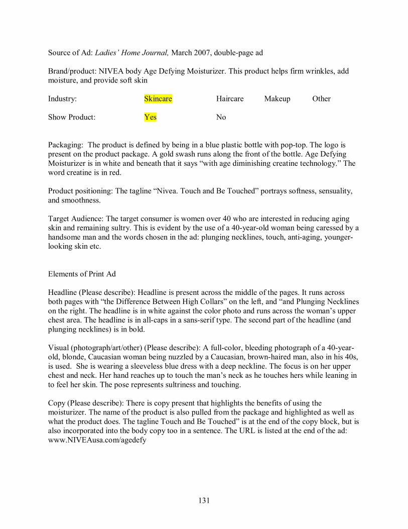
131
Source of Ad: Ladies’ Home Journal, March 2007, doublepage ad
Brand/product: NIVEA body Age Defying Moisturizer. This product helps firm wrinkles, add moisture, and provide soft skin
Industry: Skincare Haircare Makeup Other
Show Product: Yes No
Packaging: The product is defined by being in a blue plastic bottle with poptop. The logo is present on the product package. A gold swash runs along the front of the bottle. Age Defying Moisturizer is in white and beneath that it says “with age diminishing creatine technology.” The word creatine is in red.
Product positioning: The tagline “Nivea. Touch and Be Touched” portrays softness, sensuality, and smoothness.
Target Audience: The target consumer is women over 40 who are interested in reducing aging skin and remaining sultry. This is evident by the use of a 40yearold woman being caressed by a handsome man and the words chosen in the ad: plunging necklines, touch, antiaging, younger looking skin etc.
Elements of Print Ad
Headline (Please describe): Headline is present across the middle of the pages. It runs across both pages with “the Difference Between High Collars” on the left, and “and Plunging Necklines on the right. The headline is in white against the color photo and runs across the woman’s upper chest area. The headline is in allcaps in a sansserif type. The second part of the headline (and plunging necklines) is in bold.
Visual (photograph/art/other) (Please describe): A fullcolor, bleeding photograph of a 40year old, blonde, Caucasian woman being nuzzled by a Caucasian, brownhaired man, also in his 40s, is used. She is wearing a sleeveless blue dress with a deep neckline. The focus is on her upper chest and neck. Her hand reaches up to touch the man’s neck as he touches hers while leaning in to feel her skin. The pose represents sultriness and touching.
Copy (Please describe): There is copy present that highlights the benefits of using the moisturizer. The name of the product is also pulled from the package and highlighted as well as what the product does. The tagline Touch and Be Touched” is at the end of the copy block, but is also incorporated into the body copy too in a sentence. The URL is listed at the end of the ad: www.NIVEAusa.com/agedefy
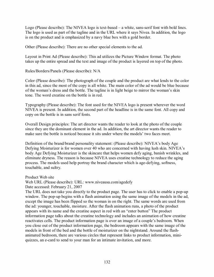
132
Logo (Please describe): The NIVEA logo is textbased – a white, sansserif font with bold lines. The logo is used as part of the tagline and in the URL where it says Nivea. In addition, the logo is on the product and is emphasized by a navy blue box with a gold border.
Other (Please describe): There are no other special elements to the ad.
Layout in Print Ad (Please describe): This ad utilizes the Picture Window format. The photo takes up the entire spread and the text and image of the product is layered on top of the photo.
Rules/Borders/Panels (Please describe): N/A
Color (Please describe): The photograph of the couple and the product are what lends to the color in this ad, since the most of the copy is all white. The main color of the ad would be blue because of the woman’s dress and the bottle. The tagline is in light beige to mirror the woman’s skin tone. The word creatine on the bottle is in red.
Typography (Please describe): The font used for the NIVEA logo is present wherever the word NIVEA is present. In addition, the second part of the headline is in the same font. All copy and copy on the bottle is in sans serif fonts.
Overall Design principles: The art director wants the reader to look at the photo of the couple since they are the dominant element in the ad. In addition, the art director wants the reader to make sure the bottle is noticed because it sits under where the models’ two faces meet.
Definition of the brand/brand personality statement: (Please describe): NIVEA’s body Age Defying Moisturizer is for women over 40 who are concerned with having lush skin. NIVEA’s body Age Defying Moisturizer is the skincare that helps women defy aging, banish wrinkles, and eliminate dryness. The reason is because NIVEA uses creatine technology to reduce the aging process. The models used help portray the brand character which is agedefying, softness, touchable, and sultry.
Product Web site Web URL (Please describe): URL: www.niveausa.com/agedefy Date accessed: February 21, 2007 The URL does not take you directly to the product page. The user has to click to enable a popup window. The popup begins with a flash animation using the same image of the models in the ad, except the image has been flipped so the woman in on the right. The same words are used from the ad: younger, touchable, moisture. After the flash animation runs, a photo of the product appears with its name and the creatine aspect in red with an “enter button” The product information page talks about the creatine technology and includes an animation of how creatine reactivates cells. The product information page is over an image of a couple’s bedroom. When you close out of the product information page, the bedroom appears with the same image of the models in front of the bed and the bottle of moisturizer on the nightstand. Around the flash animated bedroom, there are various circles that represent links to product information, mini quizzes, an ecard to send to your man for an intimate invitation, and more.
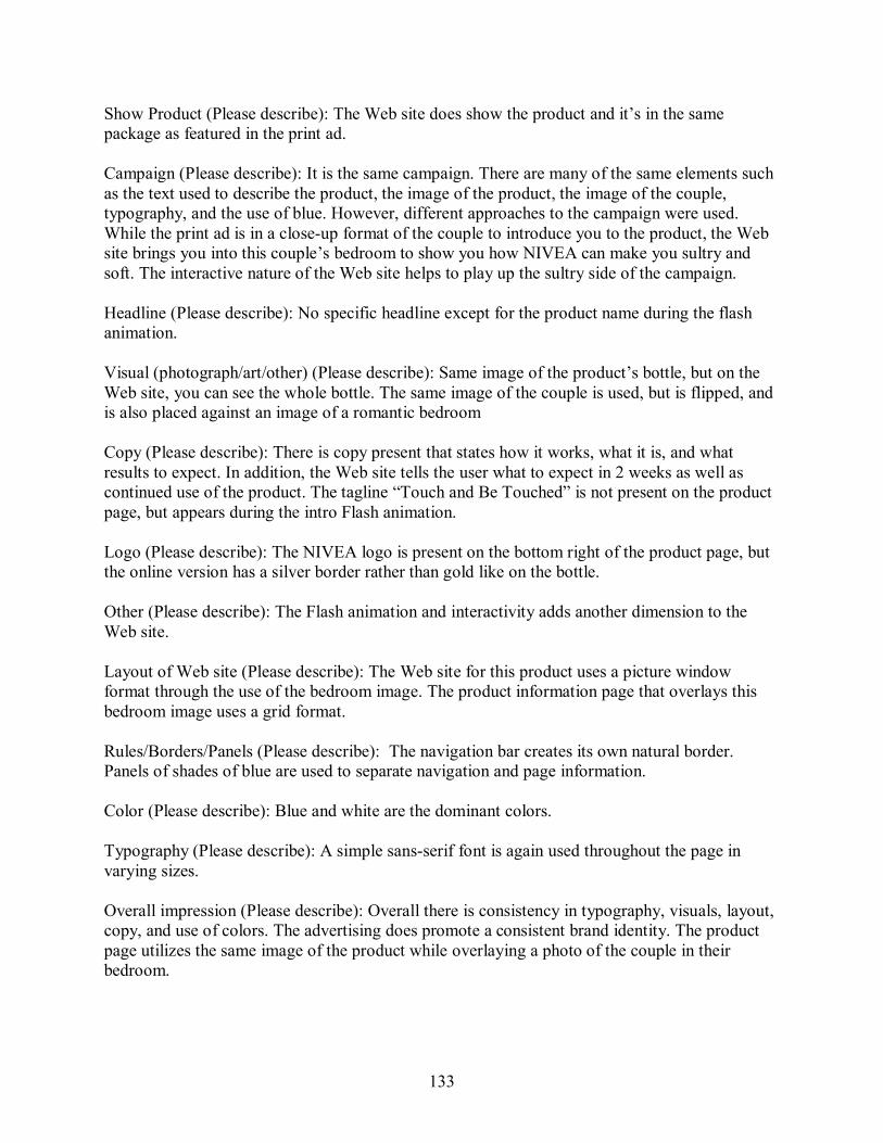
133
Show Product (Please describe): The Web site does show the product and it’s in the same package as featured in the print ad.
Campaign (Please describe): It is the same campaign. There are many of the same elements such as the text used to describe the product, the image of the product, the image of the couple, typography, and the use of blue. However, different approaches to the campaign were used. While the print ad is in a closeup format of the couple to introduce you to the product, the Web site brings you into this couple’s bedroom to show you how NIVEA can make you sultry and soft. The interactive nature of the Web site helps to play up the sultry side of the campaign.
Headline (Please describe): No specific headline except for the product name during the flash animation.
Visual (photograph/art/other) (Please describe): Same image of the product’s bottle, but on the Web site, you can see the whole bottle. The same image of the couple is used, but is flipped, and is also placed against an image of a romantic bedroom
Copy (Please describe): There is copy present that states how it works, what it is, and what results to expect. In addition, the Web site tells the user what to expect in 2 weeks as well as continued use of the product. The tagline “Touch and Be Touched” is not present on the product page, but appears during the intro Flash animation.
Logo (Please describe): The NIVEA logo is present on the bottom right of the product page, but the online version has a silver border rather than gold like on the bottle.
Other (Please describe): The Flash animation and interactivity adds another dimension to the Web site.
Layout of Web site (Please describe): The Web site for this product uses a picture window format through the use of the bedroom image. The product information page that overlays this bedroom image uses a grid format.
Rules/Borders/Panels (Please describe): The navigation bar creates its own natural border. Panels of shades of blue are used to separate navigation and page information.
Color (Please describe): Blue and white are the dominant colors.
Typography (Please describe): A simple sansserif font is again used throughout the page in varying sizes.
Overall impression (Please describe): Overall there is consistency in typography, visuals, layout, copy, and use of colors. The advertising does promote a consistent brand identity. The product page utilizes the same image of the product while overlaying a photo of the couple in their bedroom.
134
My overall impression of how the print ad’s use of design along with the Web site’s use of design perpetuates a cohesive brand identity is that they treat their Web site as an additional, interactive source for information and not as just posting their print ads in an electronic format. The Web site is an additional source for information about creatine, benefits of the product, and extends the campaign. The overall brand design is defined by using the colors blue and white and continuing with the use of the same couple but bringing the viewer into their bedroom. The use of the image of the couple and the addition of mini quizzes on romance and ecards to invite your man for touching time, makes NIVEA a sultry brand that makes your skin look younger, and make you feel sultry, and makes your spouse see you that way.

135
Source of Ad: Ladies’ Home Journal, March 2007, 1 page ad
Brand/product: RoC Protient Fortify Life and Define Night Cream. This product is used to firm facial features while you sleep.
Industry: Skincare Haircare Makeup Other
Show Product: Yes No
Packaging: The product is defined by being in a clean and simple jar package with basic lines. The logo is not present on the product.
Product positioning: The product’s branding gives off a clinical and oldfashioned drugstore feel. This is a product your mother would have used and gives off the impression that it’s been around for awhile. The tagline “We Keep our Promises” also portrays longevity and an oldfashioned, quality way of doing business.
Target Audience: The target consumer is women over 40 who are interested in reducing aging in their face. This is evident by the use of a 40+ woman and the words chosen in the ad: lifts, firms, defines, skin elasticity, etc.
Elements of Print Ad
Headline (Please describe): Headline is present along right hand side of page in white against the black and white photo: “VISIBLY LIFTS, FIRMS, & DEFINES. The headline is in allcaps in a sansserif type with the words LIFTS largest.
Visual (photograph/art/other) (Please describe): A black and white photograph of a 45yearold, brunette, Caucasian woman is used. The focus is on her face and clear skin. Her hand gingerly touches the side of her face to showcase how smooth it is. She is smiling slightly and staring directly at the reader.
Copy (Please describe): There is copy present that highlights the immediate results of using the cream and what to expect in the coming weeks of using the cream. The name of the product is also pulled from the package and highlighted as well as what the product does. A small disclosure at the bottom is present in white text, but is not easily readable against the navy background. It states “Available at a drugstore near you” and lists the URL: rocskincare.com. There is a tagline present under the logo “We Keep our Promises” in white text.
Logo (Please describe): A logo is used within the ad and stands alone in the bottom right hand corner of the ad. The logo is an illustration of the mortar and pestle used in drugstores long ago. On the side of the mortar and pestle, RoC is in a navy blue font. Beneath the logo, in a small point size is “France, 1957”
Other (Please describe): There are no other special elements to the ad.

136
Layout in Print Ad (Please describe): This ad utilizes the Mondrian format. The text is lined up on the left while the product, logo, and headline are in a column on the right.
Rules/Borders/Panels (Please describe): The fullpage ad bleeds completely so no border is present. A navy panel is used at the bottom and a narrower horizontal, red panel sits above that to highlight the product. A gold rule line separates the product’s statement of what it does and it’s timeline of benefits.
Color (Please describe): Navy, red, gold, and white are the major colors of the ad. Besides the navy and red panels, gold is used in a rule line and as small headers. In addition, a small gold gradient box is used to highlight the word “NEW.” Color used in this ad is a main focus because the use of a black and white photo makes the colors stand out even more.
Typography (Please describe): The font present on the packaging (a sansserif font) is used throughout the ad in varying point sizes to add contrast and variety. In addition, text used in the headline, subheads, and headers is in all caps while bullet points and the sentence explaining what the product accomplishes are in lowercase.
Overall Design principles: The art director wants the reader to look at the product photo and headline since they are weighted on the right side. Because the photo is in blackwhite and the rest of the ad utilizes color, the text as well as the product is intended to stand out.
Definition of the brand/brand personality statement: (Please describe): RoC’s Protient Fortify Lift and Define Night Cream is for women over 40 who are concerned with having firm skin. RoC’s Protient Fortify Lift and Define Night Cream is the skincare that helps women lift, firm, and define skin while sleeping. The reason is because RoC uses Vitamin E and patented technology to refirm and add elasticity back to skin. The use of a model that represents classic beauty contributes to the brand’s character: longevity, reliability, trust, and proven in clinical studies.
Product Web site Web URL (Please describe): URL: rocskincare.com Date accessed: March 24, 2007 The URL does not take you directly to the product page. On the top right of the home page, a link for “Age and Define” is listed with a drop down of the products in that line. It took one click from the home page to access the product page.
This product’s Web page is more of an informational page rather than a branding effort. It features all of the products in the Lift and Define line, but clicking on the link from the home page, jumps the user to the Night Cream product directly on the middle of the page.
Show Product (Please describe): The Web site does show the product and it’s in the same package as featured in the print ad.
137
Campaign (Please describe): It is the same campaign. There are many of the same elements present such as the text used to describe the product, the image of the product, the same colors, and similar typography. However, different approaches to the campaign were used. While the print ad is in a featurestyle format introducing you to the product, the Web site is used as an informational source to support the print advertisement.
Headline (Please describe): “Clinically proven to lift and define your skin” is at the top of this page
Visual (photograph/art/other) (Please describe): Same image of the product’s jar is used except this version features its mirror reflection against a white background.
Copy (Please describe): There is copy present that states how it works, what it is, and what results to expect. The same format is used for the other products on the page. There isn’t basic introductory copy that introduces the reader to the page.
The tagline We Keep our Promises is not present on the product page, but is on the home page at the bottom. The running subhead througout the pages is “The antiaging skincare experts” which does not appear anywhere in the print ad.
Logo (Please describe): The RoC logo is present on the top left of the product page. Interesting to note is that all the other products in this line have the RoC logo visible on them.
Other (Please describe): No special elements on the Web site.
Layout of Web site (Please describe): The product page uses a column format with three columns present. The products are on the left column, the copy starts in the middle and runs into the right column, and the yellow box highlighting results is in the third column
Rules/Borders/Panels (Please describe): The navigation bar creates its own natural border. Internally on the page, red rule lines are used to separate the products and yellow panels are used to highlight product benefits.
Color (Please describe): Same use of color is present and done very simple and not overpowering. Red bars separate the products, headlines and navigational elements are in blue and white, and yellow boxes (difficult to achieve gold text on screen like in print) highlight the product’s benefits.
Typography (Please describe): A simple sansserif font is again used throughout the page in varying sizes.
Overall impression (Please describe): Overall there is consistency in typography, layout, copy, and use of colors. The advertising does promote a consistent brand identity. Although the product page doesn’t use the image of the model, the home page for RoC does feature a brunette in a black and white photo that is a close up of her face.
138
My overall impression of how the print ad’s use of design along with the Web site’s use of design perpetuates a cohesive brand identity is that they treat their Web site as an additional source for information and not as just posting their print ads in an electronic format. The Web site is an additional source for information and extends the campaign. The overall brand design is defined by using the colors red, gold, navy, and white – classic colors that never go out of style; having a clinical feel, but not be too medicinal; and the element of timeless beauty. The use of black/white images and simple design makes RoC timeless like its consumers are – timeless in beauty and spanning generations.
139
LIST OF REFERENCES
Alessandri, S., & Alessandri, T. (2004). Promoting and protecting corporate identity: The importance of organizational and industry context. Corporate Reputation Review, 7, 252 268.
Allman, R. (2007). Basic ad layouts. On Indiana University Southeast faculty Web page. Retrieved May 28, 2007, from http://homepages.ius.edu/rallman/ads.html
Altstiel, T., & Grow, J. (2005). Advertising Strategy: Creative Tactics from the Outside/In. London, UK: Sage Publications.
American Marketing Association. (2007). Dictionary of marketing terms. American Marketing Association Web site. Retrieved February 10, 2007, from http://www.marketingpower.com/mgdictionary.php
Arnheim, R. (1983). Art and Visual Perception: A Psychology of the Creative Eye. Los Angeles, CA: University of California Press.
Audit Bureau of Circulation. (2006). Top 100 ABC magazines by average circulation. Magazine Publishers of America. Retrieved February 19, 2007, from http://www.magazine.org/circulation/circulation_trends_and_magazine_handbook/18425 .cfm
Babbie, E., & Rubin, A. (2005). Research Methods for Social Work. Belmont, CA: Thomson Wadsworth.
Bailey, S. (2006). Effective design is measurable. Design Week, 21, 22.
Baines, P., & Haslam, A. (2002). Type and Typography. New York, NY: WatsonGuptill.
Barber, G., & Burt, J. (1996). Elementary Statistics for Geographers. New York: NY: Guilford Press.
Baxley, B. (2002). Making the Web Work: Designing Effective Web Applications. Indianapolis, IN: Sams Publishing.
Bedford, C. (2003). A tool for managing brand assets. Design Management Journal, 14, 8188.
Bennett, A. (2006). Design Studies: Theory and Research in Graphic Design. New York, NY: Princeton Architectural Press.
Better Homes and Gardens (2007). Reader profile. Bhg.com. Retrieved on July 5, 2007, from http://www.meredith.com/mediakit/bhg/print/reader.html
Bevlin, M.E. (1997). Design through Discovery: The Elements and Principles. Belmont, CA: Thomson Wadsworth.

140
Bickner, C. (2003). Web Design on a Shoestring. Berkeley, CA: New Riders.
Blakeman, R. (2004). The Bare Bones of Advertising Print Design. Lanham, MD: Rowman & Littlefield.
Breakenridge, D. (2001). Cyberbranding. Upper Saddle River, NJ: Pearson Prentice Hall.
Burns, E. (2007). Ecommerce spending up for 2007 holiday and year. ClickZ.com Web site. Retrieved on February 21, 2007, from http://www.clickz.com/showPage.html?page=clickz_print&id=3624408
Buss, D. (2006). Design five. Advertising Age, 77, 1114.
Cagan, J., & Vogel, C. (2002). Creating Breakthrough Products: Innovation from Product Planning to Program Approval. Upper Saddle River, NJ: Pearson Prentice Hall.
Carter, B. (2005). Nokia eyes consistency in global brand revamp. Marketing, July edition, 3.
Choi, D., Kim, J., & Park, S. (2005). Visualizing ebrand personality: Exploratory studies on visual attributes and ebrand personalities in Korea. International Journal of Human Computer Interaction, 19, 734.
ClickZ.com. (2007). Global online populations. Statistics section of the ClickZ Web site. Retrieved April 1, 2007, from http://clickz.com/showPage.html?page=stats/ Web_worldwide
Cohen, J. (2003). The Unusually Useful Web Book. Berkeley, CA: New Riders.
Conover, T. & R.W. (2003). Graphic Communications Today. Clifton Park, NY: Thomson Delmar Learning.
Cooper, R., & Press, M. (2003). The Design Experience: The Role of Design and Designers in the TwentyFirst Century. London, UK: Ashgate Publishing, Ltd.
De Jong, M., Elying, W., & Van den Bosch, A. (2006). Managing corporate visual identity. Journal of Business Communication, 43, 138157.
Dominick, J.R., & Wimmer, R.D. (2005). Mass Media Research: An Introduction. Belmont, CA: Thomson Wadsworth.
Donnelly, J., & Peter, J.H. (2004). Marketing Management. Columbus, OH: McGraw Hill.
Drewniany, B.L., & Jewler, A.J. (2005). Creative Strategy in Advertising. Belmont, CA: Thomson Wadsworth.

141
Evans, P., & Thomas, M. (2003). Exploring the Elements of Design. Clifton Park, NY: Thomson Delmar Learning.
Flynn, D. (2005). Brand Clout: Maintaining Relevance and Profitability Amidst Constant Change. Ridgeland, SC: Cameo Publications.
Gobé, M., & Zyman, S. (2001). Emotional Branding: The New Paradigm for Connecting Brands to People. New York, NY: WatsonGuptill.
Good Housekeeping (2007). Demographic profile. GoodHousekeeping.com. Retrieved on July 5, 2007, from http://www.ghmediakit.com/r5/showkiosk.asp?listing_id=368324&category_id=25077& category_code=research
Graham, L. (2001). Basics of Design: Layout and Typography for Beginners. Clifton Park, NY: Thomson Delmar Learning.
Graphic Arts Monthly. (2004). Crossmedia efforts rise among creatives (TrendWatch Report). Graphic Arts Monthly, 76, 10, 16.
Gupta, S. (1995). HERMES: A research project on the commercial uses of the World Wide Web. http://www.personal.umich.edu/~sgupta/hermes/
Haig, M. (2001). The B2B ECommerce Handbook: How to Transform Your Business to Business Global Marketing Strategy. London, UK: Kogan Page.
Huffenberger K., Kanfer A., Schlosser A.E., & Ryan A. (1998). The diffusion of advertising URLs in magazines. http://www.ncsa.uiuc.edu/edu/trg/urlgrowth/index/html
Jackson, K. (2003). Suzuki seeks a common advertising theme. Automotive News, 78 (6058), 24.
Johnson, C., & Lee, M. (2005). Principles of Advertising: A Global Perspective. Binghamton, NY: Haworth Press.
Kapferer, J.N. (2001) Reinventing the Brand: Can Top Brands Survive the New Market Realities? London, UK: Kogan Page.
Keller, K.L. (2002). Strategic Brand Management. Upper Saddle River, NJ: Pearson Prentice Hall.
Kim, J.S. (2002). A study on the style and theme for visual identity of branding in focused color. Journal of Package Design Research, 12, 116.
Kim, Y.K. (2001). The study on the dimensions of eBrand personality and its determinants. Journal of Korean Society for Journalism and Communication Study, 45, 229426.
142
Koffka, K. (1955). Principles of Gestalt Psychology. London, UK: Routledge & Kegan.
Krippendorff, K. (2004). Content Analysis: An Introduction to Its Methodology. London, UK: Sage Publications.
Kumar, R. (2005). Research Methodology: A Stepbystep Guide for Beginners. London, UK: Sage Publications.
Ladies’ Home Journal (2007). Reader demographics. LHJ.com. Retrieved on July 5, 2007, from http://www.meredith.com/mediakit/lhj/print/reader.htm
Lavie, T., & Tractinsky, N. (2004). Assessing dimensions of perceived visual aesthetics of Web sites. International Journal of HumanComputer Studies, 60, 269298.
Lindstrom, M. (2006). Tell a brand’s story to cover all marketing angles. Media Asia, 10, 25.
Lindstrom, M. (2006). Let’s eradicate the evils of home page monotony. Media Asia, 9, 21.
Lindstrom, M. (2001). Clicks, Bricks & Brands. London, UK: Kogan Page.
Lindstrom, M., & Andersen, T.F. (2000). Brand Building on the Internet. London, UK: Kogan Page.
Lupton, E. (1999). Design Writing Research: Writing on Graphic Design. London, UK: Phaidon Press.
Marcus, J., Schmitt, B.H., & Simonson, A. (1995). Managing corporate image and identity. Long Range Planning, 28, 8292.
Maxwell, J.A. (2005). Qualitative Research Design: An Interactive Approach. London, UK: Sage Publications.
McCarthy, M.S., & Mothersbaugh, D.L. (2002). Effects of typographic factors in advertising based persuasion: A general model and initial empirical tests. Psychology & Marketing, 19, 663691.
McKee, S. (2005). Ad consistency: It’s the real thing. Business Week Online. Retrieved on March 20, 2007, from http://www.businessweek.com/smallbiz/content/aug2005/sb20050815_105609.htm
McMillan, S.J., (2000). The microscope and the moving target: The challenge of applying content analysis to the World Wide Web. Journalism & Mass Communication Quarterly, 77, 8098.
McNabb, D. (2002). Research Methods in Public Administration and Nonprofit Management: Quantitative and Qualitative. Armonk, NY: M.E. Sharpe.
143
Morgan Stanley Co. (2006). State of the Internet Web 2.0. Retrieved December 8, 2006, from http://www.morganstanley.com/institutional/techresearch/pdfs/Webtwopto2006.pdf
Morrison, M.A. (2002). Using Qualitative Research in Advertising: Strategies, Techniques, and Applications. London, UK: Sage Publications.
Moser, M. (2003). United We Brand: How to Create a Cohesive Brand That’s Seen, Heard, and Remembered. Boston, MA: Harvard Business School Press.
Naddaff, A. (2004). Branding by design. Communication World, 21, 5, 1821.
Newark, Q. (2002). What is Graphic Design? East Sussex, UK: Rotovision.
No, J.H., & Lim, H.H. (1999). Reconsideration of psychological differentiation methods of building up the visual image of brand identity. The Journal of Korea Design, 5, 7181.
Pantone. (2007). Retrieved on February 21, 2007, from http://pantone.com/pages/pantone/pantone.aspx?pg=19295&ca=10
Pearse, J. (2006). Martini revamps Web site as part of digital strategy overhaul. New Media Age, March 30 issue, 3.
Pearson, R., & van Schaik, P. (2003). The effect of spatial layout of and link colour in Web pages on performance in a visual search task and an interactive search task. International Journal of HumanComputer Studies, 59, 327353.
Perry, A. (2003). Before the Brand: Creating the Unique DNA of an Enduring Brand Identity. Columbus, OH: McGrawHill Professional.
PRNewswire (2007). Stars Play Out Disney Park Fantasies in New Images Unveiled by Annie Leibovitz. Retrieved on April 20, 2007, from http://www.prnewswire.com/mnr/disney/26636/
Resnick, E. (2003). Design for Communication: Conceptual Graphic Design Basics. Hoboken, NJ: John Wiley & Sons.
Ries, A., & Ries, L. (2002). The 22 Immutable Laws of Branding: How to Build a Product or Service into a Worldclass Brand. New York: NY: Harper Collins.
Riffe, D., Lacy, S., & Fico, F.G. (1998). Analyzing Media Messages: Using Quantitative Content Analysis in Research. Mahwah, NJ: Lawrence Erlbaum.
Ritchie, J., & Lewis, J. (2003). Qualitative Research Practice: A Guide for Social Science Students and Researchers. London, UK: Sage Publications.
Rowley, J. (2004). Online branding. Online Information Review, 28, 2, 131138.
144
Schenkamn, B.N., & Jonsson, F.U. (2000). Aesthetics and preferences of Web pages. Behavior and Information Technology, 19, 5, 367377.
Schultz, D.E., & Schultz, H.F. (2004). Brand Babble: Sense and Nonsense about Branding. Mason, Ohio: SouthWestern Thomson Learning.
Schultz, D.E., & Schultz, H.F. (2003). IMC, The Next Generation: Five Steps for Delivering Value and Measuring Financial Returns. Columbus, OH: McGrawHill Professional.
Schumann, D.W., & Thorson, E. (1999). Advertising and the World Wide Web. Mahwah, NJ: Lawrence Erlbaum Associates.
Smith, P.R., & Taylor, J. (2004). Marketing Communications. London, UK: Kogan Page.
Sprankle, M. (2001). Problem Solving for Information Processing. Upper Saddle River, NJ: Prentice Hall.
TNS Media Intelligence. (2006). U.S. Advertising Market Grew 4.1 Percent in First Half of 2006. Retrieved July 1, 2007, from http://www.tnsmi.com/news/09062006.htm
Upshaw, L. (1995). Building Brand Identity: A Strategy for Success in a Hostile Marketplace. Hoboken, NJ: John Wiley and Sons.
Vaid, H. (2003). Branding: Brand Strategy, Design, and Implementation of Corporate and Product Identity. New York, NY: WatsonGuptill.
Van Wagener, A. (2003). A case for visual consistency. On The Design Desk on Poynter Institute Online. Retrieved November 8, 2006, from http://www.poynter.org/column.asp?id=47&aid=41783
Wagner, E. (2006). Advertising Graphics and Production. [ADV4200 Advertising Graphics and Production booklet]. Gainesville, FL: Advertising Faculty, University of Florida.
Walser, M.G. (2004). Brand Strength: Building and Testing Models Based on Experiential Information. Frankfurt, Germany: DUV.
Wheller, A.R. (2003). Designing Brand Identity: A Complete Guide to Creating, Building, and Maintaining Strong Brands. Hoboken, NJ: John Wiley and Sons.
White, A.W. (2002). The Elements of Graphic Design: Space, Unity, Page Architecture, and Type. New York, NY: Allworth.
Whittle, D. (2006). Private view Web site. Media Asia, 2, 9.
145
BIOGRAPHICAL SKETCH
Jaclyn Sherman Rhoads was born in Malden, Massachusetts. The older of two children,
she grew up in Malden, and then moved with her family to Coral Springs, Florida in 1993. She
graduated with honors from J.P. Taravella High School in 1998 where she was editorinchief of
the awardwinning Odyssey yearbook. After graduating from high school, she was an instructor
for Taylor Publishing’s Florida Yearbook Seminar.
Jaclyn earned her B.S. in journalism from the University of Florida in 2002 with minors
in business administration and classical studies. She is the 2002 recipient of UF’s John Paul
Jones Excellence in Magazines award, and has been published in Quill and Scroll, Student
Leader, and Taylor Talk magazines.
After graduating from UF, Jaclyn worked as a fulltime marketing specialist at Florida
Credit Union until April 2006. She began her master’s degree program at the University of
Florida in August 2005. She recently completed her master of advertising degree at the
University of Florida while working fulltime as the communications coordinator for UF’s Office
of Human Resource Services. Upon completion of her masters program, Jaclyn will continue to
work for UF while growing her own advertising and design firm. Jaclyn has been married to
Jesse Rhoads since March 2004.