Embed Size (px)
Citation preview
05
IAT 102 Graphic Design
05New Typography Review
Connotation / Denotation
What’s in a logo?
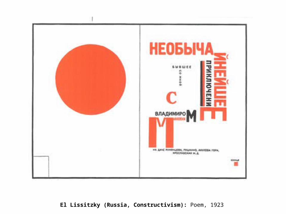
El Lissitzky (Russia, Constructivism): Poem, 1923
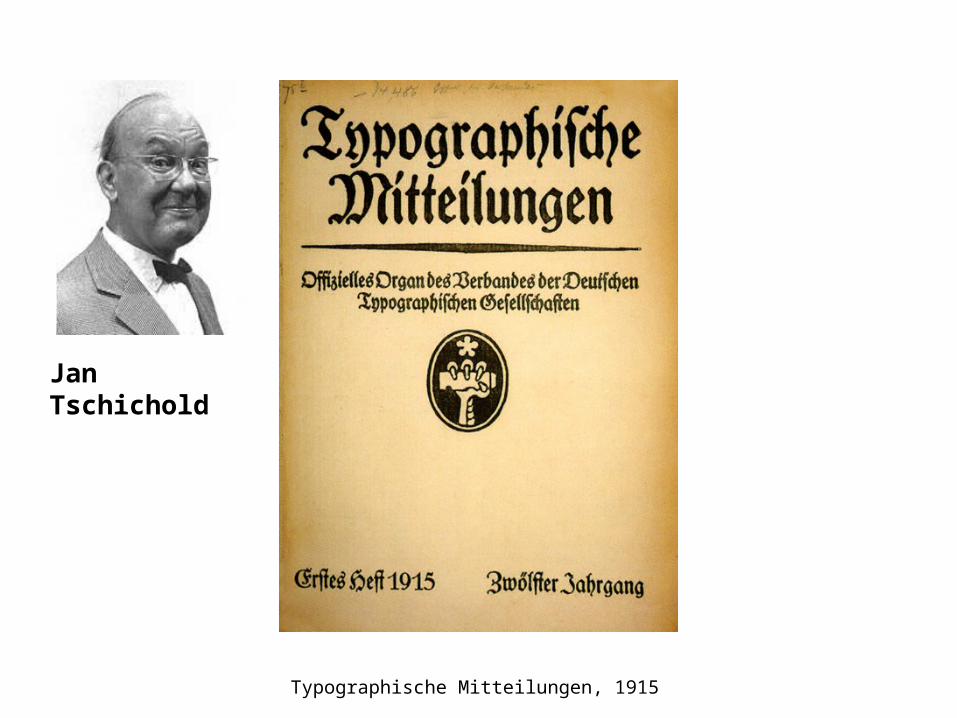
Typographische Mitteilungen, 1915
Jan Tschichold
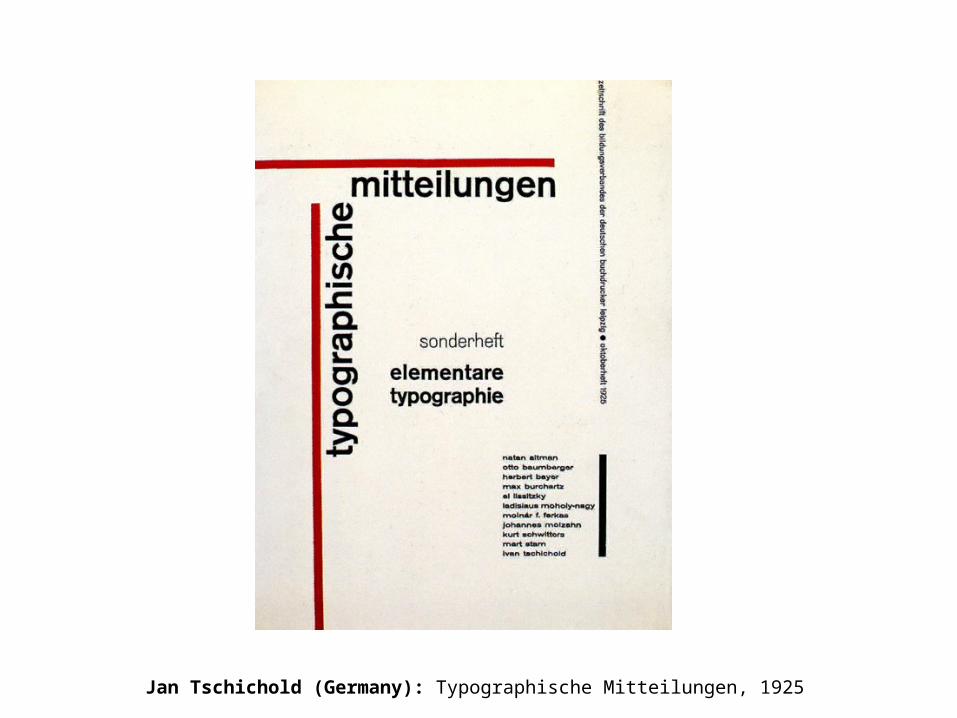
Jan Tschichold (Germany): Typographische Mitteilungen, 1925
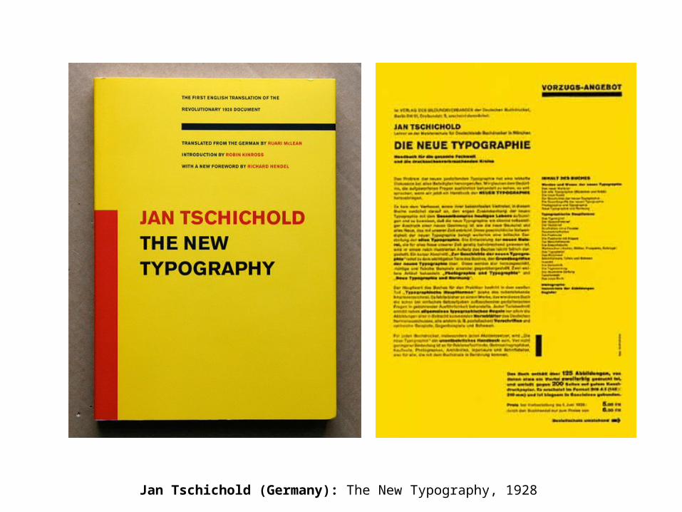
Jan Tschichold (Germany): The New Typography, 1928
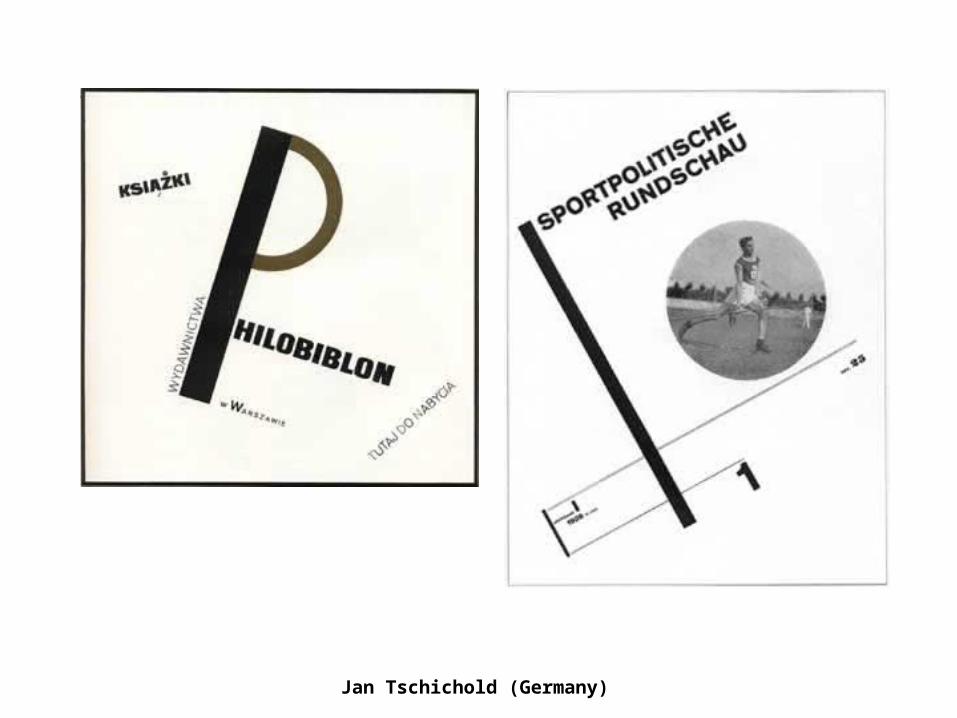
Jan Tschichold (Germany)
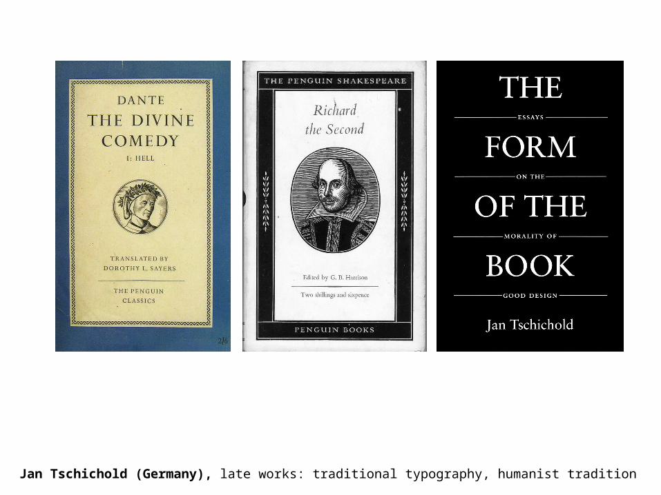
Jan Tschichold (Germany), late works: traditional typography, humanist tradition
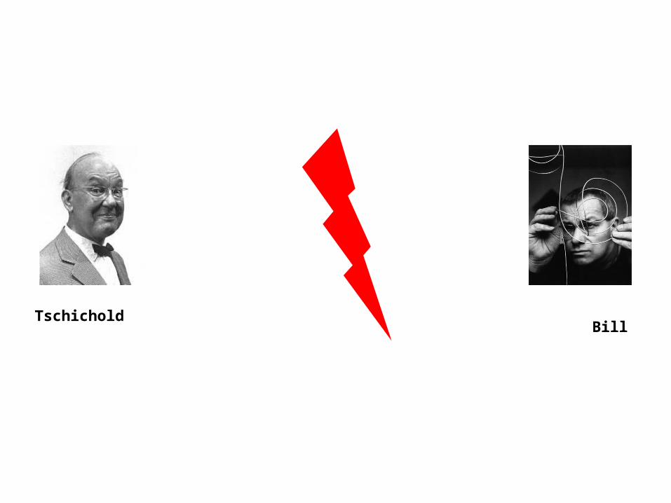
TschicholdBill

Jan Tschichold (l), dispute with Max Bill (r) about symmetry
Jan Tschichold:
Symmetry
Or Asymmetry
(according to content)
Max Bill:Asymmetrical
Layout
= Progress
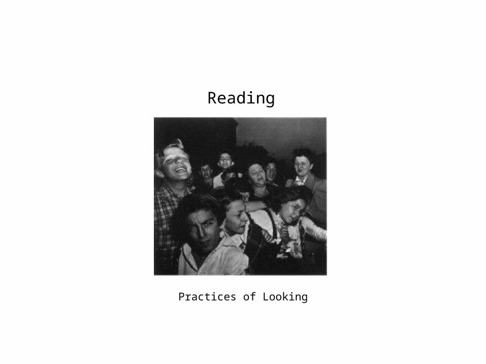
Reading
Practices of Looking
Zur Anzeige wird der QuickTime™ Dekompressor „TIFF (Unkomprimiert)“
benötigt.
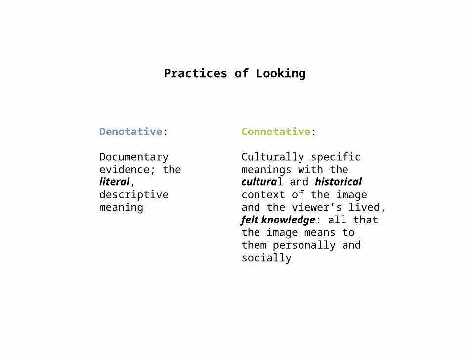
Practices of Looking
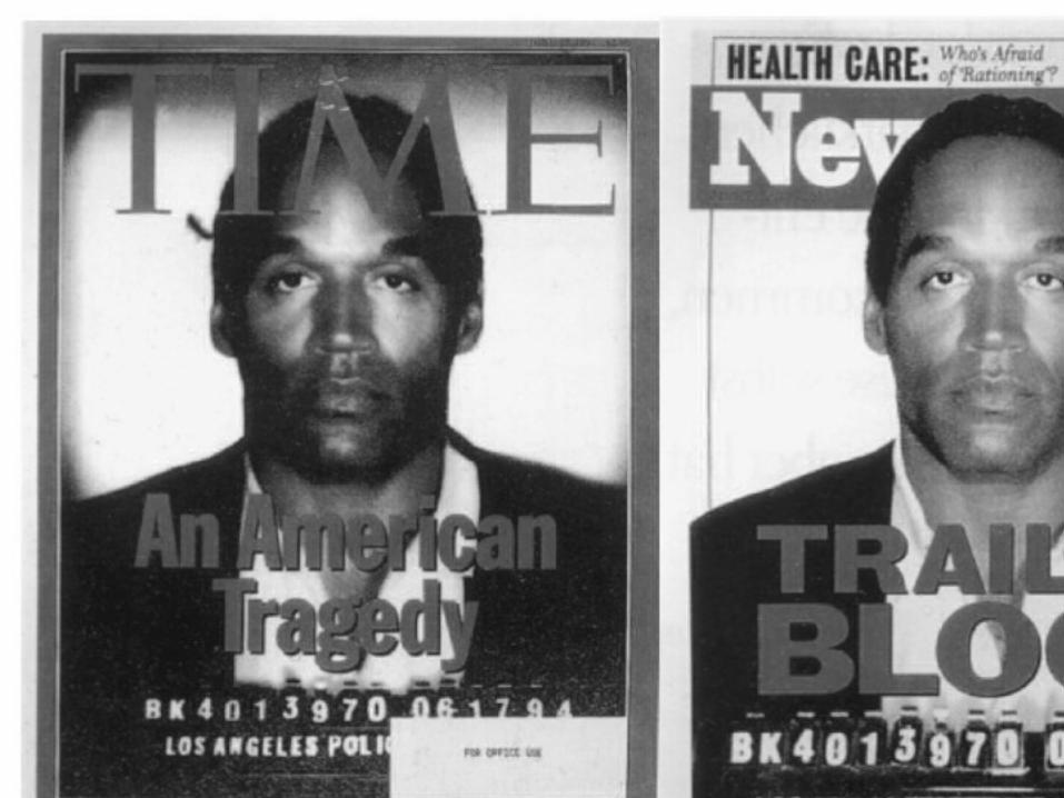
Connotative:
Culturally specific meanings with the cultural and historicalcontext of the image and the viewer’s lived, felt knowledge: all that the image means tothem personally and socially
Denotative:
Documentaryevidence; the literal, descriptive meaning


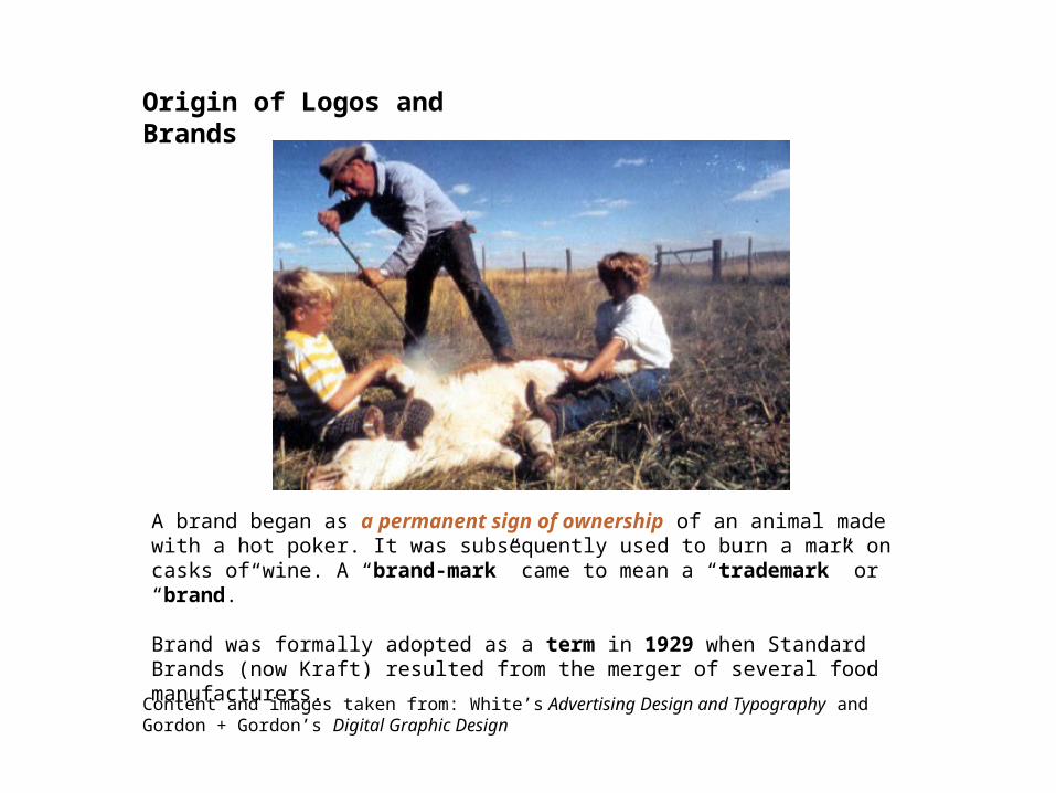
A brand began as a permanent sign of ownership of an animal made with a hot poker. It was subsequently used to burn a mark on casks of wine. A “brand-mark” came to mean a “trademark” or “brand.”
Brand was formally adopted as a term in 1929 when Standard Brands (now Kraft) resulted from the merger of several food manufacturers.
Origin of Logos and Brands
Content and images taken from: White’s Advertising Design and Typography and Gordon + Gordon’s Digital Graphic Design
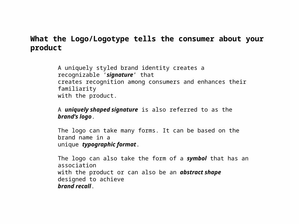
A uniquely styled brand identity creates a recognizable ‘signature’ thatcreates recognition among consumers and enhances their familiaritywith the product.
A uniquely shaped signature is also referred to as the brand’s logo.
The logo can take many forms. It can be based on the brand name in aunique typographic format.
The logo can also take the form of a symbol that has an associationwith the product or can also be an abstract shape designed to achievebrand recall.
What the Logo/Logotype tells the consumer about your product
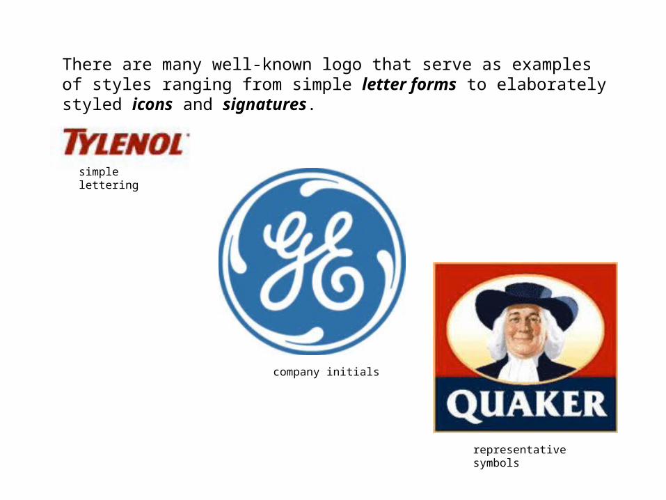
There are many well-known logo that serve as examples of styles ranging from simple letter forms to elaborately styled icons and signatures.
simple lettering
company initials
representative symbols
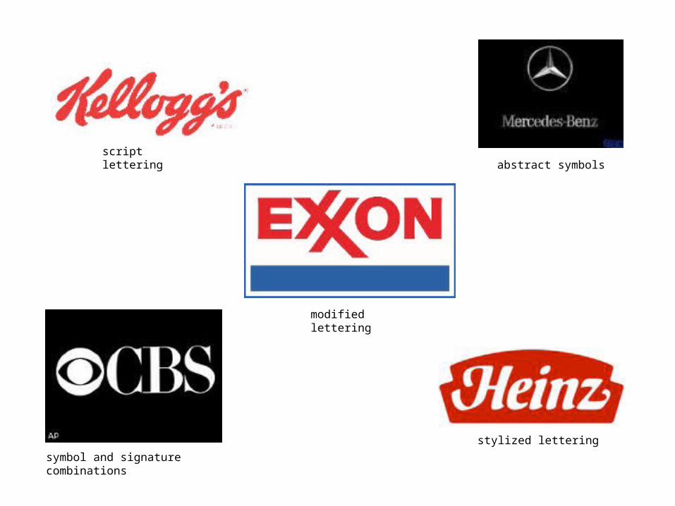
script lettering
modified lettering
symbol and signature combinations
stylized lettering
abstract symbols
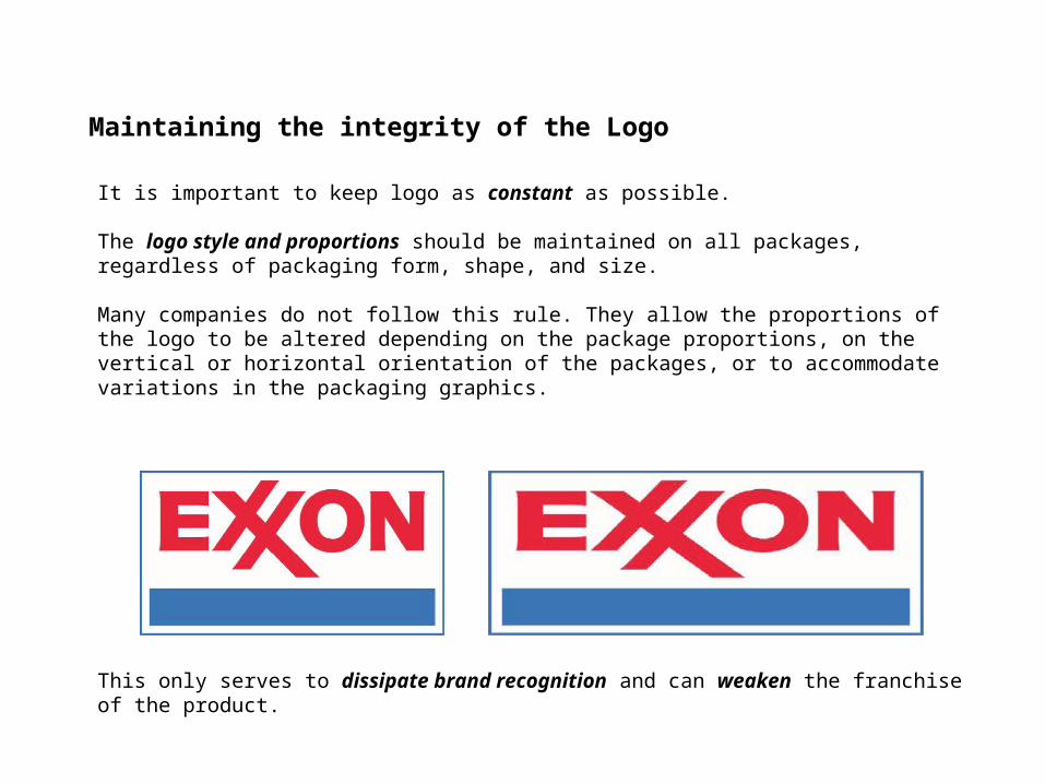
It is important to keep logo as constant as possible.
The logo style and proportions should be maintained on all packages, regardless of packaging form, shape, and size.
Many companies do not follow this rule. They allow the proportions of the logo to be altered depending on the package proportions, on the vertical or horizontal orientation of the packages, or to accommodate variations in the packaging graphics.
Maintaining the integrity of the Logo
This only serves to dissipate brand recognition and can weaken the franchise of the product.
“Words are like faces:
the more features we can see, the easier it is to tell who is who.”
Content and images taken from: Spiekermann & Ginger’s Stop Stealing Sheep
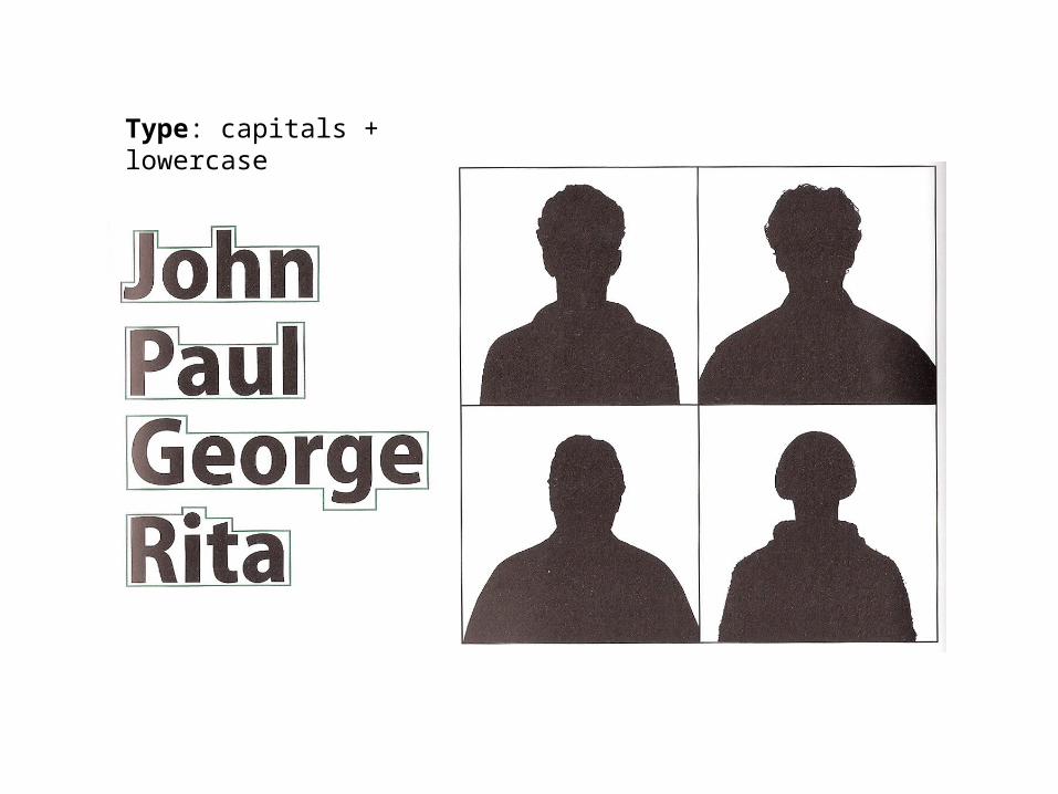
Type: capitals + lowercase
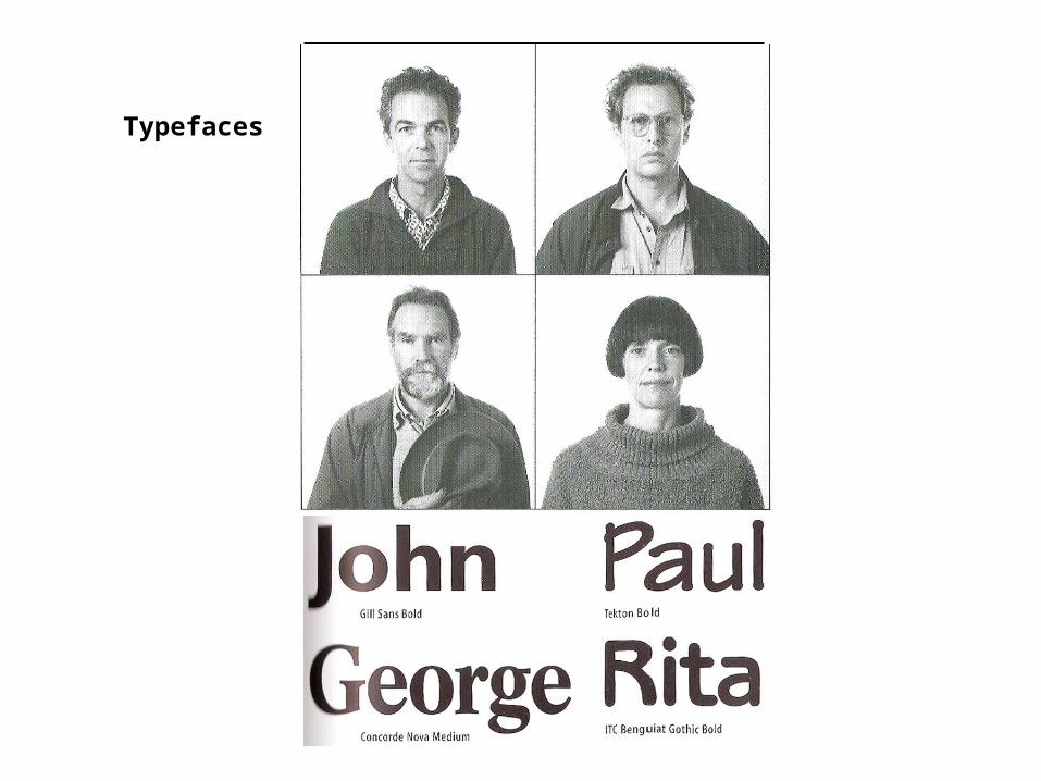
Typefaces
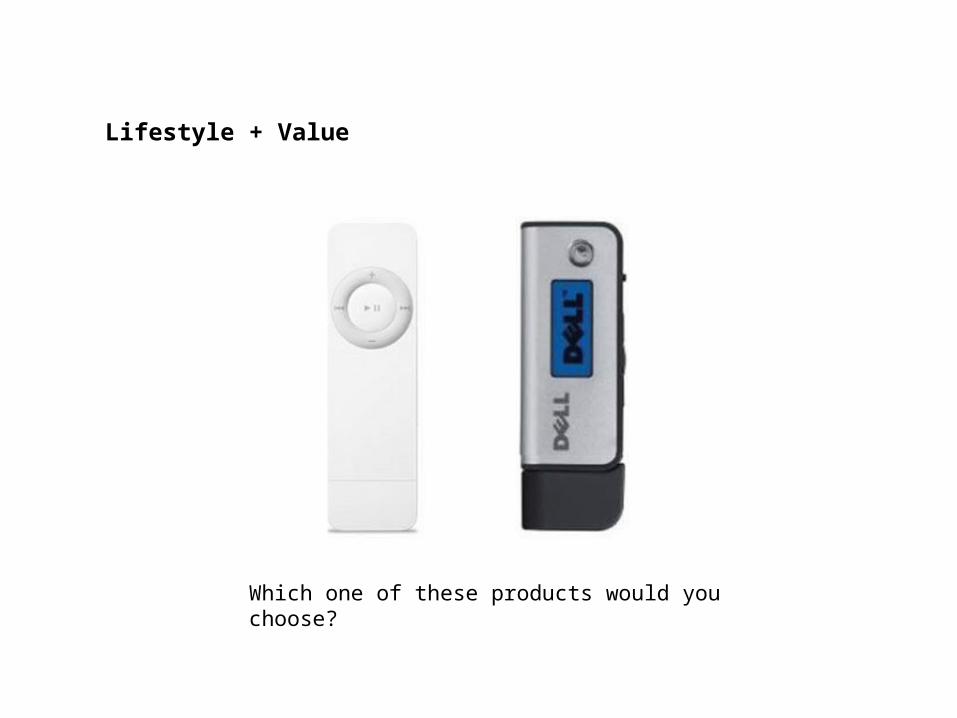
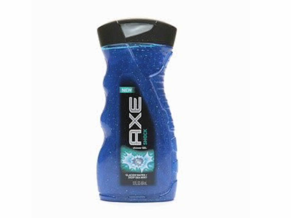
Which one of these products would you choose?
Lifestyle + Value
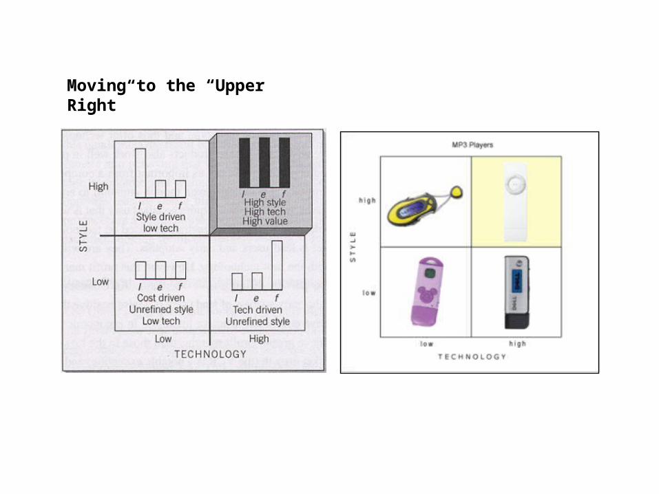
Moving to the “Upper Right”
Logos
How to present

announcements
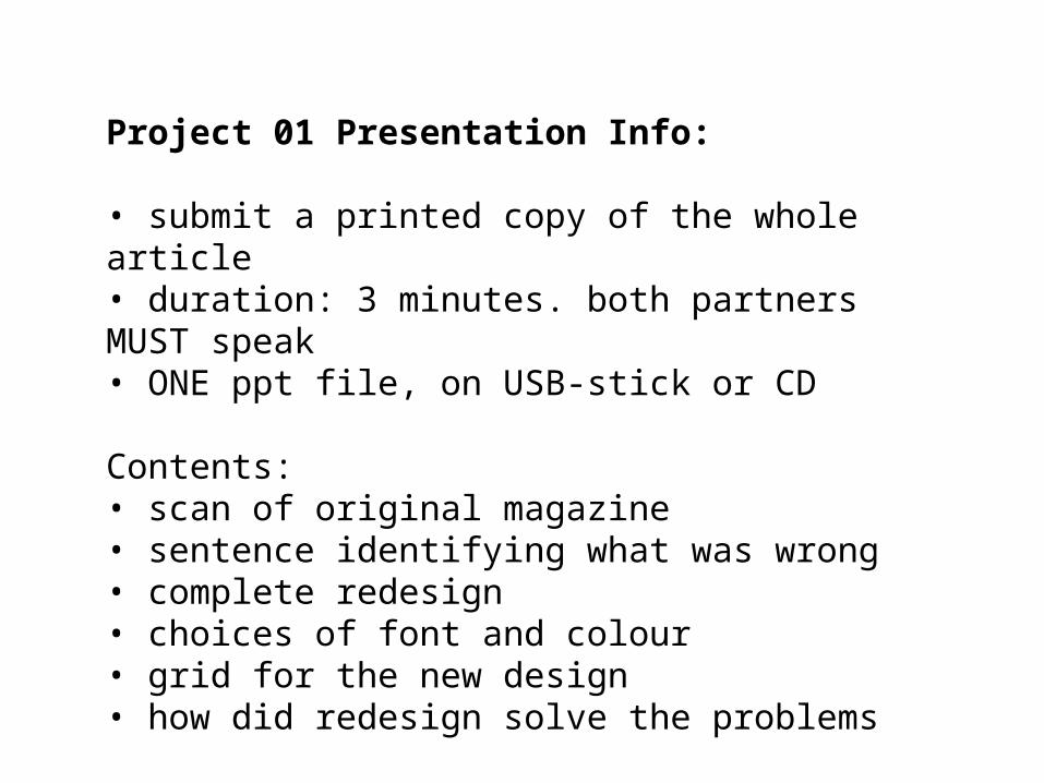
Project 01 Presentation Info:
• submit a printed copy of the whole article• duration: 3 minutes. both partners MUST speak• ONE ppt file, on USB-stick or CD
Contents:• scan of original magazine• sentence identifying what was wrong• complete redesign• choices of font and colour • grid for the new design• how did redesign solve the problems

fin