Embed Size (px)
Citation preview

Magazine Development Diary
Stage 1
Based on my textual analysis of existing film magazine reviews and the knowledge and further research I have from my secondary findings I created a mock drawing using A3 paper (representing a double page spread) of rough ideas before implementing them onto computer using Photoshop. I have created these drawings using typical conventions and forms that take place in professional magazines in order to maximize success and raise awareness for my film. Throughout the process of creating the magazine I will be using these mock ups as guides to complete all the elements and make sure nothing is left out.

Stage 2
To start off the magazine I created a new Photoshop document, making a double page spread, the first thing I did was applied a black to white gradient. This connotes the death and dark themes of our film but also the purity and freedom. Like in the poster I used the rectangular shape tool to create the 3 vertical lines and then repeated them horizontally applying black red and white to each one using the paint bucket tool. To position them correctly I used the free transform and the move tool. I have specifically repeated them so they are the same as in the poster, this creates synergy and cross promotion as audiences can see that the poster is representing our film if they have reads the review and vice versa. This in itself creates iconography for the film.
Shape tool.
Gradient tool.

Stage 3
In the next stage I used the internet to gain a copyright free image of London and opened it up in a new Photoshop file. Like with the Cory image before I use used the magnetic lasso to carefully cut around the image of the buildings taking what I wanted. The image I had cut out wasn’t what I wanted so I used the quick mask tool and the pencil to carefully go around it until I had perfection, at this point I also manipulated the image by making it stand out and have a 3D element to it. I dragged this now cut image into my other Photoshop document and applied a greyscale filter to it, in order to keep to the style within my film and give it that contemporary feel to the magazine review. I made sure I put this layer on top of the previous one so the image ran over the horizontal lines.
Move tool.
Pencil tool.
Quick mask tool.

Stage 4
Continuing with the magazine the next stage I used the text tool to put the title of the film on, using the same font (Stencil STD) at 140 pt. I used the colour selection tool to change it to white, keeping with the same theme colour throughout my production work. Using the text I have shown a form of cross promotion in that the audience can relate all my texts to the same company and it will encourage them to consume more than one as they will be reminded of them due to having the same themes. Using vertical synergy I have been able to create a string of successful media texts that the audience will relate to. I chose to place the title in the top left corner as it grabs the viewers straight away and is one of the biggest conventions I found during research. I used the text tool to create the name of the magazine and the issue date, THE REEL and AUG 11. However I chose to use a different font as this isn’t vertical synergy, as its part of the magazine, not 5IVEFILM which is the company I’m working within. Using the move tool I chose to position it above the horizontal whit line so it stands out and because it follows the modern, contemporary style of the magazine.
Text tool

Stage 5
This stage was very quick and involved me using the rectangular text tool to create a small box which I positioned in the top left hand corner of the page. I used the colour selection tool and chose black so it stood out against the lighter white background. Using the text tool I was able to number the page so it added to the realism of the magazine and looked professional.
I used the rectangular shape tool and the text tool here.

Stage 6
In this stage I used the rectangular tool to create a box intended for the text, where I used the colour selection tool to change it to white, standing out on the subtle background. I then copied the layer 5 times so I had 6 boxes, 3 equally on each page. I used the ruler at the top of the page to ensure they were correctly positioned and all symmetrical. This task proved to be quite hard to ensure each text box was aligned correctly, so it looked professional. I used the internet to obtain a copyright free image of a reel and opened it in a new document. Again I used the lasso to cut it out, due to the shape I didn’t have to use the quick mask so this was easier. I dragged it into the magazine document and positioned it onto the left hand side of the page, placing it below the skyline image so it went behind. This was to now ready to have images dropped in. I chose a reel to highlight the images but because it goes with the name of the magazine – ‘THE REEL’.
Shape tool.

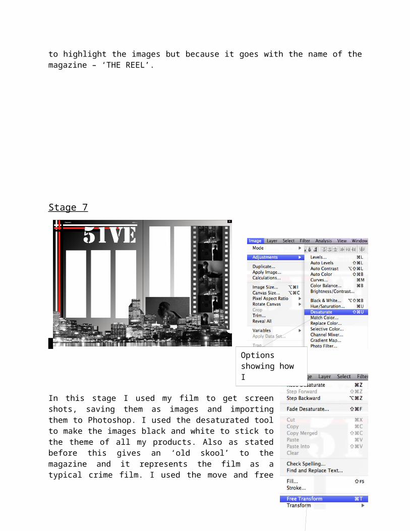
Stage 7
In this stage I used my film to get screen shots, saving them as images and importing them to Photoshop. I used the desaturated tool to make the images black and white to stick to the theme of all my products. Also as stated before this gives an ‘old skool’ to the magazine and it represents the film as a typical crime film. I used the move and free transform tool to resize the image and move it into position, to the right side of the page in the lower section behind the skyline image. This connotes that all this activity is going on within the city as all the images are set behind the skyline. I used this same technique on the other 3 pictures to manipulate them in the order I wanted, before duplicating each one and putting them in the reel. This was made to look like a reel showing our film, where the images are repeated throughout, this also promotes our film as it shows onscreen footage in the magazine which will help raise awareness to our film.
The free transform tool.
Options showing how I desaturated the images.
Stage 8
The last stage involved changing the Text boxes’ to allow room for the review. To do this I deleted 2 of the text box’s and used the free transform and move tool to expand the size of the remaining text box’s and move them into the correct position ensuring they were symmetrical with the rest of the page. Something else that was done was the text below the title that introduces the review; again this was done using the text tool and move tool to position.
Now the layout was complete the review could be written, starting with the production documents which state the release date, certificate, director producer and the cast. These brief notes tell the reader a bit about the film, something which might make them want to watch it, maybe because of a certain member of the cast or crew. The review starts with a drop cap to establish the big impact on the text as it criticises the film.
I feel this magazine review is very successful; it looks professional through the layout and the review itself. This text will help to promote awareness for the film and help it be more successful, as well through Maslow’s hierarchy of needs which state’s that advertisements for entertainment products promise to fulfil our needs to be accepted into social groups and our need for self-esteem and self respect. This means people are sub consciously drawn into this entertainment which includes our media texts.