Embed Size (px)
Citation preview
Full file at http://TestbankCollege.eu/Test-Bank-Statistics-for-Management-and-Economics-8th-Edition-Gerald-Keller
Ch2
Multiple ChoiceIdentify the choice that best completes the statement or answers the question.
____ 1. The classification of student major (accounting, economics, management, marketing, other) is an example of a(n)a. nominal random variable.b. interval random variable.c. continuous random variable.d. parameter.
____ 2. The classification of student class designation (freshman, sophomore, junior, senior) is an example of a(n)a. nominal random variable.b. interval random variable.c. ordinal random variable.d. a parameter.
____ 3. A researcher wishes to estimate the textbook costs of first-year students at Ferris State University. To do so, he recorded the textbook cost of 200 first-year students and found that their average textbook cost was $275 per semester. The variable of interest to the researcher isa. textbook cost.b. class rank.c. number of students.d. name of university.
____ 4. All calculations are permitted on what type of data?a. Interval datab. Nominal datac. Ordinal datad. All of these choices are true.
____ 5. Values must represent ordered rankings for what type of data?a. Interval datab. Nominal datac. Ordinal datad. None of these choices.
____ 6. For what type of data are frequencies the only calculations that can be done?a. Interval datab. Nominal datac. Ordinal datad. None of these choices.
____ 7. For which type of data are the values arbitrary numbers?a. Interval datab. Nominal datac. Ordinal datad. None of these choices.
____ 8. Which of the following statements about pie charts is false?a. A pie chart is a graphical representation of a relative frequency distribution.
Full file at http://TestbankCollege.eu/Test-Bank-Statistics-for-Management-and-Economics-8th-Edition-Gerald-Keller
b. You can always determine frequencies for each category by looking at a pie chart.c. The total percentage of all the slices of a pie chart is 100%.d. The area of a slice of a pie chart is the proportion of all the individuals that fall into that
particular category.
____ 9. Which of the following situations is best suited for a pie chart?a. The number of dollars spent this year on each type of legal gambling.b. The percentage of a charitable donation that goes to administrative costs vs. directly to the
charity.c. The number of students in your class who received an A, B, C, D, F on their exam.d. All of these choices are true.
____ 10. Which situation identifies when to use pie charts and/or bar charts?a. You want to describe a single set of data.b. Your data is nominal.c. You want to show the number or the percentage of individuals in each category.d. All of these choices are true.
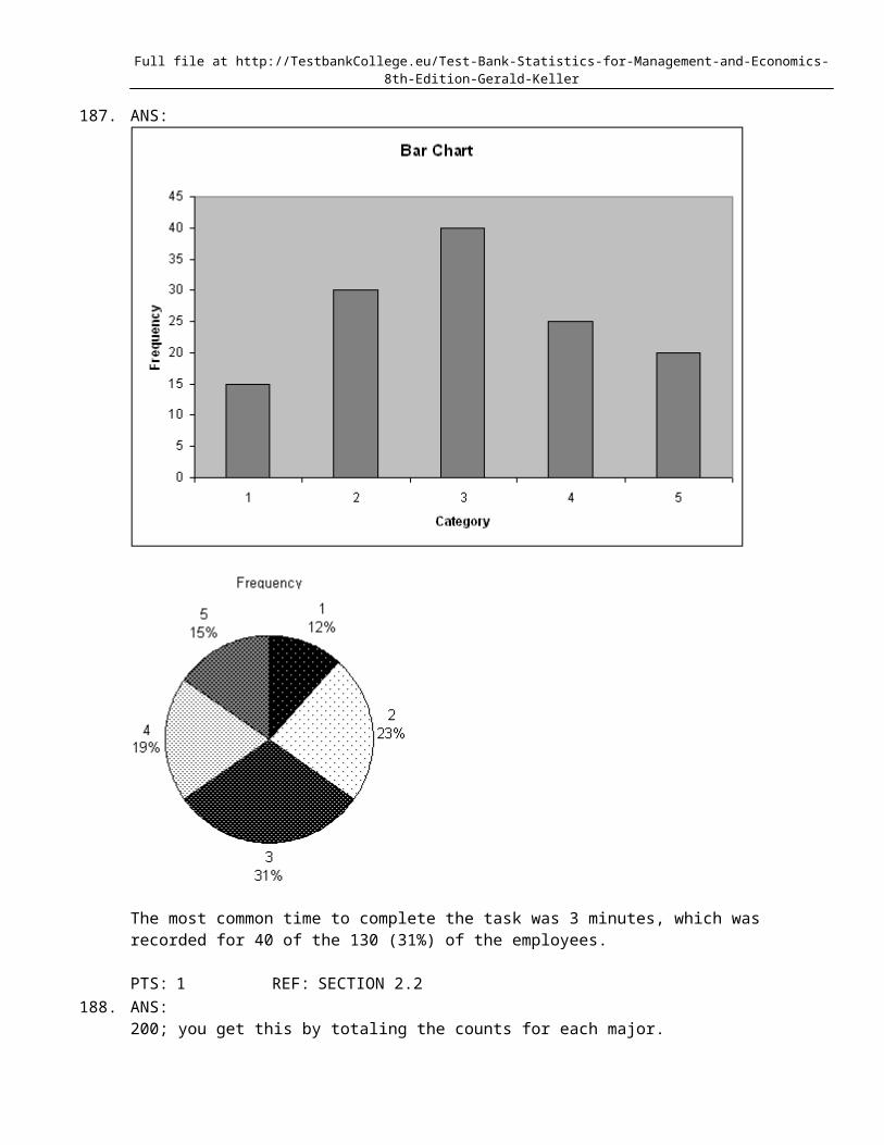
____ 11. Suppose you measure the number of minutes it takes an employee to complete a task, where the maximum allowed time is 5 minutes, and each time is rounded to the nearest minute. Data from 130 employees is summarized below. How long did it take most employees to complete the task?
Time (minutes) 1 2 3 4 5Frequency 15 30 40 25 20
a. 5 minutesb. 3 minutesc. 40 minutesd. 20 minutes
____ 12. Car buyers were asked to indicate the car dealer they believed offered the best overall service. The four choices were Carriage Motors (C), Marco Chrysler (M), Triangle Auto (T), and University Chevrolet (U). The following data were obtained:
T C C C U C M T C UU M C M T C M M C MT C C T U M M C C TT U C U T M M C U T
What percentage of car buyers identified Carriage Motors as having the best overall service?a. 1/4 = 0.25 or 25%b. 14/40 = 0.35 or 35%c. 14%d. None of these choices.
____ 13. Which of the following represents a graphical presentation of interval data?a. A bar chart.b. A histogram.c. A pie chart.d. All of these choices are true.
____ 14. Which of the following statements about histograms is false?
Full file at http://TestbankCollege.eu/Test-Bank-Statistics-for-Management-and-Economics-8th-Edition-Gerald-Keller
a. A histogram is a summary of interval data.b. A histogram is made of a series of intervals, called classes.c. The classes in a histogram cover the complete range of observations.d. All of these choices are true.
____ 15. Which of the following statements about histograms is false?a. The intervals of a histogram do not overlap.b. Every observation is assigned to one and only one class in a histogram.c. The intervals of a histogram are equally wide.d. None of these choices.
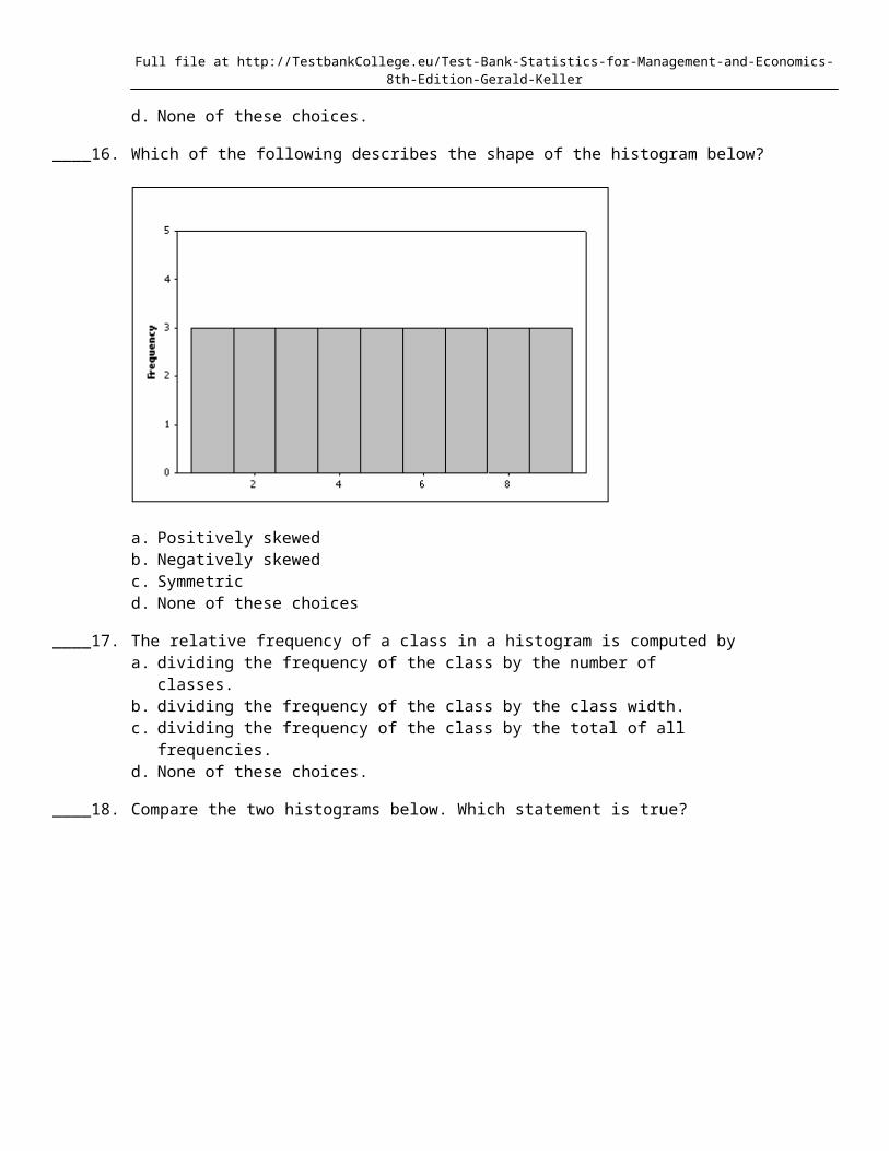
____ 16. Which of the following describes the shape of the histogram below?
a. Positively skewedb. Negatively skewedc. Symmetricd. None of these choices
____ 17. The relative frequency of a class in a histogram is computed bya. dividing the frequency of the class by the number of classes.b. dividing the frequency of the class by the class width.c. dividing the frequency of the class by the total of all frequencies.d. None of these choices.
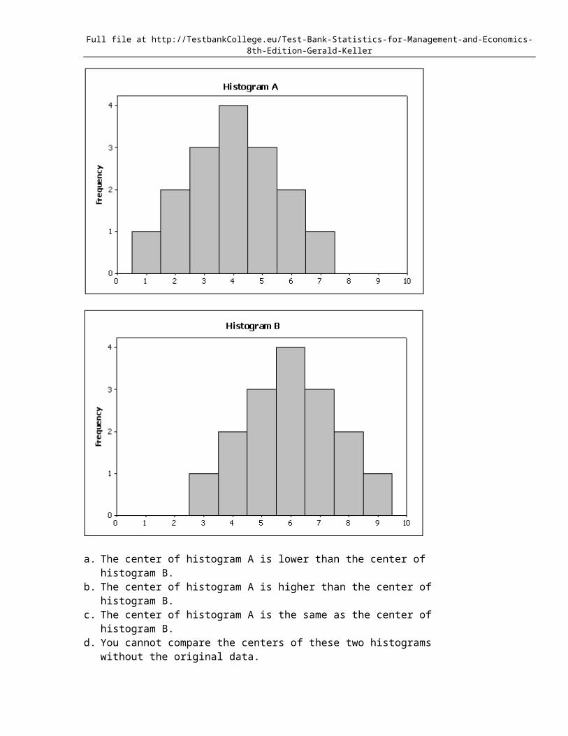
____ 18. Compare the two histograms below. Which statement is true?
Full file at http://TestbankCollege.eu/Test-Bank-Statistics-for-Management-and-Economics-8th-Edition-Gerald-Keller
a. The center of histogram A is lower than the center of histogram B.b. The center of histogram A is higher than the center of histogram B.c. The center of histogram A is the same as the center of histogram B.d. You cannot compare the centers of these two histograms without the original data.
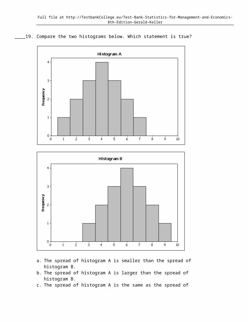
____ 19. Compare the two histograms below. Which statement is true?
Full file at http://TestbankCollege.eu/Test-Bank-Statistics-for-Management-and-Economics-8th-Edition-Gerald-Keller
a. The spread of histogram A is smaller than the spread of histogram B.b. The spread of histogram A is larger than the spread of histogram B.c. The spread of histogram A is the same as the spread of histogram B.d. You cannot compare the spreads of these two histograms without the original data.
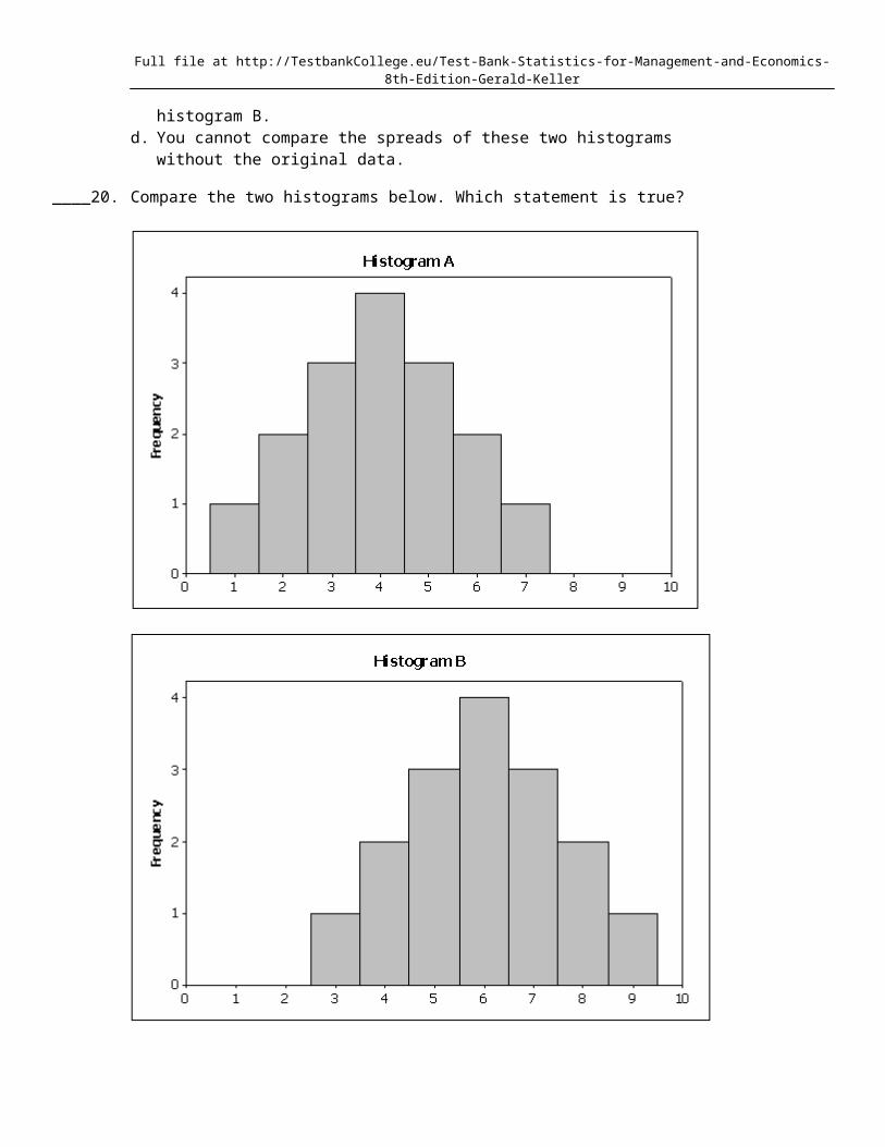
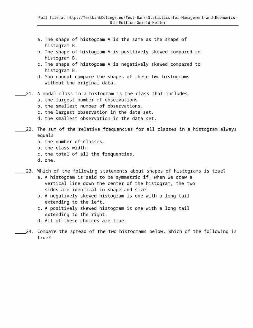
____ 20. Compare the two histograms below. Which statement is true?
Full file at http://TestbankCollege.eu/Test-Bank-Statistics-for-Management-and-Economics-8th-Edition-Gerald-Keller
a. The shape of histogram A is the same as the shape of histogram B.b. The shape of histogram A is positively skewed compared to histogram B.c. The shape of histogram A is negatively skewed compared to histogram B.d. You cannot compare the shapes of these two histograms without the original data.
____ 21. A modal class in a histogram is the class that includesa. the largest number of observations.
Full file at http://TestbankCollege.eu/Test-Bank-Statistics-for-Management-and-Economics-8th-Edition-Gerald-Keller
b. the smallest number of observations.c. the largest observation in the data set.d. the smallest observation in the data set.
____ 22. The sum of the relative frequencies for all classes in a histogram always equalsa. the number of classes.b. the class width.c. the total of all the frequencies.d. one.
____ 23. Which of the following statements about shapes of histograms is true?a. A histogram is said to be symmetric if, when we draw a vertical line down the center of
the histogram, the two sides are identical in shape and size.b. A negatively skewed histogram is one with a long tail extending to the left.c. A positively skewed histogram is one with a long tail extending to the right.d. All of these choices are true.
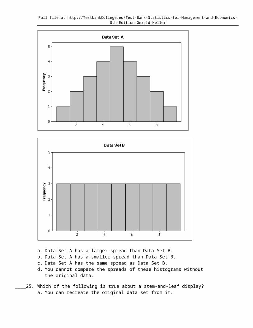
____ 24. Compare the spread of the two histograms below. Which of the following is true?
Full file at http://TestbankCollege.eu/Test-Bank-Statistics-for-Management-and-Economics-8th-Edition-Gerald-Keller
a. Data Set A has a larger spread than Data Set B.b. Data Set A has a smaller spread than Data Set B.c. Data Set A has the same spread as Data Set B.d. You cannot compare the spreads of these histograms without the original data.
____ 25. Which of the following is true about a stem-and-leaf display?a. You can recreate the original data set from it.b. Its shape resembles a histogram turned on its side.c. It provides an organized way to depict interval data.d. All of these choices are true.
____ 26. What does the length of each line of a stem-and-leaf display represent?a. The percentage of observations in the interval represented by that stem.b. The number of observations in the interval represented by that stem.c. The total frequency of observations within or below that stem.d. The number of digits to the left of the decimal point.
____ 27. What values are displayed on a cumulative relative frequency distribution?a. The number of observations that fall into each class interval.b. The proportion of observations that fall into each class interval.c. The number of observations that fall below each class interval.d. The proportion of observations that fall below each class interval.
____ 28. Which of the following describes an ogive?a. A graphical representation of frequencies.b. A graphical representation of relative frequencies.c. A graphical representation of cumulative frequencies.d. A graphical representation of cumulative relative frequencies.
____ 29. Observations that are measured at successive points in time is what type of data?a. Time-series data
Full file at http://TestbankCollege.eu/Test-Bank-Statistics-for-Management-and-Economics-8th-Edition-Gerald-Keller
b. Cross-sectional datac. Successive datad. None of these choices.
____ 30. Observations that are measured at the same time represent what type of data?a. Time-series datab. Cross-sectional datac. Synchronous datad. None of these choices.
____ 31. Which of the following represents time-series data?a. The length of time each of the top 100 stocks have been available on the NASDAQ.b. The most popular time of year that people purchase the top 100 stocks on the NASDAQ.c. The value of the #1 stock on the NASDAQ each month over a one-year period.d. All of these choices are true.
____ 32. Time-series data are often graphically depicted how?a. Bar chartb. Histogramc. Line chartd. All of these choices are true.
____ 33. Which of the following statements describes a line chart?a. A line chart is a graph of time-series data.b. A line chart is a plot of a variable over time.c. The horizontal axis of a line chart contains time periods.d. All of these choices are true.
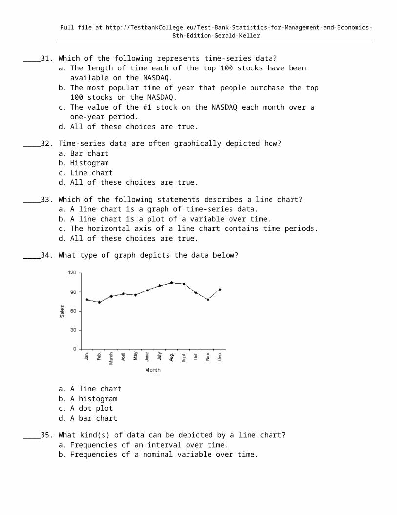
____ 34. What type of graph depicts the data below?
a. A line chartb. A histogramc. A dot plotd. A bar chart
____ 35. What kind(s) of data can be depicted by a line chart?a. Frequencies of an interval over time.b. Frequencies of a nominal variable over time.c. Relative frequencies of a nominal variable over time.
Full file at http://TestbankCollege.eu/Test-Bank-Statistics-for-Management-and-Economics-8th-Edition-Gerald-Keller
d. All of these choices are true.
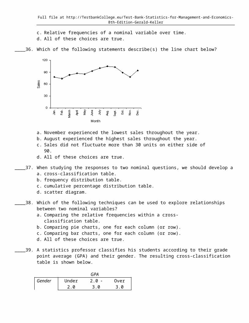
____ 36. Which of the following statements describe(s) the line chart below?
a. November experienced the lowest sales throughout the year.b. August experienced the highest sales throughout the year.c. Sales did not fluctuate more than 30 units on either side of 90.d. All of these choices are true.
____ 37. When studying the responses to two nominal questions, we should develop aa. cross-classification table.b. frequency distribution table.c. cumulative percentage distribution table.d. scatter diagram.
____ 38. Which of the following techniques can be used to explore relationships between two nominal variables?a. Comparing the relative frequencies within a cross-classification table.b. Comparing pie charts, one for each column (or row).c. Comparing bar charts, one for each column (or row).d. All of these choices are true.
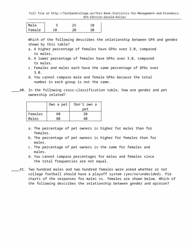
____ 39. A statistics professor classifies his students according to their grade point average (GPA) and their gender. The resulting cross-classification table is shown below.
GPAGender Under 2.0 2.0 3.0 Over 3.0Male 5 25 10Female 10 20 30
Which of the following describes the relationship between GPA and gender shown by this table?a. A higher percentage of females have GPAs over 3.0, compared to males.b. A lower percentage of females have GPAs over 3.0, compared to males.c. Females and males each have the same percentage of GPAs over 3.0.d. You cannot compare male and female GPAs because the total number in each group is not
the same.
____ 40. In the following cross-classification table, how are gender and pet ownership related?
Full file at http://TestbankCollege.eu/Test-Bank-Statistics-for-Management-and-Economics-8th-Edition-Gerald-Keller
Own a pet Don't own a petFemales 60 30Males 80 40
a. The percentage of pet owners is higher for males than for females.b. The percentage of pet owners is higher for females than for males.c. The percentage of pet owners is the same for females and males.d. You cannot compare percentages for males and females since the total frequencies are not
equal.
____ 41. Two hundred males and two hundred females were asked whether or not college football should have a playoff system (yes/no/undecided). Pie charts of the responses for males vs. females are shown below. Which of the following describes the relationship between gender and opinion?
Full file at http://TestbankCollege.eu/Test-Bank-Statistics-for-Management-and-Economics-8th-Edition-Gerald-Keller
a. A higher percentage of males want a playoff system compared to females.b. More males than females are undecided on this issue.c. Gender and opinion on a playoff system are related.d. All of these choices are true.
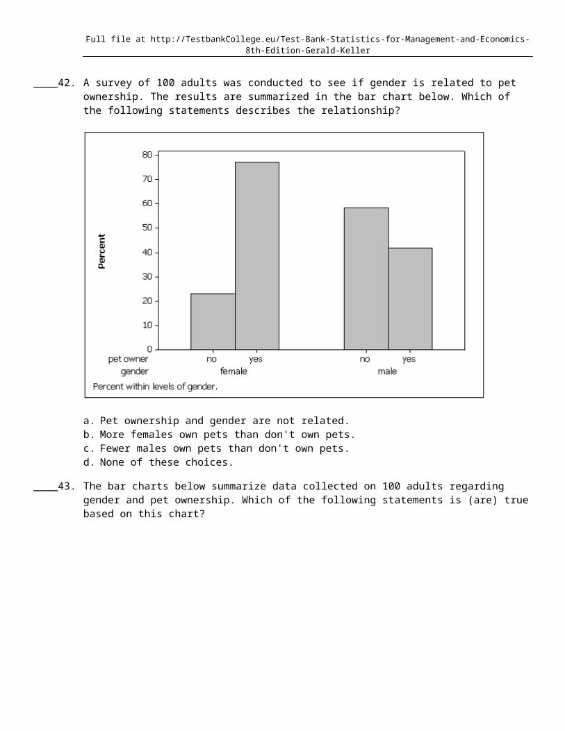
____ 42. A survey of 100 adults was conducted to see if gender is related to pet ownership. The results are summarized in the bar chart below. Which of the following statements describes the relationship?
Full file at http://TestbankCollege.eu/Test-Bank-Statistics-for-Management-and-Economics-8th-Edition-Gerald-Keller
a. Pet ownership and gender are not related.b. More females own pets than don't own pets.c. Fewer males own pets than don't own pets.d. None of these choices.
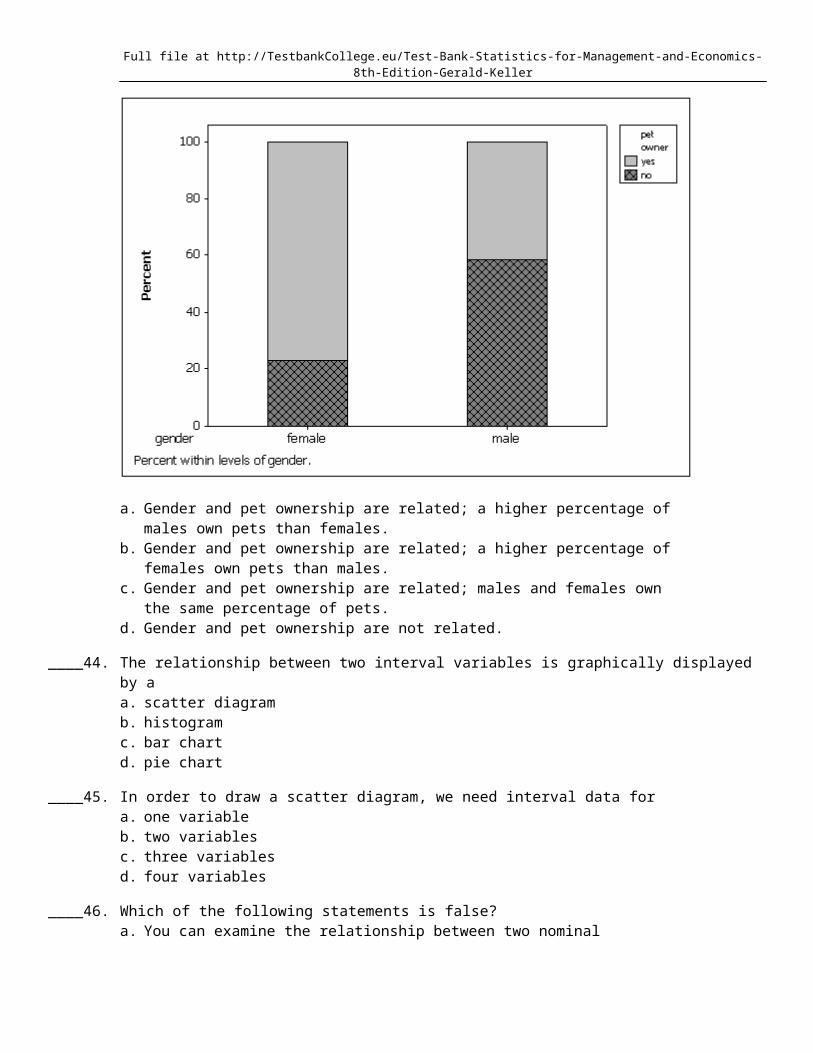
____ 43. The bar charts below summarize data collected on 100 adults regarding gender and pet ownership. Which of the following statements is (are) true based on this chart?

Full file at http://TestbankCollege.eu/Test-Bank-Statistics-for-Management-and-Economics-8th-Edition-Gerald-Keller
a. Gender and pet ownership are related; a higher percentage of males own pets than females.b. Gender and pet ownership are related; a higher percentage of females own pets than males.c. Gender and pet ownership are related; males and females own the same percentage of pets.d. Gender and pet ownership are not related.
____ 44. The relationship between two interval variables is graphically displayed by aa. scatter diagramb. histogramc. bar chartd. pie chart
____ 45. In order to draw a scatter diagram, we need interval data fora. one variableb. two variablesc. three variablesd. four variables
____ 46. Which of the following statements is false?a. You can examine the relationship between two nominal variables using a cross-
classification table.b. You can only apply statistical techniques to one variable at a time.c. You can examine the relationship between two interval variables using a scatter diagram.d. None of these choices.
____ 47. How do you determine whether two interval variables have a positive linear relationship?a. Most of the points fall close to a straight line with positive slope.b. As the X variable increases, the Y variable increases in a linear way.c. The scatter diagram shows a linear pattern that is going uphill.
Full file at http://TestbankCollege.eu/Test-Bank-Statistics-for-Management-and-Economics-8th-Edition-Gerald-Keller
d. All of these choices are true.
____ 48. If the data in a scatter diagram is scattered completely at random, what do you conclude?a. There is no linear relationship between X and Y.b. There is a strong linear relationship between X and Y.c. There is a strong linear relationship between X and Y that is described by a horizontal (flat)
line.d. None of these choices.
____ 49. Which of the following is the method statisticians use to draw the best fitting straight line through the data on a scatter diagram?a. The fit best method.b. The least squares method.c. The point-intercept method.d. None of these choices.
____ 50. Which of the following describes a positive linear relationship between X and Y?a. As the X values increase, the Y values increase in a linear manner.b. As the X values decrease, the Y values decrease in a linear manner.c. The X and Y values move uphill together in a linear manner.d. All of these choices are true.
____ 51. When two variables tend to move in opposite directions, yet still form a linear pattern, how do you describe their relationship?a. A positive linear relationship.b. A negative linear relationship.c. A proportional inverse relationship.d. None of these choices.
True/FalseIndicate whether the statement is true or false.
____ 52. Your gender is a nominal variable.
____ 53. Your final grade in a course (A, B, C, D, E) is a nominal variable.
____ 54. Your age is an interval variable.
____ 55. Your age group (1-10; 11-20; 21-30; 31-40; etc.) is an interval variable.
____ 56. Whether or not you are over the age of 21 is a nominal variable.
____ 57. The values of quantitative data are categories.
____ 58. Interval data, such as heights, weights, and incomes, are also referred to as quantitative or numerical data.
____ 59. Nominal data are also called qualitative or categorical data.
____ 60. A variable is some characteristic of a population or sample.
Full file at http://TestbankCollege.eu/Test-Bank-Statistics-for-Management-and-Economics-8th-Edition-Gerald-Keller
____ 61. With nominal data, there is one and only one way the possible values can be ordered.
____ 62. You cannot calculate and interpret differences between numbers assigned to nominal data.
____ 63. All calculations are permitted on interval data.
____ 64. Interval data may be treated as ordinal or nominal.
____ 65. A bar chart is used to represent interval data.
____ 66. One of the advantages of a pie chart is that it clearly shows that the total percentages of all the categories add to 100%.
____ 67. Bar and pie charts are graphical techniques for nominal data. The former focus the attention on the frequency of the occurrences of each category, and the later emphasizes the proportion of occurrences of each category.
____ 68. A relative frequency distribution lists the categories and their counts.
____ 69. A frequency distribution lists the categories and the proportion with which each occurs.
____ 70. From a pie chart you are able to find the frequency for each category.
____ 71. The intervals (classes) in a histogram do not overlap.
____ 72. The intervals (classes) in a histogram are equally wide.
____ 73. In a histogram, each observation is assigned to one or more classes.
____ 74. The number of class intervals in a histogram depends on the number of observations in the data set.
____ 75. A relative frequency distribution describes the proportion of data values that fall within each category.
____ 76. A stem-and-leaf display reveals more information about the original data than does a histogram.
____ 77. The number of observations within each class may be found in a frequency distribution.
____ 78. The advantage of a stem-and-leaf display over a histogram is that we can see the actual observations.
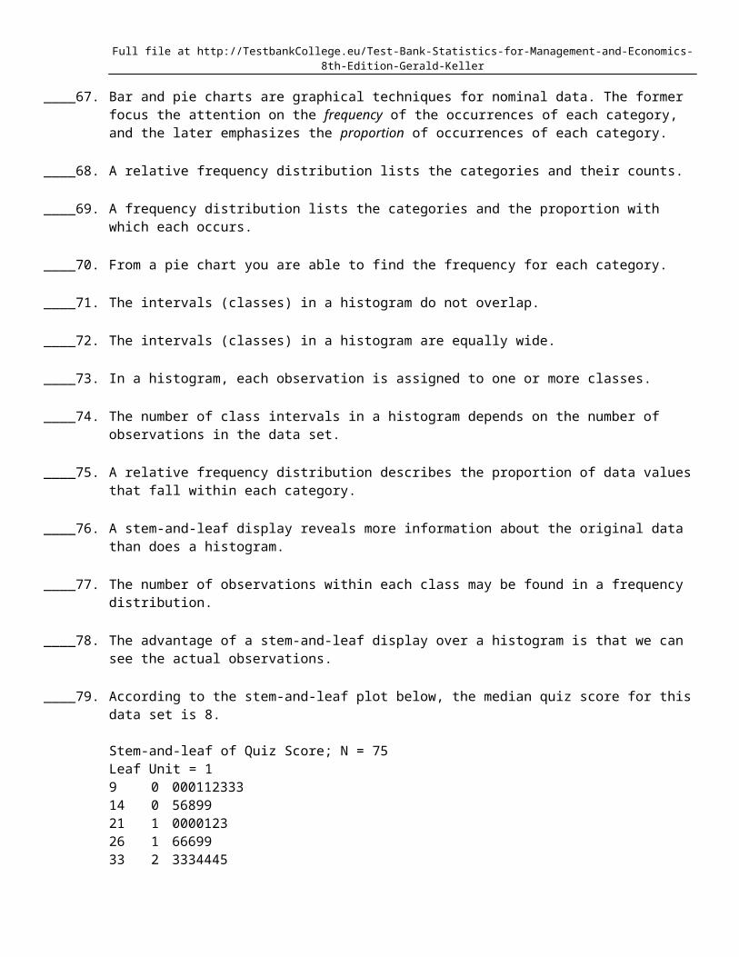
____ 79. According to the stem-and-leaf plot below, the median quiz score for this data set is 8.
Stem-and-leaf of Quiz Score; N = 75Leaf Unit = 19 0 00011233314 0 5689921 1 000012326 1 6669933 2 3334445(8) 2 6667788834 3 0023344
Full file at http://TestbankCollege.eu/Test-Bank-Statistics-for-Management-and-Economics-8th-Edition-Gerald-Keller
27 3 5666999919 4 00012223310 4 5556667799
____ 80. A cumulative relative frequency distribution lists the number of observations that lie below each of the class limits.
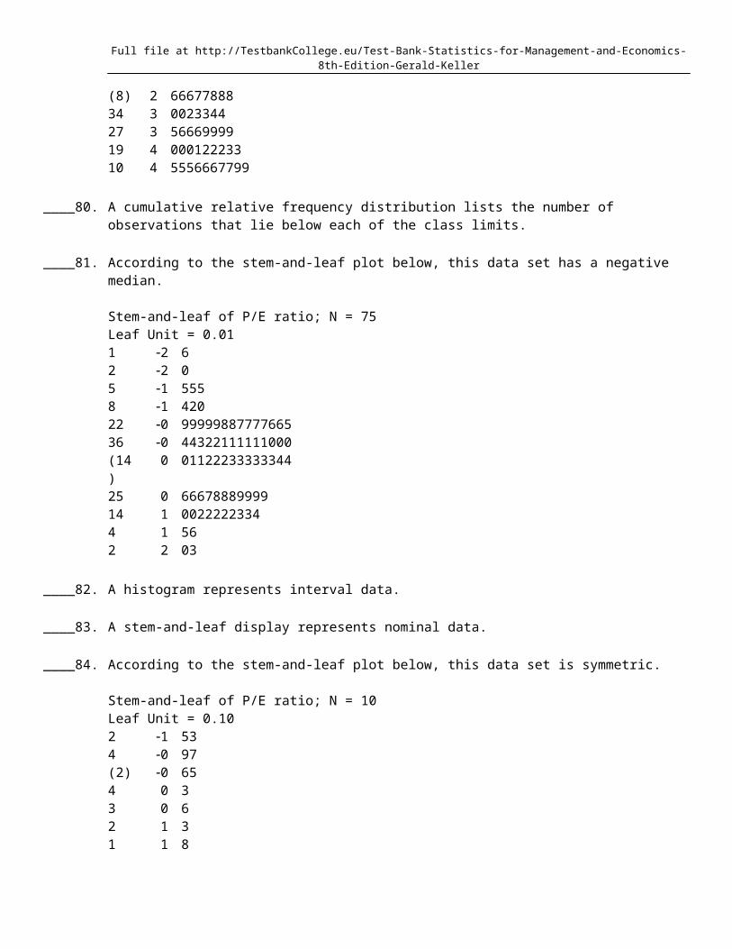
____ 81. According to the stem-and-leaf plot below, this data set has a negative median.
Stem-and-leaf of P/E ratio; N = 75Leaf Unit = 0.011 2 62 2 05 1 5558 1 42022 0 9999988777766536 0 44322111111000(14) 0 0112223333334425 0 6667888999914 1 00222223344 1 562 2 03
____ 82. A histogram represents interval data.
____ 83. A stem-and-leaf display represents nominal data.
____ 84. According to the stem-and-leaf plot below, this data set is symmetric.
Stem-and-leaf of P/E ratio; N = 10Leaf Unit = 0.102 1 534 0 97(2) 0 654 0 33 0 62 1 31 1 8
____ 85. When a distribution has more values to the left and tails off to the right, it is skewed negatively.
____ 86. A histogram is said to be symmetric if, when we draw a vertical line down the center of the histogram the two sides are nearly identical.
____ 87. A skewed histogram is one with a long tail extending either to the right or left.
____ 88. When a distribution has more values to the right and tails to the left, we say it is skewed negatively.
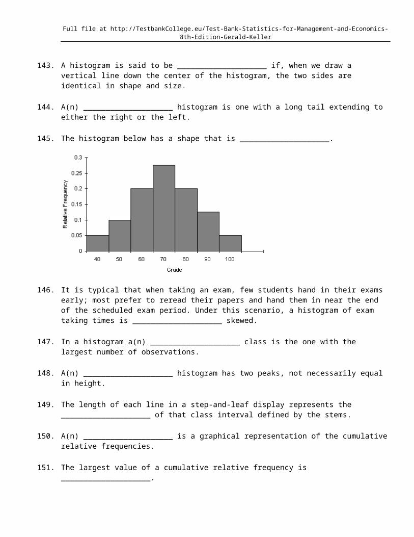
____ 89. The sum of relative frequencies in a distribution always equals 1.
Full file at http://TestbankCollege.eu/Test-Bank-Statistics-for-Management-and-Economics-8th-Edition-Gerald-Keller
____ 90. The sum of cumulative relative frequencies always equals 1.
____ 91. The original observations cannot be determined once they are grouped into a frequency distribution.
____ 92. A modal class is the class with the largest number of observations.
____ 93. Experience shows that few students hand in their statistics exams early; most prefer to hand them in near the end of the test period. This means the time taken by students to write exams is positively skewed.
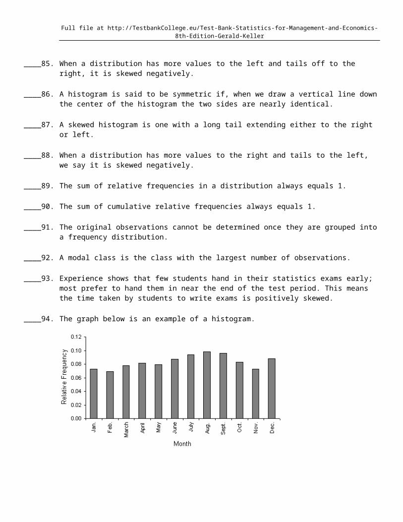
____ 94. The graph below is an example of a histogram.
____ 95. A grocery store's monthly sales (in thousands of dollars) for the last year were as follows. A histogram should be used to present these data.
Month 1 2 3 4 5 6 7 8 9 10 11 12Sales 78 74 83 87 85 93 100 105 103 89 78 94
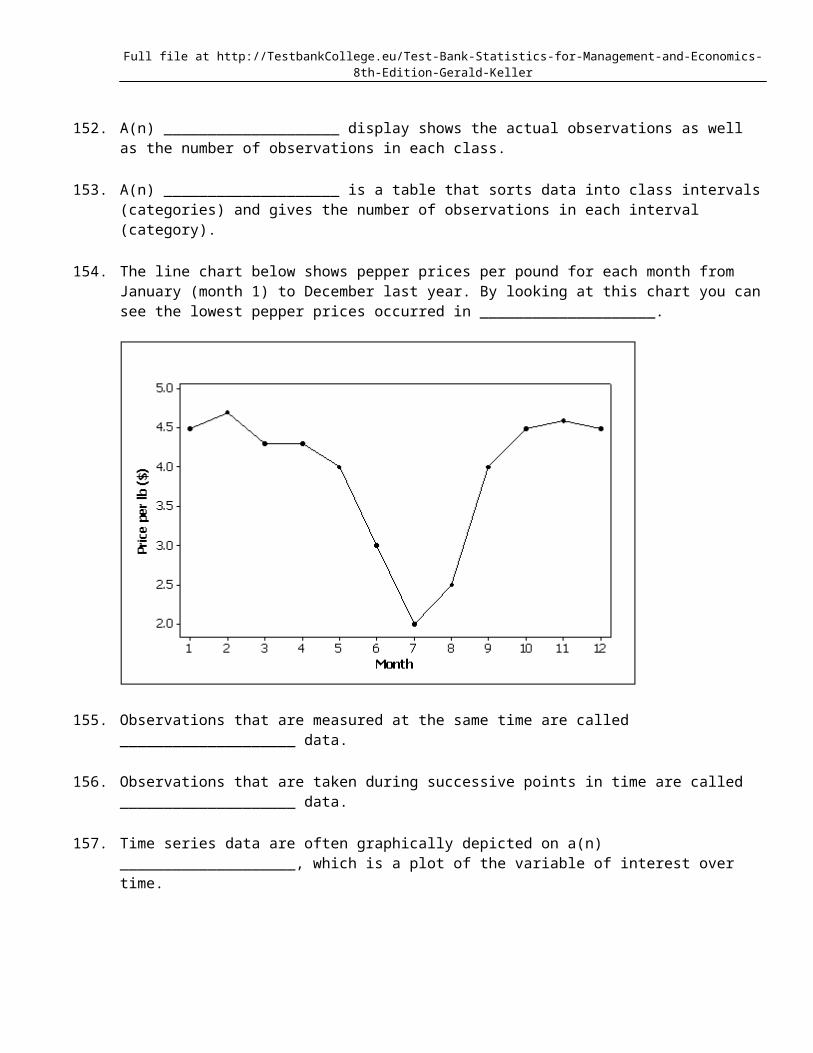
____ 96. Time series data are often graphically depicted on a line chart, which is a plot of the variable of interest over time.
____ 97. A line chart is created by plotting the values of the variable on the vertical axis and the time periods on the horizontal axis.
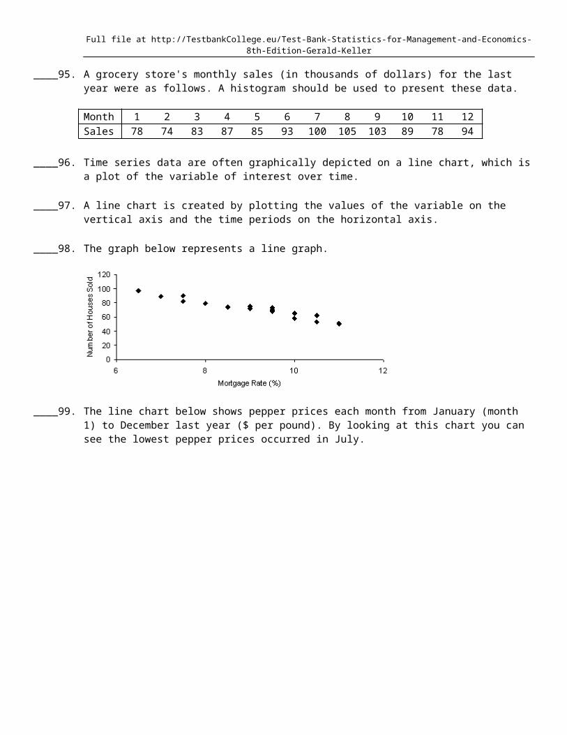
____ 98. The graph below represents a line graph.
Full file at http://TestbankCollege.eu/Test-Bank-Statistics-for-Management-and-Economics-8th-Edition-Gerald-Keller
____ 99. The line chart below shows pepper prices each month from January (month 1) to December last year ($ per pound). By looking at this chart you can see the lowest pepper prices occurred in July.
____ 100. The line chart below shows pepper prices fluctuated from $2.00 per pound to over $4.50 per pound during the year.
Full file at http://TestbankCollege.eu/Test-Bank-Statistics-for-Management-and-Economics-8th-Edition-Gerald-Keller
____ 101. A line chart that is flat shows no fluctuation in the variable being presented.
____ 102. A cross-classification table summarizes data from two nominal variables.
____ 103. To describe the relationship between two nominal variables you make a scatter diagram and look for a correlation.
____ 104. If two nominal variables are unrelated, the patterns exhibited in their corresponding bar charts should be approximately the same. If a relationship exists, then some bar charts will differ from others.
____ 105. A cross-classification table is the same thing as two frequency distribution tables, one for each variable.
____ 106. If the relative frequencies in the rows of a cross-classification table are similar, then the two variables shown in the table are not related.
____ 107. If two nominal variables are unrelated, the patterns exhibited in their corresponding pie charts should be approximately the same. If a relationship exists, then some pie charts will differ from others.
____ 108. The percentage of observations in each combination of the cross-classification table must be equal in order to show two nominal variables are not related.
____ 109. In the following cross-classification table, gender and pet ownership are related.
Own a pet Don't own a petFemales 60 30Males 80 40
____ 110. In the following cross-classification table, gender and fantasy baseball participation are related.
Full file at http://TestbankCollege.eu/Test-Bank-Statistics-for-Management-and-Economics-8th-Edition-Gerald-Keller
Participate in Fantasy Don't participate inBaseball Fantasy Baseball
Males 70 30Females 30 70
____ 111. A statistics professor classifies his students according to their grade point average (GPA) and their gender. The resulting cross-classification table is shown below.
GPAGender Under 2.0 2.0 3.0 Over 3.0Male 5 25 10Female 10 20 30
If you made a pie chart for male GPAs and a pie chart for female GPAs, those pie charts would look the same.
____ 112. The graphical technique used to describe the relationship between two interval variables is the scatter diagram.
____ 113. The two most important characteristics revealed by the scatter diagram are the strength and direction of the linear relationship.
____ 114. If we draw a straight line through the points in a scatter diagram and most of the points fall close to the line, there must be a positive relationship between the two variables.
____ 115. When two variables are linearly related, and tend to move in opposite directions, we describe the nature of their association as a negative linear relationship.
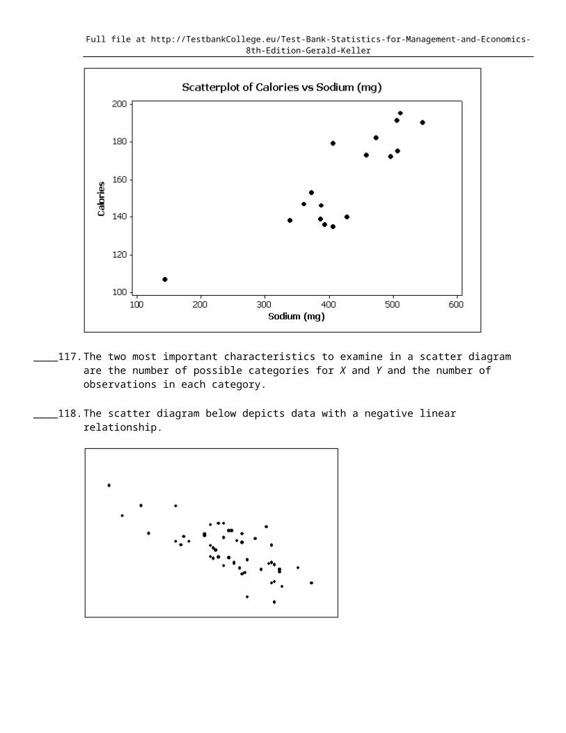
____ 116. Data for calories and salt content (milligrams of sodium) in 17 brands of meat hot dogs are shown in the scatter diagram below. According to this diagram, it appears that hot dogs that are high in sodium are generally low in calories, and hot dogs with low sodium are generally high in calories.
Full file at http://TestbankCollege.eu/Test-Bank-Statistics-for-Management-and-Economics-8th-Edition-Gerald-Keller
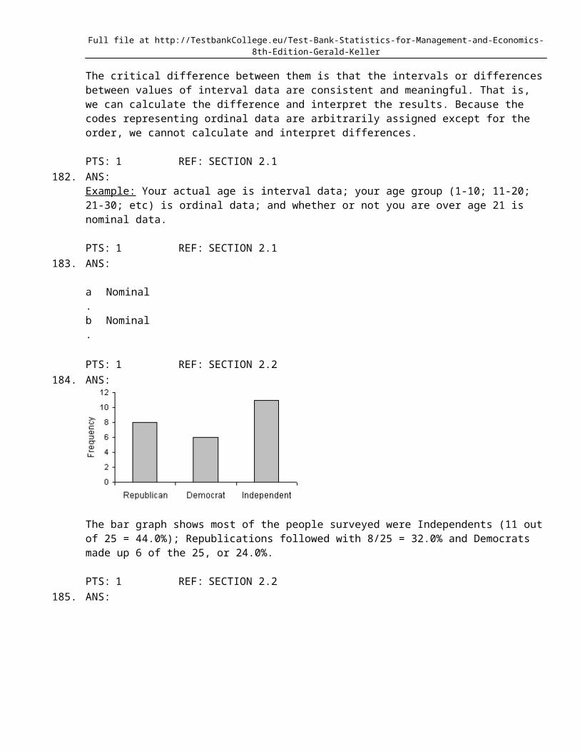
____ 117. The two most important characteristics to examine in a scatter diagram are the number of possible categories for X and Y and the number of observations in each category.
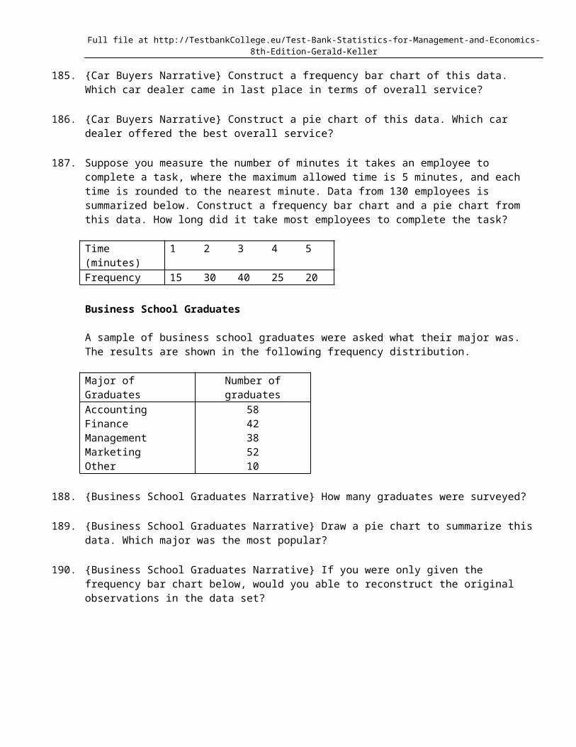
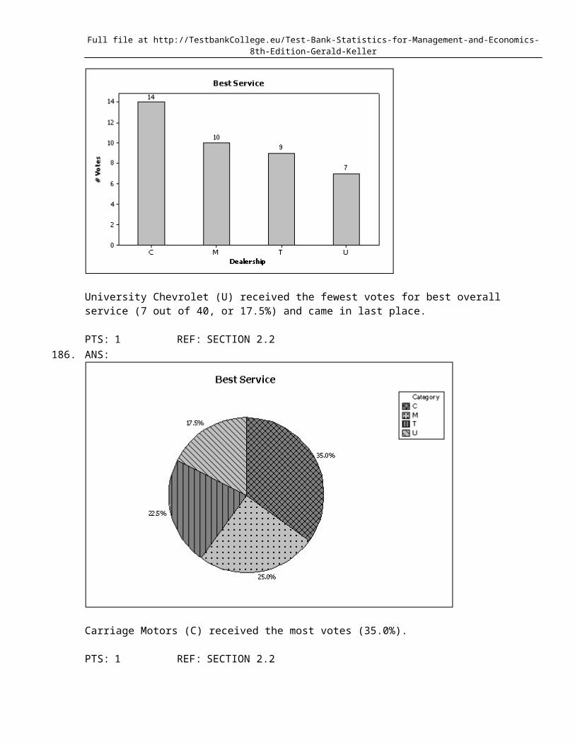
____ 118. The scatter diagram below depicts data with a negative linear relationship.
____ 119. The first scatter diagram below shows a stronger linear relationship than the second scatter diagram. (Assume the scales on both scatter diagrams are the same.)

Full file at http://TestbankCollege.eu/Test-Bank-Statistics-for-Management-and-Economics-8th-Edition-Gerald-Keller
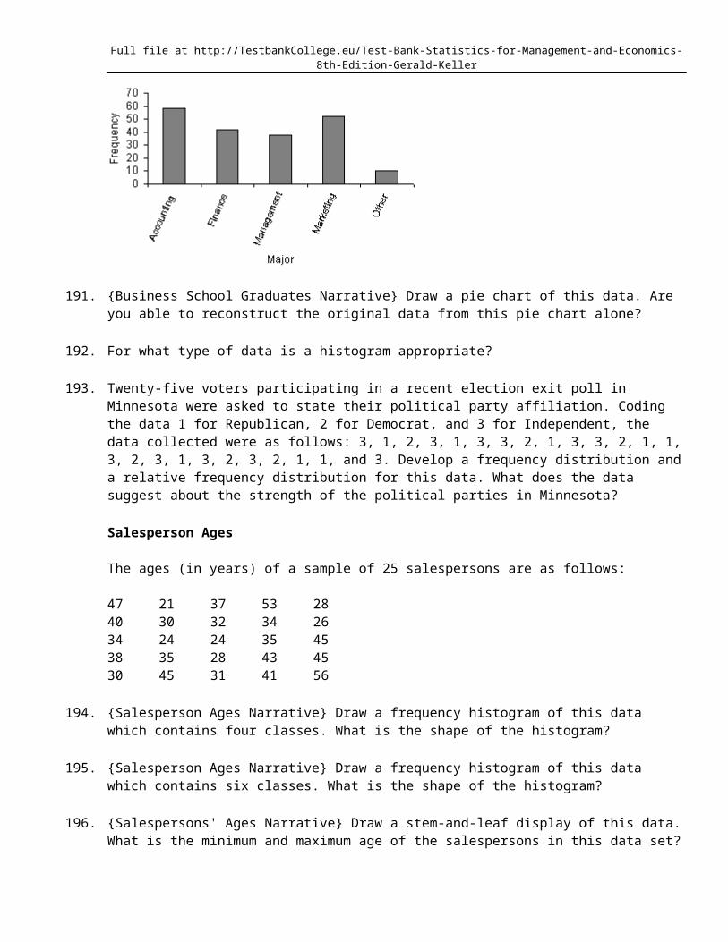
____ 120. If two variables have a strong linear relationship, that means one variable is causing the other variable to go up or down.
____ 121. Correlation implies causation.
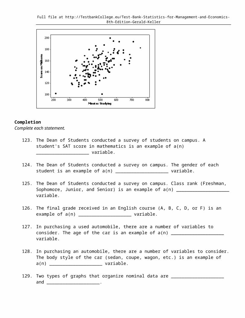
____ 122. A professor examines the relationship between minutes studying and exam score (out of 200 points) for a random sample of his students. The scatter diagram is shown below. It appears that study time has somewhat of a positive linear relationship with exam score.

Full file at http://TestbankCollege.eu/Test-Bank-Statistics-for-Management-and-Economics-8th-Edition-Gerald-Keller
CompletionComplete each statement.
123. The Dean of Students conducted a survey of students on campus. A student's SAT score in mathematics is an example of a(n) ____________________ variable.
124. The Dean of Students conducted a survey on campus. The gender of each student is an example of a(n) ____________________ variable.
125. The Dean of Students conducted a survey on campus. Class rank (Freshman, Sophomore, Junior, and Senior) is an example of a(n) ____________________ variable.
126. The final grade received in an English course (A, B, C, D, or F) is an example of a(n) ____________________ variable.
127. In purchasing a used automobile, there are a number of variables to consider. The age of the car is an example of a(n) ____________________ variable.
128. In purchasing an automobile, there are a number of variables to consider. The body style of the car (sedan, coupe, wagon, etc.) is an example of a(n) ____________________ variable.
129. Two types of graphs that organize nominal data are ____________________ and ____________________.
130. A bar chart is used to represent ____________________ data.
131. A pie chart is used to represent ____________________ data.
132. A(n) ____________________ chart is often used to display frequencies; a(n) ____________________ chart graphically shows relative frequencies.
133. A pie chart shows the ____________________ of individuals that fall into each category.
Full file at http://TestbankCollege.eu/Test-Bank-Statistics-for-Management-and-Economics-8th-Edition-Gerald-Keller
134. We can summarize nominal data in a table that presents the categories and their counts. This table is called a(n) ____________________ distribution.
135. A(n) ____________________ distribution lists the categories of a nominal variable and the proportion with which each occurs.
136. A(n) ____________________ chart is not able to show frequencies. It can only show relative frequencies.
137. In a pie chart, each slice is proportional to the ____________________ of individuals in that category.
138. A category in a pie chart that contains 25% of the observations is represented by a slice of the pie that is equal to ____________________ degrees.
139. We create a frequency distribution for interval data by counting the number of observations that fall into each of a series of intervals, called ____________________.
140. The more observations we have, the ____________________ the number of class intervals we need to use to draw a useful histogram.
141. A graph of the frequency distribution for interval data is called a(n) ____________________.
142. We determine the approximate width of the classes of a histogram by subtracting the smallest observation from the largest and dividing the answer by the number of ____________________.
143. A histogram is said to be ____________________ if, when we draw a vertical line down the center of the histogram, the two sides are identical in shape and size.
144. A(n) ____________________ histogram is one with a long tail extending to either the right or the left.
145. The histogram below has a shape that is ____________________.
146. It is typical that when taking an exam, few students hand in their exams early; most prefer to reread their papers and hand them in near the end of the scheduled exam period. Under this scenario, a histogram of exam taking times is ____________________ skewed.
Full file at http://TestbankCollege.eu/Test-Bank-Statistics-for-Management-and-Economics-8th-Edition-Gerald-Keller
147. In a histogram a(n) ____________________ class is the one with the largest number of observations.
148. A(n) ____________________ histogram has two peaks, not necessarily equal in height.
149. The length of each line in a step-and-leaf display represents the ____________________ of that class interval defined by the stems.
150. A(n) ____________________ is a graphical representation of the cumulative relative frequencies.
151. The largest value of a cumulative relative frequency is ____________________.
152. A(n) ____________________ display shows the actual observations as well as the number of observations in each class.
153. A(n) ____________________ is a table that sorts data into class intervals (categories) and gives the number of observations in each interval (category).
154. The line chart below shows pepper prices per pound for each month from January (month 1) to December last year. By looking at this chart you can see the lowest pepper prices occurred in ____________________.
155. Observations that are measured at the same time are called ____________________ data.
156. Observations that are taken during successive points in time are called ____________________ data.
157. Time series data are often graphically depicted on a(n) ____________________, which is a plot of the variable of interest over time.

Full file at http://TestbankCollege.eu/Test-Bank-Statistics-for-Management-and-Economics-8th-Edition-Gerald-Keller
158. A(n) ____________________ is created by plotting the value of the variable on the vertical axis and the time periods on the horizontal axis.
159. A line chart is created by plotting the value of the variable on the ____________________ axis and the time periods on the ____________________ axis.
160. To evaluate two nominal variables at the same time, a(n) ____________________ table should be created from the data.
161. Data that contains information on two variables is called ____________________ data.
162. A cross-classification table is used to describe the relationship between two ____________________ variables.
163. Data that contains information on a single variable is called ____________________ data.
164. You can graph the relationship between two nominal variables using two ____________________ or two ____________________.
165. If two pie charts made from the rows of a cross-classification table look the same, then the two nominal variables ____________________ (are/are not) related.
166. If two bar charts made from the rows of a cross-classification table look the same, then the two nominal variables ____________________ (are/are not) related.
167. In applications involving two variables, X and Y, where one variable depends to some degree on the other, we call Y the ____________________ variable.
168. In applications involving two variables, X and Y, where one variable depends to some degree on the other, we call X the ____________________ variable.
169. A(n) ____________________ is a graphical display consisting of a set of points, each point representing one variable measured along the horizontal axis, and another variable measured along the vertical axis.
170. If when one variable increases the other one also increases, we say that there is a(n) ____________________ relationship between these two variables.
171. When one variable increases and the other decreases, we say that there is a(n) ____________________ relationship between these two variables.
172. An individual's income depends somewhat on their number of years of education. Accordingly, we identify income as the ____________________ variable, and years of education as the ____________________ variable.
173. One of the variables used to help predict unemployment rates is the rate of inflation. Accordingly, we identify rate of inflation as the ____________________ variable, and unemployment rate as the ____________________ variable.
Full file at http://TestbankCollege.eu/Test-Bank-Statistics-for-Management-and-Economics-8th-Edition-Gerald-Keller
174. The two most important characteristics to look for in a scatter diagram are the ____________________ and ____________________ of the linear relationship.
Short Answer
175. At the end of a tour vacation, the travel agent asks the vacationers to respond to the questions listed below. For each question, determine whether the possible responses are interval, nominal, or ordinal.
a. How many tour vacations have you taken prior to this one?b. Do you feel that your tour vacation lasted sufficiently long (yes/no)?c. Which of the following features of the hotel accommodations did you find most attractive:
location, facilities, room size, service, or price?d. What is the maximum number of hours per day that you would like to spend traveling?e. Is your overall rating of this tour: excellent, good, fair, or poor?
176. Before leaving a particular restaurant, customers are asked to respond to the questions listed below. For each question, determine whether the possible responses are interval, nominal, or ordinal.
a. What is the approximate distance (in miles) between this restaurant and your residence?b. Have you ever eaten at this restaurant before?c. On how many occasions have you eaten at the restaurant before?d. Which of the following attributes of this restaurant do you find most attractive: service,
prices, quality of the food, or the menu?e. What is your overall rating of the restaurant: excellent, good, fair, or poor?
177. For each of the following examples, identify the data type as nominal, ordinal, or interval.
a. The final grade received by a student in a computer science class.b. The number of students in a statistics course.c. The starting salary of an MBA graduate.d. The size of an order of fries (small, medium, large, super-size) purchased by a
McDonald's customer.e. The college you are enrolled in (Arts and Sciences, Business, Education, etc.).
178. For each of the following, indicate whether the variable of interest is nominal or interval.
a. Whether you are a U.S. citizen.b. Your marital status.c. The number of cars parked in a certain parking lot at any given time.d. The amount of time you spent last week on your homework.e. Lily's travel time from her dorm to the student union on campus.f. Heidi's favorite brand of tennis balls.
179. Provide one example of nominal data; one example of ordinal data; and one example of interval data.
180. Explain why political affiliation is not an ordinal variable.
181. Explain the difference between ordinal data and interval data.
Full file at http://TestbankCollege.eu/Test-Bank-Statistics-for-Management-and-Economics-8th-Edition-Gerald-Keller
182. Give an example of interval data that can also be treated as ordinal data and nominal data.
183. Identify the type of data for which each of the following graphs is appropriate.
a. Pie chartb. Bar chart
184. Twenty-five voters participating in a recent election exit poll in Minnesota were asked to state their political party affiliation. Coding the data as 1 for Republican, 2 for Democrat, and 3 for Independent, the data collected were as follows: 3, 1, 2, 3, 1, 3, 3, 2, 1, 3, 3, 2, 1, 1, 3, 2, 3, 1, 3, 2, 3, 2, 1, 1, and 3. Construct a frequency bar chart from this data. What does the bar chart tell you about the political affiliations of those in this sample?
Car Buyers
Forty car buyers were asked to indicate which car dealer offered the best overall service. The four choices were Carriage Motors (C), Marco Chrysler (M), Triangle Auto (T), and University Chevrolet (U). The following data were obtained:
T C C C U C M T C UU M C M T C M M C MT C C T U M M C C TT U C U T M M C U T
185. {Car Buyers Narrative} Construct a frequency bar chart of this data. Which car dealer came in last place in terms of overall service?
186. {Car Buyers Narrative} Construct a pie chart of this data. Which car dealer offered the best overall service?
187. Suppose you measure the number of minutes it takes an employee to complete a task, where the maximum allowed time is 5 minutes, and each time is rounded to the nearest minute. Data from 130 employees is summarized below. Construct a frequency bar chart and a pie chart from this data. How long did it take most employees to complete the task?
Time (minutes) 1 2 3 4 5Frequency 15 30 40 25 20
Business School Graduates
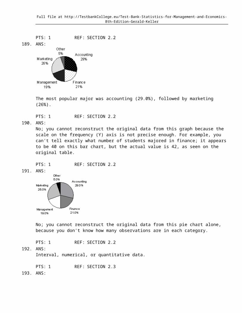
A sample of business school graduates were asked what their major was. The results are shown in the following frequency distribution.
Major of Graduates Number of graduatesAccounting 58Finance 42Management 38Marketing 52Other 10
Full file at http://TestbankCollege.eu/Test-Bank-Statistics-for-Management-and-Economics-8th-Edition-Gerald-Keller
188. {Business School Graduates Narrative} How many graduates were surveyed?
189. {Business School Graduates Narrative} Draw a pie chart to summarize this data. Which major was the most popular?
190. {Business School Graduates Narrative} If you were only given the frequency bar chart below, would you able to reconstruct the original observations in the data set?
191. {Business School Graduates Narrative} Draw a pie chart of this data. Are you able to reconstruct the original data from this pie chart alone?
192. For what type of data is a histogram appropriate?
193. Twenty-five voters participating in a recent election exit poll in Minnesota were asked to state their political party affiliation. Coding the data 1 for Republican, 2 for Democrat, and 3 for Independent, the data collected were as follows: 3, 1, 2, 3, 1, 3, 3, 2, 1, 3, 3, 2, 1, 1, 3, 2, 3, 1, 3, 2, 3, 2, 1, 1, and 3. Develop a frequency distribution and a relative frequency distribution for this data. What does the data suggest about the strength of the political parties in Minnesota?
Salesperson Ages
The ages (in years) of a sample of 25 salespersons are as follows:
47 21 37 53 2840 30 32 34 2634 24 24 35 4538 35 28 43 4530 45 31 41 56
194. {Salesperson Ages Narrative} Draw a frequency histogram of this data which contains four classes. What is the shape of the histogram?
195. {Salesperson Ages Narrative} Draw a frequency histogram of this data which contains six classes. What is the shape of the histogram?
196. {Salespersons' Ages Narrative} Draw a stem-and-leaf display of this data. What is the minimum and maximum age of the salespersons in this data set?
Full file at http://TestbankCollege.eu/Test-Bank-Statistics-for-Management-and-Economics-8th-Edition-Gerald-Keller
197. {Salesperson's Ages Narrative} Construct an ogive for this data. Estimate the proportion of salespersons that are: 1) under 30 years of age; 2) 40 years of age or over; and 3) between 40 and 50 years of age.
Exam scores
The scores on a calculus exam for a random sample of 40 students are as follows:
63 74 42 65 51 54 36 56 68 5762 64 76 67 79 61 81 77 59 3884 68 71 94 71 86 69 75 91 5548 82 83 54 79 62 68 58 41 47
198. {Exam Grades Narrative} Construct a stem-and-leaf display for this data set. Describe the shape of the data.
199. {Exam Grades Narrative} Construct frequency and relative frequency distributions for this data set using seven class intervals. Describe the shape of the data set.
200. {Exam Grade Narrative} Construct a relative frequency histogram for this data set and discuss its shape.
201. {Exam Grades Narrative} Describe the distribution of exam scores.
202. {Exam Grades Narrative} Construct a cumulative frequency and a cumulative relative frequency distribution for this data. What proportion of the exam scores are less than 60? What proportion of the exam scores are 70 or more?
203. {Exam Grades Narrative) Construct an ogive for this data set. Use the ogive to estimate the proportion of exam scores that are between 80 and 90.
204. Forty car buyers were asked to indicate the car dealer they believed offered the best overall service. The four choices were A, B, C, and D as shown below:
A C C C D C B A C DD B C B A C B B C BA C C A D B B C C AA D C D A B B C D A
Construct a table showing the frequencies and relative frequencies for this data set. What proportion of car buyers rated dealer D as the best?
205. A grocery store's monthly sales (in thousands of dollars) for the last year were as follows:
Month 1 2 3 4 5 6 7 8 9 10 11 12Sales 78 74 83 87 85 93 100 105 103 89 78 94
Construct a relative frequency bar chart for this data set. How many observations are there in this data set?
206. Consider the following cumulative frequency distribution.
Full file at http://TestbankCollege.eu/Test-Bank-Statistics-for-Management-and-Economics-8th-Edition-Gerald-Keller
Classes Limits Cumulative Frequency Frequency< 5 8
< 10 15< 15 21< 20 30< 25 42
Fill in the frequencies for each class in the above table.
207. The weights of a sample of 25 workers are given (in pounds): 164, 148, 137, 157, 173, 156, 177, 172, 169, 165, 145, 168, 163, 162, 174, 152, 156, 168, 154, 151, 174, 146, 134, 140, and 171. Construct an ogive for the data. What proportion of the worker's weights are between 160 and 180 pounds; below 150 pounds; and at or above 140 pounds, respectively?
Insurance Company
A representative from a local insurance agency selected a random sample of insured drivers and recorded the number of claims made in the last three years, with the following results:
Number of claims 0 1 2 3 4 5Frequency 10 18 16 12 3 1
208. {Insurance Company Narrative} How many drivers are represented in the sample?
209. {Insurance Company Narrative} How many total claims are represented in the sample?
210. {Insurance Company Narrative} What proportion of drivers had no claims in the last three years?
211. {Insurance Company Narrative} What number of claims was made by the highest proportion of drivers?
Computer Company
At a meeting of regional offices managers of a national computer company, a survey was taken to determine the number of employees the regional managers supervise in the operation of their departments. The results of the survey are shown below.
Number of employees supervised 1 2 3 4 5Frequency 7 11 14 8 10
212. {Computer Company Narrative} How many regional offices are represented in the survey results?
213. {Computer Company Narrative} Across all of the regional offices, how many total employees were supervised by those surveyed?
214. {Computer Company Narrative} What proportion of managers supervise 3 employees?
215. {Computer Company Narrative} What is the cumulative relative frequency corresponding to 5 employees?
On-line Classes
Full file at http://TestbankCollege.eu/Test-Bank-Statistics-for-Management-and-Economics-8th-Edition-Gerald-Keller
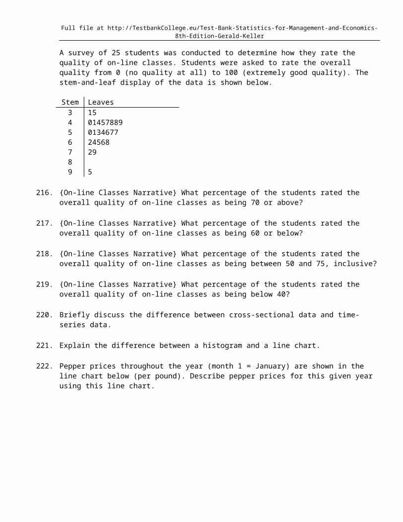
A survey of 25 students was conducted to determine how they rate the quality of on-line classes. Students were asked to rate the overall quality from 0 (no quality at all) to 100 (extremely good quality). The stem-and-leaf display of the data is shown below.
Stem Leaves3 154 014578895 01346776 245687 2989 5
216. {On-line Classes Narrative} What percentage of the students rated the overall quality of on-line classes as being 70 or above?
217. {On-line Classes Narrative} What percentage of the students rated the overall quality of on-line classes as being 60 or below?
218. {On-line Classes Narrative} What percentage of the students rated the overall quality of on-line classes as being between 50 and 75, inclusive?
219. {On-line Classes Narrative} What percentage of the students rated the overall quality of on-line classes as being below 40?
220. Briefly discuss the difference between cross-sectional data and time-series data.
221. Explain the difference between a histogram and a line chart.
222. Pepper prices throughout the year (month 1 = January) are shown in the line chart below (per pound). Describe pepper prices for this given year using this line chart.
Full file at http://TestbankCollege.eu/Test-Bank-Statistics-for-Management-and-Economics-8th-Edition-Gerald-Keller
All-Nighters
A sample of 200 students at a certain university was taken after the midterm; one hundred students reported staying up all night before the midterm and the other one hundred students did not. Researchers recorded whether each student did well or poorly on the midterm. The following table contains the results.
Did Well on Did Poorly onMidterm Midterm
Stayed up all night 30 70Did not stay up all night 60 40
223. {All-Nighter Narrative} Of those who stayed up all night before the midterm, what percentage did well on the midterm?
224. {All-Nighters Narrative} Of those who did well on the midterm, what percentage stayed up all night before the midterm?
225. {All-Nighters Narrative} Briefly explain (using percentages) whether staying up all night before this midterm is related to a student doing poorly.
226. {All-Nighters Narrative} There is a relationship between whether or not a student stayed up all night before the midterm, and how well they did on the midterm. Describe this relationship using percentages.
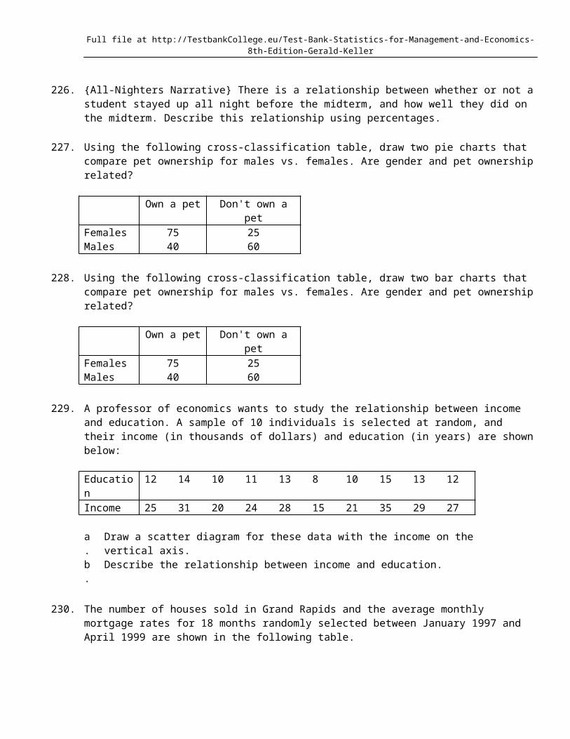
227. Using the following cross-classification table, draw two pie charts that compare pet ownership for males vs. females. Are gender and pet ownership related?
Own a pet Don't own a petFemales 75 25

Full file at http://TestbankCollege.eu/Test-Bank-Statistics-for-Management-and-Economics-8th-Edition-Gerald-Keller
Males 40 60
228. Using the following cross-classification table, draw two bar charts that compare pet ownership for males vs. females. Are gender and pet ownership related?
Own a pet Don't own a petFemales 75 25Males 40 60
229. A professor of economics wants to study the relationship between income and education. A sample of 10 individuals is selected at random, and their income (in thousands of dollars) and education (in years) are shown below:
Education 12 14 10 11 13 8 10 15 13 12Income 25 31 20 24 28 15 21 35 29 27
a. Draw a scatter diagram for these data with the income on the vertical axis.b. Describe the relationship between income and education.
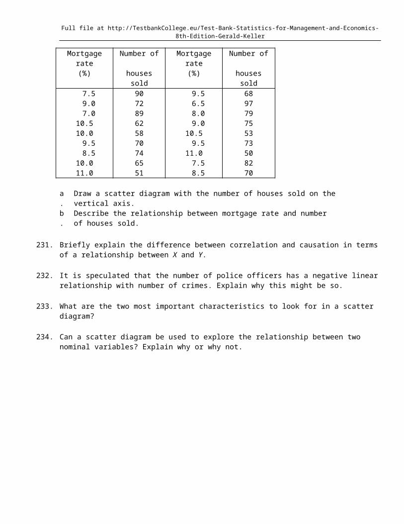
230. The number of houses sold in Grand Rapids and the average monthly mortgage rates for 18 months randomly selected between January 1997 and April 1999 are shown in the following table.
Mortgage rate Number of Mortgage rate Number of(%) houses sold (%) houses sold 7.5 90 9.5 68 9.0 72 6.5 97 7.0 89 8.0 7910.5 62 9.0 7510.0 58 10.5 53 9.5 70 9.5 73 8.5 74 11.0 5010.0 65 7.5 8211.0 51 8.5 70
a. Draw a scatter diagram with the number of houses sold on the vertical axis.b. Describe the relationship between mortgage rate and number of houses sold.
231. Briefly explain the difference between correlation and causation in terms of a relationship between X and Y.
232. It is speculated that the number of police officers has a negative linear relationship with number of crimes. Explain why this might be so.
233. What are the two most important characteristics to look for in a scatter diagram?
234. Can a scatter diagram be used to explore the relationship between two nominal variables? Explain why or why not.
Full file at http://TestbankCollege.eu/Test-Bank-Statistics-for-Management-and-Economics-8th-Edition-Gerald-Keller
Ch2Answer Section
MULTIPLE CHOICE
1. ANS: A PTS: 1 REF: SECTION 2.12. ANS: C PTS: 1 REF: SECTION 2.13. ANS: A PTS: 1 REF: SECTION 2.14. ANS: A PTS: 1 REF: SECTION 2.15. ANS: C PTS: 1 REF: SECTION 2.16. ANS: B PTS: 1 REF: SECTION 2.17. ANS: B PTS: 1 REF: SECTION 2.18. ANS: B PTS: 1 REF: SECTION 2.29. ANS: B PTS: 1 REF: SECTION 2.2
10. ANS: D PTS: 1 REF: SECTION 2.211. ANS: B PTS: 1 REF: SECTION 2.212. ANS: B PTS: 1 REF: SECTION 2.213. ANS: B PTS: 1 REF: SECTION 2.314. ANS: D PTS: 1 REF: SECTION 2.315. ANS: D PTS: 1 REF: SECTION 2.316. ANS: C PTS: 1 REF: SECTION 2.317. ANS: C PTS: 1 REF: SECTION 2.318. ANS: A PTS: 1 REF: SECTION 2.319. ANS: C PTS: 1 REF: SECTION 2.320. ANS: A PTS: 1 REF: SECTION 2.321. ANS: A PTS: 1 REF: SECTION 2.322. ANS: D PTS: 1 REF: SECTION 2.323. ANS: D PTS: 1 REF: SECTION 2.324. ANS: B PTS: 1 REF: SECTION 2.325. ANS: D PTS: 1 REF: SECTION 2.326. ANS: B PTS: 1 REF: SECTION 2.327. ANS: D PTS: 1 REF: SECTION 2.328. ANS: D PTS: 1 REF: SECTION 2.329. ANS: A PTS: 1 REF: SECTION 2.430. ANS: B PTS: 1 REF: SECTION 2.431. ANS: C PTS: 1 REF: SECTION 2.432. ANS: C PTS: 1 REF: SECTION 2.433. ANS: D PTS: 1 REF: SECTION 2.434. ANS: A PTS: 1 REF: SECTION 2.435. ANS: D PTS: 1 REF: SECTION 2.436. ANS: D PTS: 1 REF: SECTION 2.437. ANS: A PTS: 1 REF: SECTION 2.538. ANS: D PTS: 1 REF: SECTION 2.539. ANS: A PTS: 1 REF: SECTION 2.540. ANS: C PTS: 1 REF: SECTION 2.5
Full file at http://TestbankCollege.eu/Test-Bank-Statistics-for-Management-and-Economics-8th-Edition-Gerald-Keller
41. ANS: D PTS: 1 REF: SECTION 2.542. ANS: D PTS: 1 REF: SECTION 2.543. ANS: B PTS: 1 REF: SECTION 2.544. ANS: A PTS: 1 REF: SECTION 2.645. ANS: B PTS: 1 REF: SECTION 2.646. ANS: B PTS: 1 REF: SECTION 2.647. ANS: D PTS: 1 REF: SECTION 2.648. ANS: A PTS: 1 REF: SECTION 2.649. ANS: B PTS: 1 REF: SECTION 2.650. ANS: B PTS: 1 REF: SECTION 2.651. ANS: B PTS: 1 REF: SECTION 2.6
TRUE/FALSE
52. ANS: T PTS: 1 REF: SECTION 2.153. ANS: F PTS: 1 REF: SECTION 2.154. ANS: T PTS: 1 REF: SECTION 2.155. ANS: F PTS: 1 REF: SECTION 2.156. ANS: T PTS: 1 REF: SECTION 2.157. ANS: F PTS: 1 REF: SECTION 2.158. ANS: T PTS: 1 REF: SECTION 2.159. ANS: T PTS: 1 REF: SECTION 2.160. ANS: T PTS: 1 REF: SECTION 2.161. ANS: F PTS: 1 REF: SECTION 2.162. ANS: T PTS: 1 REF: SECTION 2.163. ANS: T PTS: 1 REF: SECTION 2.164. ANS: T PTS: 1 REF: SECTION 2.165. ANS: F PTS: 1 REF: SECTION 2.266. ANS: T PTS: 1 REF: SECTION 2.267. ANS: T PTS: 1 REF: SECTION 2.268. ANS: F PTS: 1 REF: SECTION 2.269. ANS: F PTS: 1 REF: SECTION 2.270. ANS: F PTS: 1 REF: SECTION 2.271. ANS: T PTS: 1 REF: SECTION 2.372. ANS: T PTS: 1 REF: SECTION 2.373. ANS: F PTS: 1 REF: SECTION 2.374. ANS: T PTS: 1 REF: SECTION 2.375. ANS: T PTS: 1 REF: SECTION 2.376. ANS: T PTS: 1 REF: SECTION 2.377. ANS: T PTS: 1 REF: SECTION 2.378. ANS: T PTS: 1 REF: SECTION 2.379. ANS: F PTS: 1 REF: SECTION 2.380. ANS: F PTS: 1 REF: SECTION 2.381. ANS: F PTS: 1 REF: SECTION 2.382. ANS: T PTS: 1 REF: SECTION 2.383. ANS: F PTS: 1 REF: SECTION 2.3
Full file at http://TestbankCollege.eu/Test-Bank-Statistics-for-Management-and-Economics-8th-Edition-Gerald-Keller
84. ANS: F PTS: 1 REF: SECTION 2.385. ANS: F PTS: 1 REF: SECTION 2.386. ANS: T PTS: 1 REF: SECTION 2.387. ANS: F PTS: 1 REF: SECTION 2.388. ANS: T PTS: 1 REF: SECTION 2.389. ANS: T PTS: 1 REF: SECTION 2.390. ANS: F PTS: 1 REF: SECTION 2.391. ANS: T PTS: 1 REF: SECTION 2.392. ANS: T PTS: 1 REF: SECTION 2.393. ANS: F PTS: 1 REF: SECTION 2.394. ANS: F PTS: 1 REF: SECTION 2.395. ANS: F
PTS: 1 REF: SECTION 2.496. ANS: T PTS: 1 REF: SECTION 2.497. ANS: T PTS: 1 REF: SECTION 2.498. ANS: F PTS: 1 REF: SECTION 2.499. ANS: T PTS: 1 REF: SECTION 2.4
100. ANS: T PTS: 1 REF: SECTION 2.4101. ANS: T PTS: 1 REF: SECTION 2.4102. ANS: T PTS: 1 REF: SECTION 2.5103. ANS: F PTS: 1 REF: SECTION 2.5104. ANS: T PTS: 1 REF: SECTION 2.5105. ANS: F PTS: 1 REF: SECTION 2.5106. ANS: T PTS: 1 REF: SECTION 2.5107. ANS: T PTS: 1 REF: SECTION 2.5108. ANS: F PTS: 1 REF: SECTION 2.5109. ANS: F PTS: 1 REF: SECTION 2.5110. ANS: T PTS: 1 REF: SECTION 2.5111. ANS: F PTS: 1 REF: SECTION 2.5112. ANS: T PTS: 1 REF: SECTION 2.6113. ANS: T PTS: 1 REF: SECTION 2.6114. ANS: F PTS: 1 REF: SECTION 2.6
Full file at http://TestbankCollege.eu/Test-Bank-Statistics-for-Management-and-Economics-8th-Edition-Gerald-Keller
115. ANS: T PTS: 1 REF: SECTION 2.6116. ANS: F PTS: 1 REF: SECTION 2.6117. ANS: F PTS: 1 REF: SECTION 2.6118. ANS: T PTS: 1 REF: SECTION 2.6119. ANS: T PTS: 1 REF: SECTION 2.6120. ANS: F PTS: 1 REF: SECTION 2.6121. ANS: F PTS: 1 REF: SECTION 2.6122. ANS: T PTS: 1 REF: SECTION 2.6
COMPLETION
123. ANS:intervalquantitativenumerical
PTS: 1 REF: SECTION 2.1124. ANS:
nominalcategoricalqualitative
PTS: 1 REF: SECTION 2.1125. ANS: ordinal
PTS: 1 REF: SECTION 2.1126. ANS:
nominalcategoricalqualitative
PTS: 1 REF: SECTION 2.1127. ANS:
intervalquantitativenumerical
PTS: 1 REF: SECTION 2.1128. ANS:
nominalcategoricalqualitative
PTS: 1 REF: SECTION 2.1129. ANS:
pie charts; bar chartsbar charts; pie charts
PTS: 1 REF: SECTION 2.2
Full file at http://TestbankCollege.eu/Test-Bank-Statistics-for-Management-and-Economics-8th-Edition-Gerald-Keller
130. ANS:nominalcategoricalqualitative
PTS: 1 REF: SECTION 2.2131. ANS:
nominalcategoricalqualitative
PTS: 1 REF: SECTION 2.2132. ANS: bar; pie
PTS: 1 REF: SECTION 2.2133. ANS:
percentagerelative frequencyproportion
PTS: 1 REF: SECTION 2.2134. ANS: frequency
PTS: 1 REF: SECTION 2.2135. ANS: relative frequency
PTS: 1 REF: SECTION 2.2136. ANS: pie
PTS: 1 REF: SECTION 2.2137. ANS:
percentageproportionrelative frequency
PTS: 1 REF: SECTION 2.2138. ANS: 90
PTS: 1 REF: SECTION 2.2139. ANS: classes
PTS: 1 REF: SECTION 2.3140. ANS:
largerhighergreater
PTS: 1 REF: SECTION 2.3141. ANS: histogram
Full file at http://TestbankCollege.eu/Test-Bank-Statistics-for-Management-and-Economics-8th-Edition-Gerald-Keller
PTS: 1 REF: SECTION 2.3142. ANS:
classesintervals
PTS: 1 REF: SECTION 2.3143. ANS:
symmetricsymmetrical
PTS: 1 REF: SECTION 2.3144. ANS: skewed
PTS: 1 REF: SECTION 2.3145. ANS:
symmetricsymmetricalbell shapedbell-shaped
PTS: 1 REF: SECTION 2.3146. ANS: negatively
PTS: 1 REF: SECTION 2.3147. ANS: modal
PTS: 1 REF: SECTION 2.3148. ANS: bimodal
PTS: 1 REF: SECTION 2.3149. ANS:
frequencycount
PTS: 1 REF: SECTION 2.3150. ANS: ogive
PTS: 1 REF: SECTION 2.3151. ANS:
one1
PTS: 1 REF: SECTION 2.3152. ANS:
stem-and-leafstem and leaf
PTS: 1 REF: SECTION 2.3153. ANS: frequency distribution
Full file at http://TestbankCollege.eu/Test-Bank-Statistics-for-Management-and-Economics-8th-Edition-Gerald-Keller
PTS: 1 REF: SECTION 2.3154. ANS: July
PTS: 1 REF: SECTION 2.4155. ANS:
cross-sectionalcross sectional
PTS: 1 REF: SECTION 2.4156. ANS:
time-seriestime series
PTS: 1 REF: SECTION 2.4157. ANS: line chart
PTS: 1 REF: SECTION 2.4158. ANS: line chart
PTS: 1 REF: SECTION 2.4159. ANS:
vertical; horizontalY; X
PTS: 1 REF: SECTION 2.4160. ANS:
cross-classificationcross-tabulationcontingency
PTS: 1 REF: SECTION 2.5161. ANS: bivariate
PTS: 1 REF: SECTION 2.5162. ANS:
nominalcategoricalqualitative
PTS: 1 REF: SECTION 2.5163. ANS: univariate
PTS: 1 REF: SECTION 2.5164. ANS:
bar charts; pie chartspie charts; bar charts
PTS: 1 REF: SECTION 2.5165. ANS: are not
Full file at http://TestbankCollege.eu/Test-Bank-Statistics-for-Management-and-Economics-8th-Edition-Gerald-Keller
PTS: 1 REF: SECTION 2.5166. ANS: are not
PTS: 1 REF: SECTION 2.5167. ANS: dependent
PTS: 1 REF: SECTION 2.6168. ANS: independent
PTS: 1 REF: SECTION 2.6169. ANS: scatter diagram
PTS: 1 REF: SECTION 2.6170. ANS:
positiveuphill
PTS: 1 REF: SECTION 2.6171. ANS:
negativedownhill
PTS: 1 REF: SECTION 2.6172. ANS:
dependent; independentY; X
PTS: 1 REF: SECTION 2.6173. ANS:
independent; dependentX; Y
PTS: 1 REF: SECTION 2.6174. ANS:
strength; directiondirection; strength
PTS: 1 REF: SECTION 2.6
SHORT ANSWER
175. ANS:
a. Intervalb. Nominalc. Nominald. Intervale. Ordinal
Full file at http://TestbankCollege.eu/Test-Bank-Statistics-for-Management-and-Economics-8th-Edition-Gerald-Keller
PTS: 1 REF: SECTION 2.1176. ANS:
a. Intervalb. Nominalc. Intervald. Nominale. Ordinal
PTS: 1 REF: SECTION 2.1177. ANS:
a. Ordinalb. Intervalc. Intervald. Ordinale. Nominal
PTS: 1 REF: SECTION 2.1178. ANS:
a. Nominalb. Nominalc. Intervald. Intervale. Intervalf. Nominal
PTS: 1 REF: SECTION 2.1179. ANS:
Nominal data example: Political party affiliation for voters using the code: 1 = Democrat, 2 = Republican, and 3 = Independent.
Ordinal data example: Response to a market research survey question measured on the Likert scale using the code: 1 = strongly agree, 2 = agree, 3 = neutral, 4 = disagree, and 5 = strongly disagree.
Interval data example: The temperature on a tennis court during the U.S. Open (degrees Fahrenheit).
PTS: 1 REF: SECTION 2.1180. ANS:
The values of political affiliation cannot be ranked in order in any way.
PTS: 1 REF: SECTION 2.1181. ANS:
The critical difference between them is that the intervals or differences between values of interval data are consistent and meaningful. That is, we can calculate the difference and interpret the results. Because the codes representing ordinal data are arbitrarily assigned except for the order, we cannot calculate and interpret differences.
PTS: 1 REF: SECTION 2.1
Full file at http://TestbankCollege.eu/Test-Bank-Statistics-for-Management-and-Economics-8th-Edition-Gerald-Keller
182. ANS:Example: Your actual age is interval data; your age group (1-10; 11-20; 21-30; etc) is ordinal data; and whether or not you are over age 21 is nominal data.
PTS: 1 REF: SECTION 2.1183. ANS:
a. Nominalb. Nominal
PTS: 1 REF: SECTION 2.2184. ANS:
The bar graph shows most of the people surveyed were Independents (11 out of 25 = 44.0%); Republications followed with 8/25 = 32.0% and Democrats made up 6 of the 25, or 24.0%.
PTS: 1 REF: SECTION 2.2185. ANS:
University Chevrolet (U) received the fewest votes for best overall service (7 out of 40, or 17.5%) and came in last place.
PTS: 1 REF: SECTION 2.2

Full file at http://TestbankCollege.eu/Test-Bank-Statistics-for-Management-and-Economics-8th-Edition-Gerald-Keller
186. ANS:
Carriage Motors (C) received the most votes (35.0%).
PTS: 1 REF: SECTION 2.2187. ANS:

Full file at http://TestbankCollege.eu/Test-Bank-Statistics-for-Management-and-Economics-8th-Edition-Gerald-Keller
The most common time to complete the task was 3 minutes, which was recorded for 40 of the 130 (31%) of the employees.
PTS: 1 REF: SECTION 2.2188. ANS:
200; you get this by totaling the counts for each major.
PTS: 1 REF: SECTION 2.2189. ANS:
The most popular major was accounting (29.0%), followed by marketing (26%).
PTS: 1 REF: SECTION 2.2190. ANS:
No; you cannot reconstruct the original data from this graph because the scale on the frequency (Y) axis is not precise enough. For example, you can't tell exactly what number of students majored in finance; it appears to be 40 on this bar chart, but the actual value is 42, as seen on the original table.
PTS: 1 REF: SECTION 2.2191. ANS:
Full file at http://TestbankCollege.eu/Test-Bank-Statistics-for-Management-and-Economics-8th-Edition-Gerald-Keller
No; you cannot reconstruct the original data from this pie chart alone, because you don't know how many observations are in each category.
PTS: 1 REF: SECTION 2.2192. ANS:
Interval, numerical, or quantitative data.
PTS: 1 REF: SECTION 2.3193. ANS:
Party Frequency ProportionRepublican 8 0.32Democrat 6 0.24Independent 11 0.44
According to the frequency distribution above, the Independents in Minnesota outnumber the Republicans and Democrats.
PTS: 1 REF: SECTION 2.3194. ANS:
This histogram of ages of salespersons is positively skewed.
Full file at http://TestbankCollege.eu/Test-Bank-Statistics-for-Management-and-Economics-8th-Edition-Gerald-Keller
PTS: 1 REF: SECTION 2.3195. ANS:
*
This histogram of ages of salespersons is positively skewed.
PTS: 1 REF: SECTION 2.3196. ANS:
Stem Leaf2 1446883 00124455784 01355575 36
The minimum age is 21 and the maximum age is 56.
PTS: 1 REF: SECTION 2.3197. ANS:
According to the ogive below, the proportions are 0.24; 1 0.64 = 0.36; and 0.92 0.64 = 0.28, respectively.

Full file at http://TestbankCollege.eu/Test-Bank-Statistics-for-Management-and-Economics-8th-Edition-Gerald-Keller
PTS: 1 REF: SECTION 2.3198. ANS:
Stem Leaf3 684 12785 144567896 122345788897 114567998 123469 14
The data is relatively symmetric and bell shaped.
PTS: 1 REF: SECTION 2.3199. ANS:
Class Limits Frequency Relative Frequency30 to 39 2 0.05040 to 49 4 0.10050 to 59 8 0.20060 to 69 11 0.27570 to 79 8 0.20080 to 89 5 0.12590 to 99 2 0.050
Total 40 1.00
The data is relatively symmetric and bell shaped.
PTS: 1 REF: SECTION 2.3200. ANS:

Full file at http://TestbankCollege.eu/Test-Bank-Statistics-for-Management-and-Economics-8th-Edition-Gerald-Keller
The distribution of the data is relatively symmetric and bell shaped.
PTS: 1 REF: SECTION 2.3201. ANS:
The distribution of the data is symmetrical and bell-shaped, with 67.5% of the observations between 50 and 80. The center looks to be around 65.
PTS: 1 REF: SECTION 2.3202. ANS:
Classes Cumulative Cumulative RelativeFrequency Frequency
< 40 2 0.050< 50 6 0.150< 60 14 0.350< 70 25 0.625< 80 33 0.825< 90 38 0.950
< 100 40 1.000
0.35; 1 0.625 = 0.375
PTS: 1 REF: SECTION 2.3203. ANS:

Full file at http://TestbankCollege.eu/Test-Bank-Statistics-for-Management-and-Economics-8th-Edition-Gerald-Keller
The proportion of grades that are between 80 and 90 = 0.950 0.825 = 0.125.
PTS: 1 REF: SECTION 2.3204. ANS:
Dealer Frequency Relativefrequency
A 9 0.225B 10 0.250C 14 0.350D 7 0.175
0.175 of the car buyers rated dealer D as the best.
PTS: 1 REF: SECTION 2.3205. ANS:
See the graph below. There are 12 observations in this data set; one sales amount is listed for each month.
PTS: 1 REF: SECTION 2.3206. ANS:
8; 7; 6; 9; 12
Full file at http://TestbankCollege.eu/Test-Bank-Statistics-for-Management-and-Economics-8th-Edition-Gerald-Keller
PTS: 1 REF: SECTION 2.3207. ANS:
The proportions are 1 0.48 = 0.52; 0.24; 1 0.08 = 0.92, respectively.
PTS: 1 REF: SECTION 2.3208. ANS:
10 + 18 + 16 + 12 + 3 + 1 = 60
PTS: 1 REF: SECTION 2.3209. ANS:
(0 10) + (1 18) + (2 16) + (3 12) + (4 3) + (5 1) = 103
PTS: 1 REF: SECTION 2.3210. ANS:
10/60 = .17
PTS: 1 REF: SECTION 2.3211. ANS:
18/60 = 30% of the drivers had one claim in the last three years.
PTS: 1 REF: SECTION 2.3212. ANS:
7 + 11 + 14 + 8 + 10 = 50
PTS: 1 REF: SECTION 2.3213. ANS:
(1 7) + (2 11) + (3 14) + (4 8) = (5 10) = 153
PTS: 1 REF: SECTION 2.3214. ANS:
14/50 = 0.28
PTS: 1 REF: SECTION 2.3215. ANS:
Full file at http://TestbankCollege.eu/Test-Bank-Statistics-for-Management-and-Economics-8th-Edition-Gerald-Keller
This is the total proportion of employees supervising 4 or fewer employees: 40/50 = 0.80 or 80%.
PTS: 1 REF: SECTION 2.3216. ANS:
3/25 = 12%
PTS: 1 REF: SECTION 2.3217. ANS:
17/25 = 68%
PTS: 1 REF: SECTION 2.3218. ANS:
13/25 = 52%
PTS: 1 REF: SECTION 2.3219. ANS:
2/25 = 8%
PTS: 1 REF: SECTION 2.3220. ANS:
Data can be classified according to whether the observations are measured at the same time or whether they represent measurements at successive points in time. The former are called cross-sectional data and the latter, time-series data.
PTS: 1 REF: SECTION 2.4221. ANS:
A histogram is a display of cross-sectional data and a line chart is a display of time-series data.
PTS: 1 REF: SECTION 2.4222. ANS:
Pepper prices started at around $4.50 in January, then lowered consistently through the months of January through July, where they hit their lowest price, $2.00 per pound. Then prices sharply increased until October, and stayed about the same through December. Prices started the year and ended the year at about the same level ($4.50 per pound).
PTS: 1 REF: SECTION 2.4223. ANS:
30/100 = 30%
PTS: 1 REF: SECTION 2.5224. ANS:
30/90 = 33.3%
PTS: 1 REF: SECTION 2.5225. ANS:
Yes, they are related. Of those staying up all night, 70/100 = 70% did poorly. Of those who didn't stay up all night, 40/100 = 40% did poorly. Staying up all night before this midterm is associated with lower performance.
PTS: 1 REF: SECTION 2.5
Full file at http://TestbankCollege.eu/Test-Bank-Statistics-for-Management-and-Economics-8th-Edition-Gerald-Keller
226. ANS:Of those who stayed up all night, 30/100 = 30% did well and 70% did not. Of those who didn't stay up all night, 60/100 = 60% did well and 40% did not.
PTS: 1 REF: SECTION 2.5227. ANS:
The pie charts below show gender and pet ownership are related. More females own pets than males (75% vs. 40%).
Full file at http://TestbankCollege.eu/Test-Bank-Statistics-for-Management-and-Economics-8th-Edition-Gerald-Keller
PTS: 1 REF: SECTION 2.5228. ANS:
The first "side-by-side" bar chart below shows gender and pet ownership are related. More females own pets than males (75% vs. 40%.) Note the bar charts could be stacked also, and show the same results; see the second "stacked" bar chart below.
Full file at http://TestbankCollege.eu/Test-Bank-Statistics-for-Management-and-Economics-8th-Edition-Gerald-Keller
OR
PTS: 1 REF: SECTION 2.5
Full file at http://TestbankCollege.eu/Test-Bank-Statistics-for-Management-and-Economics-8th-Edition-Gerald-Keller
229. ANS:
a.
b. There is a very strong positive linear relationship between education and income; as years of education increase, income also increases in a linear manner.
PTS: 1 REF: SECTION 2.6230. ANS:
a.
b. There is a strong negative linear relationship between the mortgage rate and the number of houses sold. As the mortgage rate increases, the number of houses sold decreases, in a linear way.
PTS: 1 REF: SECTION 2.6231. ANS:
If two variables are linearly related, it does not mean that one is causing the other to increases or decrease. It means a change in one variable is associated with a change in the other variable, in a linear way. Correlation implies association, not causation.
PTS: 1 REF: SECTION 2.6232. ANS:
As the number of police offers increases, number of crimes goes down. As the number of police officers decreases, the number of crimes goes up.
PTS: 1 REF: SECTION 2.6233. ANS:
The strength and direction of the linear relationship between the two variables.
PTS: 1 REF: SECTION 2.6
Full file at http://TestbankCollege.eu/Test-Bank-Statistics-for-Management-and-Economics-8th-Edition-Gerald-Keller
234. ANS:No; scatter diagrams plot points of X and Y when both variables are interval variables. You cannot talk about a nominal variable increasing or decreasing.
PTS: 1 REF: SECTION 2.6