Embed Size (px)
Citation preview
Dot Plots and Histograms

What am I?
Clue #1
I am used to display small sets of data.

Clue #2
I look like a number line.
Clue #3
I have dots that mark each data point.

I am a dot plot!

What am I?

Clue #1
I am measured.
Clue #2
I am collected.

Clue #3
I am used to create numeric displays.

I am data!

What am I?

Clue #1
I can be used to display large quantities of data.

Clue #2
I use ranges instead of exact values.

Clue #3
My bars have to touch.

I am a histogram!

What am I?

Clue #1
I am in this class right now.

Clue #2
I am someone who understands how to make a line plot.
Clue #3
I am someone who can identify types of displays.

I am a statistical thinker!

Learning Goals
Standard(s)
MAFS.6.SP.2.4 - Display numerical data in plots on a number line, including dot plots, histograms, and box plots. (Box plots will be assessed with the next lesson)
4
I can create, read and interpret numerical displays of data including Dot plots Histograms Box plots
3
I can create accurate numerical data displays given a set of data. Dot plots Histograms
2
I understand what makes a question a statistical question. (MAFS.6.SP.1.1)I can create accurate numerical data displays with the use of my notes/handouts with minimal assistance from my peers and/or teacher.
1
I can identify the type of numerical data display. Dot plots Histograms Box plotsI can explain how to create a line plot for a given set of data. (MAFS.5.MD.2.2)
What does that mean?
Your goal is to be able to connect what you already know about statistics to new ways of displaying data.
By the end of this lesson you should be comfortable creating dot plot displays and histograms.
You should also be able to decide which display to use if you are given a set of data.

Guided Notes
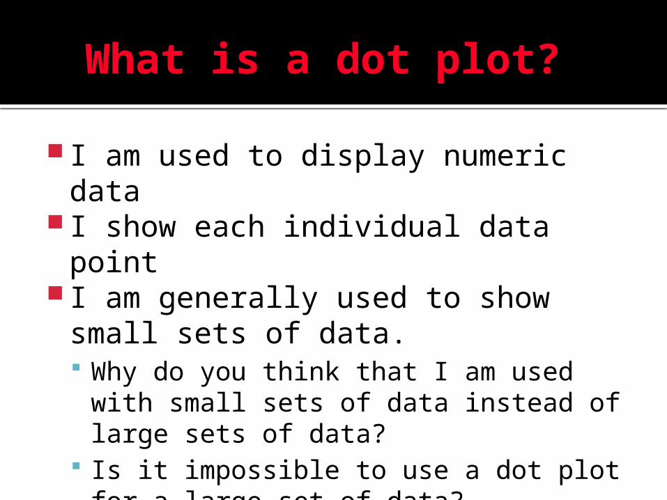
What is a dot plot?
I am used to display numeric data I show each individual data point I am generally used to show small
sets of data. Why do you think that I am used with
small sets of data instead of large sets of data?
Is it impossible to use a dot plot for a large set of data?

What does a dot plot look like?
Number of pets per student .

How do I create a dot plot?
Step 1 : Organize your data Step 2: Draw a horizontal line Step 3 : Title your display Step 4: Label your line with each
value smallest to largest Step 5: Plot your dots

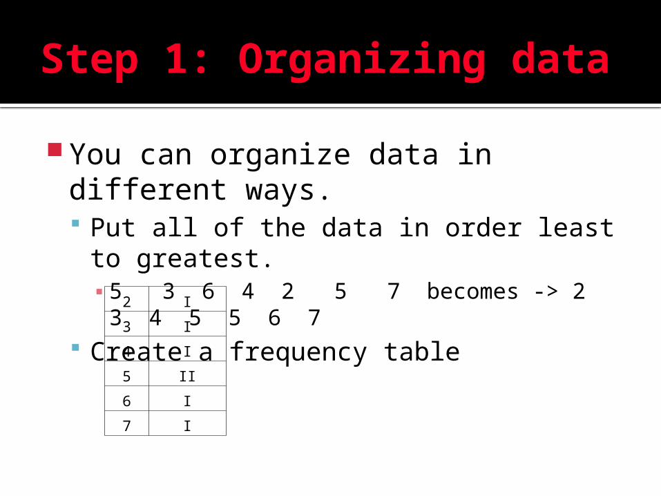
Step 1: Organizing data
You can organize data in different ways. Put all of the data in order least to
greatest.▪ 5 3 6 4 2 5 7 becomes -> 2 3 4 5 5
6 7 Create a frequency table
2 I
3 I
4 I
5 II
6 I
7 I

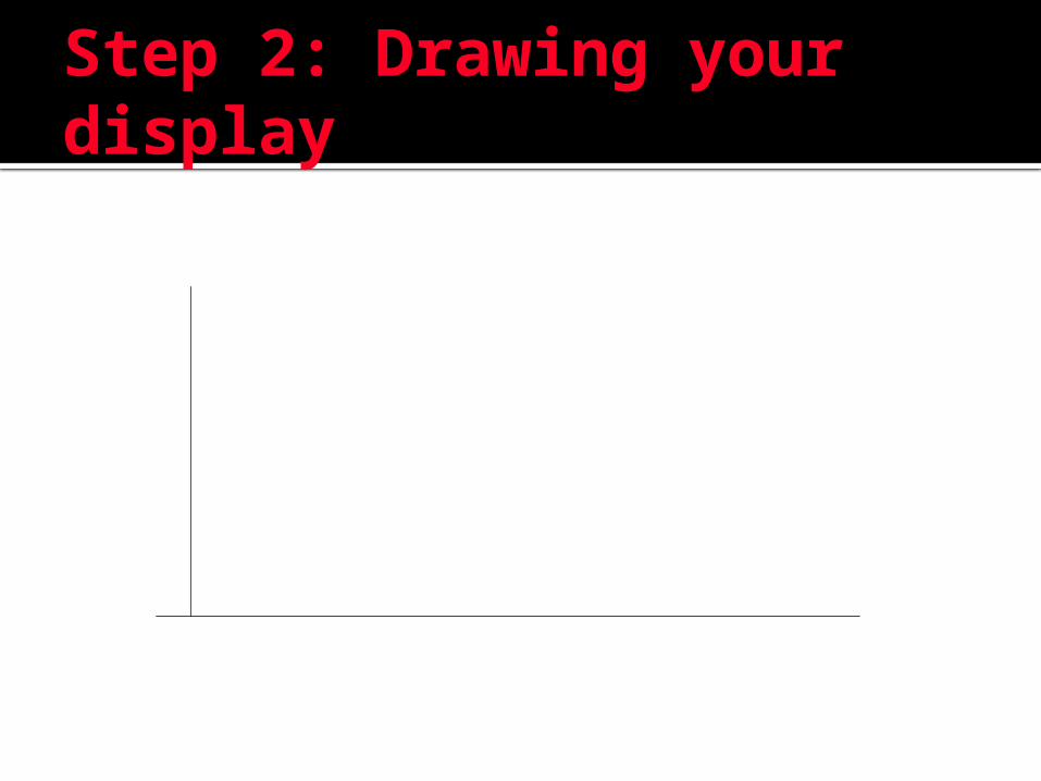
Step 2: Draw a horizontal line
It is important to look at your values so that you draw your line with enough room to put a dot for every occurrence in a data set.
If this is your paper the line near the middle represents a horizontal line.

Step 3: Title your Display
Look at your data. The title should tell what data was collected.
Examples Number of siblings Number of pets

Step 4: Label your line
Label your line with each value smallest to largest (evenly space your values)
2 3 4 5 6 7

Step 4: Plot your dots
Make a dot above the value for each time the value occurs in your data.
2 3 4 5 6 7

Rules of Dot Plots
Rule 1: Every data point must be shown
Rule 2: Horizontal line must be labeled
Rule 3: Labels must be evenly spaced
Rule 4: Dots should be uniform (same size, shape and distance apart)

What is a Histogram?
I am used to display numeric data. I use ranges to display data. I am used to display large sets of
continuous data. How is a histogram different from a dot
plot? Why do you think a histogram used
ranges to display data instead of each individual data point?
What do you think the phrase continuous data means?

What does a histogram look like?
≤ ≤ ≤ ≤ ≤
Number of sodas a student drinks in a month.

How do I create a Histogram?
Step 1 : Organize your data Step 2: Draw your perpendicular
lines Step 3 : Title your display Step 4: Label your lines Step 5: Draw your bars.
Step 1: Organizing data
You can organize data in different ways. Put all of the data in order least to
greatest.▪ 5 3 6 4 2 5 7 becomes -> 2 3 4 5 5
6 7 Create a frequency table
2 I
3 I
4 I
5 II
6 I
7 I
Step 2: Drawing your display

Step 3: Title your Display
Look at your data. The title should tell what data was collected.
Examples Height of all 7th graders to the nearest
quarter inch. Length of every G rated movie that
came out after 2005.
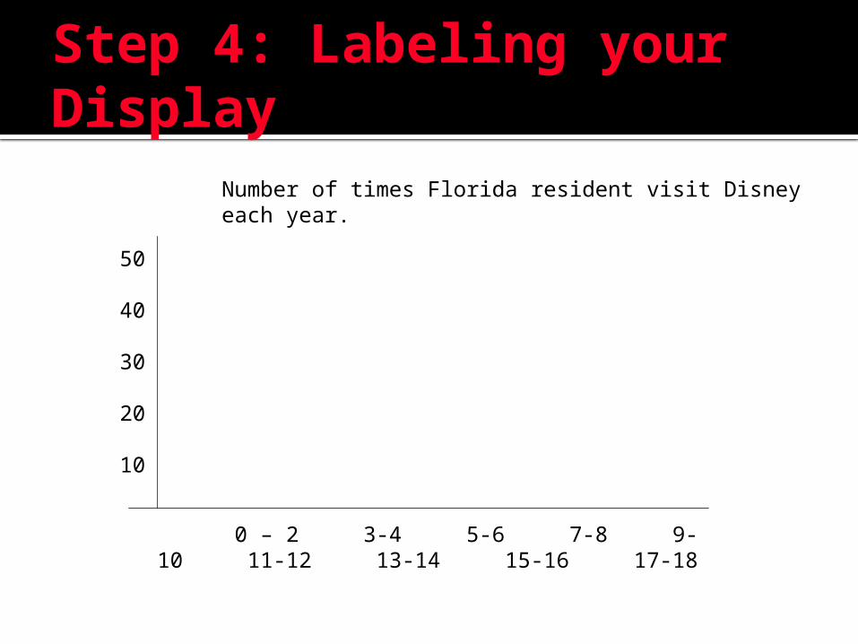
Step 4: Labeling your Display
Number of times Florida resident visit Disney each year.
0 – 2 3-4 5-6 7-8 9-10 11-12 13-14 15-16 17-18
50
40
30
20
10

Step 5: Completing the Display
Number of times Florida resident visit Disney each year.
0 – 2 3-4 5-6 7-8 9-10 11-12 13-14 15-16 17-18
50
40
30
20
10
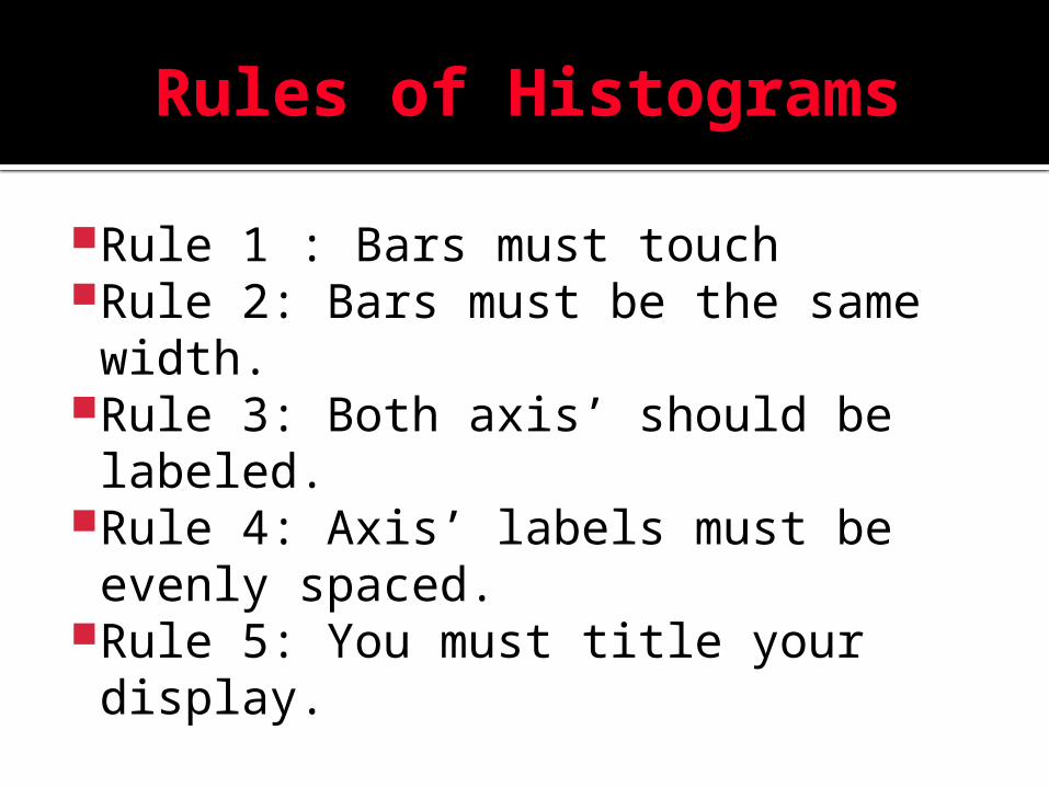
Rules of Histograms
Rule 1 : Bars must touchRule 2: Bars must be the same width.
Rule 3: Both axis’ should be labeled.
Rule 4: Axis’ labels must be evenly spaced.
Rule 5: You must title your display.