Embed Size (px)
Citation preview
Color Theory
How to use Color in Design
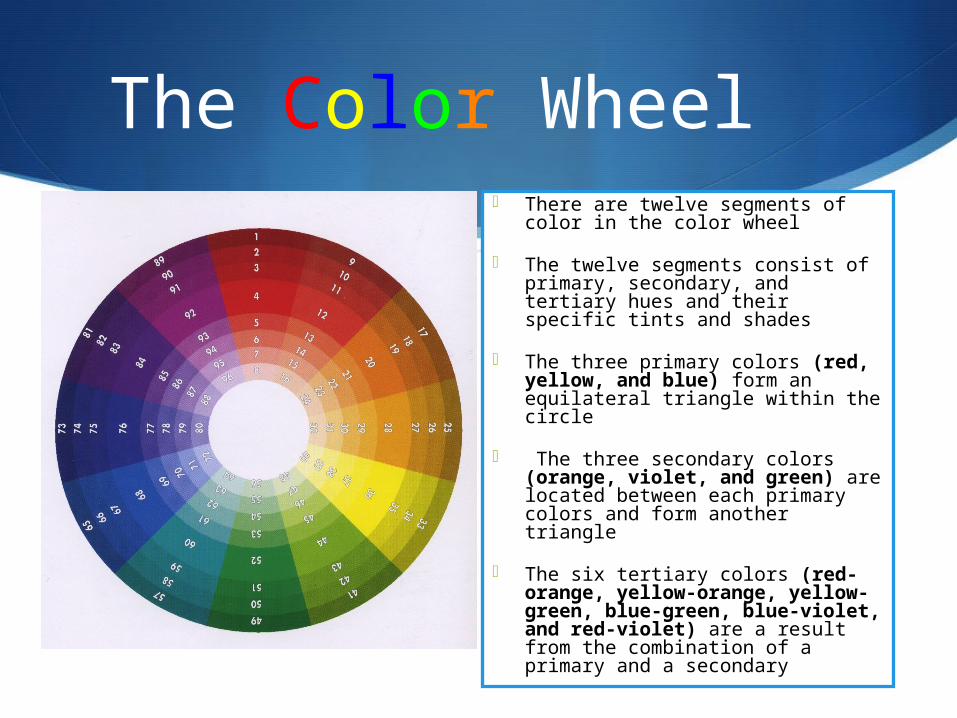
The Color Wheel There are twelve segments of
color in the color wheel
The twelve segments consist of primary, secondary, and tertiary hues and their specific tints and shades
The three primary colors (red, yellow, and blue) form an equilateral triangle within the circle
The three secondary colors (orange, violet, and green) are located between each primary colors and form another triangle
The six tertiary colors (red-orange, yellow-orange, yellow-green, blue-green, blue-violet, and red-violet) are a result from the combination of a primary and a secondary
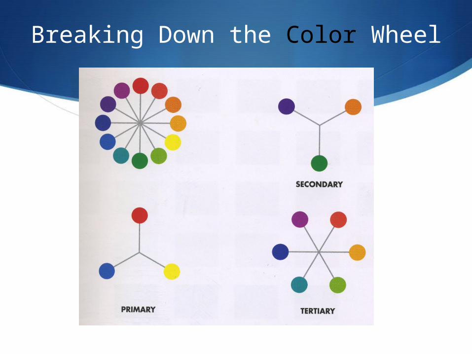
Breaking Down the Color Wheel
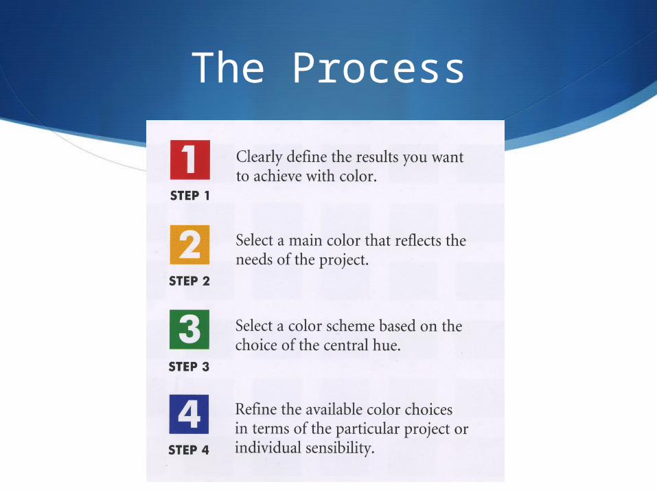
The Process
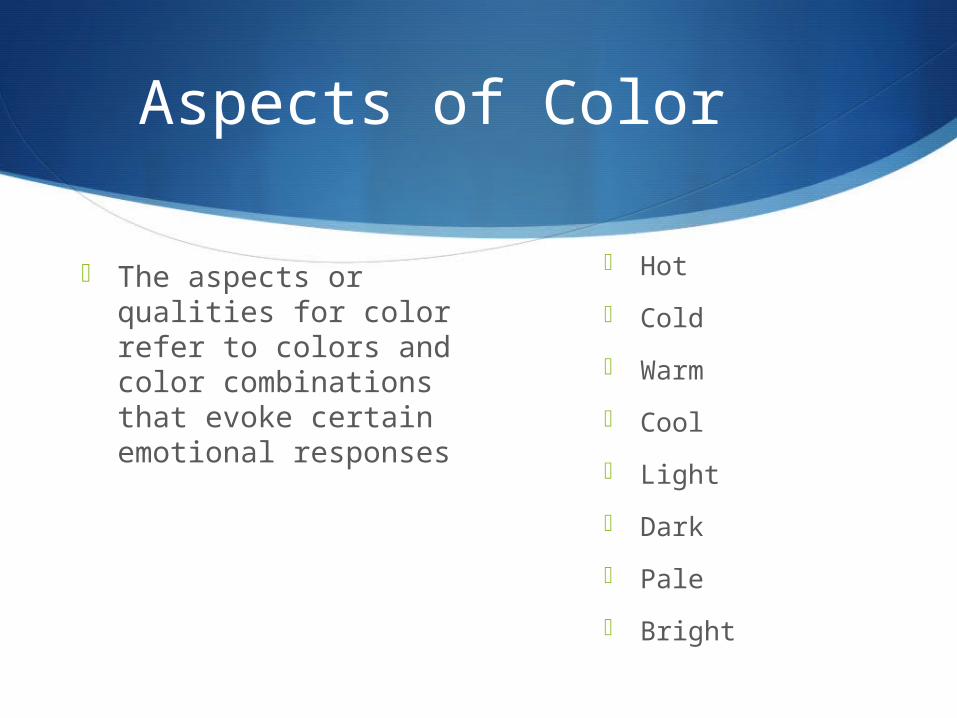
Aspects of Color
The aspects or qualities for color refer to colors and color combinations that evoke certain emotional responses
Hot
Cold
Warm
Cool
Light
Dark
Pale
Bright
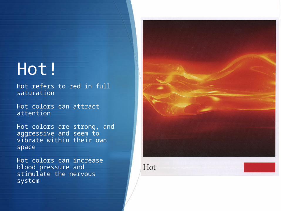
Hot!Hot refers to red in full saturation
Hot colors can attract attention
Hot colors are strong, and aggressive and seem to vibrate within their own space
Hot colors can increase blood pressure and stimulate the nervous system
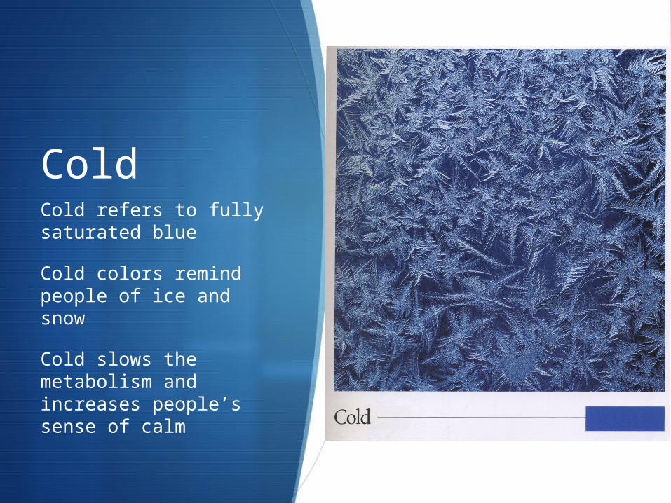
ColdCold refers to fully saturated blue
Cold colors remind people of ice and snow
Cold slows the metabolism and increases people’s sense of calm
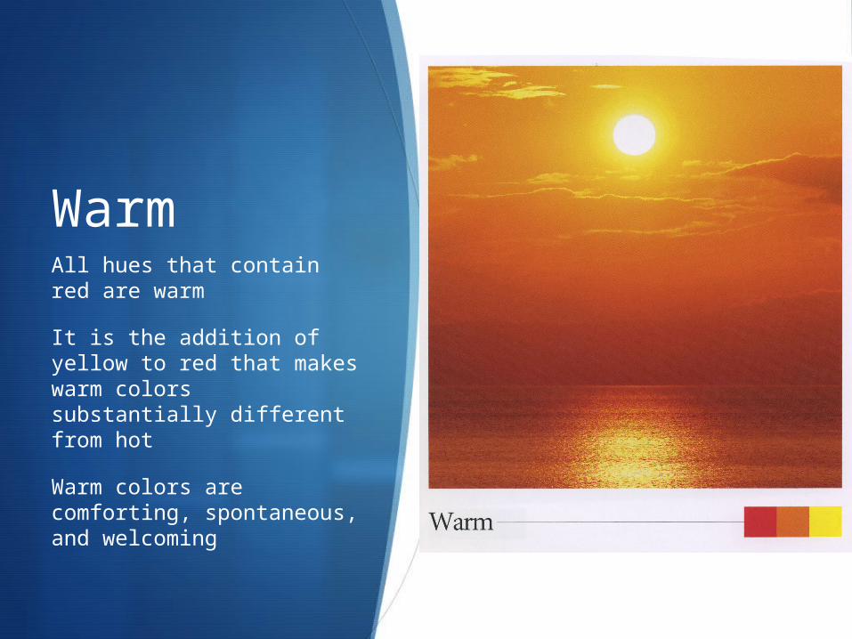
WarmAll hues that contain red are warm
It is the addition of yellow to red that makes warm colors substantially different from hot
Warm colors are comforting, spontaneous, and welcoming
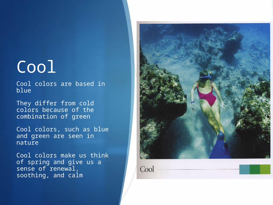
CoolCool colors are based in blue
They differ from cold colors because of the combination of green
Cool colors, such as blue and green are seen in nature
Cool colors make us think of spring and give us a sense of renewal, soothing, and calm
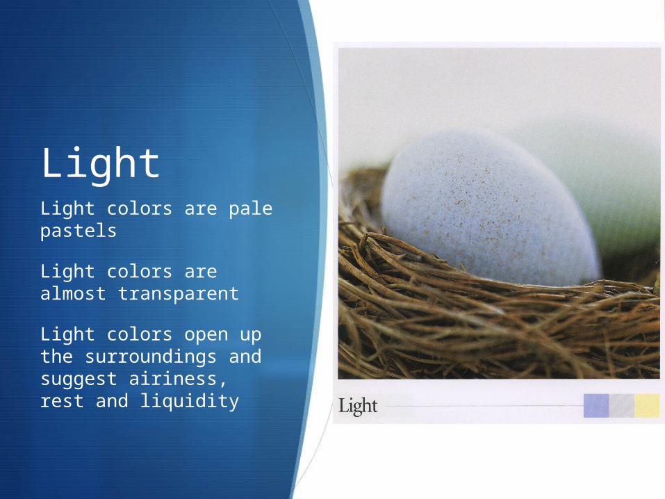
LightLight colors are pale pastels
Light colors are almost transparent
Light colors open up the surroundings and suggest airiness, rest and liquidity
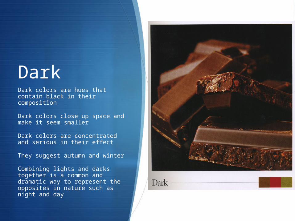
DarkDark colors are hues that contain black in their composition
Dark colors close up space and make it seem smaller
Dark colors are concentrated and serious in their effect
They suggest autumn and winter
Combining lights and darks together is a common and dramatic way to represent the opposites in nature such as night and day
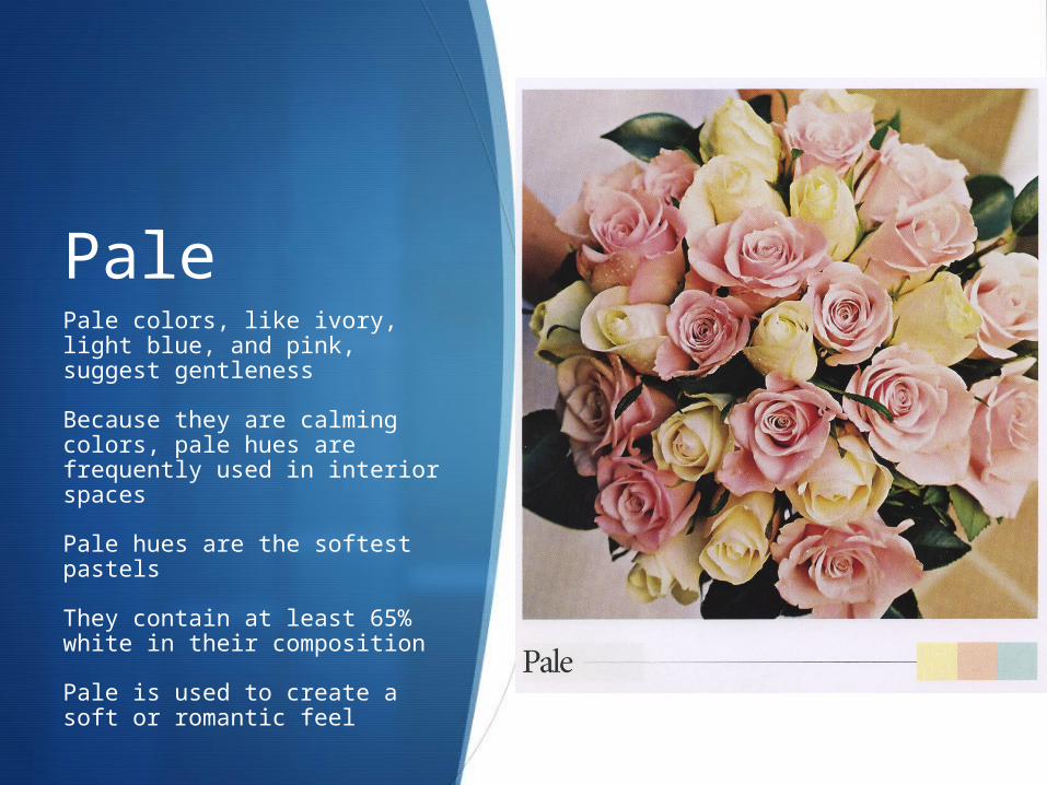
PalePale colors, like ivory, light blue, and pink, suggest gentleness
Because they are calming colors, pale hues are frequently used in interior spaces
Pale hues are the softest pastels
They contain at least 65% white in their composition
Pale is used to create a soft or romantic feel
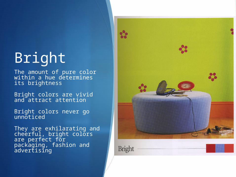
BrightThe amount of pure color within a hue determines its brightness
Bright colors are vivid and attract attention
Bright colors never go unnoticed
They are exhilarating and cheerful, bright colors are perfect for packaging, fashion and advertising
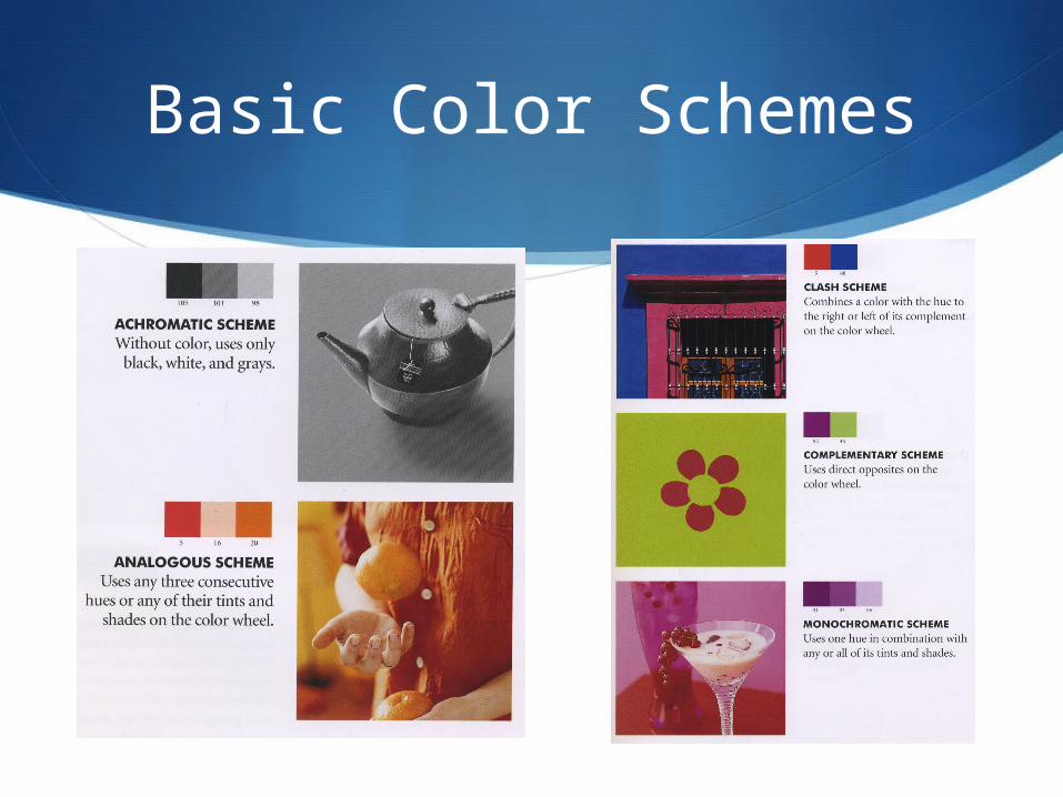
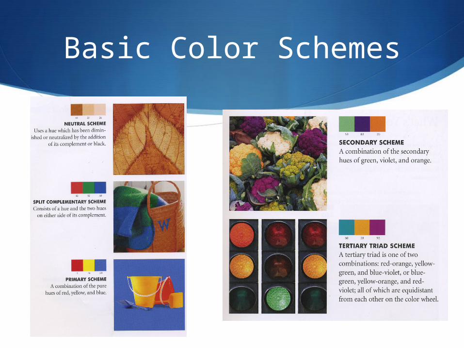
Basic Color Schemes
Basic Color Schemes