Embed Size (px)
Citation preview

© Boardworks Ltd 20051 of 58 © Boardworks Ltd 20051 of 58
AS-Level Maths: Statistics 1for Edexcel
S1.4 Correlation and regression
This icon indicates the slide contains activities created in Flash. These activities are not editable.
For more detailed instructions, see the Getting Started presentation.

© Boardworks Ltd 20052 of 58
Co
nte
nts
© Boardworks Ltd 20052 of 58
Scatter graphs
Scatter graphs, types of correlation and lines of best fit
Product–moment correlation coefficients
The effects of coding on correlation
Regression

© Boardworks Ltd 20053 of 58
There are many situations where people wish to find out whether two (or more) variables are related to each other. Here are some examples:
Correlation
Is systolic blood pressure related to age?
Is the life expectancy of people in a country related to how wealthy the country is?
Are A-level results related to the number of hours students spend undertaking part-time work?
Is an athlete’s leg length related to the time in which they can run 100m?
Correlation is a measure of relationship – the stronger the correlation, the more closely related
the variables are likely to be.

© Boardworks Ltd 20054 of 58
Example: The table shows the latitude and mean January temperature (°C) for a sample of 10 cities in the northern hemisphere.
Scatter graphs are a useful visual way of judging whether a relationship appears to exist between two variables.
Scatter graphs
City Latitude Mean Jan. temp. (°C)
Belgrade 45 1
Bangkok 14 32
Cairo 30 14
Dublin 50 3
Havana 23 22
Kuala Lumpur 3 27
Madrid 40 5
New York 41 0
Reykjavik 30 –1
Tokyo 36 5

© Boardworks Ltd 20055 of 58
The data in the table can be presented in a scatter graph:
Scatter graph showing how January temperatures change with latitude
-5
0
5
10
15
20
25
30
35
0 10 20 30 40 50 60
Latitude
Tem
per
atu
re (
ºC)
Scatter graphs
This shows that mean January temperature tends to decrease as the latitude of the city increases. We say that the variables are negatively correlated.

© Boardworks Ltd 20056 of 58
In this example, a city’s temperature is likely to be dependent upon its latitude – not the other way around. Temperature cannot affect a city’s latitude.
The latitude is called the independent (or explanatory) variable. The temperature is called the dependent(or response) variable.
Scatter graphs
When plotting scatter graphs, the convention is to always plot the independent variable on the horizontal axis and the dependent variable on the vertical axis.
Scatter graph showing how January temperatures change with latitude
-5
0
5
10
15
20
25
30
35
0 10 20 30 40 50 60
Latitude
Tem
per
atu
re (
ºC)

© Boardworks Ltd 20057 of 58
Scatter graphs

© Boardworks Ltd 20058 of 58
The type of correlation existing between two variables can be described in terms of the gradient of the slope formed by the points, and how close the points lie to a straight line.
Strong positive correlation – the points lie close to a straight line with positive gradient.
Weak positive correlation – the points are more scattered but follow a general upward trend.
Correlation

© Boardworks Ltd 20059 of 58
Strong negative correlation – the points lie close to a straight line with negative gradient.
Weak negative correlation – the points are more scattered but follow a general downward trend.
Correlation
0
5
10
15
20
25
30
0 2 4 6 8 10 12x
y
0
5
10
15
20
25
30
0 2 4 6 8 10 12
x
y

© Boardworks Ltd 200510 of 58
No correlation –the points are scattered across the graph area indicating no relationship between the variables.
Correlation
0
5
10
15
20
25
0 2 4 6 8 10 12
x
y

© Boardworks Ltd 200511 of 58
The following diagram illustrates why it is important to interpret scatter diagrams with caution.
The diagram shows life expectancy at birth plotted against annual cigarette consumption for a sample of 9 countries.
Correlation vs. causation

© Boardworks Ltd 200512 of 58
The diagram shows a positive correlation between cigarette consumption and life expectancy. However, it would be wrong to conclude that consuming more cigarettes causes people to live longer.
Correlation vs. causation
This type of correlation is sometimes referred to asnonsense correlation.
The relationship can be explained because both life expectancy and cigarette consumption for a country are correlated with a third variable – the wealth of the country.

© Boardworks Ltd 200513 of 58
When a linear relationship exists between two variables,a line of best fit can be drawn on the scatter graph.
Lines of best fit

© Boardworks Ltd 200514 of 58
Lines of best fit
It can be shown that a line of best fit always passes through the mean point, .( , )x y
mean point
Example: A line of best fit can be added to the scatter graph showing mean January temperatures and latitude.
© Boardworks Ltd 200515 of 58
Lines of best fit
The line of best fit can be used to make predictions.
For example, Los Angeles has a latitude of 34°N. The line of best fit suggests that Los Angeles should have a January temperature of about 9°C.
The actual mean temperature for Los Angeles is 13°C.

© Boardworks Ltd 200516 of 58
Co
nte
nts
© Boardworks Ltd 200516 of 58
Scatter graphs, types of correlation and lines of best fit
Product–moment correlation coefficient
The effects of coding on correlation
Regression
Product–moment correlation coefficient

© Boardworks Ltd 200517 of 58
The product–moment correlation coefficient (r) gives a numerical measure of the strength of the linear association between two variables.
Product–moment correlation coefficient
This means that it measures how close the points on a scatter graph lie to a straight line.

© Boardworks Ltd 200518 of 58
The product–moment correlation coefficient works so that:
Product–moment correlation coefficient
0
20
40
60
80
100
0 1 2 3 4
0
20
40
60
80
100
0 1 2 3 4
• r = 1 indicates perfect linear positive correlation;
0
20
40
60
80
100
0 1 2 3 4
–1 ≤ r ≤ 1
• r = –1 indicates perfect linear negative correlation;
• r = 0 indicates that there is absolutely no linear correlation between the variables.

© Boardworks Ltd 200519 of 58
i ii i
x yx y
n
i
i
xx
n
2
2
i
i
yy
n
2
2
Product–moment correlation coefficient
The product–moment correlation coefficient for n pairs of observations is obtained using the formula:( , ), ..., ( , )n nx y x y1 1
xy
xx yy
Sr
S S
( )ix x 2
xxS
( )iy y 2
yyS
( )( )i ix x y y xySwhere:
Usually, the second version of each formula is used.

© Boardworks Ltd 200520 of 58
Example: The table shows the average body mass and brain mass of 6 species of animal.
Product–moment correlation coefficient
Species Body mass (kg) Brain mass (g)
Baboon 11 180
Cat 3.3 30
Fox 4.2 50
Mouse 0.02 0.4
Monkey 10 120
Rabbit 2.5 12
a) Draw a scatter graph showing brain mass plotted against body mass.
b) Describe the relationship that exists between the two variables.
c) Calculate the product–moment correlation coefficient.

© Boardworks Ltd 200521 of 58
Product–moment correlation coefficient
Scatter graph comparing body mass and brain mass
0
50
100
150
200
0 2 4 6 8 10 12
Body mass (kg)
Bra
in s
ize
(kg
)
a)
b) The scatter graph shows strong positive correlation, meaning that the size of an animal’s brain tends to increase as its body mass increases.

© Boardworks Ltd 200522 of 58
Product–moment correlation coefficient
. ... . .11 3 3 2 5 31 02x ... .180 30 12 392 4y
. ... . .2 2 2 211 3 3 2 5 255 78x ...
2 2 2 2180 30 12 50344y ( ) ... ( . )11 180 2 5 12 3519xy
c) Species Body mass (kg) Brain mass (g)
Baboon 11 180
Cat 3.3 30
Fox 4.2 50
Mouse 0.02 0.4
Monkey 10 120
Rabbit 2.5 12

© Boardworks Ltd 200523 of 58
Product–moment correlation coefficient
So: i ii i
x yx y
n xyS
i
i
yy
n
2
2yyS
i
i
xx
n
2
2xxS
xy
xx yy
Sr
S S Therefore:
Note: The product–moment correlation coefficient can be found using built-in calculator functions.
. .
31 02 392 43519
61490
..
231 02255 78
6.95 41
. 2
392 4
50 3446
24 681
.
1490
95 41 24 681
.0 971
© Boardworks Ltd 200524 of 58
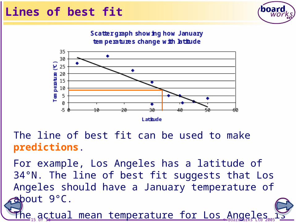
Examination-style question: A researcher believes there is a relationship between a country’s annual income per head (x, in $1000) and the per capita carbon dioxide emissions (c, tonnes). He collects data from a random sample of 10 countries and records the following results:
Product–moment correlation coefficient
.
. .
.
2 2
96 5 54
2156 9 383 54
619 6
x c
x c
xc
Calculate the value of the product–moment correlation coefficient and comment on the implications of your answer.

© Boardworks Ltd 200525 of 58
i
cc i
cS c
n
2
2
i
xx i
xS x
n
2
2
i ixc i i
x cS x c
n So:
Therefore, the product–moment correlation coefficient is:
Product–moment correlation coefficient
xc
xx cc
Sr
S S
Income shows weak positive correlation with CO2 emissions – emissions are generally higher in wealthier countries. However, as the correlation is low, the result is somewhat inconclusive.
..
96 5 54619 6
10.98 5
..
296 52156 9
10.1225 675
. 254
383 5410
.91 94
.
. .
98 5
1225 675 91 94. (3 s0 293 .f.)

© Boardworks Ltd 200526 of 58
Co
nte
nts
© Boardworks Ltd 200526 of 58
Scatter graphs, types of correlation and lines of best fit
Product-moment correlation coefficient
The effects of coding on correlation
Regression
Effects of coding on correlation

© Boardworks Ltd 200527 of 58
The value of the product–moment correlation coefficient is unaffected by linear transformations of the variables.
More specifically, if the variables u and v are related to the variables x and y through the transformations
Effect of coding on the correlation
then the correlation coefficient between u and v is identical to the correlation coefficient between x and y.
v = cy + d
u = ax + b
Note: this is only true if c and a are greater than 0.

© Boardworks Ltd 200528 of 58
Effect of coding on the correlation

© Boardworks Ltd 200529 of 58
Example: The heights (in cm) of a sample of 11 men and their adult sons can be summarized as follows:
Solution: Let u = x – 160 and v = y – 160.
Then:
where x = height of father (in cm) and y = height of son (in cm).
Calculate the value of the product-moment correlation coefficient between the fathers’ and sons’ heights.
Effect of coding on the correlation
2 2
105 142 2483
1959 3326
u v uv
u v
( ) ( ) ( )( )
( ) ( )2 2
160 105 160 142 160 160 2483
160 1959 160 3326
x y x y
x y

© Boardworks Ltd 200530 of 58
uvS
105 142
248311
As the transformations between (x, y) and (u, v) are linear, the correlation coefficient between the fathers’ and sons’ heights must also be 0.943.
We can find the values of Suv, Suu and Svv:
Effect of coding on the correlation
.
. .r
1127 55
956 727 1492 909So:
.1127 55
21051959
11uuS .956 727
vvS 2142
332611
.1492 909
0.943 (to 3 s.f.)

© Boardworks Ltd 200531 of 58
The product–moment correlation coefficient (PMCC) measures the strength of a linear relationship.
However:
Limitations of the PMCC
0
5
10
15
20
0 2 4 6 8 100
5
10
15
20
25
0 2 4 6 8 10
Outliers can greatly distort the PMCC;
The PMCC is not a suitable measure of correlation if the relationship is non-linear.

© Boardworks Ltd 200532 of 58
Variables can be described as being either:
Types of variables
Sometimes a variable is controlled by the experimenter – they decide in advance what values that variable should take. If a variable is controlled, then it is non-random.
Random variables take values that cannot be predicted with certainty before collecting the data.
random or
non-random.
© Boardworks Ltd 200533 of 58
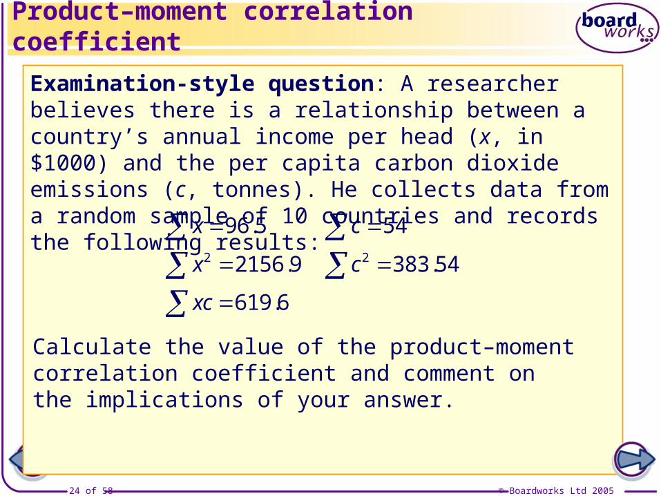
Example: An experiment is carried out into how fast a mug of coffee cools. The temperature of the coffee is measured every 2 minutes until 10 minutes have passed.
Types of variables
Time (minutes) 0 2 4 6 8 10
Temperature (°C) 95 83 73 64 55 48
The values for the time were chosen by the experimenter. If the experiment is repeated, the values for the time will be the same. Therefore, time is a non-random variable.
Temperature is a random variable. The values for this variable may be different if the experiment is repeated.

© Boardworks Ltd 200534 of 58
Co
nte
nts
© Boardworks Ltd 200534 of 58
Scatter graphs, types of correlation and lines of best fit
Product-moment correlation coefficient
The effects of coding on correlation
Regression
Regression

© Boardworks Ltd 200535 of 58
Linear regression involves finding the equation of the line of best fit on a scatter graph.
The equation obtained can then be used to make an estimate of one variable given the value of the other variable.
There are two cases to consider, depending upon whether:
Regression – random on random
We deal first with the situation where both variables (x and y) are random, and where we wish to predict a value for y given a value for x.
1. We wish to find a value of y given a value for x, or
2. We want to estimate x given y.

© Boardworks Ltd 200536 of 58
Regression – random on random
The best fitting line is the one that minimizes the sum of the squared deviations, , where di is the vertical distance between the ith point and the line.
2id
d1d2
d3
d4d5
d6
The distances di are sometimes referred
to as residuals.

© Boardworks Ltd 200537 of 58
Regression – random on random
As stated previously, the best fitting line should pass through the mean point, .( , )x y

© Boardworks Ltd 200538 of 58
The line that minimizes the sum of squared deviations is formally known as the least squares regression line of y on x.
The equation of the least squares regression line of y on x is:
Regression – random on random
2
2xx
xS x
n
and: a y bx
xy
x yS xy
n Recall: and
y = a + bx
b is sometimes referred to as the regression
coefficient.
xy
xx
Sb
Swhere:

© Boardworks Ltd 200539 of 58
Consider again the temperature data presented earlier.
Example: The table shows the latitude, x, and mean January temperature(°C), y, for a sample of 10 cities in the northern hemisphere.
Calculate the equation of the regression line of y on x and use it to predict the mean January temperature for the city of Los Angeles, which has a latitude of 34°N.
Regression – random on random
City Latitude Mean Jan. temp. (°C)
Belgrade 45 1
Bangkok 14 32
Cairo 30 14
Dublin 50 3
Havana 23 22
Kuala Lumpur 3 27
Madrid 40 5
New York 41 0
Reykjavik 30 –1
Tokyo 36 5

© Boardworks Ltd 200540 of 58
2 11 636x
Regression – random on random
We begin by finding summary statistics for the table:
x 312
We then use these to calculate the gradient (b) and y-intercept (a) for the regression line.
City Latitude (x)
Mean Jan. temp. (°C) (y)
Belgrade 45 1
Bangkok 14 32
Cairo 30 14
Dublin 50 3
Havana 23 22
Kuala Lumpur 3 27
Madrid 40 5
New York 41 0
Reykjavik 30 –1
Tokyo 36 5
y 108
y 2 2494
xy 2000

© Boardworks Ltd 200541 of 58
Regression – random on random
xy
x yS xy
n
2
2
312
108
11 636
2494
2000
x
y
x
y
xy
xx
xS x
n
2
2
To find the gradient, we need Sxy and Sxx:
Therefore:
xy
xx
Sb
S
312 1082000
10. 1369 6
2
312
11 63610
.1901 6
.
.
1369 6
1901 6–0.720 (to 3 s.f.)

© Boardworks Ltd 200542 of 58
Therefore, the equation of the regression line is:
y = 33.3 – 0.720x
This is our estimate of the mean January temperature in Los Angeles.
Regression – random on random
x 312
10
y 108
10
To find the y-intercept we also need and :x y
So: a y bx
.31 2
.10 8
. ( . . )10 8 0 720 31 2
= 33.3 (to 3 s.f.)
So, when x = 34, y = 33.3 – 0.720 × 34 = 8.82°C.
2
2
312
108
11 636
2494
2000
x
y
x
y
xy

© Boardworks Ltd 200543 of 58
This prediction for the mean January temperature in Los Angeles is based purely on the city’s latitude.
There are likely to be additional factors that can affect the climate of a city, for example:
Regression – random on random
The concept of regression we have considered here can be extended to incorporate other relevant factors, producing a new formula. This allows for more accurate prediction.
altitude;
proximity to the coast;
ocean currents;
prevailing winds.

© Boardworks Ltd 200544 of 58
A regression equation can only confidently be used to predict values of y that correspond to x values that lie within the range of the data values available.
The dangers of extrapolation
It can be dangerous to extrapolate (i.e. to predict) from the graph, a value for y that corresponds to a value of x that lies beyond the range of the values in the data set.
It is reasonably safe to make predictions
within the range of the data.
It is unwise to extrapolate beyond the given data.
This is because we cannot be sure that the relationship between the two variables will continue to be true.

© Boardworks Ltd 200545 of 58
Examination-style question: The average weight and wingspan of 9 species of British birds are given in the table.
Examination-style question: regression
Bird Weight (g)
Wingspan (cm)
Wren 10 15
Robin 18 21
Great tit 18 24
Cuckoo 57 33
Blackbird 100 37
Pigeon 300 67
Lapwing 220 70
Crow 500 99
Common gull 400 100
a) Plot the data on a scatter graph. Comment on the relationship between the variables.
b) Calculate the regression line of wingspan on weight.
c) Use your regression line to estimate the wingspan of a jay, if its average weight is 160 g.
d) Explain why it would be inappropriate to use your lineto estimate the wingspan of a duck, if the averageweight of a duck is 1 kg.

© Boardworks Ltd 200546 of 58
Examination-style question: regression
a)
The graph indicates that there is fairly strong positive correlation between weight and wingspan – this means that wingspan tends to be longer in heavier birds.

© Boardworks Ltd 200547 of 58
b) Summary values for the paired data are:
Examination-style question: regression
x 1623
xy
x yS xy
n
xx
xS x
n
2
2
xy
xx
Sb
S
These can be used to find the gradient of the regression line:
Therefore:
x = weighty = wingspany 466
2 562 397x 2
32 890y 131 541xy
1623 466
131 5419
47 505.672
1623
562 3979
269 716
47 505.67
269 7160.176 (to 3 s.f.)

© Boardworks Ltd 200548 of 58
Examination-style question: regression
.1623
180 339
x
.y 466
51 789
To find the y-intercept we also need and :x y
So: a y bx
Therefore, the equation of the regression line is:
y = 20.0 + 0.176x
where y = wingspan and x = weight.
. ( . . ) 51 78 0 176 180 33
.20 04

© Boardworks Ltd 200549 of 58
c) When the weight is 160 g, we can predict the wingspan to be:
y = 20.0 + 0.176x =
d) The average weight of a duck is outside the range of weights provided in the data. It would therefore be inappropriate to use the regression line to predict the wingspan of a duck, as we cannot be certain that the same relationship will continue to be true at higher weights.
Note: The regression coefficient (0.176) can be interpreted here as follows: as the weight increases by 1 g, the wingspan increases by 0.176 cm, on average.
Examination-style question: regression
20.0 + (0.176 × 160)= 48.2 cm (to 3 s.f.)

© Boardworks Ltd 200550 of 58
We now turn our attention to the situation where we wish to estimate a value of x when we are given a value of y. We will continue to assume that both variables are random.
To predict x given y (when both variables are random), we use the regression line of x on y. This line has the equation:
Predicting x from y – random on random
x = a′ + b′y
Note that both the regression line of x on y and the regression line of y on x pass through the mean point.
The two lines won’t in general be equal, unless the points lie in a perfect straight line.
xy
yy
Sb
S and a x by where:
This regression line is designed to minimize
the sum of the squares of the deviations in the x
direction.

© Boardworks Ltd 200551 of 58
Examination-style question: 15 AS-level mathematics students sit papers in C1 and S1. Their results are summarized below, with c representing the percentage mark in C1, and s the percentage mark in S1.
Predicting x from y – random on random
2 2 888 58 362 943 66 445 61 878c c s s cs
a) Calculate the regression line of s on c and the regression
line of c on s.b) Caroline was absent for her C1 examination, but scored
51% in S1. Use the appropriate regression line to estimate her percentage score in the C1 paper.c) Calculate the product–moment correlation coefficient between the marks in the two papers. Comment on theimplications of this for the accuracy of the estimate found in b).

© Boardworks Ltd 200552 of 58
Predicting x from y – random on random
2
888
58 36215ccS
a) From these summary values we can calculate:
For the regression line of s on c:
.
.b
6052 4
5792 4
Also:
. , .c s 59 2 62 8667
So, the equation of the regression line of s on c is:
2 2 888 58 362 943 66 445 61 878c c s s cs
.7161 7332
943
66 44515ssS .5792 4
888 943
61 87815csS
.6052 4
. ( . . )a 62 8667 1 0449 59 2.1 0449 .1 00862
s = 1.01 + 1.04c

© Boardworks Ltd 200553 of 58
Predicting x from y – random on random
For the regression line of c on s:.
.b
6052 4
7161 733
. .
.
2 2
888 94358 362 5792 4 66 445 7161 733
15 15888 943
61 878 6052 415
cc ss
cs
S S
S
. .c s 59 2 62 8667
So, the equation of the regression line of c on s is:
c = 6.07 + 0.845s
b) We wish to estimate the value of c when s = 51. Both variables are random, so we use the regression line of c on s:
. ( . . )a 59 2 0 8451 62 8667.0 8451 .6 07
6.07 + (0.845 × 51) = 49.2c = 6.07 + 0.845s =
So we estimate Caroline to have scored 49% in C1.

© Boardworks Ltd 200554 of 58
Predicting x from y – random on random
c) The PMCC is calculated as follows:
cs
cc ss
Sr
S S
The PMCC indicates that there is very strong positive correlation between the marks in C1 and S1 – the points on the scatter graph would lie very close to a straight line.
This suggests that the mark estimated in b) is likely to be fairly accurate.
. .
.
2 2
888 94358 362 5792 4 66 445 7161 733
15 15888 943
61 878 6052 415
cc ss
cs
S S
S
. .c s 59 2 62 8667
.
. .
6052 4
5792 4 7161 733.0 94
© Boardworks Ltd 200555 of 58
Regression – controlled variables
We will now consider a situation where one of the variables (here assumed to be x) is a controlled variable. This means that the values of x are fixed – they were decided upon when the experiment was planned.
If x is a controlled variable, the regression line of x on y does not have any statistical meaning, since the values of x are not random.
We consequently use only the regression line of y on x, whether we are estimating a y or an x value.

© Boardworks Ltd 200556 of 58
Regression – controlled variables
Examination-style question: An agricultural researcher wishes to explore how the yield of a crop is affected by the amount of fertilizer used. She designs an experiment in which she fertilizes a small plot of land with a pre-determined amount of fertilizer. She obtains the following results:
Amount of fertilizer (kg), x 2 4 6 8 10 12
Crop yield (kg), y 8.55 9.34 9.52 10.39 11.42 11.57
a) Calculate the regression line of y on x.
b) The regression line of x on y is: x = –23.8 + 3.04yUse the appropriate regression line to estimate how much fertilizer would be needed to achieve a crop yield of 10 kg. Explain how you decided which regression line to use.

© Boardworks Ltd 200557 of 58
Regression – controlled variables
. . .2 242 364 60 79 623 20 447 74x x y y xy Also: , .7 10 132x y
The gradient of the regression line is: b = 22.2 ÷ 70 =
From these we get: Sxx = 70 and Sxy = 22.2
a) Amount of fertilizer (kg), x 2 4 6 8 10 12
Crop yield (kg), y 8.55 9.34 9.52 10.39 11.42 11.57
0.317
7.91and the intercept is: a = 10.132 – (0.317 × 7) =
Therefore the regression line is y = 7.91 + 0.317x.

© Boardworks Ltd 200558 of 58
Regression – controlled variables
b) Since x is a controlled variable, only the regression line of y on x has meaning. Therefore, this equation should be used to estimate x when y = 10:
Note: The intercept (7.91) represents the crop yield that might be expected if no fertilizer were to be applied. The equation of the line also shows that increasing the amount of fertilizer by
1 kg increases the expected crop yield by 0.317 kg.
y = 7.91 + 0.317x
10 = 7.91 + 0.317x2.09 = 0.317x
x = 6.59