Embed Size (px)
Citation preview

© 1999 Franz Kurfess Visual Design Guidelines 1
Course OverviewCourse Overview Introduction Understanding Users and
Their Tasks Principles and Guidelines Interacting with Devices Interaction Styles UI Design Elements Visual Design Guidelines
UI Development Tools Iterative Design and
Usability Testing Project Presentations and
Selected Topics Case Studies Recent Developments in
HCID Conclusions

© 1999 Franz Kurfess Visual Design Guidelines 2
Chapter OverviewVisual Design Guidelines
Chapter OverviewVisual Design Guidelines
Motivation Objectives Screen Layout and Design
General Layout Text Numbers Coding Techniques Color
Implications for Design Windows Web Pages
Important Concepts and Terms
Chapter Summary

© 1999 Franz Kurfess Visual Design Guidelines 3
Slides FeedbackSlides Feedback I would like to get some feedback from you about the
visual design of the PowerPoint Slides I’m using. Please write down your impressions (positive or negative) on the following aspects: General layout
Usage of screen space, arrangements of items, connections between related slides, ...
Text Font size, type, use of attributes like bold, italics
Colors Background color, text colors, overall color scheme
Coding techniques Getting attention through blinking, highlighting, underlining, colors, ...

© 1999 Franz Kurfess Visual Design Guidelines 4
Important UI Design ElementsImportant UI Design Elements
Which of the UI Design elements discussed in that section are especially relevant for screen layout and design?

© 1999 Franz Kurfess Visual Design Guidelines 5
MotivationMotivation
Most of the interaction between user and computer is guided by the visual presentation of the output on the screen, and it is very important to present the information in a suitable and convenient way.
The screen layout strongly influences the buildup of a mental model in the user.
Good screen layout can reduce the effort required by the user to solve a task, e.g. by using recognition over recall, by providing clues to legal or expected inputs, or by signaling the importance of output items through color or other attributes.

© 1999 Franz Kurfess Visual Design Guidelines 6
ObjectivesObjectives
to know about design guidelines for screen layout and design
to be able to apply these guidelines to the screen design for specific tasks
to effectively use design techniques for text, numbers, graphics, and other visual elements
to be able to translate task or user requirements into appropriate and effective screen layouts
to coordinate the visual output with other output and input modes

© 1999 Franz Kurfess Visual Design Guidelines 7
Evaluation CriteriaEvaluation Criteria
recognition of relevant visual design methods recall of the most important visual design methods evaluation of screen layout for specific tasks design of individual screens for specific functions,
and of groups of screens for complete tasks or applications

© 1999 Franz Kurfess Visual Design Guidelines 8
Visual DesignVisual Design

© 1999 Franz Kurfess Visual Design Guidelines 9
Screen Layout and DesignScreen Layout and Design principles of screen design apply equally to any kind
of interface menus, fill-in forms, displays of database records, GUIs,
Web pages, etc. designers must work within the constraints imposed
by the hardware and software of a system screen size
number of pixels, pixel resolution, screen orientation (horizontal or vertical)
display capabilities highlighting, reverse video, bit-mapped graphics, color, sound
[Mustillo]

© 1999 Franz Kurfess Visual Design Guidelines 10
Screen Layout CategoriesScreen Layout Categories five main categories
general layout text numbers coding techniques color
[Mustillo]

© 1999 Franz Kurfess Visual Design Guidelines 11
General Layout PrinciplesGeneral Layout Principles
scope of information arrangement of items formatting standards fonts and styles
[Mustillo]

© 1999 Franz Kurfess Visual Design Guidelines 12
Scope of informationScope of information include only information essential to decision making
avoid putting too much information on the screen never put more on the screen that absolutely necessary be brief and concise, but be careful to match the level of
detail to the user’s knowledge and experience e.g. displaying on-screen instructions vs. type of user (expert vs.
novice)
[Mustillo]
© 1999 Franz Kurfess Visual Design Guidelines 13
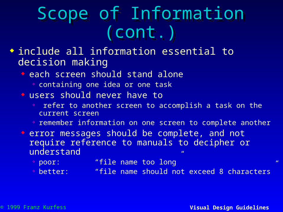
Scope of Information (cont.)Scope of Information (cont.)
include all information essential to decision making each screen should stand alone
containing one idea or one task users should never have to
refer to another screen to accomplish a task on the current screen remember information on one screen to complete another
error messages should be complete, and not require reference to manuals to decipher or understand poor: “file name too long” better: “file name should not exceed 8 characters”
© 1999 Franz Kurfess Visual Design Guidelines 14
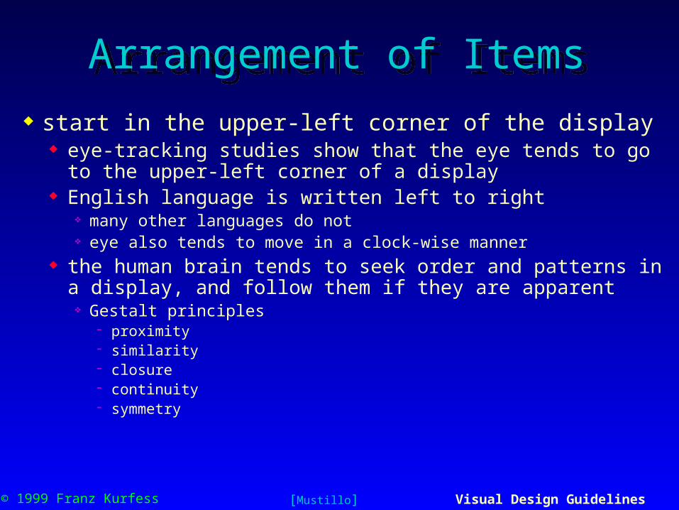
Arrangement of ItemsArrangement of Items
start in the upper-left corner of the display eye-tracking studies show that the eye tends to go to the
upper-left corner of a display English language is written left to right
many other languages do not eye also tends to move in a clock-wise manner
the human brain tends to seek order and patterns in a display, and follow them if they are apparent Gestalt principles
proximity similarity closure continuity symmetry
[Mustillo]

© 1999 Franz Kurfess Visual Design Guidelines 15
Arrangement of Items (cont.)Arrangement of Items (cont.)
group items logically keep group size manageable
roughly 12-14 characters wide by 6-7 lines high yields approximately 5 deg. of visual angle
minimize the number of groups number of groups affects search time, even when group size is
small
provide symmetry and balance through the use of blank spaces
but don’t imbed blank spaces to stretch out a word e.g. use “close,” not “ c l o s e ”
center words if appropriate
[Mustillo]

© 1999 Franz Kurfess Visual Design Guidelines 16
Formatting StandardsFormatting Standards
design formatting standards, and follow them consistently in all screens within a system related screens in a system should always have standard
types of information located in the same part of the screen e.g. screen titles, status messages, input fields, command input
lines, and error messages should consistently appear in the same area of the screen throughout the system
Tip design one or more screen templates that follow rules of
screen layout follow the templates
[Mustillo]

© 1999 Franz Kurfess Visual Design Guidelines 17
Fonts and StylesFonts and Styles
minimize font changes two different fonts per screen is plenty fonts that look good on paper may not necessarily look
good when displayed, and vice versa for text to be viewed from a distance, avoid the use of
serifs use fonts like Helvetica or Arial
minimize style changes styles are changes within a font
italics, bold, and underlining they also include different character sizes
12 point, 14 point, 16 point, 18 point, 20 point, 24 point, 28 point
[Mustillo]
© 1999 Franz Kurfess Visual Design Guidelines 18
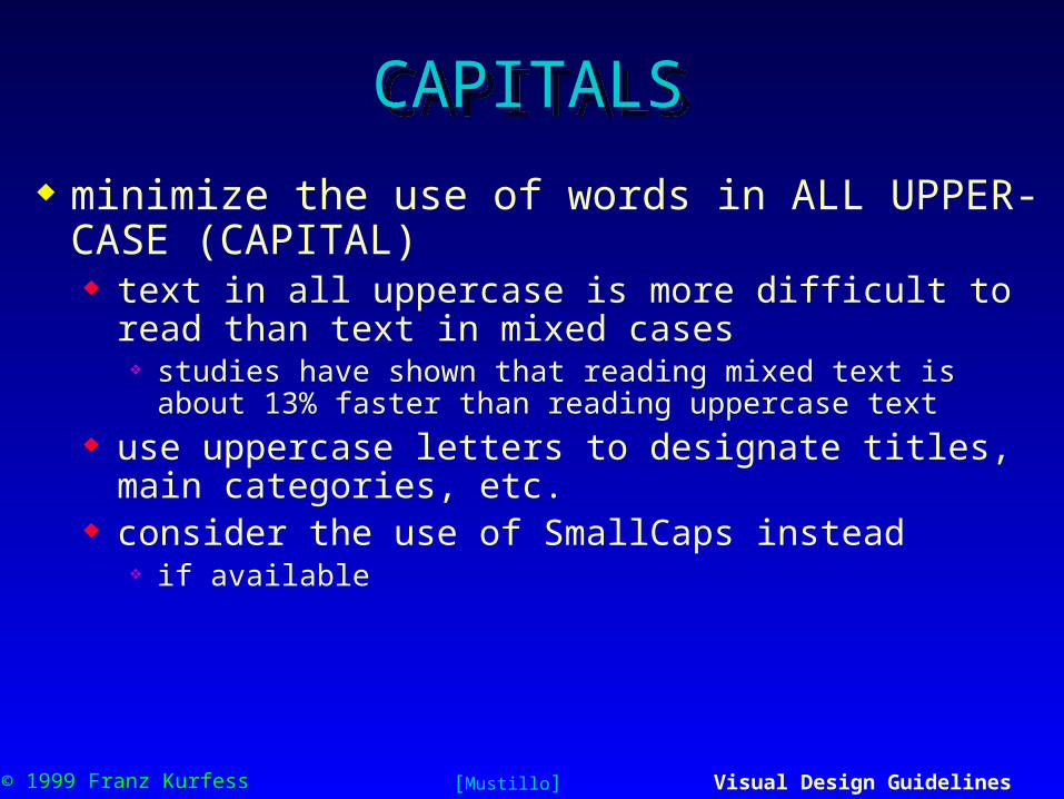
CAPITALSCAPITALS
minimize the use of words in ALL UPPER-CASE (CAPITAL) text in all uppercase is more difficult to read than text in
mixed cases studies have shown that reading mixed text is about 13% faster
than reading uppercase text use uppercase letters to designate titles, main categories,
etc. consider the use of SmallCaps instead
if available
[Mustillo]

© 1999 Franz Kurfess Visual Design Guidelines 19
Captions and FieldsCaptions and Fields distinguish and segregate captions and fields
a fill-in or display field should be easily distinguishable from its caption, label, or title
consider the use of contrasting features to make captions and fields stand out color, case, intensity, font, or reverse video
[Mustillo]

© 1999 Franz Kurfess Visual Design Guidelines 20
COURSE OFFERINGS
QUARTER UNIVERSITYSPRING 96 ALL
SEQUENCE 02 PROFESSOR ALL
COURSE COURSE NUMBERNUMBER NAME CREDITS PROFESSORCOMP535 DATASTRUC 03 SMITHPSYC101 INTRO 03 ADAMSBIOL201 GENETICS 03 PAPERMANCOMP675 HCI 03 MUSTILLO
Screen Design ExamplesScreen Design Examples
[Mustillo]

© 1999 Franz Kurfess Visual Design Guidelines 21
Screen Design ExamplesScreen Design Examples
[Mustillo]
COURSE OFFERINGS
QUARTER: SPRING UNIVERSITY: ALLSEQUENCE: 02 PROFESSOR: ALL
COURSE COURSE NUMBER PROFESSORNUMBER NAME OF CREDITS
COMP 535 Data Structures 3 J. SmithPSYCH 101 Introduction to 3 S. Adams
PsychologyBIOL 201 Genetics 3 A. PapermanCOMP 675 Human-Computer 3 P. Mustillo Interface Design
Press ARROW KEYS to scroll <RETURN> to go back

© 1999 Franz Kurfess Visual Design Guidelines 22
Screen Design ExamplesScreen Design Examples
[Mustillo]
COURSE OFFERINGS
QUARTER UNIVERSITYSPRING 96 ALL
SEQUENCE 02 PROFESSOR ALL
COURSE COURSE NUMBERNUMBER NAME CREDITS PROFESSORCOMP535 DATASTRUC 03 SMITHPSYC101 INTRO 03 ADAMSBIOL201 GENETICS 03 PAPERMANCOMP675 HCI 03 MUSTILLO
COURSE OFFERINGS
QUARTER: SPRING UNIVERSITY: ALLSEQUENCE: 02 PROFESSOR: ALL
COURSE COURSE NUMBER PROFESSORNUMBER NAME OF CREDITS
COMP 535 Data Structures 3 J. SmithPSYCH 101 Introduction to 3 S. Adams
PsychologyBIOL 201 Genetics 3 A. PapermanCOMP 675 Human-Computer 3 P. Mustillo Interface Design
Press ARROW KEYS to scroll Press <RETURN> to go back
© 1999 Franz Kurfess Visual Design Guidelines 23
Text LayoutText Layout
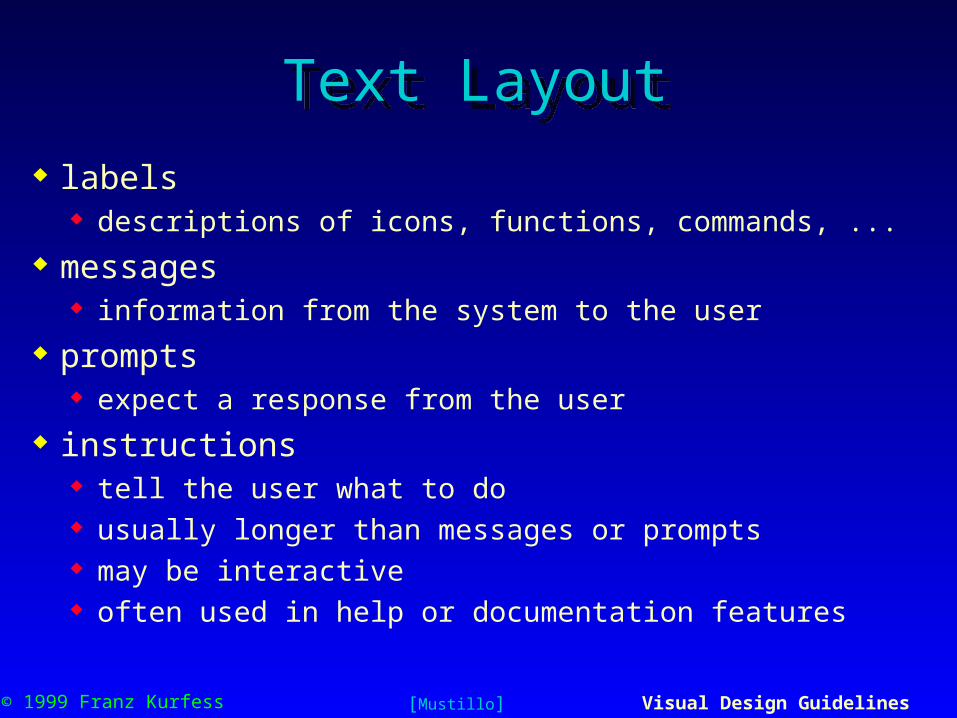
labels descriptions of icons, functions, commands, ...
messages information from the system to the user
prompts expect a response from the user
instructions tell the user what to do usually longer than messages or prompts may be interactive often used in help or documentation features
[Mustillo]

© 1999 Franz Kurfess Visual Design Guidelines 24
LabelsLabels labels should be self explanatory avoid acronyms on labels
if you can, display the entire word place labels to the left in a table left justify labels if you have more than one do not right align labels
right-aligned labels produce a ragged margin hard to scan
avoid placing labels on top of text fields or areas
[Mustillo]

© 1999 Franz Kurfess Visual Design Guidelines 25
Example LabelsExample Labels
[Mustillo]
Phone Numbers
Home (514) 488-8848
Work (514) 765-7743
Fax (514) 761-8503

© 1999 Franz Kurfess Visual Design Guidelines 26
MessagesMessages
desirable properties of messages brief and concise affirmative; avoid negative messages constructive, not critical specific and comprehensible imply that the user is in control
use words consistent with a required action (a) poor: “landing gear is not down”
(b) better: “landing gear is up”(c) best: “put the landing gear down”
design the level of detail according to the user’s knowledge and experience
[Mustillo]

© 1999 Franz Kurfess Visual Design Guidelines 27
Examples MessagesExamples Messages
[Mustillo]
Poor BetterThe processing of the texteditor yielded 23 pages ofoutput
Output 23 pages
Error in SHIRT SIZE field Error: SHIRT SIZE rangeis 14-18
Cannot exit before saving file Save file before exiting
Bad/illegal/invalid field name Maximum file name lengthis 8 characters
Syntax error 1542 Unmatched leftparenthesis in line 210

© 1999 Franz Kurfess Visual Design Guidelines 28
PromptsPrompts arrangement of prompts
when and where they will be needed order prompts chronologically or sequentially format prompts using blank spaces, justification, and visual
cues for easy scanning design the level of detail according to the user’s
knowledge and experience
[Mustillo]

© 1999 Franz Kurfess Visual Design Guidelines 29
Prompts (cont.)Prompts (cont.) phrasing information
use the active tense say “Push the button”
not “The button is to be pushed by the user” phrase prompts as affirmative statements
avoid negatives “Do x” vs. “Do not do y”
use consistent terminology use the word “type” when instructing a user to type something use “Press” for pressing a button or function key
user does not type the word “Return” when instructed to “Press Return” references on labels should be exact
if a key is labeled “RTN”, don’t say, “Press Return”, say “Press RTN” difficult to achieve since different users may have different keyboards
[Mustillo]

© 1999 Franz Kurfess Visual Design Guidelines 30
Examples PromptsExamples Prompts
Poor BetterPosition cursor and pressreturn
Position cursor,Press return to accept
SIZE:___ SIZE:___ (14-18)The message is sent bypressing TRANSMIT
To send message,Press TRANSMIT
Do not return to menu beforecompleting entry
Complete entry beforereturning to menu
Page forward after enteringaddress
Enter address, thenpage forward
Press backtab to go up,tab to go down
To go up, Press BACKTABTo do down, Press TAB
Press U for upHit D for down
For up, Press UFor down, Press D

© 1999 Franz Kurfess Visual Design Guidelines 31
InstructionsInstructions arrangement
keep paragraphs short separate them by at least one empty line limit lines to 50-55 characters per line
or use double columns, 30-35 characters per column avoid right justification with unequal spacing space between lines should be equal to or slightly greater than
character height approx. double spaced
avoid line lengths of less than 26 charactersTO AVOID
THAT THEY
LOOK LIKE
COLUMNS
[Mustillo]

© 1999 Franz Kurfess Visual Design Guidelines 32
Instructions (cont.)Instructions (cont.) phrasing instructions
keep text simple and clear use short sentences, and simple and familiar words avoid hyphenation avoid acronyms
unless you are sure that all users will understand them
[Mustillo]

© 1999 Franz Kurfess Visual Design Guidelines 33
Layout of NumbersLayout of Numbers right justify integers align decimals in real numbers avoid leading zeros when they are unnecessary and
non standard break up long numbers into groups of three or four
digits use standard separators when they apply otherwise, use spaces
[Mustillo]

© 1999 Franz Kurfess Visual Design Guidelines 34
Examples NumbersExamples Numbers
[Mustillo]
Poor Better101001,00010,000
10100
1,00010,000
100.0025.25635,432.481.45491
100.00 25.2563 5,432.48 1.45491
10:1 p.m.02/07/96
10:01 p.m.2/7/96
002100013
2100 13
51484830388003648756
(514) 838-30381-800-364-8756
617395468602840555
617-395-4686028-40-555

© 1999 Franz Kurfess Visual Design Guidelines 35
Coding TechniquesCoding Techniques use attention-getting techniques appropriately
know your screen device and what it is capable of displaying
use these techniques sparingly blinking, reverse video, color bold, italics, shadowshadow, underline, emboss, emboss, outline CAPITALS and SmallCaps font, size, shape, special characters and icons proximity, borders, depth sound, animation and motion
[Mustillo]

© 1999 Franz Kurfess Visual Design Guidelines 36
Coding Techniques (cont.)Coding Techniques (cont.) blinking
use to get the user’s attention. example: critical error messages
recommended blink rate of 2-5 Hz, with longer “on” period than “off” period minimum “on” period of 50%
reverse video dark foreground on light background or light foreground on
dark background may reduce legibility, so should not be overused very powerful search cue may be used to indicate that an item has been selected or to
indicate an error field
[Mustillo]

© 1999 Franz Kurfess Visual Design Guidelines 37
Coding Techniques (cont.)Coding Techniques (cont.)
size can be used as a cue for relative quantity or importance limit to 5 or less levels, because users have difficulty
distinguishing more than five font
can be used to draw attention uppercase characters, double-sized characters, italics, and other
different fonts limit to 2 different character types per screen same limit applies to the use of different font sizes

© 1999 Franz Kurfess Visual Design Guidelines 38
Coding Techniques (cont.)Coding Techniques (cont.)
bold use to make things stand out, but avoid using more than
three different levels of boldness users don’t remember the difference
underlining can be used to make an object or character stand out,
especially key words may reduce legibility, so it should be used sparingly

© 1999 Franz Kurfess Visual Design Guidelines 39
Coding Techniques (cont.)Coding Techniques (cont.)
shape may be used to impart different connotations, or imply
some meaning red octagon shape in north America is usually associated with stop
signs
special characters and icons tags such as asterisks, arrows, and other graphical
symbols, such as a small pointing hand can be used to draw attention to items on the screen

© 1999 Franz Kurfess Visual Design Guidelines 40
Coding Techniques (cont.)Coding Techniques (cont.)
proximity proximity implies association, and leads the eye to
consider items as part of a whole borders
very effective in identifying meaningful groups, creating a sense of closure, and focusing attention

© 1999 Franz Kurfess Visual Design Guidelines 41
Coding Techniques (cont.)Coding Techniques (cont.)
sound very effective in drawing attention different sounds can convey closeness, magnitude, weight,
etc. should be unique when used in noisy environments
animation and motion not much known about the use of animation and motion as
a screen design technique, although it would seem to be a good attention-getting or alert mechanism the human eye is very sensitive to motion in the periphery
e.g. insect on the wall

© 1999 Franz Kurfess Visual Design Guidelines 42
Coding Techniques (cont.)Coding Techniques (cont.)
depth depth is a powerful cue in nature
monocular depth cues include: (a), size, (b) interposition, (c) contrast, clarity, and brightness, (d) shadow, (e) texture
motion parallax is a another powerful depth cue observer moving relative to the environment in a train watching the
outside world technology not yet capable of rendering true stereoscopic
depth on a display, although significant progress has been made areas of wire-frame modeling, solid-object modeling, and volumetric
rendering some displays now support stereoscopic viewing

© 1999 Franz Kurfess Visual Design Guidelines 43
Coding Techniques (cont.)Coding Techniques (cont.)
color very powerful and salient coding technique that can be
used in designing screens to draw attention to communicate organization to indicate status to establish relationships to express similarity as a search cue

© 1999 Franz Kurfess Visual Design Guidelines 44
Color (cont.)Color (cont.) must be chosen and used with great care
there are physiological as well as cultural differences in how we perceive colors
we perceive colors differently, depending on age, cognitive preferences, exposure to color (adaptation)
color perception is subject to contextual effects, in which adjacent colors influence one another. for example, a gray square on a dark background appears lighter and brighter than the same color on a light background
color perception is subject to cognitive stereotypes red -> danger green -> go yellow - warning, attention

© 1999 Franz Kurfess Visual Design Guidelines 45
Colors and CulturesColors and Cultures
[Mustillo]
SOURCE: Courtney, A.J. (1986). Chinese population stereotypes: Color associations.Human Factors, 28(1), 97-100.
Concept Color % Color %
Safe Green 62.2 Green 61.4Cold White 71.5 Blue 96.1Caution Yellow 44.8 Yellow 81.1Go Green 44.7 Green 99.2On Green 22.3 Red 50.4Hot Red 31.1 Red 94.5Danger Red 64.7 Red 89.8Off Black 53.5 Blue 31.5Stop Red 48.5 Red 100.0
Chinese American

© 1999 Franz Kurfess Visual Design Guidelines 46
ColorColor use color sparingly design first in monochrome
optimize other aspects of the screen layout design add color only where it adds value don’t use color just because you have a color monitor
use color to draw attention, to communicate organization, to indicate status, and to establish relationships
use color to support search tasks color is a more salient cue for search tasks and symbol identification
tasks than other cues, such as shape, size, or brightness example: counting the number of red objects vs. the number of
horizontal bars, of small objects, or bright objects avoid using color in non-task-related ways allow users to control color coding
[Mustillo]

© 1999 Franz Kurfess Visual Design Guidelines 47
Color (cont.)Color (cont.)
do not use color without some other redundant cue not all users may have color displayed redundant coding allows the interface to be ported to a
monochrome workstation without losing important information
approx. 8% of males and 0.4% of females have some sort of color deficiency
redundant coding enhances performance. e.g. It is faster, easier, and less prone to error to search for a red
square than to search for objects that are just red or just squares
[Mustillo]

© 1999 Franz Kurfess Visual Design Guidelines 48
Color (cont.)Color (cont.) ensure that colors differ in lightness and brightness as
well as in hue brightness refers to the dimension of dull to bright hue is the visual sensation that varies according to wavelength most common types of color deficiencies
the inability to discriminate red from green and blue from yellow all sighted people can discriminate differences in lightness
lightness refers to the range of achromatic colors ranging from white through gray to black
edges may not be clear for colors on a colored background colors must contrast in brightness as well as hue
brightness is mediated by red and green photoreceptors colors differing only in blue will not produce sharp edges
[Mustillo]

© 1999 Franz Kurfess Visual Design Guidelines 49
Color (cont.)Color (cont.)
be consistent with color associations that users have in their jobs and in their culture in Western cultures, the following associations are typically
reinforced in traffic signals and consumer products. Green: Go, on, safe Red: Stop, hot, danger, on, emergency Yellow: Caution, warning, warm Blue: Cold, off
Tip: Use red for error messages yellow for warning messages
[Mustillo]

© 1999 Franz Kurfess Visual Design Guidelines 50
Color (cont.)Color (cont.)
limit coding to 8 distinct colors preferably less than four make them as distinctive as possible
spaced as far away as possible on the visible color spectrum
If you use more than 6 or 8 colors, provide a legend to assist users in learning and remembering color codes
avoid using saturated blues for text lines visual acuity is very poor for detailed, sharp, short-wavelength
targets he human eye is not good at focusing on blue
the fovea (central area of the eye) is insensitive to blue insensitivity to blues increases with age the lens becomes yellow with age
[Mustillo]

© 1999 Franz Kurfess Visual Design Guidelines 51
Color (cont.)Color (cont.)
choose symbol and background colors carefully display color images on an achromatic background (black,
gray, or white), or achromatic images on a color background improves color contrast and color discrimination
ensure greatest amount of contrast between foreground and background under different lighting conditions a light background could result in increased flicker and glare
sensitivity use dark backgrounds for colored text, light backgrounds
especially when presenting large graphical symbols
[Mustillo]

© 1999 Franz Kurfess Visual Design Guidelines 52
Color (cont.)Color (cont.)
consider viewing angle and distance in assigning symbol colors viewing angle and distance influence color perception ISO 9241 recommends the following:
avoid red and green beyond 40 deg. of viewing angle avoid yellow beyond 50 deg. of viewing angle avoid blue beyond 60 deg. of viewing angle use highly saturated colors and colors with high luminance contrast
for viewing distances beyond 60 cm avoid saturated colors on dark backgrounds for viewing distances
beyond 60 cm
[Mustillo]

© 1999 Franz Kurfess Visual Design Guidelines 53
Color (cont.)Color (cont.)
color sensitivity changes under different lighting conditions reds and blues are more difficult to distinguish in dim
lighting than greens and yellows the eye is most sensitive to middle wavelengths e.g. a red rose seen at dusk looks black
older users need higher brightness levels to distinguish colors the overall sensitivity of the eye diminishes with age the lens becomes less transparent
[Mustillo]

© 1999 Franz Kurfess Visual Design Guidelines 54
Color (cont.) Color (cont.)
avoid red and green in the periphery of large displays the human eye is insensitive to red and green in the
periphery especially when these colors are highly saturated, and when the
displayed targets or shapes are small saturation refers to the number of different wavelengths present or
contributing to the sensation of color
for the periphery of large displays, use yellow or blue avoid the simultaneous display of highly saturated,
spectrally extreme colors e.g. red vs. blue, or yellow vs. purple requires constant re-focusing
[Mustillo]

© 1999 Franz Kurfess Visual Design Guidelines 55
Color (cont.)Color (cont.)
avoid the use of red and blue together particularly for text the eye cannot focus on both colors simultaneously.
the use of both colors results in a perceptual phenomenon known as chromostereopsis
i.e., red and blue text appears to lie in different depth planes
[Mustillo]

© 1999 Franz Kurfess Visual Design Guidelines 56
Chromostereoscopic EffectChromostereoscopic Effect
[Mustillo]
Red text appears to lie in one depth plane and blue text appears to lie in a different planeRed text appears to lie in one depth plane and blue text appears to lie in a different planeRed text appears to lie in one depth plane and blue text appears to lie in a different planeRed text appears to lie in one depth plane and blue text appears to lie in a different planeRed text appears to lie in one depth plane and blue text appears to lie in a different planeRed text appears to lie in one depth plane and blue text appears to lie in a different plane

© 1999 Franz Kurfess Visual Design Guidelines 57
Summary Screen Layout and DesignSummary Screen Layout and Design
The format and content of information displayed on the screen is very important in determining the success of a user`s interaction with a system.
The format and content of information displayed on the screen is very important in determining the success of a user`s interaction with a system.
Three aspects to consider in screen design:
•Amount of Information Presented (Density)•Presentation of Information (Spatial Relationships)•Complexity of Information Presented
Three aspects to consider in screen design:
•Amount of Information Presented (Density)•Presentation of Information (Spatial Relationships)•Complexity of Information Presented

© 1999 Franz Kurfess Visual Design Guidelines 58
Summary Screen Layout and DesignSummary Screen Layout and Design density
minimize the amount of information by presenting only what is absolutely necessary to the user concise wording, familiar data formats avoidance of unnecessary detail
spatial relationships grouping similar items in a display for readability
can highlight relationships between different groups of data color coding, graphic borders, highlighting, reverse video, brightness differences
complexity of information presented keep the layout of your screens as simple as possible applies equally for all types of screen-based interfaces
including Web pages
[Mustillo]
© 1999 Franz Kurfess Visual Design Guidelines 59
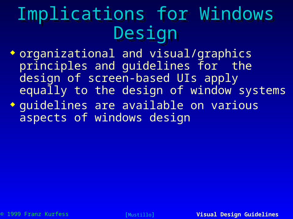
Implications for Windows DesignImplications for Windows Design
organizational and visual/graphics principles and guidelines for the design of screen-based UIs apply equally to the design of window systems
guidelines are available on various aspects of windows design
[Mustillo]
© 1999 Franz Kurfess Visual Design Guidelines 60
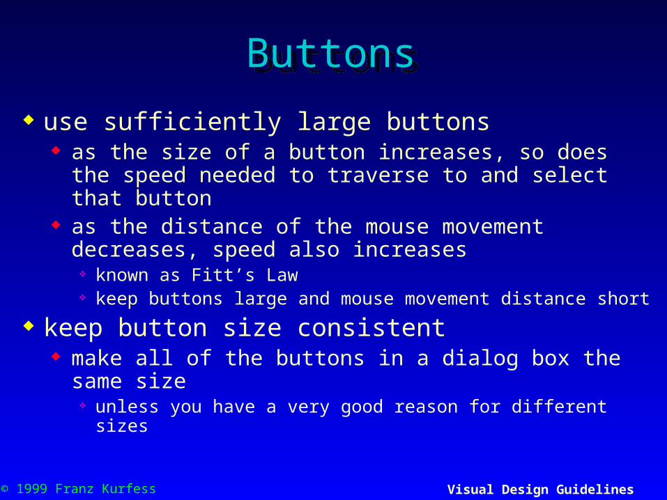
ButtonsButtons
use sufficiently large buttons as the size of a button increases, so does the speed
needed to traverse to and select that button as the distance of the mouse movement decreases, speed
also increases known as Fitt’s Law keep buttons large and mouse movement distance short
keep button size consistent make all of the buttons in a dialog box the same size
unless you have a very good reason for different sizes

© 1999 Franz Kurfess Visual Design Guidelines 61
Buttons (cont.)Buttons (cont.) group buttons together
similar functions to leave the window (OK, Cancel) destructive actions (Delete)
use heading style capitalization for button labels capitalize the first letter in each word of the button label
label and order buttons consistently clear and concise button labels affirmative buttons to leave a window (OK) canceling actions to leave the window (Cancel)
assign a nondestructive default button gray out or (dim) a button if it is unavailable
[Mustillo]

© 1999 Franz Kurfess Visual Design Guidelines 62
MenusMenus
maintain a consistent relationship with defined terms and concepts
use ellipsis (…) in items to indicate additional user input Open …, Save as …, Print …
disable inactive menu items e.g., by dimming them out
use check boxes to enable and disable attributes use radio buttons to select one item among
attributes or commands
[Mustillo]

© 1999 Franz Kurfess Visual Design Guidelines 63
Menus (cont.)Menus (cont.) do not use more than two levels of cascading menus
they add complexity to the interface they hide choices by adding a layer to menus are physically more difficult to use should only be used to minimize screen real estate
organize cascading menus with a logical relationship to the menu items they contain
minimize the use of pop-up windows
[Mustillo]

© 1999 Franz Kurfess Visual Design Guidelines 64
Implications for Web DesignImplications for Web Design
navigation design elements user interface consistency
[Mustillo]
© 1999 Franz Kurfess Visual Design Guidelines 65
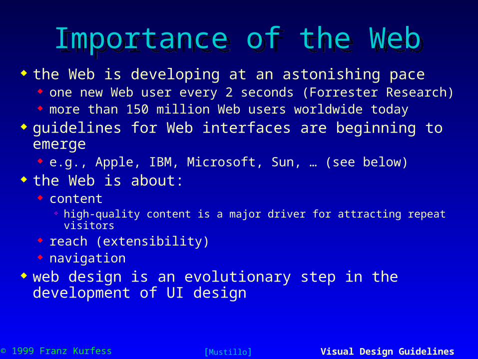
Importance of the WebImportance of the Web the Web is developing at an astonishing pace
one new Web user every 2 seconds (Forrester Research) more than 150 million Web users worldwide today
guidelines for Web interfaces are beginning to emerge e.g., Apple, IBM, Microsoft, Sun, … (see below)
the Web is about: content
high-quality content is a major driver for attracting repeat visitors reach (extensibility) navigation
web design is an evolutionary step in the development of UI design
[Mustillo]

© 1999 Franz Kurfess Visual Design Guidelines 66
NavigationNavigation
Web sites or browsers should provide the following navigational aids active table of contents backtracking and history lists site maps bookmarks (Netscape) or favorites (Internet Explorer) timestamps
don’t date information unless it is updated frequently. users will immediately leave a site if they see that the information is
not current tell users how often information will be updated update information automatically
[Mustillo]

© 1999 Franz Kurfess Visual Design Guidelines 67
Design ElementsDesign Elements frames
splitting a page into frames can be confusing for users frames may break the fundamental model of the Web page
printouts become more complicated predictability of user actions may be violated
graphics not all Web designers are good graphic designers users have a short attention span
if downloading a page takes longer than 10 sec., they may leave
scrolling text, marquees, animated sequences do not include page elements that move all of the time
overwhelming to many users, annoying to others users are very sensitive to motion in the periphery
may distract from real task
[Mustillo]

© 1999 Franz Kurfess Visual Design Guidelines 68
Design Elements (cont.)Design Elements (cont.)
complex URLs users try to infer the structure of Web sites from the URL should contain a human-readable directory and file names
reflect the nature of the information space every page should have a link to the home page and an indication of
where it will fit within the structure of the information space
orphan pages make sure that all pages include a clear indication of what
Web site they belong to users may access pages without going through the home page
outdated information information on the Web can get out of date very quickly
[Mustillo]

© 1999 Franz Kurfess Visual Design Guidelines 69
NavigationNavigation
navigational support users don’t know as much about your site as you do users get lost very easily
provide a site map let your users know where they are and where they can go
provide a good search mechanism sometimes even the best navigation mechanism is not enough some users want to jump directly to the page they need
non-standard link colors links to pages that users have not seen are typically blue links to previously visited pages are typically purple
(magenta) or red be consistent; don’t mess around with color standards
[Mustillo]
© 1999 Franz Kurfess Visual Design Guidelines 70
TextText
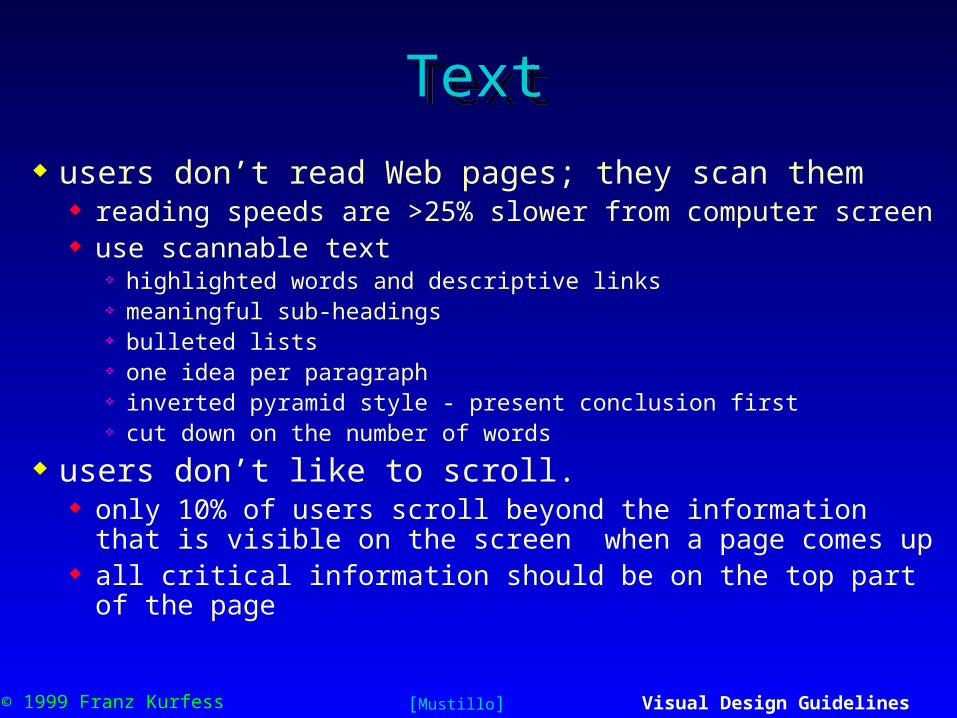
users don’t read Web pages; they scan them reading speeds are >25% slower from computer screen use scannable text
highlighted words and descriptive links meaningful sub-headings bulleted lists one idea per paragraph inverted pyramid style - present conclusion first cut down on the number of words
users don’t like to scroll. only 10% of users scroll beyond the information that is
visible on the screen when a page comes up all critical information should be on the top part of the page
[Mustillo]
© 1999 Franz Kurfess Visual Design Guidelines 71
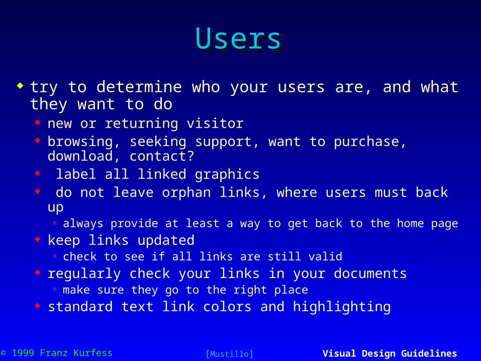
UsersUsers
try to determine who your users are, and what they want to do new or returning visitor browsing, seeking support, want to purchase, download,
contact? label all linked graphics do not leave orphan links, where users must back up
always provide at least a way to get back to the home page keep links updated
check to see if all links are still valid regularly check your links in your documents
make sure they go to the right place standard text link colors and highlighting
[Mustillo]

© 1999 Franz Kurfess Visual Design Guidelines 72
Navigation SupportNavigation Support help users navigate and search
clear and intuitive site info table of contents, index, site map, “What’s New?”
understandable and obvious visual navigation scheme e.g. buttons, text, site maps
search for topics, keywords, names, etc. within a site topics keywords, and names into Web search engines provide navigational aids on every page
make it possible for users to jump right to any page from a Web search engine
let users know where a navigation link will take them
[Mustillo]
© 1999 Franz Kurfess Visual Design Guidelines 73
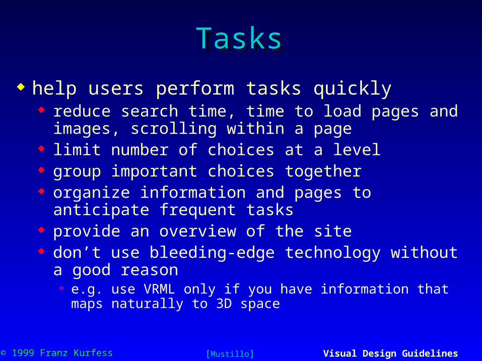
TasksTasks
help users perform tasks quickly reduce search time, time to load pages and images,
scrolling within a page limit number of choices at a level group important choices together organize information and pages to anticipate frequent
tasks provide an overview of the site don’t use bleeding-edge technology without a good reason
e.g. use VRML only if you have information that maps naturally to 3D space
[Mustillo]

© 1999 Franz Kurfess Visual Design Guidelines 74
ContentContent keep content simple
address only one topic per page get to the content quickly
place important content at the top of Web hierarchy and at the top of the Web page
provide printable versions of Web pages
[Mustillo]

© 1999 Franz Kurfess Visual Design Guidelines 75
ConsistencyConsistency
establish user interface consistency corporate identity
graphics, images, colors, fonts, and layout use the corporate identity consistently throughout the Web interface
consistent link and navigation schemes throughout the Web interface
consistent headings and terminology display background info
URL, copyrights, e-mail addresses, etc. design the interface to be easily accessible and usable
different browsers, platforms, screen resolutions
[Mustillo]

© 1999 Franz Kurfess Visual Design Guidelines 76
Web ResourcesWeb Resources
Apple Web Design Guide http://www.cybertech.apple.com/hi/web_design/web_design.html
IBM Human-Computer Interaction http://www.ibm.com/ibm/hci/designer/uides/webdesign.html
Sun Microsystems http://www.sun.com/styleguide
Yale Center for Advanced Instructional Media http://info.med.yale.edu/caim/StyleManual_Top.HTML
Jakob Nielsen, Alertbox http://www.useit.com/alertbox
Susan Weinshenk http://www.weinshenk.com
[Mustillo]

© 1999 Franz Kurfess Visual Design Guidelines 79
Important Concepts and TermsImportant Concepts and Terms usability user interface design What You See Is What
You Get” (WYSIWYG) window
ergonomics graphical user interface (GUI) human factors engineering input/output devices knowledge management

© 1999 Franz Kurfess Visual Design Guidelines 80
Chapter SummaryChapter Summary
the visual channel has the highest information transfer capacity from computer to user, and is used very extensively
visual aspects have a strong influence the usability and acceptance of user interfaces
the arrangement of design elements, text, numbers, and graphics determine the appearance of the visual display
color and coding techniques can be used to guide the attention of the user

© 1999 Franz Kurfess Visual Design Guidelines 81