Embed Size (px)
Citation preview
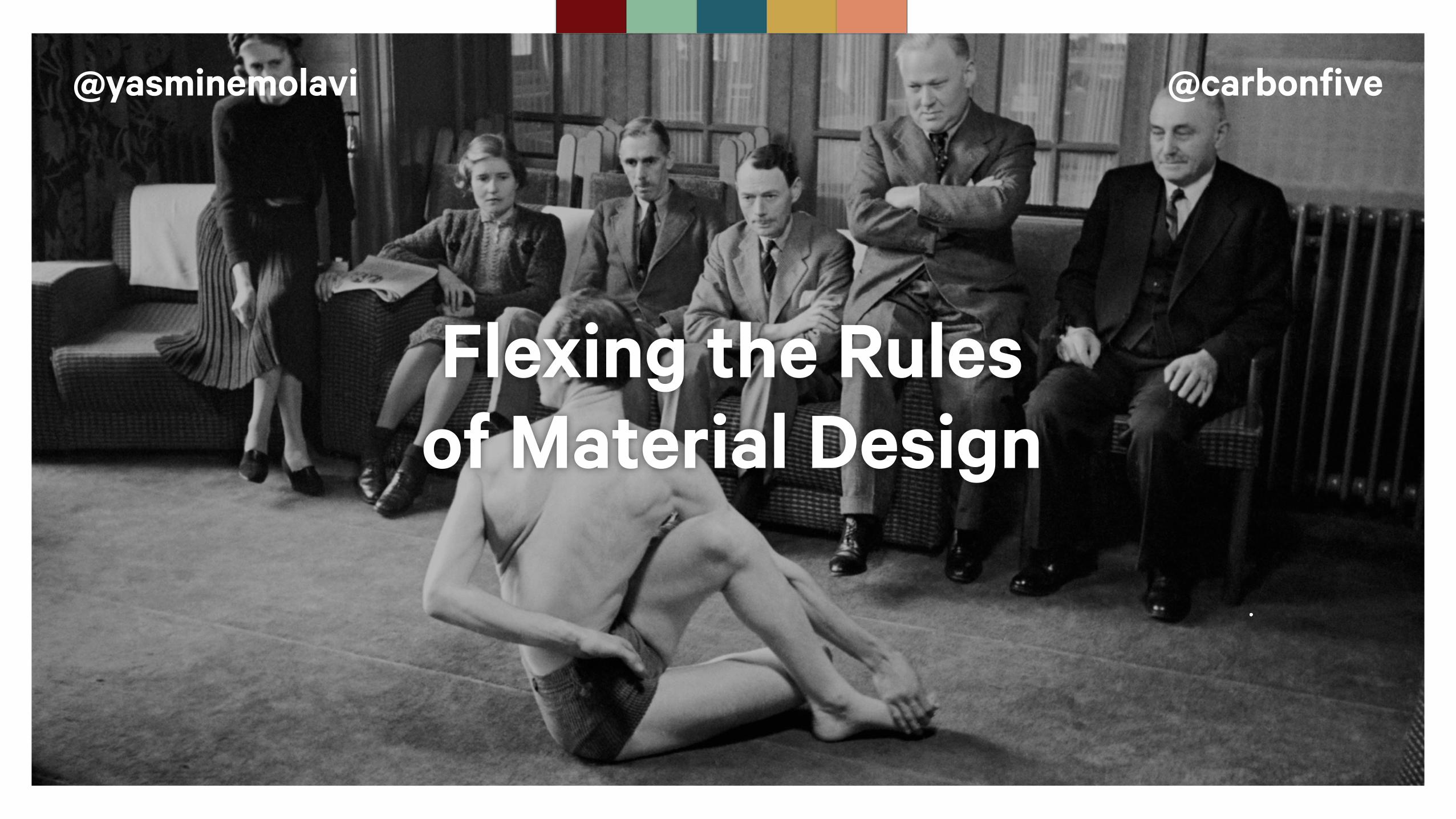
@yasminemolavi @carbonfive
Flexing the Rules of Material Design
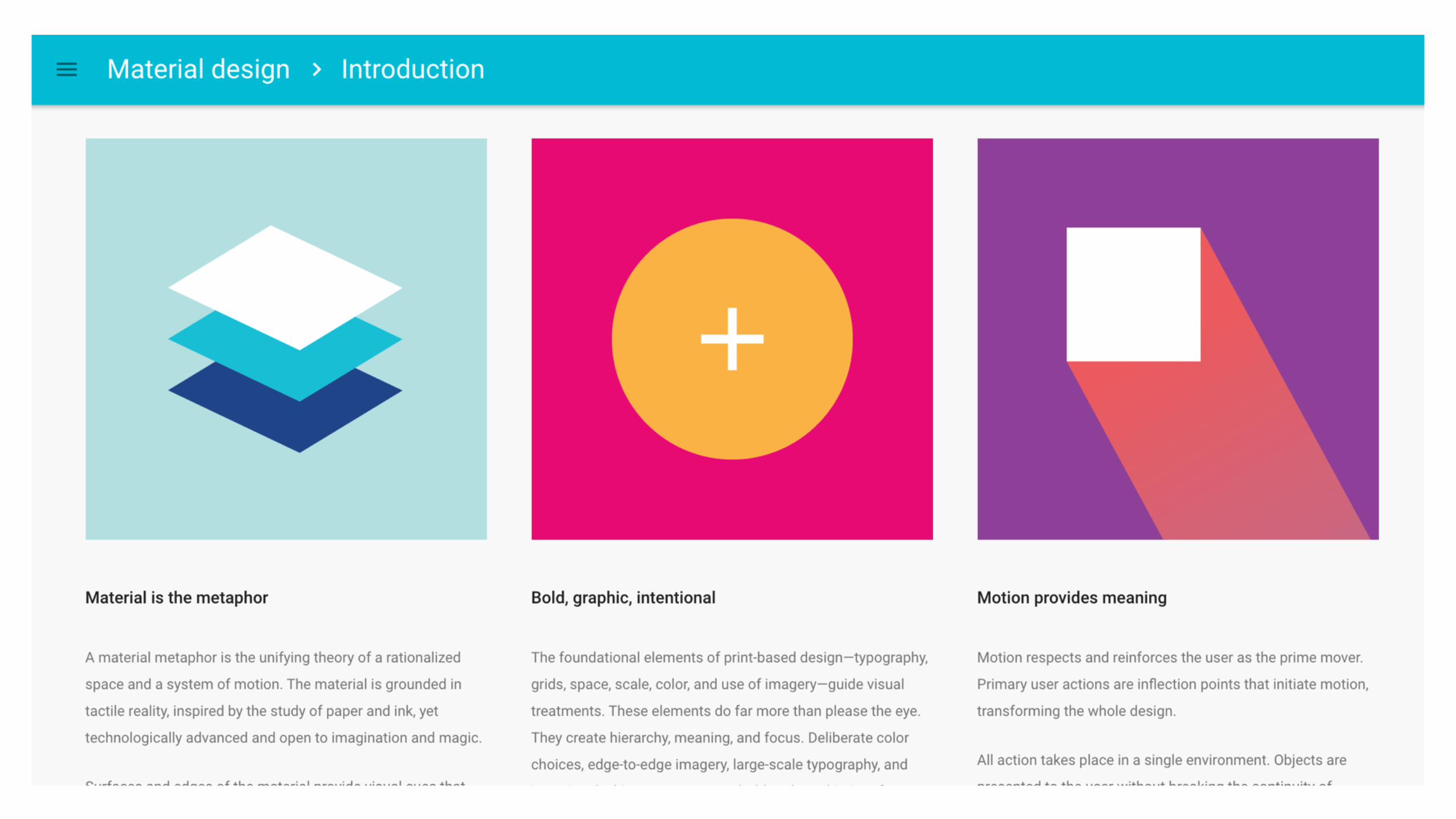
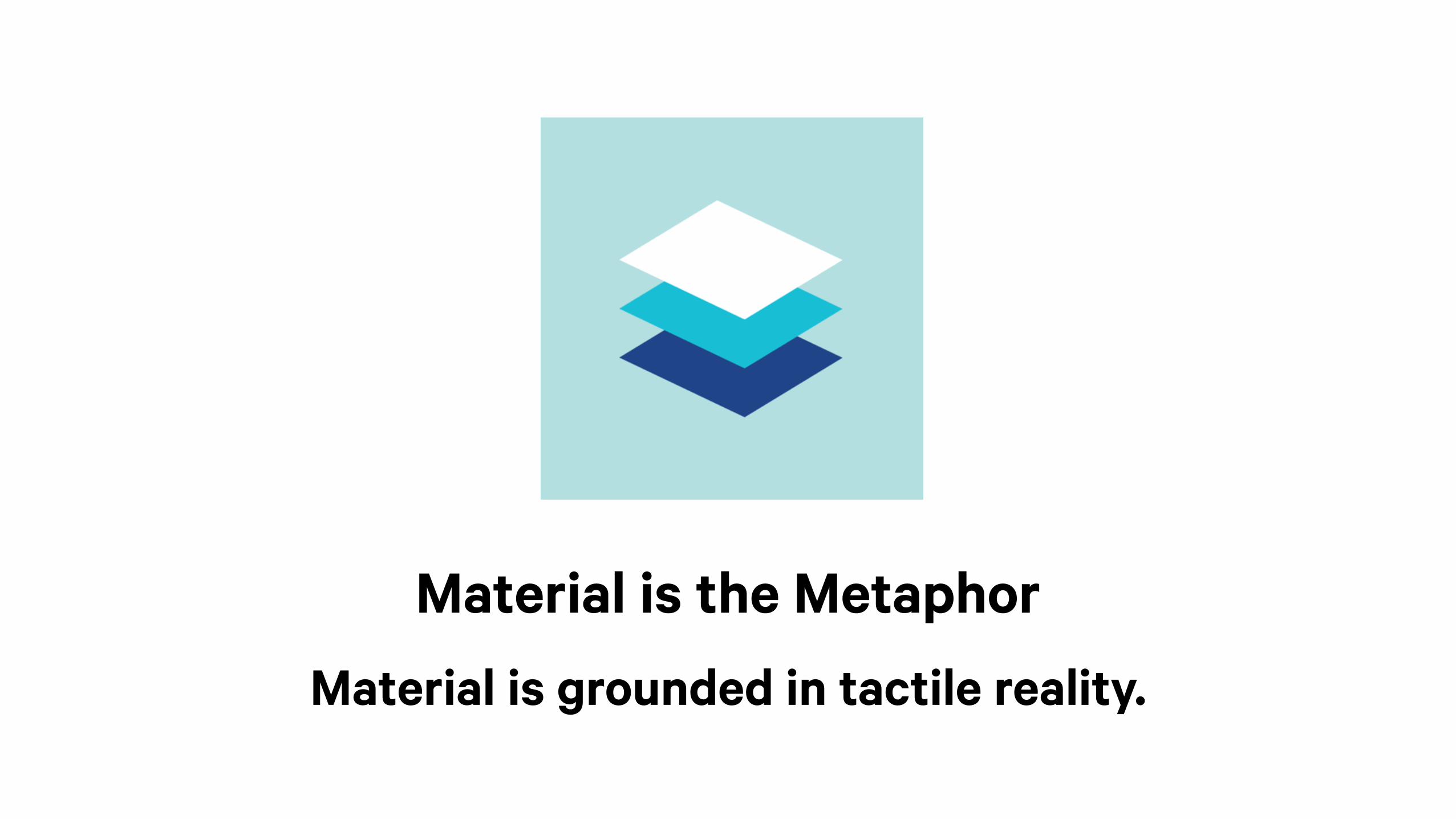
Material is the MetaphorMaterial is grounded in tactile reality.
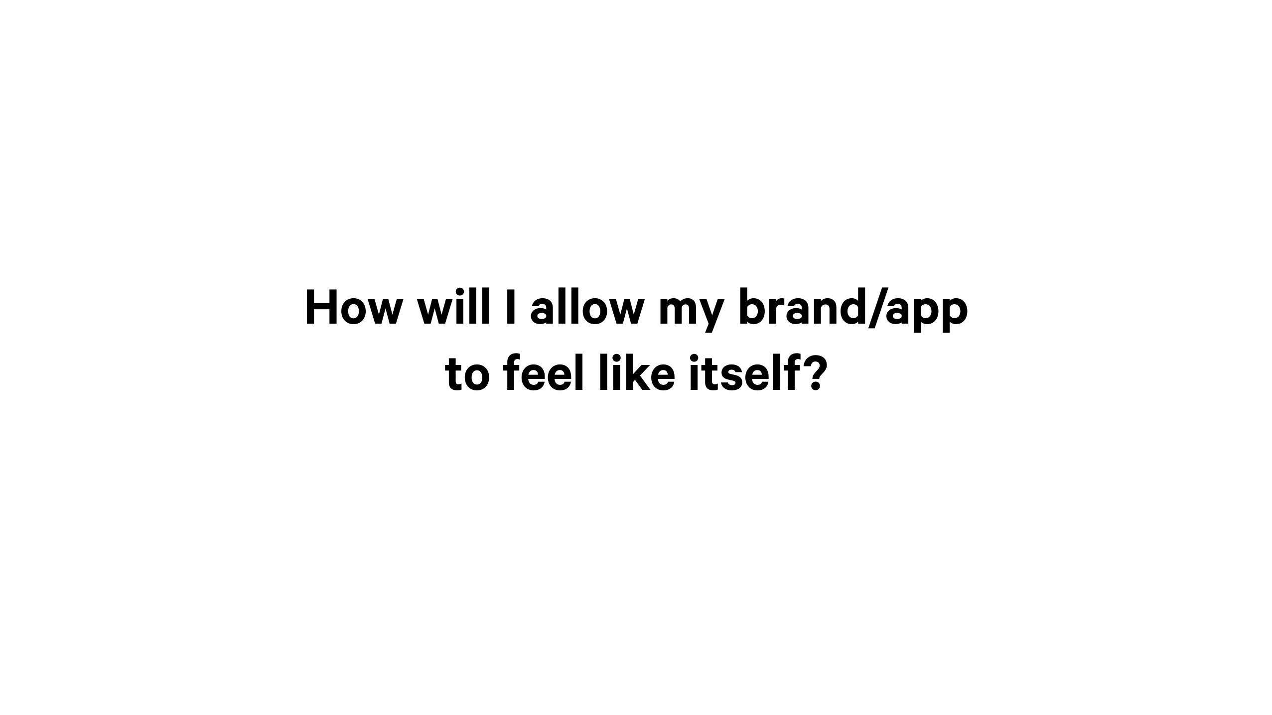
How will I allow my brand/app to feel like itself?
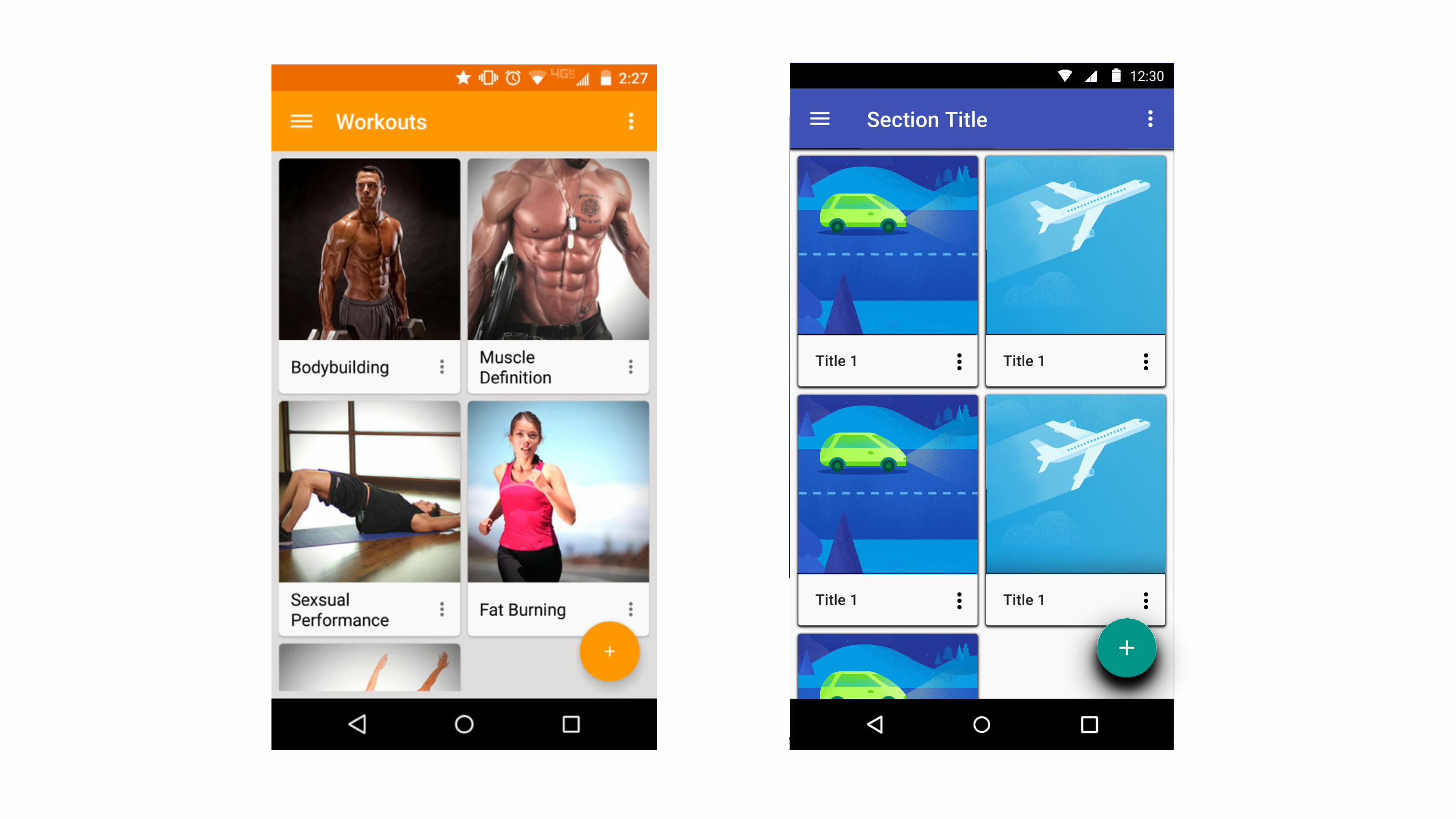
Section Title
12:30
Title 1 Title 1
Title 1 Title 1
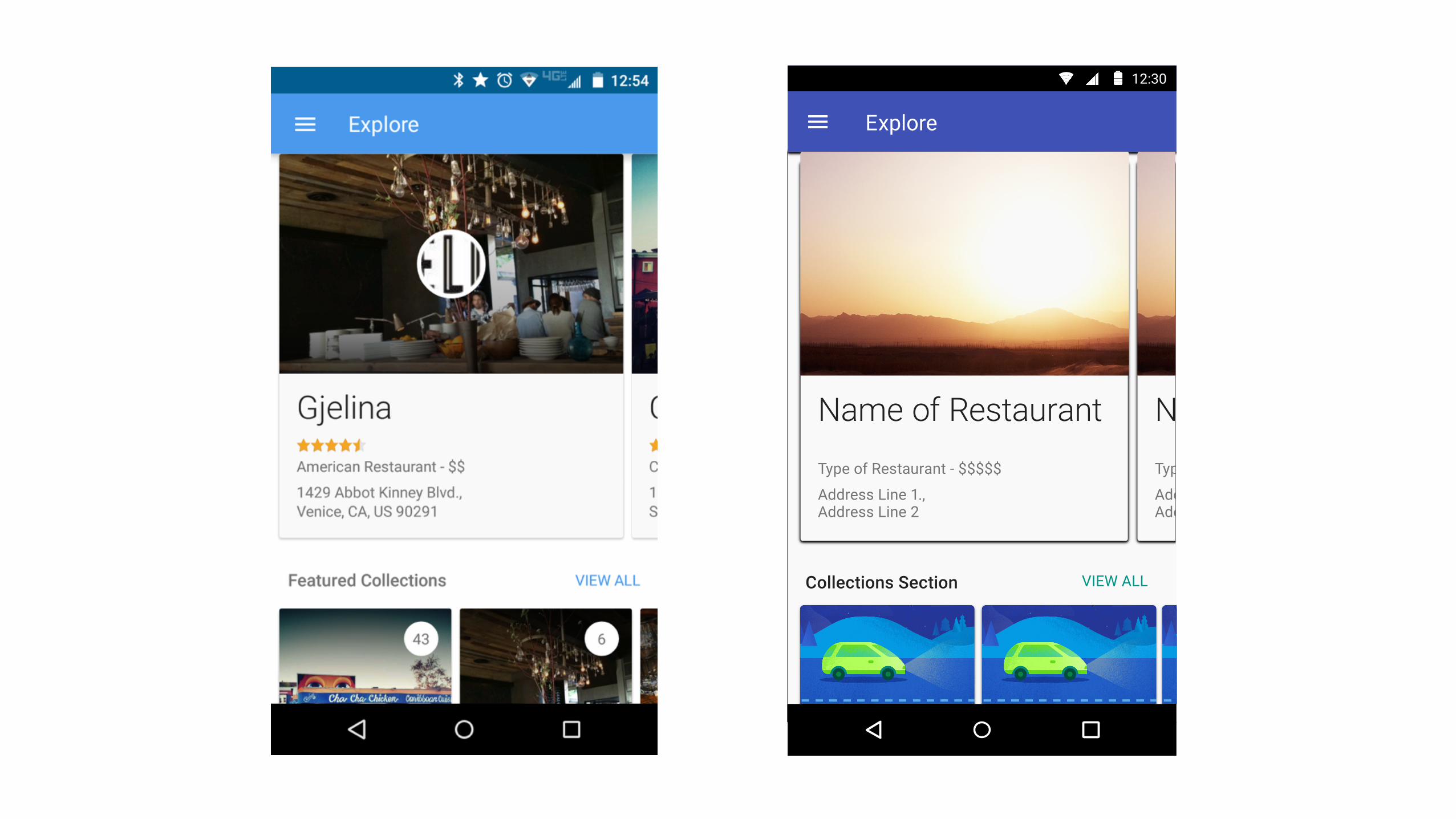
Explore
12:30
VIEW ALL
Type of Restaurant - $$$$$
Address Line 1.,Address Line 2
Name of Restaurant
Collections Section
Type of Restaurant - $$$$$
Address Line 1.,Address Line 2
Name of Restaurant
Five Fundamental Steps
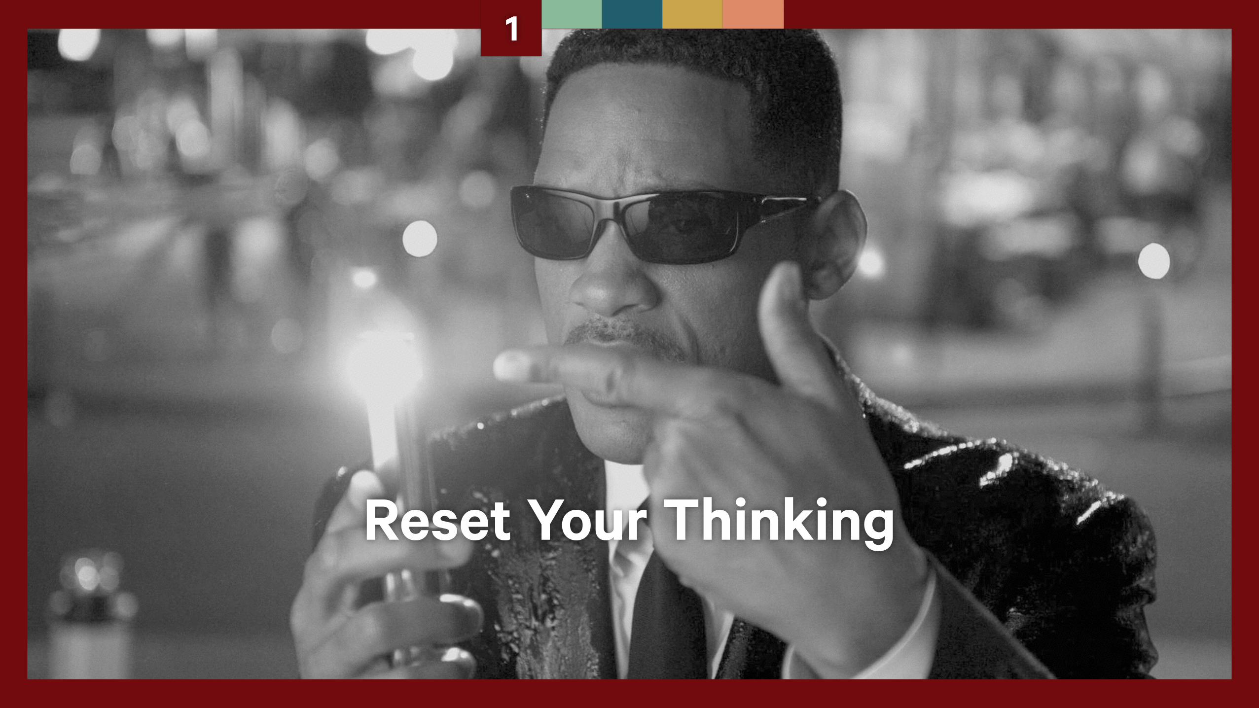
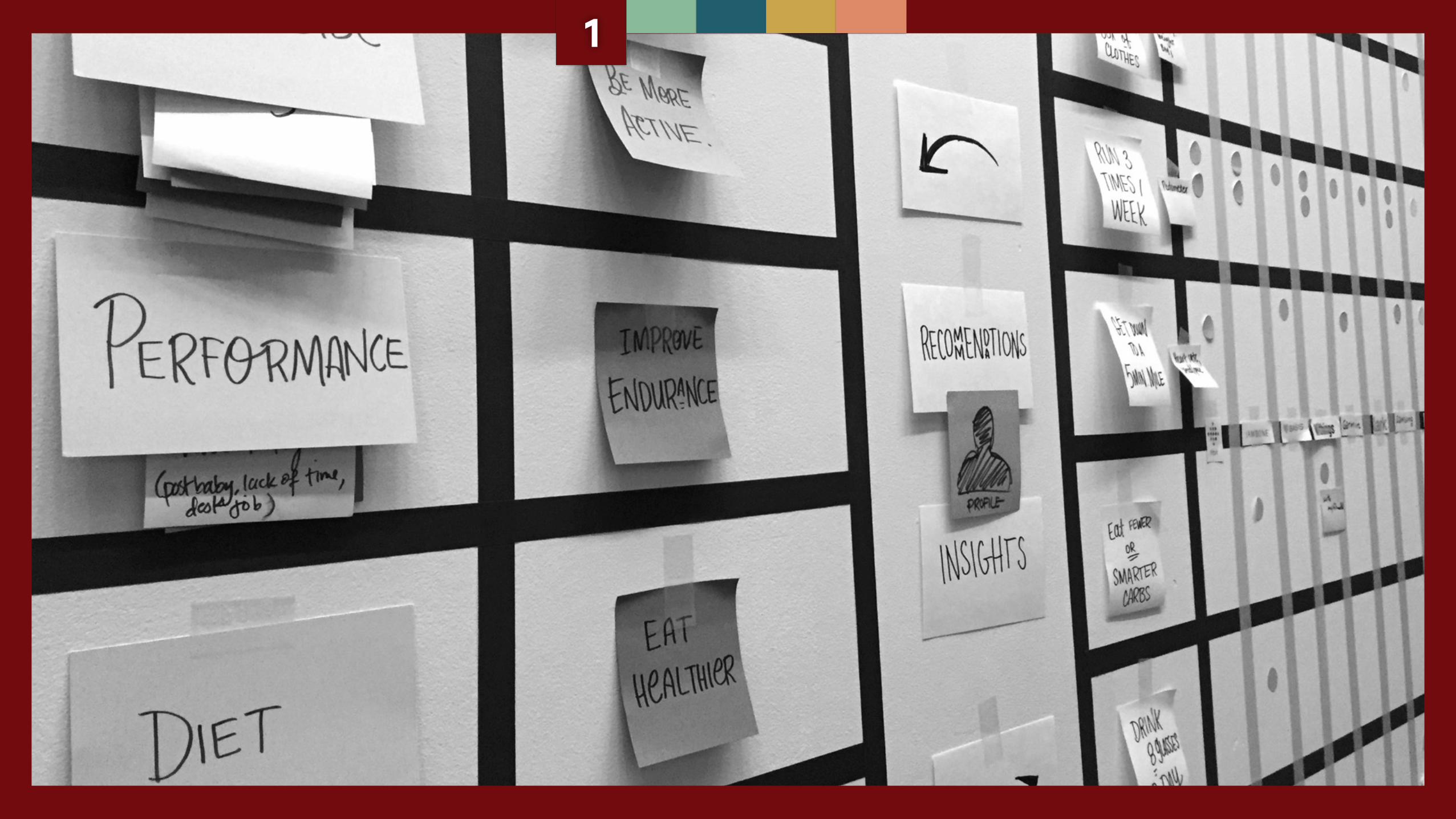
Reset Your Thinking
1
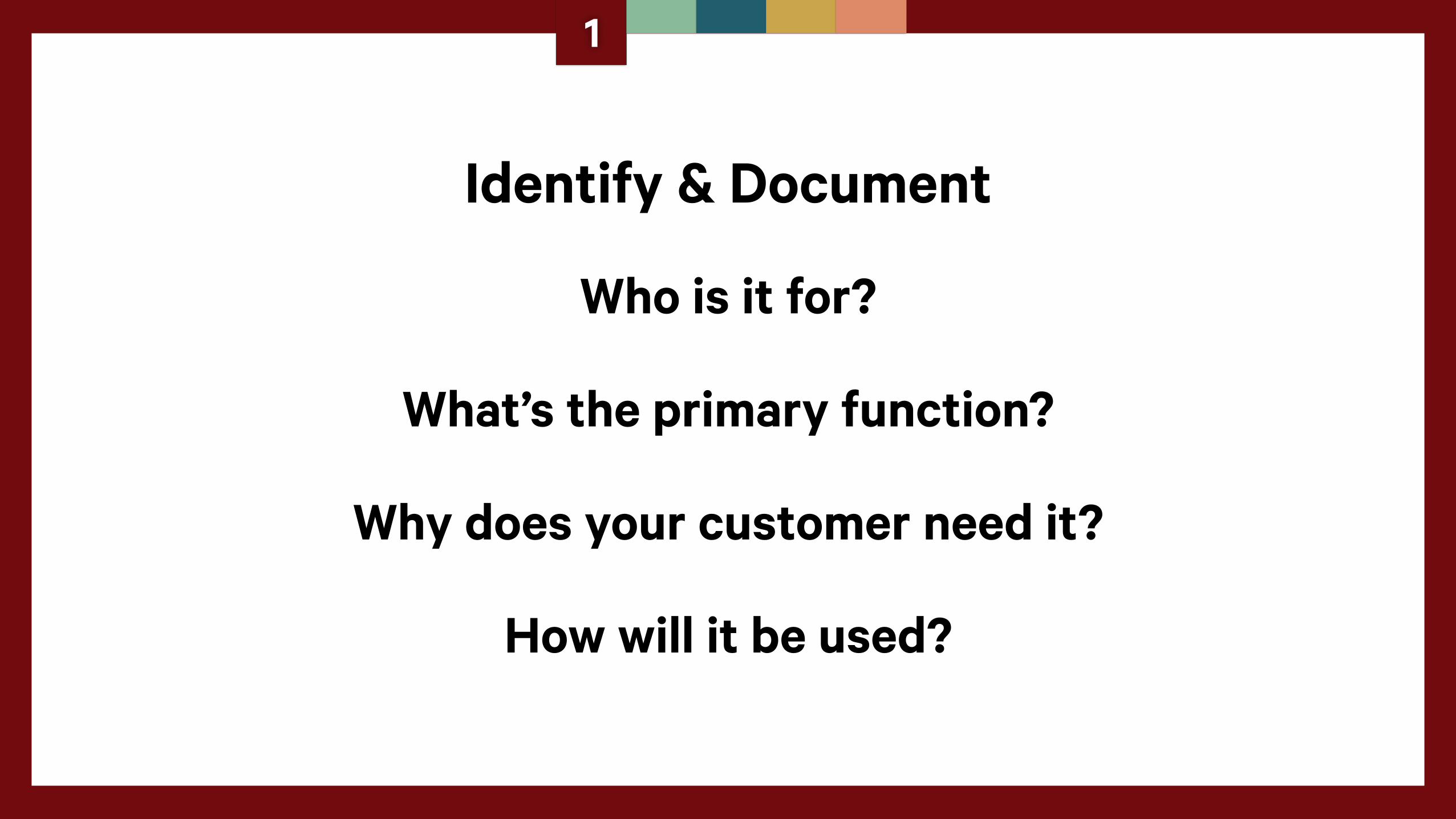
Identify & Document
Who is it for?
What’s the primary function?
Why does your customer need it?
How will it be used?
1
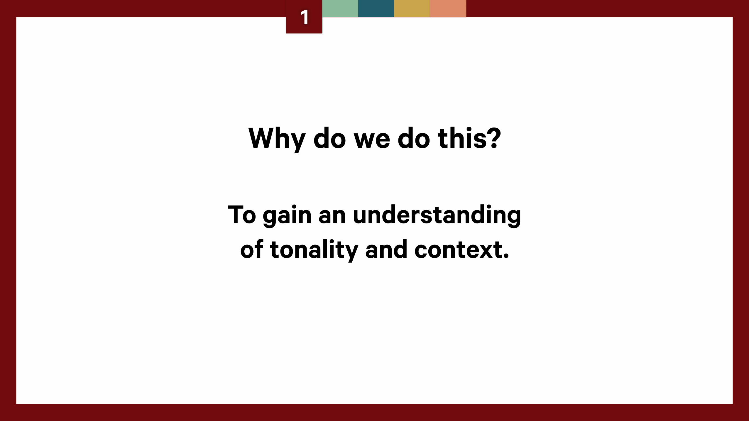
Why do we do this?
To gain an understanding of tonality and context.
1
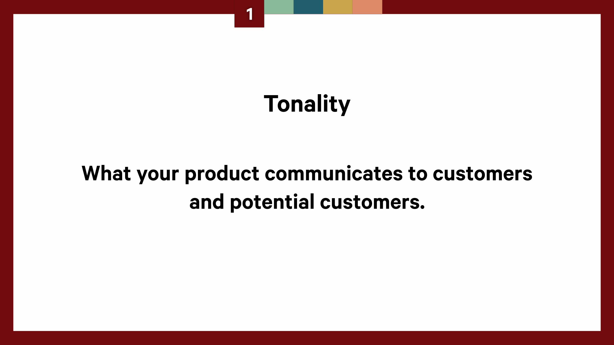
Tonality
What your product communicates to customers and potential customers.
1
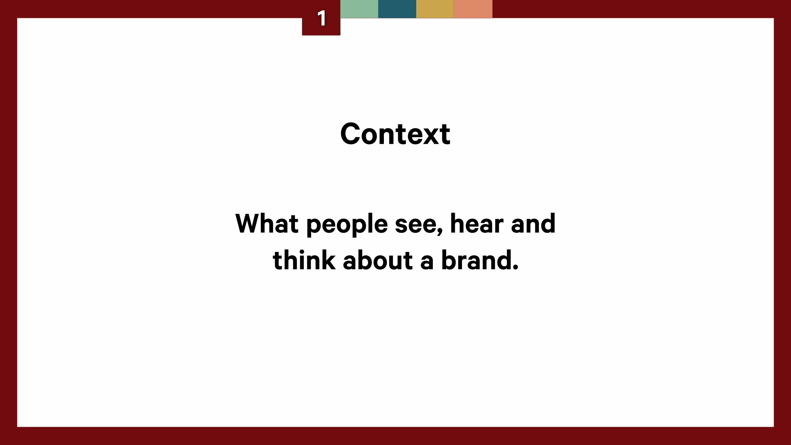
Context
What people see, hear and think about a brand.
1
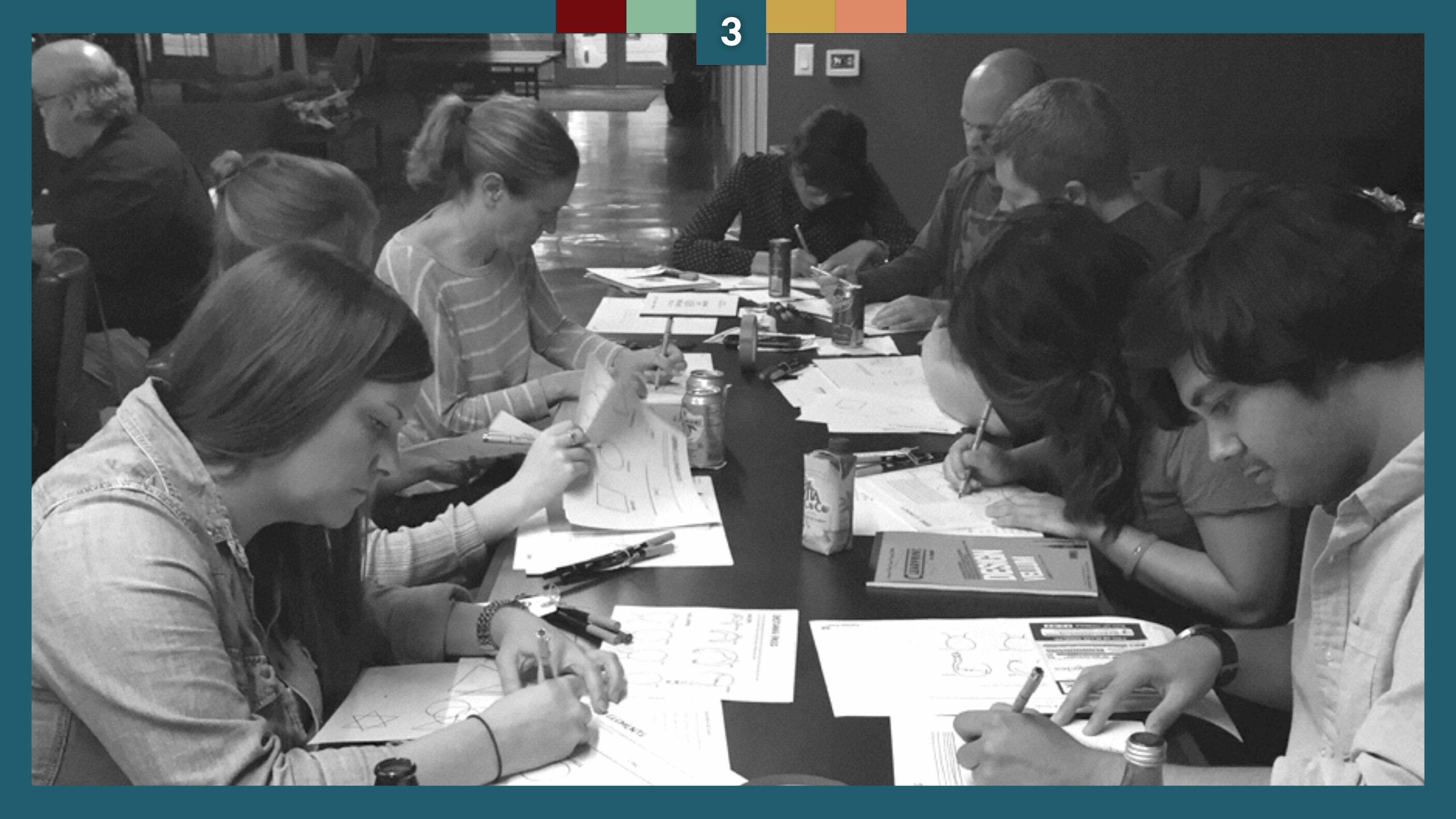
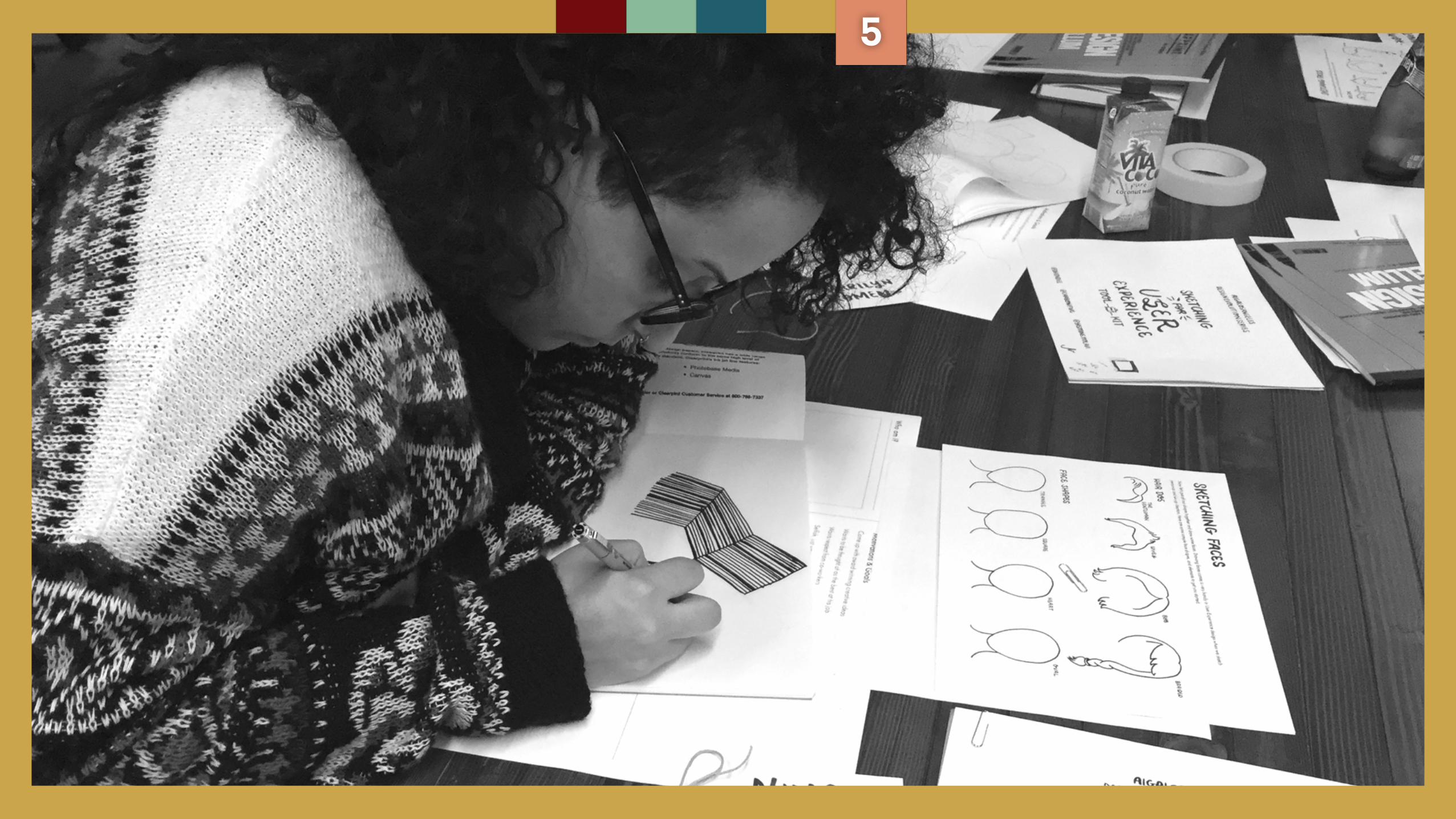
Grab a roll of tape and put it up.
1
1
2
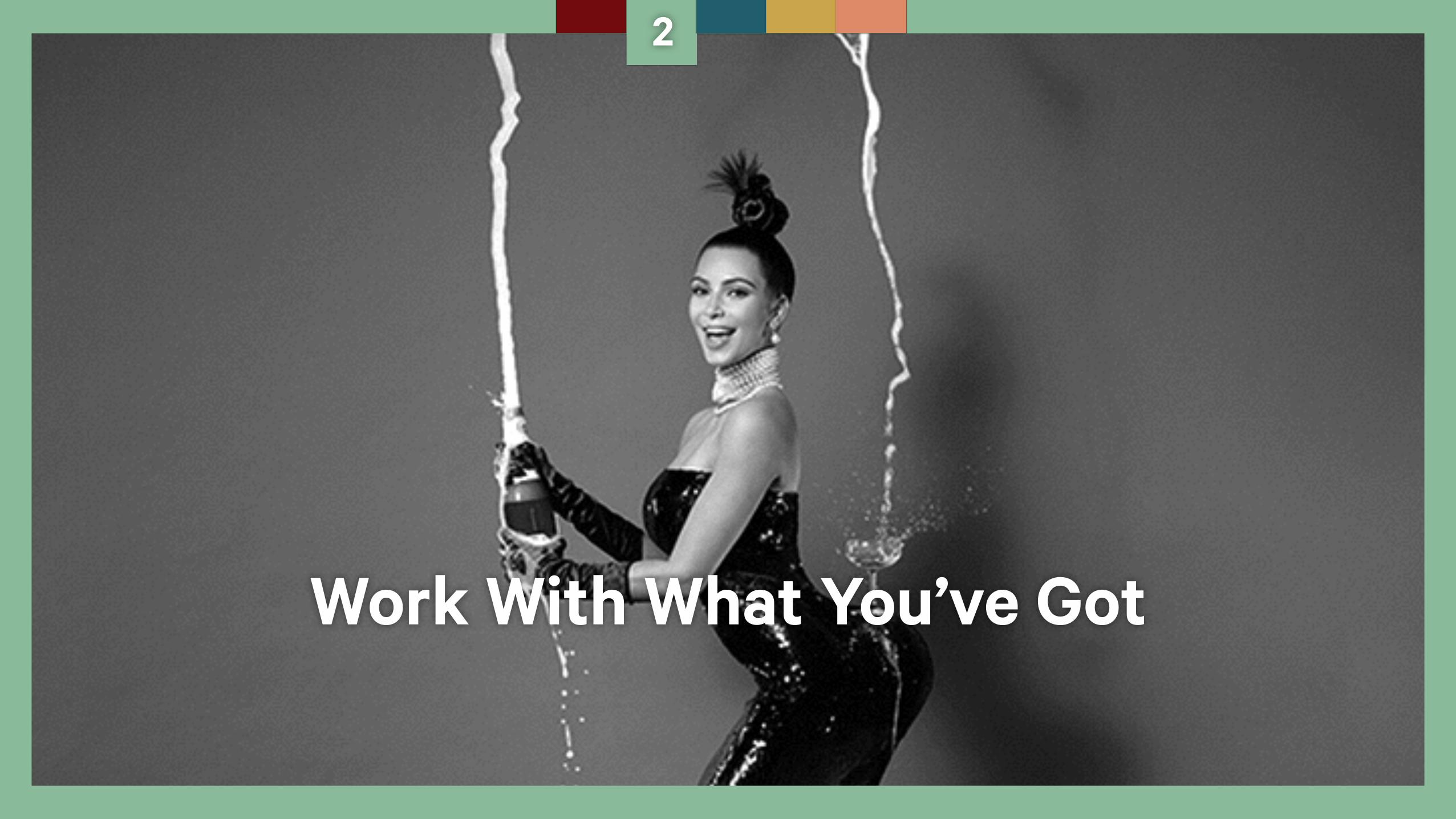
Work With What You’ve Got
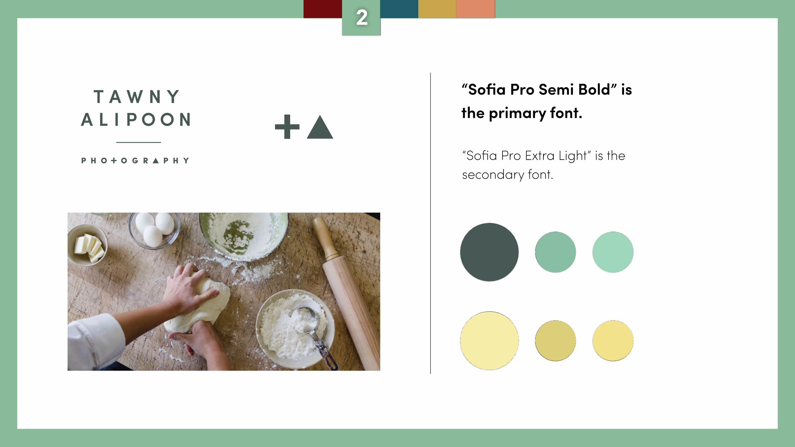
“Sofia Pro Semi Bold” is the primary font.
“Sofia Pro Extra Light” is the secondary font.
2
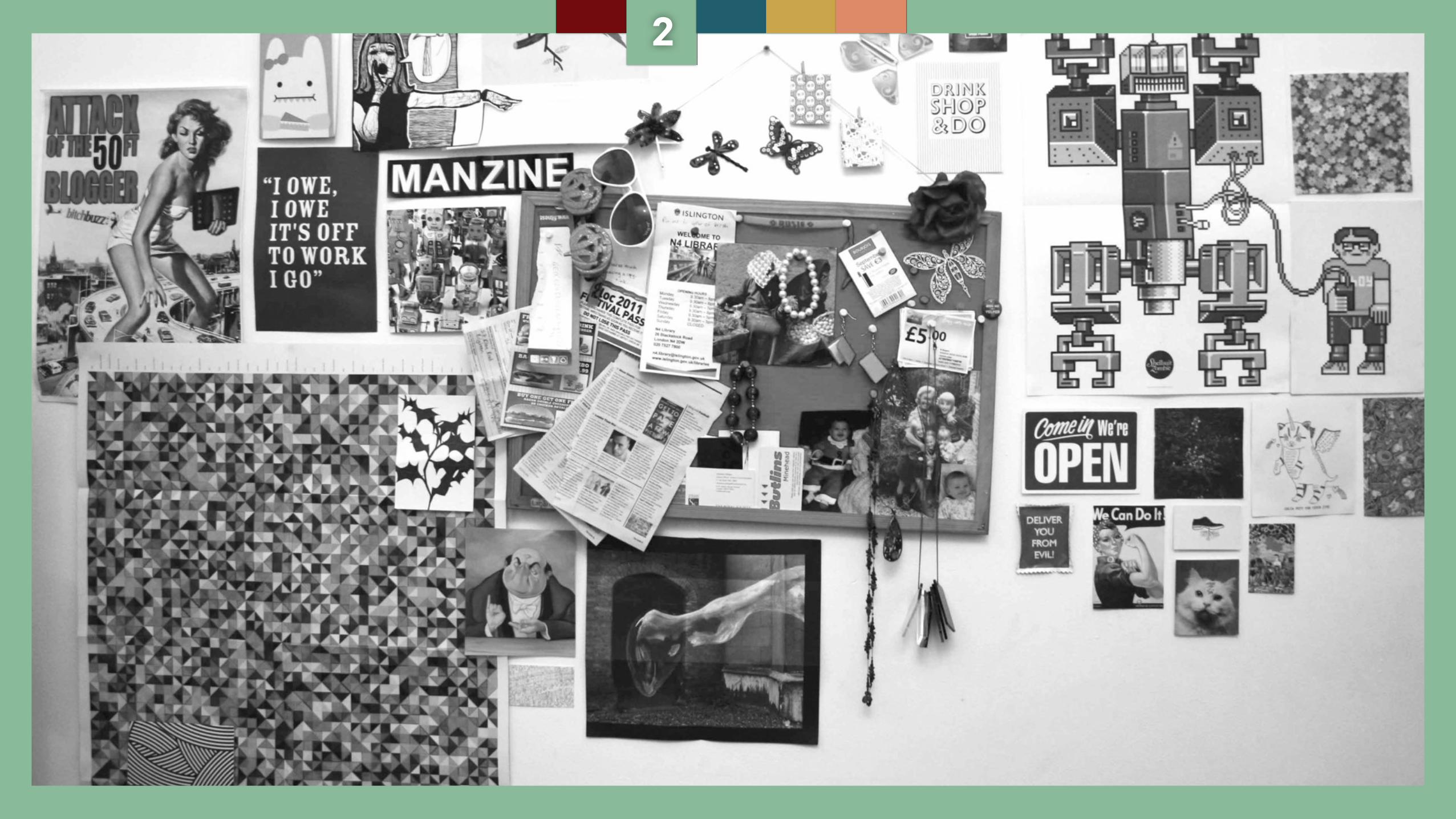
Grab a roll of tape and put it up.
2
2
Look at it and Identify:
What makes your brand unique when compared to Google’s Material Design Guidelines
2
Does your current visual esthetic communicate the elements you
identified in step 1?
2
Look at it and Identify:
If it doesn’t, what are the minimum visual changes you could make to have
your style guide meet the criteria you’ve set in Step 1?
Look at it and Identify:
2
3
What Would Paper Do?
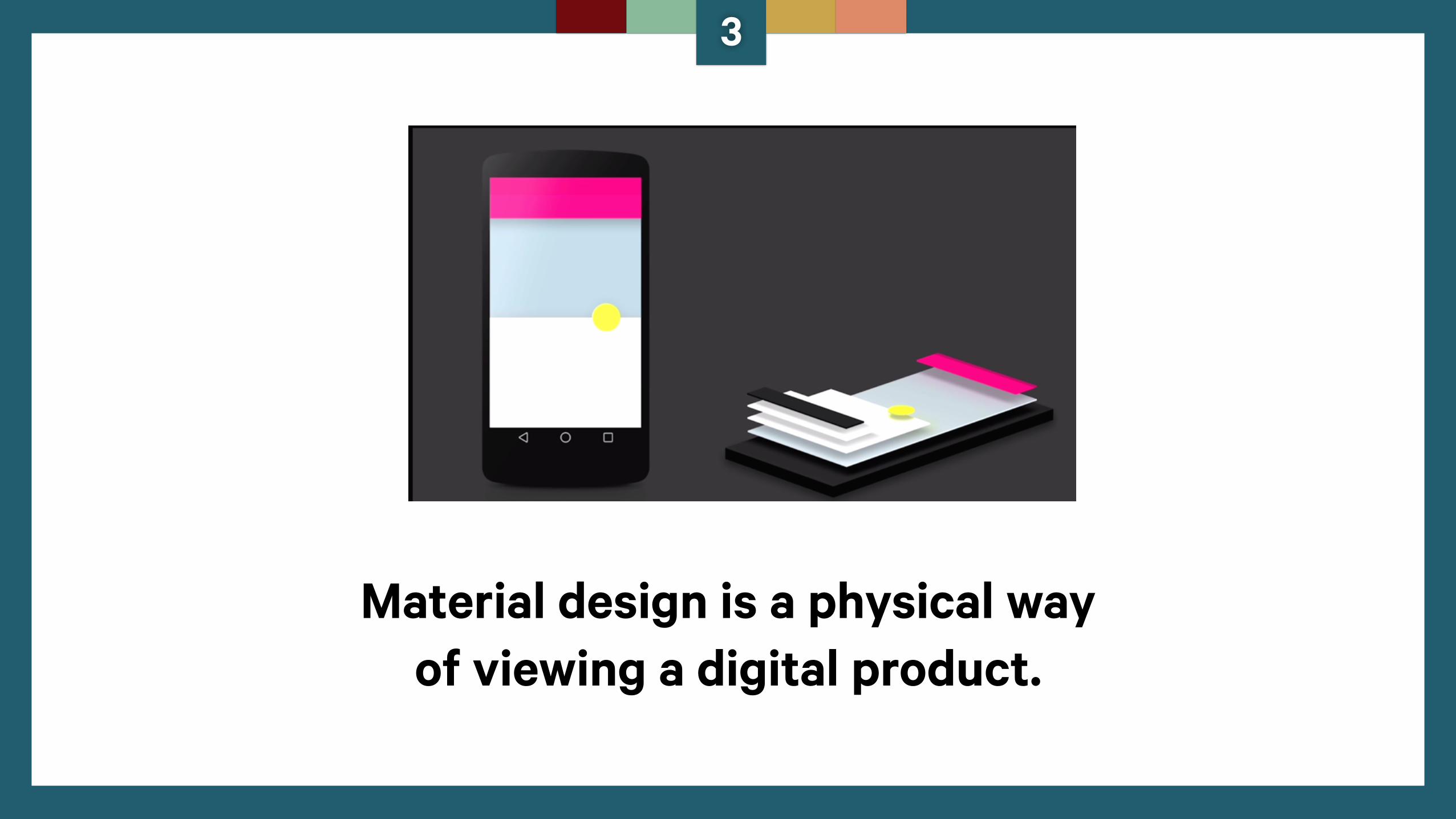
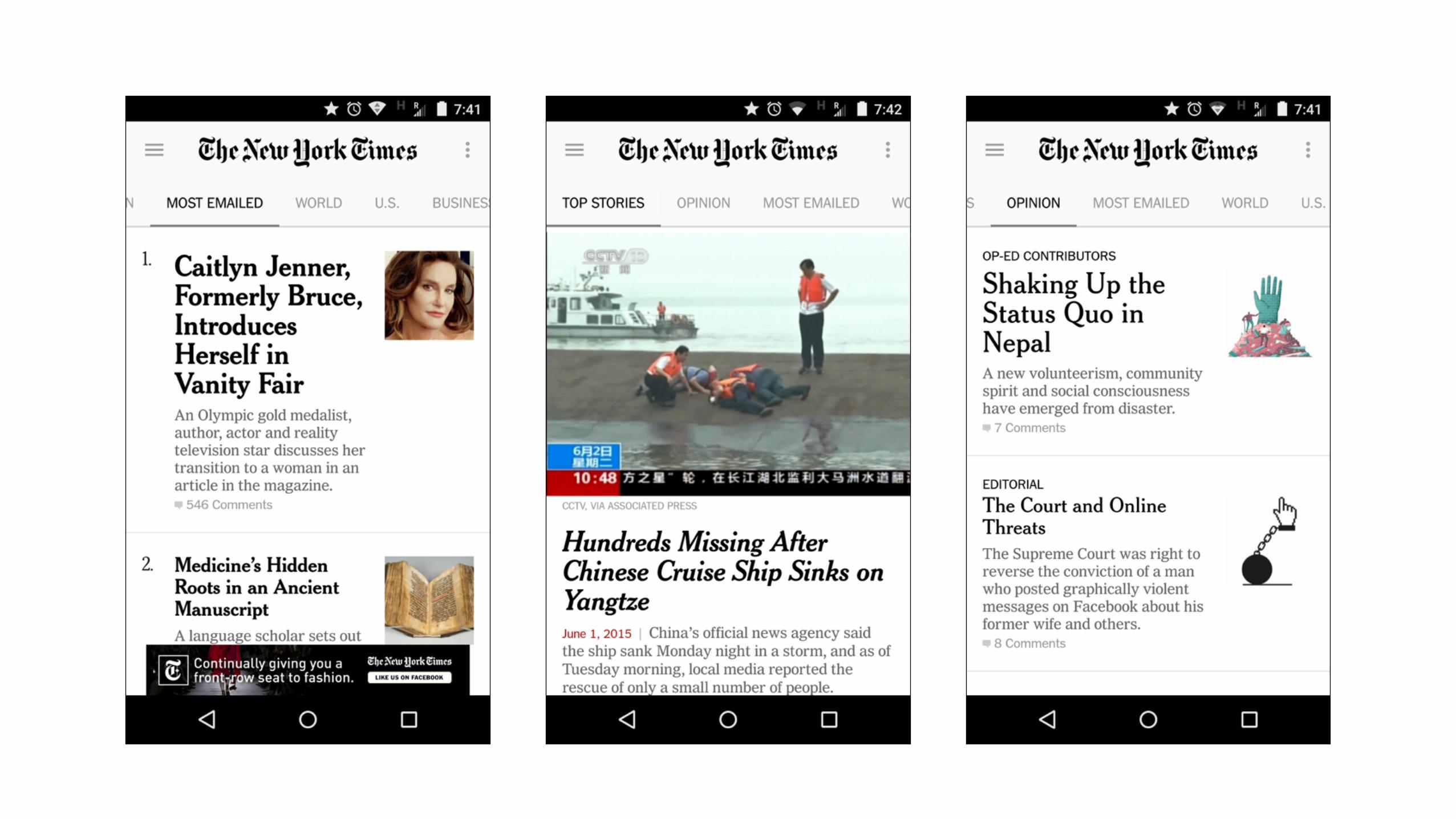
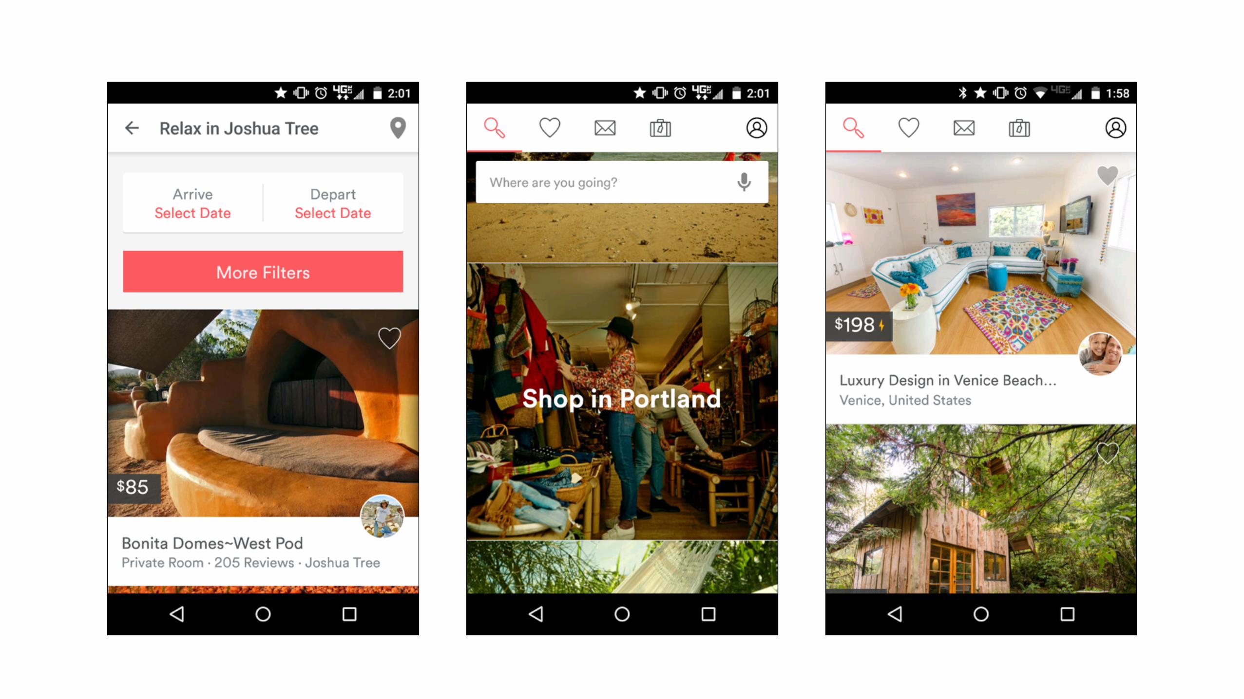
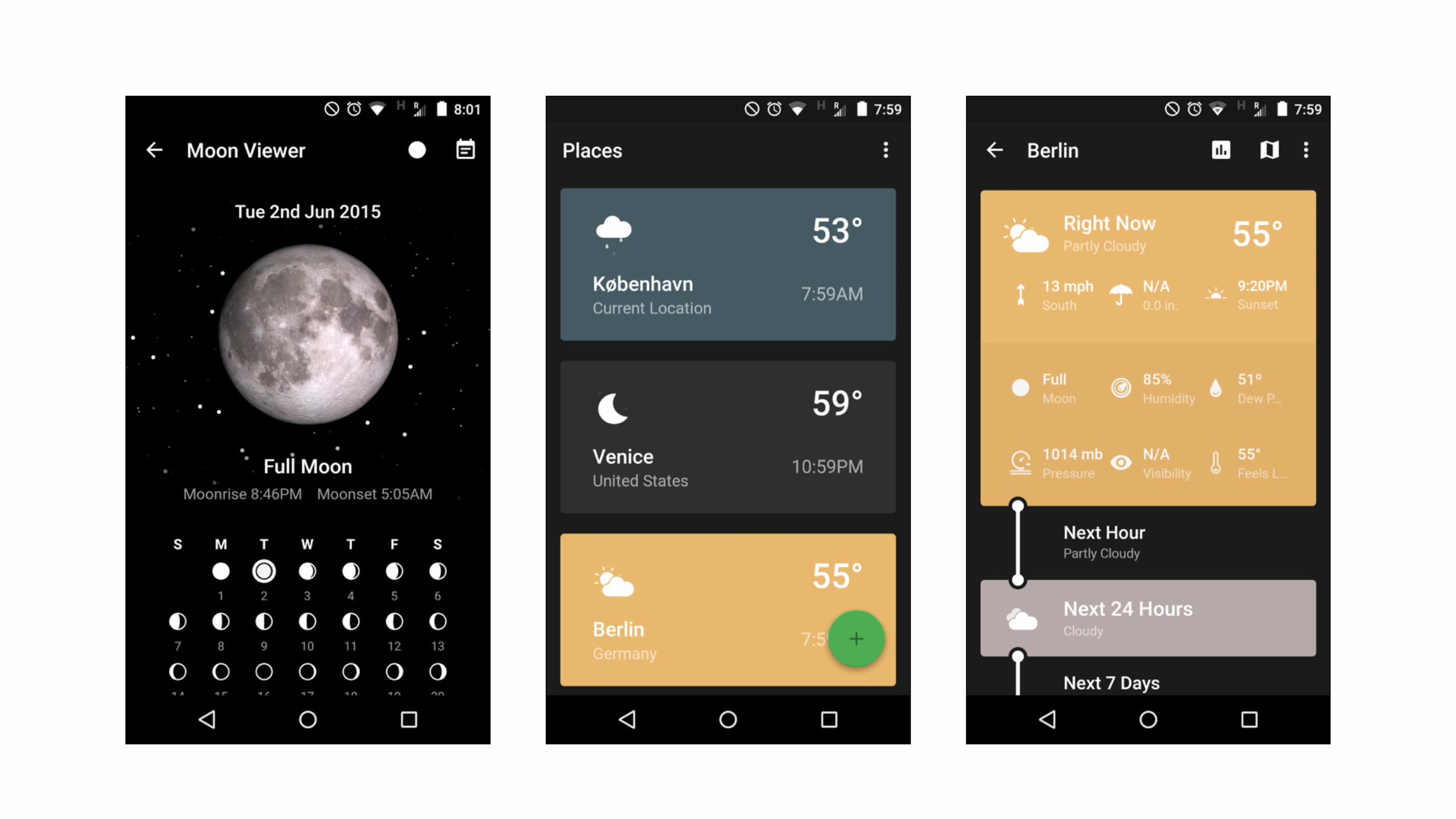
Material design is a physical way of viewing a digital product.
3
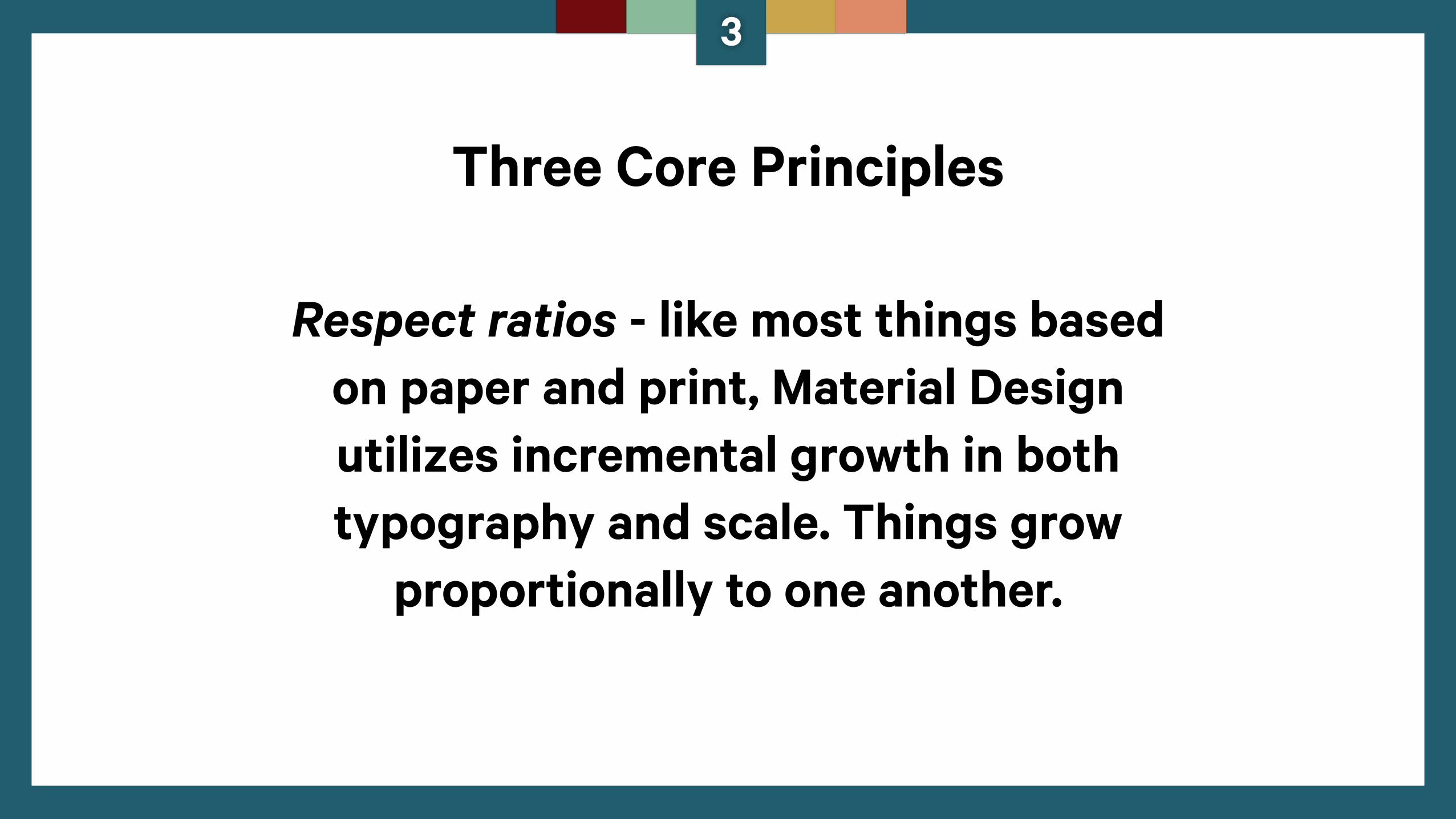
Three Core Principles
Respect ratios - like most things based on paper and print, Material Design utilizes incremental growth in both typography and scale. Things grow
proportionally to one another.
3
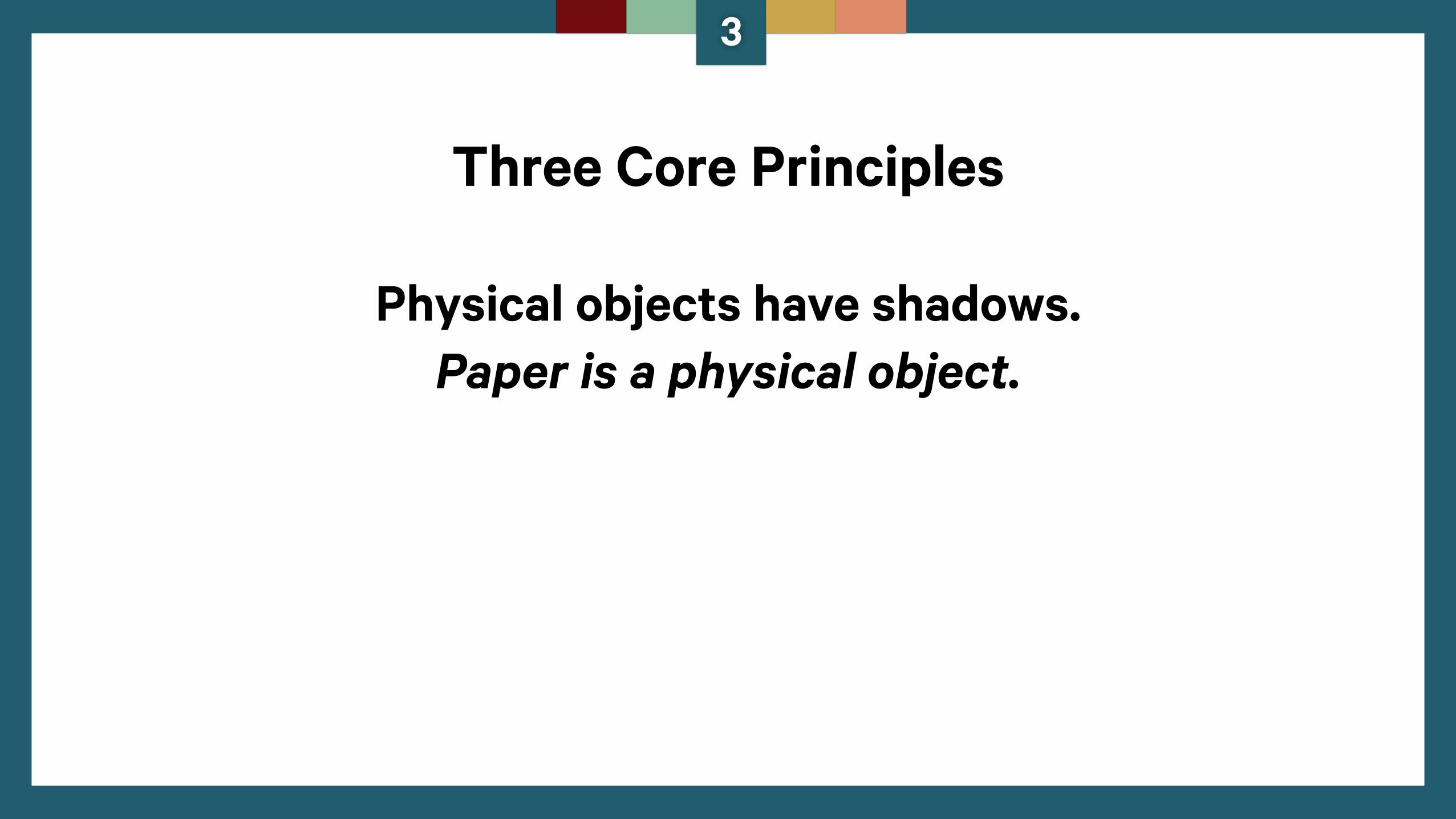
Physical objects have shadows. Paper is a physical object.
3
Three Core Principles
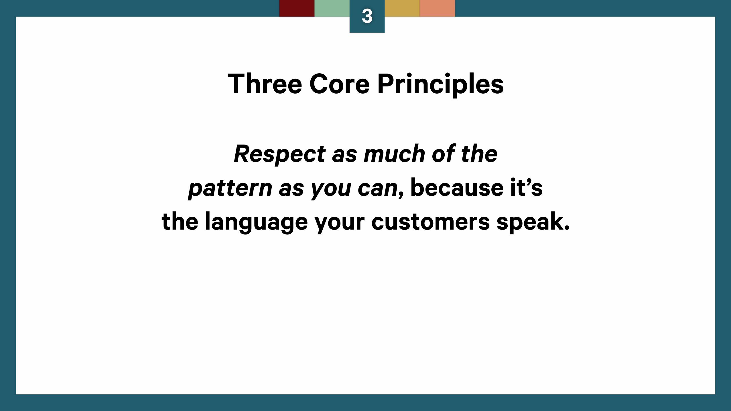
Respect as much of the pattern as you can, because it’s
the language your customers speak.
3
Three Core Principles
3
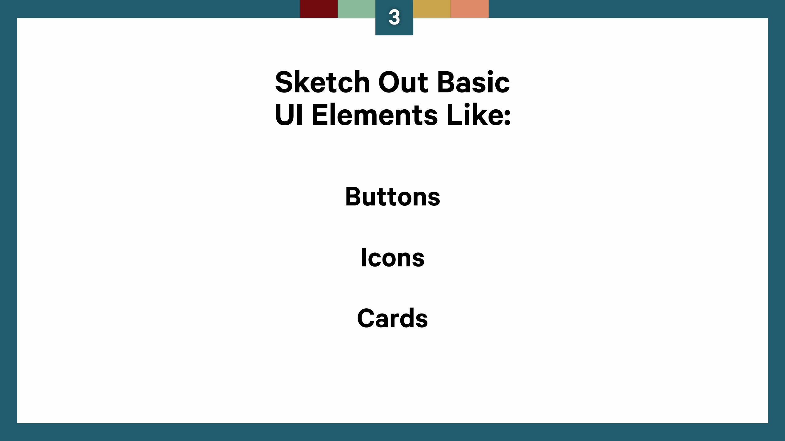
Sketch Out Basic UI Elements Like:
Buttons
Icons
Cards
3
3
But, always consider the tonality and context
you identified in Step 1 for your brand.
Grab a roll of tape and put it up.
3
4
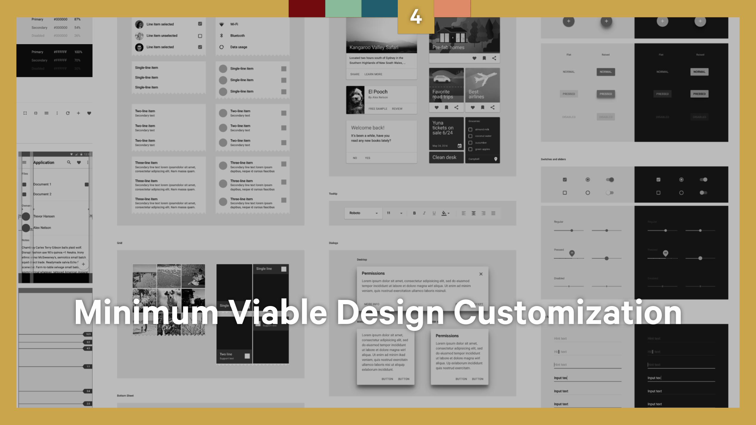
Minimum Viable Design Customization
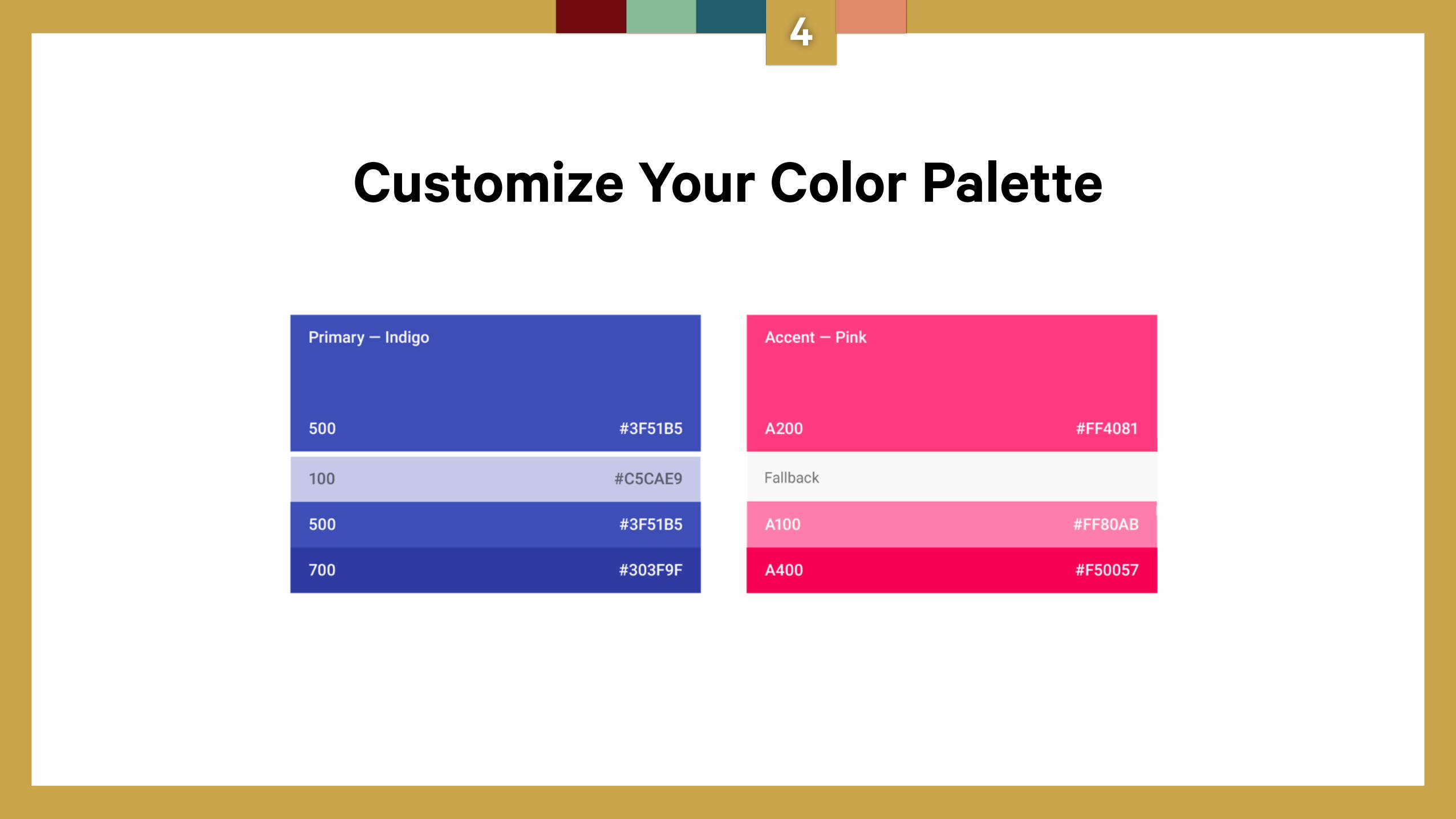
Customize Your Color Palette
4
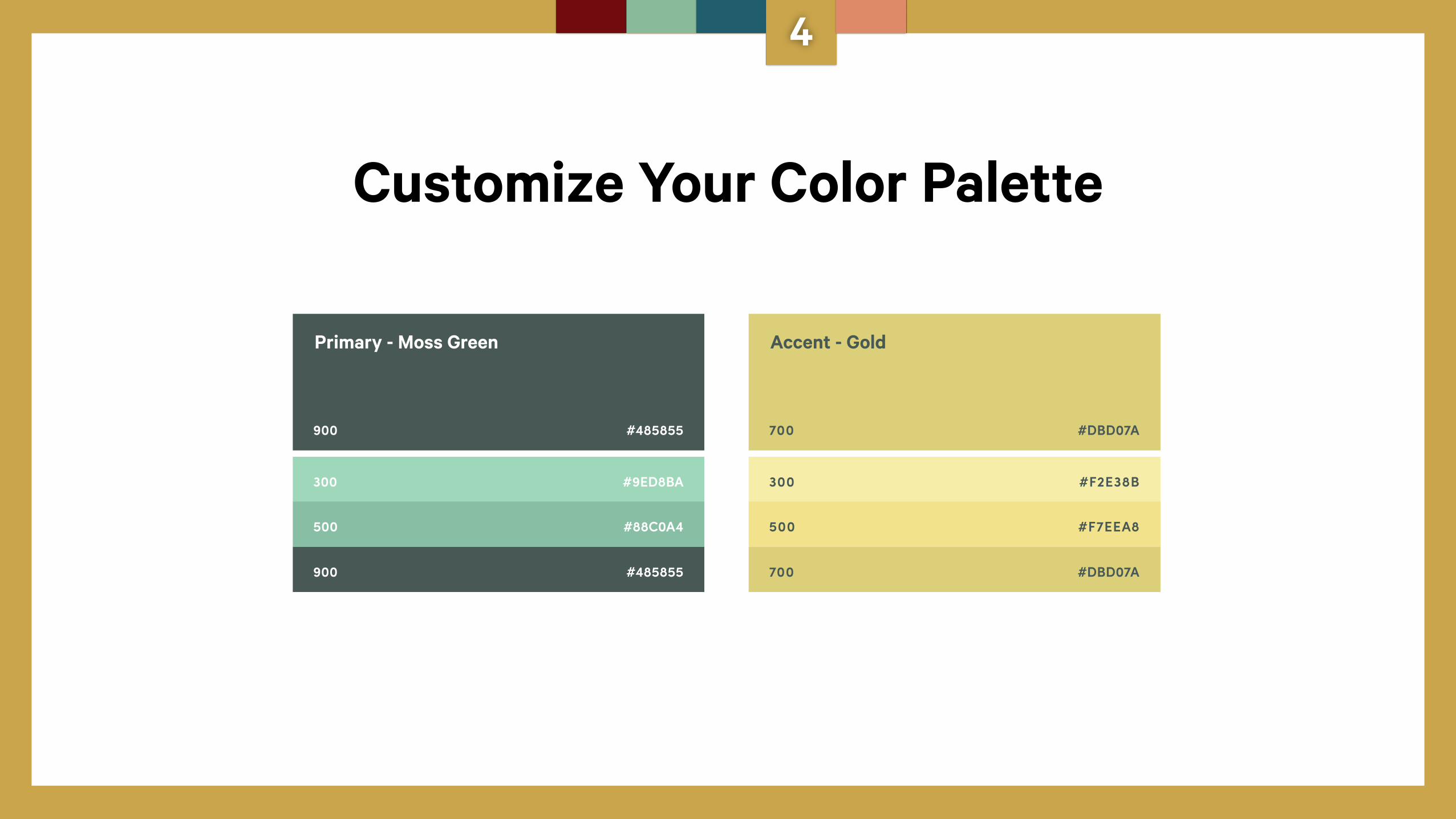
Customize Your Color Palette
900 #485855
300 #9ED8BA
500 #88C0A4
900 #485855
700 #DBD07A
300 #F2E38B
500 #F7EEA8
700 #DBD07A
Primary - Moss Green Accent - Gold
4
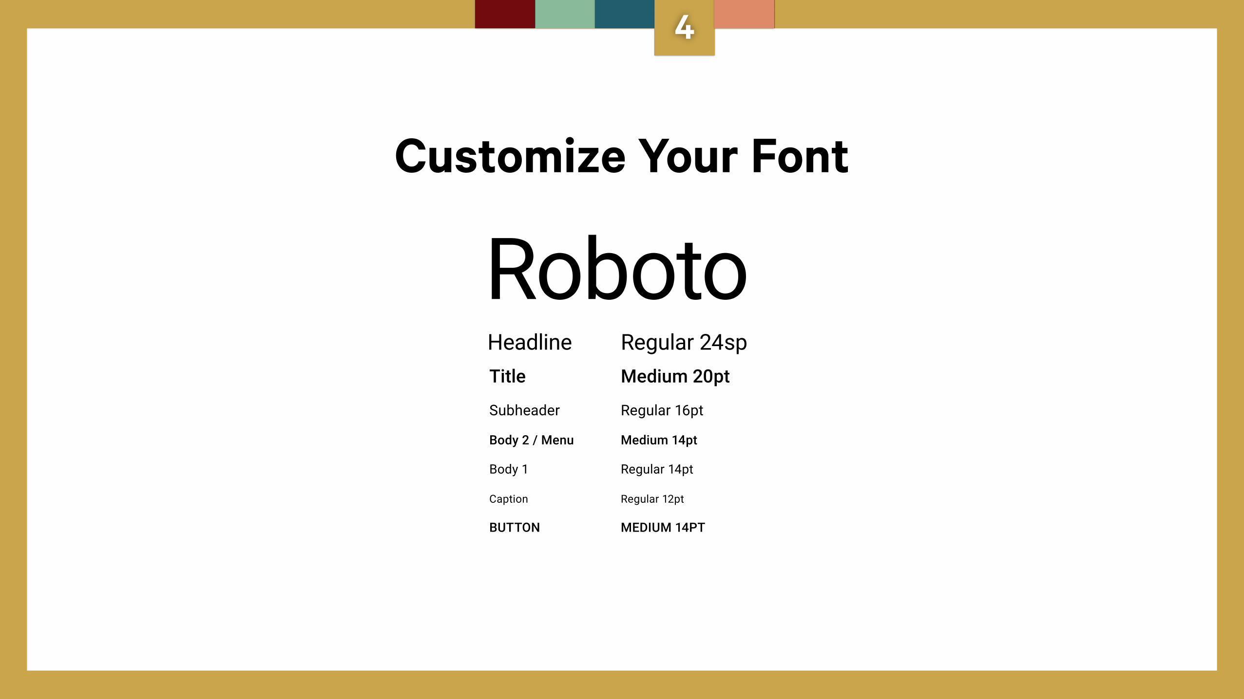
Customize Your Font
Roboto
Subheader
Title
Body 1
Body 2 / Menu
Caption
BUTTON
Regular 16pt
Medium 20pt
Regular 14pt
Medium 14pt
Regular 12pt
MEDIUM 14PT
Headline Regular 24sp
4
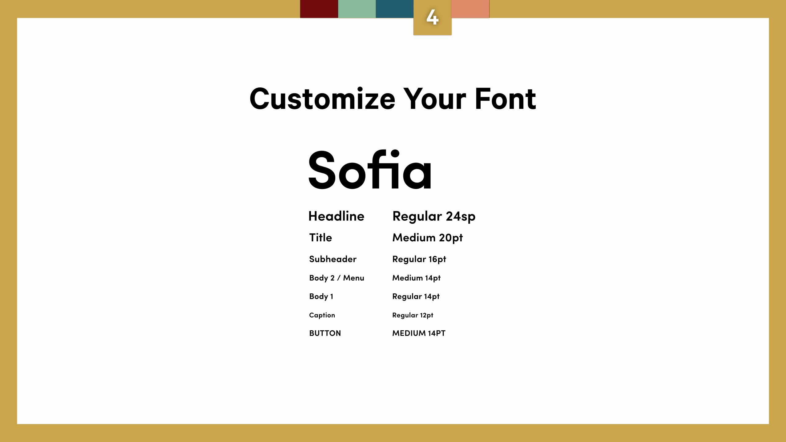
Customize Your Font
SofiaSubheader
Title
Body 1
Body 2 / Menu
Caption
BUTTON
Regular 16pt
Medium 20pt
Regular 14pt
Medium 14pt
Regular 12pt
MEDIUM 14PT
Headline Regular 24sp
4
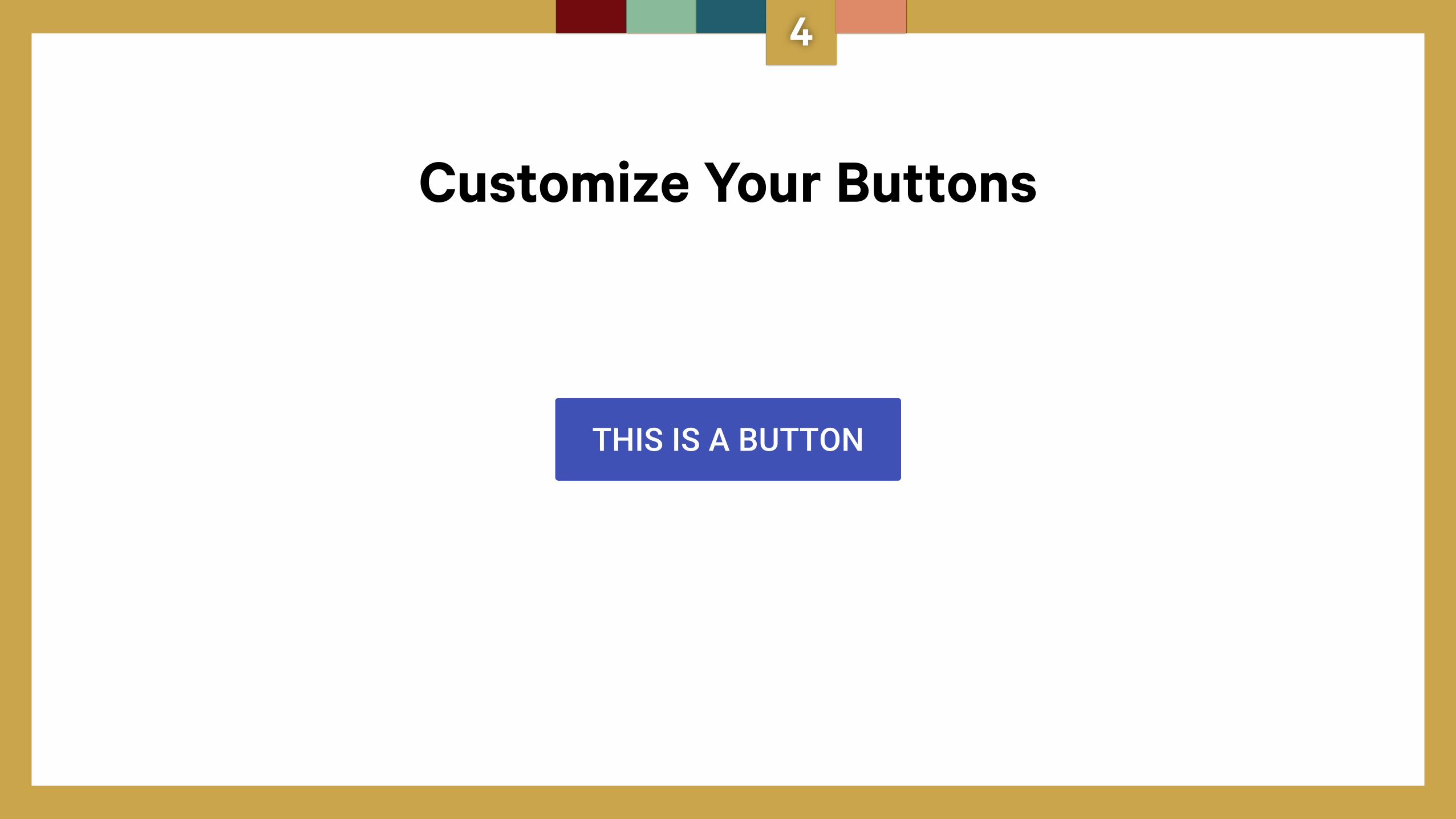
Customize Your Buttons
THIS IS A BUTTON
4
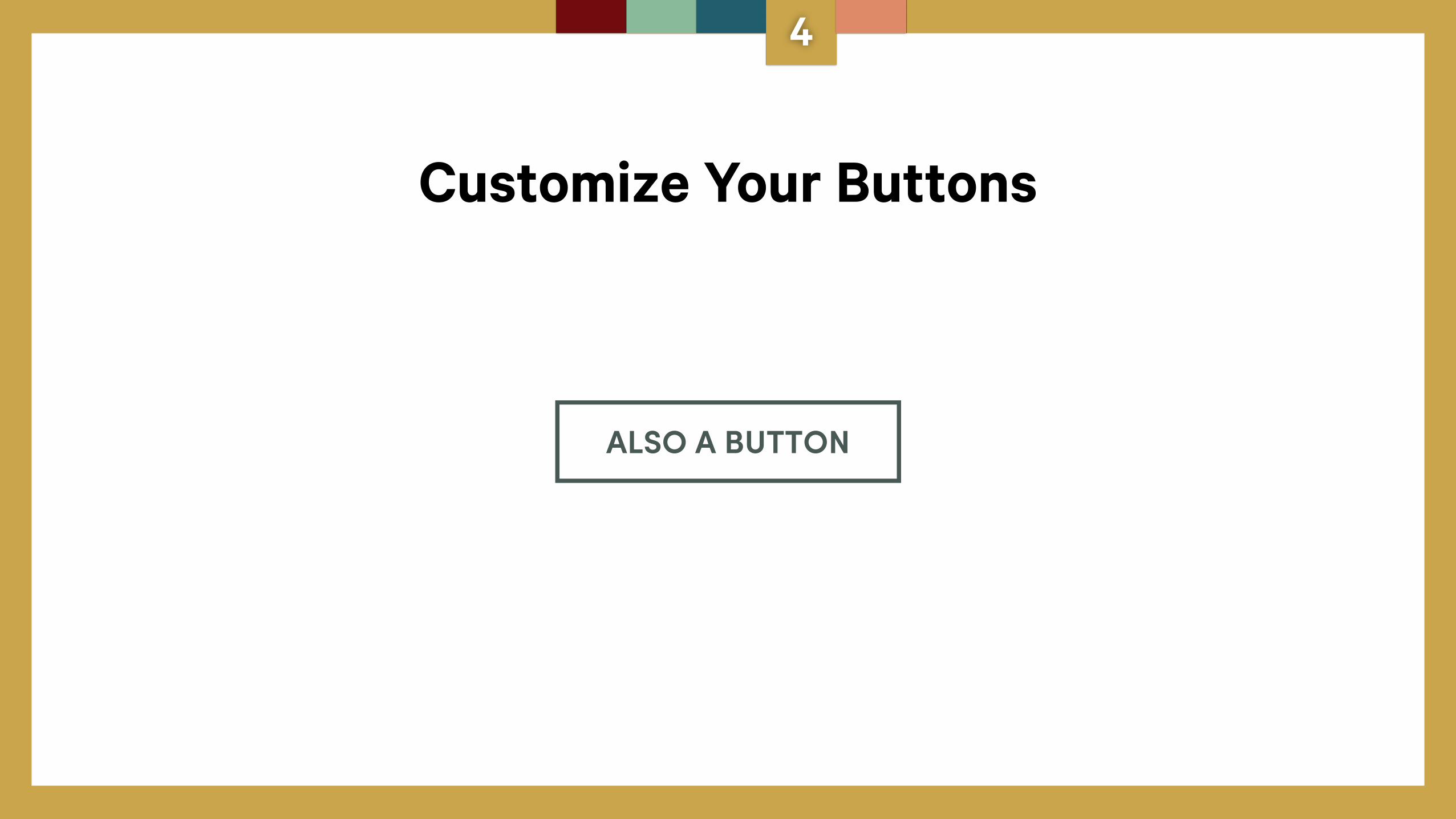
Customize Your Buttons
ALSO A BUTTON
4
5
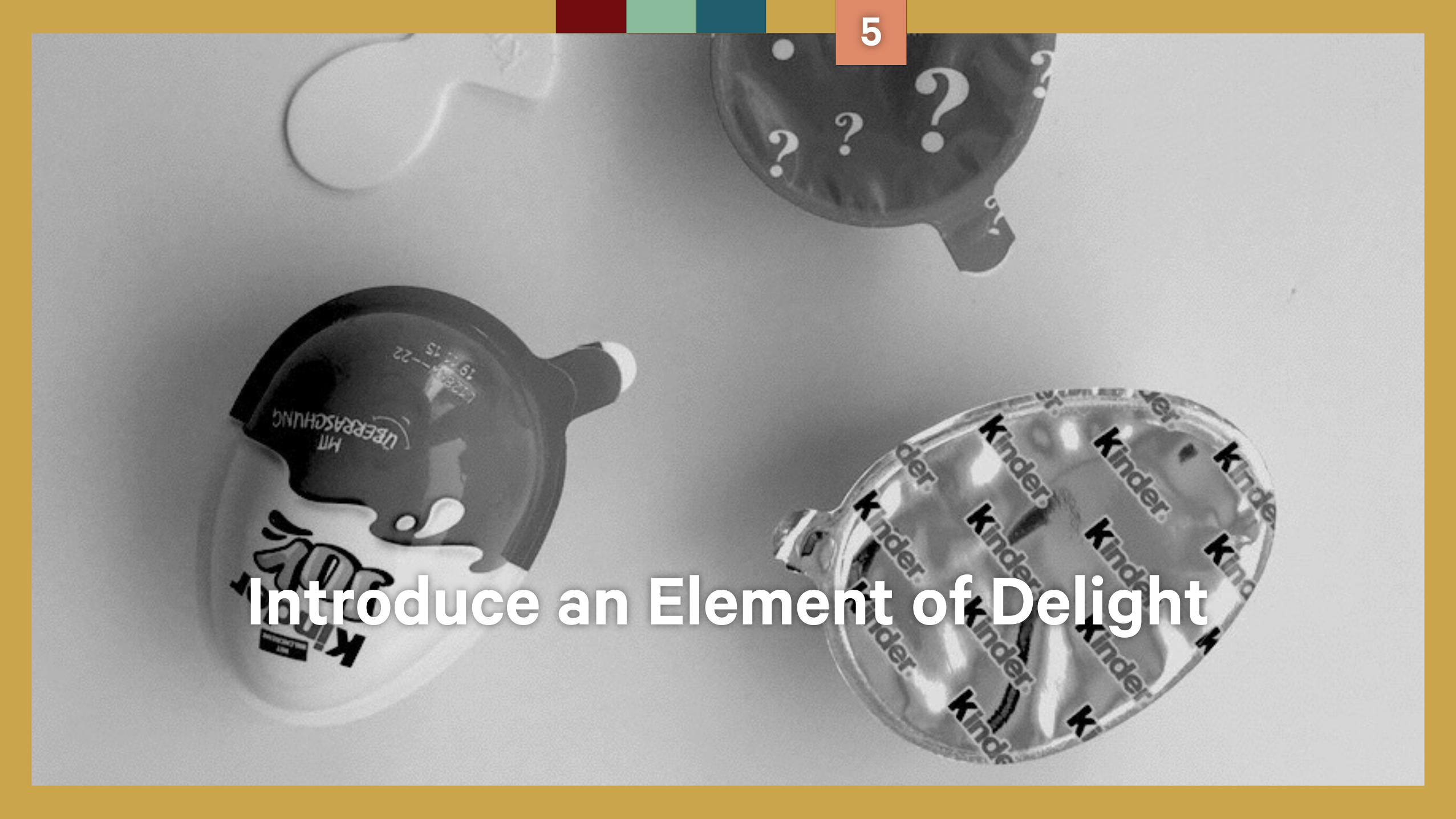
Introduce an Element of Delight
What could you do to add delight to your product with an unexpected element?
5
5
Be compliant, but, don’t be a copycat.
@yasminemolavi @carbonfive
Thanks!