Embed Size (px)
Citation preview
APP DESIGN TEARDOWN
PRODUCTDESIGNPRO.COM PRESENTS...
HOW THIS WORKS
I’m going to walk through two common things a user would do and share my insights as a mobile app designer.
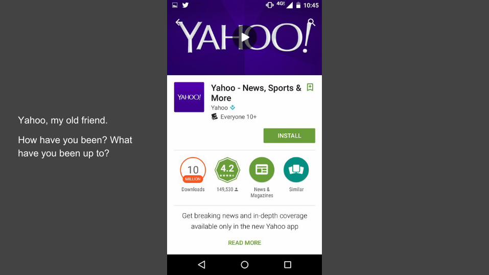
Yahoo, my old friend.
How have you been? What have you been up to?
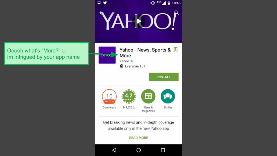
Ooooh what’s “More?” � Im intrigued by your app name
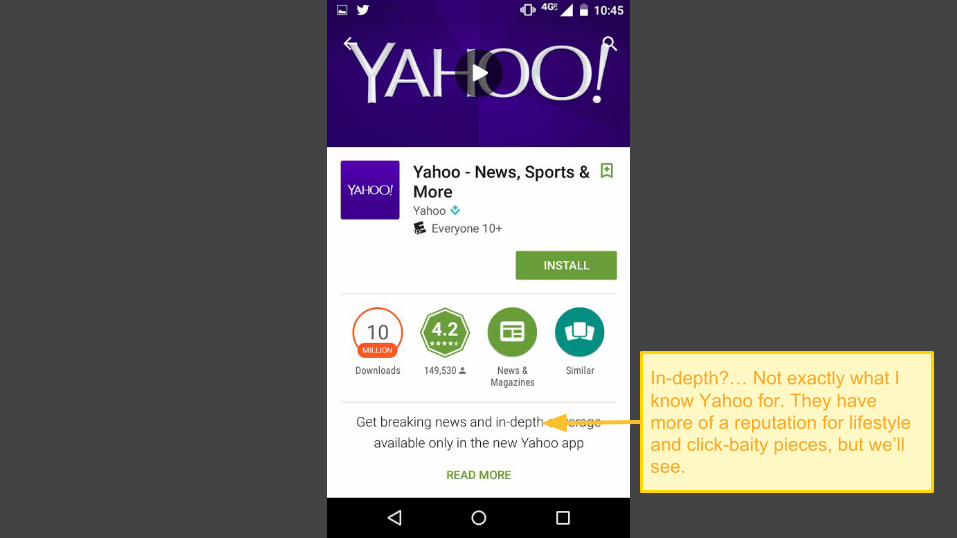
In-depth?… Not exactly what I know Yahoo for. They have more of a reputation for lifestyle and click-baity pieces, but we’ll see.
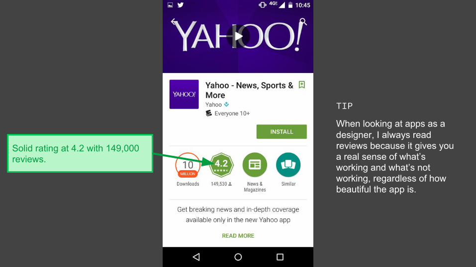
Solid rating at 4.2 with 149,000 reviews.
TIP
When looking at apps as a designer, I always read reviews because it gives you a real sense of what’s working and what’s not working, regardless of how beautiful the app is.
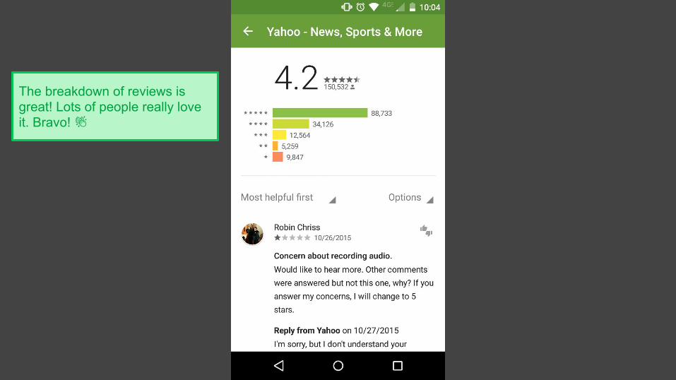
The breakdown of reviews is great! Lots of people really love it. Bravo!
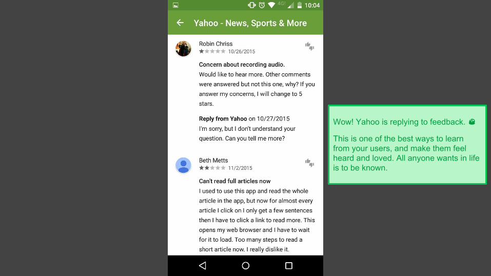
Wow! Yahoo is replying to feedback.
This is one of the best ways to learn from your users, and make them feel heard and loved. All anyone wants in life is to be known.
SCENARIO 1
Getting my mid-morning news fix
�AFTERNOON LULL
Time to see what’s going on in the world. I’ll check Yahoo.
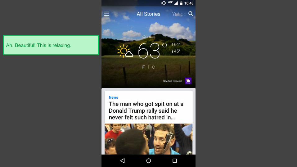
Ah. Beautiful! This is relaxing.
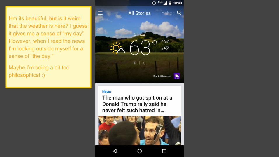
Hm its beautiful, but is it weird that the weather is here? I guess it gives me a sense of “my day” However, when I read the news I’m looking outside myself for a sense of “the day.”
Maybe I’m being a bit too philosophical :)
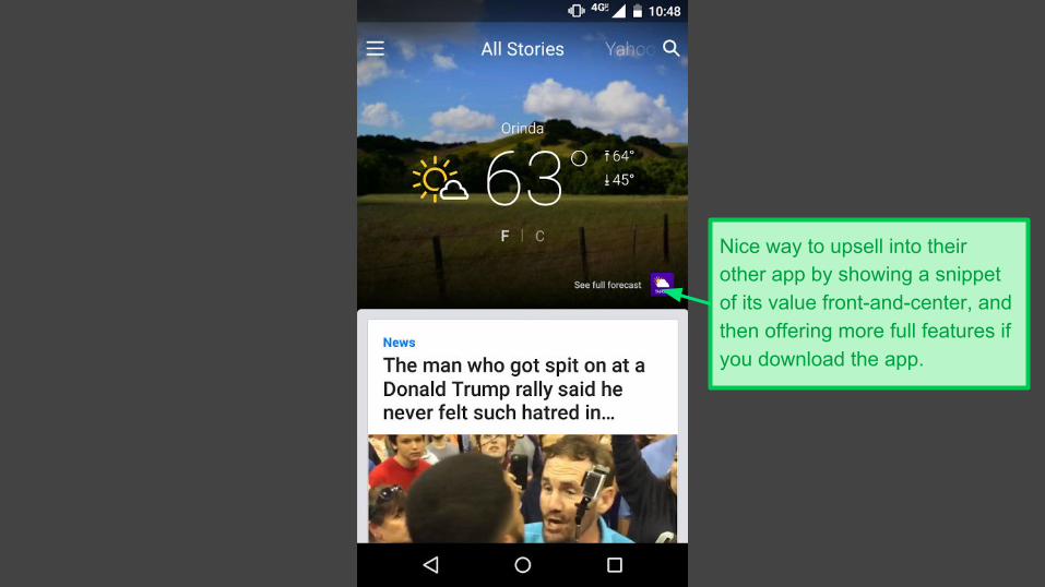
Nice way to upsell into their other app by showing a snippet of its value front-and-center, and then offering more full features if you download the app.
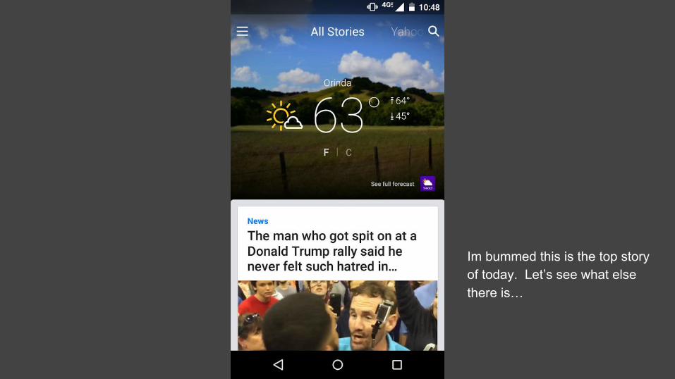
Im bummed this is the top story of today. Let’s see what else there is…
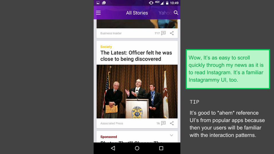
Wow, It’s as easy to scroll quickly through my news as it is to read Instagram. It’s a familiar Instagrammy UI, too.
TIP
It’s good to *ahem* reference UI’s from popular apps because then your users will be familiar with the interaction patterns.
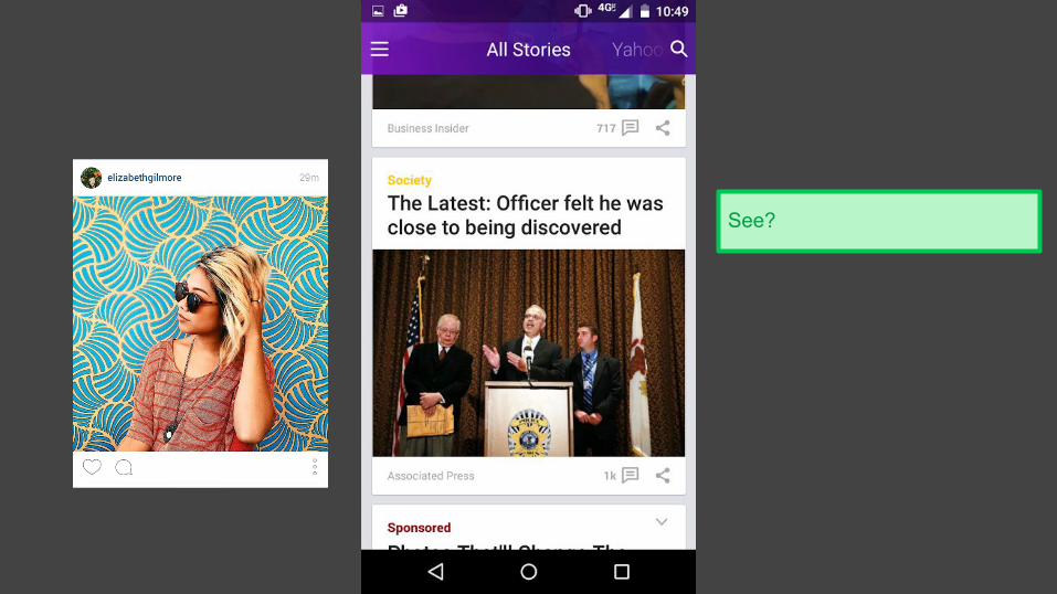
See?
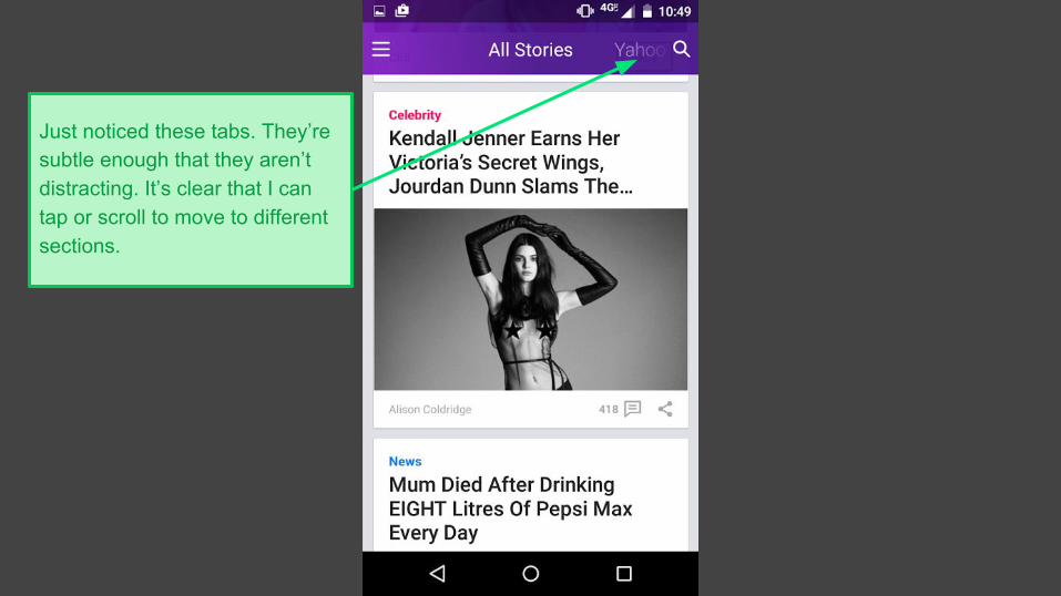
Just noticed these tabs. They’re subtle enough that they aren’t distracting. It’s clear that I can tap or scroll to move to different sections.
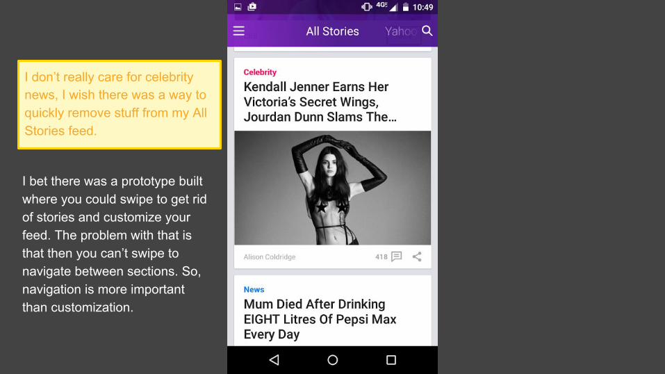
I don’t really care for celebrity news, I wish there was a way to quickly remove stuff from my All Stories feed.
I bet there was a prototype built where you could swipe to get rid of stories and customize your feed. The problem with that is that then you can’t swipe to navigate between sections. So, navigation is more important than customization.
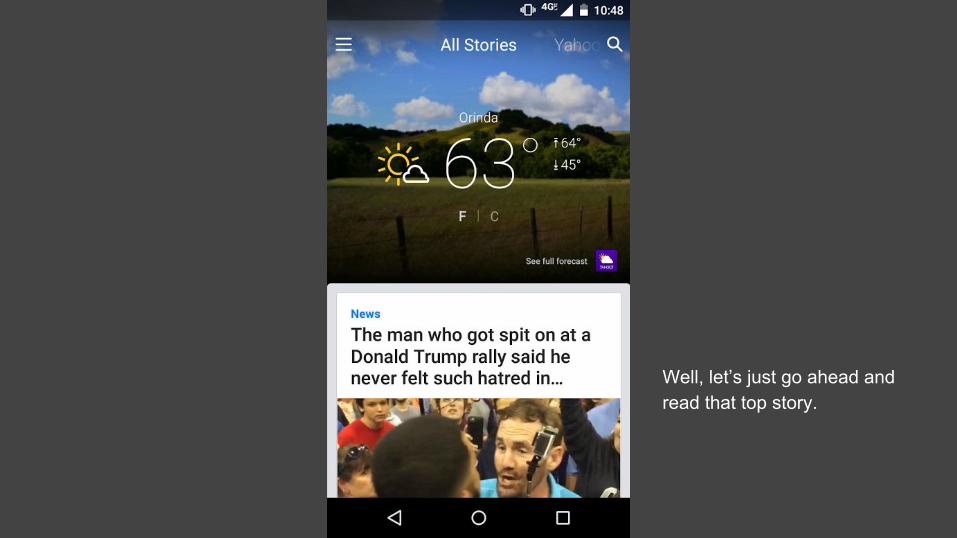
Well, let’s just go ahead and read that top story.
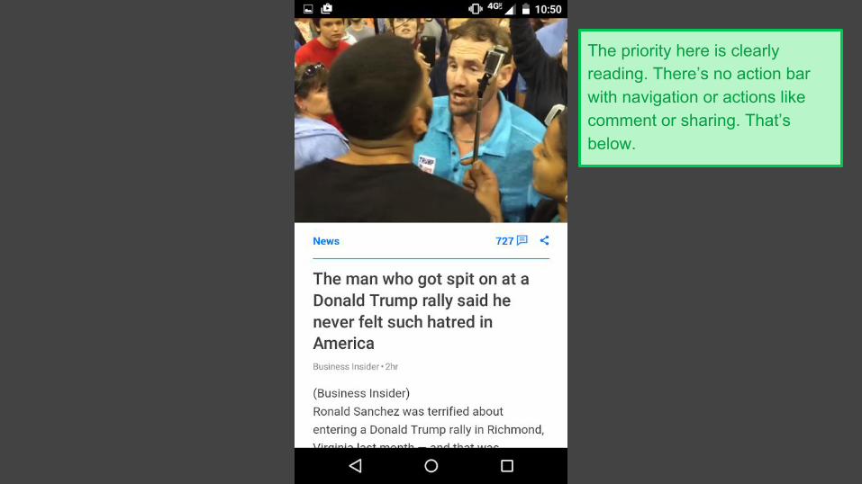
The priority here is clearly reading. There’s no action bar with navigation or actions like comment or sharing. That’s below.
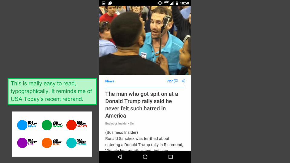
This is really easy to read, typographically. It reminds me of USA Today’s recent rebrand.
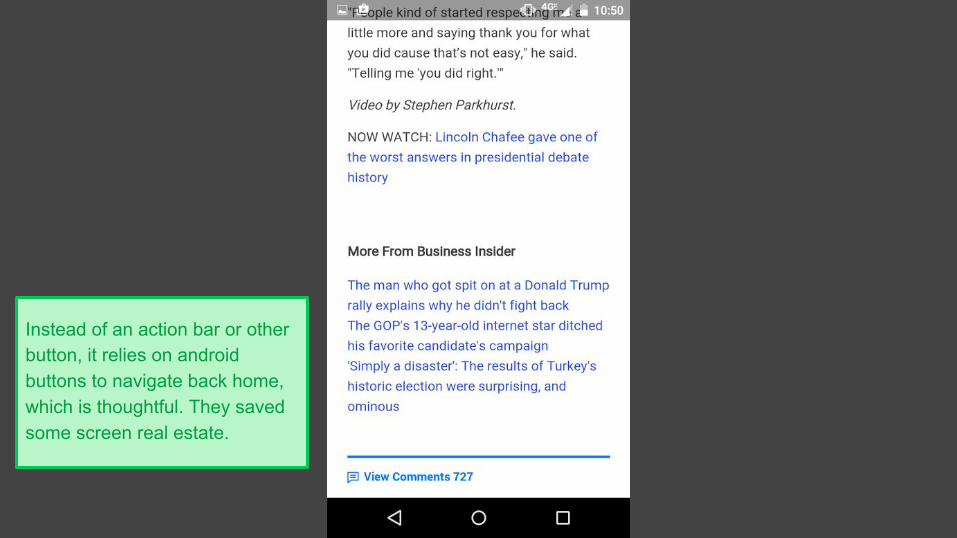
Instead of an action bar or other button, it relies on android buttons to navigate back home, which is thoughtful. They saved some screen real estate.
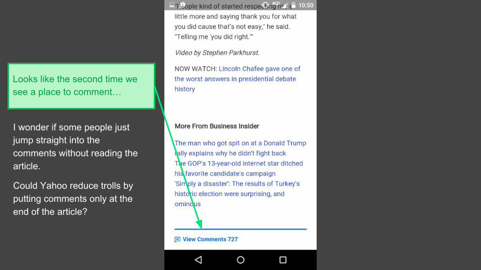
Looks like the second time we see a place to comment…
I wonder if some people just jump straight into the comments without reading the article.
Could Yahoo reduce trolls by putting comments only at the end of the article?
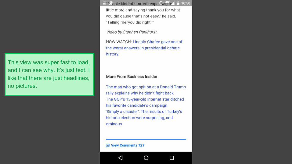
This view was super fast to load, and I can see why. It’s just text. I like that there are just headlines, no pictures.
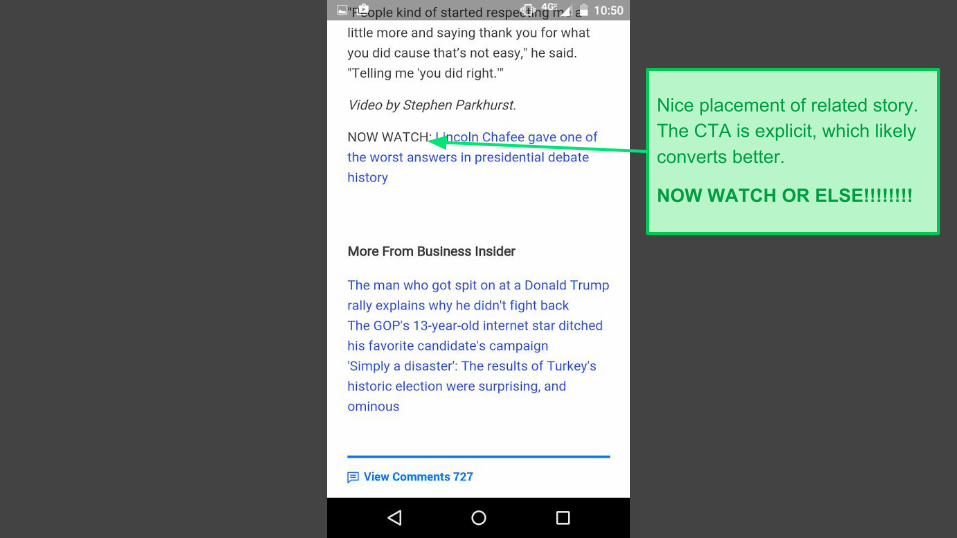
Nice placement of related story. The CTA is explicit, which likely converts better.
NOW WATCH OR ELSE!!!!!!!!
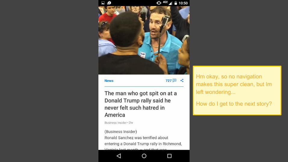
Hm okay, so no navigation makes this super clean, but Im left wondering...
How do I get to the next story?
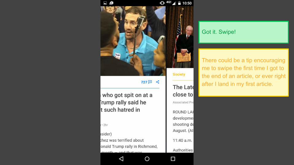
Got it. Swipe!
There could be a tip encouraging me to swipe the first time I got to the end of an article, or ever right after I land in my first article.
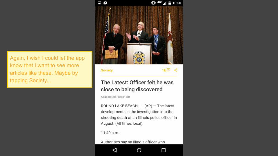
Again, I wish I could let the app know that I want to see more articles like these. Maybe by tapping Society...
Society
+ More
− Less
✕ Always hide
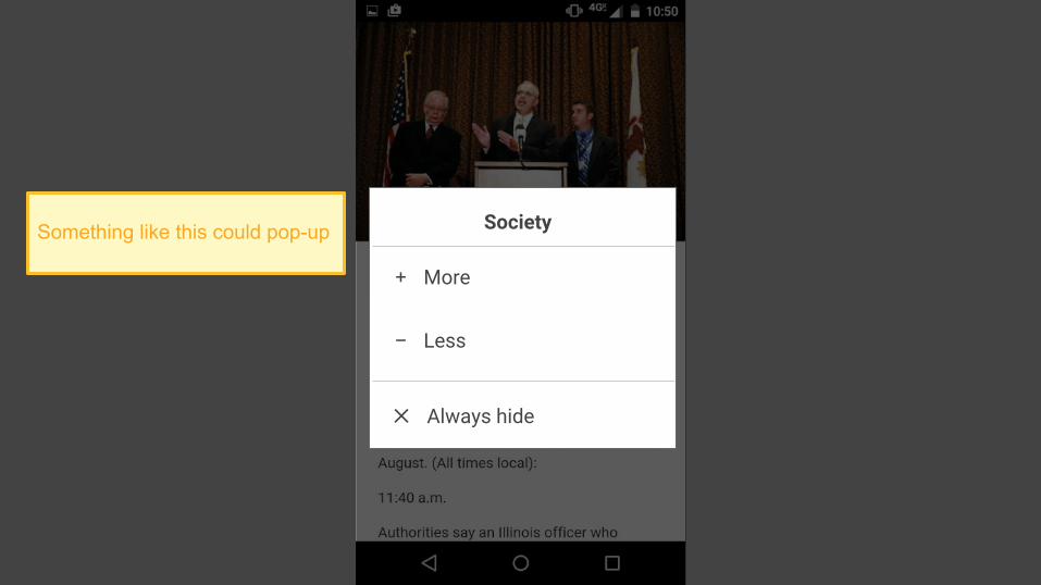
Something like this could pop-up
OK, back to business. Let’s swipe to see the next story...
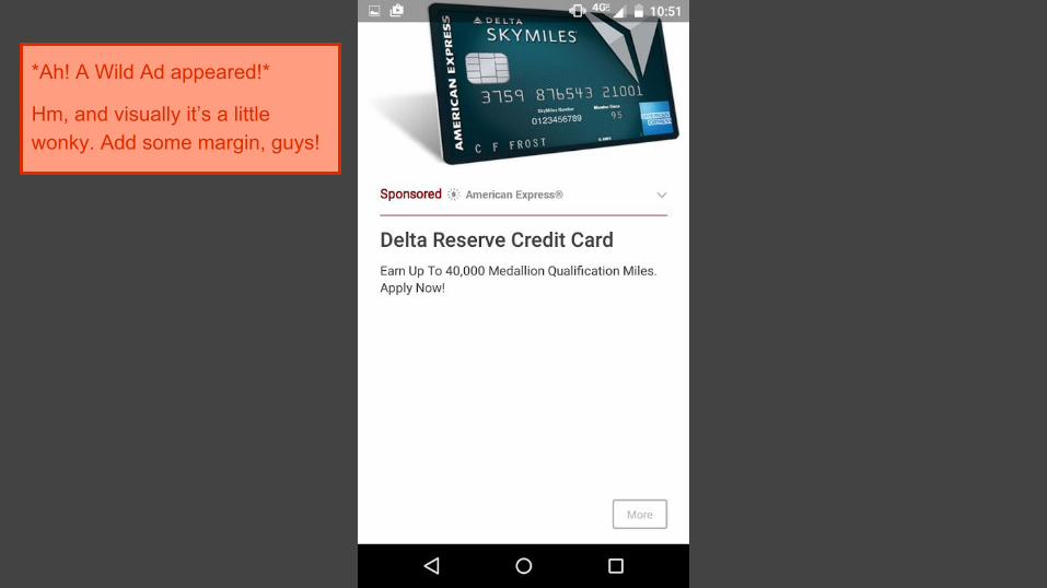
*Ah! A Wild Ad appeared!*
Hm, and visually it’s a little wonky. Add some margin, guys!
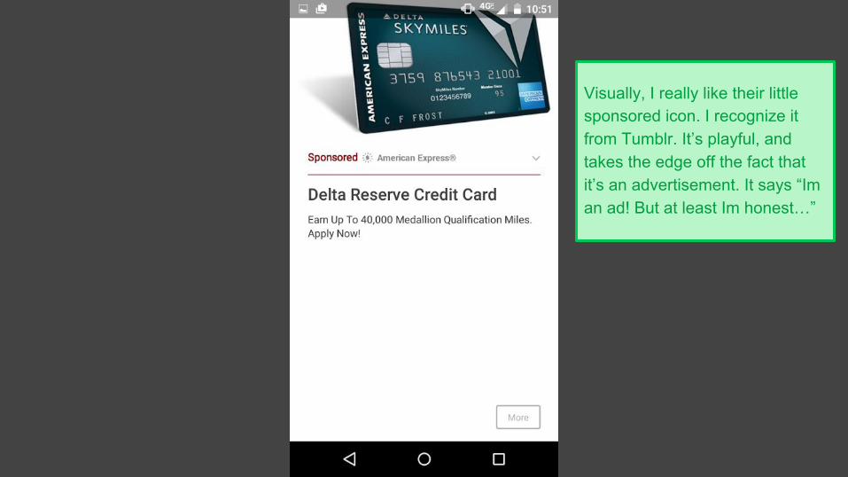
Visually, I really like their little sponsored icon. I recognize it from Tumblr. It’s playful, and takes the edge off the fact that it’s an advertisement. It says “Im an ad! But at least Im honest…”
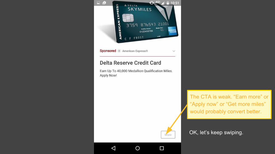
The CTA is weak. “Earn more” or “Apply now” or “Get more miles” would probably convert better.
OK, let’s keep swiping.
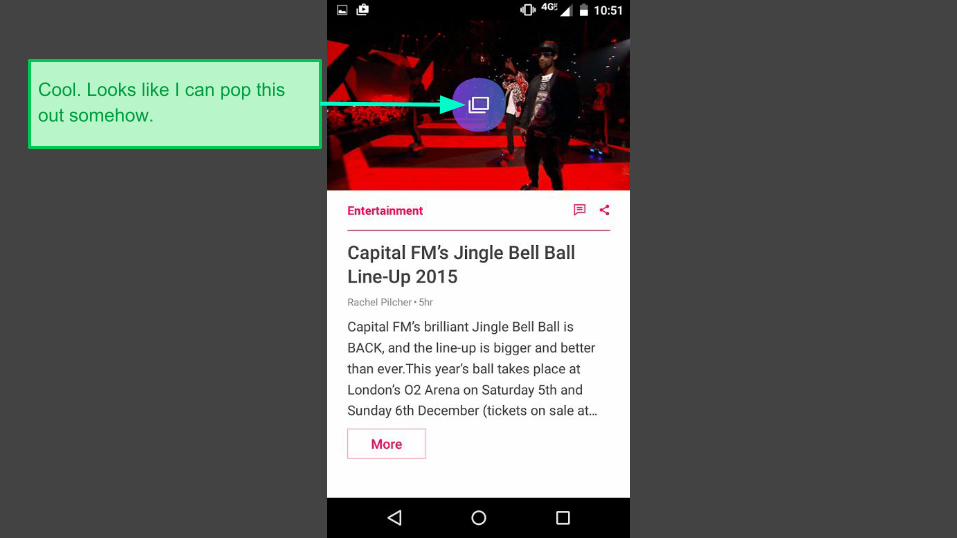
Cool. Looks like I can pop this out somehow.
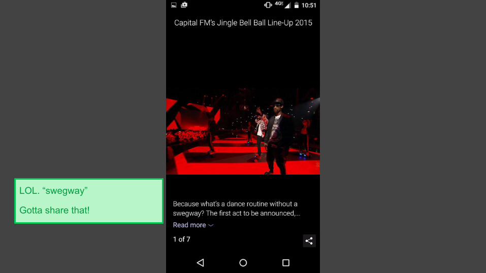
LOL. “swegway”
Gotta share that!
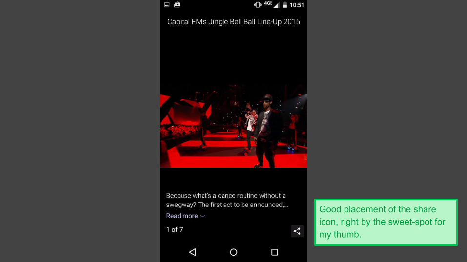
Good placement of the share icon, right by the sweet-spot for my thumb.
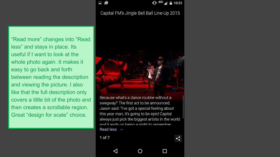
“Read more” changes into “Read less” and stays in place. Its useful if I want to look at the whole photo again. It makes it easy to go back and forth between reading the description and viewing the picture. I also like that the full description only covers a little bit of the photo and then creates a scrollable region. Great “design for scale” choice.
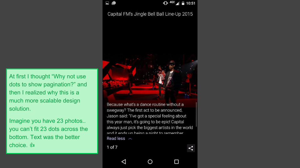
At first I thought “Why not use dots to show pagination?” and then I realized why this is a much more scalable design solution.
Imagine you have 23 photos.. you can’t fit 23 dots across the bottom. Text was the better choice.
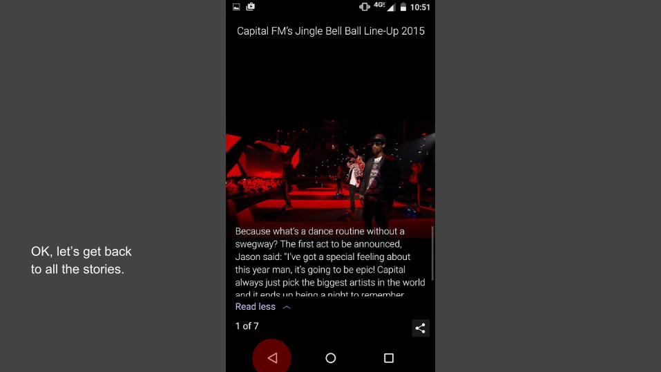
OK, let’s get back to all the stories.
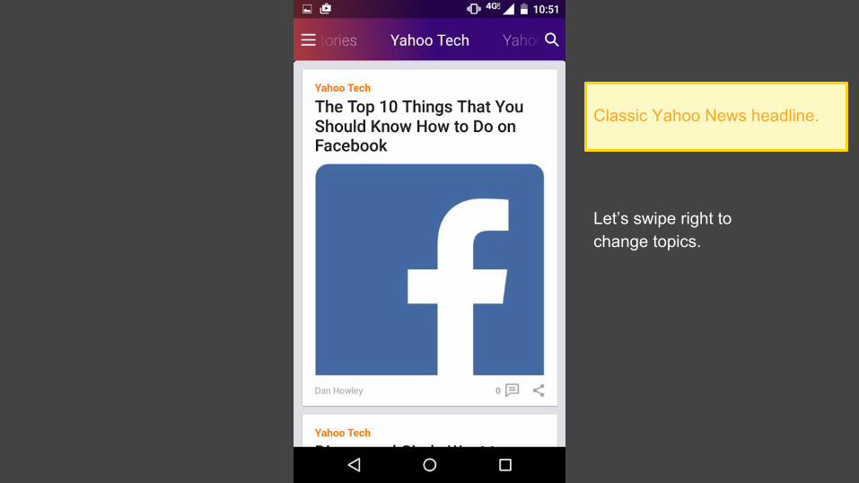
Classic Yahoo News headline.
Let’s swipe right to change topics.
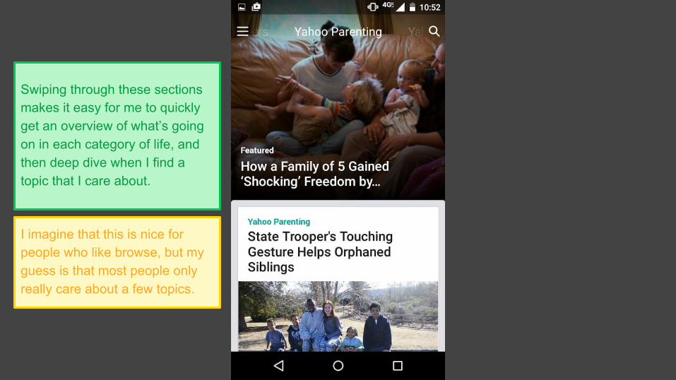
Swiping through these sections makes it easy for me to quickly get an overview of what’s going on in each category of life, and then deep dive when I find a topic that I care about.
I imagine that this is nice for people who like browse, but my guess is that most people only really care about a few topics.
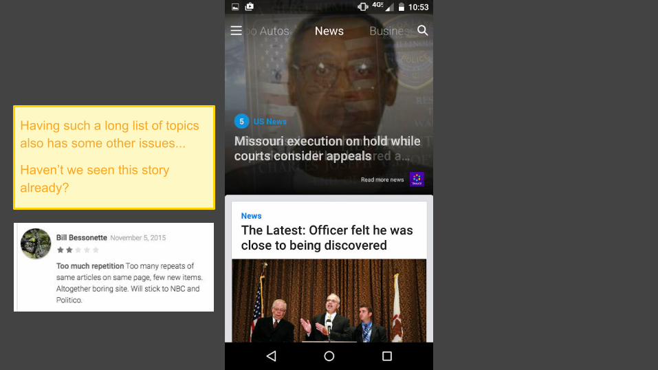
Having such a long list of topics also has some other issues...
Haven’t we seen this story already?
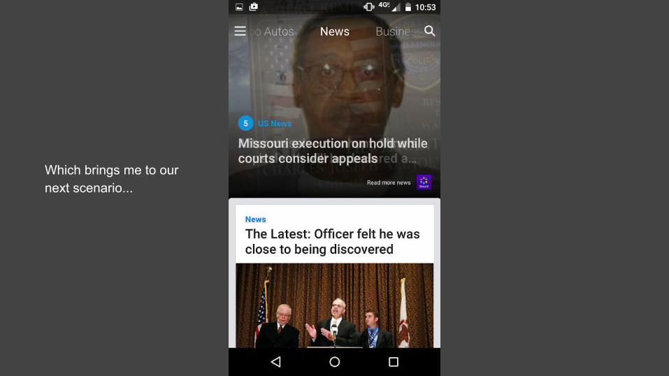
Which brings me to our next scenario...
SCENARIO 2
Customizing the app so I don’t have to bother with the topics I don’t care about
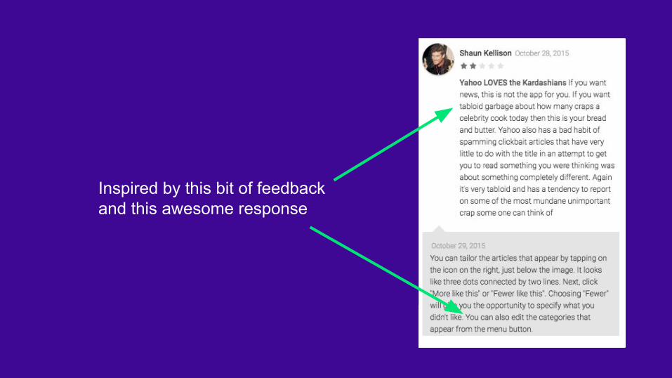
Inspired by this bit of feedbackand this awesome response
SATURDAY MORNING
I’ve used the app a few times, and am committing to using it regularly if I can tweak it the way I like it... Let’s make it mine!
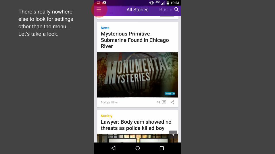
There’s really nowhere else to look for settings other than the menu… Let’s take a look.
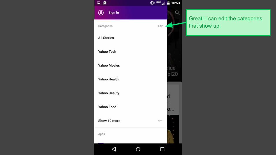
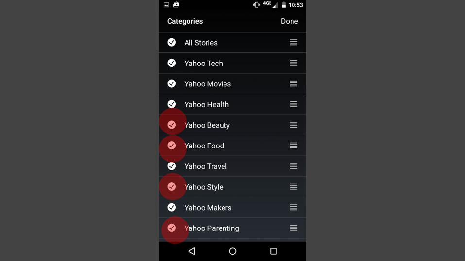
Great! I can edit the categories that show up.
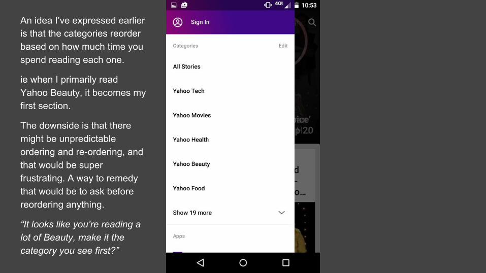
An idea I’ve expressed earlier is that the categories reorder based on how much time you spend reading each one.
ie when I primarily read Yahoo Beauty, it becomes my first section.
The downside is that there might be unpredictable ordering and re-ordering, and that would be super frustrating. A way to remedy that would be to ask before reordering anything.
“It looks like you’re reading a lot of Beauty, make it the category you see first?”
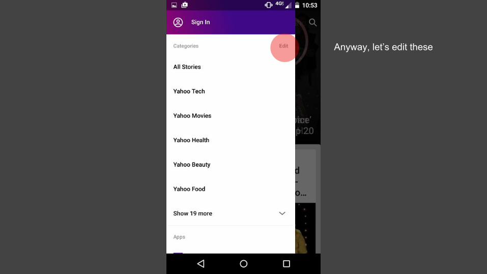
Anyway, let’s edit these
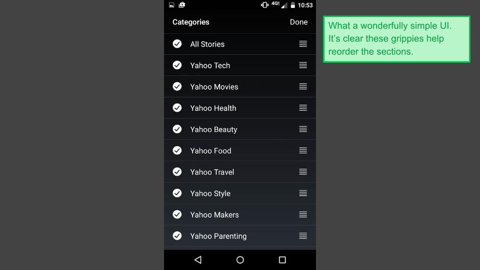
What a wonderfully simple UI. It’s clear these grippies help reorder the sections.
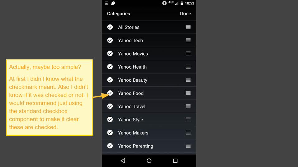
Actually, maybe too simple?
At first I didn’t know what the checkmark meant. Also I didn’t know if it was checked or not. I would recommend just using the standard checkbox component to make it clear these are checked.
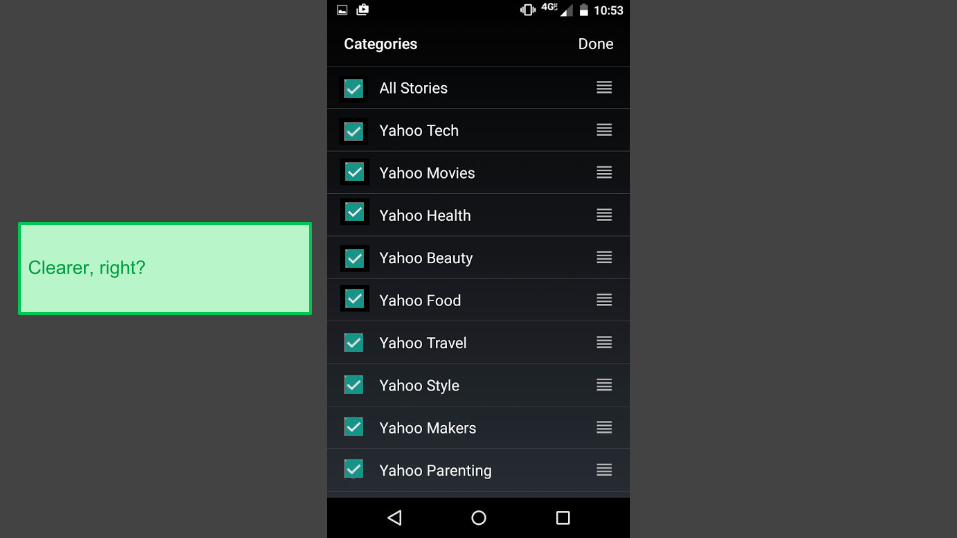
Clearer, right?
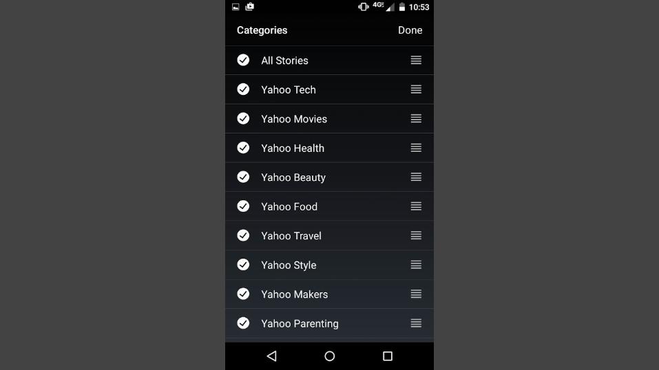
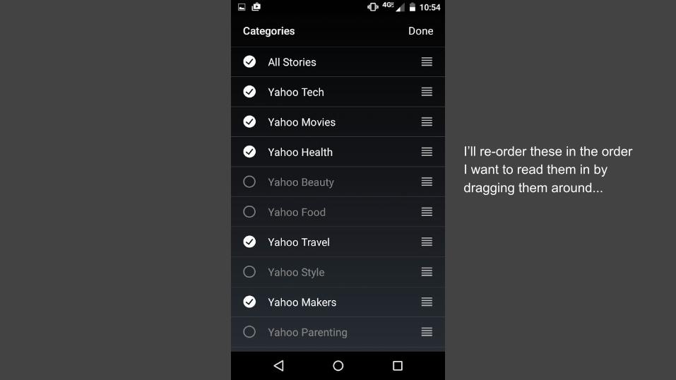
I’ll re-order these in the order I want to read them in by dragging them around...
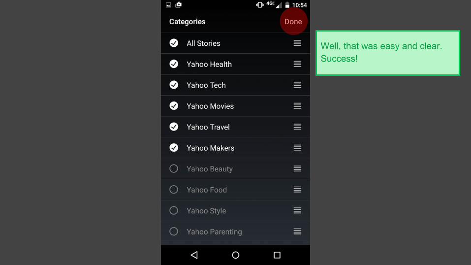
Well, that was easy and clear. Success!

THANKS!
Learn more about Product Design at www.productdesignpro.com