Embed Size (px)
Citation preview
Website Optimization Playbook Design = Traffic + Leads = Revenue
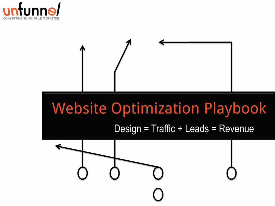
GET FOUND
ONLINE
DESIGN
+
USABILITY
CONTENT CONVERSION
1. GET FOUND
• Linking Strategy
• On-Page SEO
• XML Site Maps
• 301 Redirects
2. DESIGN + USABILITY
• First Impression
• Consistency
• Imagery
• Navigation
• Accessibility
3. CONTENT STRATEGY
• Messaging
• Blogging
• Social & Shareable Content
• Other Forms of Content
4. CONVERSION
• Calls-to-Action
• Landing Pages
• Forms
• Newsletters
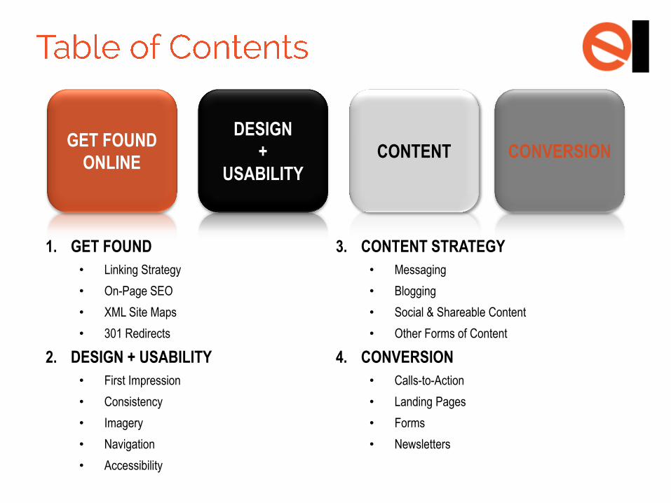
Gone are days where all it took was a URL, Flash, and an expensive ad campaign to
temporarily boost traffic. The reason for this shift? Changing user behavior.
Today’s user consumes information when and how they want, often without the
involvement of a sales pitch. They want to be educated – not sold.
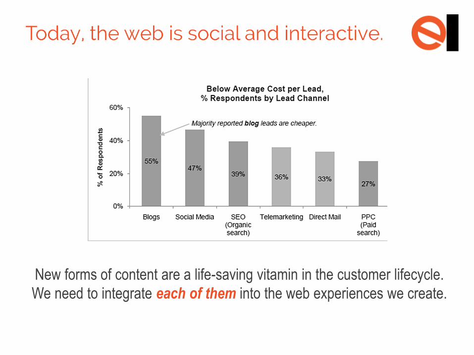
New forms of content are a life-saving vitamin in the customer lifecycle.
We need to integrate each of them into the web experiences we create.
FIRST THING’S
FIRST…
KNOW THE USER
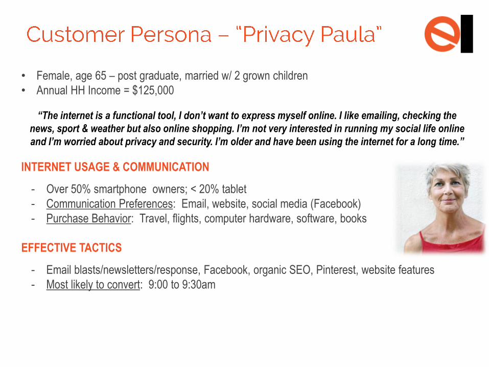
• Female, age 65 – post graduate, married w/ 2 grown children
• Annual HH Income = $125,000
“The internet is a functional tool, I don’t want to express myself online. I like emailing, checking the
news, sport & weather but also online shopping. I’m not very interested in running my social life online
and I’m worried about privacy and security. I’m older and have been using the internet for a long time.”
INTERNET USAGE & COMMUNICATION
- Over 50% smartphone owners; < 20% tablet
- Communication Preferences: Email, website, social media (Facebook)
- Purchase Behavior: Travel, flights, computer hardware, software, books
EFFECTIVE TACTICS
- Email blasts/newsletters/response, Facebook, organic SEO, Pinterest, website features
- Most likely to convert: 9:00 to 9:30am
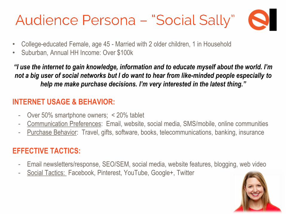
• College-educated Female, age 45 - Married with 2 older children, 1 in Household
• Suburban, Annual HH Income: Over $100k
“I use the internet to gain knowledge, information and to educate myself about the world. I’m
not a big user of social networks but I do want to hear from like-minded people especially to
help me make purchase decisions. I’m very interested in the latest thing.”
INTERNET USAGE & BEHAVIOR:
- Over 50% smartphone owners; < 20% tablet
- Communication Preferences: Email, website, social media, SMS/mobile, online communities
- Purchase Behavior: Travel, gifts, software, books, telecommunications, banking, insurance
EFFECTIVE TACTICS:
- Email newsletters/response, SEO/SEM, social media, website features, blogging, web video
- Social Tactics: Facebook, Pinterest, YouTube, Google+, Twitter
PART 1:
GET FOUND ONLINE
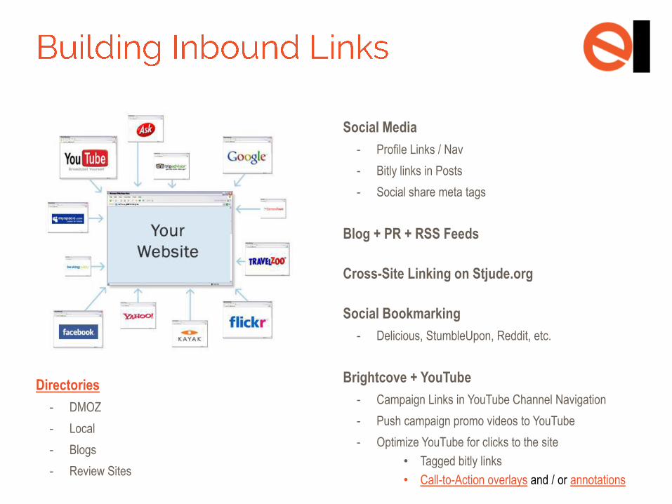
Directories
- DMOZ
- Local
- Blogs
- Review Sites
Social Media
- Profile Links / Nav
- Bitly links in Posts
- Social share meta tags
Blog + PR + RSS Feeds
Cross-Site Linking on Stjude.org
Social Bookmarking
- Delicious, StumbleUpon, Reddit, etc.
Brightcove + YouTube
- Campaign Links in YouTube Channel Navigation
- Push campaign promo videos to YouTube
- Optimize YouTube for clicks to the site
• Tagged bitly links
• Call-to-Action overlays and / or annotations
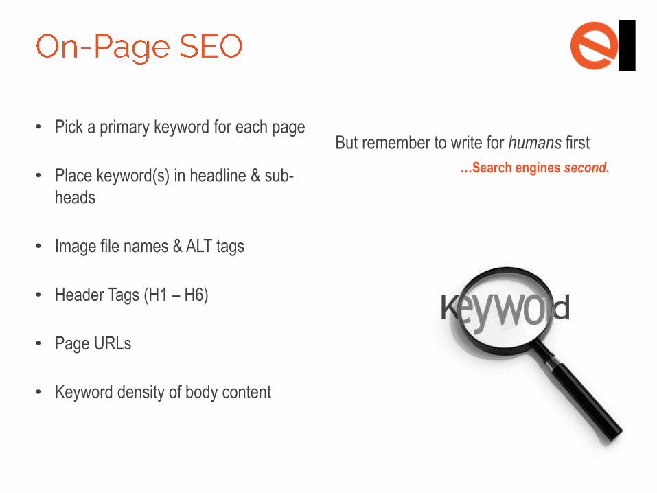
• Pick a primary keyword for each page
• Place keyword(s) in headline & sub-
heads
• Image file names & ALT tags
• Header Tags (H1 – H6)
• Page URLs
• Keyword density of body content
But remember to write for humans first
…Search engines second.
Title Tags
- The ONLY remaining meta tag that affects
Google rankings
- NEVER begin it with the brand name
Meta Description
- Unique for every single page
- While it can’t boost, duplicate meta descriptions
can significantly hurt your search ranking
Keywords
- Improve on-site search rank & SEM
- Too many tells Google SPAM
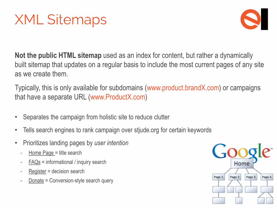
Not the public HTML sitemap used as an index for content, but rather a dynamically
built sitemap that updates on a regular basis to include the most current pages of any site
as we create them.
Typically, this is only available for subdomains (www.product.brandX.com) or campaigns
that have a separate URL (www.ProductX.com)
• Separates the campaign from holistic site to reduce clutter
• Tells search engines to rank campaign over stjude.org for certain keywords
• Prioritizes landing pages by user intention
- Home Page = title search
- FAQs = informational / inquiry search
- Register = decision search
- Donate = Conversion-style search query
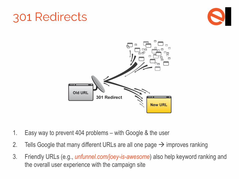
1. Easy way to prevent 404 problems – with Google & the user
2. Tells Google that many different URLs are all one page improves ranking
3. Friendly URLs (e.g., unfunnel.com/joey-is-awesome) also help keyword ranking and
the overall user experience with the campaign site
PART 2:
DESIGN & USABILITY
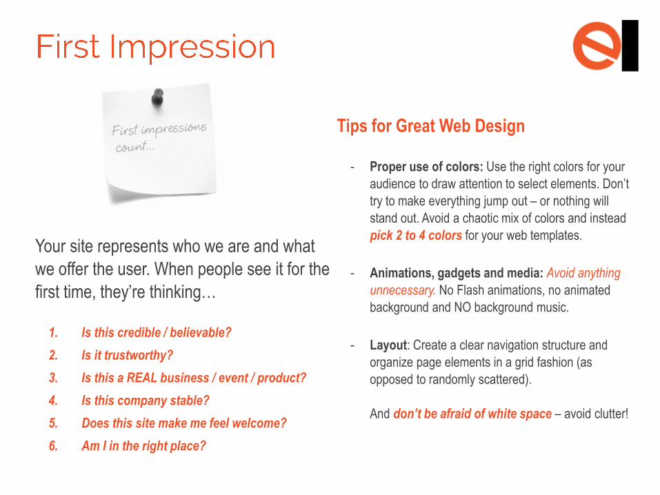
Your site represents who we are and what
we offer the user. When people see it for the
first time, they’re thinking…
1. Is this credible / believable?
2. Is it trustworthy?
3. Is this a REAL business / event / product?
4. Is this company stable?
5. Does this site make me feel welcome?
6. Am I in the right place?
Tips for Great Web Design
- Proper use of colors: Use the right colors for your
audience to draw attention to select elements. Don’t
try to make everything jump out – or nothing will
stand out. Avoid a chaotic mix of colors and instead
pick 2 to 4 colors for your web templates.
- Animations, gadgets and media: Avoid anything
unnecessary. No Flash animations, no animated
background and NO background music.
- Layout: Create a clear navigation structure and
organize page elements in a grid fashion (as
opposed to randomly scattered).
And don’t be afraid of white space – avoid clutter!
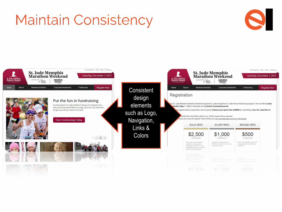
Consistent
design
elements
such as Logo,
Navigation,
Links &
Colors
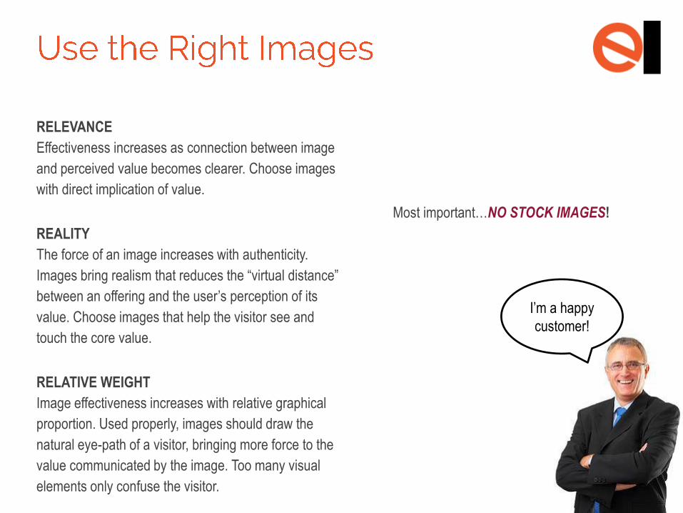
RELEVANCE
Effectiveness increases as connection between image
and perceived value becomes clearer. Choose images
with direct implication of value.
REALITY
The force of an image increases with authenticity.
Images bring realism that reduces the “virtual distance”
between an offering and the user’s perception of its
value. Choose images that help the visitor see and
touch the core value.
RELATIVE WEIGHT
Image effectiveness increases with relative graphical
proportion. Used properly, images should draw the
natural eye-path of a visitor, bringing more force to the
value communicated by the image. Too many visual
elements only confuse the visitor.
Most important…NO STOCK IMAGES!
I’m a happy
customer!
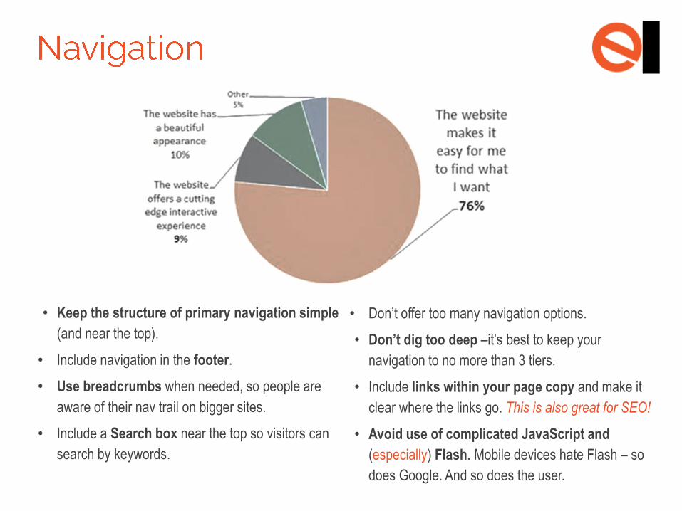
• Keep the structure of primary navigation simple
(and near the top).
• Include navigation in the footer.
• Use breadcrumbs when needed, so people are
aware of their nav trail on bigger sites.
• Include a Search box near the top so visitors can
search by keywords.
• Don’t offer too many navigation options.
• Don’t dig too deep –it’s best to keep your
navigation to no more than 3 tiers.
• Include links within your page copy and make it
clear where the links go. This is also great for SEO!
• Avoid use of complicated JavaScript and
(especially) Flash. Mobile devices hate Flash – so
does Google. And so does the user.
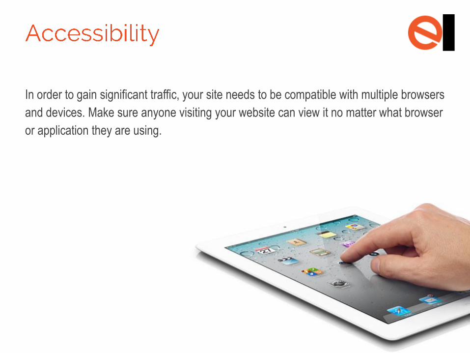
In order to gain significant traffic, your site needs to be compatible with multiple browsers
and devices. Make sure anyone visiting your website can view it no matter what browser
or application they are using.
PART 3:
CONTENT STRATEGY
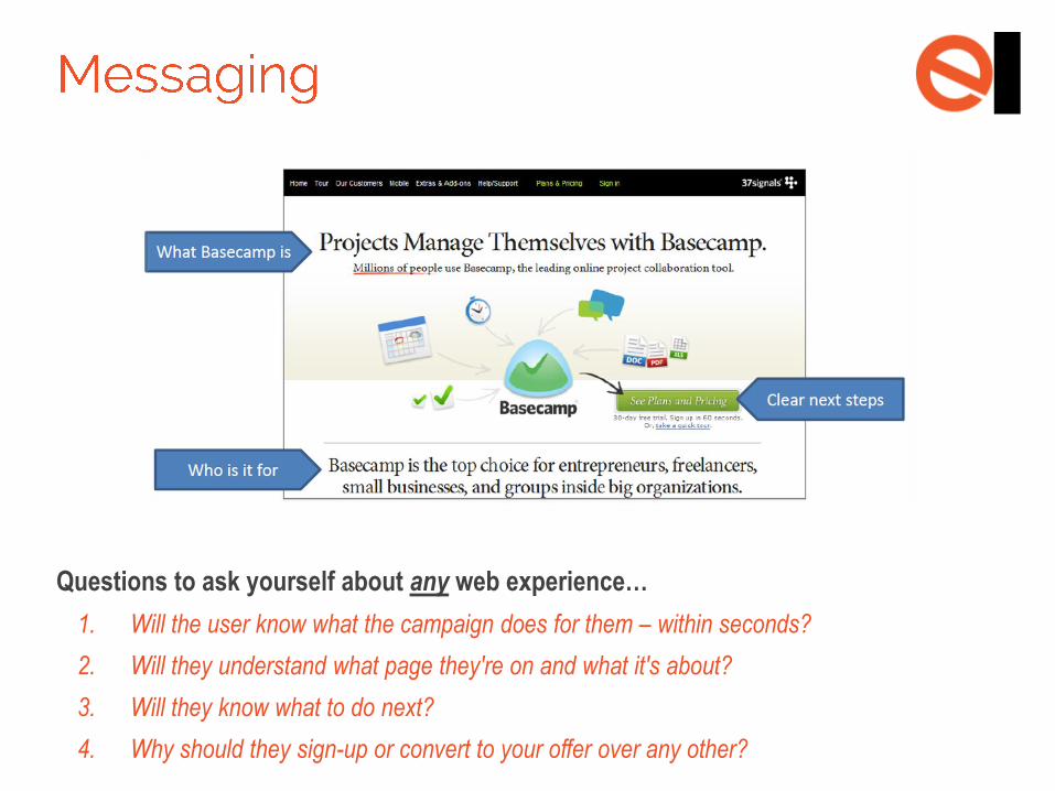
Questions to ask yourself about any web experience…
1. Will the user know what the campaign does for them – within seconds?
2. Will they understand what page they're on and what it's about?
3. Will they know what to do next?
4. Why should they sign-up or convert to your offer over any other?
1. Create a few headlines and sub-headline ideas for your most important pages.
Use a powerful value proposition and avoid clichés, gratuitous poetry or corp-speak.
2. Include clear call-to-actions and next steps. Include links in your copy, next step
links at the end and calls-to-action where appropriate.
3. Test your copy. For the most accurate indicator of winning headlines, use A/B
testing to see which variation drives the most conversions.
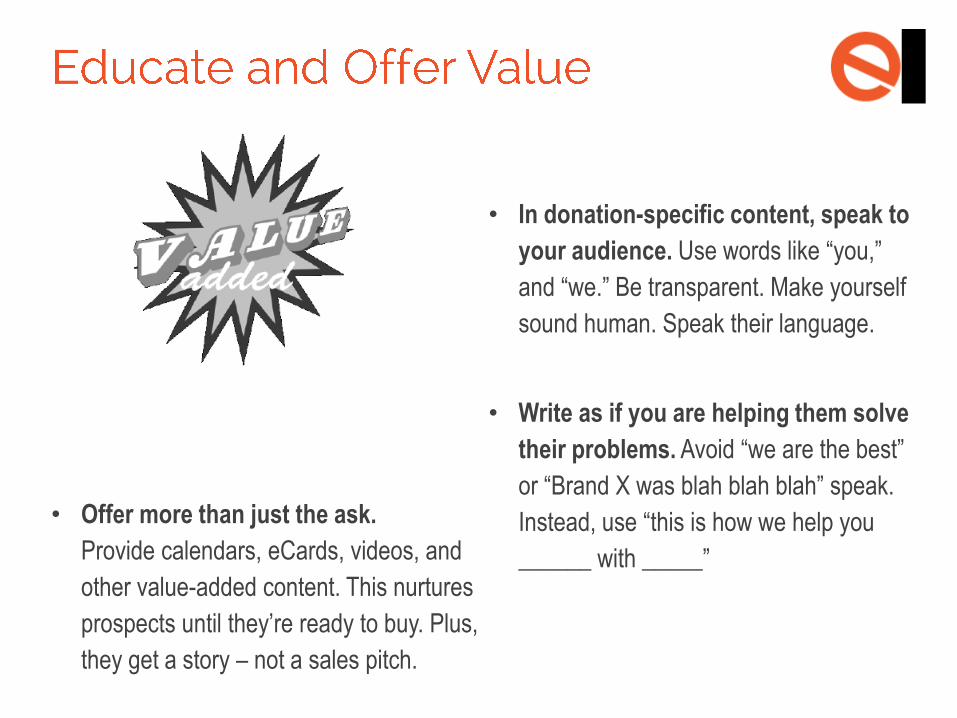
• Offer more than just the ask.
Provide calendars, eCards, videos, and
other value-added content. This nurtures
prospects until they’re ready to buy. Plus,
they get a story – not a sales pitch.
• In donation-specific content, speak to
your audience. Use words like “you,”
and “we.” Be transparent. Make yourself
sound human. Speak their language.
• Write as if you are helping them solve
their problems. Avoid “we are the best”
or “Brand X was blah blah blah” speak.
Instead, use “this is how we help you
______ with _____”
• Provide unique content. People love it
and so do search engines.
• Write for humans, not search engines.
People don’t read like robots.
• Provide value with educational content
that helps others.
• Keep content fresh. Having news that’s
two years old still on your home page
probably gives visitors a bad feeling.
• Know your audience. Providing content
specific to users makes it more relevant
for them, and in turn, higher quality.
• Evidence when needed. If using facts,
awards, testimonials, etc., back up with
sources and give credit when it’s due.
• Know your subject well. You probably
don’t want a mechanic writing about
brain surgery. Accurate equals quality.
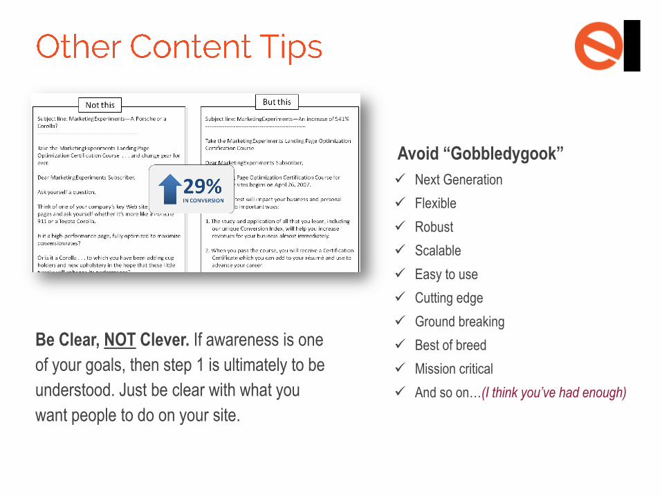
Be Clear, NOT Clever. If awareness is one
of your goals, then step 1 is ultimately to be
understood. Just be clear with what you
want people to do on your site.
Avoid “Gobbledygook”
Next Generation
Flexible
Robust
Scalable
Easy to use
Cutting edge
Ground breaking
Best of breed
Mission critical
And so on…(I think you’ve had enough)
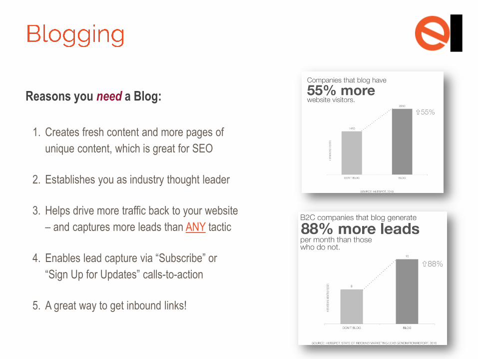
Reasons you need a Blog:
1. Creates fresh content and more pages of
unique content, which is great for SEO
2. Establishes you as industry thought leader
3. Helps drive more traffic back to your website
– and captures more leads than ANY tactic
4. Enables lead capture via “Subscribe” or
“Sign Up for Updates” calls-to-action
5. A great way to get inbound links!
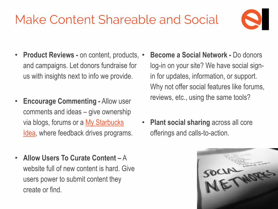
• Product Reviews - on content, products,
and campaigns. Let donors fundraise for
us with insights next to info we provide.
• Encourage Commenting - Allow user
comments and ideas – give ownership
via blogs, forums or a My Starbucks
Idea, where feedback drives programs.
• Allow Users To Curate Content – A
website full of new content is hard. Give
users power to submit content they
create or find.
• Become a Social Network - Do donors
log-in on your site? We have social sign-
in for updates, information, or support.
Why not offer social features like forums,
reviews, etc., using the same tools?
• Plant social sharing across all core
offerings and calls-to-action.
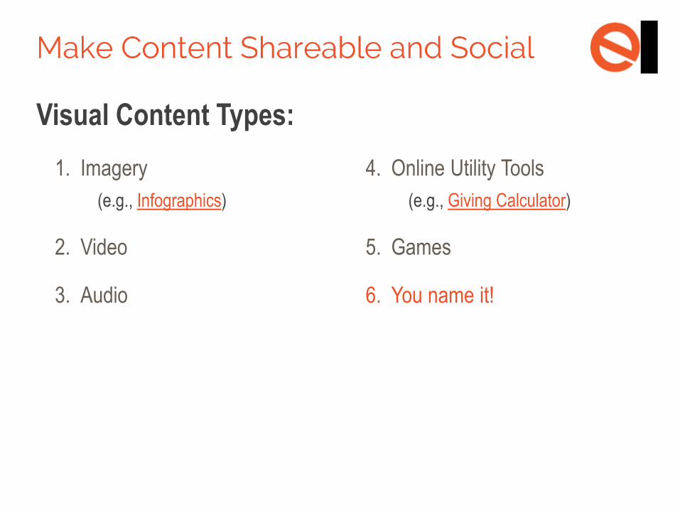
Visual Content Types:
1. Imagery
(e.g., Infographics)
2. Video
3. Audio
4. Online Utility Tools
(e.g., Giving Calculator)
5. Games
6. You name it!
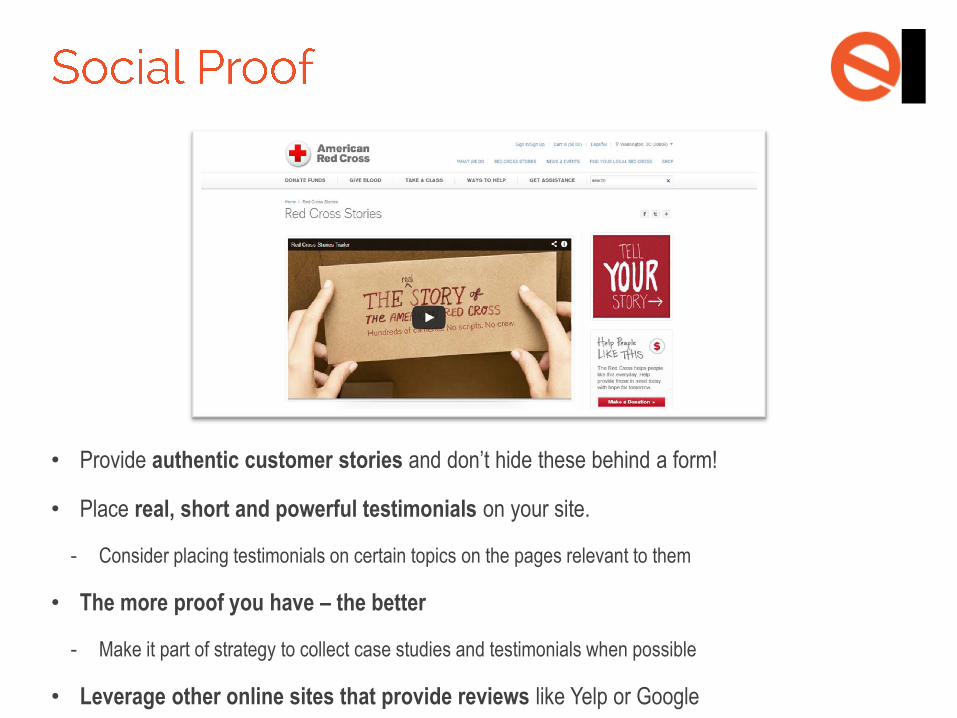
• Provide authentic customer stories and don’t hide these behind a form!
• Place real, short and powerful testimonials on your site.
- Consider placing testimonials on certain topics on the pages relevant to them
• The more proof you have – the better
- Make it part of strategy to collect case studies and testimonials when possible
• Leverage other online sites that provide reviews like Yelp or Google
PART 4:
CONVERSION
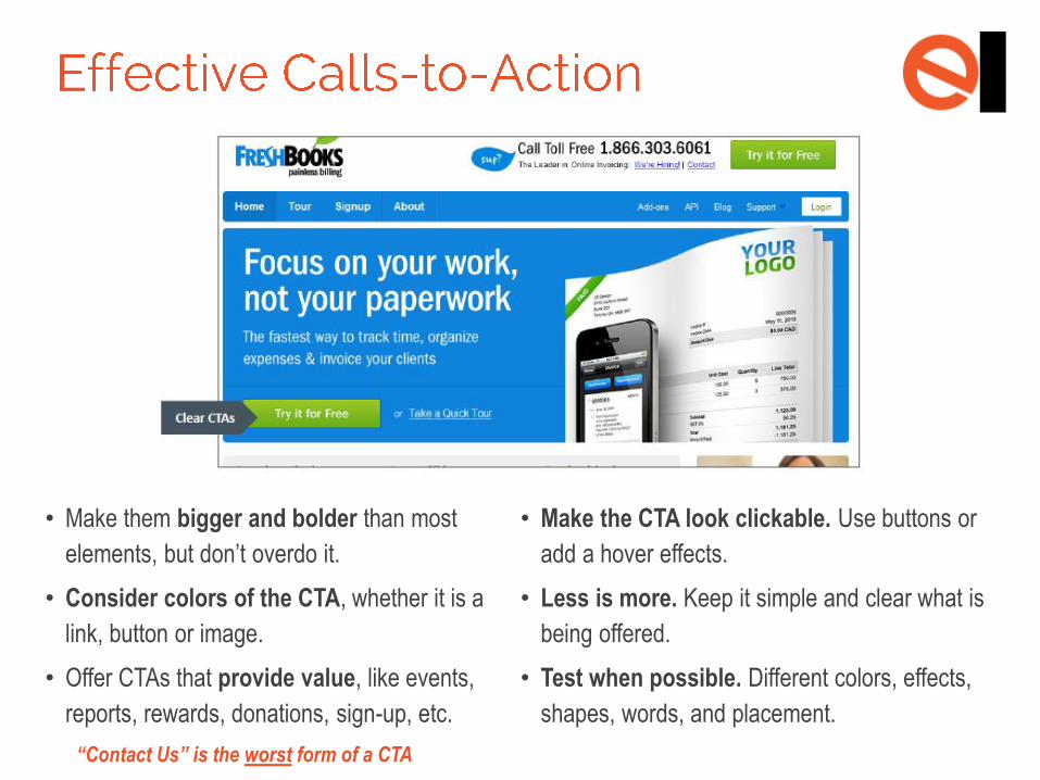
• Make them bigger and bolder than most
elements, but don’t overdo it.
• Consider colors of the CTA, whether it is a
link, button or image.
• Offer CTAs that provide value, like events,
reports, rewards, donations, sign-up, etc.
“Contact Us” is the worst form of a CTA
• Make the CTA look clickable. Use buttons or
add a hover effects.
• Less is more. Keep it simple and clear what is
being offered.
• Test when possible. Different colors, effects,
shapes, words, and placement.
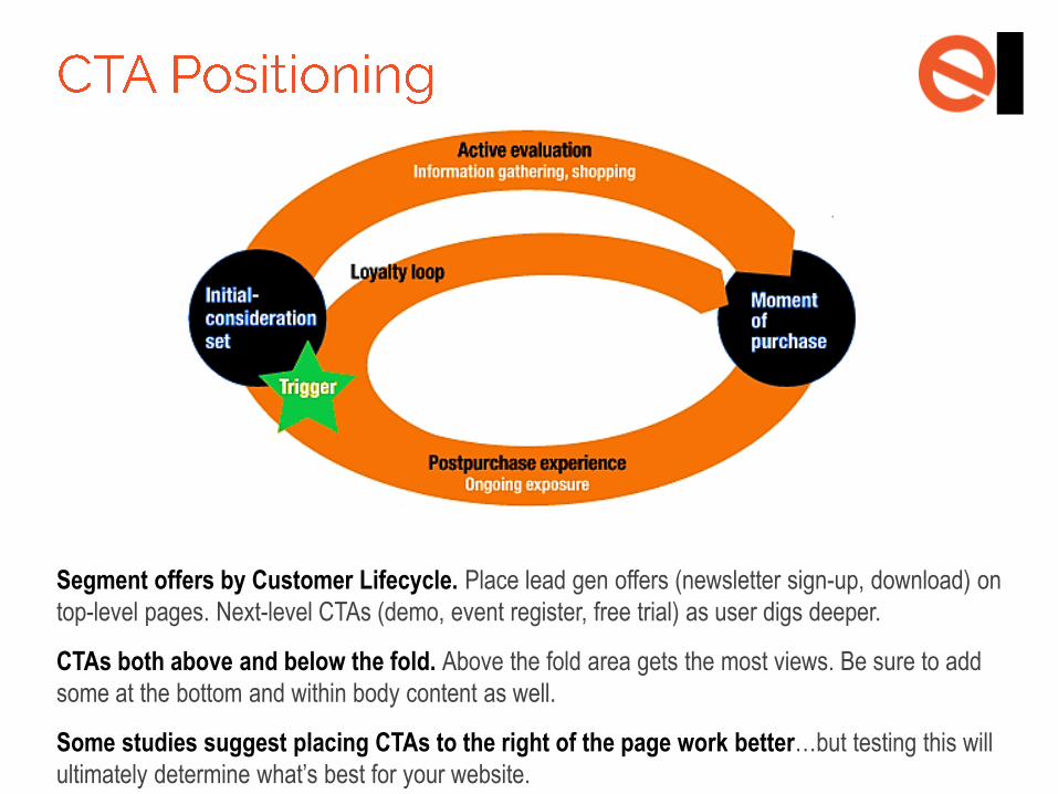
Segment offers by Customer Lifecycle. Place lead gen offers (newsletter sign-up, download) on
top-level pages. Next-level CTAs (demo, event register, free trial) as user digs deeper.
CTAs both above and below the fold. Above the fold area gets the most views. Be sure to add
some at the bottom and within body content as well.
Some studies suggest placing CTAs to the right of the page work better…but testing this will
ultimately determine what’s best for your website.
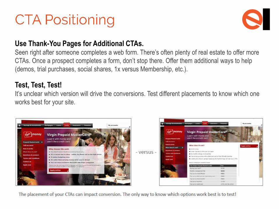
Use Thank-You Pages for Additional CTAs. Seen right after someone completes a web form. There’s often plenty of real estate to offer more
CTAs. Once a prospect completes a form, don’t stop there. Offer them additional ways to help
(demos, trial purchases, social shares, 1x versus Membership, etc.).
Test, Test, Test! It’s unclear which version will drive the conversions. Test different placements to know which one
works best for your site.
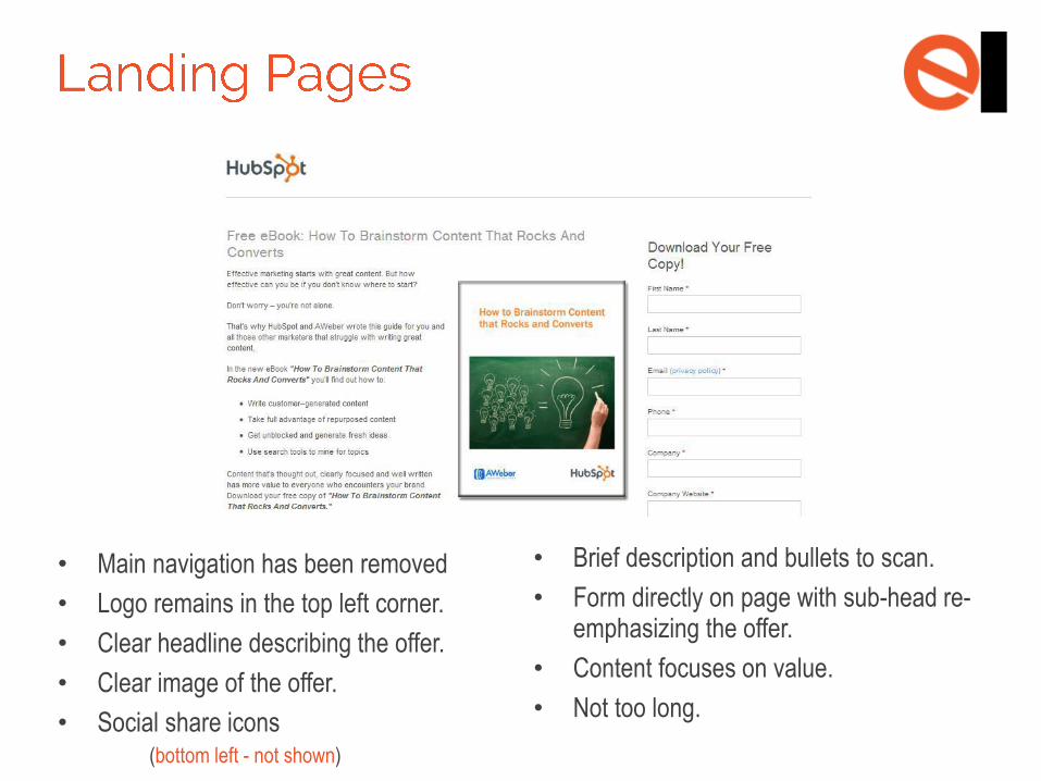
• Main navigation has been removed
• Logo remains in the top left corner.
• Clear headline describing the offer.
• Clear image of the offer.
• Social share icons (bottom left - not shown)
• Brief description and bullets to scan.
• Form directly on page with sub-head re-emphasizing the offer.
• Content focuses on value.
• Not too long.
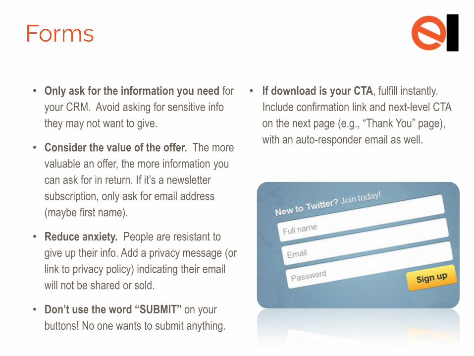
• Only ask for the information you need for
your CRM. Avoid asking for sensitive info
they may not want to give.
• Consider the value of the offer. The more
valuable an offer, the more information you
can ask for in return. If it’s a newsletter
subscription, only ask for email address
(maybe first name).
• Reduce anxiety. People are resistant to
give up their info. Add a privacy message (or
link to privacy policy) indicating their email
will not be shared or sold.
• Don’t use the word “SUBMIT” on your
buttons! No one wants to submit anything.
• If download is your CTA, fulfill instantly.
Include confirmation link and next-level CTA
on the next page (e.g., “Thank You” page),
with an auto-responder email as well.
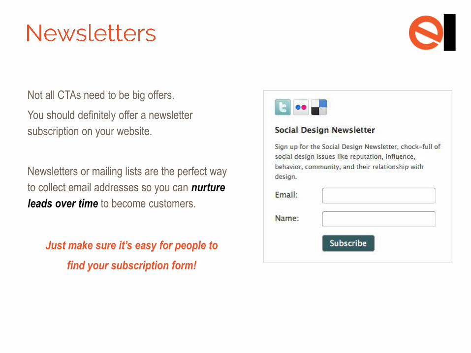
Not all CTAs need to be big offers.
You should definitely offer a newsletter
subscription on your website.
Newsletters or mailing lists are the perfect way
to collect email addresses so you can nurture
leads over time to become customers.
Just make sure it’s easy for people to
find your subscription form!


![8 Essential Elements of your Agile UX Playbook [Infographic]](https://img.pdfslide.us/doc/110x75/5873e9b61a28abd72e8b7cb5/8-essential-elements-of-your-agile-ux-playbook-infographic.jpg)