Embed Size (px)
Citation preview

1
BEST PRACTICES FOR FORM DESIGN LUKE WROBLEWSKI AUTHOR, WEB FORM DESIGN 2008
2
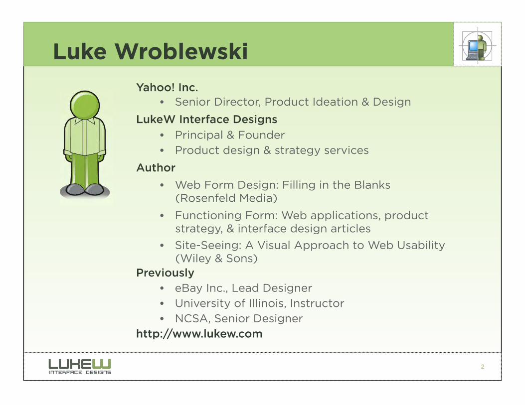
Luke Wroblewski
Yahoo! Inc. • Senior Director, Product Ideation & Design
LukeW Interface Designs
• Principal & Founder
• Product design & strategy services
Author
• Web Form Design: Filling in the Blanks (Rosenfeld Media)
• Functioning Form: Web applications, product strategy, & interface design articles
• Site-Seeing: A Visual Approach to Web Usability (Wiley & Sons)
Previously • eBay Inc., Lead Designer
• University of Illinois, Instructor
• NCSA, Senior Designer
http://www.lukew.com
3
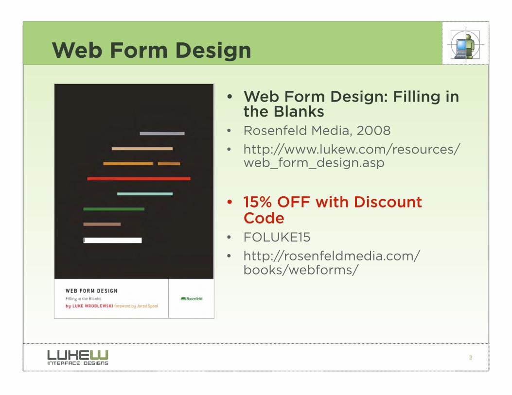
Web Form Design
• Web Form Design: Filling in the Blanks
• Rosenfeld Media, 2008
• http://www.lukew.com/resources/web_form_design.asp
• 15% OFF with Discount Code
• FOLUKE15
• http://rosenfeldmedia.com/books/webforms/
4
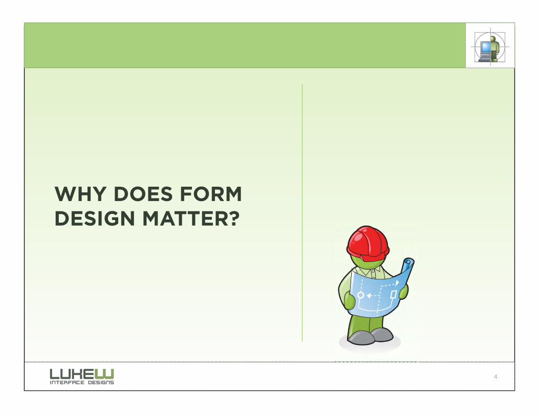
WHY DOES FORM DESIGN MATTER?
5
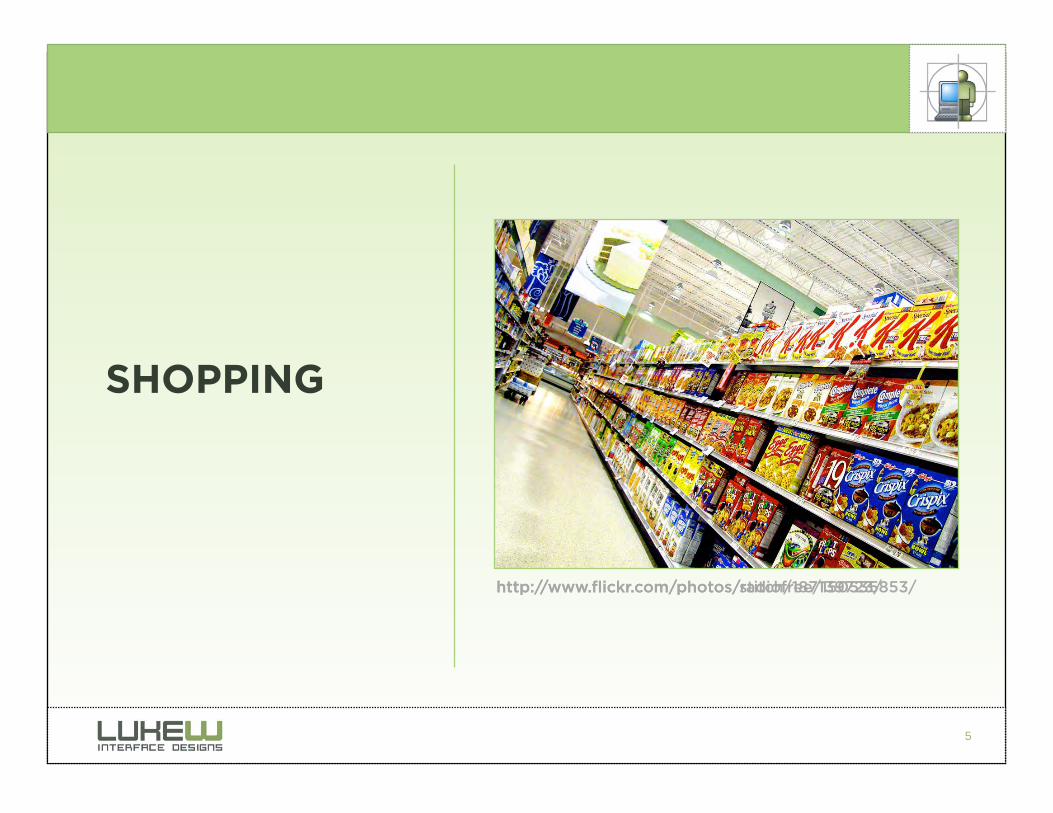
SHOPPING
http://www.flickr.com/photos/stitch/187139723/ http://www.flickr.com/photos/radiofree/150535853/
6
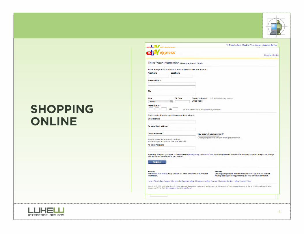
SHOPPING ONLINE

7
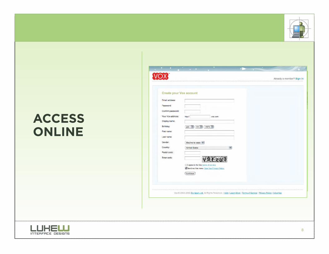
ACCESS
Images from Flickr users katielips, pealco, and *nathan
8
ACCESS ONLINE
9
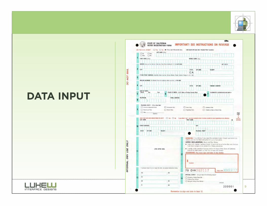
DATA INPUT
10
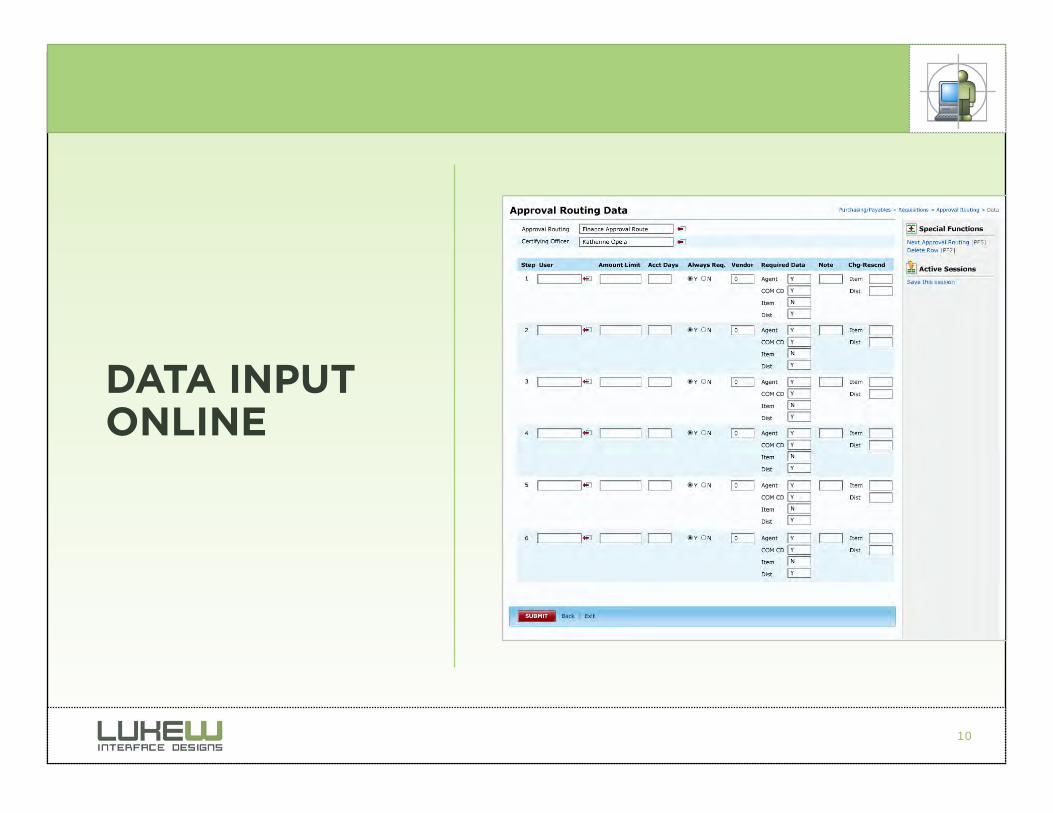
DATA INPUT ONLINE

11
Why Forms Matter
• How customers “talk” to companies online
• Commerce ($) • User: Enable purchasing
• Business: Maximize sales
• Access (membership) • User: Enable participation
• Business: Increase customers & grow communities
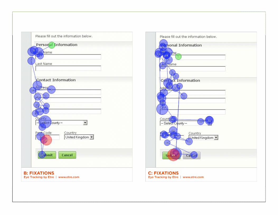
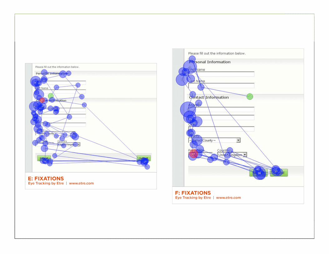
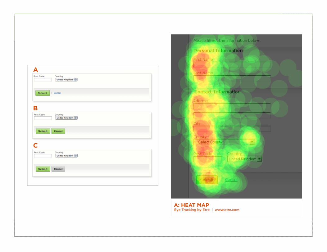
• Engagment • User: Enable information entry & manipulation
• Business: Accumulate content & data
12
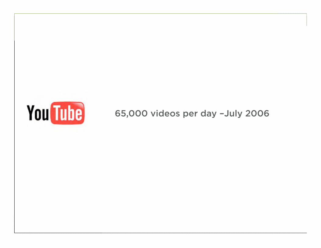
65,000 videos per day –July 2006
13
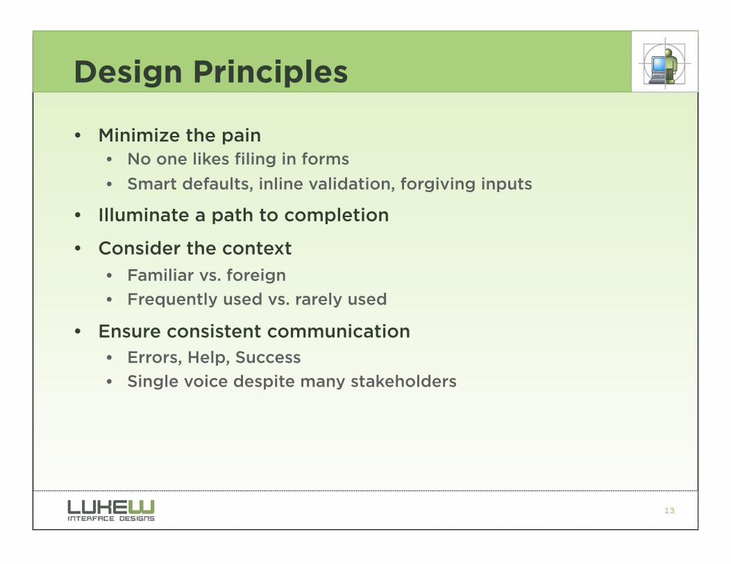
Design Principles
• Minimize the pain • No one likes filing in forms
• Smart defaults, inline validation, forgiving inputs
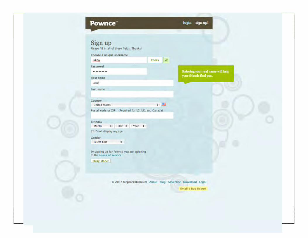
• Illuminate a path to completion
• Consider the context
• Familiar vs. foreign
• Frequently used vs. rarely used
• Ensure consistent communication
• Errors, Help, Success
• Single voice despite many stakeholders
14
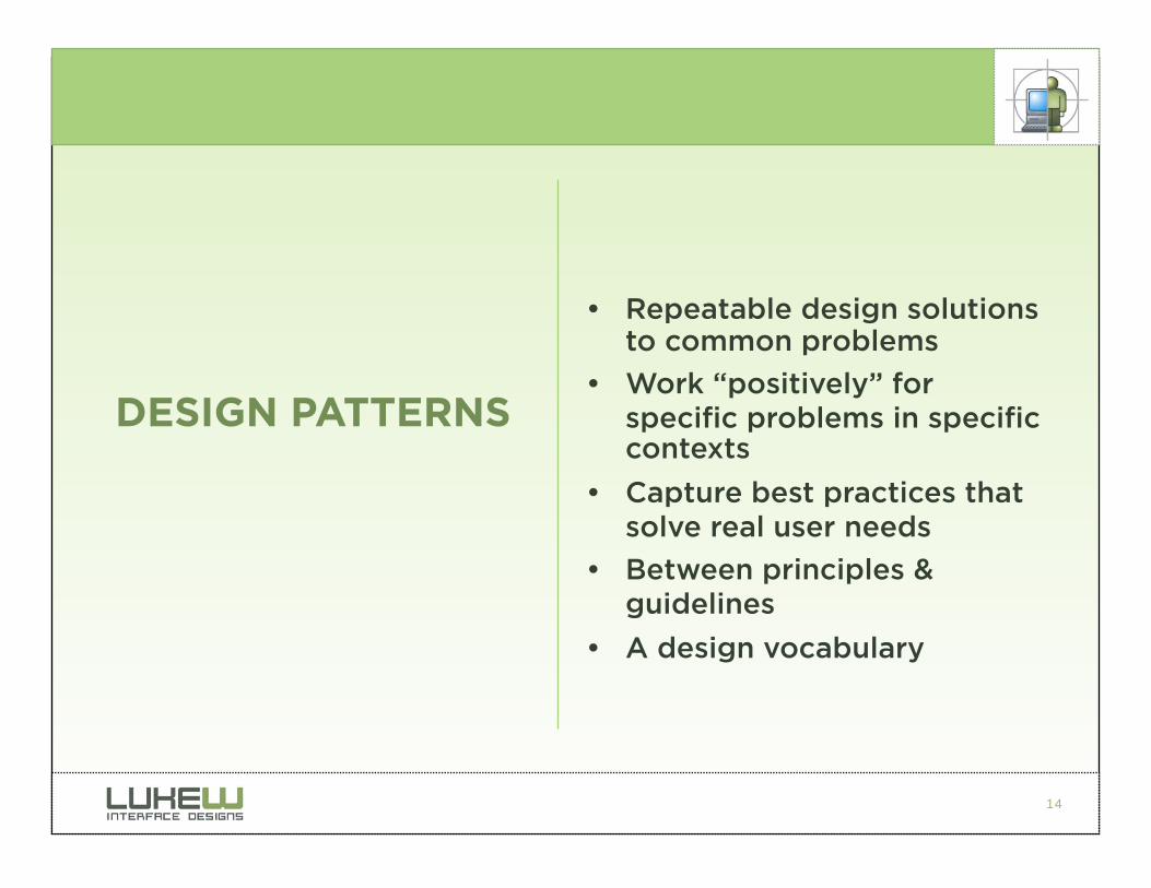
• Repeatable design solutions to common problems
• Work “positively” for specific problems in specific contexts
• Capture best practices that solve real user needs
• Between principles & guidelines
• A design vocabulary
DESIGN PATTERNS
15
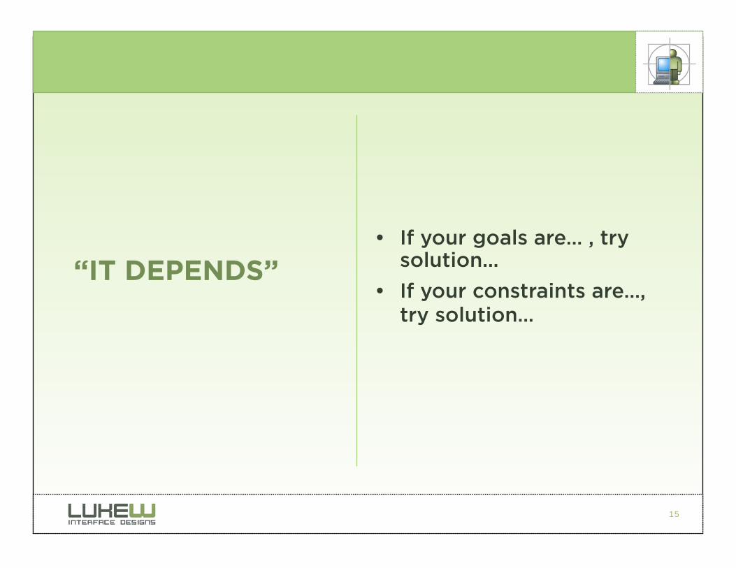
• If your goals are… , try solution…
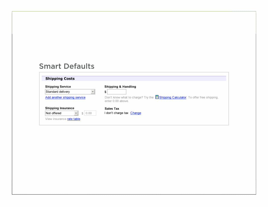
• If your constraints are…, try solution…
“IT DEPENDS”
16
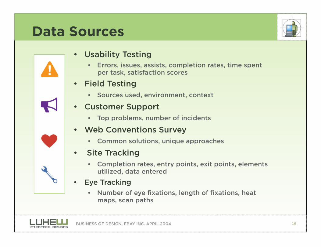
Data Sources
• Usability Testing
• Errors, issues, assists, completion rates, time spent per task, satisfaction scores
• Field Testing • Sources used, environment, context
• Customer Support • Top problems, number of incidents
• Web Conventions Survey
• Common solutions, unique approaches
• Site Tracking
• Completion rates, entry points, exit points, elements utilized, data entered
• Eye Tracking
• Number of eye fixations, length of fixations, heat maps, scan paths
BUSINESS OF DESIGN, EBAY INC. APRIL 2004
17
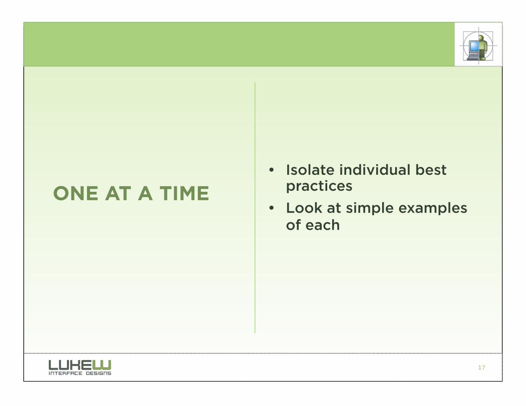
• Isolate individual best practices
• Look at simple examples of each
ONE AT A TIME
18
INFORMATION

19
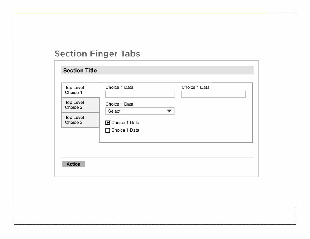
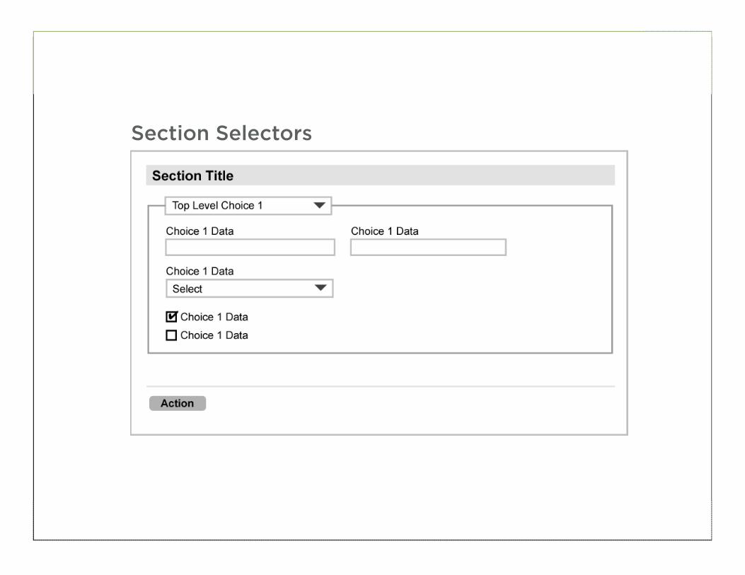
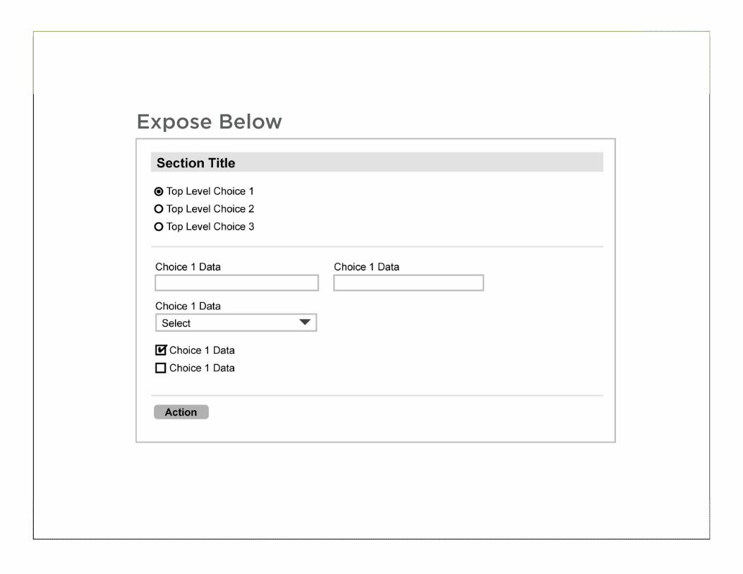
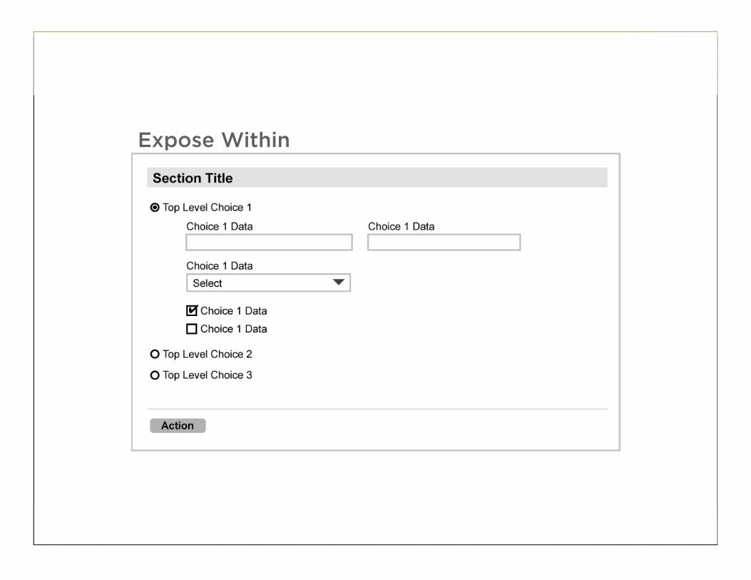
Information
• Layout • Label positioning • Content groupings
• Input Affordances • Formats, required fields
• Actions • Primary & secondary
• Help & Tips
• Visual Hierarchy
20
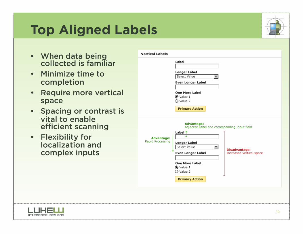
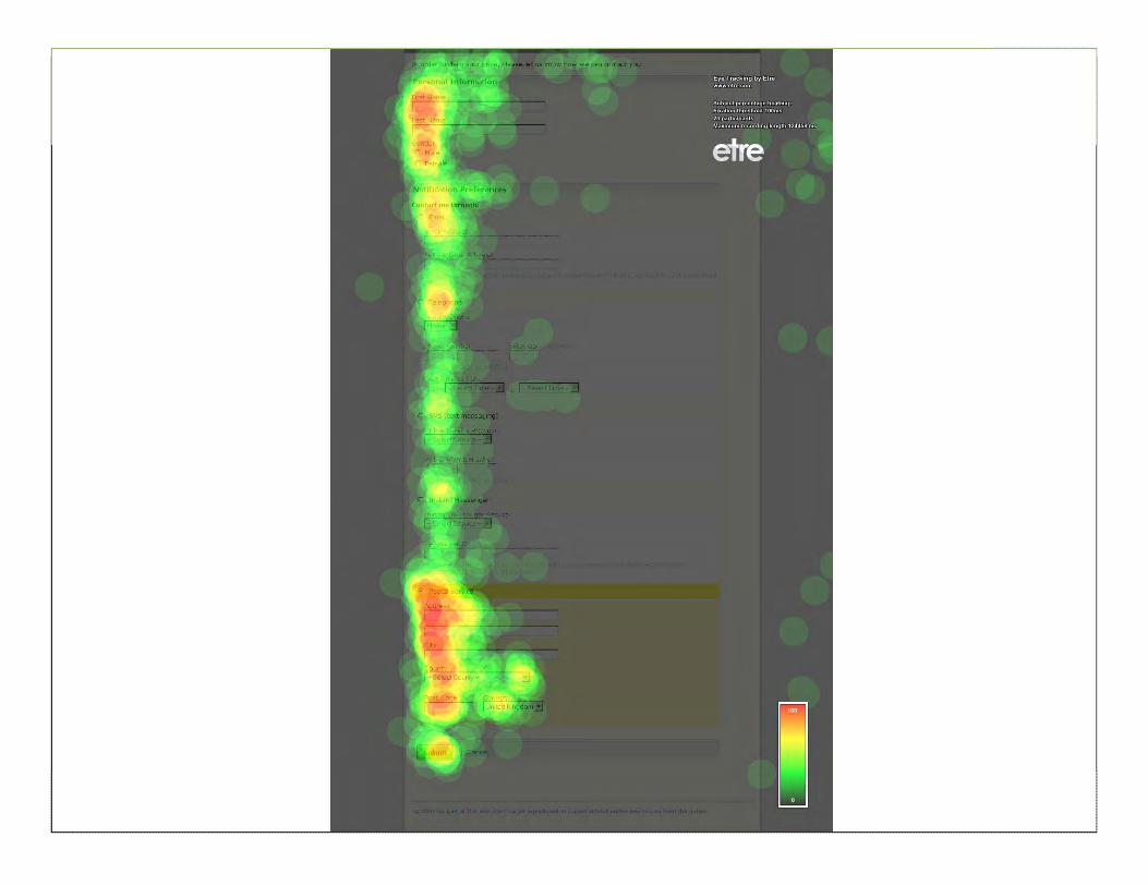
Top Aligned Labels
• When data being collected is familiar
• Minimize time to completion
• Require more vertical space
• Spacing or contrast is vital to enable efficient scanning
• Flexibility for localization and complex inputs
21
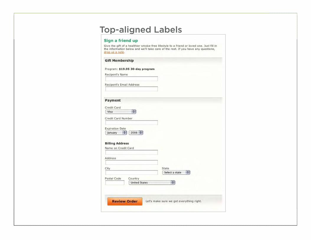
Top-aligned Labels
22
Right Aligned Labels
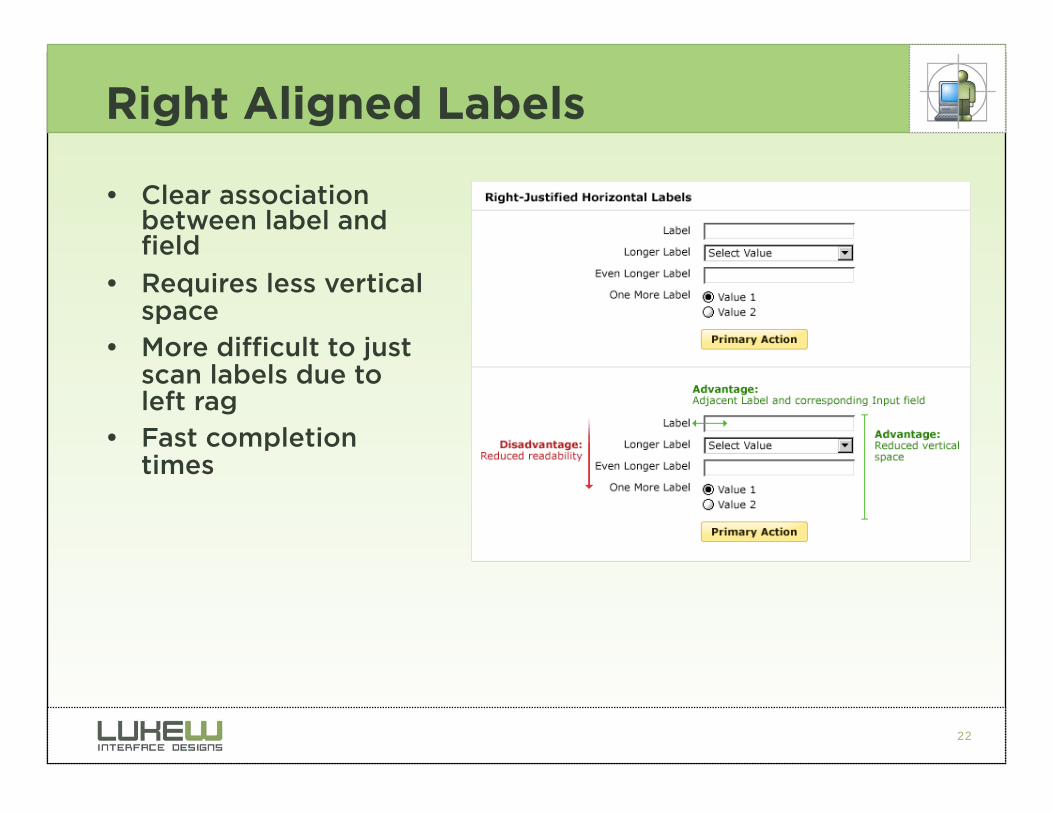
• Clear association between label and field
• Requires less vertical space
• More difficult to just scan labels due to left rag
• Fast completion times
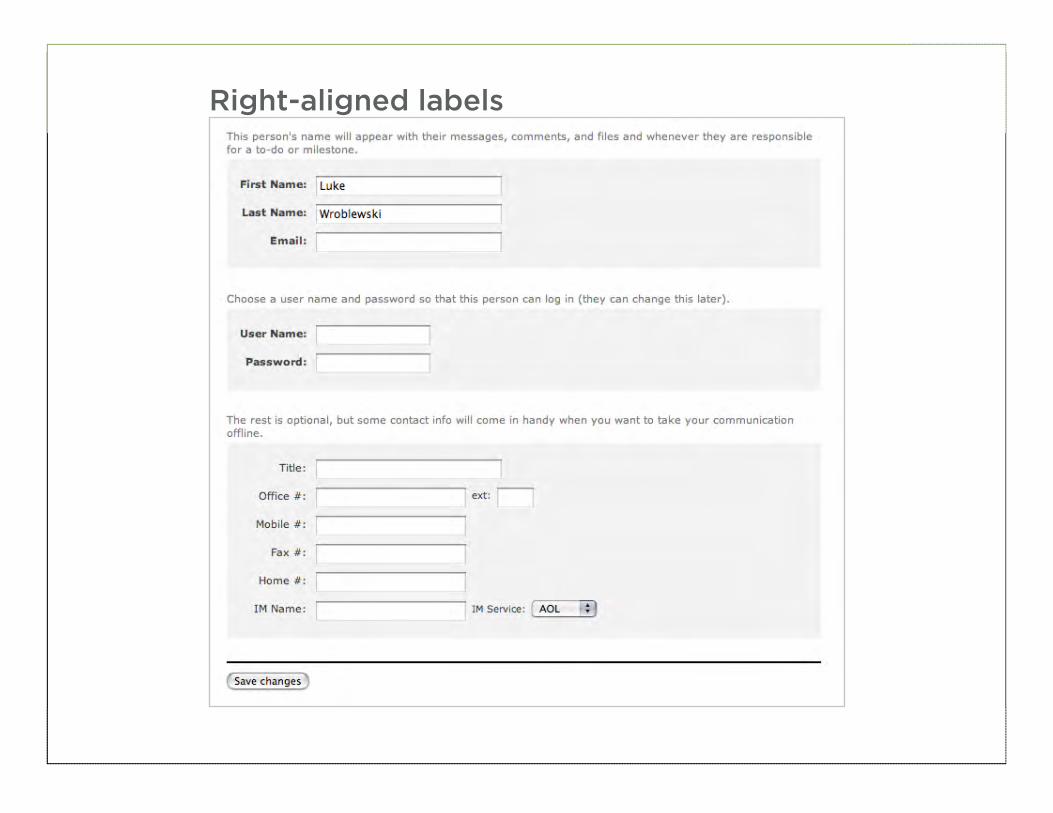
23
Right-aligned labels
24
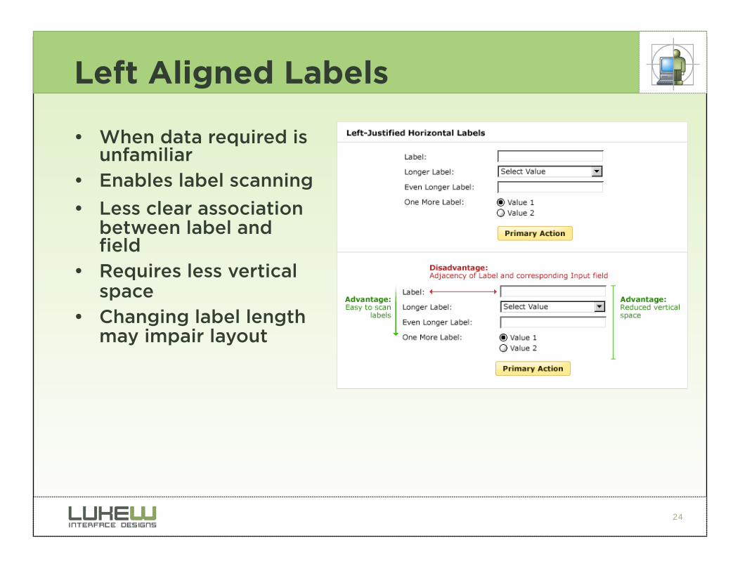
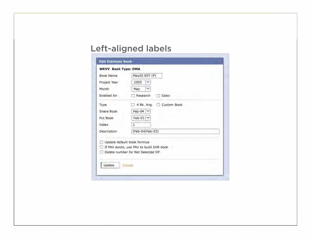
Left Aligned Labels
• When data required is unfamiliar
• Enables label scanning
• Less clear association between label and field
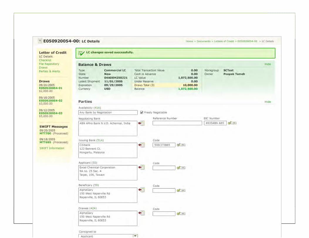
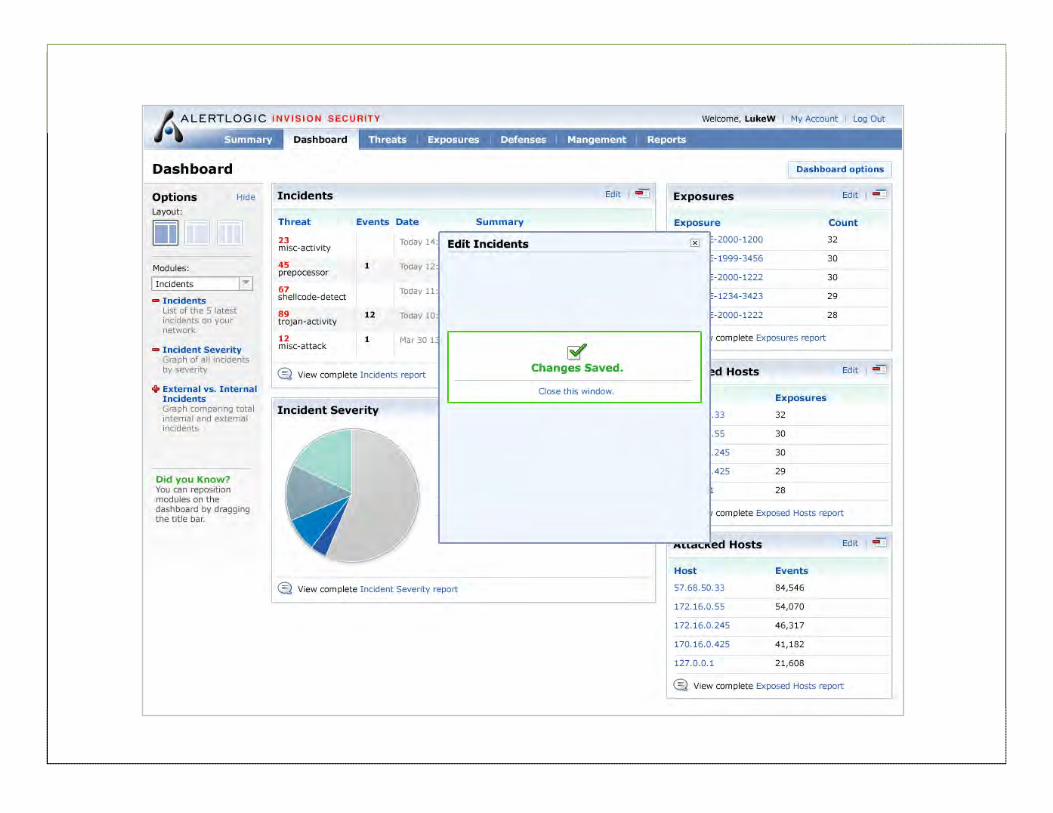
• Requires less vertical space
• Changing label length may impair layout
25
Left-aligned labels
26
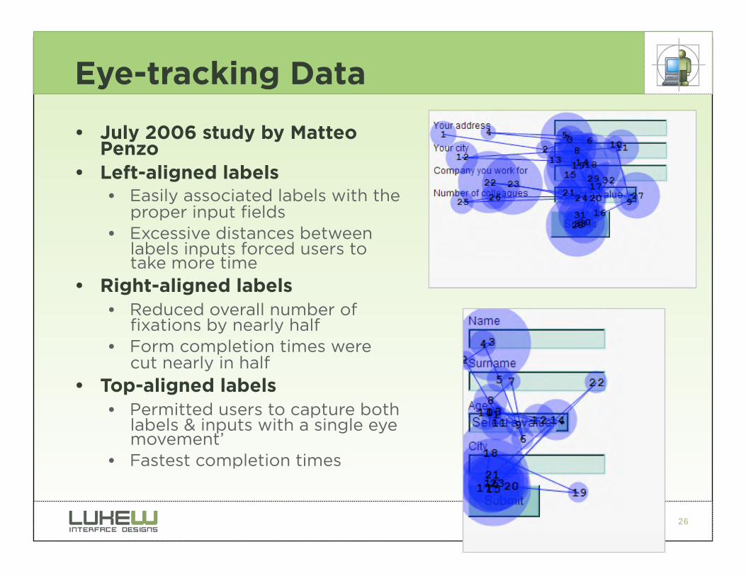
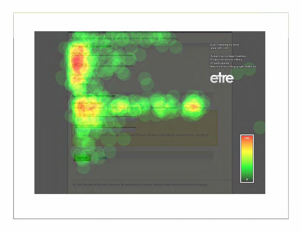
Eye-tracking Data
• July 2006 study by Matteo Penzo
• Left-aligned labels • Easily associated labels with the
proper input fields • Excessive distances between
labels inputs forced users to take more time
• Right-aligned labels
• Reduced overall number of fixations by nearly half
• Form completion times were cut nearly in half
• Top-aligned labels
• Permitted users to capture both labels & inputs with a single eye movement’
• Fastest completion times
27
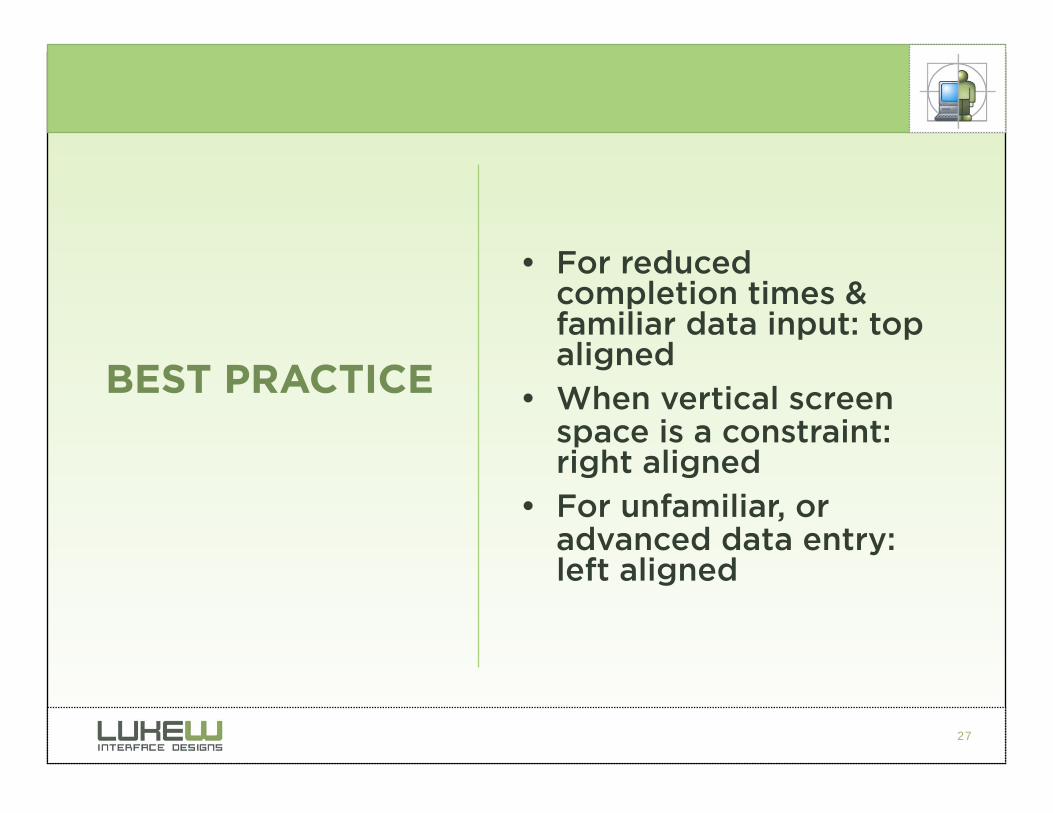
• For reduced completion times & familiar data input: top aligned
• When vertical screen space is a constraint: right aligned
• For unfamiliar, or advanced data entry: left aligned
BEST PRACTICE
28
Required Form Fields
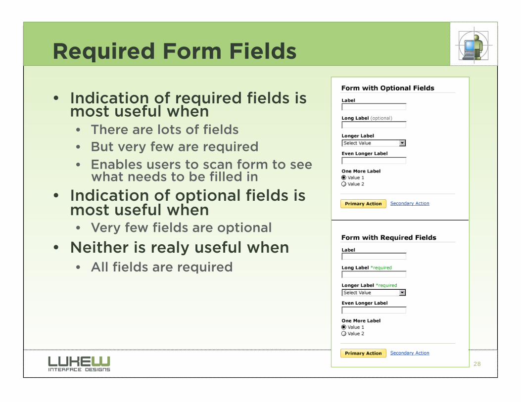
• Indication of required fields is most useful when • There are lots of fields • But very few are required • Enables users to scan form to see
what needs to be filled in
• Indication of optional fields is most useful when • Very few fields are optional
• Neither is realy useful when • All fields are required
29
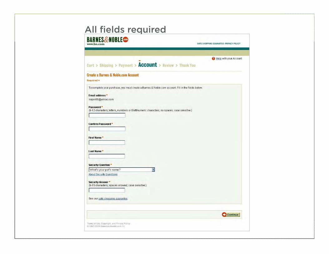
All fields required
30
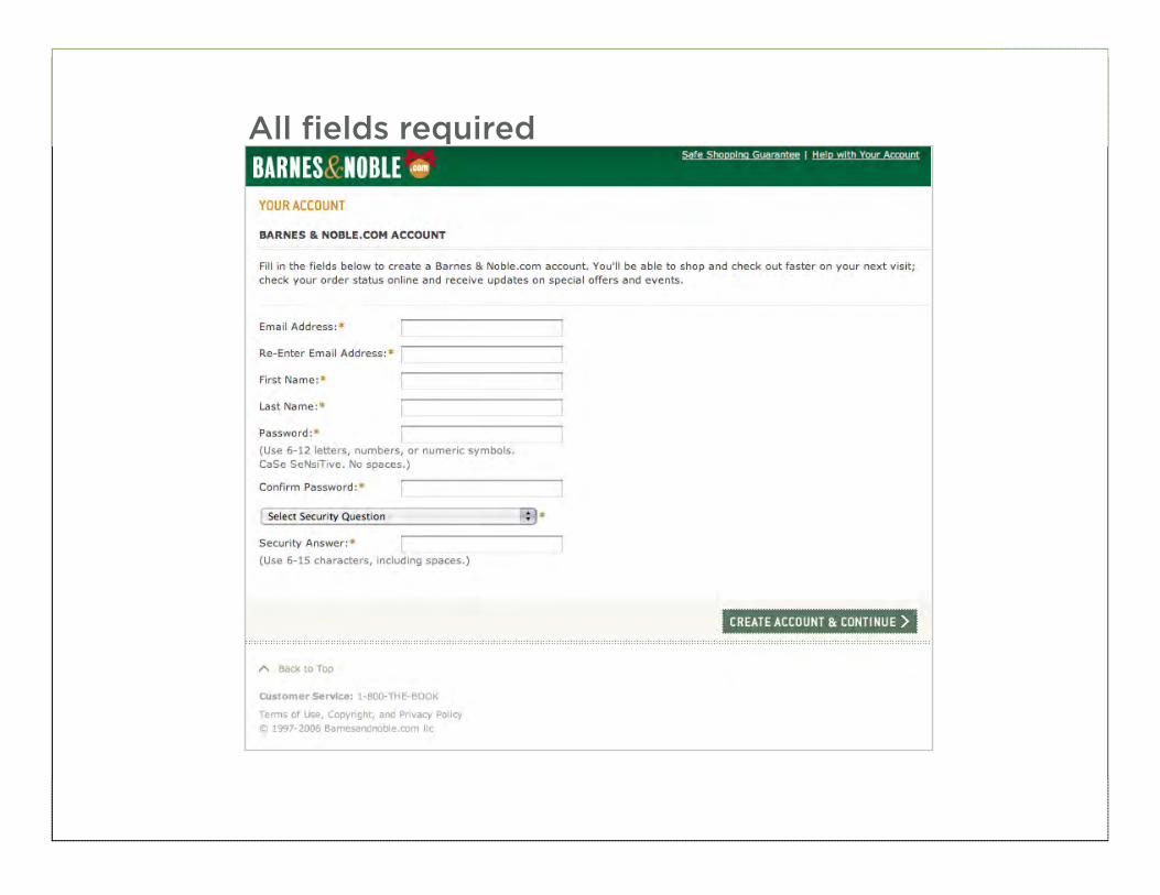
All fields required
31
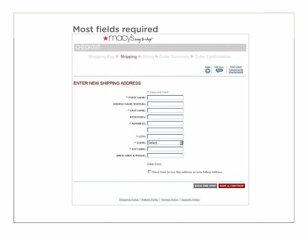
Most fields required
32
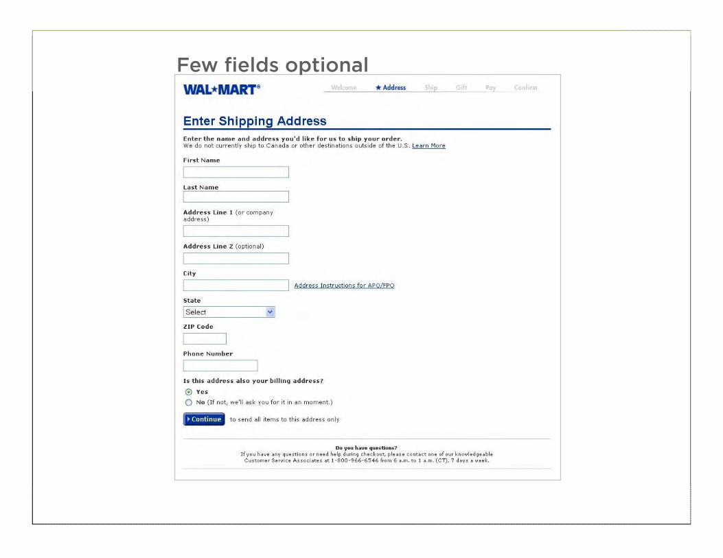
Few fields optional
33
34
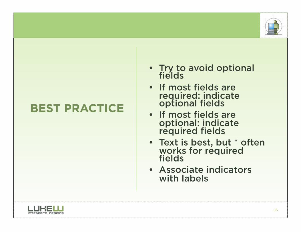
35
• Try to avoid optional fields
• If most fields are required: indicate optional fields
• If most fields are optional: indicate required fields
• Text is best, but * often works for required fields
• Associate indicators with labels
BEST PRACTICE
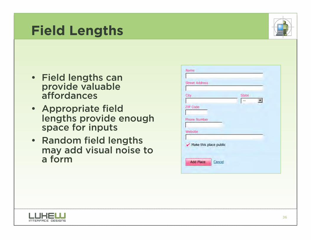
36
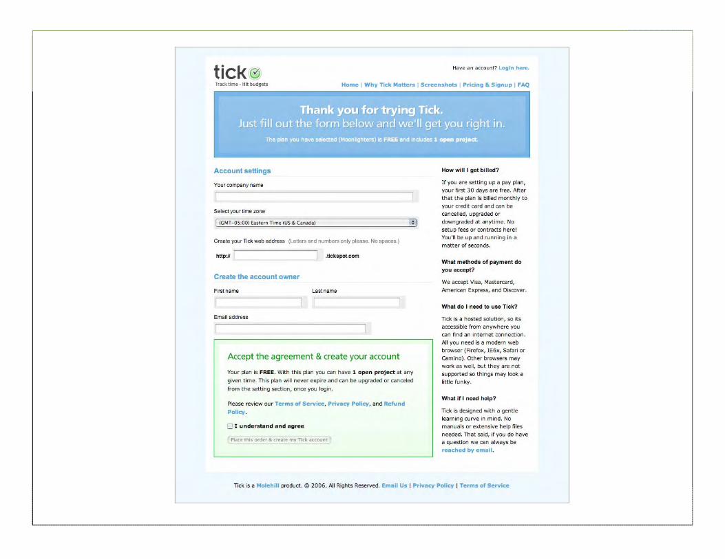
Field Lengths
• Field lengths can provide valuable affordances
• Appropriate field lengths provide enough space for inputs
• Random field lengths may add visual noise to a form
37
38
39
40
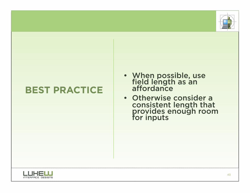
• When possible, use field length as an affordance
• Otherwise consider a consistent length that provides enough room for inputs
BEST PRACTICE
41
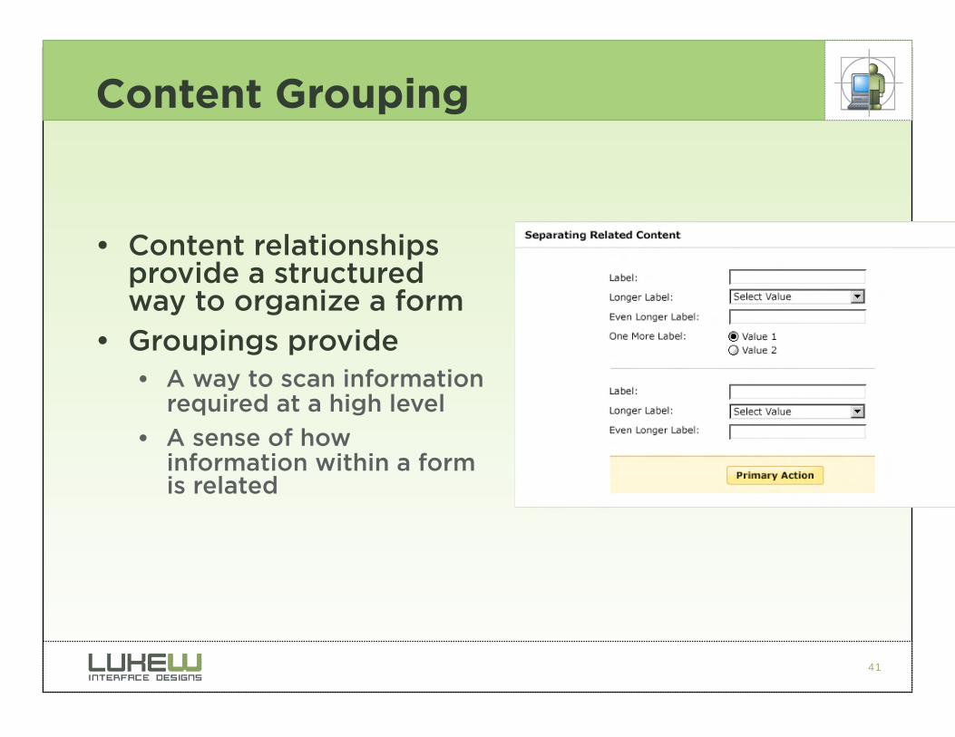
Content Grouping
• Content relationships provide a structured way to organize a form
• Groupings provide • A way to scan information
required at a high level
• A sense of how information within a form is related
42
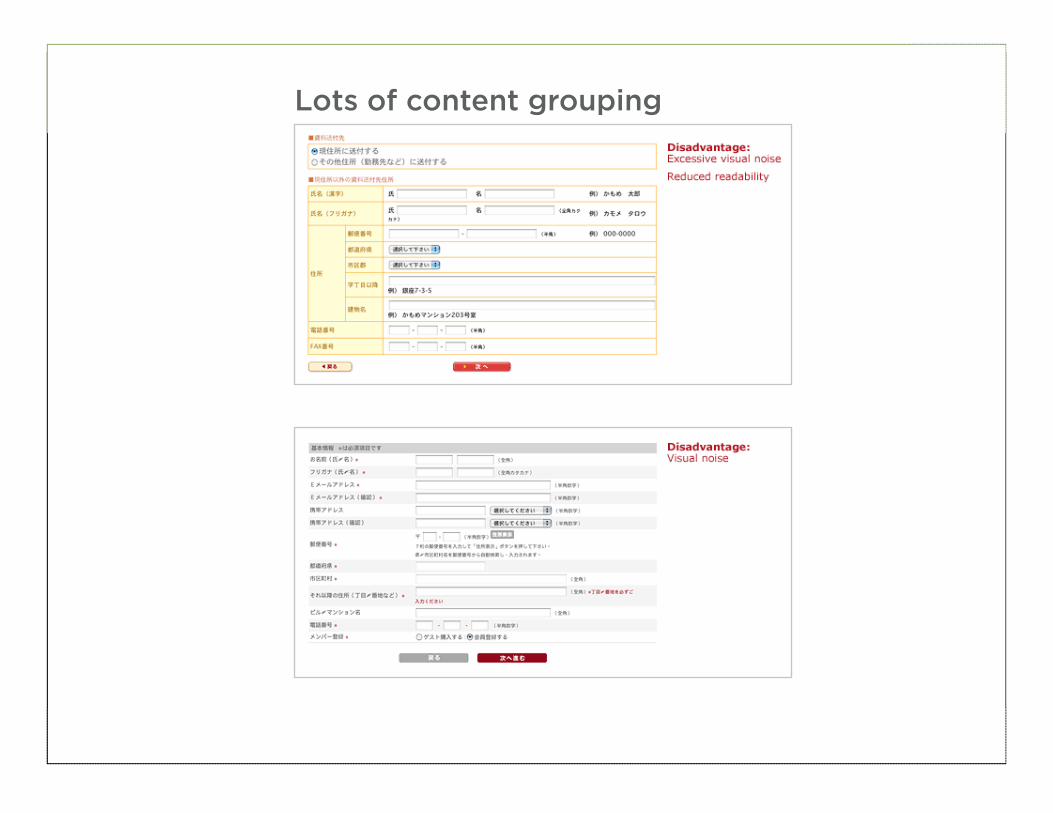
Lots of content grouping
43
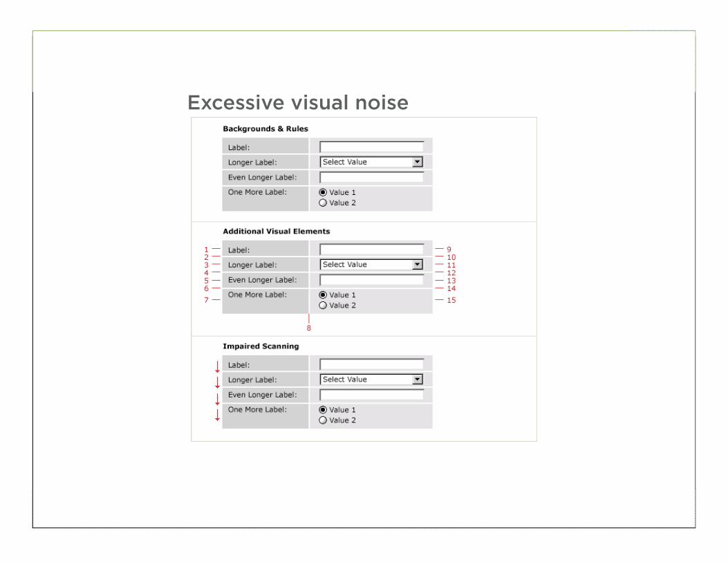
Excessive visual noise

44
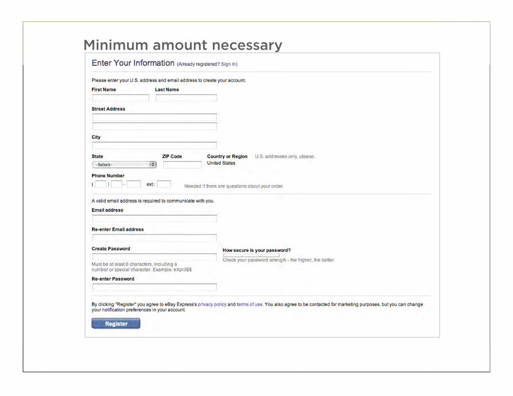
Minimum amount necessary
45
46
Minimum amount necessary
47

48
• Use relevant content groupings to organize forms
• Use the minimum amount of visual elements necessary to communicate useful relationships
BEST PRACTICE
49
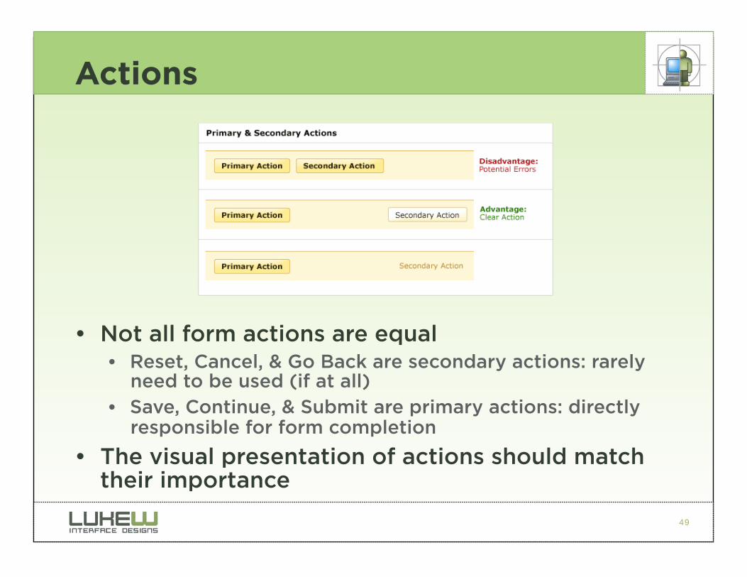
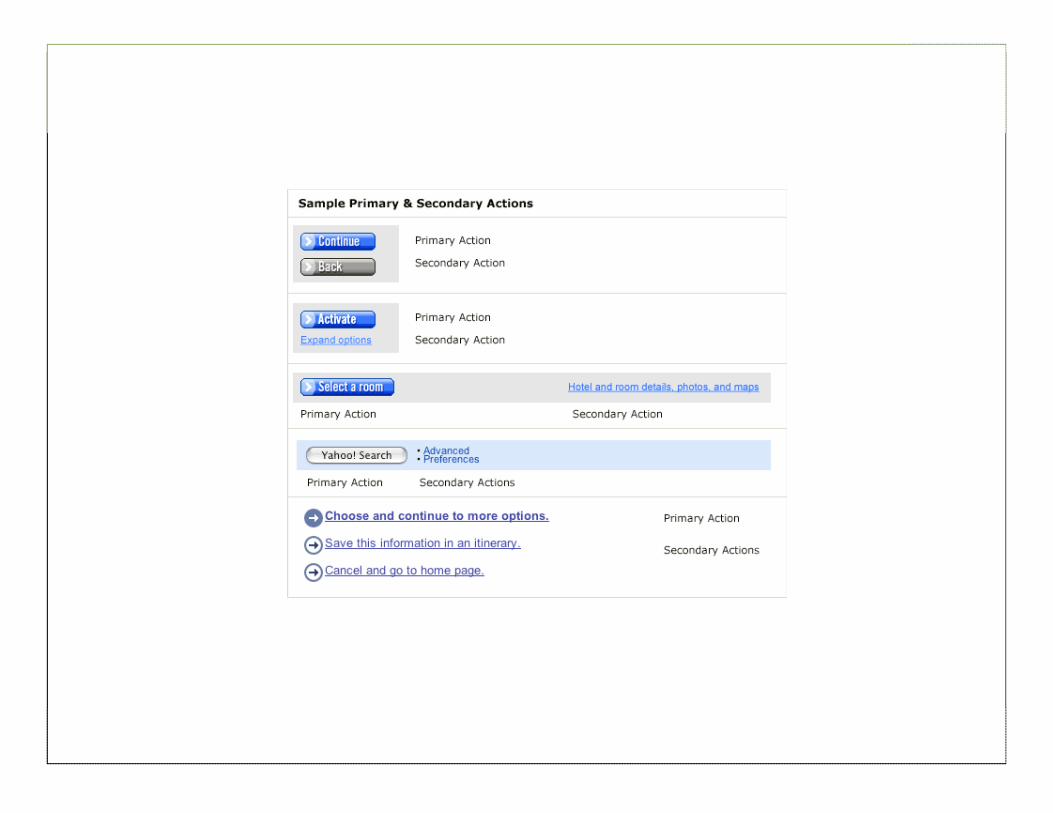
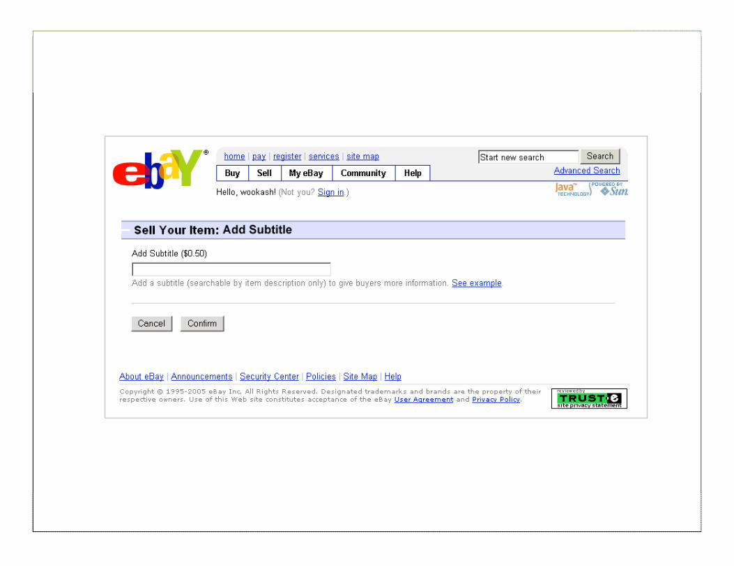
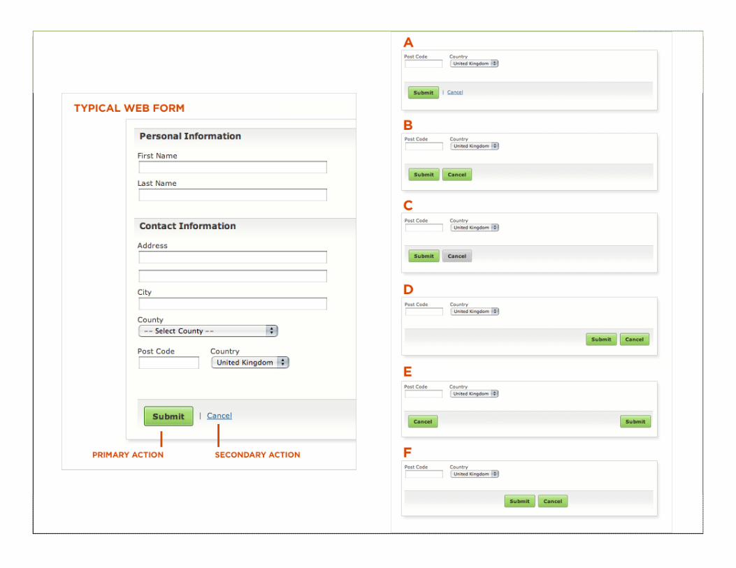
Actions
• Not all form actions are equal • Reset, Cancel, & Go Back are secondary actions: rarely
need to be used (if at all)
• Save, Continue, & Submit are primary actions: directly responsible for form completion
• The visual presentation of actions should match their importance
50
51
52
53
54
55
56
• Avoid secondary actions if possible
• Otherwise, ensure a clear visual distinction between primary & secondary actions
• Align primary actions with input fields for a clear path to completion
BEST PRACTICE
57
Help & Tips
• Help & Tips are useful when: • Asking for unfamiliar data
• Users may question why data is being requested
• There are recommended ways of providing data
• Certain data requests are optional
• However, Help & Tips can quickly overwhelm a form if overused
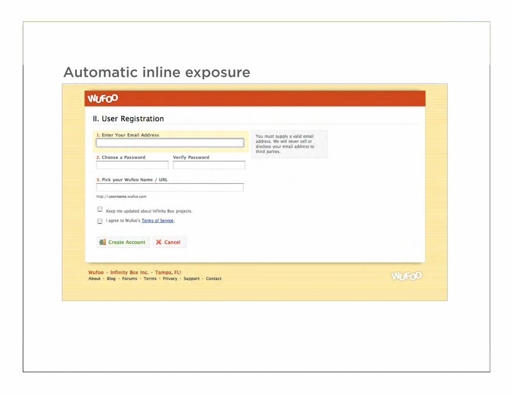
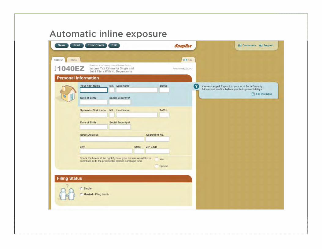
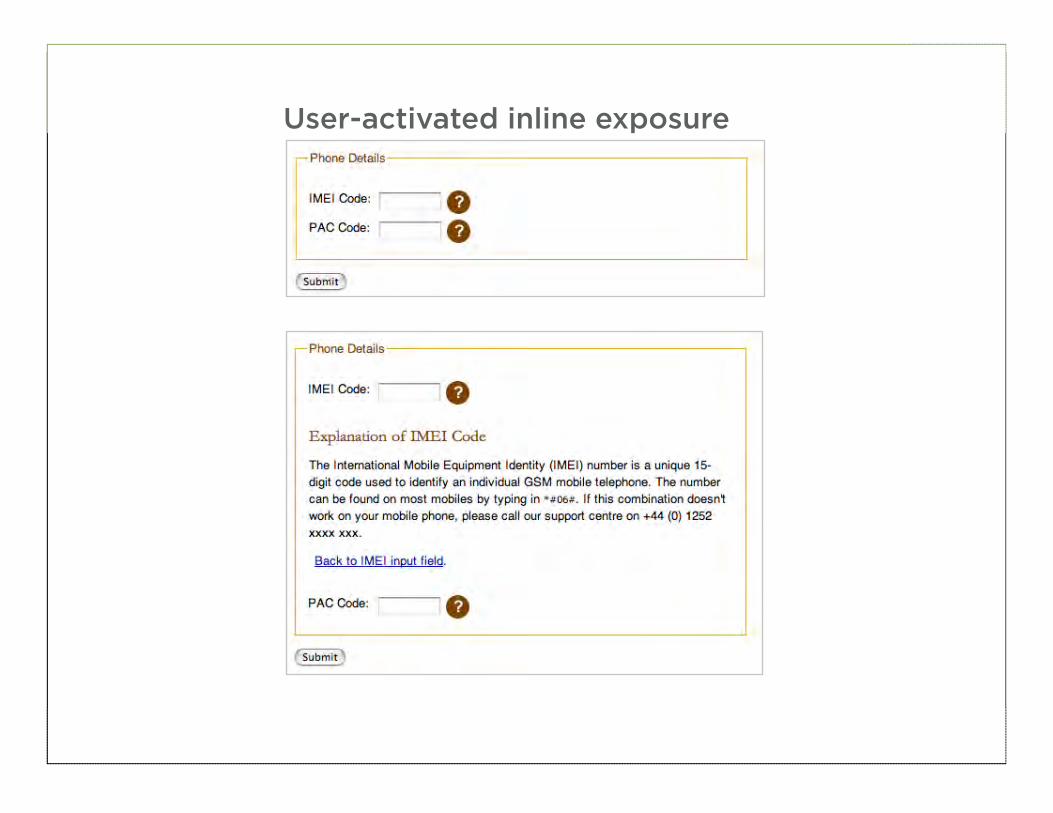
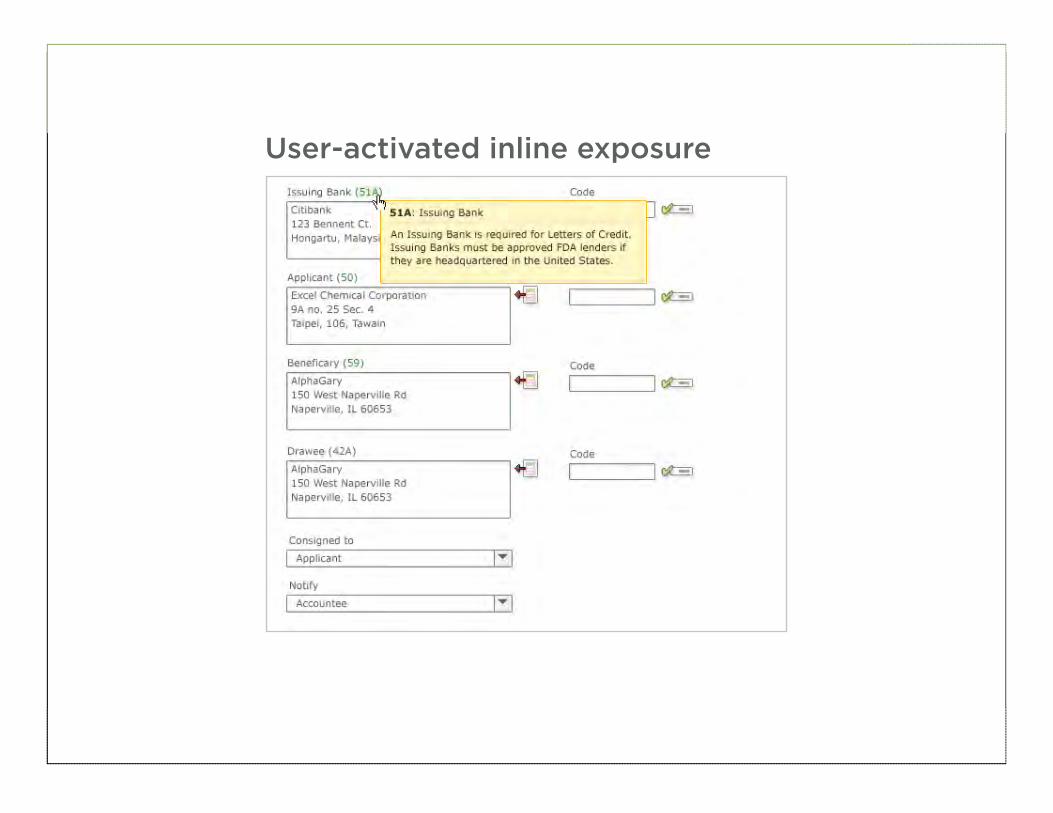
• In these cases, you may want to consider a dynamic solution • Automatic inline exposure
• User activated inline exposure
• User activated section exposure
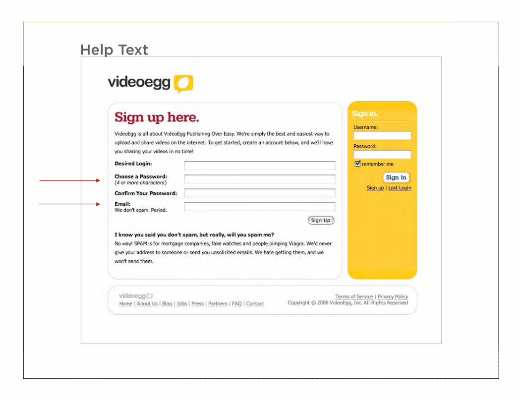
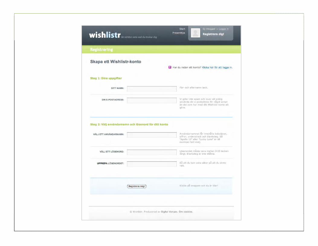
58
Help Text
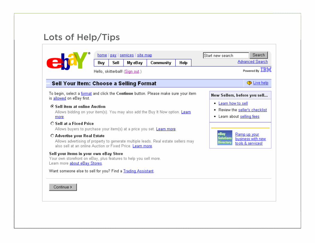
59
Lots of Help/Tips
60
61
Automatic inline exposure
62
Automatic inline exposure
63
User-activated inline exposure
64
User-activated inline exposure
65
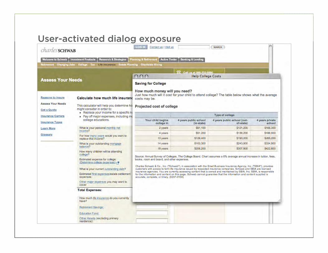
User-activated dialog exposure
66
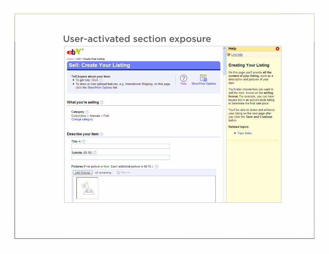
User-activated section exposure
67
• Minimize the amount of help & tips required to fill out a form
• Help visible and adjacent to a data request is most useful
• When lots of unfamiliar data is being requested, consider using a dynamic help system
BEST PRACTICE
68
INTERACTION
69
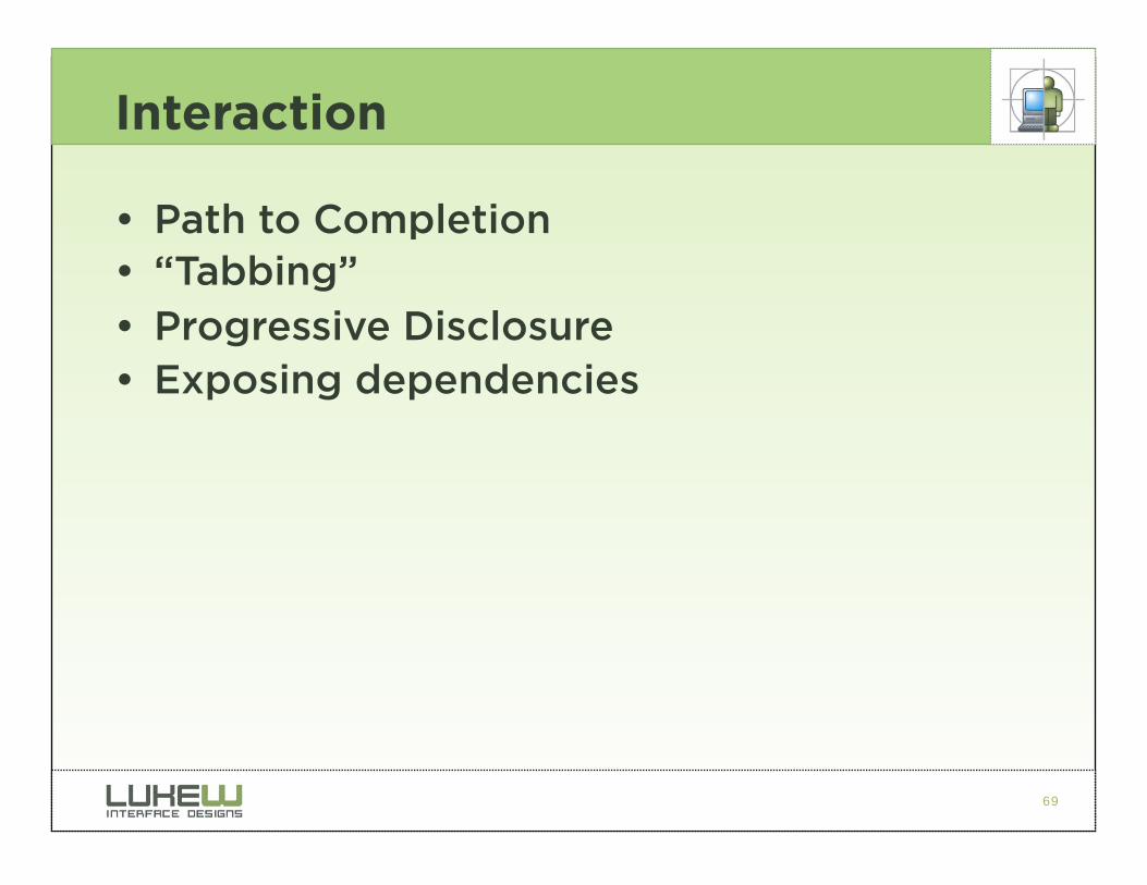
Interaction
• Path to Completion • “Tabbing” • Progressive Disclosure • Exposing dependencies
70
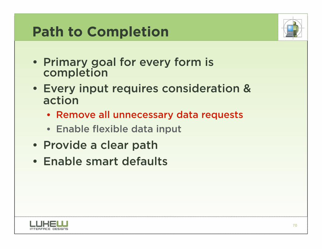
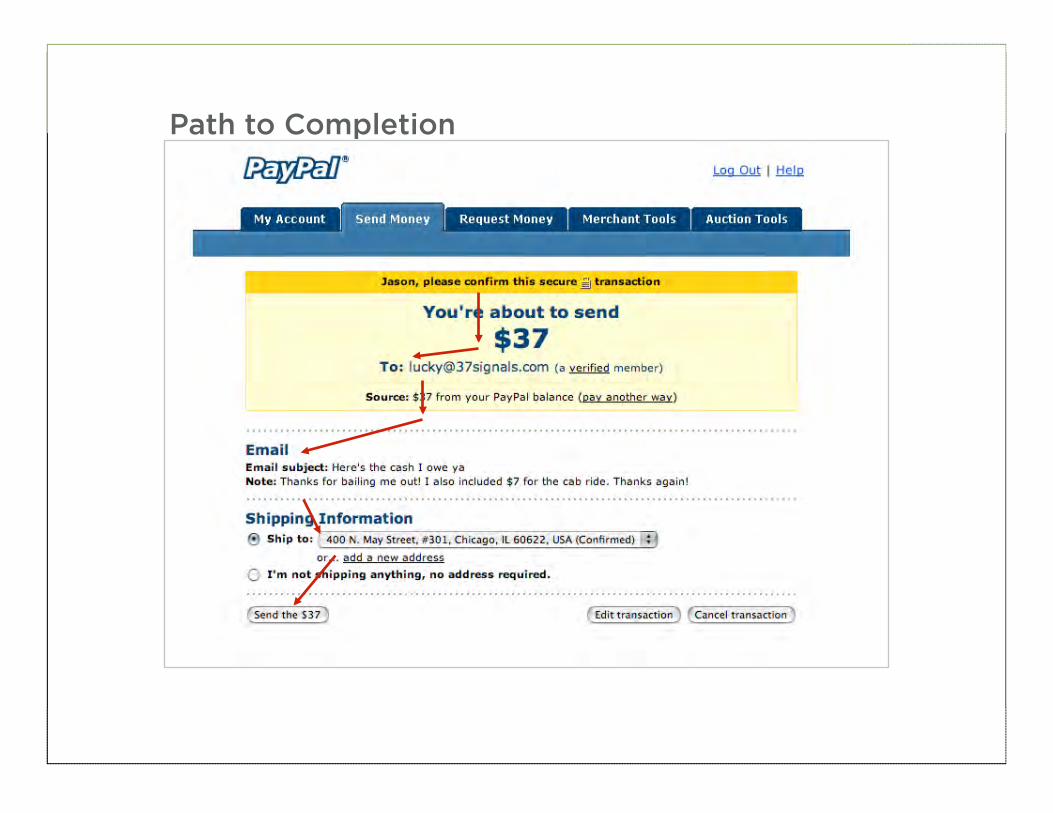
Path to Completion
• Primary goal for every form is completion
• Every input requires consideration & action • Remove all unnecessary data requests
• Enable flexible data input
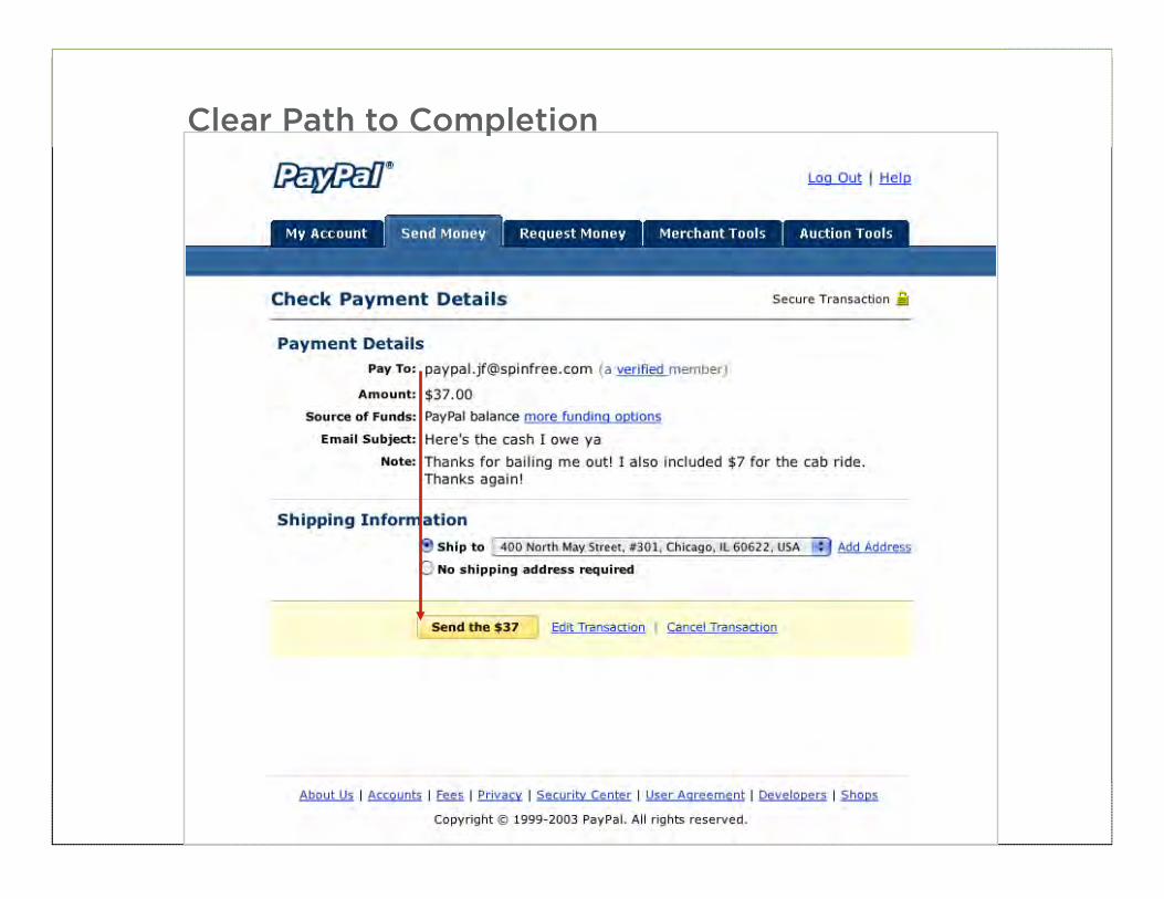
• Provide a clear path
• Enable smart defaults
71
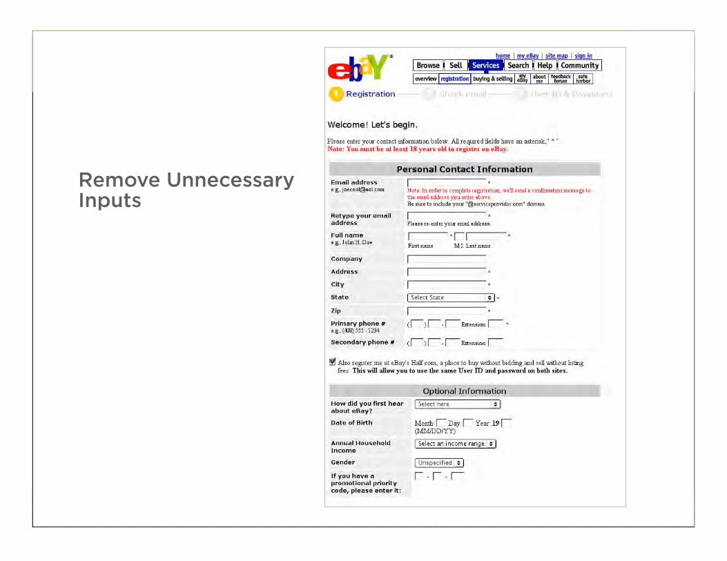
Remove Unnecessary Inputs
72
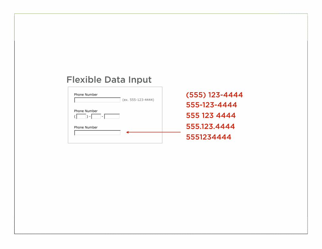
Flexible Data Input
(555) 123-4444
555-123-4444
555 123 4444
555.123.4444
5551234444
73
Smart Defaults
74
Path to Completion
75
Clear Path to Completion
76
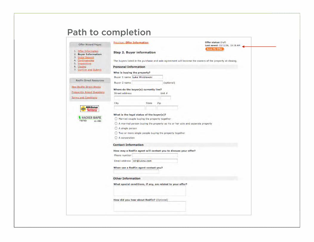
Path to completion

77
• Remove all unnecessary data requests
• Enable smart defaults • Employ flexible data
entry • Illuminate a clear path
to completion • For long forms, show
progress & save
BEST PRACTICE
78
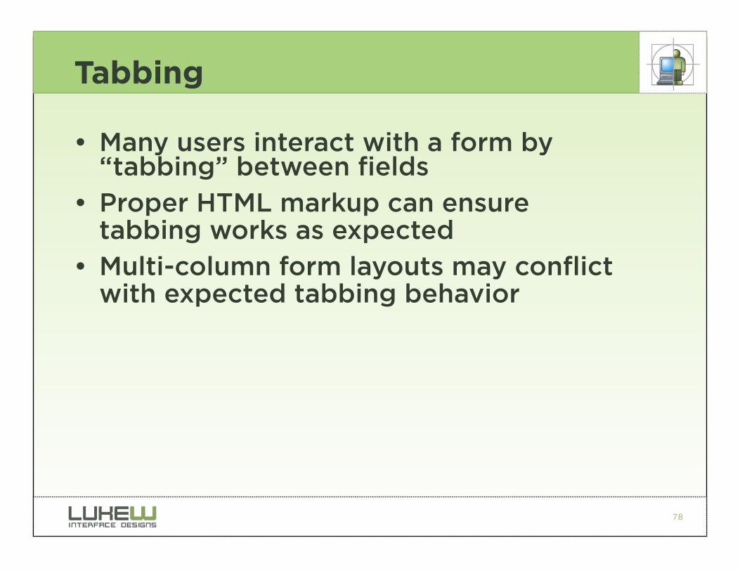
Tabbing
• Many users interact with a form by “tabbing” between fields
• Proper HTML markup can ensure tabbing works as expected
• Multi-column form layouts may conflict with expected tabbing behavior
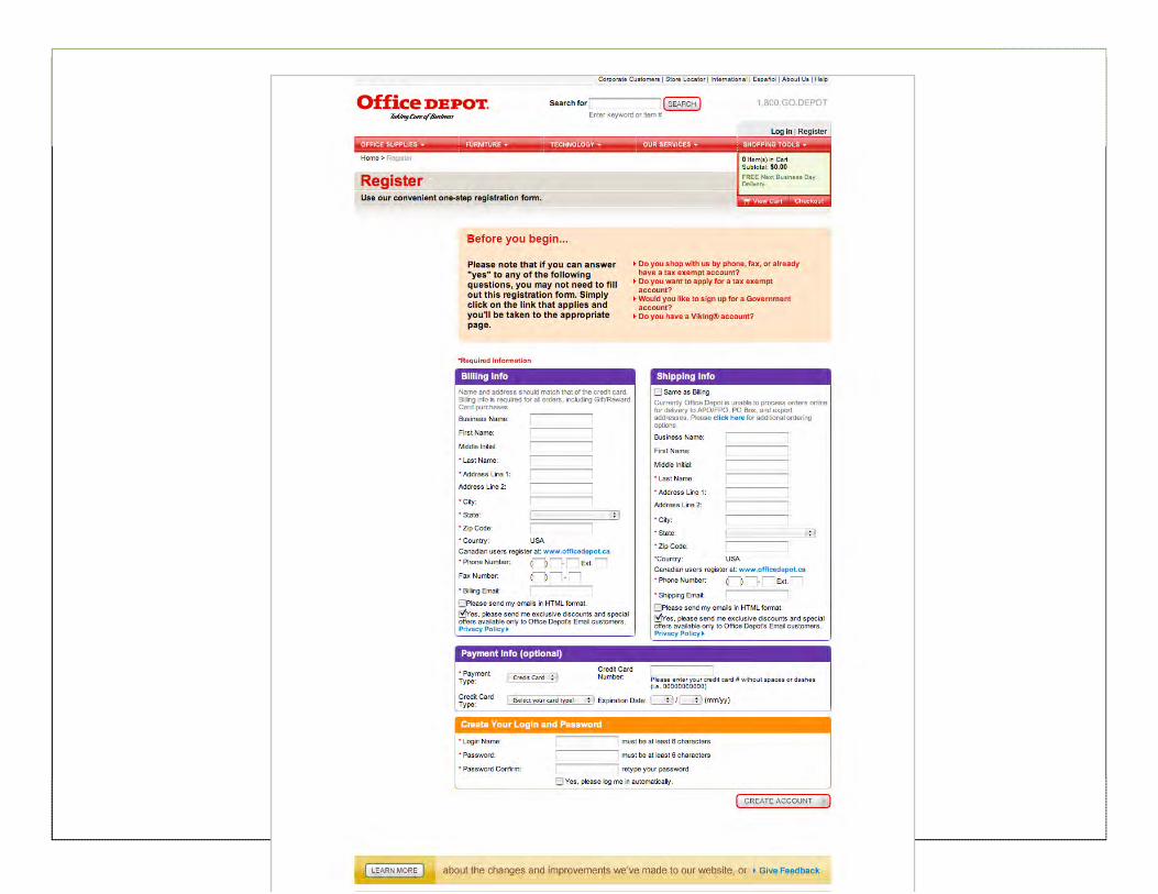
79
80
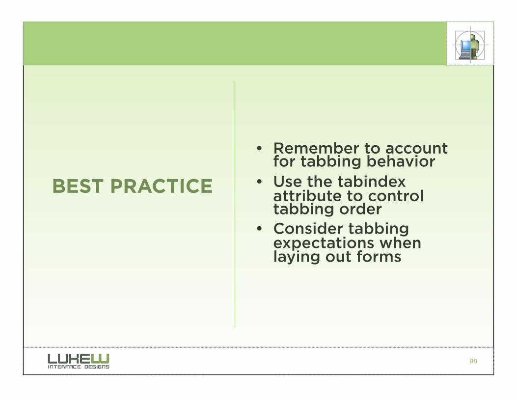
• Remember to account for tabbing behavior
• Use the tabindex attribute to control tabbing order
• Consider tabbing expectations when laying out forms
BEST PRACTICE
81
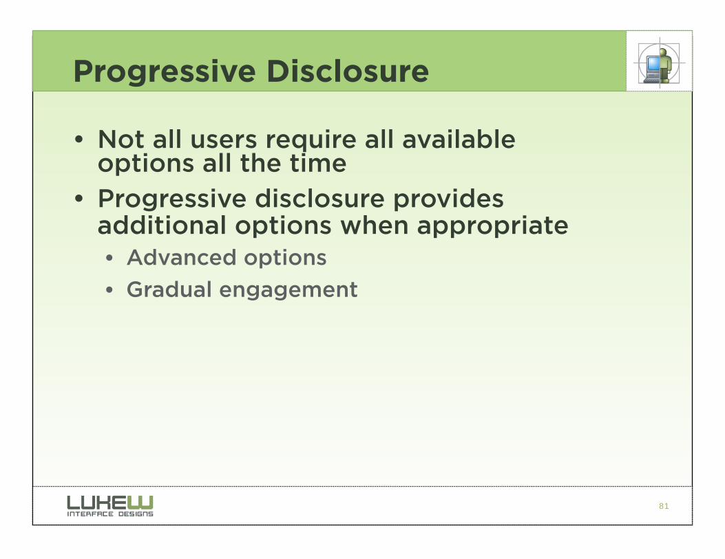
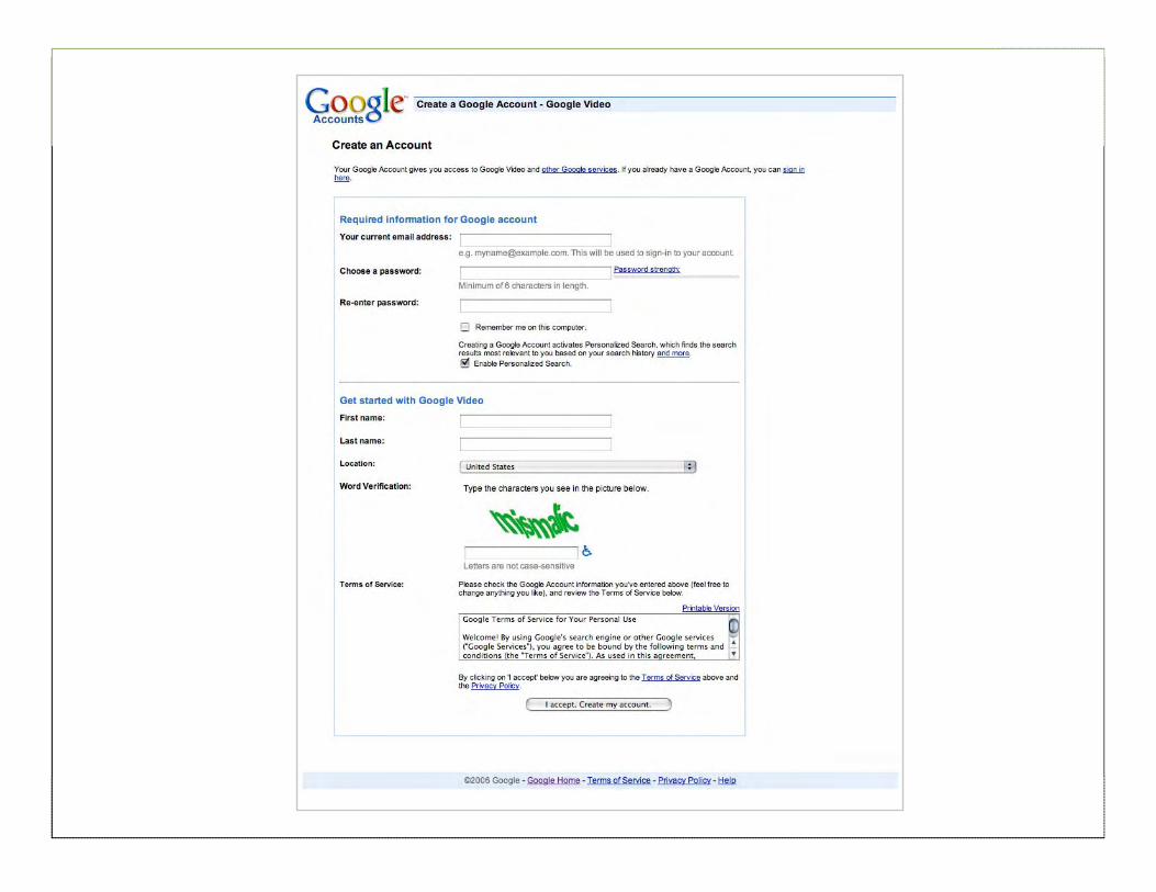
Progressive Disclosure
• Not all users require all available options all the time
• Progressive disclosure provides additional options when appropriate • Advanced options
• Gradual engagement
82
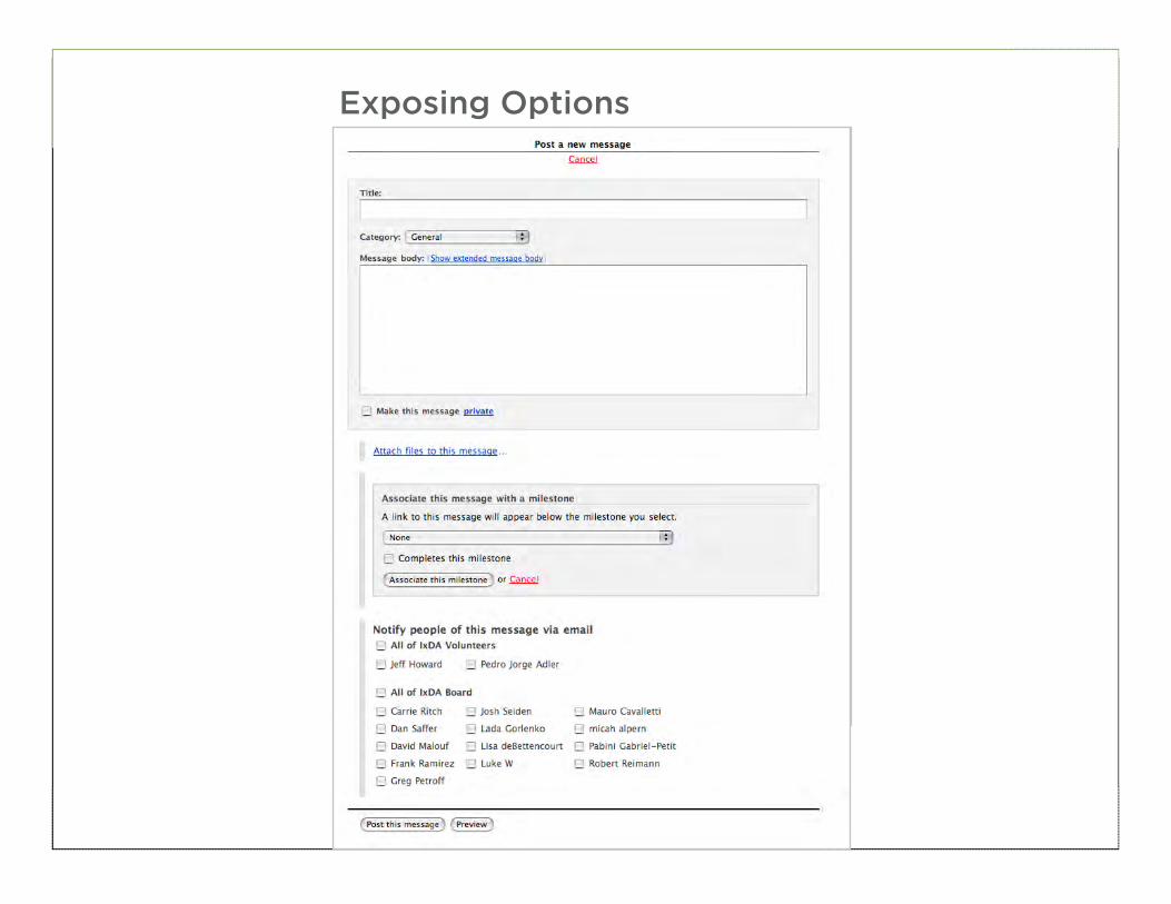
Exposing Options
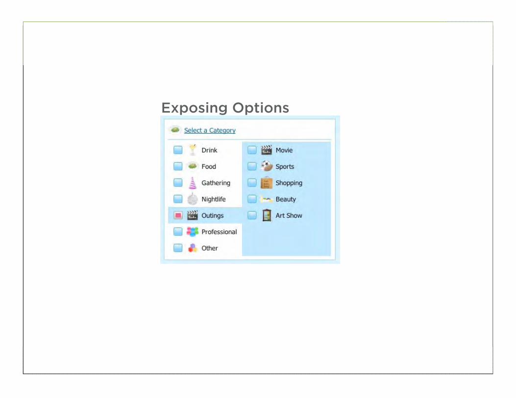
83
Exposing Options
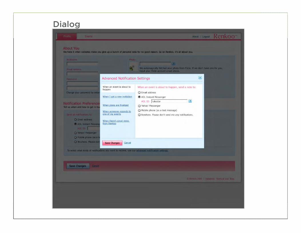
84
Dialog
85
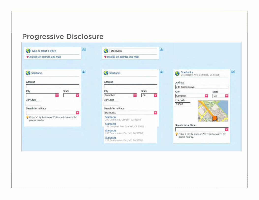
Progressive Disclosure
86
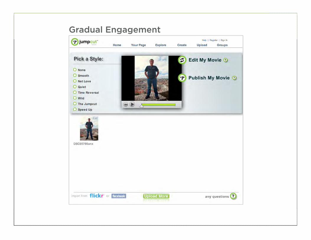
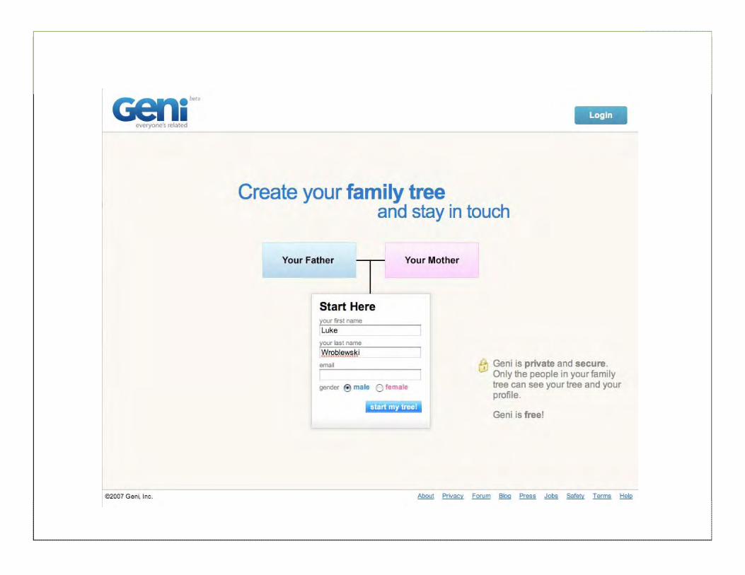
Gradual Engagement
87
88

89
90
• Map progressive disclosure to prioritized user needs
• Most effective when user-initiated
• Maintain a consistent approach
BEST PRACTICE
91
Selection Dependent Inputs
• Sometimes an initial data input requires or enables additional inputs • More options become available because of
an initial input
• Further clarification required due to initial input
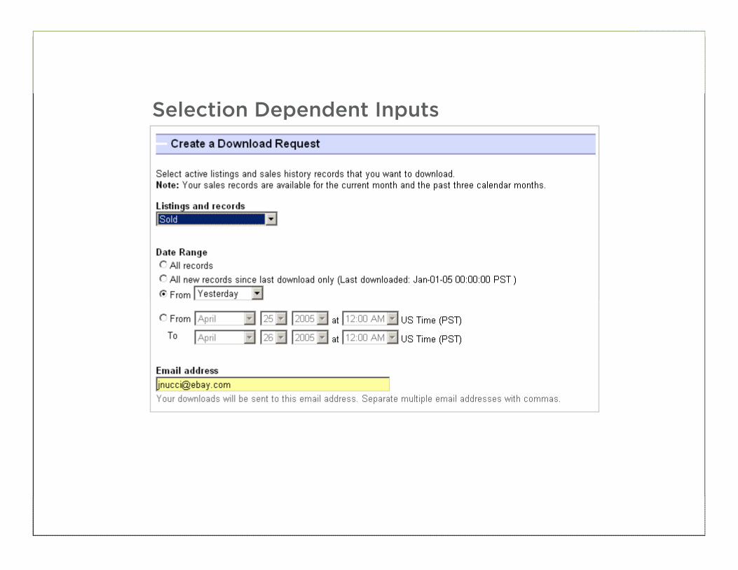
92
Selection Dependent Inputs
93
Page Level
94
Section Tabs
95
Section Finger Tabs
96
Section Selectors
97
Expose Below
98
Expose Within
99
Inactive Until Selected
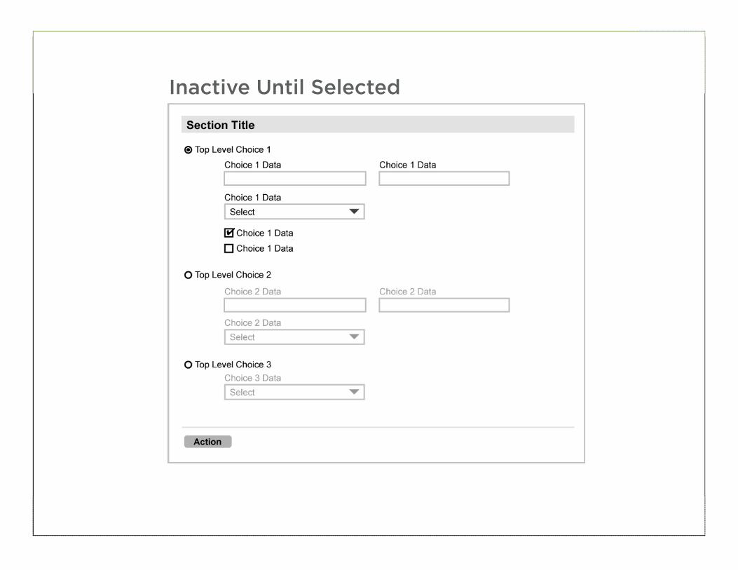
100
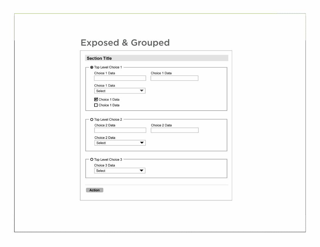
Exposed & Grouped
101
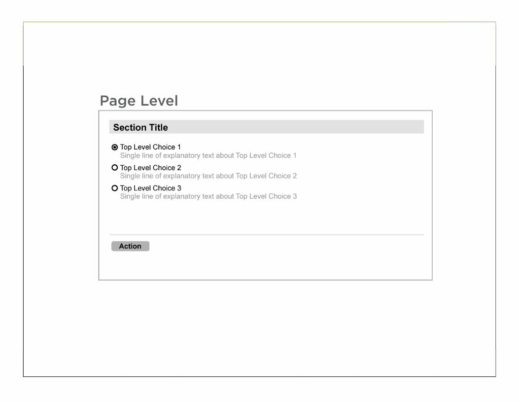
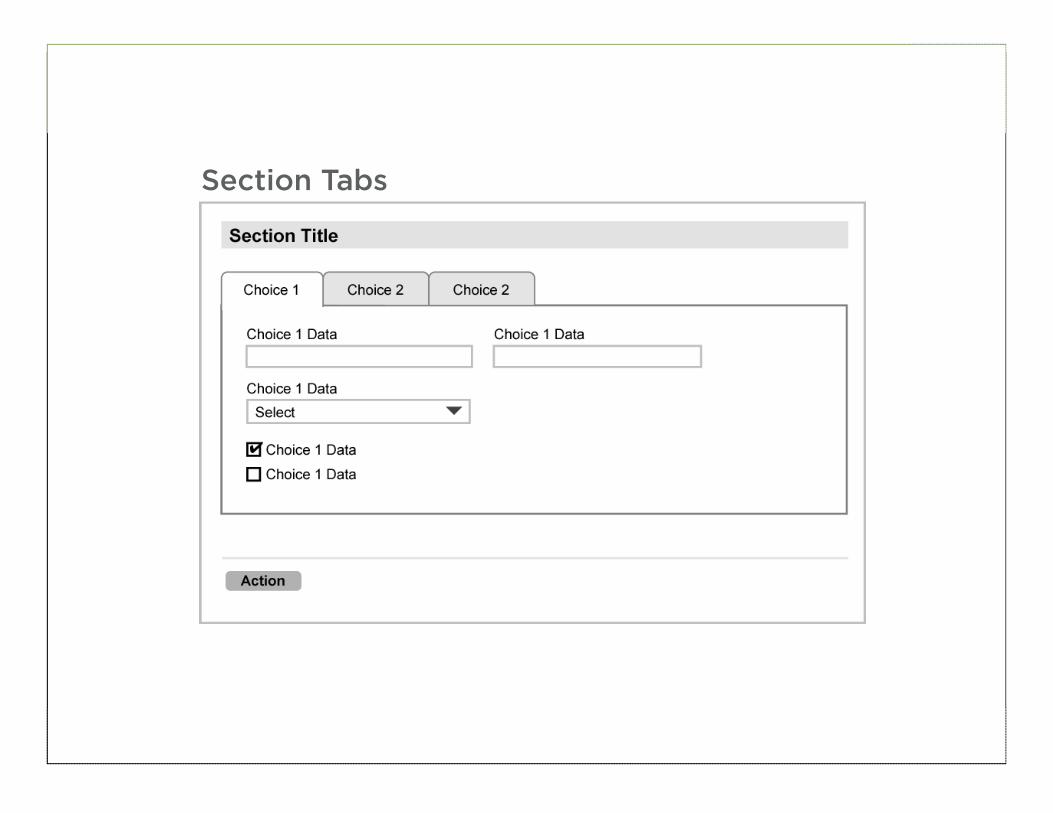
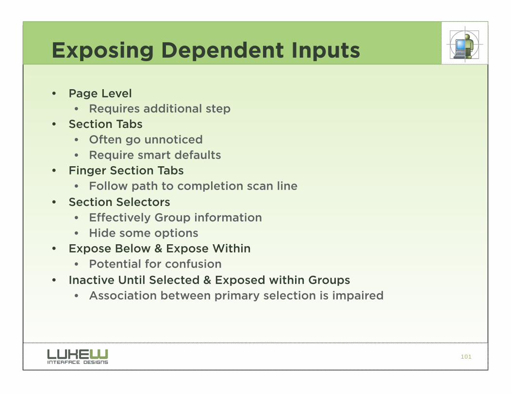
Exposing Dependent Inputs
• Page Level • Requires additional step
• Section Tabs • Often go unnoticed • Require smart defaults
• Finger Section Tabs • Follow path to completion scan line
• Section Selectors • Effectively Group information • Hide some options
• Expose Below & Expose Within • Potential for confusion
• Inactive Until Selected & Exposed within Groups • Association between primary selection is impaired
102
103
104
• Maintain clear relationship between initial selection options
• Clearly associate additional inputs with their trigger
• Avoid “jumping” that disassociates initial selection options
BEST PRACTICE
105
FEEDBACK
106
Feedback
• Inline validation • Assistance
• Errors • Indication & Resolution
• Progress • Indication
• Success • Verification
107
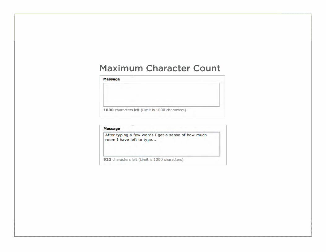
Inline Validation
• Provide direct feedback as data is entered • Validate inputs
• Suggest valid inputs
• Help users stay within limits
108
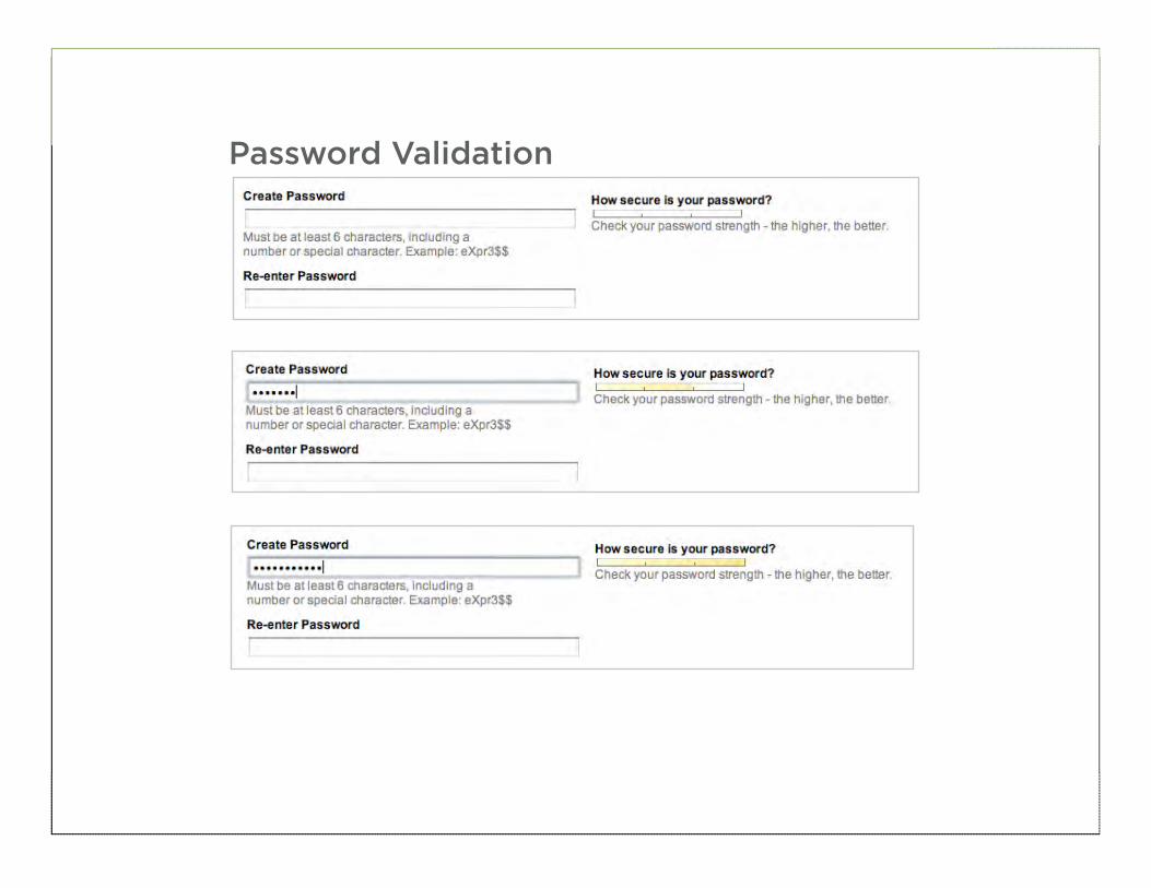
Password Validation
109
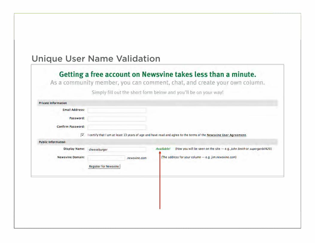
Unique User Name Validation
110
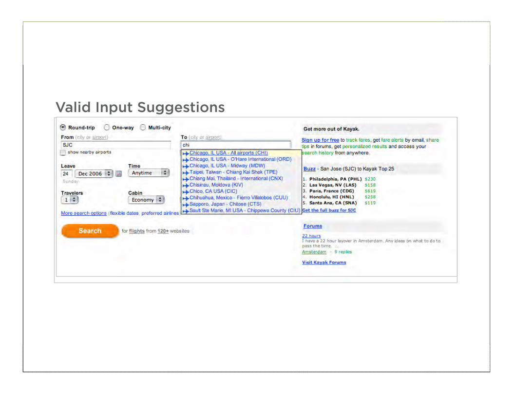
Valid Input Suggestions
111
Maximum Character Count
112
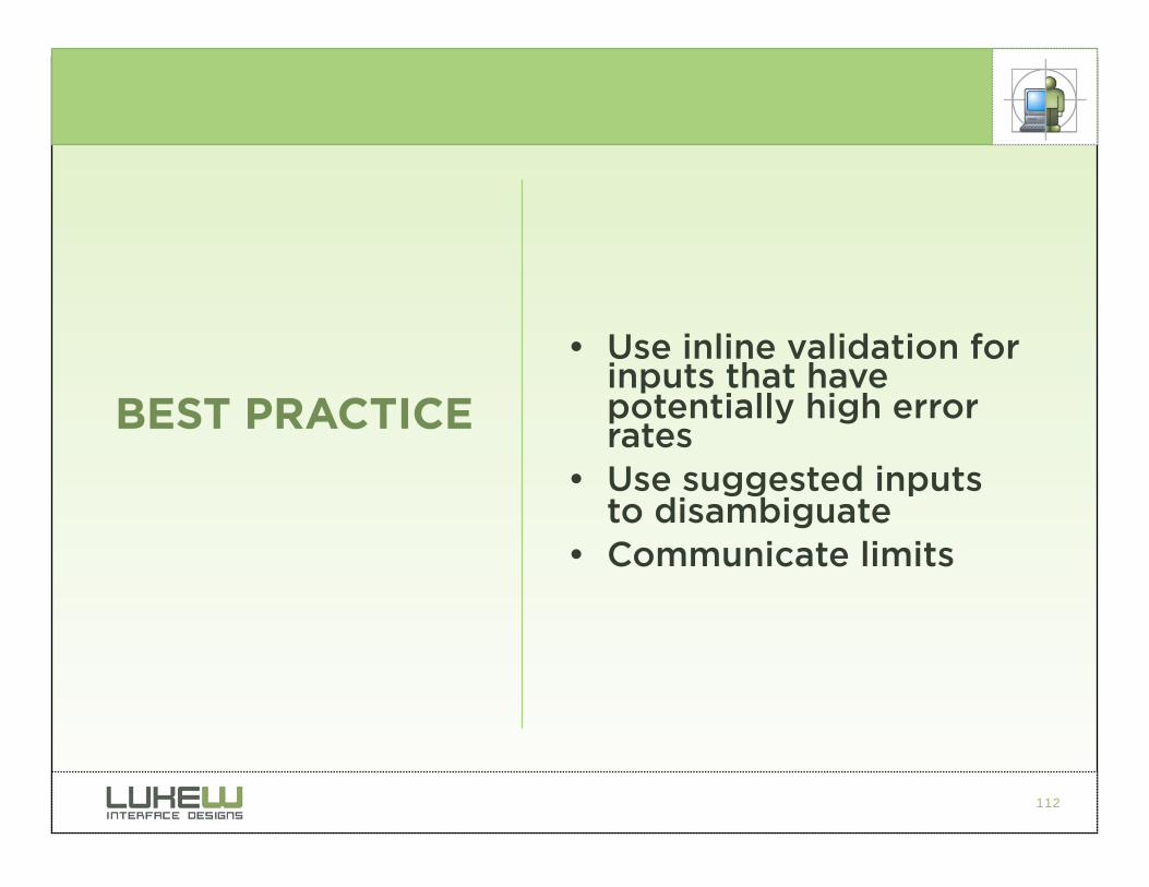
• Use inline validation for inputs that have potentially high error rates
• Use suggested inputs to disambiguate
• Communicate limits
BEST PRACTICE
113
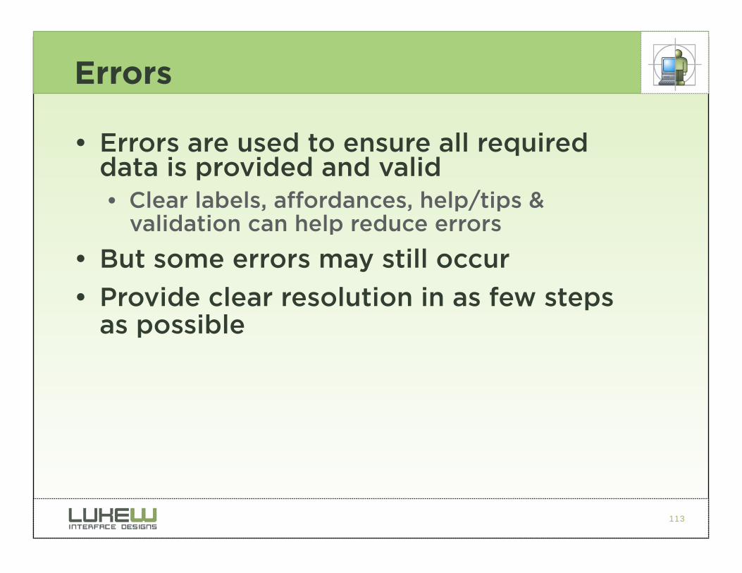
Errors
• Errors are used to ensure all required data is provided and valid • Clear labels, affordances, help/tips &
validation can help reduce errors
• But some errors may still occur
• Provide clear resolution in as few steps as possible
114
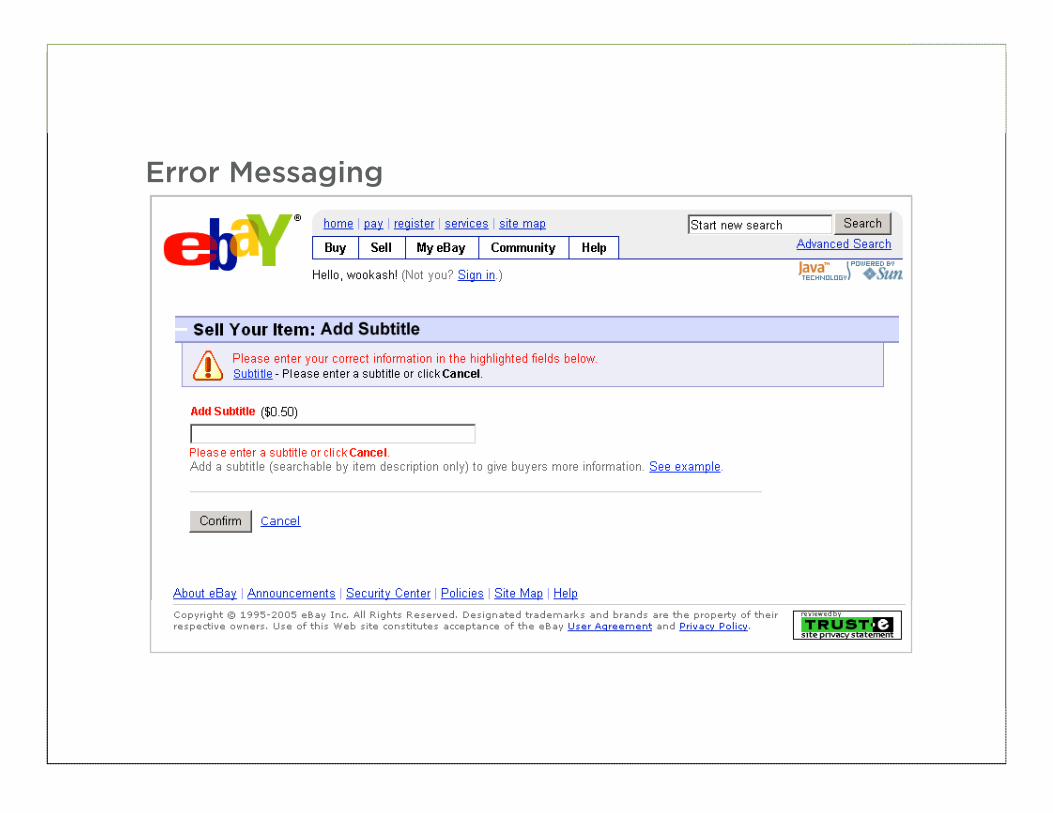
Error Messaging
115
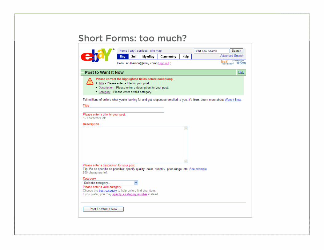
Short Forms: too much?
116
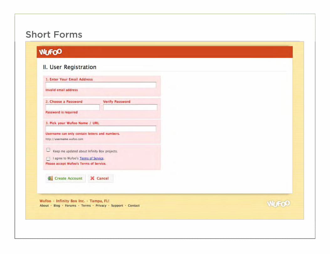
Short Forms
117
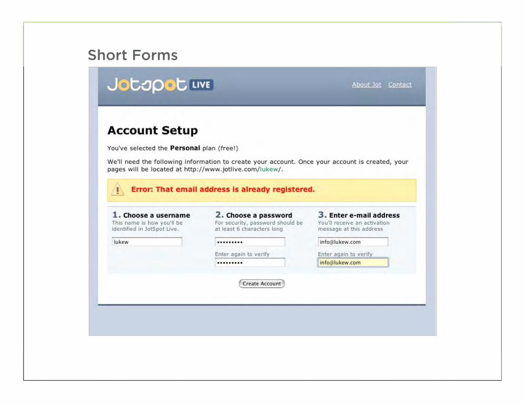
Short Forms
118
119
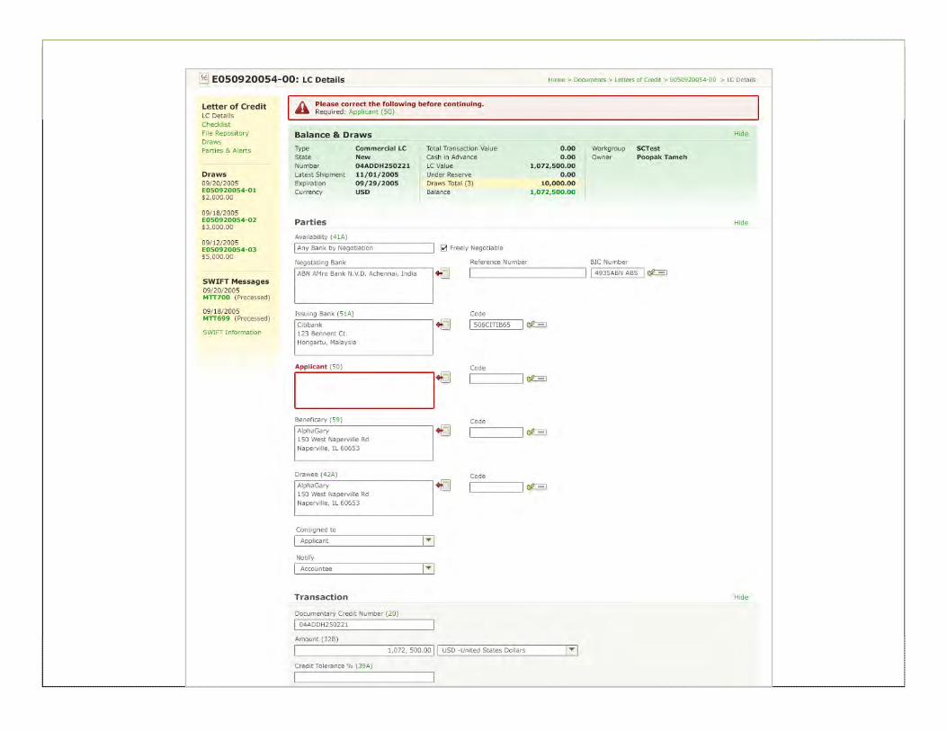
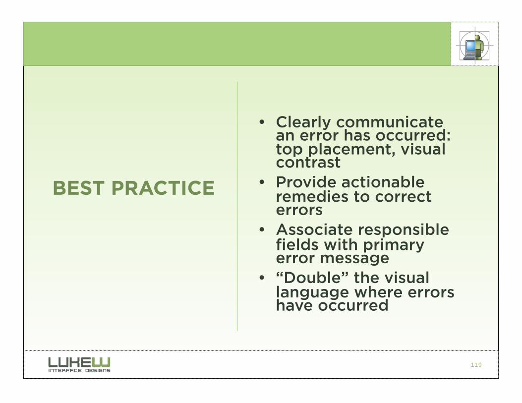
• Clearly communicate an error has occurred: top placement, visual contrast
• Provide actionable remedies to correct errors
• Associate responsible fields with primary error message
• “Double” the visual language where errors have occurred
BEST PRACTICE
120
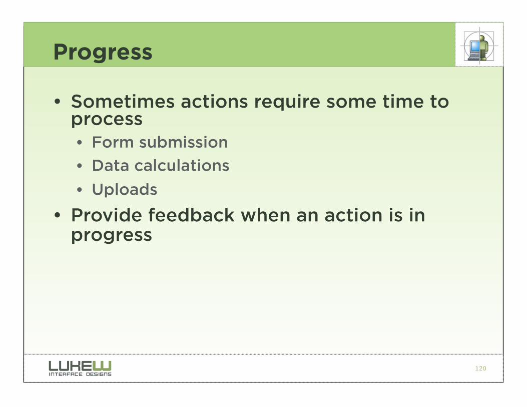
Progress
• Sometimes actions require some time to process • Form submission
• Data calculations
• Uploads
• Provide feedback when an action is in progress
121
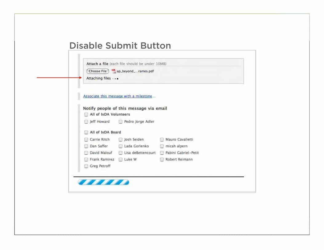
Disable Submit Button

122
• Provide indication of tasks in progress
• Disable “submit” button after user clicks it to avoid duplicate submissions
BEST PRACTICE
123
Success
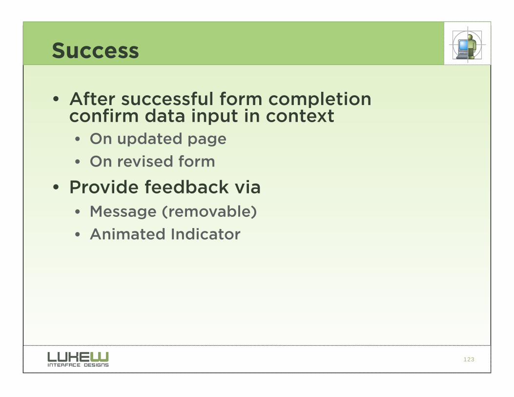
• After successful form completion confirm data input in context • On updated page
• On revised form
• Provide feedback via • Message (removable)
• Animated Indicator
124
125
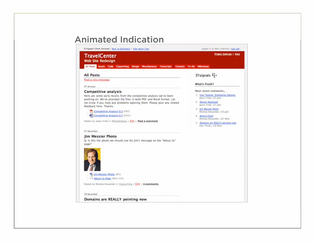
126
Animated Indication
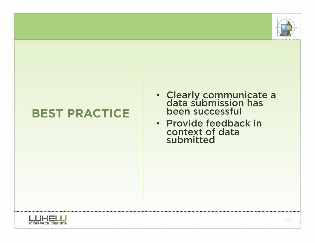
127
• Clearly communicate a data submission has been successful
• Provide feedback in context of data submitted
BEST PRACTICE
128
Additional Tips
• Avoid changing inputs provided by users • With later inputs
• After an error has occurred
• Let users know if difficult to obtain information is required prior to sending them to a form
129
Accessibility & Mark-up
• Use <label> tags to associate labels with inputs
• Properly read by screen readers
• Most browsers treat text with <label> tags as clickable: larger actions
• Use the tabindex attribute to provide a “tabbing” path
• Provides control over tabbing order
• Enables forms to be navigated by keyboard
• Consider the accesskey attribute for additional keyboard support
• Direct access to associated input fields
• Consider <fieldset> to group related form fields
130
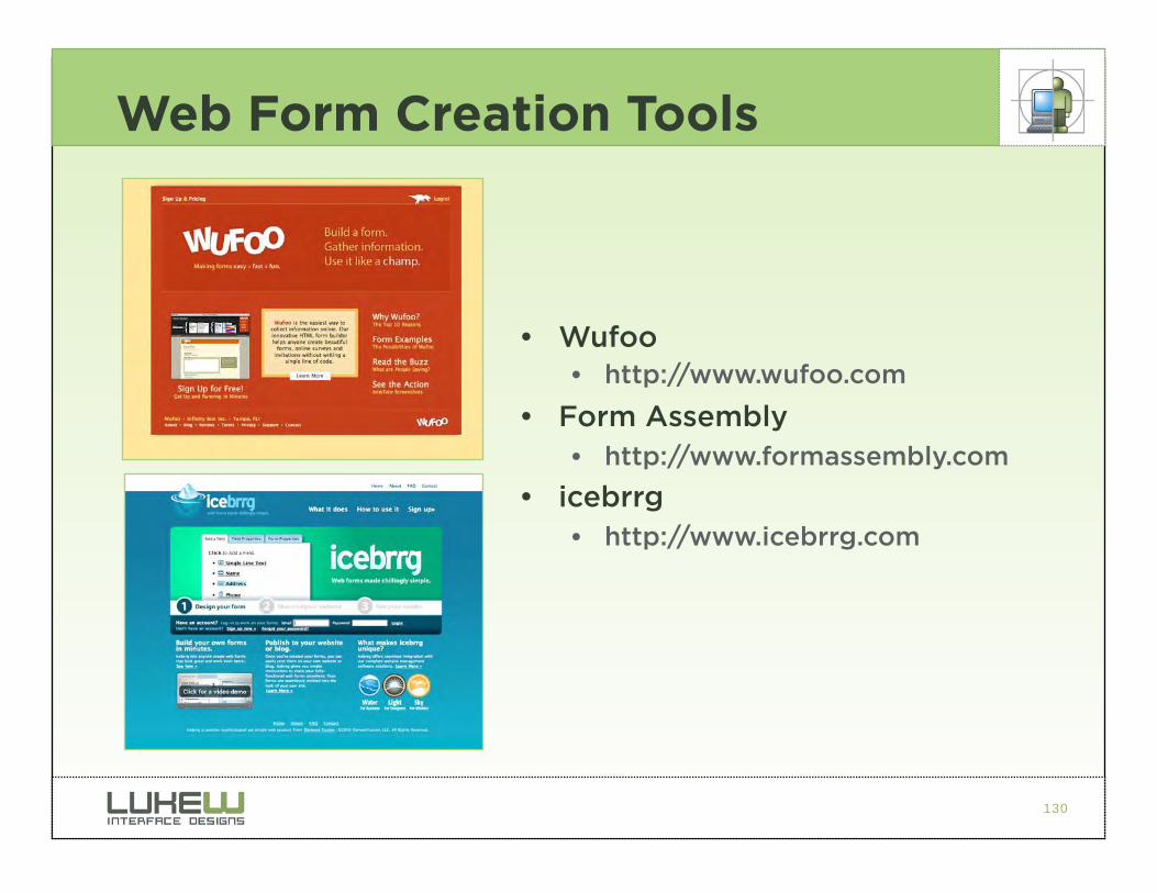
Web Form Creation Tools
• Wufoo • http://www.wufoo.com
• Form Assembly • http://www.formassembly.com
• icebrrg • http://www.icebrrg.com
131
PUTTING IT ALL TOGETHER…
132
133
For more information…
• Web Form Design: Filling in the Blanks • http://www.lukew.com/resources/
web_form_design.asp
• Functioning Form • www.lukew.com/ff/
• Site-Seeing: A Visual Approach to Web Usability • Wiley & Sons
• Drop me a note • [email protected]