Embed Size (px)
Citation preview
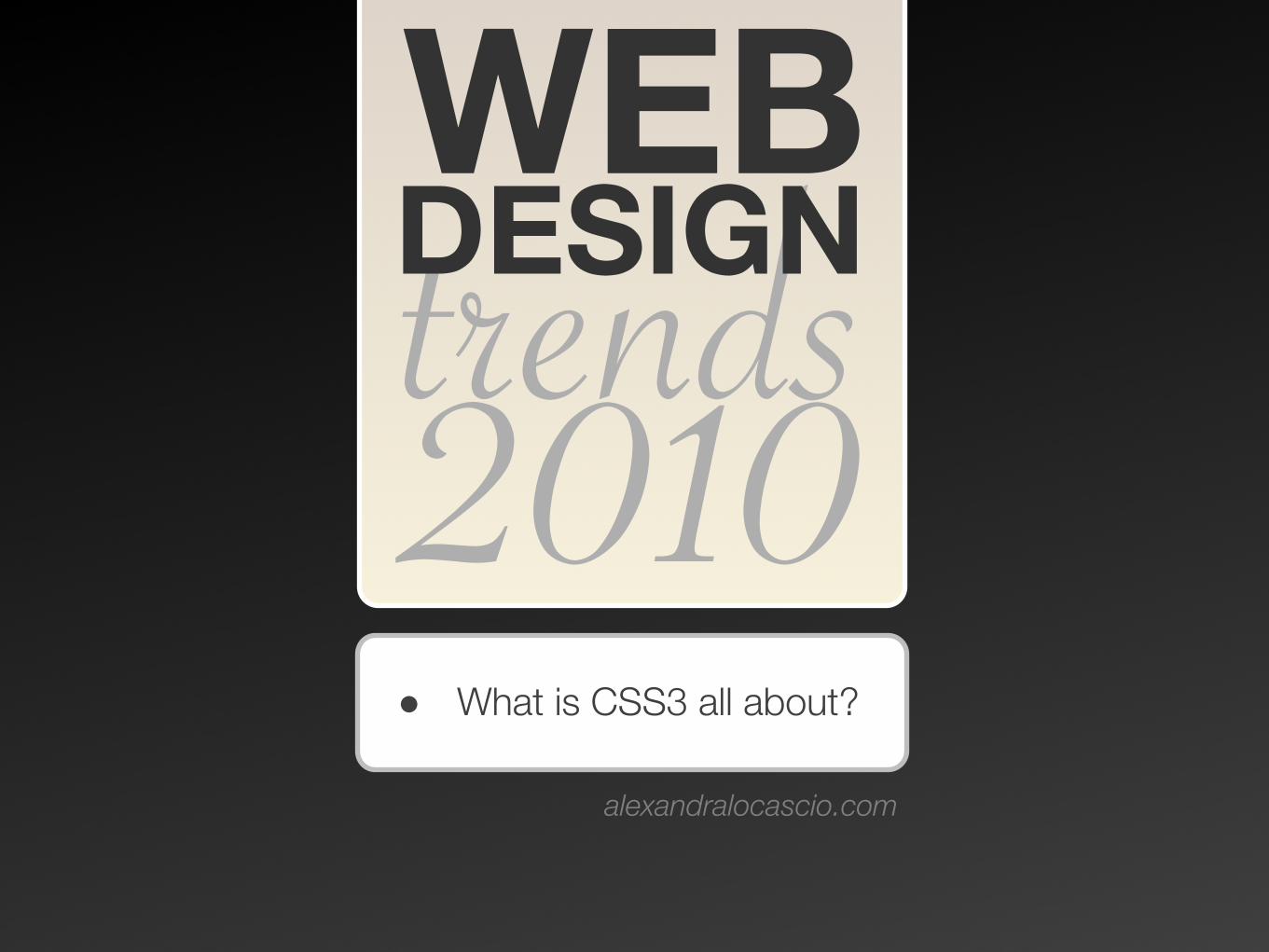
WEBtrends2010• What is CSS3 all about?
http://alexandralocascio.com
DESIGN

Box & text shadow
With the CSS3 box-shadow and text-shadow rules designers can create drop shadows, without the use of Photoshop.
Box-shadow: 10px 10px 25px #ccc;
Text-shadow: 2px 2px 5px #ccc;
tweetcc.comexample:
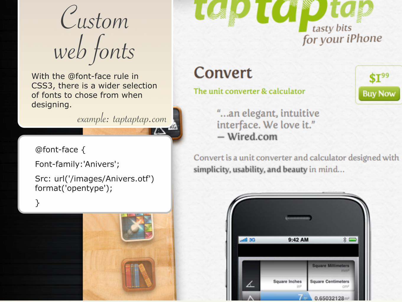
Custom web fonts
@font-face {
Font-family:'Anivers';
Src: url('/images/Anivers.otf') format('opentype');
}
With the @font-face rule in CSS3, there is a wider selection of fonts to chose from when designing.
taptaptap.comexample:
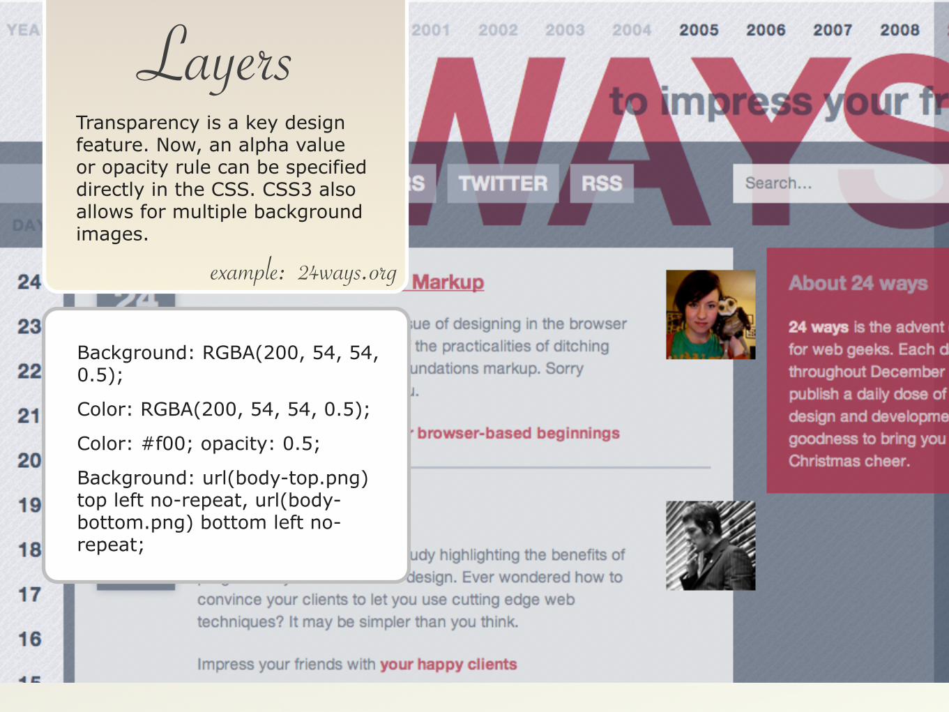
Layers
24ways.org
Background: RGBA(200, 54, 54, 0.5);
Color: RGBA(200, 54, 54, 0.5);
Color: #f00; opacity: 0.5;
Background: url(body-top.png) top left no-repeat, url(body-bottom.png) bottom left no-repeat;
Transparency is a key design feature. Now, an alpha value or opacity rule can be specified directly in the CSS. CSS3 also allows for multiple background images.
example:
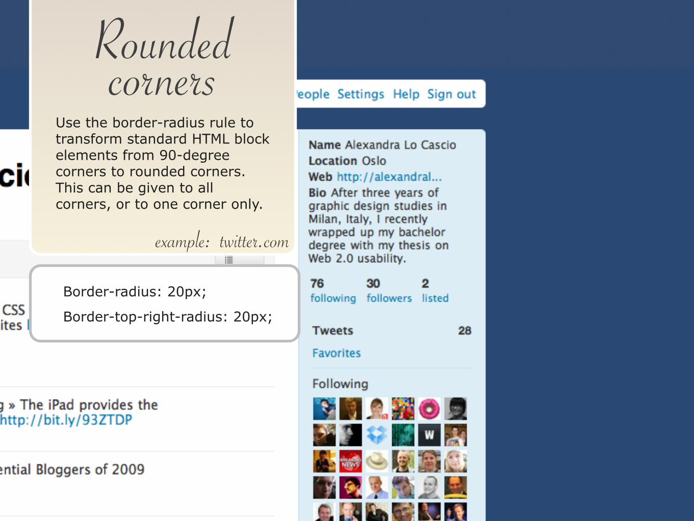
Rounded corners
twitter.com
Border-radius: 20px;
Border-top-right-radius: 20px;
Use the border-radius rule to transform standard HTML block elements from 90-degree corners to rounded corners. This can be given to all corners, or to one corner only.
example:

Animation
neutroncreations.com/blog
Neutron Creations’s blog uses webkit-transform to spin the circle graphics (view it with Mac Chrome or Safari). If your browser doesn’t support webkit-transform, it will just show the static circles.
Transform: rotate(45deg);
Transform: scale(1.0,2.0);
Transform: translate(10px,0);
example:

web designertwitter.com/alelocascio
alexandralocascio.com
FOLLOW ME
PORTFOLIO
ALEXANDRA LO CASCIO