Embed Size (px)
Citation preview
TRAVEL MAGAZINES
Megan Shea, Travel Magazines, “Coastal Living”
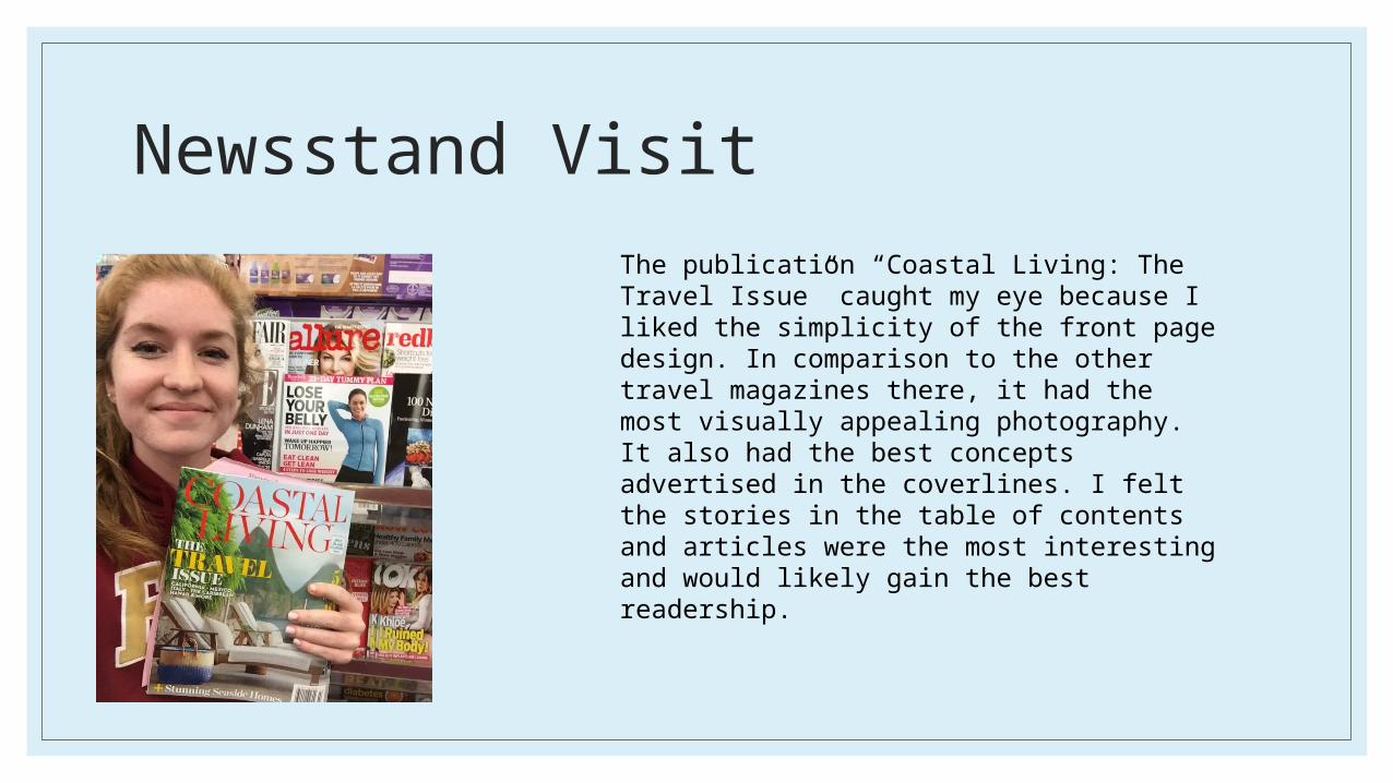
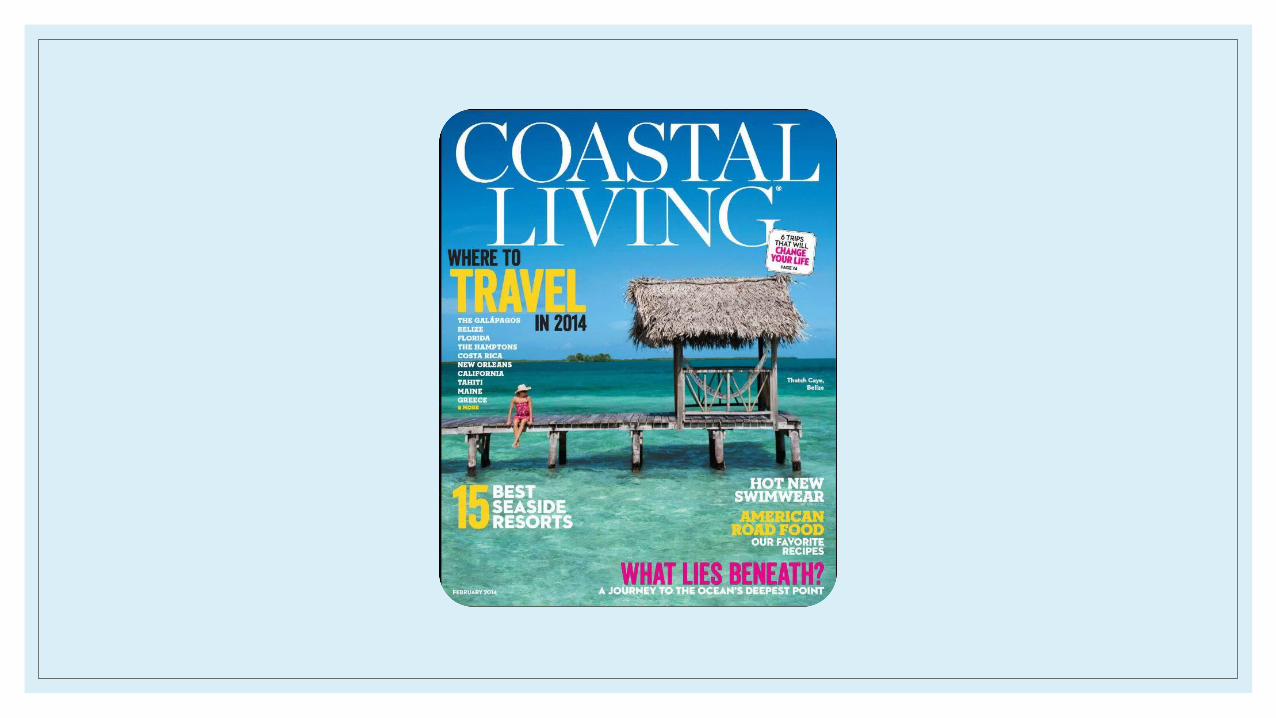
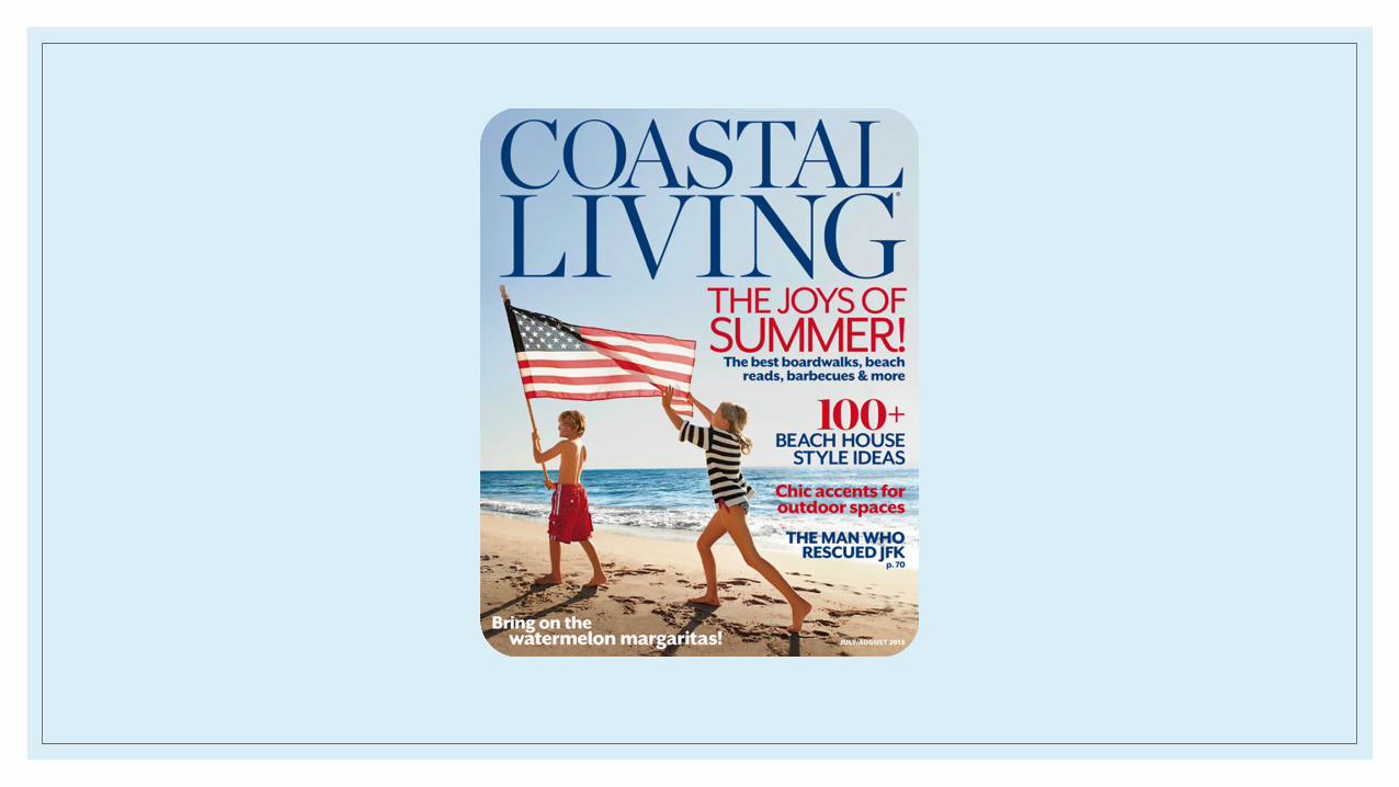
Newsstand VisitThe publication “Coastal Living: The Travel Issue” caught my eye because I liked the simplicity of the front page design. In comparison to the other travel magazines there, it had the most visually appealing photography. It also had the best concepts advertised in the coverlines. I felt the stories in the table of contents and articles were the most interesting and would likely gain the best readership.
Reflection on visit…◦In doing this project, I learned through experience what initially attracts a
reader. I learned that personally, I gravitated toward picking up more minimalistic designed covers. The photos also influenced my decision. Those with less distracting, simple cover images caught my attention. The more appealing magazines only utilized a few coverlines so as to not overwhelm the reader. Otherwise, I felt some magazines looked like a chore to read based on the business of the cover.
◦I liked the more simply formatted pieces. Everything is broken up into small, more manageable lists and paragraphs to keep the reader’s attention and prevent a loss of interest that often occurs from lengthy articles. Everything is accompanied by pictures, which I also preferred.
Most inspirational…◦ (Selfie on slide two with magazine)
◦ “Coastal Living: The Travel Issue” was my favorite publication. I admired the design decisions made as well as the simplistic photography. It is the type of magazine I hope to emulate on my own. I liked how the overall appeal of the magazine was reliant on the photography. The coverlines were fairly brief, which I also thought was a strong feature of the magazine. That way, readers are more enticed to read the actual article, as the coverlines gave nothing away.
◦ I thought the design was something that was reasonable to try and replicate, as the photography is predominately of scenery, and Florida provides good opportunities to capture similar shots.
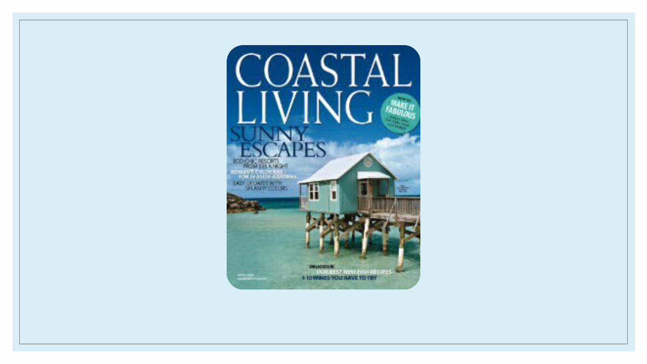
◦ My magazine specifically detailed California, Mexico, Italy, the Caribbean, and Hawaii. It gave hotel suggestions and showed pictures. It also gave suggestions on what to do while in these places. It informed what each trip destination was known for. It also described what kind of oceans and beaches to expect in Turks and Caicos with accompanying visuals.
◦ It details an open-air house in Hawaii and the concept behind/why it was created and what purpose it serves its guests. It gave recipes to various seafood dishes.
◦ It also gave home décor tips based on what style home and lifestyle the reader leads. It also has a feature on a man who makes wood paneled kayaks.
◦ It also features a small island called Little Corn Island with accompanying photography.
◦ The magazine is directed to more upscale, worldy audience- obviously interested in the idea of living or vacationing seaside.
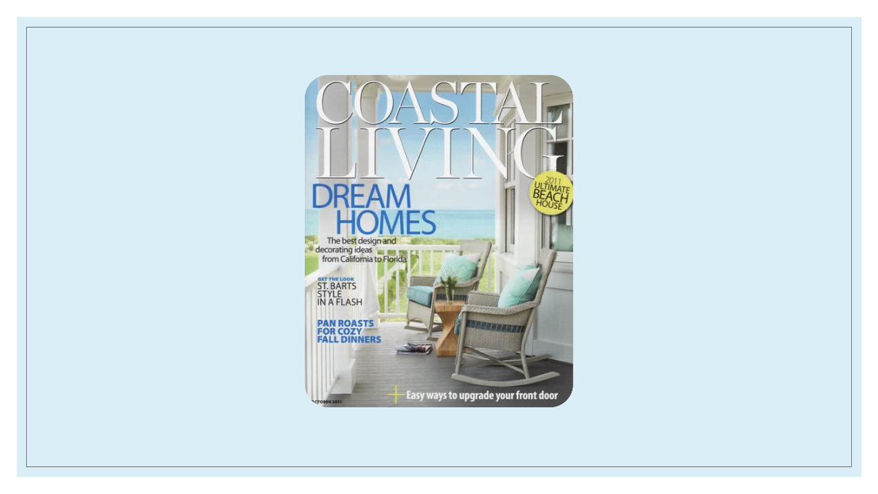
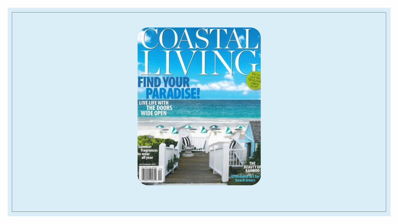
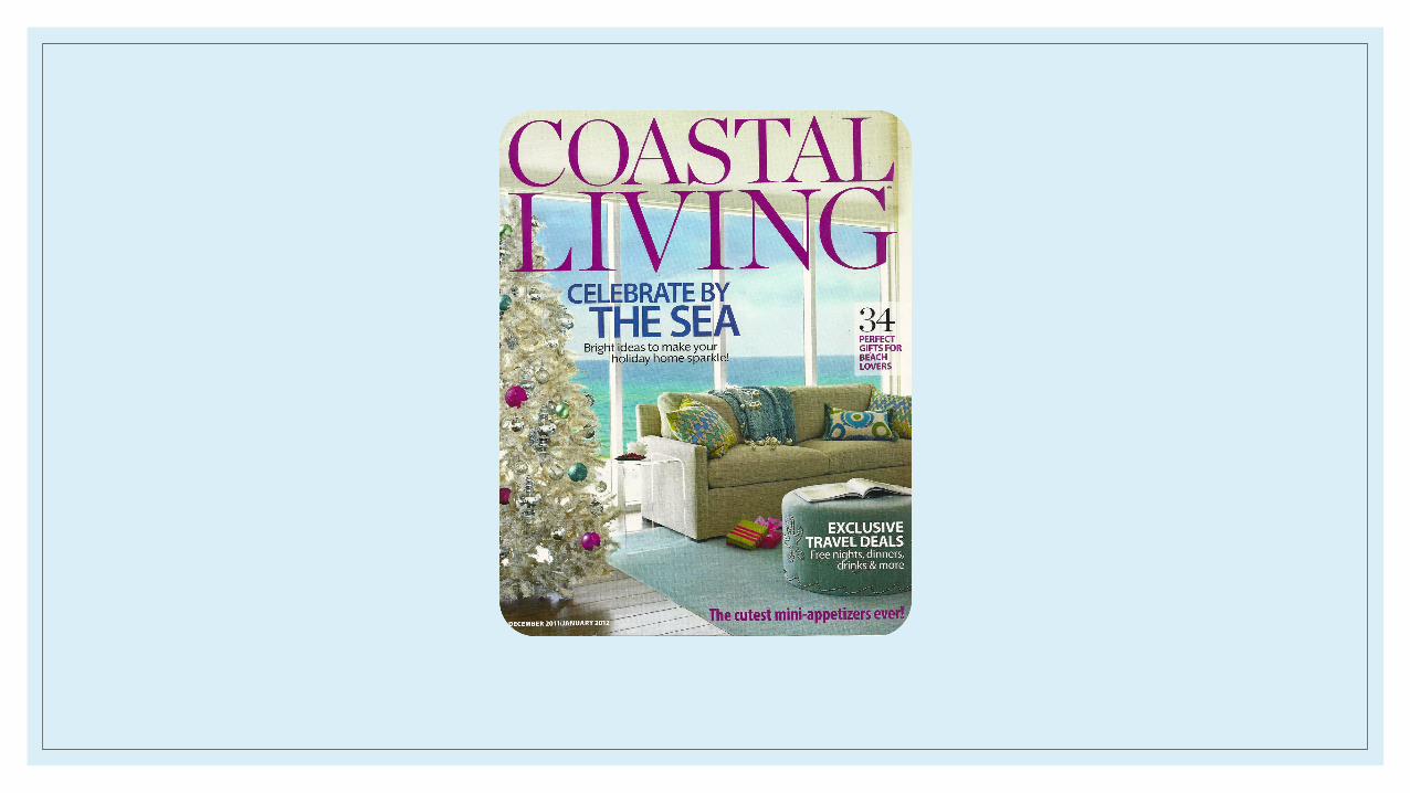
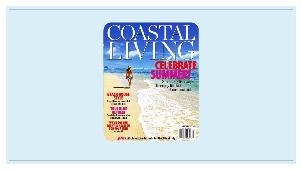
Questions…◦ Generally, the central image is a beach scene, or some picture-esque location.
They often include furniture or interior décor. Often, they use long shots.
◦ The photos are generally taken in the location that issue details, which is usually a vacation destination outside.
◦ They almost always have a puff and the same font is always used for the masthead although the color changes. The layout of the coverlines is almost always the same-they are organized down the sides of the image, with one side noticeably longer with content.
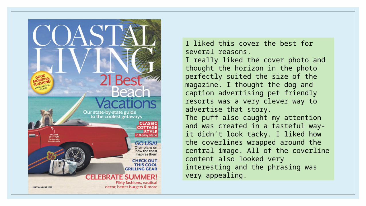
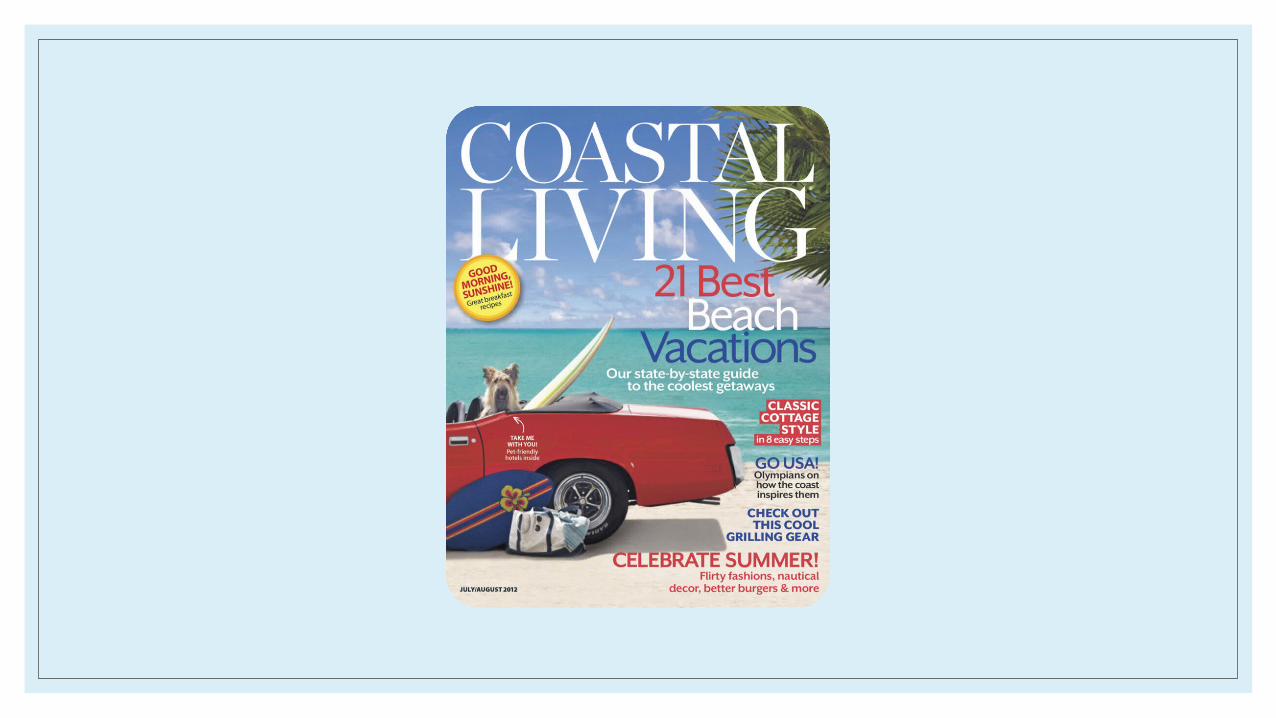
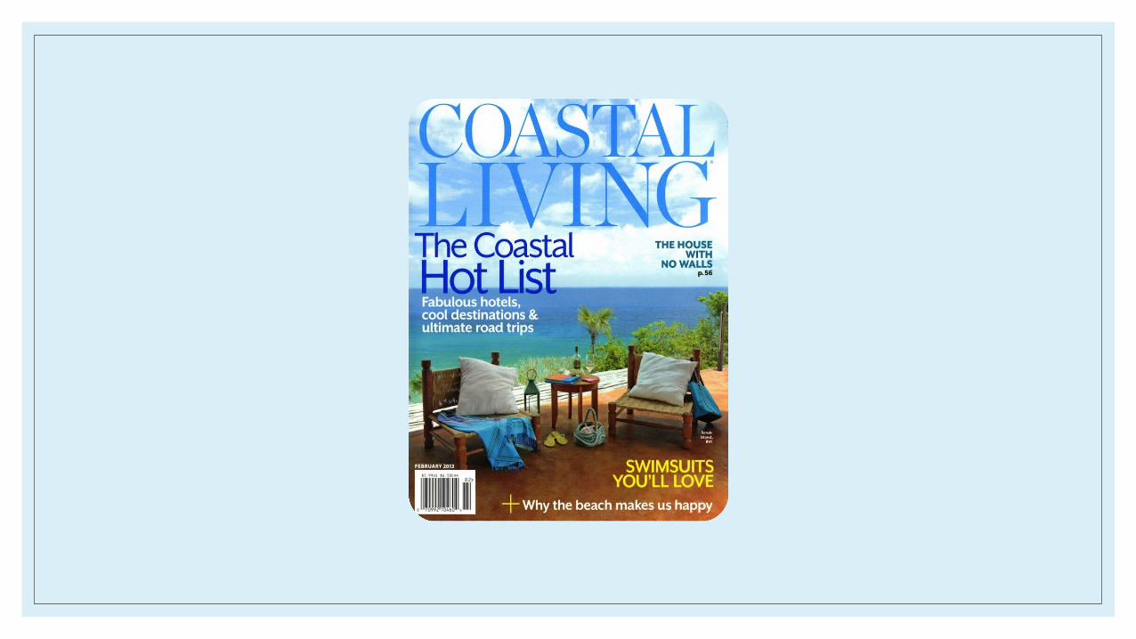
I liked this cover the best for several reasons.I really liked the cover photo and thought the horizon in the photo perfectly suited the size of the magazine. I thought the dog and caption advertising pet friendly resorts was a very clever way to advertise that story.The puff also caught my attention and was created in a tasteful way- it didn’t look tacky. I liked how the coverlines wrapped around the central image. All of the coverline content also looked very interesting and the phrasing was very appealing.
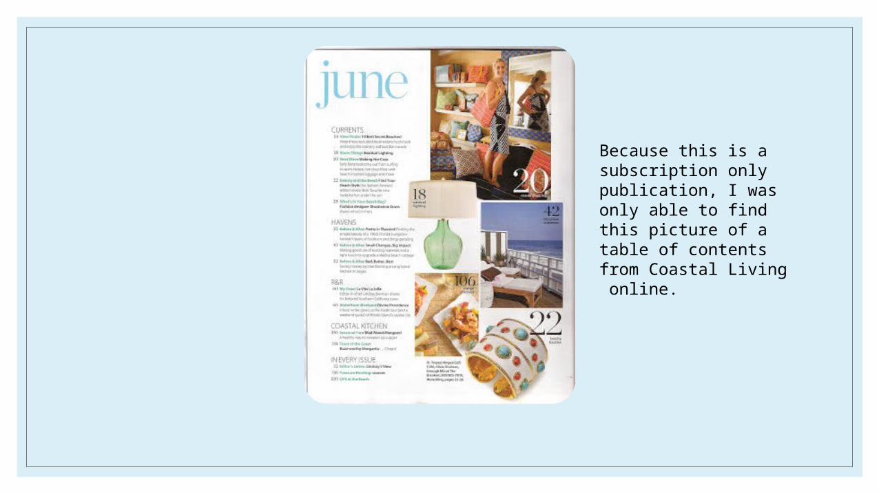
Because this is a subscription only publication, I was only able to find this picture of a table of contents from Coastal Living online.
The table of contents picture I was able to find followed the style of the cover in that it was very simple as far as layout. It was easy to read with minimal text and softer, nautical design colors.
Everything was categorized to make the magazine easier to navigate. It utilized a lot of white space, which helped to keep the page not busy looking. The photos were on the right side, and text on the left. IT made it easier to read and visually appealing this way.
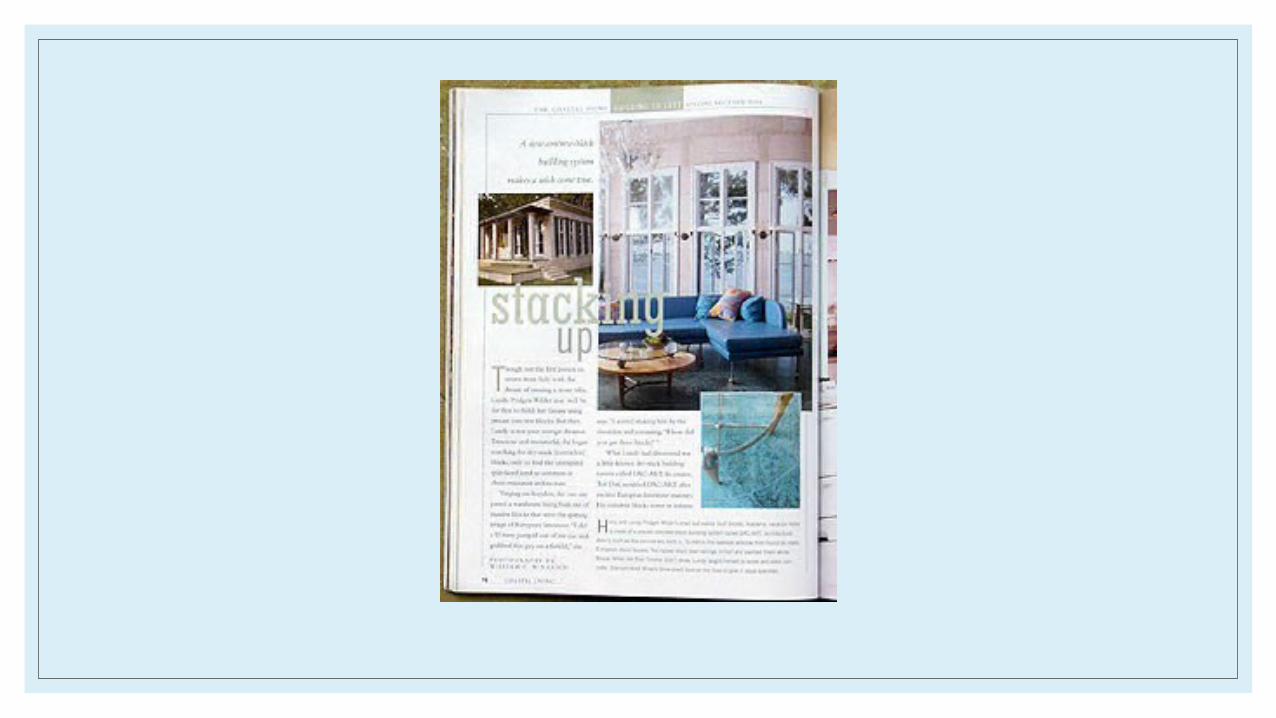
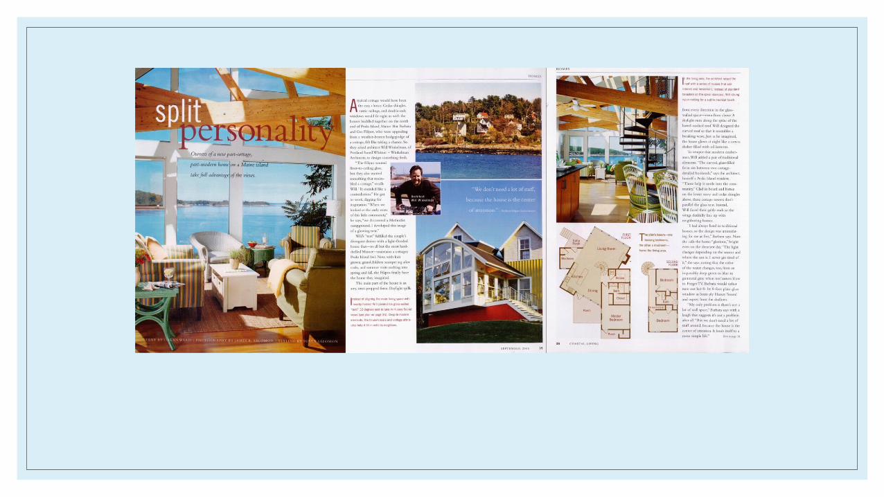
◦ Both spreads come from similarly designed covers. Both covers briefly advertised the article on the right side in a neat column wrapped around a central image. The central image were very simple, outdoor décor in the forefront of a beach scene. Both were very formal and designed very minimalist. Both articles are concerned with aspects of design and both utilize accompanying photos to break up the articles and make them more manageable to read.


![ACE Business Travel Presentation.ppt [Read-Only]ucop.edu/risk-services/_files/travel/ace-business... · Microsoft PowerPoint - ACE Business Travel Presentation.ppt [Read-Only] Author:](https://img.pdfslide.us/doc/110x75/6015784e8a5d14165136bfa9/ace-business-travel-read-onlyucopedurisk-servicesfilestravelace-business.jpg)