Embed Size (px)
Citation preview
The Tizen
Design Guidelines
Introduction and Styles
© 2015 Tizen Project, a Linux Foundation Project. All Rights Reserved. Linux is a registered trademark of Linus Torvalds.
Tizen is a registered trademark of The Linux Foundation. * Other names and brands may be claimed as the property of others. Except as noted, this content is licensed under Creative Commons Attribution 3.0. For details, see the Content License.
2
The Tizen Design Guidelines
Table of Contents
1. INTRODUCTION 3
VISIONS 3
“AIR” 3
1.2.1 The Origins of the “Air” Concept 3
1.2.2 Natural Elements in the Design Language 4
NEW IN TIZEN 2.4 6
2. STYLES 8
DEVICE COMPATIBILITY 8
ICONOGRAPHY 9
2.2.1 App Icons 9
2.2.2 Interactive Icons 12
2.2.3 Custom Icons 14
TYPOGRAPHY 15
2.3.1 Breeze Sans 15
2.3.2 Typeface-related Guidelines 16
COLORS 18
2.4.1 Default System Colors 19
2.4.2 Text and Background Color 20
2.4.3 Color Structure 21
ANIMATIONS 23
3
The Tizen Design Guidelines
1. Introduction
The guidelines we provide will show you how to design useful and aesthetically pleasing Tizen apps that users will enjoy. Let’s begin by sharing our vision for Tizen app design and the visual language we use. These concepts will help you provide users with an enjoyable Tizen experience. Refer to New in Tizen 2.4 for the new features.
Visions
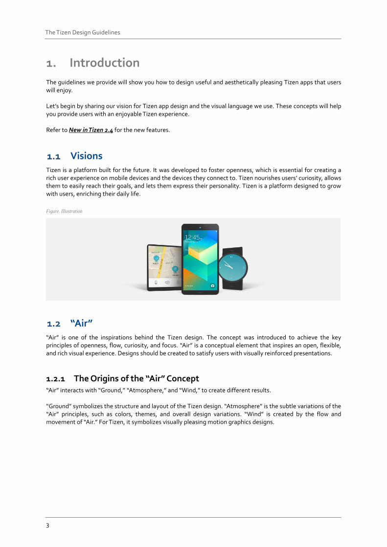
Tizen is a platform built for the future. It was developed to foster openness, which is essential for creating a rich user experience on mobile devices and the devices they connect to. Tizen nourishes users’ curiosity, allows them to easily reach their goals, and lets them express their personality. Tizen is a platform designed to grow with users, enriching their daily life.
Figure. Illustration
“Air” “Air” is one of the inspirations behind the Tizen design. The concept was introduced to achieve the key principles of openness, flow, curiosity, and focus. “Air” is a conceptual element that inspires an open, flexible, and rich visual experience. Designs should be created to satisfy users with visually reinforced presentations.
1.2.1 The Origins of the “Air” Concept “Air” interacts with “Ground,” “Atmosphere,” and “Wind,” to create different results. “Ground” symbolizes the structure and layout of the Tizen design. “Atmosphere” is the subtle variations of the “Air” principles, such as colors, themes, and overall design variations. “Wind” is created by the flow and movement of “Air.” For Tizen, it symbolizes visually pleasing motion graphics designs.
4
The Tizen Design Guidelines
1.2.2 Natural Elements in the Design Language
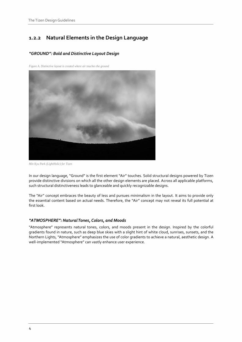
“GROUND”: Bold and Distinctive Layout Design
Figure A. Distinctive layout is created where air touches the ground
Min Kyu Park (LightHolic) for Tizen
In our design language, “Ground” is the first element “Air” touches. Solid structural designs powered by Tizen provide distinctive divisions on which all the other design elements are placed. Across all applicable platforms, such structural distinctiveness leads to glanceable and quickly recognizable designs. The “Air” concept embraces the beauty of less and pursues minimalism in the layout. It aims to provide only the essential content based on actual needs. Therefore, the “Air” concept may not reveal its full potential at first look.
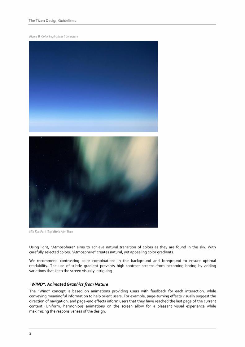
“ATMOSPHERE”: Natural Tones, Colors, and Moods
“Atmosphere” represents natural tones, colors, and moods present in the design. Inspired by the colorful gradients found in nature, such as deep blue skies with a slight hint of white cloud, sunrises, sunsets, and the Northern Lights, “Atmosphere” emphasizes the use of color gradients to achieve a natural, aesthetic design. A well-implemented “Atmosphere” can vastly enhance user experience.
5
The Tizen Design Guidelines
Figure B. Color inspirations from nature
Min Kyu Park (LightHolic) for Tizen
Using light, “Atmosphere” aims to achieve natural transition of colors as they are found in the sky. With carefully selected colors, “Atmosphere” creates natural, yet appealing color gradients.
We recommend contrasting color combinations in the background and foreground to ensure optimal readability. The use of subtle gradient prevents high-contrast screens from becoming boring by adding variations that keep the screen visually intriguing.
“WIND”: Animated Graphics from Nature
The “Wind” concept is based on animations providing users with feedback for each interaction, while conveying meaningful information to help orient users. For example, page-turning effects visually suggest the direction of navigation, and page-end effects inform users that they have reached the last page of the current content. Uniform, harmonious animations on the screen allow for a pleasant visual experience while maximizing the responsiveness of the design.
6
The Tizen Design Guidelines
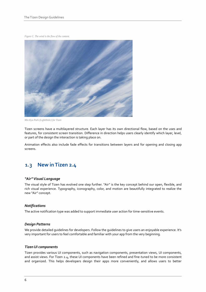
Figure C. The wind is the flow of the content.
Min Kyu Park (LightHolic) for Tizen
Tizen screens have a multilayered structure. Each layer has its own directional flow, based on the uses and features, for consistent screen transition. Difference in direction helps users clearly identify which layer, level, or part of the design the interaction is taking place on.
Animation effects also include fade effects for transitions between layers and for opening and closing app screens.
New in Tizen 2.4
“Air” Visual Language
The visual style of Tizen has evolved one step further. “Air” is the key concept behind our open, flexible, and rich visual experience. Typography, iconography, color, and motion are beautifully integrated to realize the new “Air” concept.
Notifications
The active notification type was added to support immediate user action for time-sensitive events.
Design Patterns
We provide detailed guidelines for developers. Follow the guidelines to give users an enjoyable experience. It’s very important for users to feel comfortable and familiar with your app from the very beginning.
Tizen UI components
Tizen provides various UI components, such as navigation components, presentation views, UI components, and assist views. For Tizen 2.4, these UI components have been refined and fine-tuned to be more consistent and organized. This helps developers design their apps more conveniently, and allows users to better
7
The Tizen Design Guidelines
understand the user interface. Also, controls, such as floating action button and light view, are newly introduced in Tizen 2.4 to help you provide users with apps that are easier to use.
8
The Tizen Design Guidelines
2. Styles
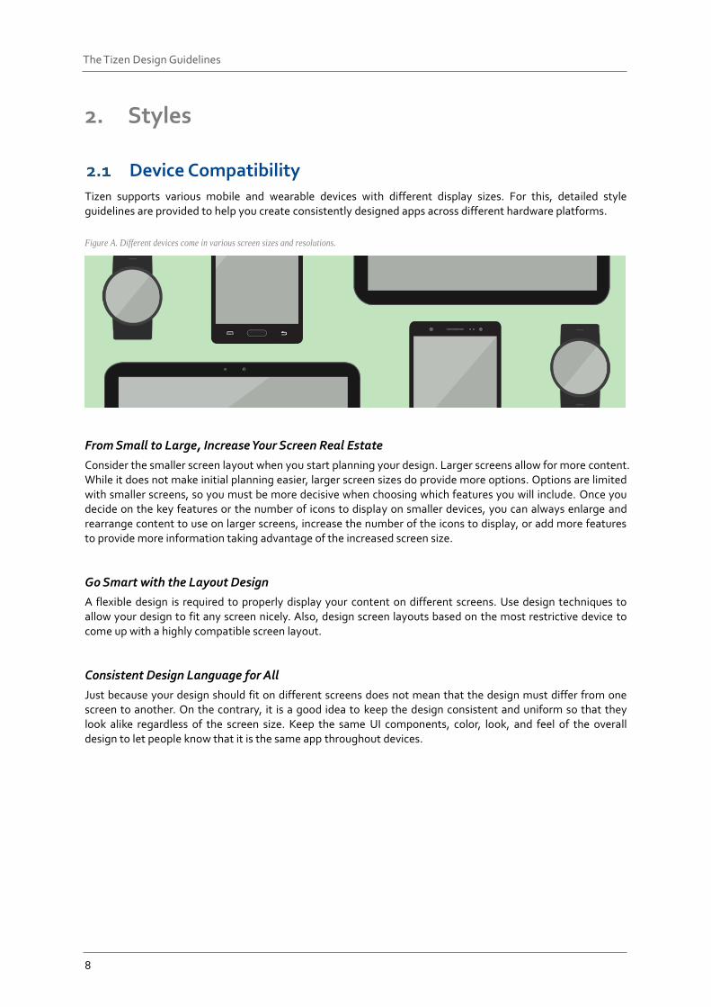
Device Compatibility Tizen supports various mobile and wearable devices with different display sizes. For this, detailed style guidelines are provided to help you create consistently designed apps across different hardware platforms.
Figure A. Different devices come in various screen sizes and resolutions.
From Small to Large, Increase Your Screen Real Estate
Consider the smaller screen layout when you start planning your design. Larger screens allow for more content. While it does not make initial planning easier, larger screen sizes do provide more options. Options are limited with smaller screens, so you must be more decisive when choosing which features you will include. Once you decide on the key features or the number of icons to display on smaller devices, you can always enlarge and rearrange content to use on larger screens, increase the number of the icons to display, or add more features to provide more information taking advantage of the increased screen size.
Go Smart with the Layout Design
A flexible design is required to properly display your content on different screens. Use design techniques to allow your design to fit any screen nicely. Also, design screen layouts based on the most restrictive device to come up with a highly compatible screen layout.
Consistent Design Language for All
Just because your design should fit on different screens does not mean that the design must differ from one screen to another. On the contrary, it is a good idea to keep the design consistent and uniform so that they look alike regardless of the screen size. Keep the same UI components, color, look, and feel of the overall design to let people know that it is the same app throughout devices.
9
The Tizen Design Guidelines
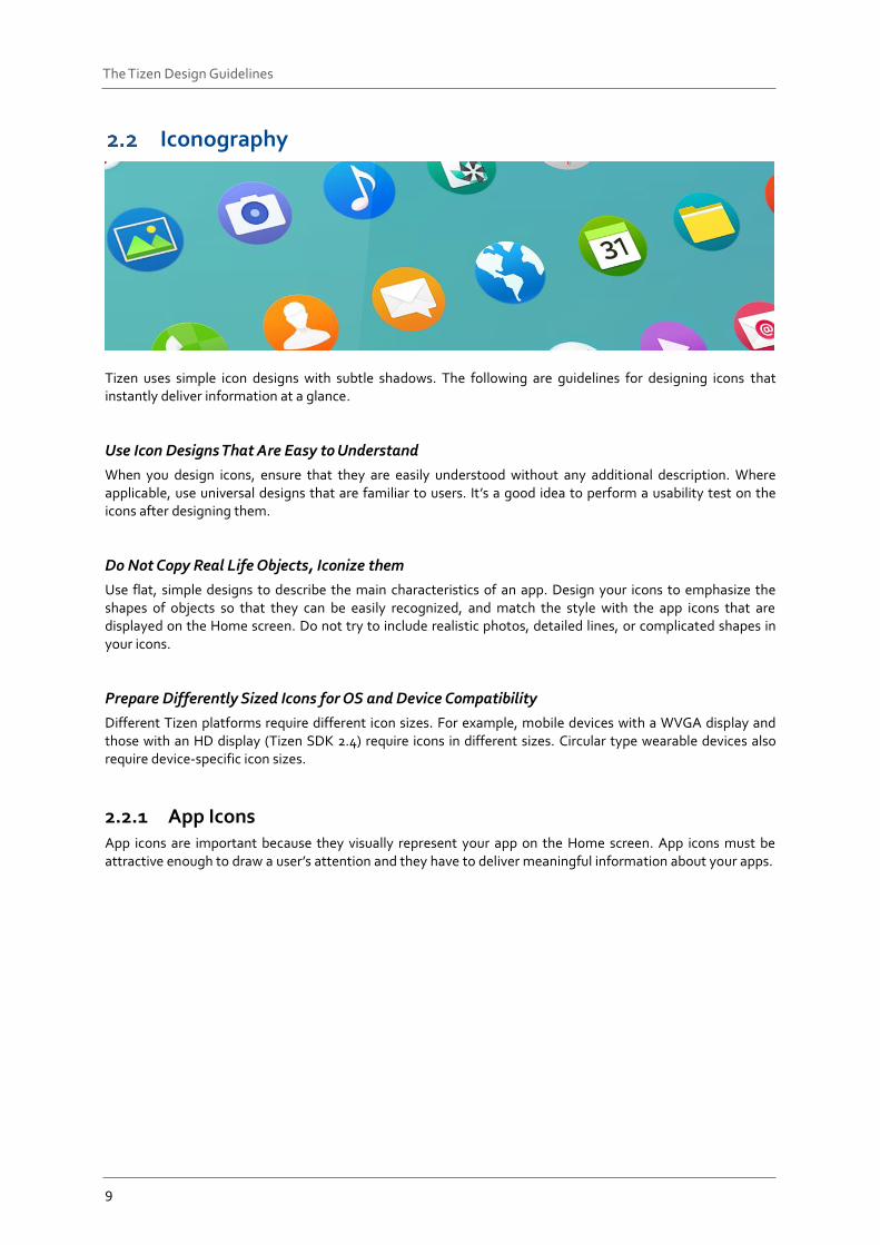
Iconography
Tizen uses simple icon designs with subtle shadows. The following are guidelines for designing icons that instantly deliver information at a glance.
Use Icon Designs That Are Easy to Understand
When you design icons, ensure that they are easily understood without any additional description. Where applicable, use universal designs that are familiar to users. It’s a good idea to perform a usability test on the icons after designing them.
Do Not Copy Real Life Objects, Iconize them
Use flat, simple designs to describe the main characteristics of an app. Design your icons to emphasize the shapes of objects so that they can be easily recognized, and match the style with the app icons that are displayed on the Home screen. Do not try to include realistic photos, detailed lines, or complicated shapes in your icons.
Prepare Differently Sized Icons for OS and Device Compatibility
Different Tizen platforms require different icon sizes. For example, mobile devices with a WVGA display and those with an HD display (Tizen SDK 2.4) require icons in different sizes. Circular type wearable devices also require device-specific icon sizes.
2.2.1 App Icons App icons are important because they visually represent your app on the Home screen. App icons must be attractive enough to draw a user’s attention and they have to deliver meaningful information about your apps.
10
The Tizen Design Guidelines
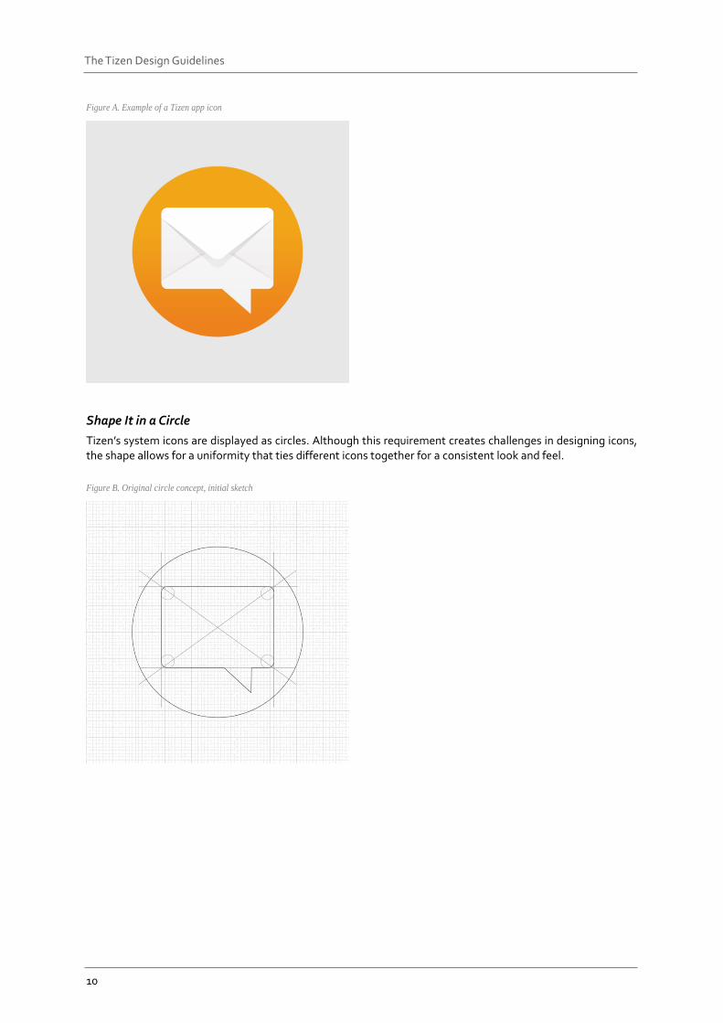
Figure A. Example of a Tizen app icon
Shape It in a Circle
Tizen’s system icons are displayed as circles. Although this requirement creates challenges in designing icons, the shape allows for a uniformity that ties different icons together for a consistent look and feel.
Figure B. Original circle concept, initial sketch
11
The Tizen Design Guidelines
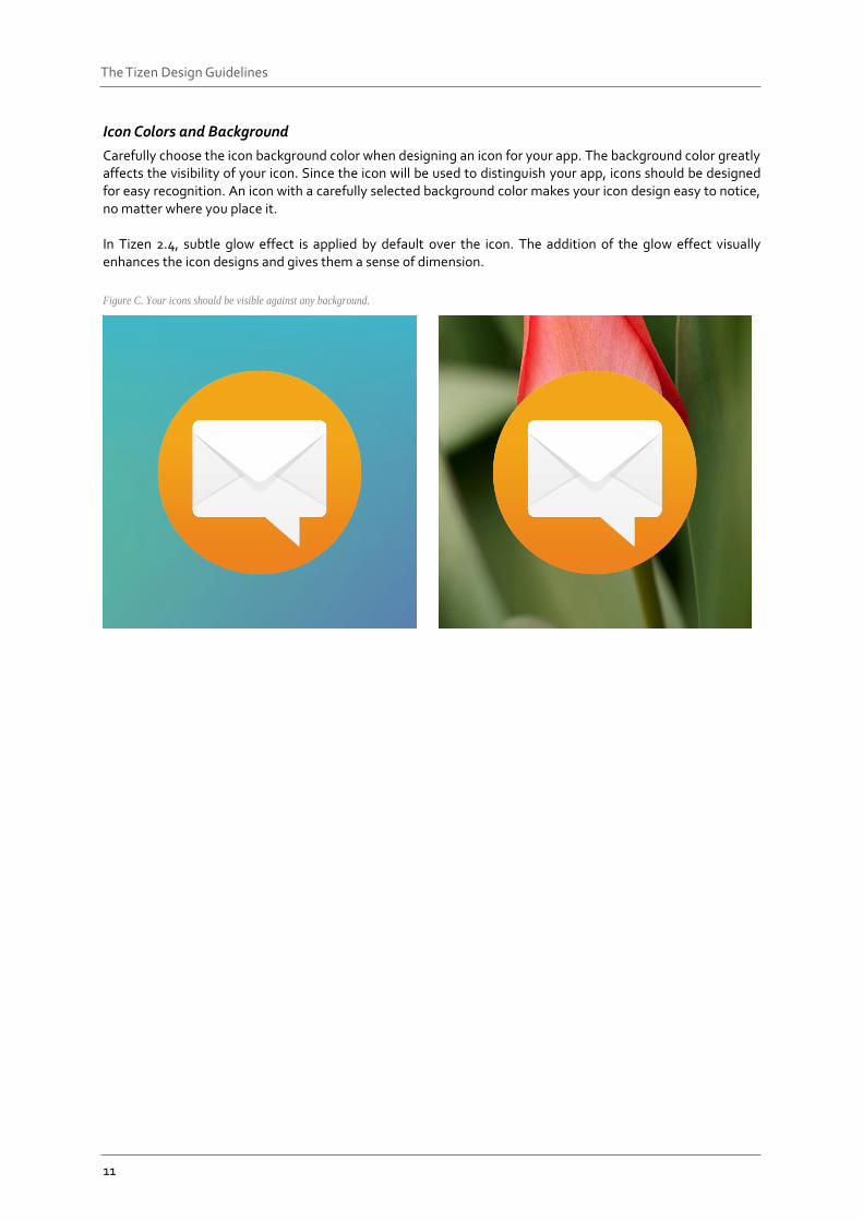
Icon Colors and Background
Carefully choose the icon background color when designing an icon for your app. The background color greatly affects the visibility of your icon. Since the icon will be used to distinguish your app, icons should be designed for easy recognition. An icon with a carefully selected background color makes your icon design easy to notice, no matter where you place it. In Tizen 2.4, subtle glow effect is applied by default over the icon. The addition of the glow effect visually enhances the icon designs and gives them a sense of dimension.
Figure C. Your icons should be visible against any background.
12
The Tizen Design Guidelines
2.2.2 Interactive Icons Interactive icons allow for instant actions, or provide additional information about the currently displayed content. The same principles for designing app icons apply for the interactive icon design: use simple lines and shapes. In Tizen, there are two types of interactive icons.
Action Icons
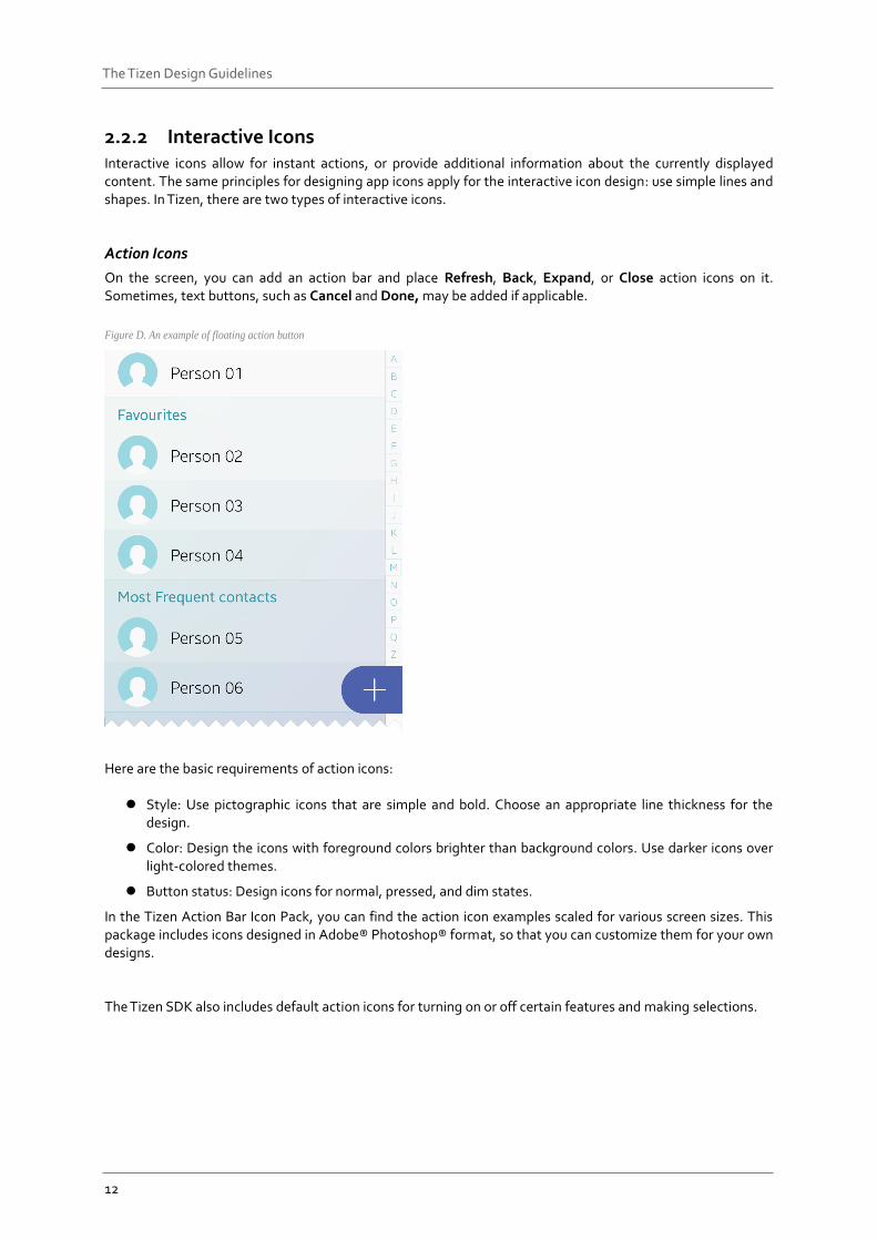
On the screen, you can add an action bar and place Refresh, Back, Expand, or Close action icons on it. Sometimes, text buttons, such as Cancel and Done, may be added if applicable.
Figure D. An example of floating action button
Here are the basic requirements of action icons:
Style: Use pictographic icons that are simple and bold. Choose an appropriate line thickness for the design.
Color: Design the icons with foreground colors brighter than background colors. Use darker icons over light-colored themes.
Button status: Design icons for normal, pressed, and dim states.
In the Tizen Action Bar Icon Pack, you can find the action icon examples scaled for various screen sizes. This package includes icons designed in Adobe® Photoshop® format, so that you can customize them for your own designs. The Tizen SDK also includes default action icons for turning on or off certain features and making selections.
13
The Tizen Design Guidelines
Informative Icons
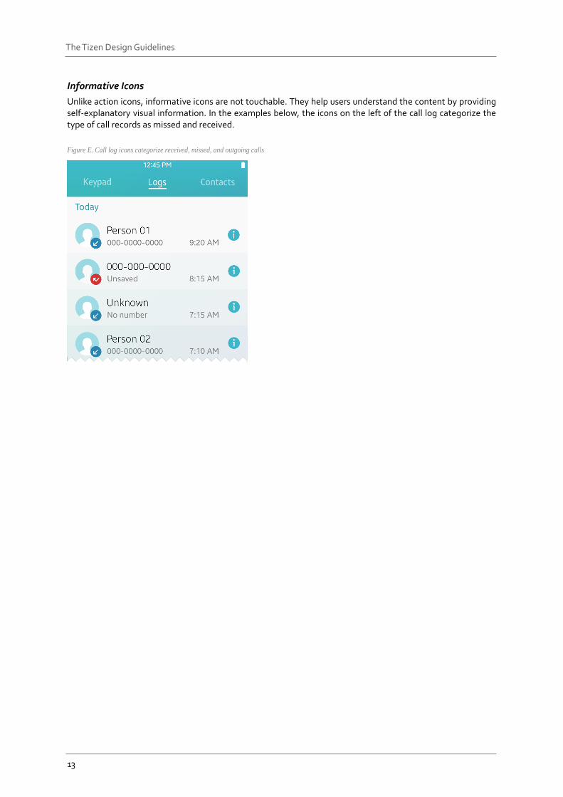
Unlike action icons, informative icons are not touchable. They help users understand the content by providing self-explanatory visual information. In the examples below, the icons on the left of the call log categorize the type of call records as missed and received.
Figure E. Call log icons categorize received, missed, and outgoing calls
14
The Tizen Design Guidelines
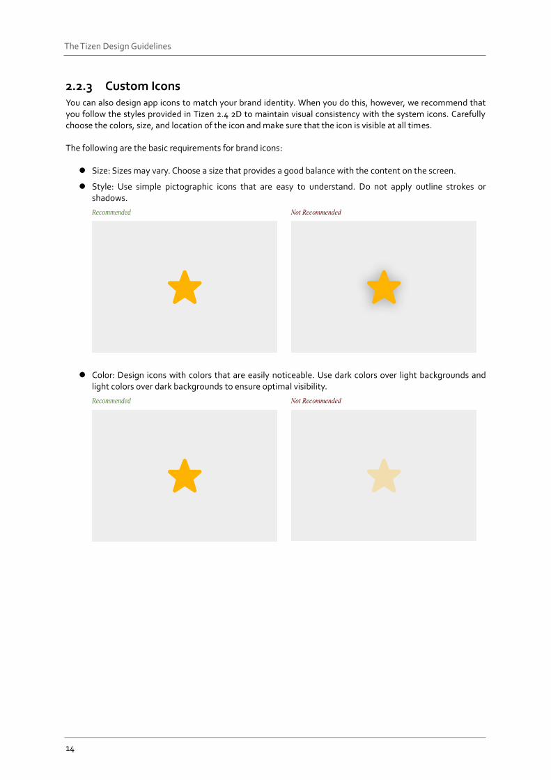
2.2.3 Custom Icons You can also design app icons to match your brand identity. When you do this, however, we recommend that you follow the styles provided in Tizen 2.4 2D to maintain visual consistency with the system icons. Carefully choose the colors, size, and location of the icon and make sure that the icon is visible at all times. The following are the basic requirements for brand icons:
Size: Sizes may vary. Choose a size that provides a good balance with the content on the screen.
Style: Use simple pictographic icons that are easy to understand. Do not apply outline strokes or shadows.
Recommended
Color: Design icons with colors that are easily noticeable. Use dark colors over light backgrounds and light colors over dark backgrounds to ensure optimal visibility.
Recommended
15
The Tizen Design Guidelines
Typography
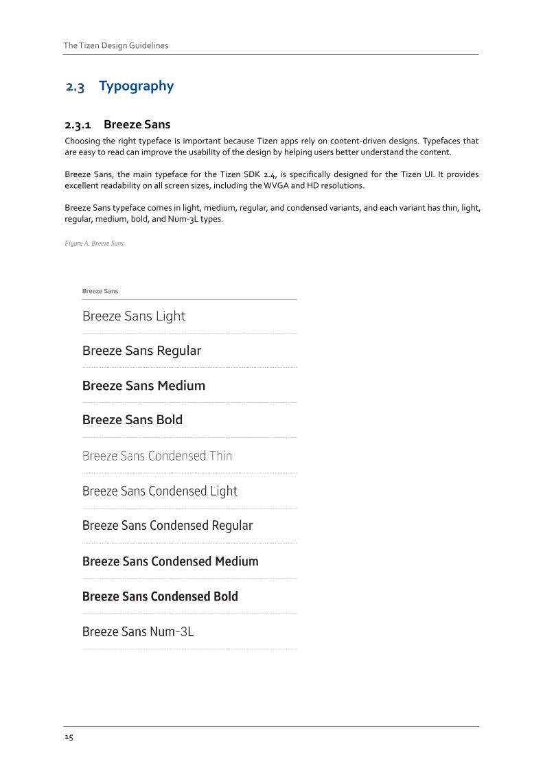
2.3.1 Breeze Sans Choosing the right typeface is important because Tizen apps rely on content-driven designs. Typefaces that are easy to read can improve the usability of the design by helping users better understand the content. Breeze Sans, the main typeface for the Tizen SDK 2.4, is specifically designed for the Tizen UI. It provides excellent readability on all screen sizes, including the WVGA and HD resolutions. Breeze Sans typeface comes in light, medium, regular, and condensed variants, and each variant has thin, light, regular, medium, bold, and Num-3L types.
Figure A. Breeze Sans
16
The Tizen Design Guidelines
2.3.2 Typeface-related Guidelines These are the guidelines for choosing and applying the typefaces when you design a Tizen app:
Design High Contrast Screens for Better Legibility
Use light text on dark backgrounds and dark text on light backgrounds. If you choose a light color for the background, use bold and strong colored text in the foreground. Do not adjust the text opacity. It will decrease the contrast between the background and the text. On the other hand, use a dark background for light-colored text. Always test the background and text colors to make sure the combination results in good contrast before making a final decision. Refer to Colors for detailed information about background and text colors.
Keep the Text Colors Consistent
Use text colors that stand out for important actions, and apply them consistently throughout the entire system. This will help users intuitively understand what the colors stand for.
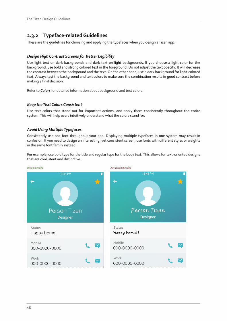
Avoid Using Multiple Typefaces
Consistently use one font throughout your app. Displaying multiple typefaces in one system may result in confusion. If you need to design an interesting, yet consistent screen, use fonts with different styles or weights in the same font family instead. For example, use bold type for the title and regular type for the body text. This allows for text-oriented designs that are consistent and distinctive. Recommended
17
The Tizen Design Guidelines
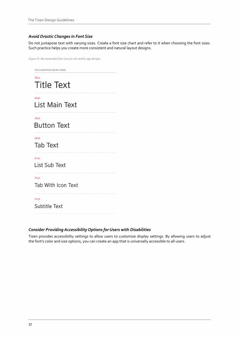
Avoid Drastic Changes in Font Size
Do not juxtapose text with varying sizes. Create a font size chart and refer to it when choosing the font sizes. Such practice helps you create more consistent and natural layout designs.
Figure D. Recommended font sizes for the mobile app designs
Consider Providing Accessibility Options for Users with Disabilities
Tizen provides accessibility settings to allow users to customize display settings. By allowing users to adjust the font’s color and size options, you can create an app that is universally accessible to all users.
18
The Tizen Design Guidelines
Colors Colors play an important role in creating designs for a rich visual experience. Carefully selected colors add rhythm and richness to the screen design and provide the entire system with visual consistency. Tizen provides various color palettes to help you select colors to indicate different functions of on-screen objects. This section provides information about the new default theme color provided with the Tizen SDK 2.4 and explains the system colors (functional colors) used to indicate different functions.
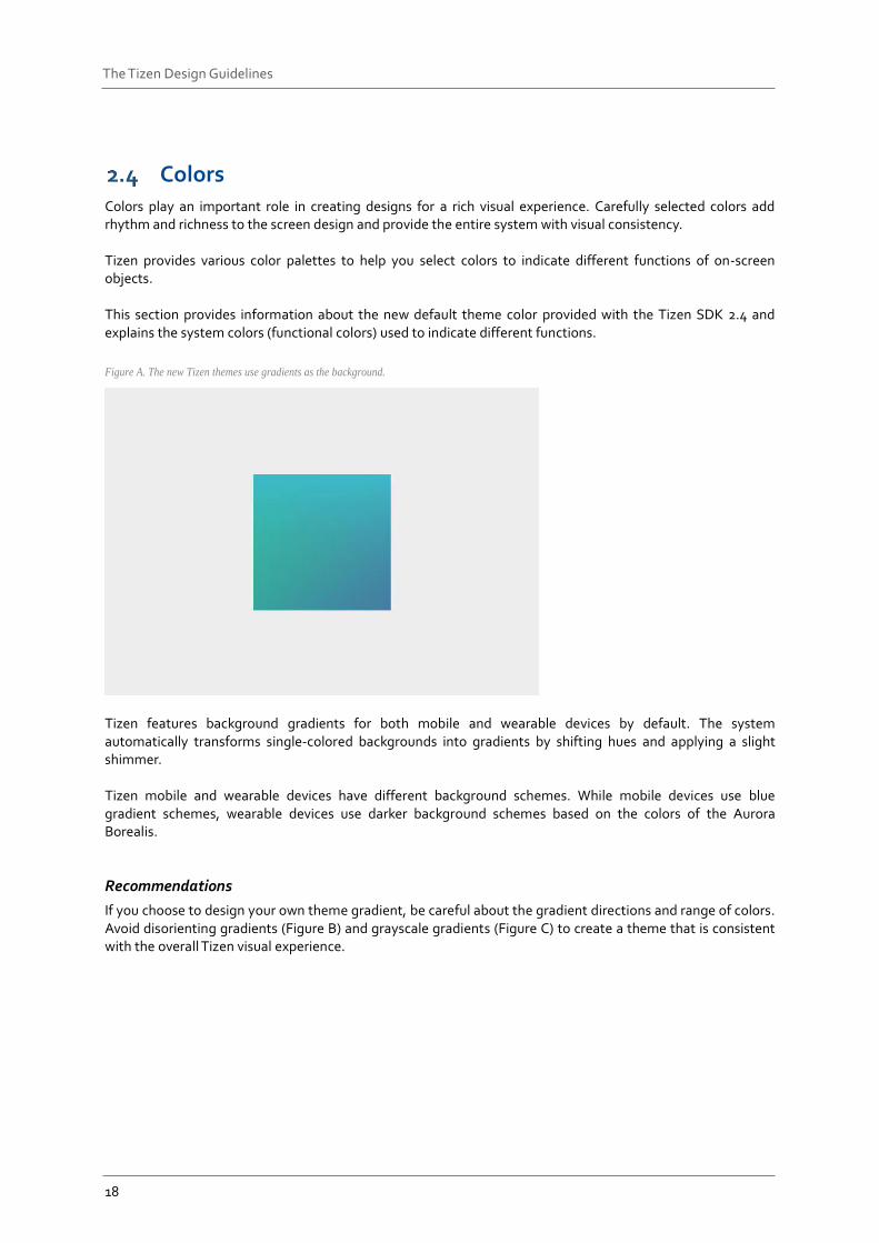
Figure A. The new Tizen themes use gradients as the background.
Tizen features background gradients for both mobile and wearable devices by default. The system automatically transforms single-colored backgrounds into gradients by shifting hues and applying a slight shimmer. Tizen mobile and wearable devices have different background schemes. While mobile devices use blue gradient schemes, wearable devices use darker background schemes based on the colors of the Aurora Borealis.
Recommendations
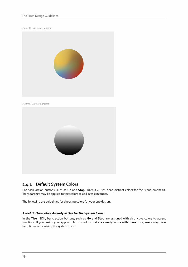
If you choose to design your own theme gradient, be careful about the gradient directions and range of colors. Avoid disorienting gradients (Figure B) and grayscale gradients (Figure C) to create a theme that is consistent with the overall Tizen visual experience.
19
The Tizen Design Guidelines
Figure B. Disorienting gradient
Figure C. Grayscale gradient
2.4.1 Default System Colors For basic action buttons, such as Go and Stop, Tizen 2.4 uses clear, distinct colors for focus and emphasis. Transparency may be applied to text colors to add subtle nuances. The following are guidelines for choosing colors for your app design.
Avoid Button Colors Already in Use for the System Icons
In the Tizen SDK, basic action buttons, such as Go and Stop are assigned with distinctive colors to accent functions. If you design your app with button colors that are already in use with these icons, users may have hard times recognizing the system icons.
20
The Tizen Design Guidelines
Choose Unique Colors for Your App
You can design your own theme, and apply it to your app to differentiate it from others. Just remember to use consistent color swatches that will enhance visual communication with users.
Keep Accessibility in Mind
It is important to remember that some users may have compromised vision, such as being near-sighted or color blind. Find combinations of colors that are easily distinguishable to these users. For example, if you have to use red and green colors together in one screen to indicate functions, adjust hue and contrast to make sure that these colors are distinguishable to users with red-green color blindness.
2.4.2 Text and Background Color On the Tizen platform, multiple layers are stacked together to produce the resulting screen colors. Since simpler colors are used in stacks, there are only a few rules to follow. These rules ensure that the combinations of colors are not unusual or unnatural.
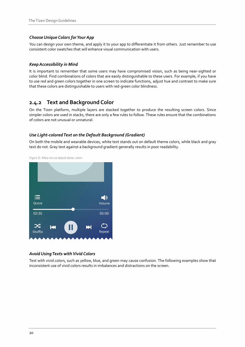
Use Light-colored Text on the Default Background (Gradient)
On both the mobile and wearable devices, white text stands out on default theme colors, while black and gray text do not. Gray text against a background gradient generally results in poor readability.
Figure D. White text on default theme colors
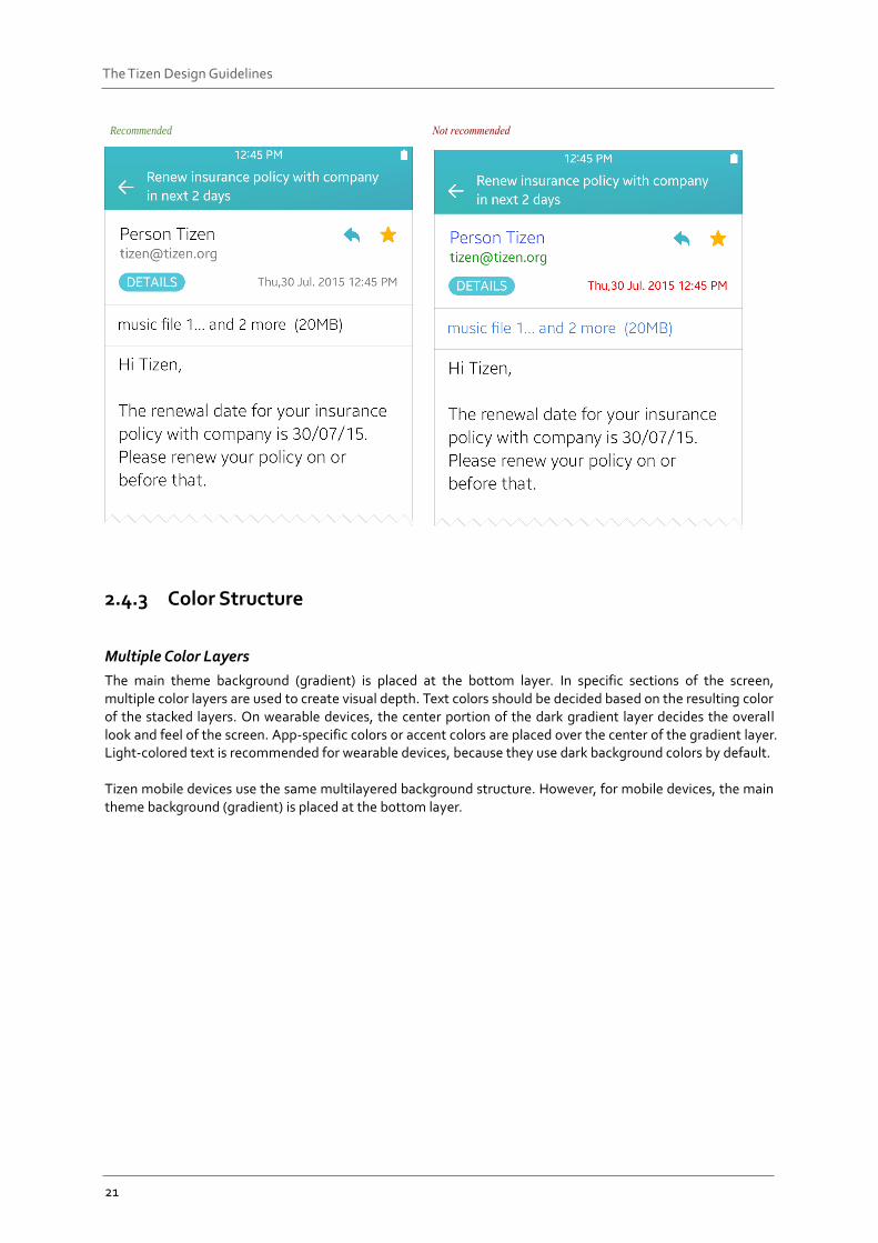
Avoid Using Texts with Vivid Colors
Text with vivid colors, such as yellow, blue, and green may cause confusion. The following examples show that inconsistent use of vivid colors results in imbalances and distractions on the screen.
21
The Tizen Design Guidelines
Recommended
2.4.3 Color Structure
Multiple Color Layers
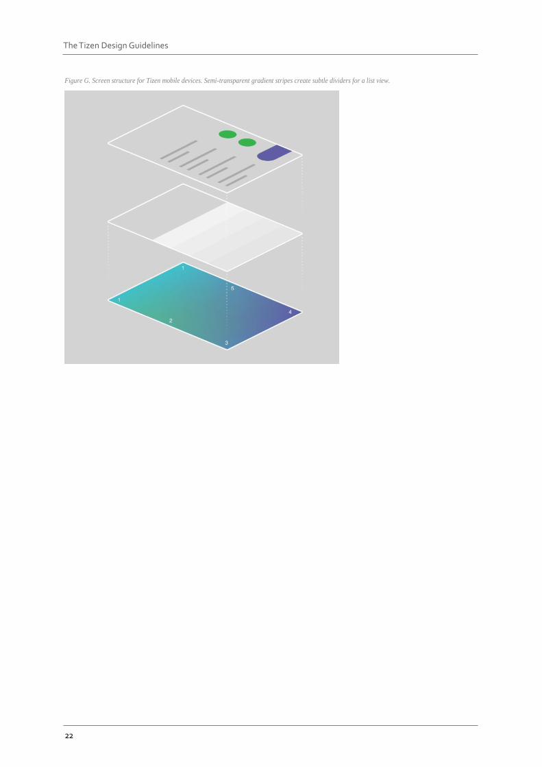
The main theme background (gradient) is placed at the bottom layer. In specific sections of the screen, multiple color layers are used to create visual depth. Text colors should be decided based on the resulting color of the stacked layers. On wearable devices, the center portion of the dark gradient layer decides the overall look and feel of the screen. App-specific colors or accent colors are placed over the center of the gradient layer. Light-colored text is recommended for wearable devices, because they use dark background colors by default. Tizen mobile devices use the same multilayered background structure. However, for mobile devices, the main theme background (gradient) is placed at the bottom layer.
22
The Tizen Design Guidelines
Figure G. Screen structure for Tizen mobile devices. Semi-transparent gradient stripes create subtle dividers for a list view.
23
The Tizen Design Guidelines
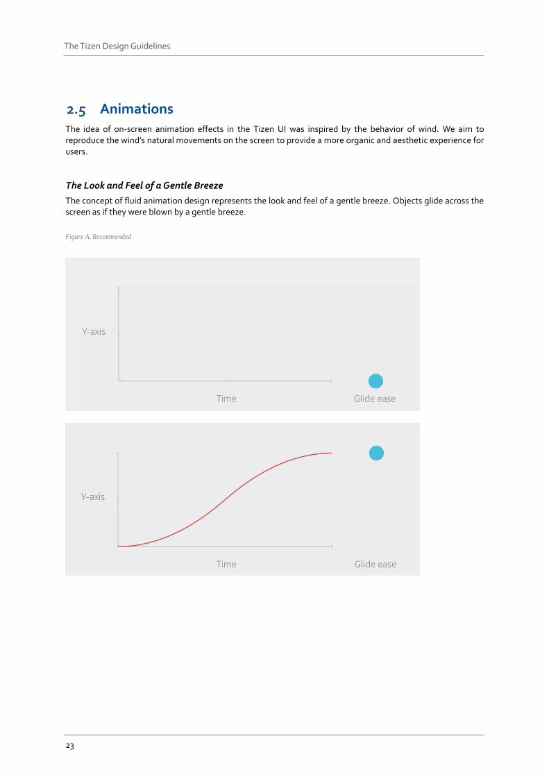
Animations The idea of on-screen animation effects in the Tizen UI was inspired by the behavior of wind. We aim to reproduce the wind’s natural movements on the screen to provide a more organic and aesthetic experience for users.
The Look and Feel of a Gentle Breeze
The concept of fluid animation design represents the look and feel of a gentle breeze. Objects glide across the screen as if they were blown by a gentle breeze.
Figure A. Recommended
24
The Tizen Design Guidelines
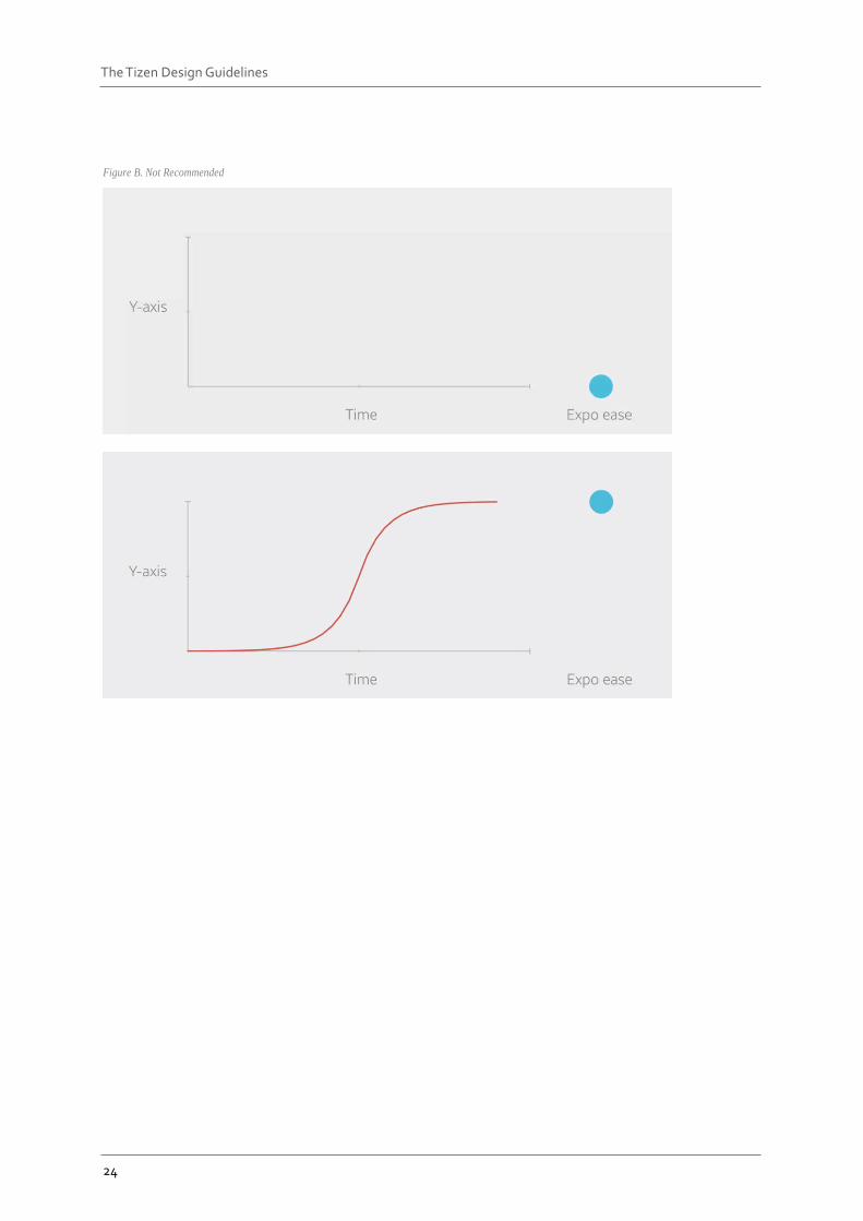
Figure B. Not Recommended
25
The Tizen Design Guidelines
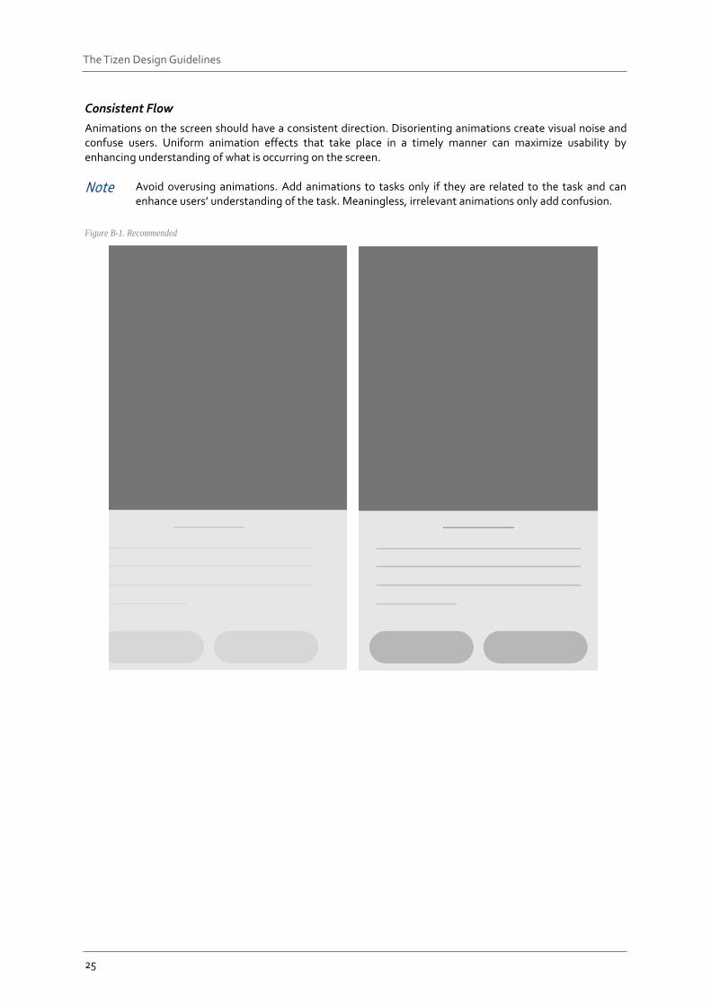
Consistent Flow
Animations on the screen should have a consistent direction. Disorienting animations create visual noise and confuse users. Uniform animation effects that take place in a timely manner can maximize usability by enhancing understanding of what is occurring on the screen.
Note Avoid overusing animations. Add animations to tasks only if they are related to the task and can enhance users’ understanding of the task. Meaningless, irrelevant animations only add confusion.
Figure B-1. Recommended
26
The Tizen Design Guidelines
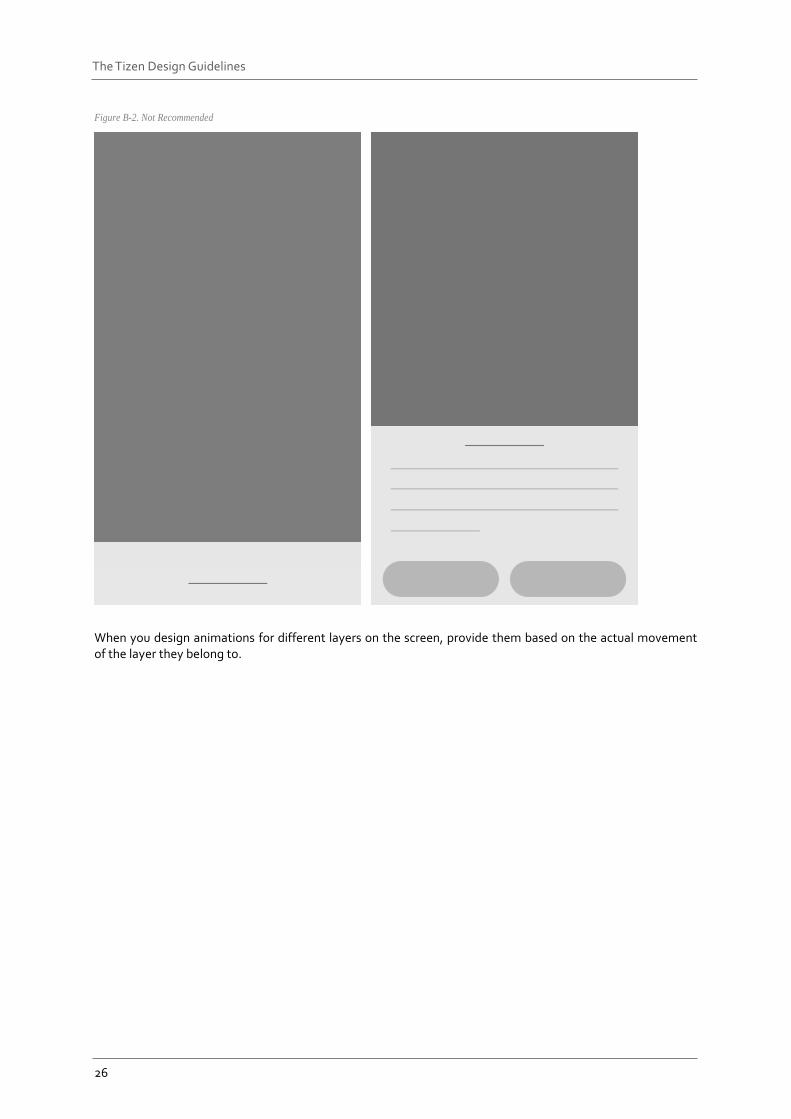
Figure B-2. Not Recommended
When you design animations for different layers on the screen, provide them based on the actual movement of the layer they belong to.
27
The Tizen Design Guidelines
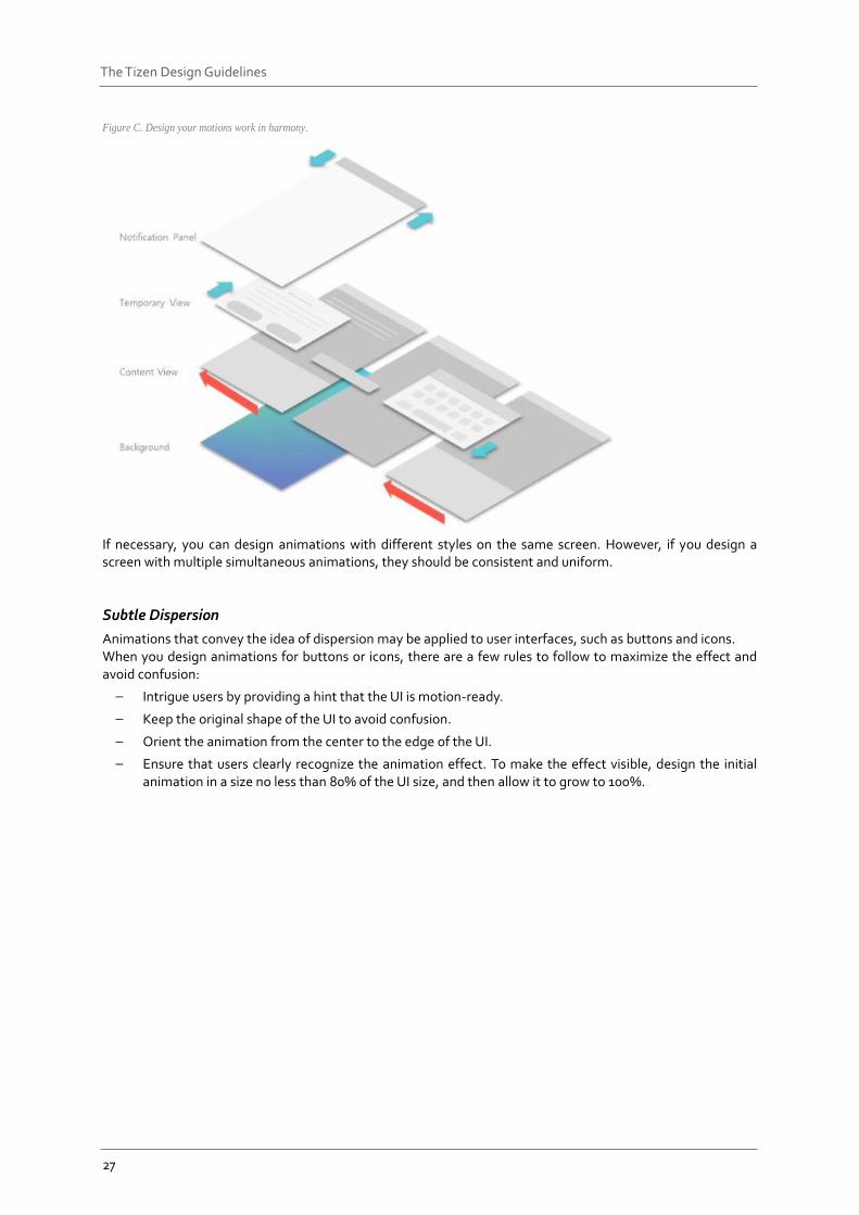
Figure C. Design your motions work in harmony.
If necessary, you can design animations with different styles on the same screen. However, if you design a screen with multiple simultaneous animations, they should be consistent and uniform.
Subtle Dispersion
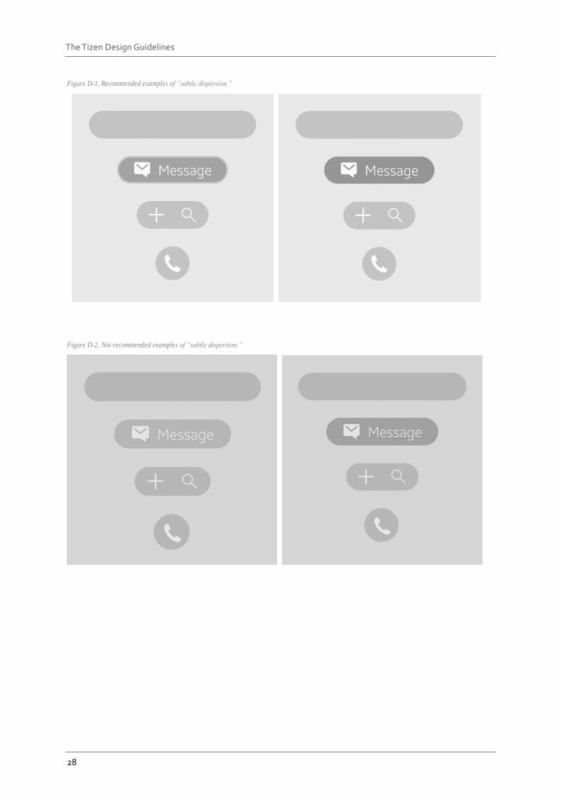
Animations that convey the idea of dispersion may be applied to user interfaces, such as buttons and icons. When you design animations for buttons or icons, there are a few rules to follow to maximize the effect and avoid confusion:
– Intrigue users by providing a hint that the UI is motion-ready.
– Keep the original shape of the UI to avoid confusion.
– Orient the animation from the center to the edge of the UI.
– Ensure that users clearly recognize the animation effect. To make the effect visible, design the initial animation in a size no less than 80% of the UI size, and then allow it to grow to 100%.
28
The Tizen Design Guidelines
Figure D-1. Recommended examples of “subtle dispersion.”
Figure D-2. Not recommended examples of “subtle dispersion.”