Embed Size (px)
Citation preview
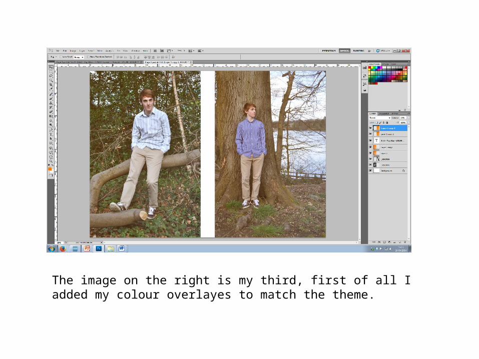
The image on the right is my third, first of all I added my colour overlayes to match the theme.
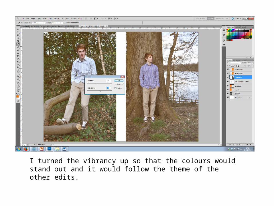
I turned the vibrancy up so that the colours would stand out and it would follow the theme of the other edits.
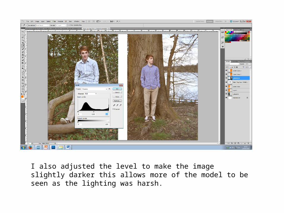
I also adjusted the level to make the image slightly darker this allows more of the model to be seen as the lighting was harsh.
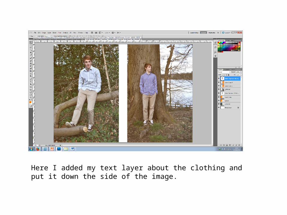
Here I added my text layer about the clothing and put it down the side of the image.
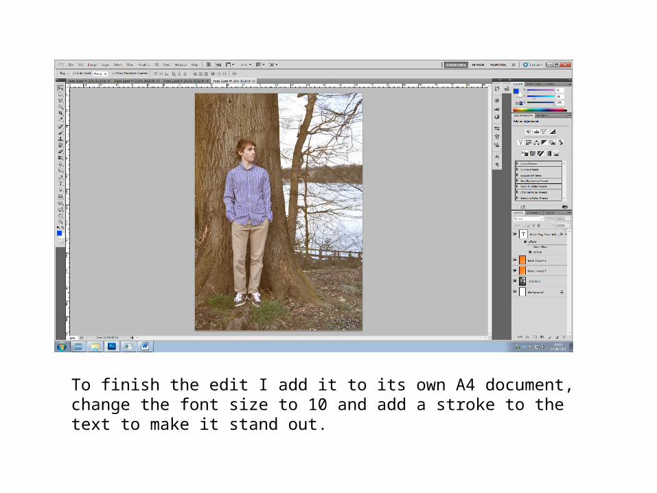
To finish the edit I add it to its own A4 document, change the font size to 10 and add a stroke to the text to make it stand out.