Embed Size (px)
Citation preview
Question 1!In what ways does your product use, develop or challenge forms
and conventions of real media products?
When I started to create my magazine I needed to look at already made pop magazines to see their typical conventions and how they use them.
I noticed that a lot of them had similar features appearing on them and this is what made them look professional and therefore be successful!
My two main inspirations whilst designing and creating mine were ‘top of the pops’ and ‘we <3 pop’.
I focused my attention of these two as these are the two big popular pop magazines. However, I did also look into other magazines to see if they had similar conventions. I quickly noticed that a lot of them did follow a similar pattern.
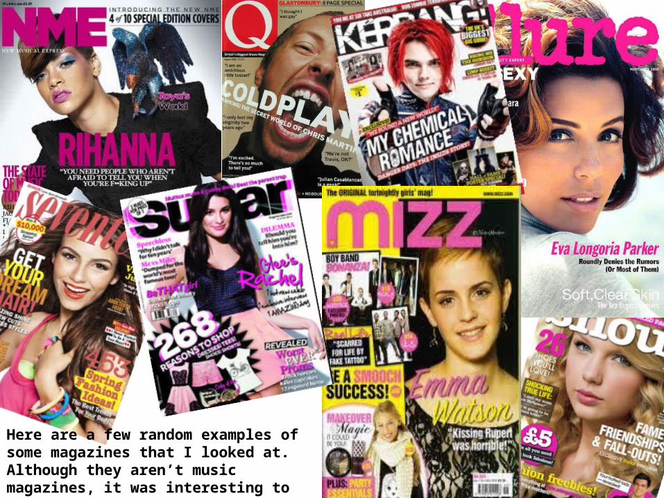
Here are a few random examples of some magazines that I looked at. Although they aren’t music magazines, it was interesting to see that they had a similar style.
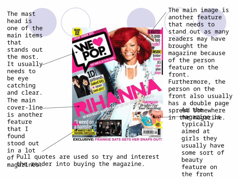
The mast head is one of the main items that stands out the most. It usually needs to be eye catching and clear.
The main image is another feature that needs to stand out as many readers may have brought the magazine because of the person feature on the front. Furthermore, the person on the front also usually has a double page spread somewhere in the magazine.
As the magazine is typically aimed at girls they usually have some sort of beauty feature on the front cover.
Pull quotes are used so try and interest the reader into buying the magazine.
The main cover-line is another feature that I found stood out in a lot of magazines.
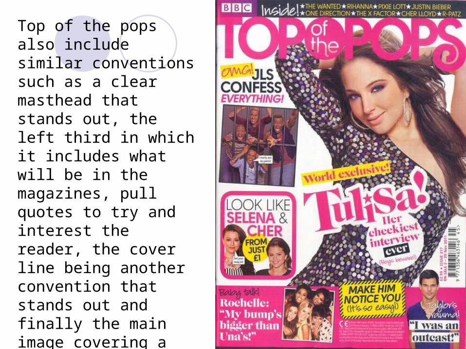
Top of the pops also include similar conventions such as a clear masthead that stands out, the left third in which it includes what will be in the magazines, pull quotes to try and interest the reader, the cover line being another convention that stands out and finally the main image covering a lot of room and being someone well known that will most likely feature later on in the magazine.
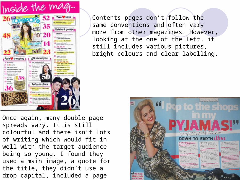
Contents pages don’t follow the same conventions and often vary more from other magazines. However, looking at the one of the left, it still includes various pictures, bright colours and clear labelling.
Once again, many double page spreads vary. It is still colourful and there isn’t lots of writing which would fit in well with the target audience being so young. I found they used a main image, a quote for the title, they didn’t use a drop capital, included a page number and used a pull quote.
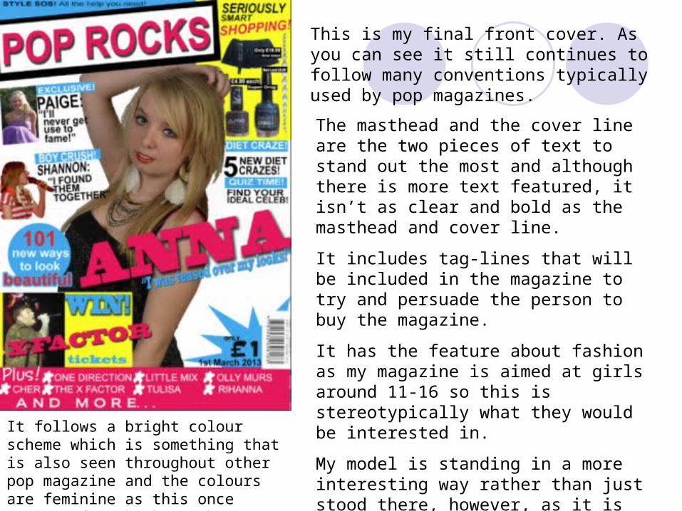
This is my final front cover. As you can see it still continues to follow many conventions typically used by pop magazines.
The masthead and the cover line are the two pieces of text to stand out the most and although there is more text featured, it isn’t as clear and bold as the masthead and cover line.
It includes tag-lines that will be included in the magazine to try and persuade the person to buy the magazine.
It has the feature about fashion as my magazine is aimed at girls around 11-16 so this is stereotypically what they would be interested in.
My model is standing in a more interesting way rather than just stood there, however, as it is aimed at young girls is cannot be anything to revealing.
It follows a bright colour scheme which is something that is also seen throughout other pop magazine and the colours are feminine as this once again refers back to the target audience.

This is my final contents page and once again it follows many conventions of a contents page.
The colour scheme needed to fit with the front page so this was one thing I needed to do.
It’s bright but not overwhelming which was something that was found in other pop contents pages.
It has several pictures on it to try and interest the reader.
The sectioning of it is similar to other contents pages. I’ve split it up into shopping, gossip, quizzes and prizes. I done this because it is what I felt a lot of magazines tried to aim for as it was something that would interest their readers.
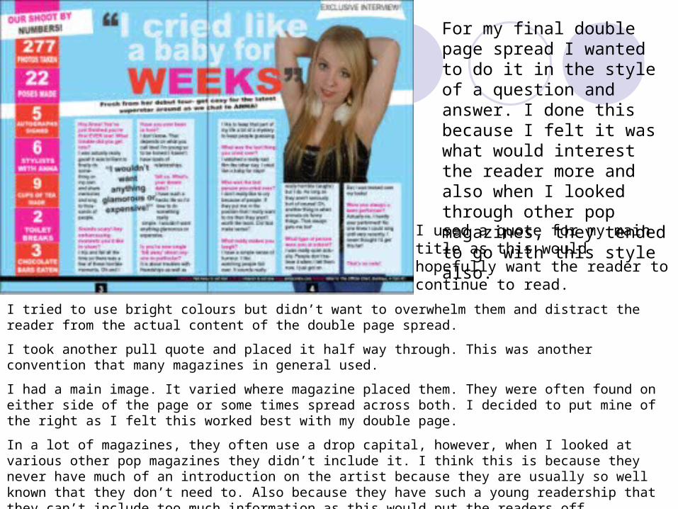
For my final double page spread I wanted to do it in the style of a question and answer. I done this because I felt it was what would interest the reader more and also when I looked through other pop magazines, they tended to go with this style also.
I tried to use bright colours but didn’t want to overwhelm them and distract the reader from the actual content of the double page spread.
I took another pull quote and placed it half way through. This was another convention that many magazines in general used.
I had a main image. It varied where magazine placed them. They were often found on either side of the page or some times spread across both. I decided to put mine of the right as I felt this worked best with my double page.
In a lot of magazines, they often use a drop capital, however, when I looked at various other pop magazines they didn’t include it. I think this is because they never have much of an introduction on the artist because they are usually so well known that they don’t need to. Also because they have such a young readership that they can’t include too much information as this would put the readers off.
I used a quote for my main title as this would hopefully want the reader to continue to read.
Overall, I felt that I did use and develop conventions more than challenge them as pop magazines are extremely popular and obviously what they are doing is working. One thing I did challenge was that their models are usually dressed in bright colours and I didn’t want to use this too much as it was the one thing that I felt could be neutral and therefore could possibly interest both boys and girls. Just because it is generally a girl magazine doesn’t mean that boys won’t have an interest in the person on the main image. I also didn’t want to dress them brightly as I felt it would be too much for the eye to have bright colours for the text etc as well as for the model.
The way pop magazine conventions are used is effective and clearly works for them so I didn’t see a real need to change them. However, obviously it needs changing to some effect otherwise I would just be making an exact replicate of another magazine.