Embed Size (px)
Citation preview
Personal Development Portfolio
Robert James McLeod
RM141709
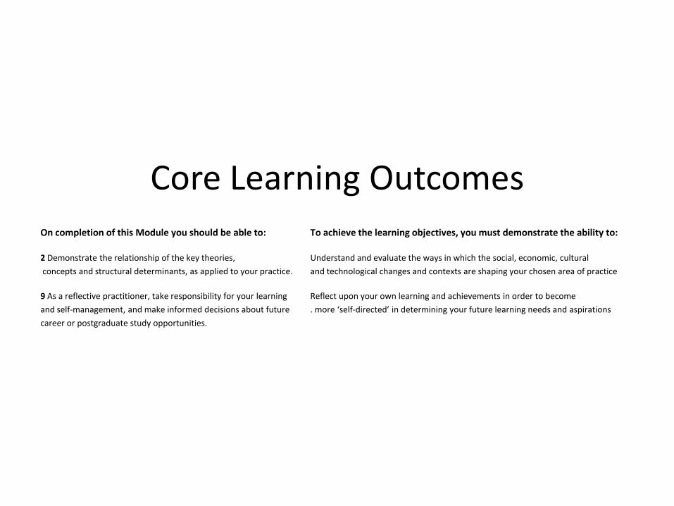
Core Learning Outcomes On completion of this Module you should be able to: To achieve the learning objectives, you must demonstrate the ability to:
2 Demonstrate the relationship of the key theories, Understand and evaluate the ways in which the social, economic, cultural
concepts and structural determinants, as applied to your practice. and technological changes and contexts are shaping your chosen area of practice
9 As a reflective practitioner, take responsibility for your learning Reflect upon your own learning and achievements in order to become
and self-management, and make informed decisions about future . more ‘self-directed’ in determining your future learning needs and aspirations
career or postgraduate study opportunities.
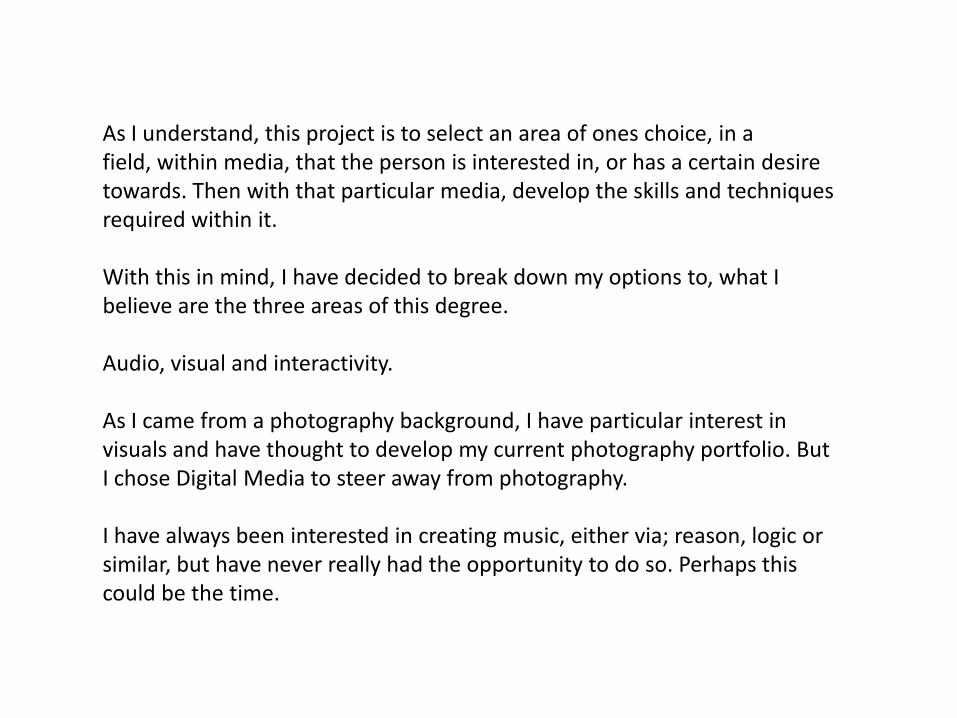
As I understand, this project is to select an area of ones choice, in a field, within media, that the person is interested in, or has a certain desire towards. Then with that particular media, develop the skills and techniques required within it.
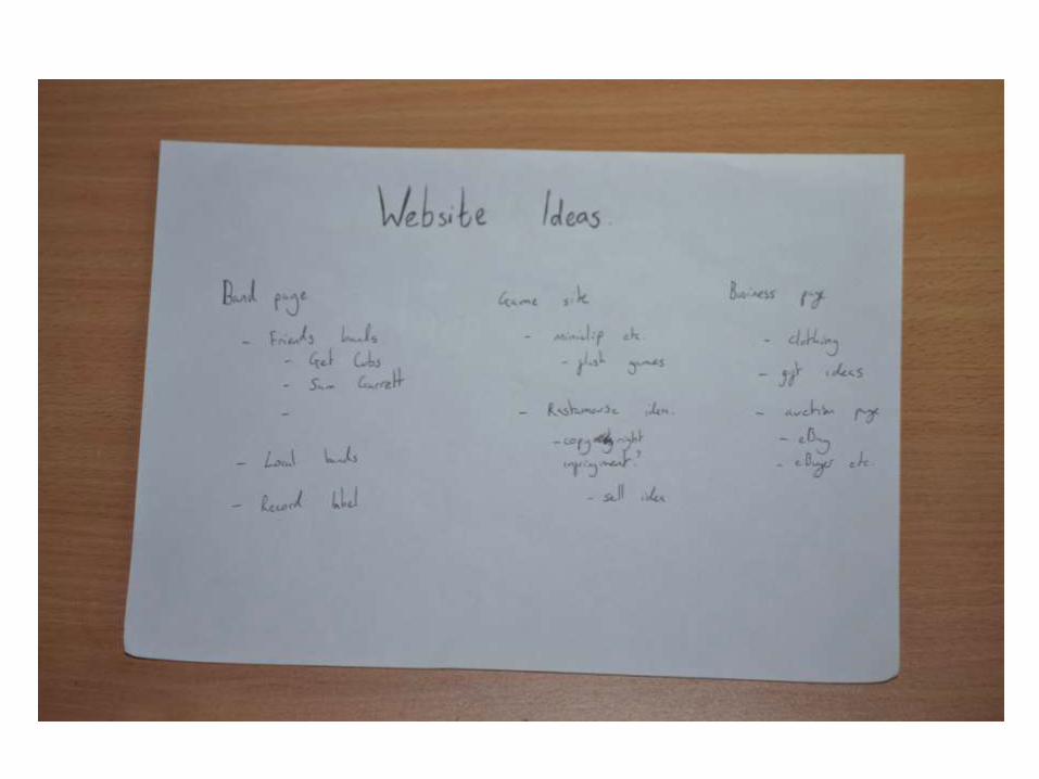
With this in mind, I have decided to break down my options to, what I believe are the three areas of this degree.
Audio, visual and interactivity.
As I came from a photography background, I have particular interest in visuals and have thought to develop my current photography portfolio. But I chose Digital Media to steer away from photography.
I have always been interested in creating music, either via; reason, logic or similar, but have never really had the opportunity to do so. Perhaps this could be the time.
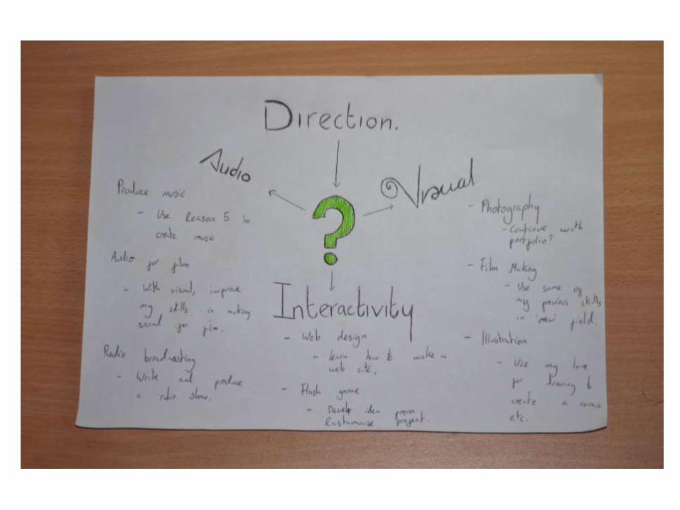
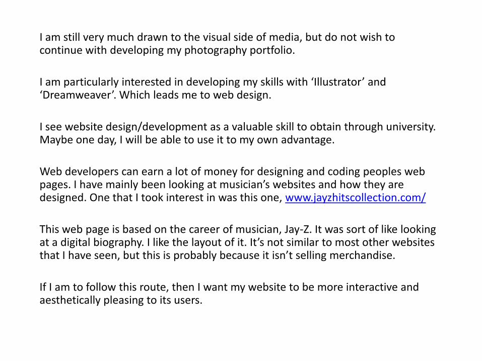
I am still very much drawn to the visual side of media, but do not wish to continue with developing my photography portfolio.
I am particularly interested in developing my skills with ‘Illustrator’ and ‘Dreamweaver’. Which leads me to web design.
I see website design/development as a valuable skill to obtain through university. Maybe one day, I will be able to use it to my own advantage.
Web developers can earn a lot of money for designing and coding peoples web pages. I have mainly been looking at musician’s websites and how they are designed. One that I took interest in was this one, www.jayzhitscollection.com/
This web page is based on the career of musician, Jay-Z. It was sort of like looking at a digital biography. I like the layout of it. It’s not similar to most other websites that I have seen, but this is probably because it isn’t selling merchandise.
If I am to follow this route, then I want my website to be more interactive and aesthetically pleasing to its users.
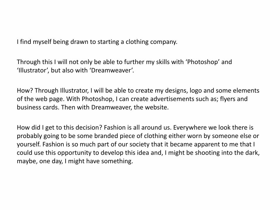
I find myself being drawn to starting a clothing company.
Through this I will not only be able to further my skills with ‘Photoshop’ and ‘Illustrator’, but also with ‘Dreamweaver’.
How? Through Illustrator, I will be able to create my designs, logo and some elements of the web page. With Photoshop, I can create advertisements such as; flyers and business cards. Then with Dreamweaver, the website.
How did I get to this decision? Fashion is all around us. Everywhere we look there is probably going to be some branded piece of clothing either worn by someone else or yourself. Fashion is so much part of our society that it became apparent to me that I could use this opportunity to develop this idea and, I might be shooting into the dark, maybe, one day, I might have something.
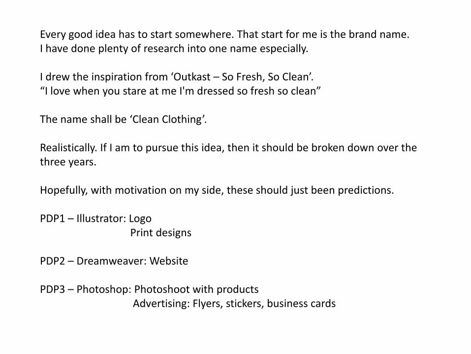
Every good idea has to start somewhere. That start for me is the brand name.I have done plenty of research into one name especially.
I drew the inspiration from ‘Outkast – So Fresh, So Clean’.“I love when you stare at me I'm dressed so fresh so clean”
The name shall be ‘Clean Clothing’.
Realistically. If I am to pursue this idea, then it should be broken down over the three years.
Hopefully, with motivation on my side, these should just been predictions.
PDP1 – Illustrator: LogoPrint designs
PDP2 – Dreamweaver: Website
PDP3 – Photoshop: Photoshoot with productsAdvertising: Flyers, stickers, business cards
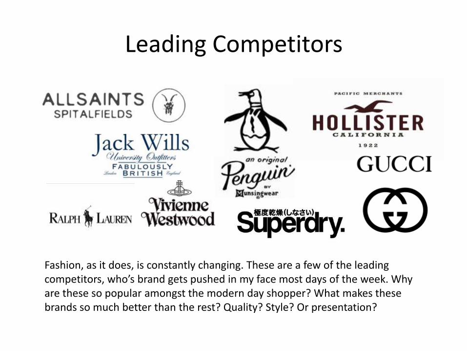
Leading Competitors
Fashion, as it does, is constantly changing. These are a few of the leading competitors, who’s brand gets pushed in my face most days of the week. Why are these so popular amongst the modern day shopper? What makes these brands so much better than the rest? Quality? Style? Or presentation?
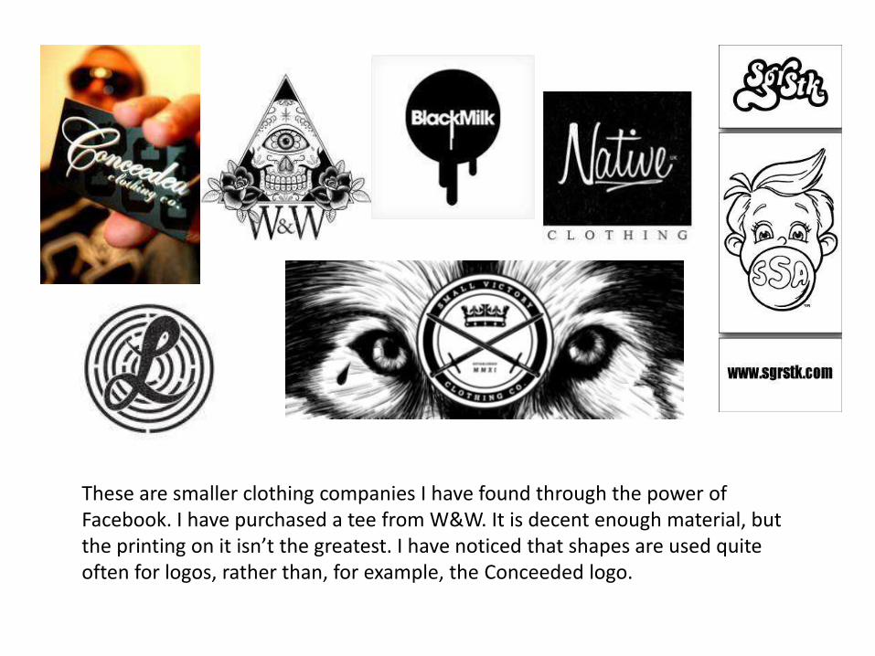
These are smaller clothing companies I have found through the power of Facebook. I have purchased a tee from W&W. It is decent enough material, but the printing on it isn’t the greatest. I have noticed that shapes are used quite often for logos, rather than, for example, the Conceeded logo.
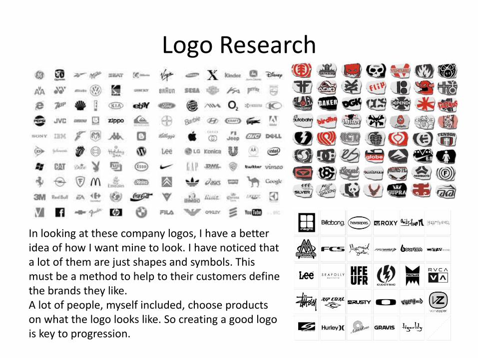
Logo Research
In looking at these company logos, I have a better idea of how I want mine to look. I have noticed that a lot of them are just shapes and symbols. This must be a method to help to their customers define the brands they like.A lot of people, myself included, choose products on what the logo looks like. So creating a good logo is key to progression.
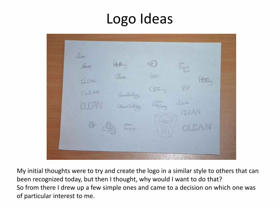
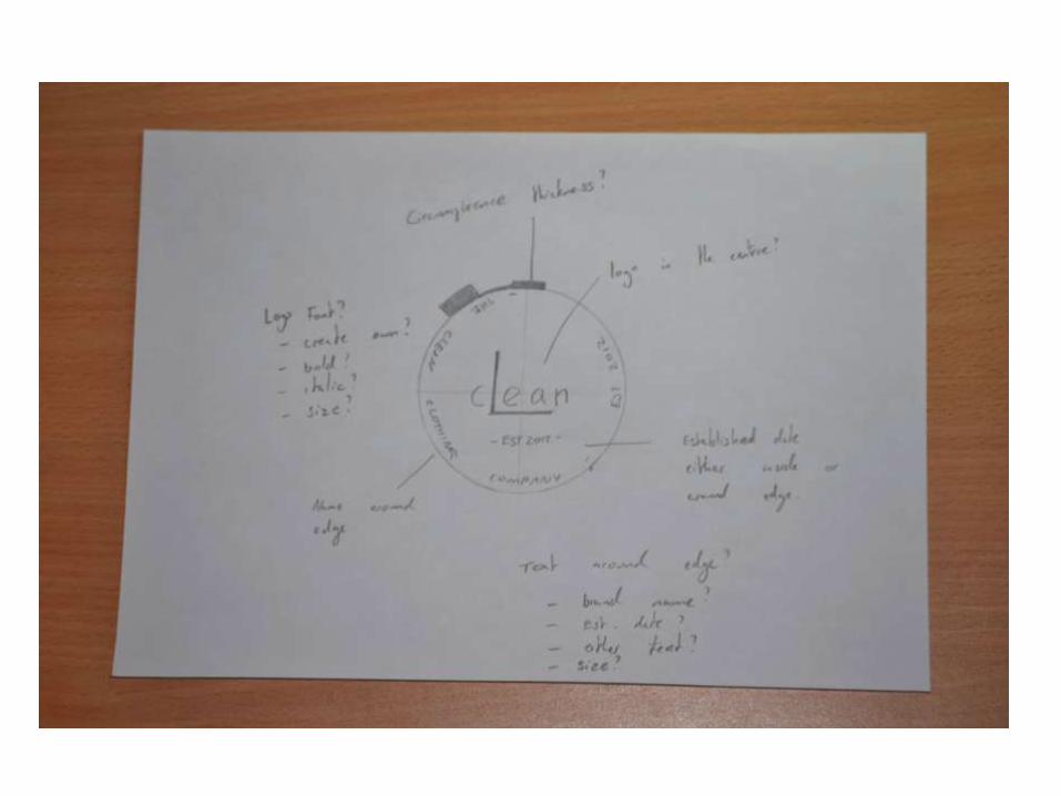
Logo Ideas
My initial thoughts were to try and create the logo in a similar style to others that can been recognized today, but then I thought, why would I want to do that?So from there I drew up a few simple ones and came to a decision on which one wasof particular interest to me.
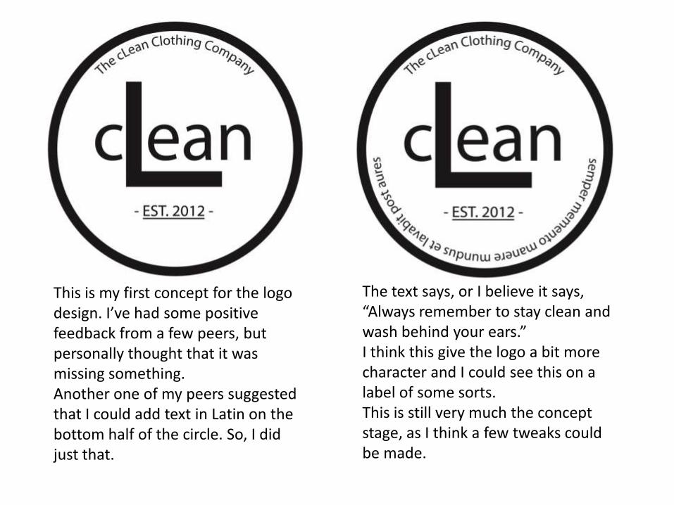
This is my first concept for the logo design. I’ve had some positive feedback from a few peers, but personally thought that it was missing something.Another one of my peers suggested that I could add text in Latin on the bottom half of the circle. So, I did just that.
The text says, or I believe it says, “Always remember to stay clean and wash behind your ears.”I think this give the logo a bit more character and I could see this on a label of some sorts.This is still very much the concept stage, as I think a few tweaks could be made.
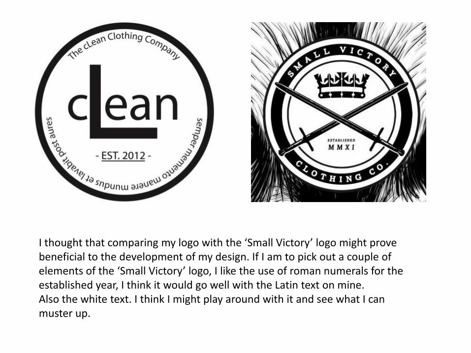
I thought that comparing my logo with the ‘Small Victory’ logo might prove beneficial to the development of my design. If I am to pick out a couple of elements of the ‘Small Victory’ logo, I like the use of roman numerals for the established year, I think it would go well with the Latin text on mine.Also the white text. I think I might play around with it and see what I can muster up.
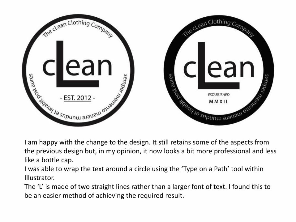
I am happy with the change to the design. It still retains some of the aspects from the previous design but, in my opinion, it now looks a bit more professional and less like a bottle cap.I was able to wrap the text around a circle using the ‘Type on a Path’ tool within Illustrator.The ‘L’ is made of two straight lines rather than a larger font of text. I found this to be an easier method of achieving the required result.
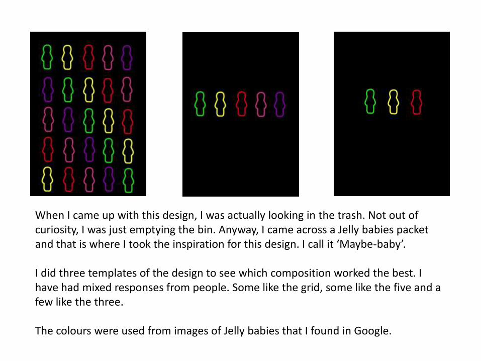
When I came up with this design, I was actually looking in the trash. Not out of curiosity, I was just emptying the bin. Anyway, I came across a Jelly babies packet and that is where I took the inspiration for this design. I call it ‘Maybe-baby’.
I did three templates of the design to see which composition worked the best. I have had mixed responses from people. Some like the grid, some like the five and a few like the three.
The colours were used from images of Jelly babies that I found in Google.
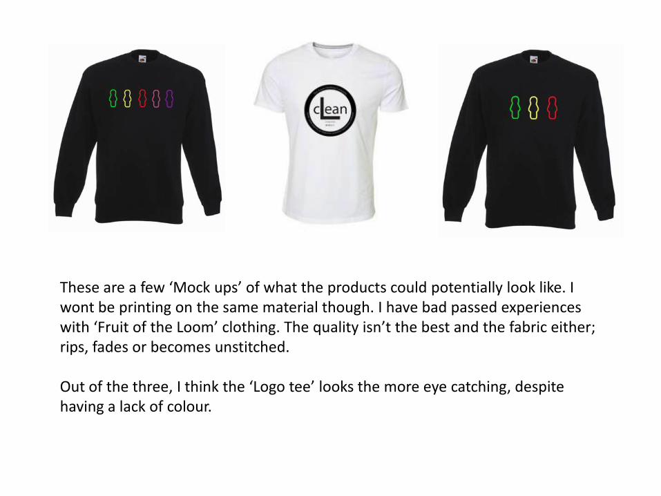
These are a few ‘Mock ups’ of what the products could potentially look like. I wont be printing on the same material though. I have bad passed experiences with ‘Fruit of the Loom’ clothing. The quality isn’t the best and the fabric either; rips, fades or becomes unstitched.
Out of the three, I think the ‘Logo tee’ looks the more eye catching, despite having a lack of colour.


![Pioneer Pdp 434cmx Pdp 43mxe1 s [ET]](https://img.pdfslide.us/doc/110x75/55cf8eae550346703b948a48/pioneer-pdp-434cmx-pdp-43mxe1-s-et.jpg)