Embed Size (px)
Citation preview
Nikki Plyem
UX Portfolio
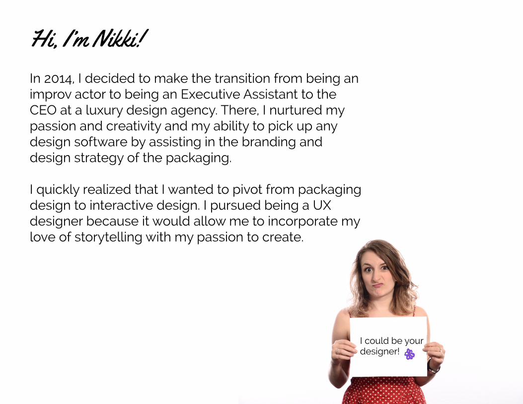
In 2014, I decided to make the transition from being an
improv actor to being an Executive Assistant to the
CEO at a luxury design agency. There, I nurtured my
passion and creativity and my ability to pick up any
design software by assisting in the branding and
design strategy of the packaging.
I quickly realized that I wanted to pivot from packaging
design to interactive design. I pursued being a UX
designer because it would allow me to incorporate my
love of storytelling with my passion to create.
I could be your designer!
Hi, I’m Nikki!
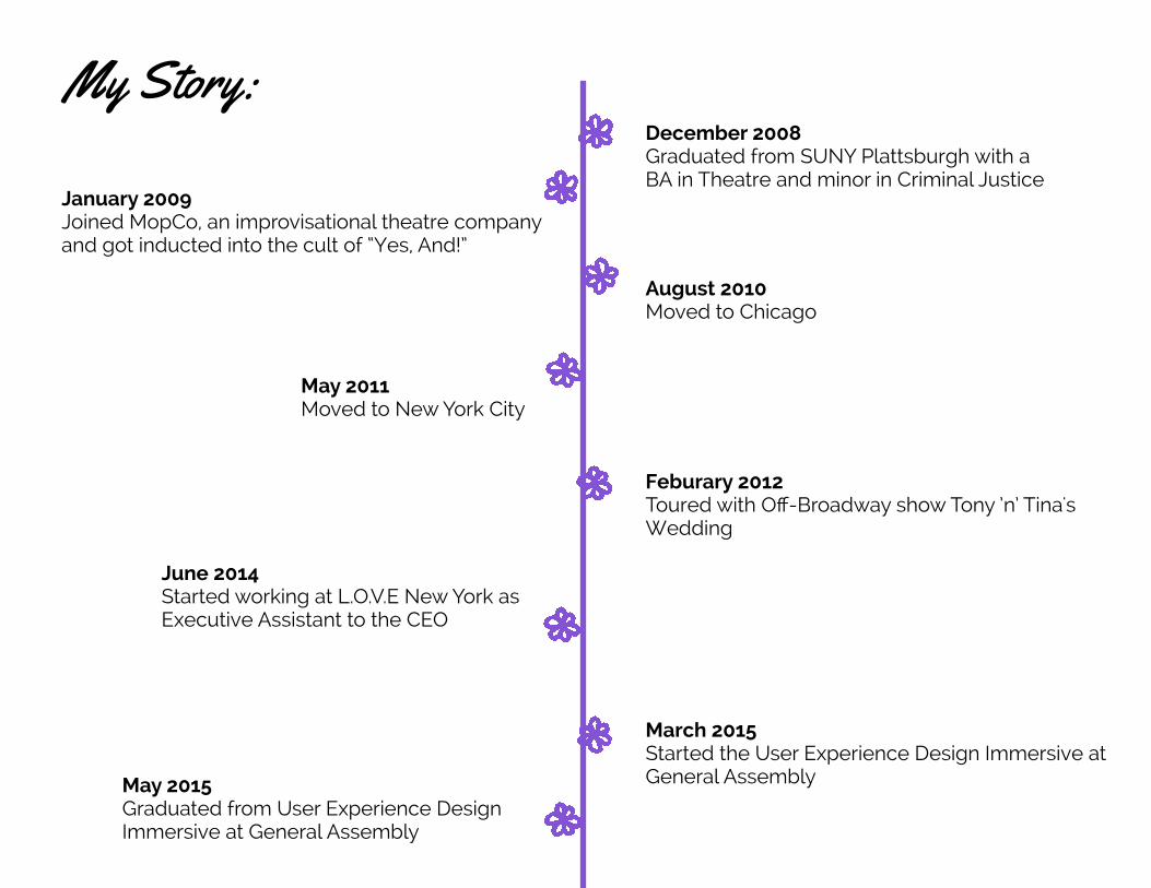
My Story:December 2008Graduated from SUNY Plattsburgh with a
BA in Theatre and minor in Criminal Justice
January 2009Joined MopCo, an improvisational theatre company
and got inducted into the cult of “Yes, And!”
August 2010Moved to Chicago
May 2011Moved to New York City
Feburary 2012Toured with Off-Broadway show Tony ’n’ Tina's
Wedding
June 2014Started working at L.O.V.E New York as
Executive Assistant to the CEO
March 2015Started the User Experience Design Immersive at
General AssemblyMay 2015Graduated from User Experience Design
Immersive at General Assembly
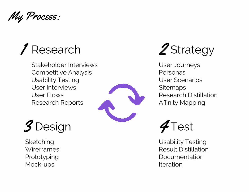
My Process:
1 2
3 4
Research
Design Test
Strategy Stakeholder InterviewsCompetitive AnalysisUsability TestingUser InterviewsUser FlowsResearch Reports
User JourneysPersonasUser ScenariosSitemapsResearch Distillation Affinity Mapping
Usability TestingResult DistillationDocumentationIteration
SketchingWireframesPrototypingMock-ups
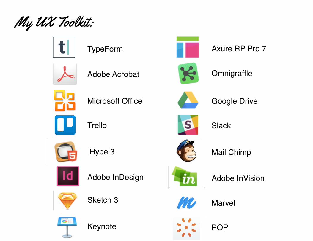
Trello
Microsoft Office
Adobe Acrobat
TypeForm
Slack
Mail Chimp
Adobe InVision
Marvel
POP
Hype 3
Adobe InDesign
Sketch 3
Keynote
Google Drive
Omnigraffle
Axure RP Pro 7
My UX Toolkit:
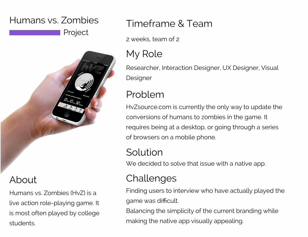
Humans vs. Zombies
Project
Timeframe & Team
My Role
Challenges
Problem
About
2 weeks, team of 2
Researcher, Interaction Designer, UX Designer, Visual
Designer
Humans vs. Zombies (HvZ) is a
live action role-playing game. It
is most often played by college
students.
HvZsource.com is currently the only way to update the
conversions of humans to zombies in the game. It
requires being at a desktop, or going through a series
of browsers on a mobile phone.
We decided to solve that issue with a native app.
Solution
Finding users to interview who have actually played the
game was difficult.
Balancing the simplicity of the current branding while
making the native app visually appealing.
Research Design TestingUser Interviews
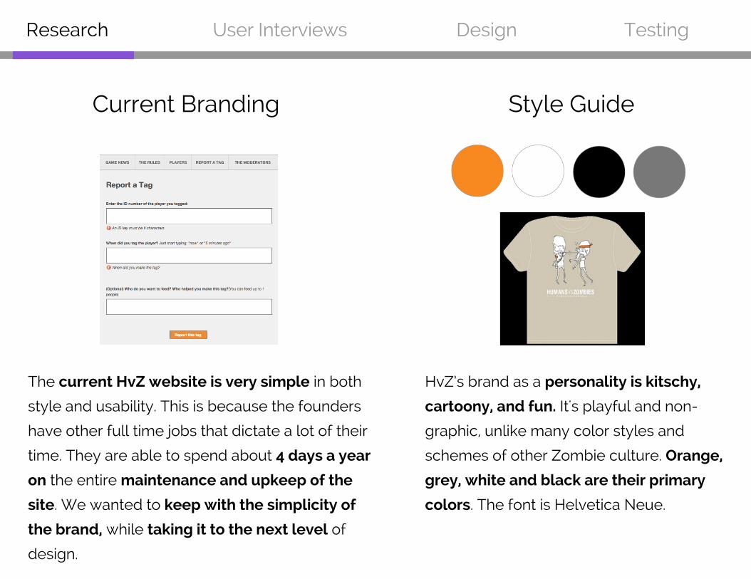
The current HvZ website is very simple in both
style and usability. This is because the founders
have other full time jobs that dictate a lot of their
time. They are able to spend about 4 days a year
on the entire maintenance and upkeep of the
site. We wanted to keep with the simplicity of
the brand, while taking it to the next level of
design.
Style GuideCurrent Branding
HvZ’s brand as a personality is kitschy,
cartoony, and fun. It's playful and non-
graphic, unlike many color styles and
schemes of other Zombie culture. Orange,
grey, white and black are their primary
colors. The font is Helvetica Neue.
Research Design TestingUser Interviews
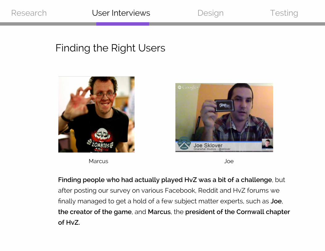
Finding people who had actually played HvZ was a bit of a challenge, but
after posting our survey on various Facebook, Reddit and HvZ forums we
finally managed to get a hold of a few subject matter experts, such as Joe,
the creator of the game, and Marcus, the president of the Cornwall chapter
of HvZ.
Marcus Joe
Finding the Right Users
Research Design Testing
The updates board can filter between tabs for moderator
only and all comments, so the
important messages don’t get lost.
User Interviews
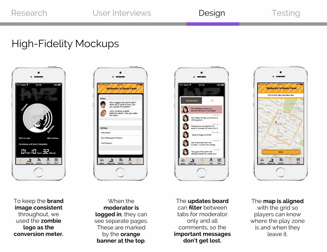
To keep the brand image consistent
throughout, we used the zombie
logo as the conversion meter.
When the moderator is
logged in, they can see separate pages. These are marked
by the orange banner at the top.
The map is aligned with the grid so
players can know where the play zone
is and when they leave it.
High-Fidelity Mockups
Research Design TestingUser Interviews
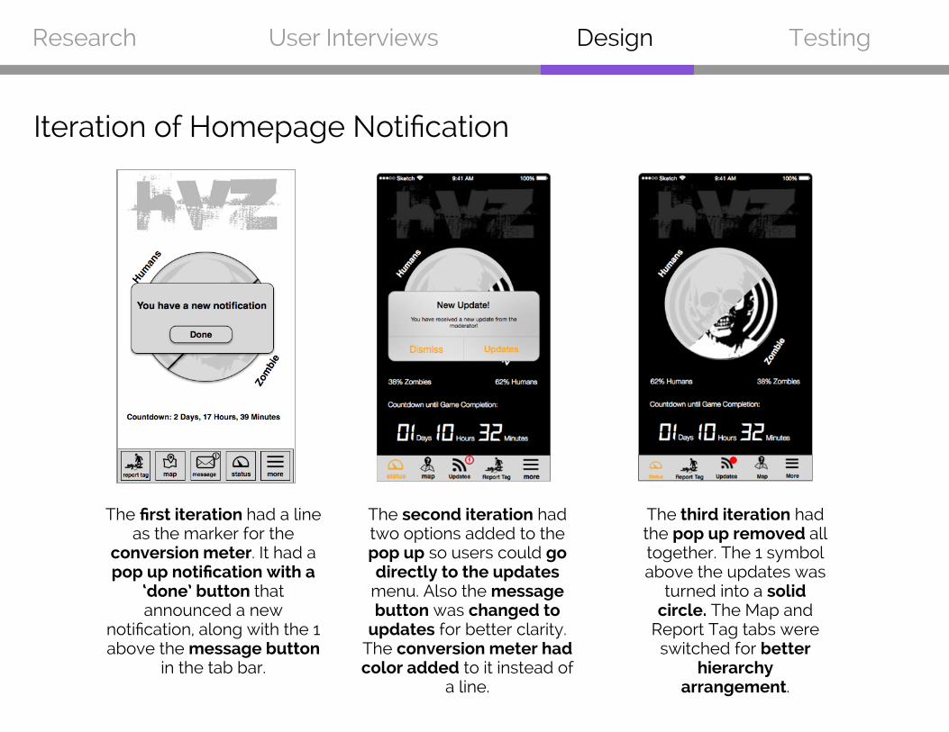
Iteration of Homepage Notification
The first iteration had a line as the marker for the
conversion meter. It had a pop up notification with a
‘done’ button that announced a new
notification, along with the 1 above the message button
in the tab bar.
The second iteration had two options added to the pop up so users could go directly to the updates
menu. Also the message button was changed to
updates for better clarity. The conversion meter had color added to it instead of
a line.
The third iteration had the pop up removed all together. The 1 symbol above the updates was
turned into a solid circle. The Map and
Report Tag tabs were switched for better
hierarchy arrangement.
Research Design TestingUser Interviews
Usability Testing
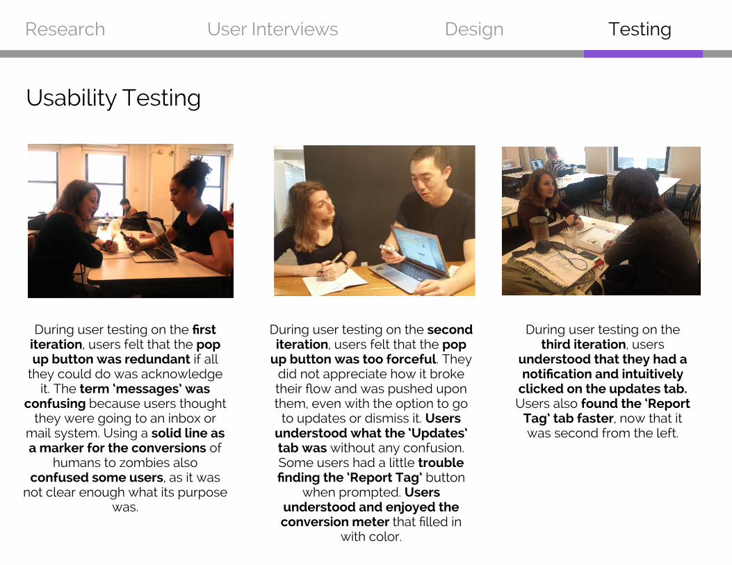
During user testing on the first iteration, users felt that the pop up button was redundant if all
they could do was acknowledge it. The term ‘messages’ was
confusing because users thought they were going to an inbox or
mail system. Using a solid line as a marker for the conversions of
humans to zombies also confused some users, as it was
not clear enough what its purpose was.
During user testing on the second iteration, users felt that the pop
up button was too forceful. They did not appreciate how it broke their flow and was pushed upon them, even with the option to go
to updates or dismiss it. Users understood what the ‘Updates’ tab was without any confusion. Some users had a little trouble finding the ‘Report Tag’ button
when prompted. Users understood and enjoyed the conversion meter that filled in
with color.
During user testing on the third iteration, users
understood that they had a notification and intuitively
clicked on the updates tab. Users also found the ‘Report
Tag’ tab faster, now that it was second from the left.
Thank you!
If you want to get a hold of me for questions, comments or coffee, call or email me!
518-364-8846
www.nikkiplyemux.com