Embed Size (px)
Citation preview

– Do’s and don’ts for slides-makers who struggle with the pictures –
HOW TO ILLUSTRATE
YOUR PRESENTATIONS

A picture speaks a thousand words
(…and it’s not just an expression!)

Your brain can process images 60,000 times faster than it can process words

to illustrate your presentations
DO’s
DON’Ts10 &

#1 DON’T
blah, blah, blah
Be a chatterbox

Margot was too beautiful for Macomber to divorce her and Macomber had too
much money for Margot ever to leave him. […] The rain made the windows of the
train wet so you could not see outside clearly and then it made everything outside
look the same anyway. We went through many towns and cities but it was
raining in all of them and when we crossed the Hudson River at Albany it was raining
hard. […] I do not suppose I thought of all those things because I have never thought
much and never in words but it was the feeling of all those things that the
country along the Hudson River gave me. […] Manuel noticed while spreading the
muleta that the white base of the horn was stained red. While he noticed these
things he did not lose sight of the bull’s feet. The bull watched Manuel steadily.
[…] She often came in when he was in bed and asked him to tell her about the war,
but her attention always wandered. His father was non-committal.

#2 DOPick 1 image to illustrate your main idea
“The illustration market is skyrocketing”

#3 DON’TAlign bullet points that nobody wants to read
• I love making presentations
• But I always have too many ideas
• So I have to write them in bullet points
• And everyone gets bored
• Reading all those bullet points
• Actually they don’t read them
• They just stare at me

• And everyone gets bored
• Reading all those bullet points
• Actually they don’t read them
• They just stare at me
• With their dull cow eyes
• And it sucks
• OK I’m stopping now
• I can’t, bullet points are my life!

#4 DO1 idea = 1 slide = 1 illustration

“We make illustrations…”

“… For millions of people…”

“… Around the globe”

#5 DON’TJust throw figures on your slides…
“In 2014, our business grew 260% compared to 2014, with over 43,000 monthly users (vs. 12,000 last year). Overall, our illustrations are shared 68% on Facebook and 41% on Twitter.”
rather…

#6 DOIllustrate figures with graphs…
“260% annual growth”

#6 DO… and data visualisation
“Social sharing”
#7 DON’TMix too many colors

(Especially if they don’t go well together)

#8 DOStick to your brand colors to create harmony

#9 DON’TMix different styles in your presentations
Get out!

Don’t mix with . That’s just ugly.

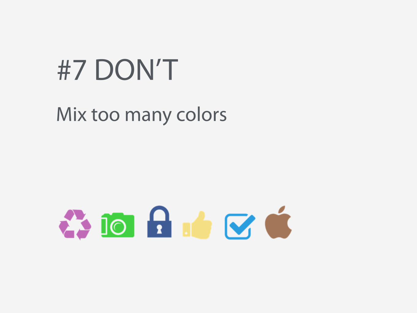
#10 DOPick 1 style and stick to it
Personally, I like flat design. But you can make your own choices. You sheep.

Enjoy your
slide-making, friend!