Embed Size (px)
Citation preview

BRAND IDENTITYGUIDELINES

01INTRODUCTION
Bold, powerful, aggressive, the Go Rhino brand identity expresses core values of strength, integrity, and product innovation.

02LOGOTYPE
The Go Rhino logo symbolizes who we are–it is our signature. Whenever possible the Go Rhino logo should be reproduced in Go Rhino Red (PMS 485) on a white or black background. It can also be displayed in white over red or black backgrounds. The minimum size of the logo is proportionate to one (1) inch or 25 mm in width.
1”

03APPLICATION
MINIMUM CLEAR SPACE
It is important to be conscious of the amount of space used around the logo, especially when it appears with other brands. The clear space helps establish the importance of the logo in environments where it competes for visual attention.
The diagram above indicates how to determine the minimum clear space around the logo. No matter what reproduction size the logo, use the x-height of the logotype as a guide, in this case, the letter “O” is used so that the size of the clear space increases or decreases proportionately to the size of logo. Always allow more clear space whenever possible.
Avoid altering the proportions of the logotype in any way. Do not change or alter the logo or add extra graphic elements to the logo.

04COLOR
Whenever possible the Go Rhino logo should be reproduced in Go Rhino Red (PMS 485) on a white or black background. It can also be displayed in white over red or black backgrounds.
GR GRAY
-------------------------------------------------------
PMS COOL GRAY 8
CMYK 0 0 0 55
RGB 140 140 140
GR BLACK
-------------------------------------------------------
PMS BLACK
CMYK 75 70 40 100
RGB 0 0 0
GR RED
-------------------------------------------------------
PMS 485
CMYK 8 97 100 1
RGB 220 40 30
WHITE
-------------------------------------------------------
PMS WHITE
CMYK 0 0 0 0
RGB 0 0 0

GO RHINO 2015 CATALOG - Inside front and Inside back cover
05HELVETICA NEUEABCDEFGHIJKLMNOPQRSTUVWXYZ01234567890 THIS TYPEFACE SHOULD ALWAYS BE SET IN ALL CAPS.
TYPOGRAPHY
HEADINGS Go Rhino uses Helvetica Neue for headlines and titles, and should always be set in ALL CAPS.
BODY AND SUBHEADS For body type and subheads, use News Gothic Medium or Bold with normal tracking and leading.
DIGITAL For websites and other digital applications, Helvetica regular may be substituted.News Gothic Bold
ABCDEFGHIJKLMNOPQRSTUVWXYZ01234567890
News Gothic MediumABCDEFGHIJKLMNOPQRSTUVWXYZ01234567890

The Go Rhino logo should always be applied using high quality badges or decals that reflect the quality of the products and brand image.
07PRODUCT
BRANDING

Go Rhino information graphics are designed to maximize customer understanding using clear, universal visual communications.
06INFORMATION
GRAPHICS
2.25”
4”
2.25”
4”
2”
5”
2”
5”
3”
6”
3”
6”
3”
5”
3”
5”
3”
6”
3”
6”
L I F E T I M E
S TA I N L ESS
W
A R R A N T Y
L IM ITED
BLACK
L I F E T I M E
STAINLESS
W
A R R A N T Y
L IM ITED
L I F E T I M E
STAINLESS
W
A R R A N T Y
L IM ITED
BLACK
BLACK/CHROME
NO WELDINGL I F E T I M E
STAINLESS
W
A R R A N T Y
L IM ITED
BLACK/CHROME SHIPS
UPS
2.25”
4”
2.25”
4”
2”
5”
2”
5”
3”
6”
3”
6”
3”
5”
3”
5”
3”
6”
3”
6”
L I F E T I M E
S TA I N L ESS
W
A R R A N T Y
L IM ITED
BLACK
L I F E T I M E
STAINLESS
W
A R R A N T Y
L IM ITED
L I F E T I M E
STAINLESS
W
A R R A N T Y
L IM ITED
BLACK
BLACK/CHROME
NO WELDING
L I F E T I M E
STAINLESS
W
A R R A N T Y
L IM ITED
BLACK/CHROME SHIPS
UPS

Go Rhino products should always expressed authenticity, boldness and high quality in photographs and video imagery.
07PHOTOGRAPHY

DIGITALCOMMUNICATIONS
08

PRINTEDLITERATURE 09
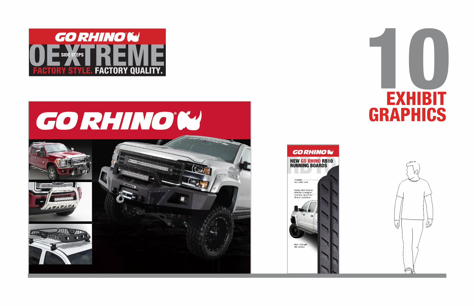
EXHIBIT GRAPHICS
10FACTORY STYLE. FACTORY QUALITY.

GORHINO.COM