Embed Size (px)
Citation preview
From April Fools' to HollywoodThe Making of the LA Typographical Map
Josh Ryan, Axis Maps
1 / 29

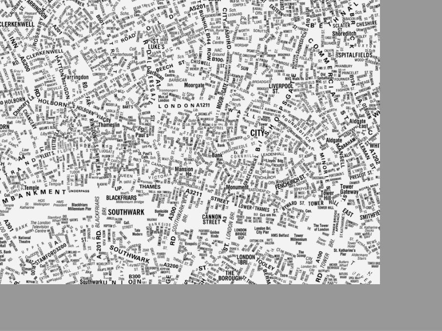
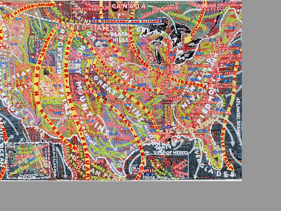
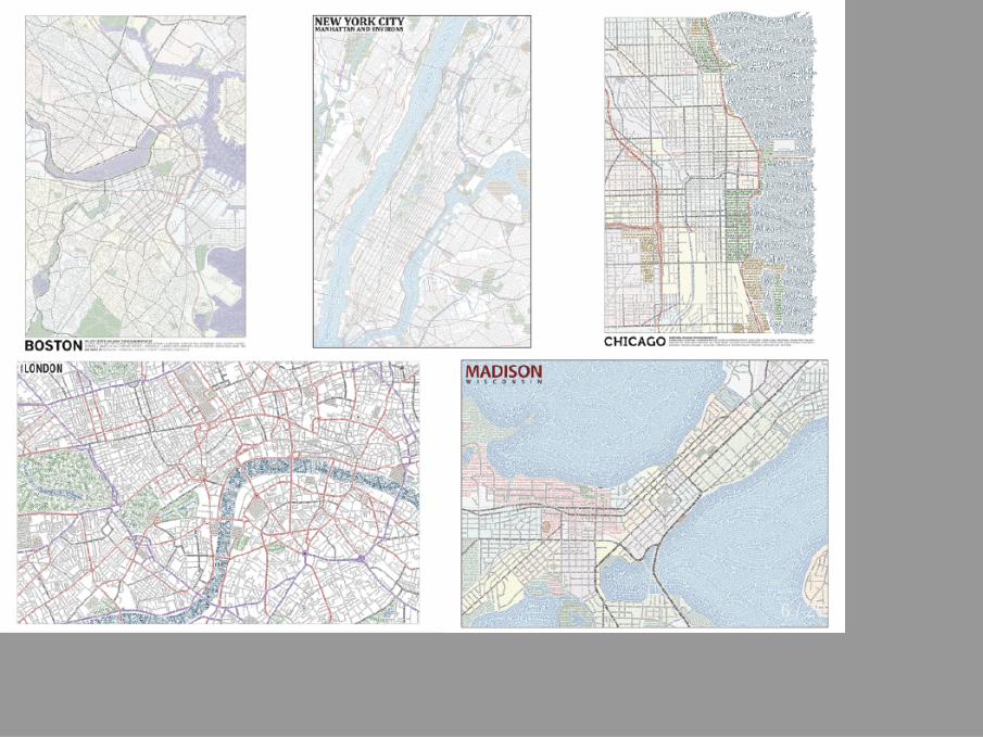
History
2 / 29
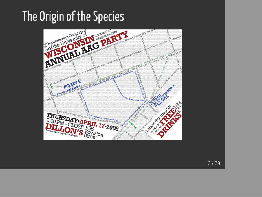
The Origin of the Species
3 / 29
4 / 29
5 / 29
6 / 29
Genesis of the LA MapI joined Axis Maps in March 2015
7 / 29
Genesis of the LA MapI joined Axis Maps in March 2015
Came from doing GIS/Developer work in Thailand
8 / 29
Genesis of the LA MapI joined Axis Maps in March 2015
Came from doing GIS/Developer work in Thailand
Make a map
9 / 29
Genesis of the LA MapI joined Axis Maps in March 2015
Came from doing GIS/Developer work in Thailand
Make a map
April Fools' day 2015
10 / 29
11 / 29
12 / 29
Fallout"Wow, looking good. What inspired you to take on this side project?"
"I completely thought this was real. They all look this crappy at some pointin the process!"
"Even bad design on these impresses, because they take forever to make."
13 / 29
1. Data
14 / 29
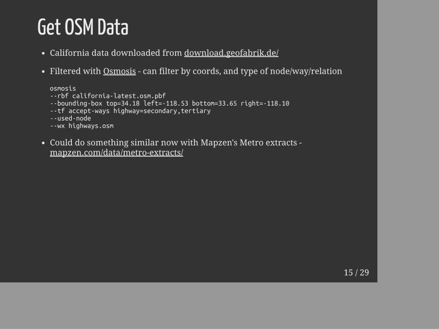
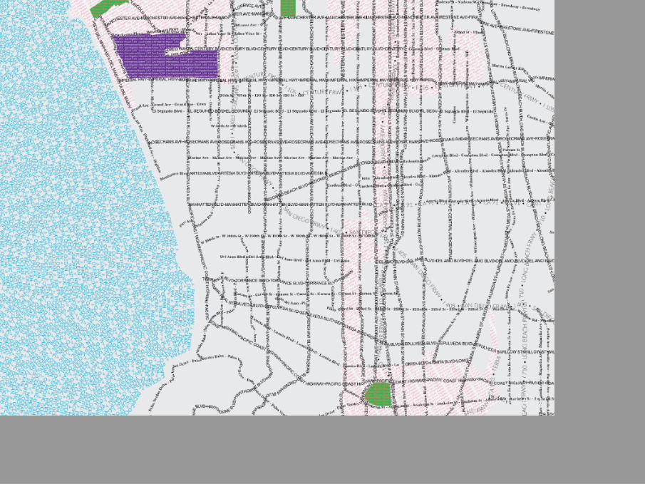
Get OSM DataCalifornia data downloaded from download.geofabrik.de/
Filtered with Osmosis - can filter by coords, and type of node/way/relation
osmosis--rbf california-latest.osm.pbf--bounding-box top=34.18 left=-118.53 bottom=33.65 right=-118.10--tf accept-ways highway=secondary,tertiary--used-node--wx highways.osm
Could do something similar now with Mapzen's Metro extracts -mapzen.com/data/metro-extracts/
15 / 29
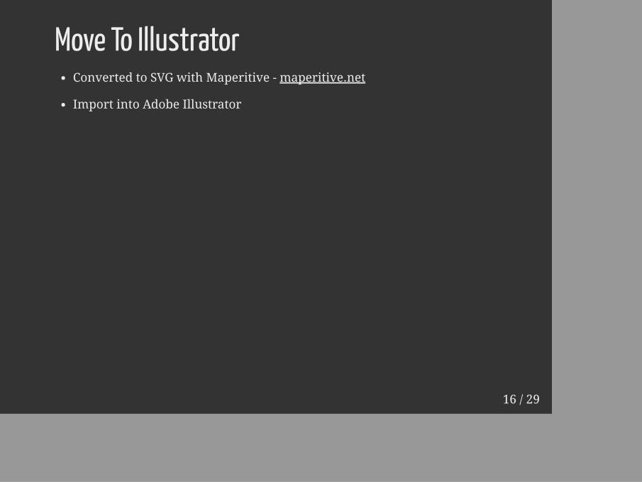
Move To IllustratorConverted to SVG with Maperitive - maperitive.net
Import into Adobe Illustrator
16 / 29
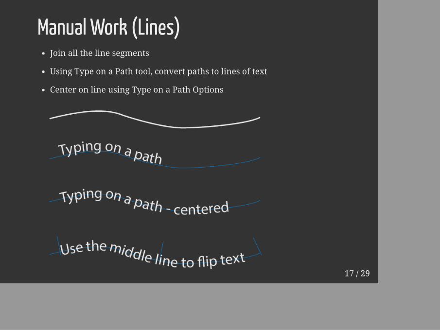
Manual Work (Lines)Join all the line segments
Using Type on a Path tool, convert paths to lines of text
Center on line using Type on a Path Options
17 / 29
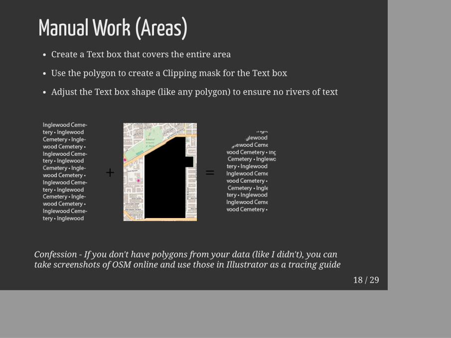
Manual Work (Areas)Create a Text box that covers the entire area
Use the polygon to create a Clipping mask for the Text box
Adjust the Text box shape (like any polygon) to ensure no rivers of text
Confession - If you don't have polygons from your data (like I didn't), you cantake screenshots of OSM online and use those in Illustrator as a tracing guide
18 / 29

2. Design
19 / 29
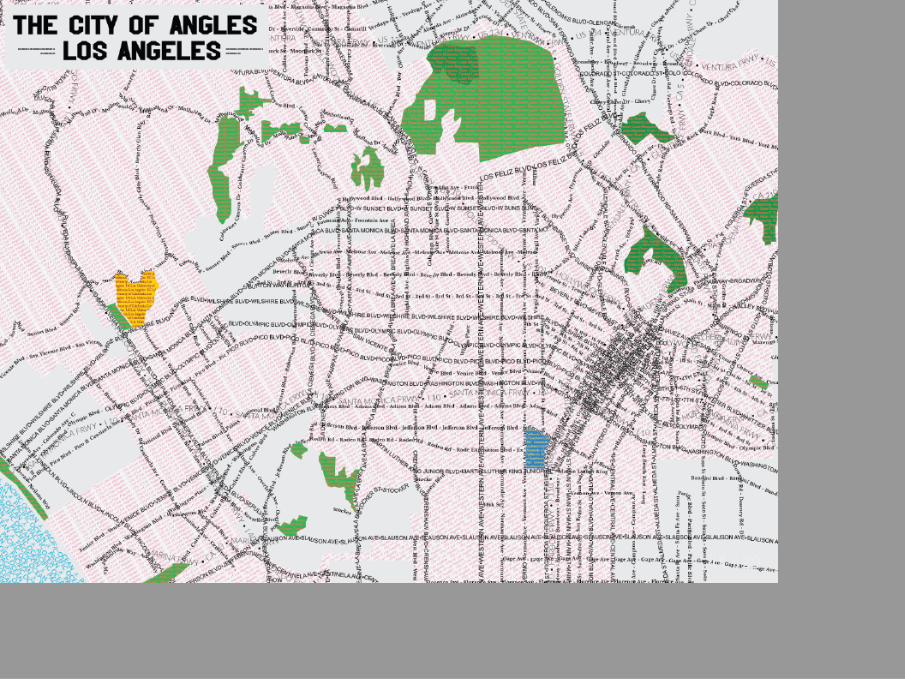
Design Goals for City of Angles versionaka Don't try this at home
DataMislabel thingsSpelling mistakes ("5rd st", misspellings of local names, etc...)No Consistency ("120th St" vs "140 St")OSM Data specific - make sure to leave off different possible tags
20 / 29
Design Goals for City of Angles versionaka Don't try this at home
DataMislabel thingsSpelling mistakes ("5rd st", misspellings of local names, etc...)No Consistency ("120th St" vs "140 St")OSM Data specific - make sure to leave off different possible tags
TypeToo many fonts (4 minimum)Arbitrary Font Hierarchy (Size, Weight, Style)Kitschy fonts (Comic Sans, Papyrus, etc...)Purposefully bad Kerning (especially on a typographic map)
21 / 29
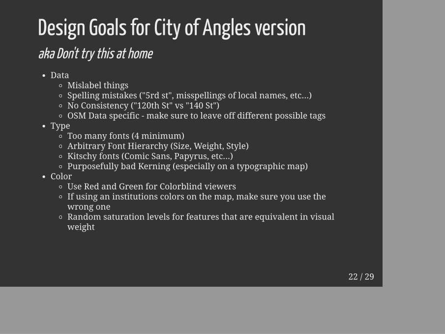
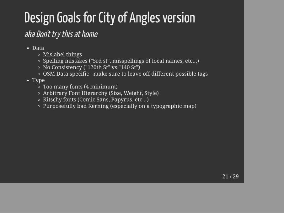
Design Goals for City of Angles versionaka Don't try this at home
DataMislabel thingsSpelling mistakes ("5rd st", misspellings of local names, etc...)No Consistency ("120th St" vs "140 St")OSM Data specific - make sure to leave off different possible tags
TypeToo many fonts (4 minimum)Arbitrary Font Hierarchy (Size, Weight, Style)Kitschy fonts (Comic Sans, Papyrus, etc...)Purposefully bad Kerning (especially on a typographic map)
ColorUse Red and Green for Colorblind viewersIf using an institutions colors on the map, make sure you use thewrong oneRandom saturation levels for features that are equivalent in visualweight
22 / 29
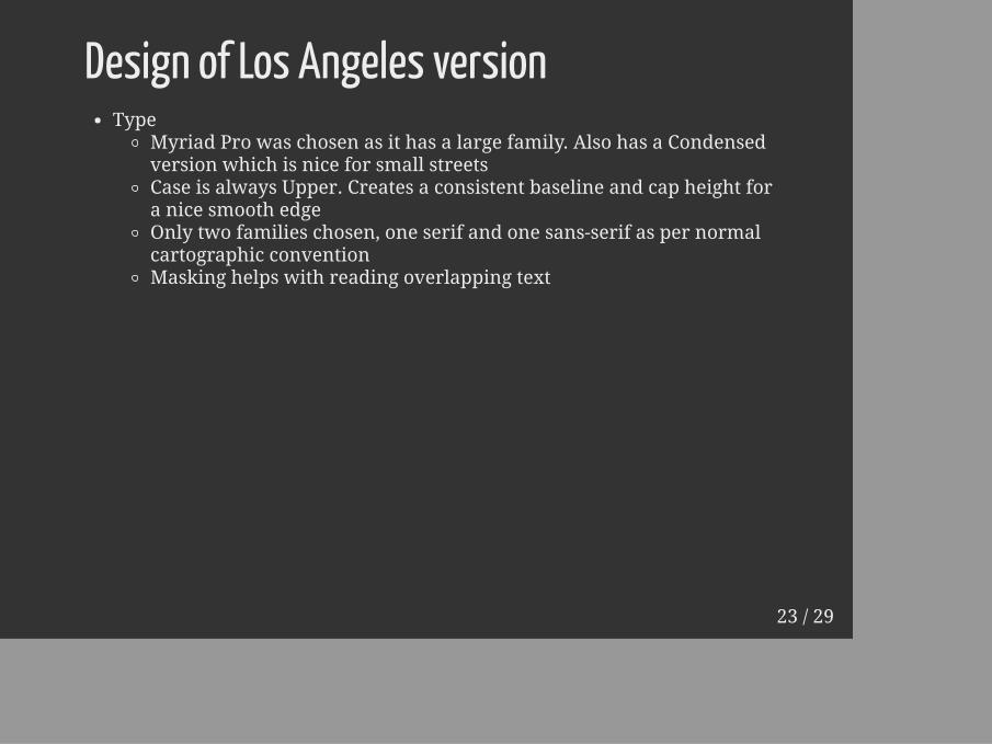
Design of Los Angeles versionType
Myriad Pro was chosen as it has a large family. Also has a Condensedversion which is nice for small streetsCase is always Upper. Creates a consistent baseline and cap height fora nice smooth edgeOnly two families chosen, one serif and one sans-serif as per normalcartographic conventionMasking helps with reading overlapping text
23 / 29
Design of Los Angeles versionType
Myriad Pro was chosen as it has a large family. Also has a Condensedversion which is nice for small streetsCase is always Upper. Creates a consistent baseline and cap height fora nice smooth edgeOnly two families chosen, one serif and one sans-serif as per normalcartographic conventionMasking helps with reading overlapping text
ColorCreates a hierarchy that is 3-4 levels deepContrast has been an issue in the past. Reversing text can help withthis
24 / 29
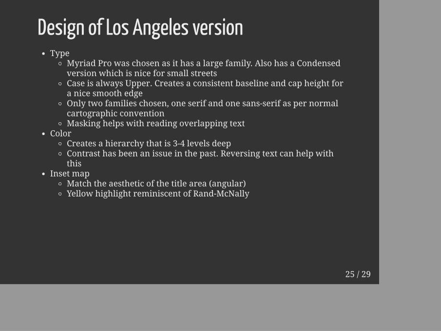
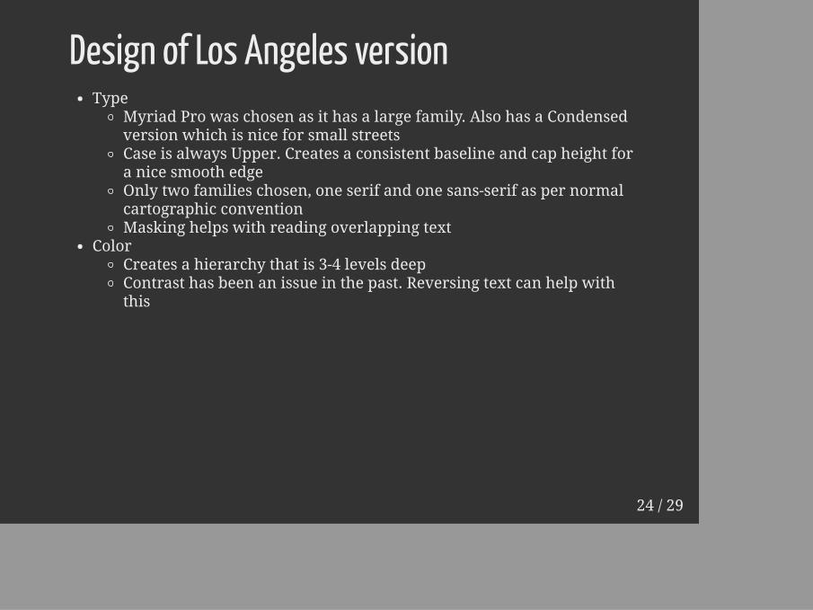
Design of Los Angeles versionType
Myriad Pro was chosen as it has a large family. Also has a Condensedversion which is nice for small streetsCase is always Upper. Creates a consistent baseline and cap height fora nice smooth edgeOnly two families chosen, one serif and one sans-serif as per normalcartographic conventionMasking helps with reading overlapping text
ColorCreates a hierarchy that is 3-4 levels deepContrast has been an issue in the past. Reversing text can help withthis
Inset mapMatch the aesthetic of the title area (angular)Yellow highlight reminiscent of Rand-McNally
25 / 29

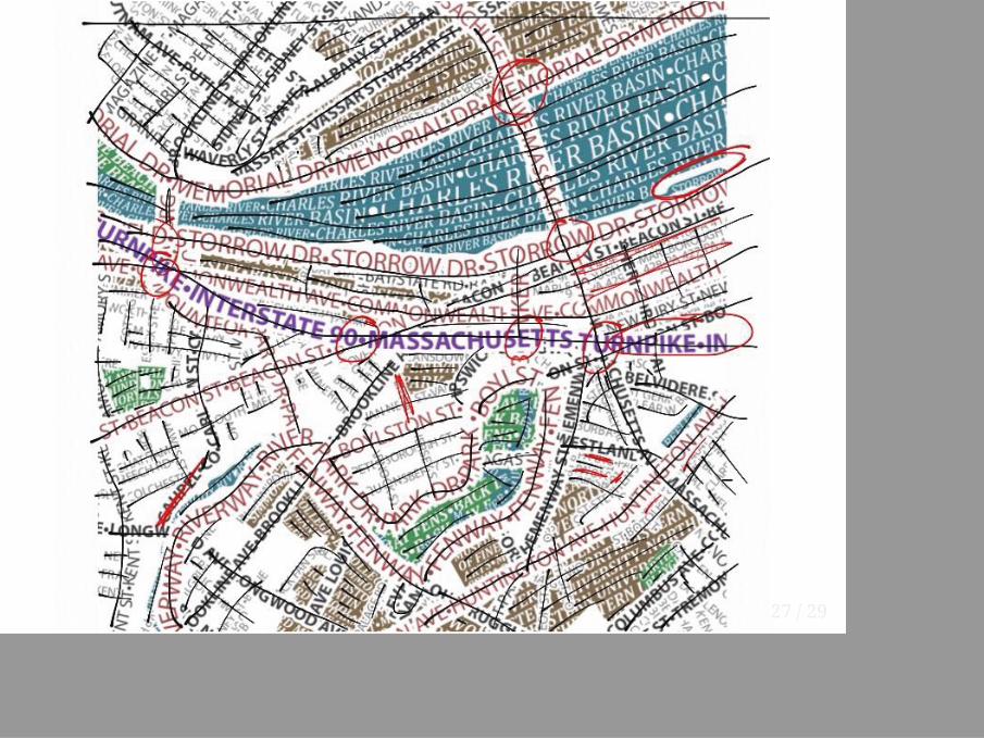
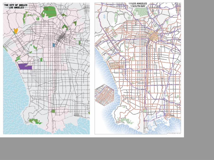
3. Review
26 / 29
27 / 29
28 / 29
Thanks!axismaps.com | @karenkingfisher
Both maps available for perusal in the map gallery
29 / 29