Embed Size (px)
Citation preview

1
PORTFOLIOBrad Campbell
2 3
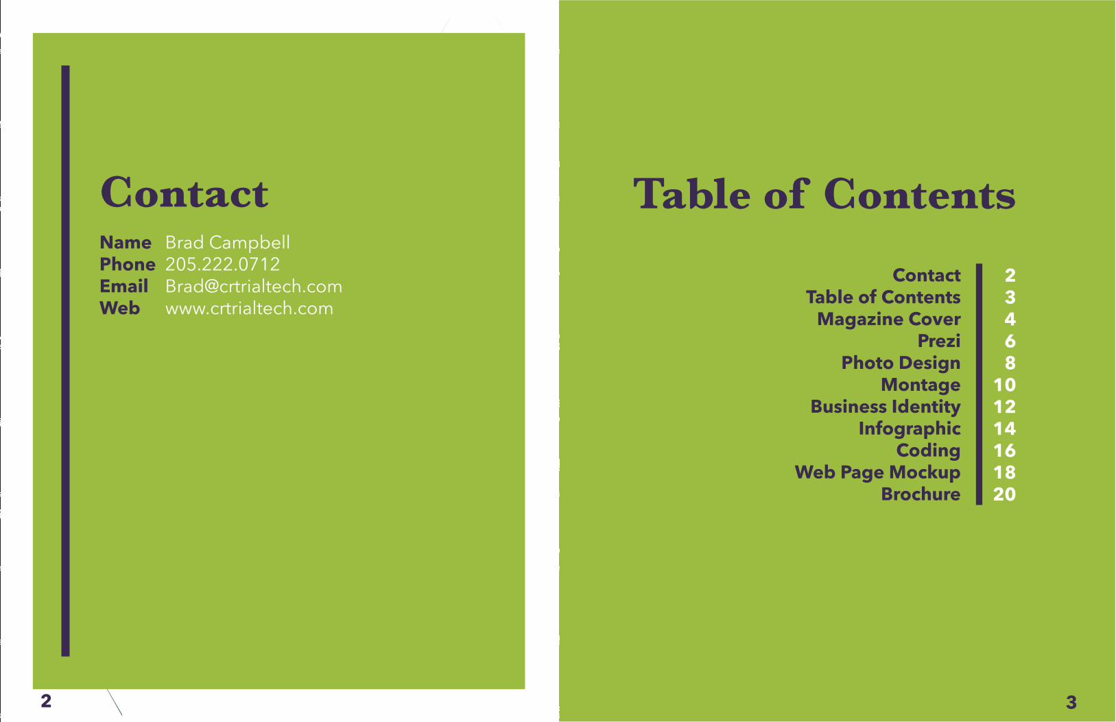
ContactName Brad CampbellPhone 205.222.0712Email [email protected] www.crtrialtech.com
Table of Contents23468
101214161820
ContactTable of Contents
Magazine CoverPrezi
Photo DesignMontage
Business IdentityInfographic
CodingWeb Page Mockup
Brochure
5
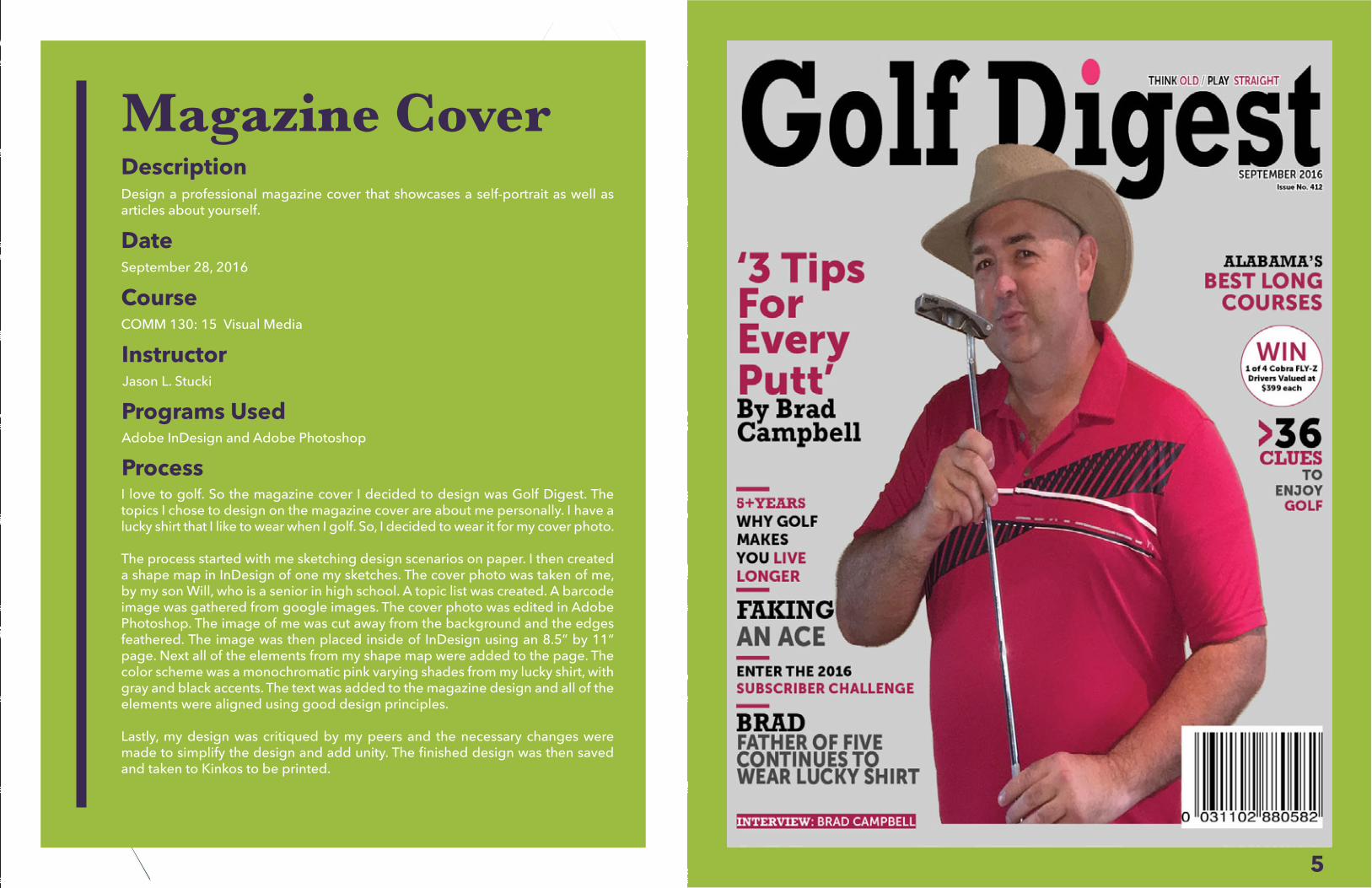
Magazine CoverDescriptionDesign a professional magazine cover that showcases a self-portrait as well as articles about yourself.
DateSeptember 28, 2016
Course
InstructorJason L. Stucki
Programs UsedAdobe InDesign and Adobe Photoshop
ProcessI love to golf. So the magazine cover I decided to design was Golf Digest. The topics I chose to design on the magazine cover are about me personally. I have a lucky shirt that I like to wear when I golf. So, I decided to wear it for my cover photo.
The process started with me sketching design scenarios on paper. I then created a shape map in InDesign of one my sketches. The cover photo was taken of me, by my son Will, who is a senior in high school. A topic list was created. A barcode image was gathered from google images. The cover photo was edited in Adobe Photoshop. The image of me was cut away from the background and the edges feathered. The image was then placed inside of InDesign using an 8.5” by 11” page. Next all of the elements from my shape map were added to the page. The color scheme was a monochromatic pink varying shades from my lucky shirt, with gray and black accents. The text was added to the magazine design and all of the elements were aligned using good design principles.
Lastly, my design was critiqued by my peers and the necessary changes were made to simplify the design and add unity. The finished design was then saved and taken to Kinkos to be printed.
COMM 130: 15 Visual Media
7
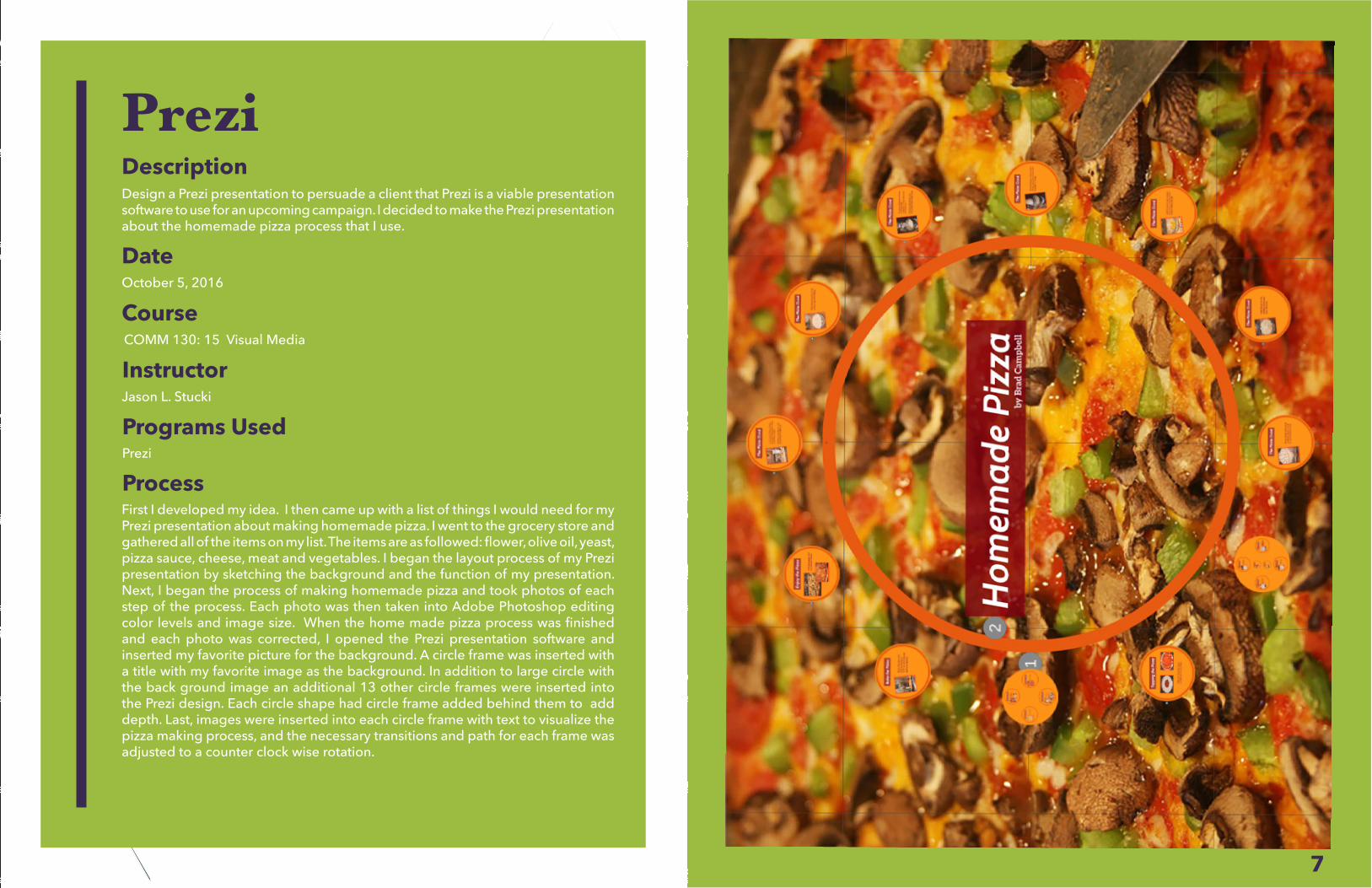
PreziDescriptionDesign a Prezi presentation to persuade a client that Prezi is a viable presentationsoftware to use for an upcoming campaign. I decided to make the Prezi presentation about the homemade pizza process that I use.
DateOctober 5, 2016
CourseCOMM 130: 15 Visual Media
InstructorJason L. Stucki
Programs UsedPrezi
ProcessFirst I developed my idea. I then came up with a list of things I would need for my Prezi presentation about making homemade pizza. I went to the grocery store and gathered all of the items on my list. The items are as followed: flower, olive oil, yeast, pizza sauce, cheese, meat and vegetables. I began the layout process of my Prezi presentation by sketching the background and the function of my presentation. Next, I began the process of making homemade pizza and took photos of each step of the process. Each photo was then taken into Adobe Photoshop editing color levels and image size. When the home made pizza process was finished and each photo was corrected, I opened the Prezi presentation software and inserted my favorite picture for the background. A circle frame was inserted with a title with my favorite image as the background. In addition to large circle with the back ground image an additional 13 other circle frames were inserted into the Prezi design. Each circle shape had circle frame added behind them to add depth. Last, images were inserted into each circle frame with text to visualize the pizza making process, and the necessary transitions and path for each frame was adjusted to a counter clock wise rotation.
9
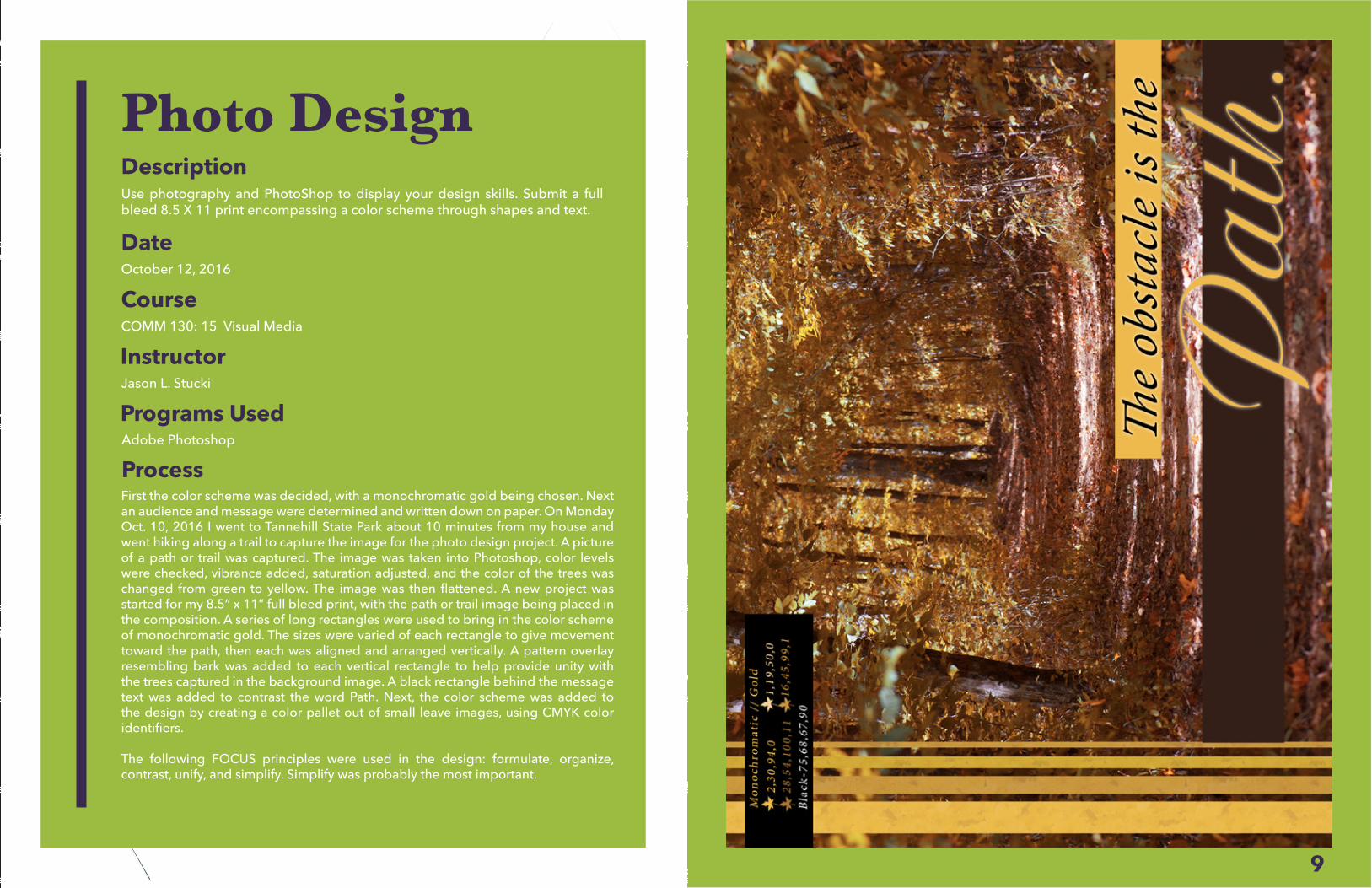
Photo DesignDescriptionUse photography and PhotoShop to display your design skills. Submit a full bleed 8.5 X 11 print encompassing a color scheme through shapes and text.
DateOctober 12, 2016
InstructorJason L. Stucki
Programs UsedAdobe Photoshop
ProcessFirst the color scheme was decided, with a monochromatic gold being chosen. Next an audience and message were determined and written down on paper. On Monday Oct. 10, 2016 I went to Tannehill State Park about 10 minutes from my house and went hiking along a trail to capture the image for the photo design project. A picture of a path or trail was captured. The image was taken into Photoshop, color levels were checked, vibrance added, saturation adjusted, and the color of the trees was changed from green to yellow. The image was then flattened. A new project was started for my 8.5” x 11” full bleed print, with the path or trail image being placed in the composition. A series of long rectangles were used to bring in the color scheme of monochromatic gold. The sizes were varied of each rectangle to give movement toward the path, then each was aligned and arranged vertically. A pattern overlay resembling bark was added to each vertical rectangle to help provide unity with the trees captured in the background image. A black rectangle behind the message text was added to contrast the word Path. Next, the color scheme was added to the design by creating a color pallet out of small leave images, using CMYK color identifiers.
The following FOCUS principles were used in the design: formulate, organize, contrast, unify, and simplify. Simplify was probably the most important.
CourseCOMM 130: 15 Visual Media
11
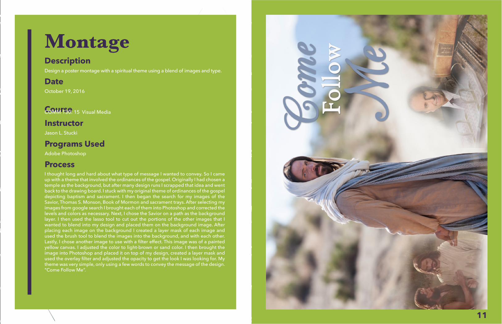
MontageDescriptionDesign a poster montage with a spiritual theme using a blend of images and type.
DateOctober 19, 2016
InstructorJason L. Stucki
Programs UsedAdobe Photoshop
ProcessI thought long and hard about what type of message I wanted to convey. So I came up with a theme that involved the ordinances of the gospel. Originally I had chosen a temple as the background, but after many design runs I scrapped that idea and went back to the drawing board. I stuck with my original theme of ordinances of the gospel depicting baptism and sacrament. I then began the search for my images of the Savior, Thomas S. Monson, Book of Mormon and sacrament trays. After selecting my images from google search I brought each of them into Photoshop and corrected the levels and colors as necessary. Next, I chose the Savior on a path as the background layer. I then used the lasso tool to cut out the portions of the other images that I wanted to blend into my design and placed them on the background image. After placing each image on the background I created a layer mask of each image and used the brush tool to blend the images into the background, and with each other. Lastly, I chose another image to use with a filter effect. This image was of a painted yellow canvas. I adjusted the color to light-brown or sand color. I then brought the image into Photoshop and placed it on top of my design, created a layer mask and used the overlay filter and adjusted the opacity to get the look I was looking for. My theme was very simple, only using a few words to convey the message of the design. “Come Follow Me”.
CourseCOMM 130: 15 Visual Media
13
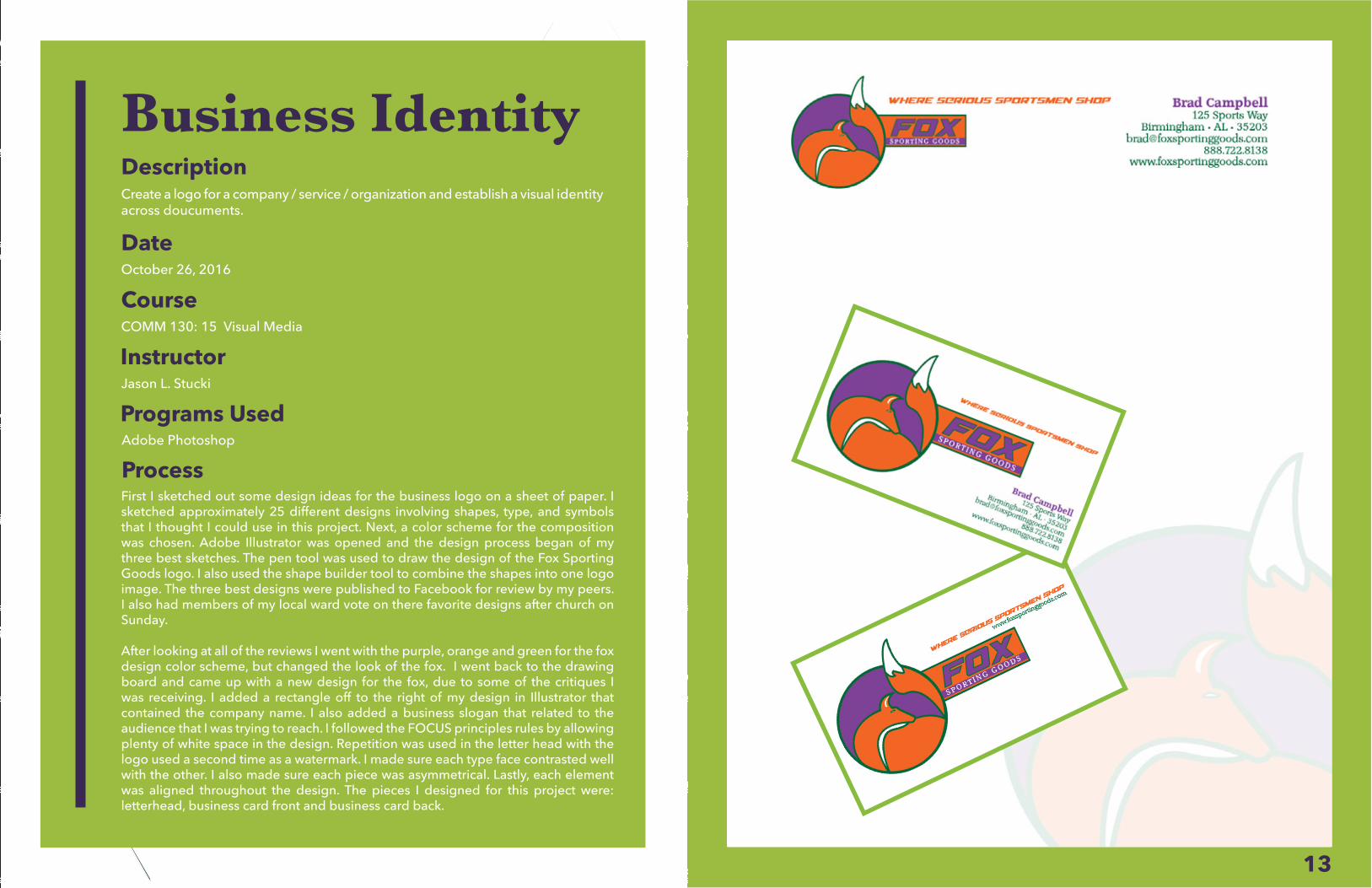
Business IdentityDescriptionCreate a logo for a company / service / organization and establish a visual identity across doucuments.
DateOctober 26, 2016
InstructorJason L. Stucki
Programs UsedAdobe Photoshop
ProcessFirst I sketched out some design ideas for the business logo on a sheet of paper. I sketched approximately 25 different designs involving shapes, type, and symbols that I thought I could use in this project. Next, a color scheme for the composition was chosen. Adobe Illustrator was opened and the design process began of my three best sketches. The pen tool was used to draw the design of the Fox Sporting Goods logo. I also used the shape builder tool to combine the shapes into one logo image. The three best designs were published to Facebook for review by my peers. I also had members of my local ward vote on there favorite designs after church on Sunday.
After looking at all of the reviews I went with the purple, orange and green for the fox design color scheme, but changed the look of the fox. I went back to the drawing board and came up with a new design for the fox, due to some of the critiques I was receiving. I added a rectangle off to the right of my design in Illustrator that contained the company name. I also added a business slogan that related to the audience that I was trying to reach. I followed the FOCUS principles rules by allowing plenty of white space in the design. Repetition was used in the letter head with the logo used a second time as a watermark. I made sure each type face contrasted well with the other. I also made sure each piece was asymmetrical. Lastly, each element was aligned throughout the design. The pieces I designed for this project were: letterhead, business card front and business card back.
CourseCOMM 130: 15 Visual Media
15
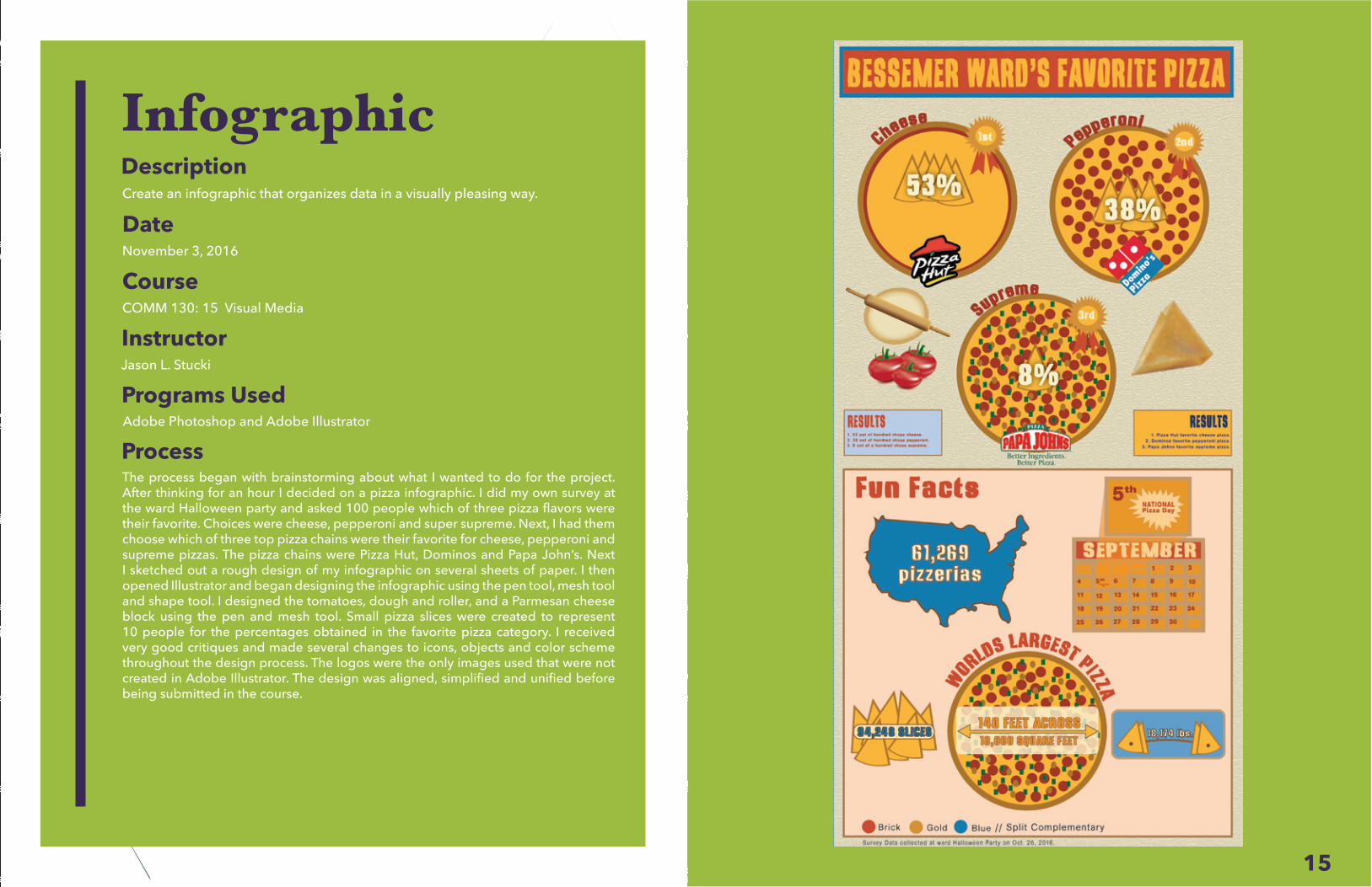
InfographicDescriptionCreate an infographic that organizes data in a visually pleasing way.
DateNovember 3, 2016
InstructorJason L. Stucki
Programs UsedAdobe Photoshop and Adobe Illustrator
ProcessThe process began with brainstorming about what I wanted to do for the project. After thinking for an hour I decided on a pizza infographic. I did my own survey at the ward Halloween party and asked 100 people which of three pizza flavors were their favorite. Choices were cheese, pepperoni and super supreme. Next, I had them choose which of three top pizza chains were their favorite for cheese, pepperoni and supreme pizzas. The pizza chains were Pizza Hut, Dominos and Papa John’s. Next I sketched out a rough design of my infographic on several sheets of paper. I then opened Illustrator and began designing the infographic using the pen tool, mesh tool and shape tool. I designed the tomatoes, dough and roller, and a Parmesan cheese block using the pen and mesh tool. Small pizza slices were created to represent 10 people for the percentages obtained in the favorite pizza category. I received very good critiques and made several changes to icons, objects and color scheme throughout the design process. The logos were the only images used that were not created in Adobe Illustrator. The design was aligned, simplified and unified before being submitted in the course.
CourseCOMM 130: 15 Visual Media
17
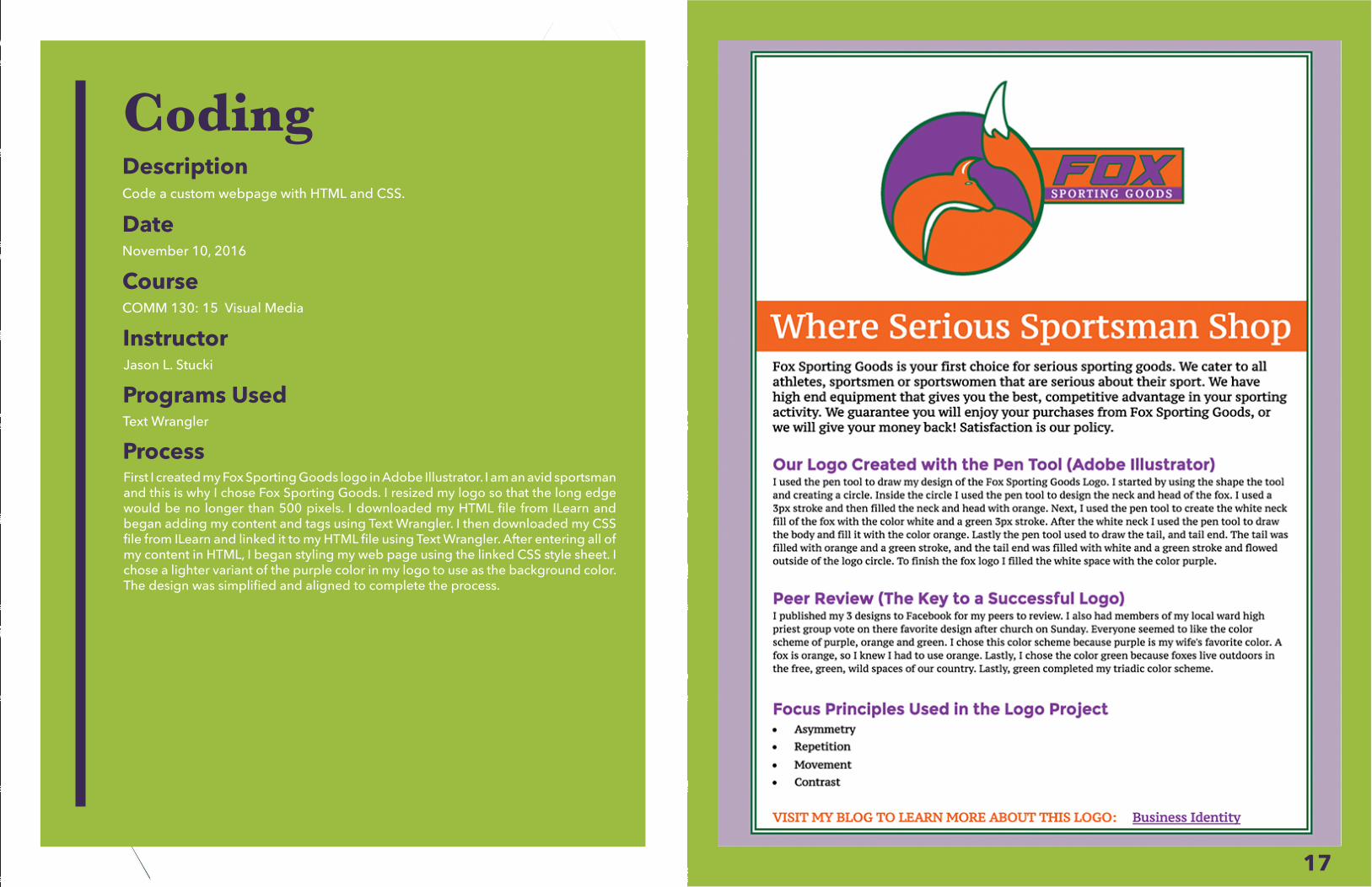
CodingDescriptionCode a custom webpage with HTML and CSS.
DateNovember 10, 2016
InstructorJason L. Stucki
Programs UsedText Wrangler
ProcessFirst I created my Fox Sporting Goods logo in Adobe Illustrator. I am an avid sportsman and this is why I chose Fox Sporting Goods. I resized my logo so that the long edge would be no longer than 500 pixels. I downloaded my HTML file from ILearn and began adding my content and tags using Text Wrangler. I then downloaded my CSS file from ILearn and linked it to my HTML file using Text Wrangler. After entering all of my content in HTML, I began styling my web page using the linked CSS style sheet. I chose a lighter variant of the purple color in my logo to use as the background color. The design was simplified and aligned to complete the process.
CourseCOMM 130: 15 Visual Media
19
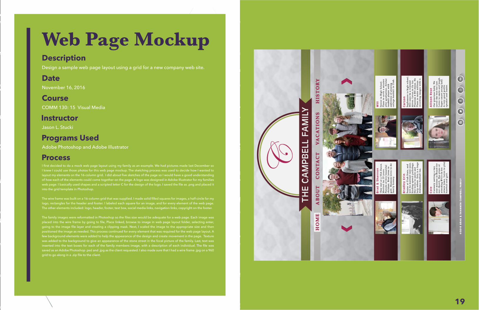
Web Page MockupDescriptionDesign a sample web page layout using a grid for a new company web site.
DateNovember 16, 2016
InstructorJason L. Stucki
Programs UsedAdobe Photoshop and Adobe Illustrator
ProcessI first decided to do a mock web page layout using my family as an example. We had pictures made last December so I knew I could use those photos for this web page mockup. The sketching process was used to decide how I wanted to layout my elements on the 16-column grid. I did about five sketches of the page so I would have a good understanding of how each of the elements could come together on the page. A logo was designed in Adobe Illustrator for my families web page. I basically used shapes and a scripted letter C for the design of the logo. I saved the file as .png and placed it into the grid template in Photoshop.
The wire frame was built on a 16-column grid that was supplied. I made solid filled squares for images, a half-circle for my logo, rectangles for the header and footer. I labeled each square for an image, and for every element of the web page. The other elements included: logo, header, footer, text box, social media links, navigation links, copyright on the footer.
The family images were reformatted in Photoshop so the files size would be adequate for a web page. Each image was placed into the wire frame by going to file, Place linked, browse to image in web page layout folder, selecting enter, going to the image file layer and creating a clipping mask. Next, I scaled the image to the appropriate size and then positioned the image as needed. This process continued for every element that was required for the web page layout. A few background elements were added to help the appearance of the design and create movement in the page. Texture was added to the background to give an appearance of the stone street in the focal picture of the family. Last, text was inserted into the text boxes for each of the family members image, with a description of each individual. The file was saved as an Adobe Photoshop .psd and .jpg as the client requested. I also made sure that I had a wire frame .jpg on a 960 grid to go along in a .zip file to the client.
CourseCOMM 130: 15 Visual Media
21
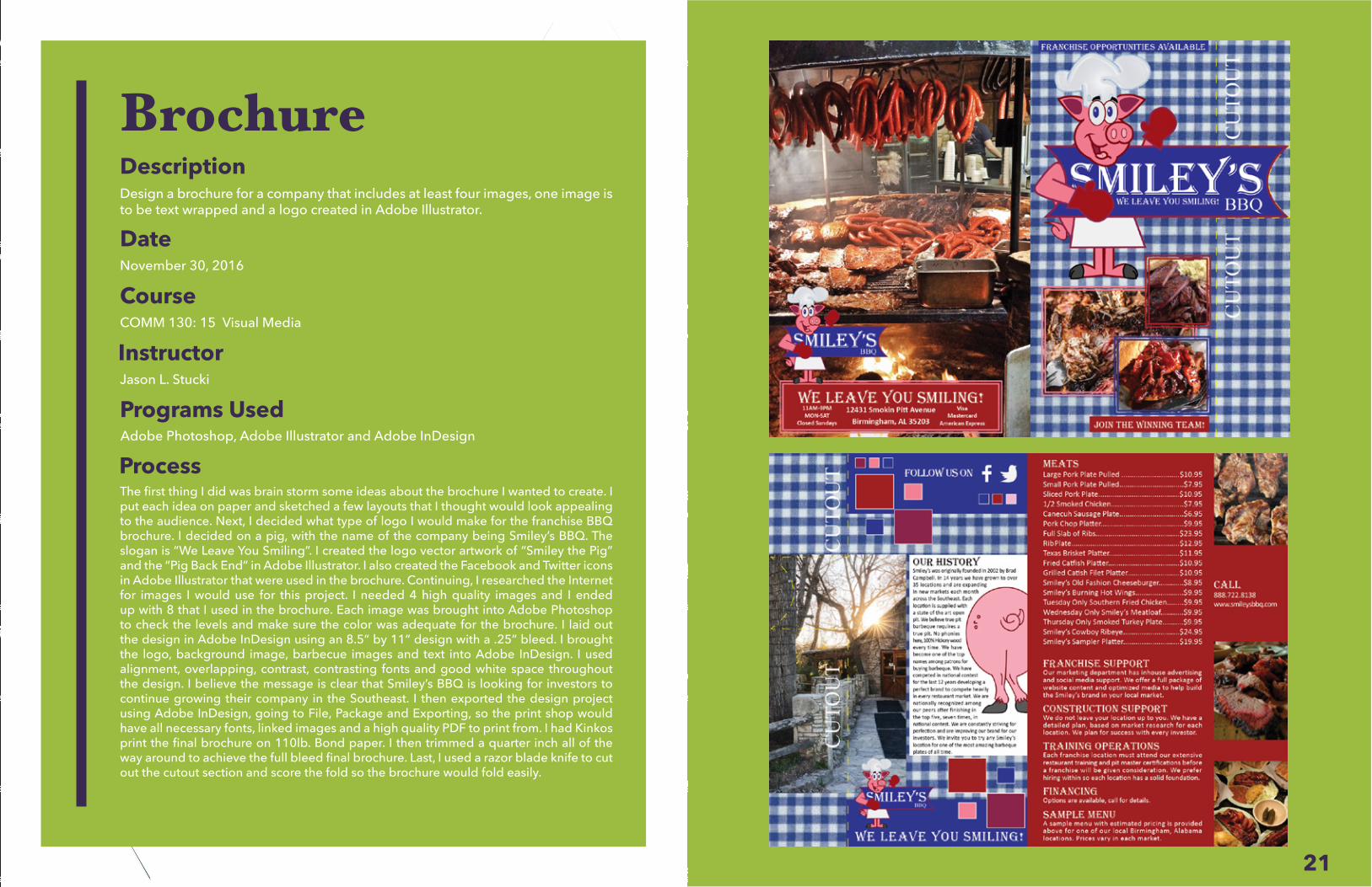
BrochureDescriptionDesign a brochure for a company that includes at least four images, one image is to be text wrapped and a logo created in Adobe Illustrator.
DateNovember 30, 2016
InstructorJason L. Stucki
Adobe Photoshop, Adobe Illustrator and Adobe InDesign
ProcessThe first thing I did was brain storm some ideas about the brochure I wanted to create. I put each idea on paper and sketched a few layouts that I thought would look appealing to the audience. Next, I decided what type of logo I would make for the franchise BBQ brochure. I decided on a pig, with the name of the company being Smiley’s BBQ. The slogan is “We Leave You Smiling”. I created the logo vector artwork of “Smiley the Pig” and the “Pig Back End” in Adobe Illustrator. I also created the Facebook and Twitter icons in Adobe Illustrator that were used in the brochure. Continuing, I researched the Internet for images I would use for this project. I needed 4 high quality images and I ended up with 8 that I used in the brochure. Each image was brought into Adobe Photoshop to check the levels and make sure the color was adequate for the brochure. I laid out the design in Adobe InDesign using an 8.5” by 11” design with a .25” bleed. I brought the logo, background image, barbecue images and text into Adobe InDesign. I used alignment, overlapping, contrast, contrasting fonts and good white space throughout the design. I believe the message is clear that Smiley’s BBQ is looking for investors to continue growing their company in the Southeast. I then exported the design project using Adobe InDesign, going to File, Package and Exporting, so the print shop would have all necessary fonts, linked images and a high quality PDF to print from. I had Kinkos print the final brochure on 110lb. Bond paper. I then trimmed a quarter inch all of the way around to achieve the full bleed final brochure. Last, I used a razor blade knife to cut out the cutout section and score the fold so the brochure would fold easily.
CourseCOMM 130: 15 Visual Media
Programs Used


![Interfacing the Internet of a Trillion Things · Internet of a Trillion Things Brad%Campbell,Pat Pannuto,and%PrabalDutta ... Match.2 -> Mark’s Hue]} Accessors, logicblocks,% etc](https://img.pdfslide.us/doc/110x75/5f8ff48f69719d26de2470f5/interfacing-the-internet-of-a-trillion-things-internet-of-a-trillion-things-bradcampbellpat.jpg)