Embed Size (px)
Citation preview

Creating a New Language for Nutrition: McDonald’s Universal Icons
for 109 Countries
How ENLASO helped McDonald’s to culturally localize nutrition icons by distilling over
13,000 comments from iconographers for 109 countries
ENLASO is a registered trademark of ENLASO Corporation

Variations in Visual Perception of Images
Is it a lollipop? Is it a warning for an avalanche? Or, is it a calorie? Obviously, there can be many interpretations for this “swirl” image. So what do you do if you need to develop images that can communicate concepts universally in a consumer friendly way across 109 countries? And what do you do if the concept behind the images is not well understood? You need to manage the risk associated with different cultural meanings that the visuals may have. McDonald’s faced this daunting challenge with its recent Nutrition Information
Initiative (NII). The company wanted to make nutrition information more accessible and understandable to the average consumer, and determined through extensive research that visual icons representing key food nutrients (protein, for example) were the appropriate course of action. But how does one convey a nutrient in pictures when no established images exist? McDonald’s essentially had to create a new visual “language” of nutrition that could communicate with or without language. And how do you find out if these visuals mean something to customers in Fiji, Paraguay, Sweden, China or elsewhere? McDonald’s quickly realized that they didn’t have the resources and expertise to conduct such a massive research effort in a timely manner. Knowing that traditional marketing research firms weren’t likely to have the needed experts, McDonald’s searched for firms that specialized in global cultural interpretation and chose ENLASO to manage that effort. McDonald’s and ENLASO focused on five main nutrient visuals (calories, fat, carbohydrates, protein, salt) that would be used globally on packaging, and also designed and evaluated half a dozen supplemental nutrient visuals that might be needed in some locales. The team had to deal with four main challenges:
1. What visuals can communicate the desired nutrients? 2. Does the visual work in 109 countries without evoking negative or socially and politically
inappropriate connotations? 3. Will the visual print or display well in all media, including packaging? 4. Does anyone else already own rights to the image that might prevent it from being used in this
context? The findings from this research were often surprising, and sometimes even amusing. But after ENLASO distilled over 13,000 comments from cultural imagery experts around the world, McDonald’s has successfully established the basis of this new visual language of nutrition. The company is sharing the icons with its customers everywhere and has made them freely available for unrestricted use within the restaurant and food industry. The focus of this case study is on the development of the nutrient visuals and their cultural evaluation, and covers the many steps and surprises in this unprecedented effort.
McDonald’s is sharing the icons with its customers everywhere and has
made them freely available for unrestricted use within the restaurant
and food industry.
Confidential Page 2 of 13 Rev. 6 01.24.2014 QCT
In the beginning “McDonald’s has been sharing nutrition information about our food for over 30 years,” says Bridget Coffing, Vice President of Corporate Communications for McDonald’s. “We wish that more consumers were aware of that information, and that they took advantage of the many ways we’ve been providing it, such as on our web site, tray liners, posters, and brochures.” “Furthermore, we know from a variety of research studies that consumers often find existing traditional packaged goods nutrition labels confusing,” adds Lisa Wolfe, Director of Balanced Active Lifestyles Research in the McDonald’s Global Consumer and Business Insights Department. “We knew that simply replicating existing packaged foods formats wouldn’t be enough, that our customers are expecting meaningful innovation in this area.” This is where the influence of the McDonald’s Europe business unit was pivotal. They were operating in an environment where the European Union (EU) had laid out minimum guidelines on the communication of nutrition information for the packaged foods industry. Furthermore, a new initiative named the EU Platform on Diet, Health and Physical Activity was created in March 2005. The purpose of this platform was to prompt voluntary commitment from the food and food service industries, which were genuinely interested in dealing with obesity, and to offset the need to create action through legislation. In November 2004, the McDonald’s Europe management team made a decision not only to voluntarily embrace the EU platform, but to lead by example and create new guidelines. McDonald’s established the Nutrition Information Initiative (NII) to define and implement an enhanced nutrition information system that could communicate to customers in a simple, short, visual and easy to use way. “We thought that this was an excellent opportunity for McDonald’s to provide leadership in labeling, with a genuinely innovative, science-based approach,” relates Alastair Fairgrieve, McDonald’s Europe Chief Insights Officer, and the European research lead for the NII effort. “Our strategy was to listen to and involve consumers, engage political and civil organization stakeholders and consult with scientists. The stakeholders we consulted included consumer groups, EU institutions, civil society and companies, comprising nearly 50 outside experts.” Based on this input, McDonald’s developed its system for Europe, including visuals (icons) to represent key nutrients, an accompanying bar chart detailing key nutrient levels, and the percentage of GDA (Guideline Daily Amounts) that the nutrients represent. McDonald’s chose to use nutrient visuals rather than words because visuals can universally communicate concepts without language. This was important because it eliminated a notable nutrition labeling barrier for Europe’s quick service industry, given the many languages that would otherwise be required on small, single-serve food packages. The labeling system focused on five key nutrients that were most often referenced by the nutrition and scientific communities and consumers as the most important: calories, protein, fat, carbohydrates, and salt. Visuals were developed for additional nutrients such as fiber, sugar, and saturated fat to allow for local flexibility.
McDonald’s chose to use nutrient visuals rather than words because visuals can universally communicate
concepts without language.
Confidential Page 3 of 13 Rev. 6 01.24.2014 QCT

Early icon development Early on, the McDonald’s team discovered there were no established standards for “language free” nutrient visuals that could be copied or modified. Even the European version of the nutrition table proved to be of little help. Fairgrieve relates the importance of primary research in providing direction for the visuals: “The NSG (McDonald’s Europe Nutritionist Steering Group, comprised of independent nutritionists) provided us with definitions of nutrients. For instance, protein acts as a building block, and carbohydrates are what fuel you. So, we had precise descriptions to share with our design firm to create the visuals.” Designers at UK-based Boxer Design Consultants tried a variety of early prototypes before hitting the mark. “Our goal was to make the visuals so obvious that a five- year-old could understand them,” recalls Stuart Ruff, Art Director. “We had very detailed scientific background on the function of each nutrient, so the intended meaning of the symbols was well laid out.” Early test designs were discarded, including abstract symbols resembling molecular structure. Three of the five main nutrients (protein, carbohydrates, and fat) “jelled” fairly early in the design phase. The basic concept of “building blocks” for protein, “fuel gauge” for carbohydrates and “measuring tape” for fat remained relatively intact throughout the design process. Other icons, like calories and salt, proved to be more of a challenge. Early rejected concepts for the five key nutrients are compared to the final images below: Calories Protein Fat Carbs Salt
Early Icon
Final Icon
Going global The original plan was to include nutrition information using these nutrient visuals on European packaging. While the system was being designed in Europe, McDonald’s personnel in other parts of the world were also trying to take product nutrition transparency to the next level. Many consumers weren’t aware of the nutrition information McDonald’s had been providing. The company investigated several options to better meet consumer needs, but found that a simple format, with key information on packaging, was the preferred global solution. McDonald’s had also experimented with reapplying traditional packaged goods nutrition information formats to packaging in some parts of the world. However, the traditional format was designed for the packaged goods industry for products that would be used at a later time, so it wasn’t ideal for McDonald’s single-serving immediate use products. And merely reapplying the packaged goods format did nothing to address the “difficult to use and understand” issues with this format documented in numerous independent research studies. Encouraged by internal research and by stakeholder feedback on the European prototypes, the McDonald’s global management team realized that the European system had the potential to “go global.” After reviewing the evidence, McDonald’s made the bold decision to develop a universal language for sharing nutrition information that could be used in its 30,000+ global restaurants.
Confidential Page 4 of 13 Rev. 6 01.24.2014 QCT

This decision to go global created some challenges. Because the initial visuals had been designed for a European audience rather than a global one, cultural analysis was needed to ensure that the visuals would be acceptable in all countries. And because many markets, including Europe, share packaging due to their geographic proximity, the visuals needed to be easily recognizable so as to be usable with or without language. This is because some packages could be used in countries collectively speaking over 10 languages; written descriptions next to a visual for that many languages would not be feasible, due to space limitations. The chart below illustrates this dilemma:
The need for cultural analysis Early feedback from McDonald’s employees outside of Europe uncovered significant disparities in how some of the nutrient visuals were interpreted. “It was important to McDonald’s that none of the nutrient visuals convey unintended or hidden meanings in our various markets,” relates Lisa Wolfe. “We realized that there was no way we could identify these issues by ourselves, so we searched for a firm with this capability.” After an extensive industry search for visual interpretation research, Wolfe discovered ENLASO (www.enlaso.com). “Ironically, I didn’t know that there was such a thing as a ‘linguistic iconographer’ before this project,” Wolfe commented. The scope of the task was likely to be daunting to even the best global supplier – there were 15 visuals to be checked in 109 countries. “When McDonald’s first approached us with this project of unprecedented scope, I initially doubted whether we could pull together such massive resources under such a tight deadline,” admits Yves Lang, Vice President of Sales and Marketing for ENLASO. “After consulting our team, I quickly realized that this is exactly the type of challenge we are equal to, and we completed the project successfully under very tight deadlines.” Wolfe concurs. “The ENLASO team did an excellent job of coordinating this project, which involved a large number of visuals and countries. I attribute this to ENLASO’s project management skills.” Both ENLASO and McDonald’s attribute much of the project’s success to the team’s commitment to stay focused on very selective goals.
Confidential Page 5 of 13 Rev. 6 01.24.2014 QCT

Breaking down the complexity This project had unique challenges due to its extensive scope and the unusual nature of the subject matter. “We had over 1,500 qualified linguists to choose from, and we can do over 200 language combinations,” states Yoshimi Stokes, who manages linguistic resources for ENLASO. “Localization projects in certain European and Asian languages are quite common,” continues Stokes, “but how often do you have projects that require cultural feedback from Fiji, Malta, and Andorra?” The ENLASO team knew that careful management would be the key to project success. Typical projects involve linguists who focus primarily on language and text. This project required a special subset of linguists who are also qualified as iconographers: specialists who can also provide cultural feedback on how images are interpreted based on local values and traditions. Rather than engage and manage 109 individual linguists/iconographers, Stokes was able to locate resources that could cover more than one country within a region, thereby substantially reducing project complexity. “For instance,” she continues, “we found one source to cover Fiji, Tahiti and the Reunion Islands.” Additionally, some countries posed multi-lingual or multi-ethnic challenges in cultural review. “Belgium has Dutch, French and German speaking people,” reminds linguist/ iconographer Denise Pitz, “so you don’t have just one universal reaction.” According to Pitz and other linguists, much of the evaluation can be subjective and these varying reactions needed to be taken into account. “You need to make a quick, accurate assessment of the icon,” Pitz states. “You base feedback on common images the broad public is exposed to. You don’t conduct research by looking up icons or images in books.” To ensure that the team of chosen linguists approached the effort in a consistent manner, linguist/iconographers were carefully qualified, and trained to follow strict project guidelines. Wolfe and the ENLASO McDonald’s account team developed a template for the visual review process that checked for 8 basic criteria:
1. Existing meanings for the visual 2. Prevalence of the existing meaning(s) 3. Existence, prevalence, intensity of negative connotations 4. Existence, prevalence, intensity of positive connotations 5. Existing similar symbols currently in use 6. Interpretation issues caused by color variations 7. Risk assessment of misinterpretation of the visual 8. Overall acceptability of using a visual, based on expert iconographer judgment
Hélène des Rosiers, who conducted French Canadian cultural review for ENLASO, was impressed by the careful thought put into McDonald’s criteria. “In the past, other clients’ surveys have had ‘loaded’ questions in terms of whether an image had ‘negative’ connotations regarding religion,” she observes. “The questions in the McDonald’s feedback sheets were better formulated because they were more specific. They were neutral in that they were not clueing the reviewer as to whether something should be negative or positive.” According to des Rosiers, the key to good analysis is objectivity. “You have to have a fresh mind, to be prepared to find ‘nothing’ if there is nothing negative with an image. In other words, don’t try to ‘read’ something into it.” “When you talk about belief-based connotations,” concludes des Rosiers, “even in the USA, when you go from Texas to New Jersey you have very different cultures. French Quebec is North American, but definitely has a French heritage. All of these elements come into play when doing analysis.”
Some countries posed multi-lingual or multi-ethnic
challenges in cultural review.
Confidential Page 6 of 13 Rev. 6 01.24.2014 QCT

“Training was also the key,” maintains ENLASO’s Stokes. “Examples of an ‘ideal feedback sheet’ (filled in with data) were distributed to all linguists/iconographers to ensure that the level of detail was consistent.” ENLASO team members monitored files as they came in, rather than waiting for them in batches. “That way we were able to identify any problems or inconsistencies early on, and correct them,” says Stokes. By the way, “at McDonald’s request, the linguists did not know who the customer was, so the evaluations were not influenced by personal preferences regarding that brand.”
A management challenge McDonald’s needed to understand the findings from the iconic analysis at a glance. Which icons were acceptable? Which needed just a few minor tweaks? And which needed complete revamping? To make this possible, ENLASO’s McDonald’s account team reviewed every individual comment from all 109 countries. The various topics analyzed multiplied by the number of visuals and countries added up to a daunting task. “We had 15 icons, and 8 evaluation comments. That gives you 120 comments per locale,” says ENLASO’s Stokes. “You multiply the 120 comments by 109 countries and you get 13,080 comments to distill and assess.” Once feedback came in from the linguists, ENLASO project managers went into action to track and manage mammoth amounts of data. Because the data were a collection of unique responses, there was no way to “automatically” sort or tabulate data. “This project was different from typical localization projects in that you must be sensitive to feedback on visuals instead of specific types of written data,” relates David Dunn, ENLASO project manager. Typical localization projects, even for highly visual web sites or software user interfaces, involve lots of text. “No grammar, syntax or sentence structure was involved in this project,” adds Dunn.
The ENLASO team collated responses, and distilled all the comments into executive summaries to reduce the time McDonald’s team members had to spend reviewing all the data. This was no easy task, as David Dunn relates: “When all the spreadsheets were in, we went icon by icon over all 109 surveys. This was a very manual process,” he continues. “In some sense, it resembled a customer satisfaction survey that
lacked numeric data subject to automatic collation. Because each written reaction varied so tremendously, each one had to be looked at individually.” “We had to review each and every response, and grade reactions on three levels: low risk, moderate risk or high risk,” Dunn continues. Although negative political or religious reactions would place an icon into “high risk,” so could other factors. “If a visual was strongly associated with something dramatically distant from food,” says McDonald’s Lisa Wolfe, “for instance, an ‘alien,’ that would also constitute high risk of the icon being ineffective.” Examples of some “high risk” visuals for fiber are compared with a later, low risk visual below:
High risk: 47 countries
associated this with “scary alien”
High risk: Perceived as “slippery” or
“curvy” road and “bird sanctuary”
High risk: Associated this with Marijuana because of 3 leaves
High risk: Associated with Christmas tree or a burning candle
Low risk icon for fiber with high
acceptance level from cultural analysis
“You multiply the 120 comments by 109 countries
and you get 13,080 comments to distill and assess.”
Confidential Page 7 of 13 Rev. 6 01.24.2014 QCT
Dunn and other ENLASO team members maintain that they did not inject any of their own value judgments in feedback. “You have to allow yourself to be surprised by how other cultures perceive what you may feel is a logical image,” says Dunn. “For instance, one of the early visuals was a ‘weight’ used to signify iron. Although it seemed logical to me (and no doubt the designer), the reactions were almost universally negative.”
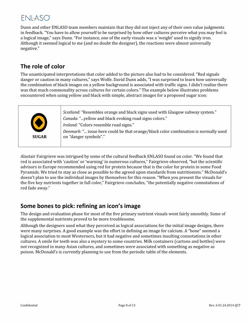
The role of color The unanticipated interpretations that color added to the picture also had to be considered. “Red signals danger or caution in many cultures,” says Wolfe. David Dunn adds, “I was surprised to learn how universally the combination of black images on a yellow background is associated with traffic signs. I didn’t realize there was that much commonality across cultures for certain colors.” The example below illustrates problems encountered when using yellow and black with simple, abstract images for a proposed sugar icon:
SUGAR
Scotland: “Resembles orange and black signs used with Glasgow subway system.” Canada: “...yellow and black evoking road signs colors.” Ireland: “Colors resemble road signs.” Denmark: “... issue here could be that orange/black color combination is normally used on “danger symbols”.”
Alastair Fairgrieve was intrigued by some of the cultural feedback ENLASO found on color. “We found that red is associated with ‘caution’ or ‘warning’ in numerous cultures,” Fairgrieve observed, “but the scientific advisors in Europe recommended using red for protein because that is the color for protein in some Food Pyramids. We tried to stay as close as possible to the agreed upon standards from nutritionists.” McDonald’s doesn’t plan to use the individual images by themselves for this reason. “When you present the visuals for the five key nutrients together in full color,” Fairgrieve concludes, “the potentially negative connotations of red fade away.”
Some bones to pick: refining an icon’s image The design and evaluation phase for most of the five primary nutrient visuals went fairly smoothly. Some of the supplemental nutrients proved to be more troublesome. Although the designers used what they perceived as logical associations for the initial image designs, there were many surprises. A good example was the effort in defining an image for calcium. A “bone” seemed a logical association to most Westerners, but it had negative and sometimes insulting connotations in other cultures. A smile for teeth was also a mystery to some countries. Milk containers (cartons and bottles) were not recognized in many Asian cultures, and sometimes were associated with something as negative as poison. McDonald’s is currently planning to use from the periodic table of the elements.
Confidential Page 8 of 13 Rev. 6 01.24.2014 QCT
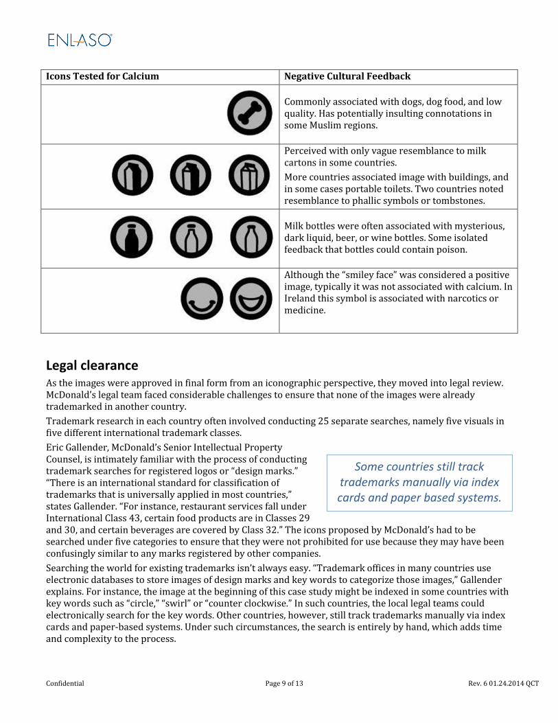
Icons Tested for Calcium Negative Cultural Feedback
Commonly associated with dogs, dog food, and low quality. Has potentially insulting connotations in some Muslim regions.
Perceived with only vague resemblance to milk cartons in some countries. More countries associated image with buildings, and in some cases portable toilets. Two countries noted resemblance to phallic symbols or tombstones.
Milk bottles were often associated with mysterious, dark liquid, beer, or wine bottles. Some isolated feedback that bottles could contain poison.
Although the “smiley face” was considered a positive image, typically it was not associated with calcium. In Ireland this symbol is associated with narcotics or medicine.
Legal clearance As the images were approved in final form from an iconographic perspective, they moved into legal review. McDonald’s legal team faced considerable challenges to ensure that none of the images were already trademarked in another country. Trademark research in each country often involved conducting 25 separate searches, namely five visuals in five different international trademark classes. Eric Gallender, McDonald’s Senior Intellectual Property Counsel, is intimately familiar with the process of conducting trademark searches for registered logos or “design marks.” “There is an international standard for classification of trademarks that is universally applied in most countries,” states Gallender. “For instance, restaurant services fall under International Class 43, certain food products are in Classes 29 and 30, and certain beverages are covered by Class 32.” The icons proposed by McDonald’s had to be searched under five categories to ensure that they were not prohibited for use because they may have been confusingly similar to any marks registered by other companies. Searching the world for existing trademarks isn’t always easy. “Trademark offices in many countries use electronic databases to store images of design marks and key words to categorize those images,” Gallender explains. For instance, the image at the beginning of this case study might be indexed in some countries with key words such as “circle,” “swirl” or “counter clockwise.” In such countries, the local legal teams could electronically search for the key words. Other countries, however, still track trademarks manually via index cards and paper-based systems. Under such circumstances, the search is entirely by hand, which adds time and complexity to the process.
Some countries still track trademarks manually via index cards and paper based systems.
Confidential Page 9 of 13 Rev. 6 01.24.2014 QCT

There are a number of issues that complicate the legal equation, beyond whether an icon resembles a prior registered symbol or image. For example, how is the existing mark being used? Is it used in the same industry (e.g. food versus clothing)? Is it used in the same trade channels (i.e., retail versus wholesale)? “Each situation must be carefully evaluated on a case-by-case basis,” Gallender continues. “The greater similarity you have in one area (e.g. appearance) the less similarity you need in another area in order for the prior reference to pose a serious risk of conflict.” All of these factors helped to determine each image’s acceptance or rejection. Rejection from a legal perspective meant that once again, an icon was returned to a designer for further modification. If modifications were major, another cultural evaluation was needed. This required careful project management, both at ENLASO and McDonald’s. For example, the final “non-language” calorie icon went through several iterations to avoid resemblance to established logos. The illustration below shows some rejected icons for this nutrient:
Although the McDonald’s legal team took great pains to ensure that use of the icons entailed no more than a reasonable risk of legal conflict, the company does not intend to keep these images for its exclusive use. McDonald’s intends to make this new language of nutritional images available for other vendors, even competitors, to use in the same way.
Looks great, but will it work on Styrofoam? Concurrently, McDonald’s had to ensure that the artwork was suitable for printing on diverse forms of packaging. The images had to be capable of being reduced to a very small size and printed in monochromatic inks for certain packaging (e.g. mustard- colored ink for cheeseburger paper wrappers). Enter McDonald’s Tricia Frawley, Director of Packaging and Merchandising in Global Marketing. “When I came into the project, not all of the technical bits about printing and packaging had been worked out yet,” Frawley admits. “Fortunately, Boxer (the UK based design firm) has a lot of experience designing images for our packages, so most of the images were already within our print feasibility guidelines.” For instance, minimum line width needs to be legible in the final, reduced image size. Some design refinements were required to accommodate printing restrictions. For instance, early images for protein, fat, and carbohydrates included letters, numbers and vertical lines that became fuzzy when the images were reduced to final print size. Letters were removed from the blocks in the protein image, and numbers were dropped from the ruler and gauge images (fat and carbohydrates, respectively) to improve legibility. Some colors were changed because nutritionist feedback identified red with protein, yellow with fat and green with energy. Although the meaning of the original versions of these images may have been a bit more obvious, they simply would not work within package printing limitations. The following table compares early and final versions of the icons for protein, fat and carbohydrates.
Some colors were changed because nutritionist feedback
identified red with protein, yellow with fat and green with
energy.
Confidential Page 10 of 13 Rev. 6 01.24.2014 QCT
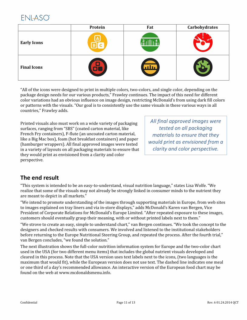
Protein Fat Carbohydrates
Early Icons
Final Icons
“All of the icons were designed to print in multiple colors, two-colors, and single color, depending on the package design needs for our various products,” Frawley continues. The impact of this need for different color variations had an obvious influence on image design, restricting McDonald’s from using dark fill colors or patterns with the visuals. “Our goal is to consistently use the same visuals in these various ways in all countries,” Frawley adds. Printed visuals also must work on a wide variety of packaging surfaces, ranging from “SBS” (coated carton material, like French Fry containers), F-flute (an uncoated carton material, like a Big Mac box), foam (hot breakfast containers) and paper (hamburger wrappers). All final approved images were tested in a variety of layouts on all packaging materials to ensure that they would print as envisioned from a clarity and color perspective.
The end result “This system is intended to be an easy-to-understand, visual nutrition language,” states Lisa Wolfe. “We realize that some of the visuals may not already be strongly linked in consumer minds to the nutrient they are meant to depict in all markets.” “We intend to promote understanding of the images through supporting materials in Europe, from web sites to images explained on tray liners and via in-store displays,” adds McDonald’s Karen van Bergen, Vice President of Corporate Relations for McDonald’s Europe Limited. “After repeated exposure to these images, customers should eventually grasp their meaning, with or without printed labels next to them.” “We strove to create an easy, simple to understand chart,” van Bergen continues. “We took the concept to the designers and checked results with consumers. We involved and listened to the institutional stakeholders before returning to the Europe Nutritional Steering Group, and repeated the process. After the fourth trial,” van Bergen concludes, “we found the solution.” The next illustration shows the full-color nutrition information system for Europe and the two-color chart used in the USA (for two different menu items) that includes the global nutrient visuals developed and cleared in this process. Note that the USA version uses text labels next to the icons, (two languages is the maximum that would fit), while the European version does not use text. The dashed line indicates one meal or one third of a day’s recommended allowance. An interactive version of the European food chart may be found on the web at www.mcdonaldsmenu.info.
All final approved images were tested on all packaging
materials to ensure that they would print as envisioned from a
clarity and color perspective.
Confidential Page 11 of 13 Rev. 6 01.24.2014 QCT
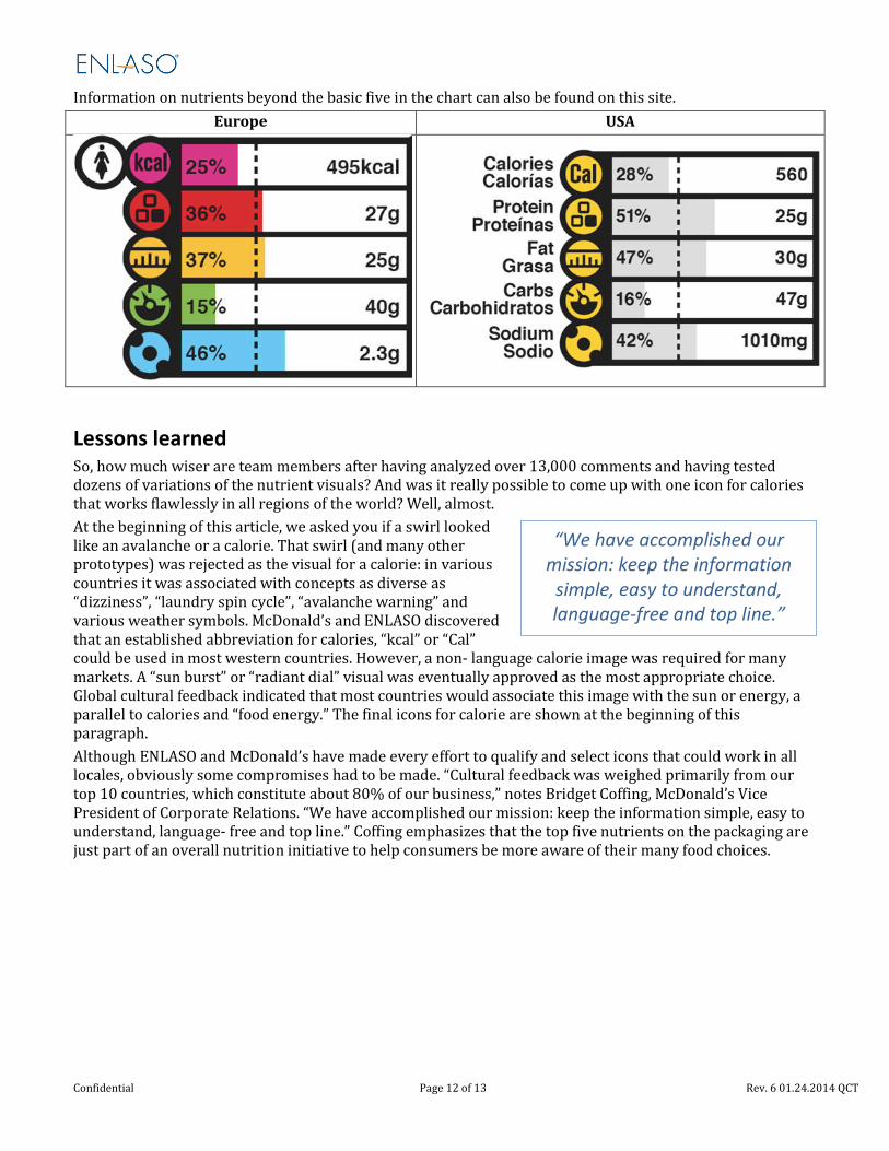
Information on nutrients beyond the basic five in the chart can also be found on this site.
Europe USA
Lessons learned So, how much wiser are team members after having analyzed over 13,000 comments and having tested dozens of variations of the nutrient visuals? And was it really possible to come up with one icon for calories that works flawlessly in all regions of the world? Well, almost. At the beginning of this article, we asked you if a swirl looked like an avalanche or a calorie. That swirl (and many other prototypes) was rejected as the visual for a calorie: in various countries it was associated with concepts as diverse as “dizziness”, “laundry spin cycle”, “avalanche warning” and various weather symbols. McDonald’s and ENLASO discovered that an established abbreviation for calories, “kcal” or “Cal” could be used in most western countries. However, a non- language calorie image was required for many markets. A “sun burst” or “radiant dial” visual was eventually approved as the most appropriate choice. Global cultural feedback indicated that most countries would associate this image with the sun or energy, a parallel to calories and “food energy.” The final icons for calorie are shown at the beginning of this paragraph. Although ENLASO and McDonald’s have made every effort to qualify and select icons that could work in all locales, obviously some compromises had to be made. “Cultural feedback was weighed primarily from our top 10 countries, which constitute about 80% of our business,” notes Bridget Coffing, McDonald’s Vice President of Corporate Relations. “We have accomplished our mission: keep the information simple, easy to understand, language- free and top line.” Coffing emphasizes that the top five nutrients on the packaging are just part of an overall nutrition initiative to help consumers be more aware of their many food choices.
“We have accomplished our mission: keep the information
simple, easy to understand, language-free and top line.”
Confidential Page 12 of 13 Rev. 6 01.24.2014 QCT

Breaking new ground Everyone interviewed for this case study conveyed tangible enthusiasm over the potential for the nutrient images and bar chart to communicate critical information to more people worldwide. Coffing adds “This initiative will transcend language barriers, extending these efforts globally, even into areas with limited literacy or to consumers who may have difficulty reading small print.” Since 50 million people worldwide are served at McDonald’s each day, this initiative is clearly an important one that can touch many lives. Karen van Bergen, Vice President of Corporate Relations for McDonald’s Europe Limited, who was involved in Europe at the project’s inception, is proud of the company’s commitment to extend nutrition literacy. “We have created a nutrition language,” she affirms. “We would like it to assist consumers in making decisions for a balanced diet.” According to van Bergen, the concept of McDonald’s itself is concise, convenient, and immediately recognizable. “The science behind nutrition is very complex, but because of these compelling, culturally proven images, you can quickly recognize them.” The learning process was equally potent for the ENLASO half of the team. “I know that the word partnership took on new meaning for both companies,” concludes ENLASO Vice President Yves Lang. “I am proud that ENLASO played such a strategic part in this pioneering effort by one of the world’s most recognized and respected brands.” “What may surprise some people,” observes ENLASO project manager David Dunn, “is how incredibly committed everyone from McDonald’s is to this nutrition information initiative. I think a lot of people in North America may still think of McDonald’s as just being a quick place to eat. My contacts at McDonald’s were so thoroughly committed to the initiative.” And one should never make assumptions about how other cultures view the world, reflects Dunn. “There were all of these simple little images, which evoked such a wide collection of responses,” he continues. “Always be open to another culture’s perceptions, and learn not to judge that feedback through the lens of your own experience.” Dunn recalls having lived in the American Southwest near a cliff with pre-historic petroglyphs, ‘icons’ of their era. “I would see all sorts of people from many different cultures around the world,” Dunn recalls. “They would just stand there and stare at the ancient images for hours on end.” There is something very potent about simple, even primitive images. “The response such images evoke may not always be universal,” concludes Dunn, “but the potency of such images can be universal. Visuals resonate with all peoples.” Dunn admits that he occasionally found himself pausing to stare at some of the new icon images, just like tourists viewing those ancient petroglyphs.
One thing is certain: this project is unique. “To my knowledge, no other corporation has done such extensive, global cultural testing of images,” concludes McDonald’s Lisa Wolfe. “How many companies can you think of that tried to find out which image makes sense for ‘protein’ in China and 108 other countries?” The time and expense that went into this project are noteworthy due to the voluntary nature of McDonald's
actions in creating this global visual nutrition language, then making it freely available for reapplication throughout the food industry. McDonald’s has already achieved universal recognition for one image: the Golden Arches. Perhaps, through time and repeated exposure, this new language of nutrient images will eventually become just as universally recognized. For more information about ENLASO, please contact [email protected], or call (866) 415-6820.
“To my knowledge, no other corporation has done such
extensive, global cultural testing of images.”
Confidential Page 13 of 13 Rev. 6 01.24.2014 QCT