Branding And User Experience DiscussionDecember 5, 2009
Prepared for SharePoint Saturday DCby Marcy Kellar
Marcy Kellar
Branding Lead at CDW responsible for branding, web content management, and usability
Diverse background in life sciences, psychology, data management and technology
Over four years experience in SharePoint architecture design, branding & implementation
Over twenty years experience in fine art and visual design
Presenter
Presentation Notes
About Marcy Kellar Branding & Design Lead at CDW responsible for web content management, branding and usability Diverse background in life sciences, psychology, data management and technology Over four years experience in SharePoint architecture planning and implementation Over twenty years experience in fine art and visual design
Presenter
Presentation Notes
Where Does My Passion For SharePoint Come From? I am an impulsive website user. That means that I fall victim to bad design just like everyone else. I get frustrated with poorly constructed sites. I just want to get my job done without having to be a sophisticated user. I started studying best practices of web design, information architecture, information mapping and usability in 2004. SharePoint Is My Hero – I worked in a job that had multiple redundant data.
Crappy content What Is It? What does that mean to you?Examples of branding issues that lead to “crappy content” The User experience (UX) elements Mapping UX elements back to SharePoint
Presenter
Presentation Notes
What You Will Learn What I Mean by “Branding won’t fix crappy content” User experience (UX) elements & SharePoint Examples of “Crappy Content” and Fixes Best Practices that prevent “crappy content” and ultimately improve user experience - How is this relevant to you? Almost every level of sharepoint user can benefit from understanding how the look and feel of sharepoint isn’t just about the color and logo. There’s a lot of structure and design that that branding sits on.
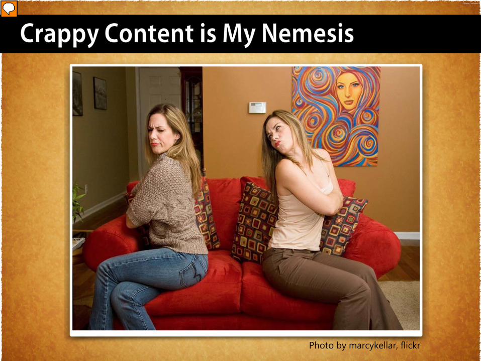
Photo by marcykellar, flickr
Presenter
Presentation Notes
Crappy Content is my nemesis Crappy Content can make a good branding project fail. It’s my arch-enemy and I look out for it all the time.
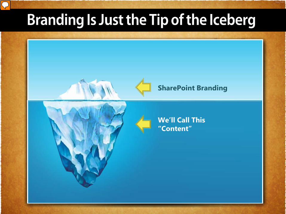
SharePoint Branding
We’ll Call This“Content”
Presenter
Presentation Notes
Branding Is Just the Tip of the Iceberg
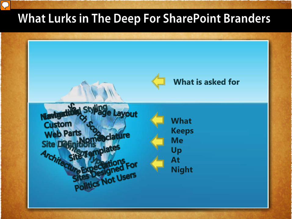
What is asked for
What Keeps MeUpAtNight
What is asked for
Presenter
Presentation Notes
What Lurks in The Deep For SharePoint Branders tasked with more objectives than changing the logo and colors. Here are a few items that can inhibit the user experience Navigation Embedded Styling Layout Nomenclature Site Definitions Content Thypes Architecture Politics Web Parts Search Scopes
Presenter
Presentation Notes
Common Causes of Branding Problems in SharePoint There are many causes of branding frustrations in SharePoint. Many of them can be avoided by being proactive. Make sure that you take time with the client/stakeholder prior to creating your branding strategy. This will ensure that you truly understand the goals of the branding effort. Guide the client to make the right decisions. �
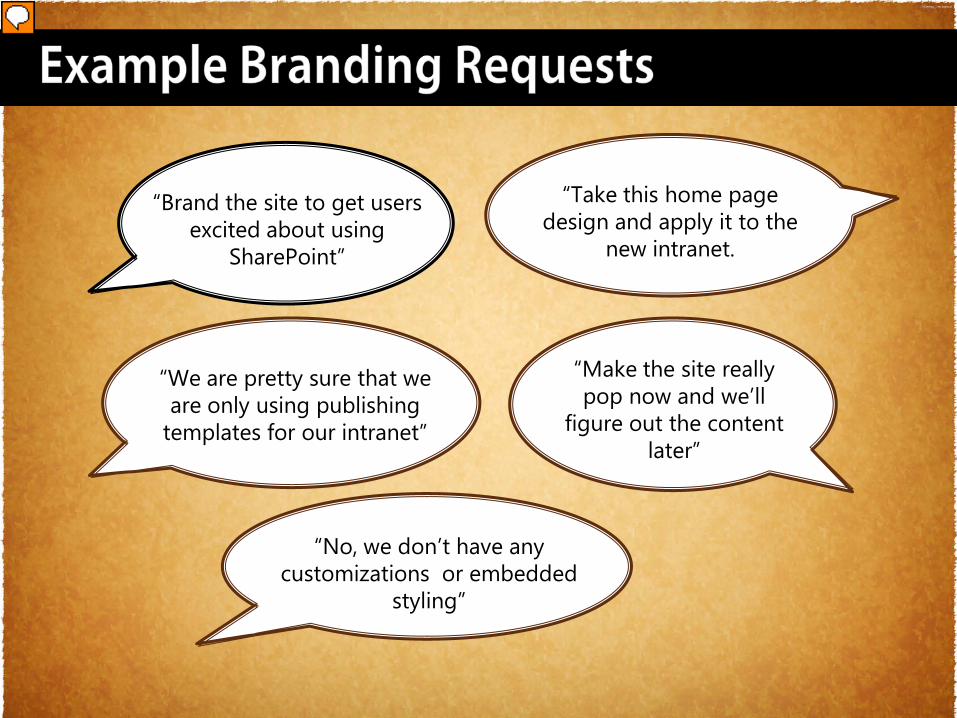
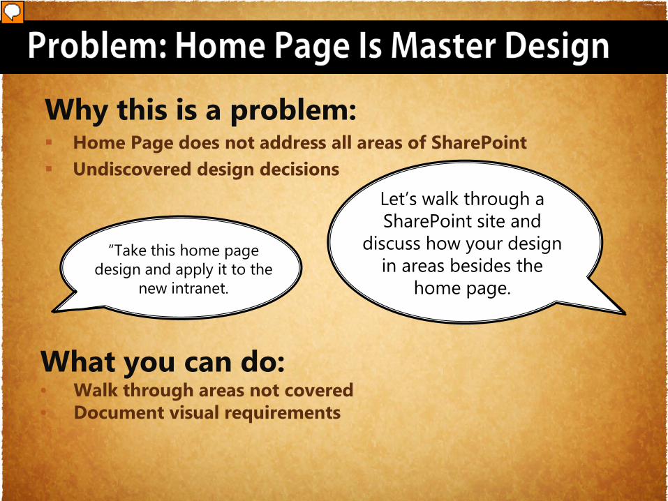
“Take this home page design and apply it to the
new intranet.
“No, we don’t have any customizations or embedded
styling”
“We are pretty sure that we are only using publishing
templates for our intranet”
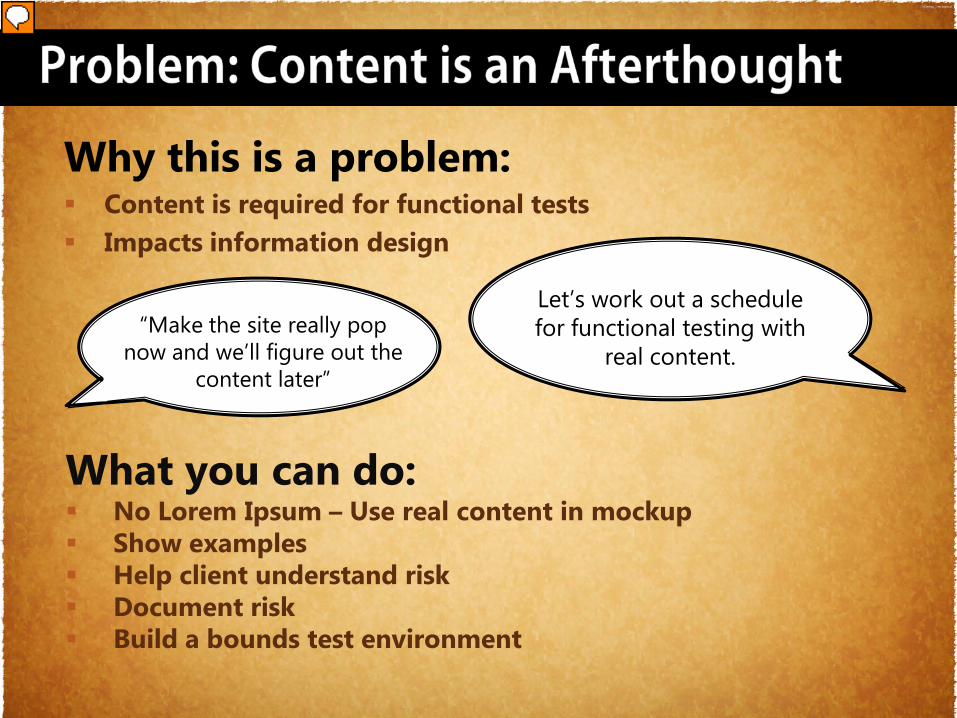
“Make the site really pop now and we’ll
figure out the content later”
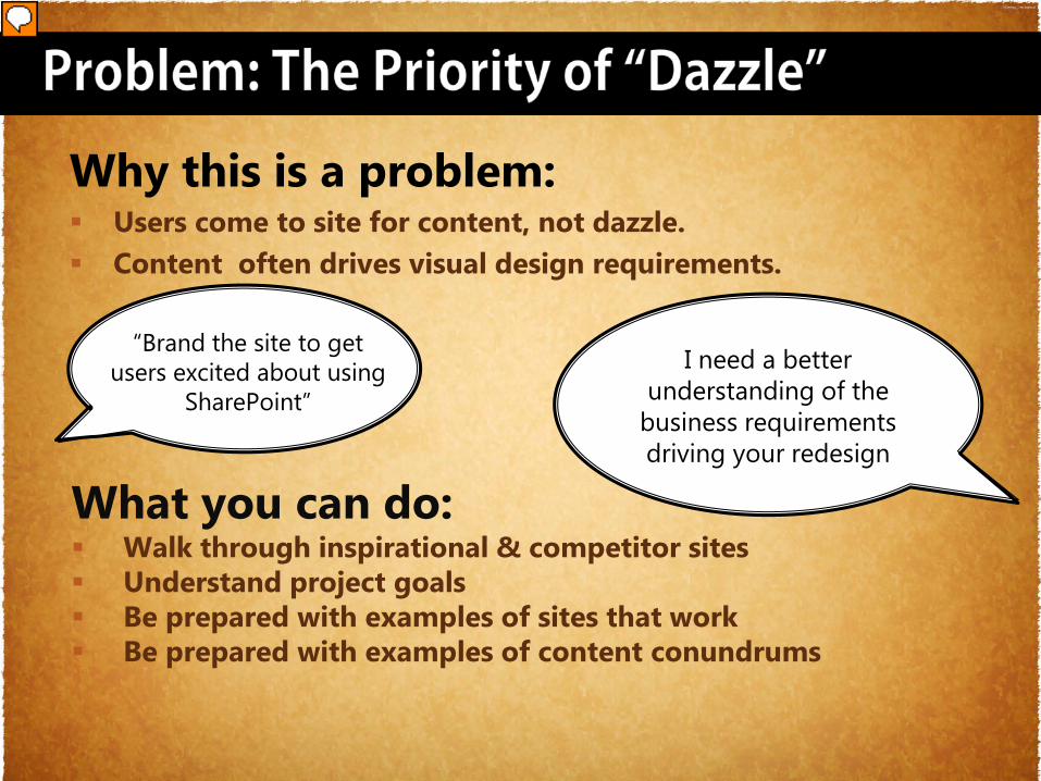
“Brand the site to get users excited about using
SharePoint”
Presenter
Presentation Notes
Branding Request Examples The Requests Seem Simple “Brand the site to get users excited about using SharePoint” “We are pretty sure that we are only using publishing templates for our intranet” “No, we don’t have any customizations or embedded styling” “Make the site really pop now and we’ll figure out the content later” “Take this home page design and apply it to the new intranet. Each one of these examples has a risk hidden below the innocent request.
“Make the site really pop now and we’ll figure out the
content later”
Why this is a problem: Content is required for functional tests Impacts information design
What you can do: No Lorem Ipsum – Use real content in mockup Show examples Help client understand risk Document risk Build a bounds test environment
Let’s work out a schedule for functional testing with
real content.
Presenter
Presentation Notes
Problem: Content is an afterthought Why this is a problem: Content is required for functional tests Content impacts design – better designs can be created with real content What you can do: No Lorem Ipsum – Use real content in mockup Be prepared for examples of mocked up design vs functional tested designs Make sure client understands risk Create your own test environment with various content scenarios. Keep adding to it with every project
“Take this home page design and apply it to the
new intranet.
Why this is a problem: Home Page does not address all areas of SharePoint Undiscovered design decisions
Let’s walk through a SharePoint site and
discuss how your design in areas besides the
home page.
What you can do:• Walk through areas not covered• Document visual requirements
Presenter
Presentation Notes
Problem: Home Page Is Master Why this is a problem: Home Page does not address all areas of SharePoint Lots of undiscovered design decisions What you can do: Walk through areas not addressed in home page (i.e. left nav, interior page structure) Document any requirements not covered in the mockup/prototype
“Brand the site to get users excited about using
SharePoint”
Why this is a problem: Users come to site for content, not dazzle. Content often drives visual design requirements.
What you can do: Walk through inspirational & competitor sites Understand project goals Be prepared with examples of sites that work Be prepared with examples of content conundrums
I need a better understanding of the
business requirements driving your redesign
Presenter
Presentation Notes
Problem: The Priority of “Dazzle” Why this is a problem: Lots of undiscovered design decisions Content often drives visual design requirements. What you can do: Walk through inspirational & competitor sites Review how they are using content Be prepared with examples of sites that work Be prepared with examples of content conundrums
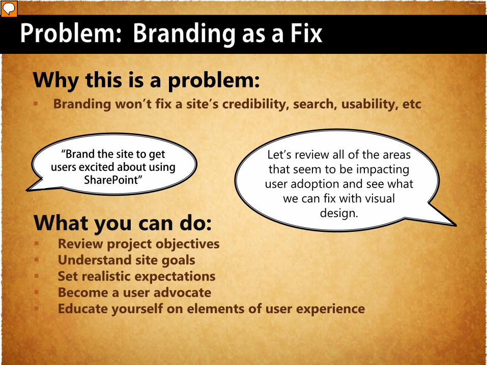
Why this is a problem: Branding won’t fix a site’s credibility, search, usability, etc
What you can do: Review project objectives Understand site goals Set realistic expectations Become a user advocate Educate yourself on elements of user experience
“Brand the site to get users excited about using
SharePoint”
Let’s review all of the areas that seem to be impacting
user adoption and see what we can fix with visual
design.
Presenter
Presentation Notes
Problem: Branding as a Fix Why this is a problem: Branding won’t fix a site’s credibility, search, usability, etc What you can do: Review project objectives Understand site goals Set realistic expectations Become a user advocate Educate yourself on elements of user experience
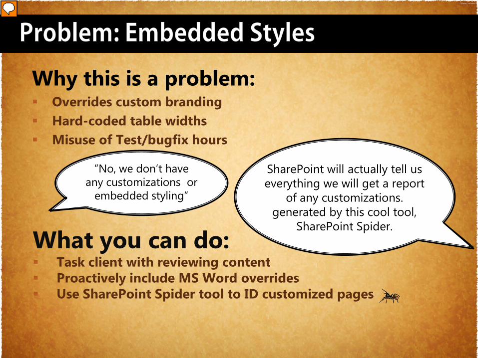
Why this is a problem: Overrides custom branding Hard-coded table widths Misuse of Test/bugfix hours
“No, we don’t have any customizations or
embedded styling”
What you can do: Task client with reviewing content Proactively include MS Word overrides Use SharePoint Spider tool to ID customized pages
SharePoint will actually tell us everything we will get a report
of any customizations. generated by this cool tool,
SharePoint Spider.
Presenter
Presentation Notes
Problem: Embedded Styles Why this is a problem: CSS called from page is last to render. Overrides your styles Hard-coded table widths Test/bugfix hours used to confirm embedded styles What you can do: Task client with reviewing content Proactively include MS Word overrides Use SharePoint Spider tool to identify site with customized pages
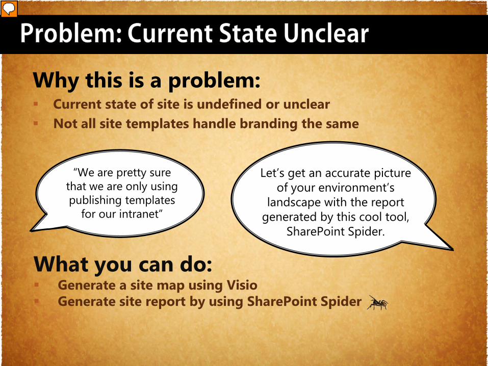
“We are pretty sure that we are only using publishing templates
for our intranet”
Why this is a problem: Current state of site is undefined or unclear Not all site templates handle branding the same
What you can do: Generate a site map using Visio Generate site report by using SharePoint Spider
Let’s get an accurate picture of your environment’s
landscape with the report generated by this cool tool,
SharePoint Spider.
Presenter
Presentation Notes
Problem: Current State Undefined Problem: Client doesn’t realize that intranet uses both publishing and collaboration. Why this is a problem: Not all site templates handle branding the same Meeting & Document Workspaces – Master Page Publishing vs Collaboration - Alternate CSS Client doesn’t really know what’s in their site What you can do: Make sure that your scope is on target by getting an accurate report of site templates being used Create a site map using Visio Generate site report by using SharePoint Spider
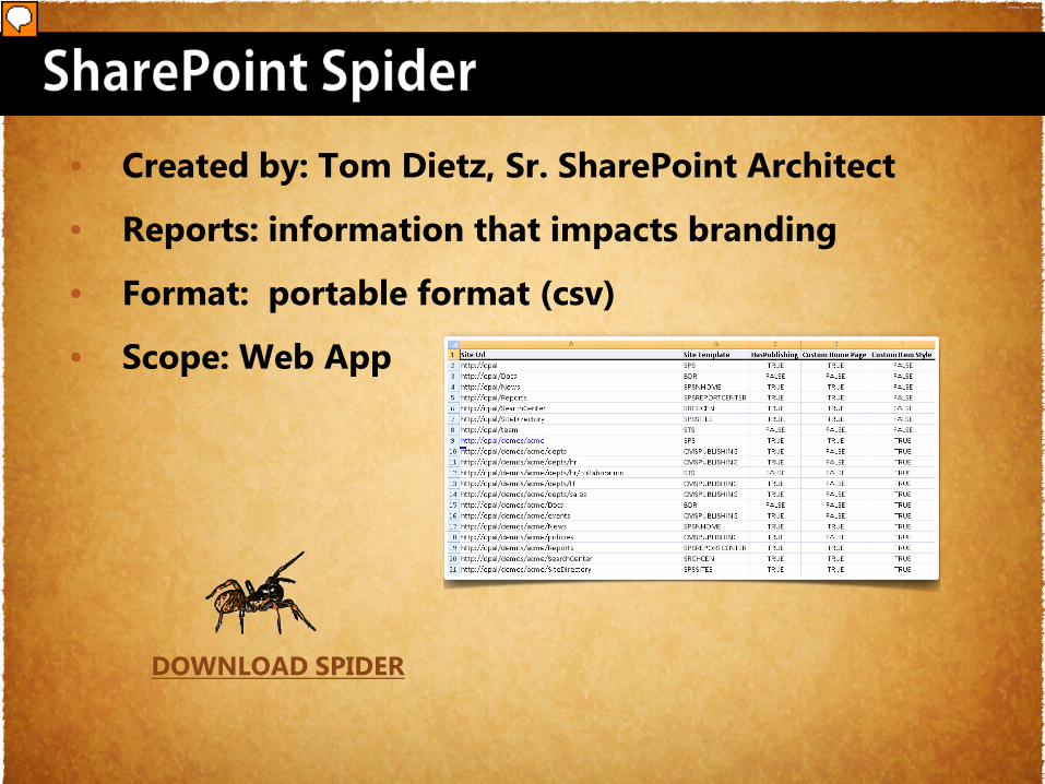
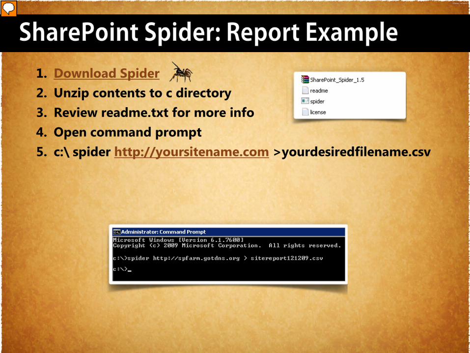
• Created by: Tom Dietz, Sr. SharePoint Architect
• Reports: information that impacts branding
• Format: portable format (csv)
• Scope: Web App
DOWNLOAD SPIDER
Presenter
Presentation Notes
SharePoint Spider Script created by Tom Dietz, Sr. SharePoint Architect Reports information that impacts branding Format: portable format (csv) Scope: Web App My Requirements: Returned data in a portable format (csv or excel) Scope: Web App Reports per site collection: Site URL - The fully qualified URL to the site Site Template - The SharePoint Site Template Name the site was created from HasPublishing- Is the Publishing Feature activated on this site Custom Home Page - Has the home page been customized? (Returns true for publishing sites by default) Custom Item Style - Has the /Style Library/XSL Style Sheets/ItemStyle.xsl file been customized (Applicable only to Publishing sites) Site Master Page - URL of site master page System Master Page Alternate css – provides the filename if using alternate css Theme – provides site theme in use
1. Download Spider2. Unzip contents to c directory3. Review readme.txt for more info4. Open command prompt5. c:\ spider http://yoursitename.com >yourdesiredfilename.csv
Presenter
Presentation Notes
SharePoint Spider: Report Example Download Spider Unzip contents to c directory Review readme.txt for more info Open command prompt c:\ spider http://yoursitename.com >yourdesiredfilename.csv Site URL Site Template Has Publishing Custom Home Page ** Custom Item Style Site Master Page System Master Page Alternate CSS Site URL Site Template Has Publishing Custom Home Page ** Custom Item Style Site Master Page System Master Page Alternate CSS
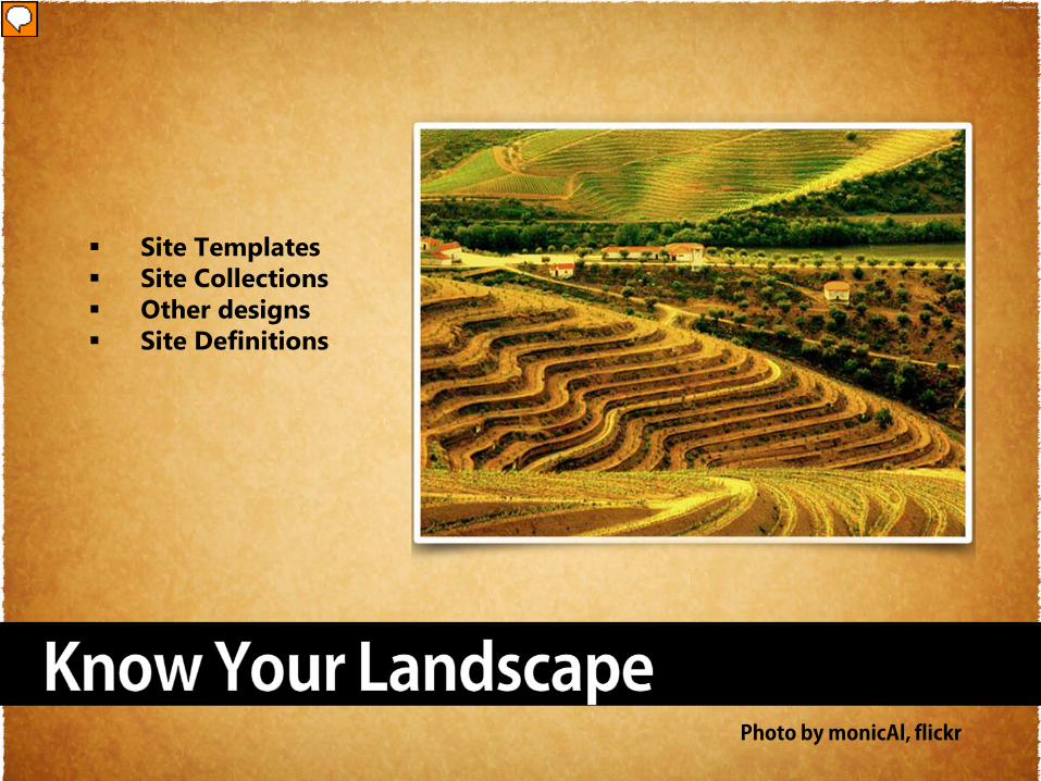
Site Templates Site Collections Other designs Site Definitions
Presenter
Presentation Notes
Know your landscape Site Templates Site Collections Other designs Site Definitions
Photo Courtesy of Tarja_, flickr
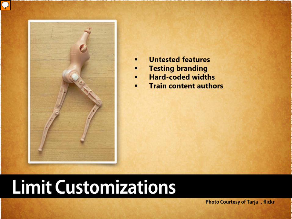
Untested features Testing branding Hard-coded widths Train content authors
Presenter
Presentation Notes
Limit Customizations Customizations such as 3rd party web parts should be managed closely if you care about a uniform and consistent look and feel. Beware of inline widths that users like to assign to tables. Train them to use % or lock down the RTE in the page layout Untested features Testing branding Hard-coded widths Train content authors
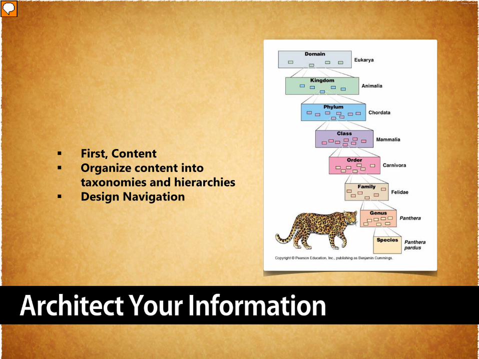
First, Content Organize content into
taxonomies and hierarchies Design Navigation
Presenter
Presentation Notes
Architect Your Information Content Analysis - Inventory your content: What do you have already? What do you need? Chunking Organize content into taxonomies and hierarchies Navigation Navigation exists to help users, not to be a puzzle in its own right. Users should be able to understand it immediately, and apply that understanding throughout the site. Sadly, lots of sites change their navigation features as users move around. Options come and go, making users feel a loss of control. How do I get that menu choice back? I saw it just a few pages ago. it's a beacon that helps users understand both where they are and how they can easily maneuver back to the top of the site if they lose their way. Navigation Improvements Use Findable Words First Limit Characters Limit Choices Wayfinding – Use Landmarks Information Scent - Don’t call a link “click here”, name it “click here to * = demo
Photo by Liz Bartlett, flickr
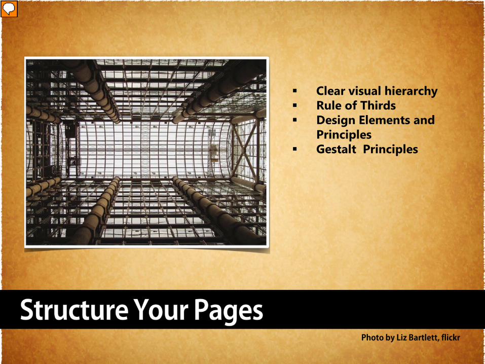
Clear visual hierarchy Rule of Thirds Design Elements and
Principles Gestalt Principles
Presenter
Presentation Notes
Improve Content Structure Wireframing, Page Structure Library - Draw diagrams that show the site structure and rough outlines of pages Analyze your system by testing the organization interactively with real users Create a clear visual hierarchy of contrast, so you can see at a glance what is important and what is peripheral Define functional regions of the page Group page elements that are related, so that you can see structure in the content Clear visual hierarchy Rule of Thirds Design Elements and Principles Gestalt Principles
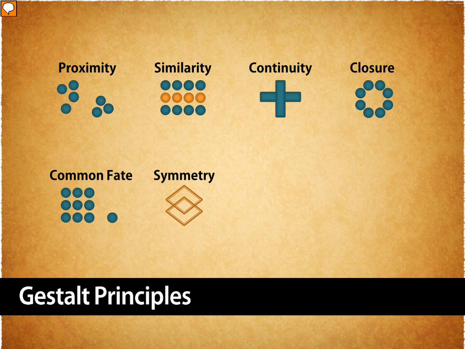
Proximity ContinuitySimilarity Closure
Common Fate Symmetry
Presenter
Presentation Notes
Patterns Communicate Additional Information about hierarchy and importance Proximity - The Gestalt law of proximity states that "objects or shapes that are close to one another appear to form groups“ Similarity - The principle of similarity states that things which share visual characteristics such as shape, size, color, texture, value or orientation will be seen as belonging together. Similarity occurs when objects look similar to one another. People often perceive them as a group or pattern. Continuity -This Gestalt law states that learners "tend to continue shapes beyond their ending points". . We perceive the figure as two crossed lines instead of 4 lines meeting at the center. Closure - Imaginary lines called vectors, or shapes called counter forms, are generated by these relationships, which the eye understands as part of the composition even though there is "nothing there. Closure can be thought of as the tension or "glue" that holds a two-dimensional structure together. Symmetry - Symmetry states that the viewer should not be given the impression that something is out of balance, or missing, or wrong. Utilitarian information (instructional or technical design) will be more effective if the presentation is orderly, especially if it must be comprehended quickly. traffic signs sets of instructions reference books Law of Common Fate: When the viewer sees similar objects or images facing/pointing in the same direction, there is a common thing between them all. However, if one of the objects or images is placed differently then tension is created for the viewer and there is no commonality with the images. Symmetry If the elements of a figure have a symmetric shape, we tend to perceive the symmetric set as a whole, instead of seeing its constituting parts.
Photo Courtesy of Mike Owens, flickr
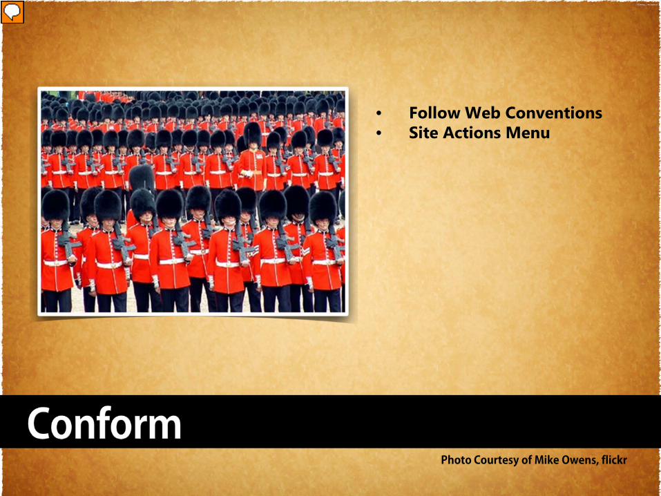
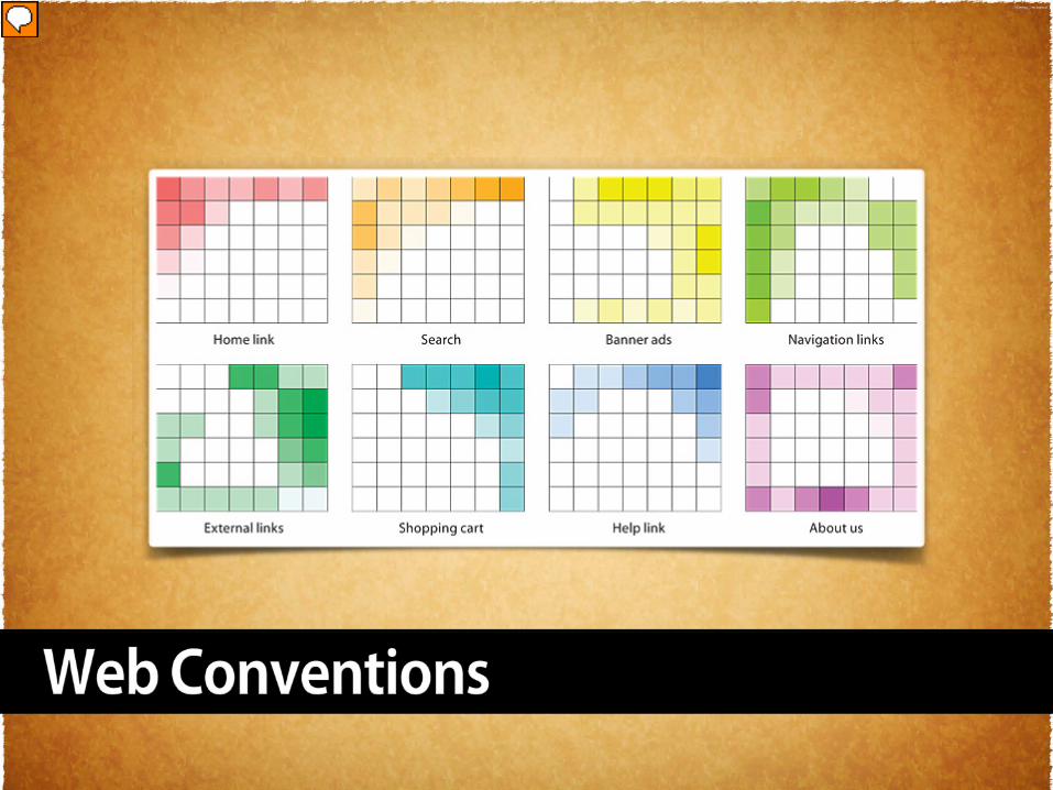
• Follow Web Conventions • Site Actions Menu
Presenter
Presentation Notes
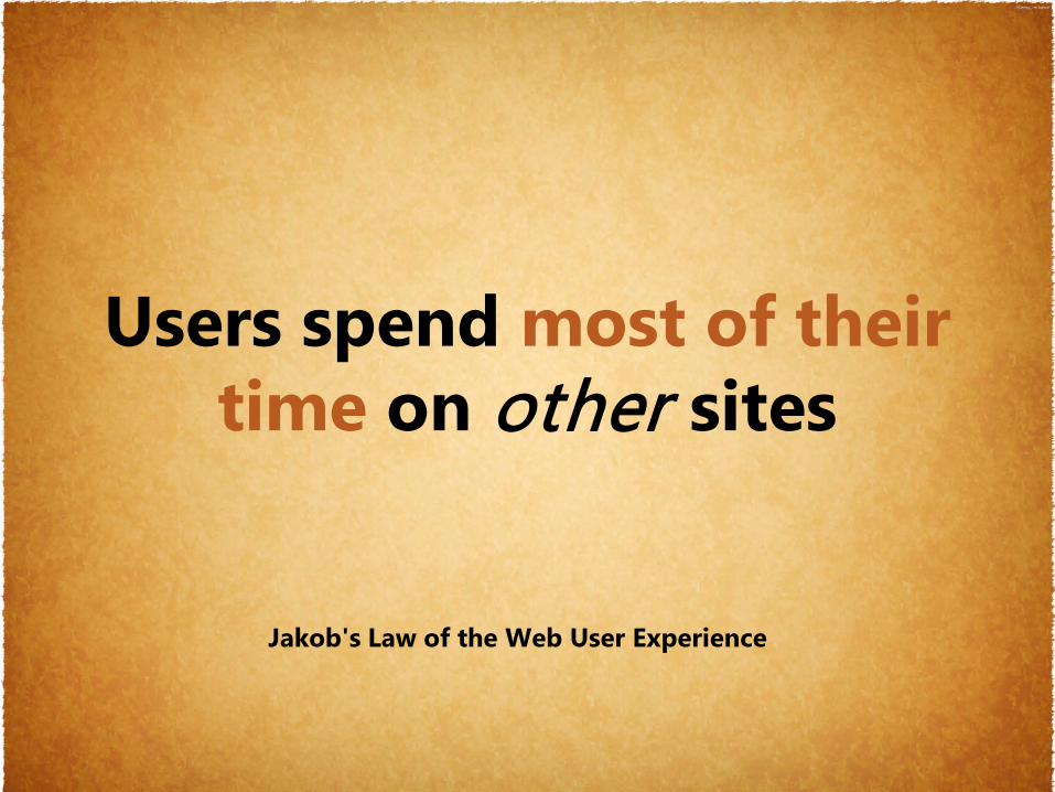
Conform – Follow Web Conventions Do the same as everybody else: if most big websites do something in a certain way, then follow along since users will expect things to work the same on your site. Remember, so that's where they form their expectations for
Jakob's Law of the Web User Experience
Users spend most of their time on other sites
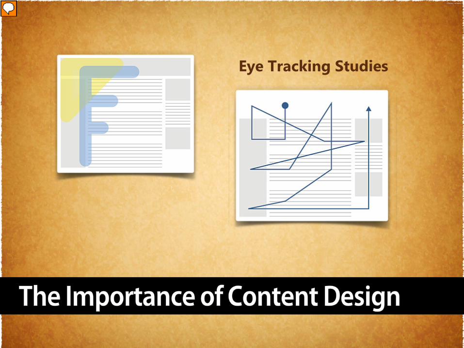
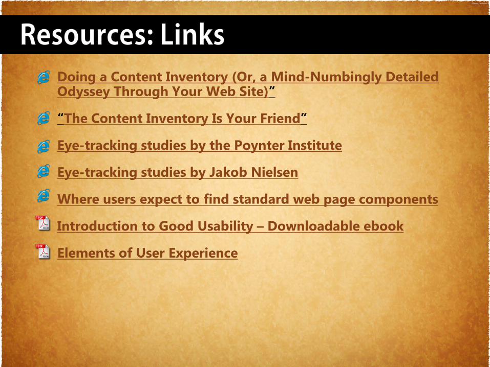
Eye Tracking Studies
Presenter
Presentation Notes
Place your content where users will find it. Eye-tracking studies by the Poynter Institute of readers looking at web pages have shown that readers start their scanning with many fixations in the upper left of the page. Their gaze then follows a Gutenberg z pattern down the page, and only later do typical readers lightly scan the right area of the page Eye-tracking studies by Jakob Nielsen show that web pages dominated by text information are scanned in an “F” pattern of intense eye fixations across the top header area, and down the left edge of the text
Presenter
Presentation Notes
Users
Photo Courtesy of noamgaala, flickr
Presenter
Presentation Notes
Listen To Your Users
User Experience (UX) is the quality of experience a person
has when interacting with a specific design. ~www.uxnet.org
Presenter
Presentation Notes
What Is User Experience? There are many definitions of UX. User Experience (UX) is the quality of experience a person has when interacting with a specific design. www.uxnet.org
Become a user advocate
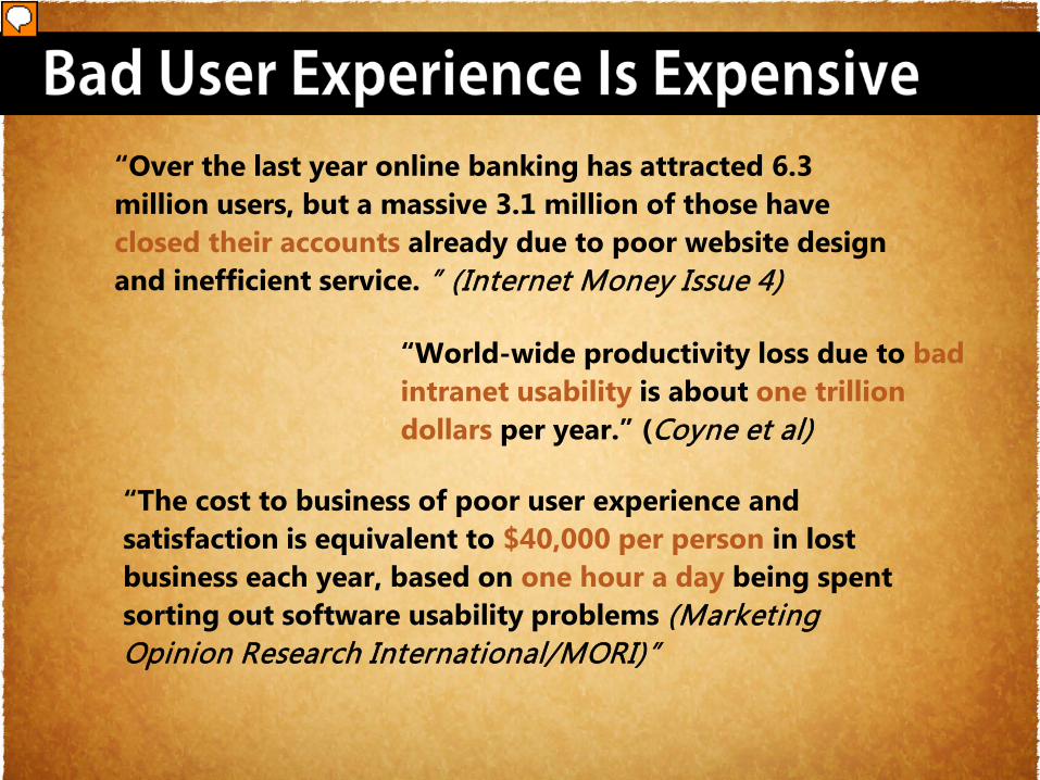
“Over the last year online banking has attracted 6.3 million users, but a massive 3.1 million of those have closed their accounts already due to poor website design and inefficient service. ” (Internet Money Issue 4)
“World-wide productivity loss due to bad intranet usability is about one trillion dollars per year.” (Coyne et al)
“The cost to business of poor user experience and satisfaction is equivalent to $40,000 per person in lost business each year, based on one hour a day being spent sorting out software usability problems (Marketing Opinion Research International/MORI)”
Presenter
Presentation Notes
Bad User Experience Is Expensive If you plan for the user needs now you save $$$ later
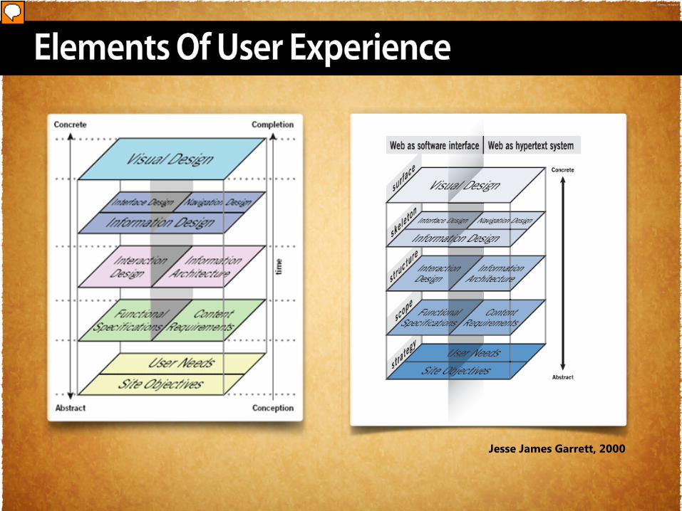
Jesse James Garrett, 2000
Presenter
Presentation Notes
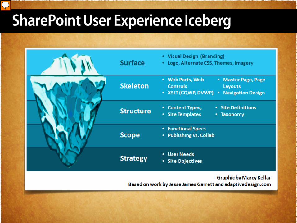
Visualizing The User Experience There is more than one bible when it comes to the elements of user experience, but Jesse James Garrett came up with a great visual to represent them in 2000 and has been. This is Jesse James Garrett’s first illustration of the user experience in 2004. Has it ever been translated into SharePoint? The Surface Plane On the surface you see a series of Web pages, made up of images and text. Some of these images are things you can click on, performing some sort of function such as taking you to a shopping cart. Some of these images are just illustrations, such as a photograph of a book cover or the logo of the site itself The Skeleton Plane Beneath that surface is the skeleton of the site: the placement of buttons, tabs, photos, and blocks of text. The skeleton is designed to optimize the arrangement of these elements for maximum effect and efficiency—so that you remember the logo and can find that shopping cart button when you need it. The Structure Plane The skeleton is a concrete expression of the more abstract structure of the site. The skeleton might define the placement of the interface elements on our checkout page; the structure would define how users got to that page and where they could go when they were finished there. The skeleton might define the arrangement of navigational items allowing the users to browse categories of books; the structure would define what those categories actually were. 22 CHAPTER 2 MEET THE ELEMENTS The Scope Plane The structure defines the way in which the various features and functions of the site fit together. Just what those features and functions are constitutes the scope of the site. Some sites that sell books offer a feature that enables users to save previously used addresses so they can be used again. The question of whether that feature—or any feature—is included on a site is a question of scope. The Strategy Plane The scope is fundamentally determined by the strategy of the site. This strategy incorporates not only what the people running the site want to get out of it but what the users want to get out of the site as well. In the case of our bookstore example, some of the strategic objectives are pretty obvious: Users want to buy books, and we want to sell them. Other objectives might not be so easy to articulate.
Presenter
Presentation Notes
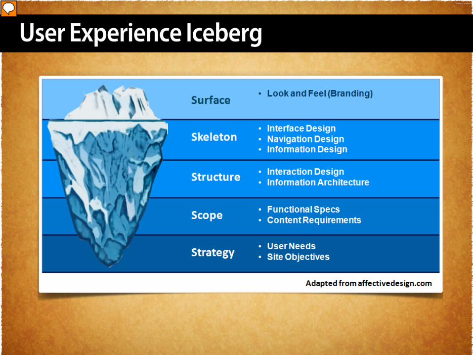
The User Experience Iceberg you should plan your project so that work on any plane cannot finish before work on lower planes has finished. The important consideration here is not to build the roof of the house before we know the shape of its foundation.
Presenter
Presentation Notes
The SharePoint User Experience Iceberg Surface = images and text Skeleton = optimize the arrangement of these elements efficiencyScope – Pub Vs Collab Little understanding of content landscape Project or Site Objective
Presenter
Presentation Notes
Relish in the User Experience & User Centric Information out there, even if it’s not for SharePoint. You can learn the concepts that promote good user experience and apply them to SharePoint.
Presenter
Presentation Notes
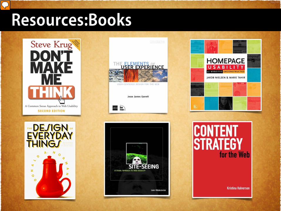
Resources You need to read these books. But if you only read one … read Don’t Make Me Think by Steve Krug. Don’t Make Me Think by Steve Krug The Elements of User Experience, Jesse James Garrett Homepage Usability, Jakob Neilson The Design of Everyday Things, Donald Norman Site Seeing -http://www.amazon.com/Site-Seeing-Visual-Approach-Web-Usability/dp/0764536745 Content Strategies for the Web, Kristin Halverson http://www.amazon.com/Content-Strategy-Web-Kristina-Halvorson/dp/0321620062