Embed Size (px)
Citation preview

ways to be a respected maverick
#UCDA MARCH 27, 2015
@RichardHBailey@RHBInformed
5

“The President’s wife doesn’t like purple.”
“Can you make the logo bigger?”
“Just center everything.”
“What do you plan to do with all that empty space?”
“I know we’re supposed to follow campus brand standards, but I don’t want to go with
those. Can you just…”

“They won’t let me __________.”
“They think these photos are good???”
“They don’t get marketing at all.”
“Where the heck did they come up with that logo?”


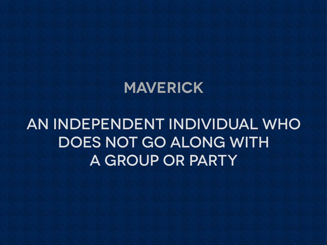
maverick
an independent individual who does not go along with
a group or party

THINK IS FOR GIRLS.
Sweet Briar, Virginia · 800.381.6142 · [email protected] · www.sbc.edu
Sara Coffey '06 · Anderson, South Carolina · Dance and government
THINK IS FOR GIRLS.
Sweet Briar, Virginia · 800.381.6142 · [email protected] · www.sbc.edu
Sara Coffey '06 · Anderson, South Carolina · Dance and government


#thinkisforgirls

guilford popcorn


alma tartan

The Warner Pacific logo consists of the two letters “WP,”
both of which have been curved at the edges to reflect the
waves of the Pacific Ocean. These curved edges function
as entry points into the process of education that occurs
at Warner Pacific—so as you enter you must traverse
the cross that is f
ramed between the W and the P. It is
only when you come to the cross with your intellect that
you are then prepared to address life’s most difficult
questions. Our tradition of sending scholars into the
world prepared to serve their communities is reflected in
the curved appendage of the letter P, which gives motion
to the process of leaving Warner Pacific.
In addition to serving as “initials” for the college’s name,
the letterforms are fresh, clean and balanced, and suggest
the natural beauty of the Pacific Northwest. The two
rounded elements that appear above the wordmark are
intended to represent two people with differing points of
view who are facing each other. Because of their shared
faith in Jesus and their ability to enter into productive
and informed dialogue, these two people can literally see
eye to eye across the cross.
Generally, the logo should appear with the wordmark.
When space is limited or when the audience is fa
miliar
with Warner Pacific, it is appropriate for the logo to
stand on its own.
To reflect the natural beauty of the surrounding Portland
environment and to capture the spirit of refreshing
inquiry on campus, colors have been selected to reflect
both the water and evergreen landscaping of our area.
Publications will be appealingly bright and open.
Communications will reveal a fresh perspective for life
and honest questioning on campus and also resonate
with the overwhelming opportunities for experience and
service in the surrounding urban area.

wpc urban position


ways to be a respected maverick5

1know your client.
(really well.)

2solve problems proactively.
(take the lead.)

3Do the research.
(insist on it.)


• who is the audience? • What do we know about them? • why will they care?
• what difference would it make if client/event/ program wasn’t available?
• who is the competition? • what do they offer that’s better?
• what is the clear advantage? • what’s honestly most important in communication?

4prepare rationale.
(pace yourself on the clever stuff.)

how to present a concept and win
“Today I’m happy to show you the concept we’ve developed in response to your request for x. I’m eager to show it to you but, before we look at the concept, I’d like to review a few key ideas…”

Ensure that you have a shared understanding of terms: (brand, positioning, marketing, advertising, promotion…)
how to present a concept and win

Review intended audience(s) and descriptions
review objectives
review anticipated results (what does the client hope to see as a result of this solution?)
how to present a concept and win

“Now… Let me show you how we have solved your problem and addressed your request…”
how to present a concept and win

5demonstrate success.
(brag purposefully.)

Build confidence. Earn trust.
the big takeaway…

Q?

thanks.