Embed Size (px)
Citation preview

DATA VISUALIZATION in a nutshell

DAVID ALAYÓN Creative Technologist · Serial Entrepreneur Design Thinker · UX & Product Designer
@davidalayon
Social Noise Chief Innovation Officer & Partner
Guud Data Scientist wannabe & Co-Founder
Google, IEBS, Miami Ad School... Professor & Mentor
MoveWoman Product Design Advisor & Co-Founder

DataPointedViz by:
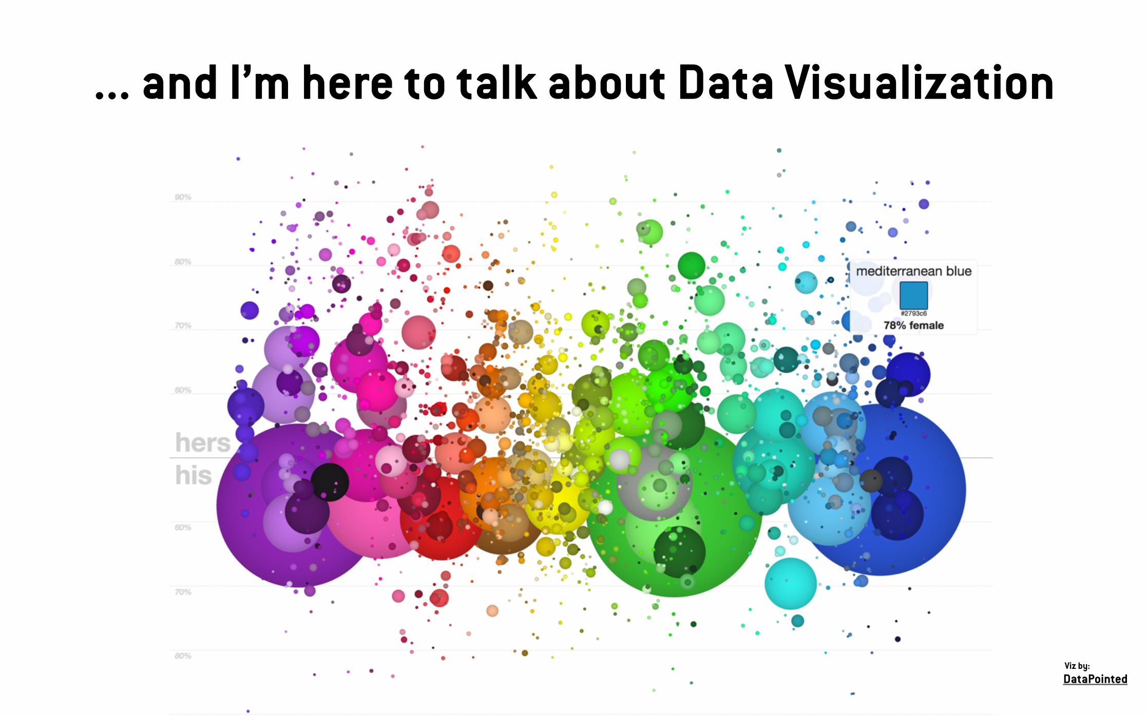
... and I’m here to talk about Data Visualization

... and I’m here to talk about Data Visualization
DataPointedViz by:

... and I’m here to talk about Data Visualization
DataPointedViz by:

... and I’m here to talk about Data Visualization
DataPointedViz by:

... and I’m here to talk about Data Visualization
DataPointedViz by:
... and I’m here to talk about Data Visualization
DataPointedViz by:

THE DEFINITION

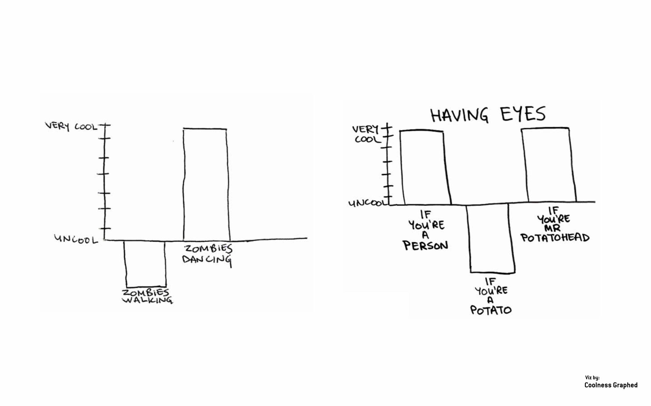
Coolness GraphedViz by:

PLOS
Viz by:
VEGETATIVE STAGE BRAIN DAMAGE HEALTHY PERSON

IMAGEN:

Best American Infographics 2013
Viz by:

Aaron KoblinViz by:
AIR TRAFFIC OVER NORTH AMERICA

IMAGEN:
IT ISN'T CLEAR...

IMAGEN:
Data visualization
Information visualization
VISUALIZE RAW DATA

IMAGEN:
Data visualization
Information visualization
Information Graphics
Data Graphics
VISUAL ENCODINGS (RAW) DATA

IMAGEN:
INFORMATION GRAPHIC

IMAGEN:
INFOGRAPHIC
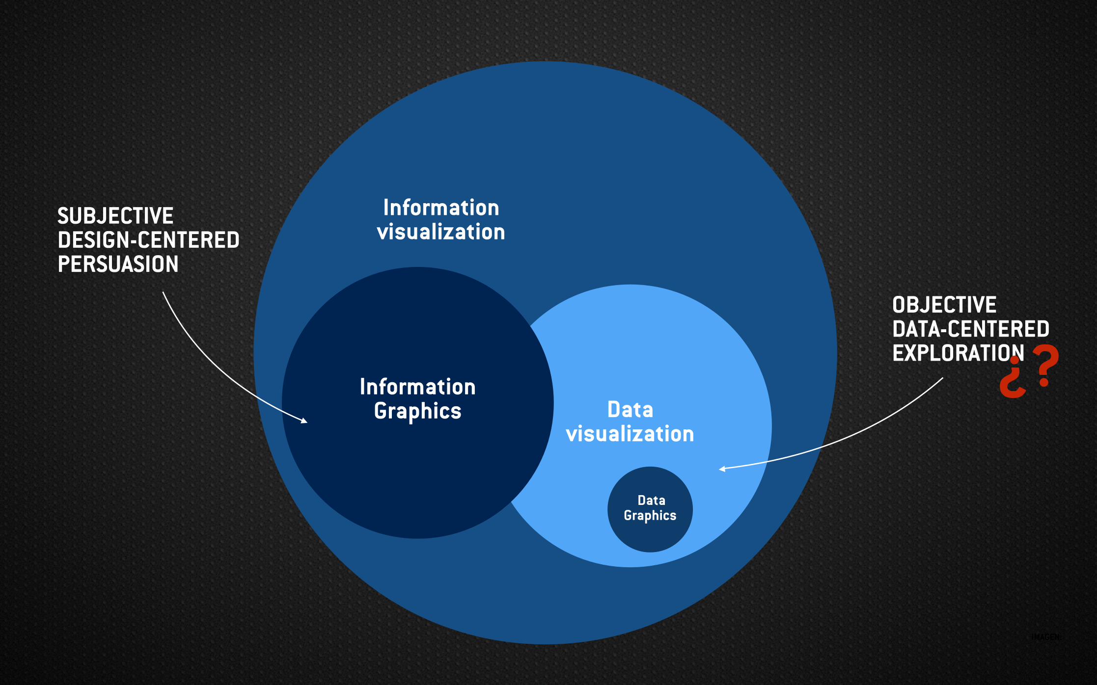
IMAGEN:
Data visualization
Information visualization
Information Graphics
Data Graphics
SUBJECTIVE DESIGN-CENTERED PERSUASION
OBJECTIVE DATA-CENTERED EXPLORATION¿?
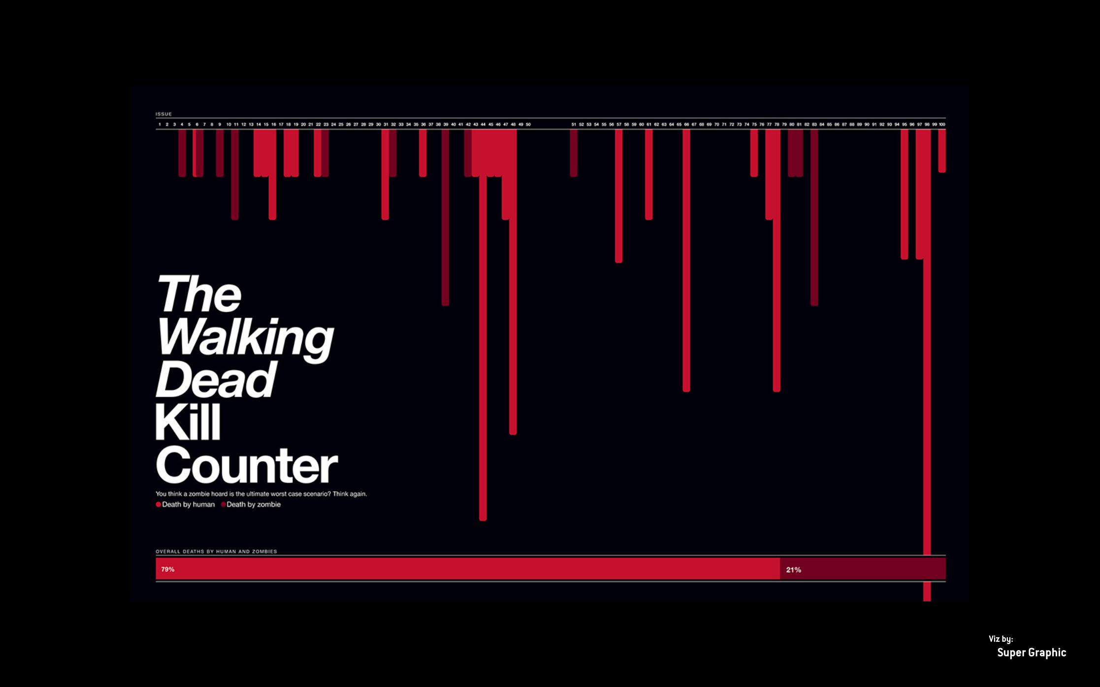
IMAGEN:
Super Graphic
Viz by:

Best American Infographics 2013
Viz by:
IMAGEN:
The goal of Data visualization is to communicate information clearly and efficiently to users via the statistical graphics, plots, information graphics, tables, and charts selected. Effective visualization helps users in analyzing and reasoning about data and evidence. It makes complex data more accessible, understandable and usable.
WIKIPEDIA

IMAGEN:
DNA11
Viz by:

IMAGEN:
Data visualization is the mix of many disciplines whose goal is to communicate data-based information in a visual way with a certain objective to a certain target audience.
COMPUTER SCIENCE STATISTICS GRAPHIC DESIGN ...
disciplinesvisual way
objective target audience
INFORM EXPLORE ADMIRE ...
IMAGE VIDEO INTERACTIVE APP ...
MAINSTREAM IN-COMPANY JOURNALISTS ...

THE WHY

IMAGEN:

IMAGEN:
Tor NorretrandersViz by:

IMAGEN:
EXPLORE INFORM ADMIRE

FRAGMENT FIRST WORLD MAP - PIRI REIS
CARTOGRAPHYEXPLORE

GMAPS - GOOGLE
CARTOGRAPHYEXPLORE
INFORM

REAL MADRID VS ATLÉTICO MADRID - CARTODB
CARTOGRAPHYEXPLORE
INFORM ADMIRE

FIRST TIME-SERIES - 10th century
OBSERVATION OF OUR WORLD
EXPLORE

TIDE TABLE
EXPLORE INFORM
OBSERVATION OF OUR WORLD

THE LARGEST STARS IN THE UNIVERSE 2015
EXPLORE INFORM ADMIREOBSERVATION
OF OUR WORLD

CHOLERA MAP - DR SNOW
PROBLEM SOLVING
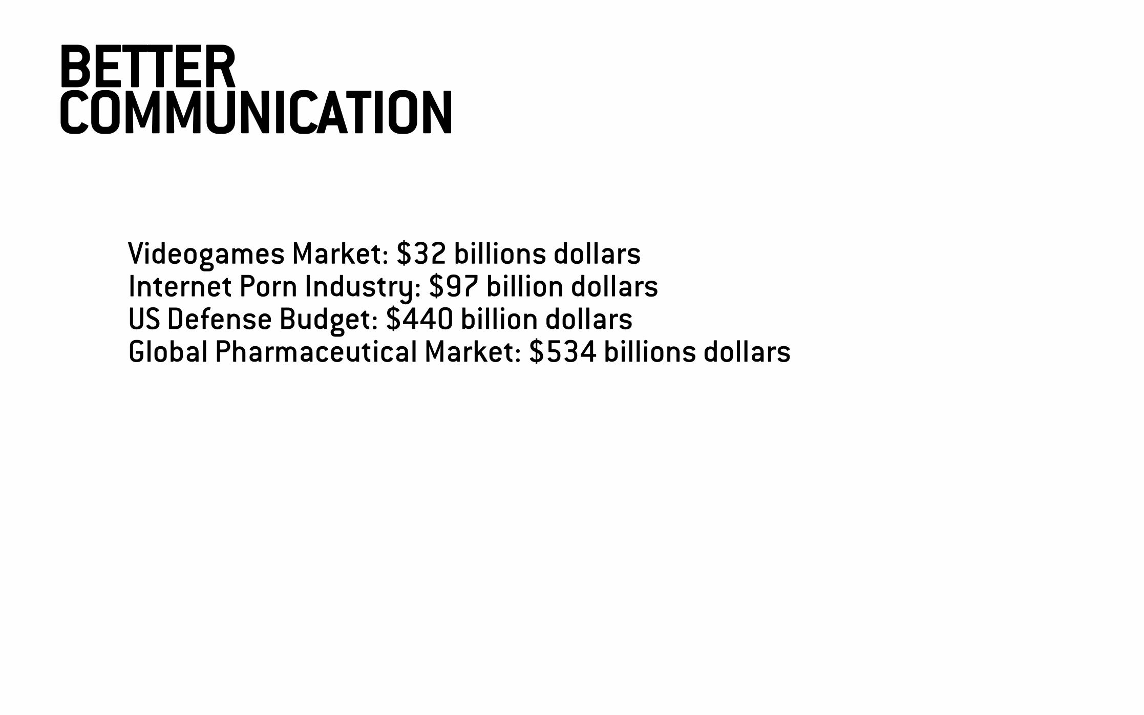
BETTER COMMUNICATION
Videogames Market: $32 billions dollars Internet Porn Industry: $97 billion dollars US Defense Budget: $440 billion dollars Global Pharmaceutical Market: $534 billions dollars

Save the Amazon: $21 billion dollars Videogames Market: $32 billions dollars Feed every child in the world for a year: $54 billion dollars Internet Porn Industry: $97 billion dollars Yearly amount given to charity by Americans: $300 billion dollars US Defense Budget: $440 billion dollars Feed and educate every child on Earth for 5 years: $465 billion dollars Global Pharmaceutical Market: $534 billions dollars
BETTER COMMUNICATION

THE BILLION DOLLAR GRAM
BETTER COMMUNICATION

DETECT PATTERN

DETECT PATTERN

THE PROCESS

IMAGEN:
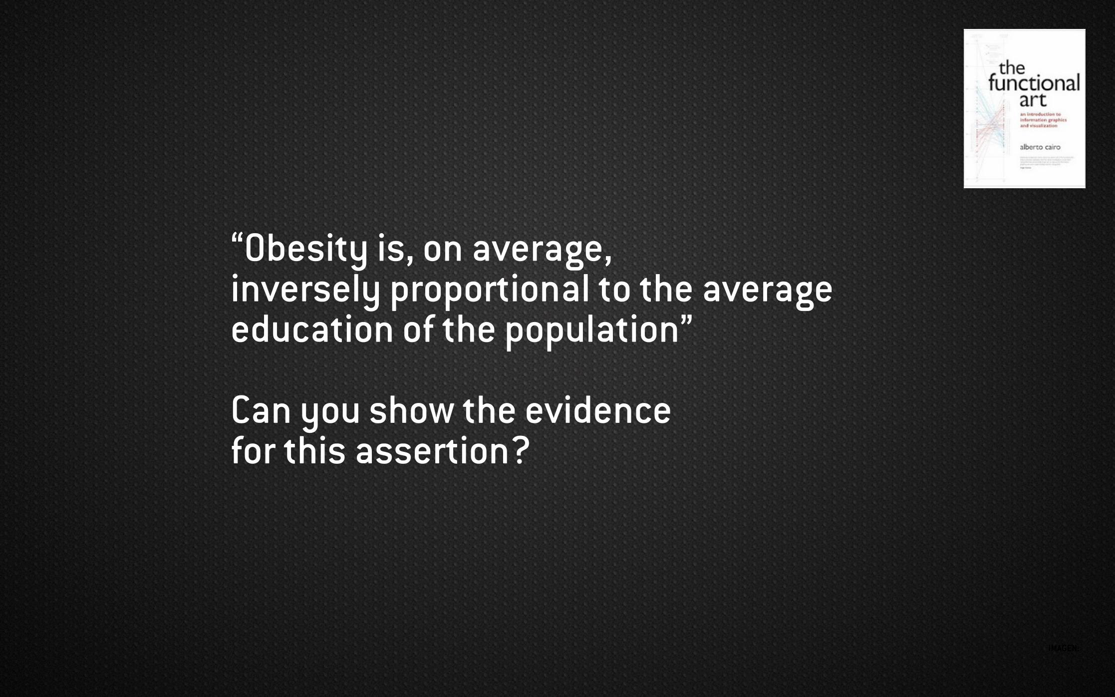
IMAGEN:
“Obesity is, on average, inversely proportional to the average education of the population”
Can you show the evidence for this assertion?

THE FUNCTIONAL ART - ALBERTO CAIRO

THE FUNCTIONAL ART - ALBERTO CAIRO

THE FUNCTIONAL ART - ALBERTO CAIRO

THE FUNCTIONAL ART - ALBERTO CAIRO

THE FUNCTIONAL ART - ALBERTO CAIRO

IMAGEN:
Step 1: Accept that a graphic is a tool for understanding
Step 2: Be curious and start making simple graphics about topics you care about. Tons of them.
Step 3: Educate yourself in creating hierarchies, narratives, stories, etc., that make your presentations understandable.
Alberto Cairo

IMAGEN:
Represent Refine Interact
DATA VISUALIZATION

IMAGEN:
Represent Refine Interact
DATA VISUALIZATION
Mine FilterAcquire Parse
EXPLORATORY DATA ANALYSYS
DATA WRANGLING

IMAGEN:
- SHAPED

IMAGEN:
- SHAPED
BROAD
D EEP

IMAGEN:
NoSQL
ETL
Statistics Machine LearningData Mining
Communication
Graphic Design
Web scrapping
API
Storytelling


IMAGEN:
Represent Refine Interact
VISUALIZING DATA
Mine FilterAcquire Parse
PREPARING DATACOLLECTING DATA DATA VISUALIZATIONEXPLORATORY
DATA ANALYSYSDATA WRANGLING
LIKE IF WE WERE COOKING!

IMAGEN:
WE HAVE THE DATA!
IT’S PREPARE TO COOK!
LET’S COOK!

HAVE A GREAT
STORYWilliam DoreePhoto by:

DETERMINE YOUR
MESSAGE
Carly WongPhoto by:

KNOW YOUR
AUDIENCE
Victoria HellnerPhoto by:

KNOW YOUR
CONTENT
Victoria HellnerPhoto by:
RESPECT YOUR
AUDIENCE

IMAGEN:
DECIDE WHICH DATA TO
ILLUSTRATE
Pablo PeronPhoto by:

DECIDE HOW TO
ILLUSTRATE
Antonis AndroulakisPhoto by:

TYPES OF DATA
Ordinal (size: S, M...)
Quantitative (counts: 1, 2, 3...)
Fields (altitude temperature...)
Nominal (shape, geo...)
Cyclic values (directions, hues...)
DISCRETE (no between values)
CONTINUOUS (values between)
ORDERED (values are comparable)
UNORDERED (values not comparable)

LIFE EXPECTANCY
GEOGRAPHICAL REGION
GapMinder
Viz:
INCOME PER PERSON

LIFE EXPECTANCY
Quantitative
Fields
GEOGRAPHICAL REGION
Nominal
GapMinder
Viz:
INCOME PER PERSON


HOW MANY TIMES BIGGER?

HOW MANY TIMES BIGGER?

x7


SATURATION
BRIGHTNESS
DENSITY
HUE

COLOR
Observers can rapidly differentiate between only five to ten hues (Healy)
Twelve colors (6+6) recommended (Ward)
Don’t forget white, black and gray

SATURATION & CONTRAST
Use saturated colors for points, strokes and symbols
Use desaturated colors for fills and larger areas
Make sure that the elements have sufficient luminance contrast

WHAT’S THE PROBLEM?
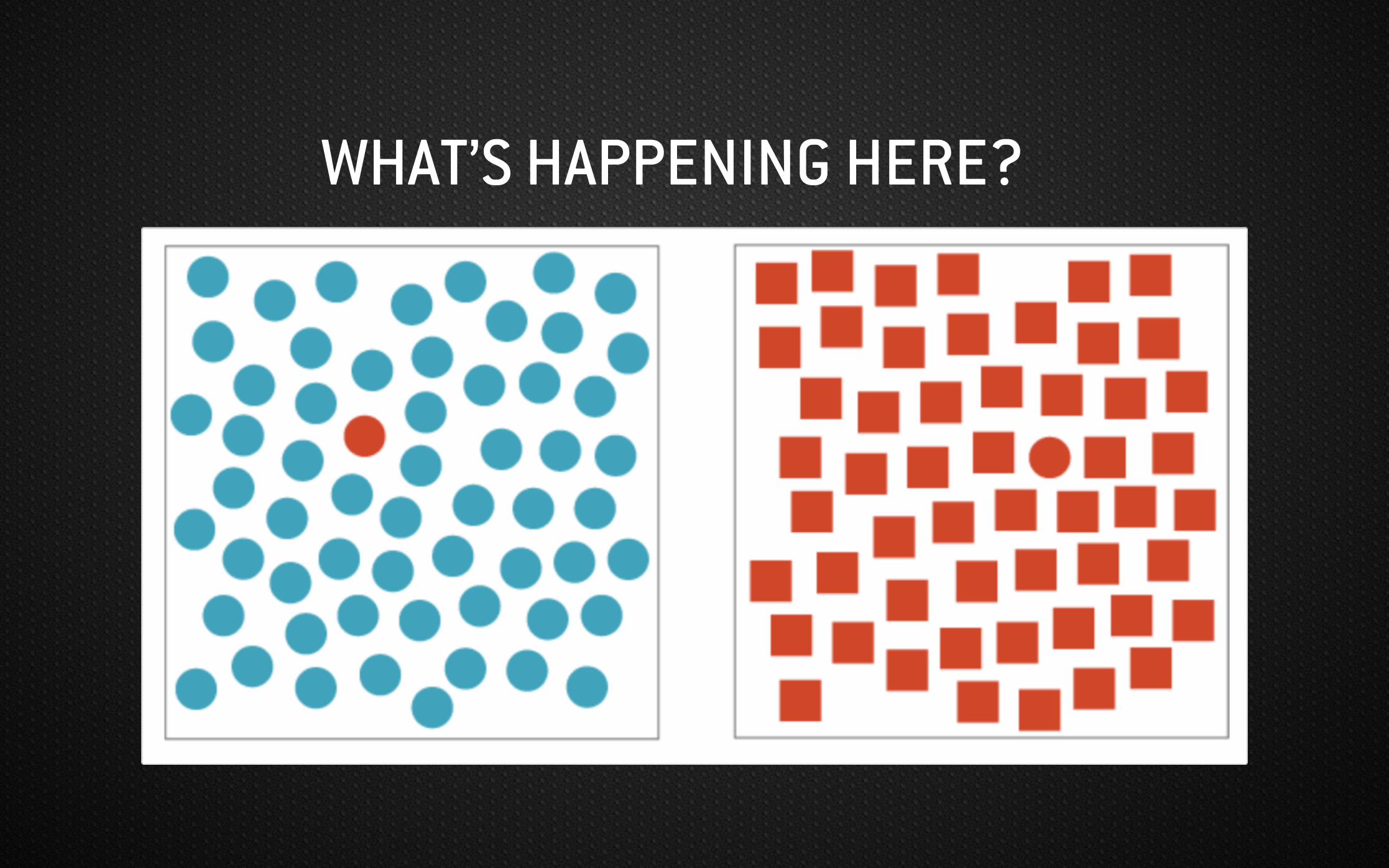
WHAT’S HAPPENING HERE?

WHAT’S HAPPENING HERE?

WHAT’S THE PROBLEM?

We organize what we see in particular ways to make sense of visual information. There are six principles that influence the ways human see and understand visuals.
GESTALT PRINCIPLES OF PERCEPTION

FONTS
Data visualization Data visualization Data visualization Data visualization Data visualization
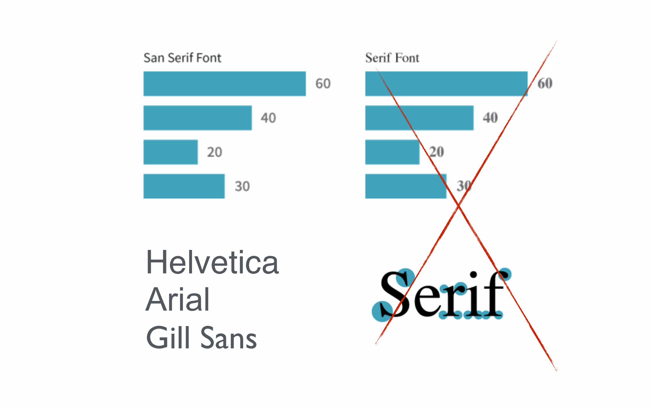
HelveticaArial Gill Sans

ICONS
Easy to understand (icon + measure)

Sentences are to speech what charts are to visual encodings
CHARTS
VISUAL ENCODINGS
DATA TYPES
RELATIONSHIPSCHART TYPES
++ =

BAR CHART
Quantitative dependent
variable
Discrete / nominal independent variable
POSITION + LENGHT

LINE CHART
Quantitative continuous dependent
variable
Quantitative continuous independent variable
POSITION

SCATTER PLOT
Quantitative independent
variable
Quantitative independent variable
POSITION + DENSITY

PIE CHART
Relative portions of a quantitative
dependent variables
On single dimension (100%)
ANGLES

STACKED BAR CHART
Two accumulating quantitative dependent
variable
Independent variables
POSITION + LENGTH


ANATOMY OF A CHART

WHAT’S HAPPENING HERE?


CHERNOFF FACES

DASHBOARD
Ducksboard


Ryan MacEachern
DESIGN X FOOD
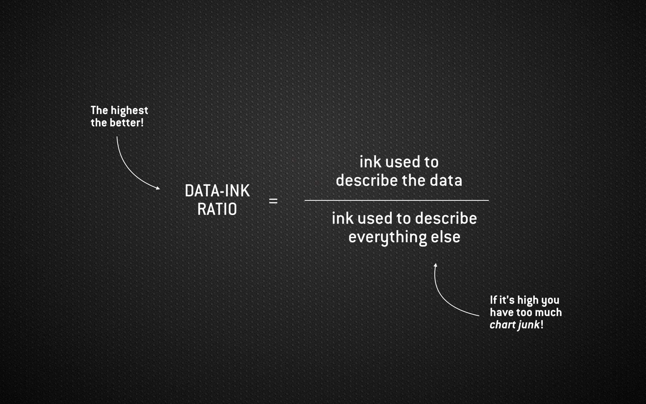
DATA-INK RATIO
ink used to describe the data
ink used to describe everything else
=
The highest the better!
If it’s high you have too much chart junk!

THE STORY

HAVE A GREAT
STORYWilliam DoreePhoto by:

PRESENTATION VISUALIZATION
INTERACTIVE VISUALIZATION
INTERACTIVESTORYTELLING
Used for communication Doesn’t support user input

COMMUTING BARCELONA
BestiarioViz by:
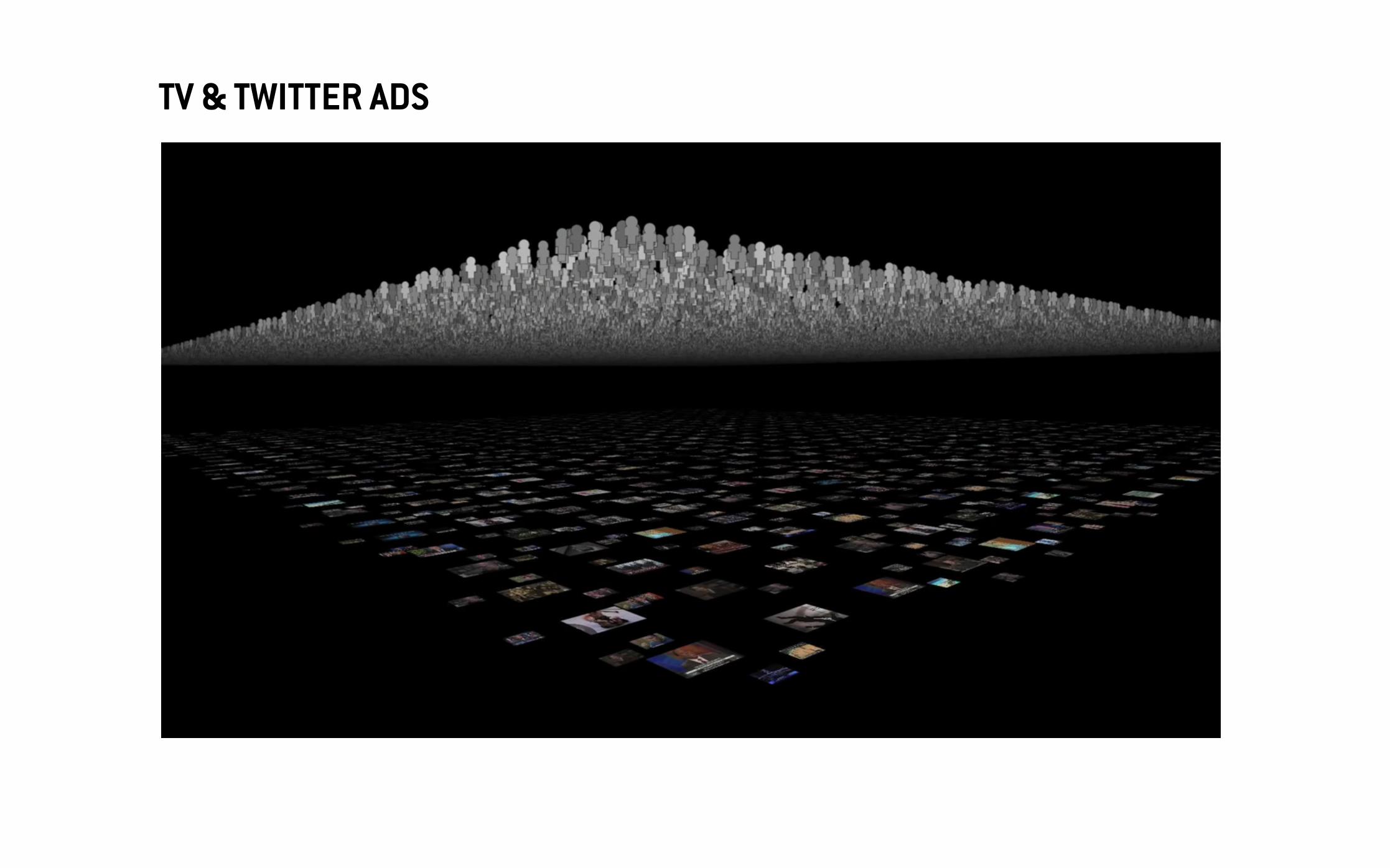
TV & TWITTER ADS

PRESENTATION VISUALIZATION
INTERACTIVE VISUALIZATION
INTERACTIVESTORYTELLING
Used for discovery Rerenders based on input

AUTHOR-DRIVEN VIEWER-DRIVEN
- Strong ordering - Heavy messaging - Need for clarity and
for speed
- Ask questions - Explore and interact - Tell your own data
story
PRESENTATION VISUALIZATION
INTERACTIVE VISUALIZATION

INTERACTIVE NARRATIVE
ending1
ending2
ending3
ending4
ending5
ending6
ending7
ending8
ending9

The Guardian
Viz:

PRESENTATION VISUALIZATION
INTERACTIVE VISUALIZATION
INTERACTIVESTORYTELLING
Mix between presentation and interaction


AUTHOR-DRIVEN
VIEWER-DRIVEN

THE TOOLSEvuan Murray
IMAGEN:

Flexibility
Productivity
ASSEMBLY
C / C++
Python / Ruby
Excel

Flexibility
Productivity
SVG, Canvas, WebGL
D3.js
Dimple.js
Tableau

SVG
<path d=‘
M 256,213 C 245,181 206,187 234,262 147,181 169,71.2 233,18 220,56 235,81 283,88 285,78.7 286,69.3 288,60 289,61.3 290,62.7 291,64 291,64 297,63 300,63 303,63 309,64 309,64 310,62.7 311,61.3 312,60 314,69.3 315,78.7 317,88 365,82 380,56 367,18 431,71 453,181 366,262 394,187 356,181 344,213 328,185 309,184 300,284 291,184 272,185 256,213 Z’>
</path>
Tavmjong
Animated:

D3.js
D3.js (Data-Driven Documents) is a JavaScript library for producing dynamic and interactive data visualizations in web browsers.
- D3 is Not a Charting Library (like Highcharts) - D3 is Not a Graphics Layer (SVG, HTML + CSS) - D3 is Not a SVG Polyfill (like RaphaelJS)
D3.js as a data visualization tool, in the sense that its API has two parts: data (comes with lots of utilities for processing data) and visualization (to bind and transform DOM elements)
Ruoyu Sun
Source:

D3.js · Binding API
var svg = d3.select('svg')
svg.append('circle') .attr({
cx: 100, cy: 100, r: 40, fill:'#25B0B0'
})
svg.append('circle') .attr({
cx: 350, cy: 100, r: 40, fill:'#25B0B0'
})
@Enjalot
Tutorial:

D3.js · Non- Binding API
var quant = [0, 5, 10, 15, 20]; var qual = ["big", "small", "medium"];
var qScale = d3.scale.linear() .domain(d3.extent(quant)) .range([10, 100])
quantValue = qScale(7);
@Enjalot
Tutorial:
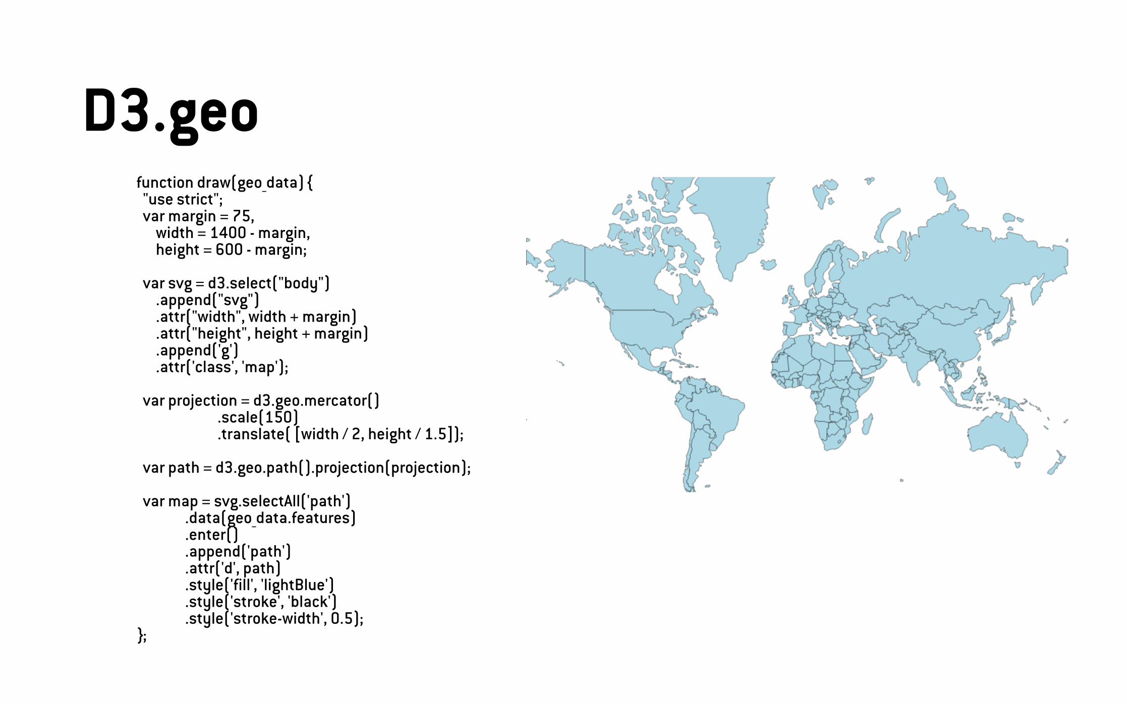
D3.geo function draw(geo_data) { "use strict"; var margin = 75, width = 1400 - margin, height = 600 - margin;
var svg = d3.select("body") .append("svg") .attr("width", width + margin) .attr("height", height + margin) .append('g') .attr('class', 'map');
var projection = d3.geo.mercator() .scale(150) .translate( [width / 2, height / 1.5]);
var path = d3.geo.path().projection(projection);
var map = svg.selectAll('path') .data(geo_data.features) .enter() .append('path') .attr('d', path) .style('fill', 'lightBlue') .style('stroke', 'black') .style('stroke-width', 0.5); };


D3.js
- Protovis (http://mbostock.github.io/protovis/) - Vega (https://trifacta.github.io/vega/) - Prefuse (http://prefuse.org/)
Dimple.js
- NVD3 (http://nvd3.org/) - Rickshaw (http://code.shutterstock.com/rickshaw/) - Highcharts (http://www.highcharts.com/)
Tableau
- RAW (http://raw.densitydesign.org/) - Chartio (https://chartio.com/) - Plot.ly (https://plot.ly/)

Books
- The functional art - Alberto Cairo - Data + Design - Infoactive - Raw Data: Infographic Designer - Steven Heller & Rick Landers - Visual Storytelling with D3 - Ritchie S. King
Online
- Data Visualization & D3.js (Udacity) - Data Visualization (Coursera) - Front-end Masters - @Enjalot (GitHub) - Mike Bostock (link) - Flowing Data (link) - Visualising Data (link)
RESOURCES