Embed Size (px)
Citation preview

PRODUCTION
ABBY DOWNING

LOGOS

LOGOS
‘SAS’ seemed the most easy type of font that I thought of first
which is popular when it comes to companies or organisations,
the A I thought could be a surfboard to immediately make you
see that that is what the organisation is about. However I didn’t
think that it said that much about the organisation and that the
logo wouldn’t be recognised.
Making the logo a bit more interesting I put the name of the
organisation on a surfboard, this still seemed to simple and
looked to boring for it to be recognised by people. It only took a
few seconds to make and I wanted something more
complicated and that said more about the organisation.

Logo progress These are some more complicated and thought about ideas
I had about the logo choice which took me longer then the
simple ideas. I thought a cross of 2 surfboards would look
good because it shows that it is about surfing, however I
didn’t think it gave enough away. I tried the logo placed into
a circle so it looked neater.
Another logo idea I tried out was having a dolphin in a circle,
with the whole title around the circle, which showed people
straight away that it is about marine conservation that came
about through surfers. This idea then moved onto a more
better structured neater version of my final idea. Which was
3 dolphins in the middle with a brighter blue with writing that
stood out above the logo, whereas on the first idea it did not
do this. The colour and the actual dolphins make the logo
very recognizable, which is a key element for a logo design.
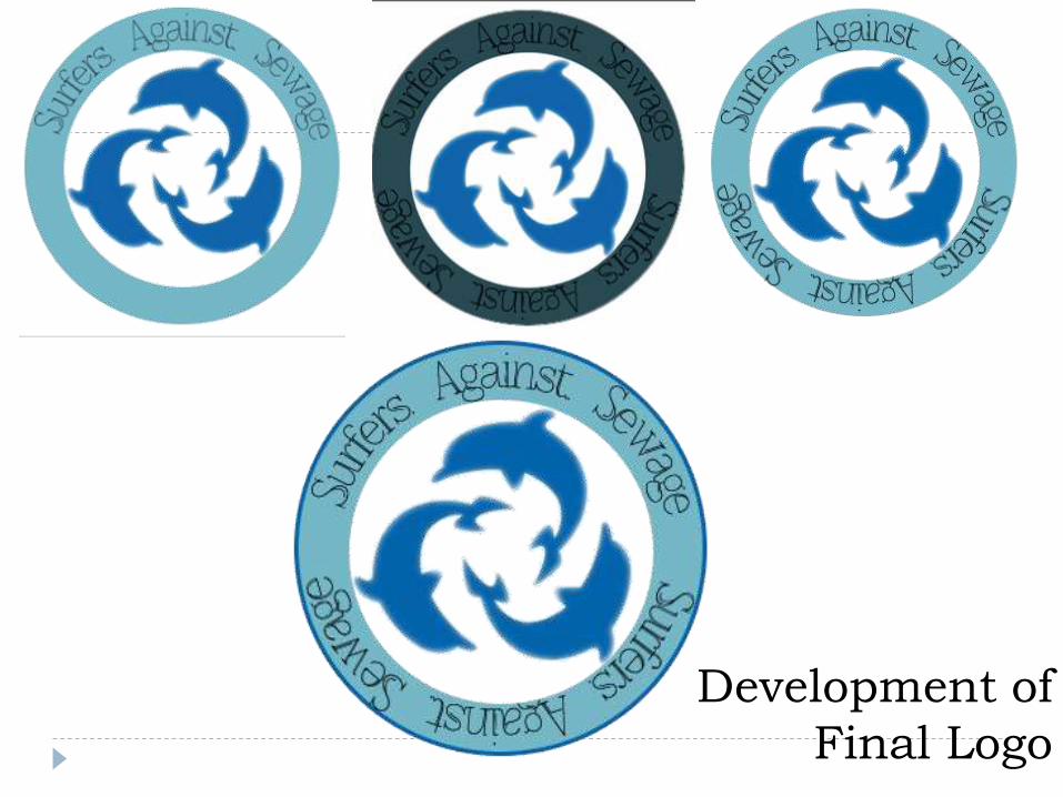
Development of
Final Logo
MEMBERSHIP FORM
Emotive photograph
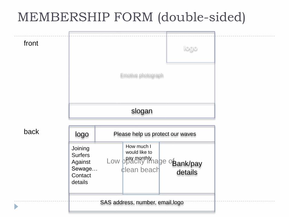
front
back
logo
slogan
SAS address, number, email,logo
logo Please help us protect our waves
Low opacity image of
clean beach
Joining
Surfers
Against
Sewage…
Contact
details
How much I
would like to
pay monthly
Bank/pay
details
MEMBERSHIP FORM (double-sided)

MEMBERSHIP FORM (booklet)FRONT BACK
JOIN SAS
PICTURE (dirty
beach)
Improvement so
far…
PICTURE
(clean beach)

Inside left Inside right
logo
Please help us
protect our
waves
Low opacity image of
dirty beach
Joining
Surfers
Against
Sewage…
Contact
details
How much I would
like to pay monthly
Bank/pay details
Low opacity image of
dirty beach
SAS address, number,
email,logo
PHOTOGRAPHS
About the
campaigns
Membershi
p Perks
I like the idea and layout of this
membership form because it
has a large image on the front
of a dirty beach which will
attract anyone who is curious
about these types of problems
(marine conservation) and want
to take a look inside the booklet
about what it is about. Which is
why my first page is all about
the campaigns that the SAS
show and provide information
on. This will be presented with
persuading text and emotive, to
try encourage readers that it is
a good cause, and then goes
on to the next page which talks
about the membership and has
the options of which
membership you want to go for
etc.
The back page then shows a
picture of a clean beach which
is what the SAS are trying to
achieve.
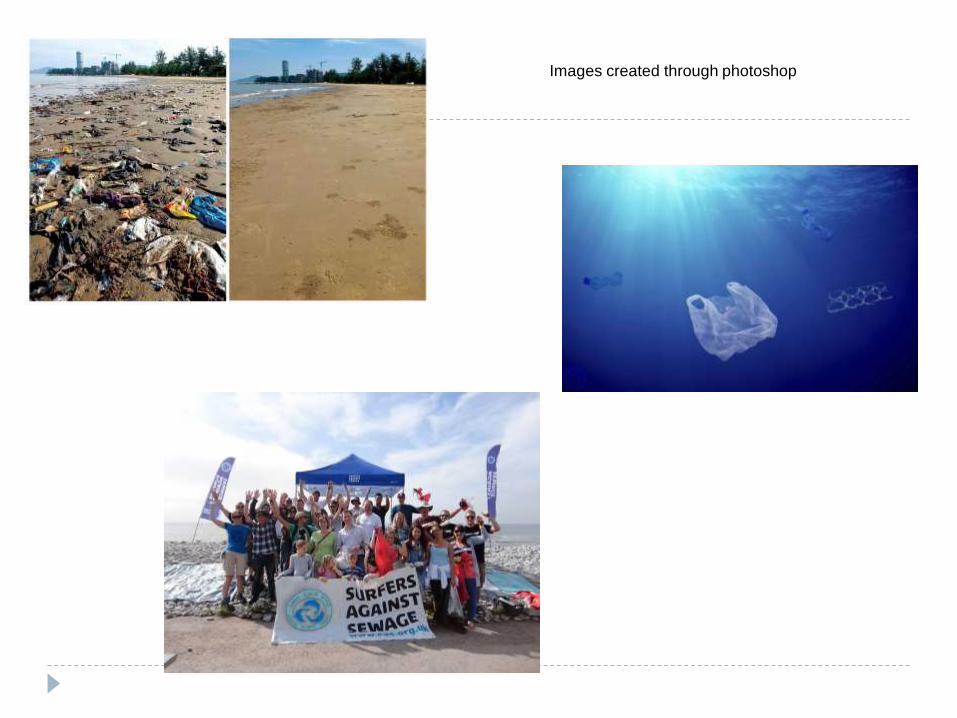
Images created through photoshop

Landscape/double-
sided (Photoshop)

Final double sided membership form

Portrait/booklet (in-design)
different colour and
background ideas


This way my final layout of the booklet
membership form idea. I like this idea
because it is covered in images to help
spread awareness about the problem/issue
which can encourage people who are looking
at the membership form to sign up. The front
cover image is particularly inspiring because
it shows all the litter that is actually under the
sea that we can not always see. The back of
the booklet shows changes that have
already been made and help that we already
have of volunteers which is something else
that can encourage people to sign up.
The inside pages show litter in the sea as
the background but with low opacity so that
you can read the writing above the image. It
also shows images of progress that has
been made through the organisation. The
text on the left is a bit of information about
the campaigns to tell you why you are
signing up, and what campaigns you will be
helping and on the left is the details you
need to fill out to sing up.
Final booklet layout
CAMPAIGN POSTER

Campaign Poster- Mind
Map

I want to create a few campaigns
that highlight the risks of what the
litter is doing to the ocean but also
some that highlight the danger to
people and also animals that litter
does in the ocean. Because it is
not only the sea that is at harm, I
want to create a bigger picture
that shows this.
I want to create an
attractive beach clean
up poster that will make
people want to attend
the event and help out.
Some of the existing campaigns I
have looked at are obviously not
real and are made through
Photoshop but they are the ones
that catch your eye and attract you
to read the little text on the page
because these ones are the ones
that make you think about how
serious the subject is and how
worse it could get if it is not stopped
or managed.
Campaign Poster - Mood
board

Idea 1 - dolphin made out of rubbish
I like this idea because it highlights that it is not just damage
to the ocean but what lives within the ocean as well.
I decided to go with the dolphin filled with cans because it
suited the image better and wasn’t to confusing and busy.
It shows the dolphin full of cans because inside them, they
could be. A lot of animals in the ocean are killed or seriously
harmed by litter and rubbish because they mistaken them for
food.
The audience for this campaign is mainly adults, more of a
mature audience can see what the advert is meant to show.
However this one will also make children question the
campaign to their parents and ask why it is filled with cans,
therefore it will also give children a lesson on littering and
bring awareness about for them also.


Idea 2 – litter beneath surfers In the sea.
Surfers against sewage was founded by surfer lovers and it was to do with
making the ocean better for the people that surf otherwise their waves would
become extinct. So I wanted to make a campaign that highlighted problems
for surfers, which was litter and sewage. I made this campaign by getting
popular rubbish products that are found in the sea and placing them beneath
the surf boards. This can also be a massive danger risk for people surfing in
the sea and not just harmful towards the sea.
I darkened the photograph to make it look more negative and a serious
subject then bright like it was from the start which suggested it was a
positive photograph.

Campaign
Posters
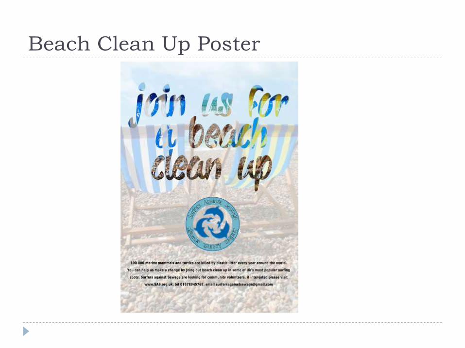
Beach Clean Up Poster

Merchandise

Merchandise – Mood Board
The merchandise I am planning
on making includes a hoodie and
T-shirt which contains the Logo,
very simple like this example on
the left. I like the simple ones
because I think they’re more
attractive to wear and also are
likely to be liked because they
are simple. Another reason I
want this is so the logo is
recognizable by many people. I want to create a phone case
that includes a background of a
beach and the writing surfers
against sewage which supports
our campaigns. This is
something cheap that you can
buy from the shop which is good
because someone might only
want a small souvenir to support
it. I also want to create a mug
with the logo on it which is also
something cheap that can be
bought for yourself or as a
present.

Phone Case Progress

Other potential
merchandise from the
first design

Simple Logo Design
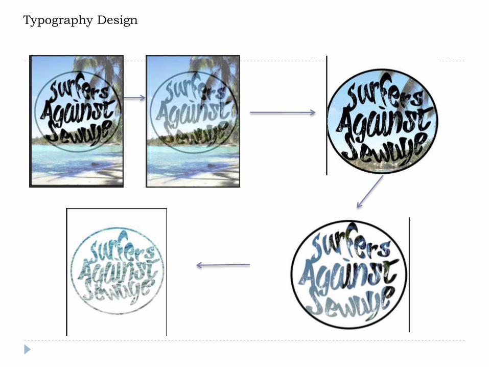
Typography Design

Final typography
design on the
merchandise
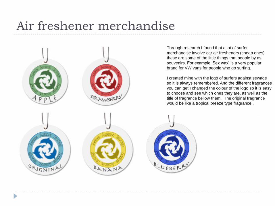
Air freshener merchandise
Through research I found that a lot of surfer
merchandise involve car air fresheners (cheap ones)
these are some of the little things that people by as
souvenirs. For example ‘Sex wax’ is a very popular
brand for VW vans for people who go surfing.
I created mine with the logo of surfers against sewage
so it is always remembered. And the different fragrances
you can get I changed the colour of the logo so it is easy
to choose and see which ones they are, as well as the
title of fragrance bellow them. The original fragrance
would be like a tropical breeze type fragrance..