Embed Size (px)
Citation preview

Unit 51 Page Layout and Design
Production Commentary

Design Programmes• For this project I used two differed types of design programs the first one
Microsoft word and the second being Photoshop .• I used word so then I was able to write out what I want the article to look like in
the magazine . Doing it on word allowed me to sort out my spelling as well a the punctuation. It also allowed me to upload it onto my photo shop file. It also allowed me to send it to a colleague to do an edit to judge by review before it goes on the magazine this is something that would happen if I was in a proftinal magazine they would have a editor look at it before it goes out to the public
• The second design program that I used was photo shop this allowed me to used varies different tools to edit the magazine cover and the double page spread as well . This included changing the brightness , cropping and resizing . Also for the font I uploaded a font from a website called dafont this allowed me to uploaded it onto Photoshop and have more fonts than the original . I could also change the colour of the background and text so it looks more eye catching and more appealing to look at rather than a dull black and white
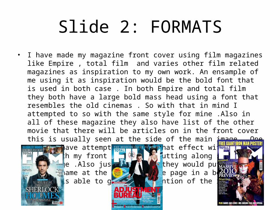
Slide 2: FORMATS• I have made my magazine front cover using film magazines like Empire , total film
and varies other film related magazines as inspiration to my own work. An ensample of me using it as inspiration would be the bold font that is used in both case . In both Empire and total film they both have a large bold mass head using a font that resembles the old cinemas . So with that in mind I attempted to so with the same style for mine .Also in all of these magazine they also have list of the other movie that there will be articles on in the front cover this is usually seen at the side of the main image . One again I have attempted to copy that effect with my front cover with my front cover with putting along side my main image .Also just like mine they would put the main article name at the bottom of the page in a bold font so that It is able to grab the attention of the readers.

Slide 3: Conventions & Visual Language
• For my mast head I have used bright bold fonts that are meant to be used to grab the attention of the audience . The font that I have used for the front covert is meant to symbolise the old style cinemas and the name of the magazine camera action is meant to mean the old style phase of cinimatrophey lights camera action . I have used a blue and black as the two colours for the front cover the reason for this is because this weeks issue is about unfriended an internet horror so the black is meant to symbolise horror and blue is meant to symbolise online and the internet . The image used on the front page is meant to represent the webcam style that unfriended has been filmed by I thought this would be a clear way of showing what movie is the main focus .
• One the double page spread I have used the phase has unfriended been unfriended as my mast head this is because I wanted to make a catch title which will grab the attention of my audience which may make them want to read it . The font which I used for it was a black hacking type font is was meant to show to my audience that it was a movie that involved computers .

The first thing that the audience will see when they start to look at the front cover will be the primary optical are a which has a masthead . This is a bold font so it is easy to read and attracts audience it also says when this issue was released so people know that It is not an old addition
Next is the strong farrow area I have left this area blank because I believe that it allows the image to be viewed batter if there is nothing in this part to distract from the image
In the week fallow are I have the main article for the magazine a review of the film unfriended if the audience look at this they will be able to tell what the main talk point is about the magazine and see if they want to read it
In the terminal are the main article spreads over to this side but it also inclodes the bar code that is needed to buy the product
In the axis of orientation there are two things that draw the eyes the first being the image of the camera which links with the internet call that accurse throughout the movie .And also the additnal articles that will be seen throughout this magazine this will tell the read what else they have in store when reading this magazine

Masthead
Date of release
Cover lines
Lead article
kickerBar code
Main focus

Masthead
Page number
image image
Body text
kicker
Drop cap
gutter
Sub heading

Slide 4: AudienceThe target audience of my magazine would be somebody who enjoys films due to obvious reason that it a magazine about films . The age rating of the audience would probably be 18 to 30 year olds because this is the age range that are intrusted in movies although it would still attract people who are outside this range just not as many . For this issue of the magazine the audience would most likely be over the age of 15 since the main article is of a movie that is a 15 but even thou it is that people under 15 would still watch the movie and read the article . I can image the gender being equal since moves are something that both genders can enjoy . But I would say that the social class would be c2 and c1 since in speaks like a working class but probably not something that somebody who is lower then c2 would buy.